

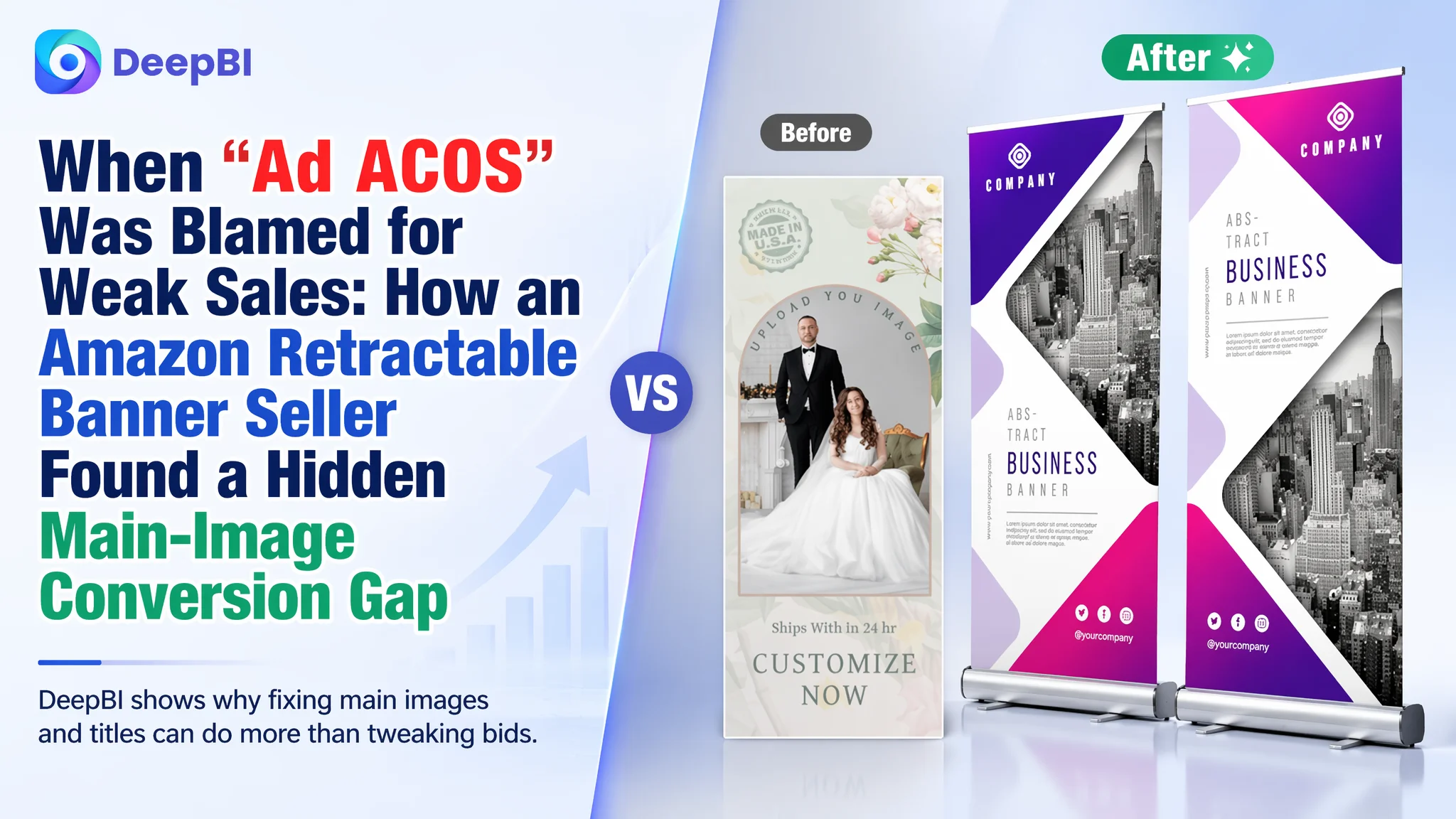
An Amazon seller in the custom retractable banner category came to DeepBI with a familiar frustration: ad spend was rising, but orders on their Amazon product page were not keeping pace. On paper, this Listing looked “better than average” — strong bullet points, solid A+ content, and a healthy review rating. The team’s first reaction was to treat this as an Amazon ads problem: keep refining bids, keywords, and campaign structure.
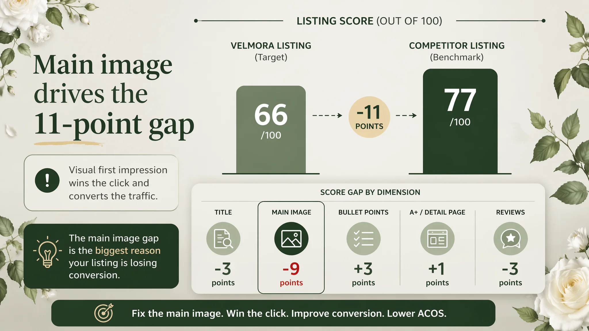
Once we put the Listing into DeepBI’s diagnostic system and benchmarked it against a direct Amazon competitor, a different picture emerged. The Listing’s overall score was 66/100 versus the competitor’s 77/100. The gap did not come from text or A+ — it came from the elements that most directly drive click and first impression: title, main image, and review scale. In other words, the product page was not converting the traffic it already had.
The turning point was recognizing that ads were amplifying a visual and positioning defect. DeepBI reframed the task: instead of “how do we squeeze more from ads?” the real question was “why doesn’t this Amazon Listing deserve more traffic yet?” The later optimization focused on tightening title search logic, rebuilding the main-image story around high-end custom display, and refining bullets to align with that positioning, while acknowledging the current review disadvantage.
For other Amazon sellers, this case is a reminder that a well-written A+ and “okay” reviews do not guarantee a healthy funnel. When main images don’t signal value clearly and titles don’t stake out the right search territory, ACOS will always feel too high — not because ads are bad, but because the page is leaking conversion at the moment of click and first glance.
What the Seller Thought Was Happening on Amazon
From the seller’s point of view, the situation looked straightforward:
- They sold personalized retractable banners on Amazon US, aimed at business events, trade shows, and weddings.
- The A+ content was well-planned, with strong scenes (weddings, holidays, commercial uses) and clear service promises.
- Bullet points were already built with a “pain point → solution” logic and backed by technical claims about printing and durability.
- Reviews were positive (4.2 stars), with no visible negative reviews on page one.
So when ad ACOS felt hard to control and sales lagged behind traffic, the intuitive explanation was: “Our ads and keywords aren’t optimized enough” or “we just need more reviews.” They viewed the Listing as mostly “done” and expected advertising tweaks to solve the problem.
The underlying assumption: if traffic comes, this page will convert it.
What the Data Actually Showed
When DeepBI benchmarked the Listing against a directly comparable, higher-performing competitor, the numbers cut through that assumption.
Overall Listing Score
- Target Listing: 66 / 100
- Comparable competitor: 77 / 100
- Gap: –11 points
Breaking it down:
- Title: Target Listing: 11, Competitor: 14, Max: 20, Gap: -3
- Main Image: Target Listing: 16, Competitor: 25, Max: 30, Gap: -9
- Bullet Points: Target Listing: 9, Competitor: 6, Max: 10, Gap: +3
- A+ / Detail Page: Target Listing: 21, Competitor: 20, Max: 25, Gap: +1
- Reviews: Target Listing: 9, Competitor: 12, Max: 15, Gap: -3
Two things were striking:
- Text and A+ were not the weakness. The Listing actually beat the competitor in bullet points and edged ahead on A+ structure and storytelling.
- The real gap was visual first impression and trust signals. The main-image score lagged by 9 points, and review maturity lagged by 3.
“The real problem was not that ads failed to bring traffic. It was that the page could not convert the traffic.”
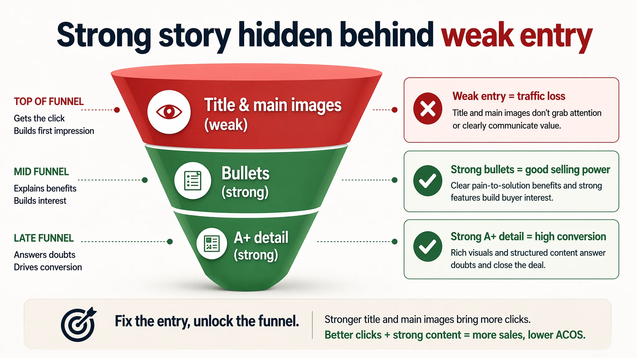
In practical Amazon terms: the Listing had a fairly strong “mid- to late-funnel” narrative (A+ and bullets) but was underperforming where it matters most for cold traffic — title, main images, and review scale.
Amazon Ads Were Not Failing. The Page Was Consuming the Traffic.
From a business perspective, this is where the misdiagnosis showed up clearly.
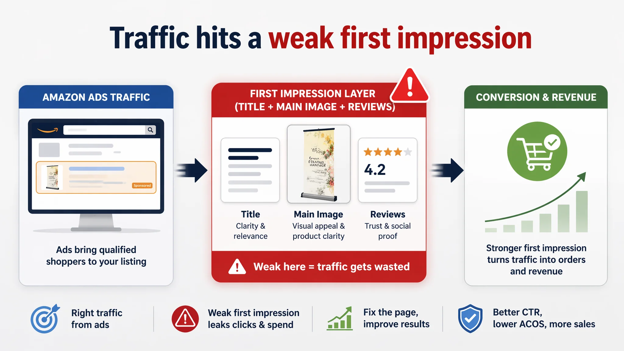
- If the main image does not create a compelling reason to click from the search results page, CTR stays suppressed, and every impression costs more to turn into a click.
- If the title is not aligned with the way buyers search and doesn’t clearly establish product type and use cases, you underutilize ad traffic and organic ranking opportunities.
- If reviews are fewer and slightly lower, you must compensate harder with visuals and clarity to justify the spend.
The DeepBI diagnosis showed exactly that pattern:
- Title: Underweighted core category term, missing brand signal, and a subtle negative framing.
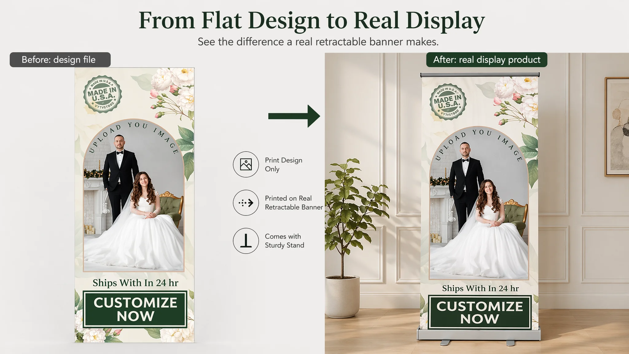
- Main image set: Looked like print design rather than a physical, high-end display product; weak at demonstrating real hardware and quality.
- Reviews: Healthy but immature compared to the competitor (13 reviews vs. 50, 4.2 vs. 4.4 stars).
In this condition, every dollar in Amazon ads was being poured onto a page that could not fully justify the click or the price. No bid optimization could fix that sequence.
Where the Listing Really Fell Behind: Title and Main Image
The Title: Category Logic and Trust, Not Just Keywords
On the surface, both titles “had keywords.” But when compared to the competitor, the deeper issues became obvious.
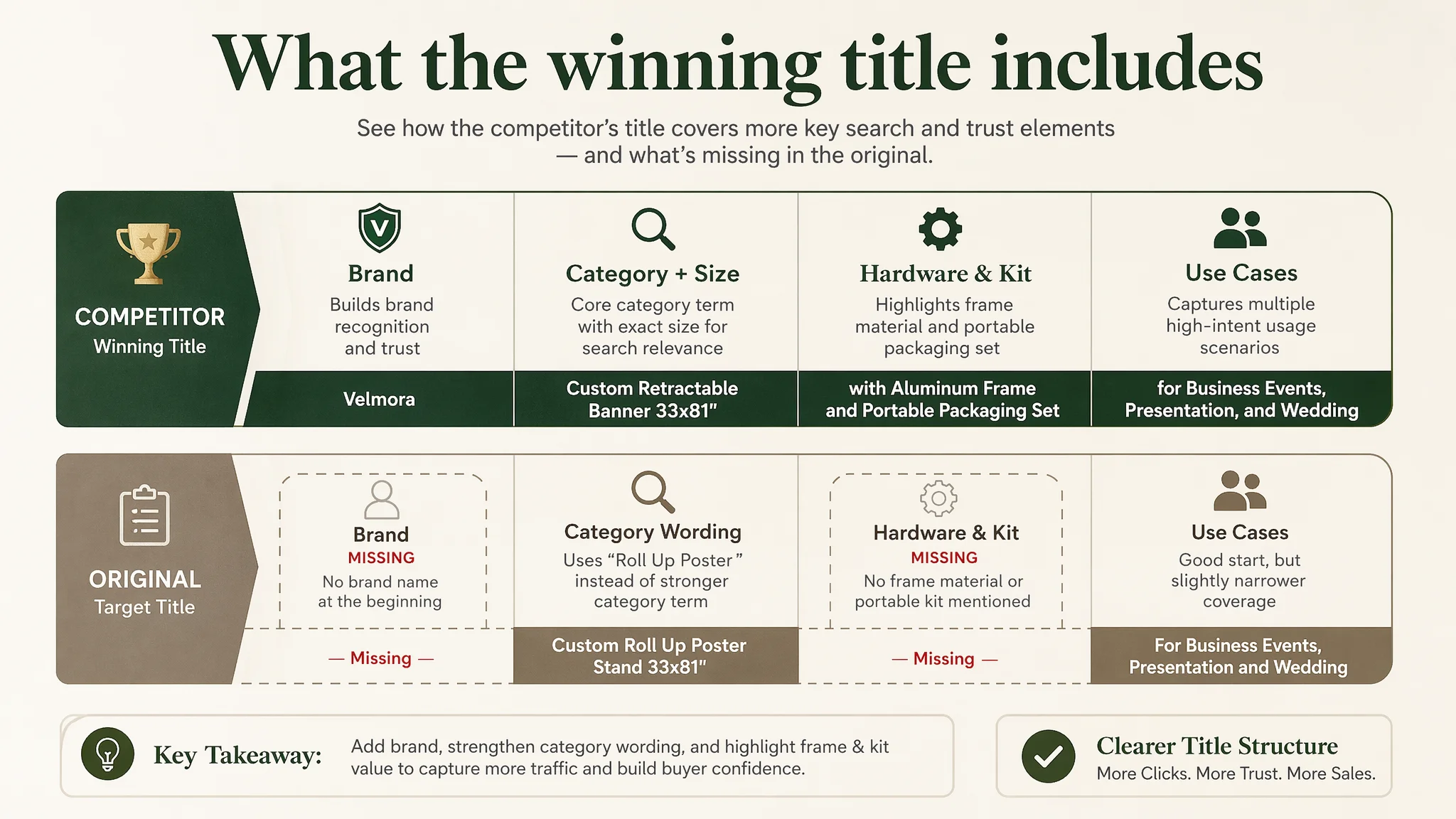
Competitor title (simplified):
[Brand] Custom Retractable Banner 33x81", Premium Printed Banner with Aluminum Frame and Portable Packaging Set, Easy to Assemble Roll Up Banner for Business Events, Presentation, and Wedding
Original target title (key gaps):
- No brand name at the start → weak brand presence in search results.
- Used “Roll Up Poster” instead of tightly focusing on “Retractable Banner / Roll Up Banner”, diluting the core category signal.
- Included “HD Personalized Banner Only” with the word “Only”, which subtly frames it as “less than a full solution” and can trigger confusion about whether a stand is included.
- Lacked differentiated functional add-ons like “aluminum frame” or “portable packaging set” that clearly define value.
From DeepBI’s perspective, this wasn’t just wording; it was decision logic:
- The competitor’s title leads with the exact category and size (“Custom Retractable Banner 33x81”).
- It immediately signals hardware (aluminum frame) and portability (packaging set) — comforting for business and event buyers.
- It stacks use cases: business events, presentations, weddings — exactly where this product is used.
The recommended title restructuring for the seller was:
Custom Retractable Banner 33x81", Personalized HD Printed Roll Up Banner for Business Events, Trade Shows and Weddings, Easy to Assemble Professional Replacement Graphic - Banner Only
This does three things commercially:
1. Restores category search power: “Custom Retractable Banner 33x81” front and center.
2. Clarifies the offer honestly: “Replacement Graphic – Banner Only” instead of a lonely “Only,” which reduces misunderstanding and potential returns.
3. Expands demand capture: Adds “Trade Shows” as a high-frequency use-case keyword.
The Main Image: From Print File to High-End Display
DeepBI’s visual comparison revealed that the main image set functioned more like a graphic design portfolio than an Amazon product presentation.
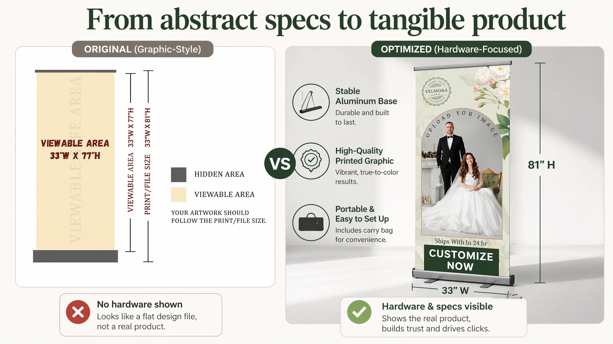
Key issues:
- The primary image included strong emotional text (“MADE IN U.S.A.”) and design elements, but these competed with the product itself and did little to show the banner as a physical object.
- Buyers could not easily see:
- How the stand looks.
- How stable the base is.
- What the actual canvas/print quality feels like.
- The overall style suggested “printed artwork” more than “high-quality retractable display hardware + print.”
This directly hurt:
- CTR in search results: It looked less like a solid, physical display product than the competitor’s images.
- Conversion on the product page: It did not visually answer typical pre-purchase fears: “Will it look premium at my wedding / booth?” “Is the stand solid?” “Is the print sharp and true to color?”
DeepBI’s diagnosis reframed the main image role as:
“The main image is not just a nice graphic. It must instantly establish this as a high-end, customizable display product — not a cheap print file.”
So the optimization focused on three main visual roles:
1. Hero image as high-end custom art object
- Central design occupying ~85% of the frame.
- Clean, warm background (light beige), surrounded by realistic white roses and greenery for a wedding-feel variant.
- Serif typography for elegance, with a bold “CUSTOMIZE NOW” callout, clearly clickable in the thumbnail.
2. Technical image as professional spec visualization
- Banner at a 45-degree angle, right side of the frame, 60% of visual space.
- Clean gray gradient background.
- Left-side white space with clean lines and size annotation (“33"W x 81"H”) presented like a professional spec sheet.
- Aligns with the competitor’s ability to make specs feel premium and easy to trust.
3. Structure image as hardware proof
- Two stands, front and slightly behind, with a hint of mirror reflection on a studio-white floor.
- Strong but realistic lighting to carve out the base, pole, and connection details.
- Purpose: convert “is this solid?” into “this looks professionally engineered.”
In short, the main image set was rebuilt to sell a high-end display solution, not a flat print.
Bullet Points and A+: Strong, but Misaligned With the Visual First Impression
DeepBI’s scoring showed the seller actually outperformed the competitor in bullet-point logic and A+ narrative:
- Bullet points followed a clear “pain point → solution → technical proof → usage → service” chain.
- A+ modules used:
- Core benefit banners.
- Real scenes (wedding, holidays, commercial).
- Service promises.
- Hardware breakdown images.
- Distinction between retractable banners and other product lines (canvas, rolls).
Yet, two business issues remained:
1. The front of the page did not match the strength of the deeper content.
Main images and title did not set an expectation of “high-end, technically superior, US-made, event-ready banner,” so many users never got far enough down the page to appreciate the strong bullet and A+ work.
2. Some bullet suggestions were misaligned with the actual offering as listed.
For example, one of the recommended bullet optimizations (“QUICK SETUP & PORTABILITY”) framed the product as including stand, brackets, and carry case — a full kit — while the updated title clarified “Replacement Graphic – Banner Only.”
This is a critical Amazon decision point:
- When the Listing is clearly “Banner Only,” adding full-stand language to bullets is not safe unless the product content is updated to match.
- DeepBI’s logic is to push for complete “solution” positioning only when the product is actually a complete kit; otherwise, clarity trumps all to avoid returns and negative reviews.
So the bullet optimization was treated as modular:
- Keep and strengthen:
- Easy customization + multi-scene usage.
- Technical printing advantages (vivid, true-to-color, UV-safe inks).
- US production and same-day capabilities.
- Support and service.
- Carefully align or postpone:
- Claims involving “sturdy aluminum frame” and “complete kit” if the offer remains “banner only.”
The main lesson: strong copy cannot compensate for a mispositioned product definition or a confusing offer.
Reviews: A Trust Gap That Raised the Bar for Visuals
Review data:
- Target Listing: 4.2 stars, 13 total reviews, no visible negative reviews.
- Competitor: 4.4 stars, 50 reviews, mix of 5-star and 4-star reviews.
From a pure rating standpoint, 4.2 vs. 4.4 is not catastrophic. But:
- The competitor has almost 4x the review volume, which signals market maturity and reduces perceived risk.
- The competitor’s mix of 5-star and 4-star reviews actually increases credibility; the seller’s all-5-star front page can look “too perfect” and possibly curated.
In this context:
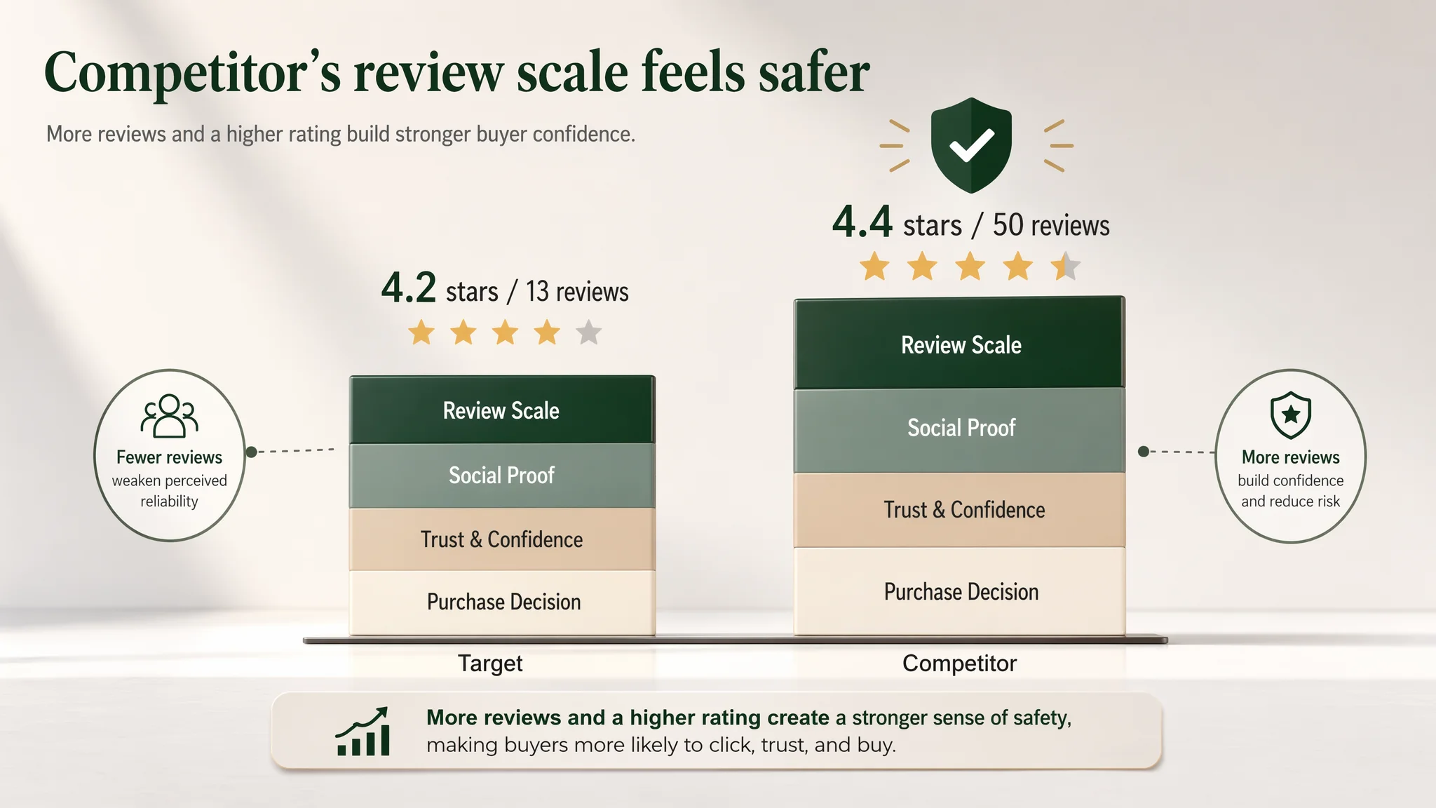
- Ads sending cold traffic into a Listing with lower review volume and slightly lower rating need stronger visual and messaging justification to offset the perceived risk.
- Without that, ACOS will feel structurally heavier, because buyers are simply more comfortable with the competitor’s social proof.
DeepBI’s judgment: you cannot fix a review-volume gap quickly, but you can dramatically improve how “safe” and “premium” the product feels through visual and structural changes.
Why Listing Conversion Had to Be Fixed Before Further Ad Scaling
At this stage, the business risk was clear:
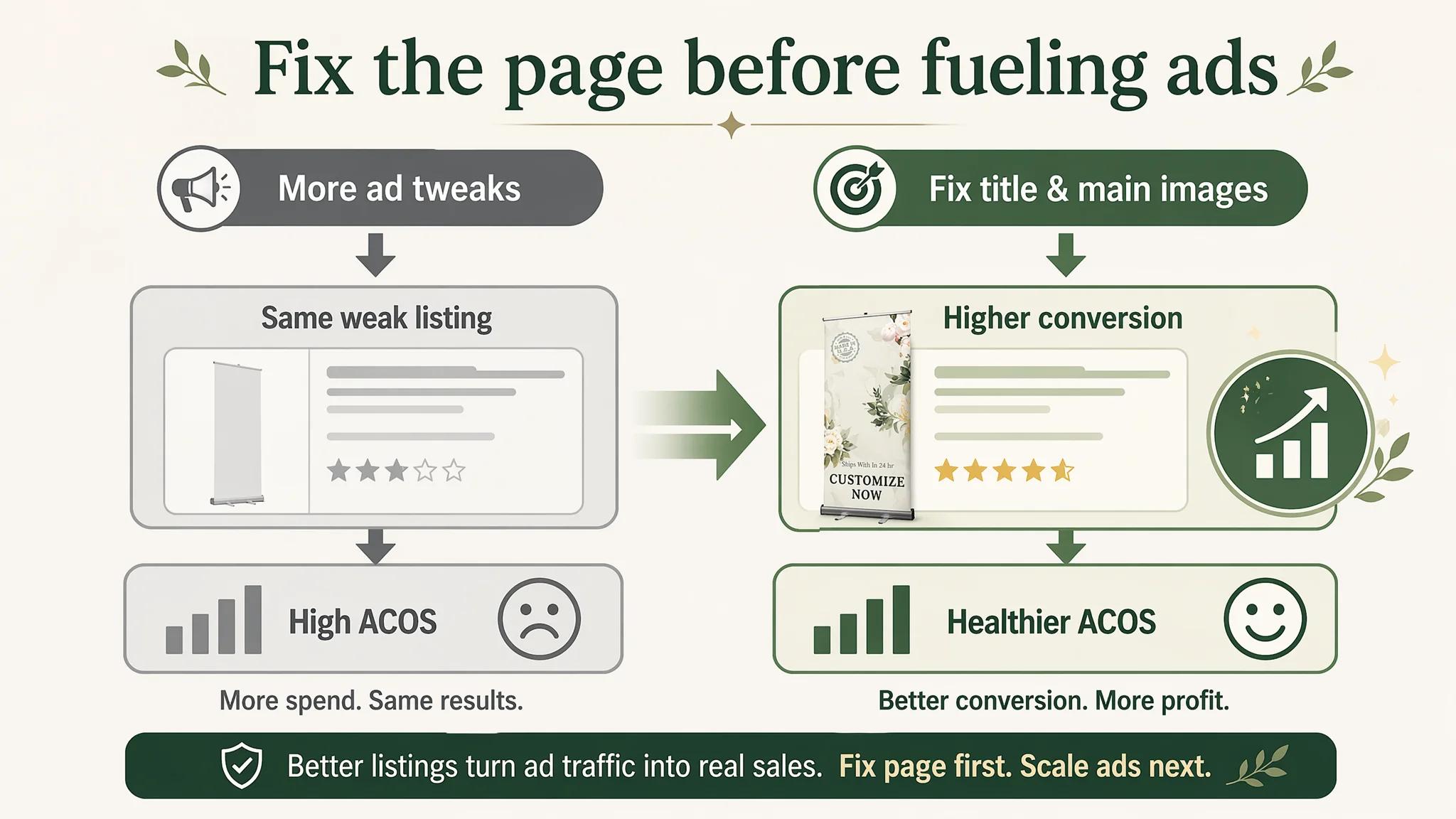
- Continue treating it as an ad problem:
- Keep adjusting bids, adding keywords, tweaking campaigns.
- Pay for more traffic into a page whose main pain is first-impression and clarity, not traffic volume.
- Watch ACOS plateau or worsen, with no structural change in page performance.
- Or step back and treat it as a Listing conversion problem:
- Accept that title + main image + review maturity were not yet strong enough to justify more ad pressure.
- Fix the page’s selling logic so that each click has a higher chance to convert.
- Then re-evaluate ad performance with a healthier funnel.
“Advertising does not only amplify advantages. It can also amplify a page’s existing defects.”
DeepBI recommended the second path. The reasoning:
1. The largest score gap was in main images (–9 points), not A+.
That is directly tied to CTR and early conversion behavior.
2. The title under-leveraged core category terms and value framing.
Fixing this is low-cost relative to ad experiments and has lasting impact on both paid and organic.
3. Review scale could not be changed quickly.
The only realistic lever in the short term was to over-deliver on perceived quality and professionalism in visuals and clarity, so the existing 4.2 rating felt “good enough.”
How the Product Page’s Sales Logic Started to Recover
The optimization work reorganized the page around a clearer buying journey:
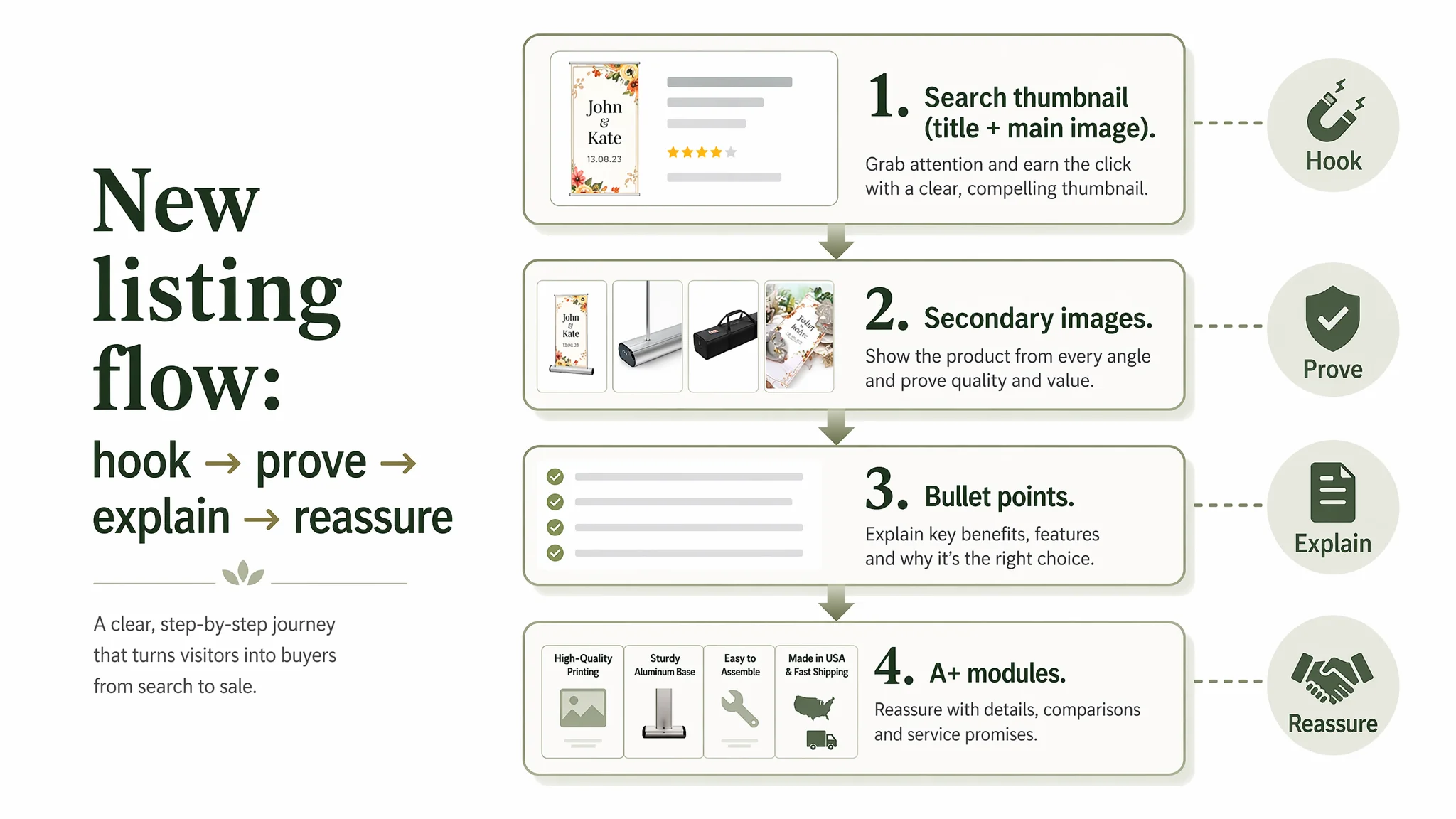
1. Search result / first glance (title + primary image):
- Immediately communicate: “Custom Retractable Banner 33x81” — this is the right product type and size.
- Clarify “Replacement Graphic – Banner Only” to reduce misunderstandings.
- Present the hero image as a high-end display at a wedding or event, not a flat design file.
2. Secondary images:
- Show hardware structure and stability in a studio-style image.
- Provide a clean, professional dimension/spec illustration.
- Introduce real-world use scenes: business expo, corporate lobby, wedding lawn.
3. Bullet points:
- Start with “EASY CUSTOMIZATION & VERSATILE USE” — reduce friction for custom orders and anchor multi-scene applications (trade shows, restaurants, offices, retail, churches, weddings).
- Reinforce print quality and color fidelity as a technical advantage, referencing “vivid & true-to-color printing” and UV-safe inks.
- Use “Proudly made in USA & reliable support” to leverage the US manufacturing and service responsiveness as trust factors.
4. A+ detail page:
- Keep the strong visual narrative but adjust sequencing:
- Professional business scene → romantic celebration scene → installation simplicity → print-quality macro → logistics & packaging.
- Make sure each module answers a major decision question:
- “Will it look premium at my event?”
- “Is the hardware stable?”
- “Is installation truly easy?”
- “Will the print be sharp and accurate?”
- “Will it arrive on time?”
As these elements aligned, the Listing began to act less like a passive product page and more like a structured sales conversation.
How Ad Traffic Became Useful Again
Even without inventing specific numbers, the operational change is clear:
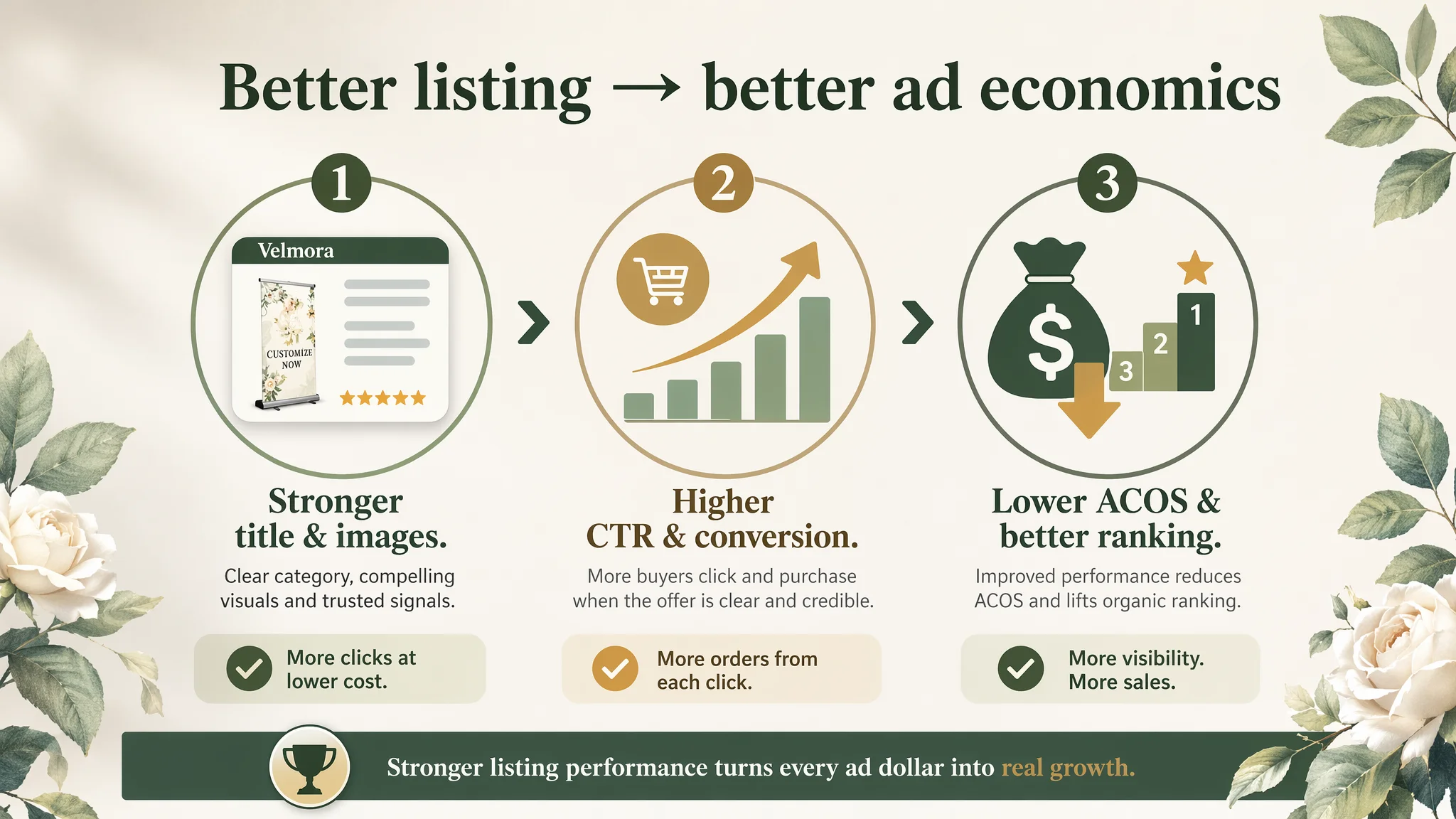
- With a stronger title and a visually credible main image set:
- CTR has room to improve because the product now looks like a high-end solution at a glance.
- Conversion has room to improve because key doubts (stability, print quality, true-to-color output, delivery reliability) are answered visually and structurally.
- As conversion improves:
- ACOS can begin to move down because each click is more likely to produce revenue.
- Organic ranking can stabilize as Amazon’s algorithm sees better performance on relevant searches.
- Dependence on ads can decrease gradually, because the Listing itself now contributes more value per impression.
Most importantly, the seller’s understanding changed:
- They stopped viewing ads as the universal fix.
- They started treating Amazon Listing conversion — especially main image and title — as the foundation of advertising efficiency.
- They began evaluating whether a page “deserves more traffic” before scaling campaigns.
What Other Amazon Sellers Can Take Away
This case is not about retractable banners alone; it is about how Amazon ad and Listing logic can misalign.
Key lessons:
1. Do not assume that a page with good A+ and bullet logic will automatically convert ad traffic.
Title and main images carry disproportionate weight for cold traffic.
2. A high ACOS is not always an ad problem.
When main-image competitiveness and title clarity fall behind competitors, ads will feel expensive no matter how well-structured they are.
3. Review maturity matters, but you cannot always fix it fast.
In categories where you lag in review count and rating, your visual presentation must do more to close the trust gap.
4. Before scaling ads, ask: “Would I choose this Listing over the top competitor if I only saw the search thumbnail?”
If the honest answer is no, fix the Listing first.
5. Listing optimization is not cosmetic; it is business judgment.
DeepBI’s role in this case was not to tweak pixels for aesthetics, but to identify where the real commercial constraint was — and to prioritize the changes that would restore the product page’s ability to convert both paid and organic traffic.
For Amazon sellers facing rising ad costs and flat orders, this case is a practical reminder: until your Amazon product page can convincingly sell the product, no level of ad sophistication will make the economics feel right.