

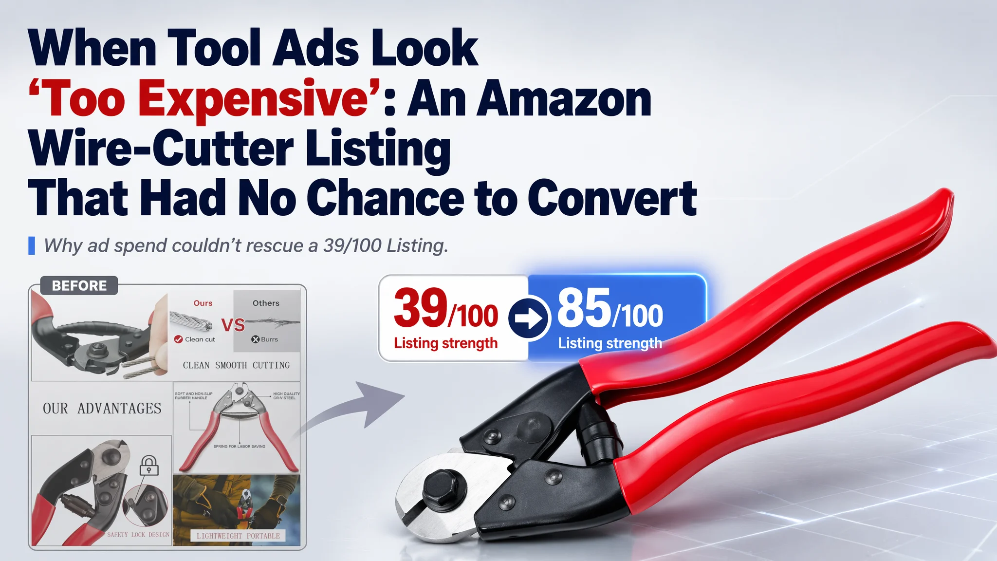
An Amazon seller in the UK wire-cutter category came to DeepBI with a familiar concern: ads felt “expensive”, but orders were not following. From their perspective, this was an Amazon ads problem—maybe bids were off, maybe keywords were wrong, maybe the tool was just “too niche”. What they did not expect was that, in its current state, the product page simply could not receive or convert serious traffic.
Once DeepBI put the Listing side-by-side against a category-leading competitor, the gap was blunt: 39/100 vs 85/100 in overall Listing strength. Title, main image and bullets were already lagging, but the real collapse was deeper—no A+ at all, no visual trust chain, and zero reviews competing against 1,500+ verified ratings. This was not a situation ads could fix; ads were just amplifying a page with almost no conversion infrastructure.
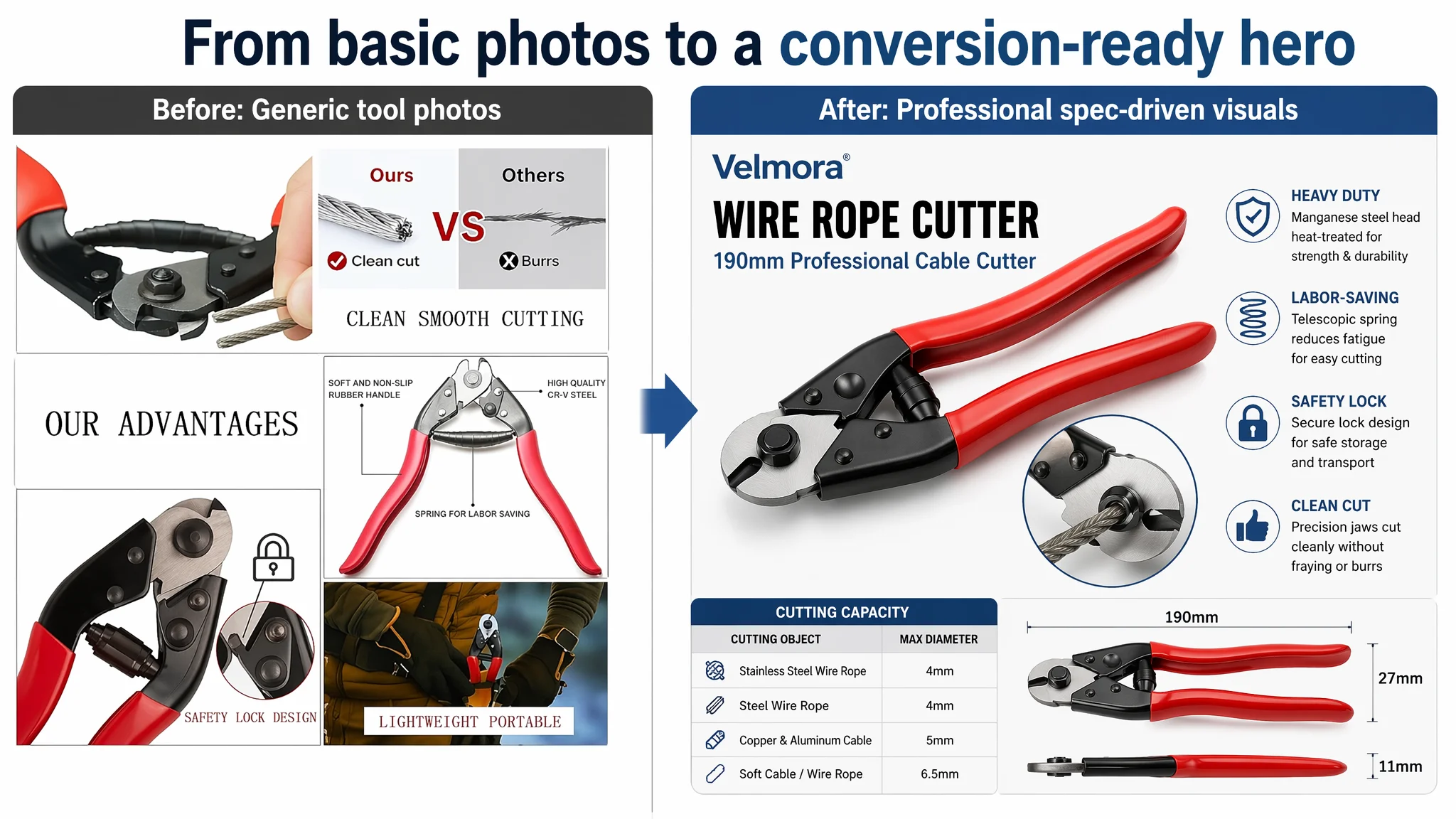
The later optimization work did not start from campaign structures. It started from rebuilding the Amazon Listing to meet the decision logic of a UK buyer choosing a heavy-duty cable cutter: clear category positioning in the title, main images that quantify cutting power, bullets that promise “clean cuts” and “reduced fatigue”, and a full A+ story that shows multi-material cutting and real usage scenes. Only when the page began to look like a legitimate professional tool did it make sense to push traffic again.
For other Amazon sellers—especially in tools and hardware—this case is a warning: if your page scores like this one did, no amount of keyword tuning will truly “fix” ACOS. Before you judge ads, you have to judge whether your Amazon product page deserves the traffic at all.
Amazon Ads Were Not Failing. The Page Was Consuming the Traffic.
When the seller first looked at their Amazon performance, the pressure seemed to come from the top of the funnel:
- Traffic was not converting into stable orders.
- Any attempt to scale ads quickly drove ACOS up.
- A benchmark competitor in the same wire-cutter niche was selling steadily on the UK marketplace.
The intuitive conclusion: “Our ads are not optimized enough.”
They tried the usual moves—adjusting bids, adding more bike-related keywords, refining match types. But the underlying pattern did not change: traffic spikes did not translate into a predictable base of orders. That is typically the moment when a store blames ads instead of asking a harder question:
“If we gave this page perfect traffic, would it actually convert?”
DeepBI’s Listing scoring made that question unavoidable.
The Real Constraint Was Listing Conversion Capacity
Once the product page was scored against a true category benchmark, the problem stopped being abstract.
Overall Listing score
- Target Listing: 39 / 100
- Benchmark Listing: 85 / 100
- Gap: –46 points
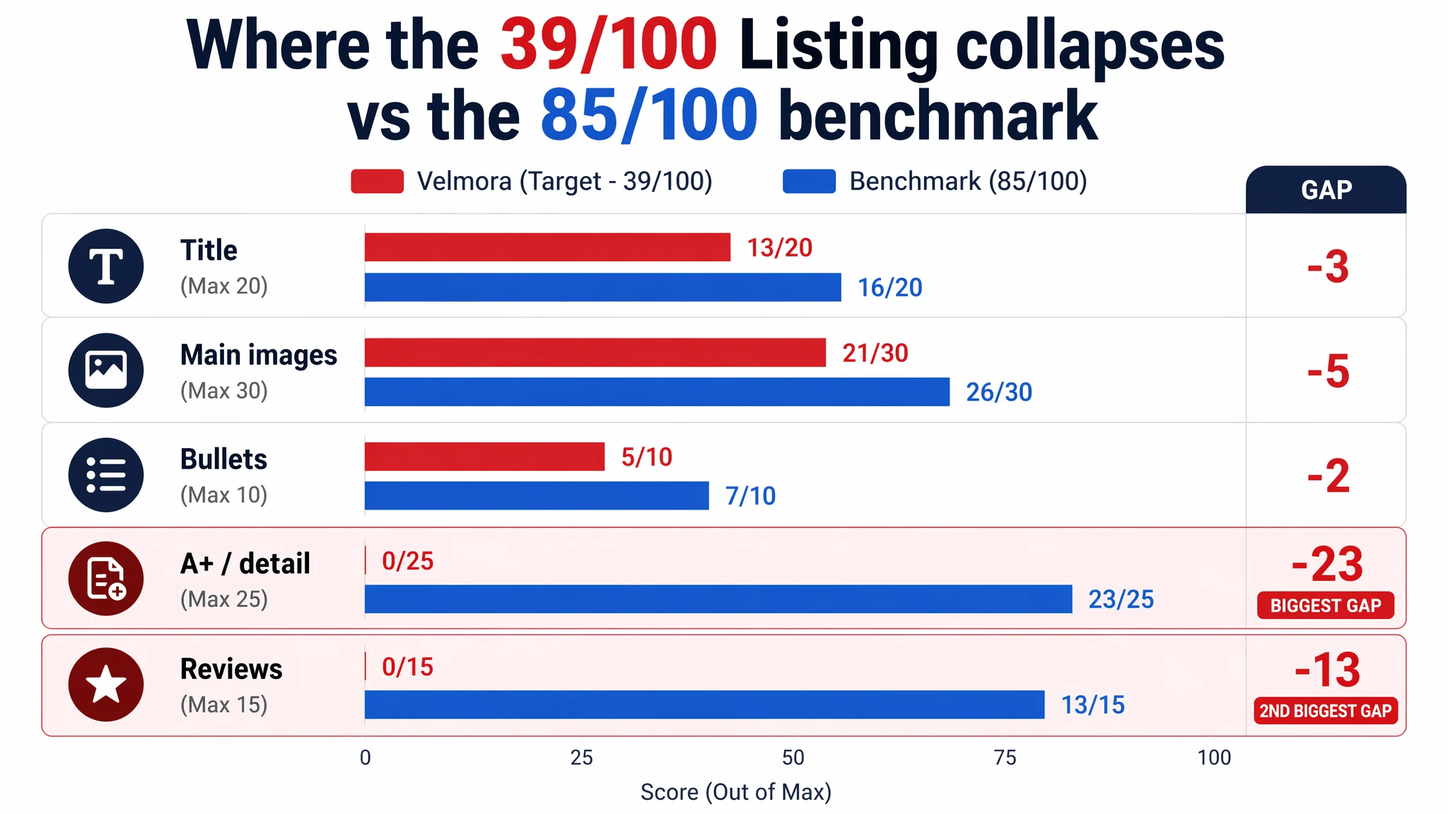
Broken down by conversion-related dimensions:
- Title: Target: 13, Benchmark: 16, Max: 20, Gap: -3
- Main images: Target: 21, Benchmark: 26, Max: 30, Gap: -5
- Bullet points: Target: 5, Benchmark: 7, Max: 10, Gap: -2
- A+ / detail page: Target: 0, Benchmark: 23, Max: 25, Gap: -23
- Reviews & rating: Target: 0, Benchmark: 13, Max: 15, Gap: -13
Two facts stood out:
1. A+ content score: 0 vs 23 – The competitor had a fully built A+ with scenes, technical diagrams, and cutting demonstrations. This Listing had nothing.
2. Reviews: 0 vs 1,550+ – The competitor had a mature review base at 4.4 stars with rich text and photo feedback; this product had no reviews at all.
From a business perspective, that means:
- The Listing did not explain what the tool really could do.
- The page did not provide any social proof that it worked as promised.
- Paid clicks were landing on a page that looked more like a test draft than a professional, trustworthy Amazon Listing.
Running more ads into this structure was essentially paying for traffic to a page where the trust funnel broke on the first scroll.
What the Seller Originally Misdiagnosed
From the seller’s conversations, their mental model looked like this:
- Product quality: “good enough”
- Images: “clear, white background, compliant”
- Title: “has the main keywords, mentions bicycle cables”
- Bullets: “describe the handle, the material, the uses”
Because nothing looked obviously “wrong”, the team pushed ad optimization as the primary lever. In their view, if they could just “find cheaper clicks” or “hit more precise search terms”, orders would catch up.
This misdiagnosis came from three blind spots:
1. Underestimating category standards.
They compared the page to their own expectations, not to the category’s best performer. In tools, the bar is high: quantified cutting capacities, technical hardness markers, and structured A+ are standard, not “nice-to-haves”.
2. Ignoring trust asymmetry.
Launching a wire cutter with 0 reviews directly against a listing with 1,550+ ratings and 4.4 stars is a trust mismatch. Without compensating visual and textual proof, buyers default to the reviewed option.
3. Equating “has content” with “has conversion logic.”
The page had a title, bullets, and some images—but they were not arranged in a way that mirrored how a buyer evaluates a professional cutter:
- Can it handle my cable thickness?
- Will the cut be clean, not frayed?
- Is it easy on the hands over repeated cuts?
- Is it safe to store in a toolbox at home?
None of these were answered with enough clarity.
Why Traditional Ad Tuning Could Only Fail Here
If this Listing had strong conversion fundamentals and only a mild gap versus the category leader, ads might have been the right starting point.
But under the above conditions, ad optimization ran into structural limits:
- Click-through rate risk – In the search results, the main images lacked the professional, quantified visual style the category leader used. The benchmark showed cutting capacity, hardness indicators, and real-life use; this Listing showed simpler white-background images with less technical storytelling. Click probability was already suppressed before any bid was placed.
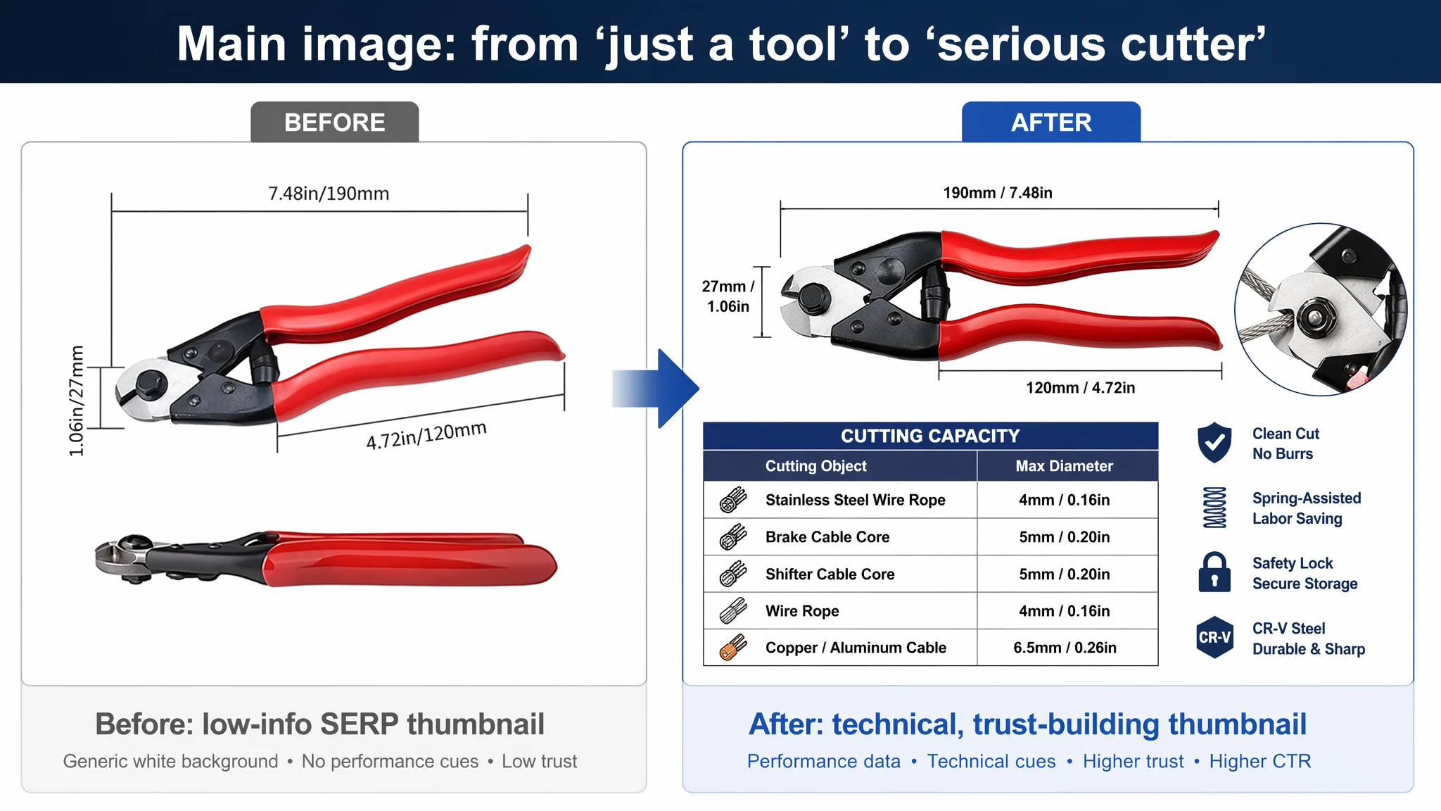
- Conversion rate risk – Once clicks arrived, buyers saw:
- No A+ content, only basic text.
- No parameter charts for cutting thickness.
- No micro close-ups of clean vs frayed cuts.
- No proof of spring-assisted, low-fatigue operation.
- No reviews at all.
“Advertising does not only amplify advantages. It can also amplify a page’s existing defects.”
In this case, every extra pound of ad spend was just exposing more buyers to a page that could not convincingly answer “Why this cutter instead of the one with 1,500 reviews?”
Under those conditions, ACOS will resist any attempt to push it down via bid tweaks alone.
This Product Page Did Not Lack Traffic. It Lacked Trust.
Looking more closely at the content gaps highlights how the Listing failed at each step of the buyer’s decision path.
The title did not lock in the broader category
The original title opened with “1 Pack”, consuming the most valuable position with a low-impact qualifier. The main category signal was framed as “Bicycle Cable Cutter”, which is narrower than the benchmark’s broader and more searched “Wire Rope Cutter”.
The benchmark used a structure like:
- Brand + “Wire Rope Cutter 190 mm”
- Material: Cr‑V Steel
- Use cases: wire rope, stainless steel, bicycle brake cable, etc.
In contrast, this Listing:
- Led with quantity (“1 Pack”) instead of category.
- Highlighted “bicycle” use early, making it look like a bike-only tool rather than a multi-purpose cutter.
- Used “Manganese Steel” as a generic material mention, without connecting it to durability, hardness, or cutting performance.
DeepBI’s recommended direction was to front-load the category and cutting role:
“Bicycle Brake Cable Cutter Pliers, Manganese Steel Wire Rope Cutter for Bike Gear Inner Cables, Housing, Stainless Steel Wire, Railing and Fencing, Heavy Duty Cutter Tool with Anti-Slip Handle”
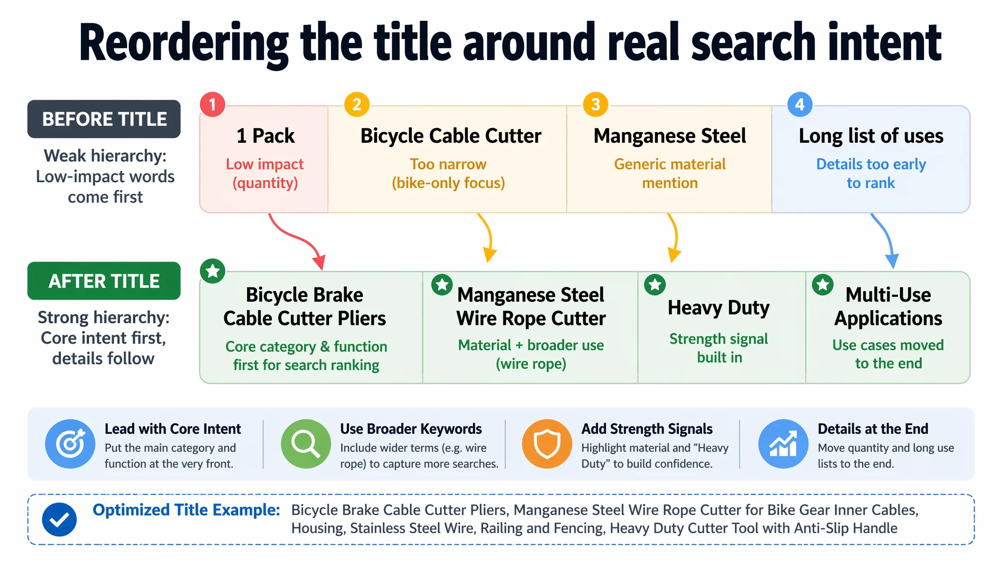
This does three things:
- Moves the core function (“Bicycle Brake Cable Cutter” / “Wire Rope Cutter”) to the front, where Amazon search weight is highest.
- Adds “Heavy Duty” to align with buyer expectations for professional-grade tools.
- Expands use cases (wire rope, stainless steel, railing, fencing) so the Listing can legitimately compete for non-bike cable queries.
The misdiagnosis wasn’t “we need more keywords”; it was “we need the right hierarchy of keywords for how buyers actually search this category.”
The Main Images Looked Like Standard Tools, Not Professional Instruments
In tools, buyers “read” the main images for confidence before they read bullets. The benchmark knew this and used images as mini technical sheets:
- HRC hardness markings.
- Close-ups of the spring mechanism.
- Before/after cutting comparisons.
- Size overlays and capacity charts.
The target Listing’s image set lacked this density. Key issues included:
- Visual impact and focus – Product shots were serviceable white-background photos but lacked strong diagonal composition, dramatic lighting, or close-up emphasis on the jaws that communicates “sharp, precise, professional”.
- No quantified cutting capability – The competitor visually spelled out cutting capacities (e.g., 4mm steel rope, 5mm cable, 6.5mm soft cable). This Listing provided almost no visual answer to “Can it cut my 4mm stainless cable cleanly?”
- Weak technical cues – Material and hardness were mainly described in text. There were no images that visually said “drop-forged”, “heat treated”, or “HRC 55–65” through labels and micro-detail shots.
- No clear story for ergonomics and safety – The spring and safety lock existed physically, but images did not isolate them in clear “open vs locked” states or highlight their benefit (reduced fatigue, safe storage).
DeepBI’s judgment was that without a professional “industrial parameter” look, the main images could not compete on the search results page. A buyer seeing both thumbnails side-by-side would instinctively feel the benchmark tool was more “serious” and justified at its price point.
So the proposed main-image direction centered on:
- 45° diagonal hero shot with 70% frame coverage and a micro inset circle showing live cutting action.
- Dimension overlay image with annotated lengths and a two-column table mapping “Cutting object → Max diameter”.
- Macro blade-head close-up emphasizing metal sheen, with labeled hardness values.
- Clean-cut vs frayed-cut comparison (“Ours” vs “Others”) with micro close-ups.
- Spring & safety lock state comparison (open vs locked) with color-coded icons.
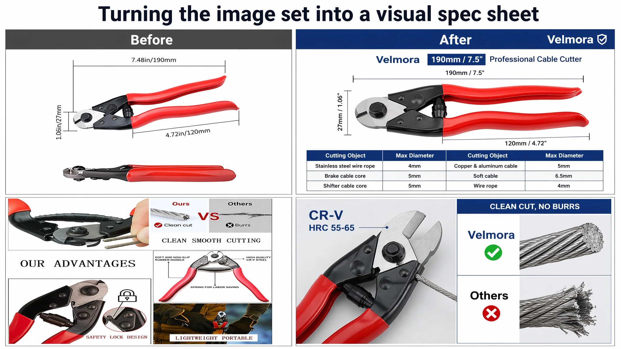
In other words: turn the image carousel into a visual spec sheet, not just a product gallery.
The Bullet Points Had Information, but Not a Buying Logic
The existing bullets focused on parts and general uses: handle description, material, ergonomics, expanded use cases, portability.
The benchmark did something more structured and more aggressive:
1. Lead with material and process (“Cr‑V steel”, “heat-treated”, “drop forged”) and a memorable claim (“cuts steel wire like butter”).
2. Spell out a labor-saving design with spring and ergonomic handle to address fatigue.
3. Highlight safety lock and portability as a distinct feature.
4. Quantify cutting capacity by millimeter across materials.
5. Then broaden into wide applications (industrial, fencing, DIY).
DeepBI reframed the bullets around the same decision logic:
1. High-Strength Manganese Steel
- Emphasize drop-forged, heat-treated manganese steel.
- Promise clean, tough cuts and long-term durability.
2. Labor-Saving Ergonomic Design
- Highlight expansion spring for one-handed operation.
- Stress reduced hand fatigue for repetitive workshop or garage use.
3. Integrated Safety Lock & Portability
- Explain the lock mechanism for safe storage and transport.
- Position it as toolbox/bike-bag friendly.
4. Precision Cutting & Wide Capacity
- Promise burr-free cuts without fraying.
- Clarify capacity (e.g., wire rope up to 4mm, typical brake/shifter cables, housing).
5. Multipurpose Tool for Various Projects
- Move beyond “bike only” into railing, fencing, wire seals, and general DIY.
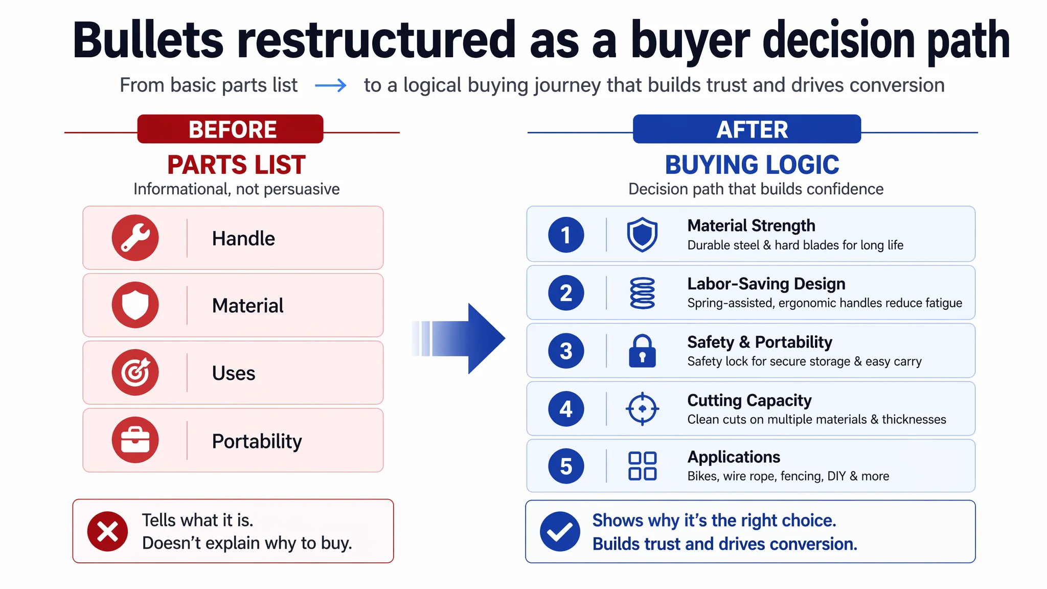
The core judgment: bullets must not just “list parts”; they must walk the buyer through pain point → solution → proof. Without that, even good material is under-leveraged.
The Detail Page Was a Conversion Dead End
The most critical gap—where DeepBI’s score difference was largest—was the detail/A+ section:
- Target Listing A+ score: 0 / 25
- Benchmark A+ score: 23 / 25
The competitor’s A+ modules included:
- Brand-led hero scene (e.g., parent and child repairing a bike).
- Detailed spec diagrams.
- Function labels (“SAFETY LOCK”, “ERGONOMIC HANDLE”, “TELESCOPIC SPRING”).
- Size charts with real measurements.
- Cable compatibility diagrams.
- Material close-ups and cutting-comparison photos.
The target Listing had none of this. There was no structured visual story below the fold.
“You lack even the basic product display. The conversion funnel breaks on the first screen.”
DeepBI’s judgment here was simple: before any new ad spend, the A+ had to exist and had to be structured correctly. The recommended logic:
1. Scene-led hero – A core product image on a light, textured background (e.g., wood-grain table) with colored cables and connectors around it, creating an immediate “cable workbench” mental model.
2. Family / outdoor repair scene – A father guiding a child in cutting bicycle brake wire in a park setting; this turns a cold tool into a relatable household product, lowering the emotional barrier to purchase.
3. Exploded structure diagram – A clean white-background image with callouts to “SHARP JAW”, “SAFETY LOCK”, “TELESCOPIC SPRING”, “ERGONOMIC HANDLE”. This transforms vague promises (“high quality”) into visible engineering.
4. Precise size chart – Side and top views with annotated length, handle width, and jaw thickness. This answers “Will it fit my hand/toolbox?” and reduces size-related returns.
5. Multi-material compatibility grid – Four micro photos showing cuts of different materials (braided cable, stainless rope, thick power cable, single-core copper). This reassures buyers that “my cable type” is supported.
6. Dual-scene cutting performance – One image for cutting a thicker black cable, one for a very thin steel wire. This visually proves that the tool covers both heavy-duty and fine work.
7. Safe storage module – An image of the cutter locked and stored, with emphasis on the safety lock and compact footprint, targeting toolbox and home storage concerns.
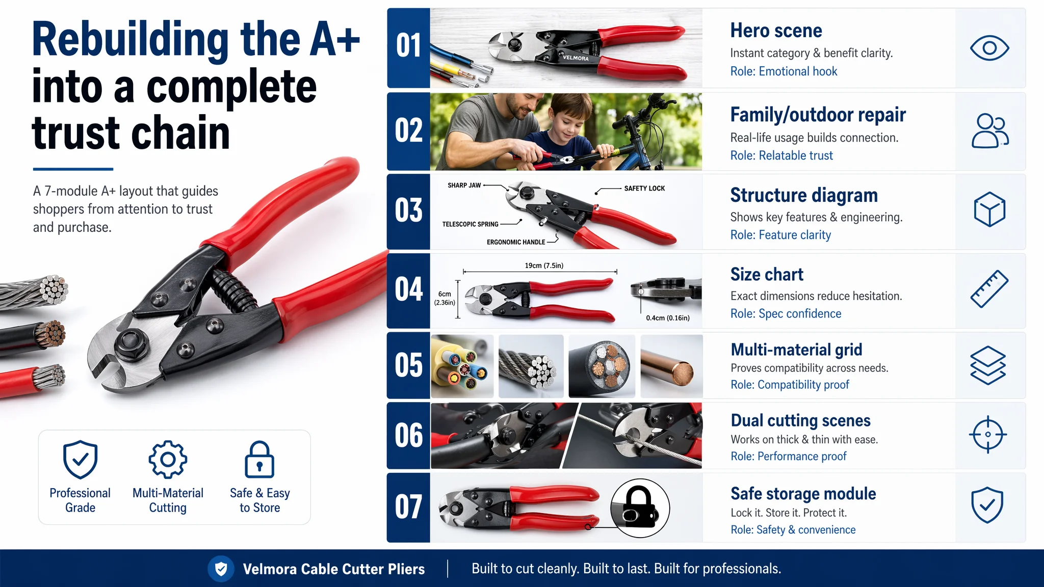
This was not decorative. It was a structured attempt to rebuild the trust and capability narrative that the competitor’s A+ already delivered.
Why Listing Conversion Had to Be Fixed Before Ads
At this point, DeepBI’s position with the seller was firm:
- With a 39/100 Listing against an 85/100 benchmark, ads were not a priority problem.
- The biggest business risk was continuing to pay for traffic that the page structurally could not convert, especially against a review-rich competitor.
The decision sequence recommended was:
1. Rebuild listing fundamentals first
- Implement the new title structure that locks in “Wire Rope Cutter” and broader use cases.
- Restructure bullets around pain → solution → quantified proof.
- Overhaul main images to communicate cutting power, precision, ergonomics, and safety at a glance.
- Launch a complete A+ that mirrors buyer decision logic, not just brand aesthetics.
2. Then carefully reintroduce ads as a test tool
- Use conservative budgets to validate whether the new page can hold a healthier CVR.
- Monitor early signals (CTR and CVR) to see if the Listing can now compete closer to the benchmark.
3. Scale only when the page shows real conversion competence
- If CVR and add-to-cart behavior improve, then and only then does it make sense to push for more impressions and broader keyword coverage.
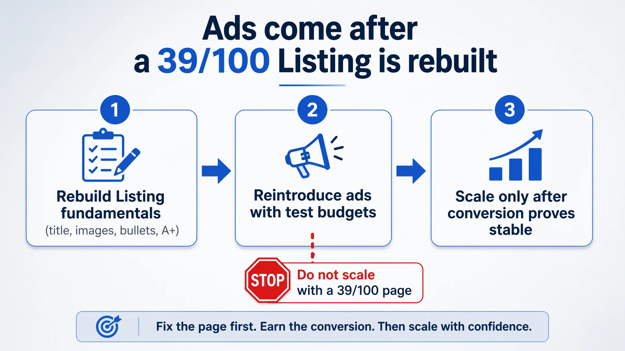
This is the opposite of the usual instinct to “buy more traffic” in the face of slow sales. But with this Listing’s initial state, buying traffic first would only magnify a conversion problem.
How the Page’s Sales Logic Started to Recover
While this case material focuses on diagnosis and the optimization blueprint rather than long-term data, several expected shifts are clear once the Listing is rebuilt in the direction above:
- The page finally answers “what am I buying?” at a glance.
The hero and A+ images make it visually obvious that this is a 190mm professional cable cutter for multi-material, not just a random bike tool.
- The main image set begins to earn clicks on the SERP.
With technical overlays, cutting insets, and clean-vs-frayed comparisons, the thumbnail can now compete as a professional instrument instead of a generic tool.
- Buyers stop bouncing at the first scroll.
The new A+ provides a coherent storyline: scene, structure, dimensions, material compatibility, and safety. Visitors have reasons to stay, scroll, and evaluate rather than clicking back to the competitor.
- Bullets and title work together to capture both bike and non-bike demand.
The Listing stops artificially limiting itself to bicycle-only searches and starts competing for railing, fencing, and general wire rope applications.
Once these pieces are in place, ad traffic becomes useful again:
- Clicks land on a page that can credibly justify a purchase despite having fewer reviews initially.
- Early buyers can convert at a rate that allows reviews to start accumulating, gradually narrowing the review gap.
- Over time, the store can legitimately reduce its dependence on brute-force ad spend and let a healthier organic share emerge.
How the Seller’s Understanding Changed
The most important outcome in a case like this is not only a better-looking Listing, but a better judgment framework inside the seller’s team.
Key realizations:
- Amazon ads cannot fix a fundamentally weak product page.
If the benchmark Listing looks twice as professional and has 1,500+ reviews, traffic alone will not close that gap.
- Listing quality is the foundation of ad efficiency.
Title, main image, bullets, A+ and reviews are not separate tasks; they are one conversion system. If A+ and reviews are at zero while a competitor is fully built out, ACOS problems are structurally baked in.
- Before scaling ads, ask: “Does my page deserve more traffic?”
In this case, the honest answer before optimization was “no.” After restructuring the Listing around real buyer decision logic, the answer moves closer to “yes”—and that is when ad spend has a chance to be truly productive.
For Amazon sellers in tools and similar functional categories, this wire-cutter case is not unique. Many products sit in the same trap: they look “normal” in isolation, but objectively weak next to the category’s best Listing. DeepBI’s role here was not to provide another dashboard, but to call out the uncomfortable truth:
“Your ACOS is not an ad problem. It’s the cost of sending paid traffic to a 39/100 Listing in an 85/100 category.”
Once that is understood, the path forward becomes much clearer—and far more controllable.