

Many Amazon sellers have a similar story: a small, “simple” accessory product, some basic images thrown together, a few ad campaigns, and then… the numbers stagnate. In this case, an Amazon seller in the bathroom & kitchen accessories category felt exactly that. They believed their problem was mainly about price and exposure, and that ads just needed more time to “warm up.” What they did not expect was that the real issue was far more fundamental: the Listing itself was almost incapable of converting the traffic they were paying for.
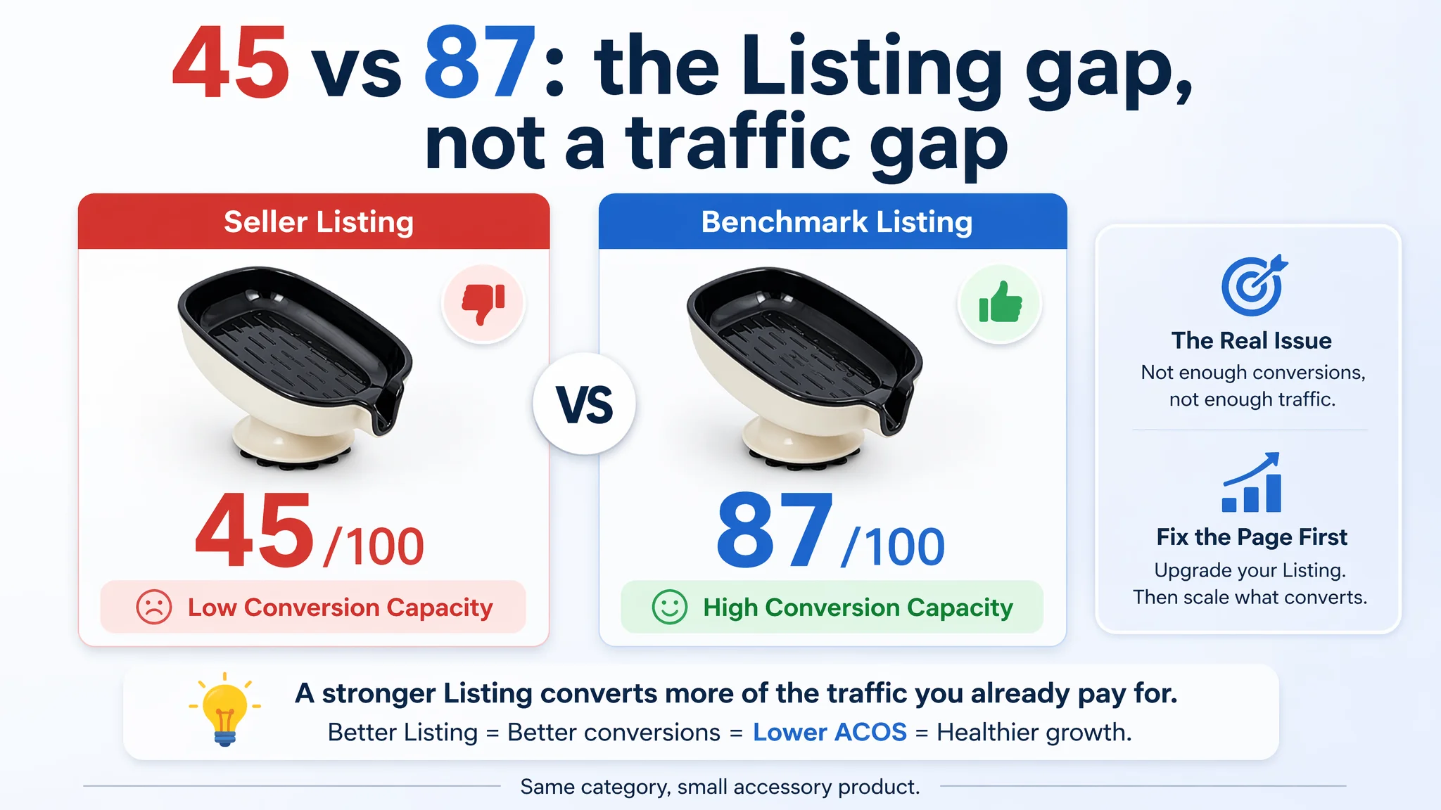
When DeepBI compared this soap dish Listing with a top-performing Amazon competitor, the gap was brutal: 45/100 vs. 87/100. The seller had no A+ content, almost no persuasive copy, a weak main image set, and a low review score. Ads were not failing; they were sending traffic into a page that could not build trust or explain value. Instead of pushing bids or keywords further, the first task had to be rebuilding Listing conversion capacity.
This article walks through how that judgment was made, why typical “ad-first” thinking would have wasted more budget, and how restructuring title, bullets, main images and the missing A+ story started to restore the page’s ability to sell. If you are running Amazon ads into a low-price, “commodity” Listing and feeling that ACOS just won’t move, this is a situation worth recognizing early.
This Amazon Listing Did Not Have an Advertising Problem. It Had No Page to Receive the Traffic.
From the seller’s perspective, the situation looked familiar:
- A low-ticket bathroom soap dish with suction cup
- Some basic white-background images
- A functional title using generic terms
- A few simple bullet points
- Ads running, but no real breakthrough in orders or efficiency
Operationally, the anxiety was around advertising: “Are our bids wrong? Are we missing keywords? Is the category just too competitive?” The instinct was to refine campaigns and hope that more clicks would eventually convert.
Once DeepBI pulled the Listing into its Amazon scoring and benchmark system and locked a single clear competitor, the picture changed completely:
- Overall Listing score: 45/100
- Benchmark competitor: 87/100
- A 42‑point gap in a small, highly standardized category
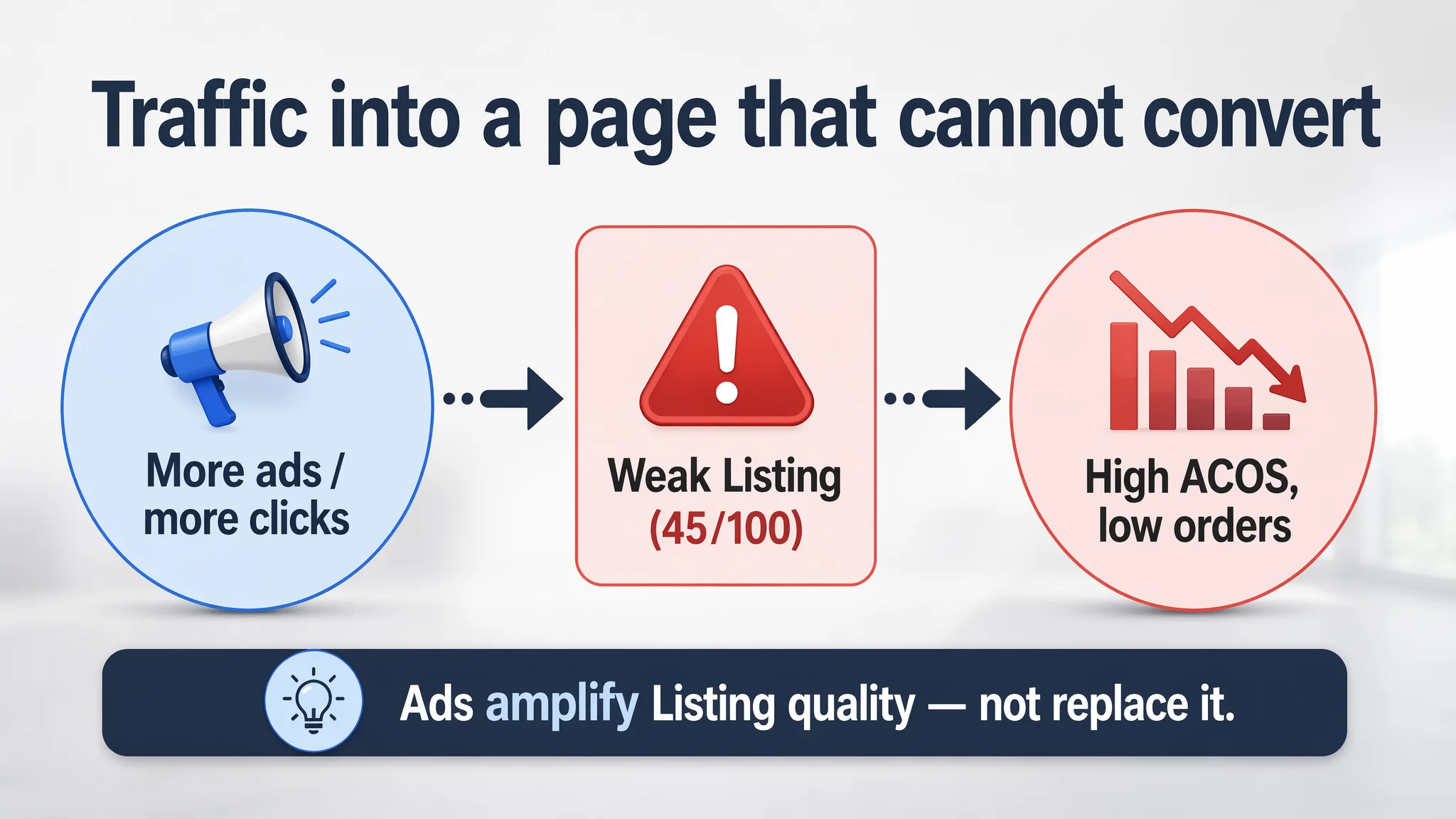
That kind of distance in a simple product line is not a nuance problem. It signals that the page itself is structurally underpowered. Driving more traffic into it will mostly burn budget.
“The real problem was not that ads failed to bring traffic. It was that the page could not convert the traffic.”
The core conflict of this case is not “How do we optimize ads?” but “Should we even be buying this traffic before the Listing can convert?”
The Real Constraint: Listing Conversion Capacity, Not Traffic Volume
Looking at DeepBI’s five key dimensions, the bottleneck became clear.
1. Title: Generic Object, Invisible Brand, Weak Decision Logic
- Seller’s title score: 14/20
- Competitor’s title score: 17/20
Superficially, both titles mentioned “self-draining soap dish” and “suction cup.” But the structure and logic were very different.
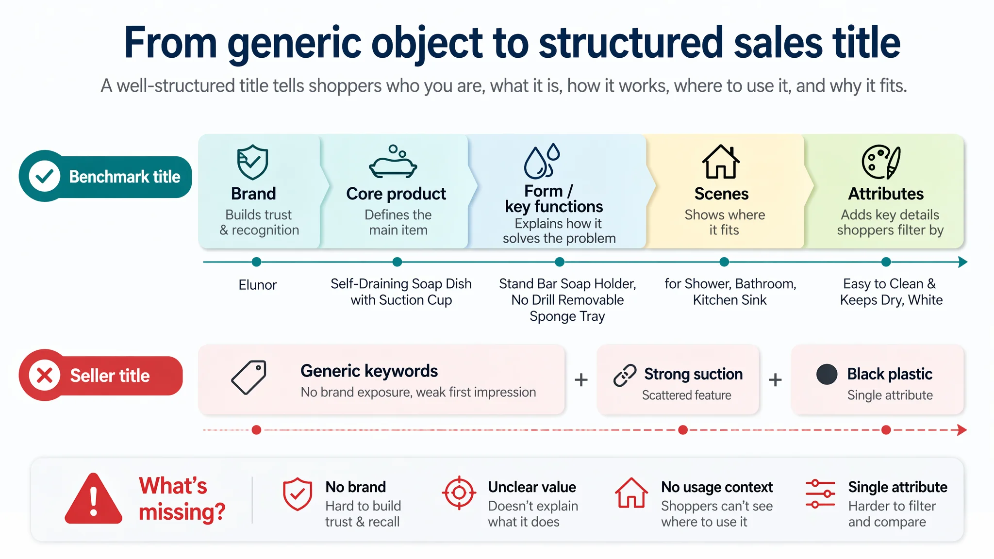
What the seller did:
- Started with generic keywords: “Black Plastic…”
- Brand was hidden behind the generic phrase, so there was almost no brand presence on the Amazon search page.
- Limited functional descriptors, mostly “Black Plastic” and “Strong Suction” dispersed in the middle.
- No clear color labeling at the end for shoppers filtering by appearance.
What the competitor did:
- Led with brand + core product (“[Brand] Self-Draining Soap Dish with Suction Cup”)
- Immediate follow-up with product form and function: “Stand Bar Soap Holder, No Drill Removable Sponge Tray”
- Clear multi-scene coverage: shower, bathroom, kitchen sink
- Closed with specific color (“White”), matching common filter usage.
Effectively, the competitor’s title followed a mature Amazon pattern: Brand + core product + key functions / form + scenes + attributes
The seller’s title, in contrast, read like an unlabeled, generic object. For paid and organic impressions, it communicated far less about what problem the product solved and where it should be used.
2. Main Image Set: No Emotion, No Proof, No Trust
- Seller’s main-image score: 23/30
- Competitor’s main-image score: 27/30
On paper, 4 points don’t look huge. But the qualitative differences have a direct impact on CTR and CVR.
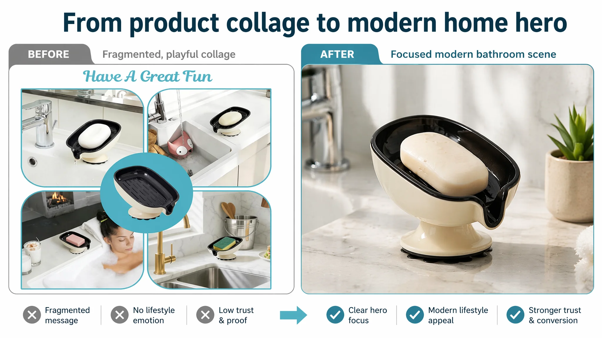
Seller’s current visuals:
- Predominantly hard white background, industrial-feeling angles
- Minimal or no real-life scenes (no “ideal bathroom” or kitchen context)
- No strong before/after contrast to show solved pain points (messy, soggy soap vs. clean, dry bar and countertop)
- No clear installation visualization or material explanation for the suction cup.
Competitor’s visuals:
- Warm, modern bathroom scenes that trigger “I want my home to look like this”
- Clear water-drainage shots and tilt angle (15°) visualized
- Close-up of ABS material, strength, durability
- Scene-based demonstrations that implicitly answer: “Will it stay on the wall? Will it keep my soap dry? Will it look good in my bathroom?”
The impact on business logic:
- Lower CTR risk: the seller’s thumbnail does not stand out or build an emotional “ideal bathroom” image.
- Lower CVR risk: buyers cannot clearly see the problem–solution story in the image sequence.
- Trust gap: no visual proof for suction stability or long-term durability.
Ads here were amplifying a non-persuasive visual story. More impressions simply meant more people seeing a product that didn’t look convincing.
3. Bullet Points: Static Attributes Instead of a Buying Logic
- Seller’s bullet score: 4/10
- Competitor’s bullet score: 8/10
This is where the conversion logic really broke.
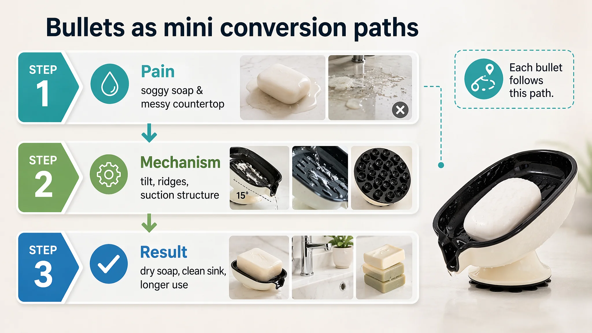
Seller’s pattern:
- Material description (“plastic”, “waterproof”, “lightweight”)
- Feature listing (“strong suction”, “drainage design”)
- Some usage scenes, but in a flat, descriptive tone
The text stayed at the attribute level. There was no clear narrative that started from what the user hates today (soggy soap, messy countertops) and ended with how their life changes after using the product.
Competitor’s pattern:
- Pain point first: water accumulation, soggy soap, waste, messy countertops
- Then mechanism: “15° tilted drainage design,” “raised ridges”
- Then result: “keeps soap dry,” “reduces waste,” “extends soap life”
- Plus data points: tilt angle, load-bearing (5.5 lbs), material (thickened ABS), installation method (“no drilling,” “no tools”).
DeepBI’s judgment: the competitor’s bullets formed a decision path, while the seller’s bullets were just text.
That’s why the optimization suggestions moved each bullet into a “label + mechanism + outcome” structure:
- Drainage design → structure detail → no soggy bars, extends life
- Tool-free installation → how to install and remove → no damage to walls
- Material & suction → thickened ABS, strong suction → reliable in humid showers
- Detachable tray → easy to rinse → hygiene and maintenance
- Multi-use, compact → space saving → soap + sponges + brushes across rooms
Without this logic, every paid click arrived on a page that did not tell a coherent “why buy now” story.
4. Detail Page / A+ Content: A Complete Vacuum
- Seller’s detail score: 0/25
- Competitor’s detail score: 23/25
This was the real red flag.
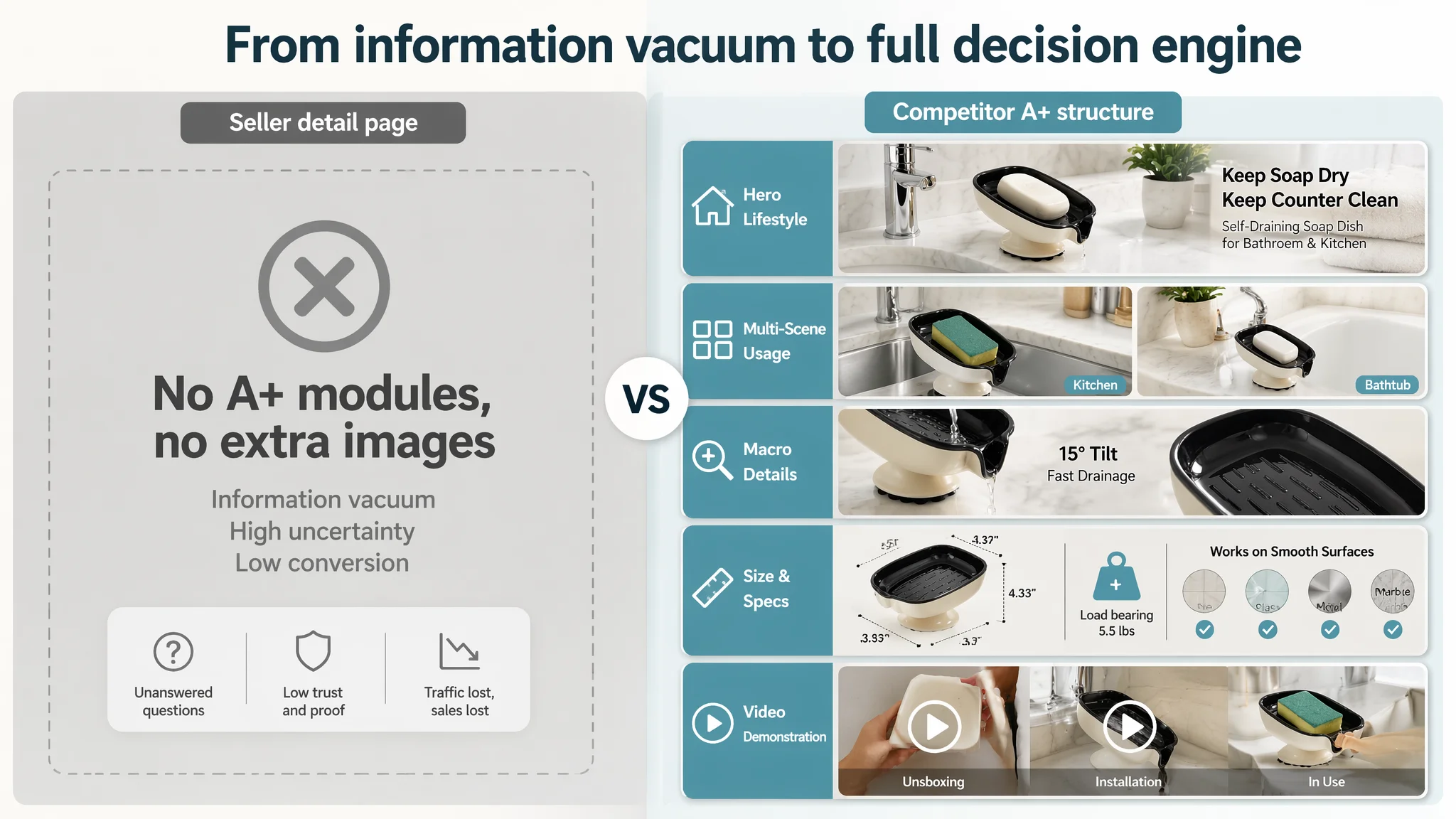
The seller had:
- No A+ content
- No extended images, no scenes, no explanatory diagrams
- No video, no layout supporting deeper reading
The competitor had:
- A structured A+ with:
- Hero lifestyle images on a modern sink / bathroom
- Multi-scene usage (bathroom, kitchen, bathtub edge)
- Macro detail shots (drainage, suction base, ridges)
- Size diagrams and material-compatibility explanations
- Video module (unboxing / installation / usage comparison)
From a business standpoint, this means:
- The seller’s Listing did not give buyers a way to reduce uncertainty after the first images and bullets.
- Any traffic from ads – even if targeted and cheap – was being asked to convert with almost no deep information.
- Competitor pages, in the same category, were doing the opposite: taking unsure visitors and guiding them step by step to “Yes.”
In DeepBI’s model, a 0/25 on detail/A+ in a visual, low-ticket category is essentially a “do not scale ads yet” signal.
5. Reviews: Weak Base Trust, High Visible Negativity
- Seller: 3.3 stars, 14 reviews, homepage showing 7 reviews
- Competitor: 4.7 stars, 23 reviews, 8 visible reviews
Two issues stood out:
- Star rating gap: 3.3 vs. 4.7 – this alone can lower CVR even before content is read.
- High negative share on homepage: 1–2 star reviews made up around 43% of visible reviews for the seller, while the competitor’s homepage had none.
In a category where buyers easily switch to another soap dish on the same results page, this level of visible negativity forces the Listing to work twice as hard. Instead, here the Listing was giving them no extra reassurance.
Why Traditional Ad Optimization Would Have Failed Here
With this diagnostic picture, DeepBI could see that the binding constraint was not targeting or bids. It was page conversion capacity.
If the team had kept going in the original direction, likely actions would have included:
- Trying more keywords, long-tail phrases, or phrase/broad experiments
- Adjusting bids down to chase better ACOS
- Tweaking campaign structure to isolate search terms
- Possibly experimenting with more couponing or minor price moves
None of those truly address:
- A 0/25 detail-score
- A 4/10 bullet-score
- A main image set with almost no emotional or proof elements
- A review profile with visible negativity and no counterbalancing story on the page
Ads in this state amplify the defect: every incremental click increases ad spend without materially improving the percentage that converts.
The risk profile was clear:
- More ad spend → more clicks → same or worse CVR → higher ACOS & unstable TACOS
- Organic ranking cannot stabilize because the Listing cannot hold its own when traffic does arrive
- Any “ad success” is fragile, highly price-dependent, and sensitive to bidding wars
From a decision-order perspective, DeepBI’s judgment was:
“Before scaling traffic, the page must prove it deserves that traffic.”
How DeepBI Reframed the Problem: From “Ad Issue” to “Sales Story Missing”
Based on the scoring gaps, DeepBI restructured the priority this way:
1. Core problem
The Amazon product page lacked a persuasive sales story. It could not:
- Visualize the main pain point (soggy, messy soap, damaged countertops)
- Explain the technical solution (tilt, ridges, suction structure)
- Build trust (scenes, material explanation, installation clarity, reviews)
2. Original misdiagnosis
- The team treated it like a commodity and assumed “cheap + exposure” would be enough.
- They viewed ad performance as the primary lever, underestimating the size of the Listing-quality gap vs. a top competitor.
3. DeepBI’s judgment
- With a 45 vs. 87 Listing score, the constraint was clearly conversion.
- Detail/A+ at 0 in a visual-heavy category is a structural defect, not a small optimization opportunity.
- The first objective had to be: repair the Listing’s ability to convert both organic and paid traffic.
This is why the optimization plan did not start with “ad tweaks.” It started with the content that shapes CTR and CVR.
Rebuilding the Sales Logic: From Title to A+ Visual Story
1. Reframing the Title Around Real Search and Real Use
DeepBI’s analysis proposed a revised title structure that:
- Keeps the color and core keyword, but shifts to a clear, search-aligned format:
Black Self-Draining Suction Cup Soap Dish, No Drill Soap Holder for Shower, Bathroom Sink & Kitchen, Removable Sponge Tray, Easy to Clean & Keeps Bar Soap Dry
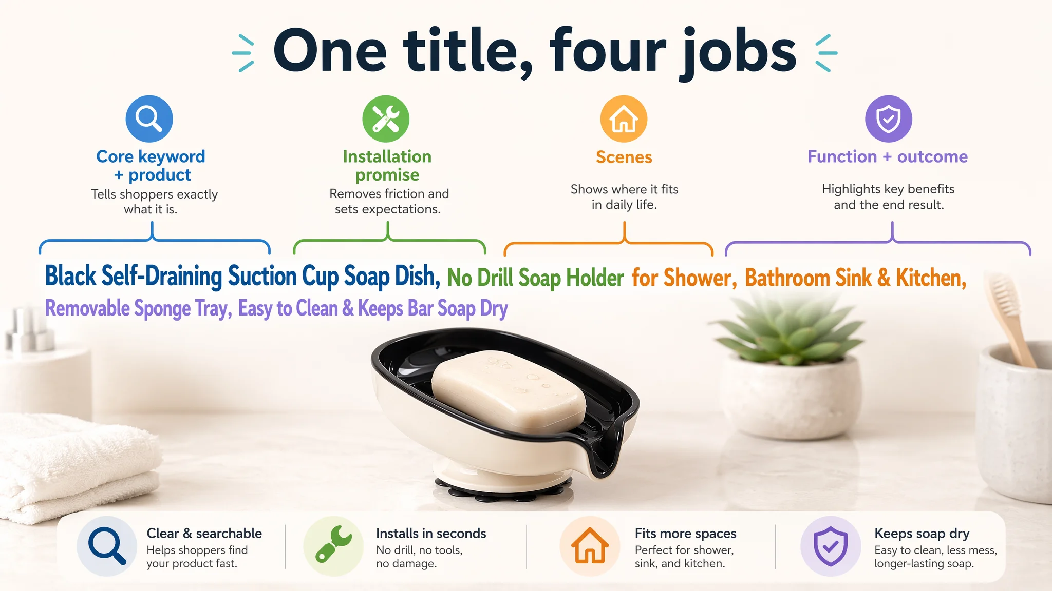
Key shifts in logic:
- “Self-Draining” only once, removing redundancy to free space for:
- “No Drill” (high-intent for renters and those protecting walls)
- “Removable” (signals ease of cleaning)
- “Sponge Tray” (expands beyond soap into kitchen and cleaning use)
- Explicit multi-scene coverage: shower, bathroom sink, kitchen
- Outcome-focused ending: “Keeps Bar Soap Dry”
Instead of a generic object (“Black Plastic…”), the title now behaves like a mini sales pitch that also respects Amazon keyword logic.
2. Bullet Points: From Attribute Listing to “Pain → Mechanism → Result”
DeepBI’s suggested bullet rewrites were not just copy-polish. They changed structure:
Bullet 1 – Drainage as the Category’s Core Pain
- New angle: “Efficient Self-Draining Design”
- Adds explicit structure: water channels to sink, raised ridges elevate soap
- Direct result language: eliminates sogginess, keeps countertop clean, extends soap life
Bullet 2 – Installation Risk Removed
- New angle: “Tool-Free & Damage-Free Installation”
- Mechanism: powerful suction cup, smooth surfaces like tiles/glass/sinks
- Outcome: no drilling, no wall damage, easy repositioning without residue
Bullet 3 – Durability and Reliability in Humid Environments
- New angle: “Durable Material & Reliable Suction”
- Specifics: thickened ABS plastic, waterproof, wear-resistant
- Outcome: stable support in showers and bathrooms
Bullet 4 – Hygiene & Maintenance
- New angle: “Detachable & Easy to Clean”
- Mechanism: tray fully detachable from base
- Outcome: quick rinse, maintains neat and hygienic environment
Bullet 5 – Scene Expansion and Space-Saving
- New angle: “Compact & Multi-Purpose Use”
- Scenes: bathrooms, laundry rooms, kitchens
- Use cases: soap bars, sponges, scrub brushes
- Outcome: saves countertop space, fits decor
This structure change turns each bullet into a mini conversion unit. For ad traffic, that is critical: even if someone skips the A+ below, the bullets now carry a full argument.
3. Main Images: From Industrial Sample to Modern Home Story
DeepBI’s visual recommendations reshaped the main image set from “plain pack shots” into a decision-driving sequence:
1. Hero image
- 45° side angle, product occupying ~65% of the frame
- Soft warm-white light, subtle shadow
- Light gray gradient background
- Subtle suction-cup detail retained as a modern graphic, not clutter
- Overall mood: “modern, clean, Nordic home,” not “cheap plastic.”
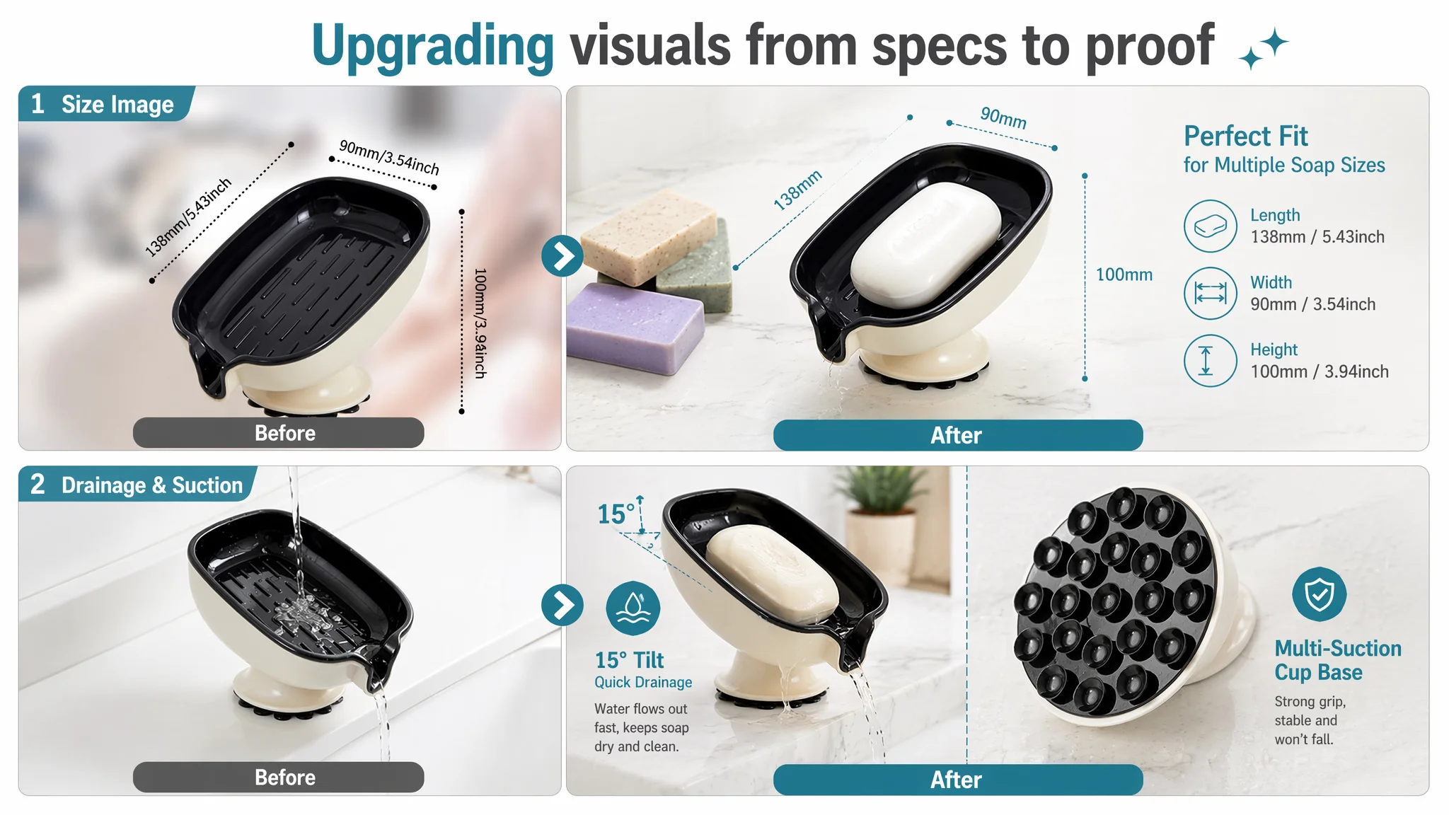
2. Size + compatibility image
- Left: product at 45° on pure white
- Right: clean parameter annotations (length/width/height) with arrows
- Text line: “Fits multiple soap sizes” to connect dimensions to real usage
3. Drainage demonstration
- Low, slightly upward angle focusing on the outlet
- Real bathroom countertop / marble scene
- Visible water flowing through, text bubble like “15° fast drainage”
- This creates the visual proof the original page lacked.
4. Suction stability
- Macro shot of the suction array at the bottom
- Bathroom tile background blurred for context
- Clear, bold text: “Multi-point vacuum suction, stable and secure”
- This addresses the “will it fall?” fear directly.
5. Lifestyle anchor image
- One large scene: clean white sink, small plant, morning natural light
- Product with a dry bar of soap, emphasis on aesthetic and cleanliness
- This allows buyers to imagine it in their own home.
The strategy: each main image now handles one core question—what it looks like at home, will it drain, will it stay put, will it fit, is it attractive enough to keep on my counter?
4. Detail Page / A+ Content: Filling the Information Vacuum
Since the Listing originally had no A+, DeepBI treated this as the biggest conversion lever.
The recommended A+ structure:
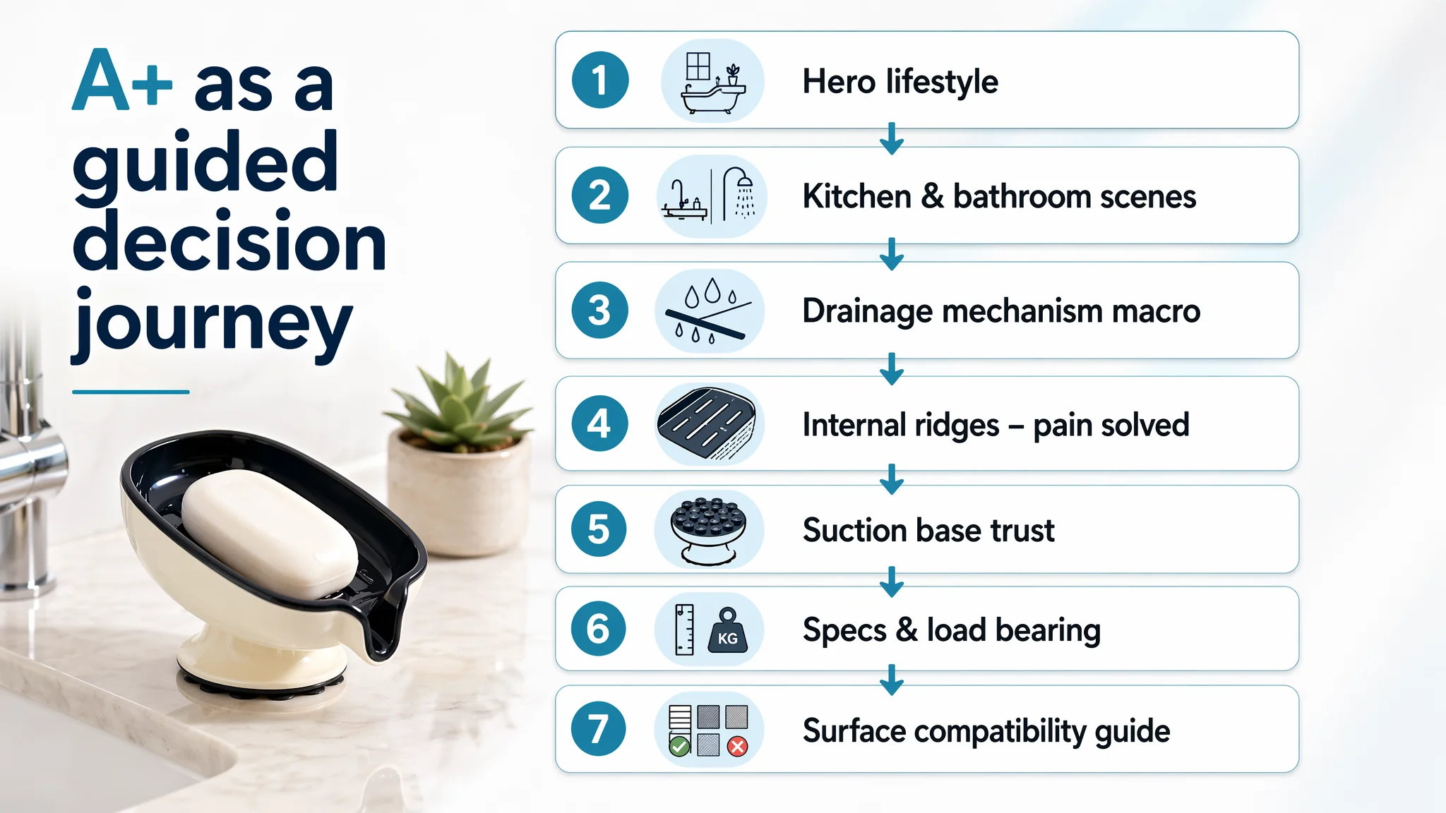
1. Opening hero module
- Modern bathroom sink, Nordic style
- Product centered with a dry soap bar
- Clear, clean environment to upgrade perceived value
2. Scene adaptation module
- Split layout: left kitchen sink with sponge, right bathtub edge with round soap
- Shows multi-scenario usage and multi-function (soap + sponge)
3. Core drainage mechanism module
- Macro, 45° angle focusing on outlet and channels
- Clean engineering-like rendering style
- Shallow depth of field to force focus on the drainage structure
4. Pain-point solution module
- Close-up of internal ridges from a top-down angle
- Visually shows soap being elevated and air circulating
- Connects directly to “no soggy bars, better hygiene.”
5. Trust & stability module
- Tilted view of transparent suction cups under the product
- Frosted glass-like backdrop with water mist hints
- Visual metaphor for strong adhesion in wet environments
6. Specification & load-bearing module
- Clean image with dimensional lines and numbers
- Small icon for “Load bearing 5.5 lbs” (or accurate, seller-confirmed spec)
- Reduces size / weight expectation mismatches and returns
7. Material compatibility module
- Central product, surrounded by circular swatches: marble, tile, metal, glass, etc.
- Green checkmarks for suitable surfaces, red crosses for unsuitable ones
- Directly answers “Will it work on my sink/wall?” and filters out wrong buyers.
This A+ redesign turns the lower half of the Amazon product page into a full decision engine instead of a blank space. When combined with improved bullets and images, it gives both organic and paid visitors a coherent path from curiosity to purchase.
How Traffic Starts to Become Useful Again
With these changes, DeepBI’s expected operating shifts are:
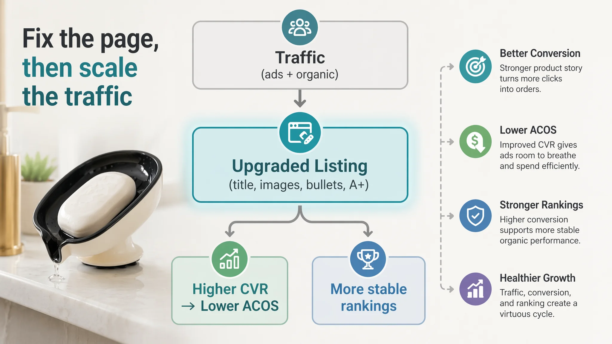
- CTR stabilizes or improves
- A more compelling hero image and better-structured title make the Listing more clickable on the search page—even for the same ad placements.
- CVR begins to recover
- Visitors now see:
- A clearer pain/solution story
- Visual proof of drainage and suction
- Multi-scene usage that fits their specific bathroom/kitchen reality
- Less ambiguity about size and surfaces
- This directly affects how many clicks turn into orders.
- Ad spend becomes more meaningful
- Instead of feeding traffic into a page with a 0/25 detail score, ads now land on a Listing engineered to answer buying questions.
- As CVR improves, ACOS has room to move down without lowering exposure, and TACOS pressure eases.
- Organic traffic becomes worth fighting for again
- A Listing that can convert traffic reliably is also a better candidate to hold ranking once it gets visibility—whether from ads or from seasonal/category shifts.
In other words, the optimization path flips from “push more traffic and hope” to “upgrade the page, then scale the traffic that page can actually monetize.”
What the Seller Learned: Ads Can’t Fix a Page That Doesn’t Sell
This case is not about a sophisticated, high-tech product. It is about a simple Amazon soap dish with a suction cup. That’s exactly why it is instructive.
Key shifts in understanding for the seller:
- High ACOS is not always an ad problem. In this case, it was the natural result of sending traffic into a Listing with almost no A+ content, weak bullets, and a low trust profile.
- Listing quality is the foundation of ad efficiency. A 45/100 Listing competing against an 87/100 benchmark will struggle no matter how refined the campaigns are.
- Title, main image, bullets, and A+ are one system.
- Title makes the first promise.
- Main image drives the click and first impression.
- Bullets carry the core reasoning.
- A+ handles doubt, detail, and trust.
When any of these is missing or thin, ads end up amplifying the gap.
- Before scaling ads, ask: “Does this page deserve more traffic?”
In this case, a 0/25 detail score made the answer obvious: not yet.
For other Amazon sellers, the takeaway is direct:
If your Amazon ads feel “expensive” and you find yourself endlessly tuning bids without seeing consistent ACOS relief, put your Listing next to a top competitor and ask:
- Is my title structured for decision logic, not just keyword presence?
- Does my main image set answer the real, visual questions my buyers have?
- Do my bullets walk the buyer from pain to solution to outcome?
- Does my detail/A+ section actually exist—and if it does, does it read like a sales story or just decoration?
- Are my visible reviews aligned with what my page promises?
When the answers turn out to be “no,” the problem is not that your ads are broken. It is that your Amazon product page is not yet set up to convert the traffic you are already paying for. DeepBI’s role in this case was not to push more knobs on advertising, but to identify that root constraint early enough that the seller could rebuild the Listing before scaling ad spend any further.