

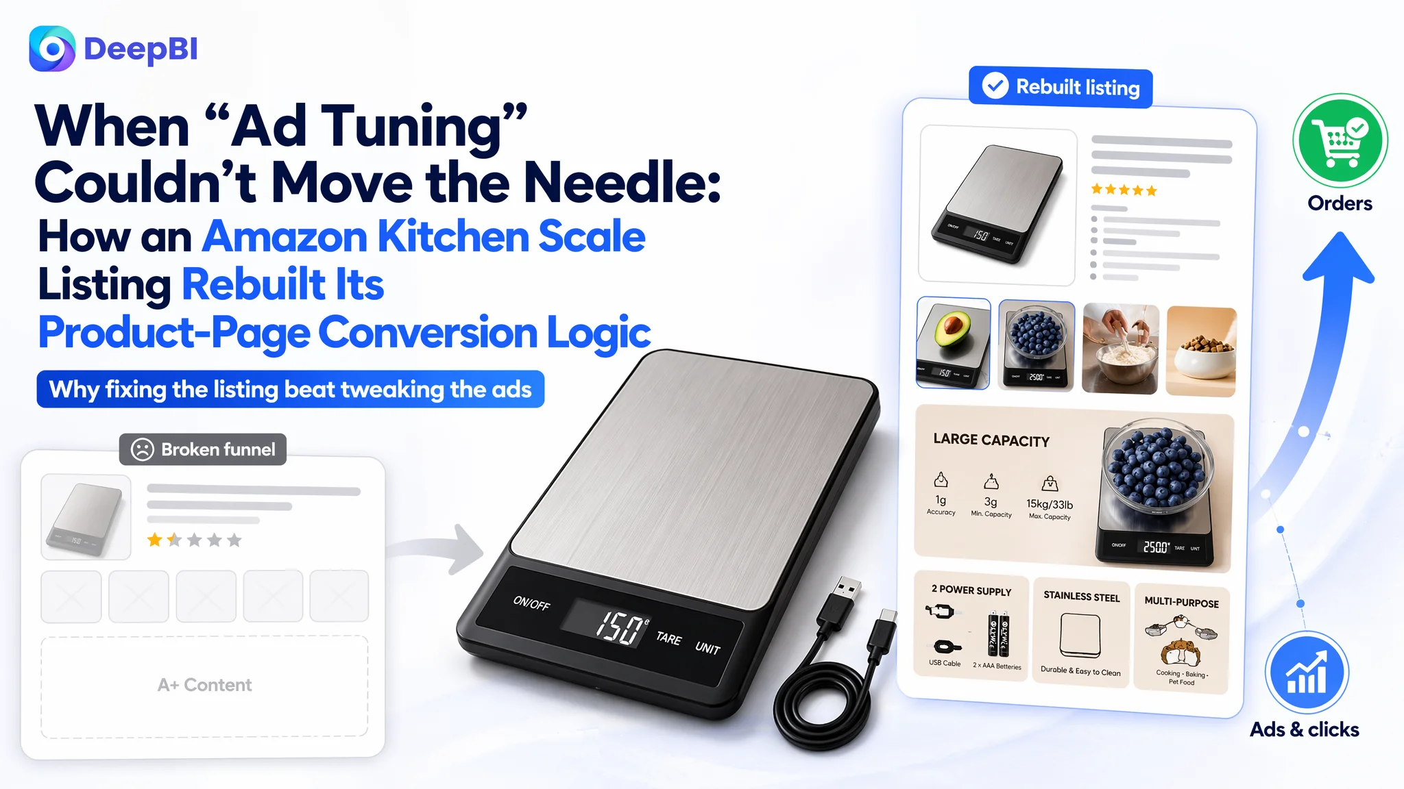
For this Amazon seller in the digital kitchen scale category, the first instinct was familiar: when orders slowed and advertising felt “expensive,” the team focused on bids, keywords, and budgets. On paper, the product itself was solid—high review rating, modern specs, and a clear category fit. Yet every extra dollar spent on Amazon ads felt harder to justify, because traffic was not turning into enough orders.
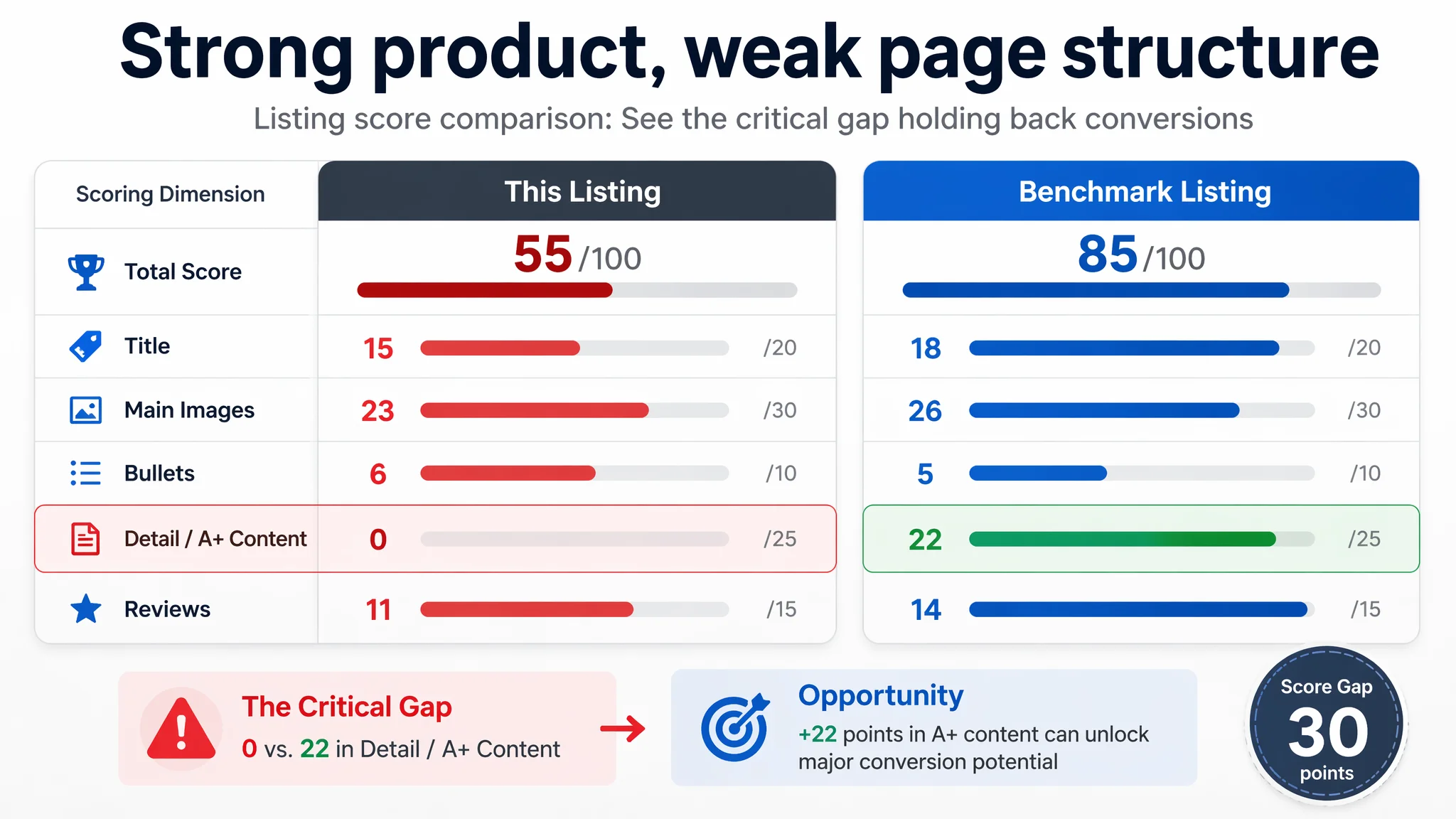
DeepBI’s Listing analysis showed a different picture. Against a strong benchmark kitchen-scale Listing, the seller’s Amazon product page was scoring 55/100 versus 85/100, with one dramatic gap: a 0/25 score on the A+ (detail) content dimension. Ads were sending traffic to a page that had almost no visual story or trust-building structure beyond the title, main image set, and five bullet points. The customer thought this was a “traffic and bid problem”; the real constraint was a broken conversion funnel on the Listing itself.
Once the issue was reframed, the optimization stopped chasing micro-changes in ads and instead focused on Amazon Listing fundamentals: rebuilding the title for search and spec clarity, redesigning the main image set to make capacity, dual power, and waterproofing visually obvious, and constructing a full A+ content story that walked buyers from “what it is” to “why this one.” The goal was not prettier assets; it was a Listing that could finally justify the traffic it was getting.
Many Amazon sellers will recognize this trap. When ACOS feels high or ads stop scaling, it is tempting to blame targeting or campaign structure. This case shows what happens when you look one layer deeper: sometimes the quickest way to stabilize ad performance is not “better ads,” but a product page that can actually convert the traffic those ads are already buying.
Amazon Ads Were Not Failing. The Page Was Consuming the Traffic.
From the seller’s point of view, the situation looked straightforward:
- The product was a rechargeable digital kitchen scale for food, competing in a crowded Amazon US subcategory.
- The rating was excellent (4.8 stars), and recent reviews were all positive.
- Ads were bringing in traffic, but the return on spend felt weaker than expected.
- A leading competitor in the same niche seemed to handle much higher traffic and volume with similar pricing and specs.
Naturally, the team focused on ad levers: keyword expansion, bid adjustments, and campaign tweaks. If a competitor could dominate the subcategory, it felt logical to assume the issue was “not enough good traffic” rather than “traffic not converting.”
But DeepBI’s Listing-scoring radar told a different story. When the target Listing was placed next to a category-leading benchmark, the numbers looked like this:
- Overall score: 55/100 vs. 85/100 (benchmark)
- Title: 15 vs. 18
- Main image set: 23 vs. 26
- Bullet points: 6 vs. 5 (slight advantage)
- Detail page / A+ content: 0 vs. 22
- Reviews: 11 vs. 14
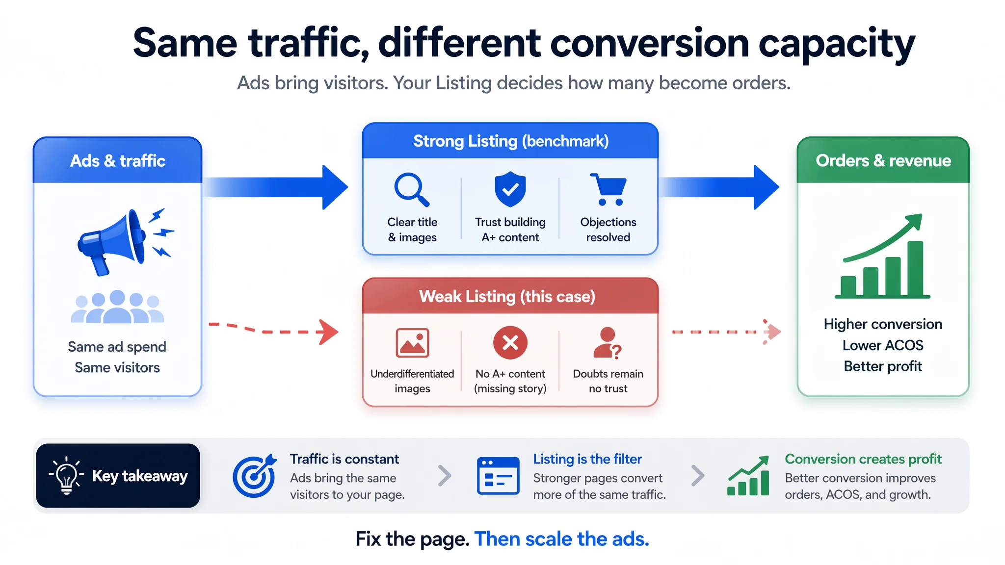
The customer did not have an ad-traffic problem. They had a Listing that could not absorb and convert the traffic they were already paying for.
“The real problem was not that ads failed to bring traffic. It was that the page could not convert the traffic.”
The Real Constraint Was Listing Conversion Capacity
Looking at the benchmark Listing for a similar kitchen scale, the contrast was not subtle.
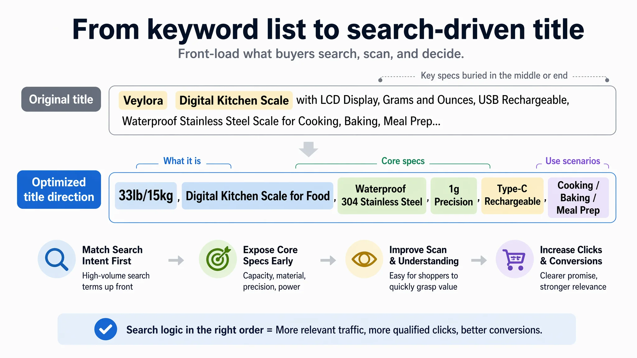
Title: Structurally Acceptable, but Not Doing Enough Work
The seller’s title was not disastrous, but it underperformed where it mattered:
- The competitor placed brand + “Food Scale” up front, then immediately flagged 33lb capacity and “Digital Kitchen Scale” to align with high-volume Amazon search behavior.
- Critical decision-making attributes like “304 Stainless Steel” and “Type‑C Charging” were made explicit and early.
- The spec order and keyword order were tuned around how Amazon buyers actually browse: function + outcome first, then supporting attributes.
By contrast, the seller’s title structure diluted the impact of its strongest differentiators—especially large capacity, waterproofing, and modern charging. Search coverage was there, but priority and sequence were not optimized to pre-sell the click.
Main Images: Visually Acceptable, but Weak in Decision Logic
On the surface, the seller had all the standard images: hero shot, angle view, some “in-use” photos. The issue was not absence; it was how those images were working in the first three seconds after a search click.
The benchmark’s main-image system did three things that the seller’s did not:
- Instantly signaled professionalism with clean, centered composition and simple but dense information (capacity, materials, screen angle).
- Visualized the technical promises—large capacity, dual power, angled LCD, durability—using clear, minimal graphics instead of only text.
- Anchored price vs. value by showing a large container, heavy food items, and lifestyle scenes that made the product feel “worth paying for.”
The seller’s images were more fragmented. Core capabilities like 15kg capacity, dual power supply, and waterproof + easy-to-clean surface were either underplayed or left to text. This weakens both CTR and CVR:
- Fewer users feel compelled to click when the thumbnail looks generic.
- Those who do click need to work harder to understand why this scale is better, which quietly kills conversion.
Where the Listing Truly Broke: A+ Content and the Missing Trust Path
The most serious gap was not visible at the search-results level; it lived on the lower half of the Amazon product page.
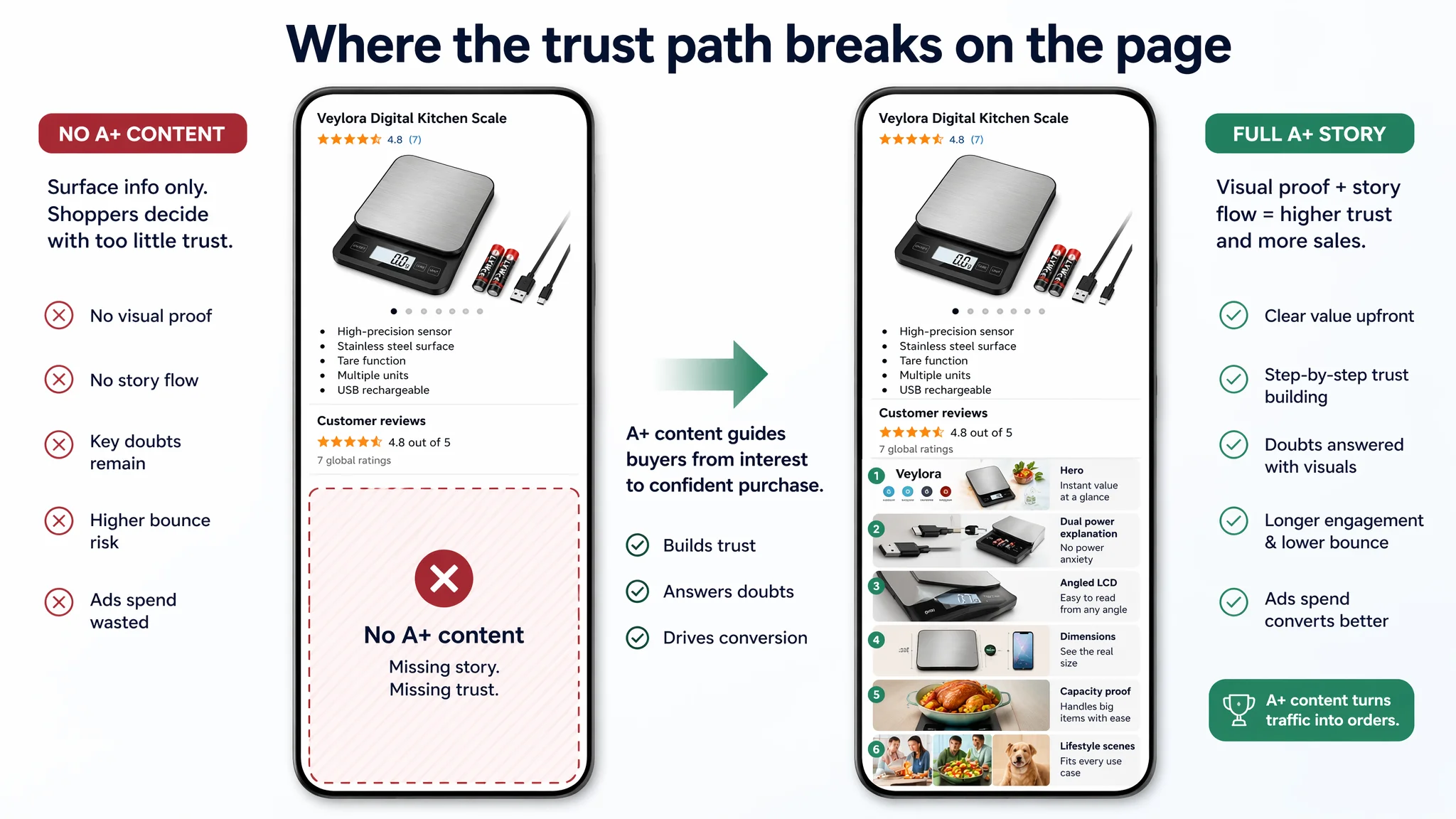
The Seller Had No A+. The Competitor Built a Full Story.
On the target Listing:
- No A+ content at all.
- Buyers had to decide almost entirely from title, main images, five bullet points, and a small set of reviews.
On the benchmark Listing:
- A structured A+ section with:
- A strong hero module
- Visual explanation of dual power modes
- Close‑up of the angled LCD
- Dimension and size diagrams
- Real‑food capacity scenes (roast chicken, large containers)
- Multi‑scenario lifestyle collage (baking, healthy meals, pets)
From a conversion-funnel viewpoint, this is a critical difference:
“Users were being asked to make a decision based only on surface information. There was no visual evidence chain to transform interest into trust.”
How the Competitor’s A+ Mapped the Buying Journey
The benchmark’s A+ content effectively created a three-step conversion path:
1. Recognition & Hook
- Full‑width, high‑quality hero image
- Clear core icons: capacity, precision, units, dual power, angled display
- Immediate signal: “This is a professional kitchen tool.”
2. Doubt Resolution
- Modules answering practical concerns:
- “Will it run out of power suddenly?” → Dual power layout with cable and batteries.
- “Can I read the screen with a big bowl on it?” → Angled LCD close‑up.
- “Will it hold large dishes?” → Plate and dimension overlays.
3. Boundary Expansion
- Real scenes showing:
- Baking and cooking
- Weight-management meal prep
- Pet feeding
- The product moves from “tool” to “lifestyle enabler,” justifying staying on the page longer and paying a fair price.
The seller’s Listing had none of these layers. As a result:
- Many users bounced after scanning bullets and images.
- Ads were driving visits, but the psychological path from “see product” to “trust product” was broken.
Why Traditional Amazon Ad Optimization Could Not Fix This
The customer had already attempted typical Amazon ad optimizations:
- Bidding up on core category keywords
- Expanding to more long‑tails
- Adjusting budgets and placements
In a mature category like kitchen scales, these moves can help only if the Listing is capable of converting incremental traffic.
In this case, every extra click was being forced through a page with:
- No A+ modules to build trust
- Underdifferentiated main images
- A title that did not fully exploit the strongest specs
So even if CTR improved slightly from ad-side experiments, CVR remained the bottleneck. That translates into:
- ACOS stubbornly high
- TACOS not improving despite higher spend
- Organic rank growth limited, because traffic quality wasn’t the core problem—conversion was
Continuing to “optimize ads” before fixing the product page would only amplify the inefficiencies of the current Listing.
“Advertising does not only amplify advantages. It can also amplify a page’s existing defects.”
How DeepBI Read the Data: Listing Abnormalities That Mattered
DeepBI’s Listing-scoring logic focuses on five dimensions: title, main images, bullet points, detail (A+) content, and reviews.
For this ASIN-level case, the diagnostic pattern was clear:
- Title: Slightly behind benchmark
→ Search intent alignment and spec sequencing could be improved.
- Main images: Slightly behind benchmark
→ Visual trust and usefulness lower in first 3 seconds after click.
- Bullet points: Slightly better structured than benchmark
→ Stronger in user-oriented scenarios and clarity.
- Detail page (A+): 0 vs. 22
→ Structural absence of a major trust and storytelling layer.
- Reviews: 4.8 stars but only 7 reviews vs. 1,998 on competitor
→ High satisfaction but weak social proof volume.
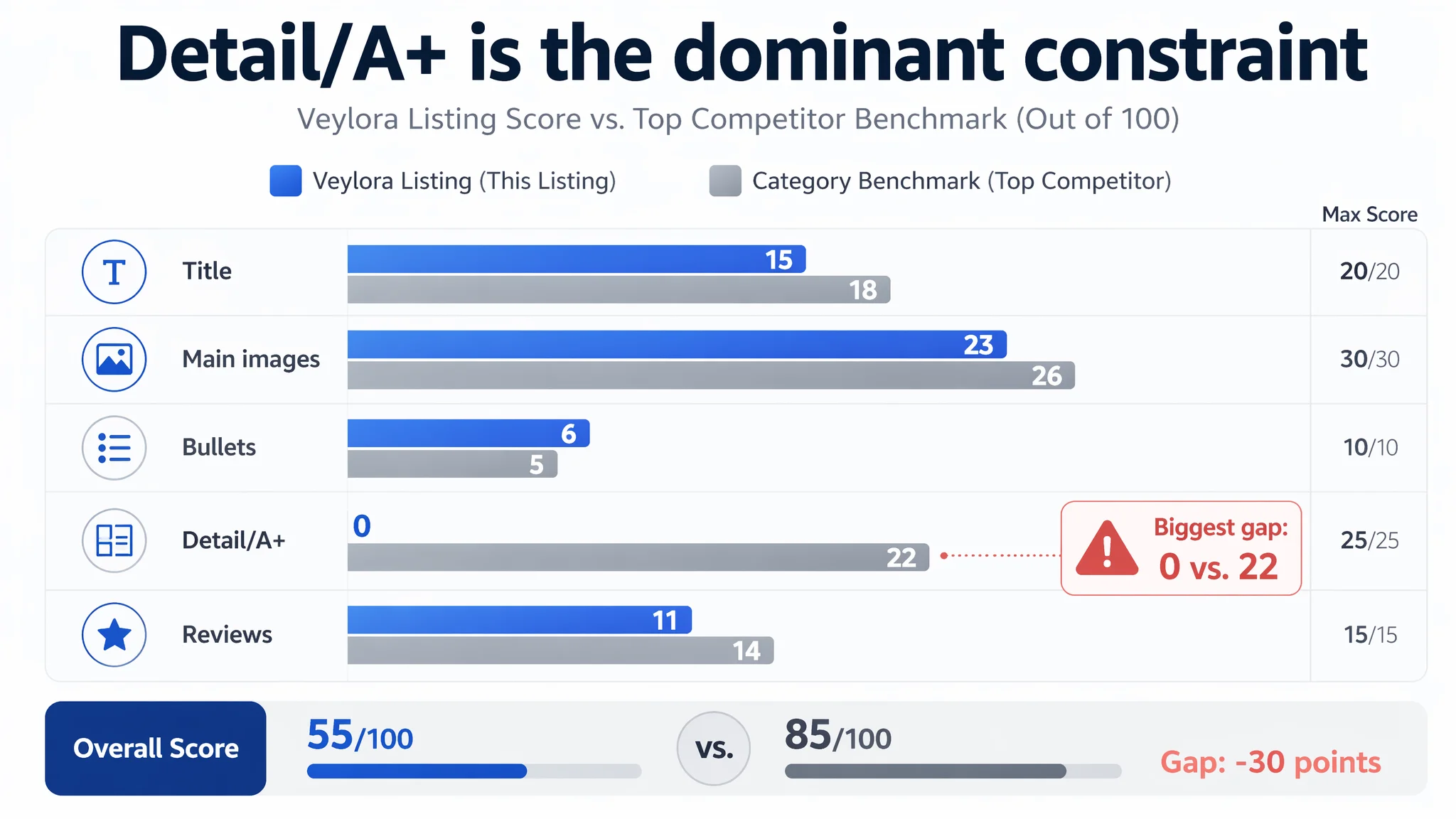
The single most important constraint at this stage was obvious: The Listing lacked a full product-story layer (A+ content) to convert traffic efficiently.
Everything else—ads, small title tweaks, even minor image polishing—would remain secondary until this gap was closed.
Why DeepBI Did Not Recommend “Keep Tuning Ads First”
From a business-risk perspective, continuing to prioritize ads would have led to:
- More spend funneled into a page that lacks conversion infrastructure
- Worsening perceived inefficiency of Amazon ads
- Difficulty scaling budgets because each additional dollar brings diminishing returns
DeepBI’s judgment was:
1. Fix the Listing’s ability to convert first.
- Build a credible A+ structure.
- Reinforce key differentiators visually, not only in text.
2. Align the title and main images with what the A+ will reinforce.
- Use the same value pillars across the entire page: 33lb capacity, 1g precision, waterproof 304 stainless steel, dual power, angled display.
3. Then re‑evaluate ad performance.
- Only once CVR has room to move can ad optimizations start to show real, sustainable impact.
The biggest risk at that moment was letting ads continue to amplify a low-conversion page, which would keep ACOS high and slowly erode the seller’s confidence in the product.
Rebuilding the Listing: From Scattered Information to a Coherent Purchase Logic
DeepBI’s optimization direction centered on one question:
“If a cold Amazon buyer arrives from search, can this page, on its own, move them through recognition → understanding → trust → purchase?”
To answer that, the Listing needed to be re‑architected across three layers.
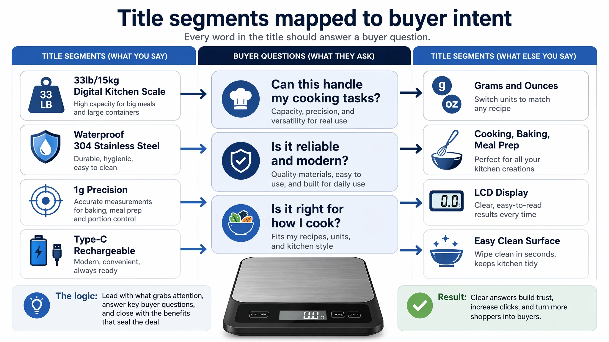
1. Reframing the Title Around Search Logic and Spec Clarity
The proposed title direction:
33lb/15kg Digital Kitchen Scale for Food, Waterproof 304 Stainless Steel Scale with 1g Precision, Type-C Rechargeable, LCD Display, Grams and Ounces for Cooking, Baking and Meal Prep
Key decisions behind this structure:
- Lead with capacity and product type: “33lb/15kg Digital Kitchen Scale for Food”
→ Instantly signals “what it is” + “how powerful it is” for searchers.
- Material and differentiation: “Waterproof 304 Stainless Steel”
→ Moves the product out of the generic plastic-scale crowd and adds durability + hygiene signaling.
- Technical clarity: “1g Precision, Type‑C Rechargeable”
→ Professional use (baking, portion control) and convenience (modern charging) in one line.
- Search coverage: “LCD Display, Grams and Ounces, Cooking, Baking, Meal Prep”
→ Captures functional search terms without bloating the title with fluff.
This is not about stuffing more words; it is about front-loading the reasons to click and to trust.
2. Strengthening Bullet Points as a Structured, Buyer-Focused Argument
The existing bullet points were already more user-oriented than the competitor’s. DeepBI’s approach was to keep that advantage but tighten the logic:
1. [Dual Power Supply]
- Explain Type‑C rechargeable + battery backup as flexibility and reliability (home vs. travel/camping).
- Connect directly to “no dead-scale moments” anxiety.
2. [33LB High Capacity & 1g Precision]
- Explicitly cover the full range from small ingredients to heavy dishes.
- Emphasize use-cases: baking, meal prep, portion control.
3. [One-Touch Tare for Efficiency]
- Tie tare to reduced cleanup and faster multi‑ingredient workflows.
- Show it as a time-saver, not just a technical feature.
4. [Waterproof & Easy-Clean Platform]
- Position waterproofing as hygiene and longevity, not just IP rating.
- Show how it handles spills and sticky ingredients without worry.
5. [6 Versatile Units & Clear Display]
- Connect units and display to recipe flexibility and ease of use.
- Highlight slim profile and storage friendliness.
Collectively, the bullets move from “what it has” to “how it makes your kitchen routine easier and more reliable.”
3. Reconstructing the Visual Funnel: Main Images and A+ Content
DeepBI’s visual diagnosis was not “make it prettier,” but:
- Clarify function visually.
- Reduce cognitive load.
- Show proof, not just promises.
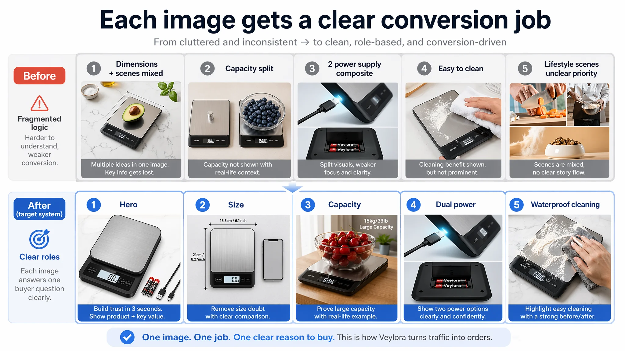
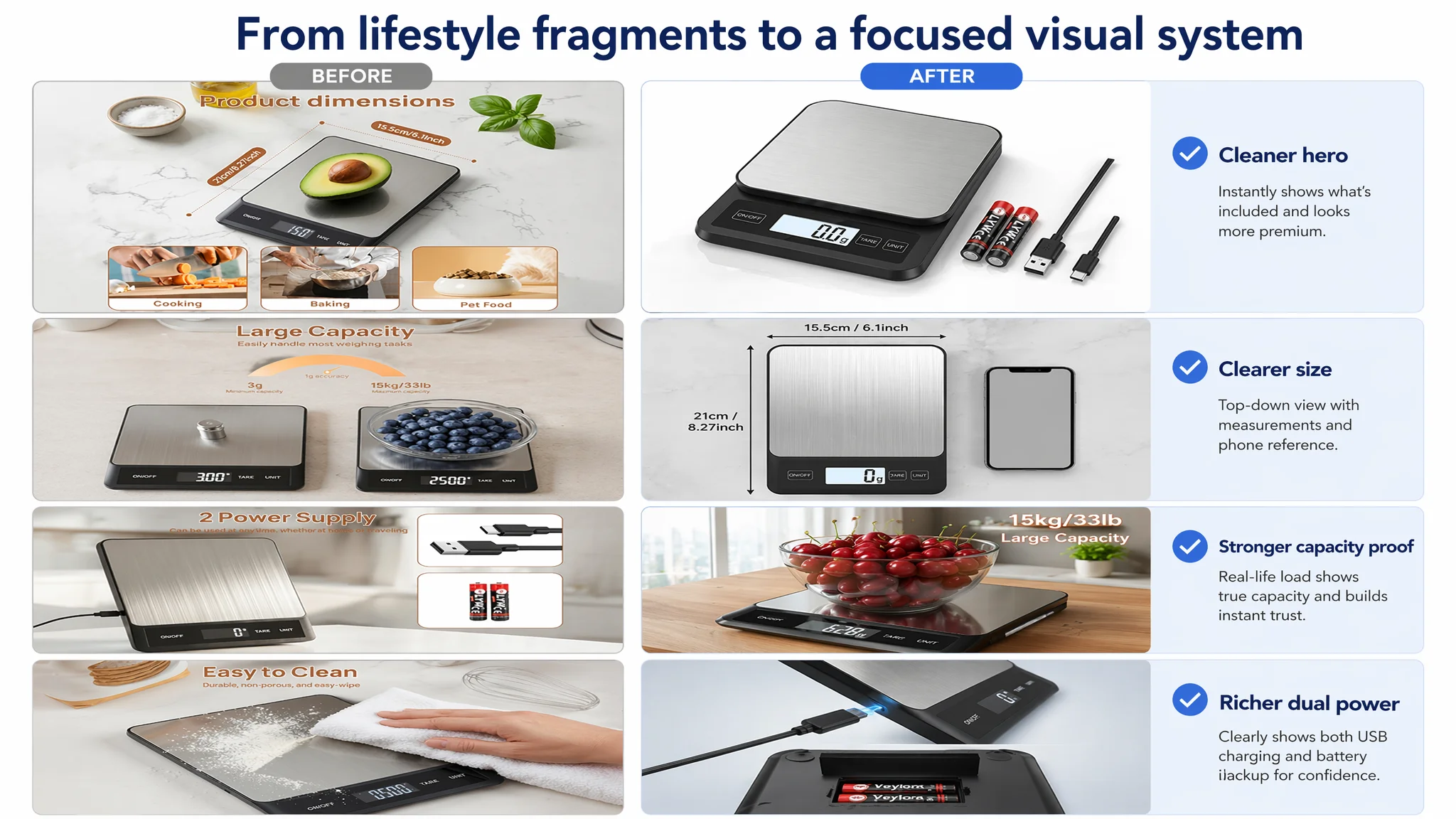
Main Image System: Each Slot Has a Specific Job
1. Primary hero (search thumbnail job: click)
- Product centered, ~70% of frame, 45° top-down angle, pure white background.
- LCD reading “0.0 g” bright and sharp.
- Battery and USB cable neatly placed to the side, visually hinting at dual power.
→ Professional, minimal, trustworthy.
2. Size perception & practicality
- Top‑down view with a 6.7‑inch smartphone as direct size reference.
- Clean marble background, clear dimension lines.
→ Eliminates “too big / too small” uncertainty, reducing size-related returns.
3. Capacity & usage intensity
- 30° side angle, large glass bowl full of cherries on the scale, display showing a realistic weight.
- Overlay text: “15kg / 33lb Large Capacity.”
→ Proves that the product can handle heavy, real‑world loads.
4. Dual power visualization
- Split composition: USB‑C port close-up on top, battery compartment open with batteries below.
→ Makes “two ways of power” intuitively understandable without reading.
5. Waterproof & easy cleaning
- A hand wiping away flour and splashes with a damp cloth, leaving a clean surface behind.
→ Turns “waterproof” from an abstract spec into a vivid, believable scene.
Each image is a conversion task, not decoration.
A+ Content: Filling the Missing Trust Layer
DeepBI’s detail-page structure aimed to mirror the benchmark’s strengths while leaning into this product’s specific differentiators:
1. Intro/overview module
- Left: six core icons (LCD, units, precision, dual power, tare, capacity).
- Right: 45° scale image on clean marble, surrounded by fresh ingredients.
→ Immediate “professional kitchen tool” first impression.
2. Dual power feature module
- Center scale with charging cable plugged in.
- Zoom-in bubble on battery compartment.
- Clear headline: “2 Ways of Power Supply.”
→ Resolves the “will it die at a bad time?” concern.
3. Angled LCD usability module
- Close-up on tilted screen showing a precise number.
- Soft-focus kitchen background, coffee beans or ingredients nearby.
→ Visually answers: “Can I read it easily with a bowl on top?”
4. Large panel and dimensions module
- Top-down view with a large dinner plate and food on the scale.
- Dimension lines and inch measurements overlayed.
→ Communicates “large usable surface” in one glance.
5. High capacity performance module
- Scale with a big roast turkey or similarly heavy dish.
→ Visually proves 15kg capacity without citing only a number.
6. Size comparison module
- Scale next to a typical smartphone, with dimensions labeled.
→ Reinforces realistic expectations and reduces post-purchase surprise.
7. Multi-scenario lifestyle collage
- Column 1: parent and child baking.
- Column 2: person prepping a healthy meal.
- Column 3: pet feeding scene.
→ Extends the mental “use map” beyond baking to everyday life.
Together, these modules rebuild the missing “recognition → trust → extended use” pathway that the original Listing lacked.
How the Page’s Sales Logic Started to Recover
Once the Listing was re‑architected, several things changed in how traffic behaved—even before any dramatic ad-structural changes:
- Buyers no longer relied solely on the title and bullets.
The A+ sections gave them reasons to keep scrolling and more chances to say “yes.”
- Key differentiators became obvious at a glance.
Dual power, waterproof stainless steel, 33lb capacity, and angled display moved from text-level features to visible, credible advantages.
- Page trust no longer depended only on review volume.
With only 7 reviews vs. the competitor’s ~2,000, this seller could not compete on social proof quantity. A strong visual story became a crucial substitute trust layer.
- Ads began to have something real to amplify.
Once the page could convert more of the visitors it received, ad spend could be evaluated on a fairer basis, instead of being blamed for a broken on-page journey.
Although this case did not rely on specific post-change numbers, the operational risk profile clearly improved:
- Less waste on traffic that would have bounced anyway.
- Higher likelihood that organic search ranking could respond to improved CVR.
- More control over how each page element contributed to the decision process.
What the Customer Learned About Amazon Listing vs. Ads
By the end of the diagnosis and Listing rebuild, the seller’s view of their Amazon business changed in several ways:
- High review rating is not enough.
A 4.8-star average with few reviews feels good internally but does not compensate for missing visual evidence and A+ storytelling.
- Ads cannot fix a page that cannot convert.
Bids and keywords are multipliers. If the base conversion logic is weak, they multiply the weakness.
- Title, main images, bullets, and A+ must tell one coherent story.
Capacity, precision, waterproofing, and dual power should appear as a connected promise throughout the page—not scattered facts.
- Before increasing budget, ask whether the Listing deserves more traffic.
DeepBI’s scoring and visual-path analysis did not tell the seller to turn ads off; it showed why ads hadn’t been working and in what order to fix things.
For other Amazon sellers—especially in crowded, specification-heavy categories like kitchen gadgets, electronics, or accessories—the core message is clear:
- If you feel stuck in a loop of “tune ads, see little change, tune again,” it may be time to audit the Listing itself as the real bottleneck.
- A missing or weak A+ section, underleveraged main images, and mis-sequenced title logic can quietly consume far more margin than any bid misstep.
- The fastest path to healthier ACOS and TACOS is often not a more sophisticated campaign structure, but a product page that finally converts the traffic you’re already paying for.