

This case comes from an Amazon jewelry seller on the French marketplace who was facing a familiar but unnerving pattern: reviews were excellent, ratings were high, but orders were not following as expected. The team’s first reaction was to look at Amazon ads—adjusting bids, keywords, and budgets—believing that “more traffic” would fix the revenue gap.
Once DeepBI stepped in, the diagnosis shifted. The core issue was not traffic volume or ad mechanics, but the Amazon Listing’s ability to convert that traffic into orders. Against a strong benchmark bracelet in the same category, the target product page was underpowered in its title logic, main-image storytelling, A+ content depth, and review “scale of trust”. Ads were sending buyers to a page that did not fully justify its price or gift positioning.
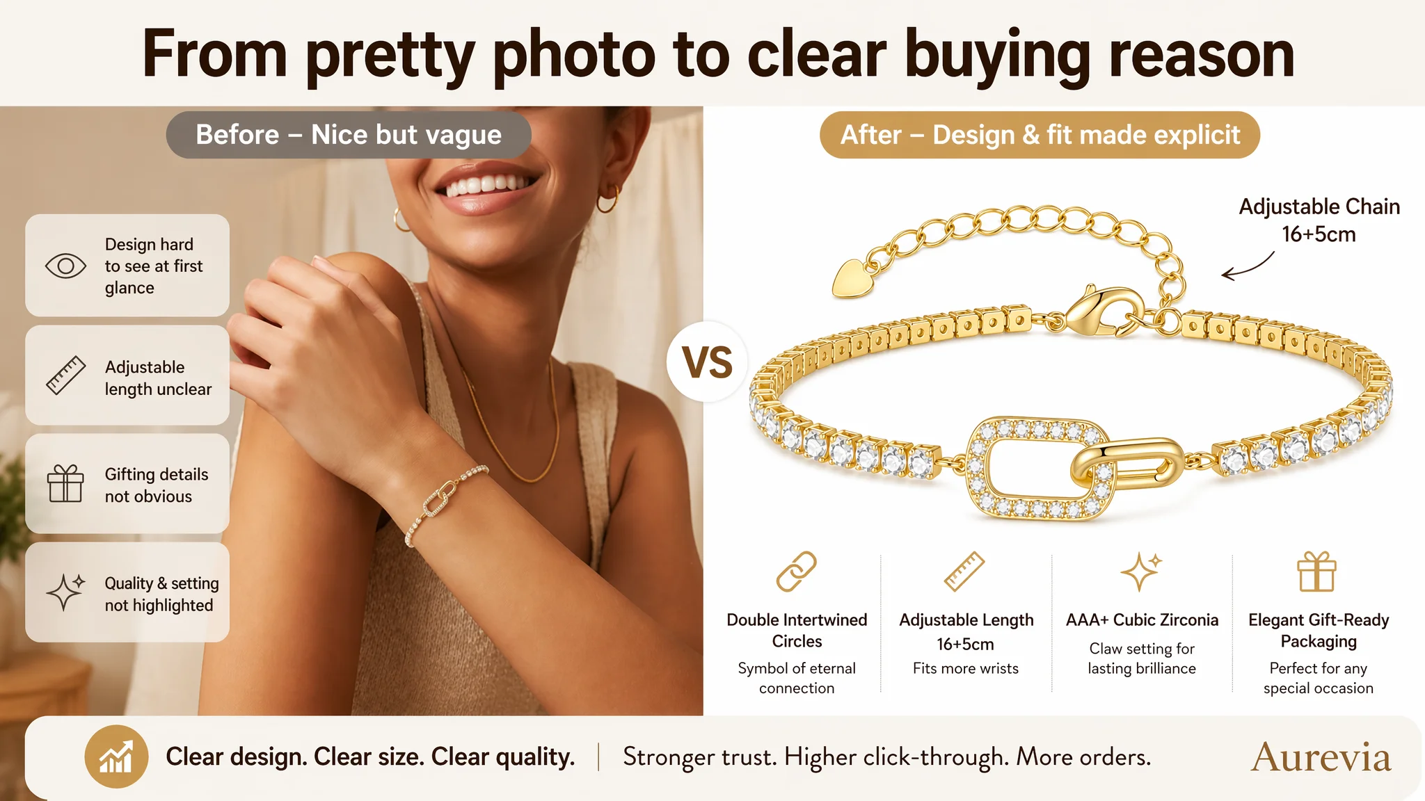
The later optimization deliberately moved away from “keep tuning ads” and focused on rebuilding the Listing: a more focused French title for search and gifting, main images that make the “double intertwined circles” and craftsmanship visually decisive, and an expanded A+ structure that systematically answers size, safety, durability, gifting, and care concerns. The takeaway for other Amazon sellers: when ACOS feels stubborn and traffic “doesn’t pay back”, the bottleneck may not be in ads at all, but in a page that hasn’t yet earned the conversion.
The Real Constraint Was Not Traffic. It Was Listing Conversion Capacity.
From a surface view, this Amazon bracelet Listing looked healthy:
- Rating around 4.8 stars
- No visible negative reviews
- Aesthetic images and emotional copy
Yet compared with a category-leading competitor on Amazon France, the numbers told another story:
- Overall Listing score: 72/100 vs competitor’s 85/100
- The main gap was not in one extreme weakness, but in accumulated deficits across all key dimensions:
- Title: -2
- Main images: -2
- Bullet points: -1
- A+ detail page: -6
- Reviews: -2
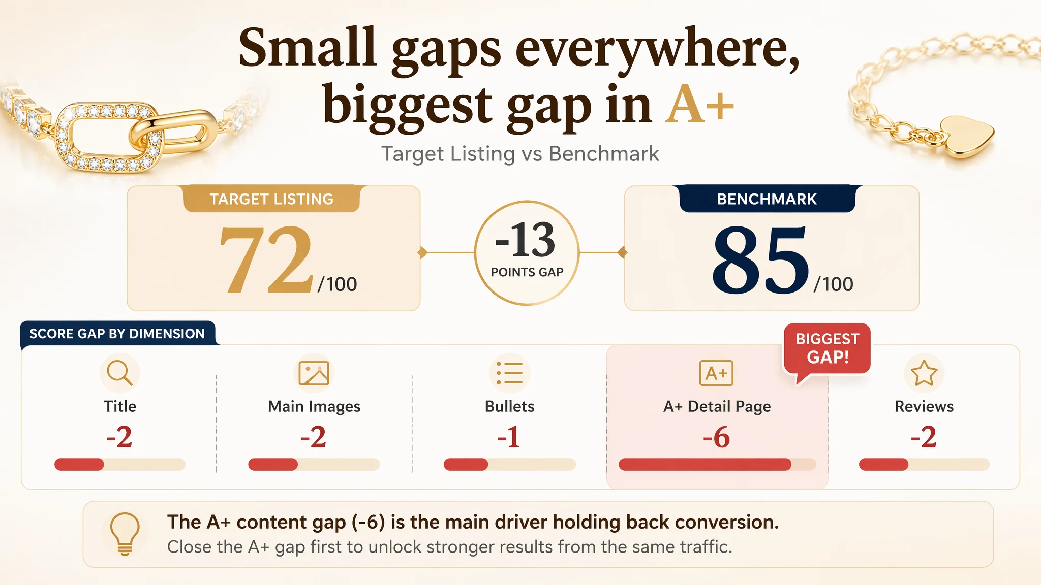
This pattern is important. It’s not a “disaster Listing”; it’s a subtly underpowered Listing: good enough to run, not strong enough to win.
“The real problem was not that ads failed to bring traffic. It was that the page could not fully convert the traffic it already had.”
The seller’s anxiety was centered on ACOS and ad efficiency. Their intuitive explanation:
- “Maybe our bids are off.”
- “Maybe we need more keywords.”
- “Maybe we just need more reviews.”
But when DeepBI compared the target Listing to a benchmark bracelet that was clearly dominating the category, a different picture emerged: the core constraint was product-page conversion, not ad mechanics.
What the Seller Originally Misdiagnosed
From the seller’s perspective, the symptoms all pointed to advertising:
- Costs felt harder to control.
- Pushing more traffic did not lift orders proportionally.
- The page looked “nice enough”, so attention went back to campaigns.
In that mindset, the optimization loop was:
1. Adjust keyword mix and bids.
2. Test more budgets.
3. Wait for ACOS to improve.
4. When it didn’t move enough, repeat from step 1.
This loop assumes a hidden premise: “Our Listing is already strong enough; the problem must be in ads.”
DeepBI’s diagnosis challenged that premise. Once the Listing was scored and benchmarked, it became clear:
- The page was not fundamentally broken.
- But it was structurally weaker than the best competitor at every decision step a buyer goes through—from search results click, to quick scan of bullets, to A+ deep reading, to trust formed from reviews.
As long as that remained true, any incremental ad optimization would only amplify a mediocre conversion engine.
How the Listing Data Revealed the Real Problem
DeepBI’s Listing scoring highlighted one decisive bottleneck:
The A+ detail page was the largest single gap: -6 points vs the benchmark.
This mattered more than the modest title or main-image gaps, for a simple reason: jewelry at this price point is a trust and gifting decision, not a quick commodity purchase. Buyers don’t only ask “Is it pretty?”; they also ask:
- Will it fit her wrist?
- Will the stones fall out?
- Will it irritate her skin?
- Is the packaging good enough to give as a gift?
- How do I take care of it so it won’t discolor?
The benchmark Listing systematically walked through these concerns in its A+:
- 5+ visual modules covering:
- Craftsmanship and materials (18K plating, 5A zircon standards)
- Safety chain and anti-drop design
- Multiple gift scenes and recipient types
- Daily care and usage guidelines
- High-density information, modularized and easy to scan.
By contrast, the target Listing’s A+ had only 4 modules:
- Emotionally attractive, but:
- No dedicated block for material safety and hypoallergenic reassurance
- No explicit explanation of claw-setting vs glued stones
- No quantified adjustable size range to remove “will it fit?” fear
- No care guide to de-risk long-term use expectations
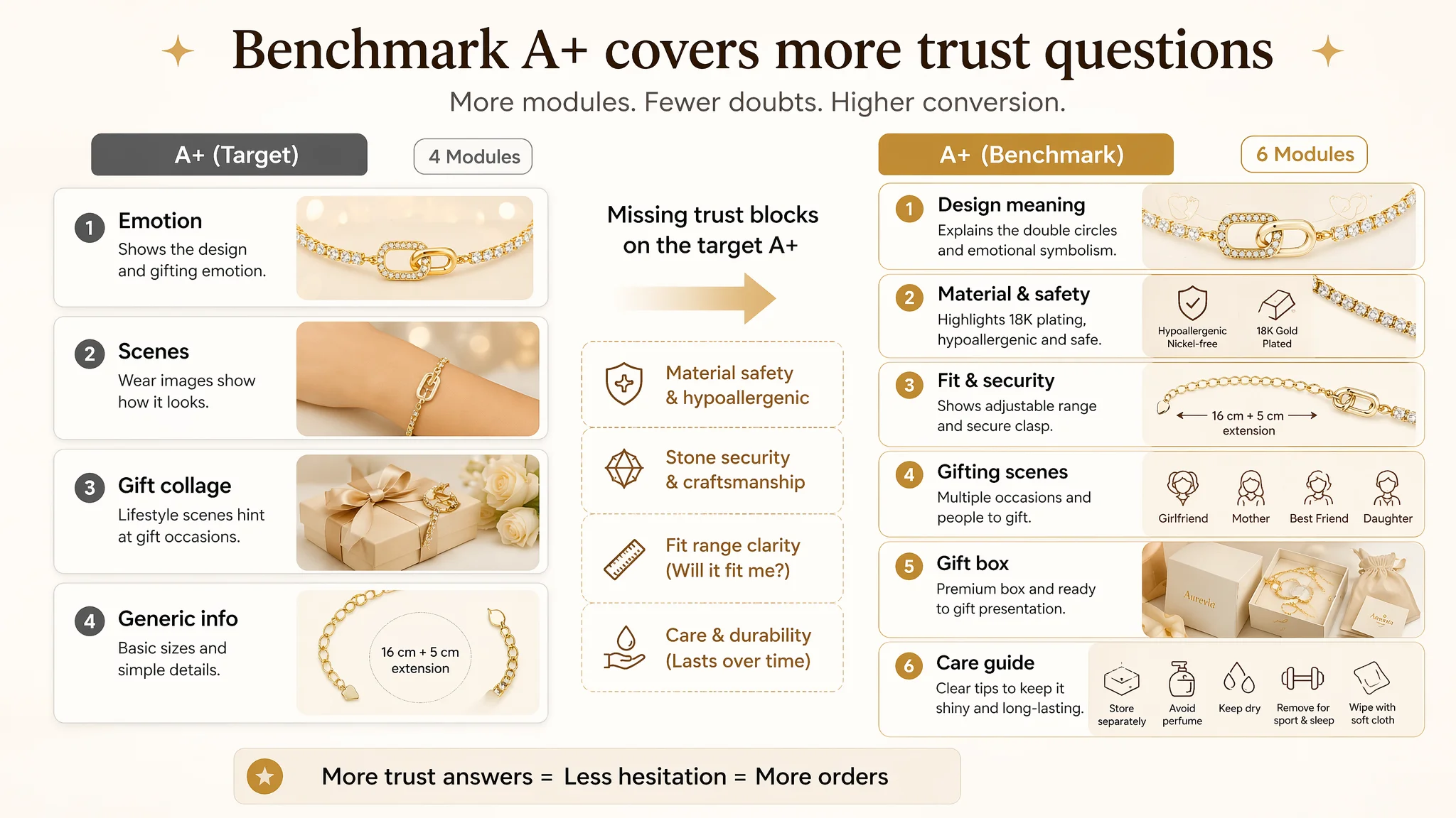
The result: buyers had to fill in too many blanks themselves. For jewelry, that hesitation is enough to stall conversion, especially when a competitor offers a more complete “trust narrative” on the same Amazon search page.
Title and Main Image: Subtle Gaps That Matter in Search
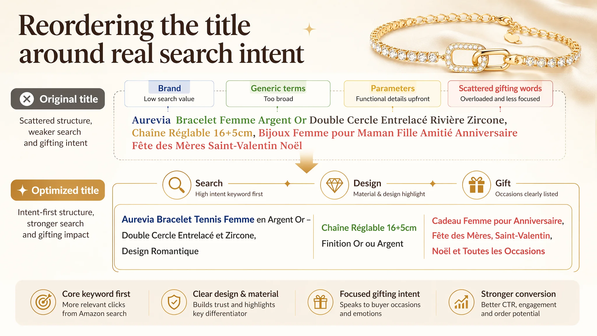
The title traded away emotional pull for raw detail
Compared with the benchmark, the target title on Amazon France had several patterns:
- Led with brand + generic “bracelet femme argent or” instead of leading with material precision and design concept.
- Mentioned “double cercle entrelacé” and adjustable chain, but did not highlight:
- Professional material detail like “18 carats”
- Stronger gemstone framing such as “zircone cubique”
- Listed gifting scenes and relations in a slightly overloaded, less fluid structure (“Bijoux Femme pour Maman Fille Amitié…”), making it harder to grab the core value in the first seconds of scanning.
The benchmark title, by contrast:
- Front-loaded 18K plating and the design concept.
- Wove emotional and romantic language into the main phrase.
- Covered “bracelet femme”, “cadeau femme”, and major holidays in a tight, readable flow.
From a business standpoint, that meant:
- The target Listing was present in search, but its click magnet was weaker.
- A portion of high-intent traffic in Amazon search results was captured earlier by the competitor’s more emotionally and materially precise title.
The main images showed the product, but not the buying reason
On the main image set, the scoring gap was small (-2), but the logic gap was bigger:
- The first image:
- Showed the bracelet, the chain, and heart charm.
- But the “double intertwined circles”—the true symbolic and design differentiator—was not visually dominant.
- The adjustable chain occupied too much visual attention for a first glance.
- Wear images:
- Showed how it looks on the wrist.
- But they did not zoom in on the claw setting or highlight AAA+ zircons in a way that directly fights the “stones falling out” industry worry.
- Color/variant images:
- The competitor used multi-color composition to build choice and credibility.
- The target Listing did not clearly exploit the available gold/silver finishes as a visible “choice driver”.
- Dimension image:
- Mixed multiple small visuals and French text (“16 cm + 5 cm de rallonge”), but lacked a clear numeric wrist-range (e.g., “fits X–Y cm wrists”) in a strong, central callout.
- Gift image:
- Suggested gifting, but did not clearly show the premium gift box in a close, high-trust way comparable to the benchmark.
- The “ready-to-gift” promise remained emotionally implied, not visually proven.
In Amazon search results and on the first fold of the product page, these weaknesses add up to fewer clicks and less immediate trust—exactly where ad traffic lands first.
Why Continuing to Tune Amazon Ads Would Not Solve This
From DeepBI’s perspective, the decision order was straightforward:
1. Ads were already bringing traffic.
2. The Listing’s relative score vs the benchmark showed structural conversion disadvantages.
3. Pushing more spend into the same page would scale the conversion leak, not close it.
“Advertising does not only amplify advantages. It can also amplify a page’s existing defects.”
If the team had continued focusing on ad knobs:
- ACOS pressure would remain high or even worsen.
- Any temporary gain from bid tweaks would be fragile, because the core decision logic on the page had not changed.
- Organic ranking potential would be limited, since Amazon’s algorithm responds to sustained conversion performance, not just temporary paid traffic spikes.
This is why DeepBI argued that Listing conversion had to be repaired first. Only after the page begins to handle traffic better—both organic and paid—does it make sense to talk about scaling spend.
How DeepBI Reframed the Problem and Prioritized the Fix
DeepBI’s role here was not to “improve creatives” in isolation, but to rebuild the business logic of the Listing step-by-step.
1. Define the true bottleneck
- The largest single gap: A+ detail page (-6 vs benchmark).
- Supporting gaps: title, main image, bullets, review volume.
- Combined effect: buyers got insufficient rational reassurance to match the emotional promise.
Thus, the true bottleneck at this stage:
The product page could not fully convert the traffic it was already receiving, especially for gifting and higher perceived value.
2. Decide what not to prioritize first
- Do not start by endlessly re-tuning ads.
- Do not chase reviews as the first lever (rating quality was already high; the problem was trust narration, not star count).
- Do not rely on generic “nicer photos” without aligning them to decision points (fit, durability, safety, gifting, care).
3. Rebuild the Listing’s sales logic
DeepBI focused on three connected layers of the Amazon product page:
1. Title – to protect search visibility and click intent.
2. Main images – to create an immediate visual and rational reason to click/add to cart.
3. A+ content – to close the loop with structured trust and usage logic.
This Product Page Did Not Lack Traffic. It Lacked Trust.
Title: From scattered information to prioritized intent
The proposed French title reorders and refines the logic:
Bracelet tennis femme en argent or – double cercle entrelacé et zircone, chaîne réglable 16+5 cm, bijou cadeau femme pour anniversaire, Fête des Mères, Saint-Valentin, Noël
Key shifts:
- Front-loading “bracelet tennis femme” as a core traffic keyword.
- Keeping “double cercle entrelacé” and “zircone” as design and material anchors.
- Keeping the adjustable chain (16+5 cm) but structured as a clear, concise spec, not clutter.
- Grouping gifting festivals cleanly to support “gift intent” searches in French.
Business impact:
- Maintain relevance for Amazon A9 while improving first-scan clarity for human readers.
- Strengthen the “this is a proper gift bracelet for women” message directly in search results.
Bullet points: From emotional phrases to “pain point → solution” logic
The bullet-point optimization focused on building a complete buying path:
1. Design symbolism and visual impact
- Emphasize the “double intertwined circles” as a symbol of eternal bond.
- Tie it to both everyday elegance and special occasions.
2. Material and safety reassurance
- AAA+ cubic zirconias with strong light refraction.
- Professional claw setting (not glued) for durability.
- Nickel-free and hypoallergenic for sensitive skin.
3. Emotional gifting value
- Not just “for Valentine’s Day”, but “a way to transmit sincere emotions” to wife, partner, mother, best friend.
- Shift from listing occasions to defining it as an emotional connector.
4. Size and packaging
- Clear explanation of 16+5 cm adjustable range, fitting thin to standard wrists.
- Emphasize elegant gift box, “ready to offer”, promising a “wow” effect on opening.
5. Service as a brand promise
- Move from “contact us if you have questions” to explicit satisfaction commitment and professional assistance.
In short: bullets stop being just a list of features and become a sequence of reassurances, each targeting a specific concern the benchmark was already addressing.
Main Images: Turning Visuals into Conversion Arguments
DeepBI’s visual judgment was not “make it prettier”, but “assign each image a conversion role”.
Image 1: Make the design meaning visible
- Refocus composition so the intertwined double circles dominate the frame.
- Use high-quality close-up to show the two independent rings and their interlocking form.
- Relegate the extension chain to a secondary role.
- Optionally, add a short, tasteful French phrase hinting at eternal bond.
Role: Immediate design differentiation and emotional hook in search results and first fold.
Image 2: Show wear + durability in one frame
- Use a more elegant hand posture and angle.
- Add an inset close-up of claw-set stones with French labels:
- “Zircones cubiques AAA+”
- “Pierres serties par griffes”
- “Sans nickel, hypoallergénique”
Role: Bridge beauty, comfort, and durability—the three things buyers worry about most in jewelry.
Image 3: Visualize choice, not repetition
- Replace a redundant wear image with side‑by‑side gold and silver versions.
- Focus again on the double-circle element in each finish.
Role: Build perceived assortment and professionalism, reducing doubts like “Is this really available in this color?”
Image 4: Resolve the size anxiety clearly
- One main close-up showing clasp + full 16+5 cm adjustable chain.
- Large, numerical callouts:
- “16 cm + 5 cm extension”
- “Convient aux poignets de X–Y cm” (once range is confirmed).
- Secondary close-ups for heart charm and claw-setting details.
Role: Kill the “will it fit?” hesitation before it blocks purchase.
Image 5: Prove “ready-to-gift” with the box
- Strong focus on the elegant gift box in hand or on a soft background.
- Clear textual overlay in French for “ready to offer” and main gifting occasions.
Role: Turn gifting from an idea into a concrete, safe choice—buyers see exactly what will be received.
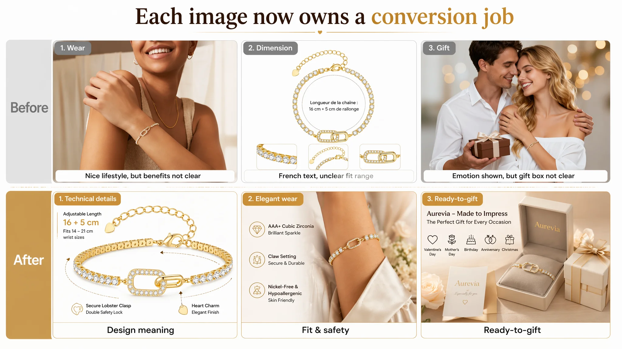
With this structure, each image supports a distinct step in the conversion funnel, instead of loosely repeating similar visuals.
A+ Detail Page: From Four Generic Blocks to a Seven‑Module Trust Chain
The largest gap vs the benchmark was the A+ detail page. DeepBI’s judgment: before ads could become efficient, the page needed a full sales narrative.
The restructured A+ logic:
Module 1 – Design meaning first, not last
- Hero banner focused on the double intertwined circles, explained as a symbol of an eternal bond—romantic or familial.
- Objective: secure the identity of the product as “a meaningful gift”, not just another bracelet.
Module 2 – Material safety and comfort
- Dedicated visuals showing skin contact, with clear statements:
- Nickel-free
- Hypoallergenic
- Comfortable for daily wear.
Objective: remove the generic jewelry fear of allergy or irritation.
Module 3 – Sparkle and durability (AAA+ zircon + claw setting)
- Macro shots of stones and settings.
- Text: AAA+ cubic zirconias, high brilliance, handmade claw-setting (not glued).
- Directly address the “stones falling out” pain point common in reviews across the category.
Objective: replace “trust me” with visible, concrete proof of quality.
Module 4 – Fit range as a competitive weapon
- Strong visual and text focus on 16+5 cm wide adjustment.
- Implicit comparison to typical 4 cm extensions in the category (without naming brands).
- Clear statement: suitable for a wider range of wrist sizes.
Objective: turn a technical attribute into a decisive buying reason, especially for gift buyers who don’t know exact wrist size.
Module 5 – Gifting scenarios and recipients
- Multiple lifestyle scenes: partner, mother, friend, daughter, graduate.
- Each labeled clearly with occasion or relationship.
Objective: help buyers “place” the bracelet in their own gifting context.
Module 6 – Gift box and “ready to offer” status
- High-quality image of the gift box, interior and exterior.
- Copy emphasizing no extra wrapping needed and an expected “wow” moment.
Objective: remove remaining friction around presentation quality.
Module 7 – Care guide and long-term expectations
- Simple icon-based care instructions:
- Avoid perfume and cosmetics
- Remove before sport/sleep
- Store separately
- Wipe with soft cloth
- Avoid excessive heat/humidity
- Framing: not as a warning, but as a guide to keep the bracelet beautiful longer.
Objective: lower long-term durability anxiety and preempt potential complaints about plating behavior over time.
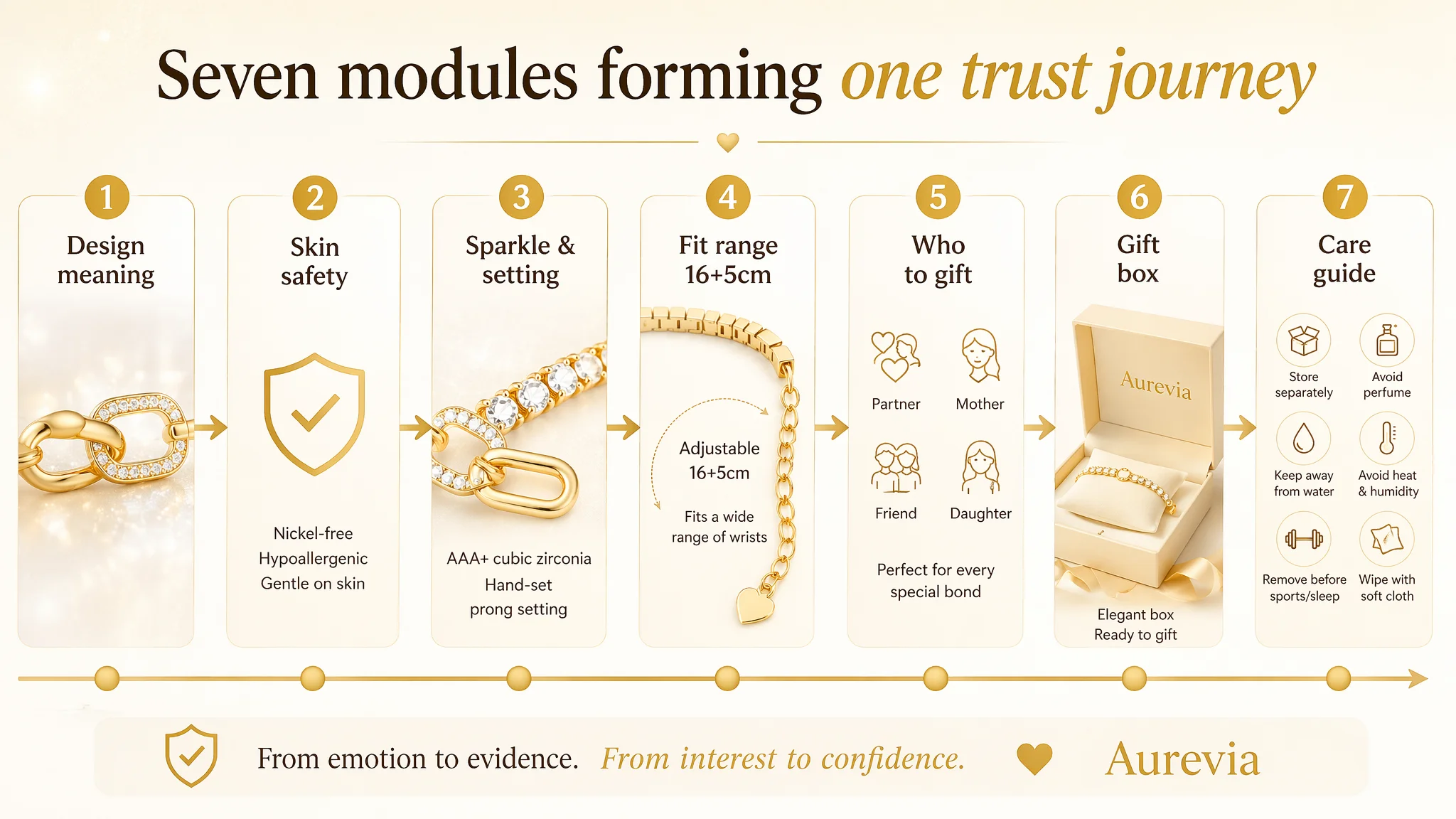
Once implemented, this structure gives the page a clear path:
1. Emotion: This is a meaningful, beautiful gift.
2. Safety: It’s safe and comfortable.
3. Quality: It’s bright and built not to lose stones.
4. Fit: It will actually fit.
5. Gifting: It’s suitable for the person I have in mind.
6. Readiness: I don’t need extra packaging work.
7. Longevity: I understand how to take care of it.
Reviews: High Rating, Low Volume – What It Really Meant
On paper, the review picture looked good:
- Target Listing: 4.8 stars, 8 total reviews, no negative feedback.
- Benchmark: 4.5 stars, 70+ reviews, some 4-star comments.
The instinctive conclusion could have been: “Our reviews are better.” DeepBI instead read it differently:
- The competitor’s larger review volume created much stronger social proof.
- On Amazon, many buyers trust a slightly lower rating with far more reviews over a near‑perfect rating with very few reviews.
- With a less persuasive title, images, and A+, the target Listing’s smaller review base made it harder to overcome hesitation.
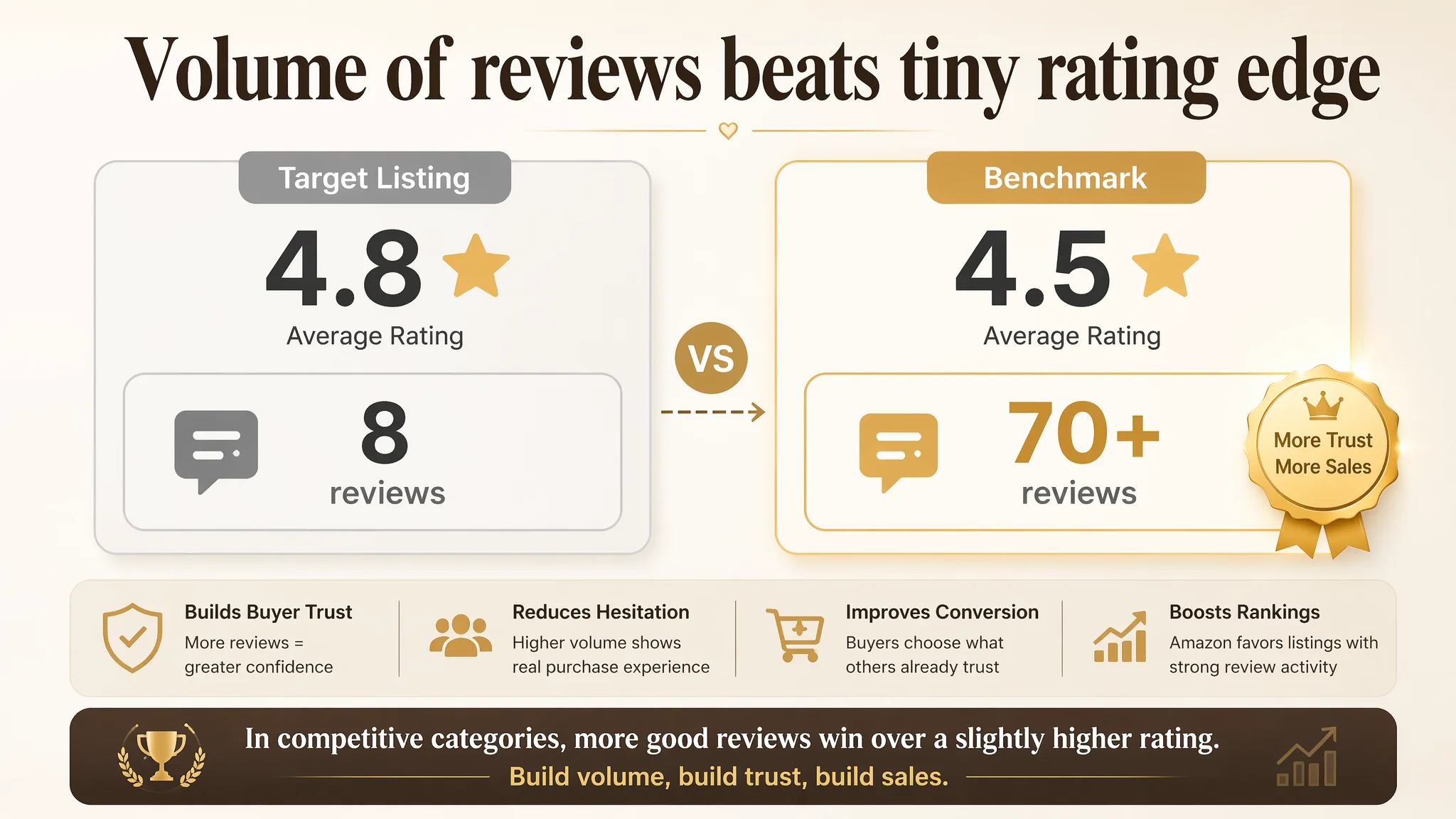
DeepBI did not push for artificial review-chasing. Instead, the logic was:
- Fix the page first so that existing and incoming traffic converts better.
- As more orders are completed, legitimate reviews accumulate.
- Over time, review volume then becomes a by‑product of a stronger conversion engine, not an isolated goal.
How the Operating State and Understanding Changed
Even without fabricating numeric results, we can describe the shift in operating state once this logic is applied:
- Listing conversion capacity improves:
- Buyers see clearer fit, durability, and safety proofs.
- Emotional gifting logic is supported by rational content.
- Ad traffic becomes useful again:
- The same or even lower ad spend can start producing more orders.
- ACOS has room to move down because the page now “holds” the traffic better.
- Dependence on aggressive ad tuning decreases:
- Campaign management remains important, but it is no longer blamed for every performance issue.
- Organic orders can recover as Amazon’s algorithm sees more consistent conversions.
- Risk profile changes:
- Less money is burned sending traffic to a half‑persuasive Listing.
- The core assets (title, main images, A+) are more resilient to competition.
Most importantly, the seller’s mental model evolves:
- From: “Our ads are not good enough; we must push harder.”
- To: “Our product page was not yet deserving of more traffic; we must make it convert.”
And that is where DeepBI’s true value sits in this case: not in generating assets, but in correcting the judgment about where the real Amazon bottleneck was.
What Other Amazon Sellers Can Take Away
For Amazon sellers—especially in gift-driven categories like jewelry, beauty, and premium accessories—this case highlights several practical judgments:
- High rating with low review volume is not enough if the page logic is weaker than a benchmark competitor.
- Amazon ads cannot compensate for a Listing that under-explains fit, safety, and durability; they will only amplify the gap.
- Title, main image, bullets, and A+ must be treated as a single conversion system, not separate tasks.
- Before scaling spend, it is crucial to ask:
- Does the title win the click against top competitors?
- Does the first image clearly state what makes this product different?
- Does the A+ walk buyers through every major concern in a structured way?
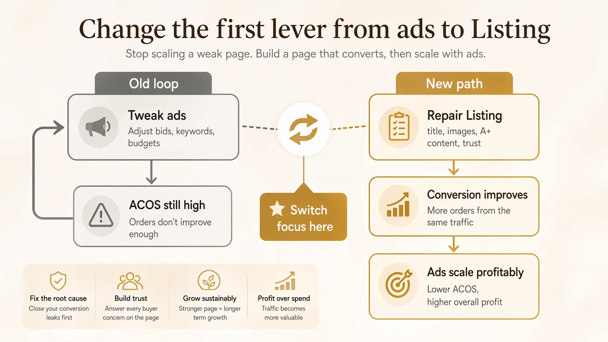
When those answers are solid, advertising becomes an accelerator instead of a spotlight on weaknesses. That is the shift this Amazon jewelry seller had to make—and the shift many others will need to consider as ad costs rise and Listing conversion becomes the true competitive edge.