

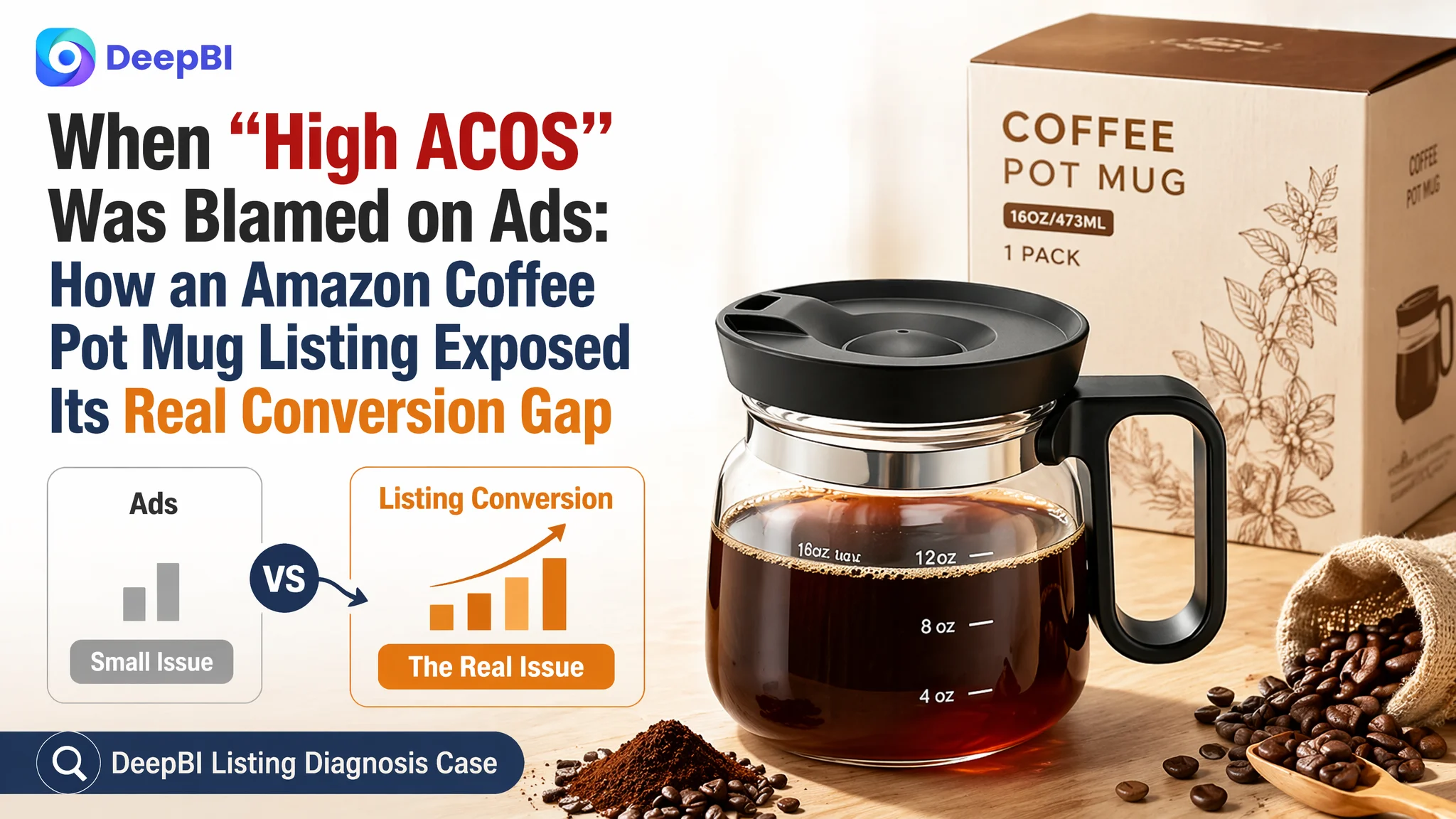
This Amazon seller operates a novelty glass coffee pot mug in the US marketplace. Faced with rising Amazon ad costs and unstable returns, the team instinctively treated the issue as an advertising problem: bids, keywords, and campaign structure. But when they finally compared their Amazon Listing to a directly competing coffee pot mug, it became clear the ads were only amplifying a deeper product-page weakness.
DeepBI’s Listing diagnosis showed that the core gap was not traffic volume but conversion capacity: the competitor’s title, main images, and A+ detail page formed a much tighter buying logic, especially around “spill-proof”, “heatproof glass”, and “giftability”. The customer’s page leaned on nostalgic “looks like a coffee pot” wording and emotional gift language, but failed to deliver visual proof and structured information where Amazon shoppers make decisions.
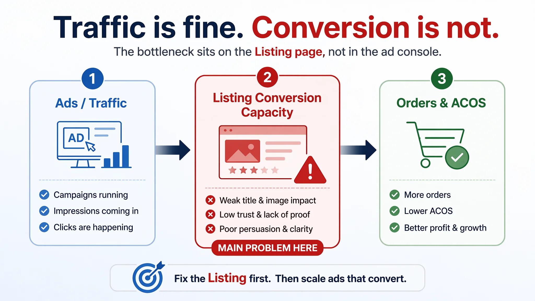
Once the team stopped over-tuning ads and instead rebuilt the listing around concrete functional claims, visualized proof (heat range, spill-proof structure), and clear multi-scenario use (office, travel, gifts), both trust and relevance on the page improved. For other Amazon sellers, this case is a reminder: when ACOS feels unmanageable, the first question is not “which keyword is wrong”, but “does my Listing actually deserve the traffic I’m buying?”.
The Problem Did Not Start in Amazon Ads
The product is a 16 oz glass coffee pot mug—essentially a novelty mini coffee pot for coffee lovers.
The seller’s Amazon ads had traffic. The category is not extremely niche, and sponsored placements could bring exposure. But the economics were unstable: ACOS was uncomfortable, and additional spend failed to unlock proportional order growth.
From the seller’s own perspective, this looked like a standard ad-optimization challenge:
- “Maybe we haven’t found the right keywords.”
- “Maybe bids are not precise enough.”
- “Maybe we should split more campaigns and refine match types.”
So the operational work gravitated toward the ad console. The Listing was treated as “good enough”: professional photos, a coherent title, some lifestyle shots, an A+ section already online. Nothing screamed “broken”.
DeepBI’s scoring changed that perception in one screen.
“The real problem was not that ads failed to bring traffic. It was that the page could not convert the traffic.”
What the Data Actually Said: A 72 vs 85 Listing Gap
When DeepBI scored the product page against a highly comparable benchmark coffee pot mug on Amazon US, the numbers were clear:
- Target Listing total score: 72 / 100
- Benchmark Listing total score: 85 / 100
- Gap: -13 points
Breaking it down by conversion-critical dimensions:
- Title: Target: 13, Benchmark: 16, Full Score: 20, Gap: -3
- Main image set: Target: 23, Benchmark: 26, Full Score: 30, Gap: -3
- Bullet points: Target: 8, Benchmark: 7, Full Score: 10, Gap: +1
- Detail / A+: Target: 19, Benchmark: 23, Full Score: 25, Gap: -4
- Reviews: Target: 9, Benchmark: 13, Full Score: 15, Gap: -4
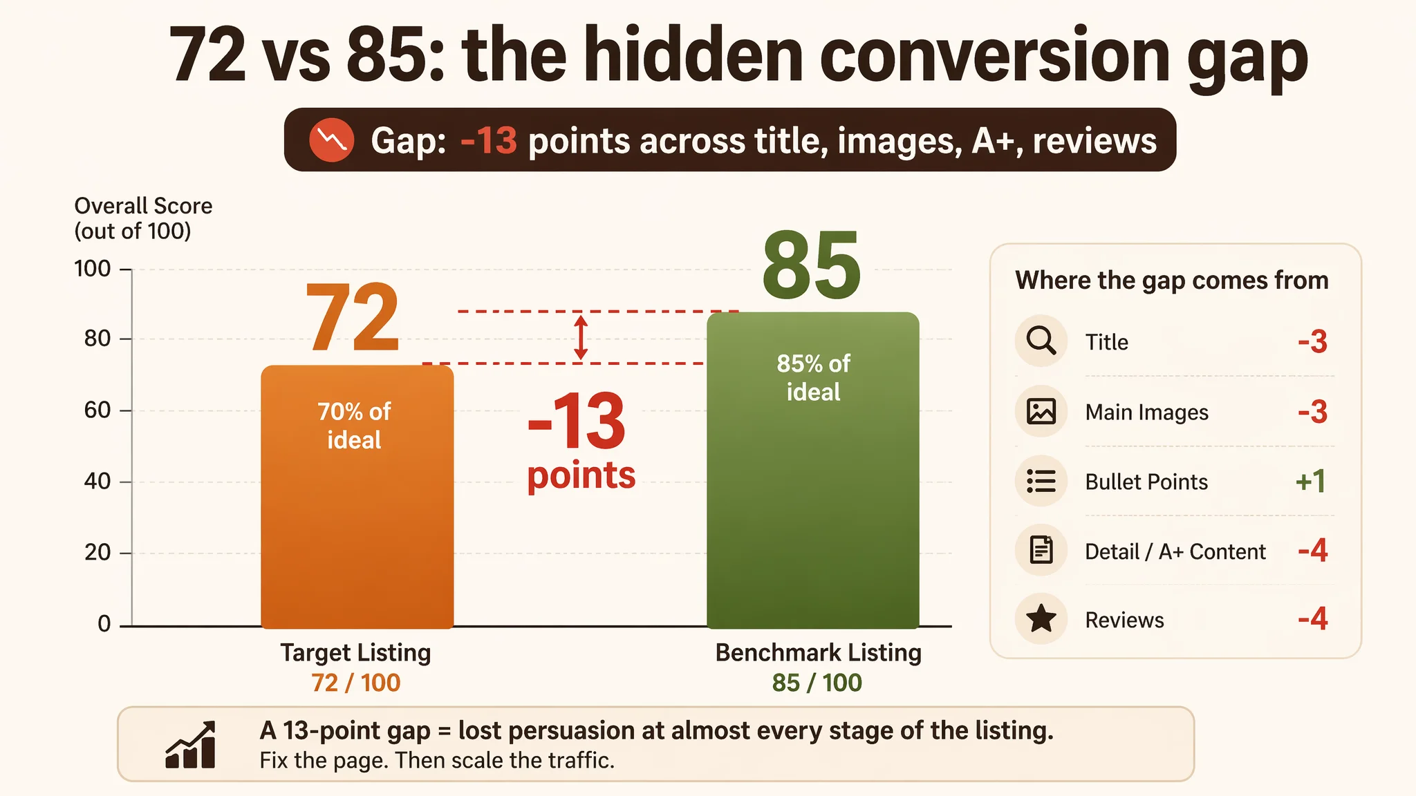
On paper, 72/100 does not look disastrous. But the benchmark at 85/100 was what shoppers actually saw as the “category standard” for this niche. That 13-point gap describes lost persuasion at almost every stage of the Amazon product page.
The most misleading part for the seller:
- Star rating was excellent at 4.7, almost identical to the benchmark’s 4.8.
- But review volume was only 9 vs the competitor’s 84—about 10% of the social proof scale.
From the seller’s vantage point: “Our rating is fine, the images don’t look bad; why are ads still expensive?” From DeepBI’s vantage point: “You’re paying to send traffic into a page that underperforms its benchmark in almost every persuasion module.”
The Original Misdiagnosis: Treating ACOS as a Pure Ad Issue
The customer had fallen into a familiar Amazon pattern:
1. Symptom: ACOS felt high, returns on incremental spend were weak.
2. Assumption: “This is an advertising problem.”
3. Default response:
- Add or tweak keywords.
- Adjust bids.
- Experiment with campaign structures.
- Pause “underperforming” terms.
What was missing was a hard look at what happens after the click.
There was no structured comparison with a strong competitor at the Listing level. The team understood their product and its novelty value, but not how convincingly the Amazon page walked a stranger through:
- What is this?
- Why is it better than a normal mug?
- Why should I trust its safety and durability?
- Why is it worth gifting?
Without that clarity, every extra dollar in ads made the same mistake slightly larger.
Amazon Ads Were Not Failing. The Page Was Consuming the Traffic.
From DeepBI’s Listing data, the core constraint emerged:
The real constraint was Listing conversion capacity, especially trust and decision logic—not lack of ad refinement.
Three modules told the story.
1. Title: Emotional Charm vs. Search Intent and Functional Clarity
The original title led with the brand name and a literary phrase:
- Brand at the very front.
- Phrase like “Looks Like a Coffee Pot” taking precious title space.
- “for Caffeine Lovers” tucked later as a looser, emotional target.
The benchmark Listing, by contrast:
- Opened directly with “16 Oz Glass Mini Coffee Pot Mug”—exact shopper language.
- Highlighted “Spill Proof Lid”, “Heatproof Clear Coffee Pot Cup”.
- Clearly anchored usage: “for Travel & Office”.
In Amazon terms:
- The benchmark’s title was search-intent aligned and function-forward.
- The target title was brand-forward and literary, which may delight some readers but weakens both keyword coverage and immediate perceived utility.
DeepBI’s judgment was straightforward: before tuning ads, the title had to be restructured to align with how shoppers and Amazon’s algorithm actually think.
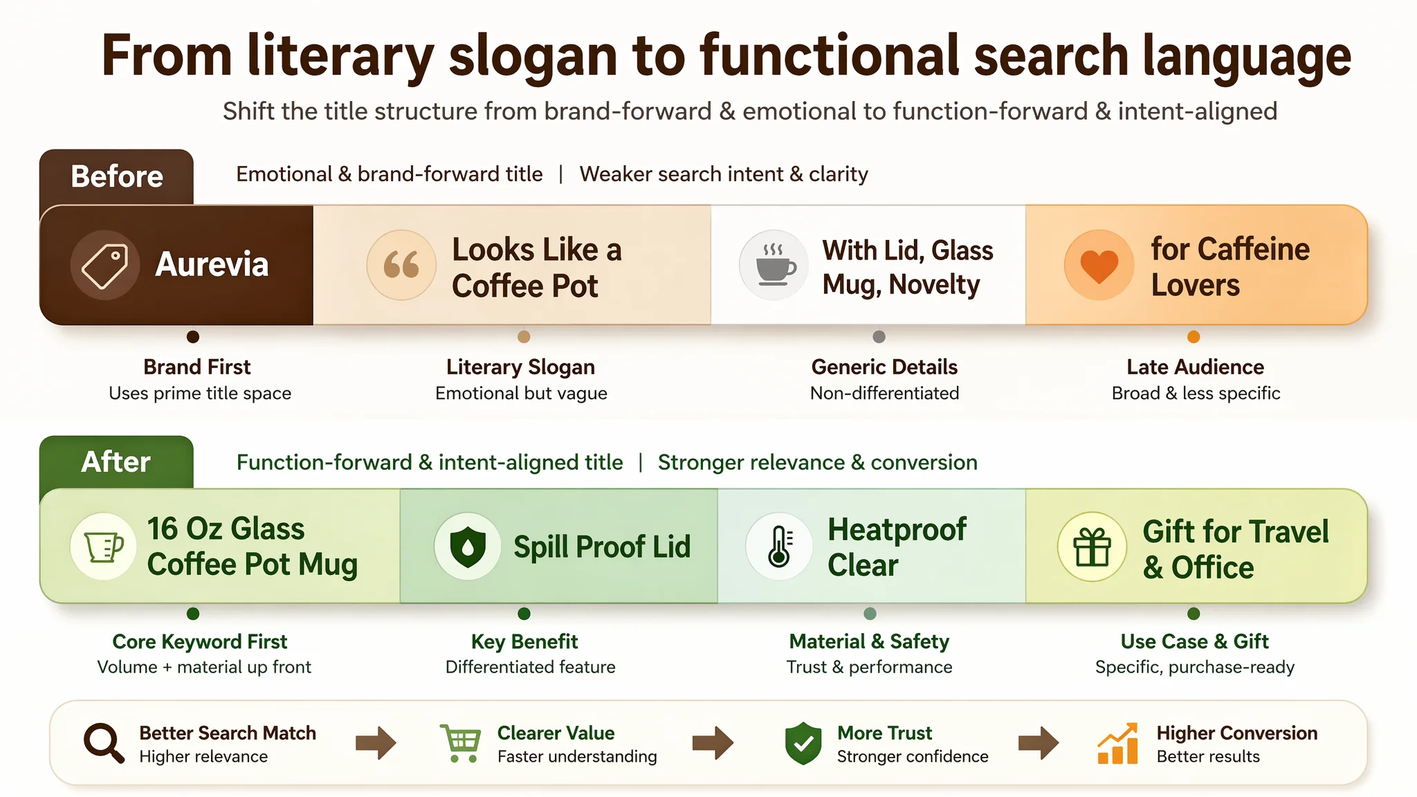
The proposed direction:
“[Brand] 16 Oz Glass Coffee Pot Mug with Spill Proof Lid, Mini Brewer Style Heatproof Clear Coffee Cup, Novelty Coffee Gift for Travel, Office and Coffee Lovers, 1 Pack”
Key shifts:
- Core keyword + material (“16 Oz Glass Coffee Pot Mug”) appear early.
- Concrete functional terms: “Spill Proof Lid”, “Heatproof”, “Clear”.
- Keep “gift” and “coffee lovers”, but anchor them after practical scenarios (“Travel, Office”).
This change is not just SEO. It reframes the product from “cute idea” to “practical, safe, giftable glass mug” in a single line.
2. Main Images: Aesthetically Fine, Commercially Underpowered
Both Listings had professional photos. But the benchmark’s image stack did far more work:
- Hero image: Product + packaging + coffee beans. Instantly:
- Signaled “proper gift”.
- Strengthened perceived brand legitimacy.
- Additional images:
- Real dishwasher photo.
- Visual hot–cold differential to prove heat resistance.
- Multiple scenarios: office, home kitchen, outdoor picnic, gift-giving.
The target Listing:
- Hero image: product-in-hand, clean but no packaging or gift context.
- Heavy reliance on text overlays to communicate attributes (e.g., heatproof, dishwasher safe), instead of using iconography and visual evidence.
- Scenes focused on individual use at home/office, without strong coverage of:
- Multi-person sharing
- Clear “gift unboxing” visuals
- Side-by-side proof of advantages vs. a regular mug
Result: Even if ad CTR wasn’t catastrophic, clicks were relatively more expensive because the main image did not immediately create the same “I want this” response or “this is a proper gift” impression.
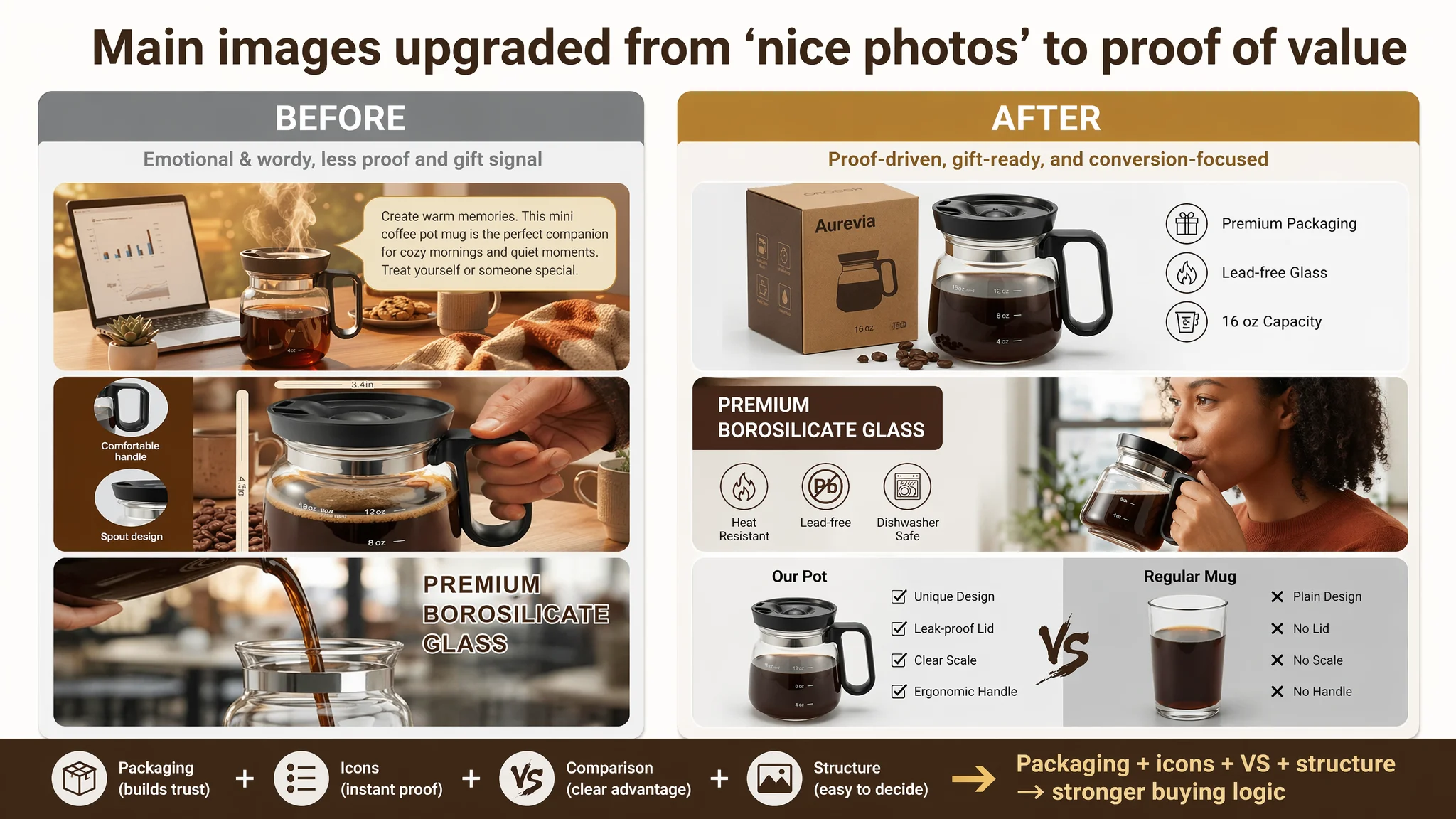
DeepBI’s analysis translated into concrete main-image decisions, not vague “make it prettier” requests:
- Hero image:
- Product centered, ~70% of frame, 45° side view.
- Remove hand; show the mug staged, with brand packaging box behind it.
- Scatter a few coffee beans at the base; controlled lighting to emphasize glass clarity.
- Scene image:
- Office use, human drinking on one side; clean typography on the other highlighting “Premium Borosilicate Glass” with icons for Heat Resistant / Lead-free / Dishwasher Safe.
- Gift image:
- Warm table, headline “THE ULTIMATE GIFT FOR COFFEE LOVERS”, plus small circles showing different drinks (milk, tea, juice, coffee) to signal versatility.
- VS comparison image:
- Left: “Our Pot” with scale markings and spill-proof lid.
- Right: plain glass mug without lid, no markings.
- Simple checklist: Unique Design vs Plain, Leak-proof Lid vs No Lid.
These were not aesthetic whims; they were conversion hypotheses tied to known shopper doubts:
- “Is this more than just a cute glass?”
- “Is it really spill-proof?”
- “Is it better than my regular mug?”
- “Is it gift-worthy?”
3. Detail / A+ Page: Too Much Text, Not Enough Visual Proof
On the A+ detail page, the contrast was stark.
The benchmark Listing:
- Opened with a strong visual banner: product as hero, emotional but information-rich.
- Used iconized selling points and numeric visualization:
- Temperature range (e.g., from hot to cold).
- Precise dimensions.
- Included a structure breakdown:
- Spill-proof lid.
- Borosilicate glass body.
- Non-slip handle.
- Clear measurement scale.
- Dedicated gift module:
- Different recipient types (friend, parents, partner, colleague).
- Gift box visuals.
The target Listing:
- Modules existed: style/design image, material detail, multi-scenario use.
- But:
- Heavy use of paragraph text in images instead of quick-scan visual blocks.
- No strong, cinematic banner anchored on the “retro diner pot” concept.
- No heat range visualization (hot vs cold in one shot).
- No clear structural breakdown of handle, lid, spout, scale.
- Gift angle mostly verbal, not visually dramatized.
For mobile Amazon shoppers, that distinction is critical: Text-heavy layouts are easy to swipe past. Visual logic, not paragraphs, closes the deal.
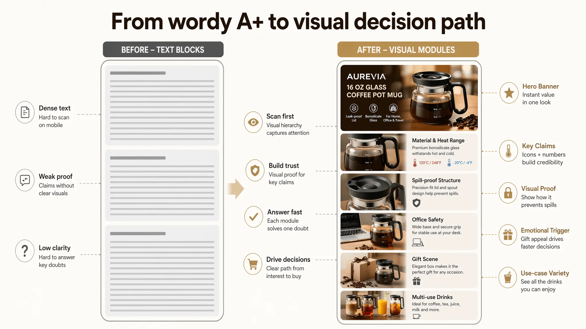
DeepBI’s guidance focused on re-architecting the A+, not just “adding more pictures”:
- Opening banner:
- Retro American diner café background, mug centered with foamy coffee.
- Lighting that frames the nostalgic “mini coffee pot” silhouette.
- No text covering the product, to cement an iconic mental image.
- Core material & safety module:
- Side-by-side composition: iced cold brew on one side, steaming hot coffee on the other.
- Clearly visible scale marks (4 oz, 8 oz, 12 oz).
- Visual demonstration of heat range support.
- Spill-proof lid close-up:
- Micro shot of lid and spout angle, focusing on the seal and opening design.
- Emphasis on real structural details, not imaginary features.
- Office spill anxiety module:
- Mug closed, sitting close to a laptop and documents.
- Composition highlights the wide, stable base, tapping into “don’t spill on my MacBook” fear.
- Ergonomic grip module:
- Real hand holding the handle, showing weight and grip comfort.
- Gift module:
- Mug next to a minimalist gift box, soft backdrop, a few coffee beans scattered.
- Visually aligned with the bullet point “THE ULTIMATE GIFT FOR ENTHUSIASTS”.
- Multi-use module:
- Split frame: coffee on one side, orange juice or tea on the other.
- Same mug position; different drinks to show transparency and versatility.
The goal: turn abstract claims (“retro design”, “heat-resistant”, “spill-proof”, “great gift”) into visual facts.
Bullet Points: Emotionally Strong, but Needed Functional Spine
Interestingly, DeepBI’s scoring showed the target Listing’s bullet points were not the weakest module. In some ways they were more emotionally engaging than the benchmark’s.
But they still lacked a coherent “pain point → solution → result” structure around the critical functions Amazon shoppers care about in glass mugs:
- Safety under temperature shock.
- Real spill-proof performance at a desk.
- Capacity and comfort in daily use.
- All-season drink versatility.
- Gift scenarios that feel specific, not generic.
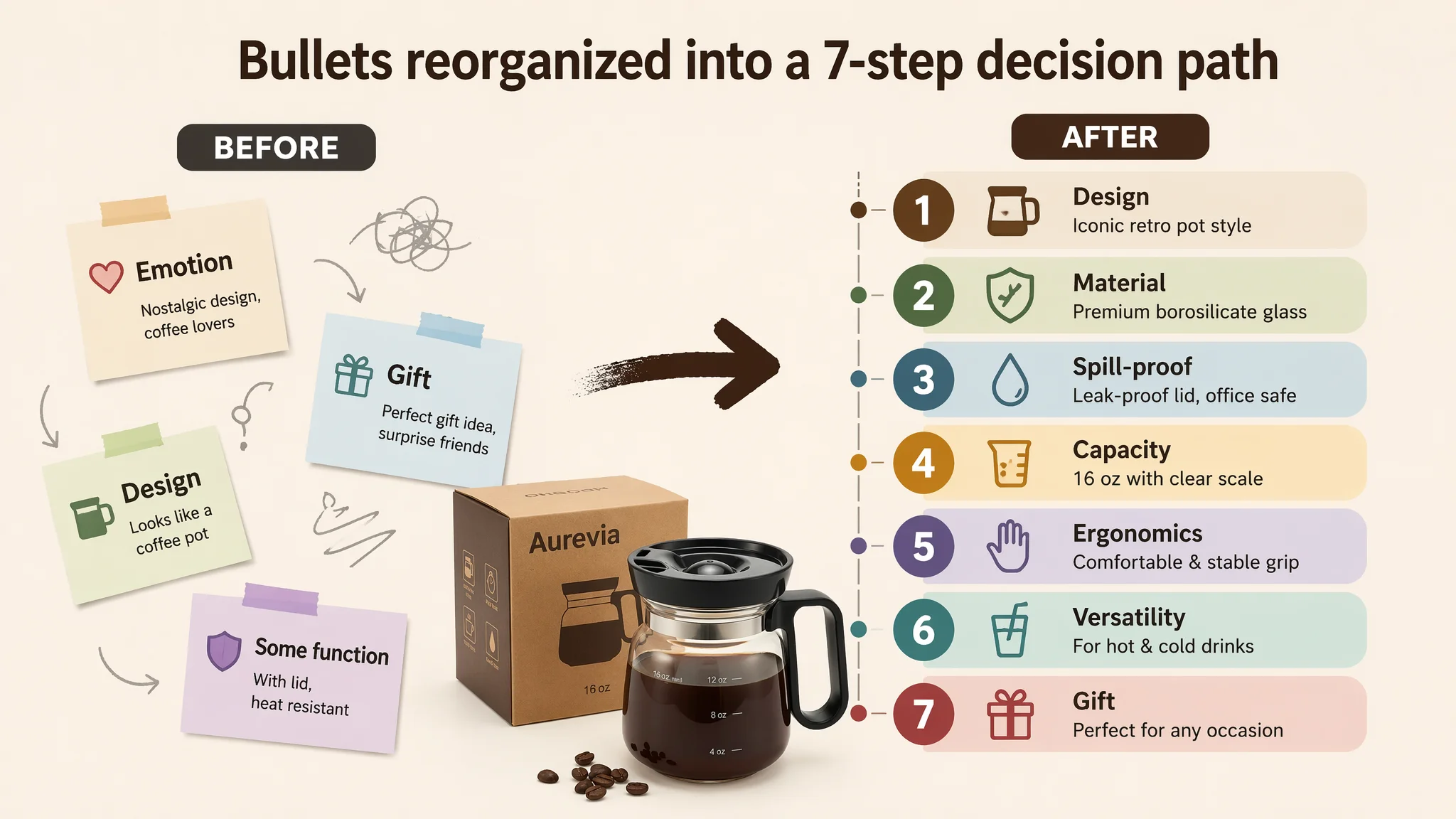
DeepBI’s restructuring sharpened each bullet into a distinct, scan-friendly pillar:
1. ICONIC RETRO DINER DESIGN
- Own the “mini coffee pot” aesthetic and emotional nostalgia.
- Make the desk or kitchen feel like a movie scene.
2. PREMIUM BOROSILICATE GLASS
- Spell out temperature shock tolerance (expressed as a range, aligned with what the brand can support).
- Emphasize clarity, odor-free use, dishwasher safe.
3. SPILL-PROOF & OFFICE READY
- Tie directly to busy, device-filled workspaces.
- Mention lid fit and reusable straw for extra value.
4. 16 OZ GENEROUS CAPACITY
- Connect volume to common drinks (latte, cappuccino, tea) and “less refilling”.
5. ERGONOMIC & STABLE GRIP
- Anchor ergonomic handle and base stability as safety + comfort.
6. ALL-SEASON VERSATILITY
- Explicitly call out hot chocolate, mulled wine, iced tea, social-media-ready layering.
7. THE ULTIMATE GIFT FOR ENTHUSIASTS
- Make the gift promise tangible: birthdays, housewarmings, holidays, coffee aficionados, retro décor lovers.
This was not about stuffing keywords. It was about building a logical path from bullet #1 to bullet #7 that mirrors how a buyer decides:
- “I like how it looks”
- “Is it safe and durable?”
- “Will it work at my desk?”
- “Is the size right?”
- “Is it comfortable to hold?”
- “Can I use it beyond coffee?”
- “Would it be a cool gift?”
Once that path exists, ad traffic gets something to work with.
Why DeepBI Did Not Recommend “Keep Tuning Ads First”
At this stage, the business risk was simple:
- Every extra dollar of Amazon ads was being spent on a Listing that underperformed a key benchmark across title, main image, A+, and review scale.
- The conversion ceiling was lower than it needed to be, so even perfectly tuned advertising would face diminishing returns.
“Advertising does not only amplify advantages. It can also amplify a page’s existing defects.”
DeepBI’s judgment:
1. Repair Listing conversion foundation first.
- Restructure the title for intent and function.
- Rebuild the main-image stack around visual proof and giftability.
- Rewrite bullets into a proper pain–solution–result sequence.
- Redesign the A+ modules into high-density, easy-scan, visual narratives.
2. Then let ads test the new page.
- With the new assets live, ad spend can start distinguishing:
- Which keywords bring the right traffic.
- How CTR responds to the upgraded hero image.
- How CVR responds to improved trust and clarity.
3. Only after that does deep ad optimization make sense.
- If CVR improves, ACOS becomes more manageable without radical structural ad changes.
- If CTR improves, more affordable clicks expand the testable keyword universe.
The critical shift: Stop expecting ads to fix what is essentially a product-page trust and decision-logic issue.
How the Page’s Sales Logic Started to Recover
Even without claiming specific numbers, we can describe the operational changes once this Listing logic was rebuilt:
- CTR began to respond:
- A more gift-forward, professional hero image was now competitive on the search results page.
- The title spoke the same language as the benchmark: volume, material, spill-proof, office/travel.
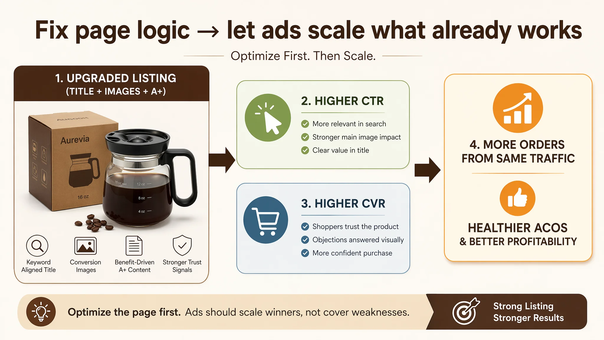
- CVR gained room to improve:
- Shoppers clicking through saw visual proof of:
- Heat resistance via hot–cold imagery.
- Spill-proof structure via close-ups.
- Real-world office safety around laptops.
- All-season drink versatility.
- Gift packaging visuals.
- Review volume and social proof could be grown on a healthier base:
- With more orders landing, the 4.7-star rating could be backed by a steadily increasing count of reviews.
- That started closing the trust gap with the benchmark’s 80+ reviews.
- Traffic structure risk decreased:
- As conversion capacity improved, the Listing became less dependent on brute-force ad spend to generate the same order volume.
- Organic ranking potential rose, because the page now behaved more like the category’s “visual and functional norm”—or better.
In other words, ad spend became useful again, instead of being a magnifier of page-level weaknesses.
What the Seller Ultimately Learned
By the end of this process, the seller’s understanding of “high ACOS” had shifted.
Previously:
- “Our rating is good.”
- “The pictures look fine.”
- “If ACOS is bad, it must be the ads.”
After the Listing diagnosis and rebuild:
- The team saw a 13-point competitive gap on the core product page.
- They realized:
- A great star rating without scale is not enough.
- Professional-looking photos are not the same as conversion-engineered photos.
- An emotional, brand-forward title can quietly weaken both search relevance and on-page clarity.
- A+ content that “has many words” is not the same as trust-building visual logic.
Most importantly, they internalized a simple ordering principle for Amazon operations:
1. Judge whether the Listing deserves more traffic.
- Benchmark it.
- Identify where title, main image, bullets, A+ lag.
2. Fix the core product-page conversion logic first.
3. Then use Amazon ads to scale what already converts, instead of trying to use ads to patch low-conversion content.
For other Amazon sellers, this coffee pot mug case is not about a niche novelty item. It’s about recognizing when “we have an ad problem” is actually “our Listing cannot fully convert the traffic we are already paying for.”
Once that distinction is clear, DeepBI’s role is not to push more features, but to bring the judgment necessary to put the page—not the ads—on the operating table first.