

This case comes from an Amazon seller in the artificial greenery / home decor category. On paper, their Amazon Listing looked “good enough”: a clear title structure, relatively solid main images, and bullet points that even used specific numbers like “98%+ UV” and “1-minute installation”. Yet advertising was getting harder to control, and the team felt they were paying more and more for traffic that did not turn into stable orders.
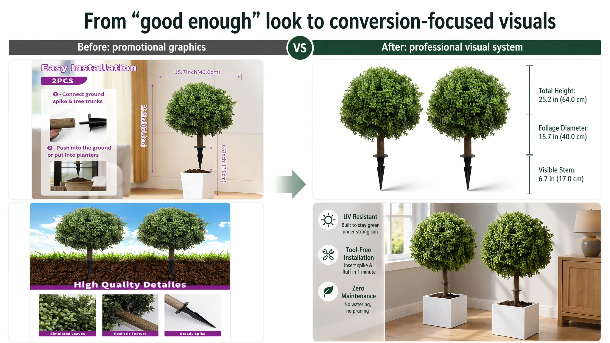
The seller originally believed this was an advertising problem. They focused on keyword coverage, bids, and campaign structure, assuming that “better traffic” or “more traffic” would unlock growth. When this stalled, they turned inward and blamed details like “maybe the main image is not attractive enough” or “we need to tweak the bullets again.”
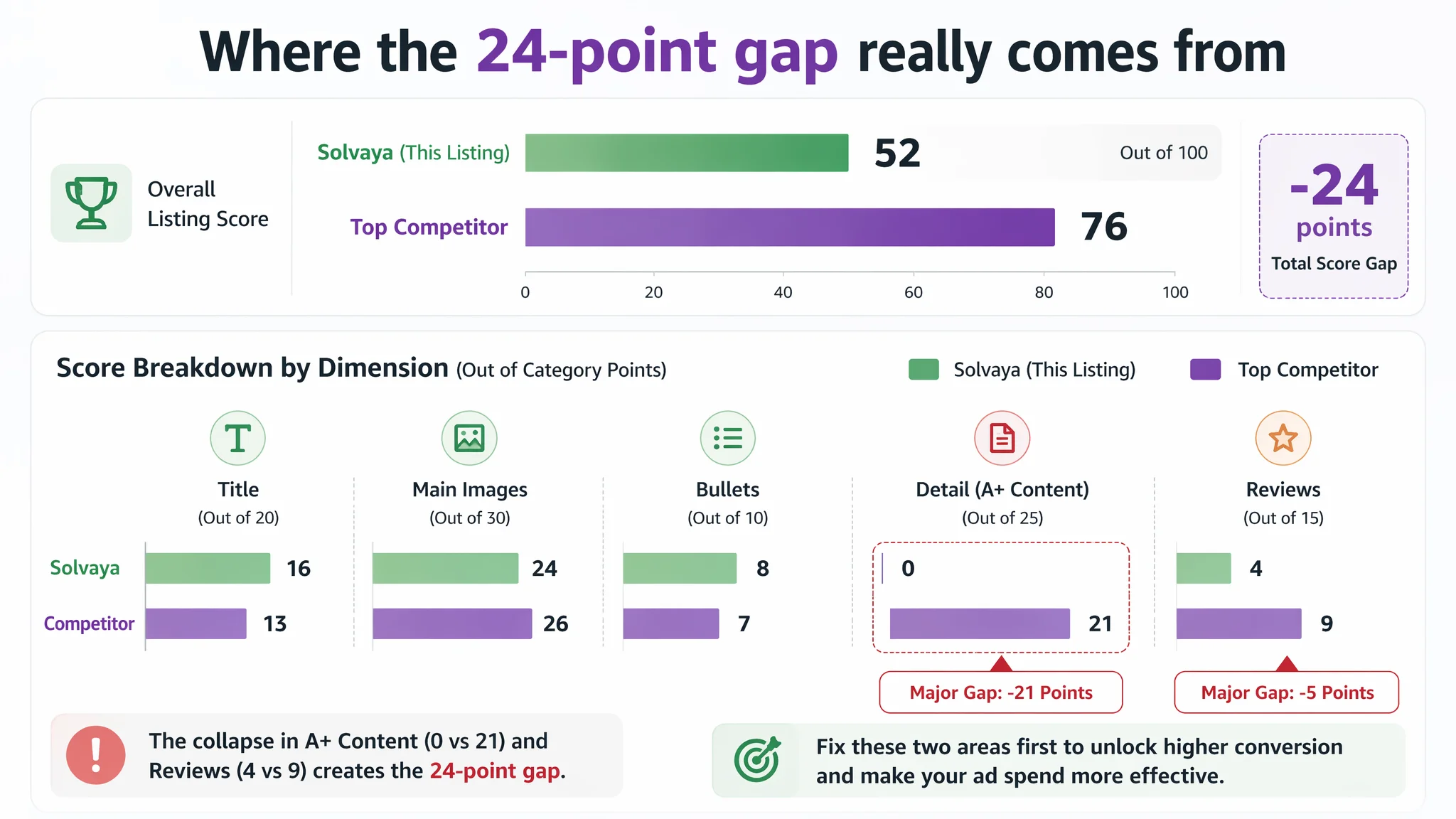
DeepBI’s diagnosis told a different story. Against a strong benchmark Amazon competitor in the same artificial boxwood topiary niche, this product scored 52/100 versus 76/100. The real gap was not in the title, not even primarily in the main images—but in the complete absence of A+ / detail content and a very weak review foundation. In other words, traffic was coming in, but the Amazon product page had almost no mid- to bottom-funnel content to carry visitors from interest to purchase.
Once the seller accepted that the core issue was Amazon Listing conversion capacity—not ad settings—the optimization path changed. Instead of endlessly tuning ads, the focus moved to building a coherent visual and textual story: professionalized main images, an A+ structure mirroring the benchmark’s “real-scene + micro detail + multi-scene adaptation,” and bullets that turn technical strengths (UV resistance, stability, zero maintenance) into a clear buying logic. This case is a reminder to Amazon sellers: when ACOS feels unmanageable, you may not need more traffic—you may need a page that actually deserves the traffic you already have.
Amazon Ads Were Not Failing. The Page Was Consuming the Traffic.
When this Amazon seller first came to DeepBI, the pressure point was straightforward: advertising felt expensive and fragile.
- Traffic was not the issue; impressions were there.
- Clicks existed, but conversion was unstable.
- Any attempt to open up bids or expand targeting quickly pushed ACOS into an uncomfortable zone.
Internally, the diagnosis was familiar: “Our ads are not optimized enough. Maybe we haven’t found the right keyword mix, or our main image is still not strong enough versus competitors.”
What the team did not have was a quantified view of how their Amazon Listing itself stacked up within the category. They were treating the product page as “basically fine” and the ads as the main variable. DeepBI’s Listing scoring changed that.
“The real problem was not that ads failed to bring traffic. It was that the page could not convert the traffic.”
DeepBI’s competitive audit put numbers around what had previously been intuition:
- Target Listing total score: 52 / 100
- Benchmark competitor score: 76 / 100
- Gap: –24 points
On the surface, title and bullets were not the weak links:
- Title: seller 16 vs. competitor 13 (out of 20)
- Bullets: seller 8 vs. competitor 7 (out of 10)
- Main image: seller 24 vs. competitor 26 (out of 30) — a small gap, not catastrophic
The real collapse was here:
- Detail (A+ / content): seller 0 vs. competitor 21 (out of 25)
- Reviews: seller 4 vs. competitor 9 (out of 15)
The Listing did not lack a title structure. It lacked a conversion engine.
The Real Constraint Was Listing Conversion Capacity
From a pure layout perspective, the gap was brutal:
- Seller: no A+ content at all
- Benchmark: a complete A+ chain—
- Hero lifestyle image at the garden/porch entry
- Icon-based feature summary (UV protection, safety, realism, low maintenance)
- Close-up micro details of dense leaves and texture
- Step-by-step installation guidance
- Multi-scene collage (indoor/outdoor, events)
- Style/variant showcase to suggest breadth of use
In other words, the benchmark Amazon Listing gave the visitor:
- A first emotional anchor (what this looks like in a “dream home” environment)
- A fast trust layer (icons + short copy explaining core functions)
- Proof of quality (macro + micro contrast: full scene + leaf texture)
- A lowered decision threshold (installation steps, no tools, stability)
- A broadened use imagination (porch, yard, wedding, restaurant, poolside)
- A subtle upsell/assortment signal (multiple flower/leaf styles)
The seller’s page gave the visitor:
- Title
- Image set
- Bullets
- Almost no mid-page visual story
- Only one review
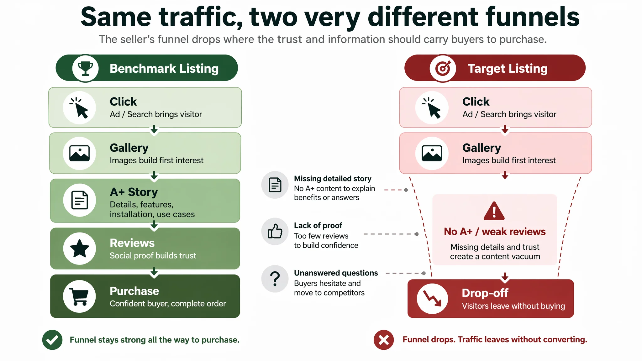
From a buyer’s path perspective:
1. Ads and search bring the visitor to the page.
2. Hero image + title catch the first few seconds.
3. On the benchmark Listing, A+ and reviews take over from there.
4. On the seller’s Listing, the visitor falls straight into a content vacuum.
That is why ads felt “inefficient”: they were feeding traffic into a page that simply did not carry enough information, trust, or imagination to justify a purchase, especially at home-decor price points where aesthetics and perceived realism matter as much as pure specs.
Why Traditional Ad Optimization Failed
The customer had been applying a familiar playbook:
- Expand keywords, refine negatives.
- Adjust bids based on ACOS signals.
- Experiment with different campaigns (exact, phrase, broad, auto).
- Tweak main image and maybe rewrite bullets for more keywords.
This playbook assumes one thing: that the Amazon product page has a reasonable baseline ability to convert the traffic it receives.
In this case, three structural issues meant that no amount of ad tuning could fundamentally change the outcome:
1. Detail content score: 0 vs. 21
With no A+ or equivalent content, the Listing had almost no visual narrative after the initial gallery. For a product whose purchase is highly visual (artificial boxwood topiary trees for porch/yard decor), this is effectively a self-imposed conversion cap.
2. Review system not yet credible
- Seller: 4.0 stars, but only 1 review.
- Competitor: 3.9 stars, 151 reviews, including multiple detailed, photo-rich reviews on page one.
Even though the seller’s numerical star rating was slightly higher, the absolute review volume was too low to build trust. Buyers do not compare decimals; they compare evidence.
3. Ads were amplifying the wrong stage
Advertising was working: it brought people to the Listing. But with a weak mid-funnel and almost no social proof, ad dollars were being used to repeatedly expose the same structural weakness.
“Advertising does not only amplify advantages. It can also amplify a page’s existing defects.”
From DeepBI’s point of view, further ad micromanagement in this state was high risk:
- Raising bids: increased ACOS without fixing the leak.
- Expanding targeting: pushed more uncommitted visitors through a weak page.
- Cutting spend: protected short-term ROAS but starved the product of the exposure needed to build a review base once the page was improved.
Instead, the first priority had to be: make every existing click more valuable.
This Product Page Did Not Lack Traffic. It Lacked Trust.
DeepBI’s Listing breakdown showed a clear pattern:
Title: Logic and Keyword Coverage Were Already Ahead
The target Listing’s title was not the problem:
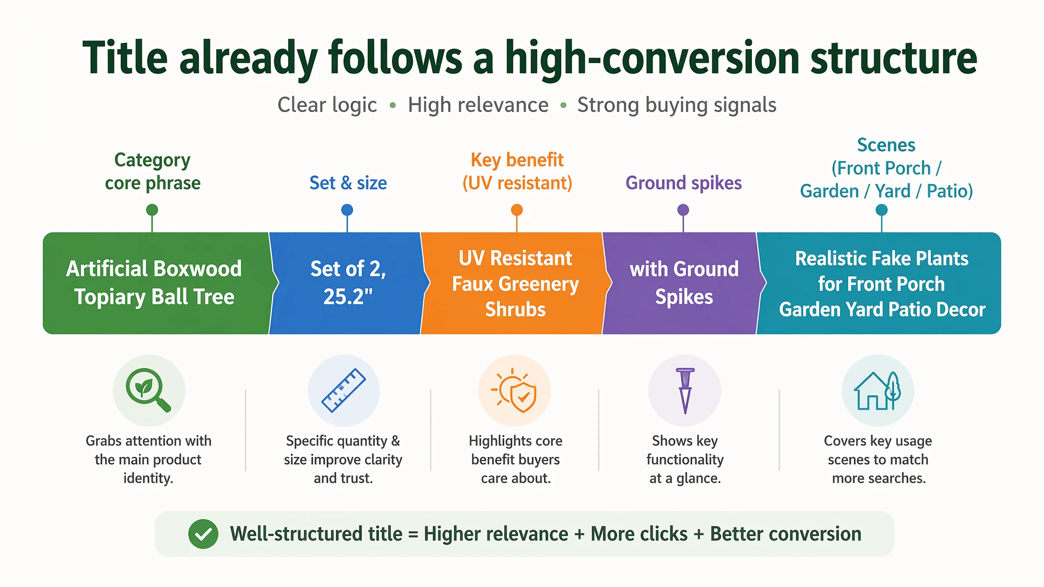
- Followed a mature “product + set/quantity + key size + core benefit + scenes” logic.
- Used concrete numbers like “Set of 2, 25.2"” to increase perceived professionalism and clarity.
- Front-loaded the core phrase “Artificial Boxwood Topiary Ball Tree”.
- Included specific scenario terms like “Front Porch”, and extended with “Garden, Yard, Patio” to broaden coverage.
- Cleverly alternated terms like “Artificial”, “Faux”, and “Realistic” for search breadth without feeling stuffed.
Against the benchmark:
- Competitor’s title had rich keywords but more chaotic structure.
- Their important descriptors (“UV Resistant”, “Realistic”) were buried.
- Use of color in parentheses for long-tail search was good, but structurally weaker than the target’s.
DeepBI’s judgment: the title was already stronger than the competitor’s from a structural and conversion logic perspective. This was not where the main constraint sat.
Bullets: Information-Rich, but Without a Linked Purchase Path
The bullet points showed clear strengths:
- A “technical parameter → user benefit → usage convenience” progression.
- Use of concrete data like “98%+ UV rays” and “1-minute installation.”
- Attention to real user pain points: zero maintenance, wind stability, all-weather durability.
But two problems remained:
1. Logic was not made visually scannable.
The competitor’s use of bracketed headers like 【Brighten up your day】 created quick anchors. The seller’s existing bullets were logical, but visually flat.
2. The page did not support the bullets with visual proof.
Claims like “dense foliage,” “UV resistant,” and “wind-stable” lived only in text. Without A+ micro shots or scene modules, the page asked visitors to believe copy without backing it up.
DeepBI didn’t need to overturn the bullet logic. Instead, the key shift was to:
- Add clear, benefit-led bullet headers.
- Preserve concrete advantages (e.g., “98%+ UV”).
- Tie each bullet to a future A+ visual: foliage density, UV/weather, zero maintenance, installation, multi-scene use.
In other words, text and images had to start talking to each other.
Main Images: Not Terrible, but Not Making the Case
On scoring, main images weren’t catastrophic: 24 vs. 26 out of 30. But DeepBI’s visual comparison made the business implication clear.
The competitor:
- Used multi-scene collages (indoor/outdoor) to tell a lifestyle story.
- Showed the product in a well-styled porch/yard setup that projected aspirational living.
- Embedded clear size and parameter visuals in a way that felt professional, not cluttered.
The seller:
- Had product shots and some scenes, but:
- Shadows felt artificial, background whites were not clean.
- Scenes didn’t lock into a unified “brand visual language.”
- Some composition and typography choices conveyed a more promotional, less premium feel.
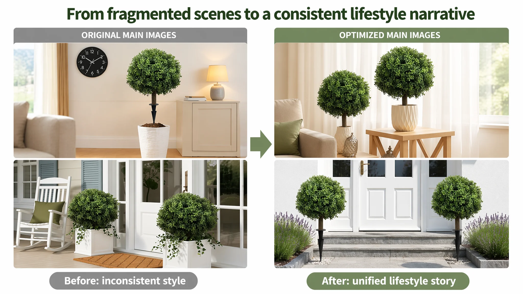
For Amazon search results, where a split-second decision determines click-through, this matters. DeepBI’s proposed shifts:
- Turn the first image from “promotional graphic” into professional architectural/home photography:
- Two trees centered, occupying about 75% of the frame.
- Clean white background, soft 45° light, natural shadow.
- High contrast to showcase leaf layering and shape clearly.
- Reserve scene images for:
- Low-angle shots in a modern interior.
- Symmetrical porch setups.
- Close-ups of leaves, stem, and ground spike in a structured, three-panel layout.
Not because “prettier is always better,” but because:
- Clear, premium visuals increase CTR.
- Scene consistency builds perceived brand quality and supports higher price tolerance.
- Technical close-ups pre-sell A+ details before the visitor scrolls.
The Missing A+ Story Was the Core Conversion Leak
Detail content was where the Listing’s score collapsed: 0 vs. 21.
In this category, A+ is not an optional bonus; it is the central trust and imagination layer. DeepBI’s benchmark analysis broke it down module by module and rebuilt the seller’s future page around the same decision logic—not to copy, but to match the buyer’s evaluation steps.
1. Opening: Real-Scene Anchor + Icon Summary
Benchmark behavior:
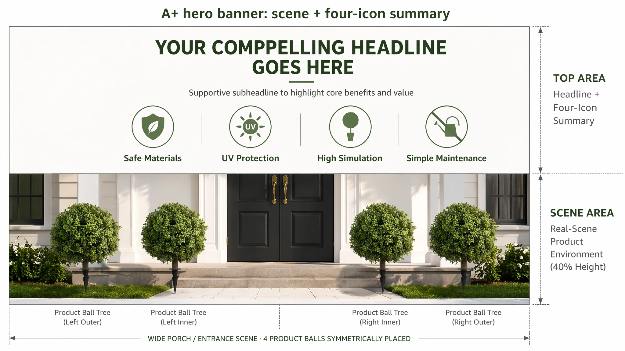
- Full-width, bright scene at a villa entrance or well-designed porch.
- Product placed symmetrically in front of the door.
- Overlaid headline plus 3–4 icons summarizing “Safe Materials / UV Protection / High Simulation / Easy Maintenance.”
DeepBI’s guidance:
- Create a hero A+ banner with:
- Four topiary balls arranged symmetrically at a modern house entrance.
- Natural, airy daylight; clear shadows; clean architecture.
- A strong, simple title like “Artificial Boxwood Topiary.”
- Four green circular icons with clear labels: “Safe Materials,” “UV Protection,” “High Simulation,” “Simple Maintenance.”
Business reason: Buyers decide in seconds whether a decor item “belongs” in their home. This module establishes:
- Visual fit
- Perceived quality bracket
- Core benefits at a glance
2. Micro Detail: Proving Density and Realism
User pain point: “Artificial plants look cheap and fake.”
Benchmark behavior:
- Tight macro shots of leaf density, texture, and overlap.
- Lighting used to create depth and hide plastic harshness.
DeepBI’s guidance:
- Micro shot with:
- The ball filling about 70% of the left side of the frame.
- Side lighting to reveal layered leaves and 3D structure.
- A simple gradient background.
- Right-side copy: “Dense Leaves With Luxuriant Foliage” plus a subline about UV protection and realism.
Business reason: By visually proving density and texture, the page turns “maybe this looks cheap” into “this could pass as real”. That unlocks willingness to pay and reduces hesitation.
3. Installation: Lowering the Last Friction
User question: “Will this be a hassle to assemble or secure?”
Benchmark behavior:
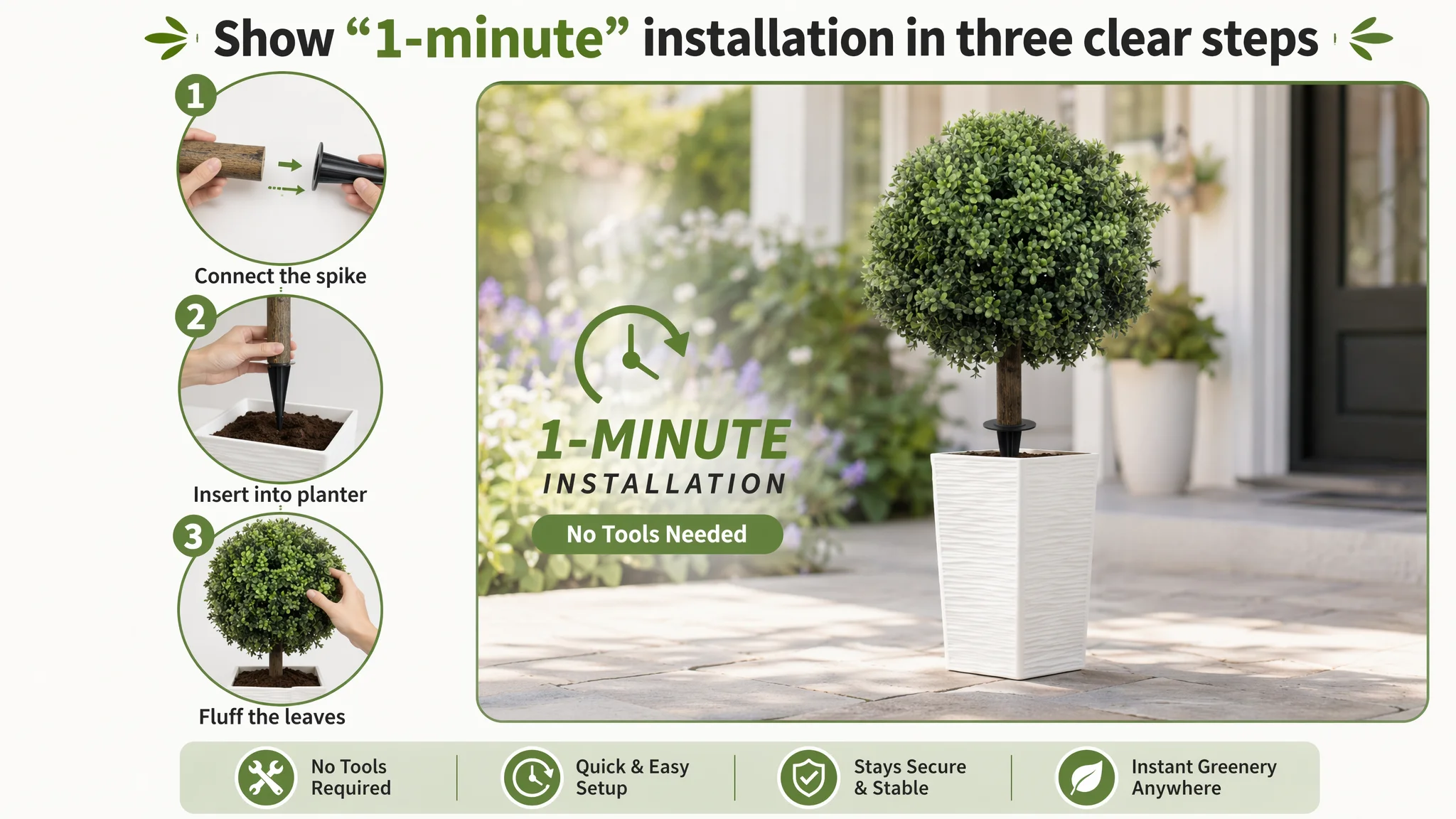
- Circular step images showing hand actions: widening branches, attaching spikes, placing into pots.
DeepBI’s guidance:
- Left: three circular images showing:
- Hand fluffing the foliage.
- Connecting the ball to the spike.
- Placing the unit into a planter.
- Right: larger overview image in a blurred garden scene.
- Short labels like “Connect the spike,” “Place into pot,” “Fluff the leaves.”
Business reason: If buyers feel “this is easy and tool-free,” they are less likely to delay or choose a simpler-looking competitor.
4. Multi-Scene Adaptation: Expanding Use Cases
User doubt: “Will it fit my space and style?”
Benchmark behavior:
- 2×2 grid of very different scenes: night terrace, formal front door, backyard line-up, indoor living room.
DeepBI’s guidance:
- Four equal quadrants showing:
- Night terrace with string lights.
- Symmetrical entryway.
- Row along a garden path.
- Indoor scene near a sofa.
Business reason: Showing versatility increases both the number of people who can imagine using the product and the number of units they might buy (pairs, rows, mixed indoor/outdoor).
5. Durability & UV Story: Addressing Longevity Risk
Core concern: “Will sun and weather destroy this in a season?”
Benchmark behavior:
- Visual emphasis on strong sunlight plus direct UV-resistant messaging.
DeepBI’s guidance:
- Overhead or slightly angled shot.
- Clear sunburst effect in one corner, suggesting strong sunlight.
- Brick or outdoor backdrop.
- Copy overlay: “UV Resistant & Weatherproof.”

Business reason: Instead of hiding from the “plastic fades” fear, the page confronts it directly and ties back to the earlier bullet claim (e.g., “98%+ UV” where accurate). This turns a risk into a selling point.
6. Visual Comparison: Making “Dense Design” Obvious
Competitive context: Buyers compare across multiple tabs.
Benchmark behavior:
- Implicit or explicit comparison of product density and quality.
DeepBI’s guidance:
- Split image:
- Left: this product, foliage dense and round.
- Right: a generic sparse faux shrub illustration.
- Middle divider with labels: “Our Dense Design” vs. “Other Sparse Brands.”
Business reason: Not every buyer reads every line of text. This single visual communicates in one glance why this product might cost more—and why that cost is justified.
7. Specs & Pack Clarity: Ending the Page with Certainty
Last-mile need: “What exactly am I getting?”
Benchmark behavior:
- Clean, white-background image with clear pack count and dimensions.
DeepBI’s guidance:
- Pure white background.
- Two balls with spikes arranged neatly, occupying about 80% of the frame.
- Clear labels like “25.2 inch” and “2 Pack” in a green-bordered box.
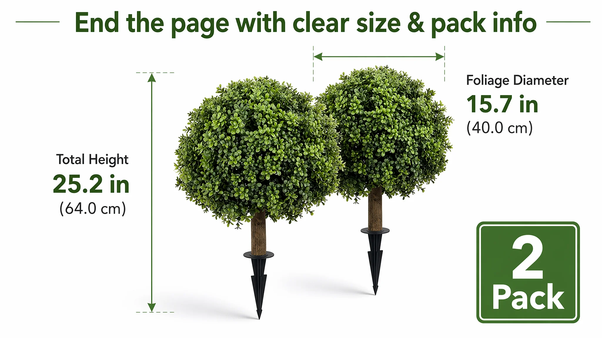
Business reason: Reduces pre-purchase uncertainty and post-purchase disputes. Also reinforces value perception (“2 Pack”) at the end of the scroll.
Why DeepBI Did Not Keep Tuning the Ads First
From DeepBI’s operating logic, the decision order was non-negotiable:
1. Fix the page’s ability to convert both organic and paid traffic.
2. Then use ads to systematically test and scale the improved creative and content.
If they had kept ads as the main lever:
- ACOS pressure would likely have stayed high.
- More spend would have gone into a structurally under-informing Listing.
- The product risked being labeled internally as “weak” or “unscalable,” when the real issue was presentation, not product.
By prioritizing Listing conversion:
- Every click—whether organic or paid—begins to have more revenue potential.
- The store gradually shifts from “paying to compensate for a weak page” to “paying to accelerate a strong page.”
- Future ad moves (new creatives, new keywords, higher bids) become multipliers instead of band-aids.
How the Page’s Sales Logic Started to Recover
The optimization path was not about random aesthetic experimentation. It followed the buyer’s decision funnel:
1. Search Result → Click (CTR)
- Clean, premium main image.
- Clear differentiation (“Set of 2,” “25.2", “Ground Spikes”).
- Strong, structured title emphasizing category, use case, and specification.
2. Click → Scroll (Initial Trust)
- Consistent gallery: hero white-background shot, home-scene shots, detail close-ups, size/parameter visual.
- Bullet points with emotive headers and concrete data.
3. Scroll → Dwell → Add to Cart (Deep Trust & Imagination)
- A+ hero villa scene with icons.
- Macro foliage detail proof.
- Step-by-step installation.
- Multi-scene collage.
- UV/weatherproof emphasis.
- Density comparison.
- Specs/pack-end clarity.
4. Post-Purchase → Review System Growth
- With a page that reduces mismatch and overpromising, early buyers are less likely to be disappointed.
- As units sell and reviews accumulate, the Listing starts building the “volume trust” it initially lacked.
- Over time, this narrows the 4 vs. 9 review-score gap versus the benchmark.
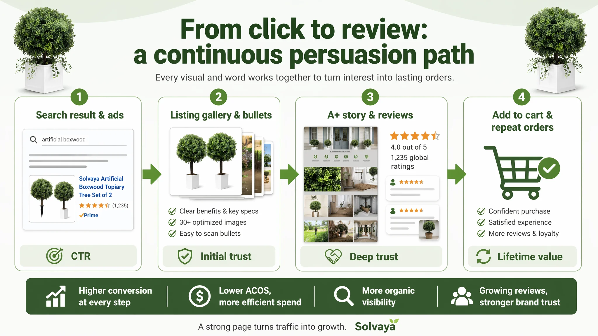
As this page-level “engine” improves, several shifts typically follow (even without quoting specific numbers):
- Conversion rate begins to stabilize or improve.
- ACOS becomes more controllable at similar or slightly higher bid levels.
- A higher share of orders can originate from organic results as the Listing’s relevance and interaction signals strengthen.
- The seller’s dependence on constantly tweaking ads to keep the product visible decreases.
What Changed in the Seller’s Understanding
Before working with DeepBI, the team’s mental model was:
- High ACOS → ad problem
- Solution → more precise keywords, better bids, maybe “prettier” images
After the diagnosis and restructuring of the Amazon Listing:
- They saw that title and bullets were already relatively mature.
- They understood that the absence of any A+ / detail content was not a cosmetic issue; it was a structural conversion leak.
- They accepted that review volume and visual trust mattered more than chasing an extra fifth decimal place of keyword coverage.
The key mindset shifts were:
- Amazon ads cannot solve every conversion problem.
- A Listing with a weak mid- and bottom-funnel will always make ads look worse than they are.
- Title, main image, bullets, and A+ must form a single, continuous persuasion path.
- Before scaling ads, you must decide whether the page actually deserves more traffic.
Takeaways for Other Amazon Sellers
This artificial boxwood topiary case is not unique to home decor. The same pattern appears in many categories:
- Sellers over-attribute performance issues to advertising.
- Titles and bullets are endlessly adjusted while A+ is neglected or missing.
- Main images receive cosmetic changes, but the core decision logic on the page remains incomplete.
What this case shows is:
- A well-structured title and “decent” images can still sit on top of an underperforming Listing if:
- There is no A+ story,
- Reviews are too few to establish trust,
- And visual proof for key claims is missing.
- DeepBI’s value in this scenario was not to suggest “more features” or “more variants,” but to:
- Quantify where the real gap versus the benchmark lay.
- Reframe the issue from “ad inefficiency” to “Listing conversion weakness.”
- Translate that diagnosis into a concrete visual and textual structure that could be executed.
For Amazon sellers, the operational lesson is straightforward:
- When ads feel hard to optimize, don’t just look at campaigns.
- Ask whether your Amazon product page—title, images, bullets, and A+ together—truly gives a visitor a reason to trust, imagine, and buy.
- If not, fix that first. Only then will your ad spend start working with your Listing instead of exposing its weaknesses.