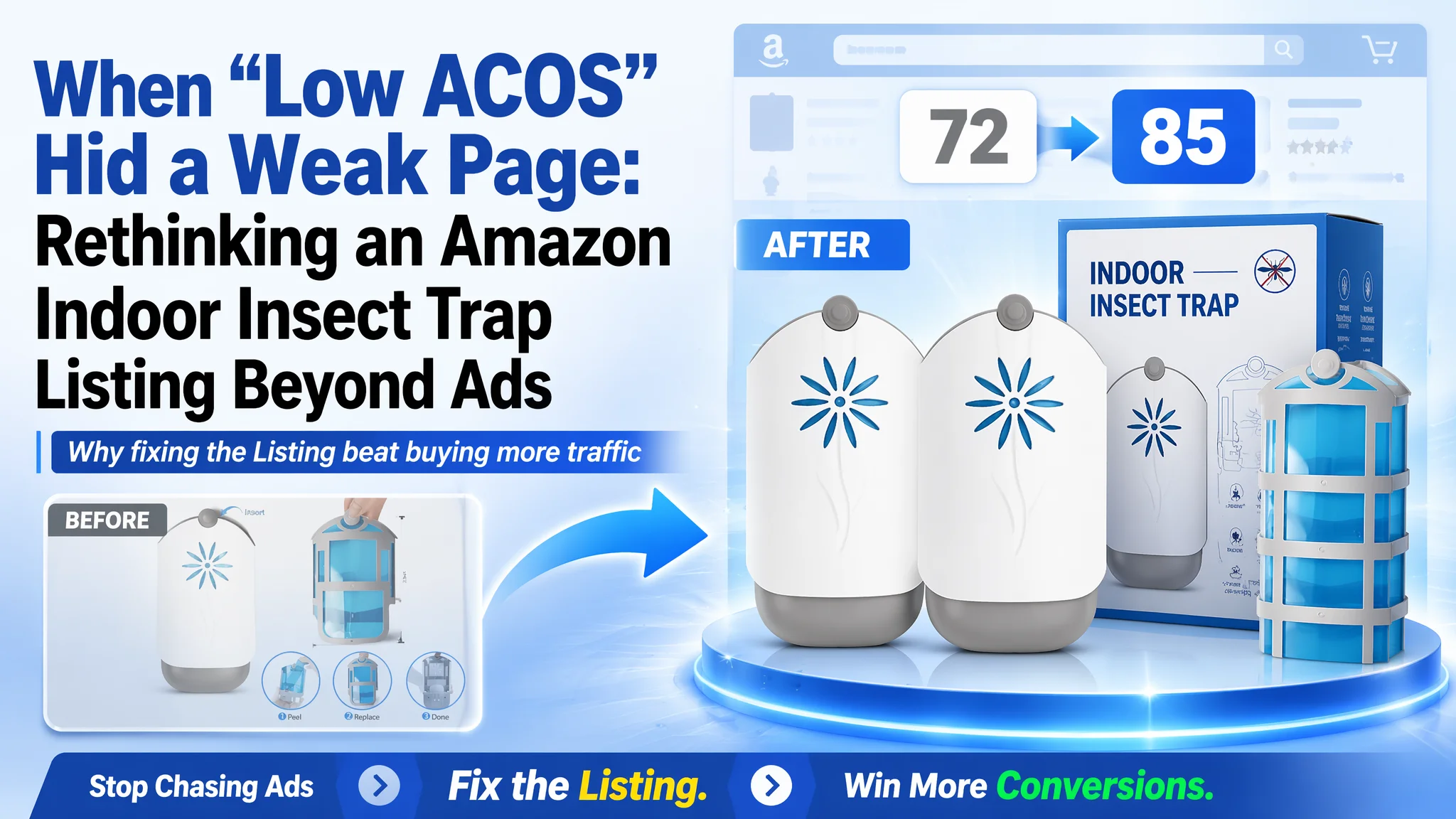
This case comes from an Amazon seller in the indoor insect-trap category on the US marketplace. On the surface, their ads were not the obvious problem: clicks were coming in, reviews were decent, and pricing was competitive. Yet the product page was constantly losing out to a single category-leading competitor. The team’s first reaction was to “push more traffic” and “wait for more reviews,” assuming the main bottleneck was advertising volume and social proof.
DeepBI’s diagnosis pointed in a completely different direction. Against a directly comparable Amazon Listing for another indoor fruit-fly/gnat trap, this product scored 72/100 versus the competitor’s 85/100. The gap did not come from traffic or price, but from how the page itself converted visitors: the title, main image logic, bullet points, A+ modules, and trust signals were all under-optimized compared with the benchmark.
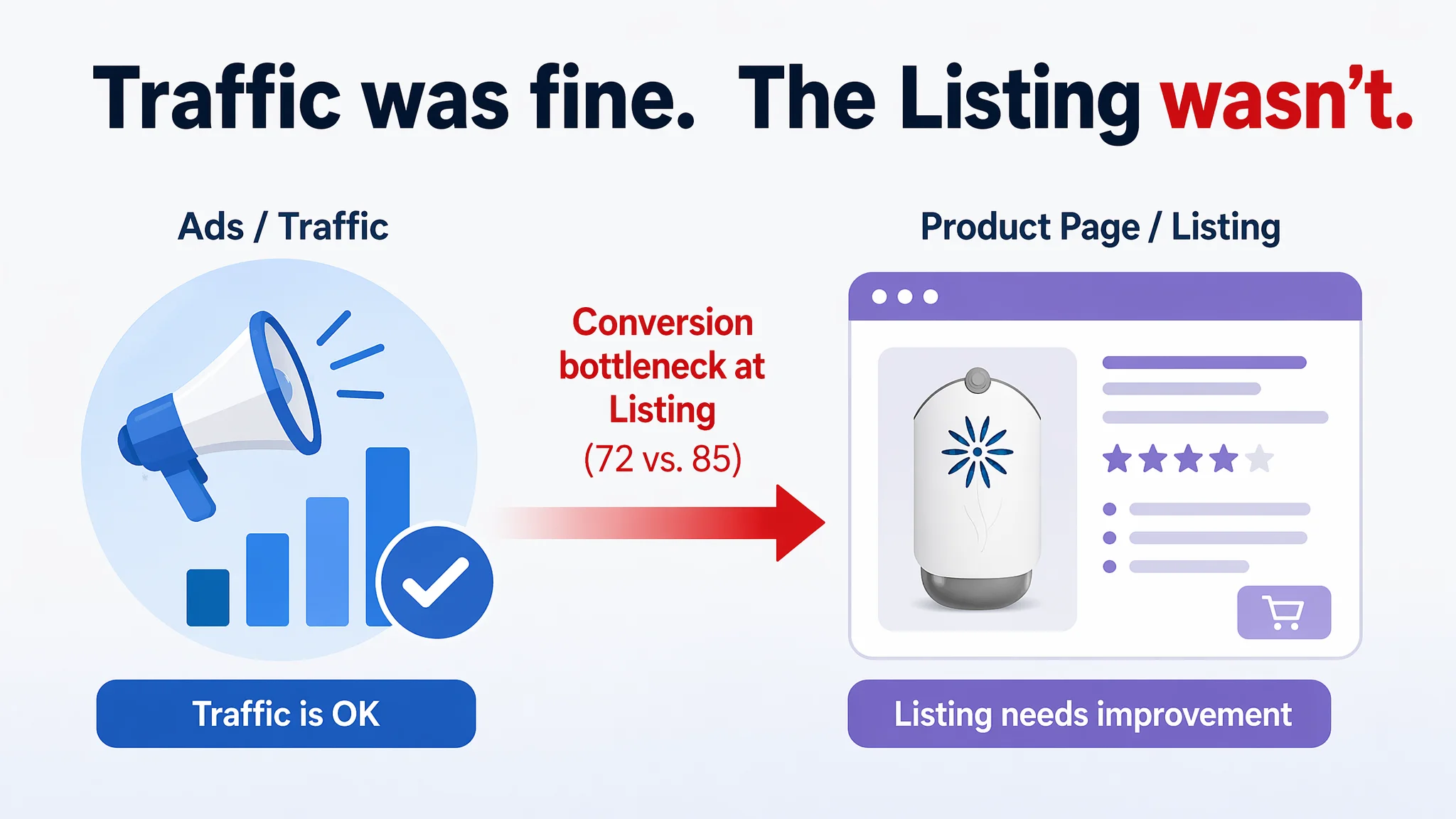
Once the seller accepted that the listing—not the ads—was the real constraint, the optimization focus shifted: rebuild the title around outcome and coverage, make the main-image set communicate “complete kit + proof of effect,” restructure bullets into a clear buying logic, and use A+ to establish 24/7 protection and safety trust. For other Amazon sellers, this case is a reminder: if a stronger competitor with similar rating and price keeps winning, the missing piece is often the conversion power of your Amazon product page, not just campaign bids or daily budget.
Amazon Ads Were Not Failing. The Page Was Consuming the Traffic.
From the seller’s perspective, the story started like many Amazon operations stories:
- ACOS was not disastrous.
- Rating was 4.1 stars, similar to the category leader.
- The product solved the same problem—indoor fruit flies, gnats, and other flying insects.
Still, when they looked at category sales and organic ranking, one benchmark listing was consistently ahead. The instinctive explanation inside the team was:
- “We just don’t have enough reviews yet.”
- “Our ads need more aggressive bidding.”
- “Maybe we should add more images; the rest is fine.”
So most of the effort went into campaign tweaks and incremental creative tests, not into rethinking the Amazon Listing itself.
“The real problem was not that ads failed to bring traffic. It was that the page could not convert the traffic.”
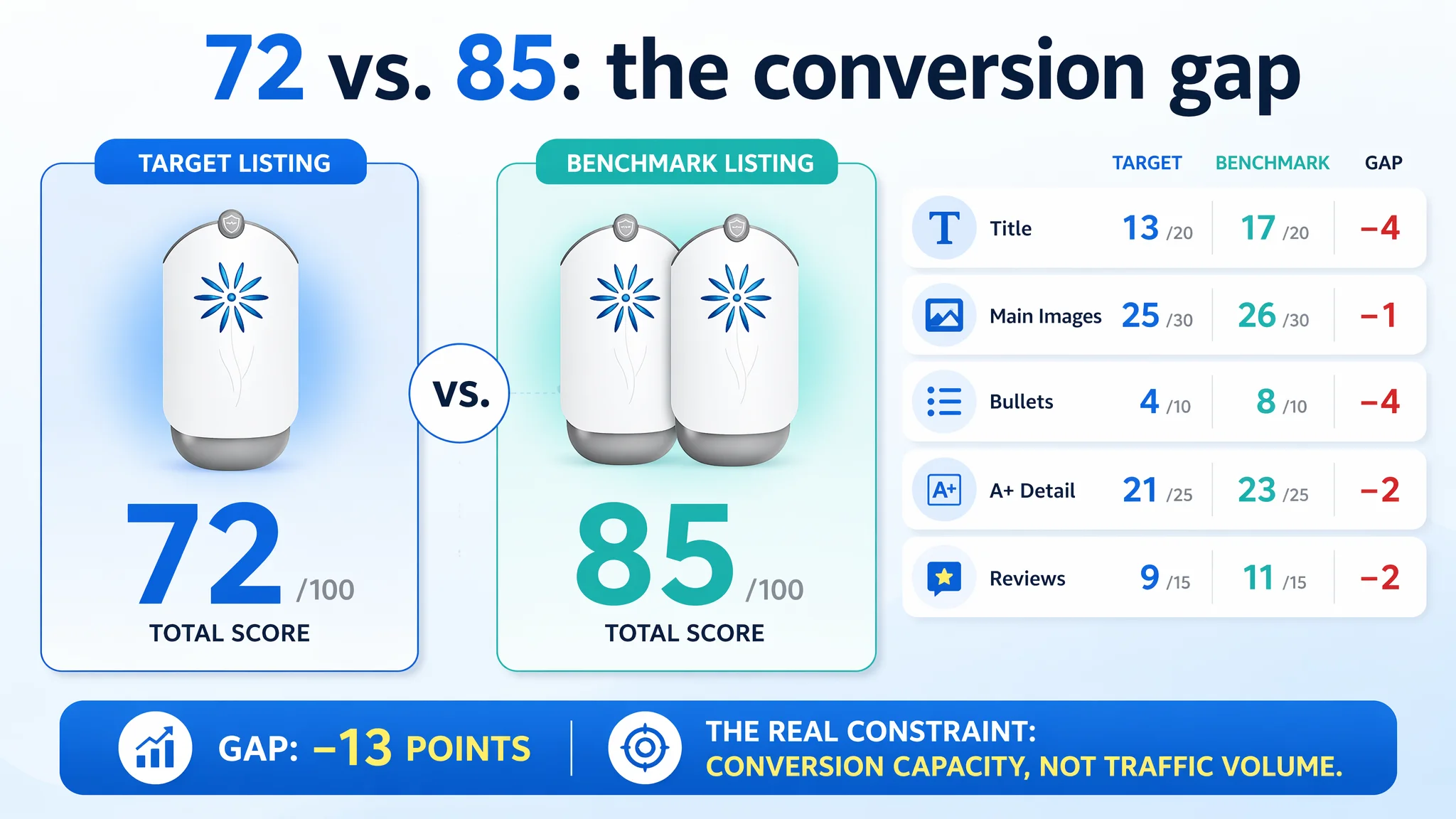
When DeepBI benchmarked the page, the first red flag was simple but decisive: 72 vs. 85 in total listing score, with gaps across every conversion-related dimension—title, main images, bullets, detail content, and review structure. In other words, sending more traffic into the current page would mostly amplify its weaknesses.
The Real Constraint Was Listing Conversion Capacity
DeepBI’s scoring showed one thing clearly: this was not a traffic-quantity problem; it was a conversion-capacity problem.
Quantified gap against a direct competitor
- Overall score:
- Target Listing: 72/100
- Benchmark Listing: 85/100
- Gap: –13 points
- By dimension:
- Title: 13 vs. 17 (–4)
- Main images: 25 vs. 26 (–1)
- Bullet points: 4 vs. 8 (–4)
- Detail/A+ content: 21 vs. 23 (–2)
- Reviews: 9 vs. 11 (–2)
This breakdown matters for one reason: it explains why ads could not fix the outcome. Even with similar star ratings, the benchmark listing had simply built a stronger decision journey for the same traffic.
Reviews were not the “magic lever”
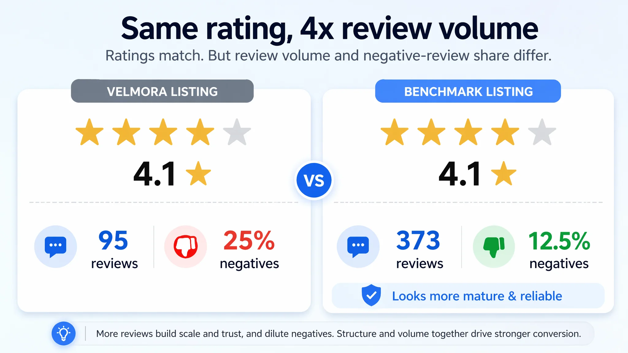
On rating alone, the two products looked equal: both at 4.1 stars.
But:
- Target Listing: 95 total reviews
- Benchmark Listing: 373 total reviews
The competitor’s review base was almost 4x larger, which:
- Created a stronger scale and maturity effect in the eyes of buyers.
- Helped dilute negative reviews (their front-page negative-review share was about half of the target Listing’s).
The seller initially overestimated what “waiting for more reviews” would do and underestimated how much page structure and messaging were already putting them behind every time a shopper compared two tabs side by side.
How the Listing Itself Was Quietly Losing the Battle
1. The title talked features, the competitor sold a solution
On Amazon, the title is not just for indexing—it is the first structured pitch.
The target Listing:
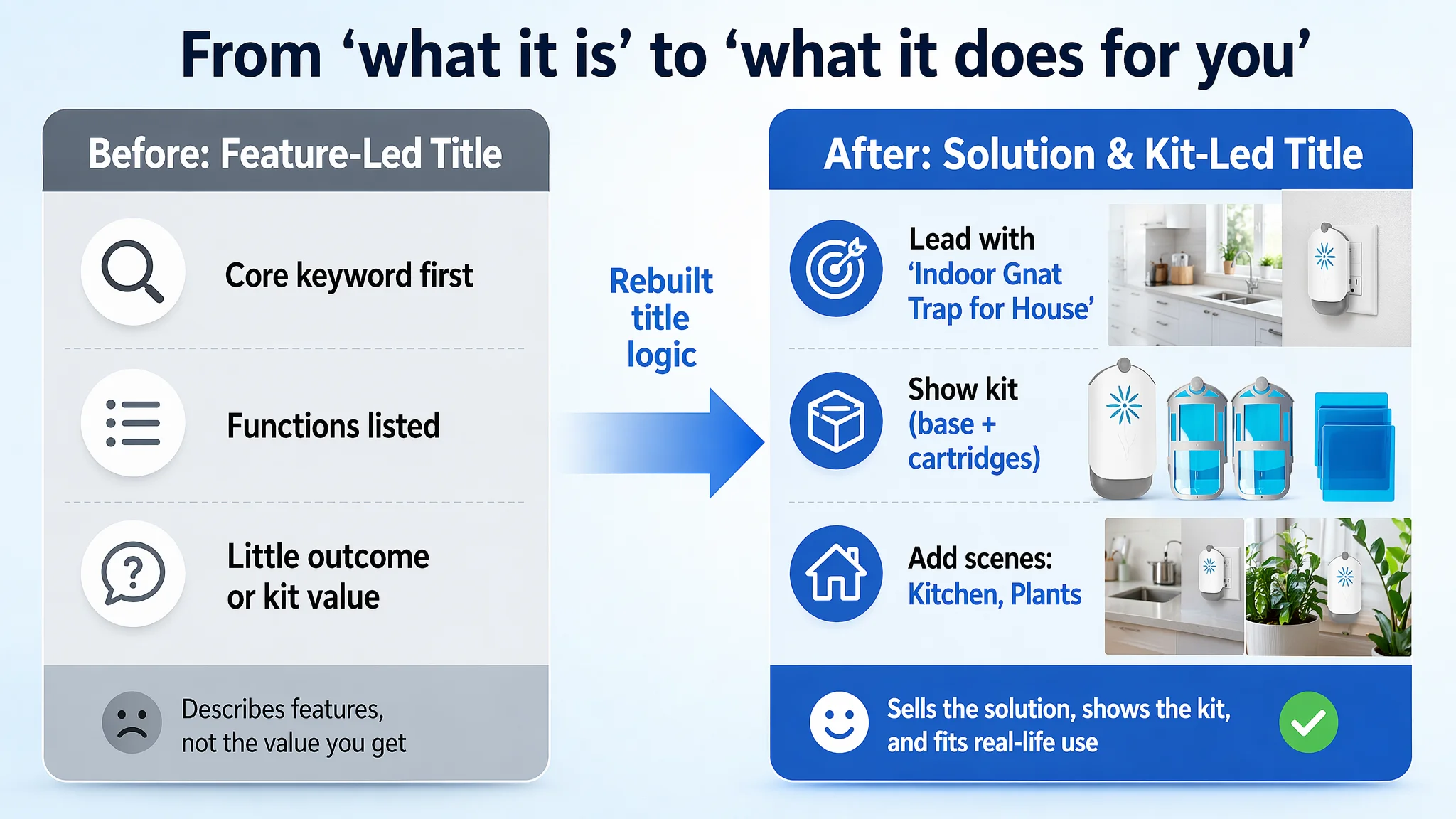
- Led with the core keyword “Flying Insect Trap Indoors,”
- Then listed functions and components,
- But did not convey a clear value outcome or kit advantage.
The benchmark Listing:
- Opened directly with “2 Fruit Fly Traps & 10 Adhesive Cartridges”—a quantified value hook that tells shoppers they are buying a full solution, not a single device.
- Layered keywords and scenarios: UV Light Fly Trap, Bug Catcher, Houseflies, Moths, Kitchen, Bathroom, Plant Areas.
DeepBI’s view: the target Listing’s title had decent core keywords but narrow coverage and weak decision logic. It was “what this is” instead of “what this kit does for you, where, and for which bugs.”
That is why the proposed new title direction shifted to:
- Remove keyword redundancy and free up space.
- Lead with “Indoor Gnat Trap for House” as a strong, high-intent phrase.
- Add “UV Light”, “Plug-in”, and clear kit composition “(1 Plug-in Base + 2 Cartridges)”.
- Explicitly mention high-intent scenes like Kitchen and Plants.
The goal was not just more keywords; it was a clearer buying promise in the first 200 characters.
2. Main images showed the product, not the value kit or proof
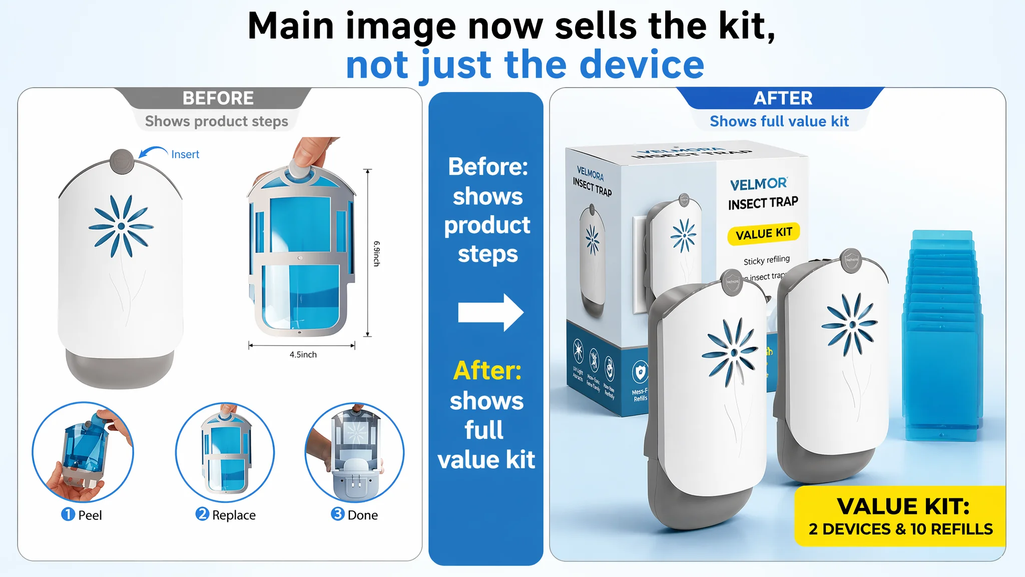
The original image set was not “bad,” but it missed the advantages that the benchmark had already weaponized.
Key weaknesses:
- No real captured insects in a believable close-up—so buyers never visually saw “this thing actually works” on the main images.
- One image slot was essentially just a video thumbnail with no static information, wasting a high-weight visual position that could have carried a value or proof message.
- The device’s ease of maintenance and refill economics were not visually framed as a differentiator—only explained in a process-style way.
By contrast, the competitor:
- Visually emphasized the “value kit”: multiple devices plus a visible stack of adhesive cards and packaging.
- Showed exploded or decomposed views that made “easy maintenance and reuse” unmistakable.
- Built a subtle “eco/less waste” mental model, preparing the ground for repeat-purchase logic.
DeepBI’s optimization direction for the main-image set revolved around turning each slot into a specific decision lever:
- Image 1: Center two devices with packaging behind and a clearly stacked set of adhesive cards. Add a concise label such as “VALUE KIT: 2 DEVICES & 10 REFILLS” so the full solution is visible at a glance in search results.
- Image 2: A clean, top-down “what you get” matrix showing each component with quantities and dimensions—answering “Is this enough? Will it fit?” in a single frame.
- Image 3: Device on the left, three round icons on the right clearly labeling mosquitoes, flies, gnats, with a UV glow around the device—"who it catches" made visual.
- Image 4: Three side-by-side brightness levels (30%, 60%, 100%) in a dark room, labeled as Adjustable Brightness Modes—making the “not too bright for sleep” promise believable.
- Image 5: A tight detail shot of the foldable plug and pull tab, annotated “Foldable Plug” and “Easy-pull Tab”—converting a small industrial-design advantage into a purchase-relevant argument.
“Advertising does not only amplify advantages. It can also amplify a page’s existing defects.”
Without these visual hooks, every additional click from ads was simply more people arriving to a page that did not fully show why this kit was the better choice.
3. Bullet points had information, but no buying logic
The bullet section is often where Amazon buyers decide “yes or no” after skimming the images.
On this Listing:
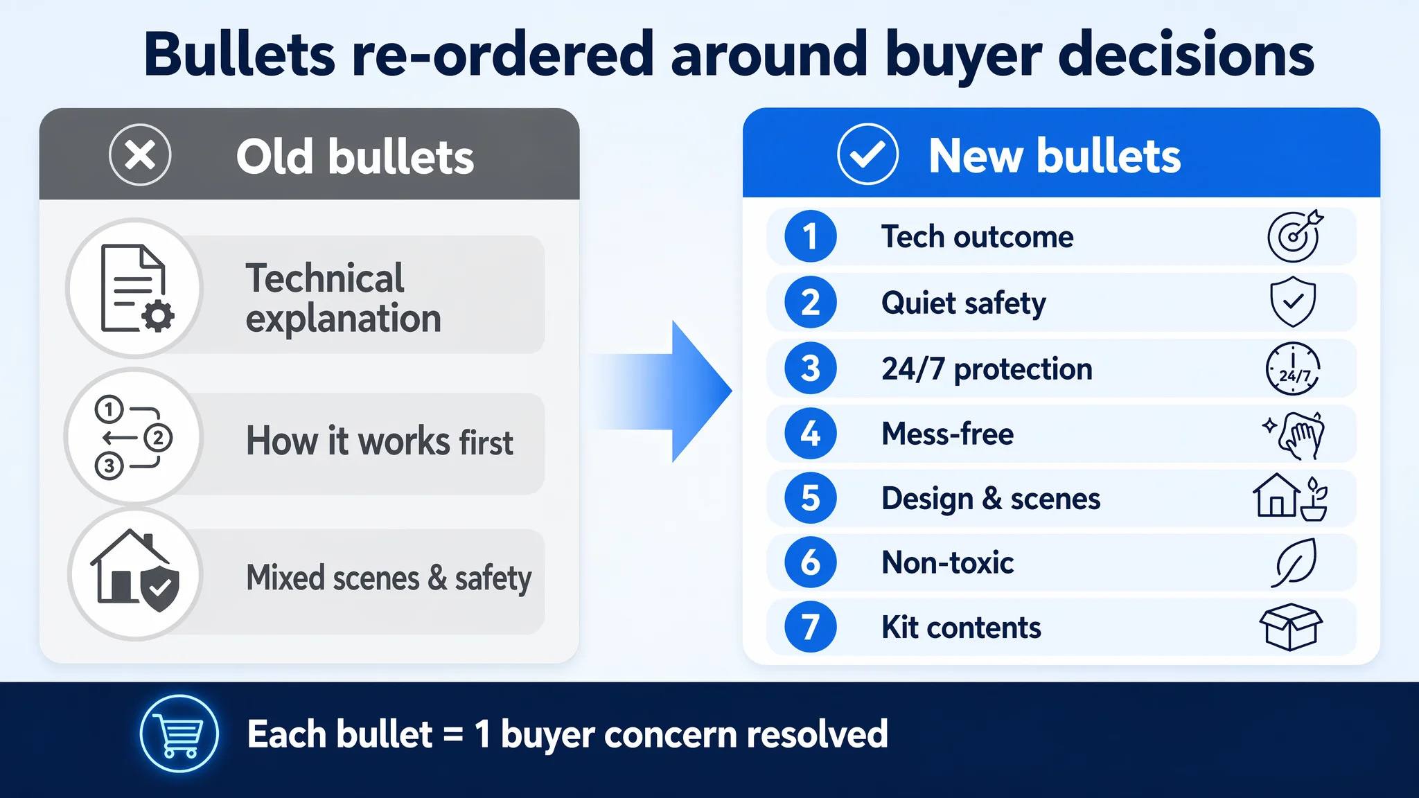
- Bullets leaned heavily on technical explanation and feature listing.
- They opened with how it works, not what problem it perfectly solves.
- They repeated safety and multi-scene usage, but each line stayed at the level of description, not a clear “pain → solution → benefit” loop.
The competitor’s bullets, by contrast:
- Framed the product as a “Perfect Indoor Insect Trap”, not just a device with UV and glue.
- Elevated adjustable brightness and compact design into separate, benefit-rich selling points (night light, decor-friendly).
- Wove user benefit into each point: “blends seamlessly into home décor”, “green solution”, “mess-free cartridge changes”.
DeepBI’s bullet restructuring therefore focused on decision order and user benefit:
1. Advanced UV Trapping Technology – First bullet = outcome and method combined: blue/UV light + ultra-sticky backing = high capture efficiency.
2. Safe & Whisper-Quiet Operation – Directly addresses a key household concern: no zapping sounds, no high-voltage fear.
3. 24/7 Continuous Protection – Gives buyers a clear mental image of round-the-clock defense with refill cartridges—this is a system, not a gadget.
4. Mess-Free & Easy Maintenance – Prioritizes “no direct contact with insects” and quick replacement, targeting disgust and convenience pain points.
5. Sleek & Versatile Design – Positions the device as unobtrusive in kitchens, bathrooms, around plants, in offices and restaurants.
6. 100% Non-Toxic & Odorless – Separate, explicit safety claim for families with children and pets.
7. Complete Starter Kit – Clearly lists contents and sets expectations on what is in the box and how quickly it can start protecting the home.
The structural shift was simple but crucial: every bullet had to close a purchase objection, not just add more words.
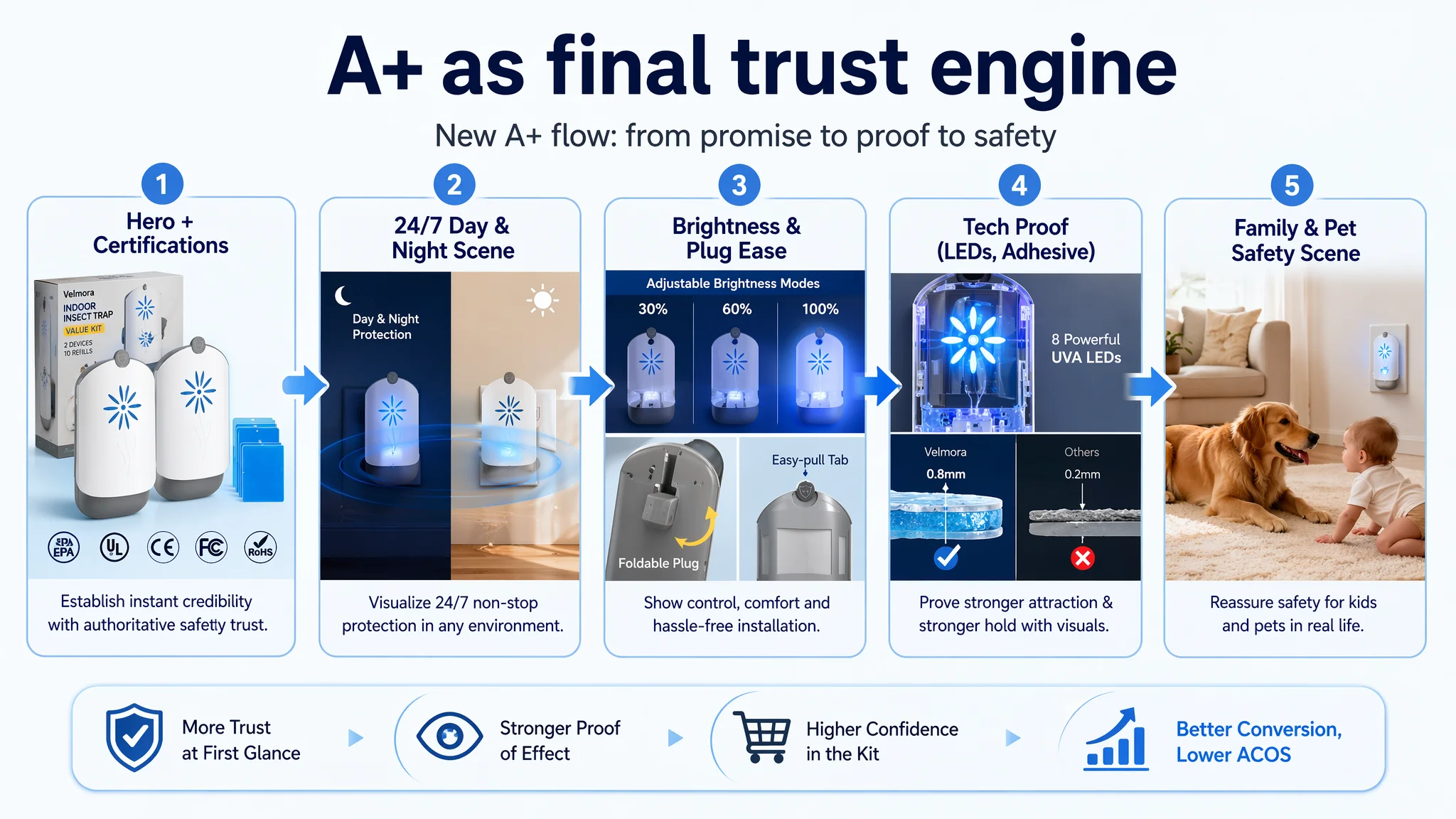
4. A+ content lacked the trust and “24/7” story the category demands
In indoor insect control, trust and peace of mind are as important as the technical mechanism.
The benchmark A+ content did two things significantly better:
1. Immediate promise on the first A+ image
A strong headline like “24/7 INSECT CONTROL WORKS WHILE YOU SLEEP” introduced time-based value, not only functionality. It framed the product as a quiet, constant guardian.
2. Concentrated trust badges and certifications
EPA, UL, CE, FCC, ROHS, PSE logos were grouped in a highlighted band on the first panel, instantly signaling safety, regulation, and product maturity.
It also used visual storytelling around:
- Brightness adjustment clarity.
- Plug rotation as a direct solution to outlet-availability pain.
- Eco “LESS WASTE” narrative combining reusable frame + disposable cards.
The target Listing’s A+ modules included a reasonable set—scene usage, icons, structure, some comparisons—but stopped one step short of building a persuasive brand and safety narrative:
- No visual certification band, only text-level reassurance.
- “2025 Enhanced Refill Version” was presented as a product update, not escalated into an eco, durability, or ESG narrative.
- Brightness adjustability and plug flexibility were mentioned, but not visually de-risking the experience the way the competitor did.
DeepBI’s recommended restructuring therefore pushed A+ into a proper trust and lifestyle engine:
- First A+ image: Hero shot with device glowing softly, flanked by clear certification-style icons (e.g., EPA/UL/CE placeholders), in a clean, modern home background—“safe, approved, belongs here.”
- 24/7 scene: Split day/night scene with the same device working in both conditions, UV ripple effect around it, to fix “always on guard” in the buyer’s mind.
- Brightness visualization: Three round windows showing low/medium/high light levels on a dark wall, addressing “Will this disturb my sleep?” with direct visuals.
- Rotatable plug detail: A macro shot with an arrow path around the plug showing rotation, framed clearly as solving outlet-position limitations.
- Technical support: Semi-transparent view of the internal LEDs, showing count and placement—not to brag about components, but to visually answer “why does this attract so well?”
- Adhesive thickness comparison: Side-by-side macro cross-sections of 0.8 mm vs. 0.2 mm adhesive cards, with clear checkmark vs. cross, turning a dry spec into something visibly “thicker and more reliable.”
- Safe around family and pets: A lifestyle shot with a baby or dog nearby, device at a low wall socket, in a warm-toned living room—turning “non-toxic and safe” from words into a recognizable home scenario.
The goal: by the time a buyer reaches the bottom of the page, the only question left should be “how many rooms do I need this for?”, not “is this safe?” or “does it really run quietly at night?”
Why DeepBI Did Not Recommend “More Ads” First
With ad costs rising, every Amazon seller feels pressure to make campaigns work. But what DeepBI’s scoring made obvious was:
- Title, bullets, A+, and main images were under-leveraging the product’s real strengths.
- Reviews were good but thin compared with the benchmark; they could not carry the whole trust burden alone.
- The competitor’s Listing had a more complete and coherent sales logic from search results through to A+.
If the seller had continued to prioritize ads, the risks were clear:
- Higher spend into a page that still converted below its potential.
- Organic ranking stagnation, because Amazon’s algorithm rewards effective listings, not just high ad bids.
- A slow, demoralizing loop where every incremental click looked worse and worse on a ROAS/ACOS basis.
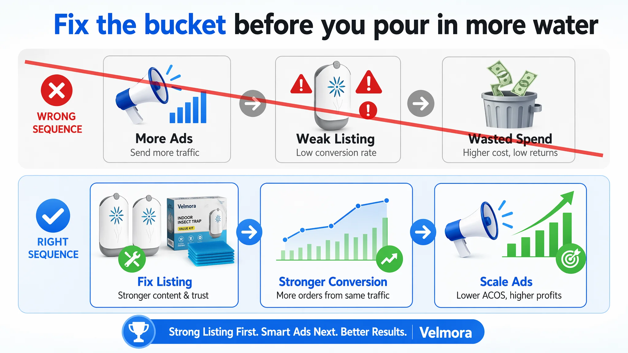
From DeepBI’s perspective, the decision sequence needed to be:
1. Repair conversion logic on the Amazon product page
Ensure that incoming traffic—organic and paid—meets a page that tells a complete, convincing story.
2. Then re-expand traffic
Once the title, main images, bullets, and A+ start working in sync, campaigns can be scaled, and their performance will more accurately reflect the product’s true potential.
In other words, fix the bucket before pouring in more water.
How the Page’s Sales Logic Started to Recover
The seller did not need a rebrand, a new product, or a radical repositioning. The product already matched the category leader in many functional aspects. The turning point was accepting that the way the page spoke to buyers was weaker, even if the product itself was not.
By reworking the Listing around the competitor benchmark and the actual decision path of buyers:
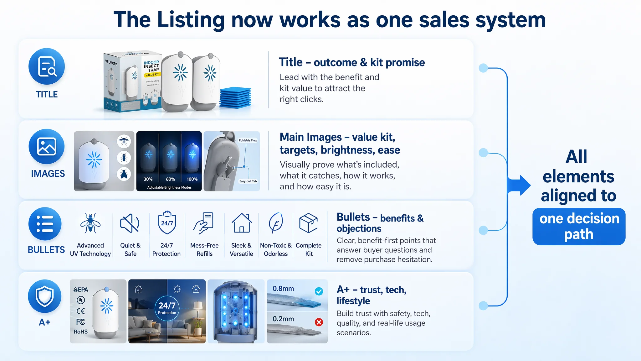
- The title became more outcome- and kit-focused, with broader and more relevant keyword coverage.
- The main-image set transformed from “here is the device” to “here is the full value kit, what it catches, how bright it can be, and how easy it is to handle.”
- The bullet points moved from technical narration to a consistent stream of buyer benefits: technology, quiet safety, constant protection, mess-free changes, design, non-toxic, and clear contents.
- The A+ content started to function as the final persuasion layer: certifications, 24/7 guard, installation ease, visible tech, adhesive quality, and safe family scenarios.
This did not instantly create a bestseller, and DeepBI did not fabricate performance numbers. But it changed the operating state of the Listing in several key ways:
- Ad traffic was now landing on a page that could justify a higher percentage of clicks turning into orders.
- The Listing had a more credible chance to grow organic orders, rather than depending on constant paid pushes.
- The seller could finally separate “Is our product competitive?” from “Is our page doing it justice?” when looking at advertising results.
What Changed in the Seller’s Understanding
Before the diagnosis, the seller’s mental model was typical:
- If orders lag, first suspect ads, bids, and budgets.
- If a competitor is ahead, assume “they have more reviews” or “their design looks fancier.”
- If ACOS feels heavy, try more keyword tuning and negative matches.
After going through this case, their understanding shifted on several fronts:
- Amazon ads do not fix a weak Listing. They only magnify whatever the product page already is—strong or weak.
- Listing conversion quality is the foundation of ad efficiency. Title, main images, bullets, and A+ are not cosmetic; they define how much revenue each click can realistically generate.
- Competitor advantage is often structural, not mysterious. When you quantify gaps in title logic, image roles, bullet-point closure, and trust modules, the reason another ASIN wins becomes far more concrete than “better design.”
- Before scaling spend, the team now asks:
“Does this page clearly answer: What do I get? Does it really work? Is it safe in my home? Is it easy to live with? Why this, not the other one?”
For other Amazon sellers in similar categories—indoor insect control or beyond—the lesson is straightforward but uncomfortable:
- If a comparable competitor with similar rating and price continues to win, look first at how your Amazon Listing converts traffic, not just at how you buy traffic.
- Repair the core sales logic of the product page before trying to force performance through bigger bids.
- Treat the Amazon Listing as a conversion engine, not just a catalog entry. Only then will your advertising spend start working for you instead of exposing your leaks.