

For this Amazon seller in the gaming mouse pad category, the pressure first appeared in the ads dashboard. Traffic was not the core issue; what really hurt was that ad spend was getting harder to control while orders did not respond the way the team expected. Their instinctive judgment was familiar: “our Amazon ads structure and bids need more fine-tuning.”
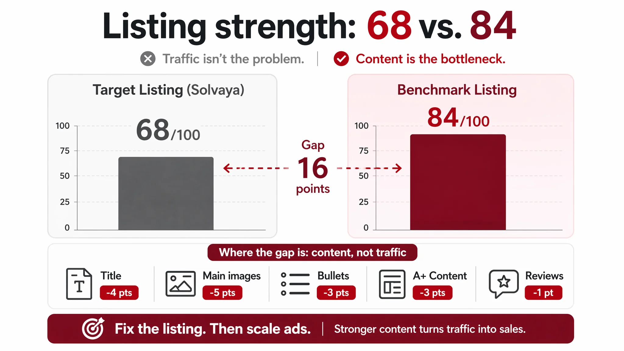
DeepBI’s diagnosis pointed in a different direction. By putting this US-marketplace Listing side‑by‑side with a high‑performing competitor, the data showed a 68/100 vs. 84/100 gap — not in exposure, but in how the Amazon product page converted traffic. The title looked dense and keyword‑stuffed, the main images lacked a clear visual hook, the bullet points talked mainly about attributes instead of outcomes, and the A+ story did not resolve the typical “is this really better?” doubts.
Once the problem was reframed as “Listing conversion capacity” instead of “ad optimization,” the strategy changed completely. The work shifted from chasing keyword and bid adjustments to systematically rebuilding the title logic, the first seven images, and the A+ modules around user pain points, scenarios, and trust signals — especially for waterproofing, anti‑slip performance, and real desk coverage.
This case is not about a dramatic overnight jump in ACOS; it is about avoiding a very real risk many Amazon sellers face: allowing ads to continuously amplify an under‑performing product page. The core takeaway is clear: before you push more budget, you need to know whether your Amazon Listing actually deserves more traffic.
The Business Tension: Ads Getting Harder, Orders Not Following
From the seller’s perspective, nothing looked “broken” at first glance:
- The category (large gaming mouse pad) was clear.
- Ratings were acceptable: 4.6 stars with 55 reviews.
- The Amazon Listing had a full image set and A+ modules, not an empty shell.
- Ads were driving a reasonable amount of traffic.
Yet performance was flat relative to expectations, while a directly comparable competitor in the same Amazon category was clearly turning similar interest into more stable sales. That competitor Listing was visibly dominant in search and had over 140 reviews with the same 4.6 rating.
The internal explanation quickly narrowed to advertising levers:
- “Our bids may not be aggressive enough.”
- “We need to expand keywords.”
- “We should redistribute budget across campaigns.”
In other words, the team treated this as a traffic and ads-efficiency issue, not as a conversion and page-logic issue.
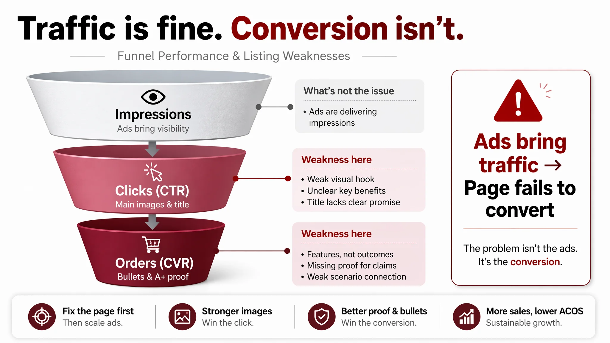
“The real problem was not that ads failed to bring traffic. It was that the page could not convert the traffic.”
DeepBI’s role here was to test that assumption against data: if ads were structurally the problem, we should see a different pattern than “Listing strength consistently lags a clear benchmark across every key content dimension.”
What the Data Actually Showed: A 16‑Point Listing Gap
DeepBI’s Listing scoring put this Amazon gaming mouse pad page at 68/100 against a benchmark competitor at 84/100. More important than the total score was where the gap appeared:
- Title: 11 vs. 15 (out of 20) → ‑4
- Main images: 21 vs. 26 (out of 30) → ‑5
- Bullet points: 4 vs. 7 (out of 10) → ‑3
- Detail/A+: 19 vs. 22 (out of 25) → ‑3
- Reviews: 13 vs. 14 (out of 15) → ‑1
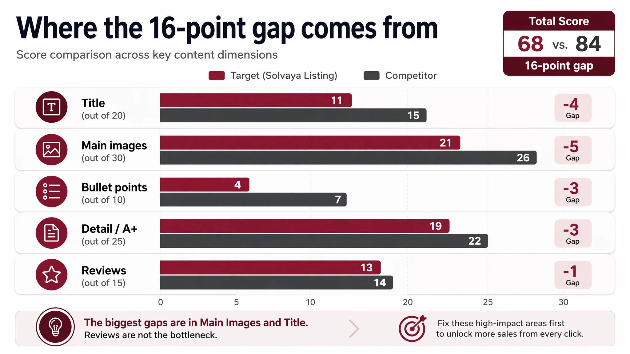
Reviews were not the bottleneck. The page content was.
If the seller had continued to treat this as an “ads problem,” they would likely have:
- Increased spend on a page that structurally underperforms.
- Driven more paid clicks into an experience that doesn’t sufficiently justify the purchase.
- Watched ACOS stay stubborn or worsen, then tried even more granular bid work.
From a business‑risk view, that would mean burning budget to validate the wrong hypothesis.
Where the Original Diagnosis Went Wrong
1. Overconfidence in “We Already Have All the Modules”
The Listing was not obviously incomplete:
- Title, bullets, gallery images, and A+ modules were all present.
- There was at least one desk‑scene image.
- A+ contained brand visuals, material details, and color matrices.
The team’s mental model was: “We’re structurally fine, we just need more exposure and better traffic.”
What this missed is crucial in Amazon operations:
Having all modules is not the same as having a coherent decision path.
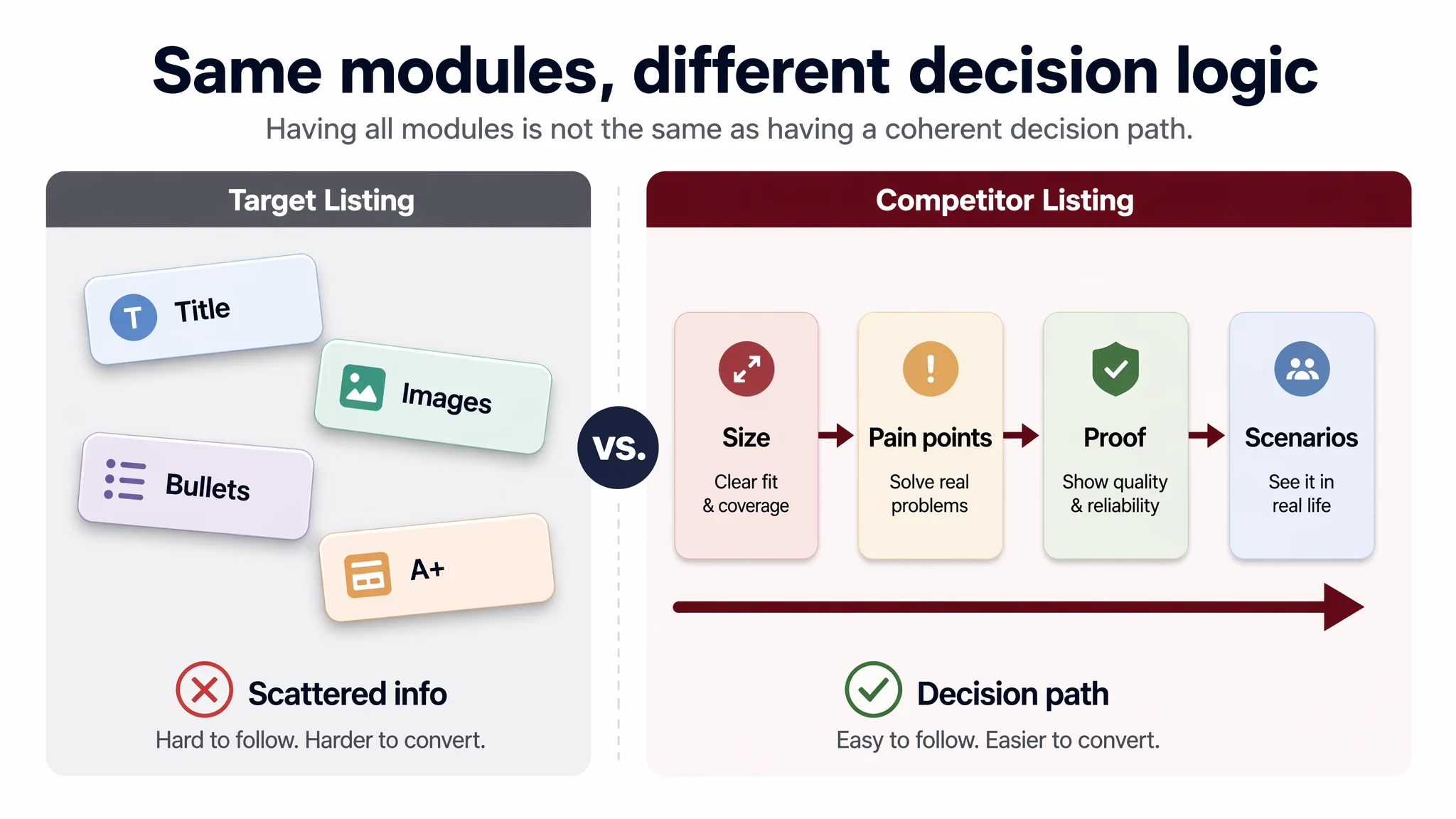
The competitor used roughly the same building blocks — title, bullets, core images, A+ — but its structure pushed shoppers along a much clearer journey:
- From size and use case → to pain-point resolution → to visual variety and waterproof/anti‑slip proof → to multi‑scenario reassurance.
The target Listing instead:
- Listed attributes without tying them to use outcomes.
- Showed the product, but did not prove core promises (anti‑slip, waterproof, durable edges).
- Used one static office scene instead of mapping to distinct user roles (gamer vs. office vs. home).
So while the seller assumed “module completeness,” DeepBI’s scoring showed “logic incompleteness.”
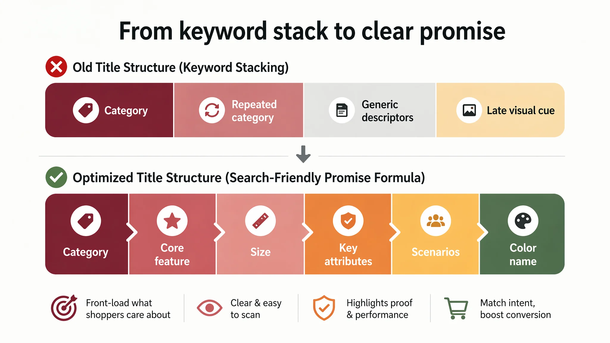
2. Focusing on Keywords, Not Title Logic
The original title tried hard to capture search volume:
- Repeated formulations like “Large Gaming Mouse Pad” and “Large Cloth Mouse Pad”.
- Generic descriptors like “Gradient Pattern” placed late in the string.
On paper, it looked keyword‑rich. In practice:
- It read like keyword stacking, not a clear promise.
- It lagged the competitor’s more mature pattern:
- Category + core feature + core parameter + visual hook + scenario.
The competitor moved quickly from “Large Gaming Mouse Pad” to a concrete visual (“Abstract Black White Ink Liquid Waves”), a clear size reference, then use scenes and detail features (“Stitched Edge”, “for Home Office Work”).
The seller believed the issue was insufficient keyword coverage. DeepBI’s view was different:
- Keywords were there.
- The ordering and logic failed to quickly communicate “What is this?” and “Why this one?”
Amazon Ads Were Not Failing. The Page Was Consuming the Traffic.
When we connect Listing scoring with typical funnel behavior, a pattern emerges:
- If CTR is weak and main images lag a benchmark, the problem is usually the image hook and thumbnail clarity.
- If CVR is weak but ratings are fine, the problem usually lies in bullets, A+, and proof for core claims.
Here, the largest score gap was in main images (‑5 points vs. competitor) and textual persuasion (title ‑4, bullets ‑3, A+ ‑3). That points straight to conversion capacity, not the absence of traffic.
“Advertising does not only amplify advantages. It can also amplify a page’s existing defects.”
For this mouse pad Listing, Amazon ads were likely doing their job: delivering impression and click opportunities. The page, however, did three things poorly:
1. Failed to create a visually differentiated first impression
- Primary images lacked strong contrast and 3D depth.
- Reflections looked cheap rather than premium.
- The product blended into search results instead of standing out.
2. Under‑translated abstract attributes into concrete proof
- “Soft to the touch” without visual evidence.
- “Anti‑slip” without a convincing bottom‑texture close‑up.
- “Thick” without context next to a keyboard or hand.
3. Missed the chance to map to distinct use cases
- Gamer vs. office vs. home vs. writing.
- The competitor explicitly labeled GAME / WRITING / WORK / HOME in its A+.
- The target Listing used a single, generic desk image.
Continuing to tune ads in this context would be equivalent to buying more cold traffic for a landing page that never truly convinced.
The Real Constraint: Listing Conversion Capacity, Not “More Traffic”
DeepBI’s judgment was to treat the 16‑point score gap as a conversion bottleneck that must be addressed before scaling ads further.
The rationale:
- The product is not inherently weak: aesthetic gradient colors, large size, natural rubber, gift box packaging.
- Reviews are fine (4.6 stars), so there’s no immediate “product quality disaster.”
- The core missing element is how the Listing packages and proves these strengths relative to category expectations.
Concretely, the constraints looked like this:
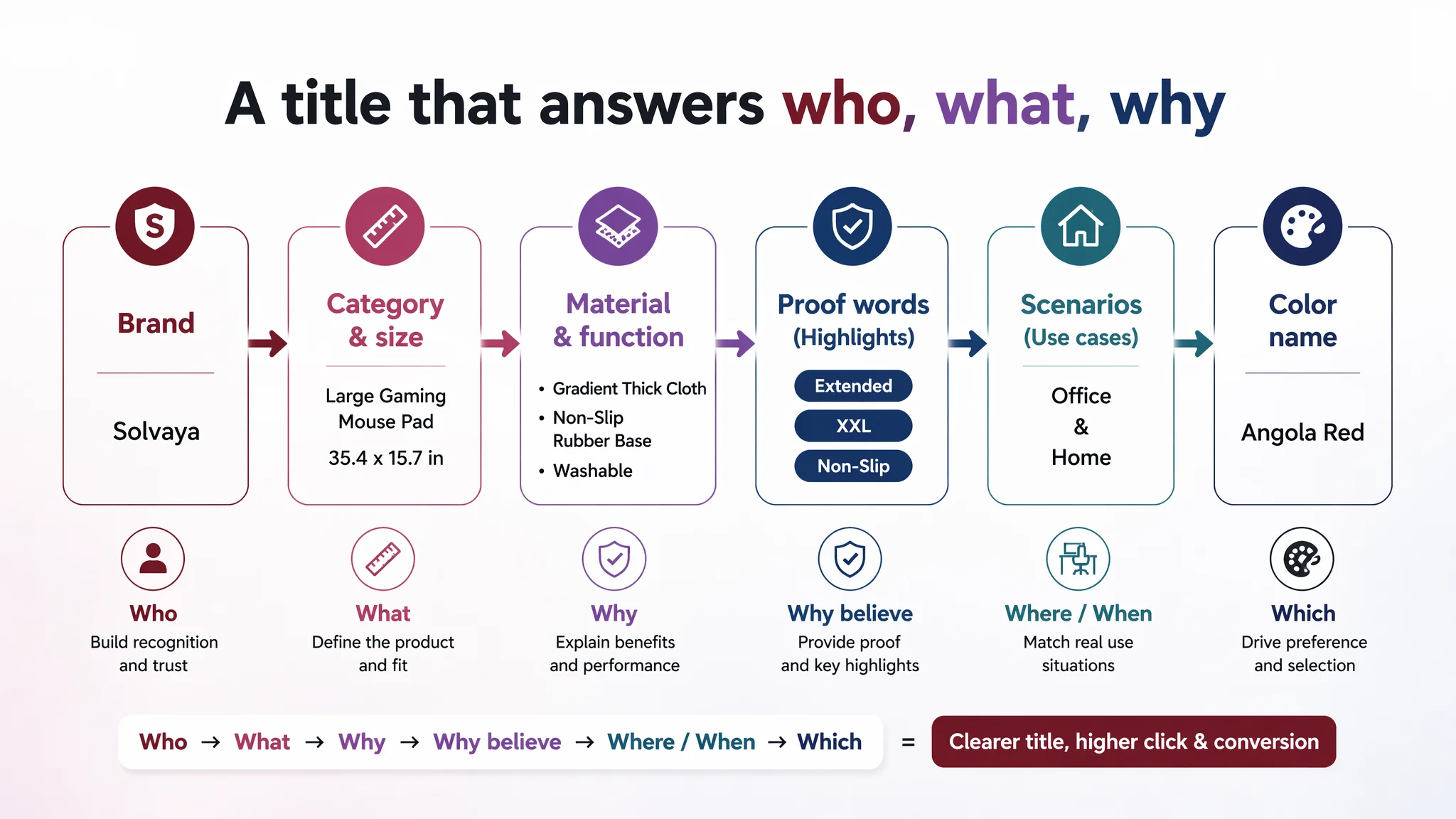
Title: From Attribute List to Search‑Friendly Promise
The proposed title restructuring:
Large Gaming Mouse Pad, 35.4x15.7in Extended XXL Keyboard Mat, Gradient Thick Cloth Mousepad with Non-Slip Rubber Base, Washable Desk Pad for Office & Home, Angola Red
Key shifts in logic:
- Keep the brand, but move straight into “Large Gaming Mouse Pad” as the opening.
- Add “Extended” and “XXL” to anchor the size advantage.
- Lock in explicit dimensions early (35.4 x 15.7 inches).
- Integrate key attributes once, not repetitively:
- Gradient, thick cloth, non‑slip rubber, washable.
- Close with use scenes (“Office & Home”) and specific color naming.
This is not about stuffing more keywords; it is about doing a better job of:
- Matching Amazon search behavior.
- Explaining at a glance who this is for and what outcome it delivers.
Bullet Points: From Product-Centric to Pain‑Point Logic
The existing bullet structure was largely attribute‑first:
- Color choices and aesthetic.
- Surface and material.
- Size and ergonomics.
- Gift attributes and packaging.
- Material explanation and after‑sales.
The competitor’s structure instead started from user pain points:
- Desk coverage and clutter.
- Wrist comfort and edge abrasion.
- Stability and anti‑slip.
- Pattern aesthetics and suitability.
- Cleaning and waterproofing.
DeepBI’s optimization inverted the logic, aligning each bullet with a clear shopper concern:
1. XXL Large Size & Stylish Ambiance
- 35.4 x 15.7 inches, 3mm thick.
- Explicit promise: fits keyboard + mouse + desk items, keeps workspace uncluttered.
- Differentiator: 7 gradient colors to “transform” the desk atmosphere.
2. Ultra-Smooth Surface & Vibrant Prints
- Smooth tracking, accuracy, speed control.
- Thermal transfer technology → vibrant and colorfast.
- Washable and wear‑resistant → credible for gamers and office use.
3. Anti-Slip Base & Precision Stitching
- “8 pattern” rubber base to prevent movement.
- Edge stitching to prevent fraying and deformation.
4. Ergonomic Comfort & Eco-Friendly Material
- 3mm thickness for wrist comfort.
- Noise reduction for heavy typing.
- Clear, honest note on natural rubber scent and dissipation.
5. Luxury Gift Packaging & Quality Assurance
- Unique gift box as a differentiator.
- 30‑day quality assurance and contact path via Amazon.
The business shift here is critical:
- The bullets no longer only say what the product is.
- They now explicitly address why it matters to the user and what problem it solves.
This Product Page Did Not Lack Traffic. It Lacked Trust and Scenario Fit.
Main Images: No Visual Reason to Click, No Proof to Believe
The image‑level gap was not about pixel resolution; it was about decision logic at thumbnail scale.
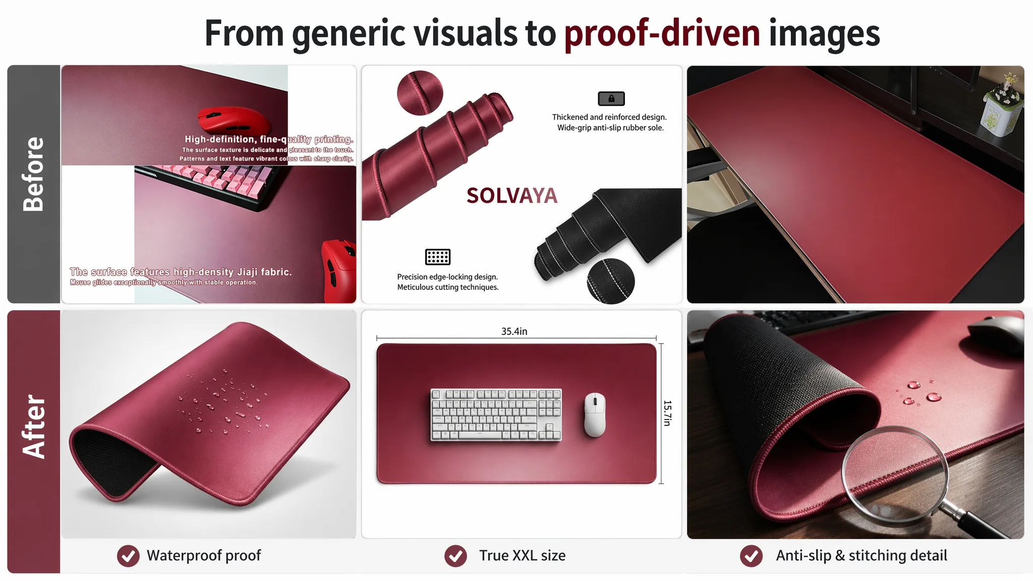
DeepBI’s diagnosis highlighted:
- A primary image with cheap‑looking reflections and flat angle.
- No clear perception of size relative to keyboard and mouse.
- Technical claims (non‑slip, thick, waterproof) not translated into convincing visuals.
- Minimal scenario diversity — essentially one office scene.
The optimization focus:
1. Hero Angle for Clickability
- 45‑degree tilt, pad occupying ~75% of the frame.
- Clean light‑gray gradient background.
- Realistic soft shadow for a floating, premium effect.
- Keep the deep red gradient as the visual anchor.
2. True Size Visualization
- Top‑down flat lay, pad centered and filling ~80% of frame.
- Standard‑size keyboard and mouse placed on top.
- Clear dimension labels (“35.4in” and “15.7in”) along edges.
3. Anti‑Slip and Edge Durability Proof
- Partial roll‑up on one side to expose bottom texture.
- Strong side light to reveal stitching density.
- Wood‑desk background to suggest real use, plus a magnifier overlay showing stitch detail.
4. Waterproof Performance Proof
- Low‑angle shot with water droplets on the surface.
- High‑contrast highlights to show beading and non‑absorption.
- Background hint of a monitor base to keep context.
5. Edge Micro‑Detail as Professional Signal
- Extreme close‑up of corner stitching.
- Black background for contrast, with concise text like “Reinforced Edges”.
6. Office and Gaming Scenes as Separate Personas
- Bright, minimalist office desk with laptop, coffee, small plant.
- Dark, RGB‑lit gaming setup with mechanical keyboard and ergonomic mouse.
7. Packaging and “Out‑of‑Box” Experience
- Product with gift box and filler, hinting “flat after unboxing” to counter fears of curling.
These are not aesthetic tweaks for their own sake. They directly address:
- Why this pad is worth a click on the Amazon search page.
- Why its claimed functions should be believed once the shopper arrives on the product page.
A+ Content: From “Showing the Product” to Completing the Story
The competitor’s A+ leveraged:
- A lead KV image focused on large coverage and clean desk impression.
- A user‑role mapping section (GAME / WRITING / WORK / HOME).
- A pattern library, emphasizing multiple designs and sizes.
- Function modules with close‑ups and iconography: waterproof, non‑slip, no glue peeling.
The target Listing, in comparison:
- Had brand, core selling points, material grids, and a color matrix.
- Lacked explicit waterproof proof.
- Lacked a structured persona mapping.
- Used more emotional, less verifiable language.
DeepBI’s optimization logic reorganized the A+ into clear modules:
1. Opening KV: XXL Coverage & Gradient Aesthetics
- Full‑width desktop scene, pad occupying ~70% of space.
- Clean, white wall and wood desk.
- Simple “XXL EXTENDED SIZE” tag — first impression: “big and clean,” not “busy and noisy.”
2. Smoothness/Control Module
- 30‑degree angled pad with ghost‑trail mouse movements.
- “ULTRA-SMOOTH SURFACE” text call‑out.
- Directly addresses friction and control concerns.
3. Waterproof & Stain Resistance
- Close shot of water droplets on the surface, clearly beading.
- “Easy to wipe clean” communicated visually.
- Strengthens trust for spill situations in office or gaming.
4. Reinforced Edges & Durability
- Macro view of stitching with “Reinforced Edges” label.
- Answering the common fear: fraying, lifting, or peeling.
5. Office Scenario Module
- Clean, bright workstation — laptop, coffee, plant.
- Implicit message: “This pad helps you keep a tidy, professional desk.”
6. Anti‑Slip Bottom Module
- Corner flipped up to reveal V‑pattern rubber texture.
- “Non-slip Rubber Base” text.
- Visual confirmation that the pad stays in place.
7. Gaming Scenario Module
- Dark room, RGB keyboard, and mouse on the gradient pad.
- Purple/blue lights matching the product’s gradient tones.
- Direct appeal to gamers’ visual and emotional expectations.
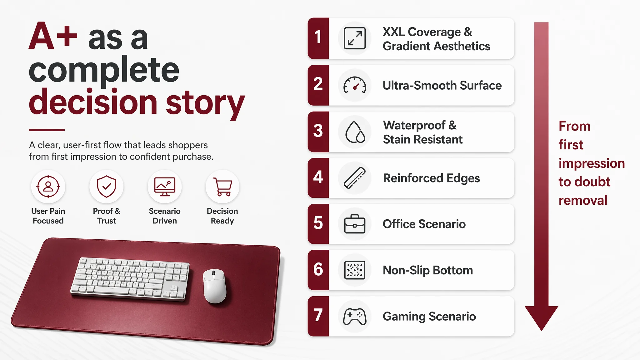
The net effect is that the A+ stops being a collection of nice photos and becomes a structured narrative:
- “This mouse pad covers your space and cleans your desk.”
- “It moves smoothly and tracks accurately.”
- “It resists spills and cleans easily.”
- “It will not curl, fray, or slide.”
- “It fits both your office life and your gaming life.”
Only after that story is in place does it make sense to push more traffic.
Why DeepBI Refused to “Just Tune the Ads First”
From a decision‑logic standpoint, DeepBI recommended:
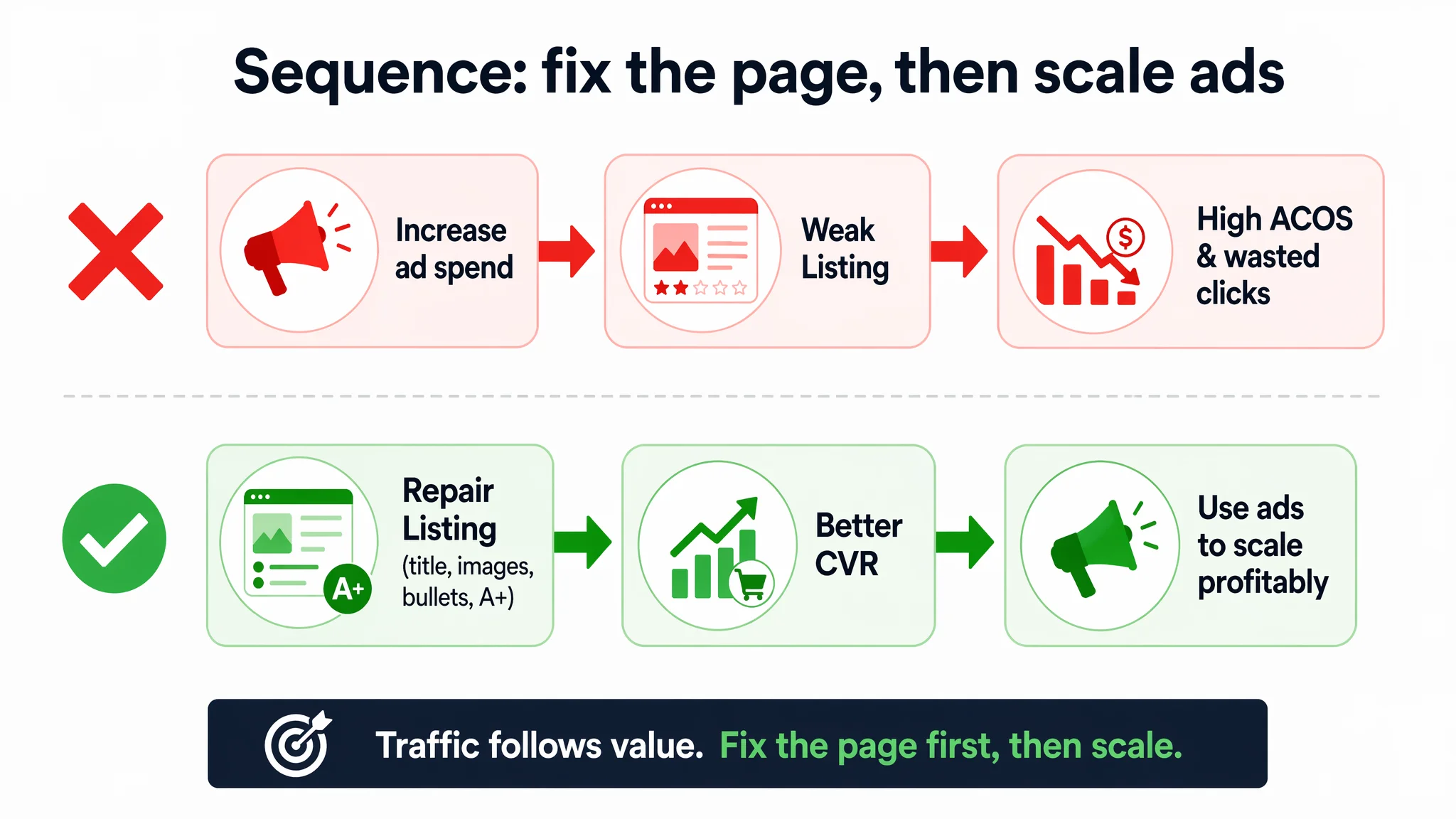
1. Do not increase ad budgets on this ASIN until the Listing gap is materially reduced.
2. Prioritize main image, title, bullet, and A+ restructuring as the first lever.
3. Use ad data later to validate whether the improved Listing really converts better.
The reasoning:
- Incremental ad optimization on a weak Listing yields diminishing and expensive returns.
- Listing improvements, once done correctly, improve both organic and paid conversion capacity.
- Every additional click bought before fixing the page is a higher‑risk dollar.
By focusing first on:
- A clear, outcome‑oriented title.
- A main image stack that wins thumbnail clicks and proves claims.
- Bullet points that trace pain → solution → outcome.
- A+ modules that systematically remove doubts.
…the seller builds a more resilient base for both organic ranking and ad efficiency.
After the Rebuild: How Ad Traffic Becomes Useful Again
The case material does not include precise post‑change metrics, so it would be irresponsible to fabricate specific lifts in CTR, CVR, or ACOS.
What we can say, based on the logic of the changes and DeepBI’s framework, is how the operating state and risk profile shift once the Listing is repaired:
- Click potential improves
- Stronger primary and secondary images increase the probability that each impression translates into a click.
- Conversion path strengthens
- Shoppers landing on the page now see:
- Clear size context.
- Visual proof of waterproof and anti‑slip.
- Edge durability evidence.
- Persona‑matching scenes (work vs. gaming).
- Bullet points that promise concrete outcomes.
- Advertising dependence becomes healthier
- As the page better converts both organic and paid traffic, the seller is less forced to rely on ever‑increasing bids to maintain volume.
- Traffic structure risk decreases
- Ads are no longer primarily amplifying weaknesses.
- Organic positions have a better chance to hold because conversion is more competitive.
Equally important is the change in the seller’s understanding:
- High ACOS is not always an ad‑strategy failure.
- Listing conversion directly governs how far ads can realistically be optimized.
- Title, main images, bullets, and A+ are not separate tasks; they must be coordinated as a single persuasion system.
- Before scaling budgets, the core question must be: “Does this Amazon Listing deserve more traffic?”
What Other Amazon Sellers Can Take from This Case
This gaming mouse pad story is not unique to that category. It is a pattern many Amazon sellers face, especially in visually competitive segments:
- You have acceptable ratings and a full set of images and A+ modules.
- You see competitors with similar products and ratings but stronger, more stable sales.
- Your first reaction is to push on keywords, bids, and campaign structures.
This case suggests a different discipline:
1. Use objective Listing scoring against a real benchmark, not gut feel.
If your title, main images, bullets, and A+ all underperform, you are not in an “ads problem” yet — you are in a “page cannot monetize traffic” problem.
2. Treat main images and A+ as business levers, not design decoration.
Every image must have a defined job:
- Win the click.
- Prove a claim.
- Resolve a fear.
- Map to a scenario.
3. Restructure bullets around user outcomes, not internal attributes.
If a bullet could appear on almost any similar product, it is not strong enough.
4. Sequence decisions correctly.
Fix the Amazon Listing’s ability to convert first. Then optimize ads to exploit that improved conversion, instead of trying to compensate for a weak page with more spend.
DeepBI’s real contribution in this case was not generating nicer pictures or longer copy. It was forcing a reversal of judgment:
- From “our ads are not sophisticated enough”
- To “our Amazon product page is not yet good enough to justify more traffic.”
For Amazon sellers, that shift in perspective often marks the difference between running harder on the same spot and building a more stable, compounding growth trajectory.