

For this Amazon seller in the DIY art & craft supplies category, the first instinct was to blame ads. Traffic on their alcohol-based marker set in the Amazon marketplace was not turning into orders, and ACOS was difficult to control. The team suspected keyword setup and bids, and kept thinking in terms of “optimize campaigns, refine targeting, push more traffic.”
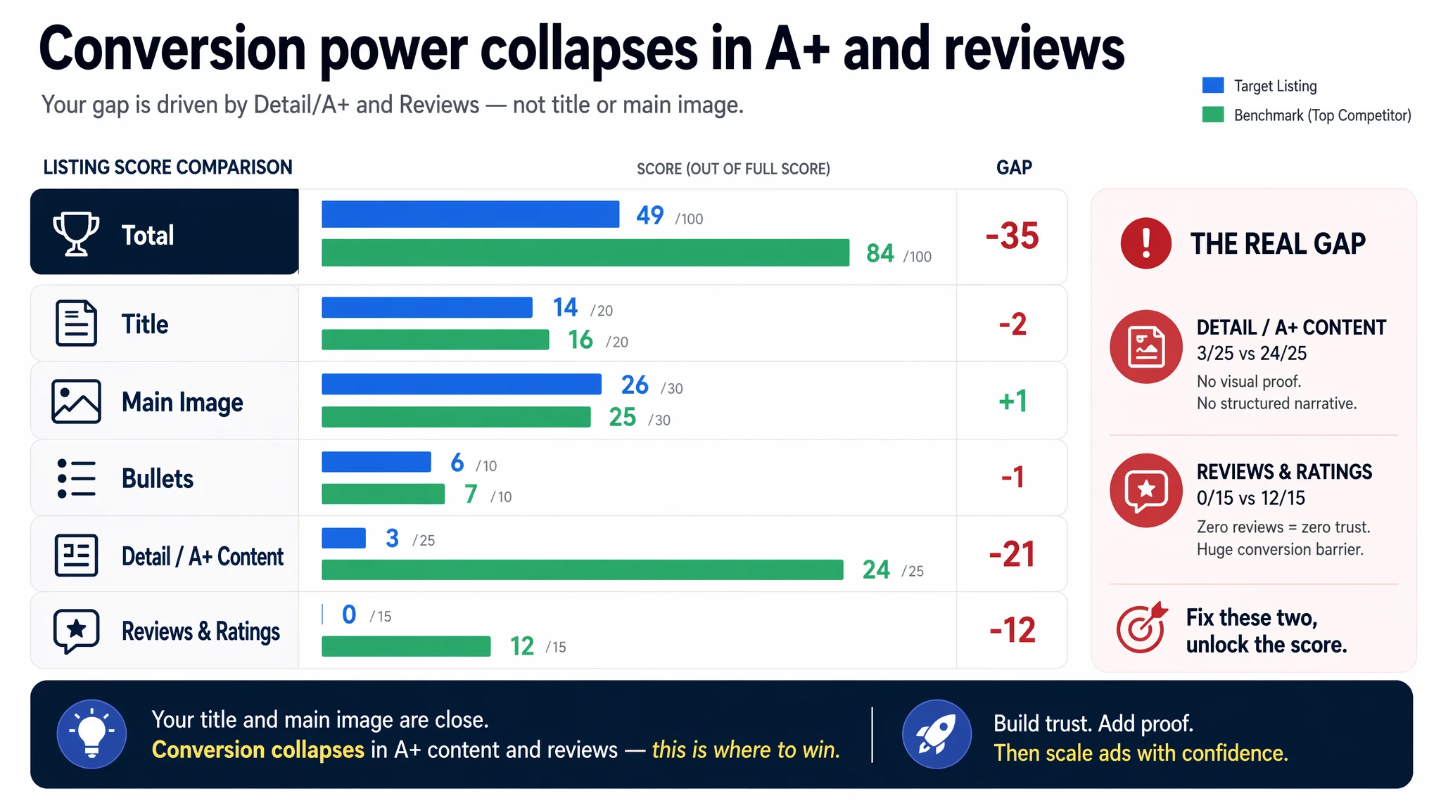
Once DeepBI put their Listing into a full Amazon Listing scoring and competitor benchmark, a different picture emerged. The product-page score was 49/100 versus a benchmark at 84/100. Title and main image were not the main disaster. The real gap was brutal: a near-empty detail/A+ section (3/25) and zero reviews (0/15), compared with a competitor’s rich visual A+ (24/25) and 4.6-star, 221-review base (12/15). The page simply could not carry the traffic it was already getting.
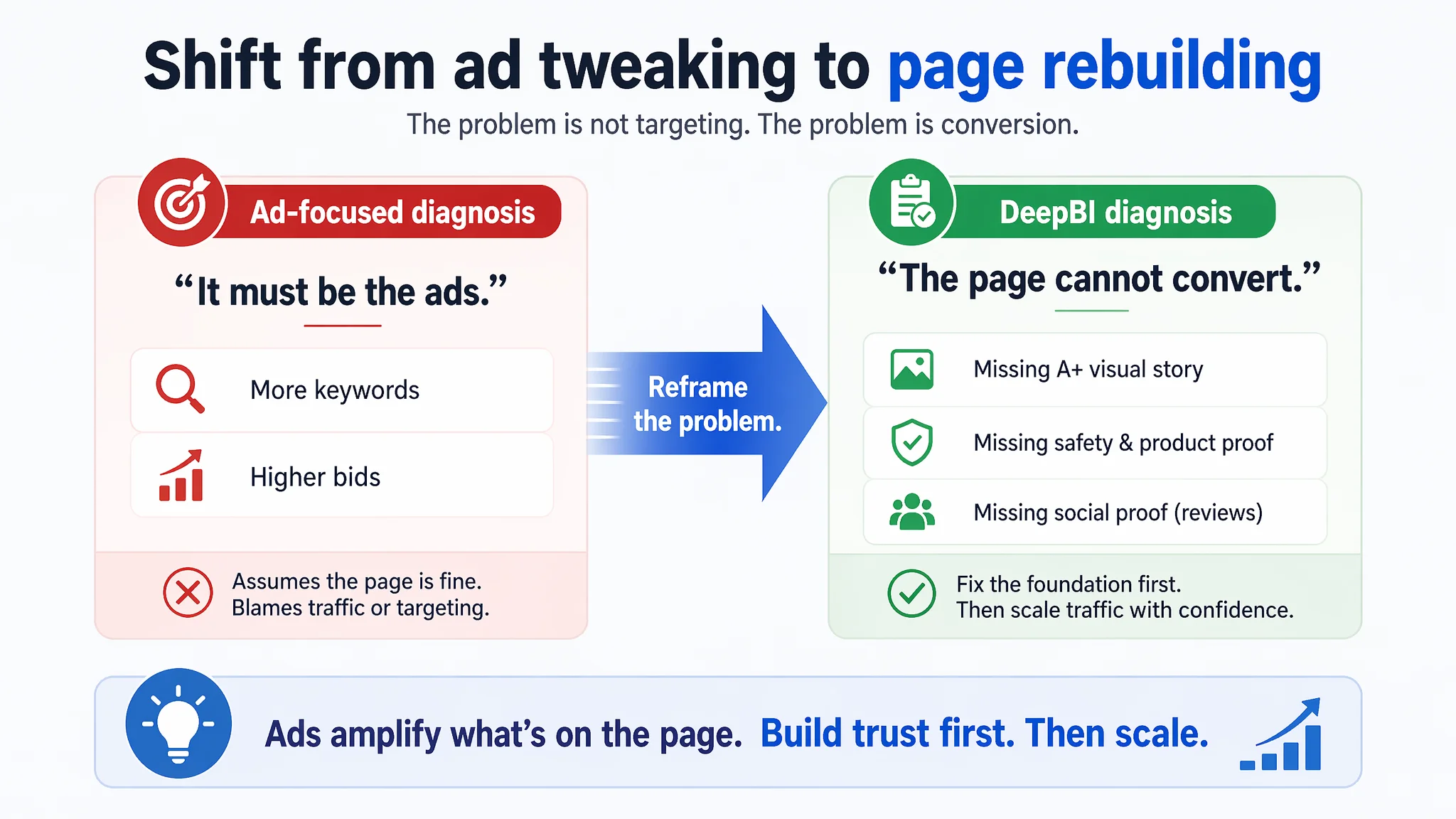
The optimization direction therefore shifted completely. Instead of treating this as an “Amazon ads fine-tuning” problem, the work focused on rebuilding the Listing’s conversion capacity: clarify outcome-focused title logic, rebalance main-image information density, re-architect bullet points around “pain point → proof → reassurance,” and, most critically, design a trust-building A+ visual chain that mirrors how buyers actually decide. Only once the page could explain, prove, and reassure did ad traffic start to make commercial sense again.
For other Amazon sellers, this case is a reminder: when ACOS feels unmanageable and orders lag behind impressions, it is not always an advertising problem. Sometimes the real issue is that the Listing has no story, no proof, and no social validation—so every extra click bought is just more expensive doubt.
This Was Not a Traffic Problem. It Was a Page With No Convincing Power.
At first glance, nothing about this product should have doomed it.
It is a dual-tip marker set for DIY crafts—an established demand on Amazon, with clear use-cases: rocks, fabric, glass, cardmaking, kids’ art. The category benchmark Listing is strong, with healthy reviews and a mature visual narrative. Ads should, in theory, be able to push this kind of product.
But once the Listing was scored against its best-performing direct competitor, the constraint became obvious:
- Total Listing score:
- Target Listing: 49/100
- Benchmark Listing: 84/100
- Gap: –35 points
- By dimension (Target vs Benchmark / Full score):
- Title: 14 vs 16 / 20 (–2)
- Main image & image set: 26 vs 25 / 30 (+1)
- Bullet points: 6 vs 7 / 10 (–1)
- Detail/A+ content: 3 vs 24 / 25 (–21)
- Reviews & ratings: 0 vs 12 / 15 (–12)
The title was not perfect but broadly acceptable. The main image set was even slightly ahead in raw scoring. Bullet points were weak but not catastrophic.
The real collapse was in A+ detail content and social proof. The target Listing had:
- No A+ or visual modules at all—just plain text.
- Zero reviews, zero rating, no user feedback on the page.
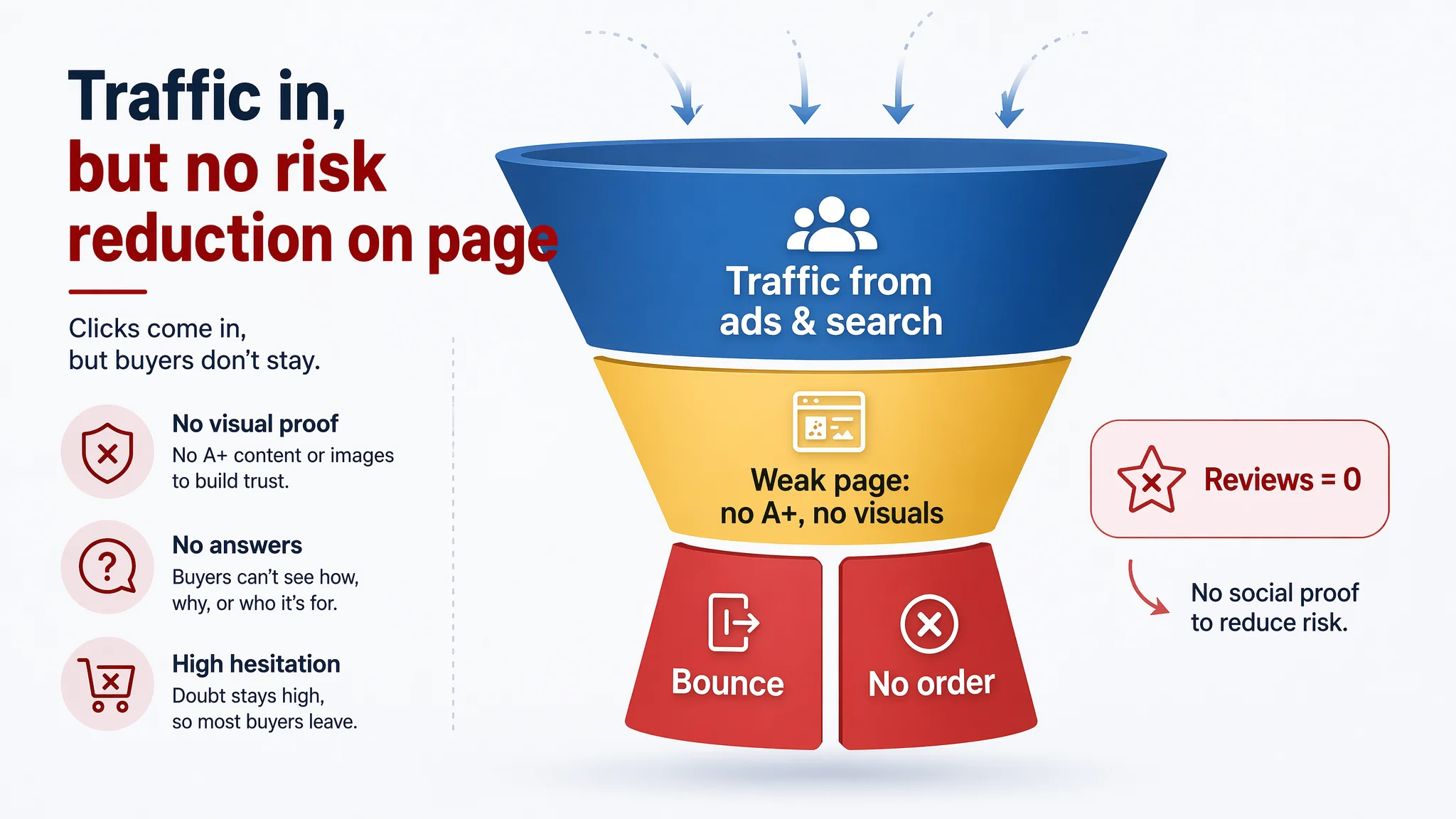
In other words, the Listing had almost no way to reduce risk perception once a buyer clicked in from Amazon ads or organic search.
“The real problem was not that ads failed to bring traffic. It was that the page could not convert the traffic.”
As long as this remained true, any further ad optimization was just amplifying a structurally unconvincing product page.
The Original Misdiagnosis: “Ad Optimization Hasn’t Been Precise Enough”
From the seller’s perspective, the symptoms looked like a classic Amazon advertising problem:
- Impressions from Amazon ads were showing up.
- Clicks were there, but orders lagged.
- ACOS felt high relative to expectations.
So the team leaned on familiar levers:
- Adjust bids and campaign structure.
- Test more keywords around “markers,” “DIY,” “craft supplies.”
- Try to refine targeting.
This thinking assumes one key premise: that the product page is already at a basic standard of conversion, and that poor performance must be because not enough of the “right” buyers are seeing it.
DeepBI’s scoring made that premise untenable.
Compared with the benchmark, the target Listing’s conversion foundation was visibly incomplete:
- No structured A+ visuals to explain features and outcomes.
- No safety or non-toxic proof at image level.
- No scene-based reassurance for parents, hobbyists, or gift buyers.
- No early review base to de-risk the purchase.
In this state, even if ads found perfectly matched buyers, those buyers landed on a page that looked half-finished compared to what they are used to in this category.
Amazon ads were not the main failure; they were just the most expensive place where the failure showed up.
Where the Data Pointed: Listing Conversion Was the Real Bottleneck
DeepBI’s Listing scoring system forces all assumptions to go through one question: “If we send more qualified traffic here today, does this page deserve it?”
For this marker set, several specific gaps made the answer “no,” or at best “not yet.”
1. The Title Communicated Features, Not a Clear Competitive Promise
On paper, the title was not terrible: it mentioned “24 Colors,” “Soft Brush Dual Tip,” “Quick-Drying Waterproof,” and surfaces.
But the benchmark Listing showed what the category’s top-performing logic looked like:
- Lead with a clear, concrete advantage:
“26 Markers Includes Extra White & Black” versus a generic “24 Colors”
- Add professional-feeling specifics:
“0.7mm Extra Fine, Brush Tip” rather than just “Soft Brush Dual Tip”
- Surface sensory and safety reassurance:
“Odorless” for smell-sensitive buyers and parents.
- Use functional words that imply durability:
“Permanent” before listing materials (rock, fabric, etc.).
- Keep structure tight: brand + quantity + core outcome/advantage + key modifiers.
The target title:
- Buried important selling points like “Quick-Drying Waterproof” in the latter half.
- Lacked any extra-value signal (e.g., additional marker colors) that could stand out in Amazon search results.
- Sounded more like a neutral catalog description than a reason to choose this Listing over others.
Impact on business logic: This weakens CTR from both ads and organic search, but more importantly, it weakens pre-commitment. Buyers do not enter the page thinking, “This one has a concrete advantage.” They enter to check, and in a competitive category, that is a fragile start.
2. The Main Image Was Busy, Not Persuasive
The main-image dimension scored close to the benchmark in a mechanical way, but the deeper analysis highlighted a crucial nuance:
- The first image carried too much information:
- Overloaded with text and small elements.
- Visual noise made it harder for Amazon’s algorithm to understand the core product at a glance.
- Technical or warning information was visually intrusive:
- Safety or usage warnings were present but designed in a way that could create subconscious doubt about product reliability.
- Scene images lacked the benchmark’s authentic, family-safe feel:
- Less polished DIY scenes.
- Weaker emotional resonance with “safe for home, safe for kids.”
Estimated impact from category A/B test patterns: a 3–5% CVR drag purely from how the first and supporting images framed trust and safety.
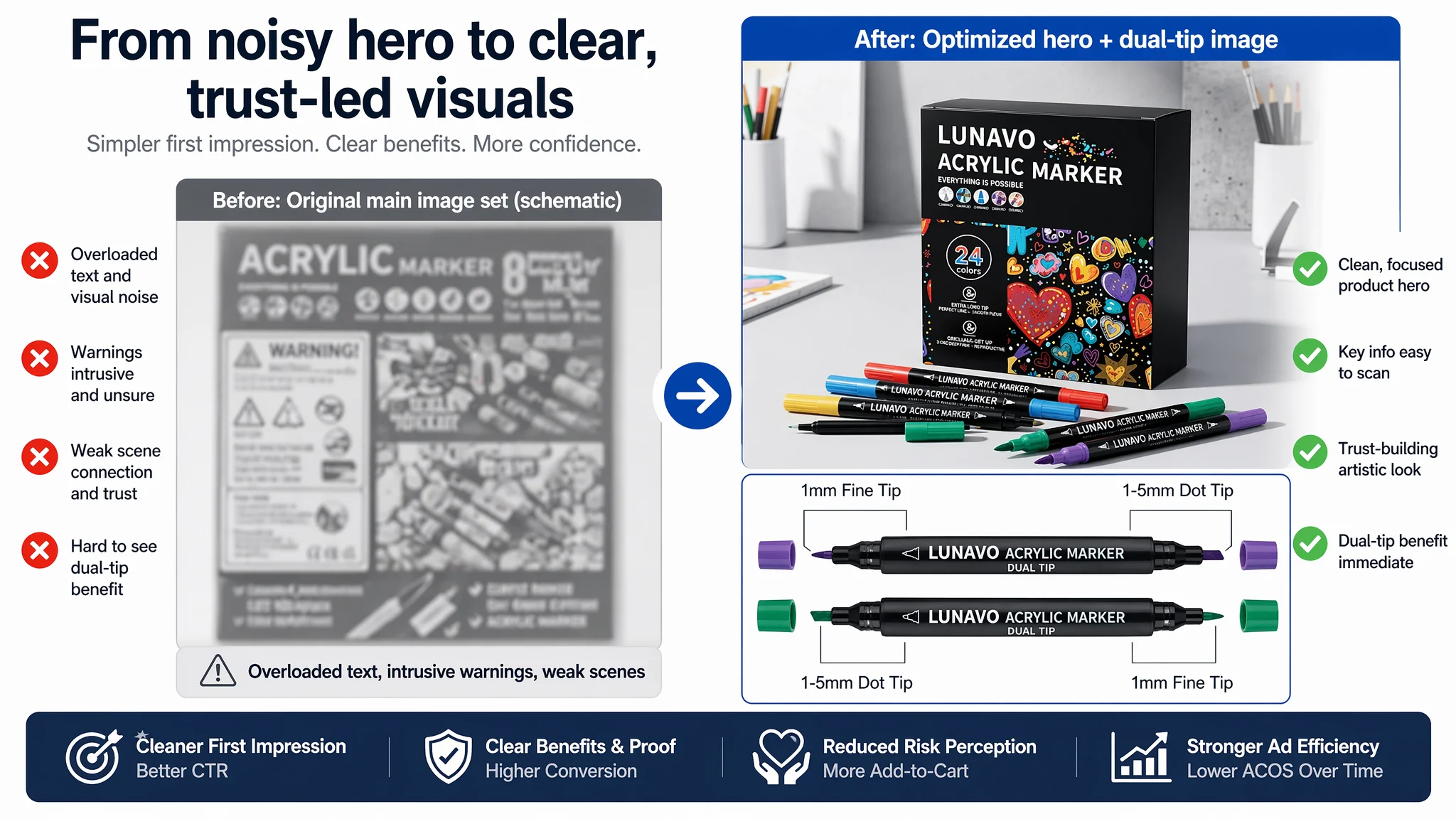
“Advertising does not only amplify advantages. It can also amplify a page’s existing defects.”
In this case, ads were amplifying a visually cluttered yet emotionally thin entry experience.
3. Bullet Points Listed Features, but Did Not Build a Buying Path
Bullet points scored slightly below the benchmark but, more importantly, reflected a different strategy:
- The competitor opened with “innovation” and “improvement”, immediately positioning itself as upgraded and different.
- The competitor used concrete data:
- Example: 7 mm cotton core, 50 m continuous line—numbers that make ink capacity and durability feel real.
- The competitor closed with user reminders and after-sales assurance, giving a final trust signal before “Add to Cart.”
By contrast, the target Listing’s bullet points:
- Focused on functional listing:
- Dual-tip description.
- Color and ink characteristics.
- Surfaces and scenarios.
- Safety and durability.
- Gift suitability.
- Lacked:
- A strong differentiation hook at the top.
- Quantified proof anywhere.
- A closing reassurance about support, replacement, or satisfaction.
Structurally:
- Target:
- Dual-tip design
- Color & ink traits
- Applicable surfaces & scenarios
- Safety & durability
- Gift attributes & audiences
- Benchmark:
- Innovation (no-shake design + dual-tip advantages)
- Improvements (cotton core capacity & packaging details)
- Functional traits (colors, surface compatibility, fast-dry)
- User-friendly (safety, eco attributes)
- Gifts & extended scenarios (portability, holiday use)
The benchmark bullets map onto a buyer’s mental checklist: “Is it better? Is it proven? Is it safe? Is it supported? Is it giftable?”
The target bullets mostly say, “Here is what it is,” not “Here is why it is better, safer, and backed.”
In a category where multiple Amazon Listings hit the same basic functional notes, this difference matters.
4. The A+ Detail Section Was Practically Empty
This is where the gap became decisive:
- Target Listing:
- No A+ images.
- No packaging visuals.
- No color chart.
- No safety-certification visuals.
- No design details.
- No multi-surface demonstrations.
- No creative outcomes gallery.
- Long, repeated text with no visual anchors.
- Benchmark Listing:
- Packaging display, showing what arrives at the door.
- Color swatch chart to set expectations.
- Safety certifications presented visually.
- Close-ups of design details.
- Usage scenes across surfaces (rocks, fabric, etc.).
- “Before/after” style or finished artwork examples.
- Graphical badges like “Certified Safe” with icon quadrants.
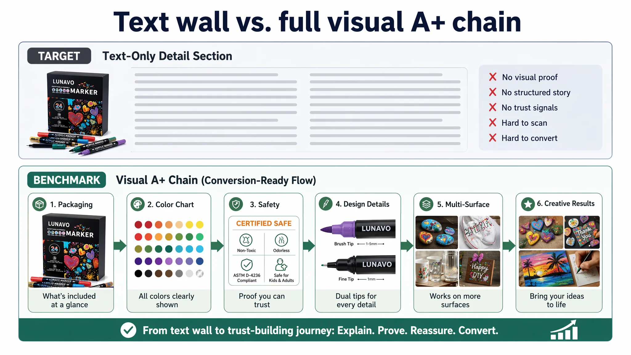
The effect is simple and severe:
- The benchmark A+ builds a complete recognition chain:
- “What is in the box?”
- “How does it look on different surfaces?”
- “Is it safe for kids?”
- “What do real projects look like?”
- “Is this brand professional and careful?”
- The target A+ leaves buyers with unanswered questions and no proof:
- No visual evidence of non-toxicity or washability.
- No clear sense of nib type or ink saturation up close.
- No context for how kids or hobbyists would actually use it.
In Amazon categories where risk (kids, fabrics, permanent marks) and quality doubts are high, text alone is not enough.
5. Reviews: Zero Versus 4.6 Stars and 221 Ratings
Finally, the social proof:
- Target Listing:
- 0 reviews.
- 0 rating.
- Benchmark Listing:
- 4.6 stars.
- 221 reviews.
- Several reviews visible on the first page.
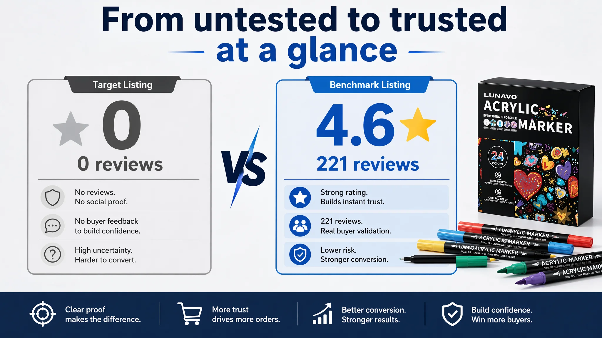
No matter how well-structured a page is, starting from absolute zero here means any buyer comparing the two Listings sees a stark contrast: one is validated by hundreds of others, one is untested.
At launch or early growth, this is normal—but it changes how you should interpret ad performance. High ACOS here does not mean ads are “bad”; it means they are trying to compensate for two missing layers: A+ proof and user confirmation.
Why DeepBI Refused to “Keep Tuning the Ads” First
Given these gaps, DeepBI’s judgment was straightforward:
- As long as detail content and trust signals remained this weak, ad performance would be structurally constrained.
- Pushing more traffic would not fix:
- Invisible safety and non-toxic proof.
- No visual demonstration of washability or multi-surface performance.
- No review base.
- No structured A+ narrative.
So the priority sequence changed:
1. Repair Listing conversion capacity
- Rebuild the A+ and visual modules to match category expectations.
- Clarify title logic to foreground concrete differentiators.
- Re-architect bullets into a “problem → solution → proof → reassurance” path.
2. Then re-evaluate ads and scaling decisions
- Once the page can convincingly answer “why this product” and “why it is safe and reliable,” additional traffic starts to make commercial sense.
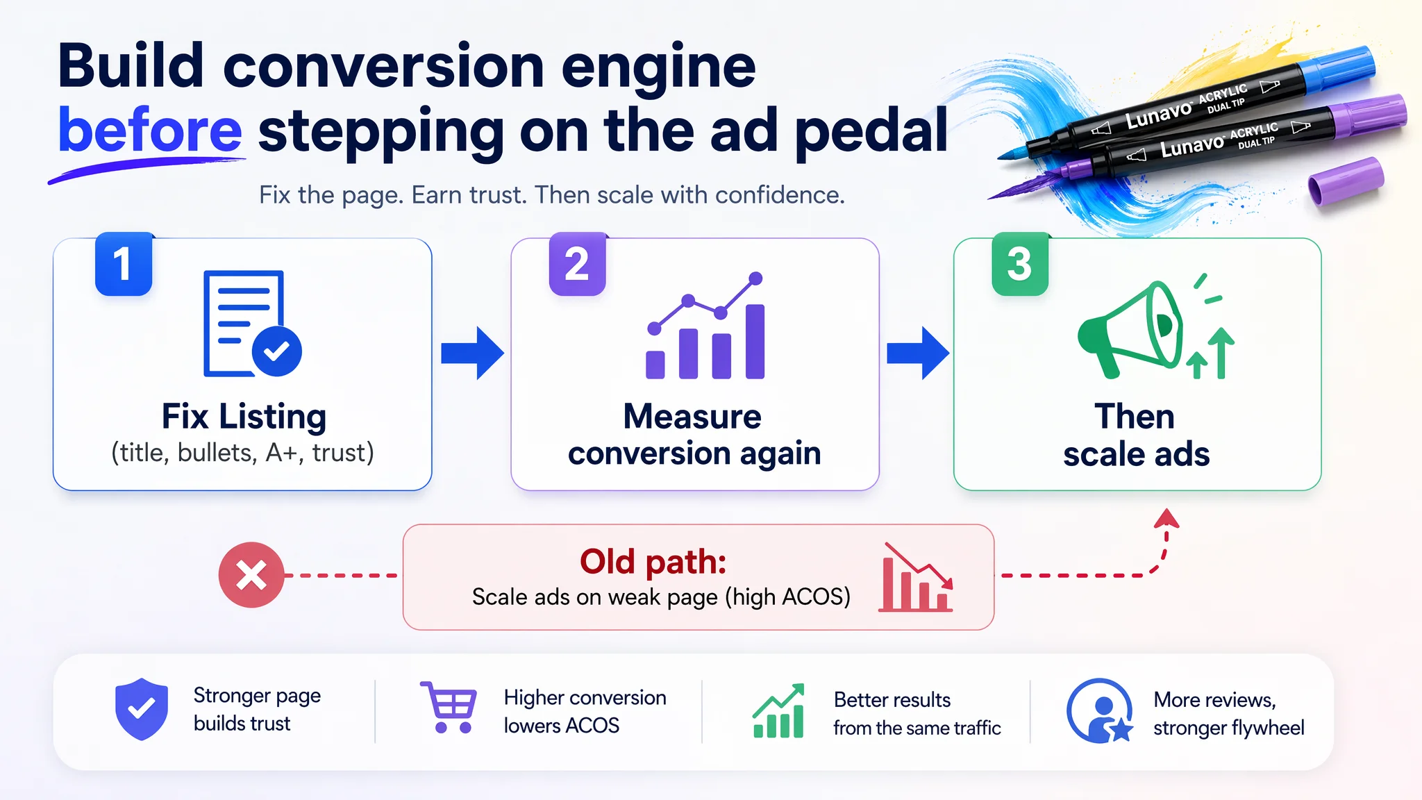
This is not an aesthetic choice; it is risk management:
- Continuing to treat this as an ads-only optimization problem would:
- Burn budget on clicks that the page cannot convert.
- Train Amazon’s algorithm to view the ASIN as weakly converting traffic.
- Make long-term ranking and organic visibility harder.
Fixing the Listing first protects future advertising leverage. It ensures that when ad spend does increase, it is feeding a page that can actually turn attention into orders and reviews.
Rebuilding the Page: From Bare Text to a Trust-Centered A+ Story
The optimization work was not about “making it prettier.” It was about aligning the Listing with how Amazon craft-marker buyers decide.
1. Title: From Generic Features to Specific, Outcome-Led Positioning
The revised title logic followed the category benchmark, but adapted to the product’s real attributes:
- Begin with quantity + advantage:
- If there is any true extra-value angle (e.g., special colors, metallics, extra white/black), surface it immediately.
- Pull critical modifiers forward:
- Move “quick-drying,” “waterproof,” or “permanent” to more prominent positions, as long as they are factually correct.
- Add precise nib or tip information:
- Specify tip sizes where possible to convey professionalism and search precision.
- Include sensory and safety descriptors where true:
- “Low-odor” or “odorless” when accurate and supported.
The shift in logic:
- From: “A long list of what the product is.”
- To: “A sharp, scannable promise of quantity + key advantage + form + validated attributes.”
This helps both Amazon’s algorithm and human buyers understand why this Listing deserves a click.
2. Main Image: Reduce Noise, Increase Clarity and Emotional Fit
On the main-image side, the focus was on:
- Reducing text clutter in the hero image:
- Let Amazon and buyers quickly understand “this is a marker set” at thumbnail size.
- Move secondary claims into secondary images or A+ modules.
- Reformatting warning or technical text:
- Keep safety notices, but present them in a less alarming, more integrated way.
- Strengthening scene authenticity:
- Show the markers used in realistic family or DIY contexts.
- Emphasize “safe, calm, controlled” usage rather than chaotic or overly staged scenes.
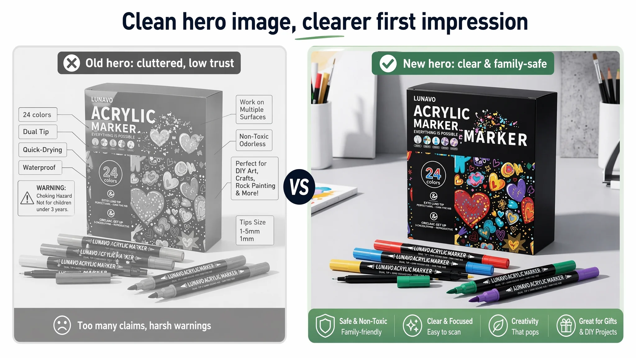
The goal is a main image that:
- Wins the click with clean visual hierarchy.
- Prepares the buyer emotionally for a safe, family-appropriate product before they read a word.
3. Bullet Points: From Feature Listing to a Persuasion Sequence
The bullet-point rewrite adopted the benchmark’s logic but tailored to the actual product:
1. Open with differentiation and improvement
- Why is this marker set an upgrade from what buyers already know?
- Example angles (if real): more ink capacity, upgraded packaging, better flow, improved tip durability.
2. Bring in data
- Any real numbers about ink volume, line length, or color count help turn generic claims into proof.
3. Clarify multi-surface performance and drying behavior
- Help buyers understand what happens on rock vs fabric vs glass.
- Address smudge risk and permanence.
4. Highlight safety and user-friendliness
- Non-toxic, low-odor, compliance where applicable.
- Age guidance if relevant.
5. Close with gifting and reassurance
- Gift occasions, plus a short support/after-sales line to show the brand is present after purchase.
This re-sequences the bullets into a decision path instead of a random feature list.
4. Detail / A+ Page: Build the Full Trust and Recognition Chain
For A+, the work was about restoring all the missing modules that the benchmark had already proven necessary in this category:
- Packaging & unboxing visuals
- Show exactly what arrives: box, trays, markers, any accessories.
- Reduce cognitive friction: “Will this look like the picture?”
- Color chart (swatch) module
- Each color as a small swatch with label.
- Helps both hobbyists and gift buyers understand variety and vibrancy.
- Safety and certification visuals
- If there are real certificates or standard compliances, present them clearly.
- Couple with kid-usage scenes (where appropriate) to show, not just tell, safety.
- Design detail close-ups
- Show dual tips, nib texture, barrel grip.
- Explain how these details solve common problems (fraying tips, inconsistent flow, etc.).
- Multi-surface application gallery
- Rock, fabric, wood, glass, card—each shown with actual marks and small notes on behavior.
- This minimizes “Will it work on my project?” hesitation.
- Creative results gallery
- Finished DIY pieces, labeled with surfaces and techniques.
- Future users see what they could make, not just what they could buy.
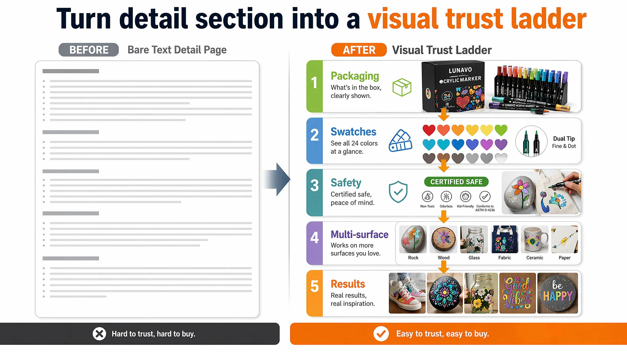
Instead of a long block of repeated text, the A+ becomes a visual ladder from interest to conviction.
Making Ad Traffic Useful Again
Once this Listing started moving toward a complete conversion framework—stronger title logic, clearer main image, structured bullets, and, most critically, a fully built-out A+—the role of ads changed.
Previously:
- Ads were compensating for a weak page.
- Each click had to work against:
- No visible proof.
- No structured narrative.
- No reviews.
With the rebuilt page:
- Ads began to activate the Listing’s underlying potential.
- Traffic now landed on:
- A familiar structure that matched category-leading expectations.
- Visual proof of safety, performance, and outcomes.
- A more coherent, quantified, and reassured offer.
Even before large review volume accumulates, conversion risk decreases:
- Buyers can see what they get.
- They can see where and how it works.
- They can connect the product to their own use-case.
From an operations standpoint, this is when scaling Amazon ads becomes rational again. ACOS is no longer dragged down by foundational trust gaps, and future review acquisition from paid traffic starts to build a reinforcing loop rather than a loss-making one.
What Other Amazon Sellers Can Take From This Case
Several patterns in this craft-marker Listing are common across Amazon categories:
- Ads were blamed first because that is where pain is visible (ACOS, ROAS).
The real constraint was structural: an incomplete page.
- The main image and title were “good enough on paper,” but they did not:
- Lead with a clear, comparative advantage.
- Frame the product emotionally around safety and reliability.
- Bullet points had information, but no persuasive logic.
Features were listed without:
- Differentiation at the start.
- Quantified proof.
- After-sales reassurance.
- The A+ detail area was almost empty.
In categories where the benchmark uses rich visual storytelling, this is a direct hit to trust and CVR.
- The Listing had zero reviews, competing against a mature ASIN with hundreds.
In such conditions, interpreting high ACOS as “ad setup failure” is a misread of the situation.
The key shift DeepBI pushed was diagnostic:
- From: “Our Amazon ads need to be tuned again.”
- To: “Our Amazon Listing, especially detail/A+ and trust modules, is not yet qualified to convert incremental traffic.”
Once sellers accept that Listing conversion quality is the foundation of advertising efficiency, decisions change:
- They prioritize building a page that can:
- Explain clearly.
- Demonstrate visually.
- Reassure confidently.
- They treat ads as an amplifier of a working conversion engine, not a bandage for a structurally weak one.
For Amazon sellers feeling the same pressure—rising ad costs, unpredictable ACOS, traffic that does not translate into stable orders—this marker-set case asks a simple question before the next bid adjustment:
If you were your own buyer, and you landed on your current product page from an Amazon ad, would you actually feel ready to buy?