


This case comes from an Amazon beauty seller in the US marketplace, operating a rice & black rice exfoliating mist set for face and body. The team was under pressure from rising ad costs and slow orders, and their first instinct was that “we just don’t have enough reviews” and “ads need more tuning.” But as the data came together, it became clear the real problem was not traffic or review stars—it was the Listing’s ability to explain what the product actually does and how to use it.
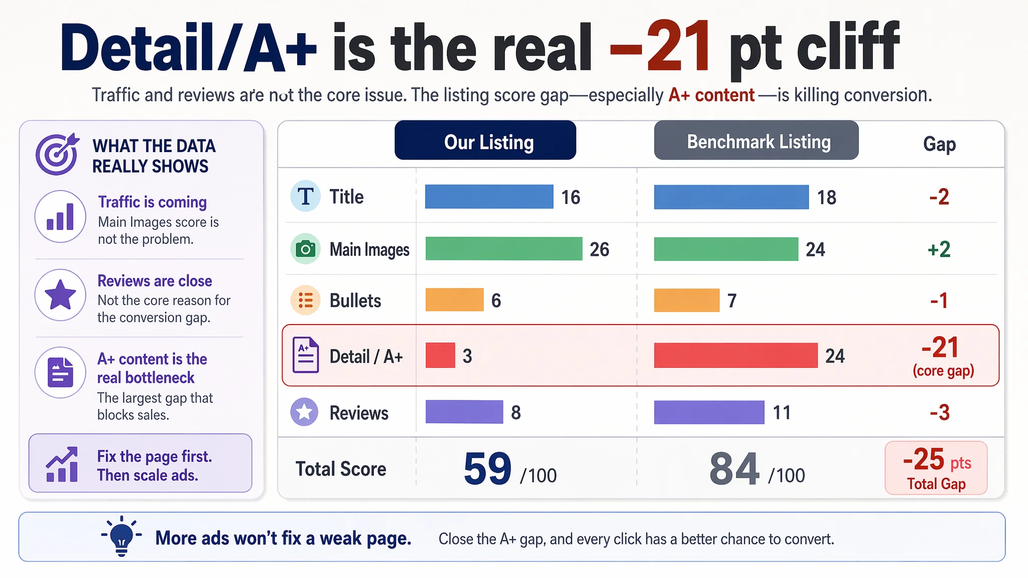
DeepBI’s Listing scoring showed a 59 vs 84 gap against a benchmark exfoliating mist Listing, with one dimension standing out: the detail/A+ module scored 3 vs the competitor’s 24. The product had some traffic and a decent star rating, but the Amazon product page was missing the visual story, usage logic, and trust bridge needed to convert. Worse, the main image sequence actually misled buyers on how the exfoliating mist should be used, directly creating doubt about stickiness and cleanliness.
The optimization that followed did not start with more ads or new keywords. It started with correcting the core usage logic, reframing the page around a “dual-solution set” (daily hydration vs deeper clean), and rebuilding A+ from “plain text only” to a complete visual chain: what the set is, what visible effect it delivers, how it works, and how to use it safely on face and body. For other Amazon sellers, this case is a reminder: when ACOS feels stubborn and CVR won’t move, the problem may not be in the ad console at all—it may sit in how your Amazon Listing tells the product story and resolves risk.
Amazon Ads Were Not Failing. The Page Was Consuming the Traffic.
From the seller’s perspective, the symptoms looked familiar:
- Ads were bringing some exposure, but orders did not scale with spend.
- Star rating was not terrible (4.1), but review volume was low.
- Internal discussion focused on: “we need more reviews,” “ads need better structure,” and “maybe the images aren’t pretty enough.”
Nothing in that view sounded unreasonable. However, when DeepBI ran a structured Listing diagnosis against a category-leading Amazon competitor, the numbers told a different story:
- Total Listing score: 59 vs benchmark 84 (–25 gap)
- Title: 16 vs 18 (only –2, not the core problem)
- Main image set: 26 vs 24 (slightly better on paper)
- Bullet points: 6 vs 7 (–1, but fixable)
- Detail/A+ content: 3 vs 24 (–21, the real cliff)
- Reviews dimension: 8 vs 11 (gap, but not fatal on its own)
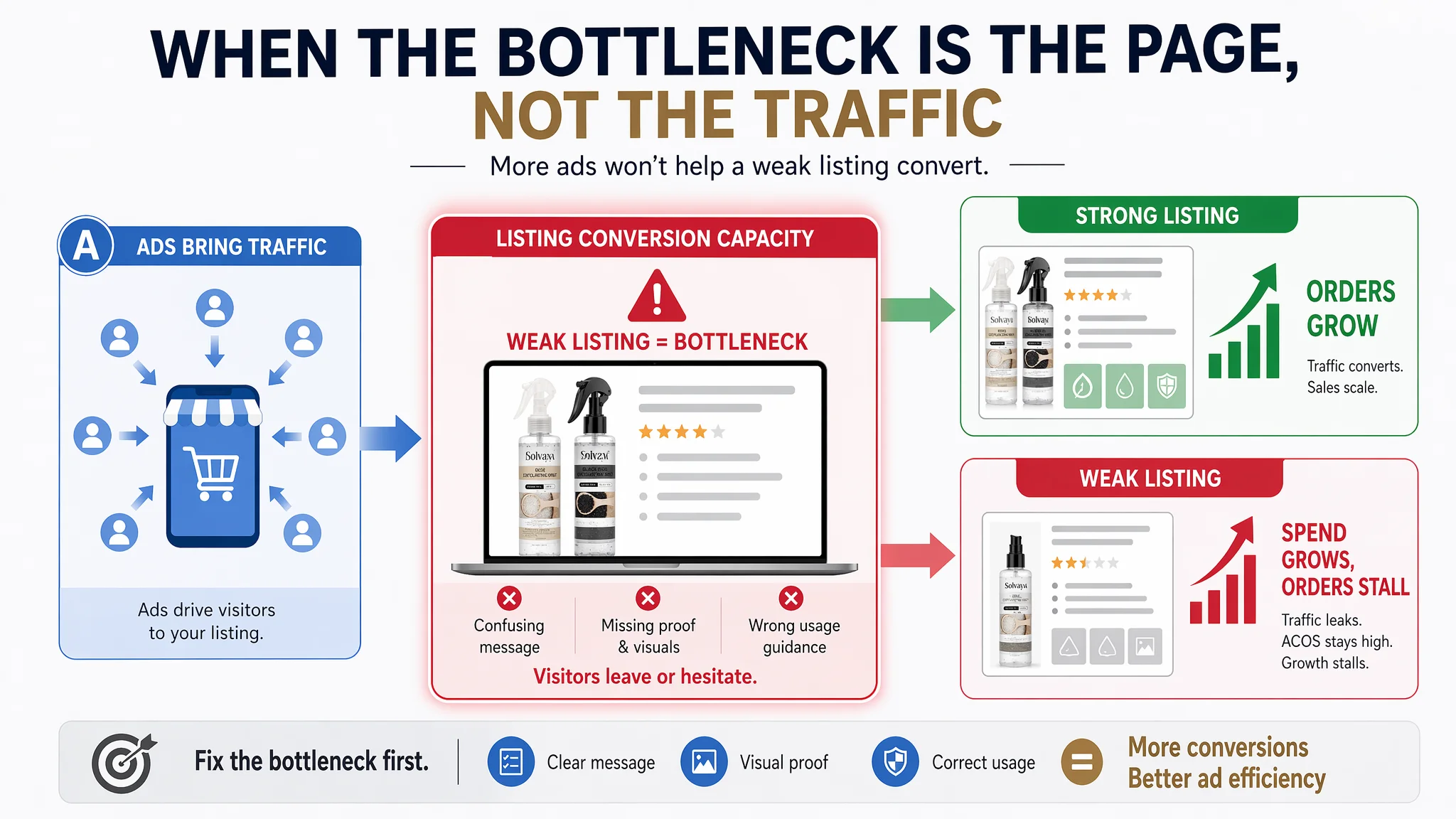
The ad side was not the main constraint. The Amazon product page simply did not have the conversion capacity to monetize the traffic it was already getting.
“The real problem was not that ads failed to bring traffic. It was that the page could not convert the traffic.”
At this stage, any additional budget into Amazon ads would mostly amplify a weak page outcome.
The Real Constraint Was Listing Conversion Capacity
Looking at the two Listings side by side, several structural gaps became obvious.
1. A title that “sounds nice” but does not anchor the search
The customer’s original title:
- Led with “Rice & Black Rice Exfoliating Mist Set,” but did not clearly emphasize “for face & body” at the front.
- Used abstract wording like “Dual Hydrating Skin Rejuvenation Mists” that felt flat and less searchable.
- Omitted volume/size (2 × 100ml / 3.4 fl.oz), weakening purchase confidence.
- Repeated “Rice & Black Rice” redundantly in parentheses instead of using that space to carry more meaningful information.
The competitor’s title:
- Opened with “Rice Exfoliating Mist Set for Face & Body”—immediately telling Amazon and the shopper: what it is and where it is used.
- Layered “Gentle Hydrating Skin-Smoothing Sprays” to clearly state outcome and safety.
- Included specs and reinforced the exfoliating function in terms aligned with actual search queries.
In isolation, a –2 gap on the title dimension is not catastrophic. But it signaled a pattern: the Listing repeatedly chose vague, cosmetic language over clear, search-aligned, trust-building language.
2. A main-image set that looked decent but confused the core use
On paper, the customer’s main-image dimension even scored slightly higher than the benchmark. But the issue was not purely visual quality—it was decision logic:
- Hero image composition
The first image combined model and products, but the model’s visual weight diluted focus on the two-bottle “set” nature. The benchmark Listing used clean, centered product composition that immediately telegraphed: “this is a rice exfoliating mist duo.”
- Before/after without the “process”
In exfoliation categories, shoppers don’t just want to see smoother skin—they want to understand how the effect is achieved. The competitor showed a clear exfoliation process with visual “residue” as proof (even if imperfect). The customer’s second image showed smaller pores and brighter skin, but almost no sense of immediate, visible effect or how it happens. That weakens perceived credibility.
- Most critical: a wrong step-by-step usage message
One of the images presented a three-step guide. The third step read: “Massage gently to promote absorption.” For an exfoliating mist designed to roll off residue and then be rinsed, this is a direct logic error. It tells buyers to leave the product on as if it were a leave-on essence. For a “mist + visible residue” product, this triggers exactly the fears that kill conversion:
- “Will this be sticky on my skin?”
- “If it’s exfoliating, why am I supposed to absorb it?”
- “Is this safe for my face if it doesn’t get rinsed off?”
At the same time, the bullet points and internal understanding of the product were actually “spray on dry skin, massage, see residue roll off, then rinse or wipe.” The main images and copy were contradicting one another.
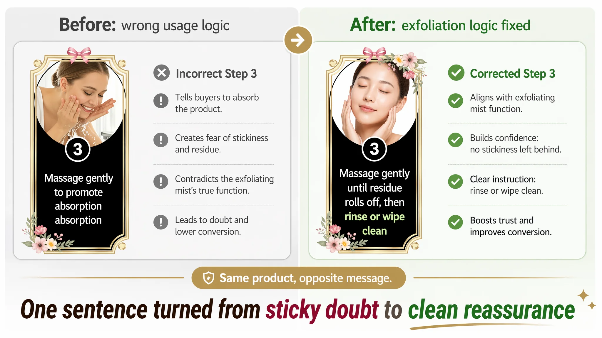
This single mismatch could quietly destroy buyer confidence even if the visuals looked “fine” in a design sense.
This Product Page Did Not Lack Traffic. It Lacked Trust.
Beyond the title and main images, the core trust bridge on Amazon—the A+ detail area—was almost non-existent.
3. An A+ section that was essentially a blank
The customer’s A+ content:
- Was only text, with no images at all.
- Repeated a single piece of copy without breaking it into modules.
- Offered no visual evidence, no how-to-use block, no before/after, no ingredient explanation.
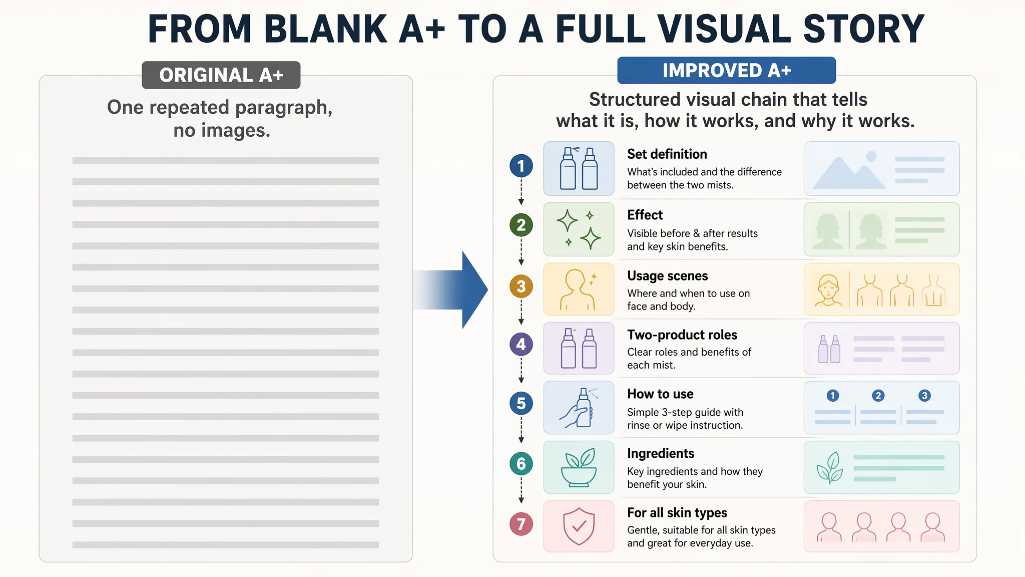
The competitor’s Amazon A+ content, by contrast, was a full conversion engine:
- Hero A+ module defining the set and clarifying the difference between the two bottles.
- Skin-effect comparison module: visual before/after of skin smoothness and radiance.
- Usage scenes and technique: photos and copy that show when and where to use (after shower, after exercise, shoulders, back, face, etc.).
- Two-product breakdown: clear roles of each mist.
- “HOW TO USE” step guide: simple 3-step flow to remove confusion and reduce perceived complexity.
- Ingredient/science module mapping rice, niacinamide, hyaluronic acid, etc., to benefits.
In DeepBI’s scoring:
- Detail/A+ dimension: 3 vs 25—a –21-point difference, and effectively the single biggest conversion bottleneck on the page.
Without visual A+:
- The product felt less real.
- The dual-mist set felt arbitrary instead of “a complete plan.”
- There was no clear reassurance on mildness, skin types, or rinse-off logic.
- Shoppers had to infer too much on their own.
For a beauty product that promises exfoliation, hydration, and sensitivity friendliness, this gap is not a “nice-to-have.” It is a structural risk.
Why DeepBI Did Not Keep Tuning the Ads First
Given this diagnostic picture, DeepBI’s judgment was straightforward:
- Pouring more budget into Amazon ads at this stage would mainly buy more impressions for a page that cannot fully explain itself.
- Ad-side experiments (bids, structures, new keywords) would deliver noisy data because the core page message was inconsistent.
The decision path was:
1. Treat the Listing as the first-class bottleneck, not the ad console.
The weakest dimension (A+) was also the one with the clearest path to fixing page-level trust and usage confusion.
2. Prioritize logical correctness over cosmetic improvement.
Before chasing a prettier layout, the team had to fix the usage story:
- Change “massage to promote absorption” to “massage until residue rolls off, then rinse or wipe.”
- Make it explicit that the product is not meant to stay as a sticky layer.
3. Rebuild the story of the “dual-solution set.”
Many shoppers looking at two near-identical bottles have a first reaction: “Do I really need both? Are they redundant?” If this question is not answered, they hesitate and leave. That’s lost CVR regardless of how good the ad targeting is.
“Advertising does not only amplify advantages. It can also amplify a page’s existing defects.”
Until the Listing could clearly define what the set is, what each bottle does, and how it is used, ramping ads was not the best use of capital.
How DeepBI Reframed the Page Logic
The optimization did not revolve around adding random modules. It followed the benchmark competitor’s logic, but adjusted to the product’s own strengths and constraints.
1. Title: from abstract promise to concrete, searchable clarity
Suggested direction:
Rice Exfoliating Mist Set for Face & Body - Black Rice & Rice Bran Water Skin-Smoothing Sprays with Niacinamide & Hyaluronic Acid, Gentle Hydrating Skin Rejuvenation Duo, 2 × 100ml / 3.4 fl.oz
Core changes:
- Lead with “Rice Exfoliating Mist Set for Face & Body” to align with high-intent Amazon searches and mirror category norms.
- Keep the key ingredients but attach them to outcomes: “Skin-Smoothing,” “Gentle,” “Hydrating.”
- Add 2 × 100ml / 3.4 fl.oz so buyers immediately know what they’re paying for.
- Remove redundancies (like repeated “Rice & Black Rice” in brackets) to preserve character space for more useful terms.
This doesn’t magically fix everything by itself, but it anchors the product in the right traffic and gives ads and organic ranking a more solid base.
2. Bullet points: from generic copy to a clear buying path
The original bullet structure was functional but flat. Against the benchmark, three weaknesses stood out:
- Weak scene description—too much “what it does,” too little “when and where you’ll use it.”
- Vague usage coverage—not explicitly calling out shoulders, back, body.
- Overly generic skin-type claim (“suitable for every skin type”) that did not calm sensitive-skin worries.
DeepBI’s proposed bullet structure reframed each point into a small decision logic:
1. Complementary set logic
Clarify that the two mists play different but complementary roles:
- Rice Mist: daily hydration and softness.
- Black Rice Mist: deeper clean and “revitalization” when skin needs more renewal.
This answers “why two bottles?” and positions the set as a simple daily ritual, not just extra product volume.
2. Visible exfoliation on face & body
Explicitly describe the “spray on dry skin, massage lightly, see residue roll away” experience:
- Make clear it works on face, shoulders, back, and other areas.
- Promise “visible smoothness in seconds” without harsh scrubbing.
3. Ingredient synergy
List key ingredients (Rice Bran Water, Hyaluronic Acid, Niacinamide) and attach them to:
- Lasting moisture.
- A calmer, smoother, more even tone.
4. Texture and non-stick reassurance
Emphasize:
- Lightweight.
- Fast-absorbing.
- No heavy or sticky residue.
This directly counters the fear generated by the previous “absorption” wording and by the category’s general concern with residue.
5. Skin-type and gifting reassurance
Move from a generic “for every skin type” to:
- Dry, sensitive, and combination skin explicitly named.
- Gentle daily use, plus a giftable positioning to expand the buyer pool.
Each bullet becomes part of a chain: “What is this set?” → “Where can I use it?” → “What’s inside?” → “Will it feel sticky?” → “Is it safe for my skin and worth gifting?”
Main Images: Fix the Logic Error, Then Reorder for Persuasion
In the main image set, DeepBI’s priority was not radical redesign, but rearrangement and correction within the given asset constraints.
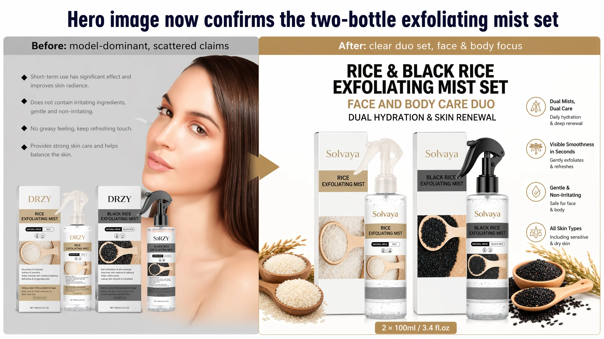
Hero image: confirm “two-bottle exfoliating mist set” at a glance
- Keep the model + product concept, but reduce the model’s dominance.
- Use big, readable text on the box area or overlay to clearly state:
- “Rice & Black Rice Exfoliating Mist Set”
- “For Face & Body”
- Core benefit: “Dual Hydration & Skin Renewal”
This makes the set identity self-evident even on mobile thumbnails.
Second image: process and feel, not just results
- Move pure before/after deeper in the sequence.
- Use the second image to answer:
- “How does it work?”
- “Will I see something happen?”
Visually, that means:
- Keep some before/after, but give more space to:
- A face usage shot.
- A body area (shoulder, arm) usage shot.
- Add clear copy such as:
- “Spray on dry skin”
- “Massage lightly”
- “See surface residue gently roll away in seconds”
This gives buyers a mental model of an immediate, tangible effect without resorting to exaggerated fake “flakes.”
Third image: separate the roles of the two mists
- Use a split layout:
- Left: Rice Mist
“Daily hydration & softness”
- Right: Black Rice Mist
“Deeper clean feeling when skin needs extra renewal”
- Move generic benefits (no harsh scrubbing, non-sticky, skin-balancing) under the appropriate bottle.
This directly answers “are these bottles redundant?” and supports the higher set price.
Fourth image: correct the three-step guide
This is the critical risk fix:
- Step 1: “Spray onto dry skin” (face or body).
- Step 2: “Massage gently until surface residue gently rolls away.”
- Step 3: “Rinse with water or wipe clean.”
Add explicit body coverage text: “Suitable for face, arms, legs, shoulders, and back.” Headline: “3 simple steps to instantly smooth, refreshed skin.”
Fifth image: ingredients that serve the positioning
- Keep this as the last “rational” trust anchor.
- Strip away vague icons that don’t add clarity.
- Focus on:
- Rice Bran Water → supporting hydration and comfort.
- Hyaluronic Acid → lasting softness and moisture.
- Niacinamide → daily tone balance and improved appearance over time.
Tie each ingredient directly to the claims already made in bullets and A+. The goal is to support, not introduce new, unconnected promises.
A+ Detail Page: From One Paragraph of Text to a Full Conversion Chain
The A+ area was the biggest structural weakness and, therefore, the biggest leverage point.
DeepBI’s guidance was to build a seven-module flow, each answering a specific shopper question:
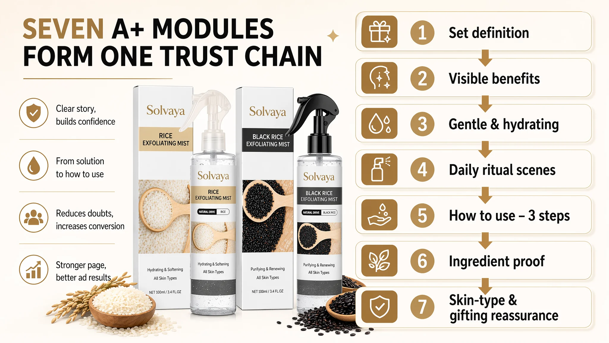
Module 1 – “What is this set?” (solution definition)
- Visual: both bottles together, clearly labeled.
- Message:
- “Rice & Black Rice Exfoliating Mist Set”
- “Dual textures, one complete routine”
- Rice Mist: daily hydration & softness.
- Black Rice Mist: deeper clean feeling when skin needs extra renewal.
- For face & body, gentle for all skin types, gift-ready.
This sets a “complete solution” frame instead of “two random mists.”
Module 2 – “What visible benefit do I get?” (outcome focus)
- Visual: subtle skin-surface macro or before/after focusing on:
- Smoothness.
- Radiance.
- More even look.
- Copy: align with “visible smoothness,” “refreshed feel in seconds,” and “improved overall appearance with continued use.”
No need for exaggerated flakes; focus on the “feel + look” outcome.
Module 3 – “Is it gentle and hydrating?” (risk removal)
- Visual: ingredient-focused, soft water/rice imagery.
- Message:
- Rice Bran Water + Hyaluronic Acid → lasting softness and moisture.
- Light, comfortable texture.
- Designed for dry, sensitive, and combination skin.
This comes before heavy process visuals to disarm rational skepticism about exfoliation harshness.
Module 4 – “Is it practical and easy to integrate?” (ritual & convenience)
- Visual: everyday use scenes (post-shower, after exercise, evening self-care), with spray in hand.
- Copy:
- “Spray – massage – rinse/wipe.”
- Works for face, arms, legs, shoulders, and back.
- A simple daily ritual, not a complicated spa routine.
Module 5 – “Exactly how do I use it?” (HOW TO USE, step-by-step)
- Structured 3-step guide:
1. Spray on dry skin.
2. Massage gently until surface residue rolls away.
3. Rinse or wipe clean.
- Optional row for:
- Frequency suggestions.
- When to choose Rice vs Black Rice mist.
This is the decisive antidote to any confusion created by past messaging.
Module 6 – “Why should I believe the claims?” (ingredient proof)
- Reiterate the core trio:
- Rice Bran Water.
- Hyaluronic Acid.
- Niacinamide.
- Map them directly to benefits already mentioned: hydration, softness, calming, more even tone.
No new promises; just evidence backing what has been said.
Module 7 – “Is this safe for me and worth buying now?” (final reassurance)
- Visual: lifestyle + packaging, highlighting gifting.
- Message:
- Gentle for dry, sensitive, and combination skin.
- For face & full-body care.
- Beautifully packaged for yourself or as a thoughtful gift.
This closes the loop: risk reduced, value justified, purchase made easier.
What Changed After the Page Logic Was Repaired
This case did not revolve around a dramatic “before-after” data chart, but several operating changes became clear once the Listing was reframed.
1. The Listing regained basic conversion ability
By:
- Correcting the usage logic in both main images and copy.
- Clarifying the dual-product roles.
- Building a complete A+ story from “solution” to “how to use.”
…the product page moved from “fragile and confusing” to “coherent and trustworthy.” Paid traffic and organic visitors now had a clear path to understand the product and see themselves using it.
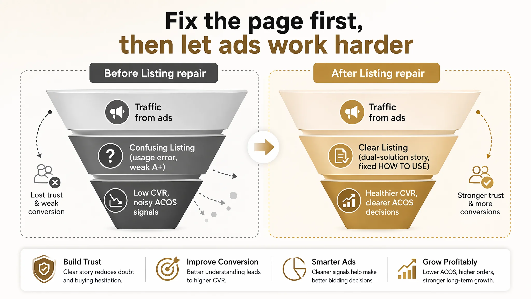
2. Ads became useful again instead of wasteful
With page-level obstacles reduced:
- Ad tests could more accurately reflect traffic quality rather than page confusion.
- Budget decisions around ACOS and TACOS became more grounded because CVR was no longer suppressed by messaging errors.
The store did not instantly escape review-count disadvantage, but at least existing traffic could convert as much as the product and market position allowed.
3. The seller’s understanding of Amazon optimization shifted
The most important change was not visual; it was conceptual:
- High ACOS is not always an “ad problem.”
- Decent star rating does not mean the Listing is okay.
- Main images and A+ are not just “decoration”—they are where you define:
- What the product is.
- How it is used.
- Why it is safe.
- Why two bottles make sense.
- What visible outcome the buyer can expect.
The customer team began to see that Listing conversion capacity is the foundation of advertising efficiency. From then on, the question before scaling ad spend became:
“Does this Amazon product page deserve more traffic yet?”
What Other Amazon Sellers Can Take from This Case
For other Amazon beauty and personal-care sellers, especially those working with exfoliating, “visible-effect” products, this case highlights a few hard-earned lessons:
1. Review count and star rating are important, but they are not the only trust driver.
A 4.1 with 10 reviews vs a 4.2 with 33 is a disadvantage—but a missing A+ and a contradictory usage guide can damage trust even more.
2. Main-image sets can pass a “looks good” test and still fail the “does this make sense?” test.
One wrong sentence in a step-by-step visual can silently kill conversion.
3. A+ is not optional in competitive categories.
When the benchmark has a full, image-rich story and you have one block of text, you are not just behind—you are structurally handicapped.
4. Ads amplify whatever your Listing already is.
If the page is confusing, ads amplify confusion. If the page is clear and persuasive, ads amplify sales.
5. Before turning up bids, fix the story.
Title, main image, bullet points, and A+ must work together as one chain. When they do, ad spend starts to feed a healthier funnel instead of leaking through page-level ambiguity.
This exfoliating mist seller’s experience shows how DeepBI’s role is not only to highlight “bad scores,” but to help reframe the real problem: from “we need more reviews” and “our images aren’t pretty enough” to “our Amazon Listing does not yet tell a coherent, trustworthy product story.” Once that judgment shifted, the path to recovery became much clearer.