


An Amazon seller in the artificial pansy flowers category came to DeepBI convinced that their problem was on the surface: the main images and title “weren’t attractive enough,” and ad performance was starting to feel expensive and unstable. The team had been circling around keywords, bids, and creatives, assuming that if they could just raise CTR, orders would follow.
Once we put their Listing side by side with a category-leading Amazon competitor, a different picture emerged. The real bottleneck wasn’t ad setup or even the hero image; it was that the product page had almost no mid‑funnel persuasion power. With no A+ content at all and weak social proof, any traffic they bought—organic or paid—was landing on a page that simply couldn’t close.
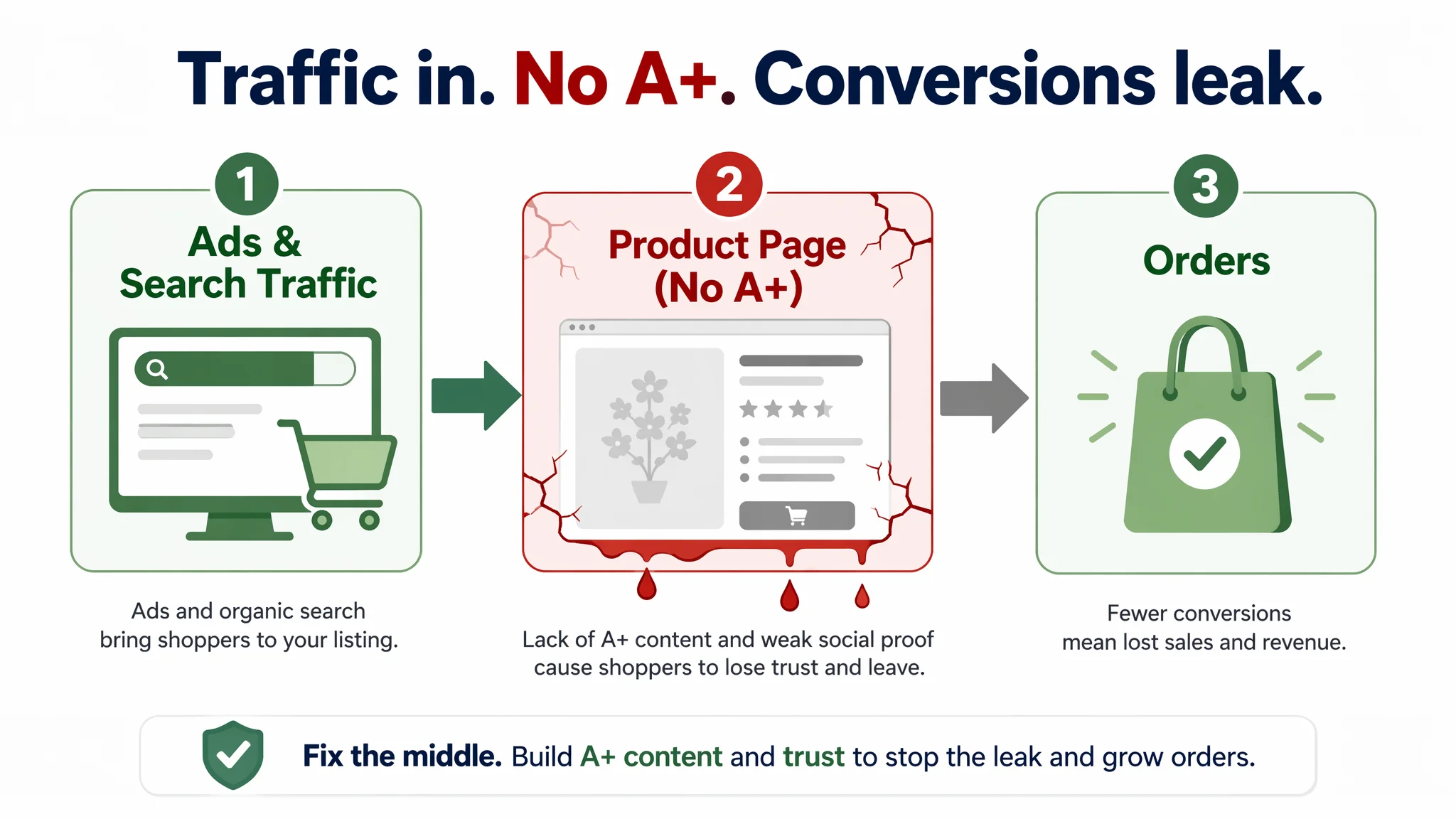
This reframed the entire optimization path. Instead of pushing harder on ads or endlessly reworking the same images, we prioritized rebuilding the product page’s conversion capacity: a clearer, value-centric title; bullet points that follow a pain‑point → solution logic; and, most critically, a full A+ visual story that matches or exceeds the benchmark Listing. For other Amazon sellers, this case is a reminder that “ad inefficiency” often starts in the product page itself—and that A+ content is not decoration, but the missing middle of your conversion funnel.
Amazon Ads Were Not Failing. The Page Was Consuming the Traffic.
Looking only at surface symptoms, the seller saw what many Amazon teams see:
- Traffic was not reliably turning into orders.
- Advertising felt increasingly expensive.
- Team discussions kept looping around “main images are not good enough” and “we might need better keywords.”
On paper, this Listing didn’t look disastrous. The title was structurally acceptable, the main image set had several angles, and the five bullet points did cover basic attributes like UV resistance, durability, and DIY flexibility.
But once DeepBI ran a direct Amazon Listing comparison against a top competitor in the same artificial pansy category on the US marketplace, the gap became quantitative:
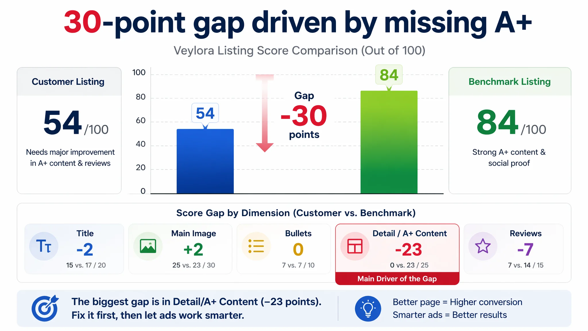
- Customer Listing score: 54 / 100
- Benchmark Listing score: 84 / 100
- Gap: –30 points
Most importantly, that gap was not where the customer expected it to be.
- Title: –2 points (15 vs. 17)
- Main images: +2 points (25 vs. 23)
- Bullet points: equal (7 vs. 7)
- Detail/A+ content: –23 points (0 vs. 23)
- Reviews: –7 points (7 vs. 14)
“The real problem was not that ads failed to bring traffic. It was that the page could not convert the traffic.”
From a business-risk standpoint, this meant every click—especially from Amazon ads—was being dropped onto a page that had no A+ structure, no visual story, and minimal social proof. Under those conditions, pushing CTR higher would only increase wasted spend.
The Seller’s Original Misdiagnosis: Blaming Images and Keywords
The customer’s initial theory followed a familiar pattern:
- Perceived problem: “Our listing isn’t attractive; main images and title need improvement. Ads are expensive because creatives are weak.”
- Optimization behavior: Repeated tweaks to images and keywords, minor copy edits, more focus on quantity of traffic than on what happens after the click.
This logic misses a critical nuance:
- If main images are truly weak, you often see very low CTR with decent on-page conversion once people arrive.
- If on-page conversion is weak, improving CTR alone only amplifies the loss—more people visit, but the same structural trust gaps remain.
DeepBI’s scoring breakdown showed that:
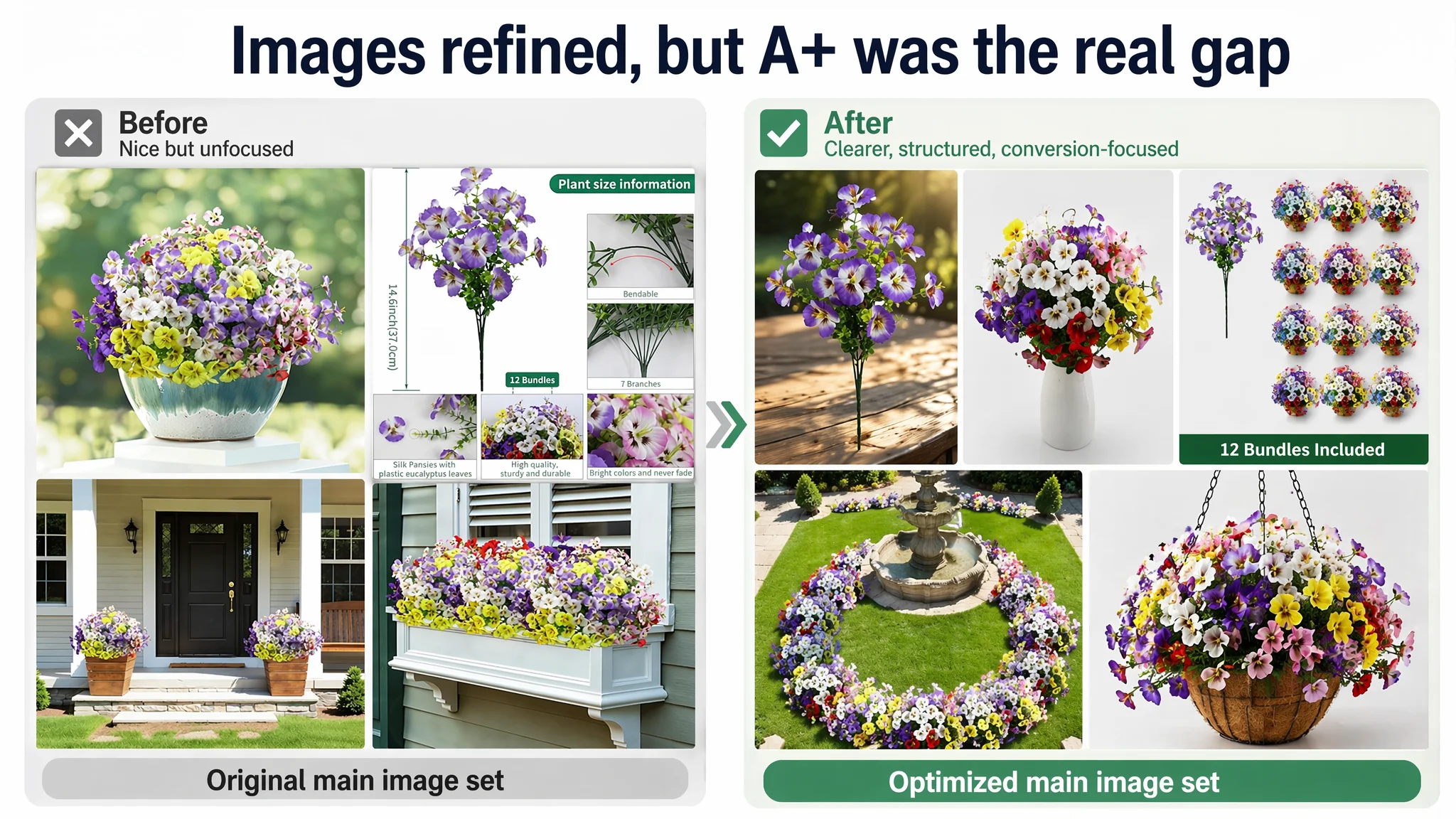
- The main-image set, while imperfect, was not the worst element in the competitive set.
- Bullet points, though not ideal, were not the main reason for a 30‑point deficit.
- The absolute absence of A+ content and the huge review volume gap were where the Listing was structurally unqualified to compete.
Continuing to “fix ads” or over-focus on hero images without resolving those deeper issues would have kept the store trapped in an expensive cycle of trial and error.
The Real Constraint Was Listing Conversion Capacity
The side‑by‑side Amazon Listing diagnosis made one thing unambiguous: the Listing did not lack traffic potential; it lacked conversion infrastructure.
Detail/A+ Content: A 0 vs. 23‑Point Gap
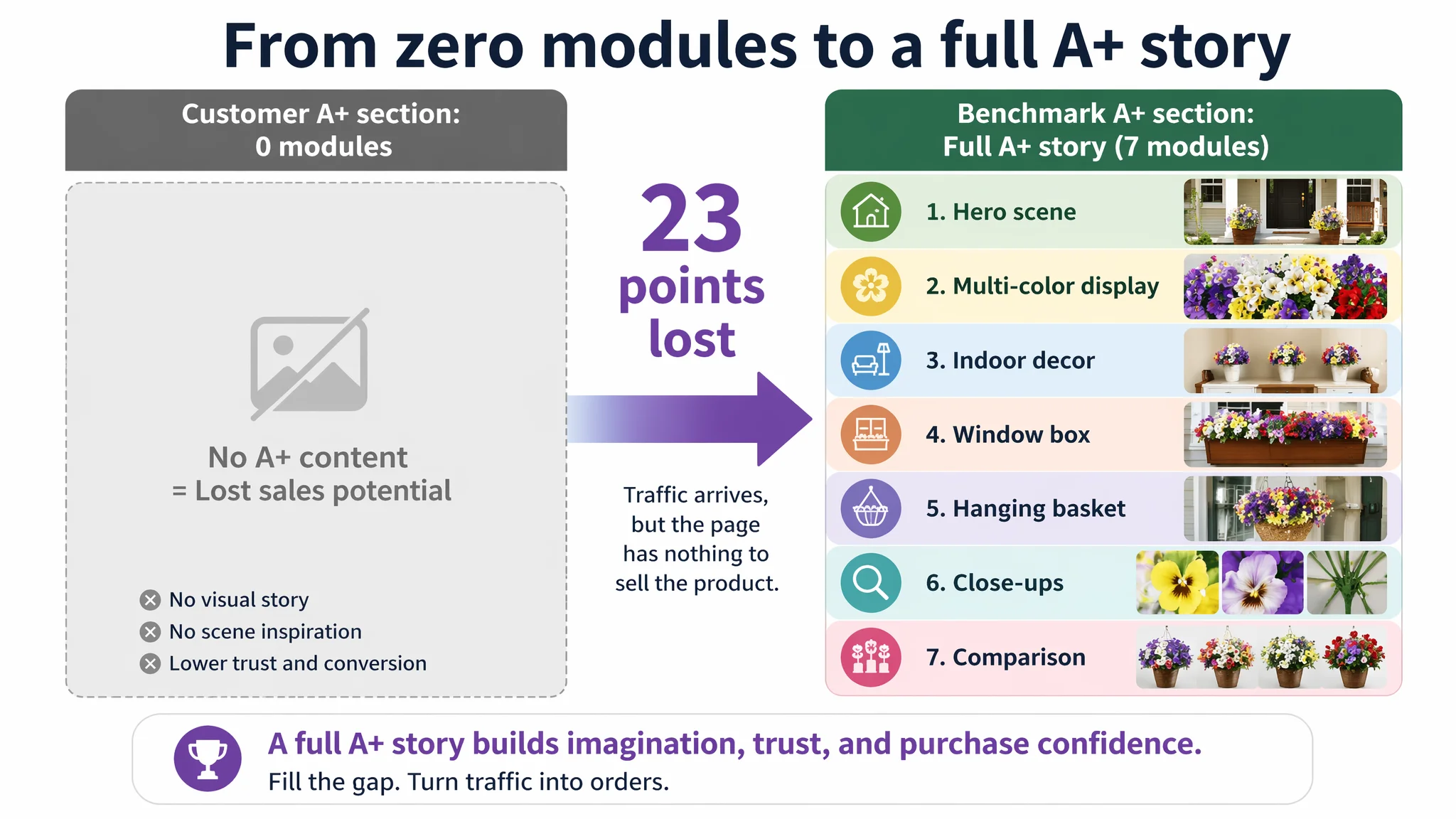
On the customer’s product page:
- No A+ content modules at all
- No visual explanation of quantity, coverage, or scenes
- No structured story from “why these flowers” to “how they look in real environments”
On the benchmark Listing’s Amazon product page:
- Full A+ stack:
- Hero lifestyle scene (porch/yard)
- Multi-color product display
- Indoor decor triptych
- Window box, hanging basket, and porch application scenes
- Close‑up detail shots (petals, stems/holders)
- Garden panoramic compositions
- Multi‑variety comparison visuals (lavender, red, etc.)
This wasn’t cosmetic. It translated into tangible decision logic:
- Imagination of value: The competitor’s large, high‑quality scenes made it easy for shoppers to imagine their own porch, yard, or window box with a full, vivid arrangement.
- Trust in quality: Micro details (petal texture, stem color, structure) addressed the classic fear in artificial plants: “Will this look plastic and cheap?”
- Breadth of use: Multiple container types and scenes (pots, hanging baskets, window boxes, doorstep) framed the product as flexible and worth buying in volume.
- Purchase justification: By visually demonstrating “fullness” and “coverage,” the competitor reduced the perceived risk of “underwhelming in real life.”
Meanwhile, the customer Listing offered none of this. From an Amazon buyer’s perspective, the page stopped at “basic info” and never progressed into “I can clearly see this product working in my specific space.”
Social Proof: Trust Gap at First Glance
Review comparison further widened the conversion gap:
- Customer Listing:
- 4.4 stars
- 16 total reviews
- Only a few reviews surfaced on page one
- Benchmark Listing:
- 4.7 stars
- 1,231 total reviews
- Dense first-page set of detailed, experience-rich reviews
Neither Listing had obvious negative reviews on the first page, but the scale difference mattered. The competitor did not just have a slightly better rating; it had a trust wall built from volume and detail.
When a shopper lands on a page, consciously or not, they compare:
- “Beautiful, full scenes + detailed A+ + 1,000+ reviews”
vs.
- “No A+ + basic images + 16 reviews”
Under that reality, expecting ads alone to carry the Listing was an operational misjudgment.
Why DeepBI Did Not Keep Tuning the Ads First
Given the scores and qualitative analysis, prioritizing more traffic would have violated a simple rule:
“Advertising does not only amplify advantages. It can also amplify a page’s existing defects.”
At this stage, the biggest commercial risk was scaling spend into a structurally weak page:
- Each incremental click had a lower chance of converting than the benchmark page.
- ACOS pressure would naturally build up; attempts to improve ROAS at the campaign level would have little room to work.
- Organic ranking opportunities were being underutilized because even existing traffic was not fully monetized.
DeepBI’s judgment was to treat this Listing not as an “ad problem,” but as a conversion infrastructure problem:
1. Stabilize page logic first: Upgrade title, bullets, and especially A+ so that both organic and paid traffic have a fair chance to convert.
2. Then re‑evaluate ads: Once the page can hold its own against a top competitor, ad optimization can truly influence unit economics instead of just feeding a leaky funnel.
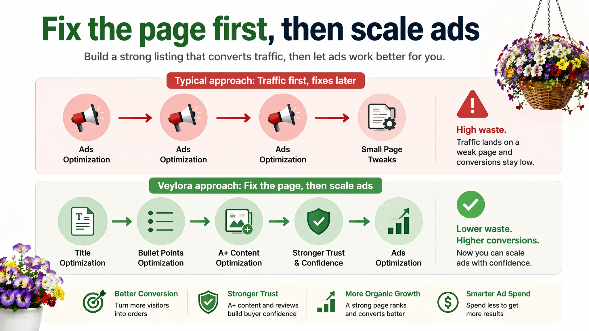
This decision order flips the usual reflex—“buy more traffic and hope”—into a more controllable, asset‑first strategy.
This Product Page Did Not Lack Traffic. It Lacked a Visual Reason to Believe.
Zooming into each content layer clarifies how the Listing was quietly capping its own performance.
Title: Close, But Not Yet a Clear Value Promise
The original title was not fundamentally broken, but it underused its first 80–100 characters:
- Quantity (“12 Bundles”) was present, yet not positioned as sharply as the competitor’s “18 Pcs.”
- Attribute redundancy (“Artificial” and “Faux” repeated) consumed space without adding search or clarity.
- Scene terms (“Patio”, “Yard”, “Window Box”) were there, but structurally scattered.
DeepBI’s suggested structure leaned into what matters most on Amazon:
12 Bundles Artificial Pansy Flowers for Outdoor, UV Resistant Faux Silk Pansies for Window Box Planter, Fake Spring Flowers for Front Door Porch Patio Yard Decor (Purple, Yellow, White, Red)
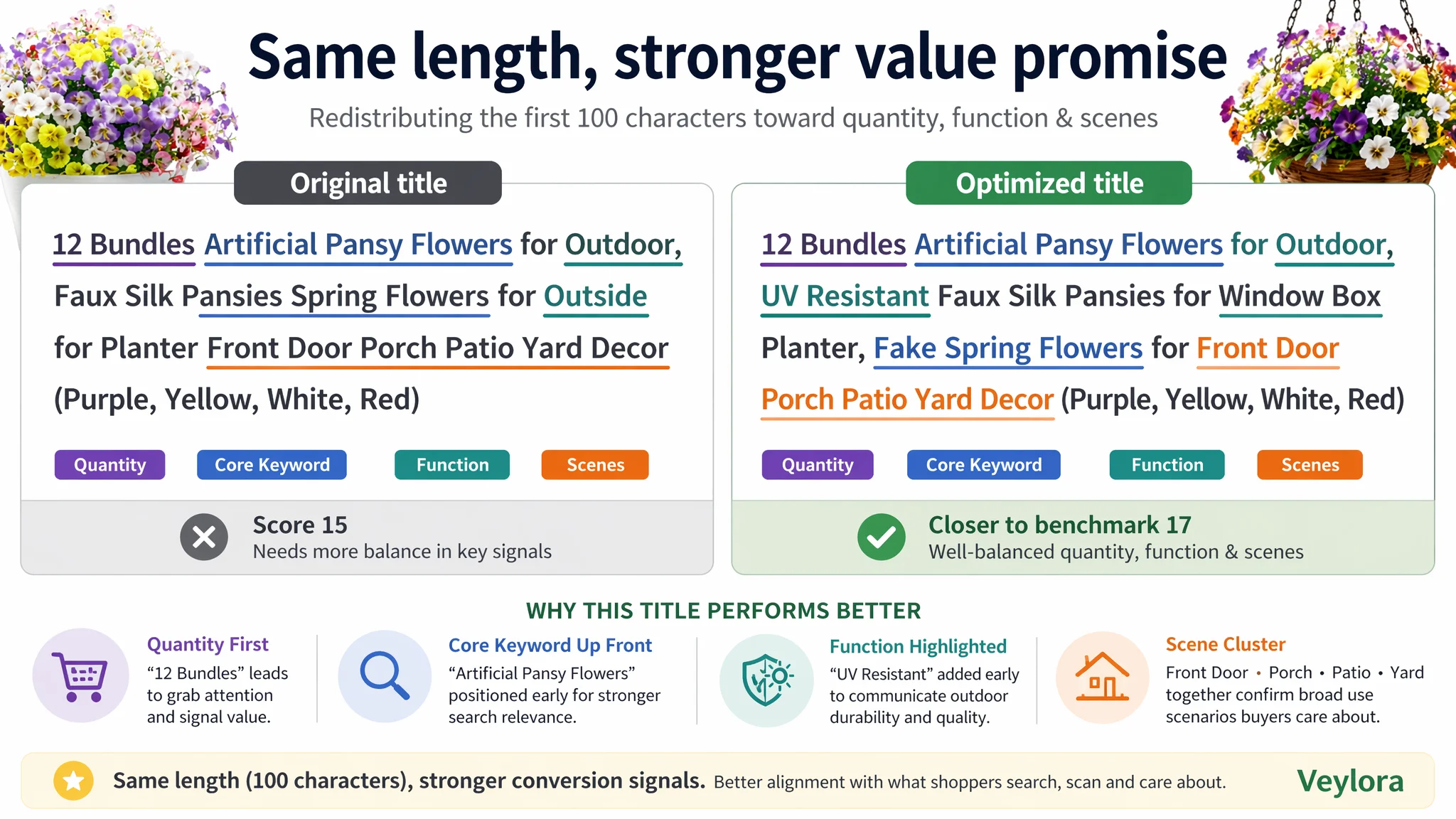
Key shifts:
- Core term clarity: “Artificial Pansy Flowers” upfront for alignment with how shoppers typically search.
- Function attribute surfaced: “UV Resistant” elevated early to signal outdoor readiness and durability.
- Scene consolidation: Cleaner grouping of window box, planter, front door, porch, patio, and yard for both A9 alignment and human readability.
This was not about stuffing more words; it was about making the title carry the first layer of value promise: quantity + core function + key scenes.
Bullet Points: From Parameter Listing to Decision Path
The bullet structure was not a disaster, but it lacked a cohesive persuasion flow. DeepBI reorganized and sharpened the bullets into a clearer “why buy / what problem is solved” logic:
1. Lifelike aesthetics & indoor/outdoor applicability
2. Versatile scenes (window box, hanging planters, pathways, porches)
3. UV resistance & all‑weather durability
4. Low maintenance + adjustable branches for DIY arrangements
5. Clear value: 12 bundles, ~14.7 inch each, ample coverage
This does two things:
- Helps Amazon’s algorithm grasp the product’s key attributes (UV resistant, outdoor, window box, porch, yard).
- Gives buyers a mental checklist they can quickly tick off: looks real, works in my scene, won’t fade, I don’t need to maintain it, and I’m getting enough volume.
However, even well‑structured text cannot on its own bridge the gap that missing A+ content created.
The Missing Middle: A+ Story That Turns Interest Into Commitment
For artificial plants, DeepBI’s operating assumption is clear: if the page cannot demonstrate realism, fullness, and scene fit visually, conversion ceiling will remain low, regardless of how much traffic is pushed.
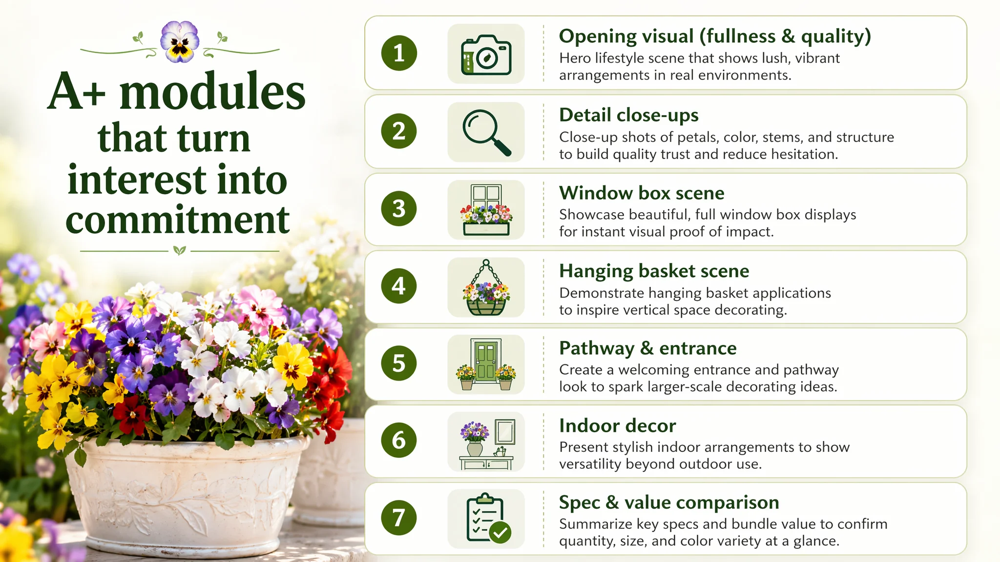
Based on the benchmark’s structure and proven category behavior, the optimization focused on rebuilding six A+ story modules.
1. Opening Visual: First Impression of Fullness and Quality
Suggested direction:
- A split layout: brand tone and headline on the left, large, lush pansy arrangements on the right.
- Two white embossed vases overflowing with purple, yellow, and white pansies in natural light.
- Soft green background tone to signal “fresh” and “garden” without stealing attention.
Business purpose:
- Immediately answer “Will this look cheap?” with a visual “no.”
- Visually communicate volume and color richness before any text is read.
2. Core Attribute Detail: Realism and Construction
Suggested direction:
- Window box filled with mixed pansies as the main visual.
- Side panels for micro shots: a close‑up of a single yellow flower (showing center texture) and a node where green branching stems connect.
Business purpose:
- Attack the core doubt: “Plastic feel.”
- Use detail shots to make “real touch” and material quality believable, not just claimed in text.
3. Scene Fit: The Outdoor Window Box Use Case
Suggested direction:
- Central scene: red‑brown rectangular window box on a white windowsill, filled with purple/white/yellow pansies.
- Strong daylight, crisp colors, mild background blur.
Business purpose:
- Solve “I like it, but where and how would I place it?” in one glance.
- Implicitly showcase UV resistance and non‑fading vividness.
4. Space Constraints: Hanging Basket as a Pain-Point Solution
Suggested direction:
- Centered hanging coconut basket filled with dense pansies.
- Mounted on a black iron hook, set against a dark green door and white window frame.
Business purpose:
- Speak to small‑space dwellers: balconies, compact porches, renters.
- Reposition the product from “nice to have decor” to “efficient use of vertical space.”
5. Bulk Purchase Logic: Pathway and Garden Entrance
Suggested direction:
- Long shot of a stone path leading to a white door, lined with 4–6 white square planters filled with pansies on both sides.
Business purpose:
- Sell multiple sets and raise average order value.
- Let buyers visualize upgrading a whole area, not just a single pot.
6. Indoor Versatility: Extending Use Cases Beyond the Yard
Suggested direction:
- Three simple white vases on a console table, each with a single color (yellow, white, purple).
- Warm indoor lighting, minimal decor around.
Business purpose:
- Expand target audience from “outdoor gardeners” to “home decor” shoppers.
- Justify buying extra bundles for both indoors and outdoors.
7. Clear Specification and Value Comparison
Suggested direction:
- Visual comparison of different bundle counts (e.g., 12 vs. higher options if offered), with clear labels for colors and pack size.
Business purpose:
- Reduce cognitive load around “How many do I need?”
- Make the 12‑bundle pack feel like an obviously safe, high‑coverage choice.
Collectively, these modules do what the original Listing completely failed to do: carry the shopper from interest to conviction in a structured, visual way.
How the Page’s Sales Logic Started to Recover
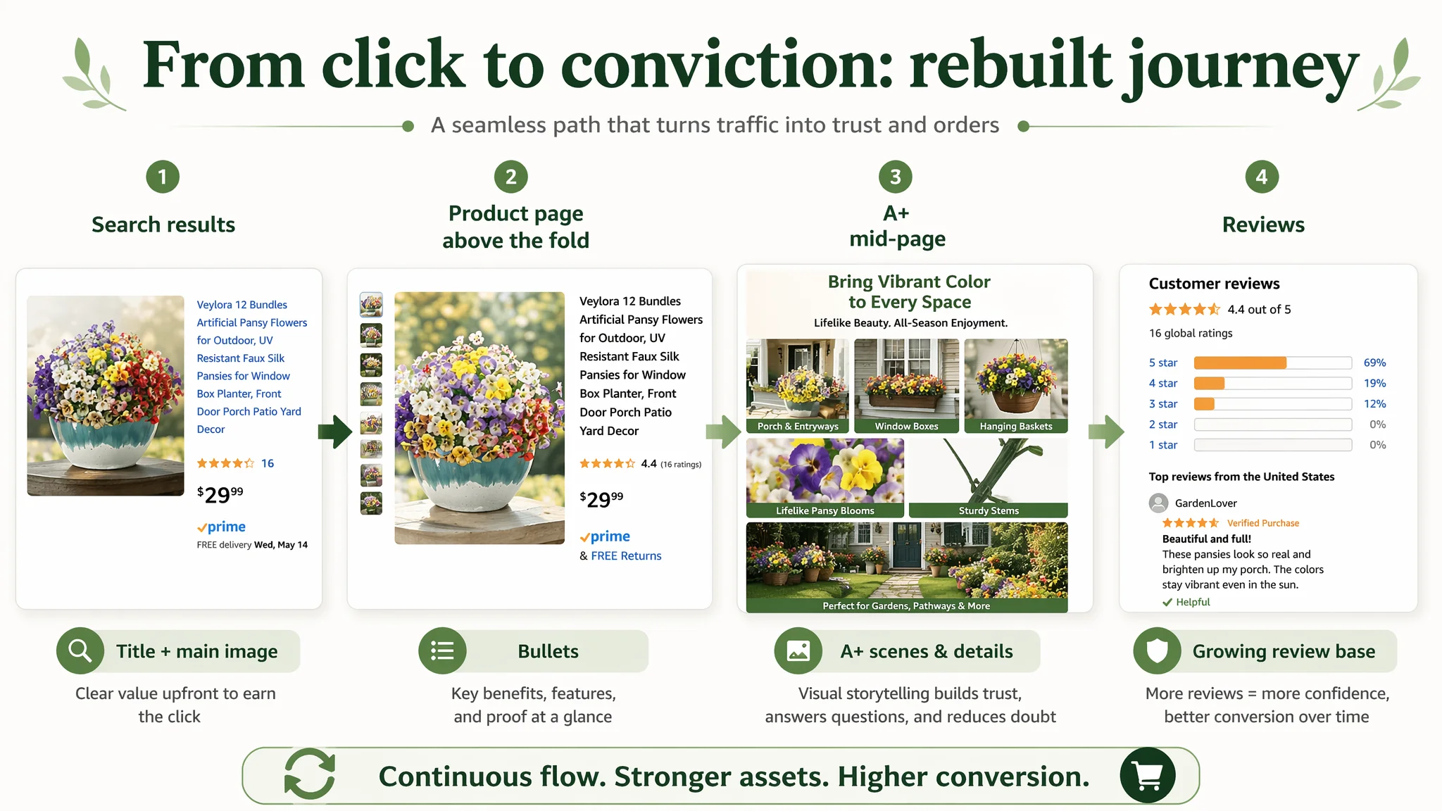
Once the A+ plan, title, and bullet-path logic were clear, the Listing moved from “static product info” to a coherent decision journey:
1. Search results:
- Cleaner, value‑forward title and more purposeful main image composition increase the chance of a qualified click.
2. Above the fold:
- Bullet points that immediately address realism, durability, versatility, and value reduce the initial bounce risk.
3. Mid‑page / A+:
- Real scenes + detail shots + bulk usage scenarios transform curiosity into concrete mental images of ownership.
- Buyers see not only “a product,” but “my porch, my path, my window, my living room.”
4. Reviews (over time):
- As conversion stabilizes and orders accumulate, review count can start to grow, closing the remaining trust gap vs. the benchmark.
At that point, ad traffic finally has somewhere solid to land. Clicks are not thrown into an information vacuum; they’re entering a page that actively works to convert them.
How Ad Traffic Became Useful Again
Even without fabricating numeric results, the operating logic shift is important:
- Before:
- Ads looked inefficient.
- Any attempt to scale spend pushed more users into a low‑trust, low‑context page.
- ACOS pressure and TACOS dependence increased disproportionally to incremental revenue.
- After reinforcing the Listing:
- Each click has higher conversion potential because the page now competes more fairly with top Listings on Amazon for this category.
- Ads can be tuned on a healthier base: poor campaign structures or keyword choices, if they exist, become visible after the page stops being the dominant bottleneck.
- Organic traffic sees the same upgraded experience, giving the product a stronger chance to climb and hold meaningful ranking positions.
In other words, the Listing regains its role as a sales asset, not just a traffic endpoint.
How the Seller’s Understanding Changed
By the end of this process, the customer’s core mental model shifted in several ways:
- From “Our main images are ugly; ads are too expensive”
→ to “Our biggest leak was the product page’s inability to build trust—especially the missing A+ layer and weak review presence.”
- From “If we just optimize keywords and bids, ACOS will come down”
→ to “Without competitive on‑page conversion, ads will continue amplifying our weaknesses instead of our strengths.”
- From “Listing optimization = nicer pictures”
→ to “Listing optimization = title + main image + bullets + A+ working together to convert both organic and paid traffic.”
This case did not end with a magic number claim, but with something more durable: a corrected diagnosis model.
For other Amazon sellers, the key takeaways are straightforward but non‑negotiable:
- When there is a large gap between your Listing score and a benchmark, check detail/A+ and review depth before blaming ads.
- A Listing with 0 A+ content in a visual category like artificial flowers will struggle to convert, no matter how well-structured the campaigns are.
- Ads can only be “optimized” meaningfully after the product page proves it can convert traffic at a level comparable to your main competitors.
Before asking whether your Amazon ads deserve more budget, ask a simpler question: Does your product page deserve more traffic yet?