

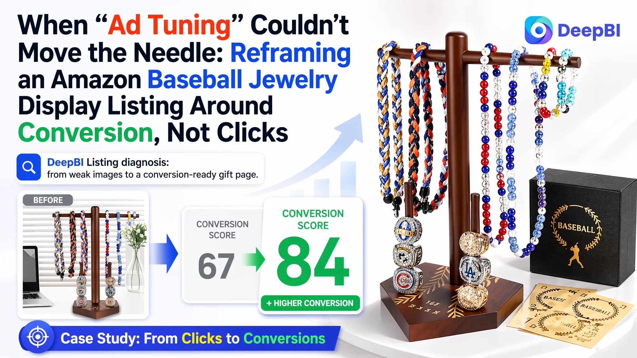
This case comes from an Amazon seller in the sports memorabilia niche, operating a wooden baseball jewelry display for drip necklaces and championship rings. The team had been watching advertising costs climb and suspected an “Amazon ads problem”: bids too high, keywords not precise enough, competition getting fiercer. Yet even when traffic came in, orders did not follow at the expected pace.
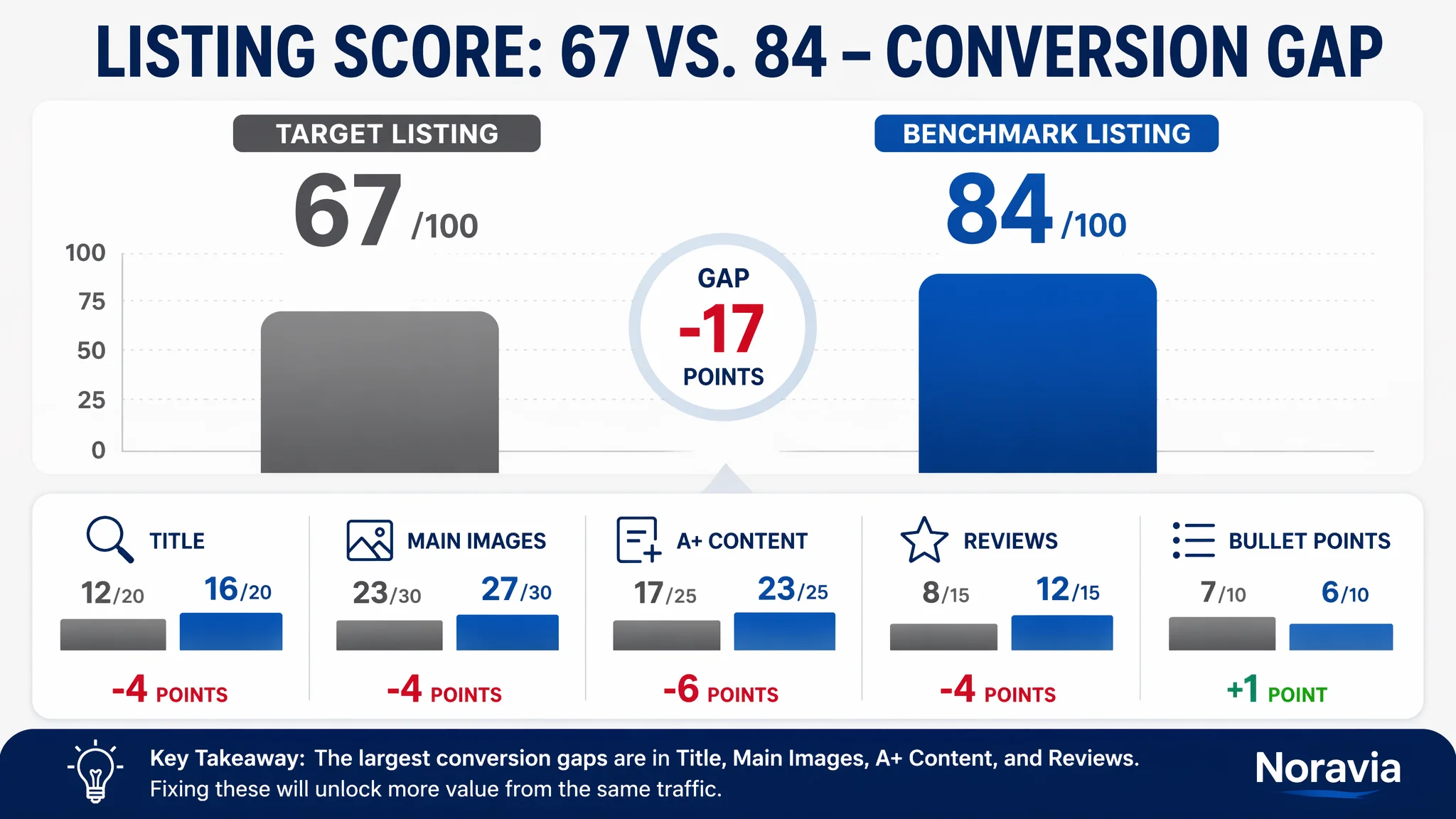
After a structured DeepBI Listing diagnosis, the picture changed. Against a directly comparable Amazon competitor, this product page scored only 67/100 versus 84/100, with clear gaps in title structure, main-image click appeal, A+ storytelling, and review strength. In other words, the ads were doing their job; the Amazon Listing was not converting the traffic it received.
Once the focus shifted from “keep tuning ads” to “repair conversion logic,” the optimization path became much clearer: rebuild the title around the real search intent, redesign main images to create a reason to click and a clear usage story, and rework the A+ visuals to expand from “a stand for baseball gear” to “a customizable sports honor display and gift.” This is a case many Amazon sellers will recognize: high ACOS that is not truly an ad-ops failure, but a Listing conversion bottleneck that ads are simply amplifying.
The Real Constraint Was Not Traffic. It Was Listing Conversion Capacity.
The seller’s product is a wooden baseball jewelry display stand for drip necklaces and championship rings on Amazon US.
From an operations perspective, the team saw:
- Ads consuming budget quickly
- Traffic coming in, but orders and revenue lagging expectations
- A category competitor visibly outrunning them in reviews and ranking
The instinctive diagnosis: “our ads are not optimized enough.”
However, when DeepBI pulled a full Amazon Listing score and benchmarked it against a directly comparable high-performing Listing, the constraint surfaced clearly:
- Overall score:
- Target Listing: 67/100
- Benchmark Listing: 84/100
- Gap: -17 points
- By dimension:
- Title: -4
- Main images: -4
- A+ / detail content: -6
- Reviews: -4
- Bullet points: the only area where the target Listing was not obviously behind
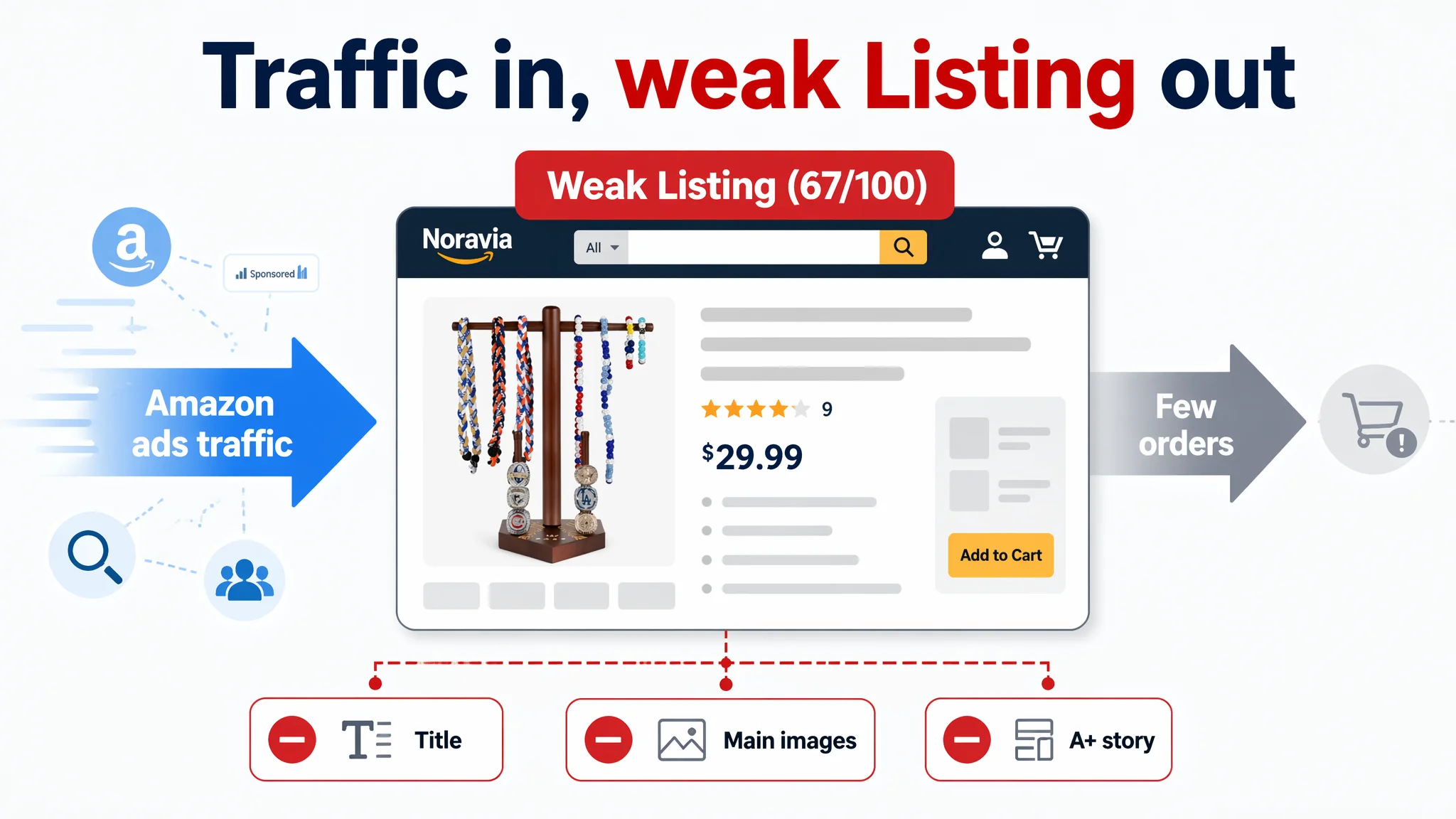
The problem was not lack of traffic or lack of ad knobs to turn.
“The real problem was not that ads failed to bring traffic. It was that the page could not convert the traffic.”
For this ASIN, the core bottleneck at this stage was Listing conversion capacity—especially how the title, main images, and A+ story worked together to build trust, show use cases, and justify a gift-level price.
How the Seller Originally Misdiagnosed the Problem
From the seller’s side, the symptoms looked like a classic advertising headache:
- Increasing competition in the sports jewelry subcategory
- ACOS pressure as bids rose
- High click costs on “baseball necklace display” and related terms
- Very limited review base, so they assumed they just needed “more reviews + better ads”
The initial responses were exactly what most Amazon teams would do:
- Keep adjusting bids and campaign structures
- Experiment with more keywords and match types
- Try different ad group splits to chase cheaper clicks
But two blind spots remained:
1. They treated the product page as “basically OK”
The bullets were actually above-average: pain-point driven, with clear outcomes (“say goodbye to tangled necklaces”, “ensuring your display stays upright”), and decent capacity info. This reinforced the belief that “the Listing isn’t the bottleneck.”
2. They overestimated what “a few decent images” could do
There was no deliberate visual funnel: main image to click, secondary images to explain, A+ to trigger emotional purchase and gifting. Instead, they had fragmented images with weak scene logic and no strong emotional hook.
As a result, they stayed stuck in an ad-optimization loop, trying to fix a conversion problem with traffic tools.
Amazon Ads Were Not Failing. The Page Was Consuming the Traffic.
Once DeepBI overlaid Listing scores with the benchmark, the pattern was hard to ignore:
1. Title: Search Intent and Buying Logic Were Misaligned
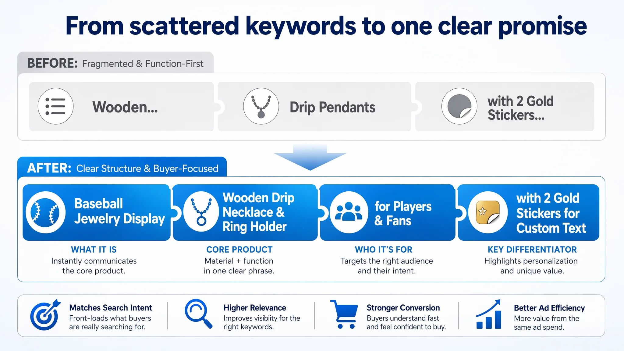
- The original title scattered keywords; the core concept “Wooden” and “Baseball Display” appeared but not in a strongly weighted, front-loaded way.
- The main phrase structure was function listing rather than “what it is + for whom + in what scenario”.
- Important differentiators like custom gold stickers were pushed to the tail as an add-on phrase, not part of the core promise.
- The inclusion of “Drip Pendants” was ambiguous and potentially confusing for part of the audience.
Meanwhile, the benchmark Amazon Listing followed a clear, proven pattern:
- “Wooden Baseball Drip Necklace Display Holder” front and center
- Then organized use case and target audience: organizer, gift for players & fans, etc.
- All wrapped in a single, coherent promise: keep all drips, necklaces, and rings organized, and make it a giftable display.
DeepBI’s judgment: title structure here is not just SEO. It controls whether the buyer instantly understands:
- What the product is
- Whether it’s the right form (wooden, jewelry display, drip necklaces + rings)
- Whether it solves their “I want a meaningful gift / display” problem
Without that instant alignment, even a decent CTR from ads will bleed conversion once users hit the page.
2. Main Images: No Clear Reason to Click, No Emotional Anchor
On Amazon, main images have two jobs:
- Win the click in search results
- Pre-frame the perceived value before the buyer even reads
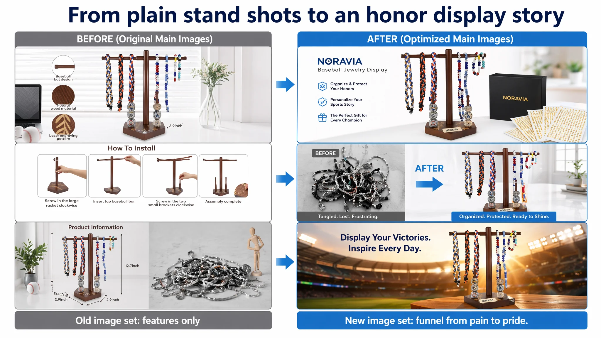
For this product, DeepBI saw several issues in the primary and secondary images:
- Lack of a strong hero composition:
The lead image felt cluttered. The product wasn’t clearly centered and elevated as a premium display. Human fingers and messy background details reduced perceived polish.
- No “pain-point before vs after” logic:
The seller had some usage images, but no direct visual comparison showing tangled necklaces on one side, and neatly displayed drips and rings on the other—something the benchmark Listing leaned into more effectively.
- Weak assembly and reassurance visuals:
The existing installation image was busy and text-heavy, without a clean, step-by-step visual sequence. For a wooden assembly product, this leaves doubts: will it wobble? Is it complicated?
- Missing emotionally charged scenes:
There was no powerful image of the stand in a real sports or gifting moment (e.g., locker room, stadium glow, kid receiving it as a gift). Benchmark content used multi-scene and gifting cues to strongly anchor emotional value.
Result: clicks were not turning into committed purchase intent. The product looked more like “a stand” than “a way to honor sports milestones.”
3. A+ / Detail Page: Narrow Scenario, Weak Trust Ramp
The A+ comparison was even clearer:
- The target Listing focused on:
- Main scene image
- Material detail
- Custom sticker tutorial
- Some usage scenarios
- Accessories list
- The benchmark Listing systematically walked the buyer through:
- Bedroom / living room / bookshelf integration (home decor, not just sports gear)
- Clear assembly steps in 4 pictures
- Multi-sport applicability: baseball, basketball, softball, volleyball, football
- Gift scenes, making it obviously a go-to present
Key gaps DeepBI flagged:
- Scenario width:
The target Listing essentially stayed in a single “baseball” and “bedside” universe. No strong message that this could be general sports memorabilia decor or fit cleanly into any room in the house.
- Ease-of-use reassurance:
The target’s custom sticker visuals looked nice but didn’t directly answer:
- How hard is it to assemble?
- Will it be stable and wobble-free?
- Will it fit my space?
- Emotional and gifting story:
There was no image of a child or teen receiving it, no sense of “this is what a proud parent or coach gives for a big season or championship.”
In short, the A+ was not building the trust ramp needed for a gift-priced display item.
4. Reviews: A Trust Deficit That the Page Was Not Offsetting
- Target Listing: 4.2 stars, 9 total reviews
- Benchmark Listing: 4.6 stars, 39 reviews
So the competitor not only had more reviews and a higher average rating, but also more focused positive feedback on sturdiness and key use cases.
With this in mind, DeepBI’s judgment was:
- You cannot fix this by ads alone.
- With fewer reviews and lower stars, the Listing needs stronger page-level trust and storytelling than the category leader, not weaker.
Why DeepBI Did Not Recommend “Keep Tuning Ads First”
At this stage, increasing ad spend or further splitting campaigns would have:
- Driven more expensive traffic into a page with a weaker conversion engine
- Amplified the perceived gap vs. competitors (since competitor pages convert better, they can afford more aggressive bids)
- Increased TACOS without structurally improving the Listing’s ability to sell
From DeepBI’s perspective, the biggest short-term business risk was:
Letting Amazon ads continuously pump budget into a page that cannot credibly justify its price, usage versatility, and gifting value.
That would push the ASIN closer to:
- Lower organic ranking (due to poor conversion signals)
- An unhealthy dependence on paid clicks to maintain minimal volume
- A widening gap vs. the category leader as the competitor enjoys cheaper, more efficient traffic
So the priority sequence had to flip:
1. Fix page-level conversion logic first
2. Then re-open the throttle on ads once the page can carry the weight
How the Optimization Reframed the Page: From “Stand” to “Honor Display and Gift”
DeepBI’s Listing analysis drove a series of direction changes, not just cosmetic edits.
1. Title: From Function Listing to “Baseball Jewelry Display” as Core Outcome
Proposed direction:
Baseball Jewelry Display, Wooden Baseball Drip Necklace and Championship Ring Holder for Softball Pendants, Sports Jewelry Organizer with 2 Gold Stickers for Custom Text
Key shifts in logic:
- “Baseball Jewelry Display” moved to the front:
Buyers searching Amazon see immediately: this is a display for baseball jewelry, not a generic accessory or random organizer.
- Wooden + drip necklace + championship ring positioned as a coherent phrase, not scattered attributes.
- Sports Jewelry broadens intent capturing:
It aligns with the competitor’s multi-sport approach, without misrepresenting the core baseball design.
- “2 Gold Stickers for Custom Text” is preserved as a clear differentiator:
Not just “with stickers,” but a specific custom text promise, positioning the product above generic sticker giveaways.
This is not about stuffing more keywords. It is about ensuring that search intent, product form, and primary differentiation are all obvious in the first line a buyer reads.
2. Bullet Points: Preserving a Strength, But Tightening the Narrative
Interestingly, bullets were the one area where this Listing was not obviously weaker than the benchmark. The seller had:
- Clear pain-point → solution logic
- Good use of results-oriented language (“Say goodbye to…”, “ensuring your display stays upright”)
- Detailed capacity and measurement information
DeepBI’s role here was not to “rewrite everything,” but to sharpen and reorganize so that each point owns a distinct pillar of the purchase decision:
1. Premium solid wood & natural aesthetics
- Emphasize quality and unique wood grain, but also add a professional disclaimer about NATURAL variation to preempt complaints and returns.
2. All-in-one storage capacity with specific numbers
- Consolidate dispersed dimension notes into a single, easy-to-scan claim:
- Overall size
- Number of rings it holds
- Necklace length it supports
- Ring size range (≥ 9) to filter out mismatched buyers
3. Upgraded stability & easy assembly
- Bring in the “upgraded screws, no wobble, includes manual and toolset” narrative that the benchmark Listing leaned on, so buyers feel safe about assembly and sturdiness.
4. Creative design & personalization with gold stickers
- Tie the base “BASE” motif and baseball field pattern to an emotional claim: it’s not just a stand; it’s a way to tell your sports story with names, years, and team details.
5. Ready-to-gift positioning
- Clarify specific gift scenarios (birthdays, graduations, Christmas, team celebrations) so visitors see this as a packaged gift, not a bare utility item.
This preserved the original bullet strength while aligning each point to a distinct decision node: quality, capacity, stability, personalization, and gift value.
3. Main Images: Building a Visual Sales Funnel, Not Just Showing the Product
DeepBI’s main-image direction was driven by one central question:
If a buyer never read a single word of text, would the image set alone make them: - feel the pain - see the solution - believe it’s easy to use - and feel proud to gift it?
Key structural changes:
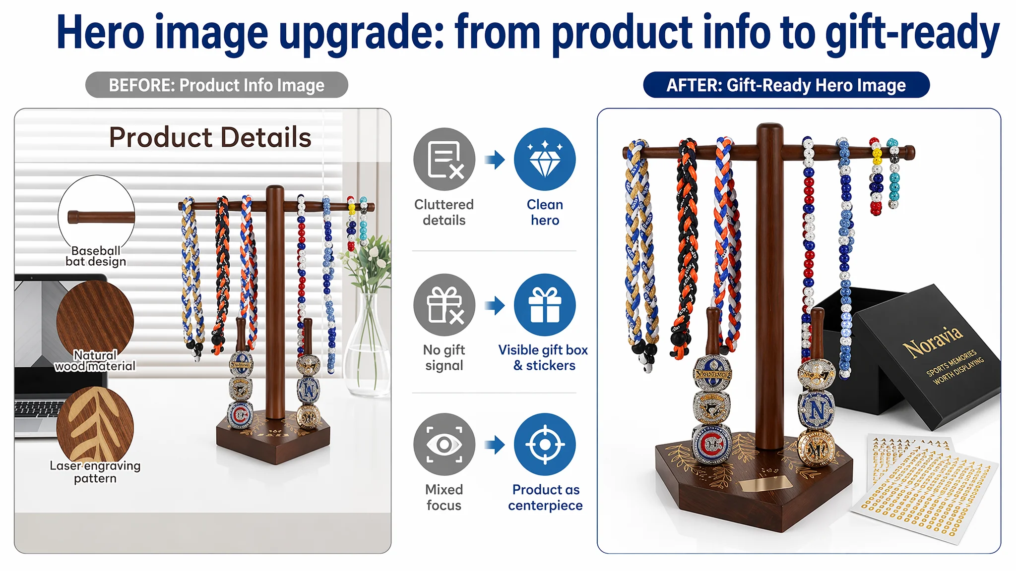
a. Hero Image: Professional, Gift-Ready Presentation
- Product centered about 65% of frame, 45° top-front angle
- Clean white background, soft white light
- Gift box and fan-shaped stickers neatly arranged as visible value extras
- All stray fingers, clutter, and non-essential elements removed
This shifts the first impression from “basic wooden stand” to a professionally packaged sports gift item.
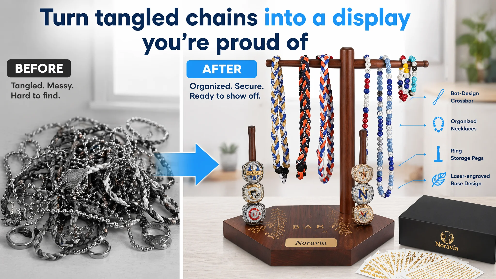
b. Before/After Pain-Point Image
- Left 35%: black-and-white, tangled necklaces and scattered rings
- Right 65%: the product fully loaded with organized drip necklaces and rings in color
- A clear “AFTER” label in bright blue
This directly visualizes the value proposition: from chaos to order, from random gear to display-worthy jewelry. It also creates a powerful “scroll-stopping” secondary image in search results and on the product page.
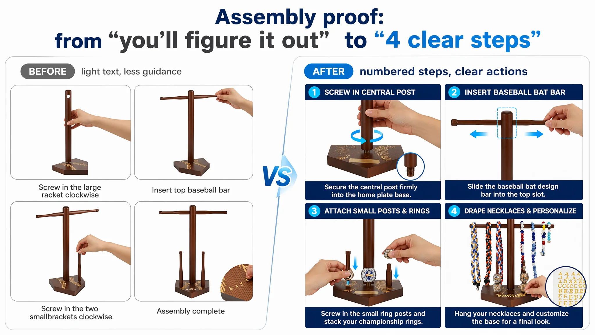
c. Step-by-Step Assembly Image
- 4-grid layout, each square showing a specific assembly step
- Close-up shots of hands inserting screws, posts, and bars
- Clean white background with short, sans-serif captions
This is about eliminating friction: buyers see instantly that assembly is manageable, hardware is included, and the design is robust.
d. Dimension and Capacity Image in a Realistic Workspace
- Display placed on a modern desk with a blurred monitor and plant in the background
- Clear blue dotted lines marking “Height 12.7 inch”, “Base 3.9 inch” etc.
- Full load of rings and necklaces already on the stand
This helps solve the “will it fit my space?” and “can it hold my whole set?” concerns with one glance.
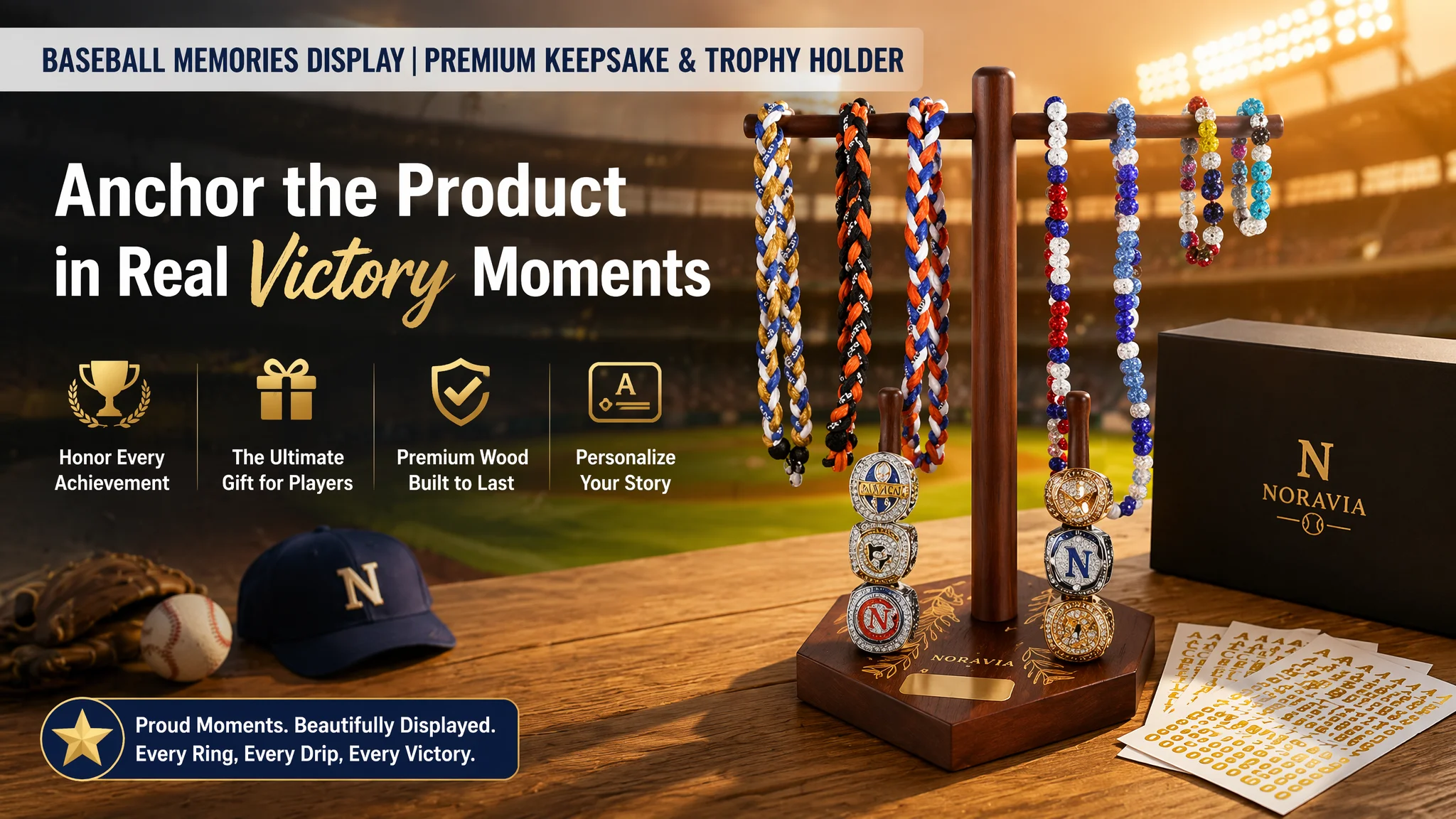
e. Emotional Stadium / Victory Scene
- Product in the foreground at a low angle, under sunset stadium lights
- Background: a blurred baseball stadium with stands and lighting
- Overlay text describing the “champion moment” or “honor display”
This image does not “invent” performance claims. It anchors the emotional context: this is not just storage, it is a way to commemorate big wins.
f. Gifting Moment with a Young Player
- A kid around 12, in baseball uniform, holding the fully loaded stand, visibly surprised and delighted
- Warm indoor lighting, soft-focus domestic background
This answers a silent but critical question: “How will they feel when they receive this?”
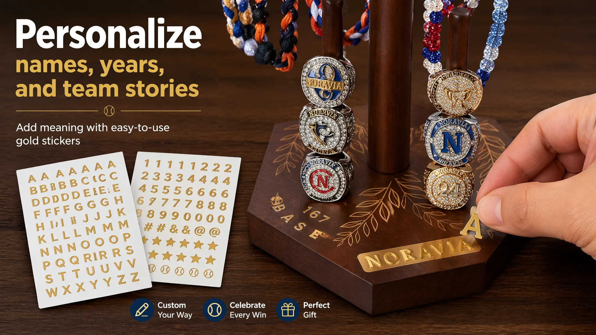
g. DIY Customization Close-Up
- Top-down shot of an adult hand applying a gold letter sticker onto the wooden base
- Full sheets of gold letters and numbers beside the product
- Strong lighting on sticker edges to show thickness and metallic texture
This makes the unique “2 gold stickers for custom text” not just a phrase in bullets, but a tangible, desirable action buyers can imagine themselves doing.
4. A+ Detail Page: Expanding from a Single Use Case to a Full Ownership Story
The A+ revamp followed a simple internal principle:
“This product page did not lack traffic. It lacked trust, breadth of scenarios, and a clear narrative that matches the price and gifting use.”
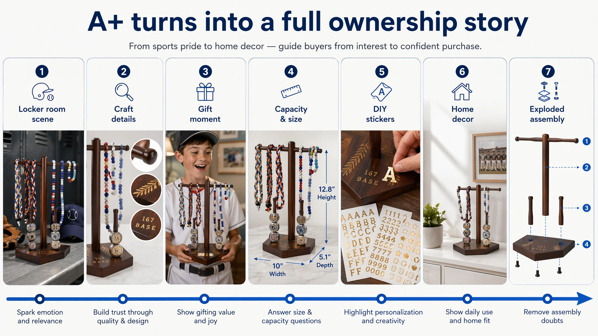
So the recommended modules were re-shaped into a progressive story:
1. Opening Scene: Locker Room / Ballpark Atmosphere
- The stand loaded with rings and necklaces in a locker-room context: bench, glove, cap in the background
- Lighting that feels like a real sports environment
- Message: this is part of the sports world, not just generic decor.
2. Core Craftsmanship and Detail Module
- Main product on the left
- Three circular macro shots on the right:
- Top “bat head” design
- Base’s “wheat” engraving
- The gold “167” / “BASE” sticker effect
This responds directly to what sports memorabilia buyers care about: wood craftsmanship and unique design details.
3. Gift and Emotion Module
- The kid receiving the stand as a gift, central in the frame
- Background home environment, warm lighting
- Copy emphasizing milestones: big games, championships, graduations
4. Capacity and Specs Module
- Product loaded to near capacity
- Measured lines and text calling out dimensions and capacity
- Clear messaging that it can hold multiple rings and several necklaces
This tackles the “will it hold enough?” concern that often leads to returns.
5. DIY Personalization Module
- Hand applying stickers
- Full sticker sheets visible
- Text emphasizing: names, years, team logos, numbers—your story, your way.
6. Home Decor / Everyday Use Module
- Product on a dresser with just a few pieces of jewelry
- Simple frame with a baseball photo on the wall, a small plant nearby
- Clean, bright home decor look
This expands the product from a once-a-year celebration item to a daily decor and jewelry organizer.
7. Exploded Assembly Guide Module
- Components spaced out vertically in an “exploded view”
- Clear numbering and arrows showing how each piece fits
- Focus on clarity and professionalism in technical visualization
This A+ structure transforms the page from a “cluster of images” into a coherent decision journey: want → trust → see fit → envision gifting and daily use → feel safe to purchase.
How This Changed the Business Trajectory
Because the case materials don’t include post-optimization numbers, we can’t claim specific percentage lifts.
But in terms of operational state, the direction of change is clear:
- Listing conversion capacity improved:
The page now actively reduces friction (assembly clarity, capacity clarity) and adds emotional pull (victory scene, gifting, personalization), rather than passively presenting the product.
- Ad traffic became more valuable:
Once the page better converts both paid and organic visitors, the same ad spend starts to drive more orders instead of being burned on a weak page.
- Dependence on brute-force ads is reduced:
With a stronger Listing, organic ranking has a chance to improve via better conversion signals, making long-term TACOS more controllable.
- Risk from weak reviews is partially offset:
Although the review gap vs. the competitor remains, a richer page mitigates some of the trust deficit by visibly demonstrating quality, usage, and emotional value.
Most importantly, the seller’s understanding shifted:
“Our Amazon ads were not fundamentally broken. We were sending them to a page that had not yet earned the right to scale traffic.”
What Other Amazon Sellers Can Take From This Case
1. Don’t treat high ACOS as purely an ad-ops problem.
If your Amazon Listing scores lag competitors, especially on main images, A+, and reviews, ads are likely amplifying a page-level weakness.
2. Bullet points alone cannot carry a weak visual funnel.
In this case, bullets were comparatively strong, but title, main images, and A+ still dragged down conversion.
3. Gifting and emotional categories require more than “showing the product.”
For sports memorabilia, parents, coaches, and players are buying an emotion. Your images must show the moments, not just the wood and screws.
4. Before pushing more traffic, ask: “Does this page deserve more traffic?”
DeepBI’s diagnosis showed that the greatest ROI at this stage came from repairing conversion logic—not from squeezing more complexity out of the ad account.
For Amazon sellers, this is the real leverage DeepBI aims to provide: not another panel of knobs to turn, but a clearer view of where the real constraint is—and when the bottleneck has shifted from ads to the Amazon product page itself.