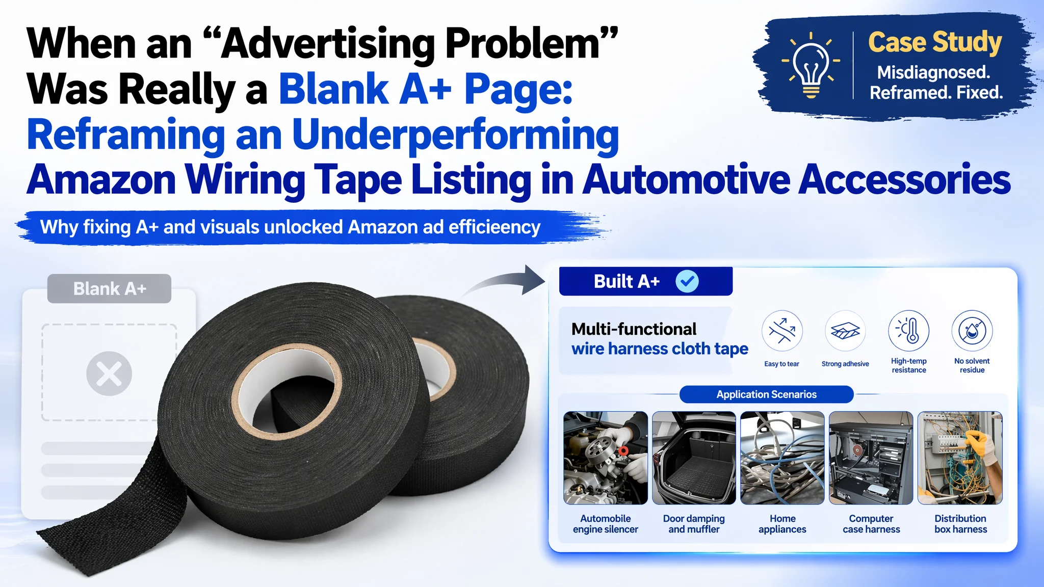
This Amazon seller in the UK automotive accessories category came to us convinced they had an advertising problem: ad costs were hard to control, and every extra pound of traffic seemed harder to turn into orders. They had already started tweaking bids and keywords, assuming ACOS pressure meant “ads not optimized enough”.
Once we put their Amazon Listing side‑by‑side with a high‑performing wiring cloth tape competitor, a different picture emerged. The title and main image were not disastrous, the bullet points were actually more structured than the benchmark—but the detail page was effectively empty: no A+ modules, no visual story, no structured selling path. The real leak was not in the ad console; it was on the product page.
The later optimization work therefore did not start from campaign structure. It started from rebuilding the Amazon product page: re‑anchoring the title around real search terms and specs, restructuring bullet points into “pain point + solution” logic, and designing a complete A+ visual system that could carry automotive, motorcycle, and wiring‑management use cases with industrial‑grade credibility. Ads only began to make sense again once the page could convert the traffic.
For other Amazon sellers, this case is a reminder: high ACOS and weak order growth do not always mean your campaigns are “bad”. When your A+ is blank and your page lacks trust signals, Amazon ads are just paying to expose that weakness faster.
Amazon Ads Were Not Failing. The Page Was Consuming the Traffic.
From an operating perspective, the seller’s situation was typical:
- Automotive accessories sub‑category, UK marketplace
- Product: cloth wiring loom tape for cars and motorcycles
- Ads running, traffic obtainable, but overall sales momentum weak and ACOS pressure rising
The team’s first reaction was to treat this as a pure advertising efficiency issue:
- “Maybe our bids are too high”
- “Maybe our keywords are not refined enough”
- “Maybe we just need more reviews before ads can work”
So they stayed in the console, adjusting bids, adding negatives, and trying different keyword combinations.
“The real problem was not that ads failed to bring traffic. It was that the page could not convert the traffic.”
Our diagnostic work started somewhere else: what kind of listing is this traffic landing on, and how does it compare to a real benchmark in the same niche?
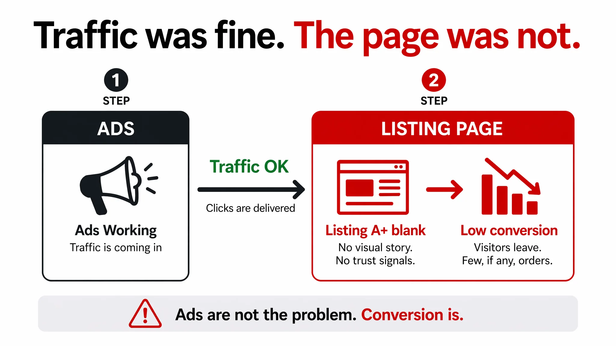
The Real Constraint Was Listing Conversion Capacity
DeepBI’s Listing scoring for this ASIN against a tightly matched benchmark made the core issue obvious:
- Target Listing overall score: 55 / 100
- Benchmark Listing overall score: 84 / 100
- Gap: –29 points
On the surface, some modules looked “okay”:
- Title: 15 vs 18 (out of 20) – gap of –3, not fatal
- Main image group: 24 vs 26 (out of 30) – gap of –2, also not fatal
- Bullet points: 8 vs 6 (out of 10) – the target actually scored higher here
But two dimensions were structurally weak:
- Detail / A+ content: 0 vs 21 (out of 25) – a 21‑point chasm
- Reviews: 8 vs 13 (out of 15) – strong rating but almost no volume
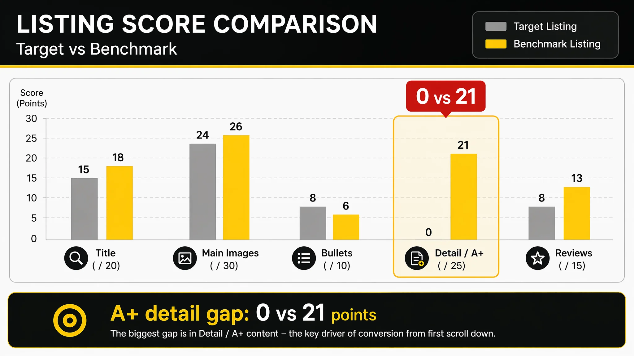
In other words, from first scroll downwards, the Listing simply stopped doing its job. No A+ modules, no structured visuals, no comparison story, no multi‑scenario proof. For a functional, risk‑sensitive automotive product, this is where professional buyers go to either gain confidence or exit.
When ads are feeding a page with:
- No professional visual framing
- No graphical explanation of heat resistance, residue‑free removal, or fabric structure
- No side‑by‑side comparison with ordinary electrical tape
- No scenario breakdown for engine bay, cabin wiring, racks, or server rooms
the conversion ceiling is defined long before bids and match types enter the picture.
Why Traditional Amazon Ad Optimization Kept Failing
From a pure ads standpoint, the seller was not doing something obviously wrong. They were pursuing the same levers many Amazon teams default to:
- Adjusting bids to try to “buy” more efficient clicks
- Cycling through different keyword sets inside automotive wiring and cable management
- Watching ACOS and CTR in isolation, hoping for a structural break
But none of those moves could change three hard facts on the product page:
1. Trust depth was missing.
The competitor used a complete A+ suite:
- Hero banner with industrial visual identity
- Icon modules for core features (heat resistance, fabric, no residue)
- Scene comparisons vs regular electrical tape
- Multi‑scenario grids (cars, motorcycles, cabinets)
- Professional wiring result shots
The target Listing had none of this. Landing visitors had to imagine product performance.
2. Decision doubts were not answered.
Automotive and electrical buyers tend to ask very specific questions:
- Will this hold in an engine bay over time?
- Does it actually come off clean after heat exposure?
- Is it flexible enough to wrap tightly around complex harnesses?
The competitor pre‑empted these doubts visually and textually; the target Listing left them mostly to text above the fold and a handful of reviews.
3. Social proof was thin.
The target Listing had 5 reviews with a 5.0 average. That looks good at a glance, but cannot compete with a benchmark showing 573+ reviews at 4.6. At decision time, raw volume of experience usually outweighs a perfect but tiny base.
Tuning ads on top of these gaps is like optimizing traffic to a landing page where the final third of the page is blank. Every incremental click is simply more expensive proof of the same structural defect.
What the Listing Score Told Us That Manual Review Missed
A human operator looking briefly at this Listing might say:
- “Title is long, but it has the right keywords.”
- “The images exist, the product is visible.”
- “Bullet points look organized, we already talk about heat and no residue.”
The scoring comparison forced a different, quantified view:
- Title: Slightly behind the benchmark, but not the main brake
- Main image: Slightly behind, but salvageable
- Bullet points: Conceptually strong, but not fully capitalized in visuals
- Detail / A+: Completely absent vs a fully‑built competitor system
- Reviews: High quality, extremely low volume
This is why we concluded:
“Advertising does not only amplify advantages. It can also amplify a page’s existing defects.”
With a 0/25 score on detail content, every extra unit of traffic was being pushed into an incomplete sales story.
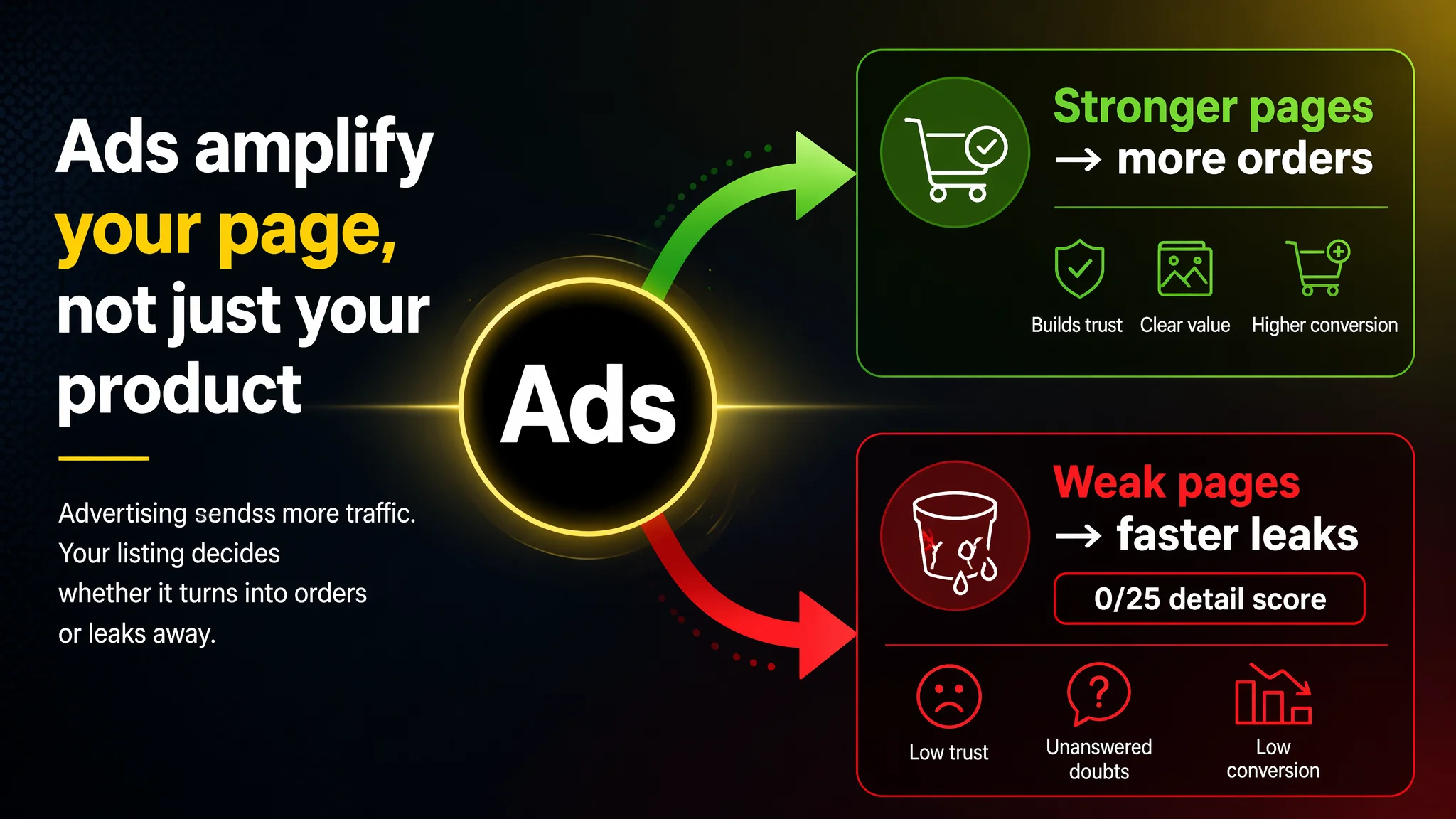
This Product Page Did Not Lack Traffic. It Lacked Trust.
Looking specifically at the visual and narrative structure:
Title: Logic Acceptable, Positioning Can Be Sharpened
The benchmark title structure followed a mature Amazon formula:
- Brand
- Pack + length spec
- Core product name
- Use case: cars, motorcycles
- Result and material: durable, heat‑resistant adhesive fabric strip
- Clear “Ideal for…” application phrase
The target title leaned toward keyword stacking and “attributes + application” logic. It was not broken, but it wasn’t squeezing the maximum value from its first 80 characters.
We reoriented around:
- Front‑loading the actual search intent term: “Cloth Wiring Loom Tape”
- Keeping clean specs: 2 Rolls, 19mm x 25m
- Explicit use case: Automotive Electrical Wire Harness Binding and Cable Management
- Retaining heat‑resistant, durable, flexible attributes
This does two things: it makes Amazon’s search algorithm happier and reduces ambiguity for the buyer scanning search results.
Main Image Group: Product Visible, But Not Selling
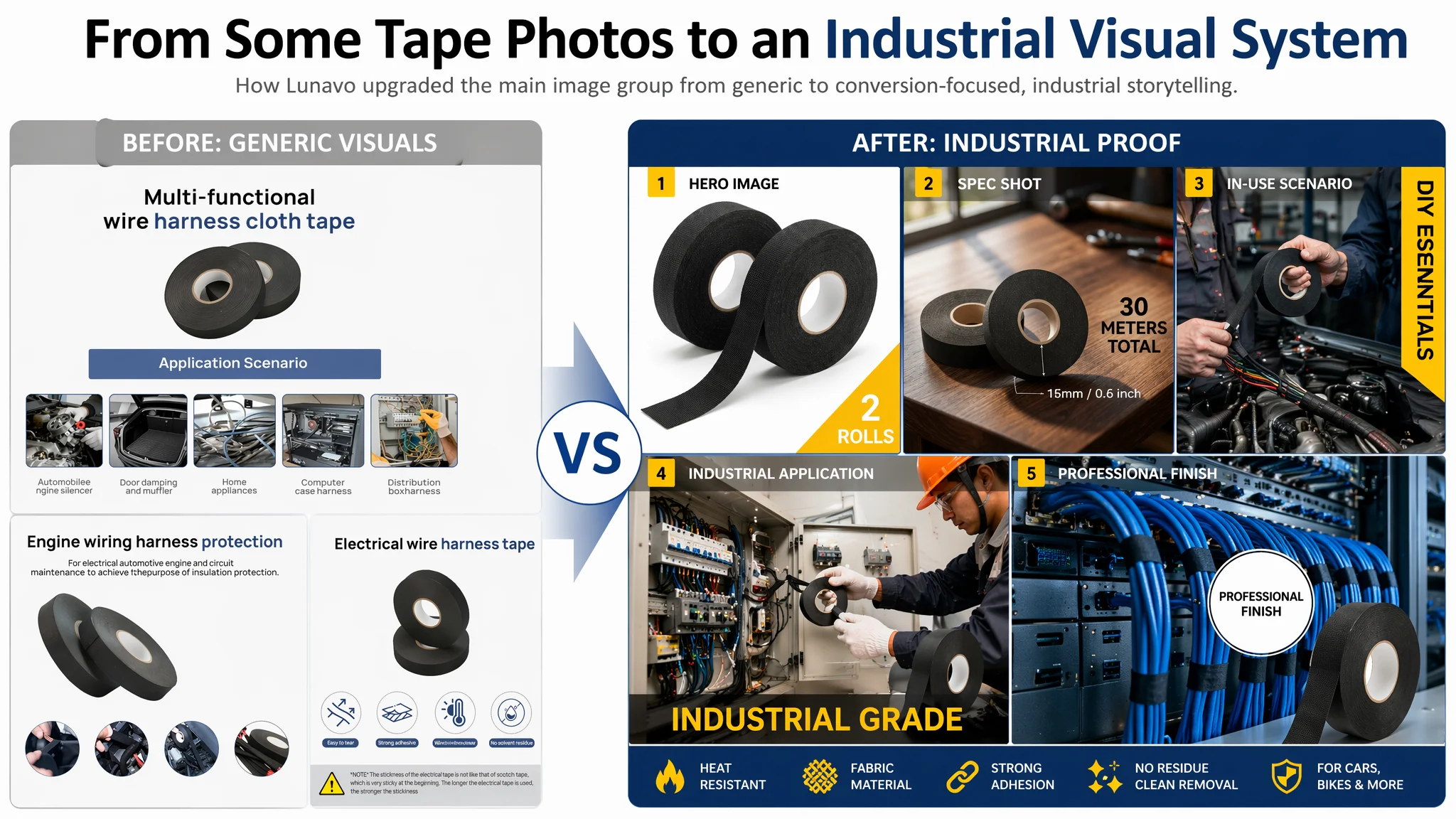
The target images did show the tape, but suffered from:
- Low information density in the primary frame
- Over‑reliance on abstract, floating packshots
- Weak or misleading scenes (e.g., car sound damping that is not this tape’s real job)
- Limited visual evidence of how the tape behaves in real use
By contrast, the competitor used:
- Tape partially unrolled to signal flexibility and adhesion
- Real workbench textures and industrial lighting
- Hands‑on shots in engine bays and wiring looms
- Scenes with technicians, cabinets, and network racks
For the target Listing, we defined a clear visual direction: “industrial, hard‑evidence, professional operator”.
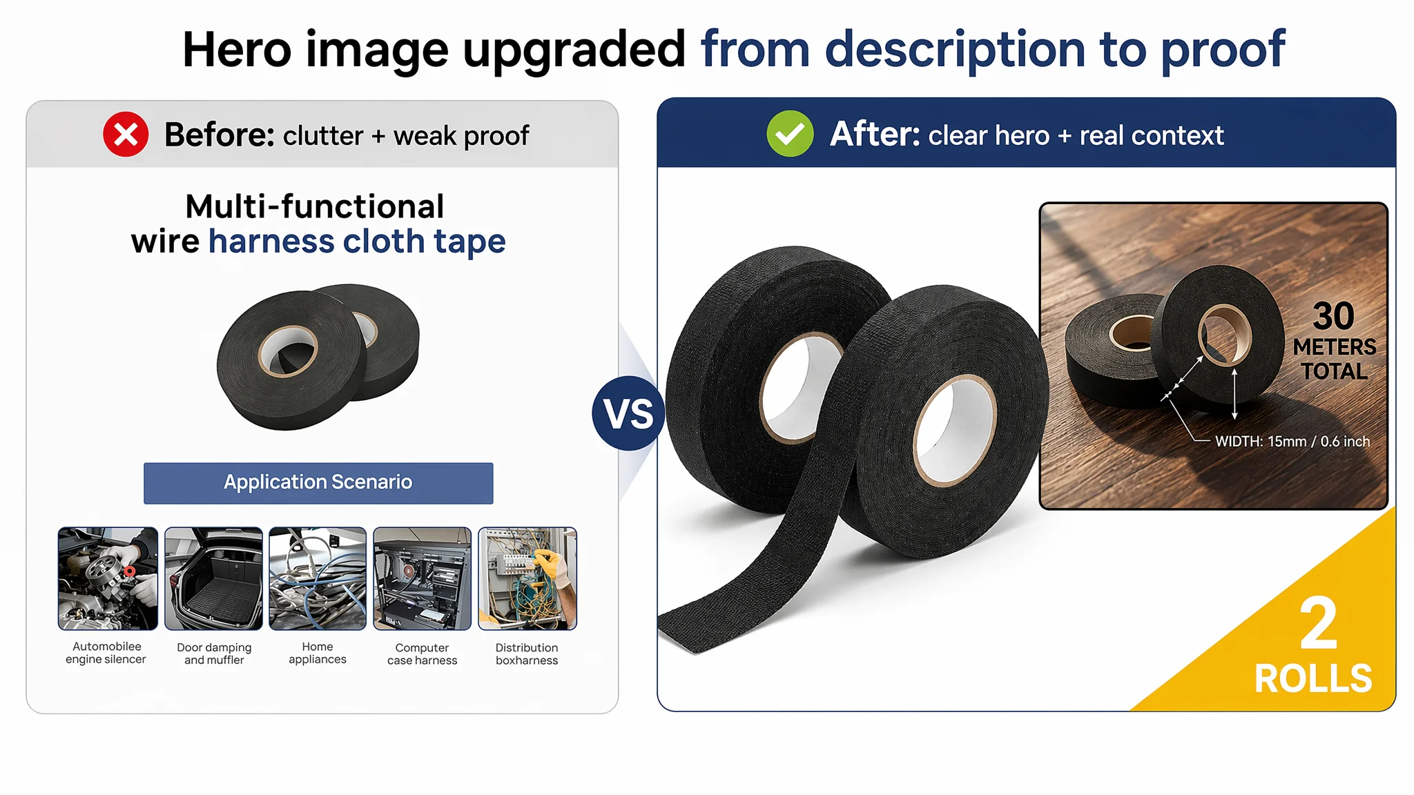
That implied:
- A hero image with two rolls occupying ~70% of the frame, one partially unrolled to show flexibility and adhesive surface, clean white background, and a bold “2 ROLLS” spec marker.
- A spec image on a real wooden workbench, overhead view, dimension lines on the tape width, and bold total length messaging (“50 METRES TOTAL” or equivalent).
- Close‑up hand shots wrapping colorful wiring harnesses in realistic workshops, tagged as “DIY ESSENTIALS”.
- Scenes with technicians in front of real distribution cabinets, labeled “INDUSTRIAL GRADE”.
- Server‑room scenes with neatly wrapped blue cables and a “PROFESSIONAL FINISH” callout.
The goal was not just aesthetic improvement; it was to prove that this tape lives comfortably in the environments the text promises.
Bullet Points: Good Logic, Not Fully Leveraged
One of the more interesting findings was that, on paper, the target Listing’s bullet structure was actually stronger than the benchmark’s:
- Each bullet clearly centered on one theme: material/durability, temperature performance, value, usability, scenarios.
- It explicitly highlighted a strong differentiator: residue‑free removal.
- It connected pain points (abrasion, heat, mess) with corresponding solutions.
But this logic was not being translated down the page or into visuals. DeepBI’s comparison suggested we retain the logic while tuning the wording and aligning it more tightly with decision psychology:
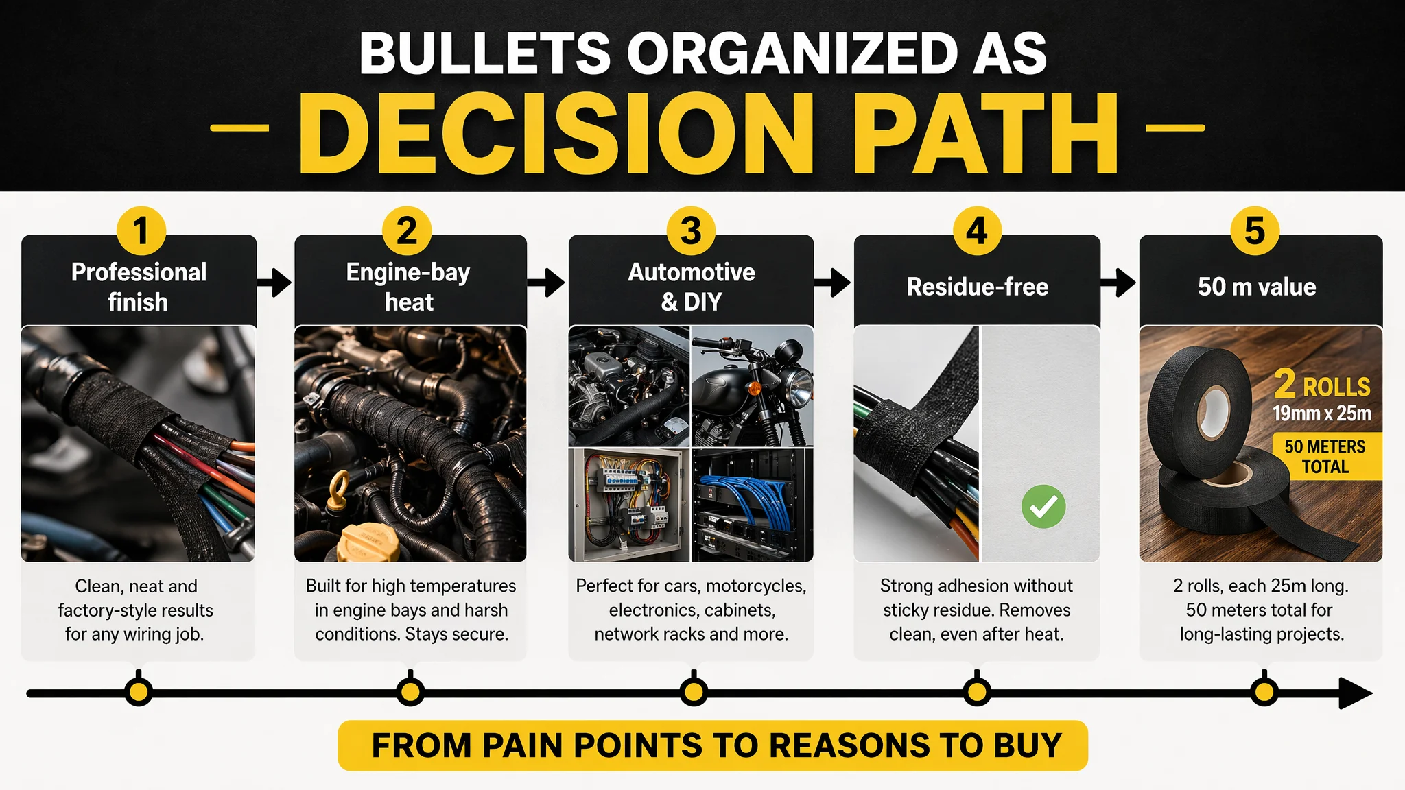
1. Bullet 1 – Professional Appearance + Protection
Combine abrasion resistance with the “clean, professional finish” language that serious buyers expect. This frames the tape not just as protective, but as a way to achieve OEM‑like harness aesthetics.
2. Bullet 2 – High‑Temperature Use in Specific Zones
Move from generic “heat‑resistant” language to engine‑bay and compartment‑specific application: it’s designed for engine bays and hot compartments, and protects wiring in those exact conditions.
3. Bullet 3 – Versatile, Not Just for Cars
Explicitly cover automotive harness repairs, cable bundling, motorcycle electrics, and general DIY installations. Buyers see themselves in one of these scenarios.
4. Bullet 4 – Mess‑Free, Residue‑Free
Highlight that even after exposure to heat, removal is clean. This is a clear differentiator versus generic PVC tape, and should read like a long‑term risk reduction, not a minor comfort.
5. Bullet 5 – Total Length as a Value Signal
With 2 × 25m rolls (50m total), the target Listing actually surpasses the benchmark’s 40m pack. Surfacing “50 metres” as an explicit value play aligns perceived value with real spec advantage.
Here, the problem was not the bullets themselves; it was that the rest of the Listing did not visually and structurally support the story those bullets started.
The Missing A+ Content Was the Real Conversion Leak
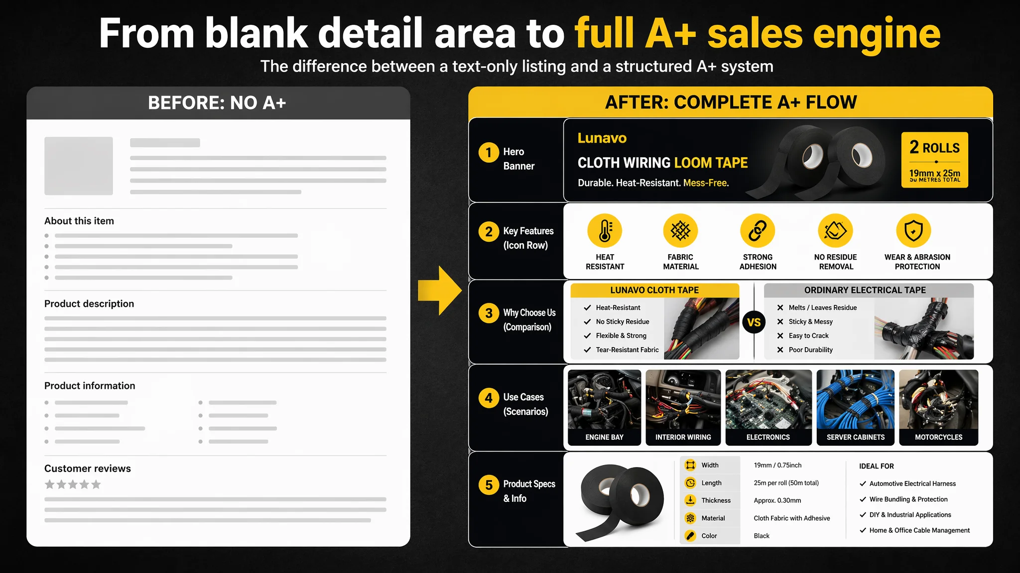
The most decisive gap was in the detail page:
- Target Listing: No A+ modules at all—zero imagery, no structured content.
- Benchmark Listing: Full A+ layout, including:
- Main visual banner with brand identity and pack info
- Icon strip for core attributes
- Comparison blocks vs normal electrical tape
- Multi‑scenario application collage
- Vehicle fitment and professional wiring result images
For a category where “cheap tape that fails later” is a real fear, this is where buyers are reassured—or lost.
How We Reframed the A+ From Blank Space to Sales Engine
We rebuilt the concept of the detail page around a simple path:
1. First impression: professional automotive tool, not just “some tape”.
- High‑contrast industrial banner: two rolls at a 45‑degree angle, black/grey background with yellow accent blocks for pack and length.
- Hard, directional lighting and realistic textures to signal seriousness and quality.
2. Core attribute icons: make capabilities scannable.
- Three bold yellow icons on a black bar:
- Flame + arrow (high‑temperature resistance)
- Tape peeling cleanly (strong adhesion, no residue)
- Woven texture (fabric construction)
- No shadow, clean flat design so they remain legible on mobile.
3. Pain‑point comparison: better than ordinary electrical tape.
- Side‑by‑side visual:
- Left: messy, loose, shiny PVC tape on wires.
- Right: neatly wrapped, tight harness with the fabric tape.
- Text overlay: “Superior to standard electrical tape” or equivalent.
4. Scenario breadth: three‑panel grid for core uses.
- Engine bay with high‑heat connections.
- Under‑dashboard bundle of colorful wires neatly wrapped.
- Precision electronics connectors being insulated.
- Consistent lighting and realistic scenes to avoid “stock photo” disbelief.
5. Extreme & non‑core environments: push beyond cars.
- Motorcycle frame wiring in exposed outdoor conditions (tight curves, complex routing).
- Server or low‑voltage racks showing organized blue cables bound with the tape, labelled “professional‑grade cable management”.
6. Final spec and pack overview: resolve last‑mile uncertainty.
- Clean grey‑gradient background with the two rolls occupying most of the space.
- Clear list of width, length, pack count, and key performance specs.
- This closes the “do I know exactly what I’m getting?” gap that often delays checkout.
This was not a cosmetic exercise. It was a direct response to the 0/25 detail score and the competitor’s 21/25, and to the underlying decision logic for automotive and electrical buyers.
Why Listing Conversion Had to Be Fixed Before More Ad Tuning
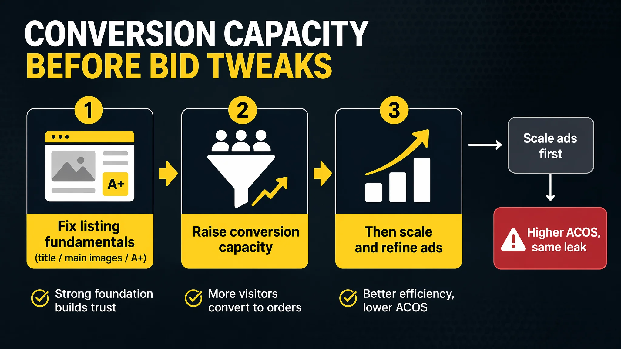
At this stage, the biggest business risk was not low impressions or poor CTR. It was:
- Paying to expose a structurally incomplete page.
- Letting a benchmark with a full visual and narrative system re‑capture undecided buyers.
- Allowing organic potential to stall because early sessions under‑converted.
That’s why we argued against continuing to pour effort into ad micro‑optimization before repairing the Listing:
- With a 0/25 detail score, every marginal gain in traffic would see diminishing returns.
- The review base could not yet carry the load; only a full page could compensate for low review volume.
- The main image and bullet points were “good enough” that their marginal improvement would not move the needle as much as adding an entire A+ system.
In other words, conversion capacity was the bottleneck, not traffic volume or keyword coverage.
How the Page’s Sales Logic Started to Recover
After the title, bullet, main‑image, and A+ rework, the Listing moved from:
- “Exists and mentions features”
to
- “Shows, proves, and structures the decision path”
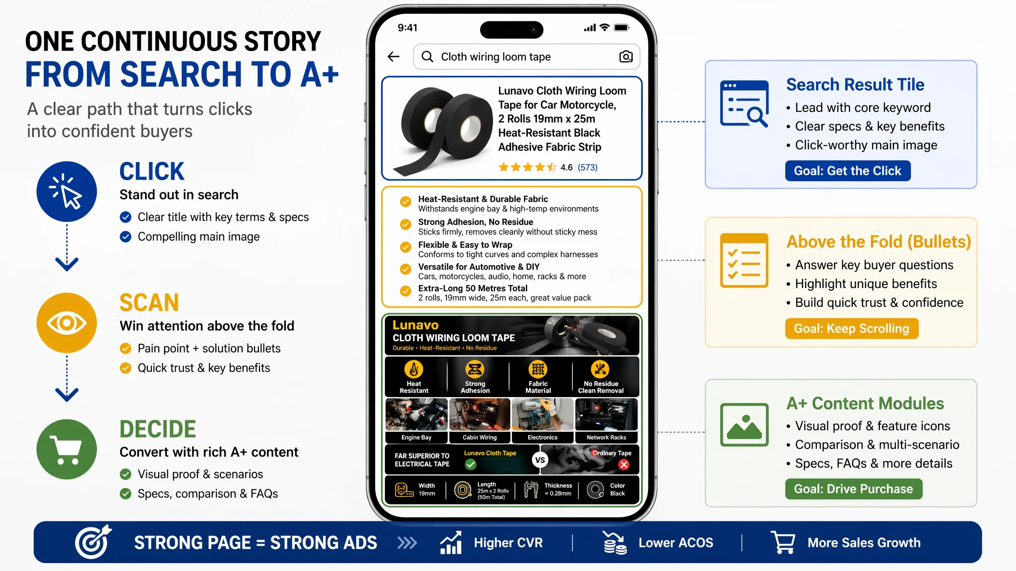
Concretely, the conversion path now looked like this:
1. Search results:
- A clearer title led by “Cloth Wiring Loom Tape” plus precise specs.
- A more informative main image that visually emphasized rolls, length, and use case.
2. Above the fold:
- Bullet points mapped cleanly to buyer pain points (heat, abrasion, residue, value, versatility).
- Early trust from professional wording and specific scenario references.
3. Scroll into A+:
- Immediate industrial‑grade visual framing.
- Quick scan of capability icons—heat, adhesion, fabric.
- Clear visual “better than electrical tape” argument.
- Scene breadth: cars, motorcycles, electronics, racks.
- Final spec reassurance.
In this configuration, incoming traffic—whether organic or paid—has a realistic chance of turning into orders, even with a low review count.
While we do not invent post‑optimization metrics, three operating state changes are typical in this configuration:
- CVR begins to recover as visitors find answers and proof rather than just product presence.
- ACOS becomes more elastic, because each click has a higher chance of converting.
- Organic ranking stabilizes around targeted terms as Amazon’s algorithm sees better behavior after click‑through (reduced bounce, more sessions converting).
Only then does continued ad optimization—bid tuning, search term expansion, refinement of match types—start to create real leverage rather than just offsetting structural weaknesses.
How the Seller’s Understanding Changed
Before the Listing audit, the seller’s implicit model was:
- “High ACOS → ads issue → tune bids and keywords → wait for more reviews.”
After going through the benchmark comparison and seeing the 21‑point A+ gap, that model shifted:
- Amazon ads are not responsible for fixing a missing page story.
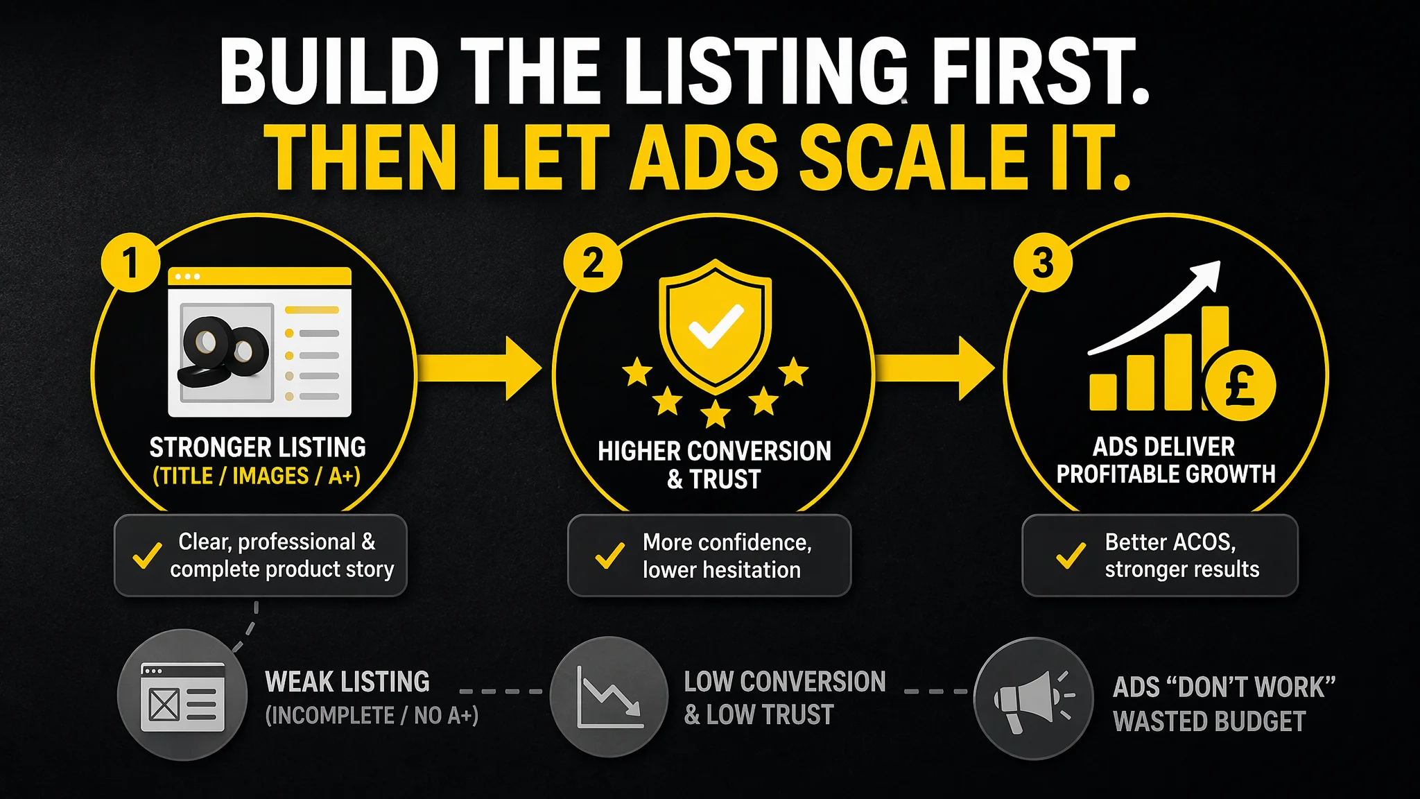
- Listing conversion is the foundation of ad efficiency.
- Title, main image, bullet points, and A+ have to form one coherent sales argument.
- Before scaling ads, you must judge whether the page deserves more traffic.
For this wiring tape product, the decisive reversal was simple but powerful:
- It was never just about “more reviews” or “lower bids”.
- It was about building an Amazon product page that could stand next to a top competitor and still tell a convincing, structured, visual story.
Many Amazon sellers in similar technical categories—automotive, tools, electrical, networking—are facing the same silent issue. As ad costs rise and CPCs tighten, the Listings that survive are the ones where:
- A+ is not a checkbox, but a conversion engine.
- Visuals do not just show the product; they prove its role in real, demanding scenarios.
- Ads amplify a strong page instead of subsidizing its weaknesses.
That is the real lesson of this case: before you accuse your Amazon ads of “not working”, make sure your Listing is capable of earning the traffic they already bring.