

This case comes from an Amazon seller in the cycling accessories category. They were launching a dual-head replacement nozzle for floor bike pumps on the US marketplace and felt the main pressure coming from Amazon ads: traffic was expensive, and they were hesitant to scale spend because orders were unstable. Internally, the team’s conclusion was simple—“this is a low-ticket accessory, returns will naturally be slow, let’s just push more traffic and wait for reviews.”
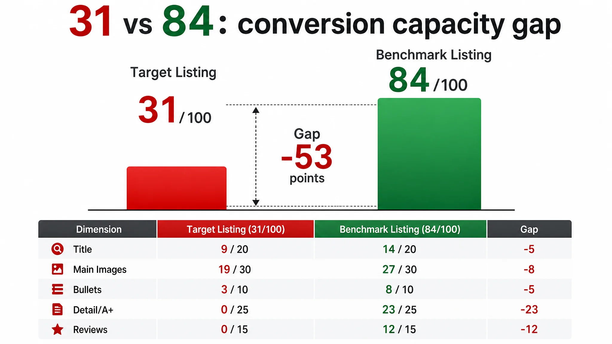
DeepBI’s diagnosis told a very different story. When we scored the Amazon Listing against a strong benchmark bike pump page, the result was a stark 31/100 versus 84/100. Title relevance was weak, the main image set could not create a reason to click, the bullet points did not form a buying logic, the detail page had zero A+ content, and there were no reviews at all. In other words, ad traffic was landing on a page that almost had no conversion infrastructure.
The optimization did not start from ads or bids. It started from reframing the problem: this was not “a slow-moving accessory,” it was “a Listing with almost no ability to convert paid or organic traffic.” We focused on rebuilding the title for search logic, reconstructing bullet points around compatibility and replacement value, and designing a complete visual story—main-image set and A+ modules—that matched how buyers actually choose bike pumps and pump heads.
For other Amazon sellers, especially in tools, accessories, and low-priced add-ons, this case is a reminder: when ACOS feels uncontrollable or you don’t dare to scale ads, the real issue may not be the campaign structure. It may be that your Amazon product page is missing the basic pieces needed to turn traffic into trust and orders.
The Surface Symptom: “Ads Feel Risky, Let’s Wait for Reviews”
The product in this case is a dual-head replacement nozzle for floor/track bike pumps—typical cycling accessory, low price, meant to be a simple add-on.
What the seller saw in their Amazon account:
- Impressions could be obtained at a reasonable level.
- They were cautious in spending because:
- Orders were inconsistent.
- There were no reviews yet.
- They believed this kind of accessory “naturally” needs time and reviews before conversion stabilizes.
So the team’s operating logic was:
- Problem = “Not enough reviews and not enough traffic.”
- Direction = “Increase ads step by step, keep bids conservative, wait for organic reviews to accumulate. We’ll optimize later if it’s worth it.”
They did not see an urgent Listing problem. The assumption was: “the page is fine for an accessory; the main issue is early-stage traffic and social proof.”
“From the seller’s perspective, ads looked risky because there was ‘no proof’ on the page. From the data’s perspective, ads were being asked to carry a page that had almost no conversion logic at all.”
What DeepBI Saw: 31 vs 84 Is Not a Cosmetic Gap. It’s a Conversion Gap.
Once we ran this Amazon Listing through DeepBI’s scoring and benchmark comparison, the picture sharpened immediately.
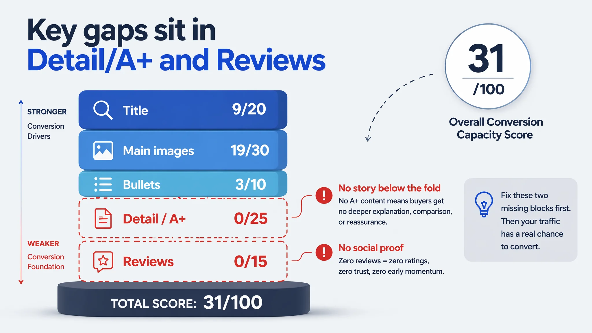
A hard numerical gap
- Target Listing total score: 31/100
- Benchmark Listing total score: 84/100
- Gap: –53 points
By dimension:
- Title: Target: 9, Benchmark: 14, Max: 20, Gap: –5
- Main Image set: Target: 19, Benchmark: 27, Max: 30, Gap: –8
- Bullet Points: Target: 3, Benchmark: 8, Max: 10, Gap: –5
- Detail / A+: Target: 0, Benchmark: 23, Max: 25, Gap: –23
- Reviews: Target: 0, Benchmark: 12, Max: 15, Gap: –12
Two things stood out immediately:
1. The Listing had almost no story below the fold.
- Detail/A+ score: 0 vs benchmark 23.
- This wasn’t “weak A+”; it was no A+ in a category where the benchmark used a full, structured A+ stack to carry the decision.
2. Zero reviews versus 2,600+ reviews is not “just a social proof gap.”
- Target: 0 reviews, 0 rating.
- Benchmark: 4.3 stars, 2,660 total reviews, 10 reviews on the first page.
- The competitor could afford mediocre sub‑reviews (20% of visible ones were ≤3 stars) because volume diluted risk.
- Our seller had nothing—no rating, no early social proof, and no replacement trust built through content.
Combined with a mid‑30s overall score, the conclusion was clear: this page did not deserve more traffic yet.
Amazon Ads Were Not Failing. The Page Was Consuming the Traffic.
From the advertising point of view, what would have happened if they had simply raised bids?
- Ads would have driven more clicks to:
- A title that hid the core category term.
- A main image set that did not differentiate the product from any other metal fitting.
- Bullet points that read like packing list and instructions, not reasons to buy.
- A detail area with zero A+ modules.
- A review section with zero reviews.
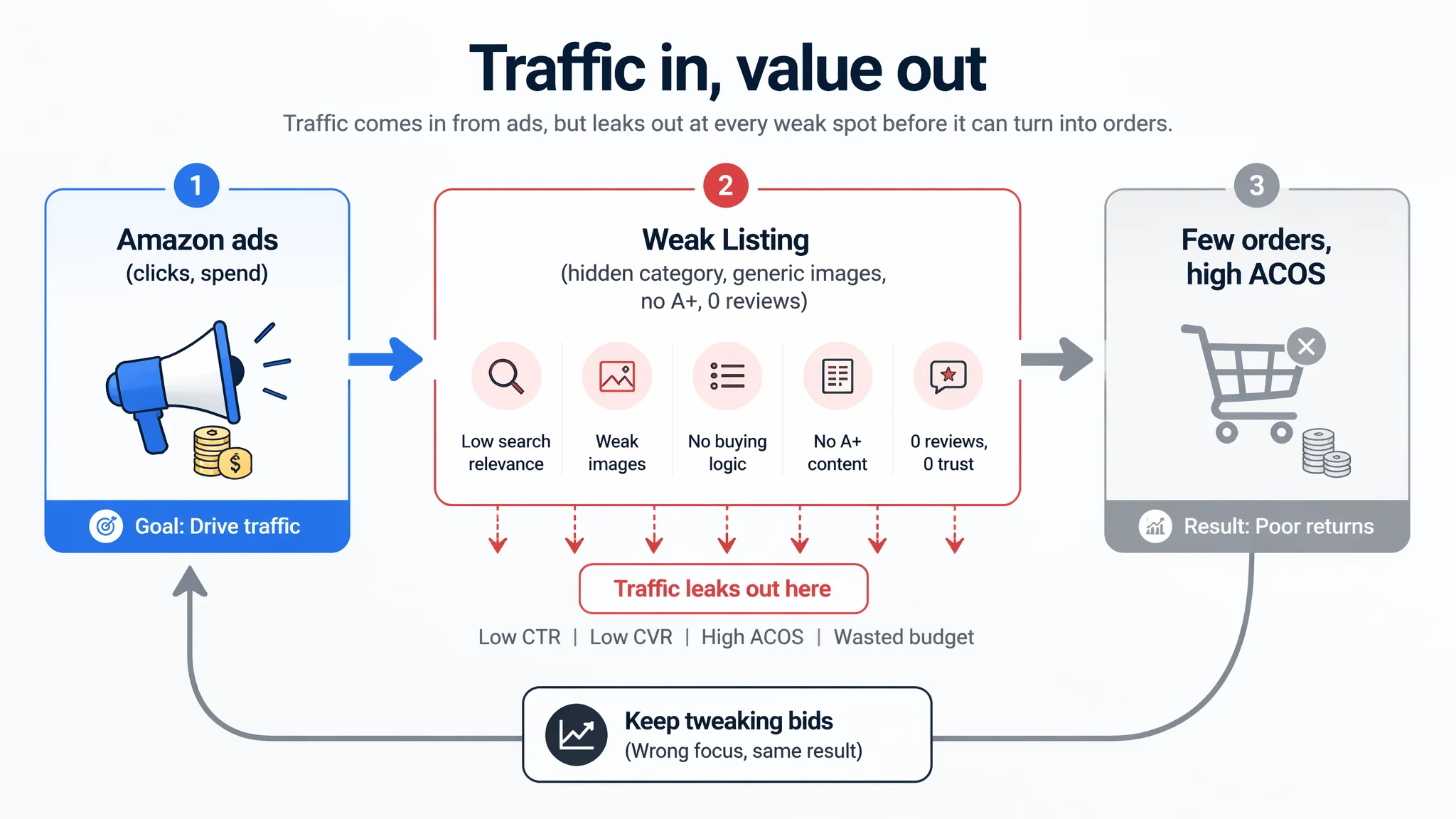
The likely result:
- More spend.
- Weak CTR next to visually stronger competitors.
- Weak CVR after click.
- Difficulty defending ACOS.
- Pressure to “keep tweaking bids and keywords,” even though the bottleneck wasn’t in the campaign layer.
“The real problem was not that ads failed to bring traffic. It was that the page could not convert the traffic.”
That’s why DeepBI’s judgment was: do not push ads first. Repair the conversion foundation first.
The Real Constraint: This Listing Had Almost No Conversion Capacity
Looking at each content block made it clear where the conversion chain broke.
1. Title: Hiding the category, missing the high-intent terms
The original title structure:
- Led with “Dual Head” (a model-like phrase), not the core category (“Bike Pump”).
- Contained a vague “Valve Connector & Adapter” phrase.
- Only lightly mentioned “2 Pieces” without tying it to value or use cases.
Benchmark behavior:
- Led with the category and usage:
“Bike Pump Floor, Advanced Bike Tire Inflator, Bicycle Hand Air Pump…”
- Explicitly listed “Dual Presta and Schrader Valves”—the key compatibility terms in this category.
- Called out usage scenarios:
“Road and Mountain Bikes, Baby Stroller, Balls.”
- Layered in perceived professionalism: “Advanced,” “Handheld Pump.”
So the target page:
- Lowered search relevance by burying the category word.
- Underused “Presta / Schrader” compatibility language that drives both search and purchase.
- Did not anchor the product in clear usage scenarios.
DeepBI’s direction was to move toward a structure like:
“Dual Head Bike Pump, Floor Bike Track Pump with Presta and Schrader Valves, Tire Inflator for Road and Mountain Bikes, Strollers, Balls, Includes Valve Connector and Adapter”
Not to copy words, but to:
- Put “Bike Pump” near the front.
- Explicitly state Presta & Schrader.
- Attach concrete use cases (bikes, strollers, balls).
- Preserve the true “2 pieces / connector & adapter” attributes.
2. Main Images: No visual reason to click, no trust built at thumbnail level
The current main image set was dominated by:
- Pure white background.
- Static product-only shots.
- Limited visual cues about:
- Dual-head function.
- Compatibility.
- Size.
- How it attaches to a pump.
- Where and how it’s used.
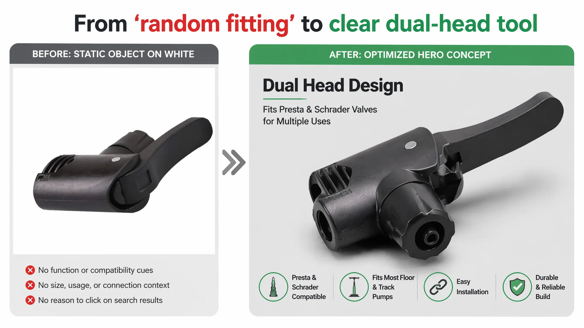
On a crowded Amazon search results page, that meant:
- Lower CTR: the main image looked like “just another fitting,” not like a precise tool.
- Limited trust: no visual cues of durability, engineering, or correct usage.
The benchmark, by contrast, used images to:
- Visualize value: “120 PSI,” “0.66 lb,” “4 adapters” directly on images.
- Show real environments and usage (held by a person, connected to tires and other inflatables).
- Make compatibility feel simple, not risky.
DeepBI’s diagnostic judgment:
- The issue wasn’t only aesthetic; it was missing decision logic at the image level.
- The page needed:
- A strong 45° hero angle that clearly shows it’s a dual-head design.
- A precise dimensions image with clean industrial-style annotations.
- A compatibility close-up labeling “Presta” and “Schrader” directly at the ports.
- A connection shot with an actual floor pump hose.
- A “multi-use” composition with different valve types visually arranged.
Without these, buyers could not quickly answer:
- “Will this fit my pump?”
- “Will this fit my valves?”
- “Is this an actual upgrade or a cheap generic?”
3. Bullet points: Information present, but no buying logic
The original bullet points were mainly:
- Packaging content.
- Basic installation steps.
- General material and durability description.
- Simple applicability notes.
- Valve type explanation in informal wording.
Benchmark behavior was completely different:
- Led with compatibility as the main pain point—“EXCELLENT COMPATIBILITY… Presta and Schrader valves… bikes, strollers, sports equipment…”
- Combined technical data (120 PSI) with results (quick and efficient inflation).
- Emphasized scenarios: outdoor adventures, multiple devices.
- Highlighted comfort, portability, and durability in distinct bullets.
DeepBI’s diagnosis:
- The seller did mention features, but not in a way that solves a buyer’s decision problem.
- There was no “pain point → solution → result” structure.
So the bullet points were reconstructed around five clear roles:
1. UNIVERSAL COMPATIBILITY
- From “it works with many things” to:
- Explicitly stating it fits most track and floor pumps, and adapts to Presta, Schrader, Dunlop for bikes, strollers, and inflatables.
2. EASY & QUICK INSTALLATION
- From generic “Instructions” to:
- Emphasizing effortless replacement: unscrew old head, slide new head on, no need to buy a new pump.
3. DURABLE & LONG-LASTING
- From simple “plastic” description to:
- “High-quality, reinforced materials… consistent performance… reliable long-term companion.”
4. USER-FRIENDLY DUAL-HEAD DESIGN
- Translating “American/British mouth” into:
- Correct industry terms: Schrader (American), Presta and Dunlop (British), clearly assigned to each port.
5. COMPACT VALUE PACK
- Turning “2 pieces” into:
- A clear value promise: 2 compact heads, portable, ideal as backup in a cycling kit, good for outdoor adventures.
Functionally, this transformed bullets from a manual into a buying script.
4. Detail page / A+: no modules, no decision support
This was the most decisive gap.
- Target Listing: no A+ content at all.
- Benchmark Listing: a full A+ stack, including:
- Brand introduction with full-width hero image and human holding the pump.
- Multi-scenario compatibility grid (bikes, balls, inflatables).
- Core parameters and design highlights (PSI, weight, size).
- Real usage scenes (roadside assistance).
- Valve operation guides and diagrams.
- Comparative module vs other pump types.
- Portability and trust messaging.
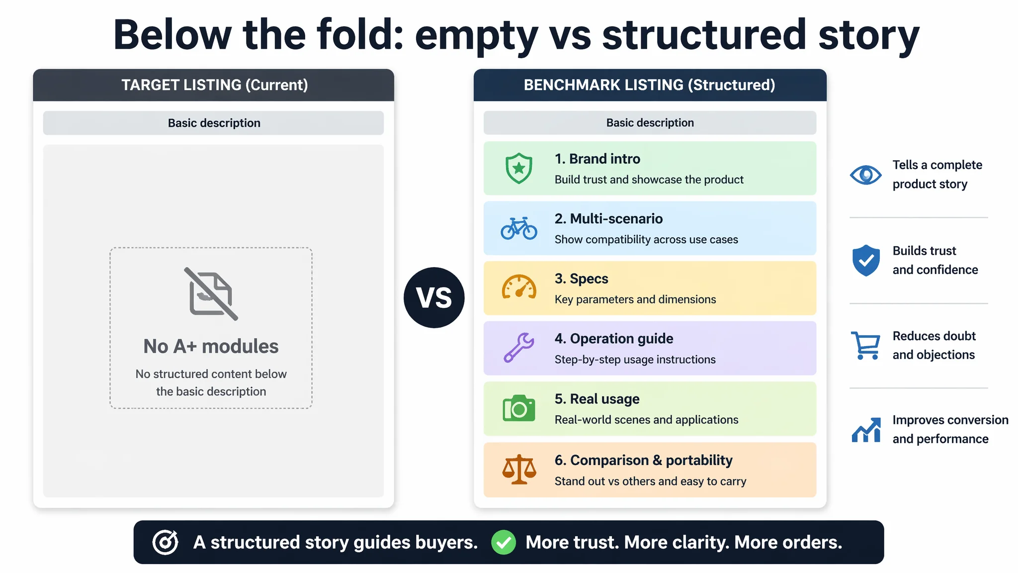
DeepBI’s view:
- In a mechanical tool category, A+ is not decoration; it’s the main trust engine.
- When you have 0 reviews, your only way to reduce perceived risk is:
- Visual clarity.
- Step-by-step operation explanation.
- Concrete parameters.
- Scenario use cases.
- Clear superiority vs alternatives.
This Listing had none of that.
Why DeepBI Did Not Recommend Pushing Ads First
At this stage, the seller faced a common temptation:
- “Let’s increase ads slowly, watch ACOS, and see how reviews and ranking move.”
From DeepBI’s operating logic, this would likely:
- Spend money to prove that:
- A 31/100 page with 0 reviews and 0 A+ cannot hold traffic in a competitive category.
- Produce “data” that seems to blame ads, not Listing conversion.
- Increase anxiety:
- “Maybe this product just doesn’t sell; maybe we should write it off.”
Instead, we argued for a different sequence:
1. Accept that the bottleneck is Listing conversion capacity, not traffic volume.
2. Rebuild the page to a level where it can reasonably be expected to convert.
3. Then use ads to test and amplify that improved conversion behavior.
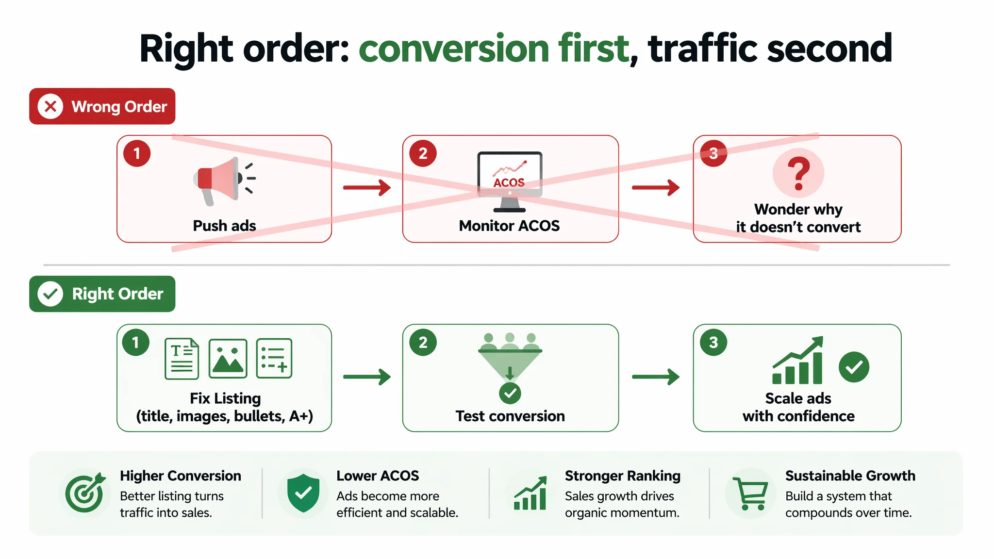
The biggest business risk at that moment was not “losing some impressions”; it was:
- Locking in a negative feedback loop: weak page → poor early performance → low confidence → underinvestment → product written off prematurely.
Rebuilding the Page: From Static Hardware to a Complete Buying Story
DeepBI’s optimization path focused on reconstructing the sales logic visually and textually, without changing the real product.
Main image set: from “object on white” to “function, clarity, and context”
Key shifts included:
- Hero image (Main):
- Product centered, ~65% of frame.
- 45° side view emphasizing dual-head structure.
- Subtle contour light, light grey gradient background to signal industrial quality.
- Overlay text like “Dual Head Design” in clean sans-serif font—focused, not cluttered.
- Dimensions image:
- Front view, perfectly aligned.
- Clean industrial-style measurement lines and labels (e.g., 46 mm height, 63 mm length).
- White background, black lines, clear scale—reads like a technical drawing.
- Valve-type close-up:
- 80% frame filled with a tight shot of the two ports.
- Angle and lighting optimized for depth and contrast.
- Semi-transparent callouts directly labeling “Presta” and “Schrader” near each port.
- Connection to pump:
- Head connected to a black hose on a real floor pump.
- Shallow depth-of-field modern interior background (softly blurred).
- Shows exactly how the product looks in use.
- Multi-valve compatibility composition:
- Head at center with three valve types around it (Presta, Schrader, Woods/Dunlop).
- Top-down view, balanced layout.
- Clean white background, controlled soft light.
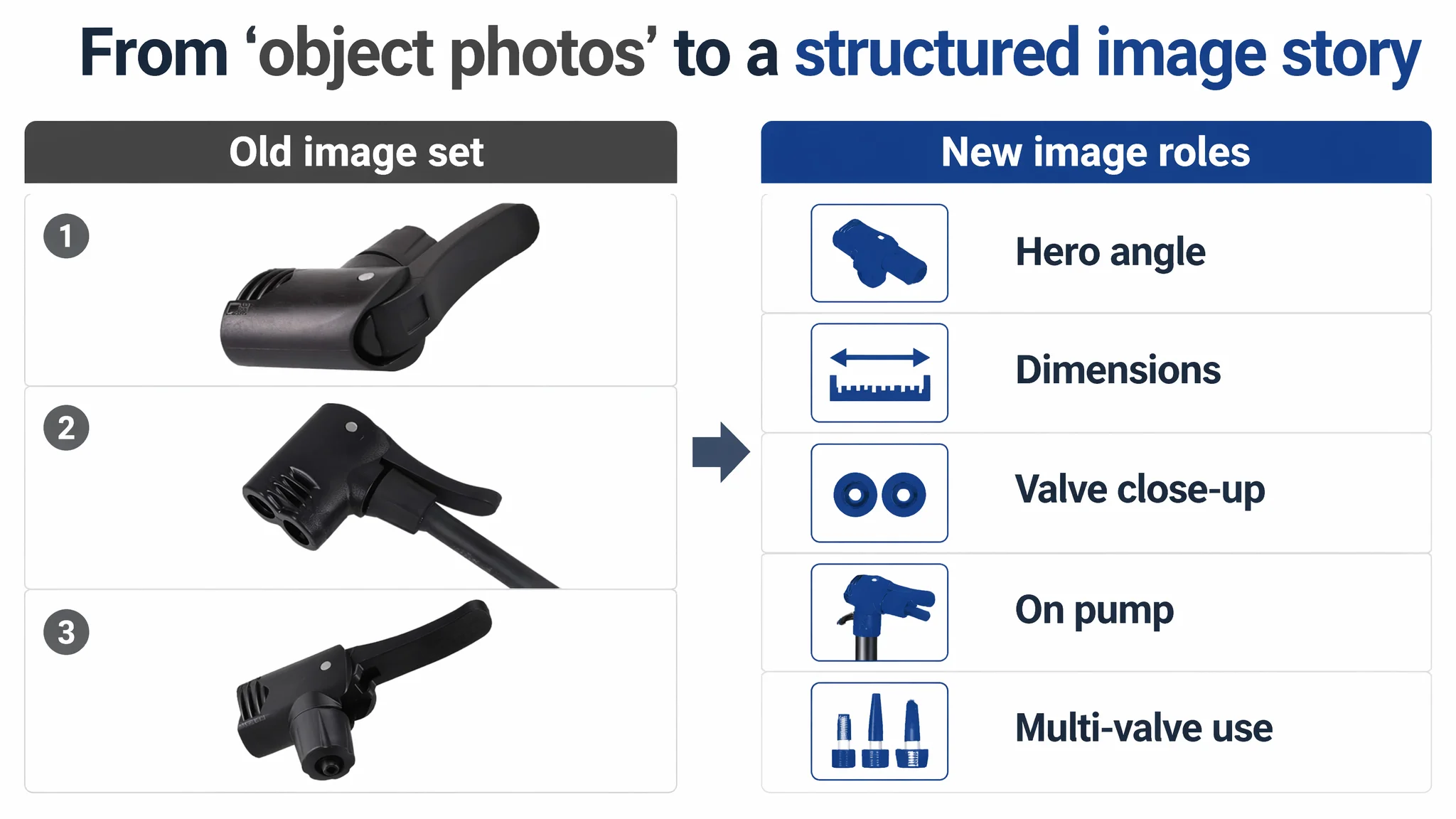
These weren’t “creative” for creativity’s sake. They answered:
- What is this?
- How does it attach?
- Which valves does it support?
- Is it a serious, precise tool—or a random generic fitting?
A+ content: six modules that carry the whole decision
Based on the benchmark structure and the product’s real attributes, the A+ plan focused on six roles:
1. Brand and trust entry
- Cyclist in sports gear holding the pump in an outdoor setting.
- Product clearly visible, center-right focus.
- Natural daylight, neutral color tone.
- Goal: immediately signal a real, usable tool in a familiar cycling scenario.
2. Multi-scenario compatibility
- Four-grid layout:
- Road bike tire.
- Inflatable swimming ring.
- Soccer ball.
- Close-up of Presta/Schrader valve connection.
- Unified white studio-like background to keep focus on function.
- Goal: show “one tool, multiple inflatables” visually, reducing doubt.
3. Core specs & parameters
- Left: bold, enlarged PSI/Bar information (e.g., “120 PSI / 8 BAR”), only if truly accurate for the base pump context; otherwise, use genuine pump-head relevant specs.
- Right: product image and clear size table (width, height, hose length of compatible pumps, weight where relevant and truthful).
- Goal: give the mechanics-focused buyer the data they expect.
4. Valve operation guide
- 1–4 step micro close-ups showing:
- Hand moving the lever.
- Locking onto valve cores.
- Dark background, focused lighting on the interaction.
- Goal: make operation look easy and transparent, remove fear of “I won’t know how to use it.”
5. Real roadside usage scene
- Bike at roadside or park, pump upright in grass, hose connected.
- Warm light, everyday cycling context.
- Goal: create emotional reassurance—this is a practical roadside assistant, not a theoretical accessory.
6. Comparison & portability close
- Comparison module:
- Middle column: this dual-head solution with ticks for “all-in-one valve compatibility,” “quick replacement,” etc.
- Side columns: older-style single-valve heads or less versatile pumps with red crosses for missing features.
- Portability module:
- Product placed into a side pocket of a cycling backpack or attached to a bike frame.
- Goal: clarify why this is superior to alternatives and underscore packability.
Together, these A+ images reconstruct what reviews and long copy could not yet provide: a complete and believable buying journey.
How the Page’s Sales Logic Started to Recover
After restructuring title, main images, bullet points, and building a full A+ story, several key changes were set in motion, even before large-scale ads:
- The page started to look like it belonged in the same competitive set as the benchmark.
The gap was no longer “31 vs 84, accessory-level page vs fully armed page,” but “early-stage product vs established competitor.”
- Compatibility doubt was visibly reduced.
Instead of forcing buyers to parse text, the images and bullets jointly explained:
- Which valves it fits.
- How to install it.
- How it operates.
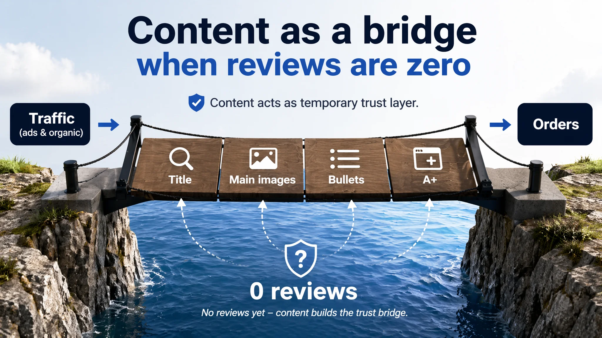
- Trust no longer relied solely on reviews.
With 0 reviews, the Amazon default is distrust. Now:
- Technical visuals.
- Usage scenes.
- Clear operation steps.
Together, they acted as a “substitute trust layer” until real rating data accumulates.
- The Listing gained a realistic chance to convert both organic and ad-driven traffic.
Ads could now amplify advantages instead of amplifying confusion.
What Changed in the Seller’s Understanding
The most important change was not on the page—it was in how the seller thought about ads and Listing quality:
1. High ACOS or ad anxiety is not always an advertising problem.
Here, the page’s 31/100 score and total lack of A+ and reviews explained far more than any bid adjustment could.
2. Listing conversion is the foundation of advertising efficiency.
Sending more clicks into a structurally weak page does not “validate” the product; it only burns budget.
3. Title, main image, bullets, and A+ must work as a single decision engine.
- Title captures relevant searches and sets expectations.
- Main image wins the click and frames the product.
- Bullets translate features into purchase logic.
- A+ fills the trust and understanding gap that reviews haven’t yet bridged.
4. Before scaling ads, ask: does this page deserve more traffic?
In this case, the honest answer at the start was “no.” Only after rebuilding the Listing could ads become a meaningful lever again.
Takeaways for Other Amazon Sellers in Tools and Accessories
If you sell mechanical tools, replacement parts, or small accessories on Amazon, this case carries a few practical implications:
- When you see low conversion or don’t dare to scale ads, check:
- Is your page structurally closer to 31/100 or 84/100?
- Do you have at least a minimal A+ story—or is your detail area essentially empty?
- Are your images only “showing the object,” or are they answering decision questions?
- If your early-stage product has 0 reviews, your Listing content is your only bridge to trust.
A page with no A+ and generic bullets forces ads to carry a load they cannot bear.
- Ads and Listing are not two separate battles; they are one system:
- Listing quality determines how far ads can go.
- Ads then determine how fast that quality can be converted into sales and organic ranking.
DeepBI’s role in this case was not to “tune campaigns” but to put a number on the Listing’s real competitiveness, expose where the decision path broke, and force a change in sequence: fix conversion first, then invest confidently in traffic.