

An Amazon home-organization seller in the US marketplace came to DeepBI with a familiar problem: ad traffic was getting more expensive, but the new sock and bra drawer organizer listing simply would not move. The team’s first instinct was to “optimize ads harder” – adjust bids, expand keywords, and push more budget to drive exposure.
Once we put the listing through DeepBI’s Amazon Listing diagnosis, the picture changed completely. Against a leading drawer-organizer competitor, the product page scored only 59/100 versus 84/100, with almost all of the gap concentrated in title logic, bullet-point persuasion, A+ storytelling, and – most critically – a total lack of reviews. This wasn’t an advertising-setup issue; it was a listing that had almost no inherent ability to convert the traffic it received.
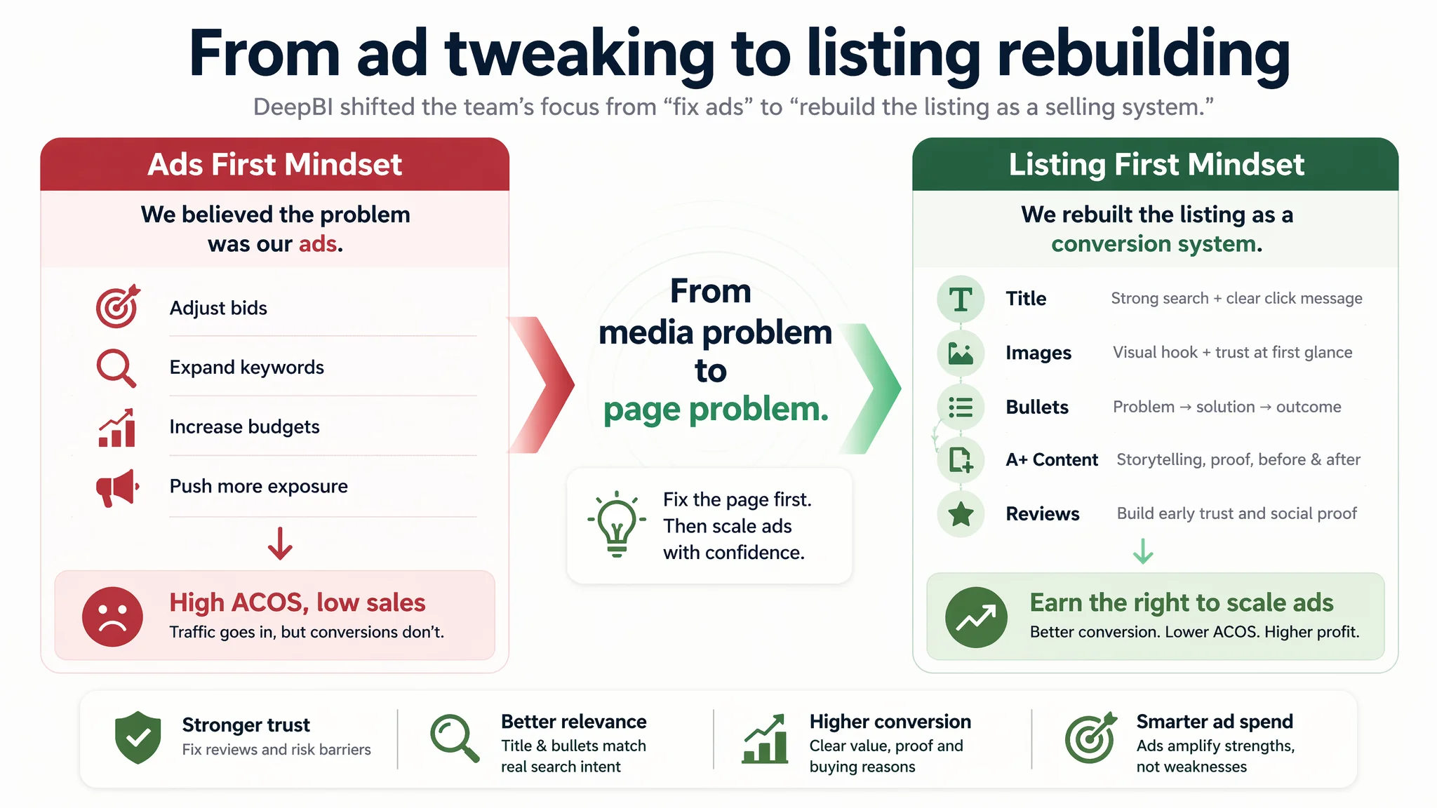
The later optimization therefore did not start from campaign structures or keyword trees. It started from rebuilding the Amazon product page as a selling system: rewriting the title for search and clarity, reorganizing bullet points around outcomes instead of features, rethinking main-image and A+ visuals around “chaos → order” before/after logic, and fixing trust gaps that blocked purchase decisions. For other Amazon sellers, this case is a reminder: if your page scores low on conversion capacity, Amazon ads will only amplify the leak, not fix it.
Amazon Ads Were Not Failing. The Page Was Consuming the Traffic.
From the seller’s side, the initial symptoms looked like a pure advertising problem.
They were launching a multi-pack non‑woven drawer organizer in the home storage category. The category is highly competitive and ad bids are intense, but they could see that a benchmark competitor with similar pricing and positioning was doing very well on Amazon. The pressure was straightforward: if that competitor could buy traffic profitably, “our ads should be able to as well.”
So the internal diagnosis went in a direction many Amazon teams will recognize:
- “Maybe we don’t have enough keywords.”
- “Maybe bids and match types aren’t aggressive enough.”
- “Maybe we just need to increase daily budgets and let the algorithm optimize.”
What this left out was one hard fact: the listing itself had never been validated as a conversion asset. The product page was essentially “untested ground,” but the team was already stepping on the accelerator.
When DeepBI ran a full Listing score against a top competitor in the US Amazon store, the gap became visible:
- Target listing: 59/100
- Benchmark listing: 84/100
- Gap: ‑25 points, concentrated in:
- Title: 8 vs 17 (‑9)
- Bullet points: 4 vs 7 (‑3)
- Detail / A+: 21 vs 23 (‑2)
- Reviews: 0 vs 13 (‑13)
- Main image: 26 vs 24 (+2 – not actually the bottleneck)
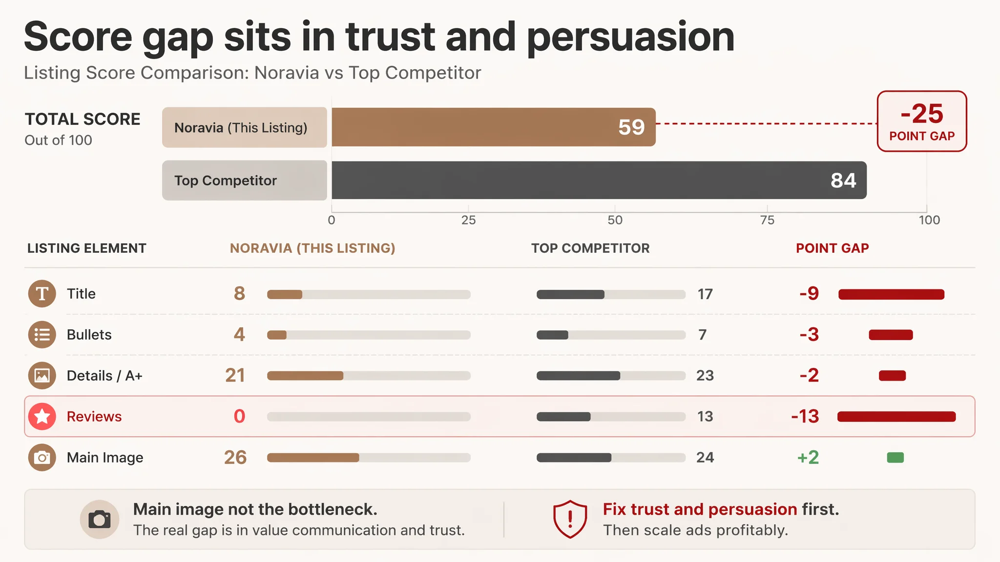
“The real problem was not that ads failed to bring traffic. It was that the page could not convert the traffic.”
At this stage, continuing to push ads first would have meant paying to prove, over and over, that the page lacked persuasion and trust.
The Real Constraint Was Listing Conversion Capacity
Looking at the total score, it’s easy to say “59 vs 84 is a big gap.” What matters more is where that gap sits in the buying journey.
DeepBI’s scoring showed:
- Main image was not catastrophic. In fact, it slightly outscored the competitor on pure technical quality (26 vs 24).
- Title, bullets, details, and reviews were structurally weak.
- Reviews were at absolute zero: 0 reviews, 0 rating, vs the competitor’s 4.6 stars and 15,000+ reviews.
Functionally, this means:
1. Trust deficit
On Amazon, a product with no rating and no social proof is starting every session in a deep trust hole, especially when competing with a 15k‑review incumbent. Even a solid main image cannot offset this.
2. Weak search and click logic from the title
- The competitor’s title opened with “Sock Drawer Organizer” – the core high‑intent term – and then layered in “2 Packs,” “24 Cell,” and multi‑use scenarios like handkerchiefs, ties, belts.
- The target listing buried core keywords, scattered attributes (dimensions, material, color) without a clear structure, and limited scenarios to narrower terms like socks and bras.
- Result: lower search friendliness, weaker thumbnail message, and less reason to click.
3. Bullets that listed features, not outcomes
- The competitor structured bullets as a problem → solution → outcome path:
- Multi‑use scenarios
- Collapsible operation
- Space and time saving
- Clear numeric capacity
- Quality guarantee and after‑sales
- The target listing stuck to function listing:
- Where you can use it
- What the material is
- How many compartments
- How to clean it
- Missing: “your drawer stops being chaos,” “you save time every morning,” “we stand behind quality.”
4. Detail page images that showed, but did not persuade
- The seller did have multiple A+ style images: usage scenes, product shape, multi‑scene fit, material details, usage steps, specs.
- The competitor, however, pushed harder on decision logic:
- Immersive lifestyle scenes (wardrobes, living spaces)
- Clear Before & After modules (messy drawer → organized drawer)
- Craftsmanship close‑ups with “Delicate Stitching,” “Durable Bottom Zipper”
- The target page lacked a strong emotional “I need this” moment and clear evidence of durability.
Once you map these gaps onto an Amazon funnel, the core conflict becomes obvious:
- Ads can bring impressions.
- The main image is just “good enough” to get some clicks.
- But from click to purchase, the page has almost no structural support – no reviews, thin value articulation, limited scenario breadth, and low emotional payoff.
This is why DeepBI judged: fixing the listing’s conversion capacity had to come before any serious ad scaling.
Why DeepBI Did Not Keep Tuning the Ads First
From a pure media-buying mindset, the temptation is always to test more keywords, more creatives, more placements.
In this case, DeepBI’s judgment was:
- Continuing to optimize ads would only amplify a structurally weak page.
- Every incremental click would meet:
- A product page with a 0‑review status
- A title that under‑communicated the main use case
- Bullets that did not close the “why this product, why now” loop
- A+ content that lacked the strongest visual conversion device in this category: Before/After transformation
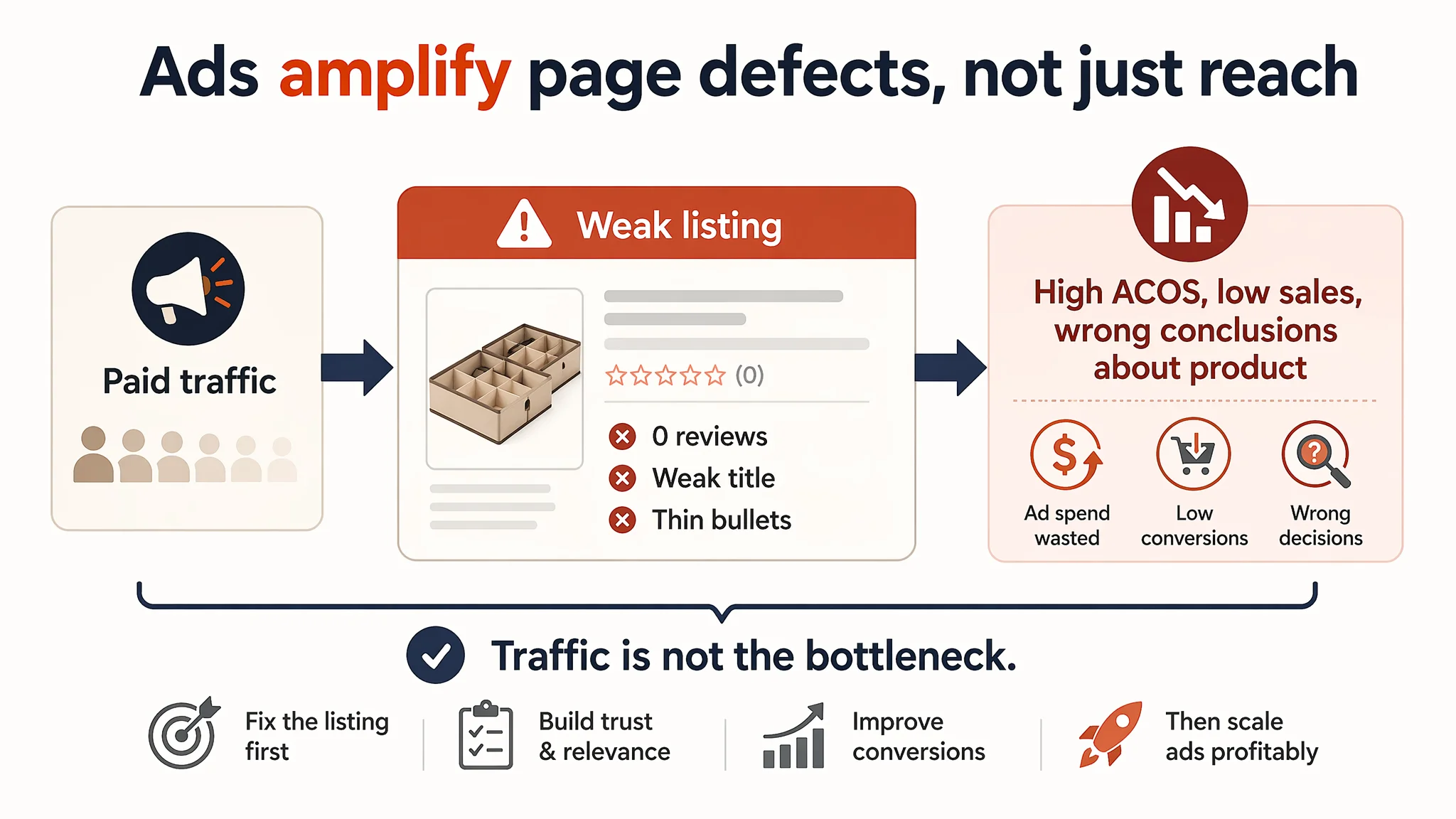
The biggest business risk at this stage was wasted ad spend and misreading the product’s true potential. If you keep pushing traffic into a page that cannot convert, you may mistakenly conclude the product or price is fundamentally uncompetitive, when the real issue is page logic.
So the operational decision path was:
1. Freeze further ad escalation.
Maintain only the minimum traffic needed for learning and basic ranking, but do not scale budgets until the listing earns the right to handle that traffic.
2. Rebuild the Listing so that each module carries its weight:
- Title: search + click logic
- Main images: click + first trust impression
- Bullets: problem → solution → outcome path
- A+ / details: immersion, proof, and risk reduction
- Reviews: strategy to break the 0‑review deadlock (via compliant review acquisition and early customer experience focus)
3. Only then consider renewed ad investment, once the page has demonstrably more conversion capacity.
“Advertising does not only amplify advantages. It can also amplify a page’s existing defects.”
This Product Page Did Not Lack Traffic. It Lacked a Buying Story.
Breaking down the listing elements clarifies where the story was missing.
The title underused its most valuable real estate
DeepBI’s analysis contrasted the benchmark’s title with the proposed optimized structure for the target listing:
- Benchmark pattern:
Brand + “Sock Drawer Organizer” + “2 Packs 24 Cell” + multi‑scenario terms (socks, handkerchiefs, ties, belts) + color.
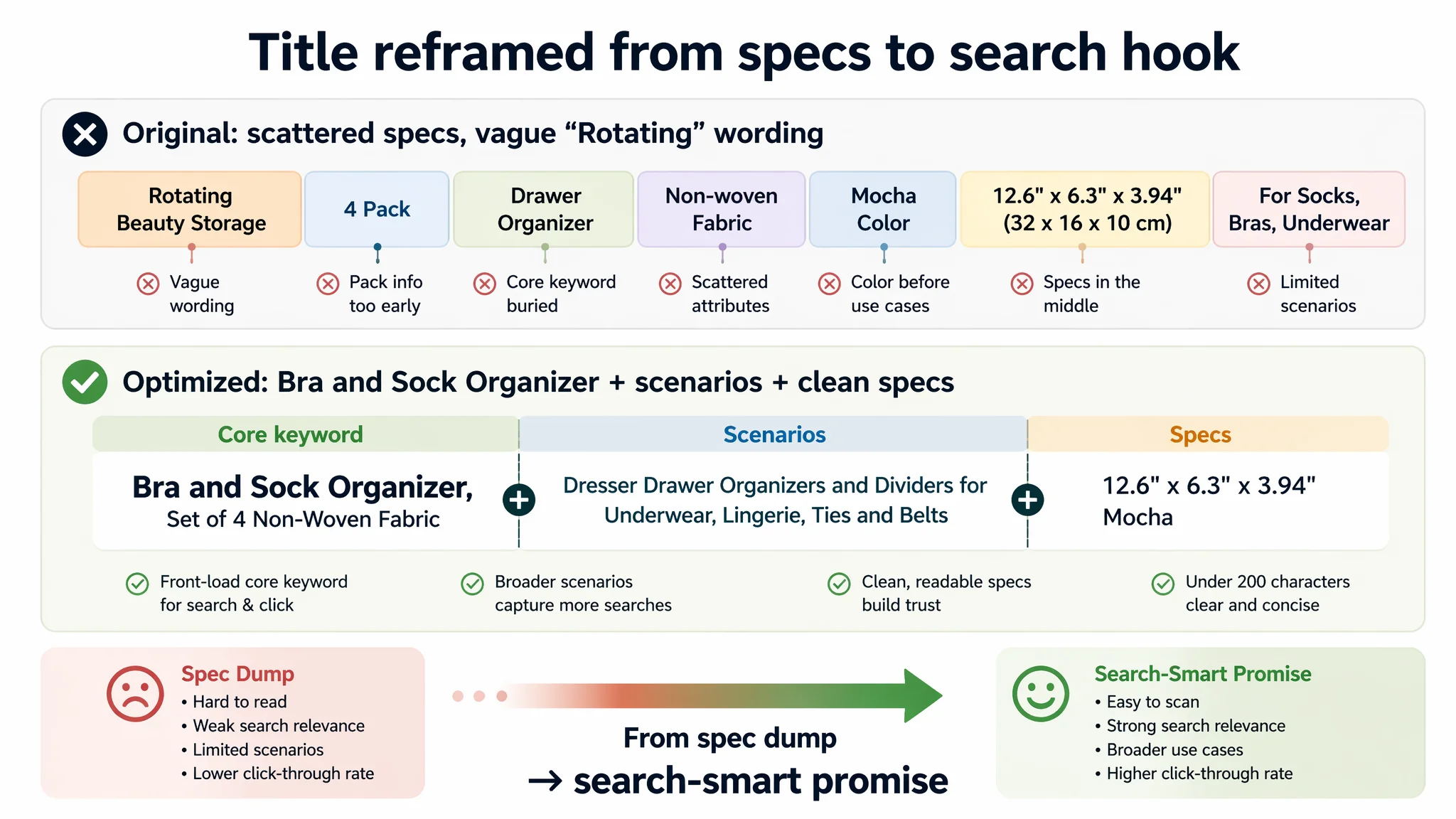
- Original target title weaknesses:
- Core search term placed later instead of leading.
- Repetition and vague phrases (e.g., “Rotating Beauty Storage,” which did not reflect the real product).
- Mixed dimensions, materials, and colors in scattered order, harming readability.
- Optimized direction:
“Bra and Sock Organizer, Set of 4 Non‑Woven Fabric Dresser Drawer Organizers and Dividers for Underwear, Lingerie and Belts, 12.6" x 6.3" x 3.94", Mocha”
Key logic:
- Front‑load “Bra and Sock Organizer” as the Amazon search and thumbnail hook.
- Consolidate high‑value long‑tail terms like “Drawer Organizers,” “Dividers,” “Underwear” inside 200 characters without keyword stuffing.
- Clean out redundant and misleading wording (“Rotating”), freeing space to extend scenario coverage (lingerie, belts, etc.).
This reframes the title from a spec dump into a search‑smart and skim‑friendly promise.
The main images showed the product, but not the transformation
The target listing’s images were not objectively “bad.” But compared to the competitor, their role in the decision journey was underused.
DeepBI’s verdict:
- Current visuals:
- Simple product shots on white.
- Some in‑drawer scenes, but with relatively low emotional pull.
- Limited use of hand interaction and clear dimension overlays.
- Competitor visuals:
- Stacked organizer shots creating a sense of volume and quality.
- Real wooden drawers filled with neatly arranged socks and underwear.
- Hand interactions showing ease of use.
- Clear dimension annotations on white backgrounds.
- Lifestyle closet scenes with warm lighting.
Optimization focus was not to “make it prettier,” but to make every image carry a specific job:
1. Primary image – earn the click:
- Four organizers stacked in a 45° view, occupying ~75% of the frame.
- Natural soft light, crisp shadows, neutral background.
- Clear sense of capacity and quality without clutter.
2. In‑drawer scene – prove fit and order:
- Organizer filling a light wood drawer at ~60% of the frame.
- Proper angle to show compartment depth.
- Colorful underwear and socks neatly sorted to visualize the end state.
- Clean textual overlay like “Organized Categories” in simple sans‑serif.
3. Hand interaction close‑up – reduce usability anxiety:
- A hand placing a rolled scarf into a compartment.
- Warm, top‑down lighting to show compartment size and material texture.
4. Dimension visualization – reduce size‑related returns:
- 45° product shot with fine white measurement lines and actual L x W x H labels.
- No extra props; just clear sizing and suggested use by compartment type.
5. Lifestyle wardrobe scene – upgrade perceived value:
- Organizers placed in a modern white wardrobe with warm lighting.
- Surrounded by neatly hanging clothing to convey “fits well into a quality home.”
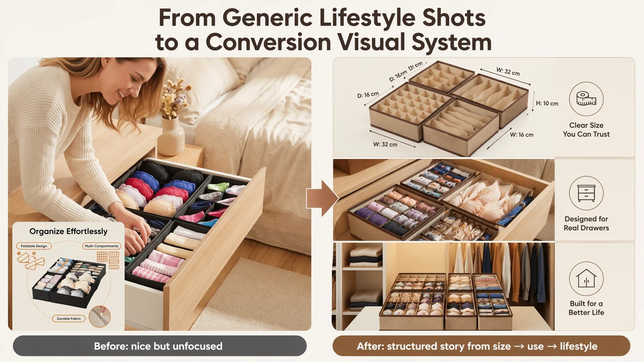
The goal: from the search results page to image 5, the shopper should be progressively convinced that this organizer will turn their chaotic drawer into a visually calming, space‑efficient system.
The Bullet Points Had Information, but Not a Buying Logic
On many Amazon listings, bullet points are treated as “a place to list everything we can think of.” This listing was no exception.
DeepBI’s comparison with the benchmark showed three main gaps:
1. Lack of scenario depth
- Competitor: opens with “Versatile Closet Organizers and Storage,” then walks through clothing, accessories, and cosmetics as distinct, concrete use cases.
- Target: lists where it can be used, but not how it concretely solves multiple life scenarios.
2. Lack of outcome language
- Competitor bullets highlight:
- “Space and Time Saver”
- “Improve utilisation of drawer space”
- “Save time finding items”
- Target bullets stop at:
- “Non-woven fabric”
- “Multiple compartments”
- “Easy to clean”
- Missing: explicit “what changes in your day.”
3. No trust closure
- Competitor closes with a quality guarantee and 30‑day return.
- Target closes with cleaning instructions only.
DeepBI restructured the bullets around a five‑step persuasion path:
1. Versatile, problem‑anchored use
“Versatile Drawer Organizers and Storage: … transforms your messy drawers into a tidy, organized arrangement, making it easy to classify and access your daily essentials.”
2. Ease of assembly and foldability
“Collapsible & Tool‑Free Assembly: … pop them open and secure the base (using the bottom zipper)… fold them flat to save space when not in use.”
3. Space and time saving outcomes
“Space and Time Saving Solution: … massively improve the utilization of your closet and wardrobe space… saves you significant time searching for what you need during busy mornings.”
4. Capacity and size confidence
“Multi‑Cell Capacity & Perfect Fit: … sized to fit perfectly into most standard dresser drawers, vanity tables, and closet shelves.”
5. Quality and maintenance, tied to longevity
“Premium Quality & Easy Maintenance: Crafted under strict quality control… easy to wipe clean… ensuring your clothes and accessories are always stored in a fresh and clean environment.”
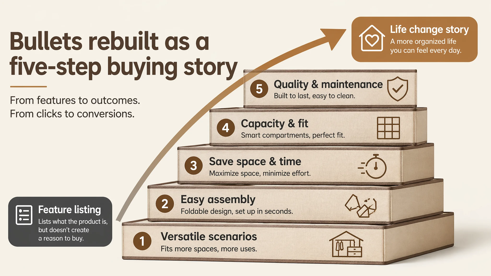
The difference is subtle but critical: the bullets now tell a coherent mini‑story of what changes in the buyer’s life, not just what the product is.
The Detail Page Needed to Show “Chaos → Order,” Not Just “Product → Product”
In home organization, shoppers are buying relief from disorder as much as they are buying fabric and compartments.
The benchmark listing understood this:
- It used a strong before/after module:
- Left: dark, messy drawer, visually stressful.
- Right: bright, organized drawer with every item in place.
- It embedded the product into aspirational home environments:
- Walk‑in closets, open shelves, real wardrobes with subtle lighting.
- It zoomed into construction details:
- Stitching, zippers, mesh density, all labeled with durability language.
By contrast, the target listing:
- Had functional scenes, but not clear emotional contrast.
- Showed material labels (e.g., Oxford cloth, thick board), but not proof of sturdiness under load.
- Lacked a clear multi‑scenario module outside of drawers (e.g., vanity use).
DeepBI’s optimization path re‑centered the A+ content on four core questions a buyer has after clicking:
1. “Will this really fix my drawer chaos?”
- Add a balanced before/after image:
- Left: messy sock and underwear drawer, slightly dimmer lighting for stress.
- Right: same drawer, same angle, organizers in place, bright and even light.
- This visually quantifies value without any extra words.
2. “Will it look good in my home?”
- Show the organizers in a high‑end wardrobe:
- Light oak shelves, soft internal side lights, neutral clothing hanging above.
- Product filled with neatly arranged items matching the color palette.
- This reframes the product from “cheap fabric box” to “fits into a modern home.”
3. “Will it hold up when fully loaded?”
- Add a load‑bearing shot:
- Two hands lifting a fully packed organizer from both sides.
- No sagging edges, clear structure maintained.
- This directly addresses the “will it collapse?” fear that drives many negative reviews in this category.
4. “Is the quality as good as it looks?”
- Use micro close‑ups:
- Zipper being pulled, stitching seams, fabric texture.
- Neutral background, shallow depth of field to spotlight craft.
- Pair with short labels like “Reinforced stitching,” “Smooth zipper.”
5. “Can I use it beyond socks and underwear?”
- Vanity / dressing table scene:
- Organizer filled with lipsticks, palettes, brushes.
- Clean morning‑light simulation with a mirror and small plant in frame.
- This extends perceived use cases and widens the potential audience.
6. “Will it actually fit my drawers?”
- Size and capacity illustration:
- Four organizers arranged with a folded T‑shirt as a reference object.
- Clear g-count labels and recommended use per organizer type.
- More intuitive than abstract paper size comparisons.
7. “Is the text and visual story consistent with reality?”
- Fix textual inconsistencies like “Rotating” that do not match the physical product.
- Replace with “Foldable” or “Compartmentalized,” supported by a simple three‑step folding sequence image.
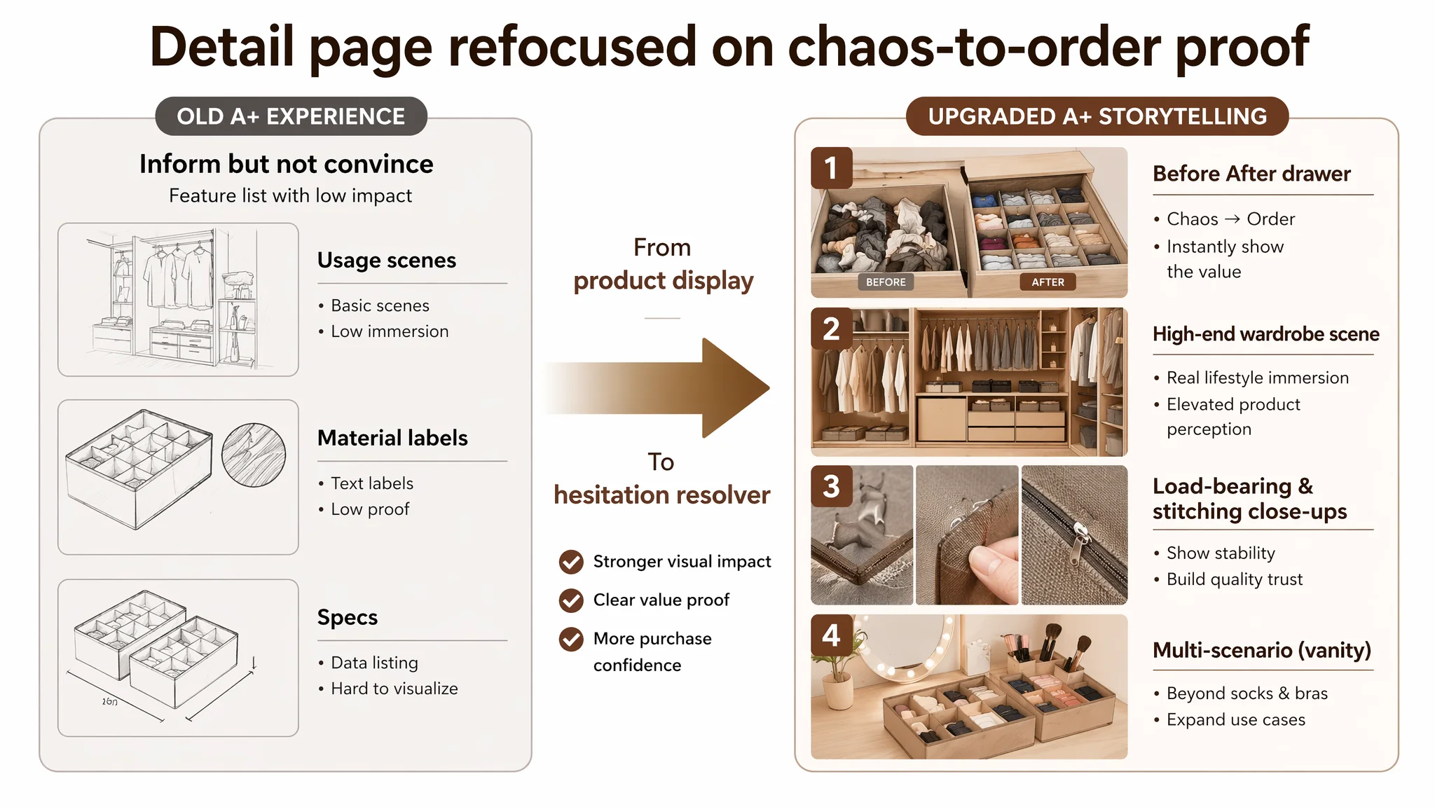
By aligning A+ visuals with these questions, the detail page shifts from “nice to look at” to “systematically resolving purchase hesitation.”
The Reviews Gap: Competing with 15,000+ Ratings from a Standing Start
On paper, the most brutal part of this case is the review gap:
- Target listing: 0 reviews
- Benchmark listing: 4.6 stars, 15,878 reviews
No amount of copy or imagery can erase that gap overnight. But DeepBI’s diagnosis reframed how the seller thought about it:
- A 0‑review listing is not “unfixable,” but it cannot be operated like a mature ASIN.
- Until early reviews and ratings appear, Amazon ads must be treated as validation and seeding tools, not full‑scale growth levers.
- The role of the listing optimization is to ensure:
- The first few buyers who do land on the page feel they got strong value for money.
- The page has no misleading claims (e.g., “Rotating”) that would generate avoidable disappointment.
- The visual quality and copy set expectations that the actual product can meet.
Once the page begins to collect early positive reviews, the 59/100 listing has room to climb:
- Title and bullets are already stronger.
- A+ visuals match shoppers’ delivered experience.
- Stable 4+ star ratings can emerge without fighting against misaligned promises.
Only then does aggressive ad scaling make commercial sense.
How the Understanding of the Business Changed
For the seller, the biggest shift was not in any individual image or bullet. It was in how they read their own Amazon data.
Previously, the thinking was:
- “High ACOS → ad problem.”
- “Need better bids, better keywords, better budgets.”
After going through DeepBI’s Listing diagnosis and competitor comparison, the new mental model looked like this:
- If main image score is reasonable but title, bullets, details, and reviews are weak, high ACOS is largely a listing problem.
- If the page is under 60/100 while the competitor sits in the 80s, ads are not the bottleneck – conversion capacity is.
- If reviews are at zero, early ad spend is effectively a paid review‑seeding phase, not a scale‑up phase.
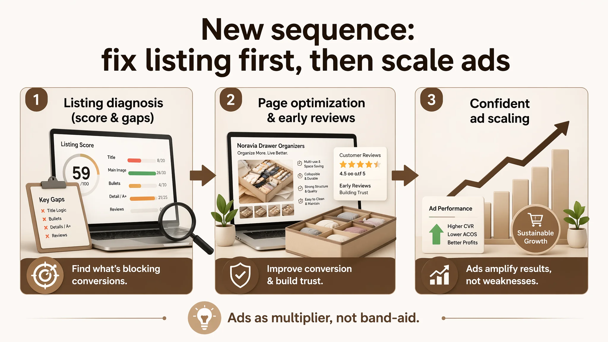
As optimization rolled out:
- The product page began to tell a coherent, trust‑building story:
- Clear search entry through the title
- Visual leadership on “chaos → order”
- Outcome‑oriented bullets
- Proof of material quality and load bearing
- Ad traffic, even at modest budgets, became more meaningful:
- Each click had a higher chance to convert.
- The risk of “false negatives” (abandoning a viable product because of a weak page) dropped.
Even without quoting specific CTR or CVR numbers, the operating state changed:
- The listing moved away from the “danger zone” where every click was being wasted on a page that couldn’t sell.
- The team gained a clear sequence: fix page → seed early trust → then scale ads.
What Other Amazon Sellers Can Take from This Case
For Amazon sellers in any category – not just drawer organizers – this case underlines a few hard, but useful, truths:
- High ACOS is not automatically an advertising problem.
When your listing scores 59 vs a competitor’s 84, you have a page‑level issue.
- A “good enough” main image does not mean the listing is healthy.
Title logic, bullet‑point persuasion, A+ storytelling, and review presence weigh heavily on conversion.
- Before & After is not a cosmetic gimmick in home organization.
It is the clearest way to visualize value and resolve the “will this actually fix my chaos?” doubt.
- Ads amplify whatever your page already is.
If your Amazon Listing cannot convert organic traffic, sending paid traffic to it at scale will just amplify the leak.
- Listing quality is the foundation of ad efficiency.
Only once the title, main images, bullets, A+, and early reviews form a coherent buying story does it make sense to seriously increase ad spend.
DeepBI’s role in this case was not to push more tools, but to reframe the seller’s judgment: see the Amazon product page as a conversion system first, and treat advertising as a multiplier only after that system is structurally sound.