

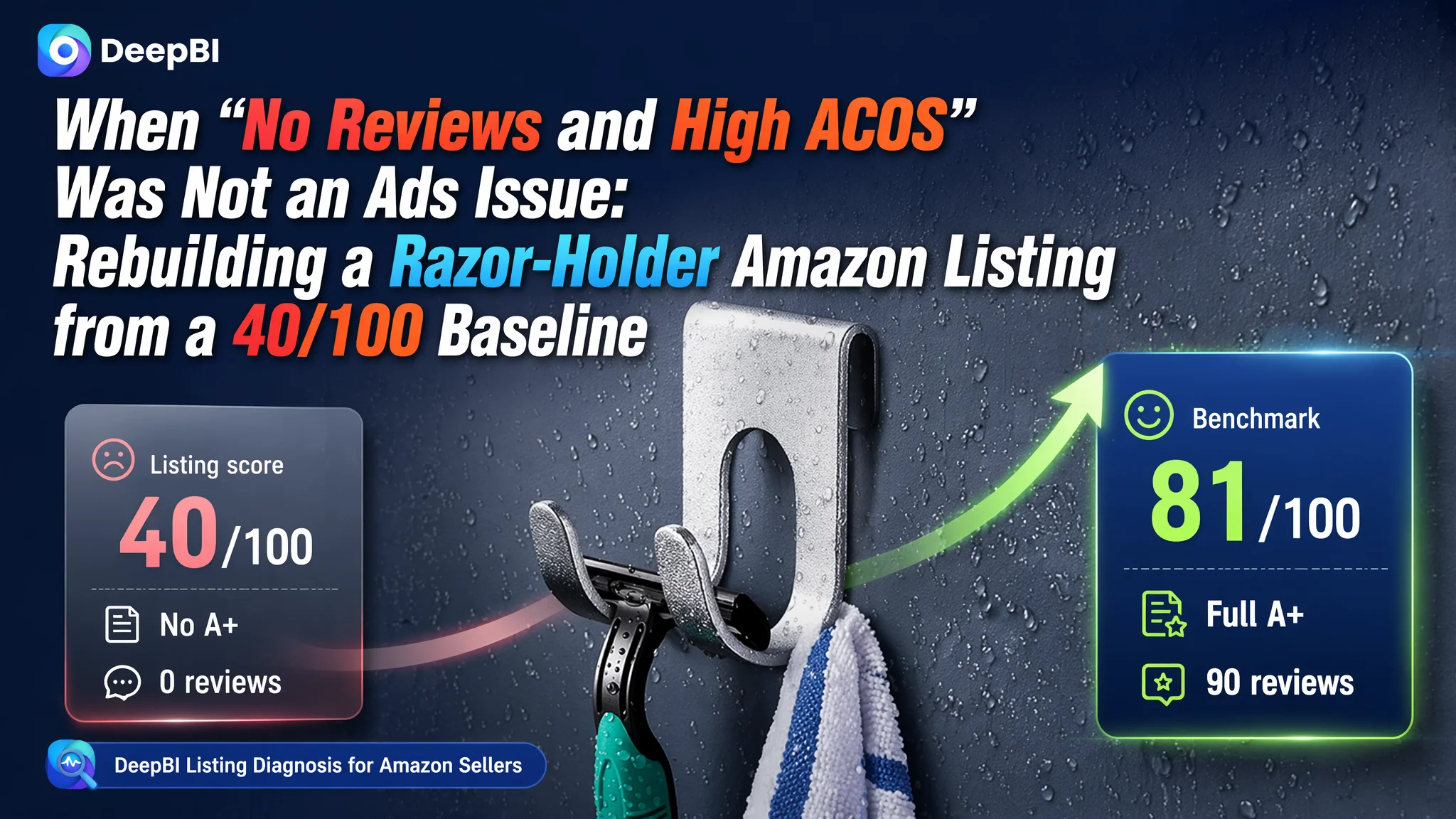
An Amazon seller in the UK bathroom-accessories category came to DeepBI with a familiar headache: Amazon ads were getting expensive, but orders were barely moving. The team’s first reaction was to blame keyword setup and bids. They believed this was an ads-optimization problem, not a product-page problem.
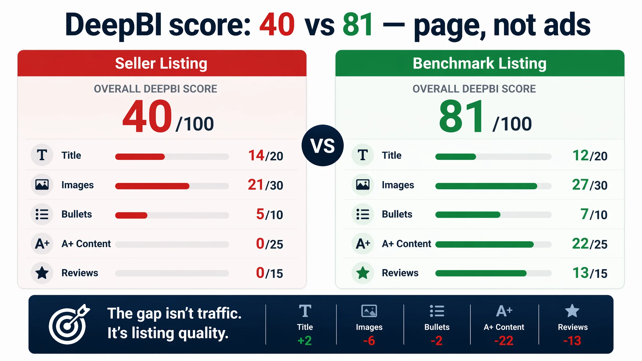
Once we put their Amazon Listing into DeepBI’s scoring and benchmarking system, a different picture emerged. Against a directly comparable top-performing razor-holder listing, their page scored only 40/100 vs. 81/100. The main gap was not traffic, but what happened after traffic arrived: no A+ content at all, zero reviews, and weak visual storytelling meant the Amazon product page simply could not convert the clicks they were paying for.
The later optimization did not start with more bid changes. It started with rebuilding the Listing’s conversion capacity: tightening the title around core search terms, restructuring bullet points into a “pain point → proof → outcome” logic, and designing a complete main-image set and A+ visual story to answer the exact doubts the benchmark listing already solved. For other Amazon sellers, this case is a reminder: when Amazon ads feel “inefficient”, it is often the Listing that is consuming budget, not the campaigns.
This Amazon Listing Did Not Lack Traffic. It Lacked a Page That Could Sell.
From the seller’s perspective, the symptom was clear:
- Ads were bringing some traffic to the Amazon product page.
- Orders and CVR were not following.
- ACOS was hard to keep under control.
So the internal narrative became: “Our ads structure is not refined enough; we should tune keywords, bids, and segmentation.”
But when we put their razor-holder Listing (UK marketplace) into DeepBI and locked a directly comparable benchmark Listing in the same category, the contrast cut through the noise:
- Overall Listing score: 40/100 vs. benchmark 81/100
- Title: 14 vs. 12 (largely fine)
- Main image set: 21 vs. 27
- Bullet points: 5 vs. 7
- Detail/A+ content: 0 vs. 22
- Reviews: 0 vs. 13
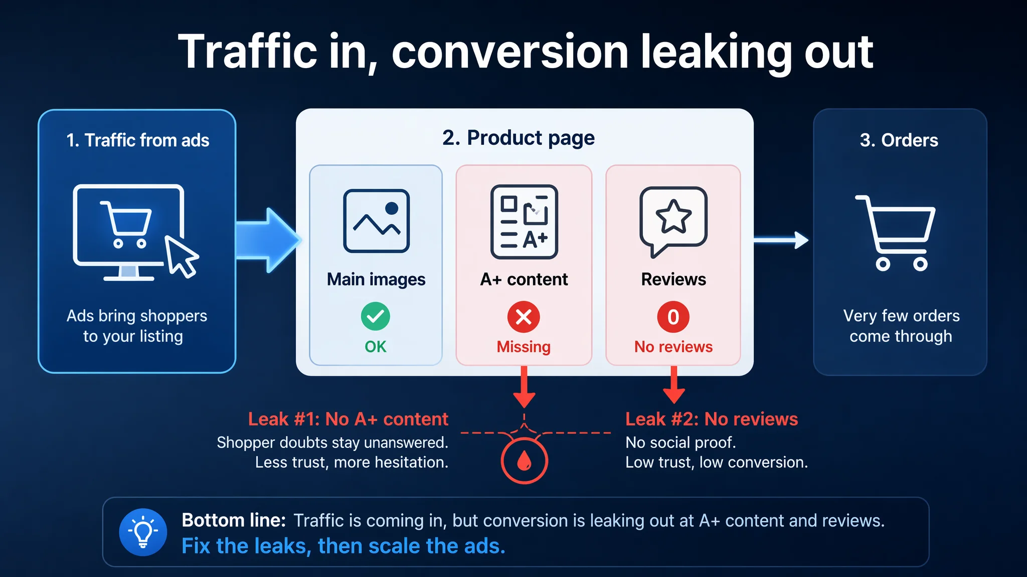
On paper, the seller had a reasonably structured Amazon title and a functional main image. The bottleneck was hidden deeper in the page:
“The real problem was not that ads failed to bring traffic. It was that the page could not convert the traffic.”
Without A+ content, without any visual explanation of installation, surfaces, or durability, and with zero review volume, every paid click was landing on a page that did not reduce risk, did not answer doubts, and did not build trust.
The Original Misdiagnosis: “If We Fix Ads, Orders Will Come”
The team’s initial thinking followed a very common Amazon pattern:
- ACOS is too high → this must be an ads issue.
- Ads optimization means: new keywords, negative keywords, bid adjustments, maybe some campaign restructuring.
- Listing tweaks are “nice to have” and can wait.
Why this logic kept failing:
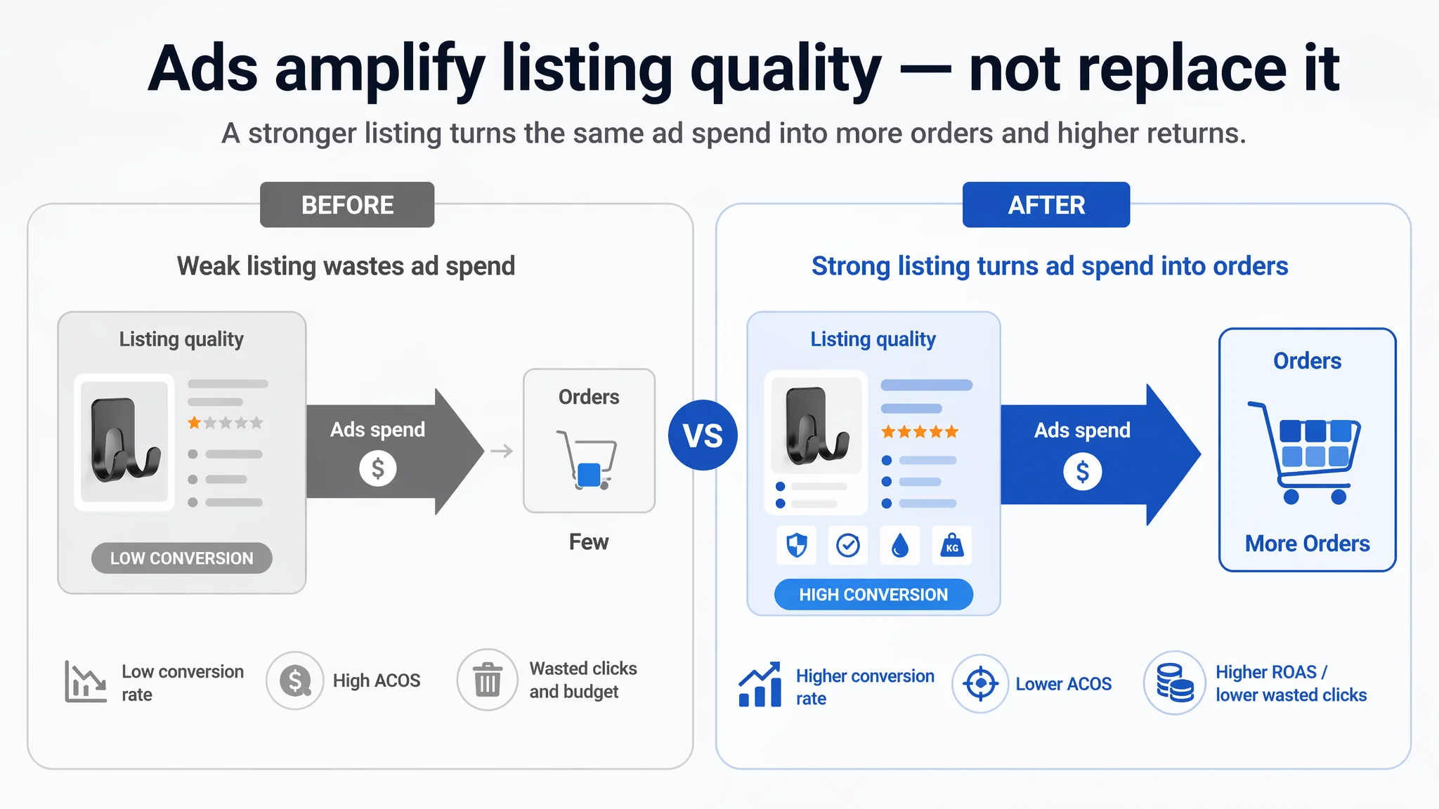
1. They treated ads as the growth engine, not as an amplifier of Listing quality.
With no A+ content and no reviews, the Listing’s intrinsic conversion capacity was extremely low. Any additional spend just sent more users into the same leaky funnel.
2. They assumed the title and a few images were enough.
Because the title structure looked “standard” and the product was simple (razor hooks), they underestimated how much the benchmark Listing was doing in visual persuasion and risk reduction.
3. They did not have a quantified view of the gap.
Without an objective Listing score and direct Amazon benchmark comparison, “our page looks okay” felt true. It wasn’t.
From a business angle, every extra pound spent on ads before fixing the Listing was generating diminishing returns. The more they pushed, the more obvious the inefficiency became.
What the Benchmark Amazon Listing Was Actually Doing Better
When we stripped away assumptions and looked only at how the benchmark Listing sold the same type of product to the same audience on Amazon UK, several key patterns emerged.
The title was not the bottleneck
DeepBI’s scoring showed:
- Seller title: 14/20
- Benchmark title: 12/20
The seller actually outperformed the benchmark on structure:
- Clear “Brand + Core Keyword + Material + Use Cases” format.
- Strong core phrase (e.g., “Self-Adhesive Razor Hooks”) placed early.
- Material (“Stainless Steel”) highlighted right after the main keyword.
- Use-case items (towel, bathrobe, loofah) clearly enumerated.
The benchmark title repeated “Razor Holder Shower” multiple times to push keyword weight but sacrificed part of its information space.
Conclusion: Spending more time “optimizing the title” would not unlock the main conversion gain. This was not the core constraint.
The main image set: Adequate, but not persuasive
Score: 21 vs. benchmark 27.
The benchmark Amazon main-image sequence systematically resolved three things:
1. Click motivation (CTR)
- High-contrast hero image: dark background + metal razor + colored towel.
- The product is instantly connected to usage, not just shown as hardware.
2. Usage clarity & risk reduction
- A multi-step “no-drill installation” diagram.
- A clear visual list of suitable vs. unsuitable surfaces.
3. Trust and quality perception
- Real bathroom scenes, not just floating product renders.
- Visual icons for stainless steel, waterproof, and durability.
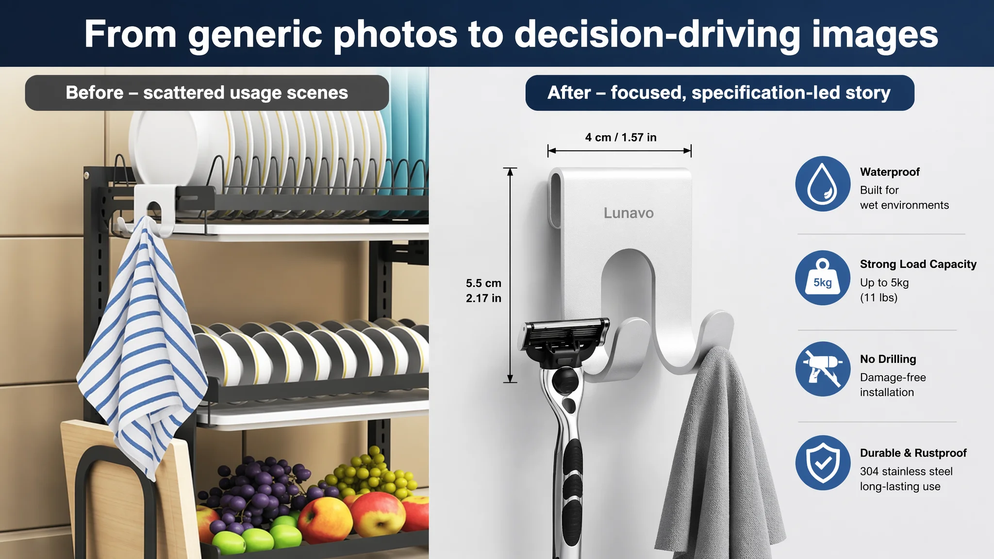
The seller’s images:
- Relied heavily on plain white backgrounds and shelf-style compositions.
- Showed the hook, but rarely showed the life around it (bathroom, water, razors, towels).
- Did not visually answer: Will it fall? Will it rust? Is it really “no drill”? Where can I stick it?
The impact:
- CTR potential from the search results page was weaker.
- Even the clicks that came through saw limited evidence that justified buying and trusting the product.
Bullet points: Information without a buying logic
Score: 5 vs. benchmark 7 is a small numeric gap, but the logic gap is larger.
Benchmark bullet sequence:
1. Material → Trust anchor
High-quality 304 stainless steel, corrosion-resistant, built for wet environments.
2. Compatibility and safety
Fits most razor brands, smooth-polished edges to protect hands and items.
3. Concrete proof
Clearly states a 5.5 lbs load capacity and explains the deep-groove design to prevent slipping.
4. Easy installation
Step-by-step and guidance on surface prep + 24-hour curing recommendation.
5. Application & gifting
Positions the hooks as not just practical but a stylish accessory and housewarming gift, expanding perceived value.
Original seller bullet logic:
- Material & durability (generic stainless steel).
- Installation & compatible surfaces (broad statements).
- Functional description and space saving.
- Multiple scenarios (bathroom, etc.), but without emotional or value framing.
- Packaging and size.
Key issues:
- Almost no quantified proof (no load numbers, no performance evidence).
- Little attention to hygiene or blade-protection concerns.
- No gift or “lifestyle upgrade” angle to lift perceived value.
- The order is descriptive, not persuasive – users must do mental work to decide.
Where the Amazon Listing Completely Broke: A+ Content and Social Proof
Detail/A+ content: 0 vs. 22 — a broken conversion funnel
The seller’s Amazon product page:
- No A+ content at all.
- No visual storytelling beyond the standard images and bullets.
- No structured modules to carry the user from “I’m interested” to “I’m confident enough to buy.”
The benchmark A+ content, by contrast, did several critical jobs:
1. Scene immersion
- Wide, high-quality lifestyle images: bathroom, laundry room, bedroom.
- Hooks in real use with razors, towels, cables, etc.
- Immediate reinforcement of “multi-room, multi-use” positioning.
2. Structured decision support
- Icons and short captions summarizing 3–4 core benefits.
- A clear 4-step installation visual module.
- Specific material and adhesion visuals (3M tape close-ups, peel & stick action).
3. Hard proof
- Real images of load-bearing demonstrations (e.g., water bottles).
- Adhesive details and no-drill advantages visualized, not just stated.
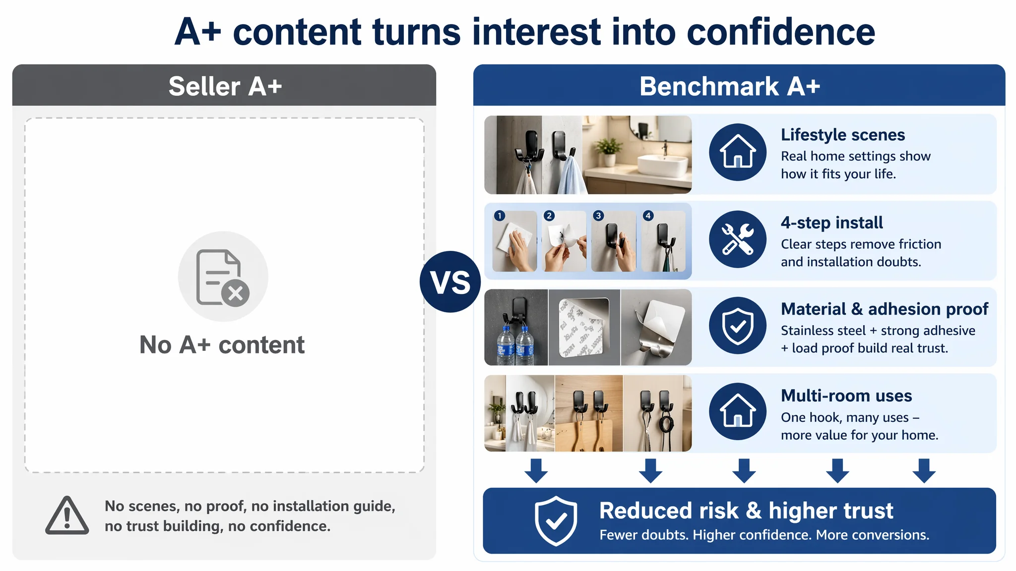
Without any A+ content, the seller’s Listing effectively stopped talking at the point where the benchmark Listing started doing real persuasion.
For a low-ticket item like razor hooks, A+ is less about “premium branding” and more about reducing perceived risk per click. The seller had no such layer.
Reviews: 0 vs. 90 — trust at ground zero
- Seller: 0 total reviews, 0 rating visible.
- Benchmark: 4.6 stars, ~90 reviews, with a home-page mix dominated by positive, multi-country comments.
This created a brutal perception gap on Amazon:
- The seller’s product looked untested.
- The benchmark looked proven, with real-world validation of “sticks well”, “doesn’t rust”, “good for rental bathrooms”.
Ads can send thousands of people to a page, but:
When A+ is empty and reviews are zero, the customer is forced to be the “first tester”. Most won’t accept that role, especially when a proven alternative is one click away.
Why DeepBI Did Not Start with More Ads Tuning
With this diagnosis, the priority question became:
Should the team invest more time in campaign structure and bids, or first repair the Amazon Listing’s ability to convert?
DeepBI’s judgment was clear:
1. Listing conversion was the binding constraint.
Even if CTR improved slightly, the page had no A+ story and no reviews. Traffic would still leak heavily at the decision stage.
2. Ads were amplifying existing weaknesses.
Every click magnified the emptiness of the detail section and the absence of social proof. Without fixing this, scaling ads would just scale waste.
3. The title was not the leverage point.
Since title scoring was already comparable or better than the benchmark, the marginal gain from title-only tweaks would be small versus visual and A+ fixes.
4. Business risk sat on the page side, not the keyword side.
The biggest risk was not “missing some long-tail terms”, but burning budget on a page that failed to convert both organic and paid traffic.
Therefore, DeepBI’s decision order was:
- First: Rebuild the Listing’s visual and textual conversion logic.
- Then: Re-evaluate ads once the page actually deserved more traffic.
Rebuilding the Listing: From Hardware Piece to Trustworthy Bathroom Tool
The optimization focus centered on five areas:
1. Tightening the Amazon title around search and intent
The title was not a disaster, but subtle refinements helped align it with search intent and decision clarity:
- Keep the pattern: Brand + 2-Pack + Core keyword (“Self-Adhesive Razor Hooks”) + Context (“for Shower”) + Material (“Stainless Steel”) + No-drill benefit.
- Add clear application anchors: bathroom wall, towel, bathrobe, loofah, door, cabinet.
This preserved readability while:
- Front-loading high-value Amazon search terms in the first 5–7 words.
- Making the “no-drill” benefit and specific usage clear at a glance.
The goal was not to “chase every keyword”, but to make the search snippet instantly communicate what this solves and for whom.
2. Transforming bullet points into a persuasion sequence
Each bullet was rebuilt with a clear role:
1. Premium material as a trust opener
- From generic “stainless steel” to “Premium 304 stainless steel”.
- Explicitly stating waterproof, corrosion-resistant, scratch-resistant performance for humid areas.
2. Adhesion and load capacity as quantified proof
- “Strong adhesive & heavy duty” with specific load (up to 5.5 lbs).
- Clear surface recommendations (tile, glass, metal) to prevent misuse and post-sale issues.
3. Universal fit and hygiene gain
- Deep-groove design to prevent razors sliding off.
- Emphasis on keeping blades off wet ledges, promoting air drying and cleanliness.
4. Safety details and multi-use logic
- Smooth, polished edges for safety.
- Practical multi-room uses: loofahs, towels, squeegees, power plugs in bathrooms and kitchens.
5. Pack size, installation steps, and value framing
- Clarifying 2-pack content and approximate dimensions.
- Step-by-step install with a 24-hour wait recommendation.
- Framing it as a practical, stylish housewarming gift.
This changed the reading path from “five disconnected facts” to a coherent buying argument:
- It’s durable → It holds enough weight → It fits your razors and keeps them hygienic → It’s safe and versatile → It’s easy to install and even giftable.
3. Re-architecting the main image set around real decision logic
The new image direction explicitly mirrored what we saw working in the benchmark, without copying:
1. Hero image with real use
- Hooks occupying ~75% of the frame at a 45° angle, strong lighting and shadow for depth.
- One hook holding a razor, the other a light-gray towel, on a clean white background.
Purpose: increase search-page CTR by immediately signaling function + multi-use.
2. Parameter and spec visualization
- Hooks on a light gray gradient background, with overlayed icons for water resistance, load capacity, and material.
- Clear arrow-based dimensions (length, width) annotated.
Purpose: compress technical reading into a 2-second glance.
3. Adhesive feature close-up
- Hook installed on smooth tiles, with a circular zoom bubble showing a hand peeling off the adhesive backing.
- “Easy to Install” caption.
Purpose: remove doubt around no-drill installation and effort.
4. Surface compatibility grid
- 2x2 grid: tiles, glass, stainless steel, wooden cabinet – each with the hook in use and a green checkmark.
Purpose: reduce returns from misuse and show broad applicability visually.
5. Four-step installation sequence
- Clean → Peel → Press → Use; each step in a separate panel with clear visuals.
Purpose: standardize installation expectations and quietly educate users to avoid “it fell off” complaints.
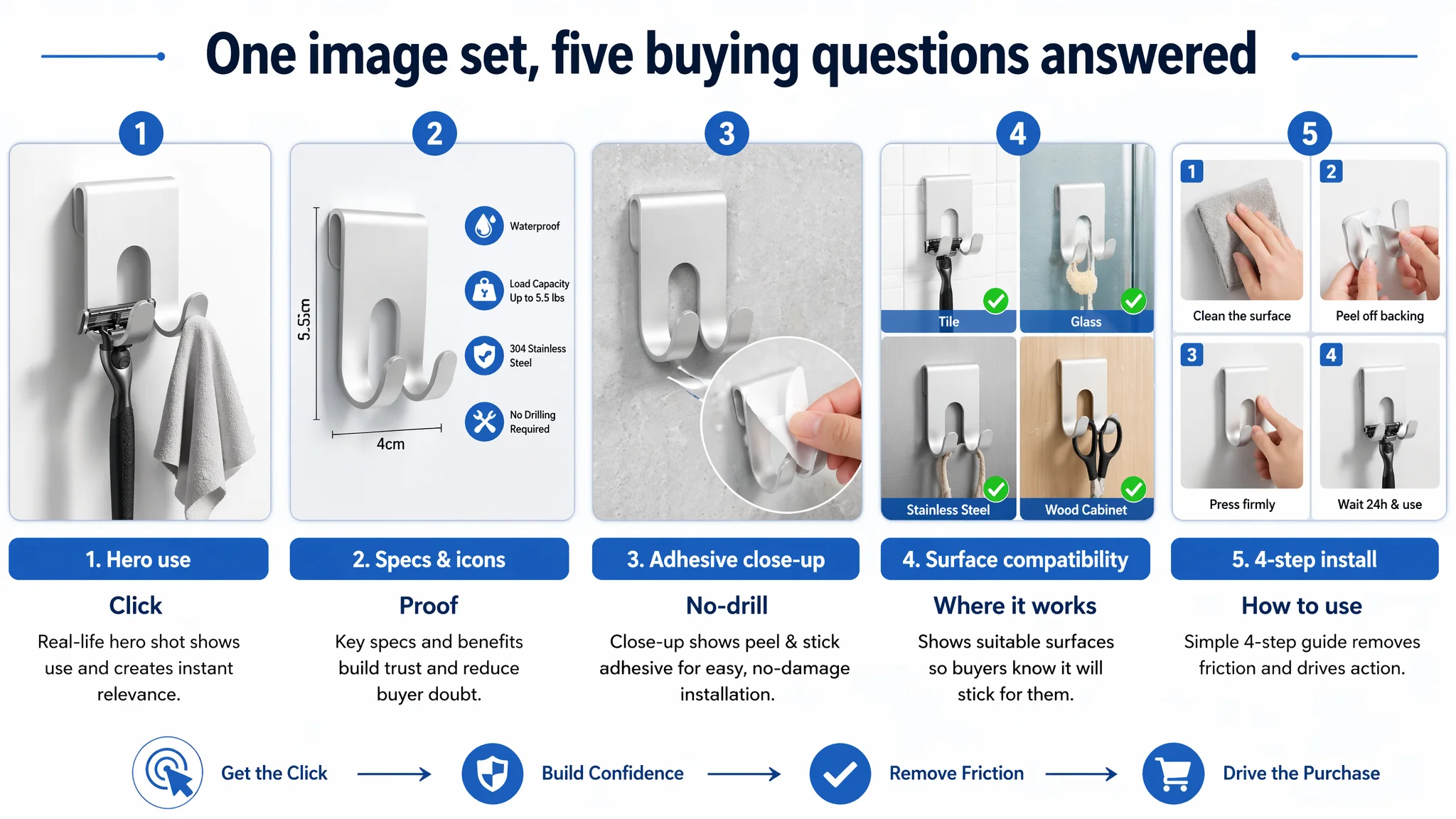
In business terms, this turned the main-image area from “product display” into a compressed decision-support system, directly aligned with the concerns shown on the benchmark Listing.
4. Building A+ content where there was none
Because the seller had no A+ at all, any coherent A+ module structure was an upgrade. DeepBI’s plan followed a clear narrative arc:
1. Opening banner – lifestyle anchor
- A morning grooming scene: a man shaving beside three hooks on a marble wall, holding a razor, cable, and towel.
- Four icons: stainless steel, no drilling, waterproof, high load.
Job: instantly connect the product to everyday life and its core promises.
2. Material & load “hard proof” module
- Close-up of a single hook holding two 500ml water bottles against a dark matte wall.
- Crisp metal edges and cold color tone to emphasize strength.
Job: visually prove “this will not fall” without relying on text alone.
3. No-damage wall protection module
- Macro shot of a hand peeling 3M-style adhesive film.
- Simple comparison sketch: red X on drilled wall vs. green check on adhesive application.
Job: hit the core “I don’t want to damage my walls” pain point, especially for renters.
4. Shower scene with water exposure
- Hook on wet tiles with a foamy razor hanging, shower head blurred in the background.
Job: prove real-world waterproofity and humidity tolerance.
5. Multi-room use collage
- Three equal-width scenes: kitchen plug, laundry brush, bedroom charging cable.
- Warm home tones (wood + white).
Job: reframe it from a “razor hook” to a whole-home organizing tool, supporting higher order volume.
6. Dimensional and fit assurance module
- Industrial-style diagram with front and side views, precise measurements, and neutral gray grid background.
Job: reduce “does my razor fit?” uncertainty and lower return risk.
7. Installation step guide
- Four panels reiterating the clean → peel → press → wait → use path, with deep blue background and focused lighting.
Job: eliminate the last bit of friction around installation complexity.
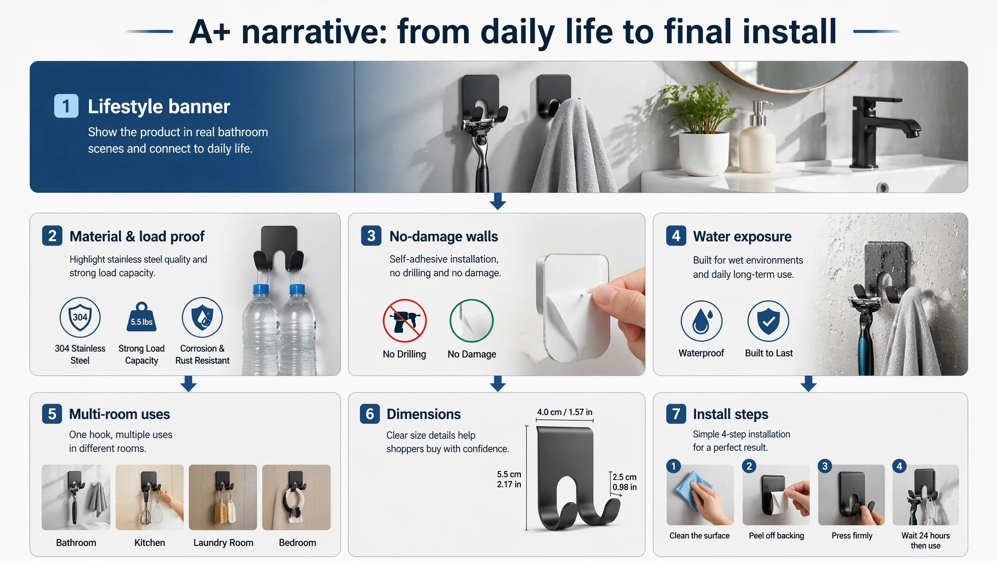
Collectively, this A+ rebuild moved the page from silent to persuasive. Where before users had to infer everything, now the page systematically led them to “Yes”.
Making Ads Useful Again: What Changed After the Listing Rebuild
This case is not about a dramatic “X% in Y days” claim. It is about risk structure and decision logic.
After the Listing optimization:
- The page gained the ability to convert both organic and paid traffic.
Prospective buyers no longer landed on an empty detail section; they saw clear, visual evidence of durability, installation simplicity, and multi-use value.
- Ads stopped amplifying a broken page.
With improved bullet logic, upgraded main images, and a full A+ journey, every click carried a higher probability of conversion — not just a bounce to a competitor.
- The seller had a rational base to re-evaluate ACOS and budgets.
Instead of endlessly tweaking keywords while guessing at page quality, they could now interpret ad data against a more competitive Listing.
- The risk of overdependence on ads decreased.
As Listing quality improved, the Amazon product page had a better chance to support organic rankings and conversions over time, reducing the need to “buy every visit forever”.
Most importantly, the seller’s understanding shifted:
- Amazon ads are not a cure-all for conversion issues.
- Listing conversion capacity is the foundation of ad efficiency.
- Title, main images, bullets, A+ content, and reviews are not separate checkboxes; together they form one continuous decision path.
What Other Amazon Sellers Can Take from This Case
1. If ACOS is stubbornly high, do not assume it’s only an ads problem.
Check whether your Amazon Listing can genuinely convert the traffic you’re already buying.
2. A “decent” title and a few clean images do not mean your page is competitive.
In many categories, the real battle happens in A+ content and reviews, where trust and proof are built.
3. Ads amplify whatever your page already is.
If the product page is weak, ads amplify weakness. If the Listing is strong, ads amplify strength.
4. Before scaling spend, ask: “Does this page deserve more traffic?”
Look at your own Listing the way we looked at this razor-hook page: compare against a true benchmark, quantify gaps in main images, A+, and reviews, and fix the conversion leak first.
DeepBI’s role in this case was not to “optimize everything at once”, but to identify the single real bottleneck: a 40/100 Amazon Listing sending paid traffic into a page that was not ready to sell. Once that judgment was made, the path forward became much clearer — repair the page, then let ads work for you, not against you.