

Many Amazon sellers first notice a problem in their ads dashboard: ACOS getting harder to control, more clicks needed for each order, or campaigns that used to work becoming unstable. In this case, the seller of an office chair lumbar cushion and seat cushion set also felt this pressure, but their first reaction was familiar—keep tuning Amazon ads and assume the ad structure or bids were the main issue.
Once DeepBI ran a Listing diagnosis against a directly comparable Amazon competitor in the same seat cushion category, a different picture emerged. Ad traffic was not the bottleneck. The real constraint was that the product page was weaker at converting pain-focused shoppers than the benchmark—especially in how the title framed the benefit, how the main image built trust at a glance, and how the bullet points and A+ content told a believable “pain relief” story.

The later optimization did not start from ads. It started from the Amazon Listing: reframing the title around ergonomic pain relief, rebuilding main-image and gallery logic around multi-scenario use and visible spinal support, and restructuring bullets and A+ modules into a clear “pain → design → relief → trust” path. For other Amazon sellers, this case shows what happens when a Listing that looks “fine” hides a conversion leak—how ad spend can be quietly consumed by a page that doesn’t fully deserve the traffic.
Amazon Ads Were Not Failing. The Page Was Consuming the Traffic.
On the surface, this Amazon seller’s cushion listing looked healthy:
- Star rating: 4.2
- Review volume: 313 reviews (far more than the benchmark’s 104)
- Clear product: lumbar cushion + seat cushion set for office chairs, cars, and home use
From an ad-operations perspective, this is the kind of ASIN many teams feel comfortable scaling. Social proof is strong, rating is safe, and the product solves a clear pain point. When conversion starts slipping or ACOS feels heavy, the instinct is to:
- Adjust bids and match types
- Refine keyword lists
- Shift budgets across campaigns
That’s exactly where this seller originally focused.
But DeepBI’s Listing scoring against a high-performing Amazon competitor told a different story. On a 100-point scale, the customer’s listing scored 73, while the competitor scored 84—an 11-point gap. The score wasn’t collapsing, but it was clearly below the category’s “conversion ceiling”.
The critical detail: the gap was concentrated in content and structure, not in reviews.
- Title: Customer: 14, Competitor: 16, Gap: -2
- Main image: Customer: 24, Competitor: 26, Gap: -2
- Bullet pts: Customer: 4, Competitor: 7, Gap: -3
- A+ detail: Customer: 19, Competitor: 24, Gap: -5
- Reviews: Customer: 12, Competitor: 11, Gap: +1
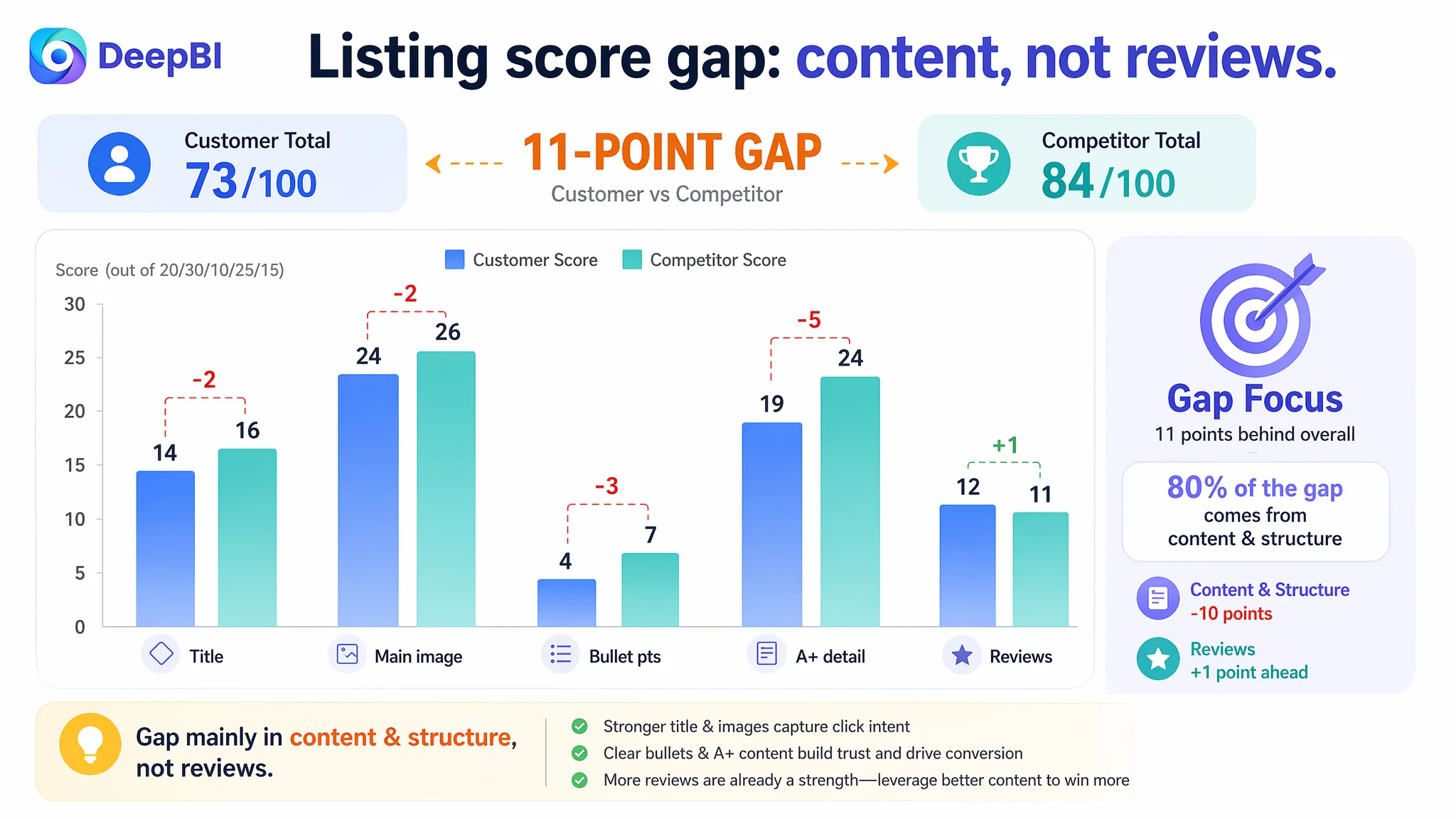
The product itself was not weaker. The page’s ability to convert traffic was.
“The real problem was not that ads failed to bring traffic. It was that the page could not convert the traffic.”
When ads push more shoppers into a Listing with these structural gaps, ACOS naturally feels heavier—not because the ad machine is broken, but because the product page is quietly wasting impressions and clicks.
The Real Constraint Was Listing Conversion Capacity
DeepBI’s judgment in this case was simple but decisive:
At this stage, more ad optimization would only amplify a page-level conversion leak. The Listing had to be repaired first.
Why?
1. The title did not fully own the “pain relief” outcome
The competitor’s Amazon title followed a mature formula:
Core benefit + product form + ergonomic concept + scenarios + pain relief promise.
Example pattern from the benchmark:
- “Ergonomic Waist Support and Seat Cushion, 2-in-1 Memory Foam Pad, Hollow Design for Coccyx, Suitable for Office Chairs, Car Safety Seats and Household Use – Relieves Lower Back and Hip Pain”
Key strengths:
- Leads with “Ergonomic” and “2-in-1” for differentiation
- Ends on “Relieves Lower Back and Hip Pain” – the shopper’s main reason to buy
- Covers concrete scenarios: office chairs, car safety seats, household use
The customer’s title did some things right:
- It front-loaded relevant keywords like “Seat Cushion and Lumbar Support Pillow”
- It highlighted “4.7" Extra Thick” and washable cover
But it framed the product more as a physical object (thick, washable) than a solution to specific pain.
DeepBI’s recommendation reframed the title to match search intent and benchmark logic:
Office Chair Lumbar Cushion and Seat Cushion Set, 2-in-1 Ergonomic Memory Foam Back Support for Car & Home, 4.7" Extra Thick for Coccyx Lower Back Pain Relief, Breathable Washable Cover
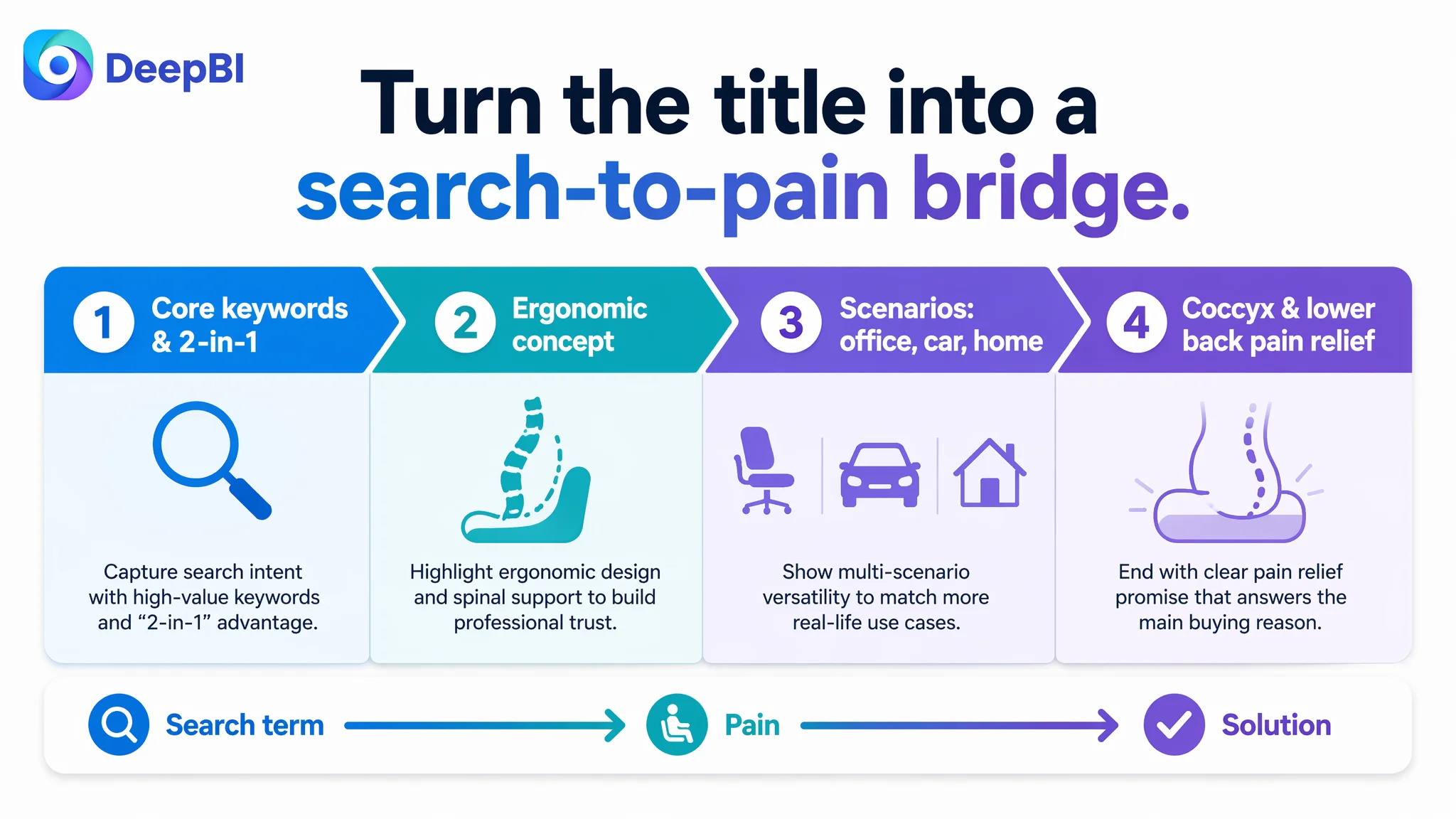
The shift:
- “Ergonomic” and “2-in-1” at the front for discovery and click
- “Coccyx Lower Back Pain Relief” brought pain relief directly into the main promise
- Scenarios (“Office Chair… Car & Home”) concretely captured search intent and multi-use demand
This wasn’t cosmetic copywriting. It was a decision to let the title work as a direct bridge from search term → pain → solution, rather than product spec → features.
2. The main image sequence lacked a strong, visual reason to click
On Amazon’s search results page, main images and thumbnails decide who gets the click. In this category, the benchmark competitor’s image stack did two things better:
- Combined shape confirmation with scenario breadth in the very first image (office + car visual coverage).
- Used anatomy-level visuals (spine models, pressure maps) to visually claim “professional pain relief”.
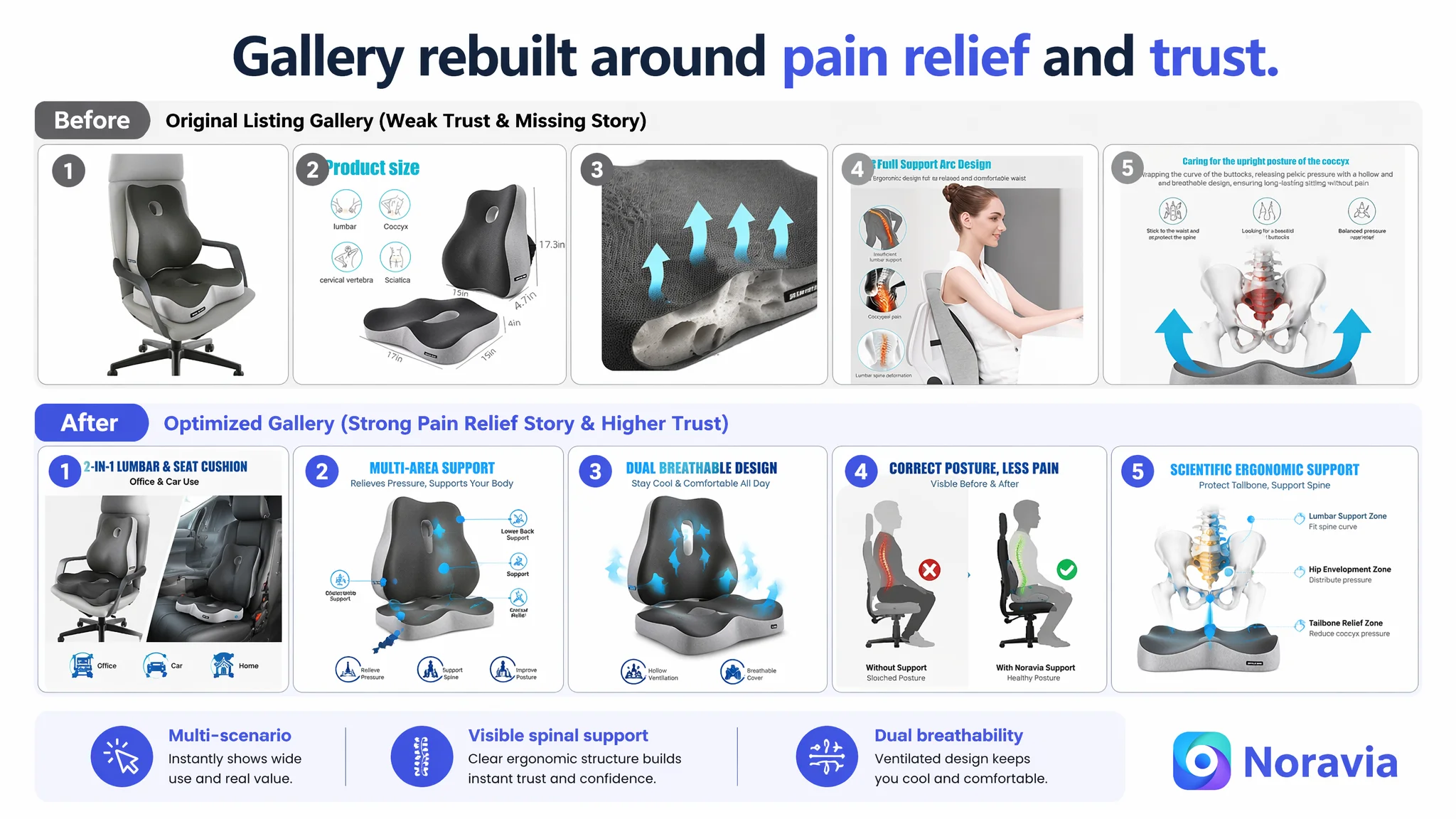
The customer’s image logic:
- Image 1: neutral product photo on an office chair (office scenario only)
- Image 2: early appearance of a dimension/“disease icon” graphic (including “neck” pain, which the product doesn’t really address)
- Image 3: close-up of seat breathability (but only for the seat, ignoring the back cushion)
- Image 4: model sitting, with soft references to posture
- Image 5: skeletal diagram showing tailbone pressure relief, but with vague labels and a “beautiful buttocks” caption that undermines professional tone
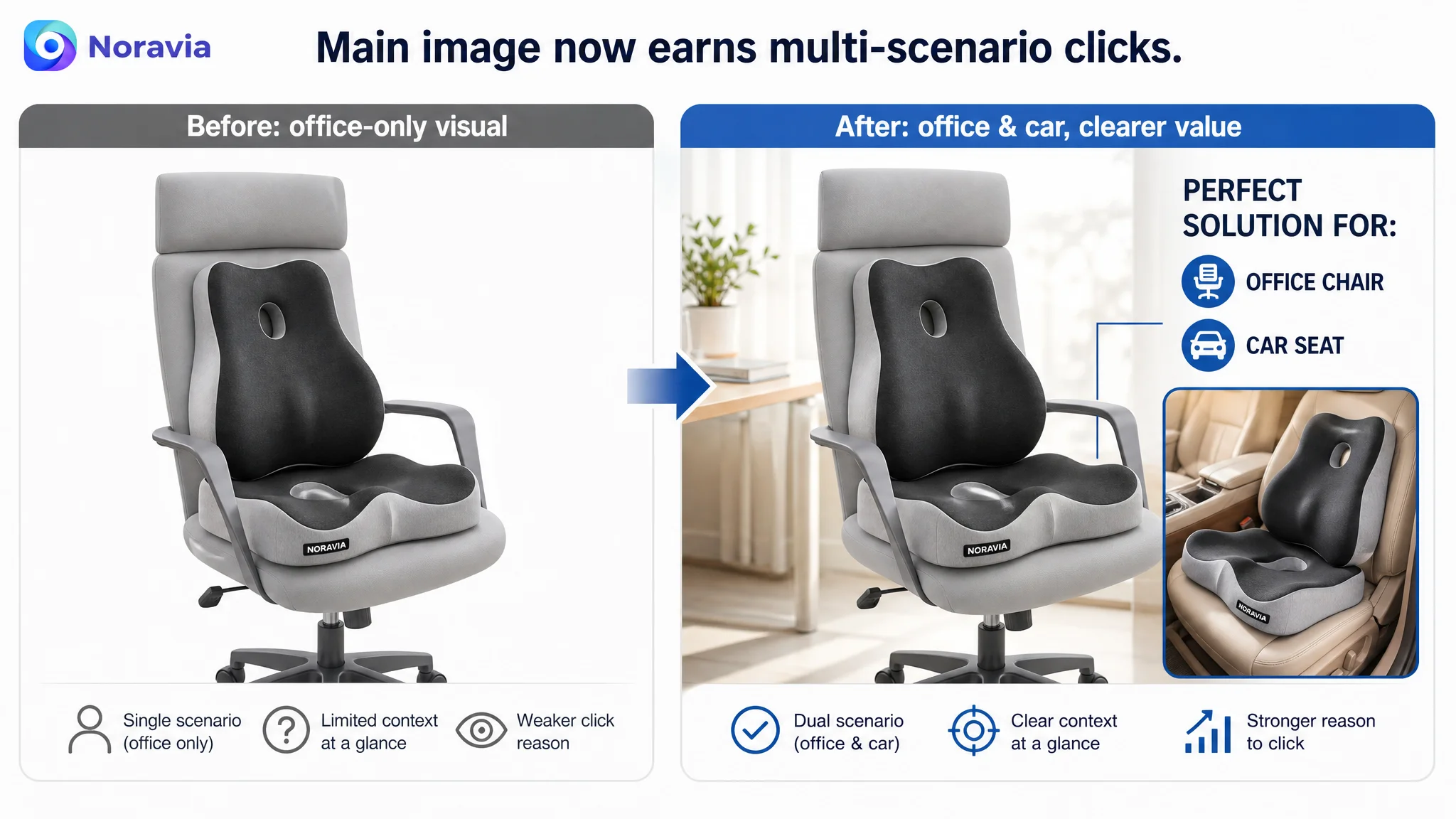
From DeepBI’s lens, several conversion leaks were clear:
- Scenario coverage was too narrow, too early. Ads were attracting “office chair” and “car cushion” queries, but the main image only visibly confirmed office use.
- Technical trust was under-visualized. Instead of showing “this design fits your spine and relieves pressure” with clear structure graphics, the listing leaned on generic icons and scattered labels.
- Mobile experience was overloaded. Three of seven images were text-heavy diagrams, which become hard to read and low-impact in small thumbnails.
The optimization path focused on rebuilding the visual decision flow:
1. Image 1 – Dual-use confirmation
- Show the product used on an office chair and a car seat in one composition.
- Add clear tags like “Office & Car Use” without clutter.
- The goal: instantly lock multi-use value and justify both office- and car-related ad traffic.
2. Image 2 – Structural support visualization
- Push the early dimension/disease icon image later in the sequence.
- Replace the vague disease icons with direct labels pointing to product zones: lower back, hips, coccyx.
- Emphasize “multi-area support” and “pressure release” visually, not just textually.
3. Image 3 – Combo breathability
- Keep breathability but show both seat and lumbar cushion with matching airflow cues.
- Use consistent hollow structures and airflow arrows to reinforce that the entire system is ventilated.
4. Image 4 – Posture before/after
- Keep the model, but add two small comparison shots: one showing poor posture on a regular chair with a clear “X”, and one showing corrected posture with this set and a clear “✓”.
- This creates a simple visual promise: this product changes how you sit, not just how something looks.
5. Image 5 – Anatomy-based trust
- Move the skeletal diagram behind the main functional images.
- Remove vague wording like “looking for a beautiful buttocks”.
- Replace it with clear, credible labels: “Tailbone Pressure Relief”, “Hip Curve Envelopment”, “Lumbar Support Zone”.
The decision logic: before ads could be scaled again, the main image sequence needed to deserve clicks by visually proving the cushion’s ergonomic value and multi-scenario utility.
“Advertising does not only amplify advantages. It can also amplify a page’s existing defects.”
3. Bullet points and A+ content lacked a coherent buying logic
On Amazon, many shoppers skim bullet points and A+ content to answer three questions:
1. Will this actually help my specific pain?
2. Will it hold up in my daily scenarios?
3. Can I trust the quality and ergonomics claimed?
The benchmark competitor’s bullets:
- Started with “Ergonomic seat cushion spinal fit design”
- Mentioned “high-density memory foam” and “slow-rebound, non-collapsing”
- Referenced testing and durability
- Explicitly listed multi-scenario use (office chairs, car safety seats, wheelchairs, gaming chairs)
- Closed on gift positioning and “strict durability testing”
The customer’s bullets, in contrast:
- Repeated functions and product nicknames
- Rarely used concrete ergonomic language (no “spinal fit”, “posture correction”)
- Offered limited data or proof (no density, no durability tests)
- Felt more like a product manual than a health-oriented solution narrative
DeepBI’s optimization path was not just to “rewrite better copy”. It was to rebuild the bullet and A+ logic around a pain-to-relief journey:
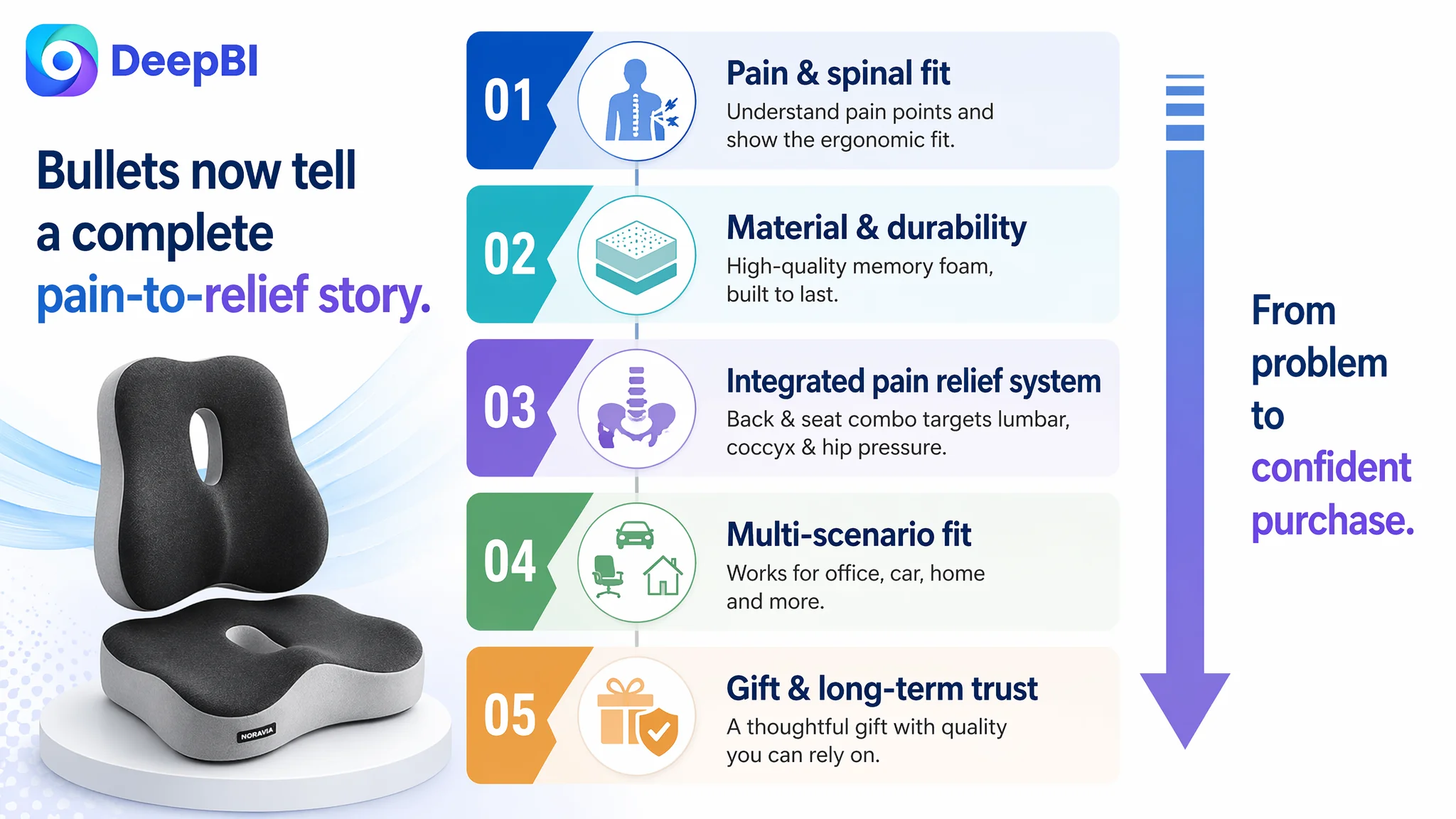
Bullet 1 – Ergonomic spinal fit and posture correction Position the core concept:
“Ergonomic Spinal Fit Design: Featuring a contoured L-shaped design that fits the curves of your lumbar and cervical vertebrae. This seat cushion and lumbar support combo naturally corrects sitting posture, reduces pressure on the waist and hips, and provides all-day support to protect your spinal health.”
Here, the Listing stops being about “a cushion” and starts being about “your spine and posture”.
Bullet 2 – Material credibility for long sitting
“High-Density Memory Foam Core: Crafted with premium, slow-rebound memory foam that is soft yet non-collapsing. It offers long-lasting support and comfort even during extended periods of sitting, ensuring the cushions maintain their shape to effectively relieve lower back and buttock pressure.”
This directly addresses a common Amazon review complaint in this category: cushions that flatten over time.
Bullet 3 – Integrated pain relief system
“Comprehensive Pain Relief Solution: Specially engineered as a coccyx cushion for tailbone pain and sciatica relief. This integrated back and seat cushion set acts as a firm support system for your lower back and hips, making it the perfect companion for those struggling with chronic sitting discomfort.”
Instead of scattering pain labels (tailbone, sciatica, hips, back) across multiple bullets, DeepBI consolidated them into a clear, combined outcome.
Bullet 4 – Universal fit and scenario coverage
“Universal Fit for Multiple Scenarios: With its versatile design and universal sizing, this combo fits perfectly on office chairs, car seats, wheelchairs, and gaming chairs. It transforms any hard surface into a painless zone, whether you are at the desk, in a truck, or traveling.”
This line aligns the bullet logic with the visual strategy: office + car + extended scenarios, strengthening ad traffic relevance.
Bullet 5 – Gift and durability trust
“The Ideal Gift for Health & Comfort: A thoughtful and practical solution for office workers, drivers, and pregnant women. Rigorously tested for durability and support, this back support system improves daily sitting posture and serves as a reliable health investment for yourself or your loved ones.”
Here, the Listing gains emotional weight and trust—moving from “something you buy for yourself” to “something you can give to someone who is suffering”, backed by durability tests.
On the A+ detail page, DeepBI recommended a parallel restructuring:
1. Identity lock-in and pain resonance
- Lead with “office workers”, “drivers”, “long hours sitting”.
- Explicitly state: this product is designed to address lower back and hip pain from extended sitting.
2. Multi-scenario adaptation
- Early modules showing the product on different chairs in real use: office chairs, car seats, home chairs.
- Visual proof that “my chair” is likely compatible.
3. Specific population deep dives
- Dedicated visuals for pregnant women and drivers, showing comfort and reduced strain.
- This targets cautious buyers with higher perceived risk.
4. Ergonomic principle explanation
- Use existing spine graphics but reframe them as clear “how this design maintains healthy posture” explanation.
- Show how the L-shape fits the lumbar curve and distributes pressure.
5. Functional zone breakdown: seat + lumbar
- Bring the cushion structure module forward, explain zones: tailbone cradle, hollow design for coccyx, leg support, lumbar curve fit.
- Convert generic “pain relief” claims into visible engineering choices.
6. Risk reduction and usage guide
- Address memory foam smell, rebound time, and correct installation.
- Explain the washable cover and care steps, signaling responsible expectations management.
7. Final all-scenario summary
- One closing module summarizing all scenes and groups: office, car, home; office workers, drivers, pregnant women.
- Reinforce “all-day, multi-scene, low-pain sitting” as the final outcome.
This is why DeepBI insisted the Listing had to be fixed before more ad experiments: without this structured narrative, ad clicks arrived to a page that did not walk the shopper through a convincing health and usage story.
Why DeepBI Did Not Keep Tuning the Ads First
For this Amazon seller, the temptation was real:
- Reviews were strong.
- Rating was in the safe zone.
- The product clearly solved a common problem.
- Ads were already running.
Traditional thinking would say: “Our page is fine; we just need better ads.”
DeepBI pushed against that.
The diagnostic data made three business risks clear:
1. Ads were amplifying a mid-tier Listing, not a benchmark-level Listing.
With an 11-point gap against the competitor, the product page was not fully equipped to turn incremental traffic into incremental orders.
2. Organic conversion potential was underused.
The review base and rating were good enough that, with stronger title, images, and A+, the Listing could pull more organic orders. Continuing to rely on ads alone would keep TACoS higher than necessary.
3. Future ad optimization would hit a ceiling quickly.
Without stronger page-level trust and pain-to-relief logic, even well-structured campaigns would see limited CVR movement. Optimizing bids without optimizing the Listing would be a low-leverage effort.
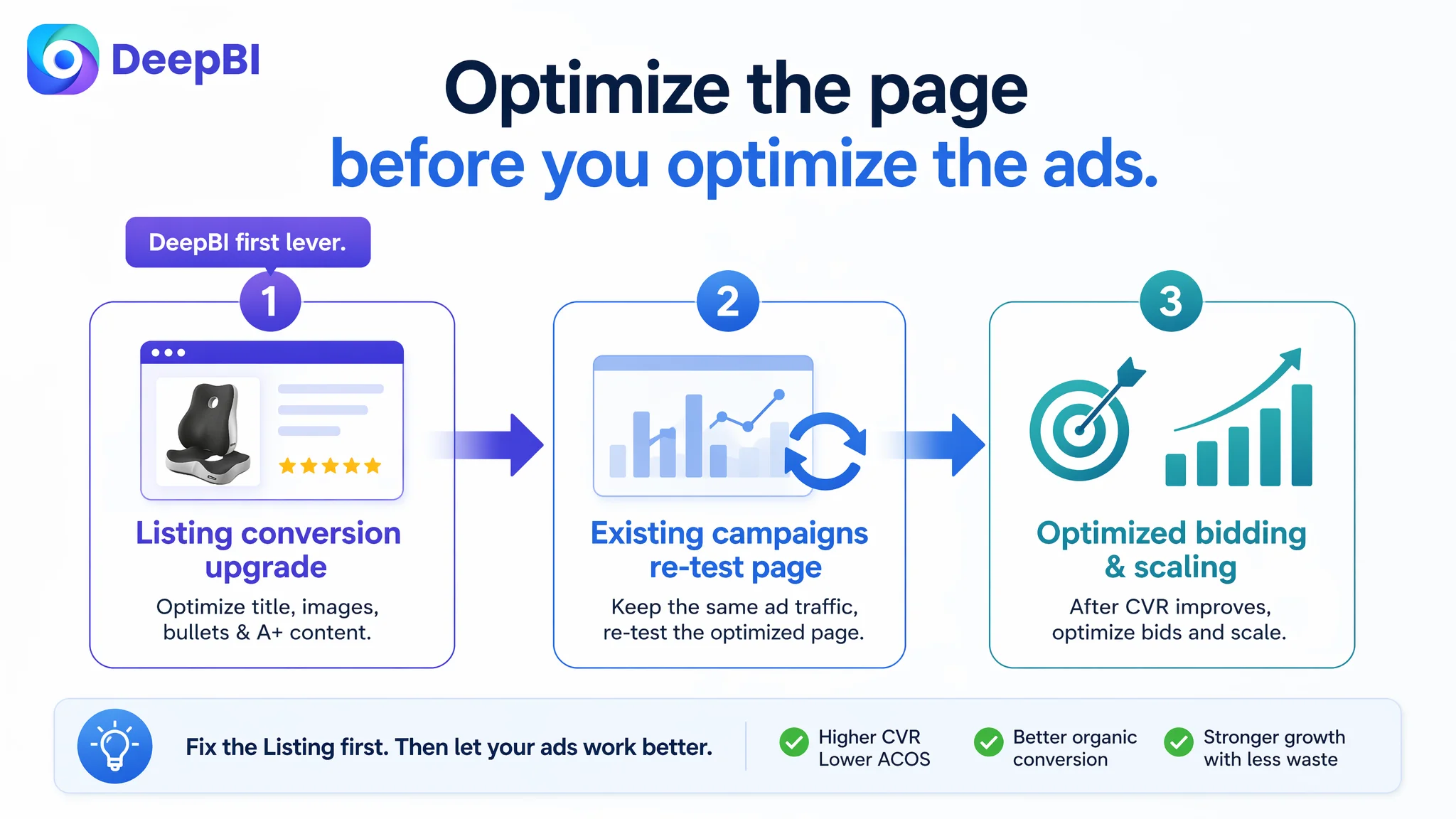
So the decision path was:
- First: improve Amazon Listing conversion capacity—title, main image sequence, bullets, A+ layout.
- Then: let existing ad campaigns “test” the new page logic.
- Finally: revisit keyword and bid strategies in a context where the page deserved the traffic.
This is the core operating order DeepBI emphasizes with Amazon sellers:
Before scaling ads, judge whether the page deserves more traffic.
How the Page’s Sales Logic Started to Recover
After the Listing-focused optimization, several operating-state changes typically emerge in cases like this, even when exact numerical results are not yet available:
- The click intent became clearer.
With “2-in-1 ergonomic memory foam back support” and “coccyx lower back pain relief” front-loaded in the title, search traffic for pain-related keywords found a more direct match.
- Thumbnail trust increased.
The new main image logic (office + car scenarios in image 1, anatomy-based support visuals later) gave shoppers more reasons to stop scrolling and click.
- Page trust deepened.
Bullet points and A+ modules now walked shoppers through a coherent journey: pain → ergonomic design → tested material → multi-scenario fit → usage guidance → trust and gifting.
- Ads became more useful again.
The same campaigns that previously felt expensive now landed on a page with higher chances of conversion, allowing ACOS to begin moving down and CVR to stabilize or recover.
- Advertising dependence became more controllable.
As the Listing’s ability to convert organic shoppers improved, the seller had a more balanced traffic structure: paid traffic no longer had to compensate for a structurally weak page.
Even without inventing specific numbers, the business logic is clear: by fixing the page’s ability to convert both organic and paid traffic, ad spend shifts from “patching leaks” to “amplifying strengths”.
What This Case Changes in the Seller’s Understanding
For this cushion seller, the main shift was conceptual:
- High ACOS is not always an ad problem.
Sometimes ACOS is the signal that the Listing is not converting well enough.
- A healthy rating and many reviews do not guarantee strong conversion.
If title, images, and A+ are not aligned around a clear pain-relief narrative, the page underuses its social proof.
- Main images and A+ content are not just “visuals”; they are decision tools.
When they fail to precisely show scenarios, ergonomic logic, and trust cues, even good products perform below their potential.
- Before spending more on ads, ask: is the page amplifying pain relief or just showing a cushion?
In this case, reframing the Listing around spinal fit, tailbone relief, and multi-scenario usage was a higher-leverage move than another round of bid adjustments.
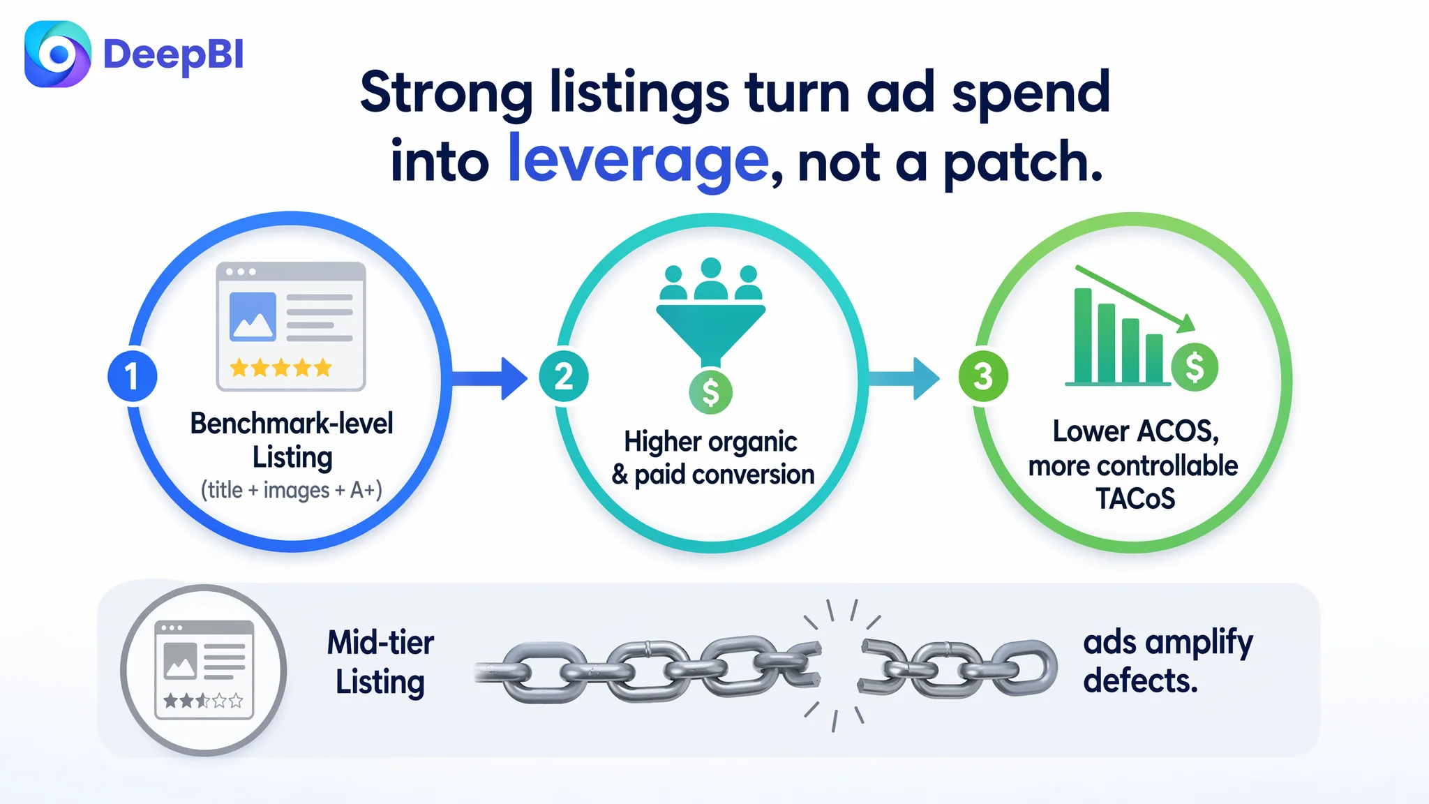
For other Amazon sellers, the takeaway is direct:
- If your product has good reviews but ads feel heavy, do not assume the problem sits only in the campaign manager.
- Use structured, competitor-based Listing diagnosis to see whether your title, main images, bullets, and A+ content are truly at benchmark level.
- Treat Amazon Listing conversion as the foundation for every advertising decision. When that foundation is weak, ads amplify defects. When it is strong, ads amplify strengths.
This is where DeepBI’s value lies in practice: not in listing features, but in helping sellers correctly judge where their real constraint is—and in this case, it was clear that the page, not the ads, had to change first.