

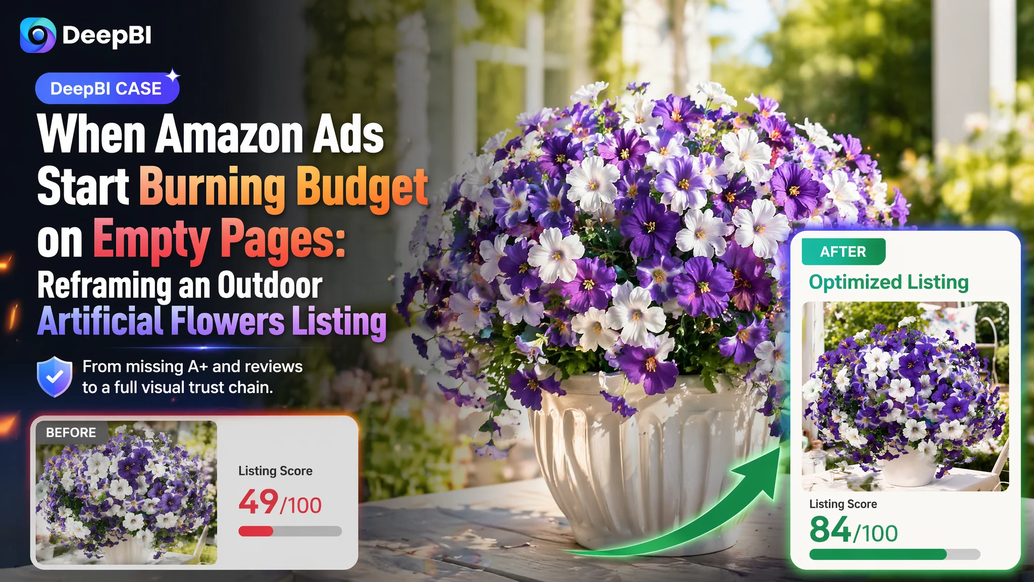
An Amazon seller in outdoor artificial flowers recently ran into a familiar wall: ad costs were climbing, but the Listing was not turning traffic into orders. They believed the problem was mainly about creatives and bids—that the images were “not professional enough” and the campaigns needed more fine-tuning. Yet even with decent title and bullet-point quality, core metrics refused to move.
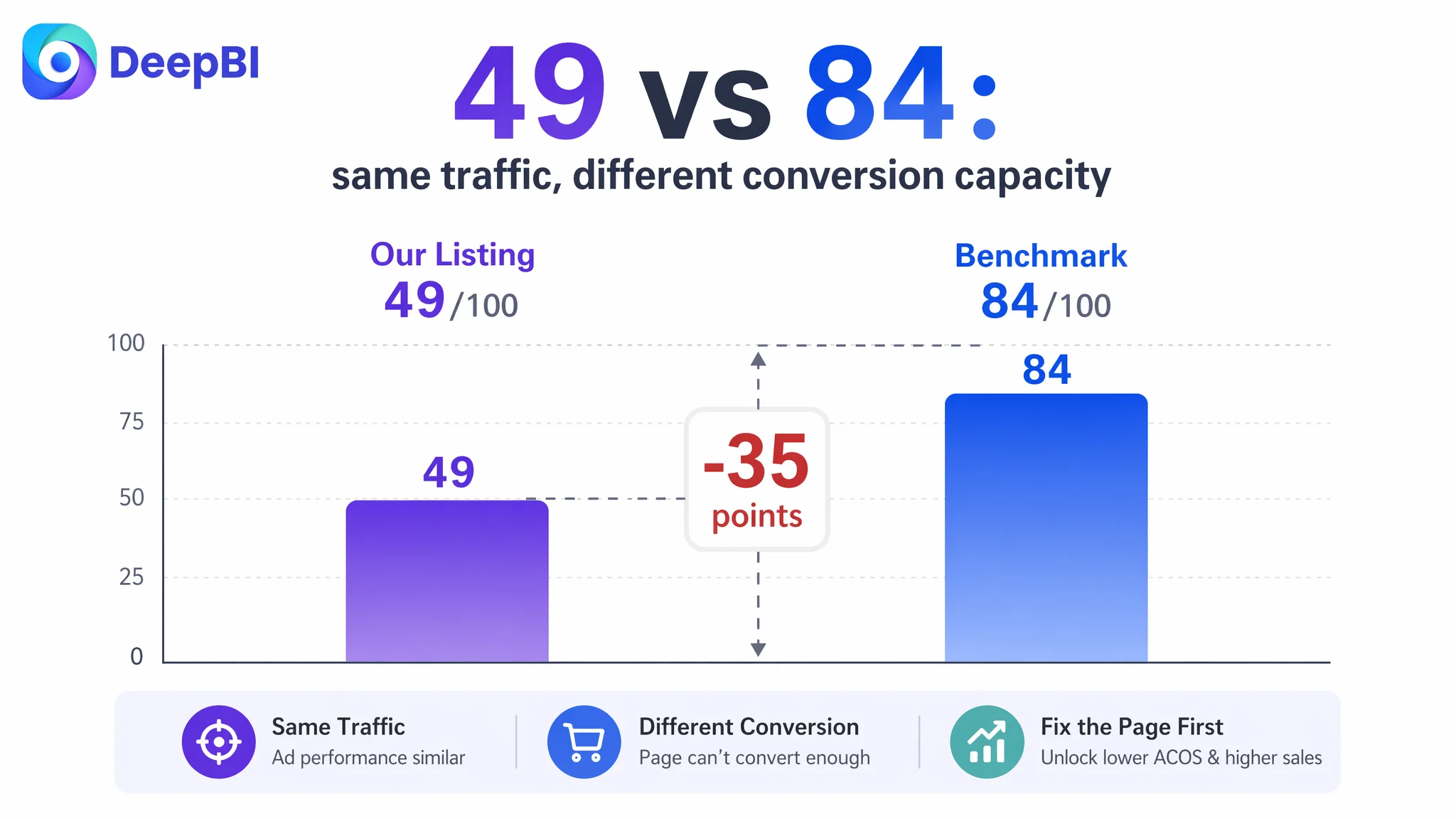
DeepBI’s diagnosis flipped that judgment. Against a strong benchmark Listing in the same sub-category, the brand’s page scored 49/100 versus the benchmark’s 84/100. The real gap did not sit in title or bullets; it was a near-complete absence of A+ detail content and zero reviews. In other words, ads were driving visitors into a page that had no trust infrastructure and no visual story to convert them.
The later optimization therefore did not start with more granular ad work. It focused first on rebuilding the Amazon product page: reconstructing main-image logic around real usage scenes, designing a full A+ flow from “first impression” to “durability proof” to “multi-scenario inspiration”, and aligning bullets with that visual journey. Only once the Listing could genuinely sell did ad traffic become useful again.
For other Amazon sellers, this case is a reminder: when ACOS feels uncontrollable, the root cause is often not in the ad console. If the page cannot build trust and reduce uncertainty, ads will only amplify that weakness. Understanding where the Listing is truly constrained is what prevents budget from being burned on a page that is structurally unable to convert.
Amazon Ads Were Not Failing. The Page Was Consuming the Traffic.
The product here is outdoor artificial morning glory flowers—12 bundles in purple-white, meant for porches, patios, window boxes and other outdoor decor. The seller had begun to push Amazon ads, expecting that more impressions and clicks would mechanically translate into more orders.
On the surface, the Listing did not look “broken”:
- The title was structurally reasonable and contained key category terms.
- Main images existed and showed the product.
- Bullet points covered material, durability, and usage scenes.
Yet, compared with a category-leading competitor on the same Amazon marketplace:
- Total Listing score: 49/100 vs benchmark 84/100 (a 35-point gap).
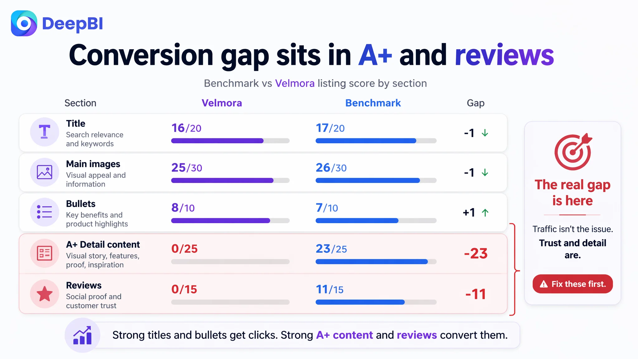
- Title: 16/20 vs 17/20 (only a minor difference).
- Main images: 25/30 vs 26/30 (again, not catastrophic).
- Bullet points: 8/10 vs 7/10 (slightly better on paper).
- Detail/A+ content: 0/25 vs 23/25 (critical gap).
- Reviews: 0/15 vs 11/15 (critical gap).
The seller’s attention was largely on creatives and keywords. High ACOS was emotionally attributed to “ads not being targeted enough” and “images not attractive enough”, so they tried to tweak copy and bidding without first asking a harder question:
“Even if we win the click, does this page have enough trust and information to justify a purchase?”
On that question, the score said no.
The Real Constraint Was Listing Conversion Capacity
DeepBI’s scoring logic made something clear: the Amazon Listing did not primarily lose in attracting clicks; it lost in converting visitors who had already arrived.
Title: Not the Main Bottleneck
Title differences existed but were not decisive:
- The benchmark leads with “Artificial Flowers for Outdoors” right at the start, clearly using the core category term as the first hook.
- It quantifies the offer early: “13 Bunches, 7 Multi Colors”, using numbers to signal value and variety.
- It immediately extends usage context with “Faux Plants Outside Indoor”, capturing both outdoor and indoor searches.
The customer’s suggested title:
12 Bundles Artificial Morning Glory Flowers for Outdoors, Realistic Silk Faux Plants, UV Resistant Plastic Flowers for Outside Planter Porch Patio Yard Decor (Purple-White)
This already aligns reasonably with Amazon search logic:
- Core keyword “Artificial Morning Glory Flowers” is near the front.
- Outdoor usage is explicit.
- Material and UV resistance are present.
The title score difference (16 vs 17) confirmed: title optimization could refine search friendliness and appeal, but it was not the main reason conversions stalled.
Main Images: Visually Adequate, Strategically Underused
Main images scored 25 vs 26—again, not a disaster, but the benchmarking revealed what was missing.
The benchmark Listing uses images to:
- Show multiple real-world scenes: porches, poolside, window boxes, garden paths.
- Make quantity and scale explicit: how many bunches, how dense they look in a planter.
- Visually demonstrate height and dimensions with human or scale references.
- Reinforce “plug-and-play” decor: you see the final look you can get with minimal effort.
The customer’s images were decent photographs but:
- They lacked systematic scene coverage (different environments and placement types).
- Quantity and density were not clearly quantified visually.
- Size expectation had to be imagined rather than seen.
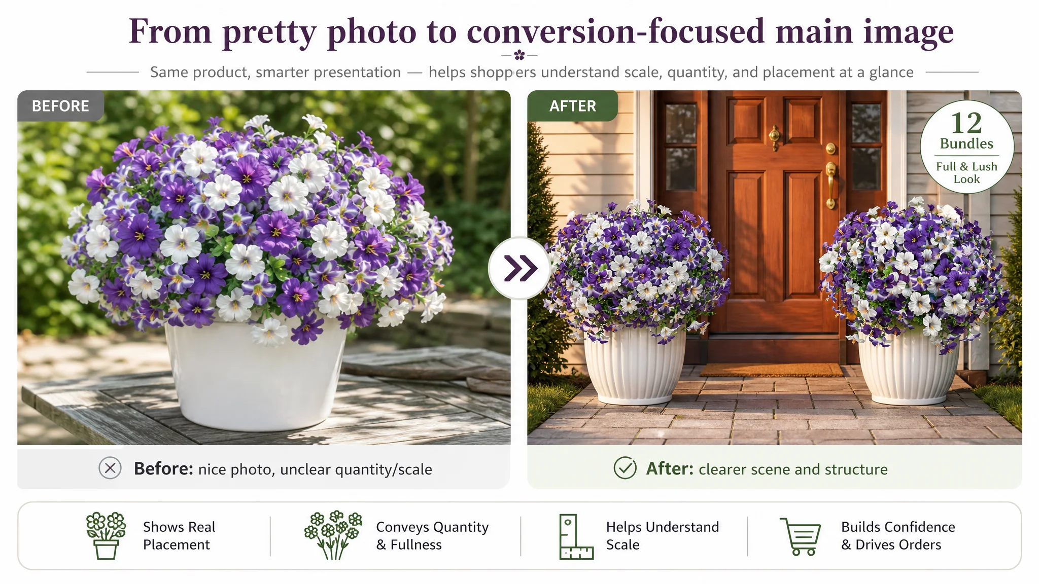
The result: a shopper could tell these were artificial flowers, but it was harder to quickly answer:
- “Will 12 bundles be enough to make my porch look full?”
- “How large is each bundle?”
- “How will these look in a window box or hanging basket?”
Main-image optimization mattered, but DeepBI’s scoring still showed that relative to title and bullets, the extreme weakness sat lower on the page.
This Product Page Did Not Lack Traffic. It Lacked Trust.
The collapse happened in the detail/A+ and review layers.
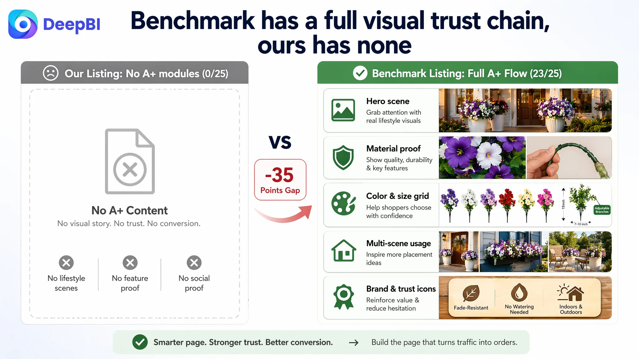
A+ Detail Content: A Complete Trust Gap
On this Listing:
- A+ content was absent.
- Score on detail content: 0/25.
On the benchmark:
- Rich A+ modules were present:
- Full-width lifestyle hero images (porch, balcony, yard).
- Core selling points clearly listed (lifelike, weather-resistant, low maintenance).
- Material and structure close-ups (UV-resistant fabric, adjustable branches).
- Multi-color SKU grid with clean, consistent photography.
- Clear dimension diagrams with inch markings.
- Scenario collages (doorway, window box, garden path, parties).
- Brand and trust icons summarizing the proposition.
Score: 23/25.
This is not cosmetic.
In this category, buyers care about:
- Realism: Will it look like plastic from the street?
- Durability: Will sun and rain make it fade quickly?
- Volume and scale: Will the planter look full, or sparse?
- Fit to their container: Will it work for a tall pot, window box, hanging basket?
The benchmark’s A+ flow answered these questions visually:
- First screen: attractive lifestyle scene plus a concise selling-point list.
- Middle panels: close-ups of material and flexible stems, with copy around UV resistance and weather durability.
- SKU and sizing panels: 6-color grid, clear height and width ranges, “adjustable branches” callout.
- Scene mosaic: multiple placements, inviting users to imagine their own porch or yard.
- Closing trust panel: brand and key benefits icons (“Fade-Resistant”, “No Watering Needed”, etc.).
The customer’s Listing, by contrast, offered no visual journey beyond standard images. A visitor arriving from an ad could not:
- See a credible demonstration of UV resistance.
- See flexibility or adjustability of stems.
- See color and volume options consistently laid out.
- See clear sizing diagrams tied to real-world containers.
- See a final trust reassurance panel.
“The real problem was not that ads failed to bring traffic. It was that the page could not convert the traffic.”
Reviews: Zero Social Proof Against an Established Benchmark
On reviews, the situation was equally stark:
- Customer Listing: 0 reviews, no rating, no social proof.
- Benchmark: 4.5 stars, 41 total reviews, 8 featured at the top.
Those benchmark reviews:
- Spoke specifically to durability (color not fading, holding up in sun and rain).
- Commented on appearance (“looks like real flowers from the street”, “very full”).
- Added photos, reinforcing the A+ visuals with real-life usage.
For a shopper comparing two options on Amazon:
- One Listing shows nothing beyond standard images and text, with no A+ or reviews.
- The other shows a well-structured A+ story plus dozens of positive reviews and customer photos.
Even if the customer’s ads win some clicks, the lack of trust and proof makes it unlikely that a comparable conversion rate can be achieved. Ads cannot compensate for a trust gap of that magnitude.
Why DeepBI Did Not Keep Tuning the Ads First
With this scoring picture, DeepBI did not frame the situation as an advertising problem.
From an Amazon business perspective:
- Scaling ads on a Listing with 0/25 detail score and 0/15 review score is high-risk.
- Ad traffic will flow into a page where most visitors’ core questions are not answered.
- ACOS will be structurally difficult to improve because the conversion stage is weak.
The biggest business risk at this stage was not under-optimized bids. It was:
- Paying to send traffic into an under-built product page.
- Allowing ads to amplify a weak conversion infrastructure.
So priority had to change:
1. Stop treating ad performance as the primary lever.
2. Strengthen the page’s conversion capacity before scaling ad spend.
This is typical of what DeepBI’s scoring plus benchmark logic reveals: when title and bullets are reasonably aligned but detail content and reviews are missing, conversion will not stabilize regardless of ad tweaks.
Rebuilding the Page: From High-Level Description to a Full Sales Logic
Once the root cause was reframed as “Listing cannot convert traffic”, the optimization path focused on the Amazon product page modules, not the ad console.
Title: Clarifying Intent and Search Entry
The suggested title:
12 Bundles Artificial Morning Glory Flowers for Outdoors, Realistic Silk Faux Plants, UV Resistant Plastic Flowers for Outside Planter Porch Patio Yard Decor (Purple-White)
This title direction:
- Reinforces the core category keyword (“Artificial Morning Glory Flowers”).
- Keeps “for Outdoors” near the front to anchor intent.
- Adds material (Silk, Plastic) and UV Resistant to catch durability-related search terms.
- Lists key usage scenes (Planter, Porch, Patio, Yard Decor) in a clean, comma-separated structure.
This improves:
- Search engine recognition for primary and secondary use-cases.
- Scanning clarity for shoppers browsing dense search results.
However, the title change is more about aligning with traffic than solving conversion. The heavier lift sits in images and A+.
Bullet Points: From Information List to Buying Logic
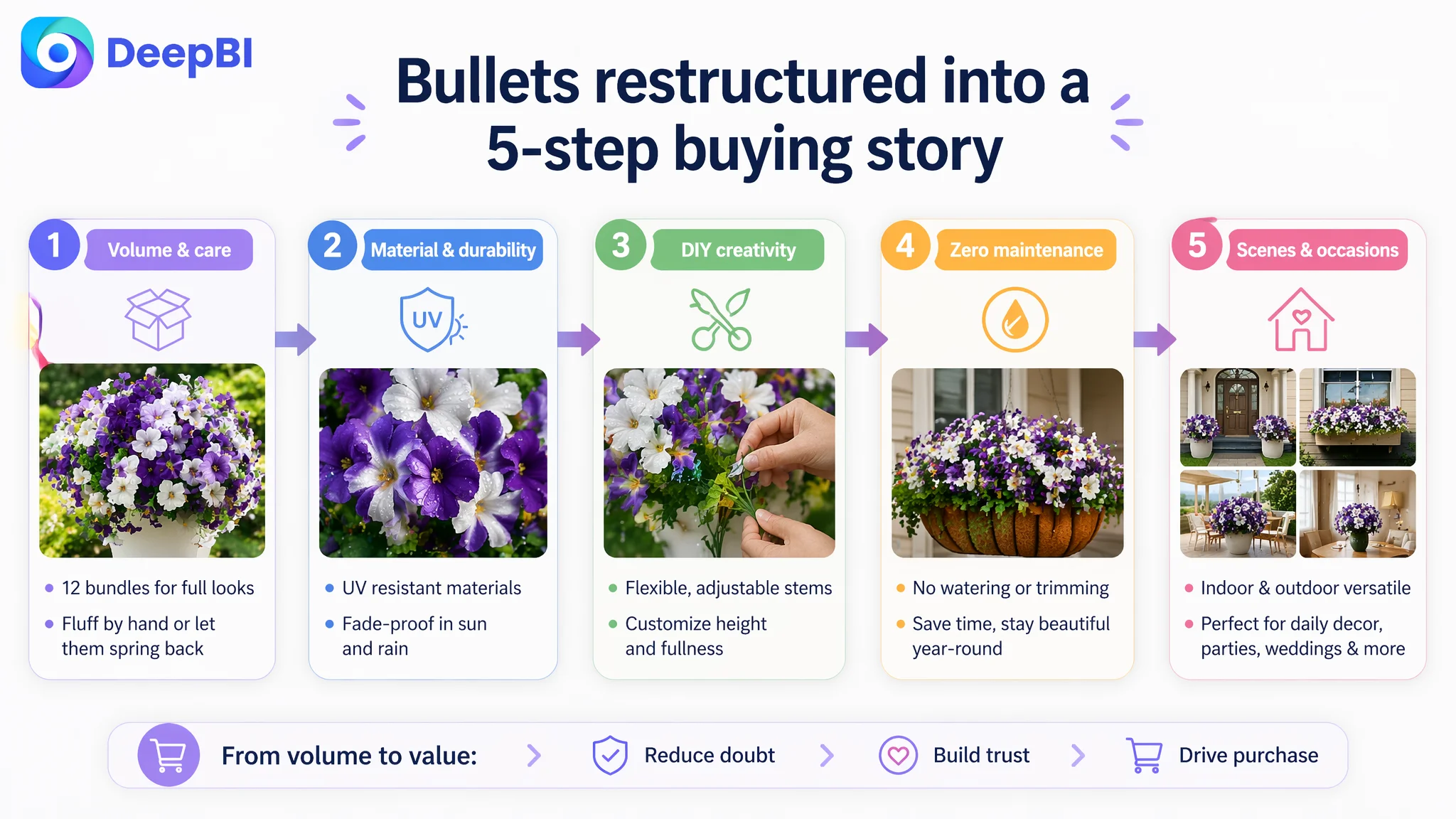
Bullet optimization aimed to build a more coherent “pain-point to solution” path.
BP #1 – Managing Volume Expectation and Shipping Reality
• 【Vibrant Variety & Care Tips】: Includes 12 bundles of colorful fake flowers, perfect for monochromatic or rainbow-style arrangements. Note: Flowers may arrive compact due to shipping; simply fluff by hand or allow them to spring back naturally for a full, lush appearance that instantly brightens your home.
This:
- Quantifies 12 bundles as a meaningful volume.
- Sets realistic shipping expectations (flowers arrive compact).
- Shows how to achieve fullness (“fluff by hand” or let them spring back).
BP #2 – Material and Durability
• 【High-Quality & UV Resistant】: Featuring delicate textures and natural color gradients, these high-quality faux flowers are designed for durability. Made of UV-resistant materials, they are fade-proof in both intense sun and heavy rain, staying fresh and vibrant year after year without wilting.
This translates:
- The benchmark’s mention of silk petals and quality plastic into a higher-end material perception.
- UV resistance and weather-proofing into concrete outcome language (“fade-proof”, “fresh and vibrant year after year”).
BP #3 – DIY Flexibility
• 【Unlimited DIY Creativity】: Features flexible, adjustable stems and lifelike flower heads, allowing you to customize the height and density of your arrangements. Whether crafting a unique bouquet or a vertical garden, these 12 bundles provide endless possibilities for personalized decor.
This incorporates:
- The benchmark’s DIY narrative (“detachable”, “adjustable”).
- A more engaging creative angle rather than only listing scenes.
BP #4 – Zero Maintenance
• 【Zero Maintenance, Lasting Beauty】: Enjoy everlasting blooms with absolutely no need for watering, trimming, or replanting. These hassle-free flowers save you time and cost while maintaining a professional landscaping look, keeping your garden or patio beautiful regardless of the season.
This clarifies:
- The core benefit of artificial plants: time and cost savings.
- The end result: professional-looking landscaping with no seasonal disruption.
BP #5 – Scene Expansion
• 【Versatile Styling for Any Setting】: Where will you style it? Perfect for window boxes, porch railings, hanging baskets, and patio planters. These durable flowers are equally ideal for indoor table decor, weddings, and parties, adding long-lasting elegance to both urban landscapes and cozy home interiors.
This expands:
- The scope from standard home decor to events (weddings, parties).
- The narrative from outdoor-only to indoor and urban contexts.
Taken together, the bullet set moves from “listing features” to a multi-step buying logic:
1. You get enough volume, and it will look full.
2. It looks realistic and is built to withstand weather.
3. You can style it creatively across different setups.
4. You avoid maintenance work.
5. You can use it across home and event scenarios.
But again, bullets alone cannot carry conversion if visuals and trust modules remain weak.
Main Images: Making Quantity, Size, and Scenes Visually Obvious
DeepBI’s image suggestions were not artistic instructions; they were conversion-driven prompts based on the benchmark gap.
Making Density and Quantity Concrete
One recommended image:
- Pure white background, flat lay composition.
- All 12 bundles neatly aligned.
- Clear “12 Bundles” text overlay in clean, sans-serif font.
- Circular close-up showing petal edges and leaf distribution.
This addresses:
- “Will it look dense enough?”
- “Does it look plasticky up close?”
By letting the shopper see both the total volume and the texture close-up, the Listing reduces uncertainty before they scroll.
Visualizing Size with Scale References
Another image uses:
- Straight-on view with a single bundle.
- Height marked with a “15 inch” annotation.
- A hand holding the bundle on the other side, giving human-scale context.
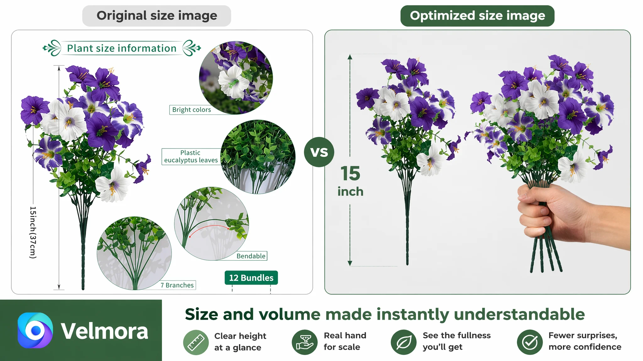
This prevents:
- Size-related disappointment, a major source of returns in this category.
- Misalignment between expectation and reality.
Real Usage Scenes, Not Abstract Backgrounds
Scene images are reoriented around specific placements:
- Flowers in a porch planter at the front door, symmetrical on both sides.
- Flowers overflowing from a window box against a dark wall, highlighting color contrast.
- Arrangements in indoor woven baskets, showing indoor decor possibilities.
These do two things:
- Show how many bundles it takes to achieve a particular look.
- Make the buyer visualize their own space with the product already in place.
“Advertising does not only amplify advantages. It can also amplify a page’s existing defects.”
By strengthening scene logic, the Listing turns the main image set into a pre-sales demonstration rather than mere display.
A+ Detail Content: Restoring the Missing Trust Chain
The heaviest lift is the A+ build, because that is where the benchmark is strongest and the customer is at zero.
DeepBI’s suggestions reconstruct A+ into a structured journey:
1. First Impression: Outdoor Hero + Clear Core Message
- Bright outdoor yard scene.
- Product in a black square pot on the left, occupying about half the visual area.
- Soft-focus backyard, fence, and trees in the background.
- Right side: a color block with clear headline (“Outdoor Artificial Flowers”) and bullet list of core benefits.
This creates:
- An immediate “this belongs outside” signal.
- A fast summary of why these flowers matter (lifelike, weather-resistant, zero maintenance).
2. Durability and Flexibility Proof
A close-up module shows:
- A hand bending a green stem to about 180 degrees without breaking.
- Background clean and minimal, emphasizing the stem.
Copy focuses on:
- Flexible stems, easy shaping, not prone to snapping.
- Reinforcement of durability under handling, not just under weather.
This is where many Listings rely on text alone. Here, the image makes durability feel physically credible.
3. Color and Style Options Grid
A standardized grid displays:
- 6 square tiles with different colors (red, purple, yellow, pink, white, magenta).
- Consistent angle and lighting across all variants.
- A clear “6 colors available” caption.
This:
- Reduces decision friction for color choice.
- Shows that the brand has a coherent range, not random variation.
For a shopper planning multiple planters or event decor, this is critical.
4. Size and Adjustability Diagram
A clean technical-style image shows:
- A single fern bundle against a neutral background.
- Vertical height annotated (“22.8 inch”).
- Horizontal width range annotated (“15.7–27.6 inch”).
- A callout bubble: “Adjustable Branches”.
This turns:
- “Adjustable” from an abstract claim into a quantified range.
- Size into something a shopper can compare to their planter or window box.
5. Scene Modules: Porches, Window Boxes, Mixed Containers
Several modules show:
- Symmetrical porch setups with two planters flanking a door.
- Window box placement with dense overflow effect.
- Mixed baskets and containers in indoor and balcony settings.
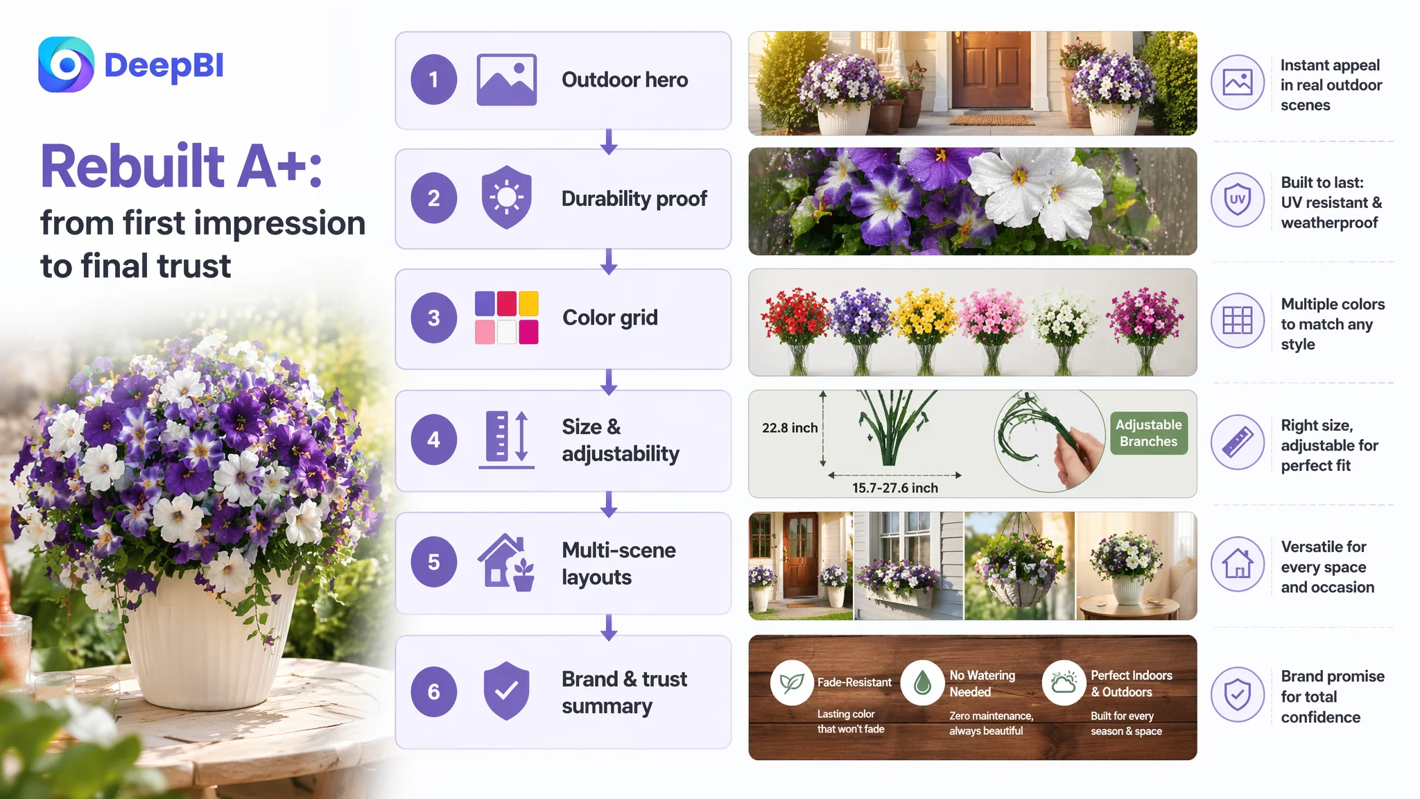
These modules:
- Demonstrate fullness (“Always Full and Lush”).
- Encourage multi-set purchasing to recreate the same visual impact.
- Prove versatility across containers.
6. Brand and Trust Summary
The closing A+ image uses:
- A warm-toned wood texture base.
- Three icons for “Brand”, “Realistic”, “Indoors/Outdoors”.
- Text callouts summarizing key attributes like “Fade-Resistant”, “No Watering Needed”.
This:
- Provides the final trust confirmation before the “Add to Cart” decision.
- Reminds the shopper what they’re buying beyond aesthetics: low risk, low maintenance, consistent appearance.
Together, these modules rebuild the recognition–trust–decision chain that was entirely missing before.
How Ad Traffic Becomes Useful Again
Once the Listing’s conversion infrastructure is repaired—title aligned, main images structured around density and size, bullet points forming a coherent narrative, and A+ content answering core doubts—ad traffic stops being wasted.
DeepBI’s operating logic here is simple:
- If click-through is acceptable but conversion is weak, ads are not the first lever.
- Fixing conversion capacity moves CVR, which in turn makes ACOS and TACOS more controllable.
- Once the page can convert, keyword targeting, bid strategy, and budget scaling start to matter again—because traffic now has a realistic chance of turning into orders.
In this case, the expected changes after Listing optimization are:
- CVR begins to recover as more visitors find enough proof to buy.
- ACOS becomes easier to push down, because fewer paid clicks die on an empty narrative.
- The Listing regains organic conversion ability, making it less dependent on ads.
- The store’s traffic structure stabilizes: paid traffic supports rank building instead of just funding a leaky page.
What Other Amazon Sellers Can Take From This Case
Several points generalize beyond artificial flowers:
1. A weak A+ layer can silently destroy conversion, even if titles and main images look “okay”.
2. Zero reviews plus zero A+ is a structural trust gap; ads cannot compensate.
3. Before blaming ACOS on ad targeting, check whether the product page answers the real questions buyers have.
4. Title, main image, bullets, and A+ must work as a single sales path, not isolated modules.
5. Ads should not be scaled until the Listing can credibly convert both organic and paid traffic.
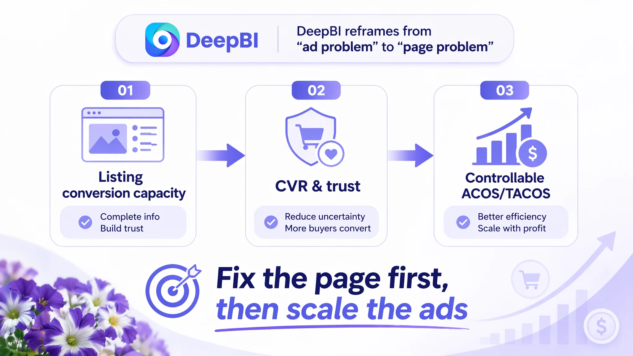
This is where DeepBI’s strength lies: in reframing the problem from “ads are bad” to “this Listing cannot yet bear more traffic”. For Amazon sellers in any category, that judgment shift is often the difference between continuously raising bids and finally building a page that deserves the clicks it gets.