

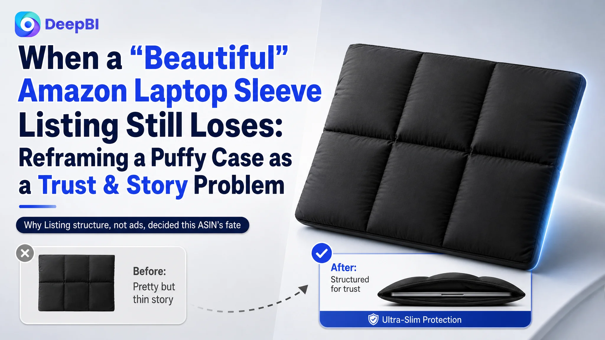
This case comes from an Amazon seller in the laptop-accessories category. They launched a puffy laptop sleeve and believed the main task was to “push more traffic and wait for reviews to build.” On the surface, the Amazon Listing didn’t look weak: the title was decent, the product images were clean, and the bullet points were even more user-centric than a leading competitor. Yet exposure was hard to monetize, and advertising was risky to scale.
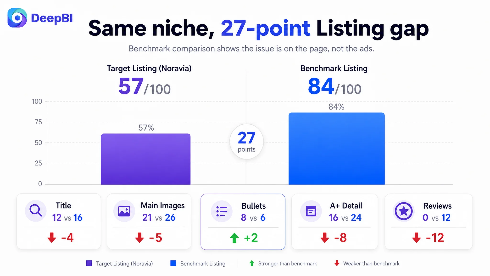
The seller’s original judgment was simple: “Our creatives are already fine; we just need more ads and reviews.” DeepBI’s Listing diagnosis reached the opposite conclusion. Against a benchmark Amazon Listing in the same puffy laptop-sleeve niche, the target page scored only 57/100 versus 84/100. The biggest gaps weren’t in “copywriting skills” but in visual storytelling, A+ depth, and social proof. In other words, ads weren’t the main constraint—the product page itself could not carry paid or organic traffic.
Once the problem was reframed, the optimization direction changed. Instead of tuning Amazon ads first, the focus moved to rebuilding the title’s traffic logic, restructuring the main-image set around decision-making moments, and upgrading the A+ content from static product shots to a full “urban lifestyle + 3-layer protection” story. Only after the page started to look and behave like the category benchmark did ad traffic become worth paying for.
For other Amazon sellers, this case is a reminder: you can have “good-looking” images and emotionally rich bullet points and still lose badly to a more commercially structured Listing. When ACOS feels hard to control or you’re afraid to increase bids on a new ASIN, the root issue may not be your campaign structure—but a Listing that doesn’t yet deserve more traffic.
Amazon Ads Were Not the Immediate Problem. The Page Couldn’t Convert.
This brand entered Amazon with a puffy “quilted” laptop sleeve positioned as a stylish, protective carry solution for 13–14 inch devices.
Internally, the team believed:
- The title already mentioned “Puffy Laptop Sleeve” and compatibility.
- Main images were clean and minimal.
- Bullet points were more user-centric and emotional than competitors.
- The A+ section at least showcased basic features: magnetic closure, inner lining, water resistance.
So when orders lagged and it felt dangerous to increase Amazon ad spend, the instinctive diagnosis was:
“We lack reviews and traffic. If we drive more ads and collect some ratings, conversion will follow.”
DeepBI’s Listing score told a different story. Compared to a category-leading competitor:
- Overall score: 57 vs. 84 (–27 points)
- Title: 12 vs. 16
- Main images: 21 vs. 26
- A+ detail: 16 vs. 24
- Reviews: 0 vs. 12
Bullet points were actually better (8 vs. 6). But the rest of the page—the parts that drive click, trust, and final decision—was significantly weaker.
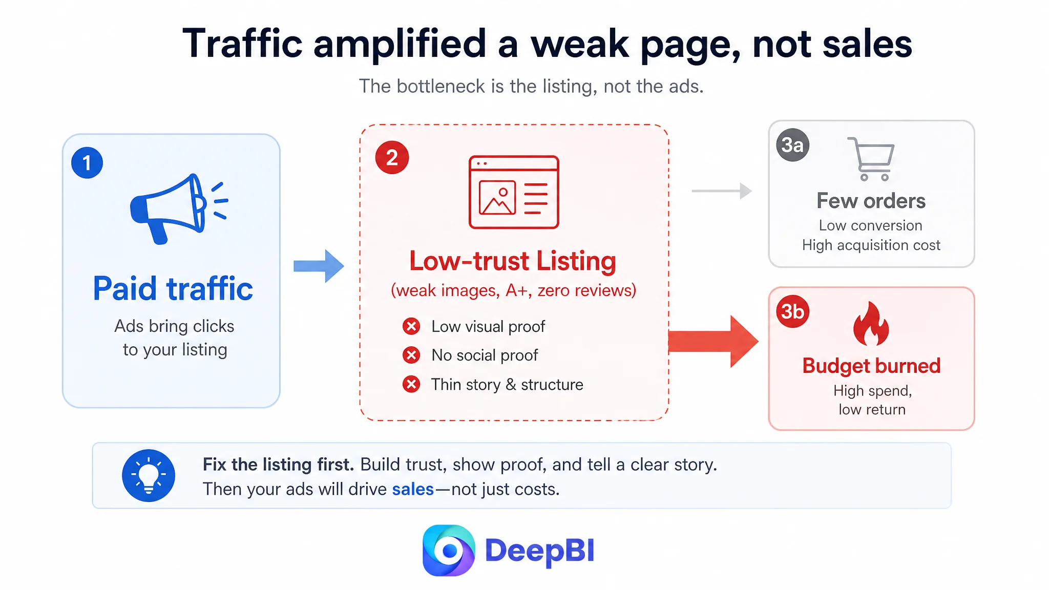
“The real problem was not that ads failed to bring traffic. It was that the page could not convert the traffic.”
With zero reviews and a thin, low-trust visual story, every paid click carried high risk. Under these conditions, pushing ads first would only amplify the existing weaknesses.
The Real Constraint Was Listing Conversion Capacity
What the seller thought was wrong
From the seller’s perspective:
- Images were already “premium enough.”
- Copy had been polished to emphasize “peace of mind,” “professional look,” and “all-around protection.”
- The main missing factor seemed to be review volume and time on market.
So their mental model was:
“We’re early in the lifecycle; ads and time will solve it.”
What DeepBI’s diagnosis actually showed
When DeepBI benchmarked the Listing against a high-performing puffy laptop-sleeve competitor on Amazon, a different pattern emerged:
1. Title: traffic reach and decision clarity were under-optimized
- The target Listing front-loaded “Puffy Laptop Sleeve” and basic size (“13 Inch 14 Inch”) and color.
- The benchmark title went further:
- Explicit size range (“13–13.3 inch”) that better matches long-tail queries like “13.3 inch laptop sleeve”.
- Brand breadth (“Compatible with MacBook Air/Pro, HP, Dell, ASUS, Lenovo”) to widen search coverage.
- Use-form & scenario (“Horizontal Bag with Small Case”) that signals practical use and additional value.
The seller’s title behaved like a basic product label; the benchmark behaved like a traffic and decision engine.
2. Main images: no visual proof, no lifestyle, limited click motivation
The competitor’s image set systematically walked a shopper from “click” to “trust”:
- Clear organization visuals (“Keep Items Well Organized” with icons + layered interior shots).
- Direct material proofs (micro close-ups of waterproof exterior + plush inner lining).
- Lifestyle and scale (office-style model carrying the sleeve, conveying fashion, size, and context).
The target Listing:
- Lacked text overlays and visualized functions; users had to mentally imagine how the sleeve works.
- Showed water droplets but without a clear comparison or explanation; easy to doubt.
- Offered no human or lifestyle scenes, leaving no emotional hook or sense of real-world use.
3. A+ content: too shallow, too few modules, too little story
The target A+ included:
- Product hero with icons.
- Close-ups of magnet, inner lining, and water resistance.
- One simple bag-in-bag scene.
The competitor’s A+:
- Opened with a strong brand + urban lifestyle scene.
- Showed multiple colors and a clear 3-layer protection diagram.
- Detailed internal organization for electronics, cosmetics, stationery.
- Listed specific compatible models.
- Used multiple on-location lifestyle photos (street, office, campus, café) to frame the product as both a tool and a fashion accessory.
In short:
- The competitor used 14+ A+ modules to build trust, decision clarity, and desire.
- The target Listing used only 5 static product-focused images, leaving a trust and information vacuum.
4. Reviews: absolute trust gap
- Benchmark: 4.7 stars, ~2300 reviews, rich photo/video content.
- Target: 0 reviews, 0 ratings.
With a weaker visual story and no social proof, even a competitive price would struggle to overcome risk perception.
Core bottleneck: this Amazon product page was not lacking “art direction”; it was lacking decision logic and trust at every step.
Why DeepBI Did Not Recommend “Optimize Ads First”
For a new or low-review ASIN, many sellers try to “push ACOS down” or “scale bids up” before seriously questioning the Listing itself.
In this case, DeepBI’s business judgment was:
- Ads were not yet the right lever.
- Every dollar of paid traffic would land on a page that:
- Had weaker title-based reach than the benchmark.
- Converted trust less effectively at the image and A+ level.
- Provided zero social proof.
The biggest business risk was obvious:
Using Amazon ads to amplify a low-conversion page would burn budget without seeding a sustainable organic position.
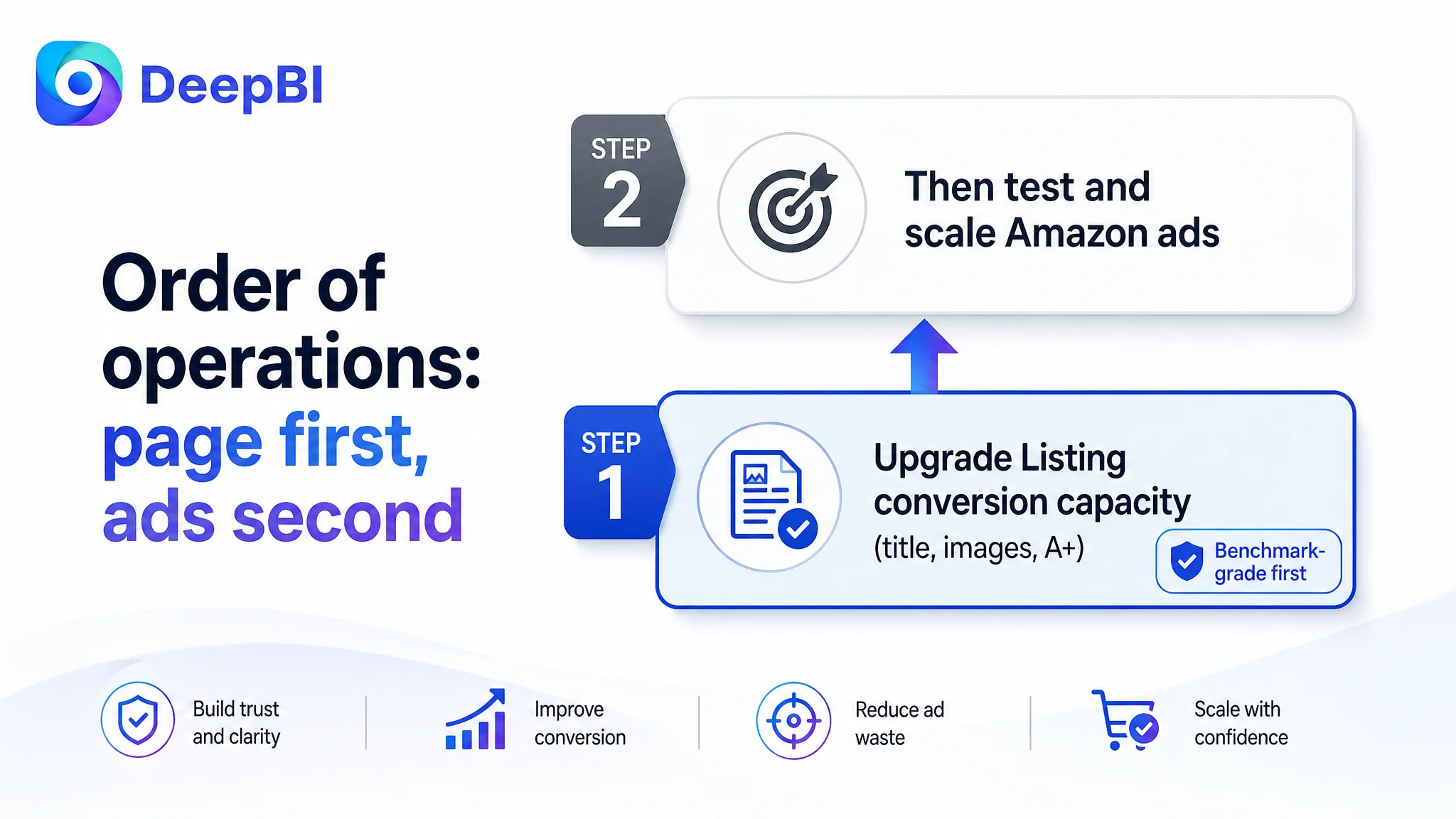
DeepBI’s operating order was:
1. Repair Listing conversion capacity first
— title, main images, and A+ must reach at least a credible “benchmark-grade” level.
2. Then re-evaluate advertising
— only once the page can reasonably convert should you consider heavier ad investment.
This Product Page Did Not Lack Information. It Lacked a Coherent Buying Story.
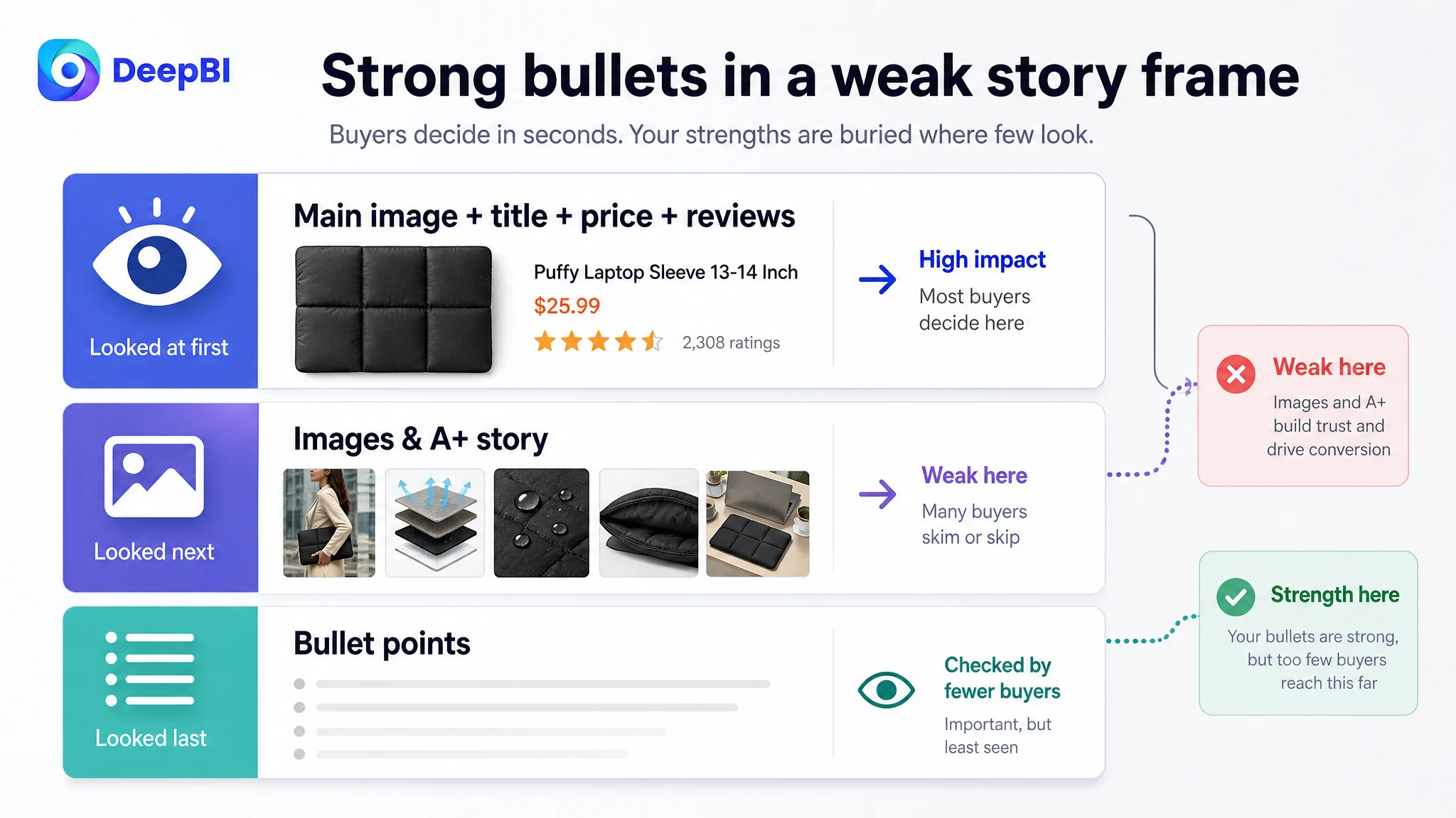
An interesting detail in this case: by DeepBI’s scoring, the seller’s bullet points actually outperformed the competitor (8 vs. 6).
The bullet points had logic. The rest of the page did not.
The target bullets:
- Were structured as “sell point + user benefit/scene”.
- Followed a clear progression:
1. Compatibility
2. Internal protection
3. External protection
4. Convenience
5. Look & scenario
- Injected emotional language like “total peace of mind” and “professional look”.
The competitor’s bullets:
- Were more parameter-driven and compatibility-list heavy.
- Less emotional, more technical.
So why didn’t that advantage translate into real-world competitiveness?
Because bullet points are rarely the first or main trust layer on Amazon. Most buyers:
- Decide to click from main image + price + reviews + title snippet.
- Skim images and A+ to resolve doubts.
- Only tap into bullets when deep-checking fit and features.
Here, the Listing’s strongest logic (bullets) sat in a module many shoppers don’t rely on first, while the higher-impact areas (main images, A+, reviews) were underpowered.
“The bullet points had information, but the rest of the page did not form a buying logic around them.”
How DeepBI Reframed the Page: From Plain Product to Urban Tech Accessory
Once the root cause was clear, DeepBI didn’t just throw “more images” at the problem. The optimization focused on decision flow:
1. Clarify the traffic & positioning via the title.
2. Turn the main image set into a clickable, trust-building sequence.
3. Use A+ to complete the lifestyle + protection + compatibility story.
1. Rebuilding the Title Around Search Behavior and Use Cases
Original bias: “We already say ‘Puffy Laptop Sleeve’ and list 13/14 inch; that’s enough.”
DeepBI’s direction:
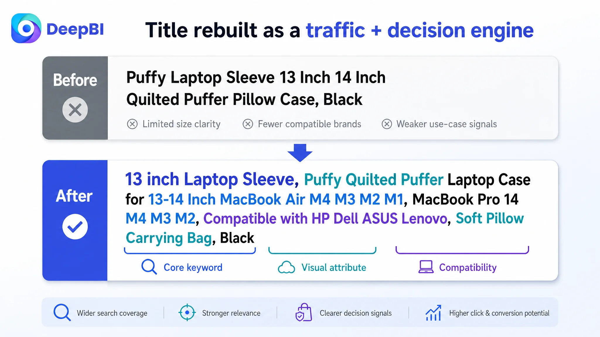
- Front-load the core search term:
Start with “13 inch laptop sleeve” rather than brand-first, to align with how buyers search.
- Integrate high-value attributes directly after the keyword:
e.g., “Puffy Quilted Puffer Laptop Case” to lock in the “quilted/puffer” visual in text.
- Expand compatibility coverage like the benchmark:
- Explicit MacBook Air / Pro models (incl. M1–M4 generations).
- Key Windows brands (HP, Dell, ASUS, Lenovo).
- Clarify the use form and feel:
e.g., “Soft Pillow Carrying Bag” to convey softness and comfort alongside protection.
The goal was not “add more words,” but to:
- Maximize search coverage within Amazon’s constraints.
- Make the title itself communicate a clear mental image and broad device fit.
2. Turning Main Images Into a Decision Journey, Not Just Angles
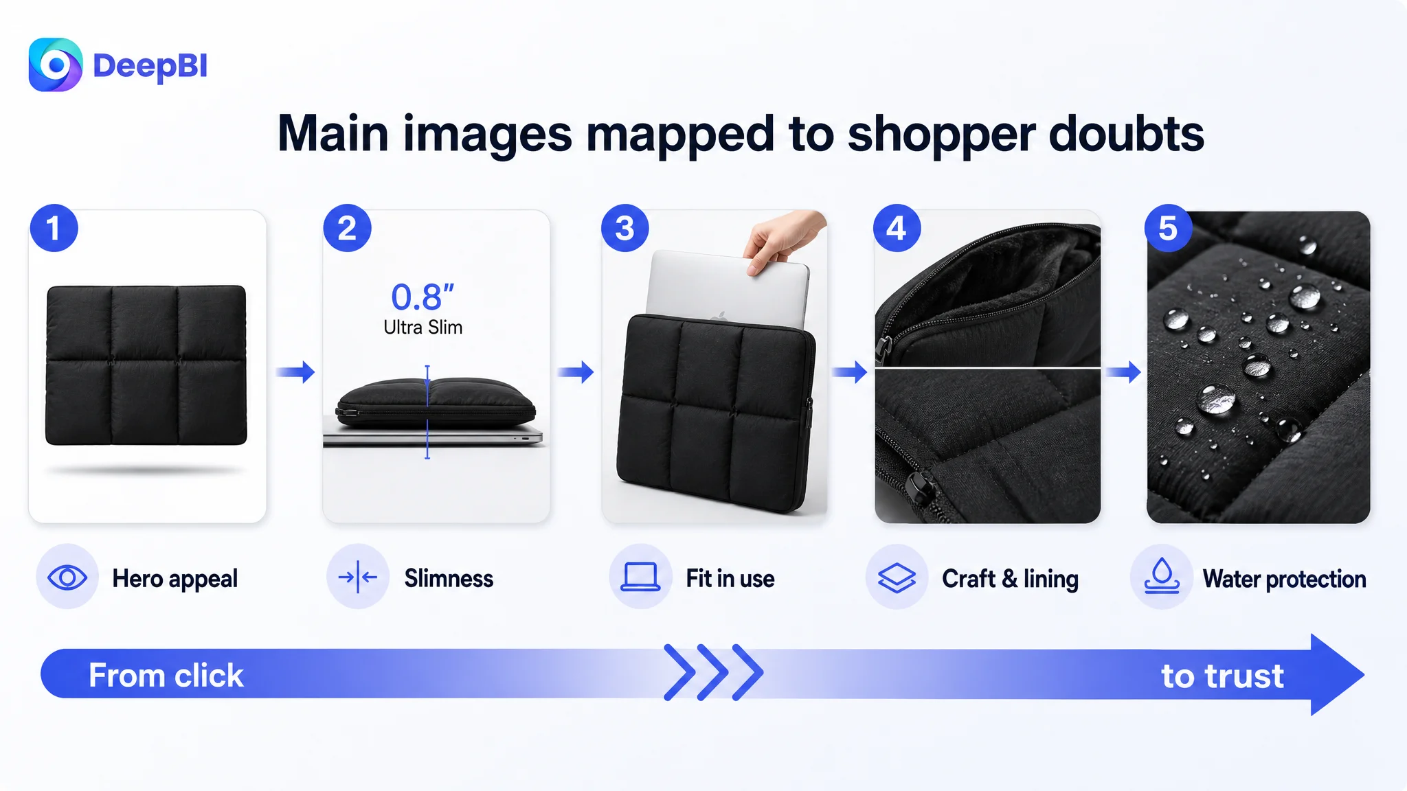
DeepBI’s analysis showed that the competitor’s images weren’t just prettier—they were structured around specific shopper doubts:
- “Is this bag bulky?” → side profile + slimness messaging.
- “Will it really protect my laptop?” → material and layered-structure visuals.
- “Does it fit my lifestyle?” → model in office/street scenes.
The optimization plan for the seller’s main images therefore followed a step-by-step, issue-driven sequence:
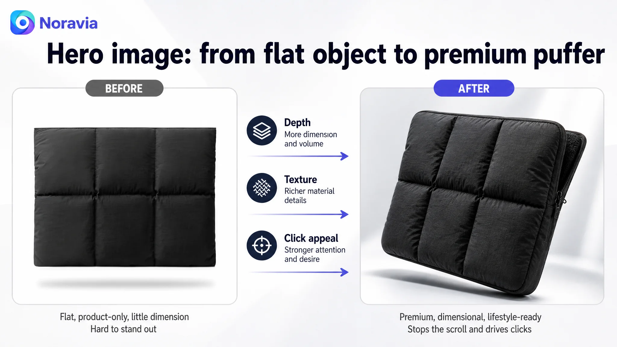
Main Image 1: Hero with industrial, puffy texture
- Product centered, ~75% of frame.
- 30° top-side angle, strong directional lighting to emphasize quilting.
- Neutral gradient background with floating effect.
- Overall look: modern, tech-minimalist, high-end.
Purpose: Win the click by making “puffy” look premium, not childish or cheap.
Main Image 2: Visualizing slimness vs. a 13" laptop
- Side view, sleeve and laptop side-by-side.
- Large, clean text overlay: “Ultra-Slim Protection”.
- Light, minimal background.
Purpose: Neutralize the “puffy = bulky” fear and support everyday portability claims.
Main Image 3: Real usage fit – laptop sliding in
- 45° angle, laptop partially sliding into the sleeve.
- Nordic-style desk scene with a pen for scale.
Purpose: Build fit and usability confidence at a glance.
Main Image 4: Craftsmanship & inner lining detail
- Split composition (zipper detail on top, open mouth + inner lining below).
- Soft, even lighting to communicate quality and smooth closure.
Purpose: Signal precision, safety for device edges, and tactile quality.
Main Image 5: Waterproof performance as visual proof
- Macro shot of water droplets beading on the fabric.
- High contrast, clear highlights, text overlay “Water-Repellent Surface”.
Purpose: Turn a textual promise (“water-resistant”) into physical evidence.
In other words, the main-image block was restructured as:
1. Attraction (puffy + premium).
2. Slimness reassurance.
3. Fit & usage clarity.
4. Craft & safety.
5. Protection proof.
A+ Content: From Static Features to a Full Lifestyle & Protection Story
In this category, DeepBI’s data and competitive analysis made one thing obvious:
- The best-performing Amazon Listings don’t just sell “a sleeve”; they sell an urban lifestyle accessory that happens to be protective.
The competitor’s A+ already embodied this. The target Listing had to close this gap.
Key A+ upgrades DeepBI prioritized
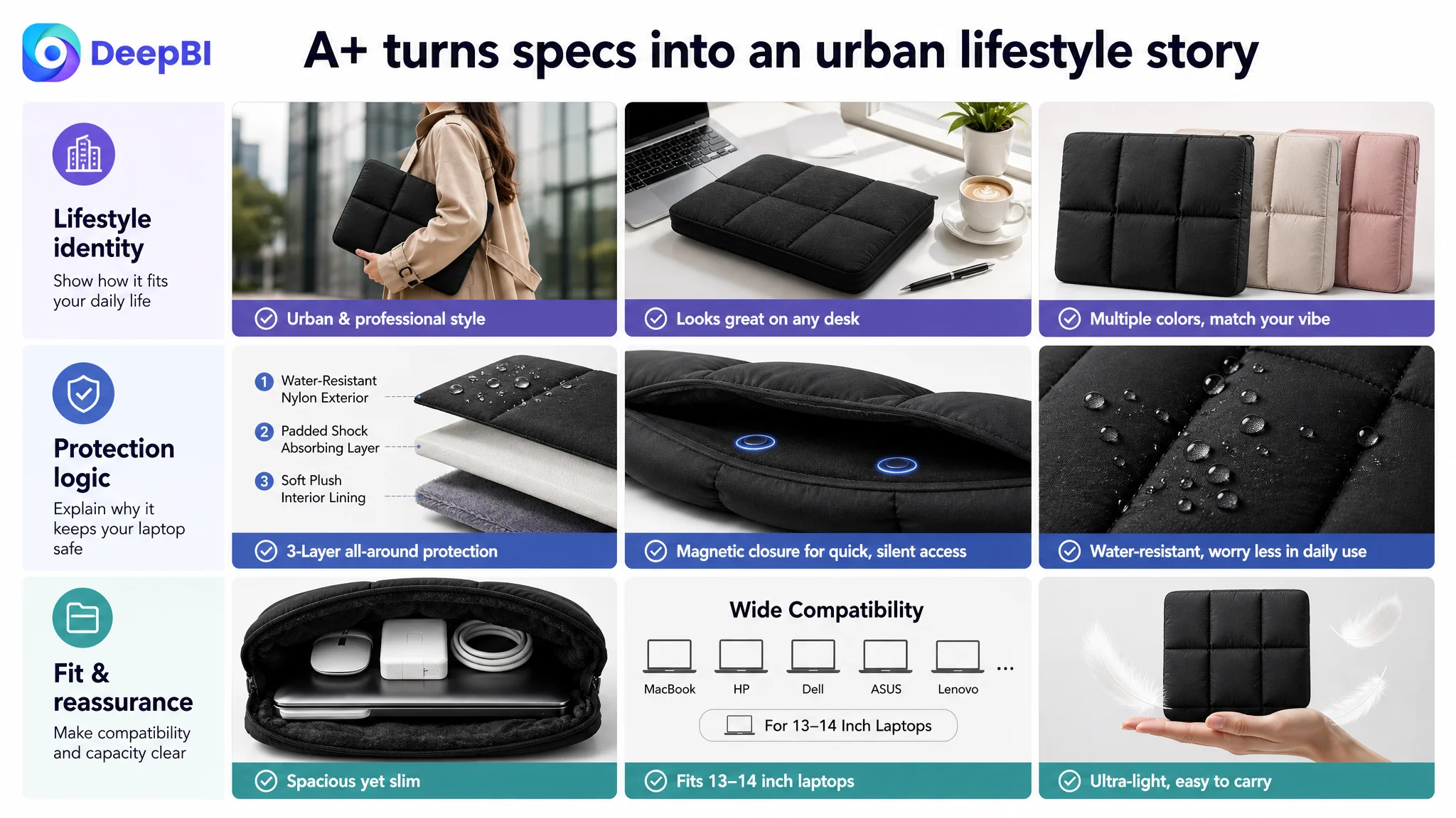
1. Lead with an urban lifestyle scene
- Female commuter in a modern city, casually carrying the sleeve.
- Soft afternoon light, blurred street background.
- Clear focus on the quilted texture and overall silhouette.
Purpose: Reframe the product as a fashionable everyday carry piece, aligning with how high-intent buyers see themselves.
2. Visualize 3-layer protection
- 45° exploded view of:
1. Waterproof outer layer.
2. Thick cushioning layer.
3. Soft plush inner lining.
- Simple numeric labels (1–3) and short functional text.
Purpose: Translate “Puffy Protection” from abstract wording into visible, understandable engineering.
3. Highlight magnetic closure as the differentiator
- Macro top-down shot of the opening, slightly ajar.
- Focus on the magnetic strip and soft inner lining.
Purpose: Position the zipper-free, magnetic design as:
- Quick, quiet access.
- Lower risk of scratching device edges.
- Cleaner, more minimal aesthetic than zipper competitors.
4. Prove capacity & compatibility visually
- Flat lay of the sleeve with a 13–14" laptop, phone, and mouse arranged around it.
- Text block listing compatible mainstream laptop models.
Purpose: Reduce the “will this fit my device?” anxiety that often stalls conversion.
5. Make water resistance tangible
- Extreme close-up of the fabric surface with crystal-clear water beads.
- Strong side lighting to highlight repellence.
Purpose: Solidify durability and protection in the buyer’s mind.
6. Anchor the sleeve in real work-life usage
- Bright, minimal office desk scene.
- Sleeve next to coffee, notebook, pen, and greenery.
Purpose: Associate the product with a professional, organized, taste-driven work style.
7. Resolve the “puffy = heavy” misconception
- Hand holding the sleeve by two fingers, with a few white feathers floating nearby.
Purpose: Visually communicate “light as a feather” while still looking protective.
“Puffy” was repositioned from a weight liability into a comfort and style asset, backed by clear visuals.
Bullet Points: Aligning Text With the New Visual Logic
Since the bullet-point structure was already stronger than the competitor’s, DeepBI’s work here was more about alignment and sharpening than reinvention.
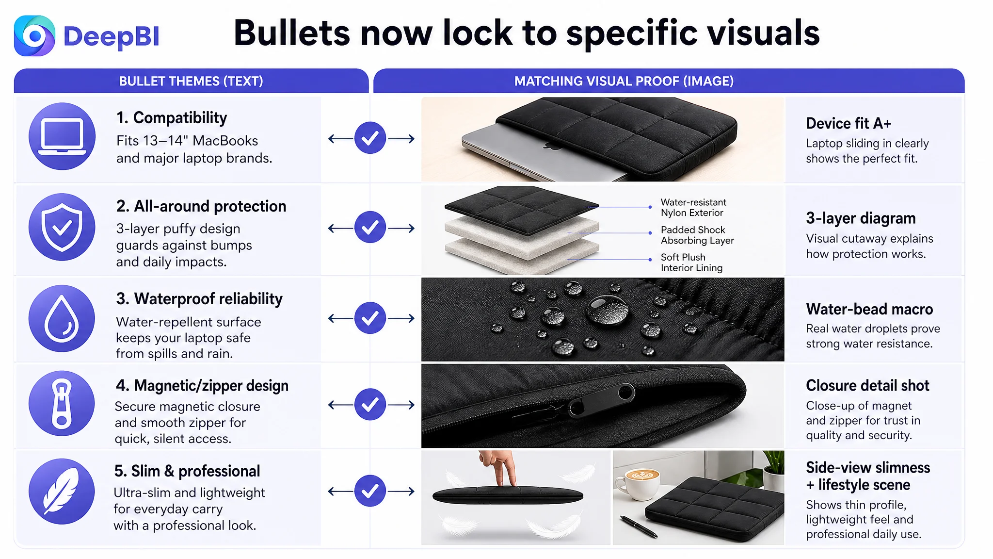
The revised bullets focused on:
1. Universal Compatibility & Precision Fit
- Concrete coverage of MacBook Air/Pro models and main Windows brands.
- Clear positioning as an “all-in-one protective solution” for laptops and tablets.
2. 360° All-Around Protection
- Emphasizing the dual-defense design: plush interior + durable exterior.
- Reinforcing the 3-layer visual story in text.
3. Waterproof Exterior & Daily Reliability
- Explicitly linking the premium waterproof nylon to real-world scenarios (rain, coffee spills, commuting).
4. Secure Magnetic Closure & Zipper-Free Access
- Contrasting quiet, smooth magnetic closure with the risks of metal zippers.
- Framing it as a smarter, more refined choice.
5. Slim Profile & Professional Dimensions
- Transparent internal/external dimensions.
- Connecting slimness and aesthetic to work, study, and travel contexts.
The result: bullets that not only sounded attractive but also matched the imagery and A+ structure one-to-one.
What Changed for the Seller—Even Before Heavy Ad Scaling
Because this case is early-stage and the ASIN started from zero reviews, we do not have long-term data curves yet. But several operational changes were immediate:
- The Listing score gap to the benchmark shrank:
While the competitor still held the review advantage, the target Listing’s weak modules (title, images, A+) now had a clear roadmap to catch up structurally.
- The product page began to offer a complete persuasive path:
- Click trigger (hero image + title).
- Size & bulk reassurance (side view, dimensions).
- Protection proof (3-layer A+, water-resistance macro).
- Lifestyle identification (urban, office scenes).
- Differentiated feature (magnetic closure).
- The seller gained a clearer boundary for ad investment:
- Instead of hesitating blindly, they could say:
“Once this new Listing version is live and initial reviews appear, we can safely test higher ad budgets because the page is now structurally capable of converting traffic.”
From a risk perspective:
- The Listing was no longer in a state where every click was a high-trust gamble.
- Ads, when turned on, had a higher chance of contributing to reviews and organic ranking instead of just burning budget.
How the Seller’s Understanding of Amazon Changed
Before this diagnosis, the seller’s thinking was:
- “Our images look fine; the issue is time and reviews.”
- “If we can just get more ads running, orders will come.”
After working through DeepBI’s Listing analysis and optimization logic, their understanding shifted in several key ways:
1. Amazon ads cannot compensate for a structurally weak product page.
If the title, main images, A+, and reviews are not aligned with category winners, ad spend mostly magnifies inefficiency.
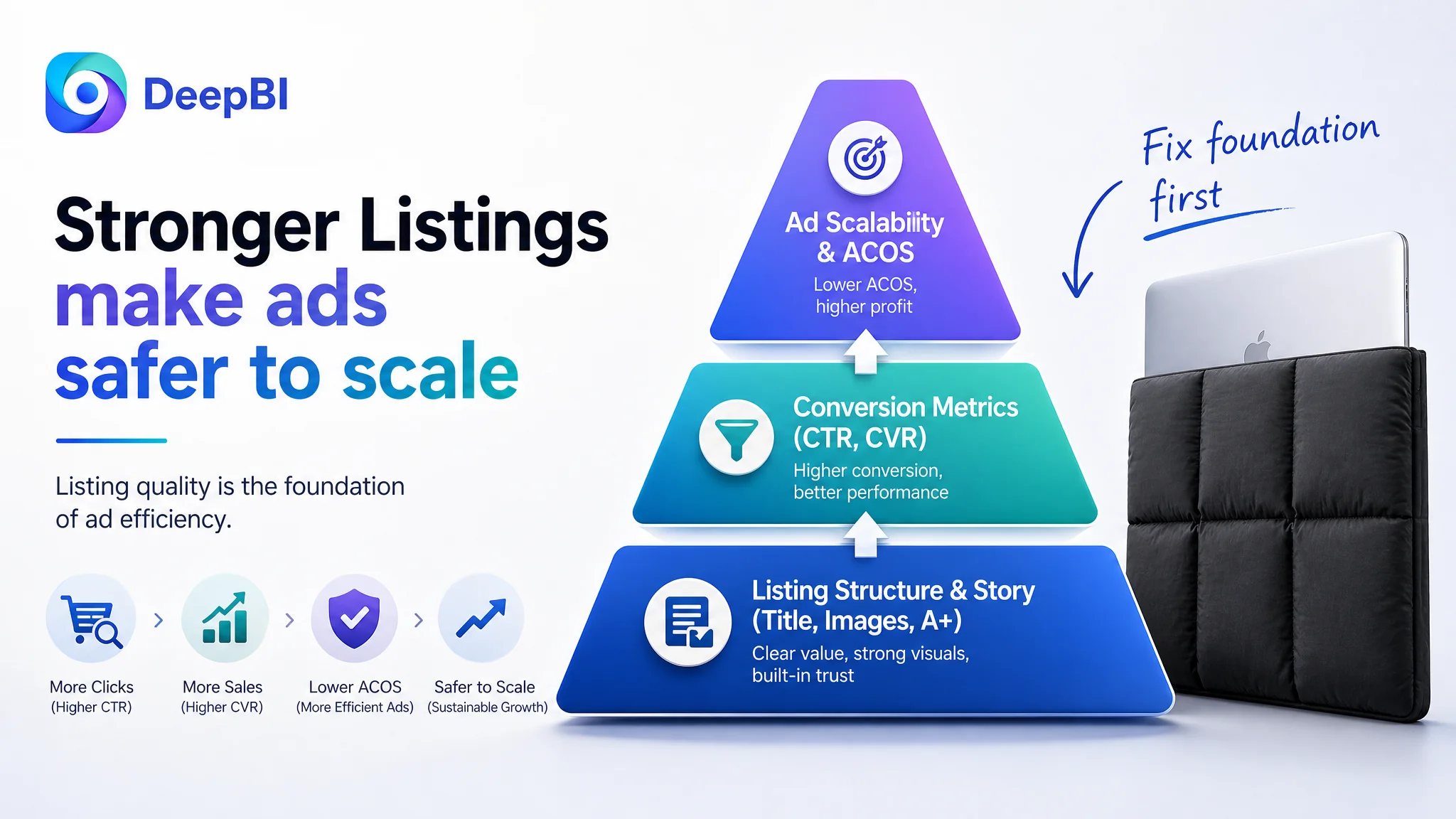
2. Listing quality is the foundation of advertising efficiency.
CTR and CVR are not just ad problems; they are page problems first.
3. Title, main image, bullets, and A+ must tell one coherent story.
Having strong bullet points alone is not enough if images and A+ fail to visually prove and reinforce those claims.
4. Before scaling ads, you must judge whether the page deserves more traffic.
Benchmarking against the real category ceiling—not just “looks good to us”—is a necessary step.
5. In fashion-adjacent categories (like puffy laptop sleeves), lifestyle framing is not a luxury; it’s core to conversion.
Buyers want to see themselves in the images, not just see the product.
Takeaways for Other Amazon Sellers
If you recognize yourself in this case—“our Listing looks fine, but ads feel dangerous to scale”—consider:
- Benchmark your Amazon Listing objectively:
- How does your title structure, image set, A+ depth, and review block truly compare to a top ASIN in your exact niche?
- Identify the single biggest bottleneck:
- In this case, it wasn’t ad structure or bullet-point quality; it was the lack of a full, trustable product-page story.
- Sequence your optimization correctly:
- Fix Listing conversion capacity first.
- Only then use Amazon ads to accelerate.
DeepBI’s value in this case was not “adding features” or “making nicer pictures.” It was in changing the judgment of what the real problem was, and aligning every visual and textual element of the Amazon product page with the way real shoppers actually decide.
For many Amazon sellers, that shift in judgment is where ACOS finally becomes manageable—and where traffic starts to work for you instead of against you.