

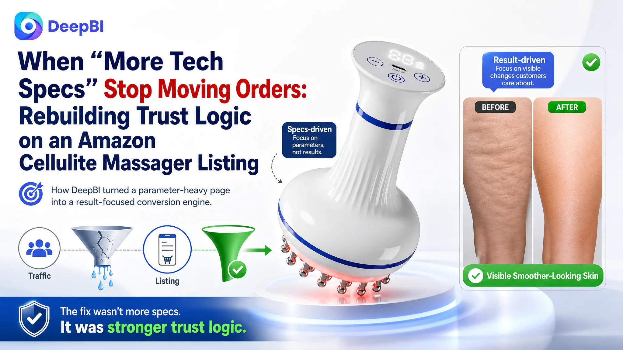
For this Amazon seller in the personal-care category, the problem did not begin with a lack of traffic. Their electric cellulite and lymphatic drainage massager was already competing head‑to‑head with a strong benchmark listing on Amazon US. Ads could bring visitors to the page. The pressure came from somewhere else: a product page that looked technical, but did not fully convince users to buy.
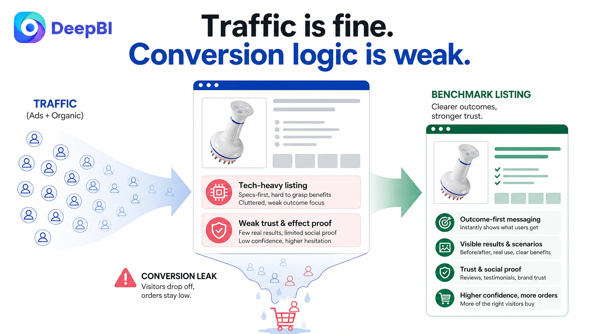
The customer originally believed the issue was about fine‑tuning Amazon ads and highlighting more hardware advantages—more zinc alloy nodes, more levels, more EMS and red light parameters. In practice, ACOS remained hard to control, and traffic converted less efficiently than a key competitor. DeepBI’s listing scoring and content analysis showed that the real gap was not in “how much was said,” but what was being said and in what order: the title, A+ content, images, and reviews were under‑serving the core promise of visible body‑contouring results.
By reframing the problem from “ad performance” to “listing conversion capacity,” DeepBI pushed the team to fix the page before pumping in more traffic. The later optimization focused on the Amazon Listing itself—title logic, bullet‑point framing, main image and A+ visual storytelling, and trust modules like before/after effects and user stories—so that both organic and paid visitors would see a credible, result‑oriented solution instead of a lab device.
For other Amazon sellers, the case is a reminder: when a competitor wins with fewer technical claims but clearer outcomes, the bottleneck is rarely solved at the campaign level. If the product page cannot build trust and make the result tangible, ads will only amplify a weak conversion engine.
Amazon Ads Were Not Failing. The Page Was Consuming the Traffic.
On the surface, this listing did not look weak. In DeepBI’s scoring, the product page reached 73/100, only 10 points behind a well‑performing benchmark at 83/100 in the same Amazon US subcategory. Main image and bullet‑point dimensions were basically competitive:
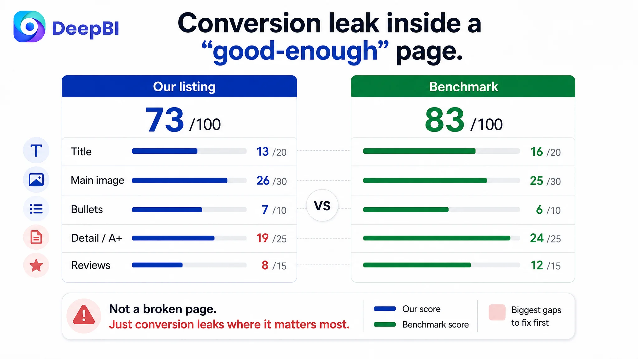
- Title: 13 vs 16 (out of 20)
- Main image: 26 vs 25 (out of 30)
- Bullet points: 7 vs 6 (out of 10)
The obvious gaps were elsewhere:
- Detail/A+ content: 19 vs 24 (out of 25)
- Reviews: 8 vs 12 (out of 15)
This meant the core constraint was not a completely broken page, but a conversion leak inside a roughly adequate listing—a far more dangerous state, because it tempts teams to blame ads or bids instead of revisiting how the page actually persuades.
The seller’s operations team initially focused on:
- Highlighting more hardware specs and “clinical‑style” features
- Testing Amazon ad structures and bids
- Expecting higher impressions and clicks to eventually “push” orders up
What they did not see was that the benchmark listing needed less effort to turn each visit into a sale. It felt more like a high‑end beauty tool with predictable results, while their page still read like a technical medical gadget with incomplete proof.
“The real problem was not that ads failed to bring traffic. It was that the page could not convert the traffic.”
The Real Constraint Was Listing Conversion Capacity, Not Technical Depth
DeepBI’s diagnosis made one judgment clear: this was a result‑driven product sold on a parameter‑driven page. For cellulite and lymphatic drainage tools, the purchase decision revolves around visible changes, comfort, and trust—not just temperature ranges and RPM.
Three core gaps emerged.
1. The title prioritized hardware over outcomes
The customer’s original title:
- Scattered keyword layout; “Lymphatic Drainage Massager” not front‑loaded
- Heavy emphasis on specs (25 Zinc Alloy Nodes, 30 Levels, etc.)
- Mixed “overview + detailed function” structure, making the logic feel long
- Weak semantic linkage between “Lymphatic Drainage” and related pain points
By contrast, the benchmark title:
- Led with “Lymphatic Drainage Massager & Anti‑Cellulite Massage Tool”
- Quickly connected to body‑contouring and smoother skin
- Mapped to buyer intent: what area is treated, what result is expected
On Amazon, title logic has a direct impact on both search visibility and click intent. DeepBI’s scoring signaled that, even before users reached the page, this listing was under‑communicating the main benefit at the search result level.
2. A+ content lacked “effect visibility” and trust anchors
In the detail/A+ dimension, the gap was more severe: 19 vs 24.
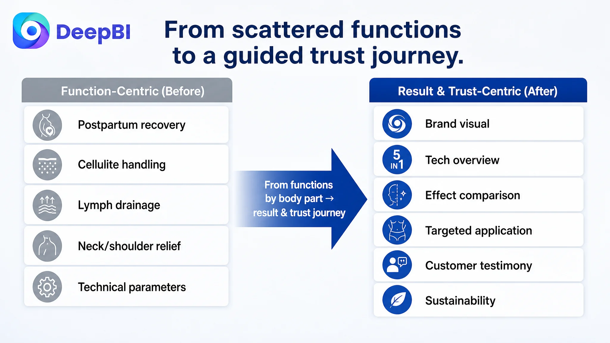
- The customer used six modules focused on functions: postpartum recovery, cellulite handling, lymph drainage, neck/shoulder relief, technical parameters.
- The benchmark used seven modules centered on results and trust: brand visual, 5‑in‑1 tech overview, multi‑maintenance breakdown, before/after comparison, targeted application by body area, customer testimony, sustainability claims.
Where the benchmark built a journey from technical legitimacy → personalized use → visible effect → social proof, the customer’s A+ simply moved from body part to body part. There was information, but no clear conversion path.
3. Reviews reinforced the perception gap
Review scoring reinforced the same story:
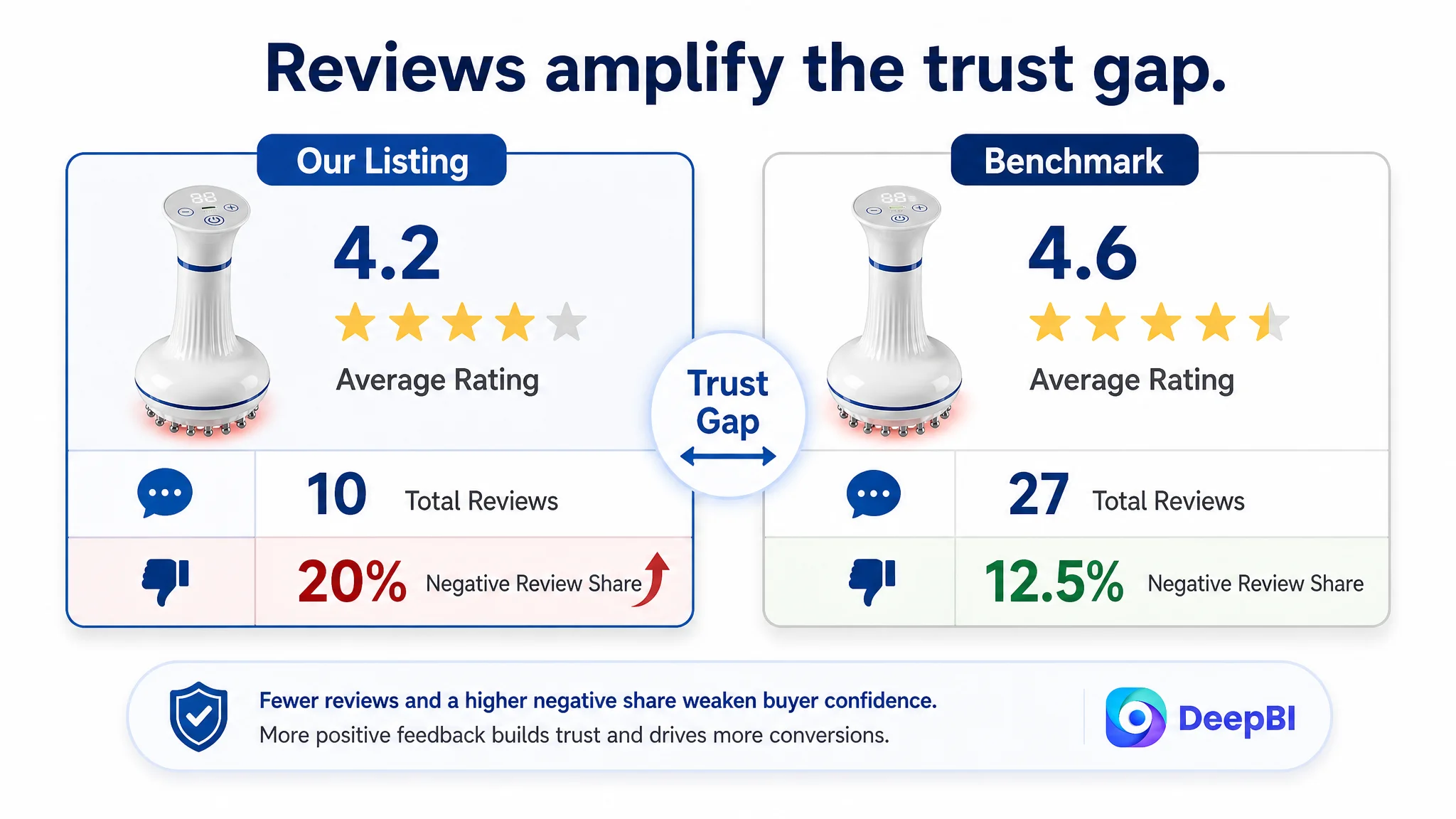
- Rating: 4.2 stars (10 reviews) vs 4.6 stars (27 reviews)
- Homepage reviews: 5 vs 8
- Negative review share: 20% vs 12.5%
The benchmark’s reviews were short, positive, and focused on core experience: relaxation, portability, visible improvements. The customer’s included longer analyses with detailed pros and cons, inadvertently amplifying perceived drawbacks.
DeepBI’s conclusion: the listing did not lack claims; it lacked a coherent trust narrative. Fixing this narrative was more urgent than another round of bid adjustments.
Why DeepBI Did Not Keep Tuning the Ads First
From a business‑risk view, continuing to optimize ads on top of this page would have created three problems:
1. Higher spend into a low‑trust funnel
Ads would keep buying traffic that a benchmark listing could convert, but this listing could not. ACOS would stay inflated, and CVR would lag without a clear explanation.
2. Misleading feedback loops
When a page is “okay but not convincing,” ad metrics become noisy. It becomes hard to tell whether a keyword is weak or the page underperforms that keyword’s intent.
3. Erosion of organic potential
Amazon’s algorithm responds to conversion strength. A listing that fails to convert both paid and organic traffic risks losing keyword positions to better‑structured competitors.
DeepBI’s judgment was simple but decisive: before buying more exposure, the page had to be worth exposing. For this category, that meant turning a parameter‑heavy device into a credible, result‑focused wellness tool.
This Product Page Did Not Lack Traffic. It Lacked Trust.
DeepBI’s optimization path centered on rebuilding the sales logic inside the listing, not the bids around it. Four components became the focus:
1. Reframing the title around buyer outcomes
The recommended title:
Cellulite Massager & Lymphatic Drainage Tool, 4‑in‑1 Electric Gua Sha Meridian Brush for Body Sculpting, Legs, Arms & Stomach, Heated Red Light EMS Vibration Massager for Smoother Skin
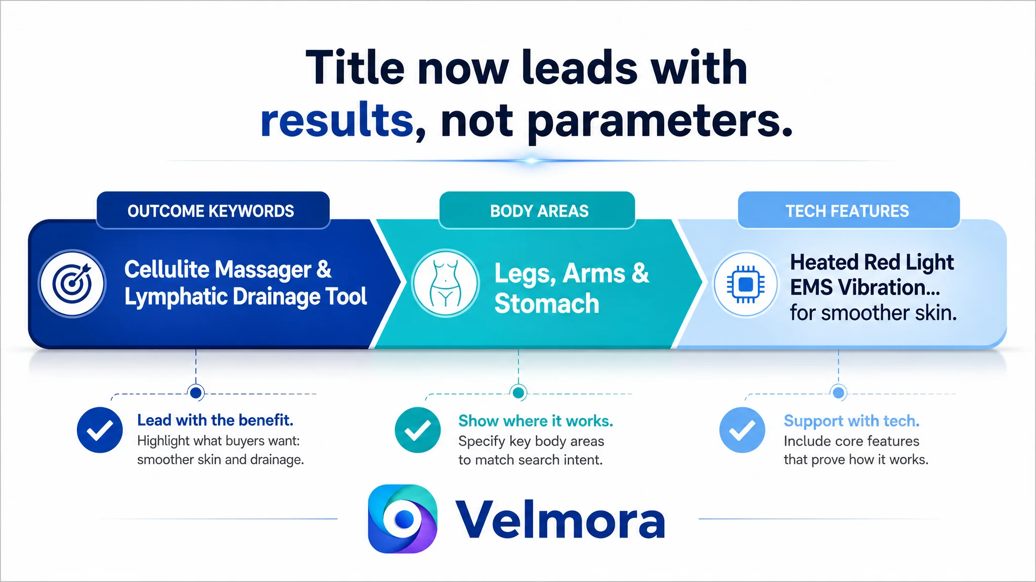
Key changes in logic:
- Outcome‑first: opening with “Cellulite Massager & Lymphatic Drainage Tool”
- Clear body areas: “Legs, Arms & Stomach” for instant applicability
- Balanced tech and benefit: EMS, heated red light, vibration paired with “for smoother skin”
This title layout aligns better with Amazon search behavior and ensures that users already understand what result they are evaluating before clicking into the listing.
2. Turning bullet points into a buying path, not a spec sheet
Originally, the seller’s bullet points were well‑structured but heavily technical—EMS, temperature ranges, RPM, battery capacity. DeepBI did not discard that strength; it reorganized it around a “pain point → method → outcome” logic:
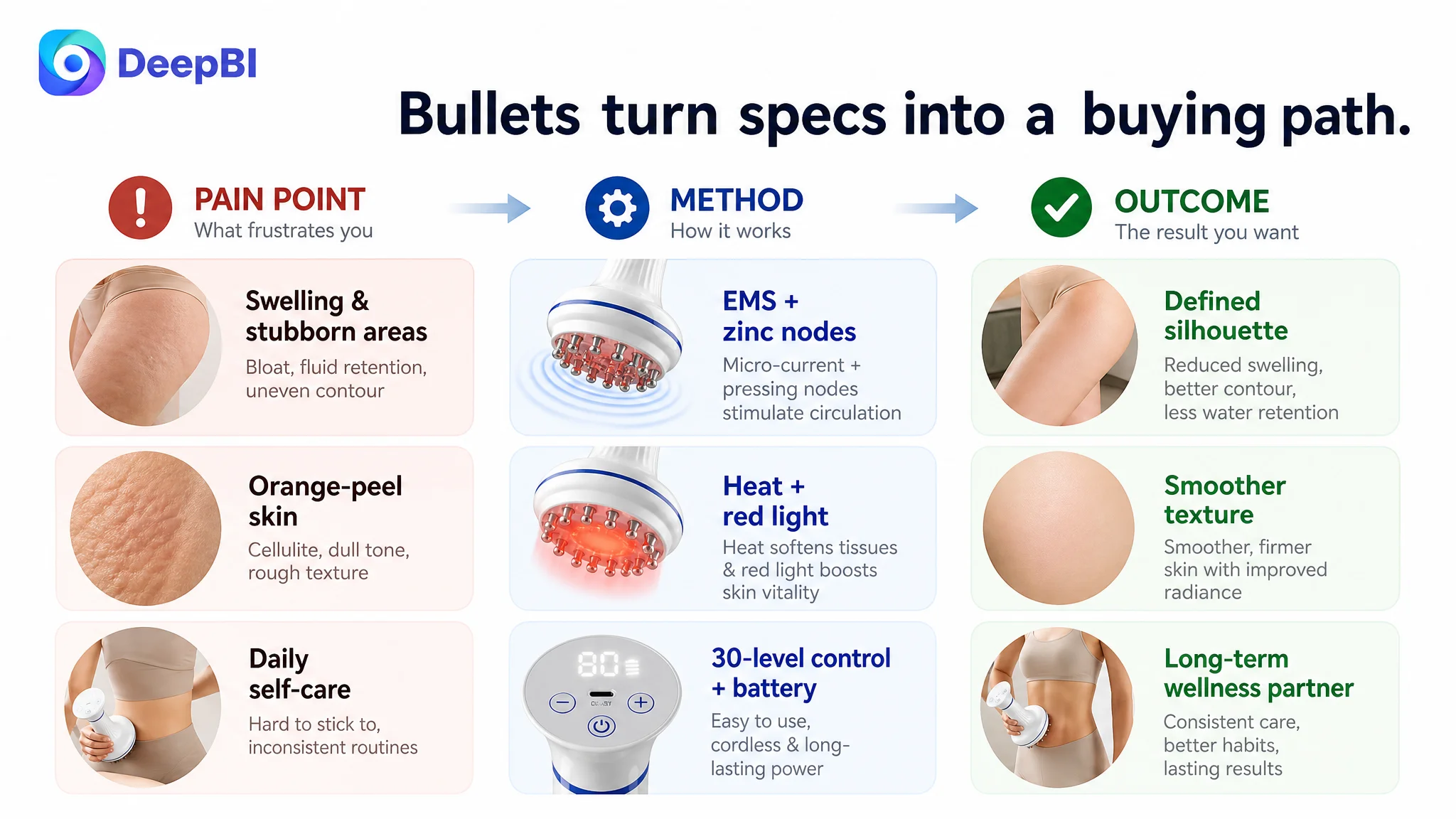
1. Professional contouring & drainage
Hardware (25 solid zinc alloy teardrop nodes) is positioned as the engine behind at‑home professional‑grade lymphatic drainage and targeted sculpting, directly referencing stubborn areas like abdomen and thighs.
2. Cellulite reduction & skin revitalization
Tech (100–140°F, 660nm red light) is bound to specific cosmetic outcomes—cellulite, orange‑peel skin, tissue softness, radiance—so the buyer sees a concrete skin‑change scenario.
3. Precision customization with 30‑level control
Instead of generic “multiple modes,” this bullet formalizes a digital adjustment story: EMS, vibration, and heat independently tuned for gentle drainage vs deep fascia release.
4. Powerful & secure design with 3000mAh battery
Battery capacity becomes a proxy for consistent professional‑grade output, supporting all functions simultaneously and reinforcing safety and hygiene.
5. All‑in‑one wellness partner
The last bullet elevates positioning: from a single recovery tool to a comprehensive wellness solution suited for daily sculpting, post‑workout relief, long‑term care, and gifting.
In short, the technical depth is kept, but each bullet now walks the buyer from what hurts or worries them to how this device addresses it and what they can expect over time.
“The bullet points had information, but not a buying logic. The optimization turned specs into a narrative that could justify the price and usage effort.”
3. Main images: from “device display” to “effect and usage story”
The benchmark listing used images to do what text cannot:
- Show visible “before/after” differences
- Connect product to a real body in a calming environment
- Make complex technology (multi‑mode massage, warming, vibration) feel tangible
DeepBI’s visual strategy for the customer listing mapped directly to those gaps:
The primary thumbnail: pain point and effect in one frame
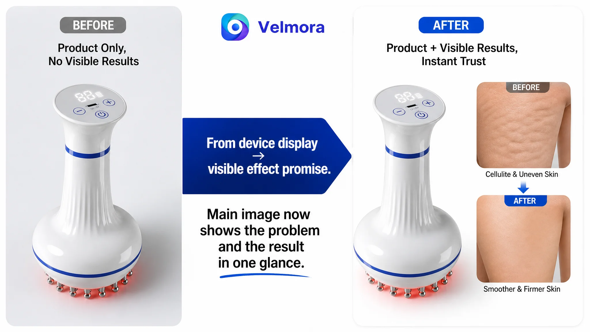
- Product on the left (about 50% of the image) in a clear white background with lit digital screen
- On the right, a skin close‑up: top block showing pronounced orange‑peel texture, bottom block showing smoother skin, connected by a subtle arrow
- Clean, clinical‑yet‑warm feel to signal professional capability and attainable improvement
This makes the promise of change explicit on the search results page, boosting CTR and setting a realistic expectation before users even read the bullets.
Human‑use scene: turning a device into a lifestyle choice
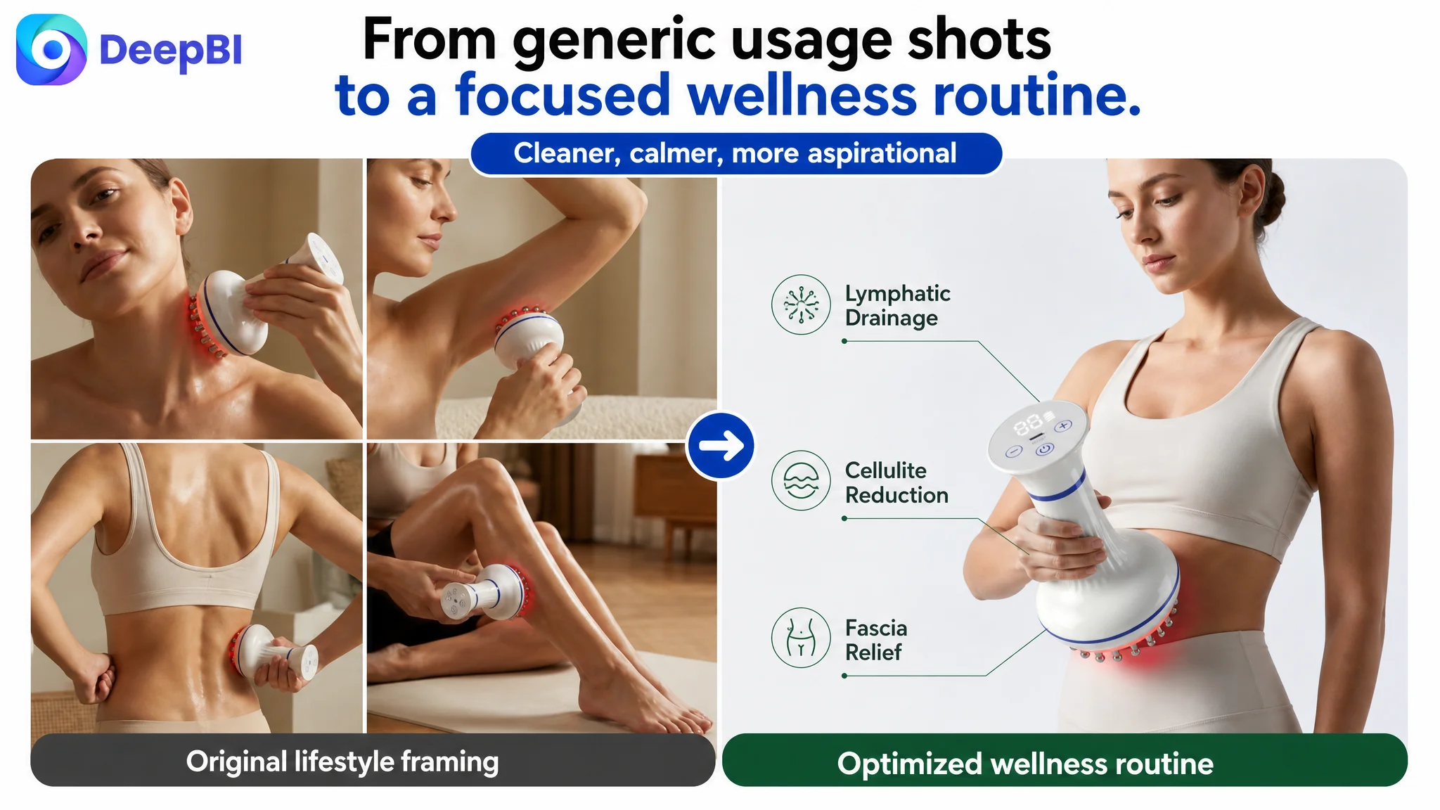
- Model in light yoga wear, using the product on the abdomen
- Minimal, soft‑gray studio background; gentle side lighting to shape body contours
- A soft red glow around the massage head to hint at active therapy
Rather than a cut‑off body part, this image situates the device in a high‑end yet approachable wellness routine—crucial for a female‑skewed audience evaluating self‑care as much as pure functionality.
Technology breakdown and usage grid
Additional images:
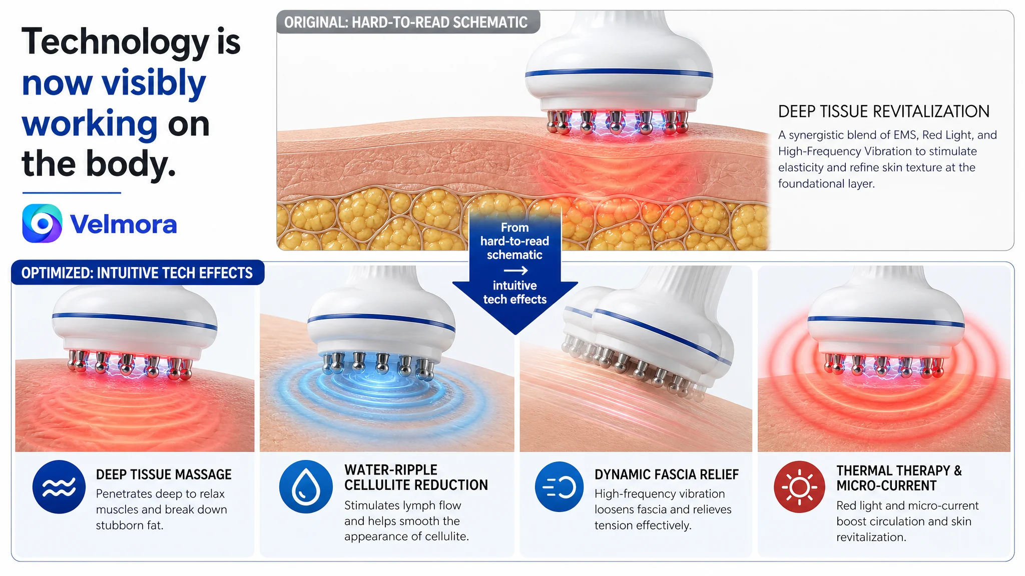
- A 4‑grid composition visualizing core tech: close‑up of the massage head, blue water‑wave effect, dynamic blur for motion, red glow for warmth/red light—each with clear labels.
- Another 4‑grid scene with the same model treating thighs, waist, arms, and back, numbered and color‑coded.
These address two cognitive questions:
- “What is this thing actually doing to my skin/tissue?”
- “Can it cover all the areas I care about, or is it limited?”
By answering both visually, the listing reduces the need for users to mentally simulate usage, making the decision lighter.
Before/after montage for multiple body areas
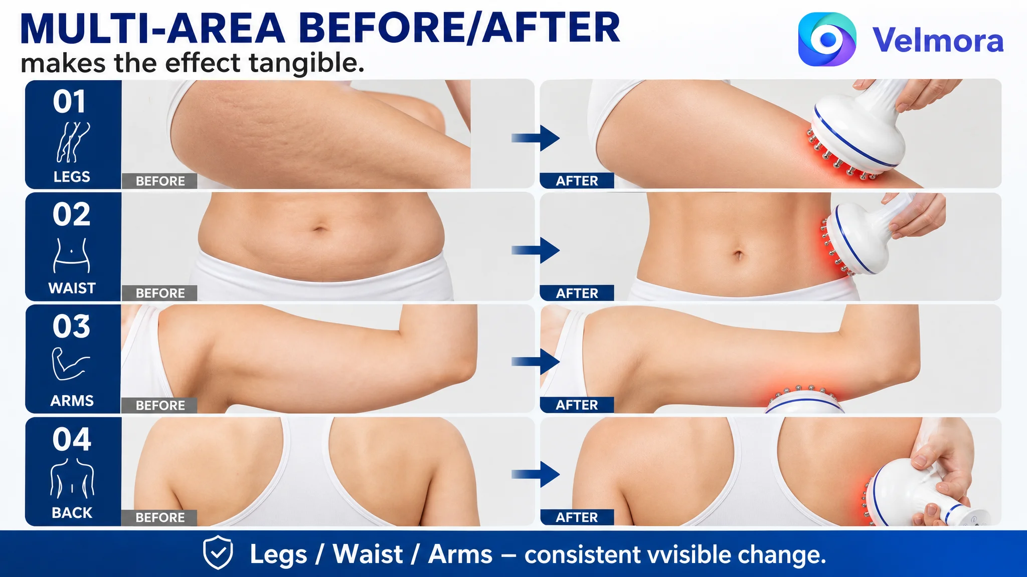
One image is devoted purely to effects:
- Three rows comparing legs, waist, and arms in “Before” vs “After”
- Neutral, clean lighting, no distracting background
This directly tackles the category’s biggest trust barrier: will I see enough change to justify the price and effort?
4. A+ content: stitching together result proof, lifestyle, tech, and social proof
Beyond individual images, DeepBI reshaped the intended structure of the A+ modules to mirror the benchmark’s user journey:
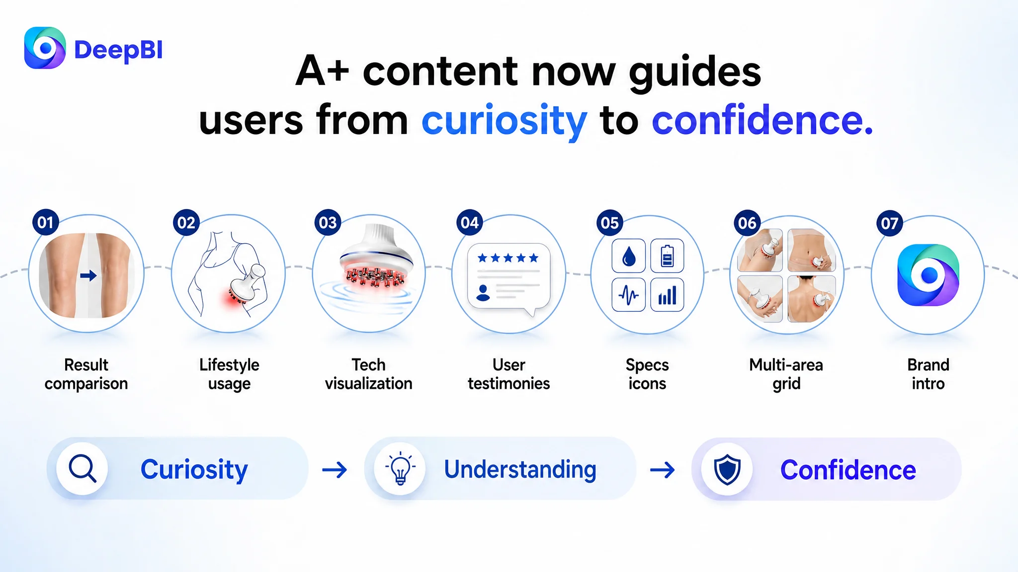
1. Result comparison module
Multi‑area before/after visuals (stretch marks, cellulite, skin firmness) with careful, credible lighting and natural skin tones.
2. Lifestyle usage module
Home‑SPA scene: user in white loungewear on a neutral sofa, natural light, plants in the background, a relaxed posture—reframing the device as a calming daily ritual, not just a treatment.
3. Technology visualization module
EMS and red light represented as layered blue pulses and red heat halos penetrating the skin, giving substance to terms like “microcurrent” and “heat therapy.”
4. User trust and testimonies module
Avatar and speech‑bubble design echoing social platforms: short quotes, high star ratings, different use cases (postpartum, desk worker, fitness), to create relatable scenarios and social proof.
5. Parameter and spec module
Product front view with icon grid for waterproofing, battery, intensity levels, etc., concentrating performance cues instead of scattering them across the page.
6. Multi‑area usage grid
2x2 layout showing legs, abdomen, arms, and back, with consistent lighting and visible active status (red glow).
7. Brand‑level introductory visual
Centered product surrounded by fluid graphic lines symbolizing lymph flow and detox, in clean blue‑white tones, establishing a “professional yet approachable” brand identity.
This A+ structure does what the original could not: lead the user from curiosity to confidence in a controlled sequence.
Before Ads Could Work Again, the Page Had to Convert
DeepBI’s role in this case was not to promise a magical CTR or ACOS number. It was to force a change in operating logic:
- From: “Our device has strong specs; ads should eventually pick it up.”
- To: “Our listing must convincingly show the results, usage, and trust; only then will ads have a fair chance to perform.”
Once the title, bullets, main images, and A+ modules were aligned around:
- Visible, believable effects
- Clear usage scenarios
- Structured tech explanations
- Social proof and review framing
the listing’s conversion capacity began to recover. That created three practical shifts in the customer’s business state:
1. Ad traffic became useful again
Paid clicks were no longer landing on a page that looked more like a datasheet than a solution. The team could start reading ad metrics as real feedback, not noise.
2. Organic potential was protected
With stronger conversion signals, the listing had a better chance to maintain or regain keyword positions, reducing over‑dependence on paid traffic.
3. Operations became more controllable
The seller could decide how much traffic to buy with a clearer sense of how the page would handle it, rather than continuously raising bids into an opaque funnel.
What This Case Means for Other Amazon Sellers
Several lessons generalize beyond lymphatic drainage tools:
- Ads cannot repair a weak value story. If a benchmark listing converts better with fewer specs but stronger outcome framing, the priority is not another bid test—it is a listing diagnosis.
- Title, main image, bullets, and A+ must tell one coherent story. Fragmented improvements (a better image here, a new phrase there) rarely fix conversion if the overall path from pain point to proof remains broken.
- Result‑driven categories need visible effects and emotional context. For beauty, body‑care, and wellness devices, parameters support the story; they are not the story.
- Reviews and A+ trust modules are part of the conversion engine. They do not just “decorate” the page—they determine whether high‑intent visitors feel safe enough to buy.
Most importantly, this case shows the kind of judgment DeepBI aims to provide: not just where to change pixels or words, but in what order to change them so that Amazon ads and organic traffic work on top of a listing that actually deserves to sell.