

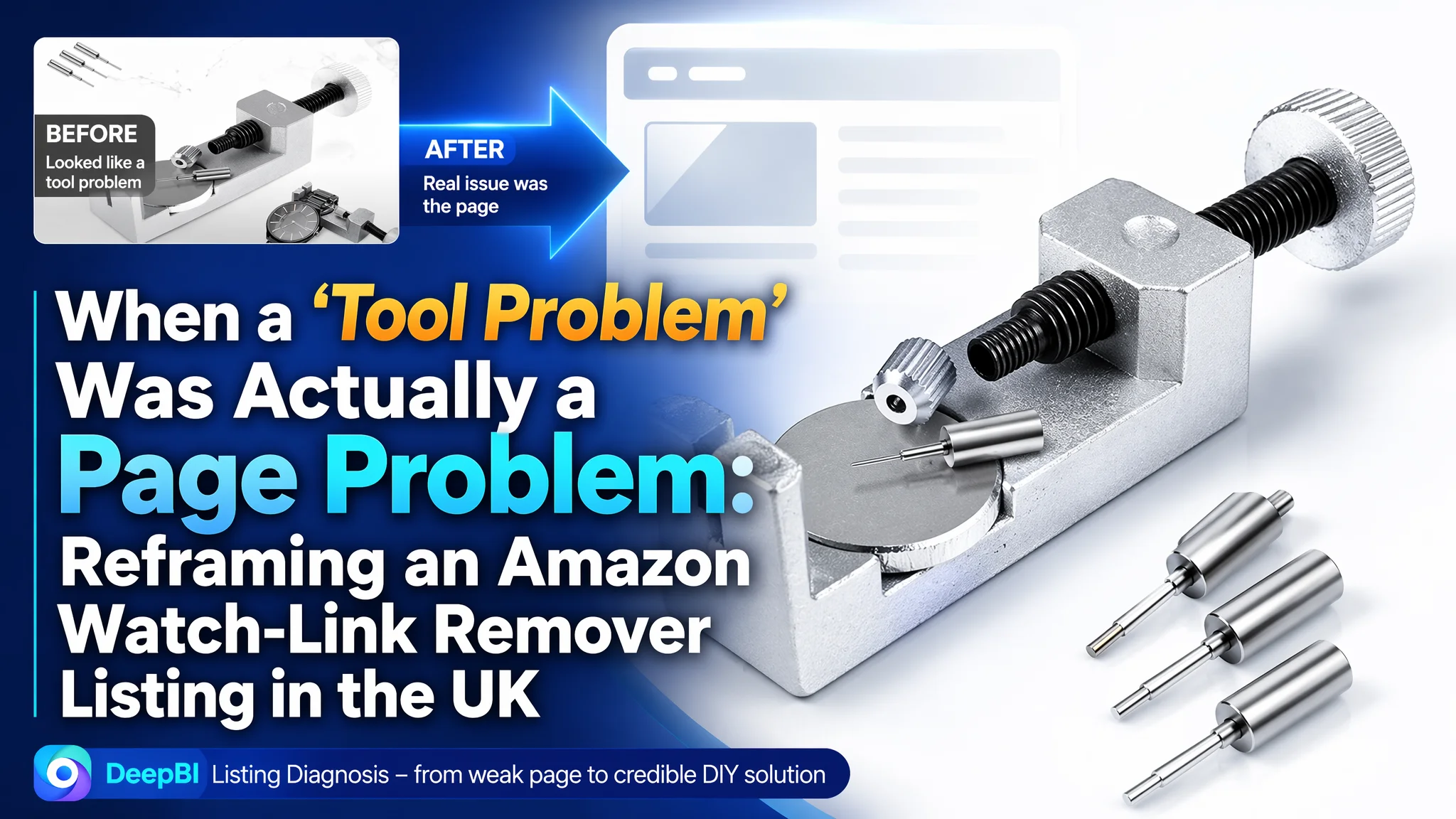
For this Amazon seller in the UK watch-repair tools category, the pressure first appeared in the ads. Clicks were not turning into enough orders, and the team naturally suspected issues with targeting and bids. They kept asking how to “push exposure harder” and “get more traffic” to a watch band link removal tool. But once DeepBI ran a Listing diagnosis against the category benchmark, it became clear the ads were not the real bottleneck—the Amazon product page itself could not convincingly convert the traffic it already had.
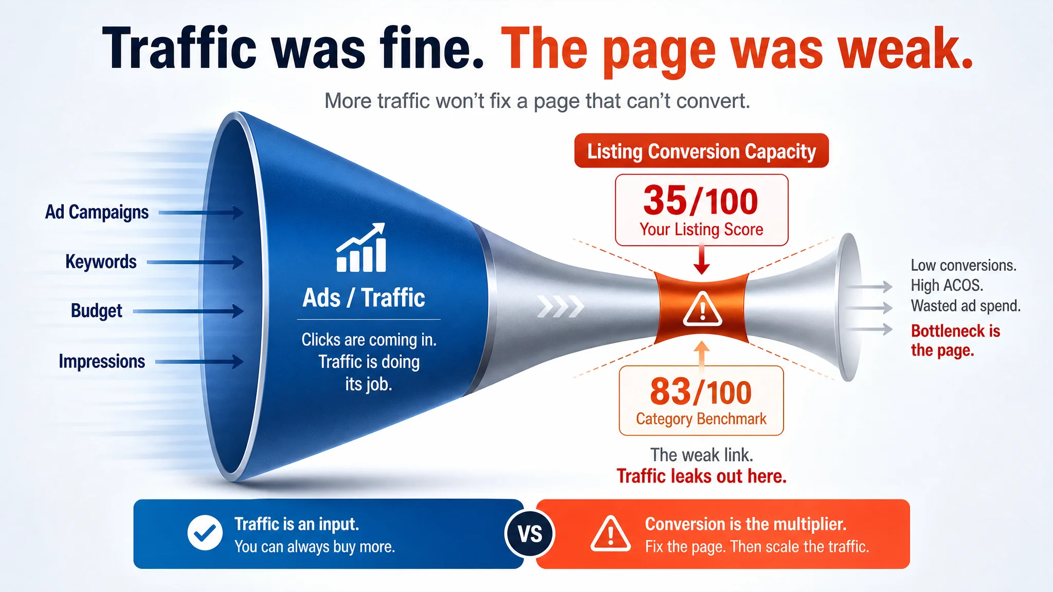
The Listing scored only 35/100 against a comparable benchmark at 83/100. Title, main image, bullet points, A+ content, and reviews all lagged together, forming a structural conversion leak. The seller’s optimization efforts had focused on technical feature wording and basic specs, while the benchmark listing was built around clear strap‑adjustment outcomes, visualized steps, and trust‑building A+ modules. In other words, ads were being asked to compensate for a page that had never been given real sales capacity.
DeepBI’s judgment was to pause the reflex of “keep tuning ads” and instead reconstruct the Listing’s decision logic: rewrite the title around search intent and strap‑adjustment benefits, rebuild the main image and gallery as a professional, step‑by‑step tool story, and design A+ modules that explain function, boundaries, and use scenarios. As these elements were aligned, the product page began to offer a credible DIY solution instead of a bare tool picture, and ad traffic had a much better chance of turning into orders.
For other Amazon sellers, the lesson is blunt: when ACOS feels high and ads “underperform,” the real issue may be that the Listing cannot carry the traffic. Before adding budget, it’s worth asking whether the title, main image, bullets, A+ content, and review base together create a clear, low‑friction path from search intention to purchase. In this case, reframing the problem from “ads are weak” to “page cannot persuade” was the turning point.
The Core Constraint Was Not Traffic. It Was Listing Conversion Capacity.
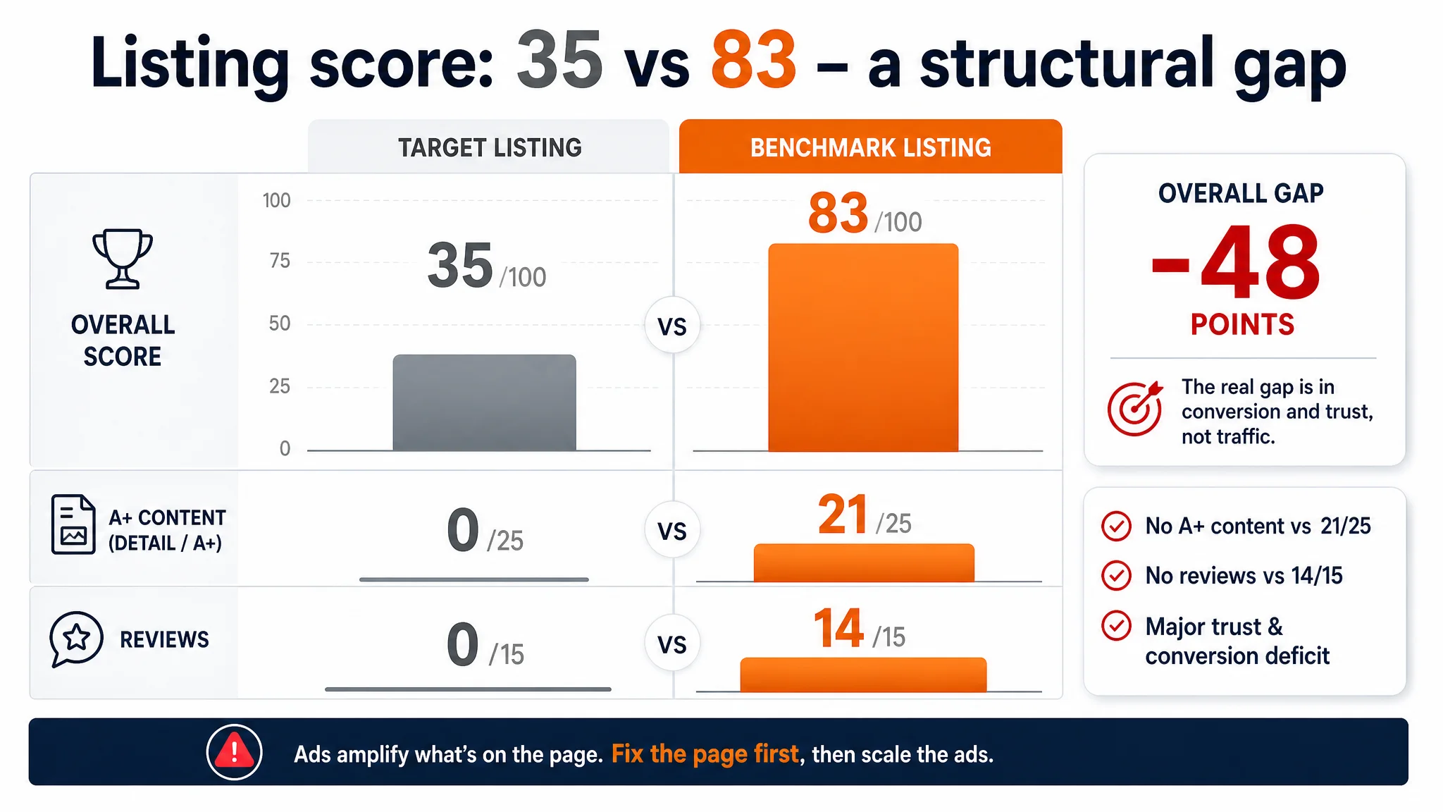
DeepBI’s Listing scoring for this watch link removal tool in the UK marketplace showed a stark gap:
- Target Listing: 35/100
- Benchmark Listing: 83/100
- Overall gap: –48 points
Breaking that down:
- Title: Target Listing: 8, Benchmark: 14, Max: 20, Gap: -6
- Main image & gallery: Target Listing: 21, Benchmark: 26, Max: 30, Gap: -5
- Bullet points: Target Listing: 6, Benchmark: 8, Max: 10, Gap: -2
- A+ / detail content: Target Listing: 0, Benchmark: 21, Max: 25, Gap: -21
- Reviews: Target Listing: 0, Benchmark: 14, Max: 15, Gap: -14
This is not a minor cosmetic issue; it’s a structural conversion deficit. Two dimensions are decisive:
- A+ / detail content: 0 vs 21 – the target Listing has no A+ at all; the benchmark has a full, structured explanation of function, usage, and limits.
- Reviews: 0 vs 8862 reviews / 4.4 stars – the target Listing has no rating or review base; the benchmark has a mature trust layer.
“The real problem was not that ads failed to bring traffic. It was that the page could not convert the traffic.”
With this score profile, any push on ads amplifies a page that is fundamentally under‑equipped to convert. From a business perspective, the biggest risk was not “losing impression share” but burning ad spend into a low‑trust, low‑clarity Listing.
How the Seller Misread the Problem
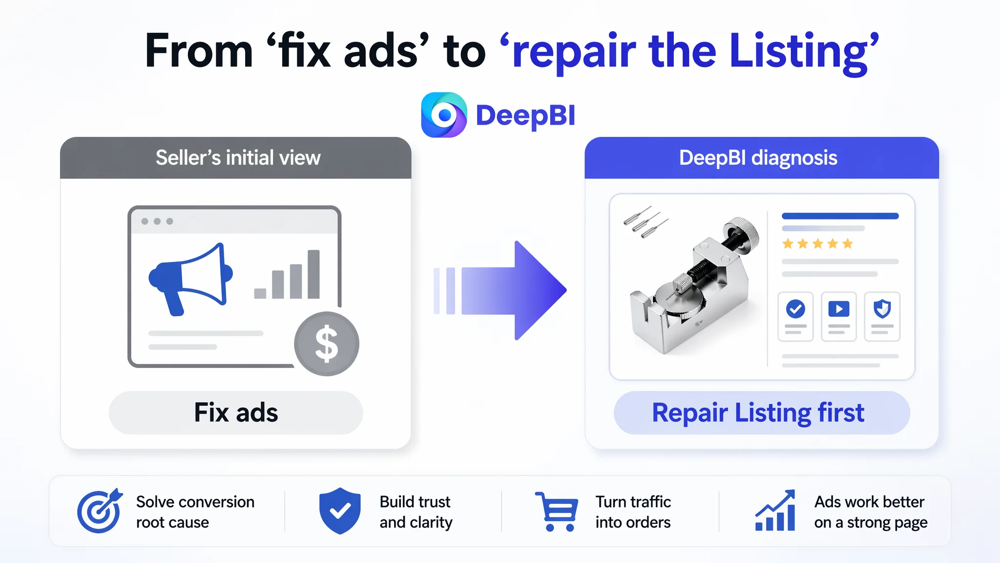
Before the diagnosis, the seller’s thinking focused on operational levers they knew well:
- Improve ads to win more exposure.
- Run campaigns on “watch link removal tool” and related terms.
- Emphasize the product’s technical features (adjustable platform, threaded push rod, aluminium alloy).
The implicit judgment was:
- “If traffic is slow or ACOS is high, the ads must be the issue.”
- “Our page already shows the tool; the problem is we’re not getting in front of enough people.”
DeepBI’s scoring and benchmark comparison showed that this judgment missed the central constraint:
- Search visibility and click‑through were not the real ceiling.
- Conversion and trust were.
Traditional ad optimization—adjusting bids, keywords, budgets—could not fix:
- A title that did not fully align with user intent.
- A main image that looked like a generic product shot instead of a clear solution.
- Bullet points that described components and steps but did not frame outcomes.
- A completely empty A+ section.
- Zero reviews to anchor trust.
Ads were being asked to perform on a Listing that lacked a coherent buying story.
Title: Technical Description vs Search Intent and Outcomes
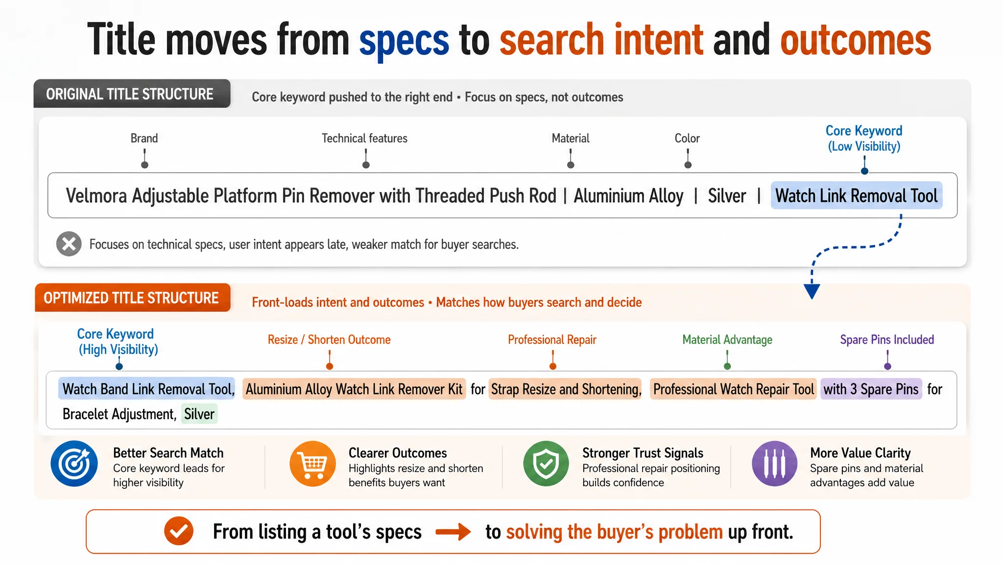
The seller’s original title structure followed a basic pattern:
- Brand + function description + material + color.
From a category point of view, it was technically correct but commercially weak. The key issues:
- Core keyword position
The main search term “watch link removal tool” was sent to the back of the title. The benchmark listing front‑loaded “Watch Link Removal Kit” and related search phrases, aligning more directly with how shoppers search.
- Function wording vs user pain point
The seller emphasized technical phrases like “Adjustable Platform Pin Remover” and “Threaded Push Rod”. These make sense to a tool enthusiast but do not speak directly to common shopper intents such as:
- “shorten a metal watch band”
- “resize the strap”
- “adjust bracelet links at home”
The benchmark title uses phrases such as “for Strap Adjustment”, “Watch Resize Shortening Tool” and “Watch Band Repair Tool”, all tightly bound to the outcome the buyer wants.
- Information structure and density
The target title stayed at a basic spec level. The benchmark built a richer concept:
- Core keyword cluster (watch link removal kit / watch band repair tool).
- Multiple use aliases (bracelet chain pin remover, watch adjuster).
- Extra value signals (with user manual, punch pins).
DeepBI’s optimization logic therefore did not simply “add more words”. It rebuilt the title around:
Watch Band Link Removal Tool as the central phrase, paired with strap resize/shortening, professional repair positioning, and explicit mention of aluminium alloy and spare pins.
The proposed direction:
Watch Band Link Removal Tool, Aluminium Alloy Watch Link Remover Kit for Strap Resize and Shortening, Professional Watch Repair Tool with 3 Spare Pins for Bracelet Adjustment, Silver
This shifts the title from “what the tool is” to:
- What problem it solves (resize and shortening).
- For whom (home or professional watch repair).
- With what advantage (aluminium alloy durability, spare pins).
Main Image and Gallery: A Tool Without a Story
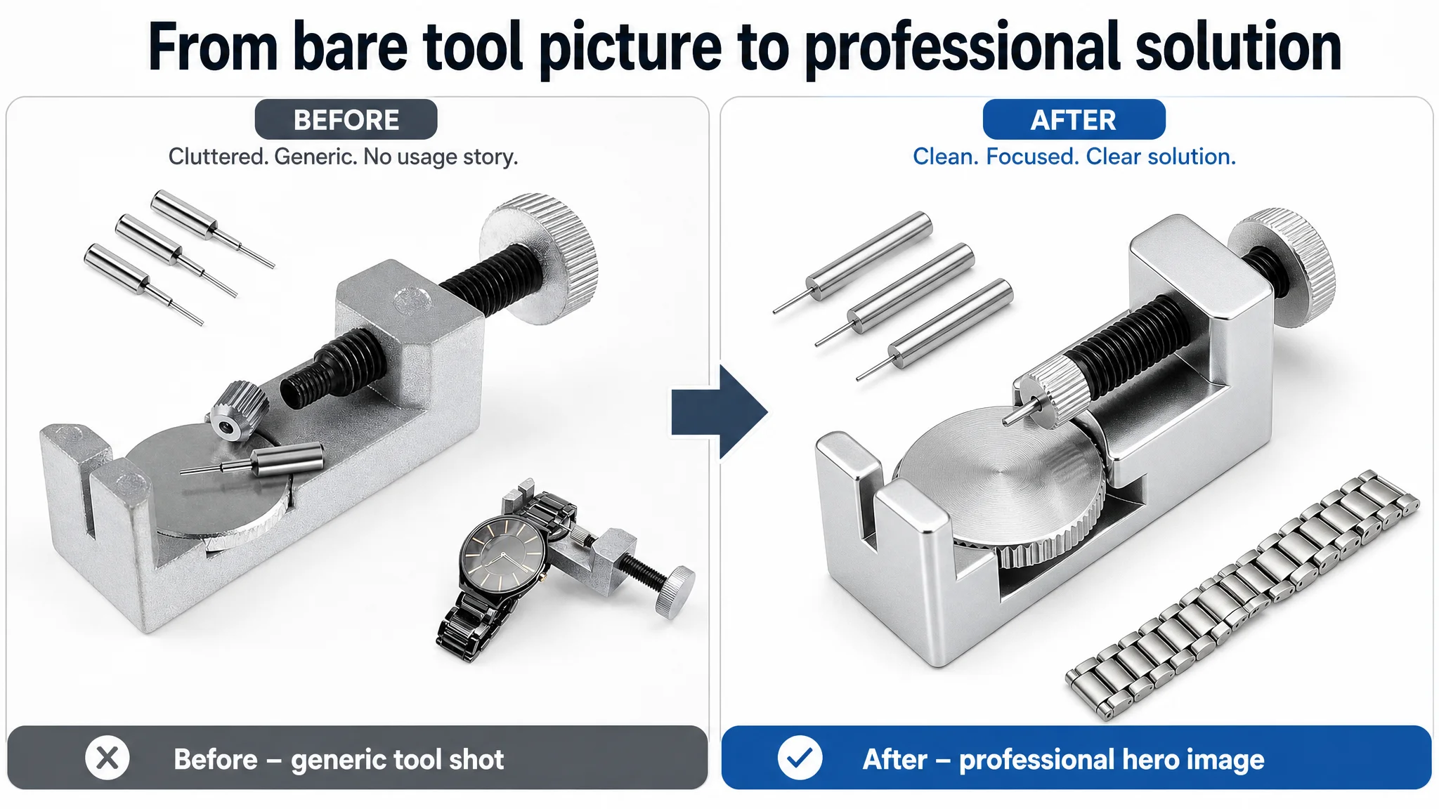
On Amazon, the first image has two jobs:
1. Win the click (CTR) on the search results page.
2. Set a clear expectation about what will happen after purchase.
The target Listing’s primary image and secondary images fell short on both:
- Static white‑background product stack
The main image presented a simple white‑background shot with the tool and some components loosely arranged. There was no visual hierarchy, no clear focal point, and no indication of usage.
- Weak professional impression
Compared to the benchmark’s high‑contrast black‑orange layout and tight composition, the target image looked flat and generic; it did not project “precision tool for watch repair”.
- No step visualization
While the benchmark gallery broke down the use process into clear visual steps (align, press, remove), the target Listing’s images mixed text and visuals in a way that felt busy but still failed to show a clean sequence of actions.
DeepBI’s analysis tied this directly to conversion risk:
- CTR risk: The benchmark’s main image likely draws 5–8% more clicks due to stronger contrast, clearer composition, and direct “tool in action” positioning.
- Conversion risk: Lack of step‑by‑step visualization raises perceived difficulty, particularly for non‑professional users. This can easily suppress add‑to‑cart by 10–15%.
“Advertising does not only amplify advantages. It can also amplify a page’s existing defects.”
Rather than tweaking ad creatives alone, DeepBI judged that the visual stack had to be rebuilt to:
- Present the tool as a professional, precise device.
- Show exactly how it solves the strap problem, in four or more clearly visualized stages.
- Convey compatibility and usage context.
The Reframed Main Image Direction
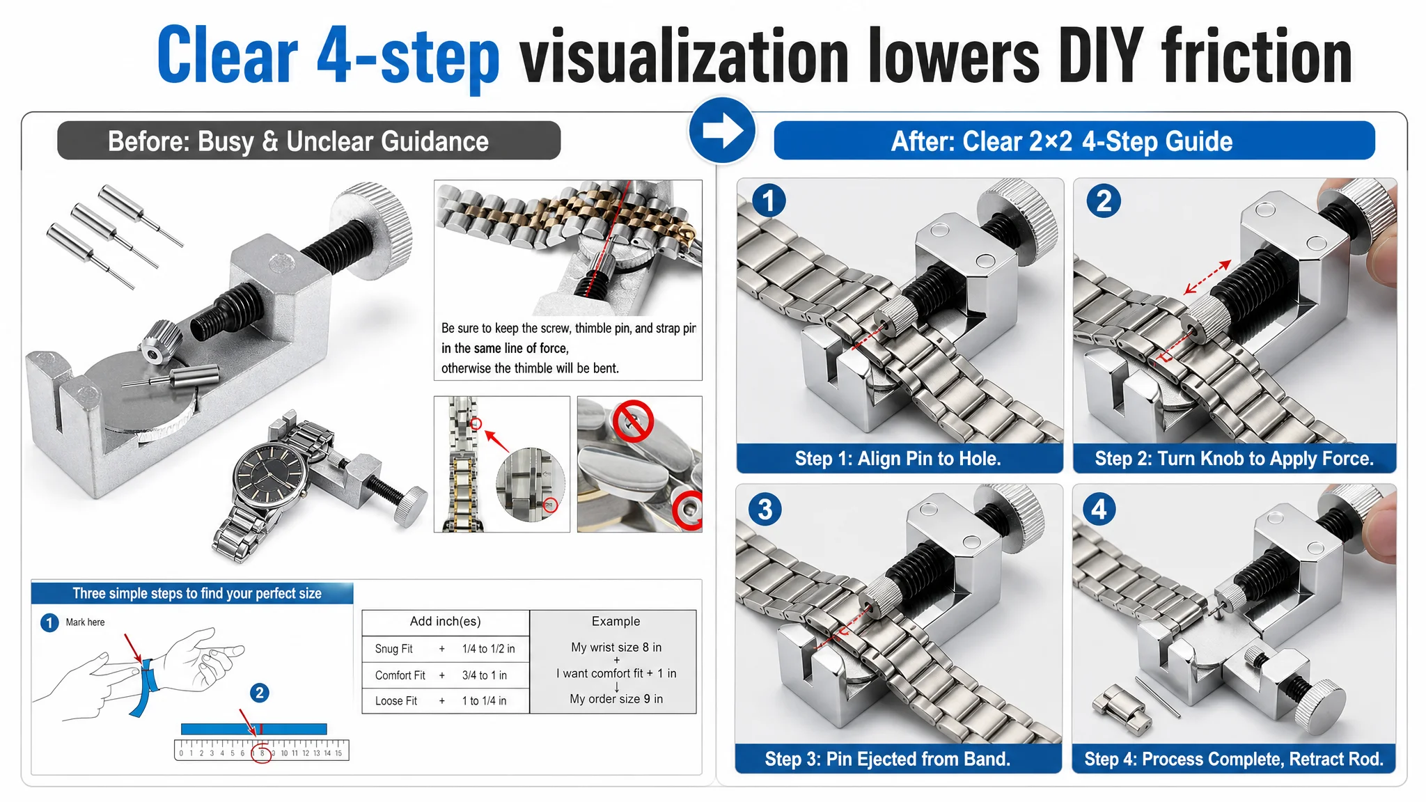
Key decisions in the recommended visual path:
1. Industrial minimalism and precise composition
- Tool centered, occupying around 65% of the frame.
- 45° side view to reveal form and functional details.
- Pure white background with controlled soft industrial lighting.
- Spare pins aligned neatly in the top‑left; a small inset showing the tool in contact with a strap.
2. Step‑grid operational image
- A 2×2 grid showing four states: alignment, turning the threaded rod, pin ejection, finished strap.
- Consistent angle and lighting.
- Fine red dashed lines highlighting the exact contact point.
3. Function‑focused hero views
- Low‑angle shot emphasizing the adjustable platform with an “Adjustable Height” call‑out.
- Composition that compares different strap thicknesses alongside the tool to visually explain compatibility.
4. Real hand‑operation close‑ups
- Warm, real home environment, shallow depth of field.
- Focus on the pin entering the strap hole, communicating controlled precision and DIY feasibility.
The point is not “nicer pictures”; it is a clear, low‑friction mental model of how the tool works and whether the buyer can confidently use it at home.
Bullet Points: From Component List to Benefit Path
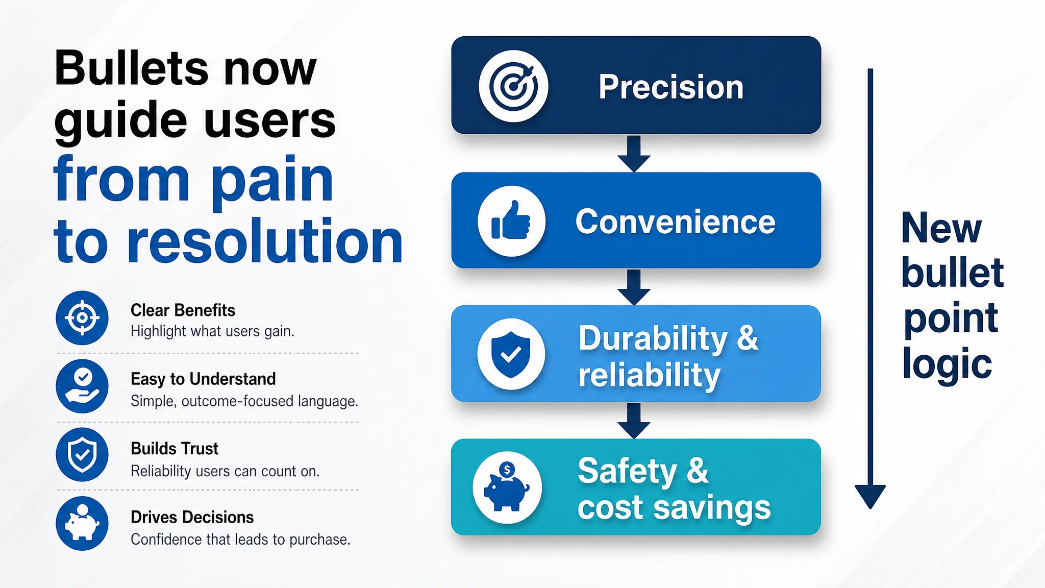
The original bullet points leaned on:
- Component descriptions.
- Operation instructions.
- Material mentions.
What they did not fully provide was a clear benefits path from pain point to resolution.
The benchmark bullets instead:
- Emphasized efficiency, convenience, and compatibility.
- Used concrete quantities and diameters to signal professional reliability.
- Ended on “avoid damaging your watch” and “solve problems at home” value promises.
DeepBI’s comparative logic highlighted three gaps:
1. Outcome framing: The seller talked about how the platform and push rod worked; the benchmark talked about how the user would efficiently adjust straps without damage.
2. Data‑based credibility: The benchmark used specific counts and measurements (9 replacement needles, multiple diameters). The seller’s bullets remained generic.
3. Value‑driven endings: The seller ended on “how to operate”; the benchmark ended on “protect your watch” and “solve it yourself at home”.
The recommended bullet structure therefore shifted in tone and logic, while staying within the product’s real capabilities:
- BP #1 – Precision benefit, not just mechanism
Emphasize that the adjustable platform ensures accurate alignment across different bracelet thicknesses, making resizing faster and more efficient.
Adjustable Platform for Precision – Aligns perfectly with various bracelet thicknesses so the punch pin hits the link hole accurately, making watch resizing faster and more efficient for home users.
- BP #2 – All‑in‑one solution
Combine the platform and threaded push rod into a clearly described “remove and install” function, stressing controlled pressure and versatility.
All‑in‑One Link Removal & Installation – Combines link remover and strap holder in one versatile tool. The hand‑turned threaded push rod provides smooth, controlled pressure to press out or reinstall pins when shortening or extending your metal bracelet.
- BP #3 – Material advantage reframed as durability
Position aluminium alloy as the differentiator versus typical plastic tools: durable yet lightweight, stable base for repeated repairs.
Durable Aluminium Alloy Construction – Crafted from premium aluminium alloy for professional‑grade durability in a lightweight design, providing a stable base that outperforms standard plastic alternatives for long‑term use.
- BP #4 – Spare pins as reliability, not just count
Clarify that spare pins are engineered for repeated operations, supporting multiple maintenance projects.
Includes 3 Spare Replacement Pins – Includes 3 durable spare pins for easy replacement during repeated operations, keeping your tool ready for multiple watch maintenance projects.
- BP #5 – Safety and cost avoidance, not just instructions
Recast operation guidance as protection from damage and saving on workshop fees.
Safe Operation & Damage Prevention – Helps you align bracelet pins correctly to reduce stress and avoid scratches or damage, enabling professional‑level results at home and reducing the need for costly watch shop visits.
The result is bullet points that guide the buyer through:
- Precision → convenience → durability → reliability → safety and savings.
This is a persuasive path, not a technical manual.
A+ Content: From Empty Space to a Structured Trust Story
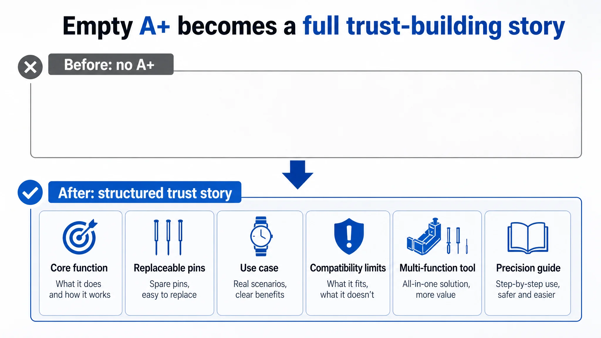
On this Listing, the A+ section is entirely absent.
By contrast, the benchmark Listing uses A+ to:
- Visualize core functions (liftable platform, non‑slip handle).
- Show detailed component shots (replaceable heads, spring bar tool).
- Demonstrate real strap adjustment scenarios with human context.
- Proactively warn about non‑compatible strap types (“Not Suitable for Screw‑down Spring Bar”).
This is where DeepBI’s judgment was most decisive: before further ad optimization, the A+ area had to be built into a credible, structured explanation of the product.
Key module concepts in the recommended A+ design:
1. Core function module
- Split‑screen showing non‑slip handle and adjustable lifting platform from a 45° top view on a dark grey matte background.
- High‑contrast white labels: “Non‑Slip Handle” and “Adjustable Lifting Platform”.
- Purpose: anchor the idea that this is a precise, controllable tool.
2. Replaceable pins / heads module
- Macro shot of the tool head occupying most of the frame.
- Two replacement heads of different lengths aligned on the side, labeled “Two‑Length Replaceable Heads”.
- Purpose: visually answer the durability and adaptability concern.
3. Use‑case module (strap too long → solved at home)
- Left: wrist close‑up with an oversized metal strap.
- Right: two small step images with arrows and labels (“Strap Remover”, “Punch Removal”) showing how the excess links are removed.
- Purpose: tie the tool directly to the daily problem buyers have.
4. Compatibility boundary module (risk management)
- Three equally sized panels showing incompatible strap types, each with a clear red “X”.
- Top text: “Not Suitable for Screw‑down Spring Bar”.
- Purpose: reduce returns and build a “professional and responsible” brand impression.
5. Spring bar tool module (multi‑function)
- Left: close‑ups in use showing V‑HEAD and O‑HEAD operations.
- Right: full tool shot with strong contrast on black background, orange labels marking each head.
- Purpose: elevate value perception: not just a single‑function tool, but part of a fuller repair toolkit.
6. Portability / aesthetic module
- Three different watches next to the tool on a small display pedestal, deep grey honeycomb background.
- Copy block: “Convenient and Portable”.
- Purpose: appeal to watch enthusiasts’ expectation of professional, well‑presented tools.
7. Precision adjustment module
- Overhead view focusing on the internal threaded region and the exact pin/strap contact point.
- Orange arrows showing rotation and push direction, label “Precise Length Adjustment”.
- Purpose: visually calm the fear of “I might damage my watch; I don’t know how much pressure to apply.”
Together, these modules transform the A+ area from a blank into a complete decision path:
- What it is → How it works → Where it works → Where it doesn’t → How it protects your watch → Why it is worth the price.
For a new Listing with no review base, this kind of visual explanation is often the only substitute for missing word‑of‑mouth while early orders accumulate.
Why Ads Had to Wait Until the Page Was Repaired
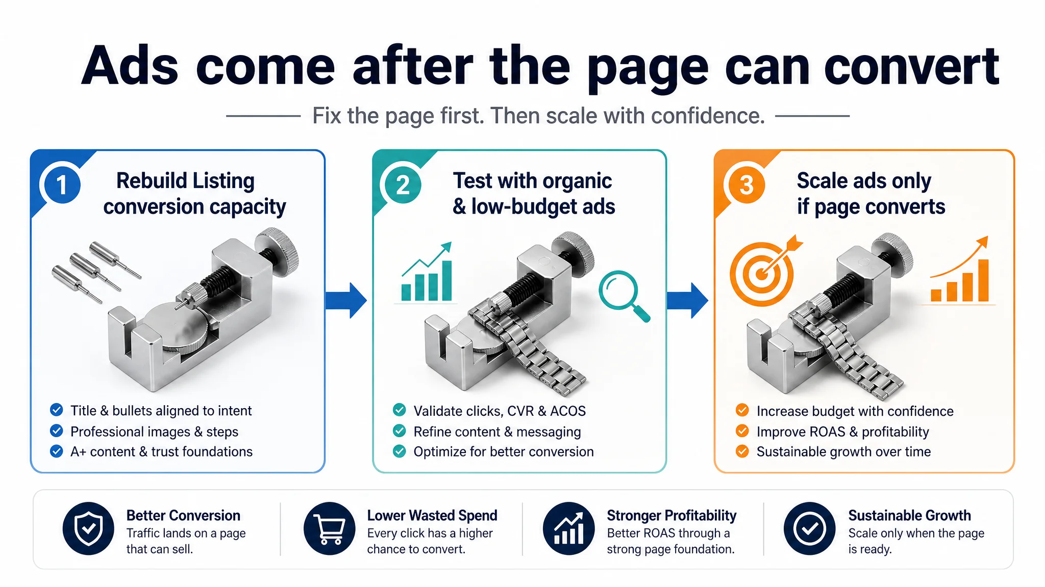
Given this diagnosis, DeepBI’s operational judgment was clear:
- Do not treat ads as the first lever.
- Treat page conversion as the foundation that determines whether ads are even worth scaling.
At this stage, the biggest business risks were:
- Throwing budget into campaigns that send shoppers to:
- A weak title for search intent.
- A main image that does not build professional trust.
- Bullets that lack outcome framing.
- An empty A+ story.
- Zero reviews.
- Letting ads “prove” that the product does not convert, when in reality the Listing has not yet been given a fair chance to convert.
The decision path prioritized:
1. Rebuilding Listing conversion capacity
- Title aligned with strap‑adjustment search behavior.
- Main image and gallery reconstructed around step visualization and professional feel.
- Bullet points turned into a benefit‑driven logic path.
- A+ modules installed to answer how, where, and why.
2. Allowing early organic and low‑budget ad traffic to test the new page
- Watch whether add‑to‑cart and conversion begin to move from a very low baseline.
- Judge whether buyers now understand and trust the DIY promise.
3. Only then, scaling ads on top of a page that actually deserves more traffic
- If CTR and CVR show signs of recovery, push relevant search terms more confidently.
- If not, iterate again on the page rather than blindly turning up bids.
This sequence protects the seller from a common Amazon trap:
“More budget on a low‑conversion Listing does not build a brand. It builds a more expensive data set proving that the page cannot sell yet.”
How the Page’s Sales Logic Began to Recover
Because this case focuses on structural diagnosis rather than final metrics, we do not speculate on precise percentage gains. Instead, the meaningful changes are in the operating state and risk profile:
- Listing conversion capacity
- The page shifted from “bare tool plus specs” to a guided, visual explanation of how the tool solves a strap problem.
- Buyers now have a clearer sense of: what to expect, how to operate, and how to avoid damage.
- Trust foundation
- A+ content and more structured bullets compensate for the initial lack of reviews.
- Visual risk warnings and compatibility modules reduce surprise and potential dissatisfaction.
- Ad traffic utility
- Incoming clicks—from both organic search and early ads—now land on a page that can plausibly carry them to checkout.
- Ads no longer simply magnify confusion; they feed into a coherent story.
- Operational controllability
- The seller moves from “tune ads and hope” to “adjust page logic, then tune ads based on observed behavior.”
- This makes ACOS and TACOS more manageable over time because the foundation (conversion) is no longer ignored.
What Other Amazon Sellers Can Take from This Case
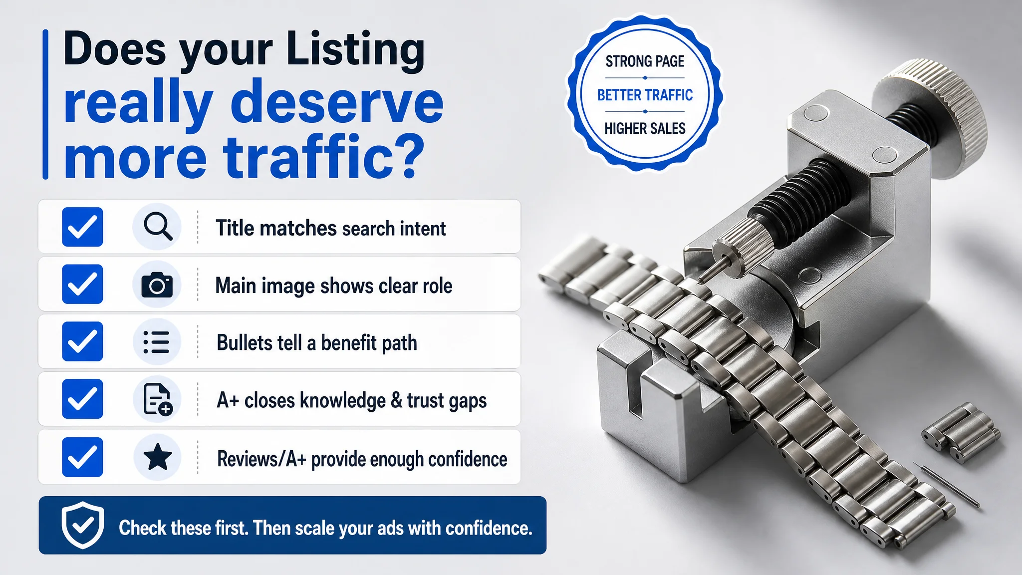
This watch‑tool Listing in the UK marketplace illustrates a pattern many Amazon sellers face, especially in technical or tool categories:
- Ads are often blamed first.
Teams focus on CTR, bids, keyword match types, and budgets, assuming that more traffic will solve slow growth.
- But the product page can be the true bottleneck.
If title, main image, bullets, A+, and reviews do not collectively build a clear “why buy, why now, why safe,” then traffic simply exposes the page’s weaknesses.
- Listing conversion and ad efficiency are inseparable.
High ACOS or disappointing campaign results may be symptoms of a weak Listing, not poor ad management.
- Before scaling ads, ask whether the page deserves more traffic.
A Listing deserves traffic when:
- The title captures search intent and outcomes.
- The main image makes the product’s role obvious and credible.
- Bullet points walk buyers from pain points to resolved states.
- A+ content closes knowledge and trust gaps.
- The review layer (or A+ storytelling for new products) gives enough confidence to click “Buy Now”.
In this case, DeepBI’s value did not lie in more complex ad tactics. It lay in reframing the seller’s judgment: ads were not failing; the Listing had never been built to convert.
For Amazon sellers under pressure from rising ad costs, this kind of reframing is often the difference between chasing more impressions and building a product page that can genuinely support sustainable growth.