

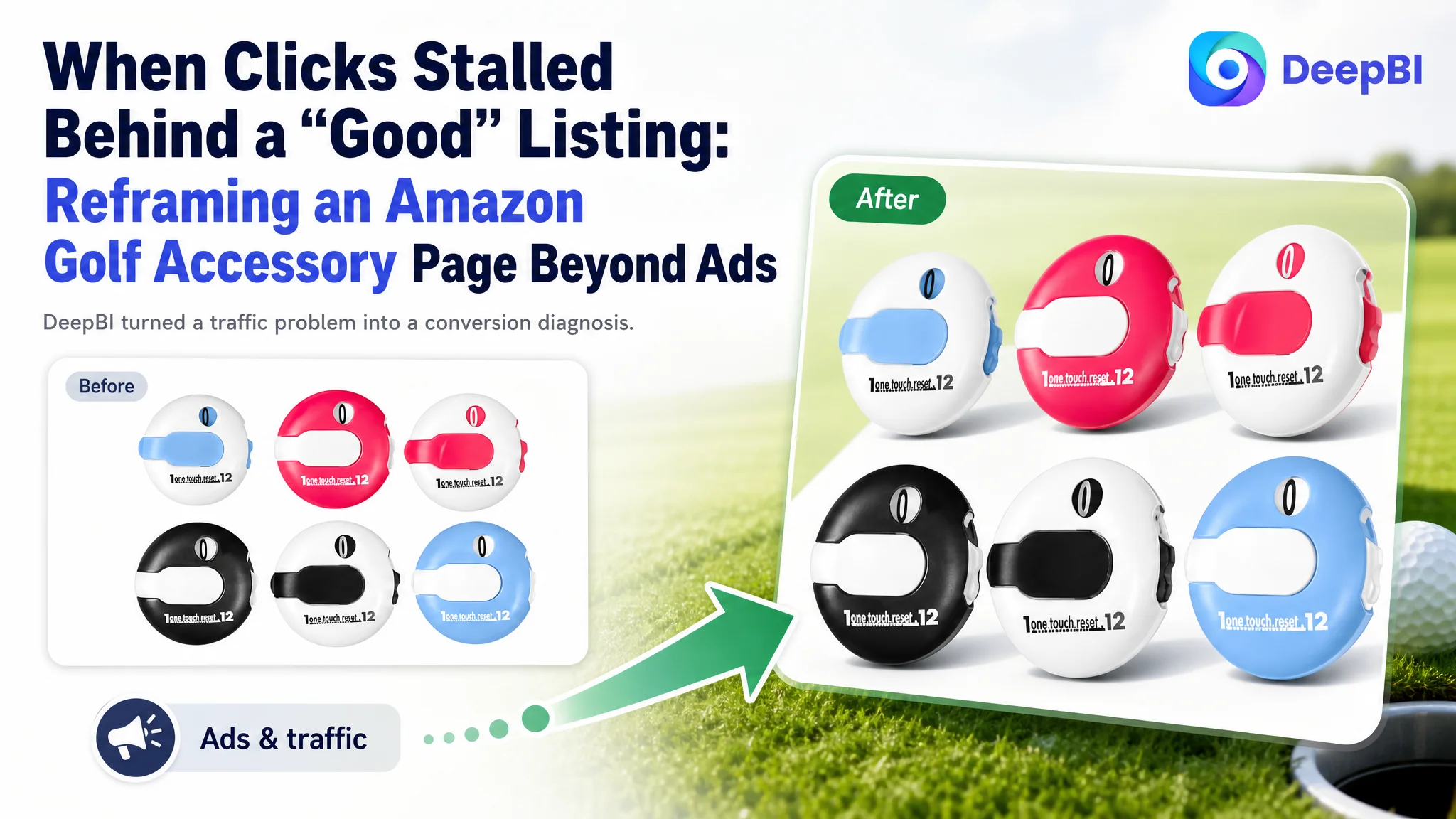
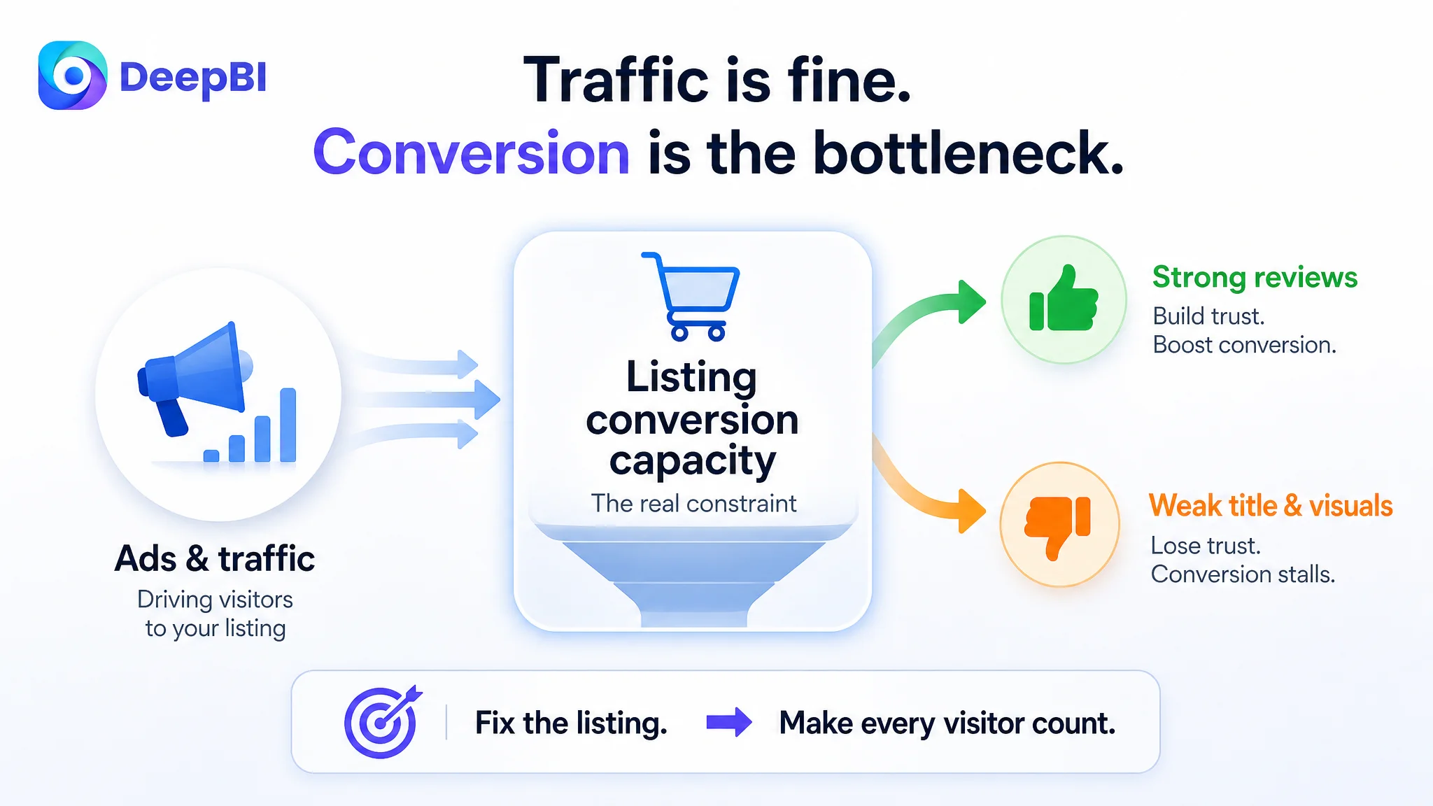
 An Amazon seller in the golf accessories category came to DeepBI with a familiar frustration: ads were delivering traffic to their golf stroke counter, reviews were strong, but the product page simply was not converting at the level they expected. The team’s instinct was to keep fine-tuning bids, keywords, and budgets, assuming that ACOS pressure meant “the ads are not optimized enough.”
DeepBI’s Listing scoring quickly showed a different picture. Against a benchmark golf score counter on Amazon US, the customer’s Listing was not primarily suffering from ad problems—it was leaking conversion on the product page itself. Title and visual gaps were pulling down click-through and trust, so every dollar of ad spend was being pushed into a page that could not fully convert the visitors it attracted.
Once the team accepted that the constraint was Amazon Listing conversion capacity, the optimization direction changed: from “fixing ads” to rebuilding the page’s decision logic—title, main images, and A+ detail content—to match how golfers actually choose a score counter on Amazon. By reframing the problem this way, the page began to carry its own weight again: ad traffic became more valuable, organic discoverability improved, and the store’s dependence on aggressive bidding eased.
For other Amazon sellers, this case is a reminder that strong reviews and decent visuals can still mask a fundamental conversion gap. When ad tuning no longer moves ACOS or orders, it’s often because the Listing is not telling the right story, in the right way, to the right buyer—especially in visually driven categories like sports accessories.
The Conversion Problem Was Not in the Ads
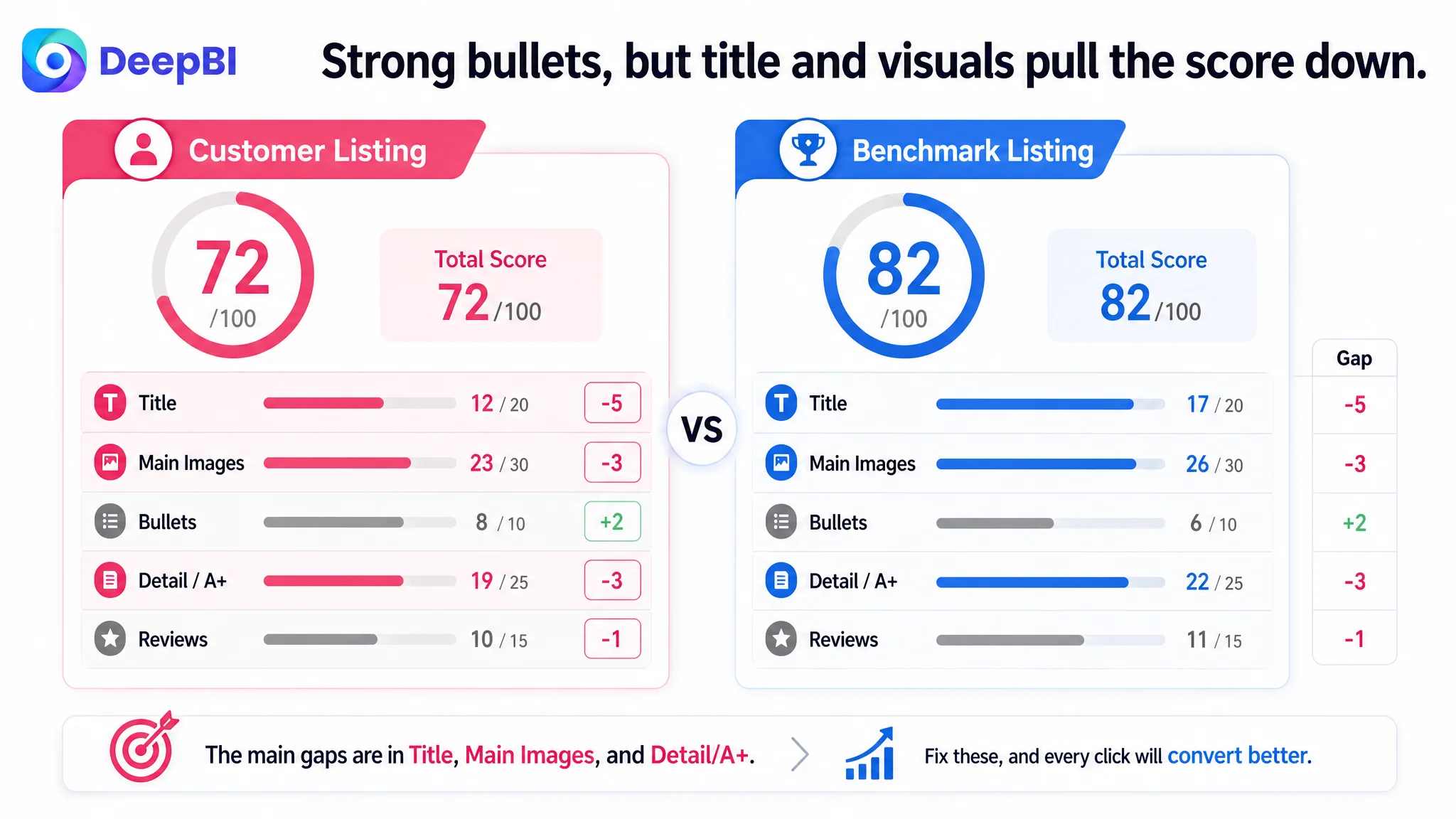 The product is a compact golf stroke counter listed on Amazon US. The seller had invested in structured bullet points, A+ content, and had already achieved a 4.5-star rating with low negative feedback. On the surface, this looked like a solid Listing. Yet, against a leading competitor Listing in the same golf score counter niche, DeepBI’s scoring system showed a clear competitive gap:
- Customer Listing: 72 / 100
- Benchmark Listing: 82 / 100
- Gap: -10 points
The breakdown made the issue explicit:
- Title: 12 vs. 17 (–5)
- Main Image set: 23 vs. 26 (–3)
- Bullet Points: 8 vs. 6 (+2)
- Detail/A+: 19 vs. 22 (–3)
- Reviews module: 10 vs. 11 (–1)
The bullet points were actually stronger than the competitor’s. The problem lay in the elements that drive discovery and click (title, main image) and visual trust and understanding (A+ detail content). This is precisely where ad traffic and Listing conversion intersect.
“The real problem was not that ads failed to bring traffic. It was that the page could not convert the traffic.”
The seller’s initial judgment—“we need better ad optimization”—was understandable. But with a higher star rating (4.5 vs. 3.6) and much cleaner review sentiment than the benchmark, the bottleneck was not social proof. It was that the Listing did not visually or semantically align with how golfers evaluate this accessory in search results and on the product page.
The Original Misdiagnosis: Blaming ACOS on Ads
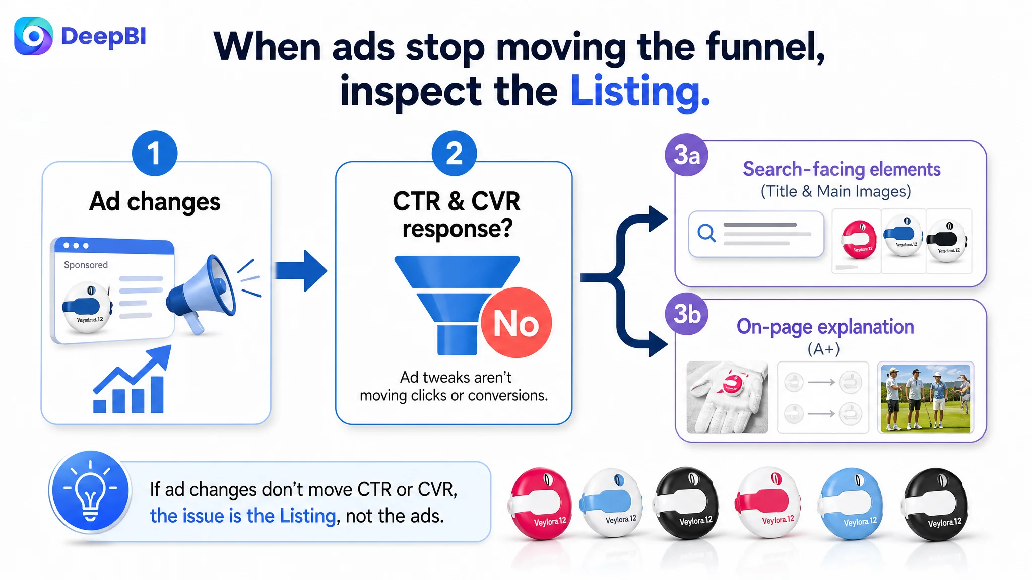 From the seller’s perspective, the situation looked like this:
- Ads were driving impressions.
- Clicks and orders were not following the expected trajectory.
- ACOS felt heavy relative to the perceived “quality” of the Listing.
- The page already had A+ and structured bullets, so attention stayed on campaign structure and bids.
Traditionally, teams in this position:
- Increase or refine keyword coverage.
- Adjust bids and placements.
- Experiment with ad creatives or audiences.
But DeepBI’s diagnosis logic connects Listing scores with funnel data: if click-through and conversion do not respond to ad changes, it’s usually because the page is failing at either (1) attracting the click in search results, or (2) turning pageviews into purchases.
In this case, the score breakdown made the error in judgment clear:
- Title was under-optimized for search and expectation-setting.
- Main image set underdelivered on emotional and functional cues.
- Detail visuals did not fully explain how the product works or how it fits into real golf life.
Continuing to tune ads in this state would just amplify a weak outcome: more traffic into a page that still did not clearly communicate quantity, core attributes, operation, and lifestyle value.
Amazon Ads Were Not Failing. The Page Was Consuming the Traffic.
Title: Discovery and Expectation Logic Was Incomplete
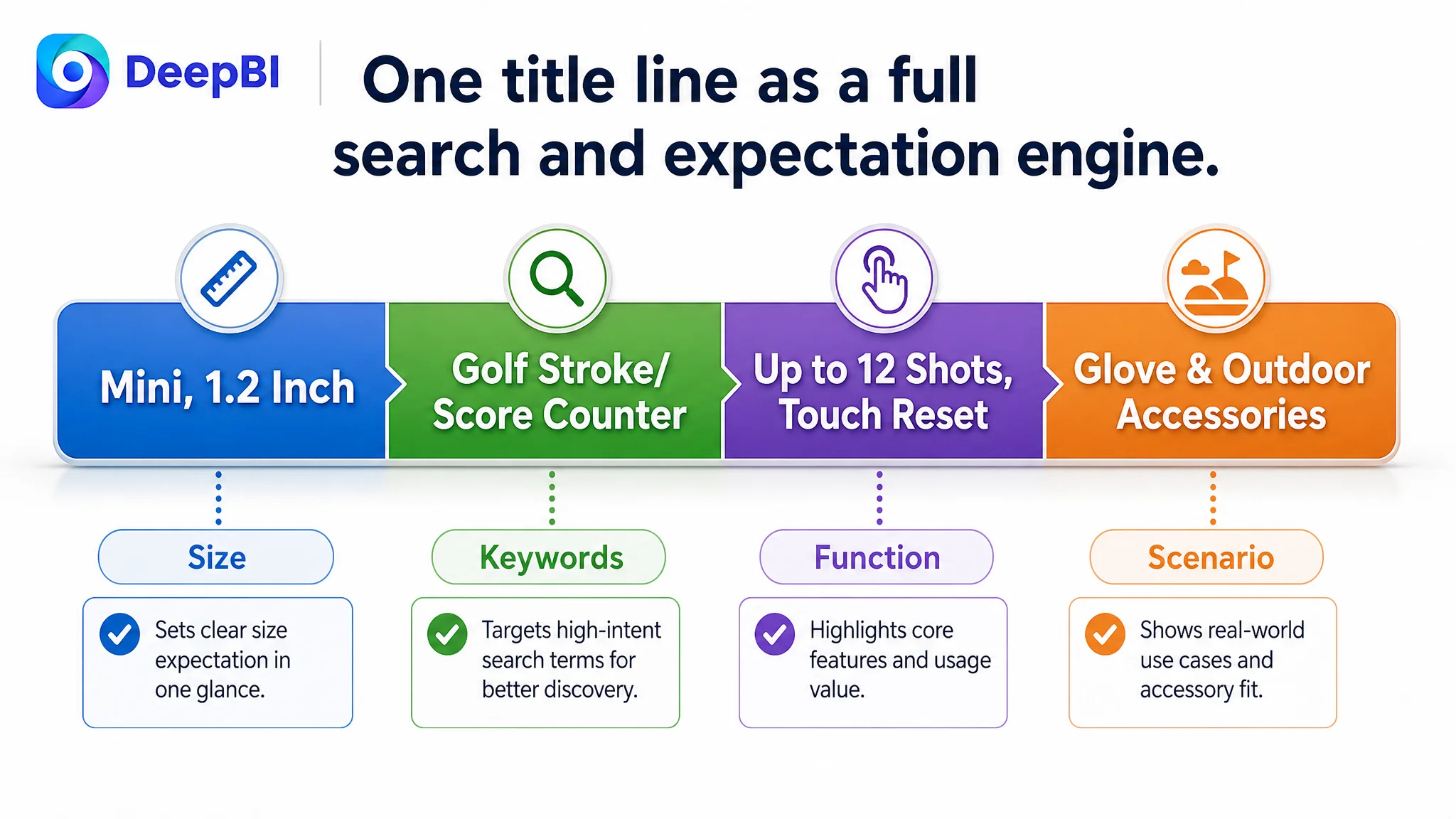 The benchmark Listing’s title had a clear structural advantage:
- Led with quantity: “6 Pcs” (immediate value perception).
- Called out core attribute: “Mini” (size expectation).
- Stacked high-intent keywords: “Golf Score Counter”, “Stroke Counter”, “Scorekeeper”, “Accessories”, “Glove”.
- Closed with scenario cues: “for Outdoor Light and Compact”.
This structure did three things at once:
1. Maximized keyword coverage for Amazon search.
2. Set a precise usage and size expectation directly in the search result.
3. Framed the product as a practical, lightweight accessory for outdoor golf.
The customer’s title, in contrast:
- Was structurally simpler.
- Did not signal pack quantity upfront.
- Was less aligned with the cluster of high-volume search terms.
- Did not explicitly tie the product to glove attachment and outdoor portability.
DeepBI’s judgment: before scaling ad spend, the title needed to be rebuilt as a search and expectation engine. Without that, ads would repeatedly buy impressions on keywords where the Listing wasn’t the strongest candidate to win the click.
Main Images: Click-Driving Visual Hooks Were Weak
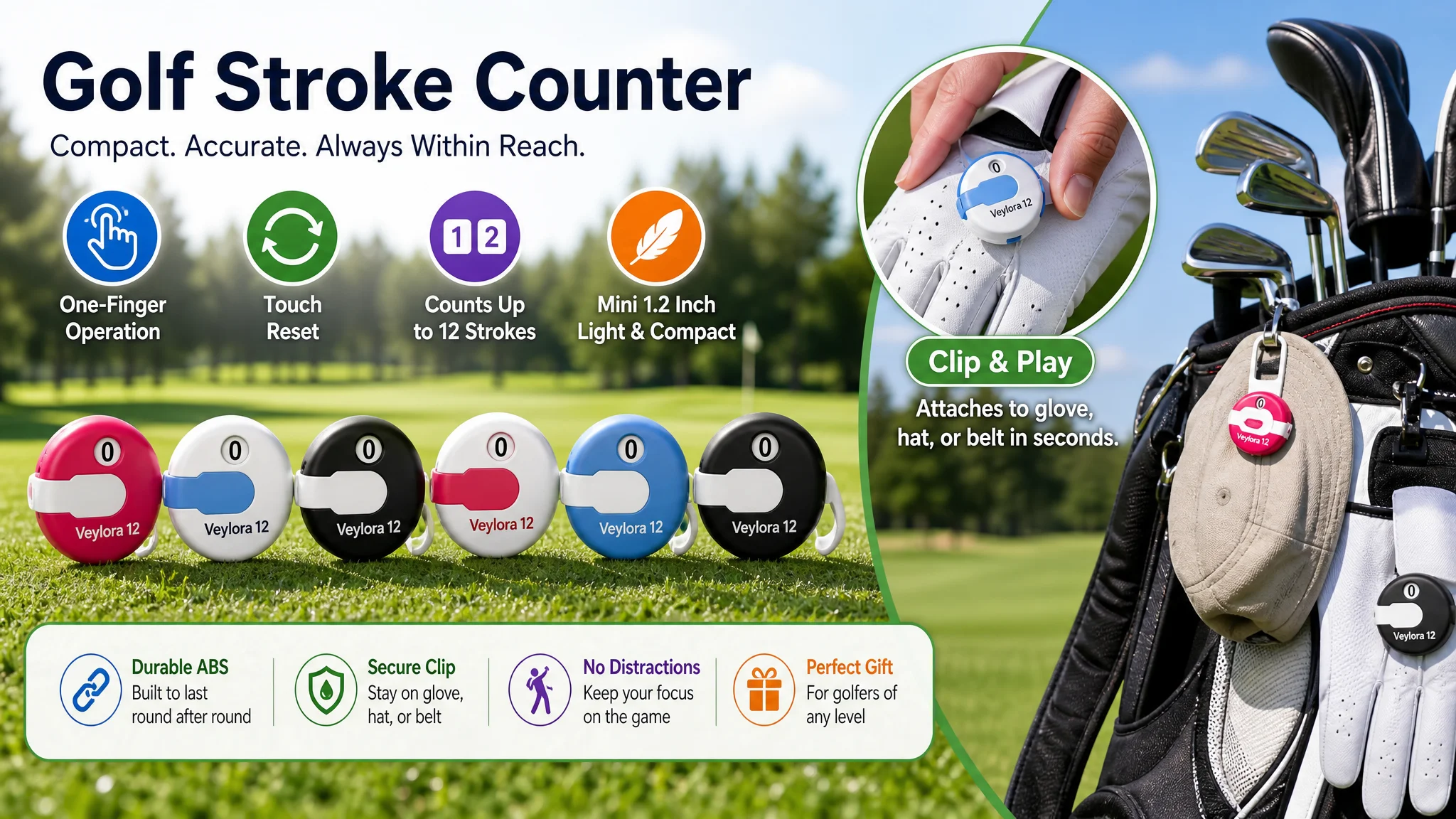 The main image set was functional but lacked the visual hooks and trust-building structure that the benchmark Listing used:
- The customer’s primary image employed a static grid layout, with six counters neatly but somewhat rigidly arranged on a white background.
- It lacked dynamic composition, light, and shadow that would make the counters “pop” in the search grid.
- There were no strong usage scenes communicating how and where the counter is worn.
- Operation cues (how to count, how to reset) were mentioned in text, but not seen.
The benchmark Listing, by contrast, used:
- Dynamic stacked layouts and rich lighting to create depth and visual energy.
- A “One Touch Reset” illustration with arrows and gear icons, visually encoding how the mechanism works.
- A full golf environment shot (clubs, balls, tees, shoes) that positioned the counter as part of a complete golfer’s kit.
- Real-life hanging and wearing scenes to eliminate doubts about “how to attach” and “will it get in the way.”
From DeepBI’s perspective, this meant:
“Advertising does not only amplify advantages. It can also amplify a page’s existing defects.”
Sending more traffic to a Listing that:
- Did not clearly show how the counter is operated.
- Did not visually convey size and portability.
- Did not embed the counter into credible golf scenarios.
…was a structural risk, not just a bid management issue.
This Product Page Did Not Lack Traffic. It Lacked Trust and Visual Explanation.
Bullet Points: Strong Logic That Needed Better Visual Support
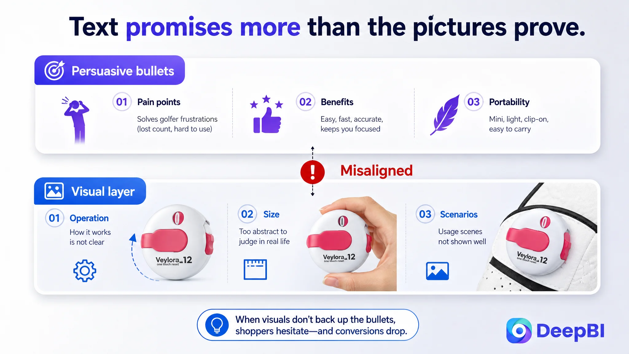 Interestingly, the customer’s bullet points were better structured than the benchmark’s:
- They started from user pain points like one-handed operation and quick reset.
- They emphasized results and user benefits: time savings, focus, reduced chance of losing the counter.
- They followed a logical progression: core function → durability → usage convenience → portability → user and social value.
By comparison, the benchmark Listing’s bullet points:
- Started with pack contents.
- Focused on material, basic specs, and operation methods.
- Included color options and quantity but were more descriptive than persuasive.
However, there was a disconnect:
- The text described a smooth, professional user experience, but the images did not visually support those promises.
- Key operational concepts like “Effortless One-Finger Operation,” “Touch Reset,” “Up to 12 strokes” existed, but without mechanism diagrams or hand-operation close-ups, they remained abstract.
DeepBI’s optimization direction focused on closing this gap:
- Keep the stronger persuasive text logic.
- Align the visual layer with the bullet claims: operation steps, durability, attachment, size, and lifestyle.
Detail/A+ Content: Functional But Missing Decision-Stage Visuals
 The seller’s A+ modules included:
- Main image scene.
- Icon-based selling points.
- Color / spec graphics.
- A female golfer usage shot.
- Triple-panel function illustration.
- Clip-on wearing demonstration.
These modules were not “bad” but they were missing several high-impact elements that the benchmark Listing used to lock in conversion:
1. Physical size comprehension
- Benchmark: a clear hand size comparison image, showing the counter in a palm, making “mini, 1.2 inch” visually real.
- Customer: numeric dimensions only, with a misspelled “Didmeter” label. No physical comparison point.
2. Operation principle visualization
- Benchmark: close-up of the wheel mechanism and single-finger lever movement, with arrows showing “turn to count, press to reset.”
- Customer: mentions “single-finger operation” in text, but no mechanism diagram to turn understanding into trust.
3. Social and emotional scenarios
- Benchmark: family and friend group scenes (6-person photo, high-five, head-to-head challenge), turning the counter into a social game tool.
- Customer: focus on a single professional golfer, emphasizing performance but not connecting with casual and family golfers.
DeepBI’s judgment was that:
- The Listing was technically informative but under-optimized for emotional and scenario buy triggers.
- This limited the addressable audience to more “serious” players, leaving casual golfers and gift buyers less engaged.
- For a small accessory often bought in multi-packs, this meant leaving volume on the table.
The Real Constraint Was Listing Conversion Capacity, Not Review Quality or Ad Setup
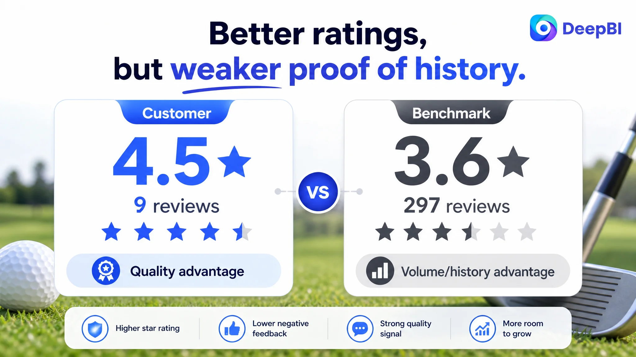 The review data underscored the misalignment:
- Customer Listing:
- 4.5 stars
- 9 total reviews, 8 on the front page
- Low negative rate (~11%)
- Benchmark Listing:
- 3.6 stars
- 297 total reviews
- Higher negative rate (~25%)
The seller’s product was arguably better received by buyers who did purchase. But the benchmark’s Listing had:
- A much larger review volume, projecting longevity and sales history.
- A more mass-market scenario and quantity framing, appealing to teams, families, and groups.
In this context, DeepBI’s scoring logic concluded:
- The customer’s product had trust potential (high rating, low complaints).
- The real risk was that the Listing failed to fully communicate this value to new visitors.
Pre-optimization, ad spend was being used to force traffic through a page that:
- Under-communicated quantity and value.
- Under-visualized operation and size.
- Under-leveraged social and emotional triggers.
Before any further ad scale, Listing conversion capacity had to be fixed.
Why DeepBI Did Not Keep Tuning the Ads First
DeepBI’s decision path followed a clear hierarchy:
1. Ads can only amplify what the Listing presents.
2. If title and main images do not win clicks, CTR ceiling is structural, not bid-related.
3. If A+ content does not resolve “how to use” and “how it fits into my life,” CVR ceiling is structural, not audience-related.
4. With a strong star rating and low complaint ratio, product quality was likely not the problem.
5. Therefore, Listing optimization had to precede further ad optimization.
Continuing to adjust ads without addressing:
- Title keywords and structure.
- Main image visual hooks and operation scenes.
- A+ modules for size, clip usage, and social scenarios.
…would just funnel budget into a bottleneck. The priority became:
- Rewriting the title to align with high-intent search behavior.
- Rebuilding the main image set to tell the full visual story.
- Reframing A+ content around operation, size, clip use, and social value.
How the Page’s Sales Logic Started to Recover
Title: From Partial Description to Full Funnel Entry
DeepBI recommended transitioning to a title like:
Golf Stroke Counter 1.2 Inch Mini Golf Score Counter up to 12 Shots with Touch Reset, Portable Scoring Keeper Attachment Accessories for Golf Glove and Outdoor Sports, Lightweight and Compact
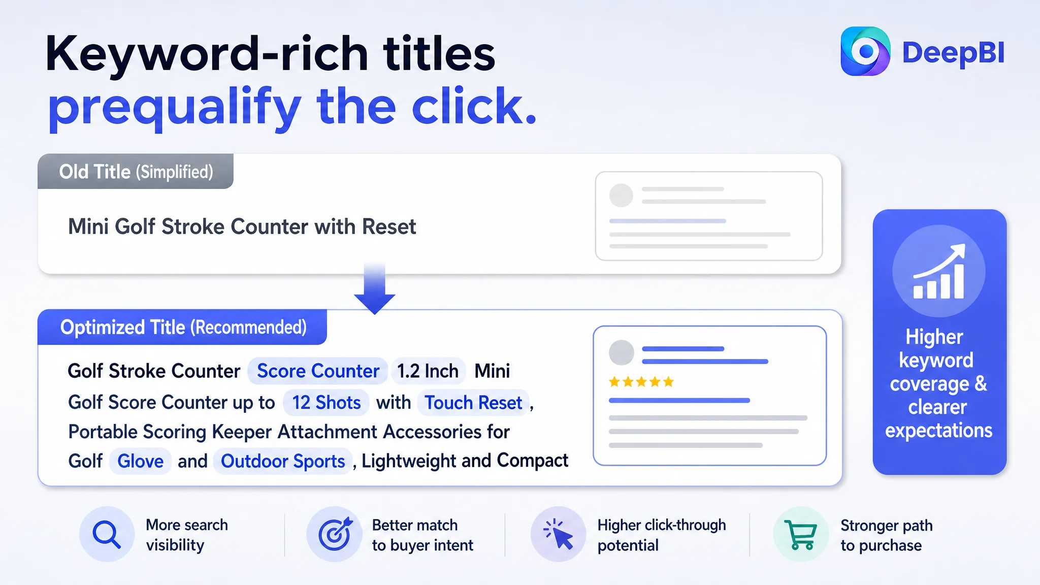 Strategic changes:
- Add “Golf Score Counter” and “Scorekeeper” to directly capture core query patterns.
- Explicitly call out “1.2 Inch” and “Mini” to match size expectations.
- Include “up to 12 Shots” and “Touch Reset” to answer the core functional questions in the search result itself.
- Emphasize attachment and portability with “Accessories for Golf Glove and Outdoor Sports, Lightweight and Compact”.
This redesign targeted:
- Better ranking relevance on key search terms.
- Clearer expectations in the search results.
- More qualified clicks—visitors who already understood the counter’s format, capacity, and attachment style.
Bullet Points: Keeping Good Logic, Fixing Compliance and Clarity
DeepBI’s bullet point suggestions did not try to reinvent the seller’s logic; they refined and aligned it:
1. Effortless One-Finger Operation
- Clarify “record up to 12 strokes” with a lever twist and touch reset.
- Tie this to staying focused on the game.
2. Premium ABS Construction
- Lock in durable, lightweight ABS material.
- Emphasize resistance to wear, deformation, and fading in outdoor conditions.
3. Versatile & Secure Clip
- Detail attachment options: gloves, watches, belts, golf bags.
- Highlight hands-free convenience and reduced risk of misplacing the counter.
4. Ultra-Compact & Portable Design
- Anchor the 1.2-inch diameter as a no-bulk, swing-safe size.
- Reframe “easy storage” into a more professional compact design narrative.
5. Vibrant Assorted Colors
- Remove first-person wording that violates Amazon Listing norms.
- Emphasize personalization, sharing with partners, and gift suitability.
This kept the seller’s original strengths—pain-point-driven, benefit-focused—while tightening compliance and making sure each bullet could be visually supported.
Main Images: Turning Static Grids Into Decision-Stage Visuals
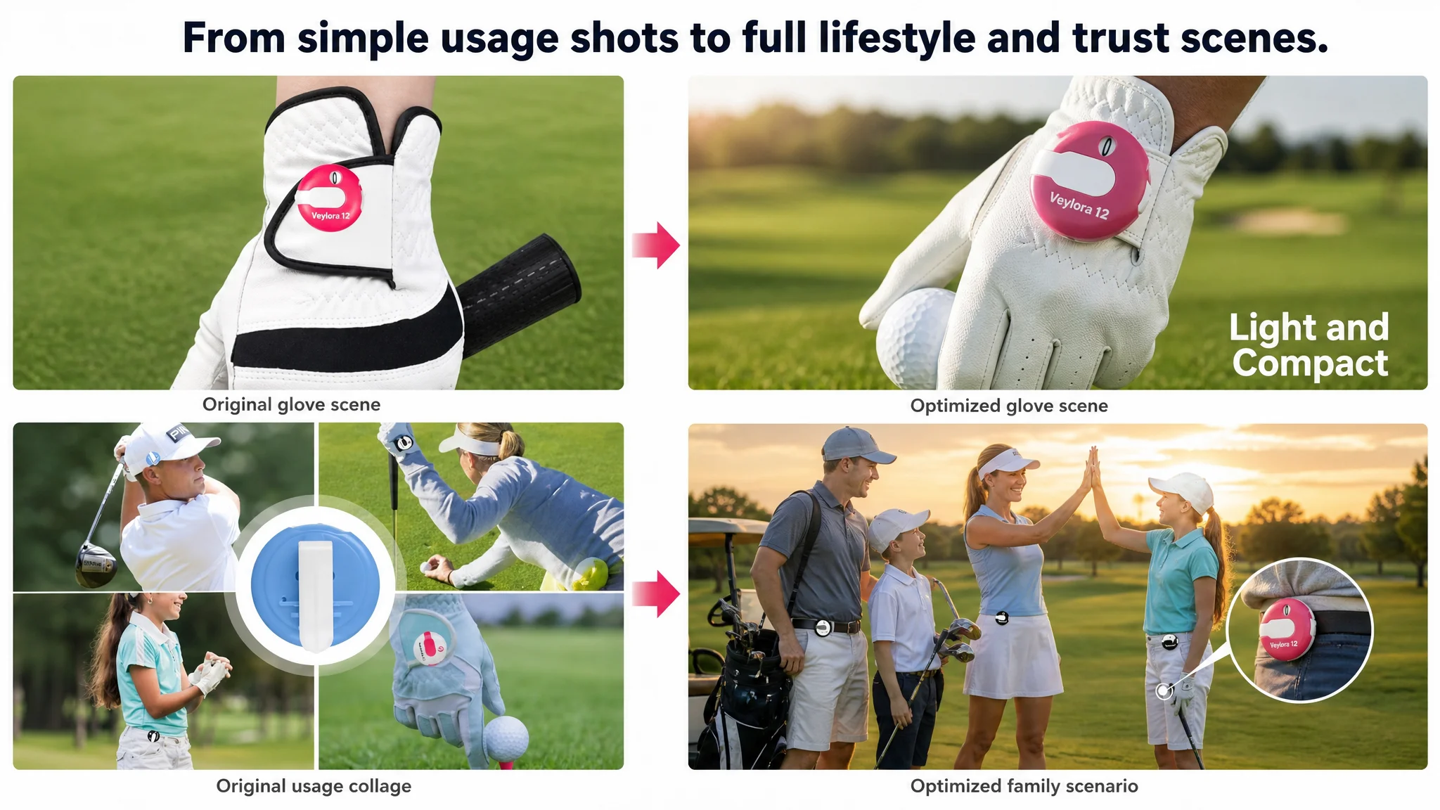 DeepBI’s image optimization track effectively restructured the entire main image logic:
1. Primary hero image
- Six counters in different colors arranged radially, occupying ~75% of the frame.
- Slight angled views (around 30°) under strong side lighting with long soft shadows.
- Pure white background, high saturation to emphasize variety and energy.
This improved search-grid click appeal directly.
2. Front + back + clip detail on real grass
- Show front and back, highlighting the clip design.
- Use a blurred golf course background.
- Overlay clean text: “Diameter 3 cm / 1.2 inch” and “Clip Design.”
This answered “how big is it?” and “how does it attach?” at a glance.
3. Operation split-screen
- Upper circle: finger turning the wheel to count.
- Lower circle: finger pressing the reset lever.
- Red arrows and icons guiding the motion.
This visualized “one-finger operation” and “touch reset” to reduce cognitive friction.
4. On-glove usage shot
- Counter worn on a white golf glove holding a ball.
- Real green background, daylight feel.
- Caption: “Light and Compact.”
This made portability and non-intrusiveness believable.
5. Multi-player lifestyle shot
- Three golfers (adult male, adult female, youth) wearing counters on hat, glove, and collar.
- Natural outdoor lighting, blue sky, green grass.
This expanded perceived audience from “serious players” to families and groups.
A+ Detail Content: From Mixed Visuals to a Structured Buying Journey
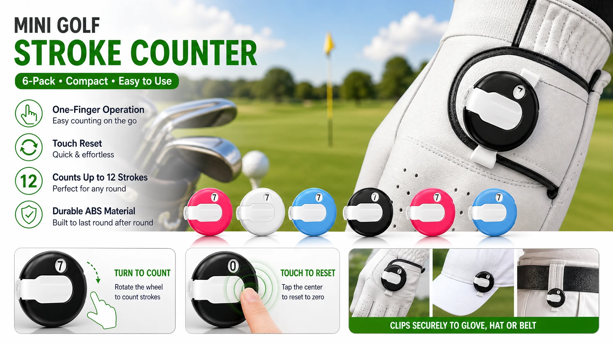 DeepBI’s visual guidance reorganized the A+ modules around a clear decision path:
1. Intro key visual
- All color variants grouped on a professional green, with brand and title text in a clean corner.
- Bright, natural lighting to elevate perceived product value.
2. Operation feature close-up
- Gloved hand operating the counter, with arrows labeling “Wheel Regulator” and “One Touch Reset.”
This removed ambiguity about how the counter works.
3. Size comprehension module
- Counter in a male palm, top-down shot, clean white background.
- Corrected “Diameter” spelling, with precise dimensions.
This fixed a subtle but damaging professionalism issue.
4. Attachment scenario grid
- Four close-ups: hat edge, glove back, belt, golf bag ring.
- Emphasized clip stability and flexibility.
This answered concerns about losing the counter or interfering with swing.
5. Trust and completeness flat lay
- Six counters scattered among clubs, gloves, and balls on real grass.
This visually communicated “6 pieces” and “part of a professional kit.”
6. Social call-to-action scene
- Adult golfers and youth interacting on the course at sunset.
- Enlarged product circles pointing to where counters are worn.
- Simple CTA text: “Call your friends and have a head-to-head battle.”
This repositioned the counter from a utility item to a social facilitator.
How Ad Traffic Became Useful Again
While the case does not provide explicit post-optimization metrics, the operational impact can be summarized in terms of state changes rather than invented numbers:
- Listing conversion capacity improved
- Visitors now saw:
- Clear quantity and size information.
- How the counter operates, with visual steps.
- How and where to attach it, with multiple options.
- Real golf and social scenarios matching their intended usage.
- Ad traffic regained its role as an accelerator, not a bandage
- With the page capable of converting both paid and organic visitors, ad optimization efforts could finally meaningfully influence ACOS and order volume.
- Organic discoverability stabilized
- Better title keyword coverage and more relevant click behavior created a healthier basis for organic ranking.
- The product could compete more fairly for “golf score counter,” “stroke counter,” and related terms.
- Advertising dependence became more controllable
- Instead of endlessly increasing bids to fight a weak Listing, the seller could:
- Scale ads on keywords where the new title and visuals now made the Listing a strong candidate.
- Reduce wasted spend on traffic that previously bounced due to unclear operation or weak scenarios.
- Understanding inside the seller’s team shifted
- Ads were no longer viewed as the primary solution to conversion problems.
- Listing quality—title, main images, bullets, and A+—was recognized as the foundation of ad efficiency.
- There was a clearer internal rule: before pushing more traffic, ensure the page deserves it.
What Other Amazon Sellers Can Take From This Case
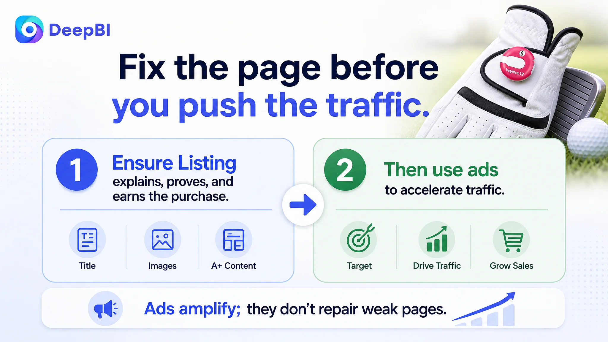 This golf score counter case is not just about better photos; it is about better judgment.
Key takeaways:
- Strong reviews do not guarantee strong conversion. If search-facing elements (title, main image) and decision-stage visuals (A+) are misaligned with how buyers choose in your category, ad spend will underperform regardless of star rating.
- Ads cannot fix a page that doesn’t explain itself. When a product’s operation, size, and usage scenarios are not visually obvious, visitors hesitate—even if the copy says all the right things.
- Listing conversion is the real ceiling on ACOS. If campaign changes don’t move ACOS or orders, evaluate whether your page truly earns the click and the purchase.
- Title, main image, bullets, and A+ must work as a single decision engine. Each module has a distinct role:
- Title: discovery and expectation.
- Main image: click trigger and immediate trust.
- Bullets: concise pain–solution mapping.
- A+: visual explanation, size, scenarios, social value.
- Before scaling traffic, ask: “Would I buy from this page if I landed here cold?” If the answer is not clearly yes, rework the Listing first. Only then does ad optimization become a lever rather than a crutch.
DeepBI’s value in this case was not in generating “prettier” assets, but in diagnosing that the seller’s real constraint was Listing conversion capacity, not ad configuration. That shift in judgment is ultimately what made their Amazon ads meaningful again.