

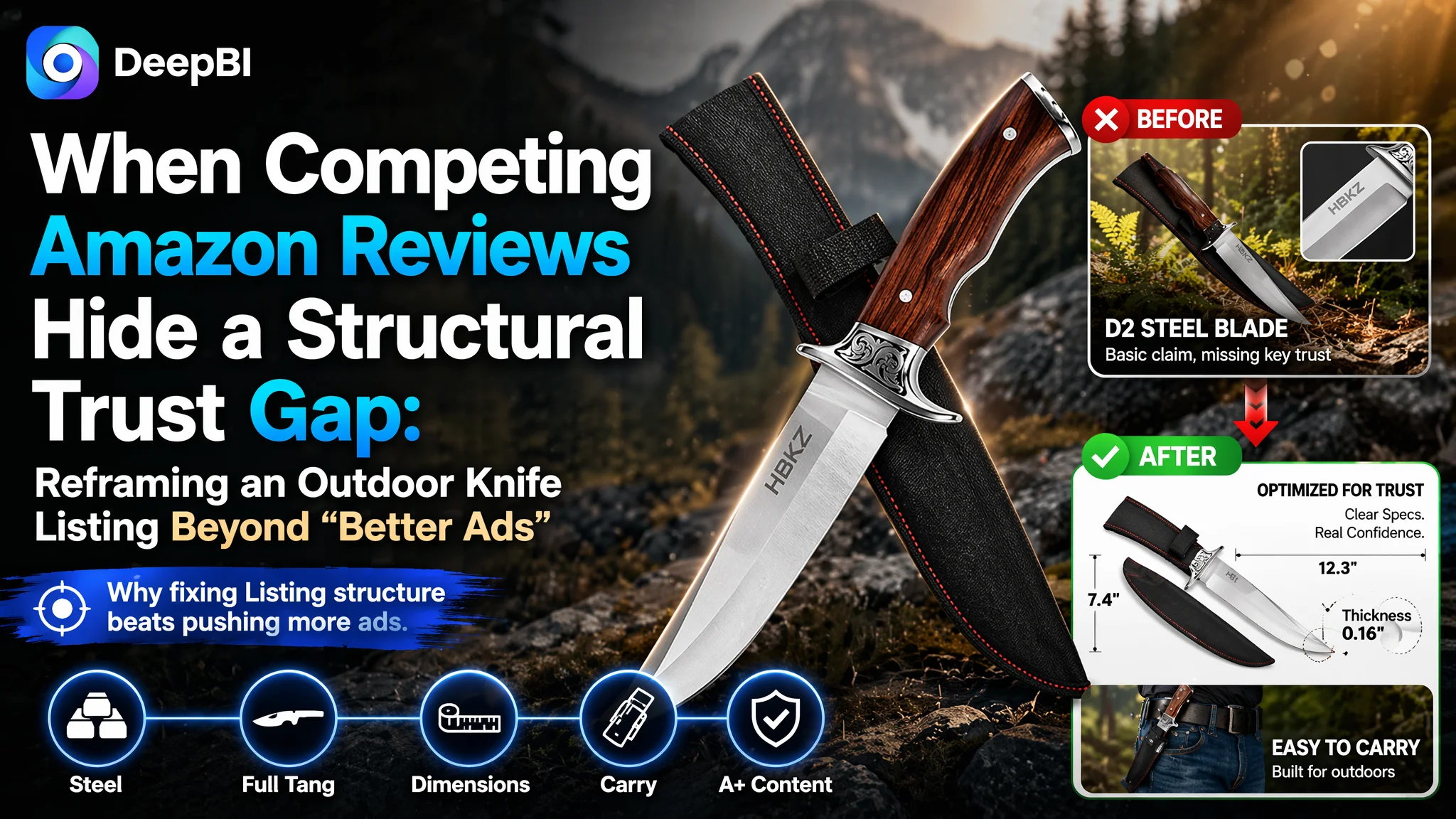
At first glance, this Amazon seller’s fixed-blade outdoor knife listing looked strong: solid 9Cr18 stainless steel, full-tang construction, a complete visual set of main images, and bullet points clearly built around user benefits. Yet under steady advertising spend, the listing struggled to compete with a category-leading benchmark knife on the US Amazon marketplace. Clicks were not the main issue; the real weakness appeared once shoppers arrived on the product page.
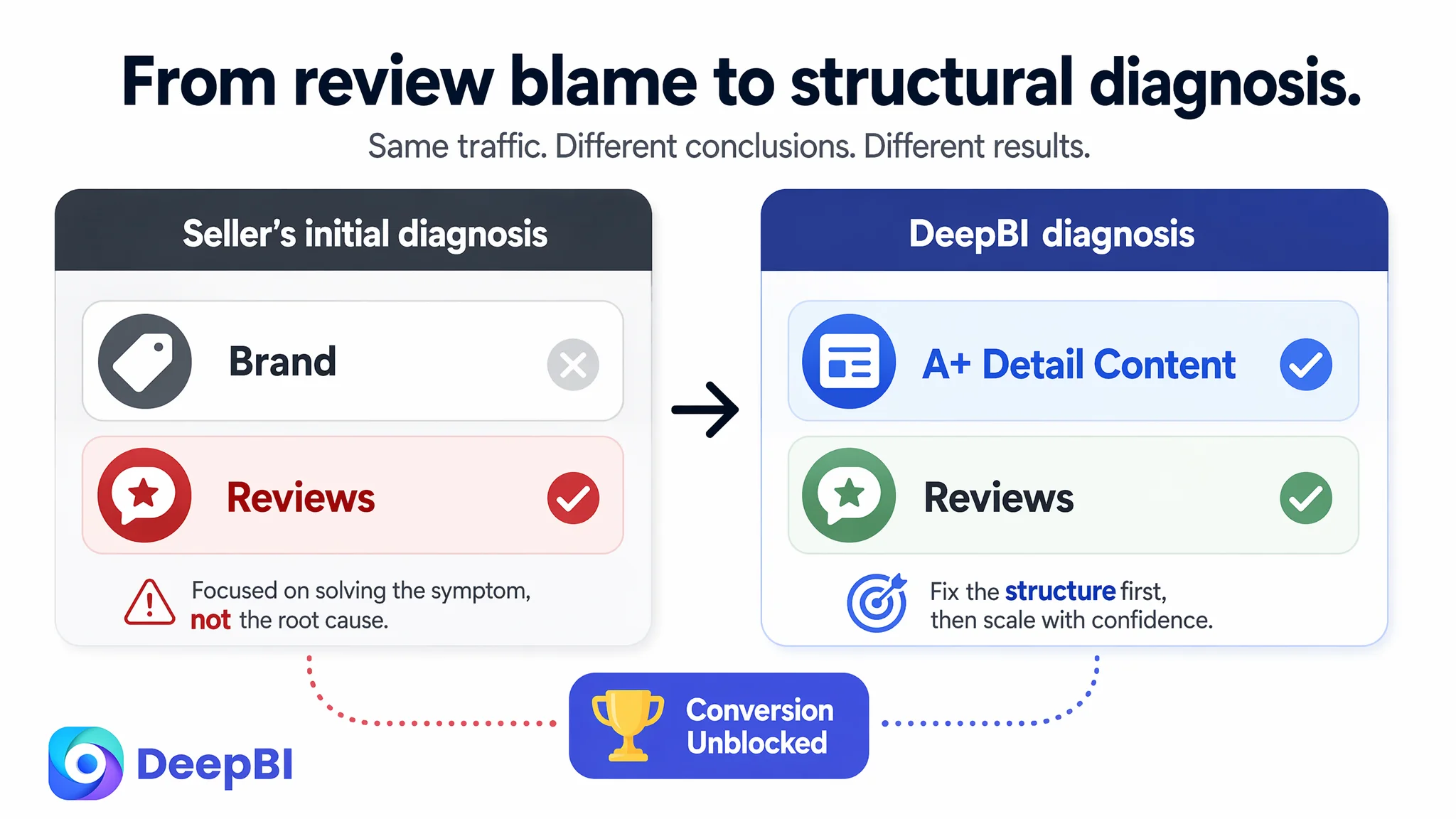
The seller’s team initially attributed the gap to Amazon reviews and brand power: a well-known competitor brand with thousands of ratings versus a relatively new listing with only five. They focused on “getting more reviews” and tuning ads, expecting ACOS to improve once social proof caught up. DeepBI’s Listing scoring, however, showed a different story—reviews were only one part of the trust gap. The deeper problem was a structural weakness in the Amazon Listing’s A+ content and visual logic that left core durability questions unanswered.
By dissecting title structure, main-image sequencing, bullet-point logic, and especially the A+ modules against a benchmark listing, DeepBI reframed the issue: this product page did not lack features; it lacked a clear, visual explanation of those features as reasons to trust and buy. Optimization shifted away from “push more traffic and collect reviews” towards rebuilding the page’s sales narrative around full-tang durability, 9Cr18 steel, ergonomic wood handle, and carry safety. For other Amazon sellers, this case is a reminder that when ads stall and reviews become the easy scapegoat, the real conversion bottleneck often sits inside the Listing’s ability to answer the buyer’s critical questions in a structured, visual way.
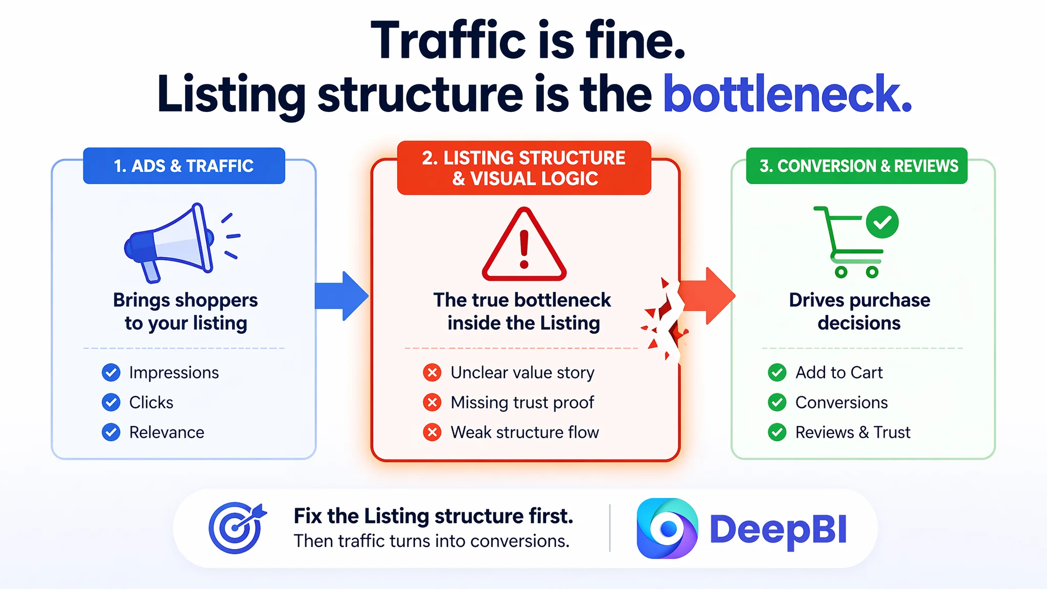
Amazon Ads Were Not Failing. The Page Was Consuming the Traffic.
From an operations standpoint, this outdoor fixed-blade knife listing did many things “right” for Amazon:
- A keyword-rich title capturing “Fixed Blade Outdoor Knife”, “Survival Gear”, and “Gift for Men”.
- Main images covering full product view, close-ups, simulated toughness tests, and on-pack scenarios.
- Bullet points centered on benefits: sharpness, durability, comfort, safety, and versatile use.
- A+ content with lifestyle scenes in outdoor environments.
The team had started Amazon ads, seeing impressions and clicks but no stable path to strong orders relative to a benchmark knife in the same category. As ACOS became harder to keep under control, internal discussions gravitated towards two explanations:
1. The competitor’s brand name created an unfair trust advantage.
2. The competitor’s massive review count (over 5,000) dominated Amazon search and conversion.
Their working assumption: “If we tune keywords and bids, and gradually accumulate more reviews, conversion will follow.” Ads were treated as the main lever; the Listing content was considered basically “good enough”.
DeepBI’s diagnostic score, however, surfaced a different reality: total Listing score 68/100 versus the benchmark at 80/100. That 12-point gap did not stem from main images or bullet points; it came primarily from A+ detail content and reviews.
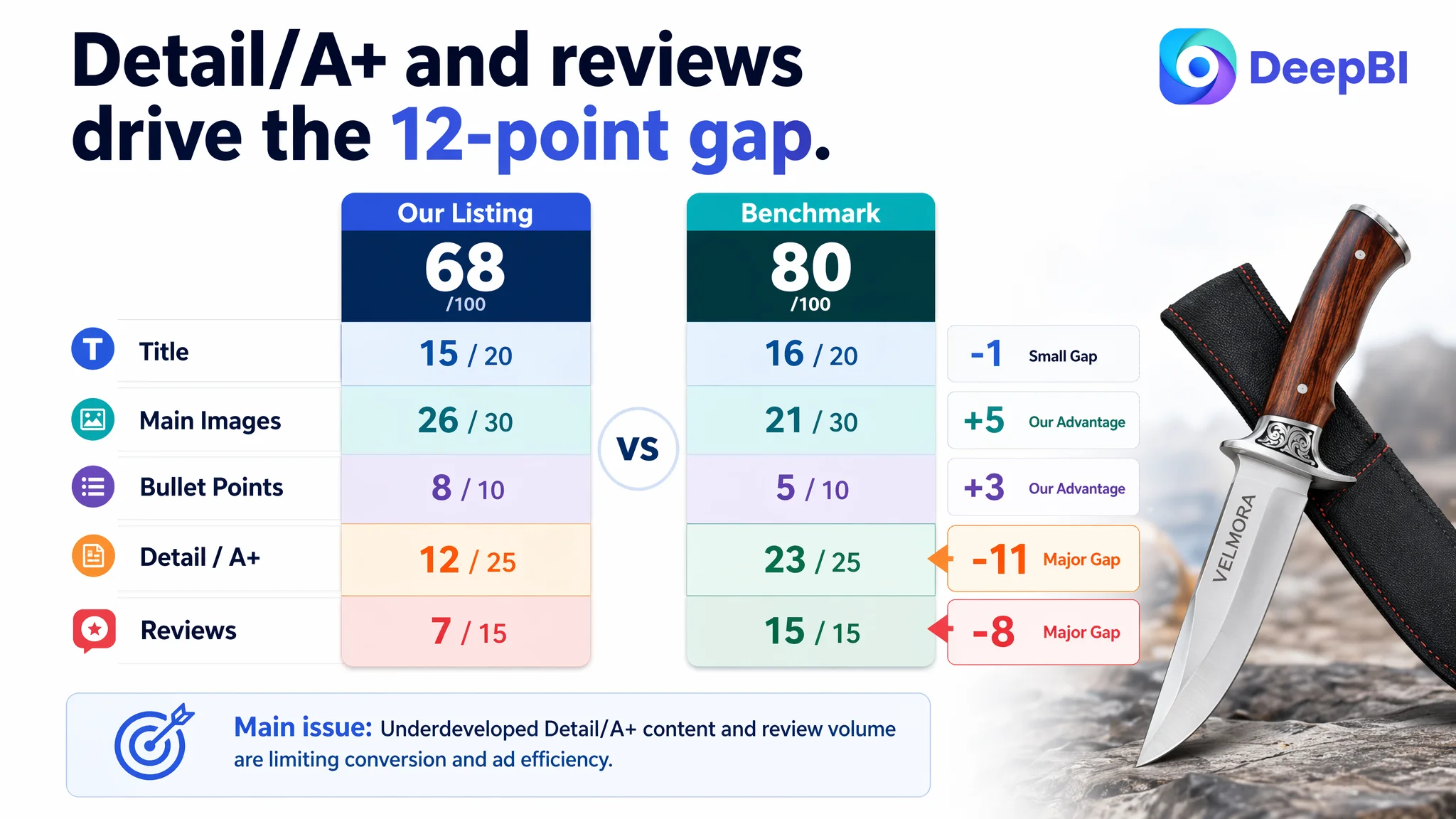
- Title: 15 vs. 16 (close; not the main problem)
- Main images: 26 vs. 21 (our listing actually scored higher)
- Bullet points: 8 vs. 5 (our listing ahead on structure)
- Detail/A+: 12 vs. 23 (major gap)
- Reviews: 7 vs. 15 (major gap)
This pattern is critical. The seller had been trying to solve a conversion problem with ads and reviews, but the bigger structural leak was inside the product page’s ability to build professional trust—especially around durability, structure, and usage.
“The real problem was not that ads failed to bring traffic. It was that the page could not convert the traffic.”
The Real Constraint Was Listing Conversion Capacity, Not Keyword Tuning
What the seller originally misread
Looking at the benchmark knife, the seller saw:
- A strong brand name in the title.
- Thousands of reviews and slightly higher star rating (4.7 vs. 4.5).
- A clear bestseller presence in the category.
The natural conclusion: “We’re losing because we don’t have the brand and the reviews yet.”
This misdiagnosis kept them focused on:
- Ads structure, keywords, and bids.
- Long-term review accumulation strategies.
- Minor tweaks to already strong main images.
What they did not see clearly was the different role each part of the Listing was playing in conversion:
- Main images and title were already competitive enough to attract the click.
- Bullet points were organized and benefit-focused.
- The A+ detail section—the part that should resolve heavy-duty durability doubts—was underbuilt and largely atmospheric.
Their Amazon ads were sending traffic into a page that looked appealing but did not give a rigorous explanation of “why this knife will hold up in demanding outdoor tasks.”
How DeepBI’s scoring reframed the problem
DeepBI’s multi-dimensional scoring did not stop at aesthetics; it compared the Listing’s sales logic against the benchmark:
- Title: We front-loaded “Fixed Blade Outdoor Knife” and rich specifications like “9Cr18 Stainless Steel” and “12.4””. The benchmark opened with its brand (“Mossy Oak”), creating immediate recognition and trust. Our title carried more information but less instant credibility.
- Main images: Our visual set was actually richer—a complete system including scenes, functional tests, parameters, and usage. The benchmark visuals were simpler, with less proof-testing of durability.
- Bullet points: Our bullets were structured around user benefits and integrated parameters with scenes and feelings. The benchmark bullets were more parameter-heavy and, in some places, repetitive.
On these three fronts, the Listing was not substantially weaker than the benchmark; in some ways, it was stronger. The scoring highlighted instead:
- Detail/A+ score: 12 vs. 23 — a 11-point gap.
- Reviews score: 7 vs. 15 — an 8-point gap.
The crucial insight: the seller had been over-weighting reviews and under-weighting detail-page structure. The ads were not failing; they were amplifying a page that did not fully explain its professional strengths.
“Advertising does not only amplify advantages. It can also amplify a page’s existing defects.”
This Product Page Did Not Lack Features. It Lacked a Trust-Building Story.
The A+ content stopped at atmosphere
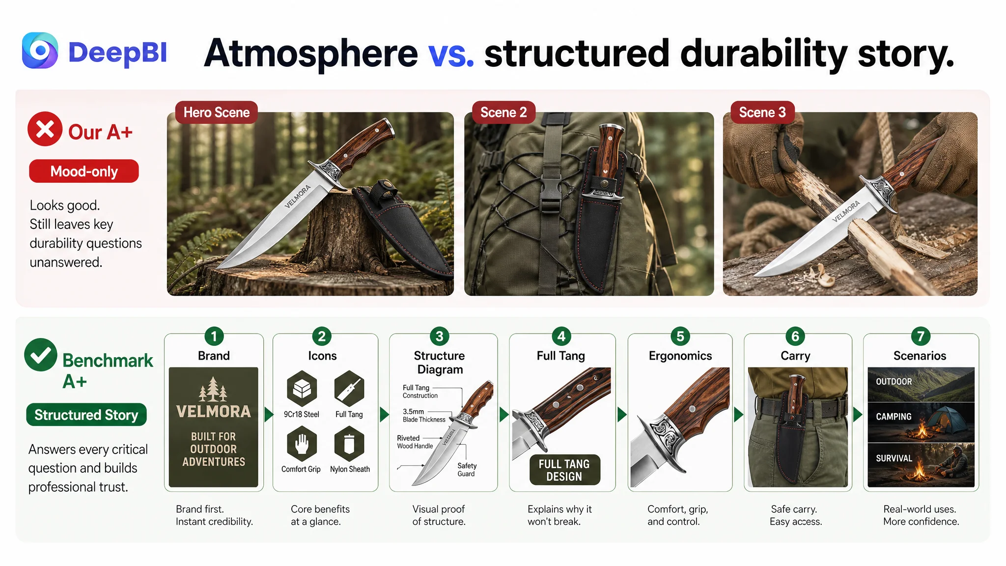
The current A+ layout was:
- One scene hero image.
- Two additional usage/action images.
All three focused on outdoor mood and natural scenes: the knife in the wild, the knife and sheath in an outdoor setting, a user cutting rope or wood.
Visually, it looked appealing. But structurally, it missed what heavy-duty knife buyers care about:
- Is the knife truly full-tang?
- How is the handle reinforced?
- What steel is used, and what does that imply?
- How thick is the blade, and what type of tasks is it realistically suited for?
- How does the sheath carry on a belt and behave in real movement?
The benchmark A+ addressed these points directly using:
- A brand-first introductory module.
- Icon-based core selling points.
- A labeled structural diagram.
- A dedicated “FULL TANG DESIGN” explanation module.
- Blade close-ups and ergonomic handle focus.
- Real-life carry scenes and multi-scenario visuals (OUTDOOR / CAMPING / SURVIVAL).
In other words, the benchmark built a professional narrative: brand → material → structure → ergonomics → usage scenarios. Our listing built a mood but left key structural doubts unresolved.
The main-image logic had hidden contradictions
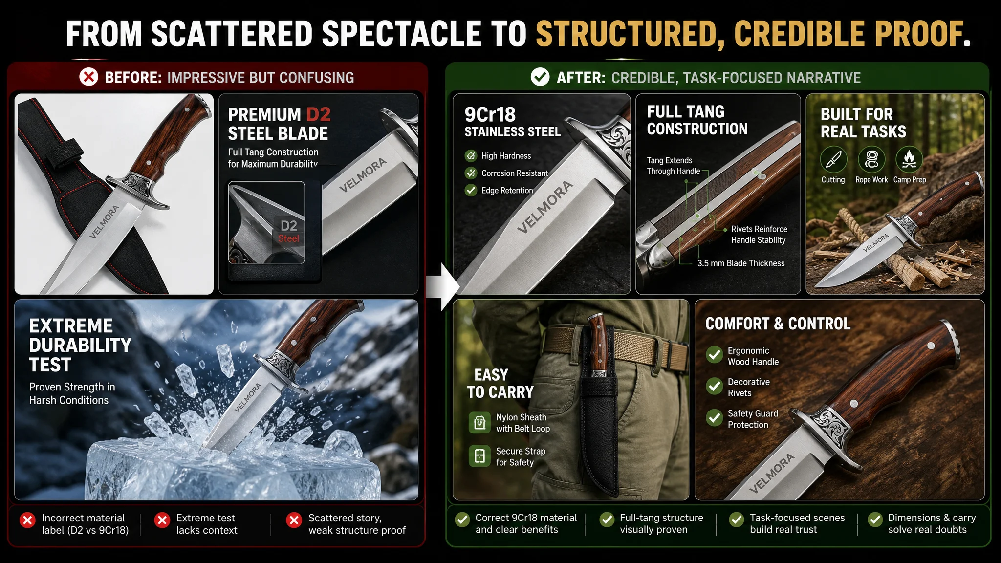
DeepBI’s visual analysis further uncovered a crucial red flag: incorrect material labeling.
- One primary image zoomed into the blade and handle, prominently labeling “D2” steel.
- The actual specification was 9Cr18 stainless steel.
This error did more than mislabel a material. It undermined the Listing’s credibility in a category where steel type signals quality and durability. For a buyer comparing multiple knives, seeing mismatched or confusing material claims can immediately trigger doubt, regardless of how good the knife actually is.
At the same time, our main-image set tried to do a lot:
- Product full view with sheath and artistic guard.
- Close-up combining structure and material (but mislabeled).
- An extreme ice-breaking scene to signal durability.
- A backpack-carry scene with the sheath.
- A handle close-up plus three small usage thumbnails.
Individually, each image had merit. Collectively, the logic was scattered:
- Material credibility was compromised by the D2 vs. 9Cr18 mismatch.
- Full-tang structure was asserted in text but not visualized clearly.
- The extreme test scene looked impressive but did not translate into everyday decision logic.
- Carry and ergonomics benefits were shown, but without focused, single-message frames.
The underlying pattern: strong raw assets, weak narrative sequencing.
Why DeepBI Did Not Recommend “More Ads” First
Ads would have amplified the wrong outcome
With a Listing score trailing the benchmark primarily on detail-page structure and reviews, pushing more ad traffic would have:
- Increased spend on clicks already being won at a decent rate.
- Driven more people into a page that lacked a rigorous durability explanation.
- Pushed more visitors into a review environment with very low comment volume.
In that state, additional ad spend risks:
- Wasting budget on traffic that still would not be convinced to buy.
- Reinforcing Amazon’s learning that this Listing converts weakly relative to the benchmark.
- Making the review gap feel even larger per visitor (more people seeing “only 5 reviews”).
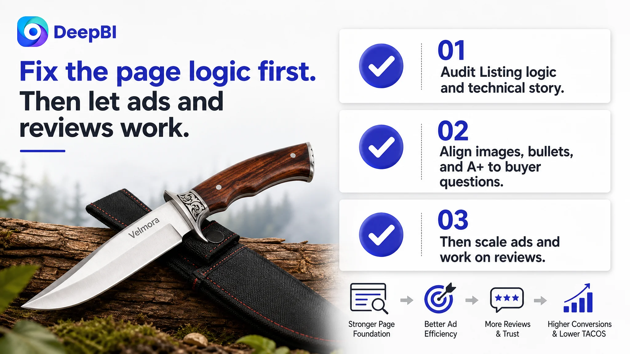
DeepBI’s judgment was clear: Listing conversion capacity had to be repaired before scaling ads. The biggest business risk at this stage was not low exposure; it was sending paid traffic into a structurally incomplete sales narrative.
What had to be fixed first
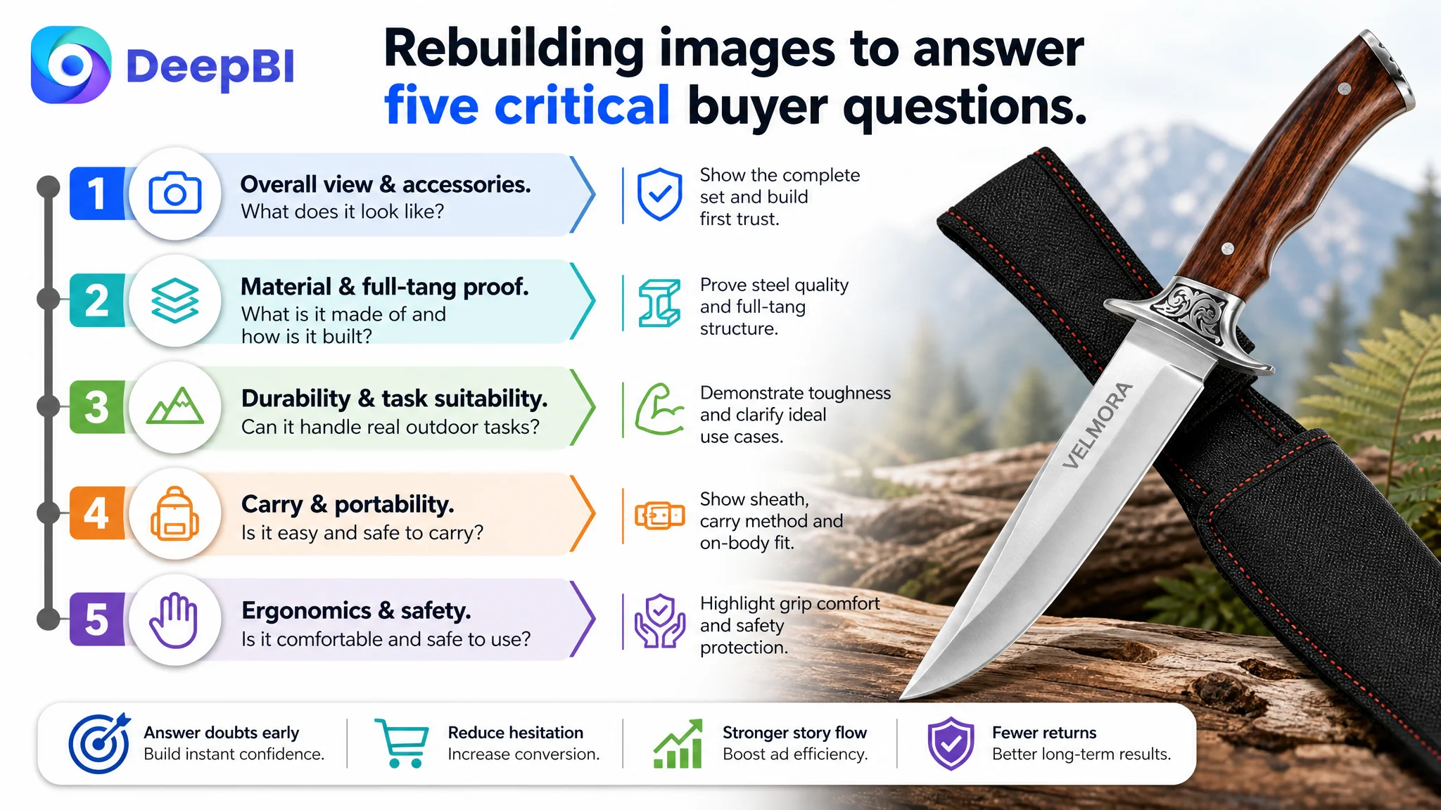
DeepBI’s optimization direction prioritized:
1. Correcting material information across images.
All references to “D2” needed to be replaced with the true “9Cr18 stainless steel,” restoring consistency and trust.
2. Rebuilding image sequence around a clear logical ladder:
- Full product and accessories overview.
- Material and structure proof (9Cr18 + full tang + blade thickness).
- Durability and task suitability.
- Carry and portability.
- Ergonomics and safety in hand.
3. Transforming A+ from atmosphere to explanation:
- Introduce a core-selling-point icon poster as the first module.
- Add a labeled structural diagram covering blade steel, thickness, full-tang construction, handle rivets, guard details, and sheath stitching/belt loop.
- Dedicate modules to full-tang explanation, steel capability, handle ergonomics, and sheath carry.
- Close with scene-based reassurance tying “survival gear” and “gift” positioning to real use.
4. Aligning bullets with this visual story:
- Bullet #1 consolidating dimensions and professional specs.
- Bullet #2 emphasizing 9Cr18 steel vs. common 3Cr13.
- Bullet #3 focusing on ergonomic wood handle and balance.
- Bullet #4 detailing heavy-duty nylon sheath and carry convenience.
- Bullet #5 outlining appropriate outdoor applications.
- Bullet #6 adding clear usage notes to avoid misaligned expectations.
The logic: once the Listing could visually and textually answer “Is this knife structurally sound and appropriately suited to my tasks?” ad traffic would start to have a fair chance at converting.
The Bullet Points Had Information, but Not a Fully Aligned Buying Path
DeepBI’s analysis found the bullet points were relatively well-structured compared to the benchmark, but they needed to serve the new narrative more tightly.
From scattered data to intentional sequence
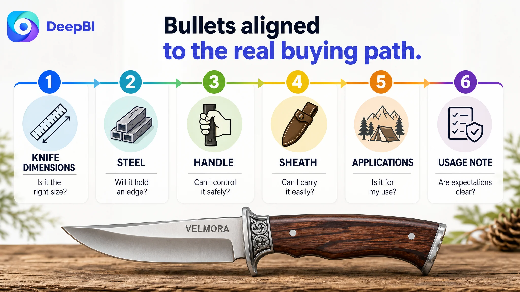
The benchmark’s bullets opened with a dense specification list (overall length, blade length, handle length, blade thickness, weight), immediately helping buyers judge size and suitability. Our Listing originally split these details across multiple bullets and imagery, diluting their impact.
DeepBI’s restructuring aligned bullets with buyer decision steps:
1. Dimensions and physical reality (KNIFE DIMENSIONS)
All key measurements in one place—overall length, blade length, handle length, blade thickness, weight—presented not as raw data but as justification for balanced, demanding outdoor tasks.
2. Material advantage (PREMIUM 9Cr18 STAINLESS STEEL)
Directly positioning 9Cr18 against more common 3Cr13 steel in terms of hardness, rust resistance, and edge retention, and tying this to specific cutting tasks (piercing, precision cutting, survival).
3. Ergonomics and safety (WOOD HANDLE & GUARD)
Highlighting non-slip grip, reduced fatigue, and balanced control under load, reinforcing that this knife is engineered for real use, not just appearance.
4. Carry system (HEAVY-DUTY NYLON SHEATH)
Turning the sheath from a silent accessory into a trust point: reinforced stitching, integrated belt loop, secure strap, and lightweight carry for treks and camp.
5. Applications and positioning (VERSATILE OUTDOOR APPLICATIONS)
Clarifying the knife’s intended use spectrum—hunting, survival, tactical, campsite setup—and aligning it with the “premium gift” angle for outdoor enthusiasts.
6. Usage expectations (USAGE NOTE)
Explicitly discouraging heavy chopping or batoning firewood to avoid misuse and protect both product integrity and reviews, mirroring the benchmark’s care in setting boundaries.
This reordering did more than refine copy; it created a path from “What is this knife?” to “Is it for me?” to “Will it hold up and be safe?”—the core decision chain for this category.
The A+ Page Had to Become a Durability and Trust Engine
From three scenes to six+ structured modules
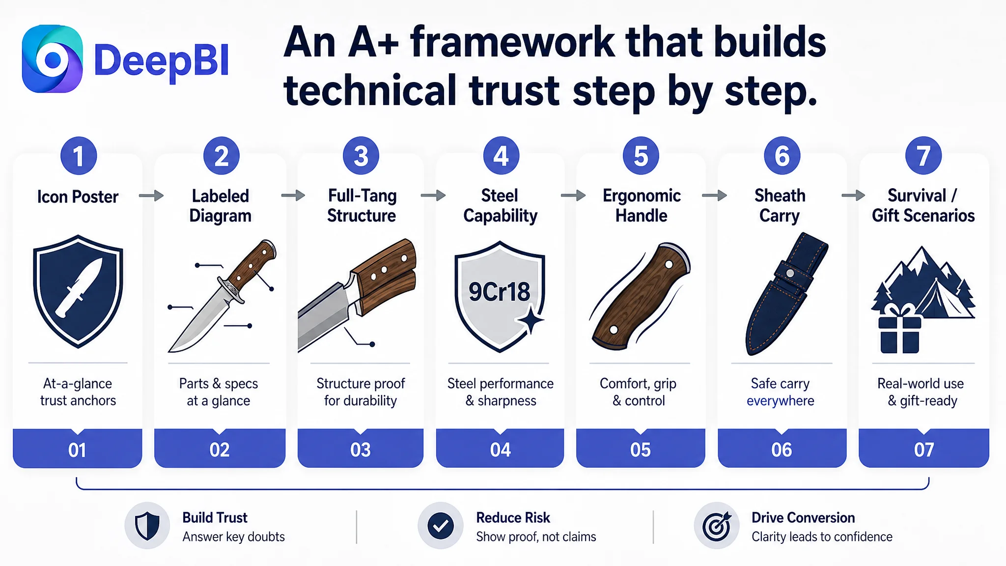
DeepBI’s A+ optimization plan transformed the content from three natural scenes into a framework of high-density, trust-building modules:
1. Core attribute icon poster
Reusing the atmospheric hero image but overlaying concise icons and text for:
- 12.4" full-tang Bowie knife.
- 9Cr18 stainless steel blade.
- Solid wood handle.
- Heavy-duty nylon sheath.
- Included accessories (fire starter, sharpening stone, rope).
2. Detailed labeled diagram
A product-part annotation image marking:
- Blade steel (9Cr18) and thickness (3.5mm / 0.137").
- Full-tang construction.
- Wood handle and decorative rivets.
- Metal guard.
- Sheath stitching, integrated belt loop, and fastening strap.
3. Full-tang and heavy-duty structure explanation
A module visually showing the blade running through the entire handle, with rivets reinforcing the construction and blade thickness highlighted. Text explaining why this provides structural integrity for demanding utility tasks.
4. Steel capability and sharpness verification
Using existing cutting-rope imagery, but explicitly tying performance to 9Cr18 properties: corrosion resistance, hardness, and edge retention.
5. Ergonomic handle reassurance
Focusing on grip contours, comfort over longer use, and natural traction in varied weather, without overpromising, but addressing fatigue and regret risk head-on.
6. Real-life sheath carry scenes
A human waist-carry image showing:
- Belt loop integration.
- Secure strap.
- Stable yet comfortable carry during movement.
7. Survival gear and gift positioning
A final module connecting accessories and craftsmanship to:
- Camp setup.
- Trail clearing.
- General wilderness tasks.
- Gift suitability for hikers, collectors, outdoor enthusiasts.
This rebuilt A+ turned the Listing into a professional narrative comparable to, and in some aspects stronger than, the benchmark: less about lifestyle mood, more about “here is how this knife is built, what it can reasonably do, and why you can trust it.”
The Main Image Was Not Just a Visual Issue. It Failed to Create a Clean Reason to Trust.
DeepBI’s main-image guidance was not about style for its own sake; it was about aligning each image with a single, clear question in the buyer’s mind.
Image 1: Overall view and craftsmanship
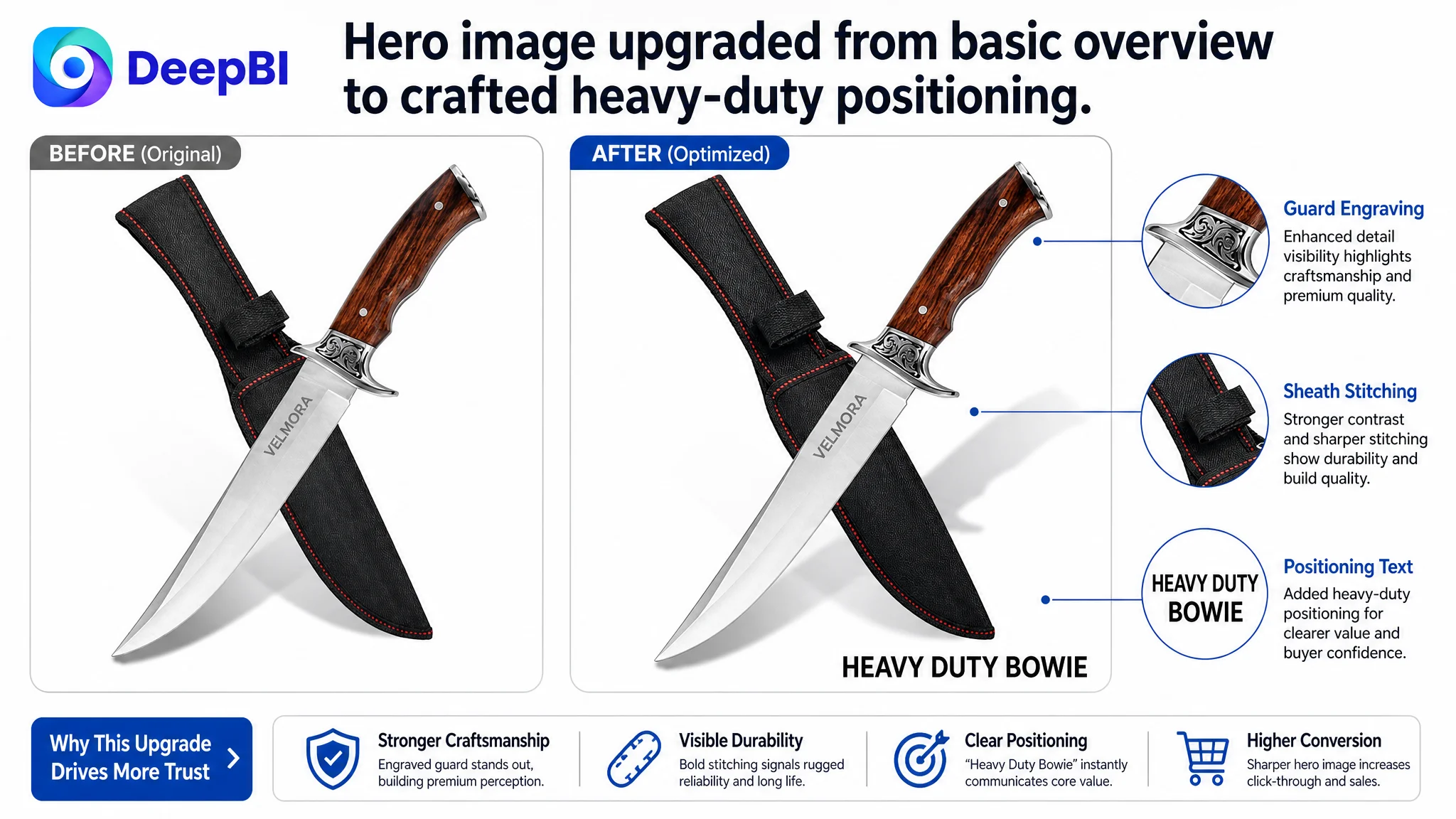
- Keep the full product and sheath shot.
- Subtly adjust composition and lighting to highlight:
- Artistic metal guard with engraving.
- Wood grain and finish of the handle.
- Sheath’s stitching and form.
This image answers: “What does this knife look like, including its sheath and craftsmanship?”
Image 2: Material and structure proof
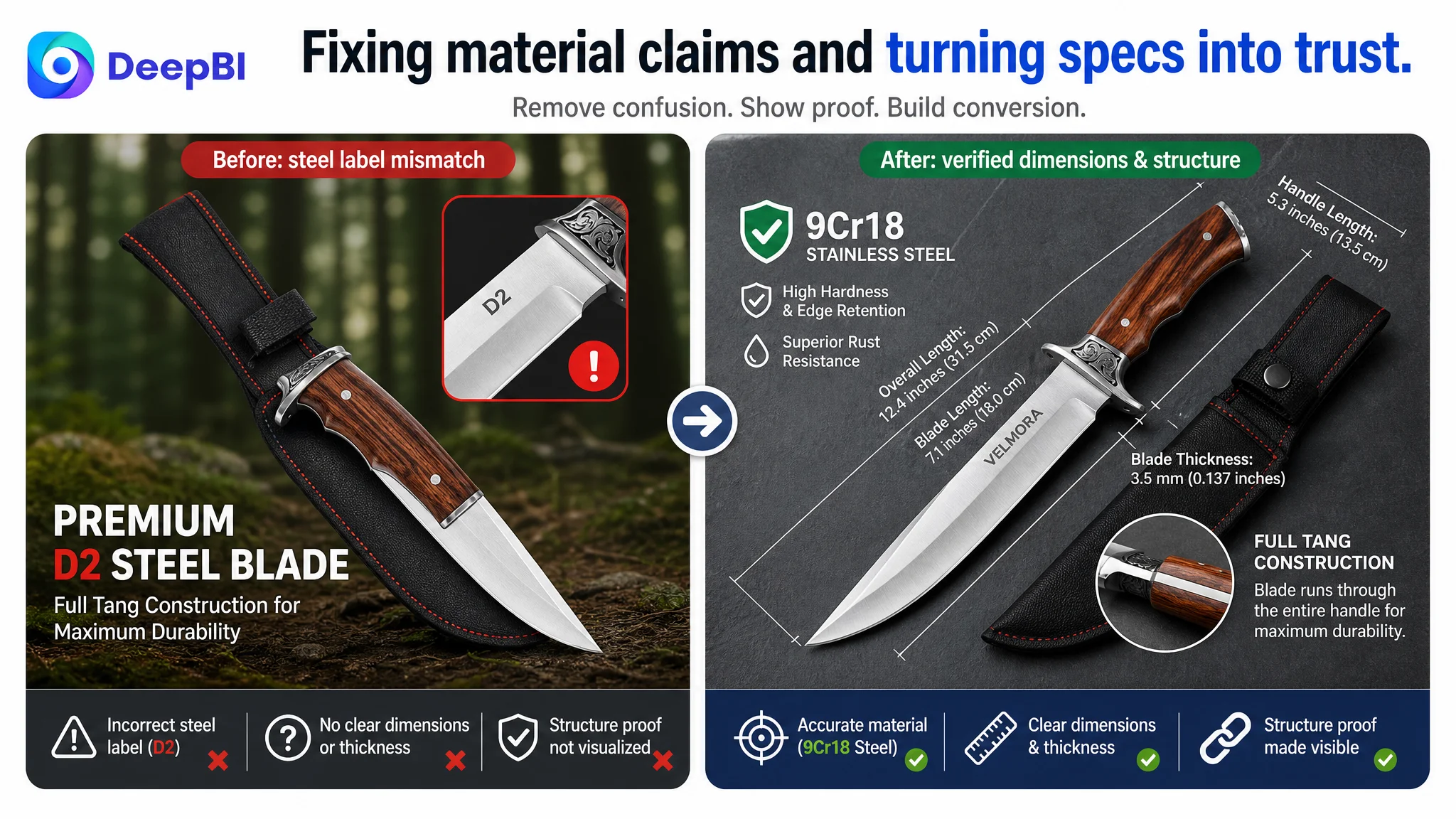
- Remove incorrect “D2” text.
- Focus the frame exclusively on:
- Blade close-up with “9Cr18 stainless steel” text.
- Clear full-tang visual exposition.
This image answers: “What steel is actually used, and is this really full-tang?”
Image 3: Durability in credible scenarios
- Reconsider the extreme ice-breaking image as a primary proof.
- Shift emphasis toward:
- 9Cr18 steel’s durability and rust resistance.
- Guard and handle working together for safe control.
This image answers: “Is this knife engineered for tough tasks while remaining safe to use?”
Image 4: Carry and portability
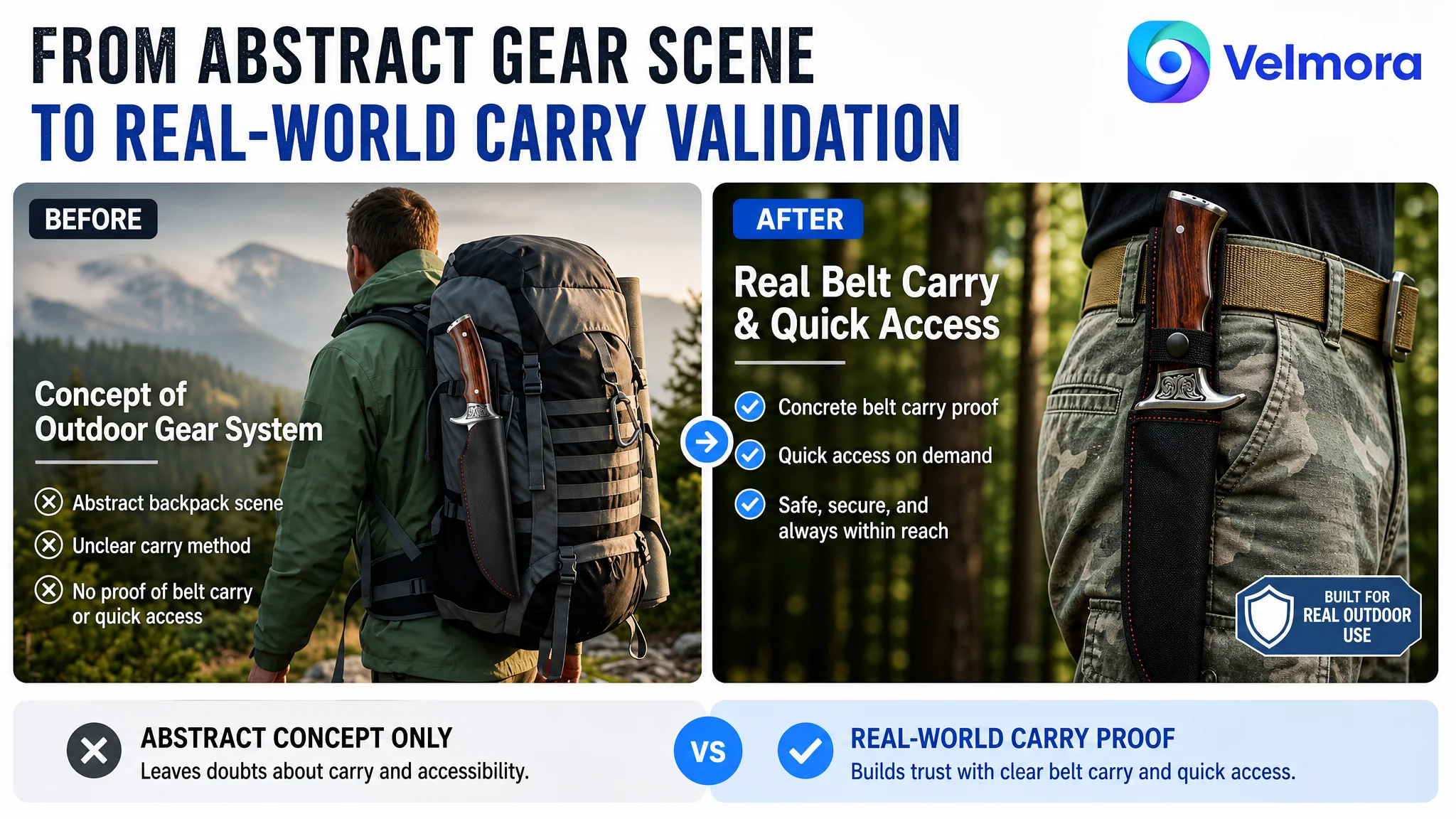
- Refine the backpack carry composition to highlight:
- Belt loop, strap, and actual attachment points.
- Add specific context text: camping, hiking, survival carry.
This image answers: “How does this knife travel with me in real outdoor scenarios?”
Image 5: Ergonomics and safety
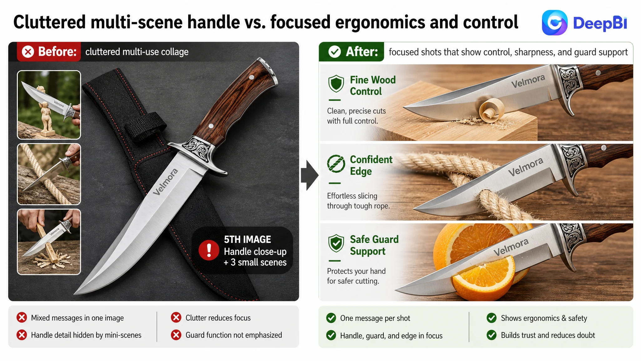
- Remove cluttered small usage thumbnails.
- Use the handle close-up to:
- Show ergonomic contour.
- Emphasize rivets reinforcing the handle.
- Highlight the guard as a safety barrier.
This image answers: “How does this knife feel and behave in hand for longer use?”
By making each image answer one focused question, the Listing avoids visual noise and builds a cumulative, coherent story that ads can safely amplify.
After the Page Started to Convert, Ads Could Work Again
Once the Listing’s structural issues were addressed:
- Material claims became consistent.
- Full-tang and durability got visual and textual proof.
- Dimensions and tasks became clear.
- Carry and ergonomics were explained.
- A+ evolved into a layered trust engine instead of pure atmosphere.
The direct outcomes were not expressed as fabricated numbers, but the operational state changed:
- The Listing began to have a fair chance of converting both organic and ad-driven traffic.
- The gap between the benchmark’s professional story and this Listing’s narrative narrowed considerably.
- The risk of sending paid clicks to a structurally incomplete page decreased.
- The knife’s strengths—9Cr18 steel, full-tang, ergonomic wood handle, nylon sheath—became visible and believable rather than buried.
For the seller, the key understanding shift was this:
- Amazon ads are not a universal cure for conversion issues.
- Reviews matter, but they cannot compensate for missing structural explanation.
- Listing quality—title clarity, main-image logic, bullet alignment, and A+ depth—is the foundation on which ad efficiency sits.
- Before scaling spend, the team must ask: “Does this page deserve more traffic?”
What Other Amazon Sellers Can Take From This Case
This outdoor knife case is not about a single product; it is about judgment:
- It is easy to blame brand power and review count when a competitor dominates.
- It is tempting to keep tuning ads—keywords, bids, budgets—while assuming the Listing is “fine.”
- It is common to invest in more scenes and more images without asking whether they actually answer the buyer’s difficult questions.
DeepBI’s role here was not to generate prettier pictures; it was to expose that the Listing’s true bottleneck was a missing technical story and structural trust path. Once the seller stopped treating high ACOS as purely an advertising optimization problem and started treating it as a Listing conversion problem, the optimization direction changed—and ad traffic became valuable again.
For Amazon sellers, the core takeaway is simple but demanding:
- Before you scale ads or chase more reviews, audit whether your Amazon product page can convincingly explain what your product is built to do, how it is built, and where its reasonable limits are.
- Listing conversion capacity is not a cosmetic metric; it is the primary constraint on sustainable ad efficiency and long-term TACOS.
This case shows that when reviews and brand recognition seem unbeatable, the most leverage often comes from quietly fixing the logic of the page itself.