

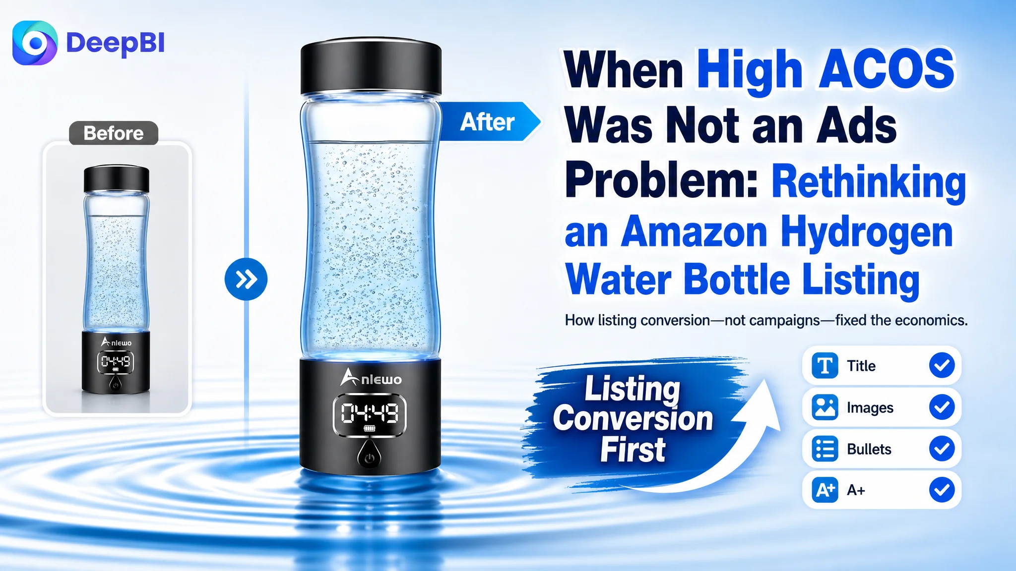
This case comes from an Amazon seller in the hydrogen water bottle category who had fallen into a familiar trap: treating rising ACOS as a pure Amazon ads issue. They kept tuning bids and keywords, but even when traffic came in, the product page could not turn that traffic into stable orders.
At first, the team believed the main gap versus a leading competitor was reviews and ad execution. But once we put their Listing into DeepBI’s scoring and benchmark system, a very different picture emerged. The page’s total Listing score lagged the benchmark by 17 points (69 vs. 86), with the biggest gaps not in reviews or price, but in title, bullet-point logic, A+ structure, and especially main-image trust signals.
The real constraint was Listing conversion capacity. The product itself was competitive, review quality was actually slightly better than the competitor’s, but the Amazon product page did not look like a high-end, medically trustworthy device. We shifted the focus away from “optimize ads harder” toward rebuilding the Amazon Listing’s sales logic: retuning the title, restructuring bullets from “instruction manual” to “persuasion path,” and redesigning main and A+ images around quantifiable performance and third‑party trust.
For other Amazon sellers, this case is a reminder: when ACOS won’t drop and ads “feel” inefficient, the problem may not be the campaigns. If your competitor’s Amazon Listing is built around numbers, certification, and decision shortcuts while yours reads like a spec sheet, ads are just paying to amplify a weak page. Fix the Listing first; only then will every click you pay for start to matter.
The Core Conflict: Traffic Wasn’t the Issue, Trust Was
On this Amazon US hydrogen water bottle, the seller saw what many see:
- Rising Amazon ad spend.
- A sense that “our product is good, but orders don’t follow.”
- A competitor in the same category pulling ahead.
Their instinctive response was to push more on Amazon ads—optimize bids, refine keywords, test audiences—assuming that high ACOS meant “we haven’t found the right ad structure yet.”
DeepBI’s Listing scoring, however, placed their ASIN at 69/100 vs. a benchmark competitor at 86/100, a meaningful 17‑point gap in a tight category.

The breakdown immediately reframed the problem:
- Title: 11 vs. 15 (‑4)
- Main images: 24 vs. 27 (‑3)
- Bullet points: 4 vs. 9 (‑5)
- A+ / detail content: 19 vs. 23 (‑4)
- Reviews: 11 vs. 12 (‑1)
The real problem was not that ads failed to bring traffic. It was that the page could not convert the traffic.
Reviews were healthy; price was not the bottleneck; but the content that actually carries a buyer from click to purchase was systematically weaker than the category leader.
What the Seller Originally Misdiagnosed
From the seller’s side, the situation looked like this:
- Star rating: 4.5 vs. competitor’s 4.6 – almost identical.
- Review quantity: 15 vs. 29 – lower, but not catastrophic.
- Home-page review quality: actually better than the benchmark (higher 5‑star concentration, lower complaint rate).
- Ads: working hard to bring impressions, but ACOS stayed uncomfortable.
So the internal narrative became:
- “We need more reviews.”
- “We need better ads.”
- “Maybe our creatives are not ‘eye-catching’ enough.”
This logic led to several missteps:
- Overweighting ad-side tweaks while ignoring structural Listing weaknesses.
- Underestimating how much title, main image, bullets, and A+ together drive CVR on Amazon.
- Assuming that because the product is niche/technical, buyers will “read carefully” instead of needing a fast, trust‑heavy decision path.
Traditional Amazon ad tactics—bid optimization, campaign restructuring, keyword expansion—were trying to squeeze more efficiency out of traffic that was landing on a page not built to sell like a top competitor’s page.
DeepBI’s Diagnosis: A Conversion Page, Not an Ad Account, Was Blocked
When DeepBI benchmarked this Listing against a directly comparable high-performing competitor, three things stood out as the true bottlenecks:
1. Weak title as a trust and click driver.
2. Main-image set that looked like a generic small appliance, not a high‑end health/tech device.
3. Bullet points and A+ built as “instruction manual” content, not as a conversion funnel.
1. Title: Not Claiming Authority, Not Leading With What Matters
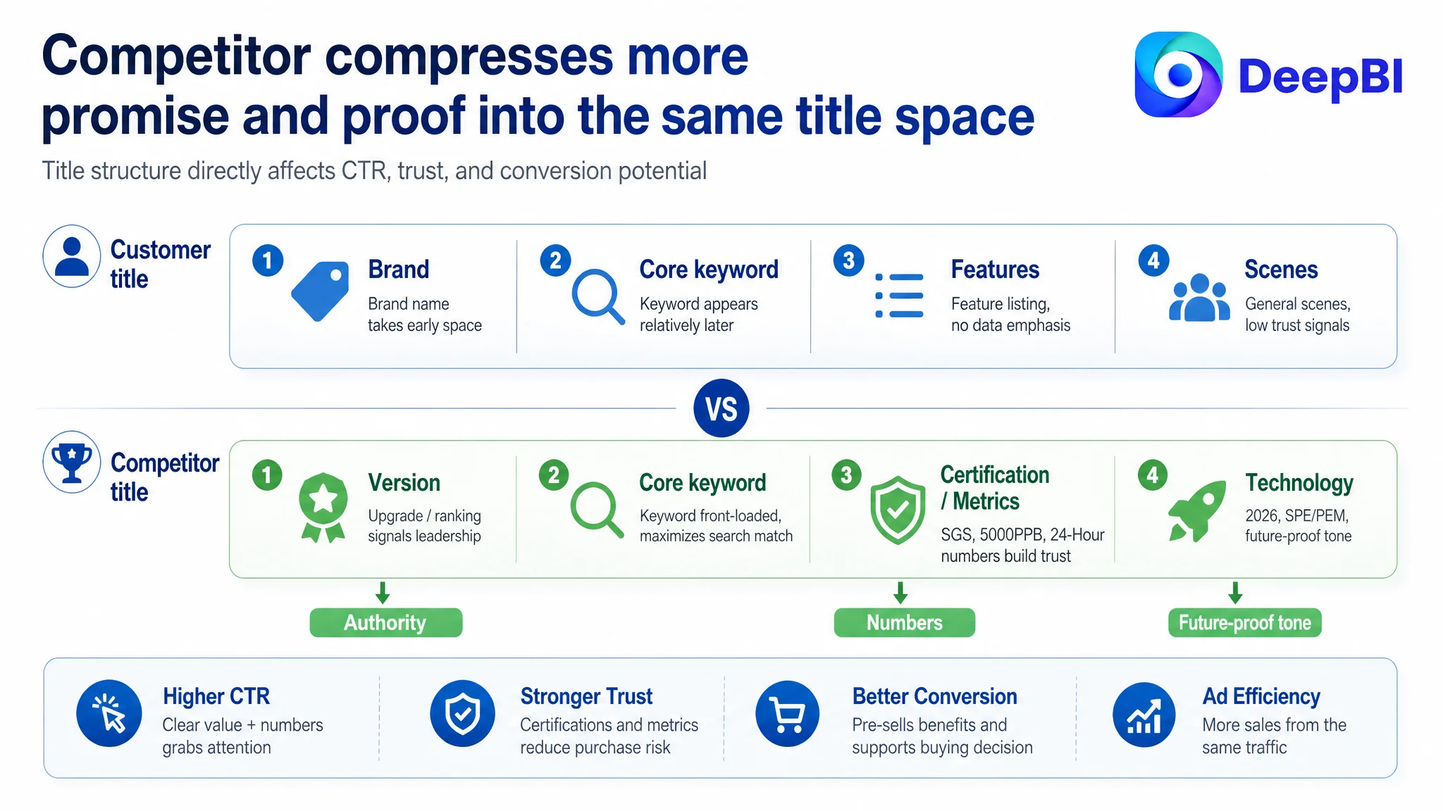
The competitor’s title did three things very clearly:
- Stated strong third‑party validation (“SGS certification”) and market position (“NO.1”).
- Highlighted core performance data (“5000PPB”, “24‑Hour Hydrogen Lock”) with typographic emphasis.
- Used a marketing-oriented structure: version + keyword + certification/data + technology.
By contrast, the target Listing’s title:
- Followed a safe template: keyword + brand + generic benefits + scenarios.
- Front‑loaded the brand name instead of the main Amazon search term.
- Lacked any visible authority markers or performance numbers in the first glance.
On Amazon, titles are not just for indexing. In competitive SERPs, they function as a second main image line: they signal authority, performance, and differentiation. Here, the Listing ceded that ground.
2. Main Images: Everyday Gadget Look, No “Medical-Tech” Authority
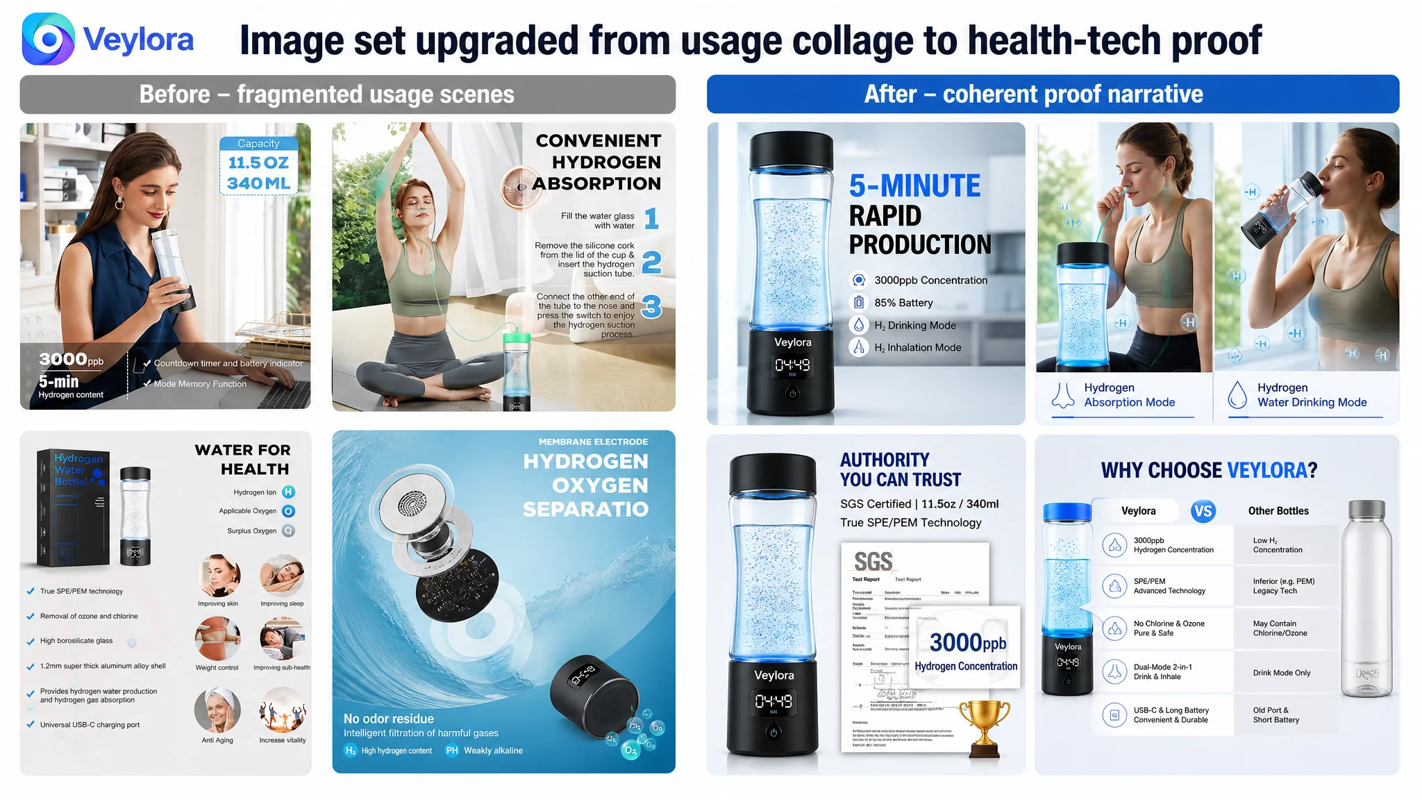
DeepBI’s visual comparison found:
- Insufficient “medical / lab‑grade” tech feel: more like a household gadget than a serious health device.
- Technical images were dense but hard to read, which hurts scanability and watch‑time.
- Lifestyle images lacked clear, high‑intent scenarios: no sharp “morning routine”, “post‑workout recovery”, or “desk vitality” narratives.
The benchmark, in contrast, used:
- Clean, cold blue + white palettes.
- Strong performance callouts (e.g., PPB numbers) directly on images.
- Simple but powerful visual proof of double modes, certifications, and superiority over “other” products.
Missing here was not just “prettiness,” but first‑glance trust. On Amazon, that’s what drives CTR. DeepBI estimated that this gap alone could be suppressing CTR by 5–8% in a high‑competition niche.
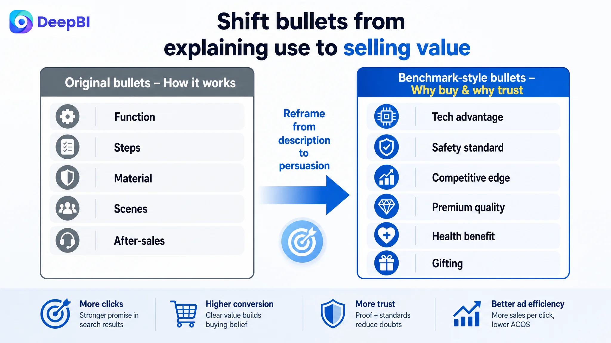
3. Bullet Points: From “User Manual” to “Persuasion Logic”
The bullet-point gap was the single biggest scoring delta: 4 vs. 9 (out of 10).
- The target Listing’s bullets read like a product manual:
- How to use.
- What materials.
- Operating steps.
- The competitor’s bullets followed a marketing and trust path:
- “Industry-leading”, “scientifically supported”, “0 harmful substances”.
- Clear “tech → safety → health → quality → gifting” storyline.
- Bolded micro‑headlines = mini promises, not mere feature labels.
- Frequent comparison framing (“beyond regular”, “more than twice”) to position themselves above the category.
In short, the competitor’s bullets answered: “Why should I pay this price for this device, and why should I trust its health impact?”
The target Listing answered: “How does this work and what is it made of?”
On Amazon, information is not enough. What converts is a structured, low‑friction argument.
4. A+ Detail Page: Lifestyle Nice, But Authority Thin
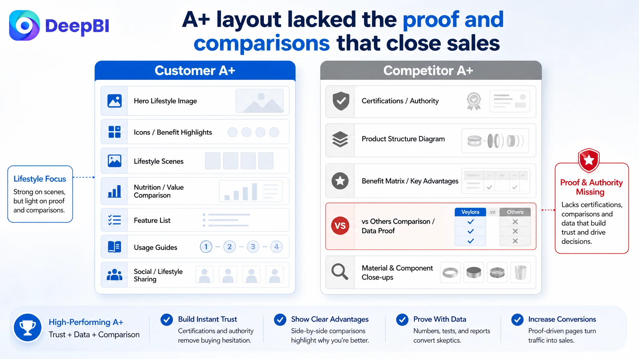
The A+ modules for the target Listing emphasized:
- Scenes and lifestyle.
- Icon‑based benefits.
- Usage guides and social scenes.
The competitor’s A+ prioritized:
- Third‑party validation (SGS, “TOP1”, “patented core components”).
- Cutaway and data visualizations (PPB, purity percentages).
- Dedicated “vs OTHER” contrast modules, explicitly defining why their product is superior.
The target A+ made the product likeable; the competitor’s A+ made it trustworthy, justified, and premium.
Why Continuing to Adjust Ads Would Have Been the Wrong Next Move
At this point, DeepBI’s judgment was clear: fix the Listing’s conversion logic before touching ad structure again.
Why?
1. Each click was landing on a structurally weaker page.
Better targeting and lower CPC would still be feeding a page that lacked the authority cues and decision shortcuts this category needs.
2. Review quality proved the product; the page failed to prove the product.
With a 4.5 rating and strong positive front‑page feedback (better than the competitor’s ratio), Amazon customers who bought were broadly satisfied. The problem was getting more visitors to feel safe enough to buy.
3. Ads were amplifying the wrong outcome.
More spend was not yielding more stable order volume, because the page did not meaningfully differentiate itself from cheaper or more “lab‑looking” alternatives.
Advertising does not only amplify advantages. It can also amplify a page’s existing defects.
So DeepBI prioritized Listing conversion as the immediate bottleneck. Only after the page deserved the traffic would further ad optimization make economic sense.
How the New Optimization Direction Was Defined
DeepBI’s role here was not to suggest cosmetic changes, but to rebuild the sales logic of the Amazon product page in a way that:
- Aligns with how buyers decide in this health/tech niche.
- Catches up to, and selectively surpasses, the benchmark Listing.
- Respects product reality and Amazon compliance.
Reframing the Title: From Description to Positioning
The proposed title direction:
Hydrogen Water Generator Bottle, SPE PEM Technology 5000PPB High H2 Concentration Water Ionizer Machine, Portable Hydrogen Water Maker for Travel, Sports, Office and Fitness (Black)
Key shifts:
- Core keyword and function clarified: “Hydrogen Water Generator Bottle” and “Water Ionizer Machine” make the role explicit.
- Tech and quantitative proof surfaced: “SPE PEM Technology”, “5000PPB High H2 Concentration” – moving from generic claims to measurable tech.
- Scenarios kept, but trimmed: “Travel, Sports, Office, Fitness” – enough to cover major use cases without bloating length.
The intent was to make the title itself function as:
- A search anchor (keyword relevance).
- A performance claim bar (numbers and tech).
- An expectation setter (portable, use cases).
Rebuilding Bullet Points as a Conversion Path
Instead of five functional blurbs, the bullet points were redesigned as a stepwise decision logic:
1. “Advanced SPE & PEM Technology”
- Leads with technical authority and a concrete number (up to 5000 ppb in 10 minutes).
- Reassures on purity by explaining the exhaust vent removing ozone and chlorine.
2. “Smart Memory & Optimal Performance”
- Turns a potentially cumbersome first‑use instruction (“soak for 12 hours”) into a performance optimization tip.
- Adds “intelligent” positioning — it adapts to usage, not just “you must follow these steps.”
3. “Food-Grade Materials & Dual-Mode Design”
- Combines safety (premium glass, food‑grade, leak‑proof) with differentiation (drink + inhalation in one device).
4. “The Perfect Health Gift for Vitality”
- Elevates the product into gifting and lifestyle, not just a tool.
- Uses compliant, non‑medical wording (“support metabolism,” “relieve fatigue,” “promote well‑being”) to avoid policy risks while still speaking to health aspirations.
5. “Easy Operation & 24-Month Support”
- Simplifies operation steps; avoids overwhelming buyers with technical detail.
- Adds a 24‑month support promise as a strong trust anchor to reduce purchase anxiety.
Seen together, these bullets now answer:
- Is this technology legit?
- Is it safe?
- Is it different from a cheap hydrogen cup?
- Is it easy enough for daily life or as a gift?
- Will the seller stand behind it?
That is a conversion path, not a manual.
Redesigning the Main Image Set Around “High-End Medical-Tech”
The main-image strategy was rebuilt around one central decision: this must look like a high-end, medically credible device, not a random kitchen gadget.
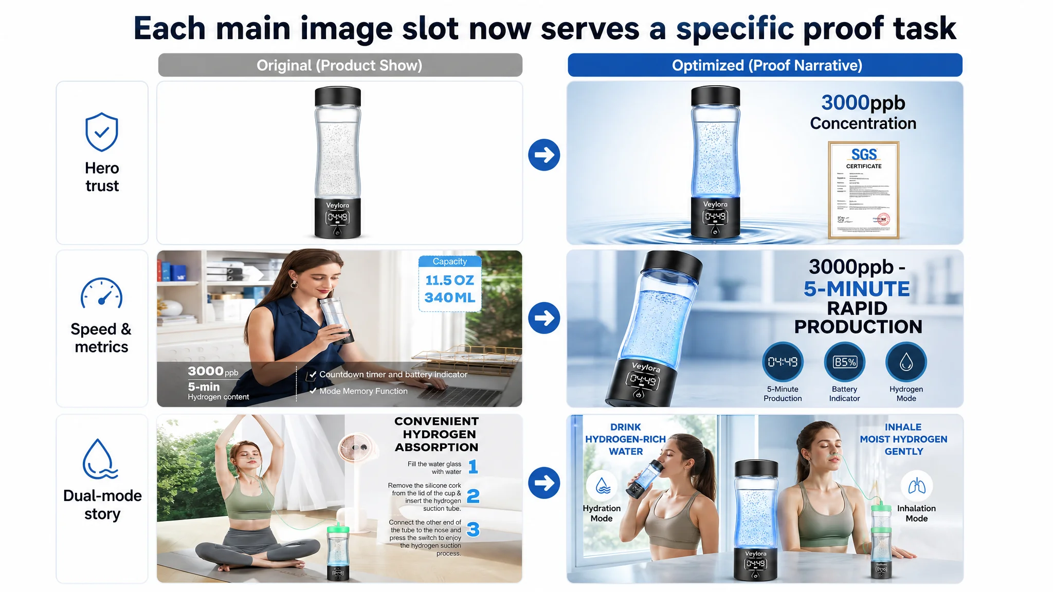
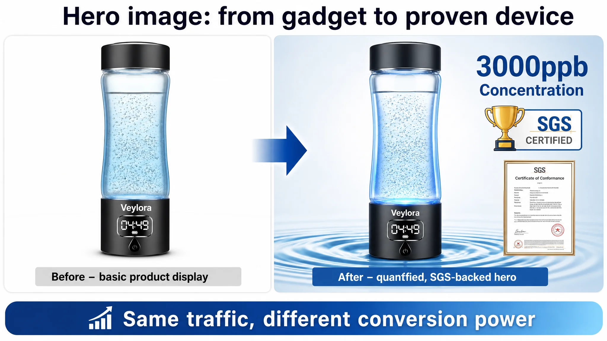
Main Image 1: Hero Shot With Quantified Credibility
Direction:
- Product centered, ~75% of frame, straight-on view.
- Cold blue + pure white palette to signal tech and cleanliness.
- Subtle radial gradient background and water ripple under the base for energy.
- Bold text overlay: e.g., “3000ppb Concentration”.
- SGS‑style certification icon to visually import authority.
Business intent:
- Win the SERP first glance: “This one looks legit, measured, certified.”
- Turn what was previously buried technical info into a top‑of‑funnel click driver.
Main Image 2: Speed and Control, Not Just a Cup on a Desk
Direction:
- Product at left, 45° angle, modern office background softly blurred.
- Right side: bold “5-Minute Rapid Production” and a simple mode + battery visual display.
Business intent:
- Address a frequent niche concern: “How long does this take and how often do I need to charge?”
- Make abstract technical efficiency visually felt without reading dense text.
Main Image 3: One Device, Two Modes, Clearly Shown
Direction:
- Split composition:
- Left: device in inhalation mode with tube attached.
- Right: hand holding the cup in drinking mode.
- Bright natural-light window background; soft blue “+H” reactive molecule effects around the product.
Business intent:
- Stop hiding the key differentiator (inhale + drink) in text.
- Let buyers grasp the multi‑function at a glance, so the product no longer looks like “just another cup with a light.”
Main Image 4: Authority and Quality, Visually Compressed
Direction:
- Side view in a clean studio setting, with a semi‑transparent lab report overlay and a subtle “NO.1” or “Quality Certified” trophy icon.
Business intent:
- Replicate the competitor’s “industry standard” effect without copying.
- Translate “good quality” from vague copy into visual proof.
Main Image 5: Address the Core Pain Point—Purity and Smell
Direction:
- Left: the product in a fresh blue field, with bubbles and “SPE Technology, No Chlorine” messaging.
- Right: a greyed‑out competitor silhouette, marked with a cross and “Smell & Impurity.”
Business intent:
- Hit the #1 friction in this category—fear of chlorine smell or residual impurities.
- Use simple visual contrast to anchor “ours is clean; typical others are not.”
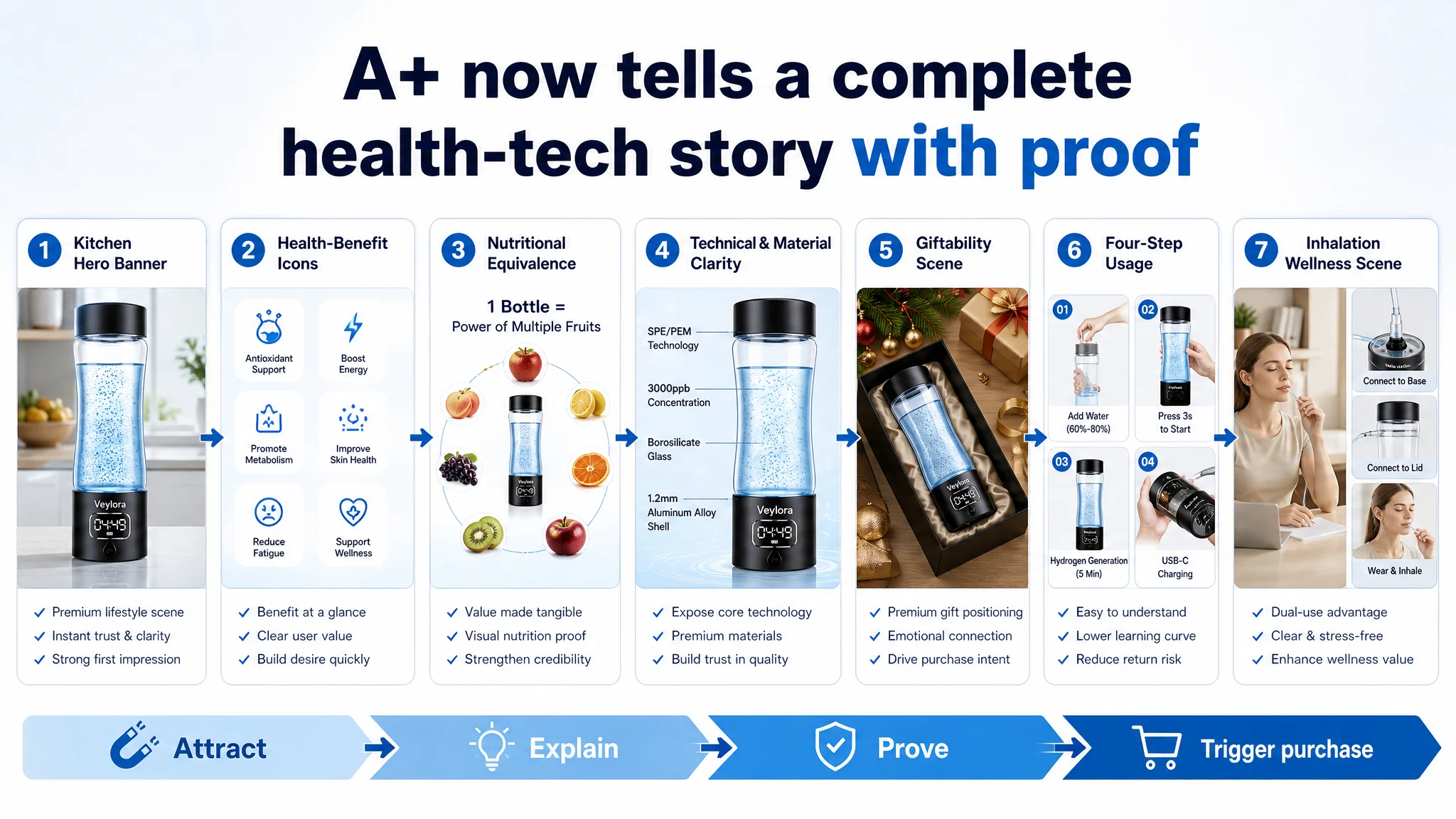
Rewiring the A+ Detail Page Around Decision Velocity
The existing A+ focused on lifestyle and benefits, but was light on professional proof. DeepBI restructured it into a sequence of modules aligned with how buyers research:

1. Opening Banner – From Mountain Hike to Kitchen Counter
- Shift to a modern, high‑end home/kitchen setting under calm morning light.
- Clean typography: “CHOOSING HEALTHY HYDROGEN WATER.”
Why: buyers in this category imagine daily, at‑home use, not just extreme sports. This makes the product feel reachable and normal, not niche.
2. Core Benefits – From Cute Icons to Clinical-feel Layout
- Vertical stack of five clear benefit icons (antioxidant support, metabolism, energy, etc.) on a clean blue‑to‑white gradient.
- No water-splash clutter, more “lab sheet” than “Instagram graphic.”
Why: in health‑adjacent categories, design language = perceived scientific rigor.
3. Nutritional Equivalence – Visual Value Justification
- Product in the center, surrounded by real, natural fruit (no cheap bubble overlays).
- Corrected, professional heading: “NUTRITIONAL EQUIVALENCE.”
Why: visually answer “what do I get per glass?” and justify the price without heavy reading.
4. Structure and Quality – Detail Without Sloppiness
- Clean, angled product breakdown on a neutral grey background.
- Fine callouts to core details (USB‑C, glass thickness, etc.).
- Fix spelling and spacing issues that previously undermined professionalism.
Why: small errors on technical products create outsized doubt. This module had to say, visually and linguistically: “we know what we’re doing.”
5. Gifting Scene – Unified, Warm, Intentional
- Proper, cohesive gifting layout with a real box, mild festive elements, and warm light.
- Clear, modern labels for gifting targets (family, partner, etc.).
Why: in this niche, a large share of orders are gifts. The old montage looked like stock clutter; the new version sets a concrete mental picture: “I see this as a premium health gift.”
6. Usage Steps – Reduce Friction and Returns
- Four simple, consistent squares with clean lab backgrounds and natural hand motions.
- Clear numbering and concise text below each.
Why: complexity is a major return driver. This module’s job is to make usage look obvious, not intimidating.
7. Inhalation Tutorial – From “Diagram” to “Wellness Moment”
- Left: a calm, seated user scene in a home office.
- Right: three close‑ups of connecting and using the inhalation tube.
Why: inhalation is the differentiator but can look complicated. This combination makes it feel like a relaxing wellness ritual, not a medical procedure.
What Changed in the Business Reality
This case did not invent new product capabilities, change pricing, or flood the Listing with fake reviews.
What changed was the logic of the Amazon product page:
- The title started working as a click driver and authority signal, not just a keyword container.
- The main images began to carry quantified performance, trust icons, and visual answers to the category’s main fears (purity, smell, safety).
- The bullet points evolved from scattered facts to a coherent argument: tech → safety → differentiation → lifestyle → after‑sales security.
- The A+ content started compressing technical, emotional, and gift-driven reasons to buy into a quick scroll.
For the seller, the practical effects were:
- Ad traffic became useful again. With stronger Listing conversion, each paid click had a better chance to become a sale instead of a bounce.
- ACOS had room to move down without touching bids first, because CVR was no longer structurally suppressed.
- Dependence on ever‑increasing ad spend softened. A more persuasive product page also supports organic traffic and ranking.
Just as important, the seller’s understanding shifted:
- “High ACOS” is not always proof of an advertising problem.
- Review count and rating are not the whole trust story on Amazon.
- In high-consideration categories, Listing conversion capacity is the real economic engine: if the page does not clearly look and read like a top choice, ads only magnify the weakness.
Takeaways for Other Amazon Sellers
For any Amazon seller, especially in higher‑price or health‑adjacent categories, this case suggests a few hard questions to ask before throwing more budget at ads:
- Does my title immediately communicate a quantified, credible edge, or does it just list features?
- Do my main images make the product look like the best‑in‑class option, or like “another gadget”?
- Are my bullet points walking buyers through a decision, or just explaining operations and materials?
- Does my A+ combine lifestyle appeal with professional proof, or only one of the two?
- Is my real issue traffic quantity, or is it conversion capacity on the page?
Once you see that distinction clearly, optimization order becomes obvious: Fix the Listing’s ability to convert both organic and paid traffic, then scale ads.
That was the turning point for this hydrogen water bottle seller—and for many Amazon businesses, it is the difference between endlessly chasing lower ACOS and finally building a Listing that actually deserves the traffic it buys.