

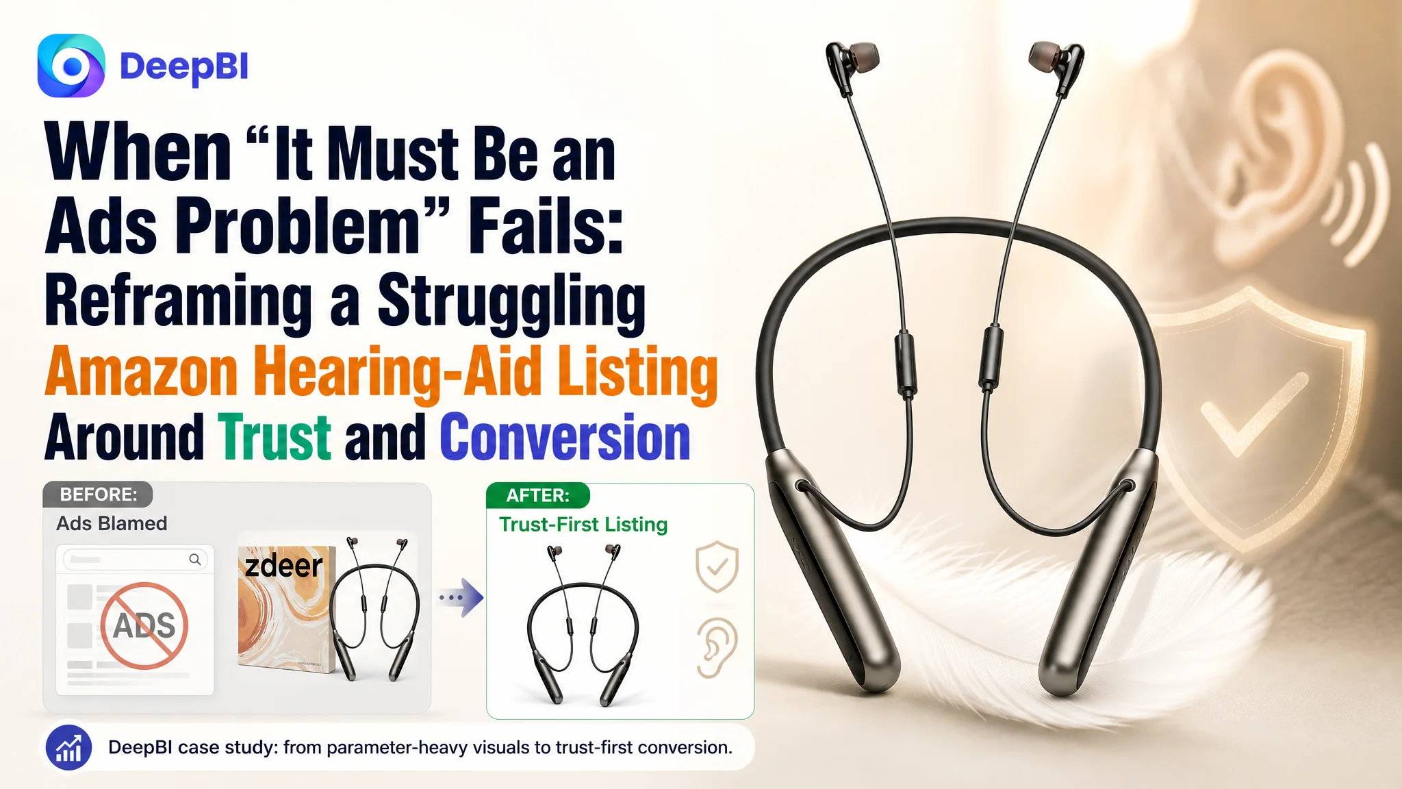
This case comes from an Amazon seller in the OTC hearing-aid category on the US marketplace. The team had already invested in Amazon ads and a relatively complete A+ page, but orders were not following traffic. Internally,the discussion kept回到 familiar topics: “our bids aren’t aggressive enough,” “maybe our keywords are wrong,” or “we just need more reviews.” In other words, they assumed an advertising and review-volume problem.
Once DeepBI benchmarked their Amazon Listing against a category-leading competitor, a different picture emerged. The core weakness was not traffic quantity, nor a lack of technical specs. It was a trust and decision-clarity gap in the first screen (title + main image + bullets) compounded by a fragile review profile. Ads were driving people to a page that spoke in engineering terms while competitors were speaking directly to hearing pain points and peace-of-mind.
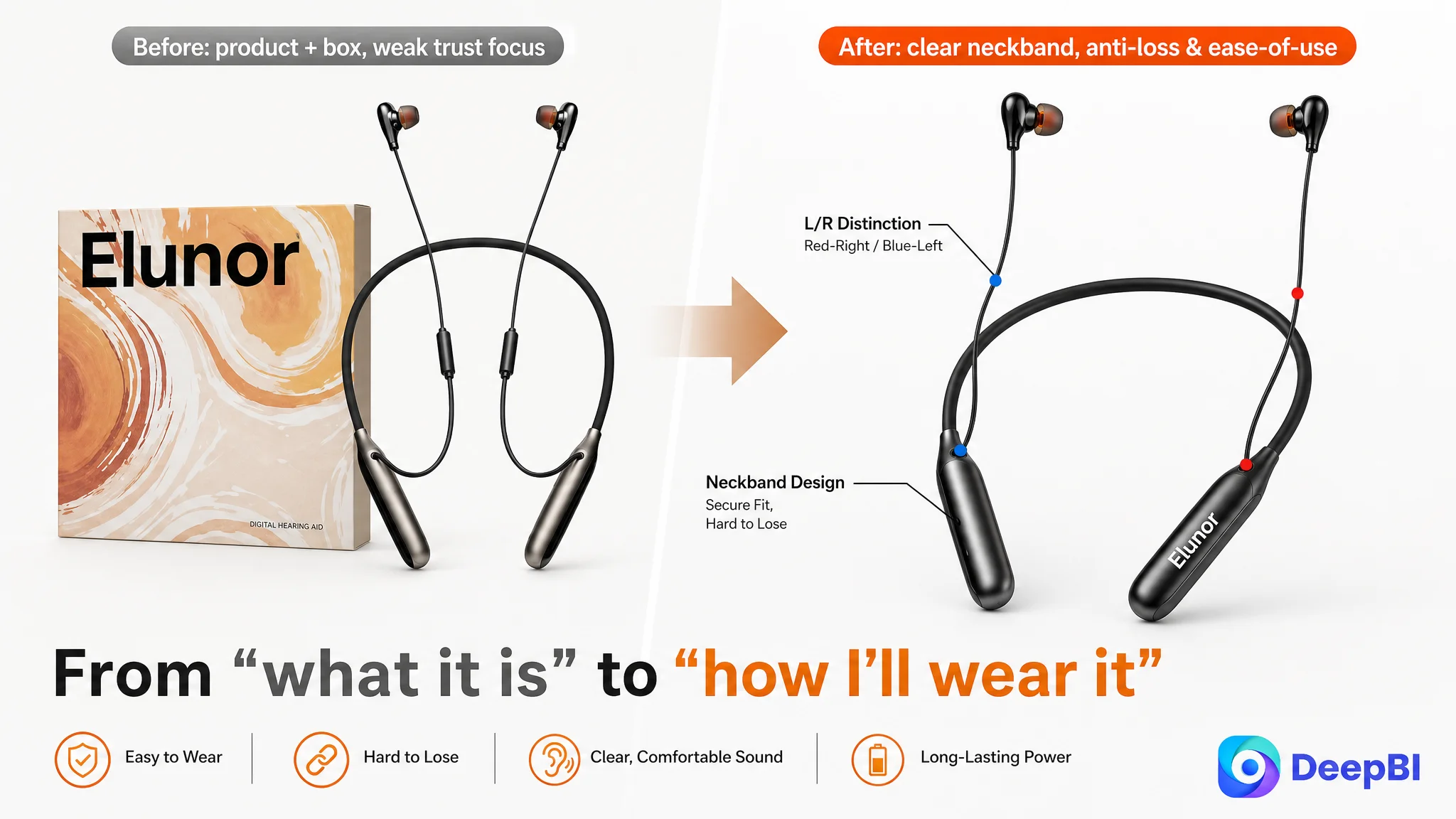
The later optimization did not start from “more ads” or “more features.” It started by reshaping how the Listing introduces itself on Amazon search results and how quickly it answers, “Will this help me hear better, comfortably, and without risk?” That meant reframing the title from parameters to outcomes, focusing main-image storytelling on “easy to wear, hard to lose,” restructuring bullets around user pain-points, and reordering A+ content to lead with core benefits and professional trust. For Amazon sellers, this case is a reminder: when ACOS feels hard to control and ads “don’t work,” the leverage point is often not in the campaign console, but in the way your product page converts the traffic you already paid for.
The Real Constraint Was Not Ads, It Was Listing Conversion Capacity
When this Amazon hearing-aid seller approached DeepBI, their Listing looked “complete” on the surface:
- A+ content was richer and more emotionally coherent than the main competing product.
- The product had genuine technical advantages: 32‑channel digital sound, dual-chip processing, neckband anti-loss design, voice low-battery alerts, and a 40‑hour battery life.
- The team was already running Amazon ads.
Yet, against a benchmark competitor in the same OTC hearing-aid segment, DeepBI’s Listing score showed:
- 75/100 for the customer vs 85/100 for the competitor (–10 gap).
- Title: –2 points.
- Main image: slightly ahead on raw score, but with structural issues.
- Bullets: –2 points.
- Detail page (A+): slightly ahead in logic and depth.
- Reviews: –8 points, the largest single gap.
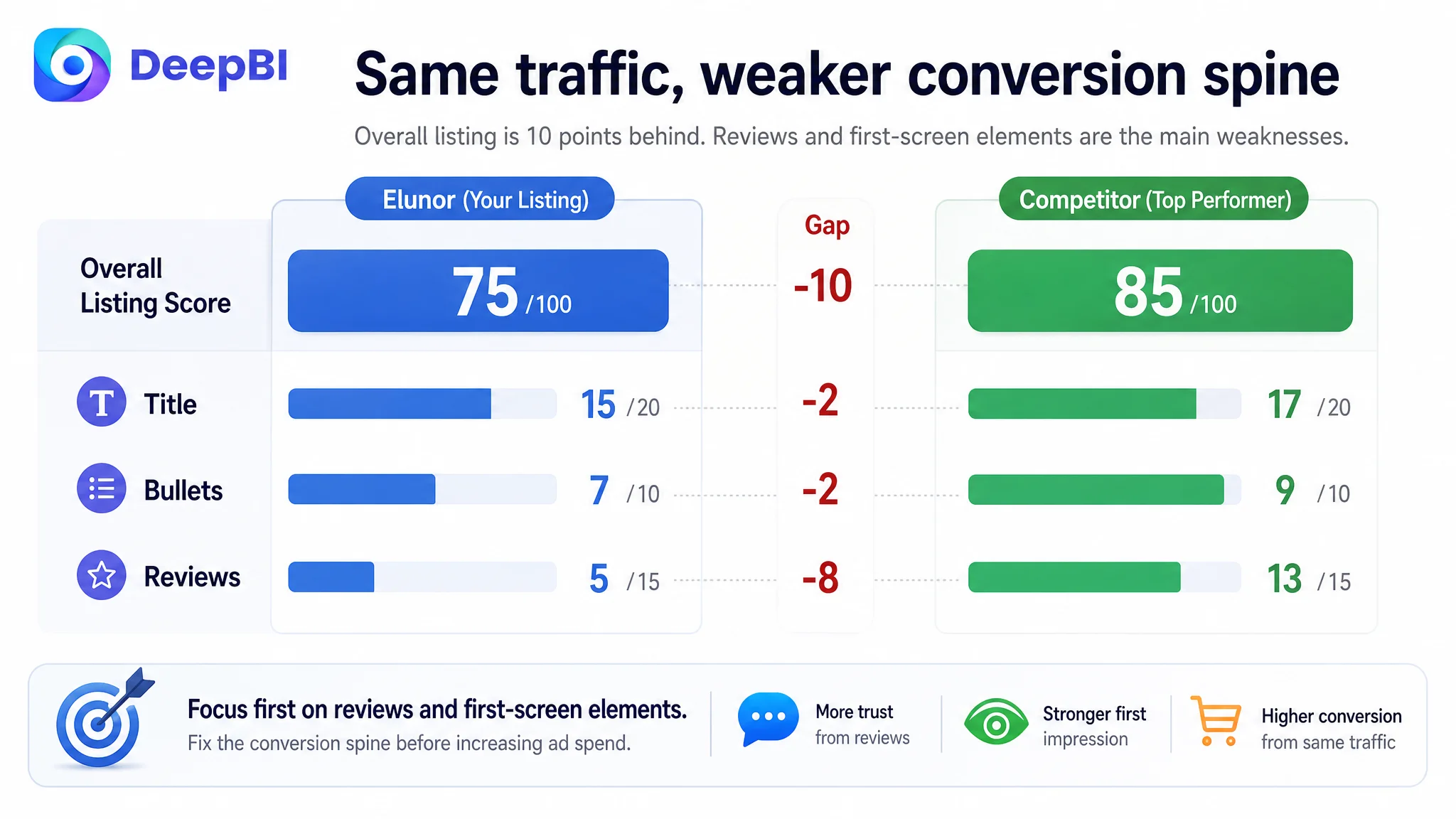
The page had traffic and a relatively strong A+ backbone, but it lacked a sharp, trust-building “front line” and social proof. This is a classic situation where:
“The real problem was not that ads failed to bring traffic. It was that the page could not convert the traffic.”
As a result, any increase in ad spend would mostly amplify waste, not orders.
What the Seller Originally Misdiagnosed
From the seller’s perspective, the symptoms looked familiar:
- ACOS felt high and hard to bring down.
- CTR and CVR did not match the technical sophistication of the product.
- Competitors with simpler hardware seemed to be converting better.
The intuitive conclusion inside the team was:
- “We haven’t pushed enough reviews.”
- “We need to tweak keywords and bidding logic more.”
- “Our technology is stronger; maybe shoppers just don’t see it yet.”
In other words, they treated this as:
- An advertising-parameter issue, and
- A review-volume issue that time would eventually fix.
What was missing was a hard look at how their Amazon product page actually guided a hearing-impaired, risk-averse buyer from impression to conviction—not just whether the product looked “professional.”
How DeepBI’s Benchmarking Changed the Diagnosis
DeepBI’s Listing scoring did not start from aesthetics. It started from a head-to-head benchmark against a single, high-performing competitor Listing in the same OTC hearing-aid niche.
Headline insight: the front of the funnel was misaligned with buyer logic
Across dimensions, a pattern appeared:
1. Title: strong keywords, weak promise
- The customer front-loaded “OTC Hearing Aids for Seniors” correctly for Amazon search.
- But the rest of the title leaned on parameters: “32‑Channel Digital Sound,” “7 Volume Levels.”
- The competitor led with outcome and emotional benefit: “Superior Sound Quality,” “Smart Noise Cancelling,” “No Feedback,” then only later mentioned OTC and accessories.
So, while the customer’s title performed decently from a keyword standpoint, it was weaker at turning impressions into clicks because it didn’t answer the first human question: “Will I hear clearly, without whistling and hassle?”
2. Main-image set: technically clean, but under-leveraged for trust
- The primary image included product, color, neckband design, and packaging—but the box occupied too much space and diluted focus.
- Visual indicators like left/right markings (L/R colors) were underused.
- There was no strong early visual for “anti-loss neckband” or “real human wearing it comfortably.”
- Technical spec callouts focused on channels and dB rather than “hear your family clearly,” “wear all day without worry.”
On paper the main image scored slightly above the competitor, but from a decision standpoint it failed to create a simple, trustworthy reason to click.
3. Bullets: information without a buying path
- The customer’s bullets opened with technical spec talk.
- The competitor’s bullets opened with pain relief: “Crystal clear sound, no feedback,” “Designed for all-day comfort,” “Easy controls,” “Fast charging, long lasting power,” “Extra features for everyday use.”
- The competitor consistently tied parameters back to concrete user outcomes (no whistling, prevent squealing, avoid sudden power loss).
The result: the customer had data, but the competitor had logic. The bullets did not walk the buyer from fear and confusion to “this solves my exact problem.”
4. Detail (A+) content: strong story, but buried
- DeepBI’s analysis found the customer’s A+ was actually more coherent than the competitor’s:
- Clear “problem → solution → emotional payoff” storyline.
- Single, consistent middle-aged male model, warm home and outdoor scenes.
- High-value modules: hearing-loss level guide, model comparison table, three-mode usage visualization.
- The competitor’s A+ skewed toward chip jargon and inconsistent visual identity.
In other words, the depth of the customer’s A+ was not the problem; the sequencing was. The most useful trust and clarity modules appeared too late in the scroll—after many risk-averse buyers had already bounced.
5. Reviews: the biggest and most dangerous gap
- Customer: ~4.1 stars, only 7 reviews, with about 29% at 3 stars or below.
- Competitor: 4.6 stars, 150 reviews, 0% low-star on the first page.
This meant:
- The competitor’s social proof was structurally strong and supported every other part of the funnel.
- The customer’s early review set introduced uncertainty right where you need reassurance.
When you put these layers together, the core constraint was clear:
The Listing did not lack information. It lacked an early, low-friction path from “I’m worried about hearing and wasting money” to “This looks safe, clear, and easy to live with.”
Why DeepBI Did Not Recommend “Fix Ads First”
From a purely ad-operations standpoint, the seller could have:
- Rebuilt campaigns.
- Split out more keyword groups.
- Adjusted bids more frequently.
- Pushed harder on branded terms.
DeepBI’s judgment was that doing this before fixing the Listing would:
- Increase spend into a page that could not fully convert the traffic.
- Expose more people to inconsistent data (35h vs 40h battery claims in different visuals).
- Funnel more traffic into a fragile review profile and under-optimized bullets.
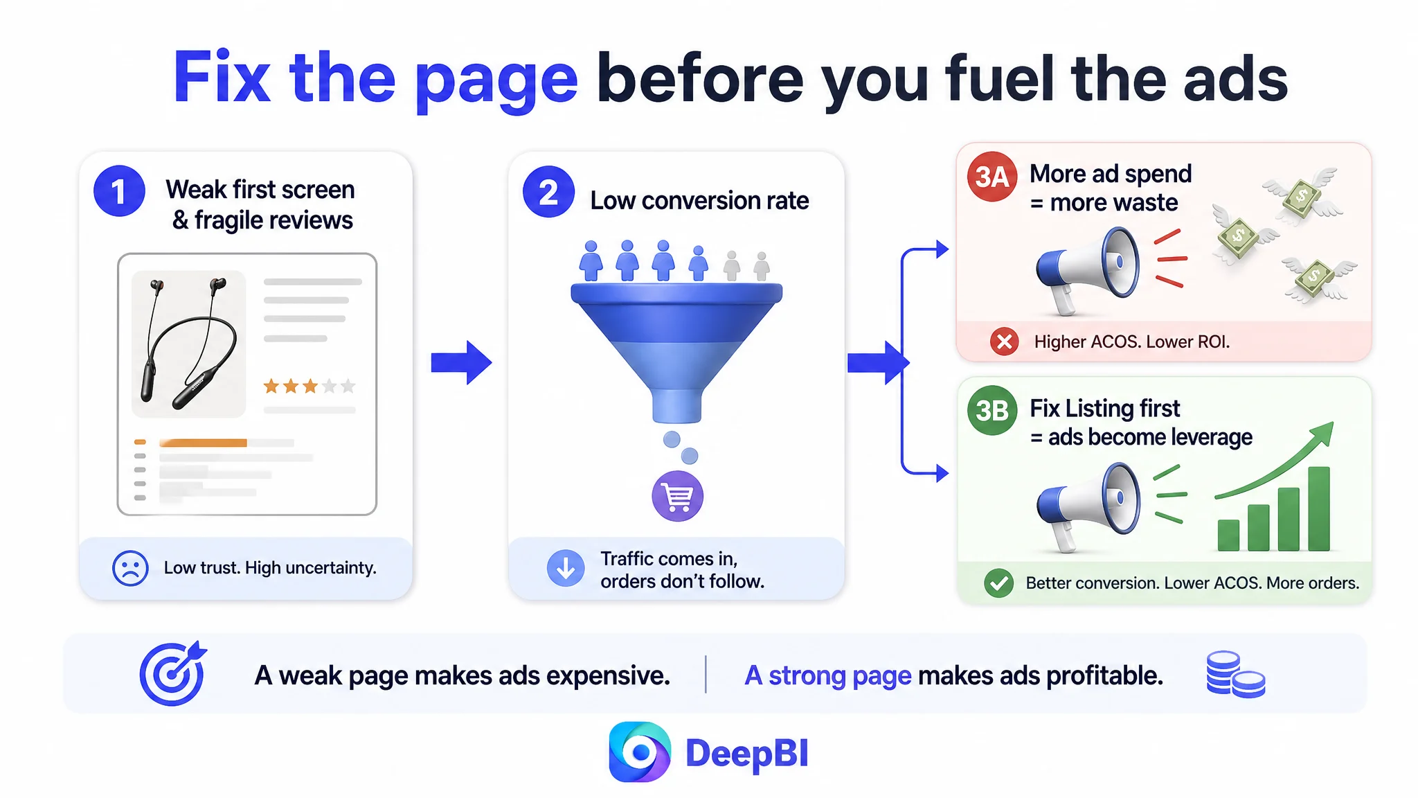
The biggest business risk was simple:
- Letting ads amplify a conversion leak.
In this situation, the priority order had to flip:
1. First, improve how the Amazon Listing earns trust and explains value.
2. Then, let ads become a force multiplier for a page that actually deserves more traffic.
Where the Listing Was Consuming Traffic
1. Title: visible, searchable, but not decisive
DeepBI’s recommendation was not to abandon technical positioning, but to translate it into outcomes and broaden reach without sacrificing relevance.
Original dynamic:
- Strong: “OTC Hearing Aids for Seniors” front-loaded.
- Weak: emphasis on “32‑Channel Digital Sound” as a naked parameter.
Reframed direction:
- Keep “OTC Hearing Aids for Seniors” at the front for Amazon’s A9.
- Add “Adults” to expand reach (aligning with the competitor’s “Seniors Adults”).
- Pair the 32‑channel promise with “Smart Noise Cancelling” and “Clear Sound” in the same breath.
- Surface the real differentiation—neckband anti-loss and 40H rechargeability—as concrete benefits, not hidden details.
This moves the title from “for engineers” to “for decision-makers” while staying Amazon-search compliant.
2. Main-Image Logic: a product photo that didn’t answer fear
DeepBI’s visual analysis showed that the customer’s main-image series spread itself thin across packaging, parameters, and internal model comparison, instead of tackling the buyer’s real questions:
- Will it fall off or get lost?
- Will it feel heavy or obvious?
- Can I wear it all day without worry?
- Will I run out of battery unexpectedly?
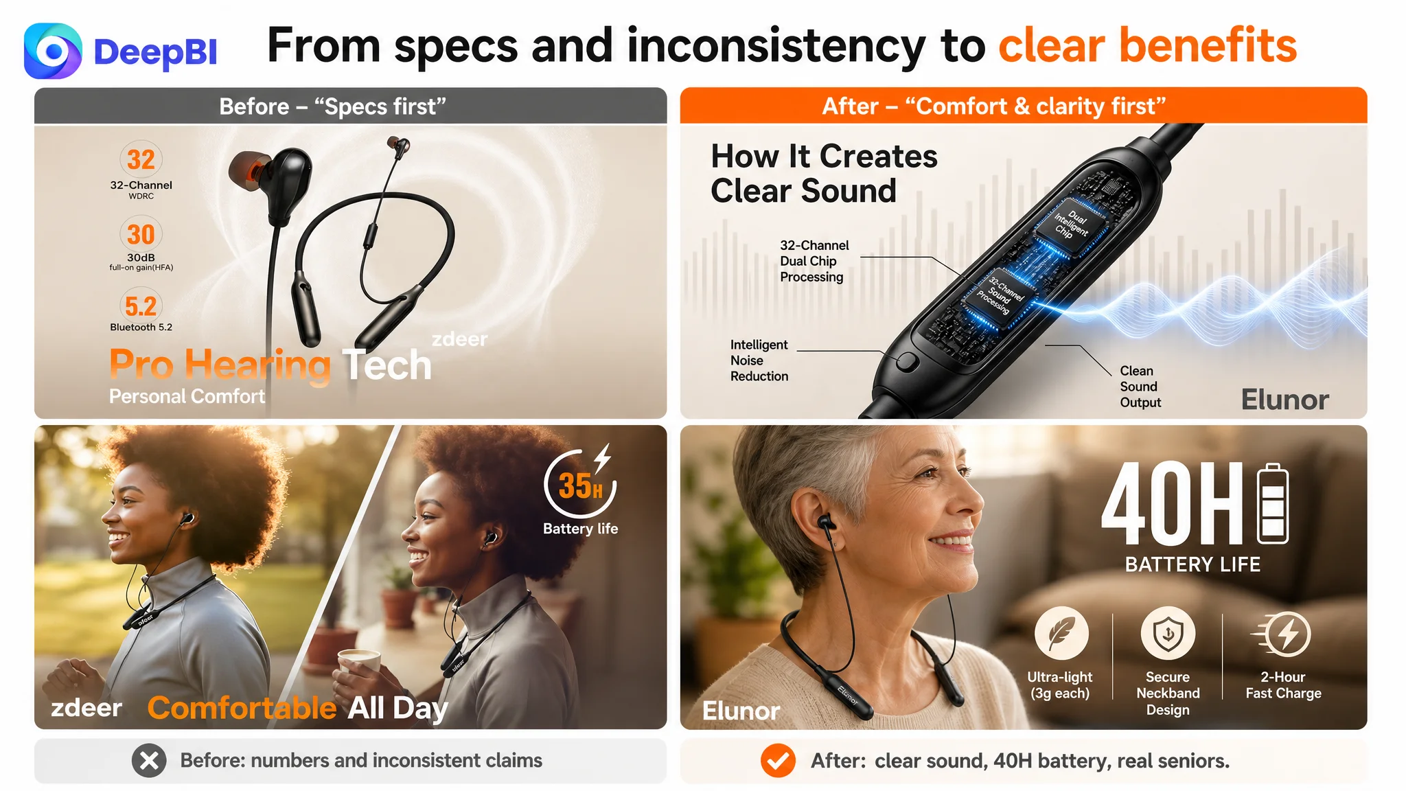
Key judgment calls:
- Image 1 (hero):
- Problem: packaging dominates, earbud L/R clarity underused, core “neckband = anti-loss” message invisible.
- Direction:
- Remove the box; center the hearing aid itself.
- Highlight L/R color cues or labels for “easy left/right recognition.”
- Make it obvious at a glance that this is a modern, neckband-style OTC hearing device.
- Image 2 (tech highlight):
- Problem: overloaded with raw numbers—channels, dB gain, Bluetooth version—that do not map to “can I hear better?”
- Direction:
- Collapse to 2–3 key tech claims that tie directly to perceived sound quality: 32‑channel digital sound, dual-chip noise reduction.
- Replace the wall of parameters with clear, iconized benefits: clear conversations, intelligent noise reduction, comfortable all-day wear, long battery life.
- If any credible “for seniors hearing support” label exists, feature it as a simple trust tag (without fabricating authorities).
- Image 3 (lightweight claim):
- Problem: numbers (54.6g) without emotional anchor; no human context to show “I barely feel it.”
- Direction:
- Visualize “light” with a feather or a simple scale, but keep the real product and weight.
- Explicitly call out “each earpiece only 3g” as a sub-point.
- Tie weight to outcome: “all‑day comfort, stable neckband design, anti-loss.”
- Image 4 (lifestyle + battery):
- Problem: model scene looks slightly staged, and more dangerously, the displayed 35h battery conflicts with the claimed 40h in text.
- Direction:
- Fix the inconsistency: unify all visuals and text around a single 40‑hour figure.
- Make “40H” a bold, central visual anchor.
- Use a natural, believable scene to show all-day comfort, not just a stock pose.
- Combine “40H battery” + “comfortable wear” as one integrated promise.
- Image 5 (model comparison):
- Problem: presenting multiple models and dense specs at the image stage introduces friction and confusion, especially for seniors.
- Direction:
- Remove model comparison from the main image carousel.
- Repurpose this slot to attack a core anxiety: power and charging.
- Clearly show “40 hours of use” and “2‑hour fast charging,” with a credible charging scene.
In short:
Advertising does not only amplify advantages. It can also amplify a page’s existing defects.
Before scaling spend, the visual set had to stop confusing and start reassuring.
3. Bullets: from parameter listing to pain-point closure
DeepBI’s scoring showed:
- Customer bullets: 7/10.
- Competitor bullets: 9/10.
The gap was less about grammar or length and more about what each bullet chose to do in the buyer’s head.
DeepBI guided a restructuring around five logical moves:
1. Lead with sound quality & feedback control, not with raw chips
- From: “32 channels, dual chips” as standalone facts.
- To: “32‑Channel Digital Sound & Feedback Cancellation” – directly tied to:
- “crystal-clear sound amplification,”
- “eliminate annoying whistling and background hiss,”
- “effortless conversations in traffic, crowds, or wind.”
2. Turn comfort + anti-loss into a central promise
- Elevate the neckband from a design detail to a risk reducer:
- “Anti-Loss Neckband & Personalized Comfort,”
- emphasize 12 silicone ear tips, multiple sizes,
- clear L/R markings to reduce misuse and improve perceived ease-of-use.
3. Frame controls as “no learning curve”
- Replace generic “simple operation” lines with:
- “No complicated smartphone apps or setups,”
- 7 intuitive volume levels,
- explicitly call out adaptation to different environments (quiet conversations vs noisy outdoors).
4. Recast battery specs as continuity of life, not a number
- Rather than apologizing for a smaller hours count than the competitor, highlight:
- 40 hours of continuous use,
- 2‑hour fast charging,
- built-in voice low-battery alerts to avoid sudden cut-offs.
5. Make after-sales feel real, not vague
- Go from “quick response” type language to:
- “comprehensive user manual,”
- “dedicated customer technical support,”
- “hassle-free after-sales service from setup to daily use.”
With this logic, each bullet becomes a conversion lever, not just extra text.
The Detail Page Did Not Lack Content. It Lacked Priority.
One of the most counterintuitive findings for the seller was that, in A+ terms, they were ahead of the competitor:
- Strong narrative: “problem → solution → emotional family closeness.”
- Consistent model and warm, realistic scenes.
- High-value rational aids: hearing-loss level guides, model comparison tables, three-mode explanations.
- Clear usage context and decision support.
Yet the performance gap remained. DeepBI’s conclusion: content was good, but its order didn’t match how Amazon buyers make decisions.
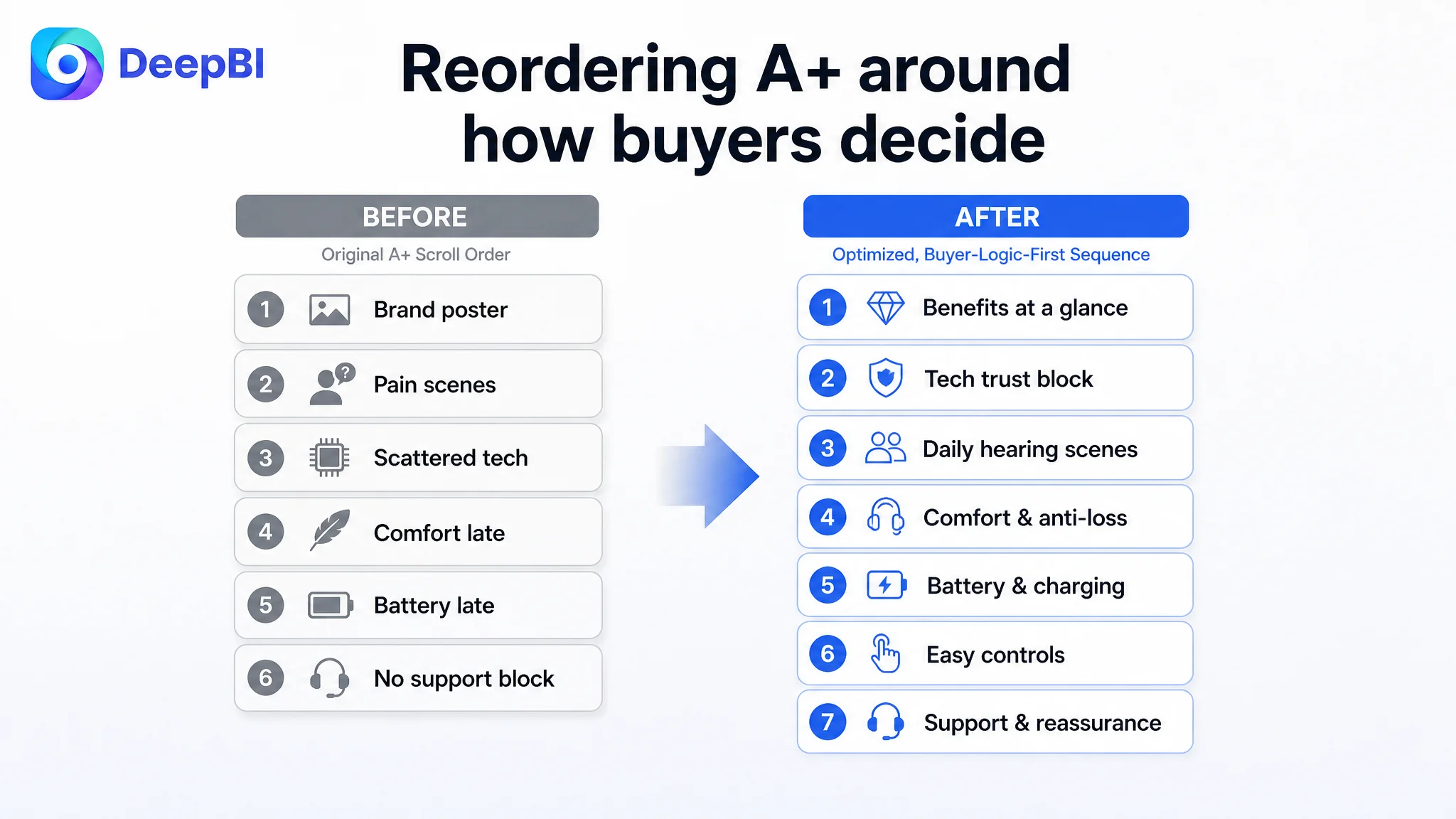
Rebuilding the A+ sequence around buyer psychology
DeepBI recommended a seven-step content reflow:
1. Immediately follow the hero image with a “core benefits at a glance” block
- Bring the existing icon-based benefits summary up to the top.
- Compactly re-state:
- 32‑channel digital sound,
- dual-chip noise reduction,
- neckband anti-loss design,
- 40‑hour battery, 2‑hour fast charge,
- 7 volume levels.
This gives cautious buyers a quick map before they scroll deeper.
2. Cluster technical credibility into one “trust block”
- Combine current scattered modules into a focused section for:
- dual-chip noise reduction,
- 32‑channel digital processing,
- feedback control maintaining stable sound.
- Visualize the principle without inventing internals: use schematic or clear conceptual diagrams, not imaginary circuit layouts.
3. Tie noise reduction to daily-life hearing, not just waveforms
- Reduce repetitive environment-vs-waveform diagrams.
- Keep one strong scene to show “easier conversations in everyday environments”—restaurants, streets, family gatherings.
4. Move comfort and anti-loss forward
- Bring up the module that tackles “will it be uncomfortable or fall off?”
- Use:
- real-person wearing photos,
- quantified claims: 3g per earpiece, total device weight,
- explicit “stable neckband, prevents loss” messaging.
5. Surface battery and charging earlier
- Center “40 hours” and “2‑hour fast charge” as a standalone trust block.
- Address “will I be caught without power?” directly.
6. Simplify operation visually, earlier
- Bring control explanation (on/off, 7 volume levels) closer to the top.
- Use simple diagrams or step visuals to show:
- no complex setup,
- easy for older users to understand.
7. Add a closing “risk reduction & support” module
- The A+ originally lacked a proper reassurance section, even though the Listing text already promised “responsive customer service and hassle-free after-sales support.”
- DeepBI advised turning this into a clear visual:
- “responsive customer service,”
- “worry-free after-sales support,”
- without inventing specific locations or staff.
This reordering ensures that:
- Tech credibility and emotional reassurance appear before skepticism solidifies.
- Buyers see “you can trust this” and “you can handle this” early enough to keep scrolling.
What Changed Once the Page Could Actually Convert
Because this is an in-flight business, we’re not attaching invented numbers. Instead, it’s more meaningful to describe the operating state that changed:
- Listing conversion capacity improved.
The front-line assets (title, main image, bullets) stopped fighting the buyer’s instincts and started reinforcing them:
- The promise of “clear sound without whistling” was explicit.
- Comfort and anti-loss were visually obvious.
- Battery and charging anxiety were addressed in both bullets and visuals.
- Trust gaps shrank.
While review volume would still take time, the internal contradictions (35h vs 40h) and weak early reassurance were removed. The A+ story aligned with the title, bullets, and main images, forming a coherent impression.
- Ads became useful again.
With a page that better converted and reduced buyer doubt, every click from Amazon ads had a higher probability of turning into an order. This changed the character of ad spend:
- From “paying to expose people to confusion”
- To “paying to expose people to a clear, low-risk offer.”
- The team’s mental model shifted.
Perhaps the most critical change was in understanding:
- High ACOS is not always primarily a bidding or keyword issue.
- A rich A+ does not compensate for weak first-screen trust and logic.
- Strong technical specs do not automatically translate into strong conversion.
- Listing conversion is the foundation on which Amazon ads sit; not the other way around.
What Other Amazon Sellers Can Take From This
Several lessons in this hearing-aid case generalize far beyond this single ASIN or category:
1. A technically “better” product can still lose if the page speaks the wrong language.
If competitors describe outcomes (“hear clearly, no feedback, all-day comfort”) while you describe parameters (“32 channels, 30dB gain”), you will often lose—even with stronger hardware.
2. Rich A+ content does not save a weak title + main image + bullets.
Most buyers form their conviction in the first few seconds:
- Search result thumbnail.
- Title.
- Hero image + first 1–2 bullets.
If these don’t reduce risk and clarify value, many buyers will never see your beautiful A+ story.
3. Inconsistent claims silently kill trust.
Conflicting battery-life numbers or loosely phrased promises (vs. concrete, believable benefits) can make cautious buyers step back, especially in medical-adjacent categories like OTC hearing aids.
4. Amazon ads amplify whatever your Listing already is.
If the page converts poorly, higher spend mostly amplifies waste. If the page converts well, ads become an efficient growth lever. Diagnosis must start with the Listing, not the campaign console.
5. Review structure is part of page logic, not a side metric.
In this case, review volume and star rating were structurally weaker than the competitor’s. Combined with a parameter-heavy story, this made buyers question whether the device would really solve their hearing problem. Listing changes can’t instantly fix reviews, but they can reduce new negative experiences and invite better ones.
For Amazon sellers facing stubborn ACOS, low CVR, or an inexplicable gap versus simpler competitors, this case underscores a simple but often overlooked point: before you push more traffic, ask whether your Amazon Listing actually deserves more traffic. DeepBI’s role in this case was not to “beautify” the page, but to expose the real conversion bottleneck and reorder the seller’s efforts so that every pixel and every word works together to support ads, not fight them.