

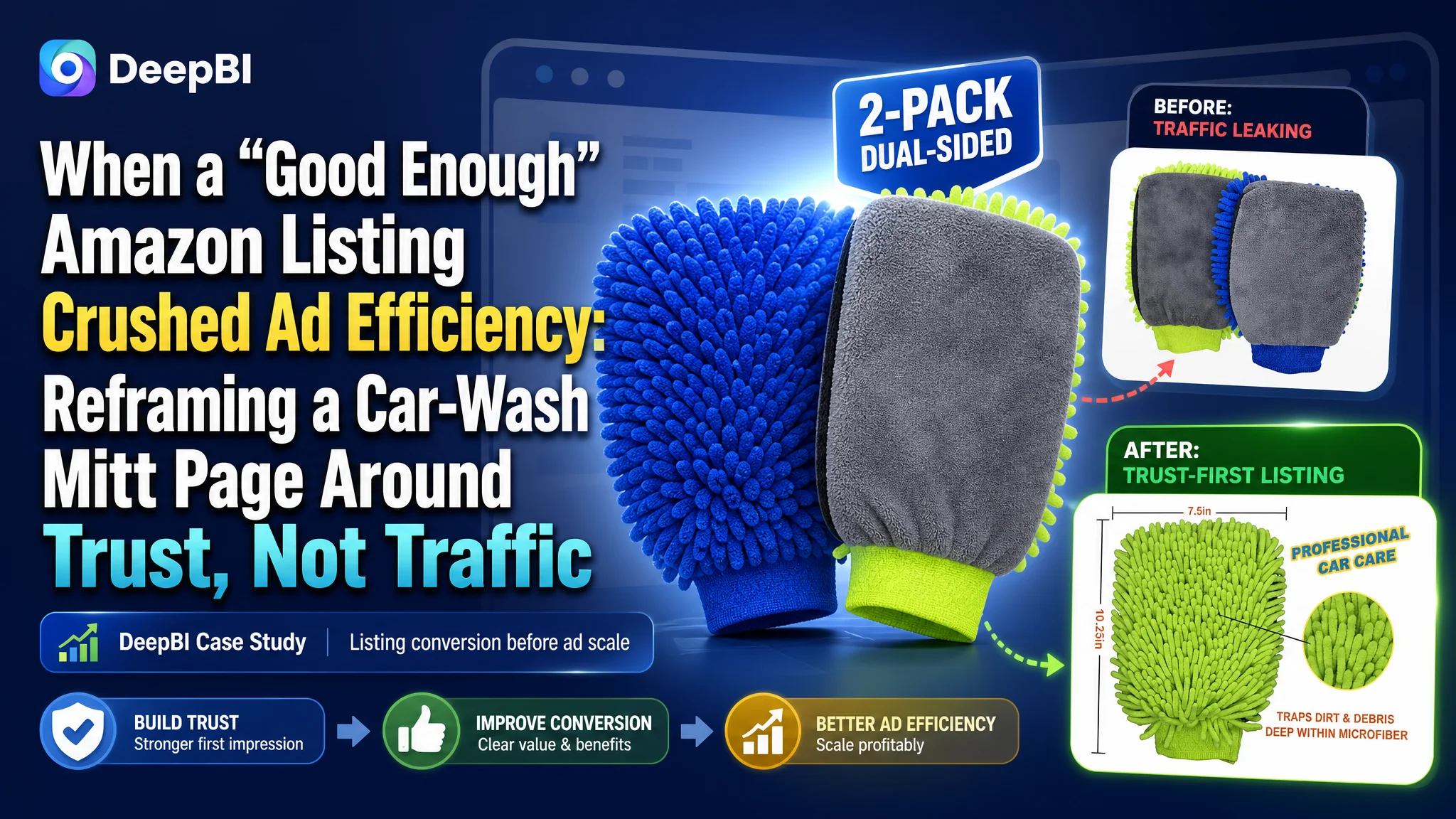
This case comes from an Amazon seller in the car-care accessories category. On paper, the Listing for a double-sided microfiber car wash mitt looked “decent”: the title was well structured, the five bullet points were in place, and ads could bring in traffic. Yet ACOS was difficult to control and conversion lagged behind a key competitor. The team’s instinct was to keep tuning Amazon ads and keywords, assuming the problem was bid strategy rather than the product page.
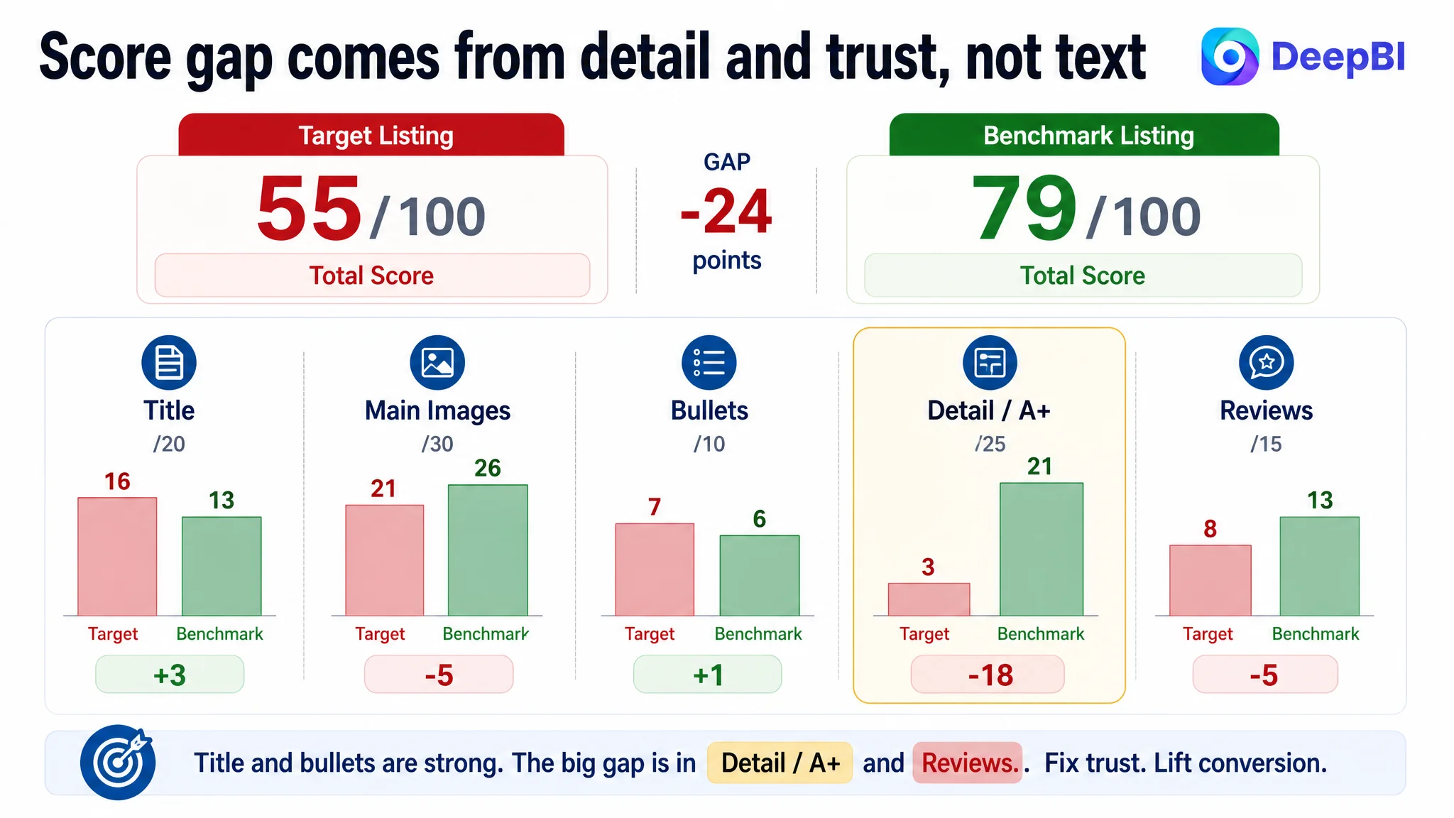
DeepBI’s analysis told a very different story. Against a benchmark car-wash mitt Listing in the same niche, the seller’s page scored just 55/100 versus 79/100. Title and bullets were not the issue; the real gap came from the main-image set, non-existent A+ content, and much weaker review profile. In other words, the page could not convert the paid traffic it was already getting, and every additional advertising dollar was being poured into a leaky bucket.
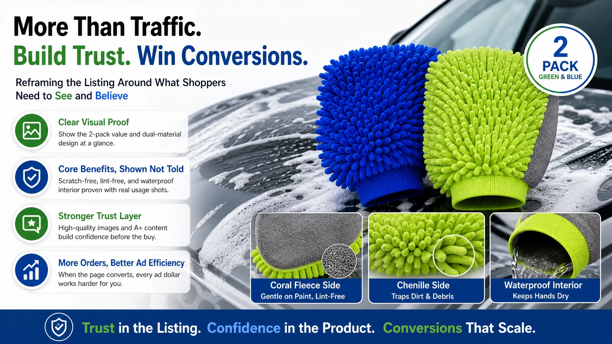
 Once the problem was reframed as a Listing-conversion issue, the optimization path changed completely. Instead of pushing more spend through the same weak page, DeepBI prioritized rebuilding the visual sales logic: clarifying the “2-pack” and dual-material differentiation in the main images, and replacing a text-only detail area with a structured A+ story that proves “waterproof interior” and “lint-free” with visual evidence. The goal was simple: repair trust on the Amazon product page so that both organic and paid traffic could finally translate into orders.
For other Amazon sellers, the lesson is clear: when a Listing’s title and bullets look fine but ACOS remains stubborn and CVR never catches up to competitors, the problem is rarely “just ads.” It is often a missing trust path on the product page—especially in main images, A+ content, and reviews—that silently caps your ad efficiency.
What the Seller Saw: Traffic Without Reliable Conversion
From the seller’s point of view, the Amazon Listing did not look like a disaster.
- The title already followed a mature Amazon pattern: brand/attributes + core keywords + multiple benefits + size and color.
- The bullets covered material, scratch-free cleaning, waterproof interior, set convenience, and lint-free results.
- The product itself had clear differentiation: dual-material construction (chenille + coral fleece), waterproof interior, and a 2-pack value (green & blue).
Yet the business reality was uncomfortable:
- Advertising brought traffic, but orders did not scale with spend.
- ACOS was harder and harder to pull back.
- A direct competitor in the same car-wash-mitt space was consistently out-converting them and holding stronger ranking positions.
The team’s natural response was to believe they had an ad-optimization problem:
- Maybe bids were not precise enough.
- Maybe they needed more negative keywords.
- Maybe campaign structure or budget allocation needed refinement.
What they did not suspect was that the core issue sat inside the Listing itself, especially in the parts of the page they did not pay much attention to: the main-image sequence, A+ content, and social proof.
The Misdiagnosis: Treating a Page-Conversion Problem as an Ad Problem
DeepBI’s scoring and competitive audit made one thing obvious: this was not primarily a keyword or bidding issue.
The score profile exposed the real constraint
Against a benchmark competitor Listing in the same niche:
- Total Listing score
- Target Listing: 55/100
- Benchmark Listing: 79/100
- Gap: -24 points
Breakdown by dimension:
- Title: Target: 16, Benchmark: 13, Max: 20, Gap: +3
- Main image set: Target: 21, Benchmark: 26, Max: 30, Gap: -5
- Bullet points: Target: 7, Benchmark: 6, Max: 10, Gap: +1
- Detail / A+: Target: 3, Benchmark: 21, Max: 25, Gap: -18
- Reviews: Target: 8, Benchmark: 13, Max: 15, Gap: -5
Two critical signals stand out:
- Title and bullets are not the bottleneck. They are at least on par with, or slightly ahead of, the competitor in structure and keyword coverage.
- Detail/A+ and reviews are the real deficit. A 3 vs. 21 gap in detail content, plus a meaningful gap in review quality and volume, is exactly the pattern that kills CVR while ads keep driving traffic.
“The real problem was not that ads failed to bring traffic. It was that the page could not convert the traffic.”
Despite that, the seller’s mental model was still: “We must optimize the ads harder.” This is the classic misdiagnosis—treating symptoms in ad metrics while ignoring the conversion capacity of the page.
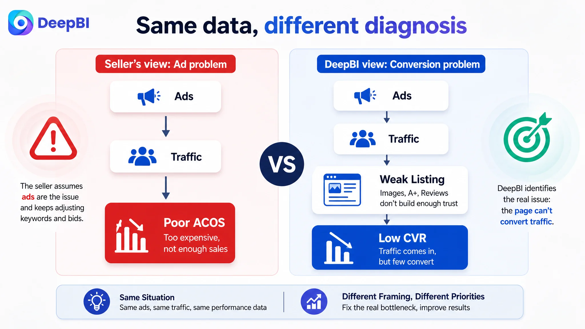 Amazon Ads Were Not Failing. The Page Was Consuming the Traffic.
From a business-logic perspective, DeepBI had to answer a simple question first:
If we keep improving ads, will this page convert enough to make those improvements pay off?
The data said no.
Main images lacked decision-level clarity
Compared with the competitor, the target Listing’s image sequence had three core issues:
1. 2-pack value was visually vague.
The first image showed two colors, but did not make the “2-pack” offer unmistakable at thumbnail level. The competitor made “2-pack” and set value instantly obvious.
2. Dual-material story was not clear in visuals.
The product’s technical edge is “chenille + coral fleece double-sided, waterproof interior”. The existing images hinted at textures but did not:
- Explicitly show one mitt on the chenille side and one on the coral fleece side.
- Use close-ups to tie each side to a specific use-case (e.g., heavy wash vs. delicate polishing).
3. Function claims depended on text, not visual evidence.
“Scratch-free”, “lint-free”, “waterproof interior” existed as words, but the images did not provide:
- A clear action shot proving scratch-free safety on paint.
- A credible visual showing interior dryness while the outside is soaked.
- Any comparison or material deep-dive that confirms “lint-free” and premium microfiber.
The competitor did exactly the opposite:
- High-quality lifestyle usage shots in natural light.
- Clear fiber and texture close-ups.
- Visual demonstrations of cleaning performance and ease of use.
On Amazon, this directly affects both CTR (from thumbnails) and CVR (once on the page). The target Listing had to “explain” with words what the competitor already “proved” with images.
 Detail page had almost no visual trust layer
The A+ / detail section was the most severe weakness:
- The target Listing: no A+ images at all, only repetitive text.
- The competitor: 5 structured A+ modules, including:
- Main value proposition visual.
- Usage scene images.
- Feature close-ups.
- Cleaning and maintenance guidance.
This is what the score gap (3 vs. 21) represents in practice:
- Shoppers on the target page hit a trust wall after the bullets. There is no visual explanation of how the product works, why it is different, or how it solves specific pain points.
- On the competitor page, A+ walks them through a full decision funnel: value → usage → function detail → maintenance → reassurance.
In a category where shoppers want to avoid scratching paint and wasting time with cheap mitts, this missing layer is exactly where conversions die.
Reviews confirmed the trust deficit
The review section reinforced the same pattern:
- Target:
- 3.5 stars
- 22 total reviews
- Higher share of 3-star-and-below on the first page
- Fewer image/video reviews; weaker visual proof from real users
- Competitor:
- 4.6 stars
- 375 total reviews (around 17x more)
- Lower negative-review share
- Better narrative of real usage in reviews
For a first-time buyer landing from Amazon ads, this difference is huge. Even if better ads could bring more people to the page, the review wall would keep blocking a large share of them.
The Real Constraint: Listing Conversion Capacity, Not Keyword Coverage
Given the score distribution and qualitative comparison, DeepBI’s judgment was straightforward:
- Core constraint: The Amazon Listing’s conversion capacity was too weak to justify more aggressive advertising.
- Non-core at this stage: Keyword coverage, title structure, and bullet content were already at an acceptable baseline.
If the team had continued to focus on ads first, three business risks would have persisted:
1. Ad spend amplifying a weak page.
More traffic into the same conversion bottlenecks means more wasted impressions and clicks.
2. ACOS stuck at a high plateau.
Any short-term ad wins would be fragile because the underlying CVR problem remained.
3. Organic ranking limited by poor on-page conversion.
Amazon’s ranking logic rewards listings that convert traffic well. A page with structurally weaker A+ and social proof is less likely to hold strong organic positions, regardless of temporary ad pushes.
“Advertising does not only amplify advantages. It can also amplify a page’s existing defects.”
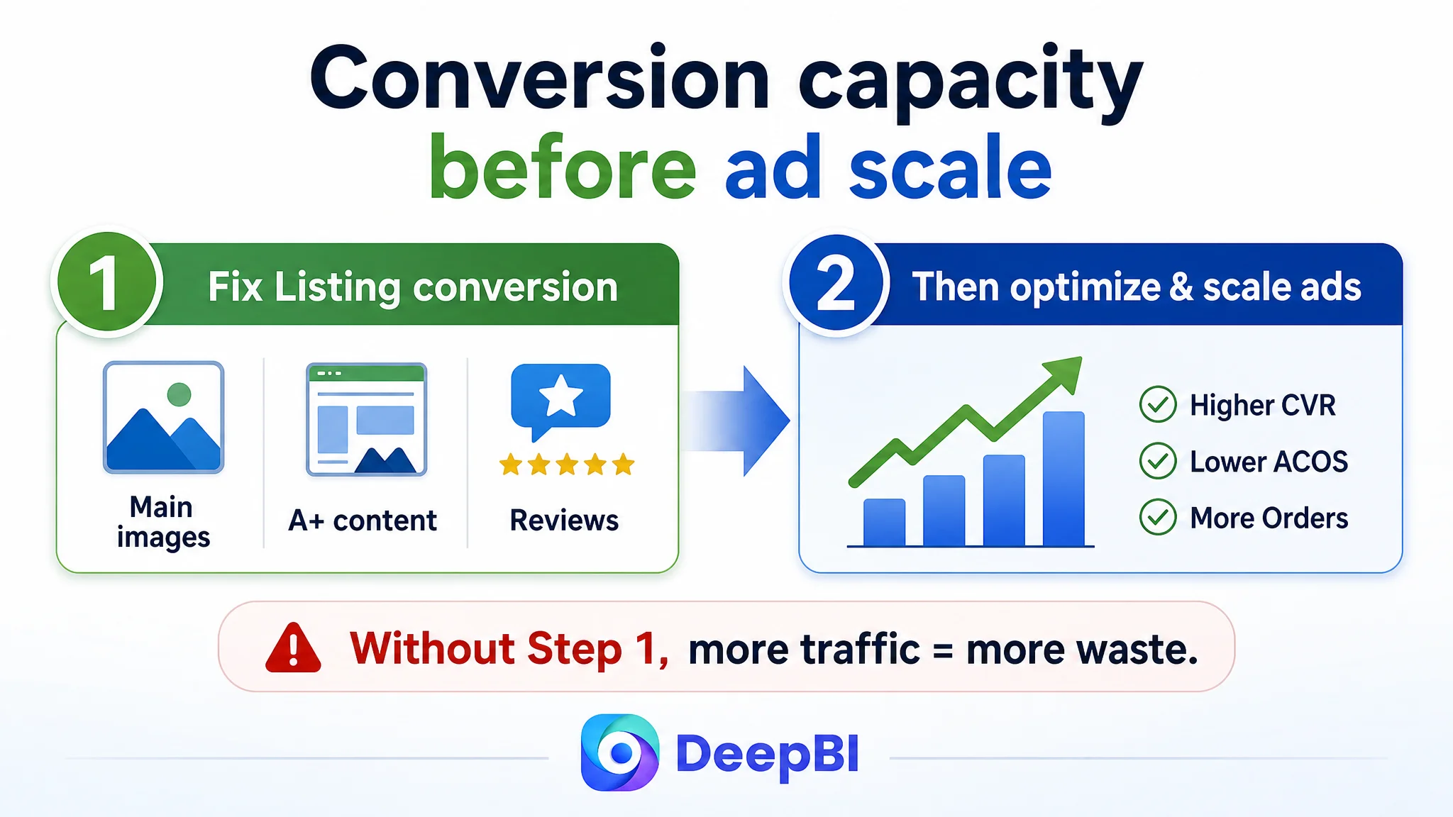
Therefore, DeepBI did not recommend “more granular ads” as the first move. The priority had to be: repair the page so that each visit, organic or paid, has a fair chance to convert.
Why DeepBI Did Not Keep Tuning the Ads First
From a decision standpoint, the sequence mattered:
1. Title & bullets already competitive
- The recommended title (“2-Pack Microfiber Car Wash Mitt, Chenille & Coral Fleece Double Sided, Scratch-Free & Lint-Free…”) already:
- Front-loaded “2-Pack” and “Microfiber Car Wash Mitt”.
- Integrated “Chenille & Coral Fleece,” “Scratch-Free & Lint-Free,” “Waterproof Interior,” and dimensions.
- Bullet suggestions added structure and depth but did not change the basic fact: text alone would not fix the trust gap created by missing visuals and weak social proof.
2. Visual and trust gaps were structurally large
- Main image set 21 vs. 26 is not a trivial difference in a visual-first category.
- Detail/A+ 3 vs. 21 is a structural failure, not a small optimization gap.
- Reviews lagged on both star rating and total count.
3. Fixing ads without fixing the page would lock in inefficiency
At the current state, additional ad optimization would only:
- Increase the volume of poorly converted visitors.
- Make ACOS volatility worse.
- Delay necessary investments into page conversion.
So the decision path was:
- Step 1: Increase the Listing’s ability to “deserve” more traffic.
- Step 2: Once CVR stabilizes on a stronger page, revisit ad scaling and keyword expansion.
 This Product Page Did Not Lack Traffic. It Lacked Trust.
The next step was to clarify which parts of the page had to change to restore conversion capacity.
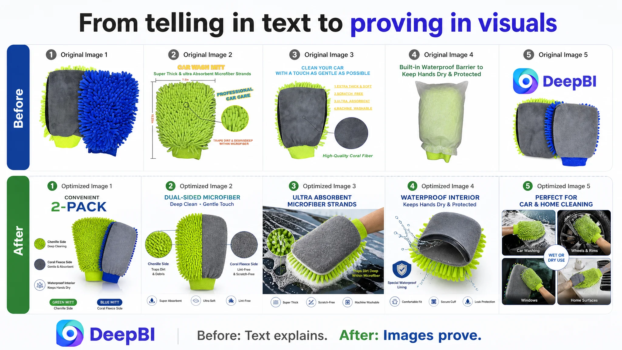
Main image: from “showing the product” to “proving the value”
DeepBI’s comparison of each image slot led to precise priorities:
1. Image 1 – Make “2-pack” and dual-material obvious at a glance
- Current role: shows product, dual color, hints at two materials, but “2-pack” is not unmistakable.
- What needed to change:
- Show two clearly separate mitts.
- One faces chenille side, one faces coral fleece side.
- Integrate a visual cue for “2-Pack” and “Dual Material Design”.
Business logic: This is where the value proposition (more mitt for your money, plus dual function) must be instantly legible in the search results.
2. Image 2 – Confirm real usability, not just dimensions
- Current role: dimension callout.
- Problem: same logic as competitor, but misses a chance to prove fit and function.
- Optimization direction:
- Show the mitt worn on a hand.
- Keep dimensions.
- Use callouts to highlight “Chenille & Coral Fleece Double Sided” and “Traps Dirt & Debris Deep Within Microfiber”.
Business logic: Shoppers don’t just want to know size; they want to know, “Will this stay on my hand and work as intended?”
3. Image 3 – Turn generic overview into material deep-dive
- Current role: repetitive overall product view.
- Problem: adds no incremental persuasion versus other images.
- Optimization direction:
- Close-ups of chenille loops and coral fleece.
- Explicit labels for which side is ideal for heavy washing vs. delicate polishing.
- Visual proof tied to “Soft” and “Lint-Free” claims.
Business logic: This is where the Listing can surpass the competitor in technical material proof, not just match it.
4. Image 4 – Replace static feature list with real-world action
- Current role: isolated mitt with generic feature text.
- Problem: static, no situational trust.
- Optimization direction:
- Show an action shot of the mitt on car paint or headlight with foam.
- Use callouts tied to “Scratch-Free Cleaning” and “Gentle on Paint”.
Business logic: This resolves the primary risk perception—“Will this scratch my car?”
5. Image 5 – Visualize the waterproof interior credibly
- Current role: packaging bag implying waterproof barrier.
- Problem: indirect and weak; does not prove the lining exists or works.
- Optimization direction:
- Cross-section diagram: outer microfiber → waterproof lining → inner layer.
- Visual showing wet exterior and dry interior hand.
- Direct callout for “Waterproof Interior – Keeps Hands Dry and Comfortable.”
Business logic: This is a differentiator the competitor does not emphasize. It must be seen, not just read.
 A+ Content: From “No Visual Story” to a Structured Conversion Path
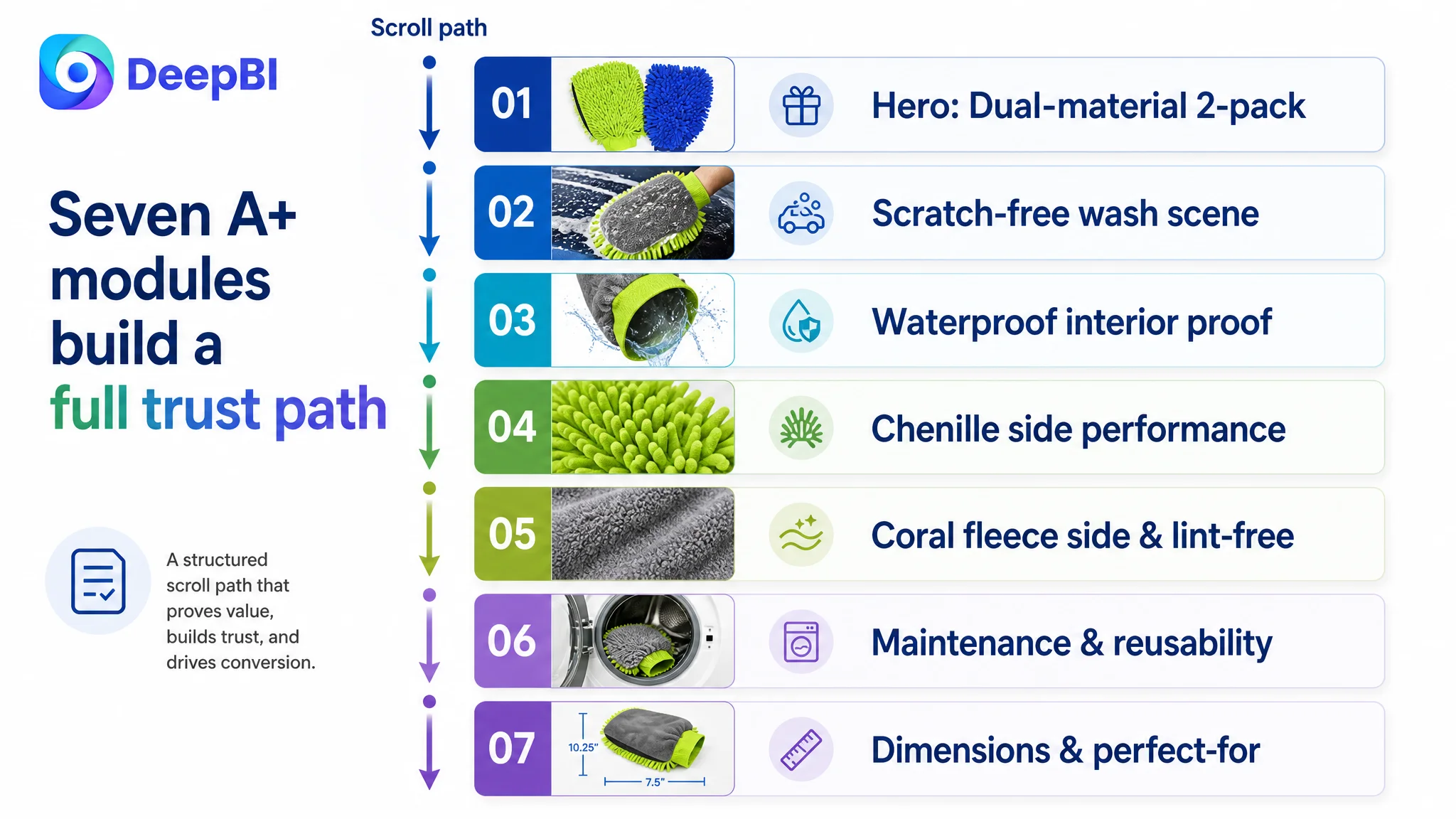
With no current A+ modules, the detail area was effectively empty from a visual-decision standpoint. DeepBI’s recommended architecture was built around seven modules, each aligned to one step in the buyer’s decision journey.
1. Establish the dual-material, 2-pack value upfront
- Visual: Hero image of both mitts (green & blue) with textures of chenille and coral fleece clearly shown.
- Message:
- Dual-material design.
- Convenient 2-pack.
- Distinct value vs. single-material competitors.
Purpose: Immediate framing of “why this mitt is different and worth considering” when shoppers scroll.
2. Validate standard usage and scratch-free cleaning
- Visual: Large panel showing a typical wash scene—mitt on a car panel with rich foam.
- Message:
- “Scratch-Free Cleaning”
- Ultra-soft microfiber safe for paint.
Purpose: Calm the primary anxiety: “Will this damage my paint job?”
3. Prove the waterproof interior advantage
- Visual: Mitt exterior soaked, interior clearly dry; or cross-section plus usage demo.
- Message:
- Waterproof interior lining.
- Hands stay dry and comfortable throughout wash.
Purpose: Turn an abstract claim into tangible benefit—comfort and reduced annoyance.
4. Verify chenille-side performance
- Visual: Chenille side working on grilles, wheels, textured areas.
- Message:
- “Superior Cleaning Performance”
- Long fingers reach into grooves and lift dirt.
Purpose: Show how the product handles heavy-duty cleaning tasks better than a flat mitt.
5. Verify coral-fleece-side performance and lint-free results
- Visual: Coral fleece used on glass, gloss trim, or delicate surfaces.
- Message:
- “Lint-Free Results”
- Spotless, streak-free finish.
Purpose: Show that the mitt can handle the detailing finish, not just the rough wash.
6. Address maintenance and reusability
- Visual: Mitts in washing machine / drying scene, without distortion.
- Message:
- Machine washable and dryable.
- Maintains absorbency and softness after many washes.
Purpose: Build perception of durability and long-term value—key when price is compared.
7. Clarify dimensions and “perfect for” scenarios
- Visual: Clean, precise dimension chart plus standard car-wash scenes.
- Message:
- Exact size (10.25" x 7.5").
- “Perfect for Car Washing & Detailing.”
Purpose: Remove doubts about fit and reinforce category-specific usage instead of diluting with generic home-dusting scenes.
 Bullet Points: Turning Information into a Buying Logic
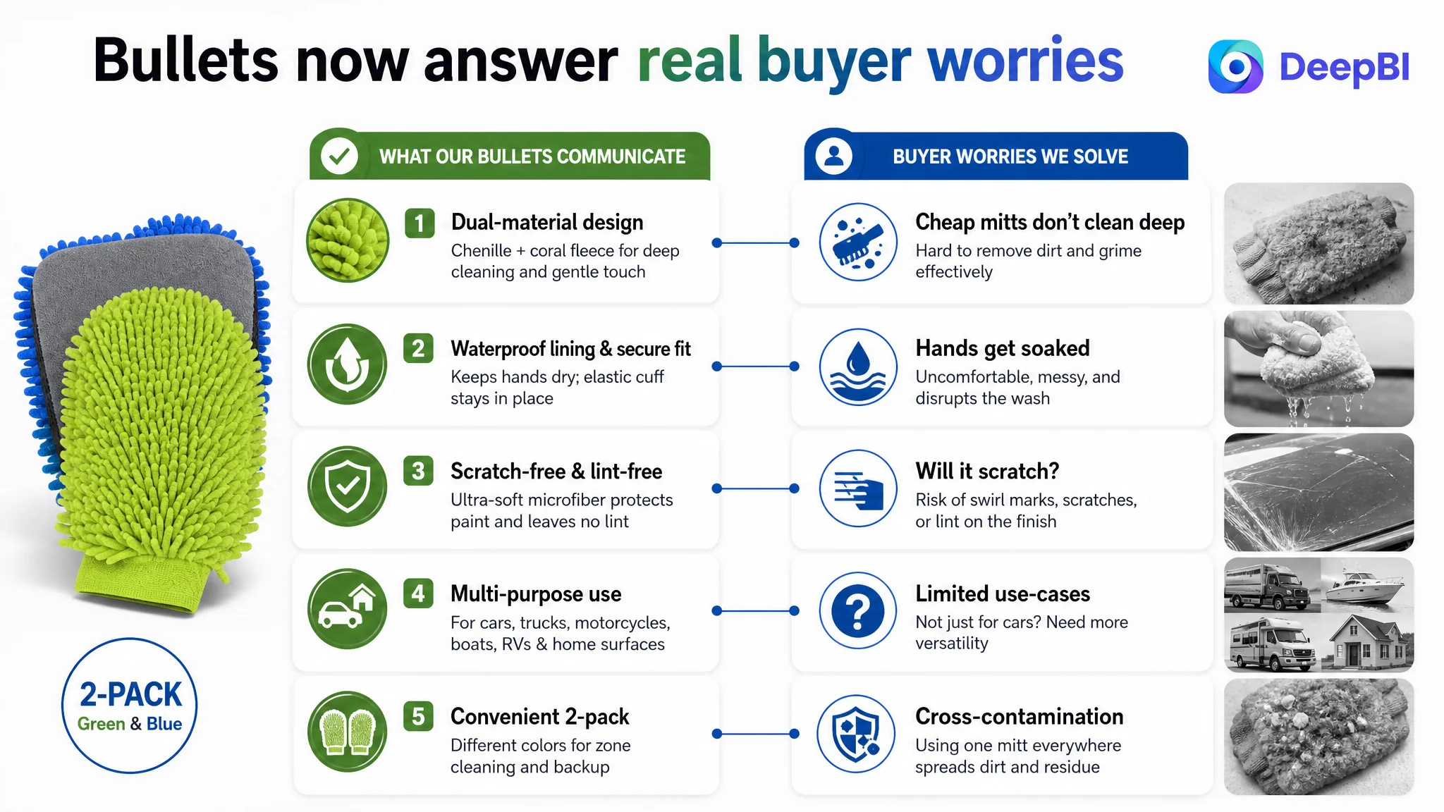
The original bullets were not a disaster, but they were under-leveraged. DeepBI’s adjustments focused on turning each point into a mini “pain point → solution → proof” story, often integrating learnings from the competitor’s wording while leaning on this product’s real strengths.
Bullet 1 – Premium dual-material design
- From: Basic mention of material.
- To: Clear headline plus explanation.
- Structure:
- “PREMIUM DUAL-MATERIAL DESIGN”
- Explain chenille + coral fleece combination.
- Highlight dirt-trapping microfiber and softness on finish.
Role: Establish technical credibility and justify why this mitt is not just another commodity cloth.
Bullet 2 – Waterproof lining & secure fit
- From: Partial mention of waterproof interior.
- To: Combine comfort and usability:
- Waterproof interior keeps hands dry.
- Double-stitched elastic cuff ensures snug fit, prevents slipping.
Role: Solve two real usage worries in one point: “wet hands” and “mitt falling off.”
Bullet 3 – Scratch-free & machine washable
- From: Scratch-free claims only.
- To: Add long-term value:
- Gentle on paint, glass, and chrome.
- Machine washable and dryable, retains absorbency after many washes.
Role: Build both safety and durability into the same mental slot.
Bullet 4 – Versatile multi-purpose use
- From: Narrower usage scope.
- To: Expand to:
- Wet wash & wax, dry dusting.
- Cars, trucks, motorcycles, boats, RVs, plus home surfaces (windows, mirrors, furniture).
Role: Increase perceived universality and value per unit; expand the pool of use-cases.
Bullet 5 – 2-pack for zone cleaning
- From: “Two colors” only.
- To:
- Explicit zone-cleaning strategy (one for paint, one for wheels).
- Emphasize cross-contamination prevention.
Role: Turn a basic “two pieces” fact into a professional-wash rationale.
These changes do not merely beautify text; they align bullets with the visual and A+ strategy, so the page tells a coherent story at every scroll depth.
 How the Page’s Sales Logic Started to Recover
Once the Listing was reframed and redesigned along these lines, several operational shifts naturally followed:
- The product page transformed from “spec sheet” to “decision guide.”
Shoppers could now see:
- Why dual-material matters.
- How scratch-free is visually validated.
- How waterproof interior actually works.
- What each side is best used for.
- How to maintain the mitts over time.
- The trust path became continuous instead of fragmented.
Instead of hitting a wall after bullets, buyers follow:
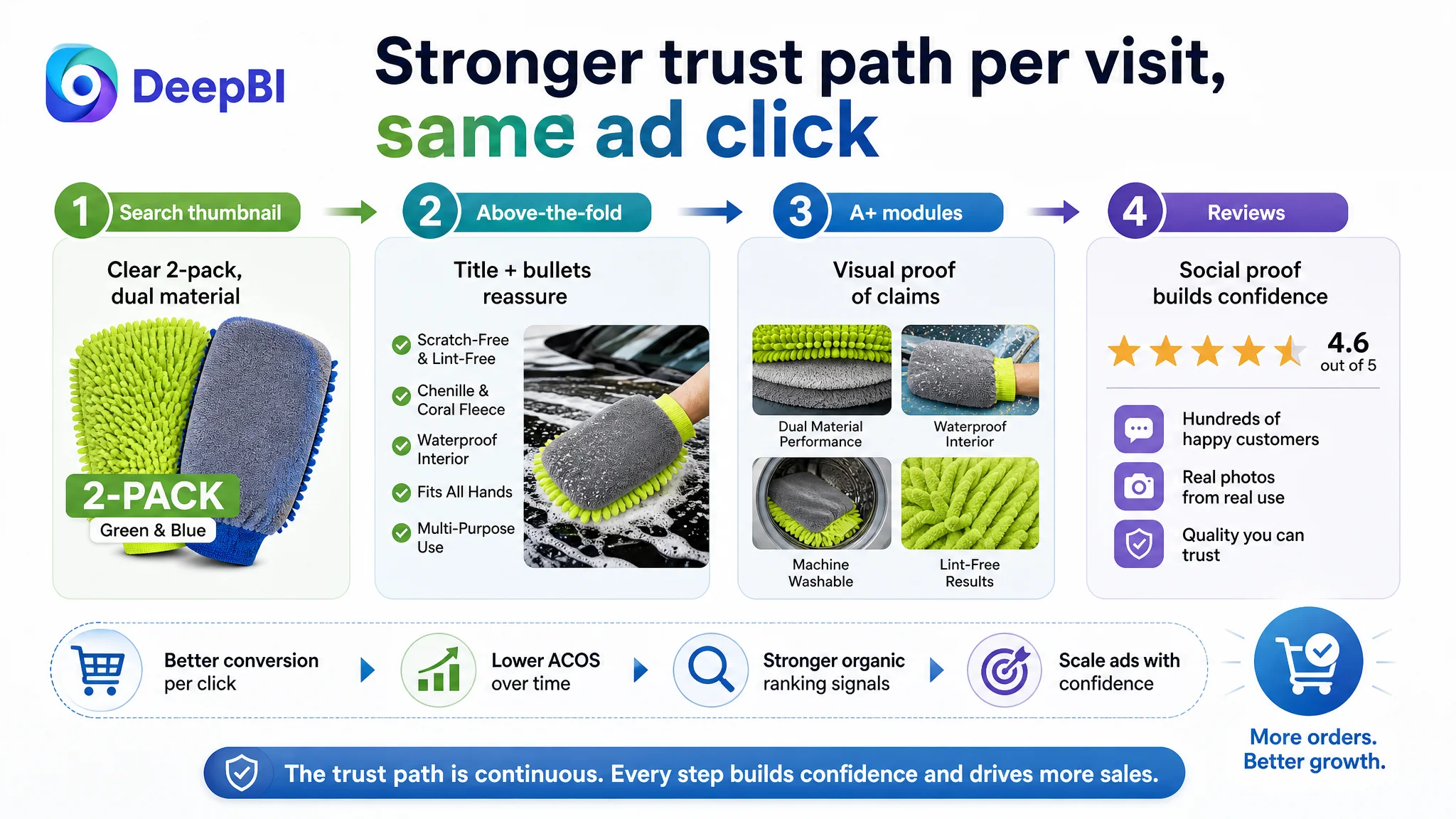
- Thumbnail → main image clarity (2-pack, dual material)
- Above-the-fold bullets → immediate reassurance
- Scroll → structured A+ evidence
- Reviews → social proof layer (even if still smaller than competitor, at least now supported by page logic)
- Ad traffic became more “valuable” per click.
With a stronger page, each paid visit has:
- A higher chance to turn into an order.
- Lower psychological friction throughout the decision journey.
This does not mean CVR jumps overnight or reviews magically catch up to 375 units. But it fundamentally changes the trajectory:
- The Listing starts to accumulate more positive experiences.
- Future reviews have a better base to build on.
- Organic rankings can benefit from improved conversion signals.
- Advertising can be scaled on top of a healthier foundation.
 How the Seller’s Understanding Changed
The deeper impact of this case was not just the page redesign; it was the shift in how the seller thought about Amazon performance:
- From “ads are broken” to “our Listing cannot fully convert the ad traffic we already buy.”
- From “we need more precise keywords” to “we need a page that proves what our ads promise.”
- From “title and bullets look fine, so the page is fine” to “main image, A+, and reviews are as critical as text for conversion.”
Key takeaways other Amazon sellers can apply:
1. A strong title and bullet set do not guarantee a strong Listing.
A page can still lose heavily in main-image logic, A+ structure, and review depth.
2. Before scaling ads, ask: “Does this page deserve more traffic?”
Look at:
- Do thumbnails clearly communicate your main value (e.g., 2-pack, dual material)?
- Does A+ visually validate your core claims?
- Does your review profile support or contradict your positioning?
3. Advertising cannot solve a structural trust gap.
When detail/A+ and reviews are substantially weaker than a benchmark Listing, ad optimization will only marginally improve ACOS at best.
4. Listing conversion is the foundation of ad efficiency.
Once the product page starts converting better, every incremental click—whether from organic or paid search—has a higher chance of becoming revenue.
In this car-wash mitt case, DeepBI’s value was not in adding more parameters or shiny graphics. It was in making a simple but crucial judgment: this Amazon Listing did not have a traffic problem; it had a conversion-capacity problem. By fixing the page first, the seller could finally let their Amazon ads work with the Listing, not against it.