


This case comes from an Amazon seller in the baby-care category, promoting a vegan-leather diaper tote/backpack in the US marketplace. On the surface, the Listing looked polished: high-end lifestyle images, decent A+ layout, and an on-trend “vegan leather” positioning. The team believed the core problem was lack of traffic and weak advertising, and their initial reaction was to “push more Amazon ads” and “add more lifestyle scenes” to attract clicks.
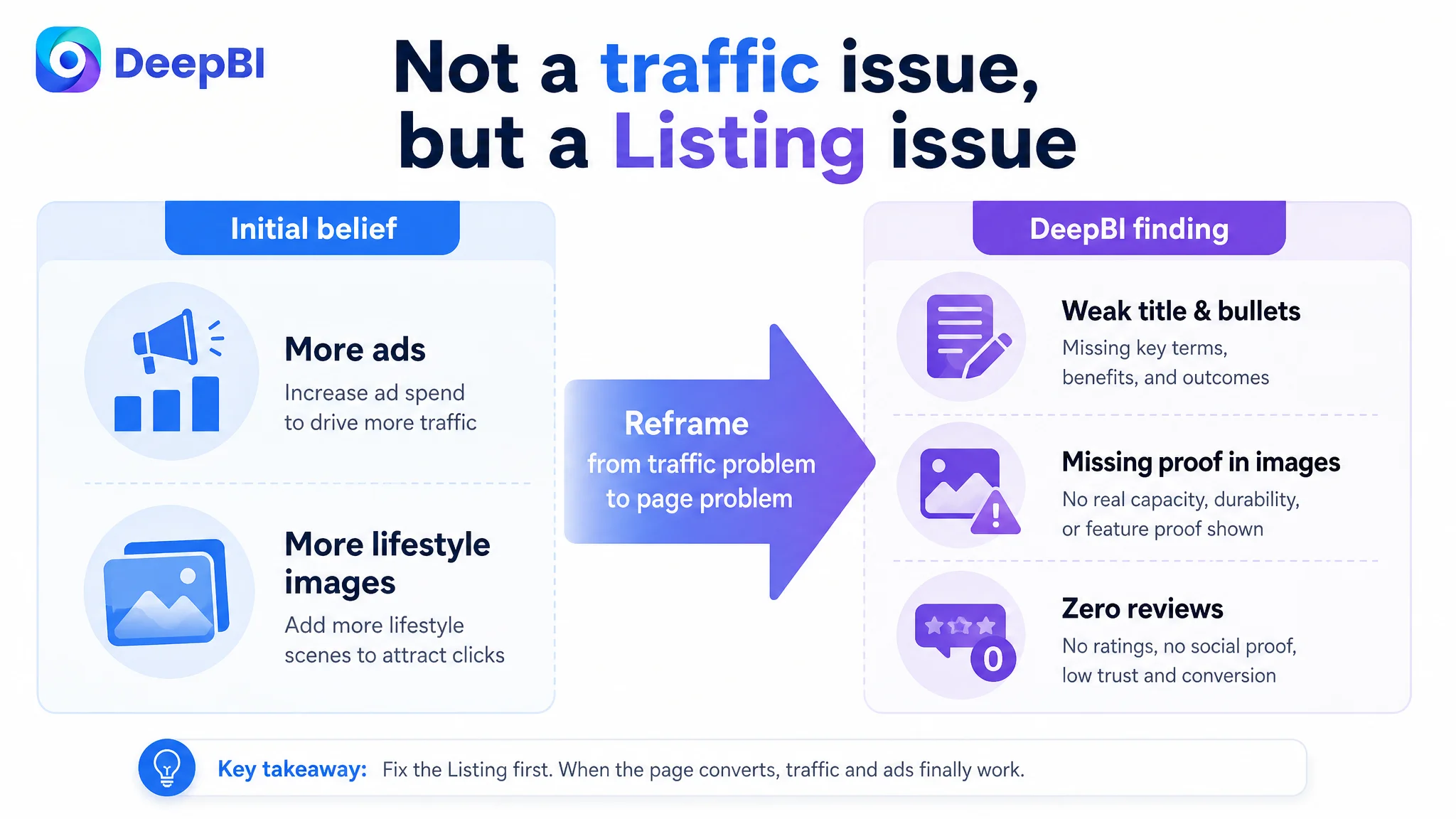
Once DeepBI stepped in and benchmarked the Listing against a directly competing Amazon diaper tote, a different picture emerged. The main gap was not aesthetics, but the Listing’s ability to convert traffic into orders: a weak title strategy, bullets that talked about features but not outcomes, main images that skipped over capacity and durability, and—most critically—zero reviews versus a competitor with over a thousand and a 4.7-star rating.
The later optimization intentionally shifted away from “more scenes + more spend” toward “rebuilding the decision logic of the Amazon product page”: restructuring the title around real search terms and scenarios, rewriting the bullets to follow a pain-point → solution path, reorganizing the main-image sequence to prove capacity and durability first, and tightening A+ modules so key information appeared earlier and more coherently. For other Amazon sellers, this case is a reminder that premium-looking creatives and aggressive ads cannot compensate for a Listing that doesn’t answer core buying doubts or build trust; fixing product-page conversion is often the only way to make ad spend useful again.
The Real Constraint Was Not Traffic, but Listing Conversion Capacity
At the point DeepBI was brought in, the brand’s Amazon diaper bag Listing had one fundamental bottleneck:
The product page could not convert traffic, especially when directly compared to a mature competitor Listing in the same search pool.
The internal scorecard made this clear. Against a comparable high-performing Amazon Listing in the same category, the target Listing scored:
- Total score: 64/100 vs competitor 79/100 (–15 gap)
By dimension:
- Title: 12 vs 16 (–4)
- Main images: 26 vs 23 (+3)
- Bullet points: 5 vs 7 (–2)
- A+ / detail page: 21 vs 19 (+2)
- Reviews: 0 vs 14 (–14)
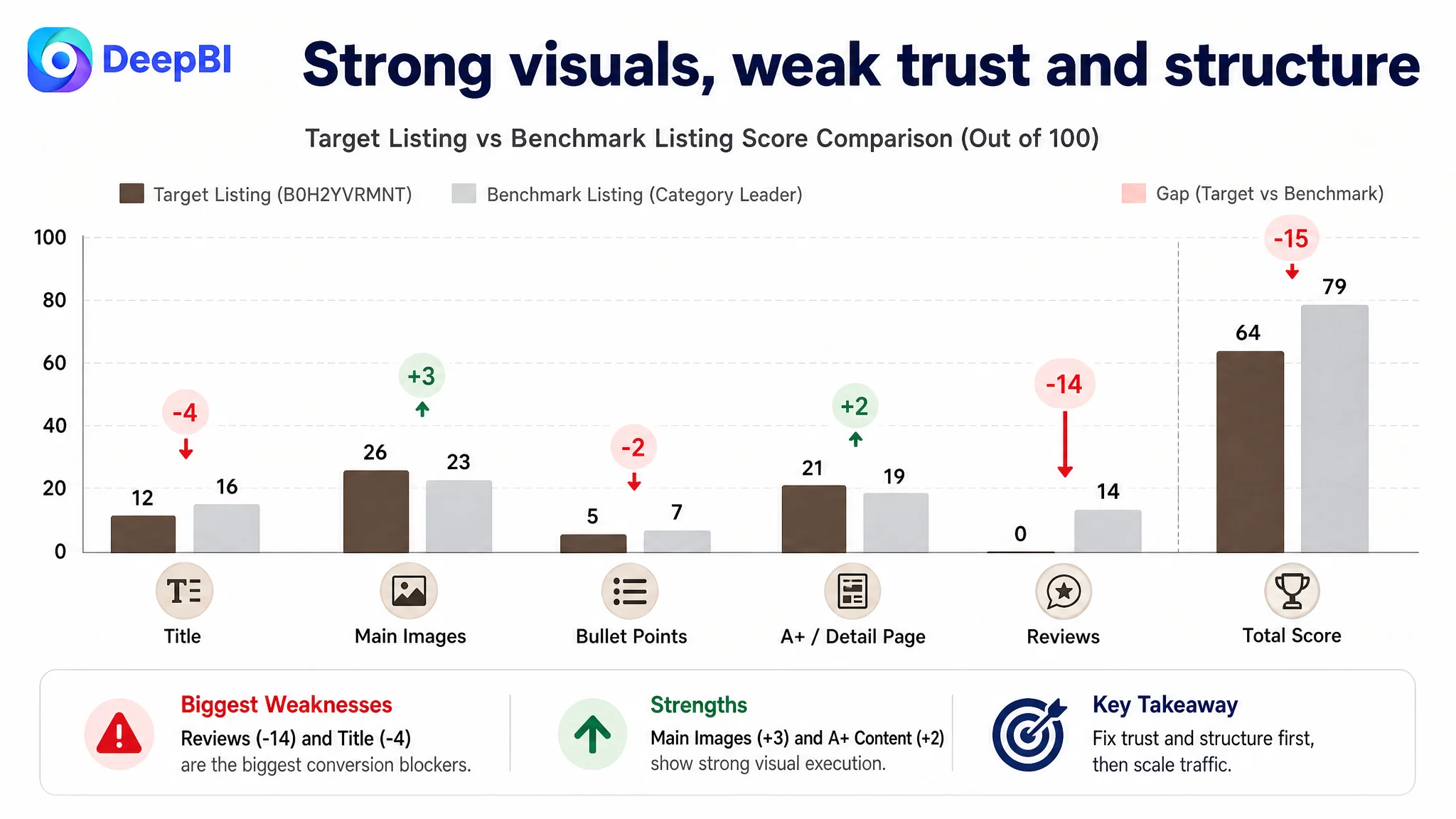
Two important signals stood out:
1. Visually, the Listing was not “bad” at all. Main images and A+ content actually scored slightly stronger than the benchmark on quality and emotional appeal.
2. Conversion infrastructure and trust were broken.
- No ratings, no reviews, no UGC.
- Title and bullets were structurally weaker than the benchmark.
- The conversion gap was being decided before the beautiful A+ even had a chance to work.
From a business perspective, this meant:
- Pushing more Amazon ads would only send more traffic into a page that was less trustworthy and less structured than the competitor.
- Ads would amplify the Listing’s weaknesses faster than they could be fixed.
What the Seller Originally Misdiagnosed
The customer team’s initial thinking was straightforward and very familiar:
- “Our bag looks more premium than others.”
- “We’ve already invested in good A+ lifestyle images.”
- “CTR and sales are not where we want them; ads must not be optimized enough.”
- “Let’s scale Sponsored Products and Sponsored Brands, and maybe add more lifestyle images to stand out.”
This misdiagnosis rested on two assumptions:
1. Visual premium = automatic conversion advantage
They believed higher-end visuals alone would justify higher price perception and drive orders, even with weak social proof.
2. Ad optimization can solve a conversion problem
They expected better bids, keywords, or creative variations in Amazon ads to close the CVR gap.
DeepBI’s diagnosis turned this logic upside down.
“The real problem was not that ads failed to bring traffic. It was that the page could not convert the traffic.”
With a directly comparable benchmark showing a stronger title strategy, clearer functional bullets, and overwhelming review volume, continuing to force traffic through ads into this Listing would only accelerate ACOS issues and drag down organic potential.
Why Traditional Ad Optimization Kept Failing in This Context
If we look at the category reality the Listing was facing:
- The benchmark Listing had 4.7 stars, over 1,100 reviews, and dozens of image/video reviews.
- The target Listing had 0 rating, 0 reviews, and no evidence of user validation.
In a search result where both products appear side by side, several things happen:
- Even with a well-designed main image, the star rating and review count dominate click choice.
- If the target Listing somehow wins the click (e.g., due to price or visuals), the lack of reviews immediately increases bounce risk.
- Amazon’s A9/A10 algorithms read short dwell time and low conversion as negative signals, weakening both organic ranking and ad performance.
From this perspective:
- Changing keywords or bids would have almost no effect on the core trust gap.
- Improving only the emotional lifestyle scenes without reinforcing functional proof would not repair the rational decision chain.
- Scaling ads would increase spend but not structurally change the page’s ability to convert.
The business risk was clear: every extra dollar into Amazon ads without fixing the Listing would be wasted or under-leveraged.
How DeepBI Located the Real Bottleneck in the Amazon Listing
DeepBI’s Listing score breakdown against the benchmark clarified where the decision logic broke.
1. Title: Missing Brand Signal, Outcomes, and Structured Long-Tail Coverage
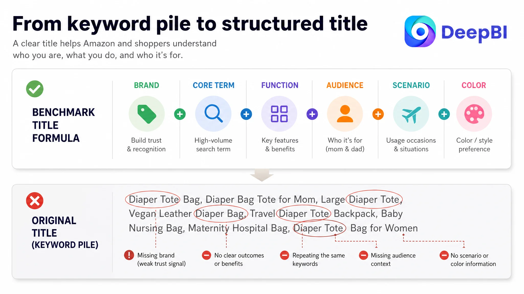
The competitor’s Amazon title followed a mature formula:
- Brand + core term + concrete function + audience + scenario + color
For example (simplified structure):
Brand + Diaper Bag Tote, Baby Diaper Bag with Pacifier Case, Large Travel Diaper Tote Caddy for Mom and Dad, Multifunction Large Baby Bag – Black
Key strengths:
- Brand name front-loaded for recognition and trust.
- Clear “with Pacifier Case” and “Large Travel Diaper Tote Caddy” signals—immediate functionality and scenario.
- Inclusion of “Mom and Dad” (audience) and “Black” (color for filtered searches).
- Efficient coverage of long-tail search terms without wasteful repetition.
The target Listing’s original title:
- Lacked a brand word, weakening recognition on Amazon search results.
- Repeated terms like “Diaper Tote” several times, wasting character space.
- Focused on keyword stacking rather than a logical reading path.
- Omitted color and size cues that often drive filtered searches and help convert.
This wasn’t only an SEO issue. On a crowded Amazon search page, the title is a key micro-pitch that tells the shopper:
- What this product is
- Who it’s for
- Why it’s better / what problem it solves
- In which scenarios it fits
The existing title did not deliver that logic.
2. Main Images: Emotional, Premium – but Weak on Proof
On scoring, the target Listing’s main-image set actually looked stronger than the competitor on visual quality and brand feel:
- High-quality vegan-leather textures.
- Lifestyle scenes (street, airport, mom-child interaction) that evoked an urban, premium parent identity.
- Detailed macro shots of zippers, metal feet, and craftsmanship.
Yet DeepBI’s multi-modal analysis flagged missing proof at critical decision nodes:
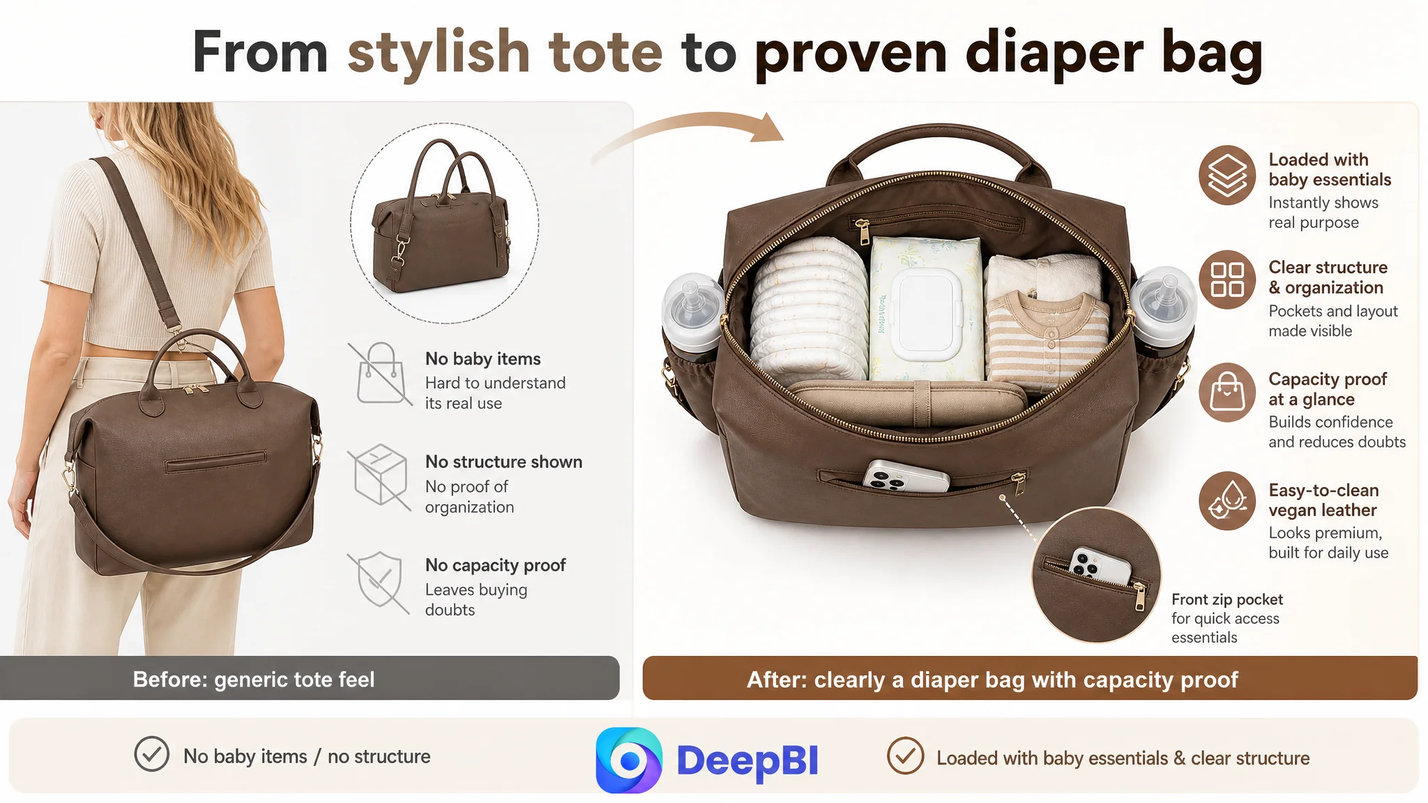
- The first image showed mostly the back of the bag with backpack strap hints—visually pleasant but:
- Looked like a generic tote at first glance, not obviously a diaper bag.
- Didn’t immediately showcase structure, capacity, or organization.
- Early in the sequence, a stroller image appeared, before there was clear validation of capacity, pocket layout, or material durability.
- The grid-style pocket overview image was clinical, listing pocket positions without visually connecting them to actual baby items (bottles, wipes, clothes).
- Dimensions image gave external sizes, but didn’t visually answer the shopper’s core question:
“Will all my baby essentials actually fit in here, in a way that stays organized?”
In the baby-care category, especially at higher price points, shoppers are risk-averse and overloaded. They need:
- Fast confirmation that this is truly a diaper bag, not a fashion tote.
- Visual proof of bottle storage, including insulation or leak protection if claimed.
- A clear sense of internal structure under real load, not just pocket counts.
The images on the target Listing emphasized style and lifestyle earlier than proof of function and durability.
Advertising does not only amplify advantages. It can also amplify a page’s existing defects.
3. Bullet Points: Talking About Features, Not Outcomes
Comparing the two Sets of Amazon bullet points revealed a structural gap in persuasion logic.
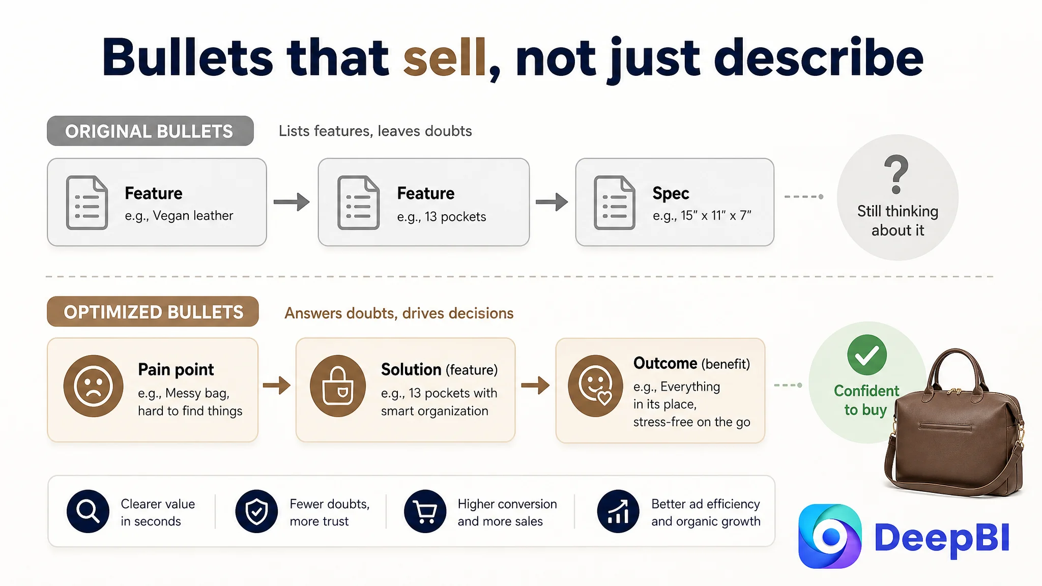
Competitor bullets:
- Open with “Spacious and Organized Storage” – directly naming the primary pain point.
- Emphasize waterproof, durable fabric plus clear outcome: “belongings remain dry and protected.”
- Tie features to explicit scenarios: rainy conditions, travel, comfort for new moms.
- Link to gift and baby-registry use, adding a social/purchase-trigger angle.
Target Listing bullets originally:
- Led with material and hardware (“luxurious feel”).
- Listed number of pockets and dimensions in a disconnected way.
- Mentioned multi-function design (different carry styles) but not in a way that anchored concrete benefits (e.g., hands-free, airport navigation, stroller use).
- Listed use cases (hospital, travel, work) with weak emotional or functional hooks.
In other words, the bullets:
- Described, but did not convince.
- Lacked a pain-point → solution → outcome flow that high-intent Amazon shoppers expect.
DeepBI’s rewriting approach focused on:
- Leading with the real buying reason: organized storage, durability, and ease-of-clean for baby gear.
- Integrating numbers (13 pockets, dimensions) into benefit statements, not raw specs.
- Highlighting the 4-way carry design as a true advantage against the benchmark.
- Explicitly positioning the product as a hospital bag, travel weekender, work tote, and baby-registry gift.
4. A+ / Detail Page: Strong Visuals, Misordered Information
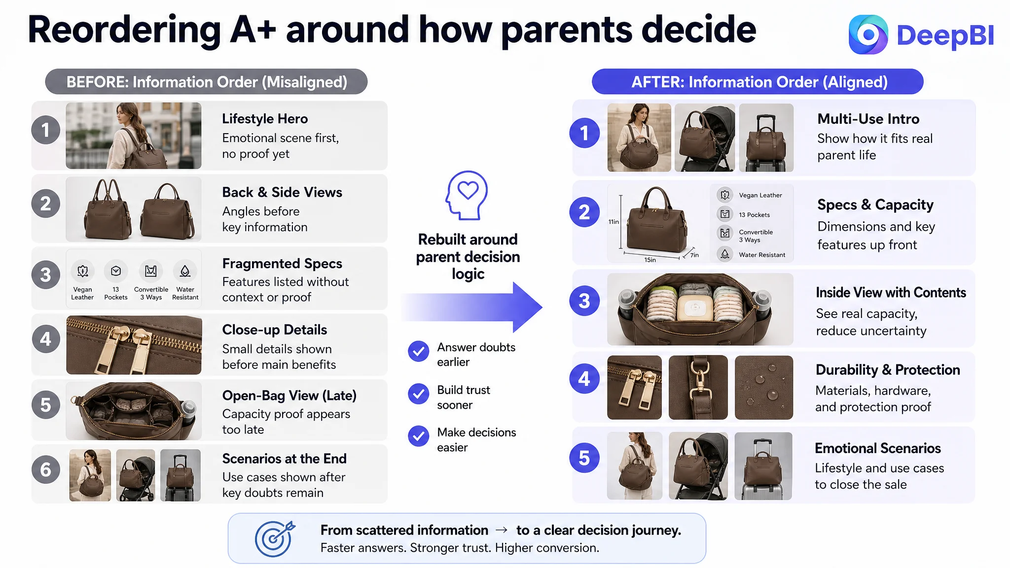
Ironically, the target Listing’s A+ (detail page) was already visually superior to the competitor:
- Full-width lifestyle hero images with brand feel.
- Macro shots demonstrating zipper quality, metal feet, and material realism.
- A three-scene path (commute → travel → parenting) that told an “all-in-one bag” story.
But the module order and information density worked against fast decision-making:
- Early modules were used on generic lifestyle branding and back/side views without strong call-outs.
- Dimensions and internal storage diagrams were fragmented across separate images, instead of being consolidated into a single, high-trust spec module.
- The powerful open-bag-with-contents visual was buried too deep, shown only after lower-value close-ups.
- Two separate modules dealt with metal feet and detachable straps, duplicating “durability & structure” instead of consolidating them into a strong reassurance block.
In contrast, the competitor:
- Brought functional icons and specs earlier in the layout.
- Provided a concentrated multi-pocket overview with clear labeling.
- Used family/child scenes to reinforce everyday usage and trust (though visually weaker than the target in emotion).
DeepBI’s judgment: the target Listing had the assets, but not the order and logic to support fast, confident decisions on Amazon.
5. Reviews: A Near-Absolute Trust Deficit
The review contrast was stark:
- Target Listing:
- 0 rating, 0 total reviews
- Benchmark Listing:
- 4.7 stars
- 1,119+ total reviews
- Dozens of photo and video reviews
Impact in Amazon terms:
- On the search page, star rating and count drive a large share of CTR decisions.
- On the detail page, reviews double as proof that promises in bullets and images are real.
- Competitor reviews repeatedly highlighted “big capacity”, “good quality”, “great value”, directly reinforcing their Listing claims.
With zero reviews, the target Listing:
- Had no external validation to balance a higher-end visual positioning.
- Could not lean on “social proof” to support price or differentiate from cheaper alternatives.
In this environment, no ad optimization can fully offset a zero-review status against a deeply validated competitor.
Why DeepBI Did Not Recommend “Fix Ads First”
Given this diagnostic picture, DeepBI’s decision logic was straightforward:
- Ads were not the root problem; they were the amplifier.
- Sending more paid traffic into a low-trust, mis-structured page would:
- Drive up ACOS.
- Damage organic rankings due to poor conversion signals.
- Increase financial and operational stress on the seller.
Instead, DeepBI prioritized:
1. Rebuilding Listing conversion capacity before any large-scale ad push.
2. Reordering information to address shoppers’ real decision sequence:
- Is this truly a diaper bag that fits my needs?
- Can it hold everything and stay organized?
- Is it durable, easy to clean, and safe for family use?
- Does it fit my lifestyle and scenarios (hospital, travel, work, stroller)?
3. Positioning the product where it actually has an edge:
- Vegan leather look and feel.
- Convertible 4-way carry.
- Metal feet / durability design.
- Multi-scenario use and gift suitability.
Without this foundation, even a well-structured Amazon ad strategy would remain an expensive band-aid.
How the Optimization Focus Shifted: From “More Lifestyle” to “More Proof, Earlier”
1. Title Reframing: From Keyword Pile to Decision Statement
DeepBI’s suggested title:
Vegan Leather Diaper Bag Tote Backpack, Large Convertible Diaper Bag for Mom and Dad, Multifunctional Travel Hospital Bag and Work Tote
Key shifts:
- Front-loaded core phrase: “Vegan Leather Diaper Bag Tote Backpack”
- Captures the main search intent and material positioning in one go.
- Removed redundant repetition: Eliminated multiple repeats of “diaper bag” and “tote” that wasted characters.
- Added scenario and role clarity:
- “Large” → capacity expectation.
- “Convertible” → design advantage vs competitor.
- “for Mom and Dad” → broadens audience beyond “moms only”.
- “Travel Hospital Bag and Work Tote” → compresses strong search scenarios into the tail.
Effect on decision logic:
- The Amazon search-result snippet now states exactly what the product is, who it’s for, and when it’s used, not just a string of half-repeated keywords.
- Long-tail coverage is preserved and improved, but the reading experience becomes persuasive instead of chaotic.
2. Bullet Points: Rebuilding the Pain-Point → Solution Path
DeepBI’s bullet rewrites followed a simple principle: each bullet must answer a category-relevant anxiety and close with a clear outcome.
Examples:
Bullet 1 – Material & Durability
Before: Emphasized “luxurious feel” of vegan leather and hardware with little functional payoff.
After (concept):
Premium Vegan Leather & Durable Craftsmanship: Crafted from high-quality, soft vegan leather, this diaper bag offers a luxurious aesthetic while being water-resistant and easy to wipe clean. Featuring smooth metal zippers, elegant gold hardware, and reinforced stitching, it is built to withstand the rigors of daily motherhood without sacrificing style.
Shift:
- Connects look (premium) with function (easy to clean, durable).
- Speaks directly to the daily-use reality of parents.
Bullet 2 – Organization
Before: Listed pockets and compartments with no narrative.
After (concept):
Spacious & Organized Storage: This diaper tote bag features 13 functional pockets in total, including 1 spacious main compartment, 9 internal pockets, 2 exterior bottle pockets, and 1 quick-access front phone pocket. It provides ample space and a dedicated place for all your baby essentials and personal belongings, ensuring everything stays neatly organized.
Shift:
- Keeps numbers, but uses them to paint a mental picture of order.
- Addresses the “will this actually keep my stuff organized?” concern.
Bullet 3 – Protective Details
After (concept):
Thoughtful Design with Protective Details: Measuring 15"L x 11"H x 7"W, this bag is a new mom must-have that perfectly balances capacity and portability. It is uniquely equipped with protective metal feet on the bottom to keep the bag clean and upright, preventing direct contact with dirty surfaces and extending the bag's longevity.
Shift:
- Uses existing spec and metal-feet advantage to talk about hygiene and lifespan, not just hardware aesthetics.
Bullet 4 – Carry Flexibility
After (concept):
Versatile 4-Way Carry Options: Designed for ultimate flexibility, this bag comes with fully detachable straps that allow you to switch effortlessly between a backpack, a shoulder tote, and a crossbody bag. It also includes integrated stroller straps for hands-free convenience, making it the ideal companion for busy parents on the move.
Shift:
- Positions convertible design as a real differentiator vs competitor.
- Anchors it in the category’s most important practical benefit: hands-free mobility.
Bullet 5 – Scenarios & Gift Angle
After (concept):
Multifunctional Use & Perfect Gift: More than just a diaper bag, its chic design makes it ideal as a hospital maternity bag, a travel weekender, or even a professional work bag. Combining fashion with functionality, it is a perfect choice for baby registry gifts and an essential accessory for every stage of motherhood.
Shift:
- Expands beyond “mommy bag” to maternity, travel, work, and gift.
- Intentionally adds “baby registry” to capture gift and registry traffic.
Result: bullet points become structured sales arguments, not a raw spec list.
3. Main-Image Sequence: Proving Diaper-Bag Status, Capacity, and Durability
DeepBI’s adjustment was not about adding more images, but about reordering and repurposing what already existed.
Core decisions:
- Image 1: Switch from a passive back-view to a 45-degree front view that clearly shows:
- Multiple compartments.
- Recognizable diaper-bag elements.
- Vegan leather texture as a secondary, not primary, hook.
- Image 2: Move stroller-use shot later in the sequence.
- First images must prove: “this is a real diaper bag with enough space and structure”.
- Later images can confirm convenience scenarios like stroller attachment.
- Image 3: De-emphasize pure lifestyle “how it looks on you” until after rational proof.
- Maintain convertible-carry information, but only once functional doubts are reduced.
- Image 4: Transform the pocket overview into a loaded visual:
- Show actual baby items in pockets (bottles, wipes, diapers, clothes).
- Use call-outs to link to bullet claims (e.g., “9 internal pockets”, “insulated bottle pockets” if supported).
- This becomes the visual backbone of storage and capacity proof.
- Image 5: Replace generic external size-only view with a capacity + size hybrid:
- Keep dimensions for rational check.
- Add internal load views showing how many diapers/clothing sets fit, aligning with bullet promises.
By doing this, the first few images on the Amazon Listing now:
1. Confirm category fit (truly a diaper bag).
2. Demonstrate capacity and organization under real load.
3. Then transition to carry flexibility and lifestyle scenes.
This is the opposite of “pretty first, proof later”; it is proof first, then emotion.
4. A+ Detail Page: Moving From Fragmented Beauty to Structured Decision Flow
DeepBI’s recommended changes to the Amazon A+ modules focused on information order and density:
- Module 1:
- Reframe as “Multipurpose Diaper Bag Tote” with emphasis on vegan leather as “luxurious yet practical for families”.
- Make clear that this is a multi-use bag (diaper, hospital, travel, work), aligning with bullets.
- Module 2:
- Build a consolidated “Ideal for Travel and Daily Use” collage:
- Group travel features, internal organization, stroller straps, and 4-way carry into one module.
- Use icon call-outs and short lines to avoid text-heavy clutter.
- Module 3:
- Create a clean spec diagram:
- Combine size arrows (15" x 11" x 7") with side view showing wipes pocket.
- This becomes the single source of truth for dimensions and base materials.
- Module 4:
- Move the open-bag-with-contents visual earlier, as an “Inside View of Your Daily Essentials”.
- Use call-outs to match claims like “9 internal pockets” and “13 pockets in total”.
- Module 5:
- Build a durability assurance module:
- Merge close-up zipper, hardware, and detachable strap visuals.
- Text shifts from “Smooth zipper” to “Built to last through daily use and travel”.
- Module 6:
- Create a dedicated “Protection & Risk Reduction” module:
- Emphasize metal feet protecting the bottom from dirt and moisture.
- Show the bag standing upright cleanly beside a “messy floor” reference.
- Module 7:
- Focus purely on target audience & emotional scenarios:
- Mother kneeling with daughter and bag as hero.
- Copy speaks directly to “new moms balancing hospital, travel, and everyday life”.
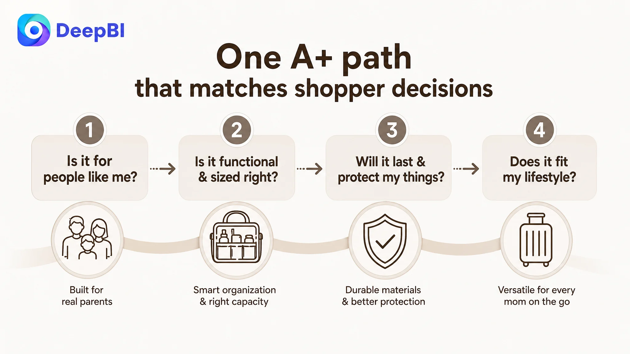
Now the A+ path mirrors how high-intent Amazon shoppers actually read:
1. What is this, and is it for people like me?
2. Is it functional enough and sized right?
3. Will it last and protect my things?
4. Does it fit my lifestyle and identity?
How the Page’s Sales Logic Started to Recover
Once these changes are implemented, we expect:
- Clearer micro-pitches on the search page:
- Title and main image immediately express “vegan leather diaper tote backpack, large, convertible, for mom and dad, travel/hospital/work”.
- Higher-quality clicks:
- Shoppers who click in are now those whose needs match the scenarios stated in the title and images, improving the chance of conversion.
- Shorter decision paths on the detail page:
- Key doubts (capacity, organization, durability) are addressed in the first few images and early A+ modules.
- Bullet points act as fast reassurance rather than generic feature lists.
- Better fit for future reviews:
- Once initial reviews start arriving, many will likely echo the same advantages (organization, convertible carry, quality), further reinforcing the Listing’s new narrative.
In this improved state, ads can finally become useful again:
- Paid traffic is more likely to result in orders because the Listing now:
- Answers core doubts faster.
- Builds trust through coherent claims and visuals.
- ACOS has structural room to decline because CVR is no longer artificially suppressed by Listing logic.
What This Case Means for Other Amazon Sellers

Several lessons from this Amazon diaper bag Listing generalize well across categories:
1. A beautiful Listing is not necessarily a high-converting Listing.
This page actually scored well on main-image and A+ quality. The damage came from misordered information, weak title logic, and zero social proof.
2. Ads cannot fix a broken conversion story.
When a benchmark Listing has a stronger title, clearer bullets, and thousands of reviews, no amount of bid tuning can close that gap if your Listing does not rebuild its own sales logic.
3. Title, main images, bullets, and A+ are one sales engine, not four separate tasks.
DeepBI’s analysis looked at how those elements worked together—or failed to. The turning point was reorganizing them into a single, coherent decision journey.
4. Advertising amplifies whatever is already on the page.
If your Amazon product page has weak proof, ads amplify that weakness. If the page is structurally sound and persuasive, ads become a growth lever instead of a cost sink.
For this seller, the most important shift was mindset: from “our ads are not working” to “our Listing is not yet ready to receive more traffic.” Once that judgment changed, the path forward became much clearer—and far more controllable.