

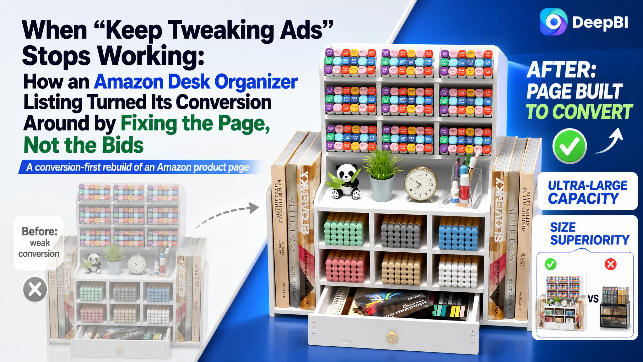
This Amazon seller in the desk organizer category had already invested in traffic. Ads were running, clicks were coming in, and the A+ content looked more polished than many competitors. Yet the Amazon Listing still underperformed a key competitor and struggled to turn traffic into stable orders. The team’s instinct was to keep tuning keywords and bids, assuming high ACOS and weak sales were “an ads problem.”
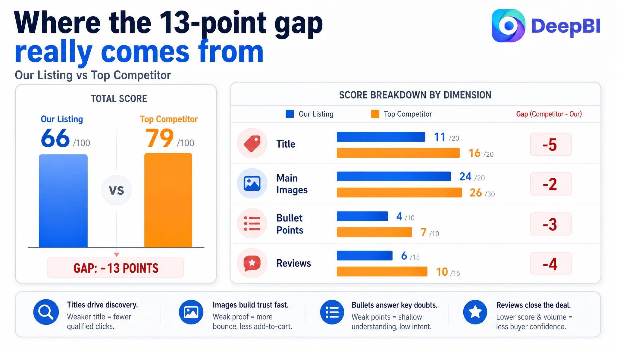
DeepBI’s diagnosis told a different story. Against a directly comparable Amazon competitor, this Listing scored 66/100 versus 79/100, with clear gaps in title logic, main-image strategy, bullet-point persuasion, and review strength. In other words, the problem was not a lack of traffic; it was the Listing’s ability to convert that traffic. Ads were effectively sending shoppers into a page that did not quickly prove capacity, size, sturdiness, or ease of assembly—precisely the points that mattered most in this category.
The optimization work therefore did not start from new ad structures or broader keyword tests. It started from rebuilding the page’s sales logic: rewriting the title to carry a clear benefit structure, restructuring bullet points around ultra‑large capacity and easy assembly, refocusing main images on capacity, dimensions, and sturdiness, and reordering A+ modules to show powerful before/after impact earlier. The result was not a cosmetic facelift, but a reset of how the Amazon product page told its story—so that every extra ad click had a real chance to turn into an order.
For other Amazon sellers, this case is a warning against defaulting to ad tweaks when ACOS is uncomfortable. Here, the real constraint was Listing conversion capacity. Once that was addressed, advertising stopped being a blunt instrument and became a useful lever again.
The Core Conflict: Traffic Was There, Trust Was Not
DeepBI’s scoring made the Amazon context very clear:
- The target Listing: 66/100
- A directly comparable high‑performing competitor: 79/100
- Gap: –13 points
At first glance, the seller did not feel “weak”:
- A+ modules were visually richer and more immersive than the competitor’s.
- The page had multiple lifestyle scenes, structural diagrams, and a before/after module.
- The product truly had strong functional specs: 15 compartments, 2 file holders, EVA material, large dimensions.
Yet the Listing underperformed on the metrics that decide whether an ad click becomes an add‑to‑cart:
- Title: 11 vs competitor’s 16 (–5)
- Main images: 24 vs 26 (–2)
- Bullet points: 4 vs 7 (–3)
- Reviews: 6 vs 10 (–4)
“The real problem was not that ads failed to bring traffic. It was that the page could not convert the traffic.”
The Amazon product page wasn’t missing content; it was missing a clear, low‑friction path from impression to trust.
The Seller’s Original Misdiagnosis: “Ads Need More Work”
From the seller’s perspective, the storyline sounded familiar:
- Ads were delivering impressions and clicks, but orders and CVR lagged expectations.
- A+ content had already been upgraded; scenes looked modern, the product looked “chic.”
- The internal conclusion: “We probably haven’t found the right ad structure and keyword mix yet.”
So the team’s default actions circled around:
- Adjusting bids on high‑volume desk organizer and office supply terms.
- Increasing budget on campaigns that showed acceptable CTR.
- Adding more related keywords to broaden reach.
This created a dangerous loop:
1. More traffic was pushed into a page that did not immediately prove size, load capacity, and ease of assembly.
2. Some shoppers entered, skimmed, and left—without finding fast answers to “Will this fit my desk?” and “Will this wobble or break?”
3. Rising spend produced little movement in sales, reinforcing the sense that “ads are just getting more expensive.”
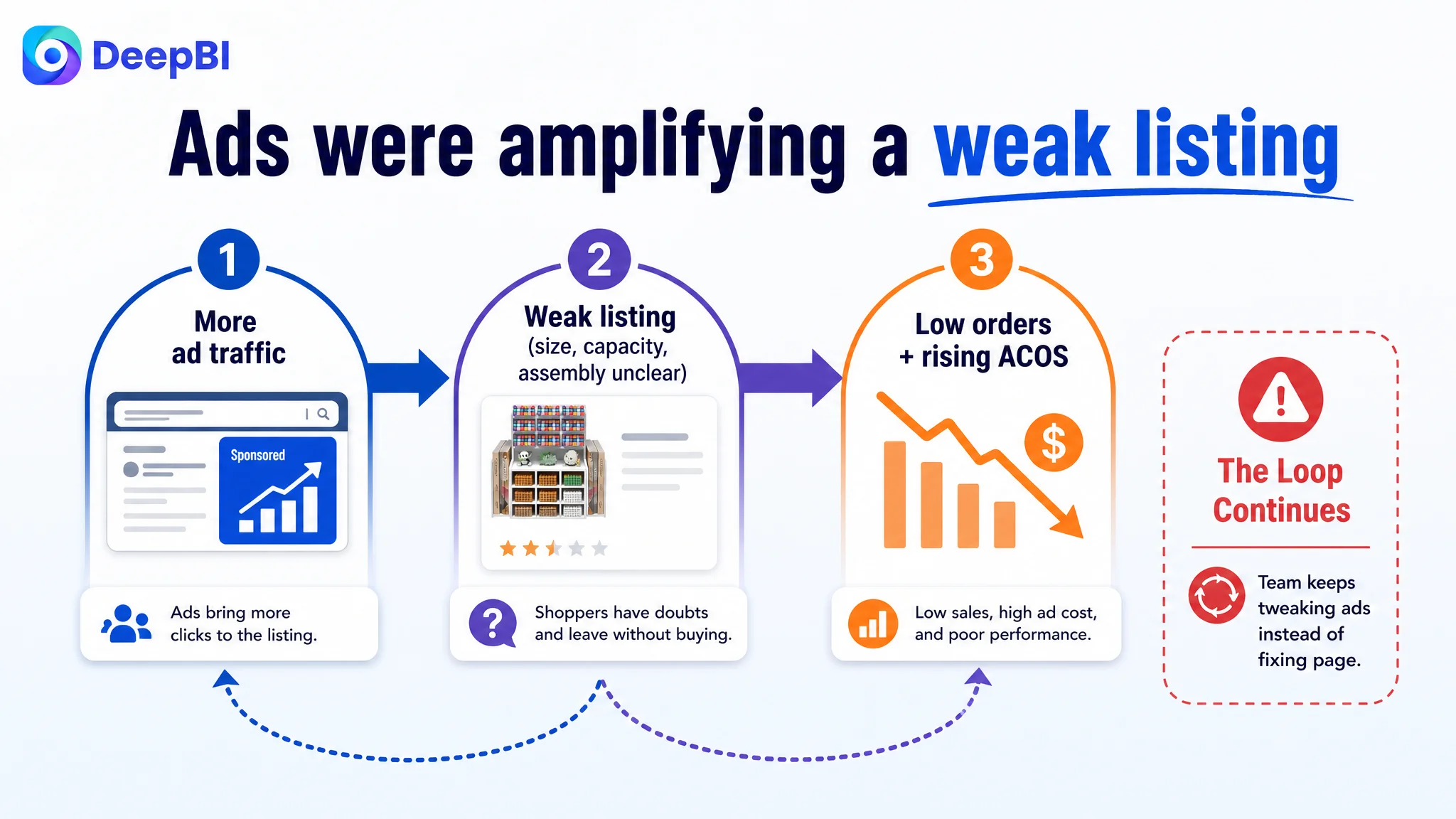
Without a clear way to quantify Listing conversion capacity, the seller kept treating a page‑level trust problem as a media problem.
DeepBI’s Diagnosis: A Conversion Bottleneck Hiding Behind Pretty Visuals
When DeepBI benchmarked the Amazon Listing against a direct category competitor, one pattern dominated: every friction point that mattered for conversion was weaker on this page.
Title: Information Was There, but Decision Logic Was Not
The existing title did include “desk organizers” near the front, but several issues limited both search power and human readability:
- Keyword stuffing and repetition: “organizer,” “desk,” and similar terms appeared without a clear logic, hurting flow and perceived professionalism.
- Missing brand and benefit framing: No brand at the front, no strong outcome or differentiator (e.g., “Larger,” “Ultra-Large Capacity,” “Easy Assembly”) early enough to trigger interest.
- Unclear value communication: No numbers for capacity, no clear material callout, no immediate context such as home office, school, or art supplies.
By contrast, the competitor’s Amazon title:
- Started with brand.
- Immediately framed “Larger Mesh Desk Organizer with Drawer” as the core promise.
- Layered in benefits like “Multi-Functional” and “Easy Assembly.”
- Embedded use scenarios like “Office Art Supplies.”
In DeepBI’s view, the title was not just missing keywords; it was missing a decision narrative. It did not quickly answer why this organizer was better than dozens of similar thumbnails on Amazon search.
Main Images: Beautiful Scenes, Weak Proof
On the surface, the main image set looked “full”:
- Multiple lifestyle scenes showing the organizer on desks.
- A before/after style visual in A+.
- Structural and dimension diagrams.
But DeepBI’s multi‑image review found a structural problem: five out of five main-image slots were used on repetitive, generic scenes.
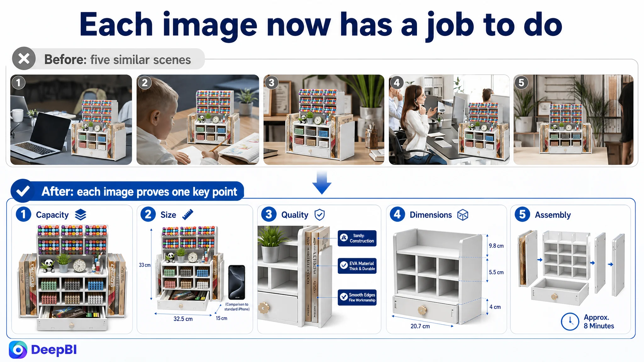
Key gaps against the competitor:
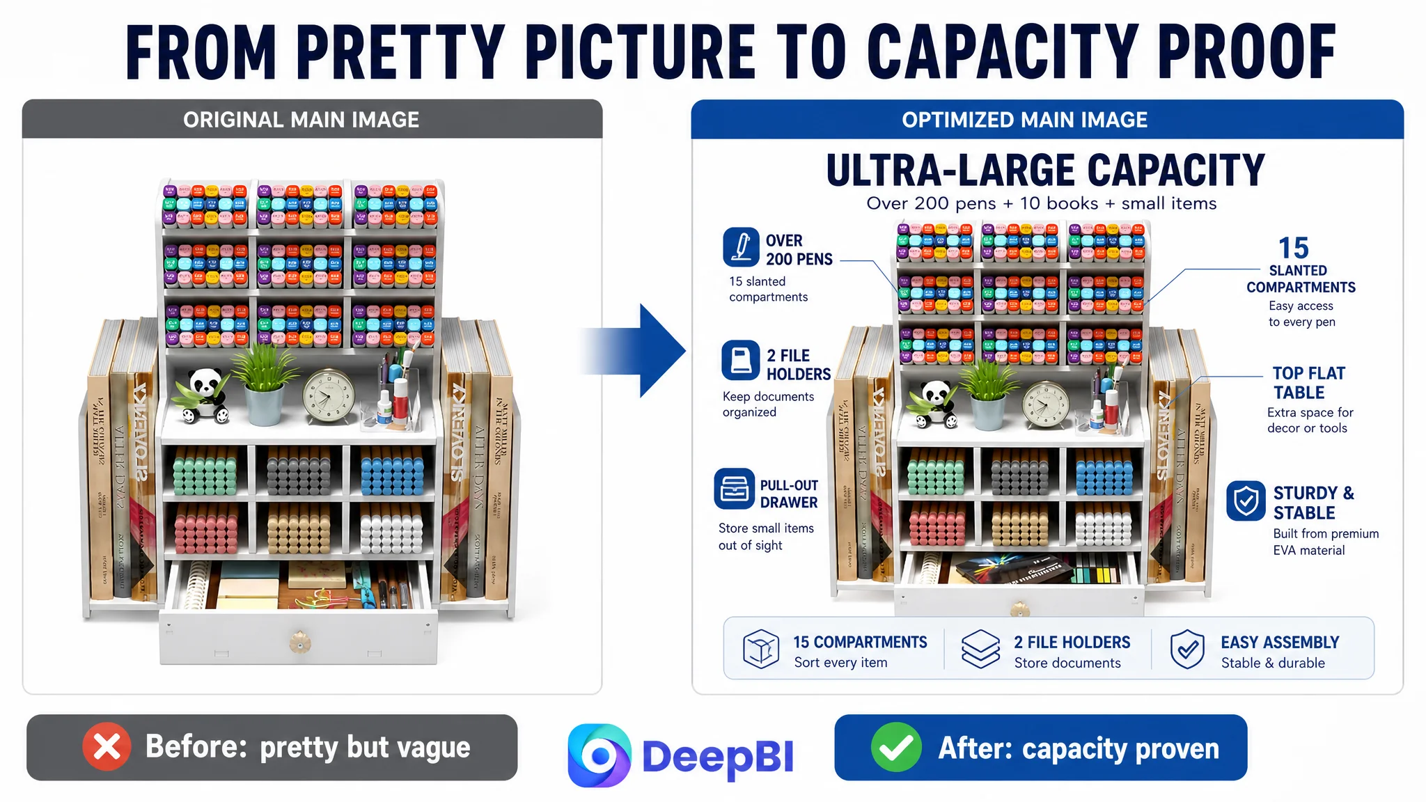
- No visual proof of “ultra‑large capacity.” The primary product image showed a neat, mostly empty organizer rather than every compartment packed. Shoppers could not instantly see that this unit swallowed more items than cheaper alternatives.
- No comparative size image. The competitor used an obvious size comparison (product vs. another item / variant), giving rational buyers a quick “bigger and better” signal. This page did not.
- No clear sturdiness/anti‑wobble signal. Given review complaints about material and assembly, there was no image explicitly showing heavy loads or close‑up material thickness to counter doubts.
- No human‑scale size reference. Dimensions were text, not anchored visually against an object like a phone or notebook.
- One slot consumed by a low‑information video thumbnail. That space could have carried a key trust‑building visual.
In short, images were attractive but not commercially sharp. They didn’t neutralize the exact fears that were later confirmed in 1‑star reviews.
Bullet Points: Data Without a Persuasive Spine
Bullet points are often the first long‑form text shoppers see on an Amazon Listing. Here, DeepBI found:
- First bullets focused on material and size, whereas the competitor led with “ULTRA-LARGE CAPACITY” in all caps—a clear benefit hook.
- Bullet headings were vague (e.g., “Looks chic”) instead of structured labels such as “EASY TO ASSEMBLE,” “SPACE SAVING,” or “VERSATILE DESIGN.”
- Dimension data used inconsistent units and felt scattered; there was no single, coherent statement that tied structure, capacity, and size together.
- Usage scenarios were generic (“help you sort different kinds of desk items”) vs. the competitor’s concrete scenes (e.g., storing makeup brushes, art supplies).
The result: plenty of information, but no pain‑point → solution → proof rhythm. Readers had to work too hard to connect features to their own desks.
A+ Content: Stronger Than Competitors, but Mis‑Ordered
Interestingly, DeepBI judged the A+ detail content as visually superior to the competitor’s:
- Realistic lifestyle scenes with people working.
- Clear callouts for six storage zones.
- A proper before/after module.
- Structural breakdown diagrams that explained construction and components.
Yet two issues limited conversion impact:
1. The strongest persuasion module (before/after) sat too late in the sequence. Shoppers had to scroll through more neutral content before seeing the “clutter solved” payoff.
2. Dry specification details appeared too early, interrupting emotional build‑up with technical data before desire was fully formed.
So while the A+ was good, it did not lead with its best shot. It behaved more like a catalog than a guided decision path.
Reviews: A Quiet but Serious Trust Leak
The review dimension was a clear numerical gap:
- Target Listing: 3.7 stars, 90 reviews
- Competitor: 4.1 stars, 222 reviews
Weaknesses were not only in quantity:
- Two out of eight front‑page reviews were 1‑star, highlighting material fragility and assembly difficulty—direct strikes against perceived sturdiness.
- The competitor’s lower‑star reviews were more dispersed and balanced, without such a heavy concentration of strong negatives on page one.
For Amazon shoppers skimming quickly, a 3.7 rating and visible 1‑star pain points were enough to make them look elsewhere, especially when main images did not aggressively counter those same fears.
Why DeepBI Refused to Start with Ads
With this diagnostic picture, DeepBI made a deliberate call: do not touch ad structure yet.
The logic was straightforward:
- Ads amplify whatever the page currently does. If the page under‑explains size, capacity, and assembly, more clicks simply amplify bounce and wasted spend.
- Click‑through rate and conversion rate are coupled. A weak main image and title will cap CTR from search; weak bullets, images, and reviews will cap CVR on the page. Both matter before adding more budget.
- The competitor was converting with higher ratings and stronger proof visuals. There was no reason to expect ad tweaks alone to close a 13‑point Listing score gap.
“Advertising does not only amplify advantages. It can also amplify a page’s existing defects.”
From a business‑risk angle, the priority was therefore:
1. Fix how the Amazon Listing receives traffic (title, images, bullets, A+ order).
2. Only then consider feeding it more traffic via revised ad strategy.
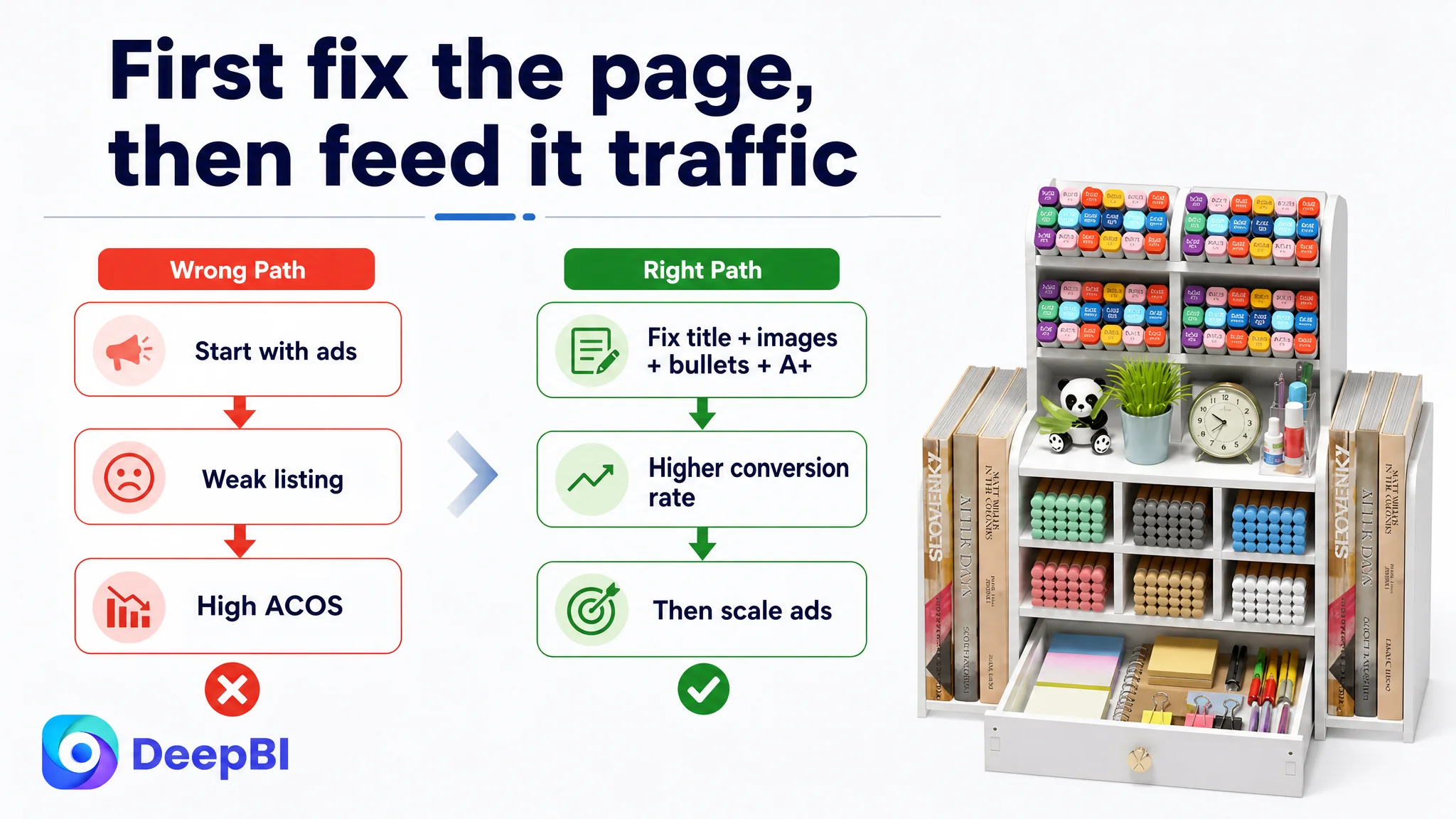
Rebuilding the Listing’s Sales Logic
DeepBI’s optimization recommendations followed one principle: every major visual/text element must either create a reason to click or remove a reason to hesitate.
1. Title: From Keyword Pile to Structured Proposition
Recommended title:
Desk Organizer with 15 Compartments 2 File Holders and Drawer, Multi-Functional Mesh Pen Pencil Holder, Desktop Organization for Home Office School Art Supplies
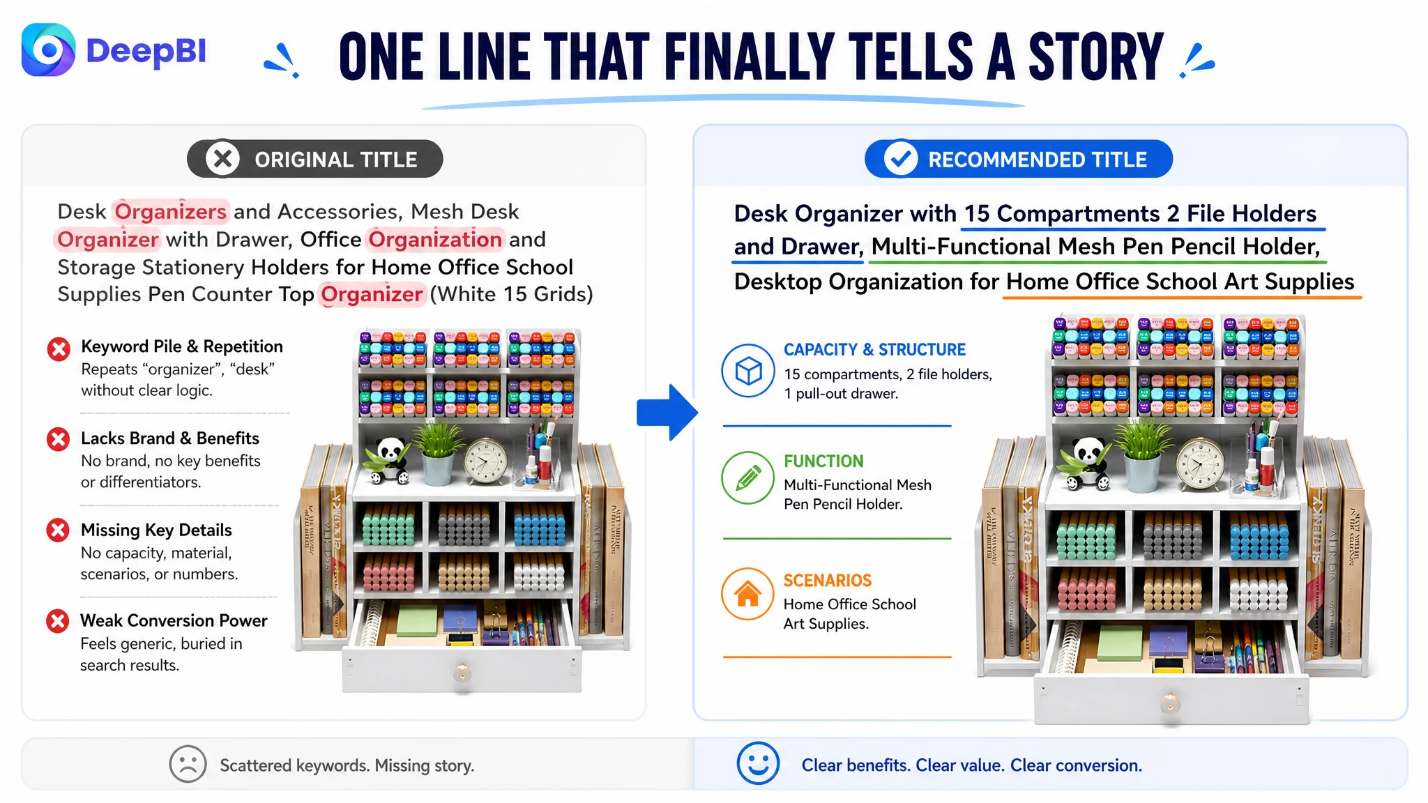
Key shifts in logic:
- Quantified capacity up front: “15 Compartments 2 File Holders and Drawer” clearly communicates scale and structure.
- Removed redundant terms like “organization,” “desk” repetitions, improving readability and keyword efficiency.
- Inserted “Multi-Functional” to mirror competitor success and signal that this is more than a basic pen cup.
- Expanded usage scenarios: “Home Office School Art Supplies” catches broader high‑intent searches.
This is not just about A9 keywords; it’s about ensuring that when shoppers scan Amazon search results, this title tells a coherent, competitive story in one line.
2. Bullet Points: Turning Features Into Buyable Benefits
DeepBI’s bullet‑point redesign anchored each line to a clear decision lever.
Bullet 1: Capacity as a Category‑Level Differentiator
【ULTRA-LARGE CAPACITY & MULTI-FUNCTIONAL】: Featuring 15 slanted compartments, 1 flat top shelf, 1 pull-out drawer, and 2 vertical file holders, this desk organizer offers massive storage space. Measuring 32.5 x 15 x 33 cm, it is specifically designed to store everything from pens and pads to large documents, keeping your workspace clean and tidy.
- Headline clearly names the core promise.
- Structure and dimensions are grouped into one coherent statement.
- Directly addresses clutter and “will it hold everything?” doubts.
Bullet 2: Sturdiness and Assembly as a Single Story
【STURDY STRUCTURE & EASY ASSEMBLY】: The package includes all necessary accessory screws and mounting plates. While it requires DIY installation, the process is straightforward and results in an incredibly stable structure once assembled. Enjoy the satisfaction of building your own organized workspace with a design that is built to last.
- Moves away from “please be patient installing” toward confidence in the final structure.
- Acknowledges DIY but frames it as controlled and rewarding, countering review complaints.
Bullet 3: Space Saving and Efficiency
【SPACE-SAVING & EFFICIENT ORGANIZATION】: Maximize your desktop real estate with our layered design. This desk butler helps you sort different types of items for quick access, making it more than just storage—it's a complete organizational solution for busy professionals and students alike.
- Connects physical form (layered design) to outcome (more usable desk space).
- Targets clear user groups—professionals and students—for relevance.
Bullet 4: Material and Durability
【PREMIUM QUALITY MATERIAL】: Crafted from high-quality EVA material, this organizer is corrosion-resistant, moisture-proof, and waterproof. Its fine workmanship ensures smooth edges and a chic look that fits any decor. Easy to clean and maintain, it stays looking brand new even with heavy daily use.
- Elevates EVA from “just plastic” to professional‑grade, easy‑care material.
- Smooth edges and chic look directly counter cheap‑feeling assumptions.
Bullet 5: Usage Scenarios and After‑Sales
【VERSATILE USAGE & RELIABLE SUPPORT】: Perfect for office organization, teacher desks, or home study areas. We are committed to providing high-quality products and excellent service. If you have any questions, please feel free to contact us; we will provide a solution within 24 hours to ensure your complete satisfaction.
- Expands practical use cases, which can inspire buyers’ own use.
- Standardizes service promise into a clear, calm support statement.
Together, these bullets stop being a list of facts and become a conversion script.
3. Main Images: From Generic Scenes to Proof of Capacity, Size, and Strength
DeepBI’s view was that each image slot on the Amazon product page must have a distinct commercial role. The recommendations re‑assigned those roles:
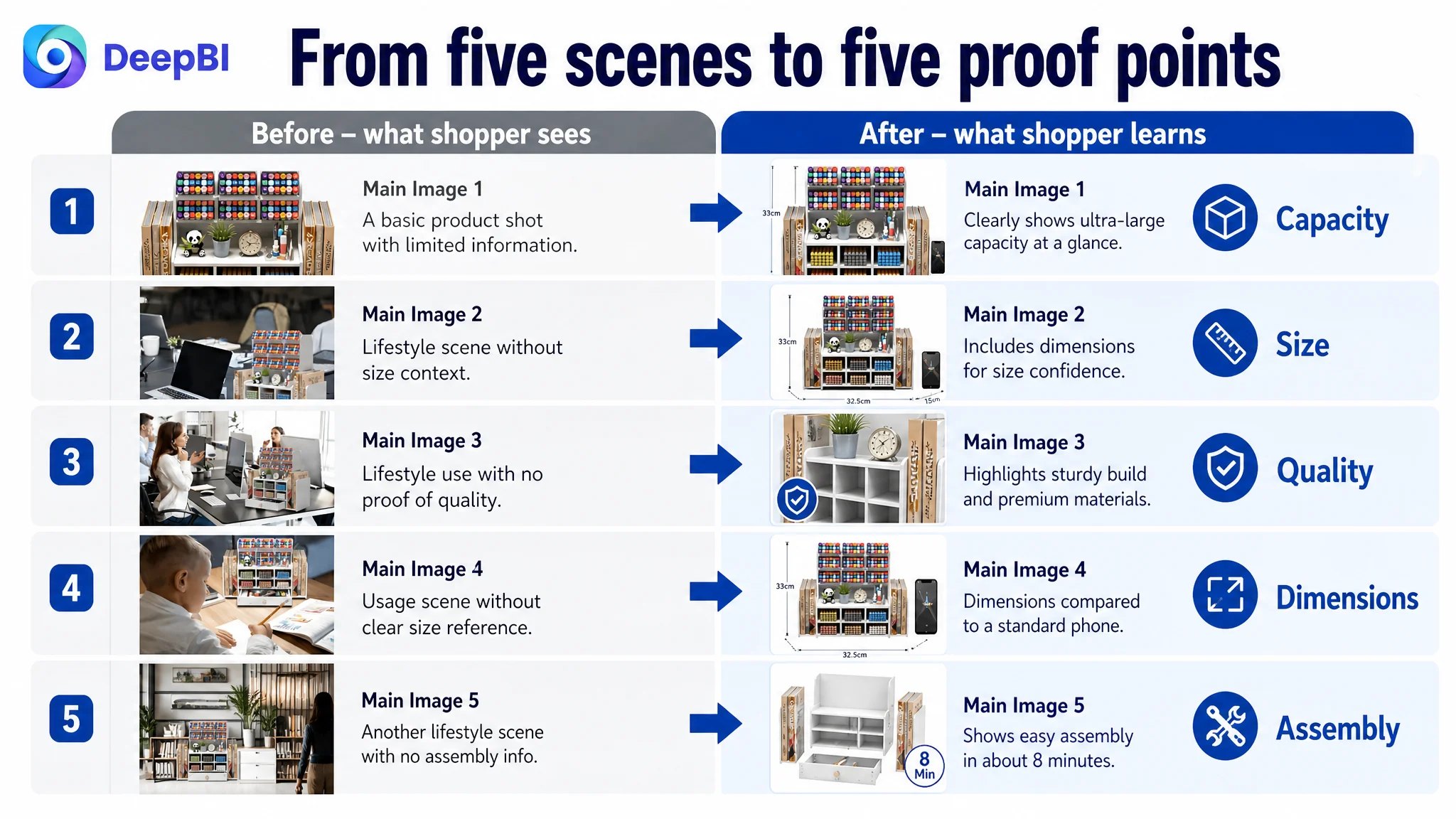
Image 1: Immediate “Ultra-Large Capacity” Validation
- Show every compartment completely filled with pens, markers, scissors, sticky notes, etc.
- Maximize visual density to prove “this holds more than your current solution.”
- Keep background clean so the eye goes straight to storage volume.
Image 2: Side‑by‑Side Size Superiority
- Place the organizer next to a generic smaller organizer labeled “Others” (without copying any real design).
- Maintain identical camera angle and background to make volume difference obvious.
- Overlay clear dimension text tied to the main product.
This gives rational buyers an instant reason to justify a higher price point or choose this unit over cheaper alternatives in Amazon search.
Image 3: Sturdiness and Material Confidence
- Split visual:
- One side: close‑up of EVA texture and smooth edges labeled “EVA material,” “Fine workmanship.”
- Other side: organizer holding heavier items without warping or leaning.
- Align text directly with the visual: stability, no wobble, safe edges.
This is designed to directly neutralize review complaints about fragility and wobble.
Image 4: Real‑World Dimensions with Human Reference
- Show the organizer on a desk next to a standard notebook or phone, with overlays: “32.5 cm,” “15 cm,” “33 cm.”
- Keep reference object proportionally accurate.
Now, instead of guessing from numbers, shoppers can feel the size.
Image 5: “Easy Assembly Proof” Instead of Another Scene
- Break down the few core parts with numbered callouts.
- Simple visual guide that suggests a short assembly time and low complexity.
- Highlight “screws and mounting plates included,” tying back to Bullet 2.
Together, the main-image sequence answers four questions before a shopper reaches the bullets:
1. Will it actually hold all my stuff?
2. Is it bigger and better than what I have now?
3. Is it sturdy, or will it wobble?
4. Will assembling it be a headache?
4. A+ Detail Page: Moving from Information Display to Emotional Drive
On Amazon, A+ content is often where persuasion either deepens or collapses. DeepBI did not attempt to “add more modules”; instead, it reordered and refocused what already worked.
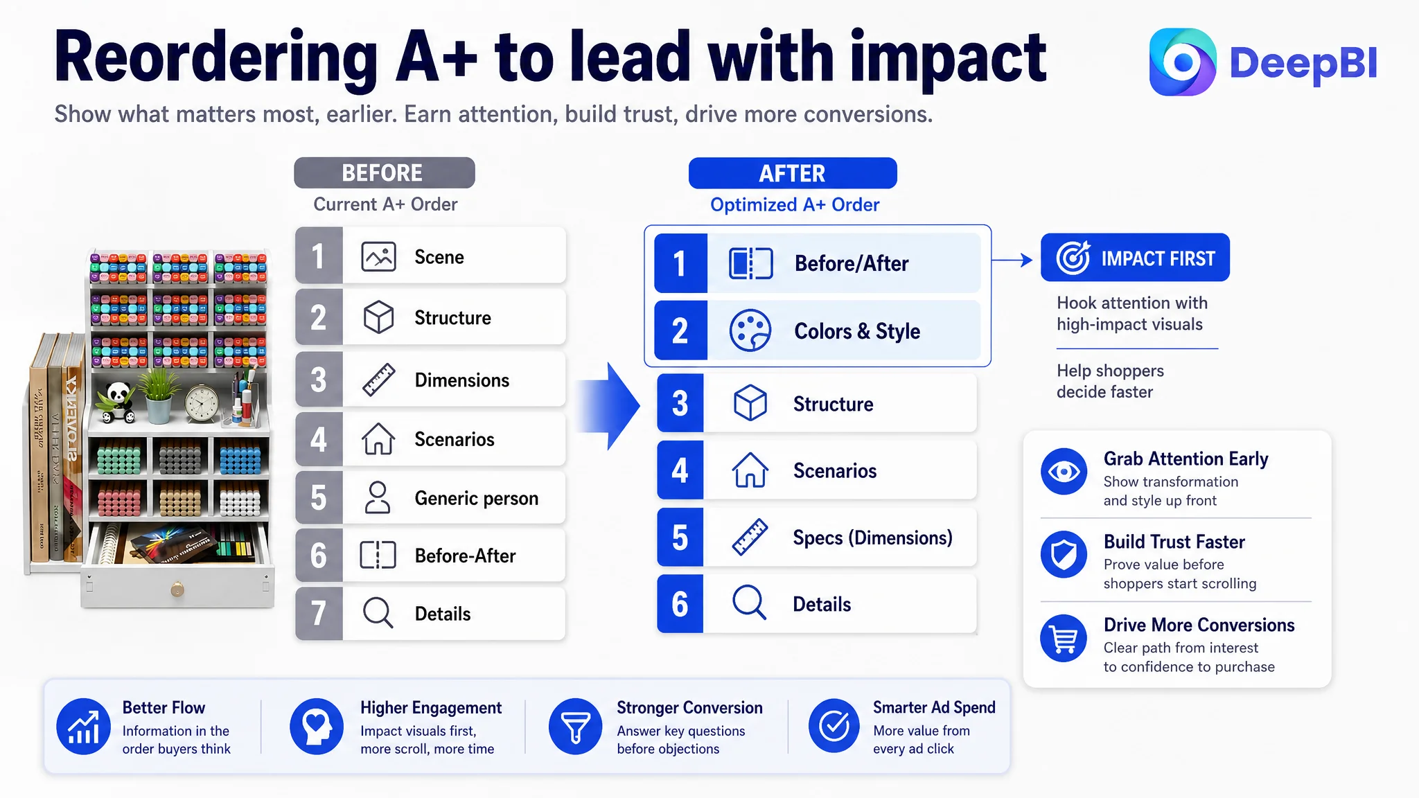
Put Before/After at the Top
- Move the clutter vs. organized desk comparison to the very first A+ module.
- Translate “Vor/Nach” to “Before/After” for clarity.
- Use recognizable office clutter on the “Before” side and a visibly calmer, more functional space on the “After” side.
This gives shoppers an immediate visual answer to “Why should I care about another organizer?”
Bring Color Options and Aesthetic Fit Forward
- Show available color variants early to satisfy style preferences quickly.
- Combine this with short copy about “Looks chic” and integration into different décor styles.
Once aesthetic fit is confirmed, shoppers are more willing to evaluate functional details.
Keep Structure, Push Raw Specs Slightly Back
- Maintain the module that calls out:
- 15 compartments
- 2 file holders
- Drawer
- Top shelf
- Clean up icons and callouts to match bullet‑point language.
Move pure dimension tables one step later, or embed them visually in a lifestyle context instead of as a dry chart.
Prove Versatility with Real Scenarios
- Replace generic office‑only shots with:
- A student desk with school materials.
- A teacher’s desk with graded papers, markers, and sticky notes.
- An artist’s corner with markers and pencils.
- Use only items consistent with the bullets and category rules.
This turns “multi‑functional” from a word into a set of real images.
Re‑use Structural Detail for Risk Reduction
- In the final modules, use:
- Close‑ups of smooth edges (“safe handling”).
- Callouts on “moisture-proof and waterproof” for easy cleaning.
- Clear indication that screws and mounting plates are included.
This closes the trust loop: from desire (before/after) to reassurance (quality, assembly, durability).
What Changed for the Business (Even Before New Data Arrives)
The case data does not include a post‑optimization spreadsheet, so we won’t invent numbers. But we can describe what changed in the operating state and risk structure of this Amazon Listing once the page was rebuilt.
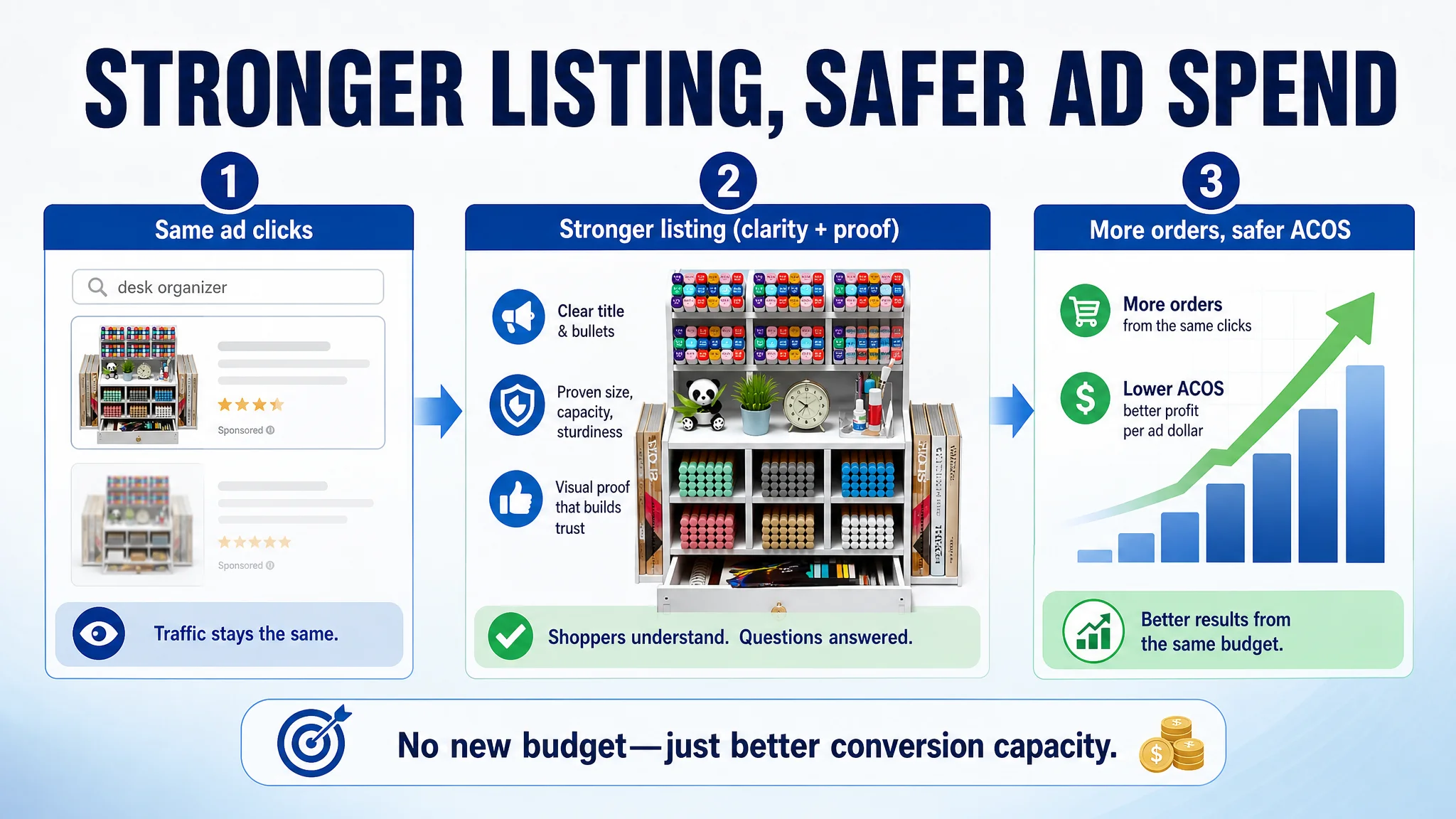
Conversion Capacity Improved
- The page now answers key doubts early—capacity, size, sturdiness, assembly—rather than making shoppers dig.
- Title and bullets form a coherent path instead of fragmented facts.
- Main images and A+ work in sequence rather than repeating similar generic scenes.
This means each unit of ad traffic is less likely to bounce due to unresolved questions.
Ad Spend Became Less Risky
- With a stronger Listing, each additional click from Amazon ads is more likely to produce revenue, not just spend.
- The seller avoided the trap of throwing more budget at a page that was structurally weak.
- Future ad tests (new keywords, new bids) are now tests of traffic mix, not of whether the page is capable of converting at all.
Understanding of the Real Constraint Shifted
The seller moved from:
- “We need to optimize ads harder,”
to:
- “Our Amazon product page must first earn the right to receive more traffic.”
That change in judgment is DeepBI’s central value in this case.
Takeaways for Other Amazon Sellers
This desk organizer Listing is specific, but the underlying Amazon logic is broad:
- If your ACOS is stubbornly high and sales lag despite “good visuals” and A+ content, do not assume it’s just an ads problem.
- Compare your Amazon Listing against a real category benchmark on:
- Title structure and value communication.
- Main-image role allocation (capacity, size, strength, assembly, comparison).
- Bullet‑point logic (pain point → solution → proof).
- A+ module order (impact up front, specs after).
- Review score and distribution.
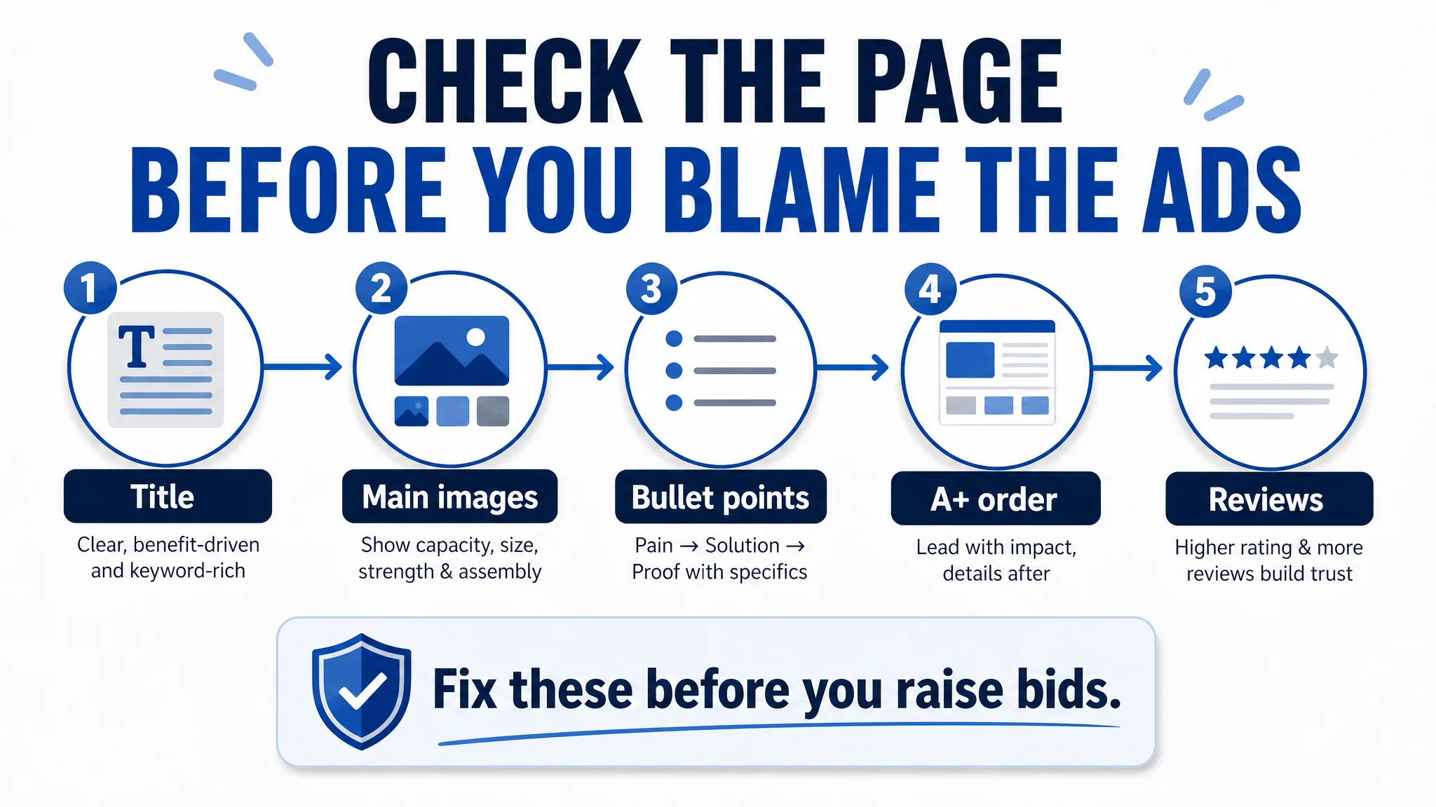
- Before scaling ads, ask: Does this page remove the most likely reasons a buyer would hesitate?
In this case, DeepBI’s role was not to push more traffic, but to clarify that conversion, not clicks, was the true constraint. Once the Amazon product page started to behave like a focused sales engine rather than an information catalog, every future ad dollar had a much higher chance of coming back as profit.