

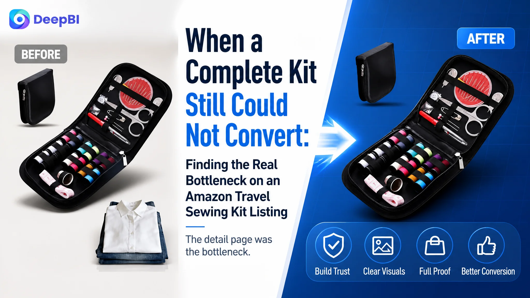
This case involved an Amazon US seller whose portable sewing kit Listing contained useful product information but failed to create the same level of confidence as comparable listings. The initial instinct was to keep improving the visible details: add more specifications, clarify the accessories, and strengthen the functional descriptions.
The deeper issue was not a lack of information. It was that the Amazon product page did not turn that information into a convincing buying sequence. The Listing had a relatively capable bullet-point structure, but its detail section relied almost entirely on repeated text, while the product had no review history to provide independent trust.
DeepBI reframed the problem as a product-page conversion constraint rather than a copywriting gap. The later direction focused on rebuilding the page around visual proof: clearer portability, practical repair scenarios, organized storage, exact component verification, and a complete A+ content narrative. For other Amazon sellers, the lesson is direct: before sending more traffic to a Listing, determine whether the page gives shoppers enough reason to trust, understand, and choose the product.
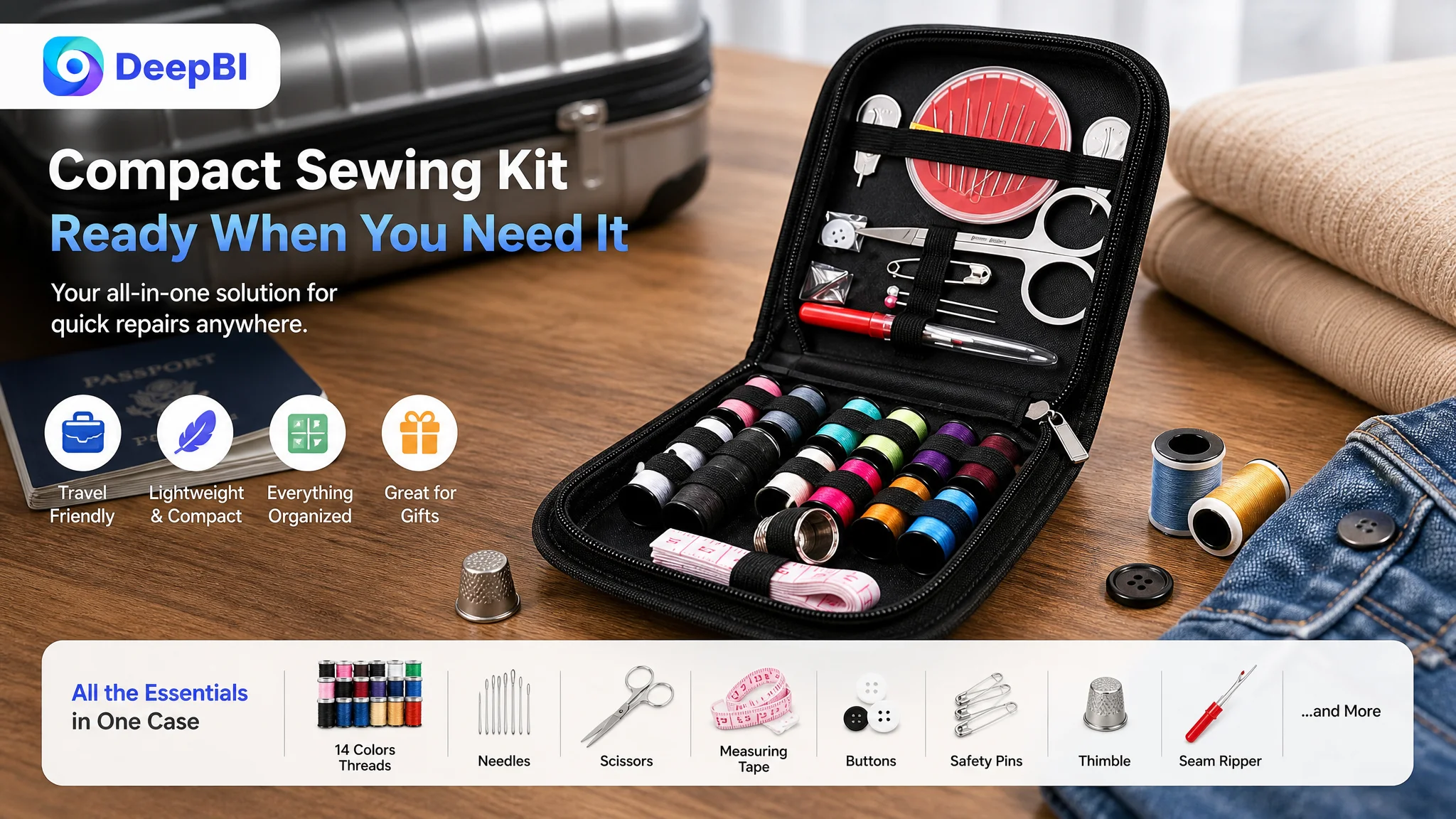 The Listing Looked Complete Until It Was Compared With the Market
At first glance, this portable sewing kit appeared to have many of the elements Amazon shoppers expect:
- A recognizable core keyword near the beginning of the title
- Detailed product dimensions and weight
- A clear accessory list
- Several use cases, including travel, daily repairs, and DIY
- Material and construction descriptions
- Internal storage details
- Gift-oriented positioning
The problem became visible only when the Listing was compared with a closely matched, higher-performing category reference.
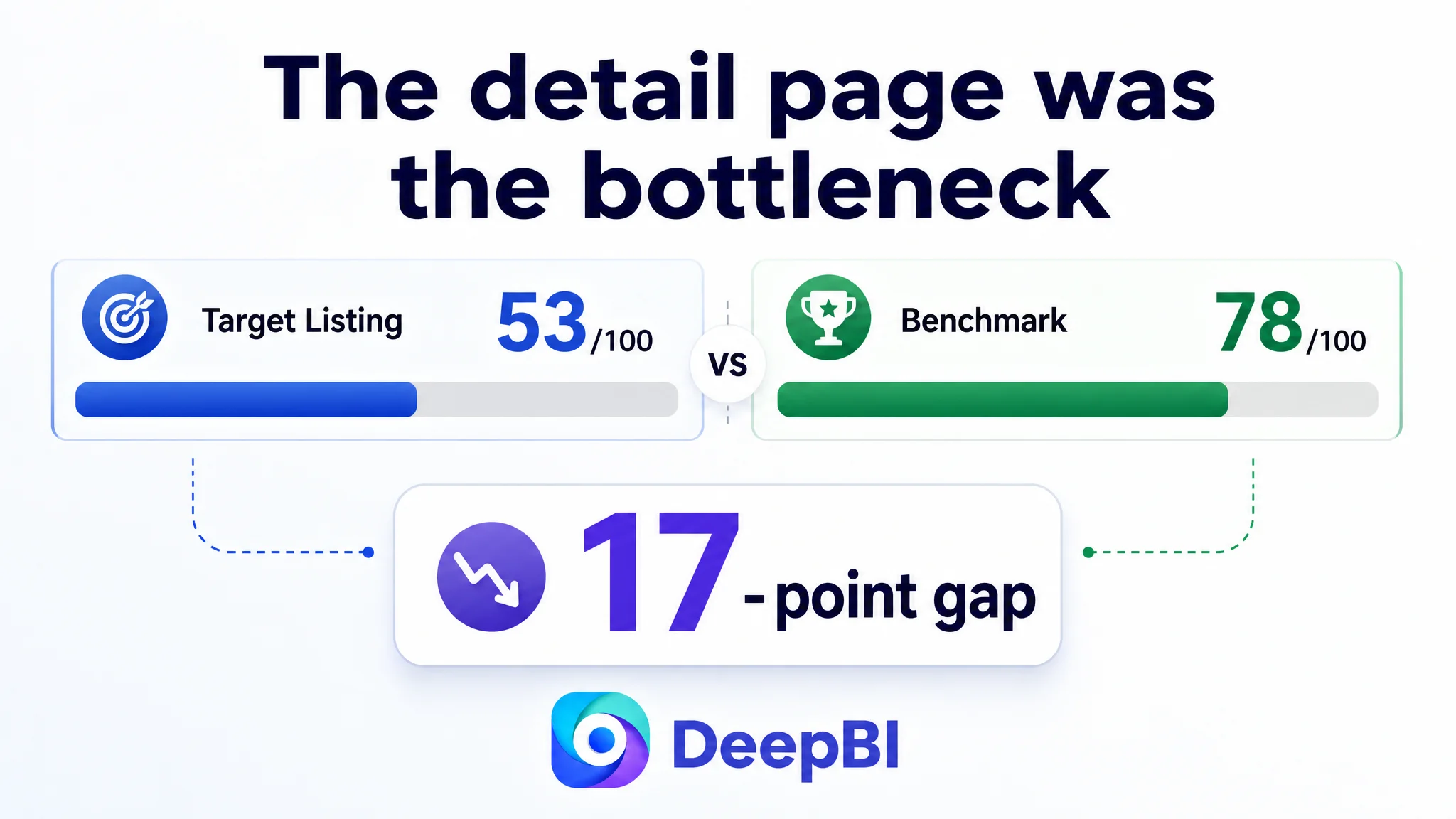
The target Listing scored 53 out of 100, while the benchmark reached 78. A 25-point gap is meaningful, but the distribution of that gap mattered more than the total.
- Title: Target Listing: 15/20, Benchmark: 17/20, Gap: -2
- Main image: Target Listing: 25/30, Benchmark: 26/30, Gap: -1
- Bullet points: Target Listing: 7/10, Benchmark: 5/10, Gap: +2
- Detail page: Target Listing: 5/25, Benchmark: 22/25, Gap: -17
- Reviews: Target Listing: 1/15, Benchmark: 8/15, Gap: -7
 The first important judgment was therefore not “the Listing needs improvement everywhere.”
It was this:
The largest conversion constraint was concentrated in the detail page, not in the bullet points or the main image alone.
That distinction changed the order of operations.
The Original Diagnosis Focused on Information, Not Persuasion
The Listing’s existing content was not empty. In several areas, it was more specific than the benchmark.
The bullet points included:
- Product dimensions of 4.84 x 4.72 x 1.1 inches
- A weight of 3 oz
- A 14-color thread assortment
- Oxford cloth construction
- Reinforced edging
- Layered internal storage
- Scenarios such as travel, daily use, and DIY
This created a common Amazon optimization trap.
When a product page already contains many factual details, the team may assume the remaining problem is to make those details even more complete. More specifications are added. More accessories are named. More use cases are listed.
But shoppers do not evaluate a small travel sewing kit by reading facts in isolation. They are trying to answer a sequence of practical questions:
- Is the kit genuinely compact?
- What can I repair with it?
- Will the tools stay organized?
- Can I find the right item quickly?
- Is the case durable enough for travel?
- Is the product suitable for a beginner or as a gift?
- Why should I trust this Listing when there are no reviews?
The existing Listing answered some of these questions in text, but it did not make the answers easy to see or believe.
The original diagnosis was therefore incomplete: it treated the page as an information inventory instead of a conversion path.
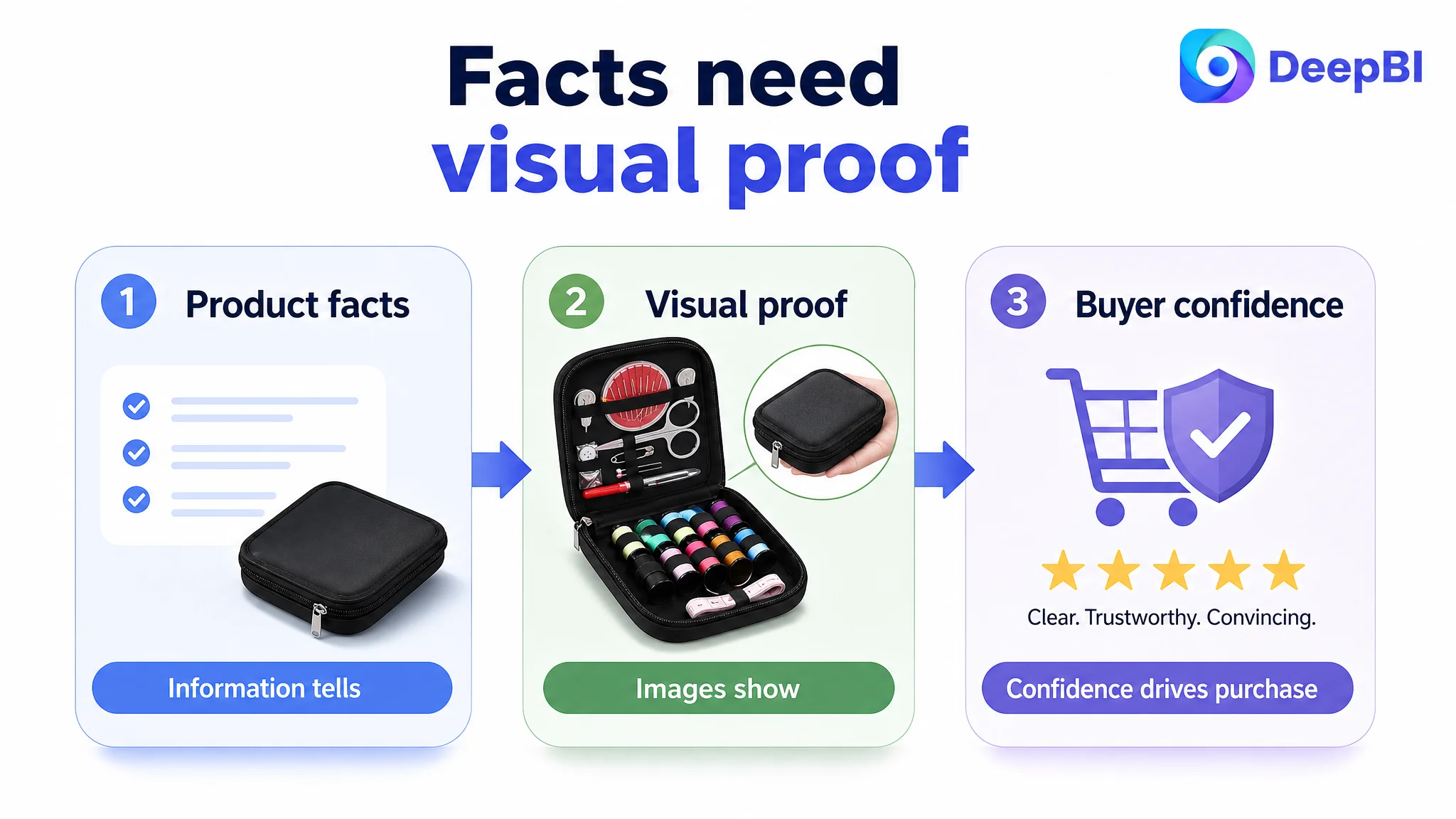 Amazon Ads Could Not Solve a Page-Level Trust Deficit
No advertising performance figures were provided in the case material, so this diagnosis does not depend on a specific ACOS, CTR, or CVR result. The Listing evidence itself was sufficient to identify the risk.
A shopper arriving from Amazon search or an ad would encounter a product page with limited visual reinforcement and no customer review history. The main image set described features, but did not consistently prove the product’s most important practical advantage: compact, organized, ready-to-use portability.
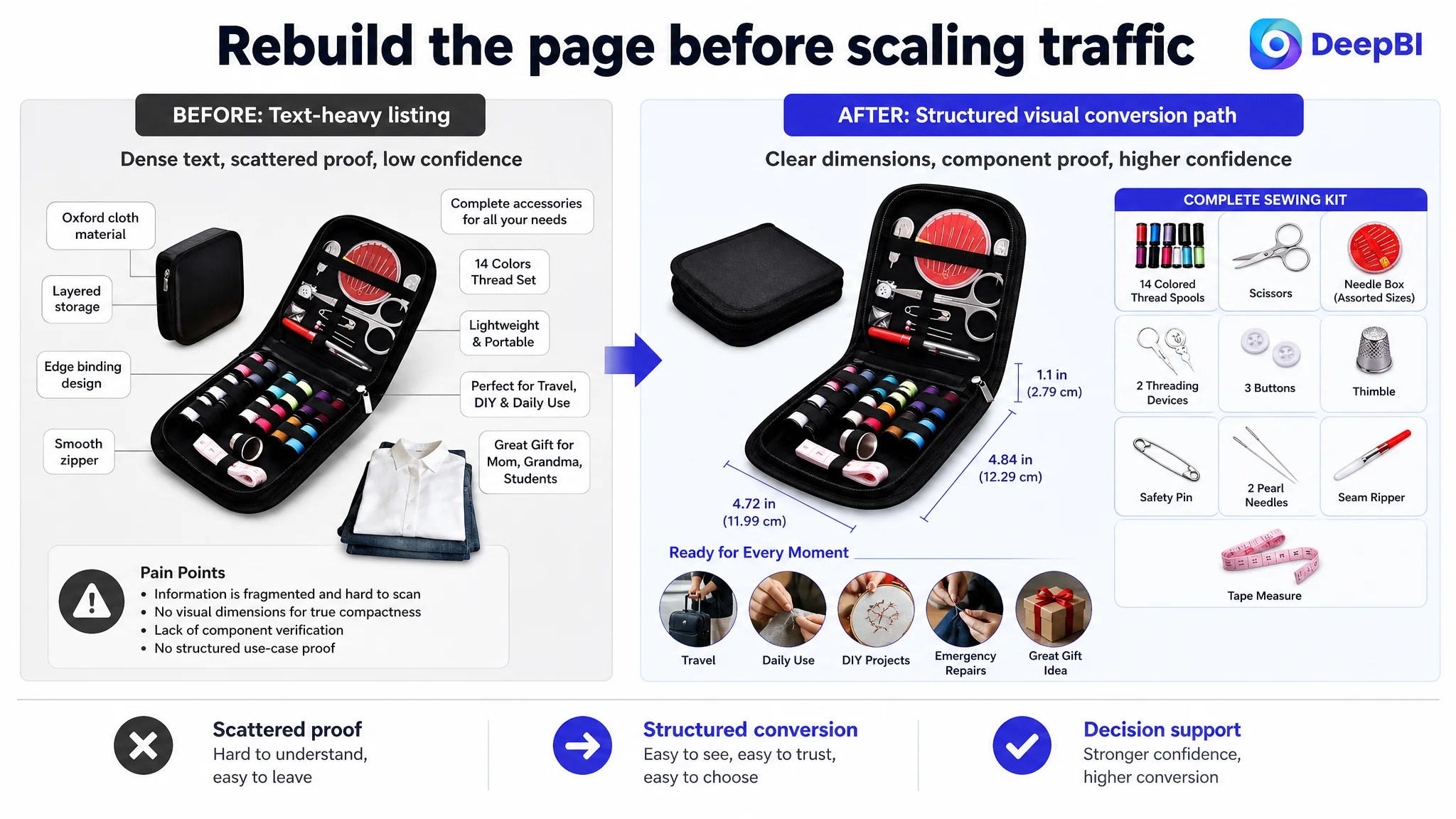
The detail section was especially weak. It used plain text without the visual A+ modules present in the benchmark Listing.
That meant paid traffic could bring shoppers to the product page, but the page had limited ability to complete the persuasion process.
Advertising can create an opportunity to evaluate a product. It cannot manufacture trust that the product page has not built.
For this sewing kit, continuing to focus only on traffic or keyword coverage would risk sending more shoppers into the same unresolved decision environment. The issue was not simply whether the product could appear in front of shoppers. It was whether the page could convert that attention into confidence.
DeepBI Located the Real Constraint in the Detail Page
The score gap made the priority clear.
The target Listing’s detail page scored 5 out of 25, compared with 22 out of 25 for the benchmark. The 17-point difference was far greater than the gaps in title and main image performance.
The benchmark Listing used a fuller visual structure:
- A leading product banner
- Practical-use scenes
- An unpacking or contents display
- Dimension verification
- Multi-occasion applications
- Gift-oriented imagery
- A clear accessory inventory
The target Listing depended on repeated text instead.
This created three connected problems.
The product was described, but not demonstrated
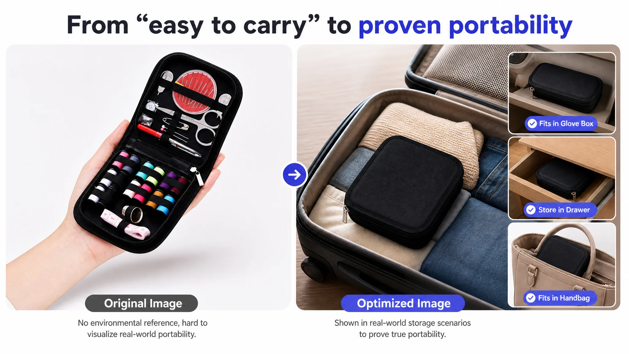
The page mentioned the kit’s compactness, weight, materials, and accessories. But shoppers were not shown how the product fits into a purse, suitcase, glove compartment, desk drawer, or other limited space.
For a portable sewing kit, “3 oz” is useful information. A visual showing the kit being carried or stored makes that information meaningful.
The product’s utility remained abstract
The page discussed basic repairs and DIY use, but did not build a visual bridge between the tools and the problems they solve.
A shopper should be able to recognize situations such as:
- Reattaching a loose button
- Repairing a small tear
- Handling an emergency clothing issue during travel
- Starting a simple hand-sewing project
Without these demonstrations, the kit risks appearing as a collection of small accessories rather than a practical solution.
The absence of reviews removed the basic trust layer
The target Listing had no rating and no customer reviews. The benchmark had a 4.5-star rating and 17 reviews.
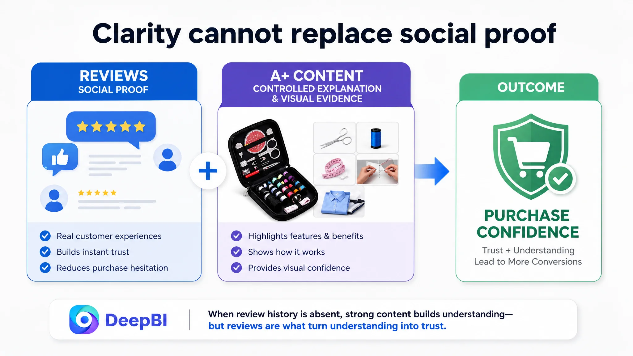
This does not mean the Listing could solve its trust problem through A+ content alone. Reviews and page content serve different roles. Reviews provide social proof; A+ content provides controlled explanation and visual evidence.
With no review history, the product page had to work harder to establish clarity, organization, quality, and use-case relevance through its own content.
 The Main Image Was Not Bad. It Was Not Resolving the Right Doubts
The main image dimension scored only one point below the benchmark, so it was not the primary weakness. But the visual review identified an important opportunity.
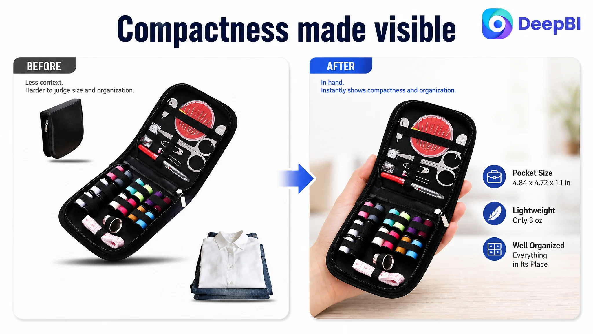
The existing images attempted to communicate product contents and organization, yet several of them created uncertainty around size and use. One image used a stack of clothing as background context, but the element did not clearly prove portability. Another used dense text to list features and color information, making the visual hierarchy harder to follow.
The question shoppers needed answered was simple:
Is this kit small enough to carry and useful enough to keep nearby?
The image sequence did not answer that question with enough direct evidence.
The recommended visual direction was not to add more text. It was to change the proof structure:
1. Establish the product’s compactness with a clear scale reference.
2. Show the exact dimensions without overwhelming the frame.
3. Demonstrate storage in a purse, suitcase, glove compartment, or desk drawer.
4. Show how the internal layers and elastic bands keep tools organized.
5. Consolidate functional proof around the scissors, needles, thread, buttons, and other included tools.
This is a change from feature accumulation to decision support.
The image needed to prove portability
The kit’s stated dimensions and weight were strong factual assets. But facts become more persuasive when shoppers can picture the product in their own lives.
A hand comparison, a limited-space storage scene, or a realistic travel context could make the compactness immediately understandable without changing the product itself.
The image needed to show outcomes, not only components
A kit filled with tools may look complete, but completeness is not the same as usefulness.
The stronger sequence would connect the tools to practical outcomes: a loose button repaired, a small tear handled, or an emergency clothing fix completed. The objective is not to create a dramatic lifestyle image. It is to show why the kit deserves a place in a bag or drawer.
 The Bullet Points Were Not the Main Problem
One of the more useful findings in this case was that the target Listing’s bullet points actually scored higher than the benchmark: 7 out of 10 versus 5 out of 10.
This prevented an inefficient optimization path.
The bullet points already had several advantages:
- More precise specifications
- More detailed material descriptions
- Clearer storage-structure information
- Better separation of travel, daily-use, and DIY scenarios
- More concrete construction language
The opportunity was not to discard that information. It was to reorganize it into a more direct buying logic.
The revised structure followed a more practical sequence:
Complete contents first
The first bullet should make the kit feel ready for basic repairs by clearly presenting the 14 colored threads and essential tools.
Portability second
The dimensions and 3 oz weight should be connected to realistic storage locations and travel situations.
Durability and organization third
The Oxford cloth case, reinforced edging, zipper, elastic bands, and compartments should explain how the product stays usable during storage and transport.
Quick repair capability fourth
The page should connect the organized layout to specific actions such as repairing a loose button or a minor tear.
Audience and gift relevance fifth
The gift message should support, rather than interrupt, the practical value of the product for beginners, students, travelers, and crafters.
The principle was straightforward:
Keep the useful facts, but make every fact answer a shopper’s decision question.
Why DeepBI Did Not Prioritize More Ad Tuning First
The decision order came from the size and nature of the Listing gaps.
The title had room for improvement. The main image had room for improvement. The bullet points could be refined. But none of those areas explained a 17-point detail-page deficit combined with a complete absence of reviews.
That made further ad-first optimization a poor priority.
If the page remained text-heavy and visually underdeveloped, more traffic would not address the fundamental uncertainty around:
- Product scale
- Practical use
- Storage organization
- Component completeness
- Material and construction
- Gift suitability
DeepBI’s diagnosis was therefore to repair the page’s conversion capacity before attempting to scale the traffic flowing into it.
This did not mean advertising was irrelevant. It meant advertising should not be asked to compensate for a weak product-page experience.
The New A+ Direction Followed a Complete Conversion Chain
The proposed detail-page structure used seven modules, each with a distinct role in the shopper’s decision process.
1. Establish what comes in the kit
The opening module should show the complete package, including the closed case and the included tools. The goal is immediate confidence that this is an all-in-one repair kit rather than a partial assortment.
2. Show what the kit helps users do
The next module should demonstrate practical repairs such as loose buttons, minor tears, and basic hand-sewing tasks. This gives the product a clear job to perform.
3. Prove compactness in real settings
The kit should be shown in a purse, luggage, desk drawer, or glove compartment. The exact size and 3 oz weight can then support a visible portability claim rather than appear as isolated specifications.
4. Explain the internal organization
The two-layer structure, elastic bands, and compartments should be shown in use. The key message is that tools stay in place and can be found quickly when needed.
5. Confirm the contents and dimensions
A clean inventory display should verify the components named in the bullet points. The exact dimensions, 4.84 x 4.72 x 1.1 inches, should be presented directly on the product image so shoppers do not need to search for them in a paragraph.
6. Broaden the use context
The page can then show relevance for travelers, beginners, adults, and crafters. This expands the product’s usefulness without turning the Listing into an unfocused collection of audiences.
7. Close with gift and quality value
The final module should connect the breathable Oxford cloth case, reinforced bindings, and smooth zipper with gift occasions such as birthdays or Mother’s Day. The emotional message works better after the page has already established practical value.
This sequence matters because it moves from recognition to proof, then from proof to reassurance and purchase relevance.
 The Title Needed Better Search and Buying Logic
The title was not the largest weakness, but it still contained avoidable inefficiencies.
The existing structure placed the core keyword early, yet also included scattered use-case language and less focused gift phrasing. The suggested direction concentrated the main search terms and product attributes near the front:
Mini Travel Sewing Kit with Threads and Scissors Oxford Cloth Case, Portable Emergency Repair Set for Beginners, Adults & Kids, Compact Small Sewing Box for Travel, DIY Handcrafts, Gifts (Black)
The purpose was not to copy the benchmark title. It was to create a clearer relationship between:
- Core category: mini travel sewing kit
- Included contents: threads and scissors
- Differentiating material: Oxford cloth case
- Primary use: emergency repair
- Relevant audiences: beginners, adults, and kids
- Extended use: travel and DIY handcrafts
- Gift positioning
The title should help both Amazon search relevance and shopper comprehension, while avoiding unnecessary repetition.
The Business Change Was a Change in Operating Logic
The case material does not include post-optimization CTR, CVR, ACOS, or organic-order results. It would therefore be misleading to claim a specific performance improvement.
The meaningful change at this stage was the operating decision:
- The Listing was no longer treated as a copy-completeness issue.
- The 17-point detail-page gap became the primary repair target.
- Existing bullet-point strengths were preserved rather than replaced blindly.
- Main-image changes were tied to portability and real-world proof.
- A+ content was planned as a structured persuasion path rather than decorative content.
- Review absence was recognized as a trust risk that visual clarity alone could not fully replace.
- Advertising was treated as traffic that must be supported by page-level conversion capacity.
The intended result of this direction was a more controllable Listing: one that could explain the product quickly, prove its compactness, demonstrate its usefulness, and provide stronger trust signals even before a substantial review base existed.
 The Lesson for Amazon Sellers
This case is not really about sewing kits. It is about how an Amazon Listing can appear detailed while remaining difficult to trust.
A page may have:
- Plenty of keywords
- Accurate specifications
- A long accessory list
- Multiple use cases
- Several product images
And still fail to convert because those elements do not work together as a decision sequence.
The deeper lesson is that Listing optimization should be prioritized by business constraint, not by the number of visible edits available.
For this Amazon seller, the largest gap was not the lack of another keyword or another parameter. It was the absence of a visual and emotional structure that could turn product facts into confidence.
Before increasing traffic, ask whether the Amazon product page has earned the right to receive it.
DeepBI’s role in the case was not to produce more content for its own sake. It was to identify where the Listing was losing commercial value, distinguish strong areas from weak ones, and place the next decision where it could matter most: rebuilding the page’s ability to convert both paid and organic Amazon traffic.