

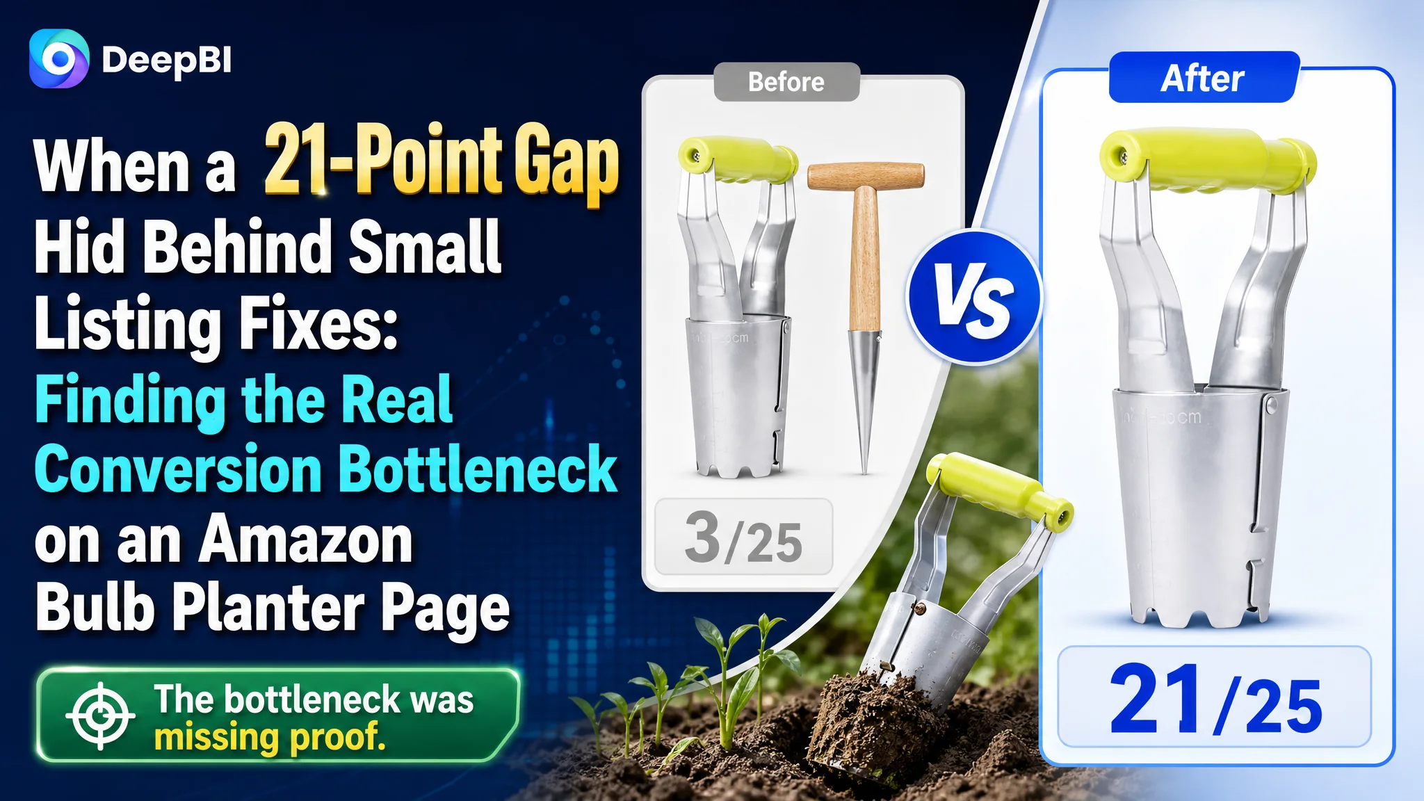
This Amazon seller was not facing a simple keyword problem. The bulb planter Listing had a reasonable main-image foundation and functional product claims, yet its overall competitiveness remained well below a comparable high-performing Amazon product page. The customer’s initial instinct was to keep refining the title, image callouts, and bullet points so the product would appear clearer and more persuasive.
DeepBI’s diagnosis pointed somewhere more consequential: the page was missing the visual explanation needed to make the product believable. The largest gap was not in the title or five bullets, but in the detail experience, where the Listing scored just 3 out of 25 against the benchmark’s 21.
The later optimization therefore focused on rebuilding the Amazon product page around proof: showing the depth markings, explaining the one-button soil-release mechanism, demonstrating the tool in real soil, and connecting its material and ergonomic claims to actual use. The case offers a practical lesson for Amazon sellers: before sending more traffic to a Listing, determine whether the page gives shoppers enough evidence to trust and use the product.
The Listing Was Not Empty. It Was Unconvincing in the Place That Mattered Most.
The product was a manual bulb planter designed for digging planting holes, controlling depth, and releasing soil more efficiently. Its Listing already contained several useful selling points:
- A serrated cone tip for soil penetration
- Built-in depth markings
- A one-button soil-release mechanism
- A lightweight structure
- A comfortable handle
- Use across tulips, daffodils, lilies, dahlias, and other garden planting tasks
On paper, the product had enough features to support a competitive Amazon offer.
But Amazon conversion does not come from the number of features mentioned. It depends on whether shoppers can quickly understand what the product is, why it is different, and whether its promised result is credible.
The Listing’s overall score was 57 out of 100, while the comparable benchmark Listing scored 78.
The 21-point difference was not evenly distributed:
- Title: Customer Listing: 15/20, Benchmark Listing: 17/20, Gap: -2
- Main image: Customer Listing: 26/30, Benchmark Listing: 21/30, Gap: +5
- Bullet points: Customer Listing: 7/10, Benchmark Listing: 7/10, Gap: 0
- Detail page: Customer Listing: 3/25, Benchmark Listing: 21/25, Gap: -18
- Reviews: Customer Listing: 6/15, Benchmark Listing: 12/15, Gap: -6
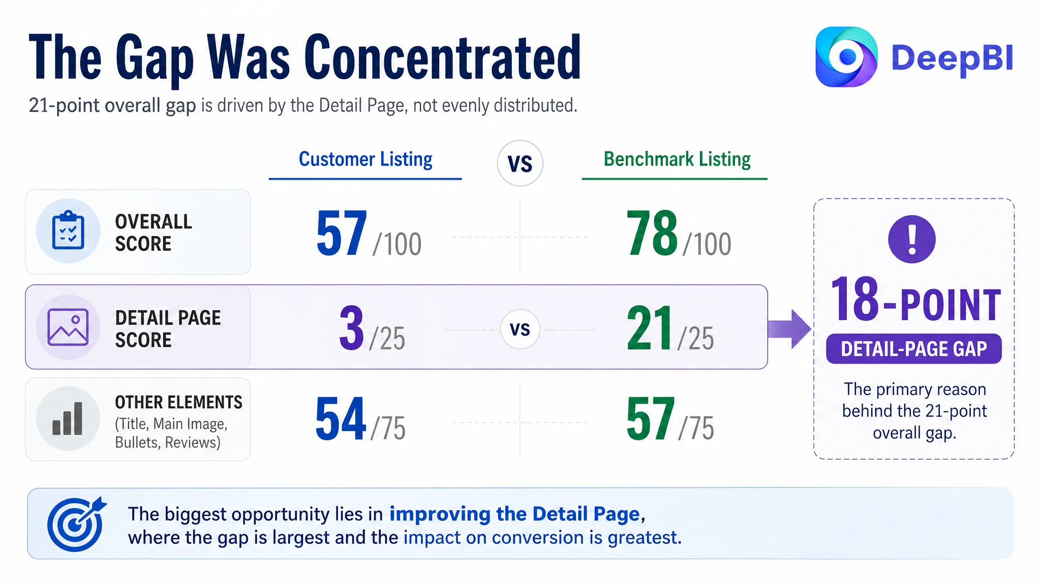
The result changed the direction of the diagnosis.
This was not primarily a case of an Amazon Listing lacking information. It was a case of information failing to become proof.
The Initial Fixes Were Reasonable—but Too Close to the Surface
The first optimization instinct was understandable. The title could be more direct. The images could communicate the product more clearly. The bullet points could make the benefits easier to scan.
Those were valid improvements, but they did not explain the full business problem.
The title was only two points behind the benchmark. Its main weakness was not the absence of relevant terms, but the way those terms were arranged. “Gardening Planting Tool Set” appeared before the more specific product identity, while the competing title led with “Bulb Planter” and highlighted “Automatic Soil Release” immediately.
The customer’s title also spread its important claims across longer, less focused phrasing:
- The core product type was not given enough priority
- The automatic soil-release benefit was not prominent enough
- Functional terms were diluted by general wording
- The color variation appeared at the end without contributing much search value
These issues could affect relevance and click quality. But they were not large enough to account for an 18-point detail-page gap.
The five bullets presented a similar pattern. They were not empty or poorly structured. In several respects, they handled operational details well:
- Ergonomic use
- Reduced hand fatigue
- Depth control
- Durability
- Multi-purpose planting
- Lightweight portability
The problem was that the bullets carried claims that the rest of the page did not adequately demonstrate.
A shopper could read that the tool releases soil automatically. They could read that it reaches a planting depth of up to 7 inches. They could read that the handle is comfortable and the steel structure resists bending.
But the page did not show enough of those claims in action.
The Detail Page Was the Real Conversion Constraint
The detail-page score exposed the most important difference between the two Amazon Listings.
The customer’s A+ area contained no meaningful visual module. It relied on repeated text and static descriptions. The benchmark Listing used a sequence of images and illustrations to explain:
1. The depth scale
2. The operating principle
3. The planting environment
4. The soil-release process
5. The practical result
This created a complete decision path: problem, mechanism, use, and outcome.
The customer’s page stopped much earlier. It named the mechanism but did not make it visible. It listed the depth benefit but did not physically validate how the markings worked in soil. It described ease of use but did not demonstrate the hand movement or handle design that made the claim credible.
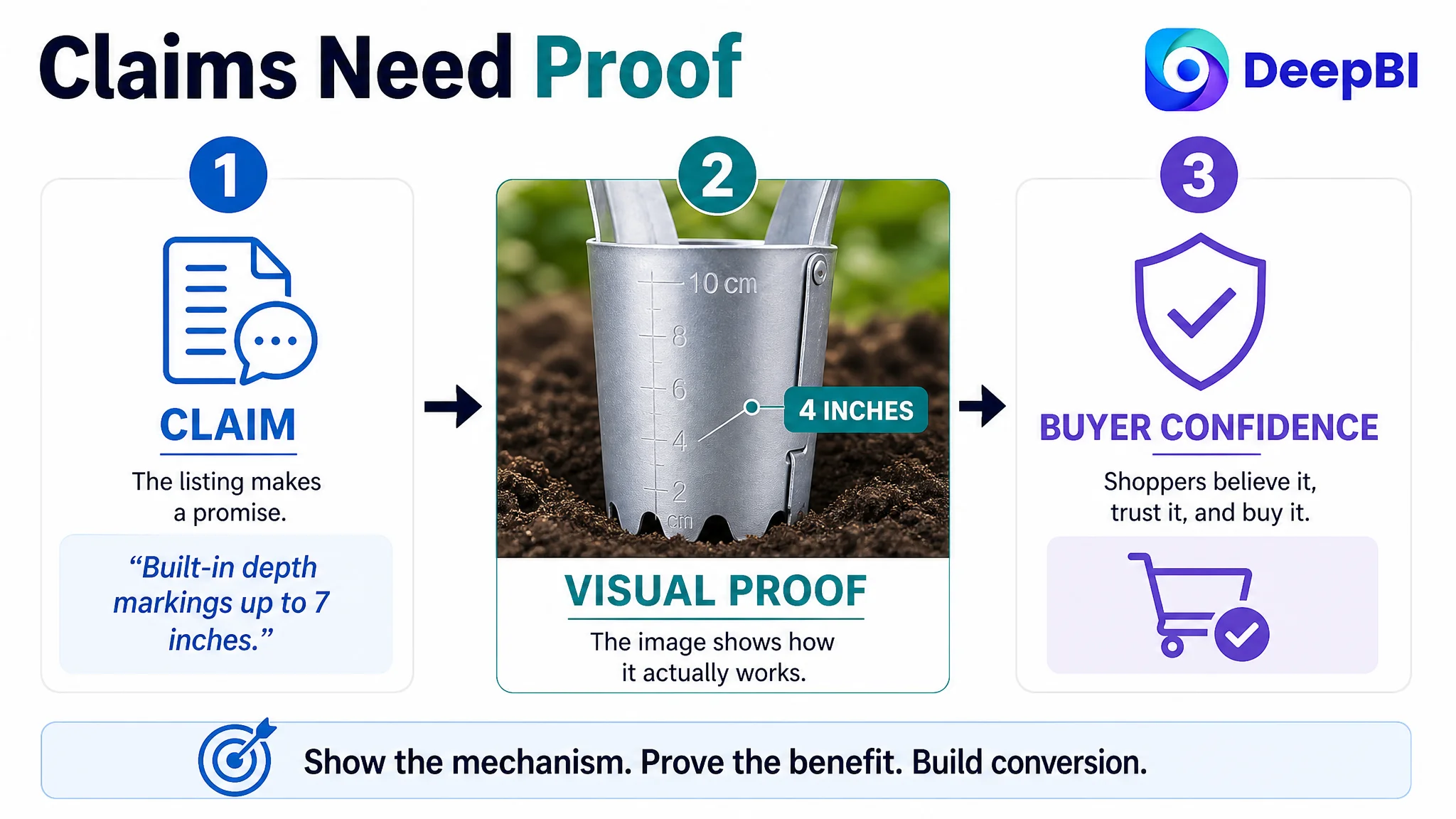
For a product such as a bulb planter, this matters. The shopper is not only asking, “What does this tool include?”
They are also asking:
- Will it enter compact soil without bending?
- Can I control the planting depth accurately?
- Does the soil really release as described?
- Can I use it repeatedly without excessive hand strain?
- Is this a practical gardening tool or just another small accessory?
Text can answer these questions partially. A well-built Amazon product page must answer them visually as well.
“The biggest conversion leak was not missing product information. It was missing evidence that the information was true.”
Why the Main Image Still Needed Reframing
The main-image score was actually higher than the benchmark’s: 26 versus 21. That result made the diagnosis more nuanced.
The customer Listing already had several visual strengths. Its images included real gardening scenes and showed multiple stages of use. The visual system had the potential to communicate more than a basic product catalog.
However, the image sequence was not fully coherent.
The first image included an additional wooden dibber, even though the later images focused on the metal bulb planter. A separate tool appeared again in another image, creating uncertainty about what the shopper was actually buying. Other images used dense text callouts or warnings where a visual demonstration would have been more persuasive.
The issue was therefore not simply “make the images prettier.”
It was to make the image sequence answer questions in the order shoppers naturally ask them:
- What exactly is the product?
- What size is it?
- How does the handle and release mechanism work?
- Can it enter soil effectively?
- What happens after the hole is made?
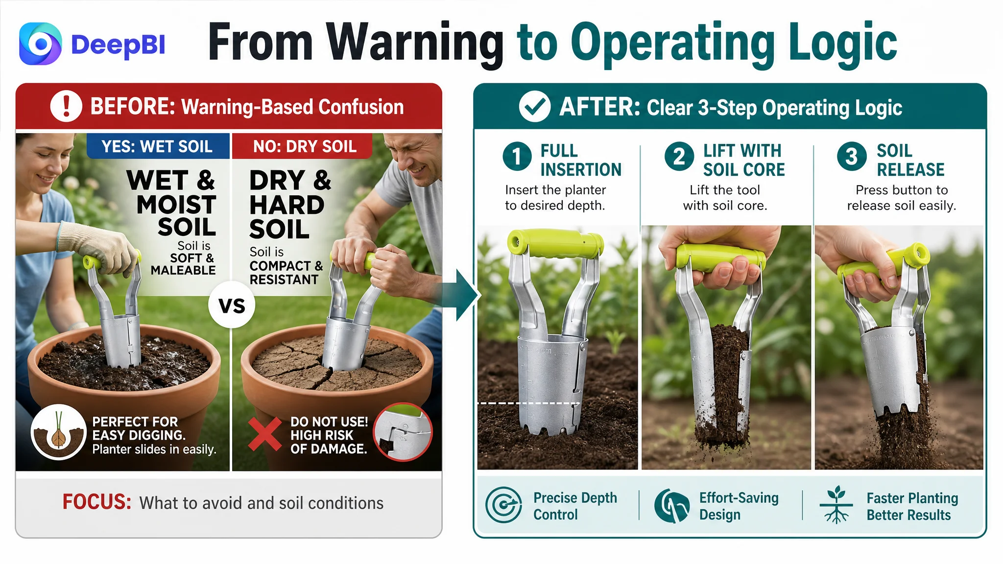
The first image should establish the product identity without unrelated accessories. The second should resolve dimensions and fit questions. The third should show the handle, button, and depth markings. The fourth should demonstrate insertion into soil. The fifth should show soil release and the practical planting result.
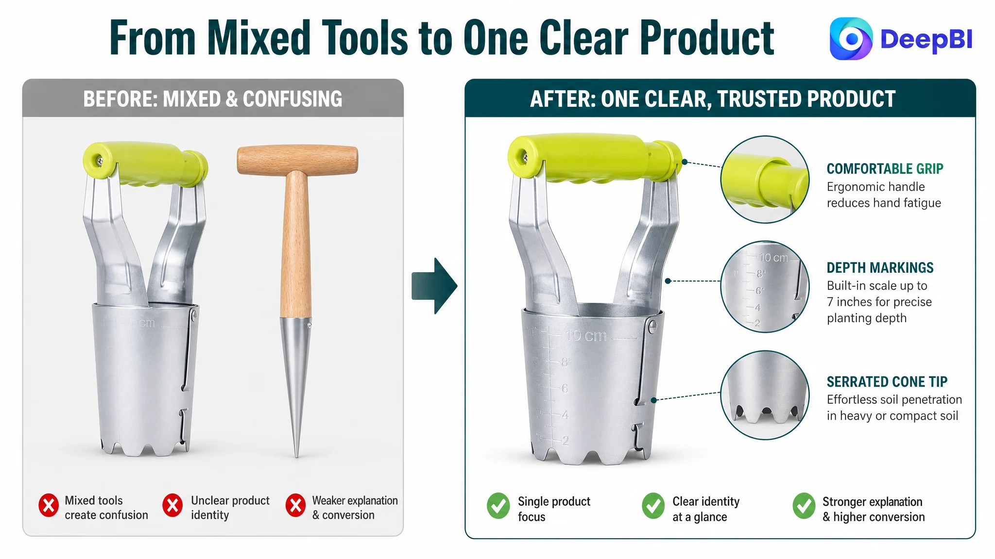
This distinction is important for Amazon sellers. A Listing can have strong individual images and still lose conversion if those images do not form a consistent explanation.
The Title Needed Better Search and Buying Logic
The title gap was smaller, but it still affected how the Listing entered the shopper’s decision process.
The revised direction placed the product identity and core function earlier:
“Bulb Planter with Depth Marking Serrated Cone, Manual Bulbs Transplanter Tool for Digging Holes & Planting Tulips, Daffodils, Dahlias…”
The change was not about adding more keywords indiscriminately. It was about making the title perform two jobs at once:
- Establish the precise product type for Amazon search relevance
- Give shoppers an immediate reason to understand the product’s use
The title needed to foreground:
- Bulb planter
- Depth marking
- Serrated cone
- Hole digging
- Planting use cases
It also needed to remove vague or redundant wording that consumed space without strengthening either search relevance or purchase confidence.
The customer’s original title contained useful terms, but they were arranged more like a list of possible applications than a clear product proposition. The improved structure followed a more practical sequence: product type, functional differentiator, use case, compatible plants, and specification.
That is a relatively small textual adjustment. It was not the main treatment, but it helped align the top of the funnel with the deeper page experience.
The Bullet Points Needed to Lead Toward a Decision
Because the bullet-point score was equal to the benchmark, the goal was not to rewrite every line simply for stylistic improvement.
The more important question was whether the bullets and visuals were working together.
The revised bullet logic made each point follow a clearer path:
Feature → practical benefit → user concern addressed
For example:
- Reinforced steel and a serrated cone tip address bending and penetration concerns in heavy soil.
- High-hardness, rust-resistant material supports durability expectations.
- Depth markings up to 7 inches address consistency and planting control.
- The one-button soil-release mechanism addresses speed and hand fatigue.
- Lightweight construction and a comfortable grip address extended garden use.
This structure gives the shopper a reason to care about each specification. But it only works fully when the A+ content and secondary images reinforce the same claims.
A bullet saying “automatic release” and an A+ image showing the soil-release action are not two separate messages. They are two parts of the same conversion argument.
Why DeepBI Did Not Recommend More Ad Tuning First
The case material does not provide post-optimization advertising metrics, so it would be inaccurate to claim a specific ACOS decline, CVR increase, or organic-order recovery.
What the diagnosis did establish was the correct order of decisions.
If the customer continued refining ad bids or campaign structure before repairing the product page, more traffic would have been directed toward an experience that could not fully explain the product. Advertising might increase exposure, but exposure alone would not solve uncertainty about the mechanism, usability, or product identity.
This is the operational risk:
Advertising can amplify a Listing’s strengths, but it can also amplify the page’s unresolved doubts.
For this bulb planter, the priority was to improve the page’s conversion capacity before treating additional traffic as the main answer.
That meant first resolving:
- Product identity confusion caused by unrelated accessories
- Missing visual proof of the depth markings
- Lack of demonstration for one-button soil release
- Weak explanation of the handle’s ergonomic benefit
- No coherent A+ narrative from operation to result
- Insufficient visual support for durability in heavy or compact soil
Only after those issues were addressed would further Amazon ads optimization have a stronger foundation.
Reviews Added a Separate Layer of Trust Risk
The review dimension also weakened the Listing, although it was not the central bottleneck.
The customer Listing showed:
- 3.9 stars
- 20 total reviews
- 8 reviews visible on the first page
The benchmark showed:
- 4.5 stars
- 222 total reviews
- 11 reviews visible on the first page
The difference affected first-purchase confidence. The customer Listing had three low-rated reviews among the first eight visible reviews, including two two-star reviews and one one-star review. The benchmark also had lower-rated reviews, but its larger review base and higher average rating created a stronger sense of market validation.
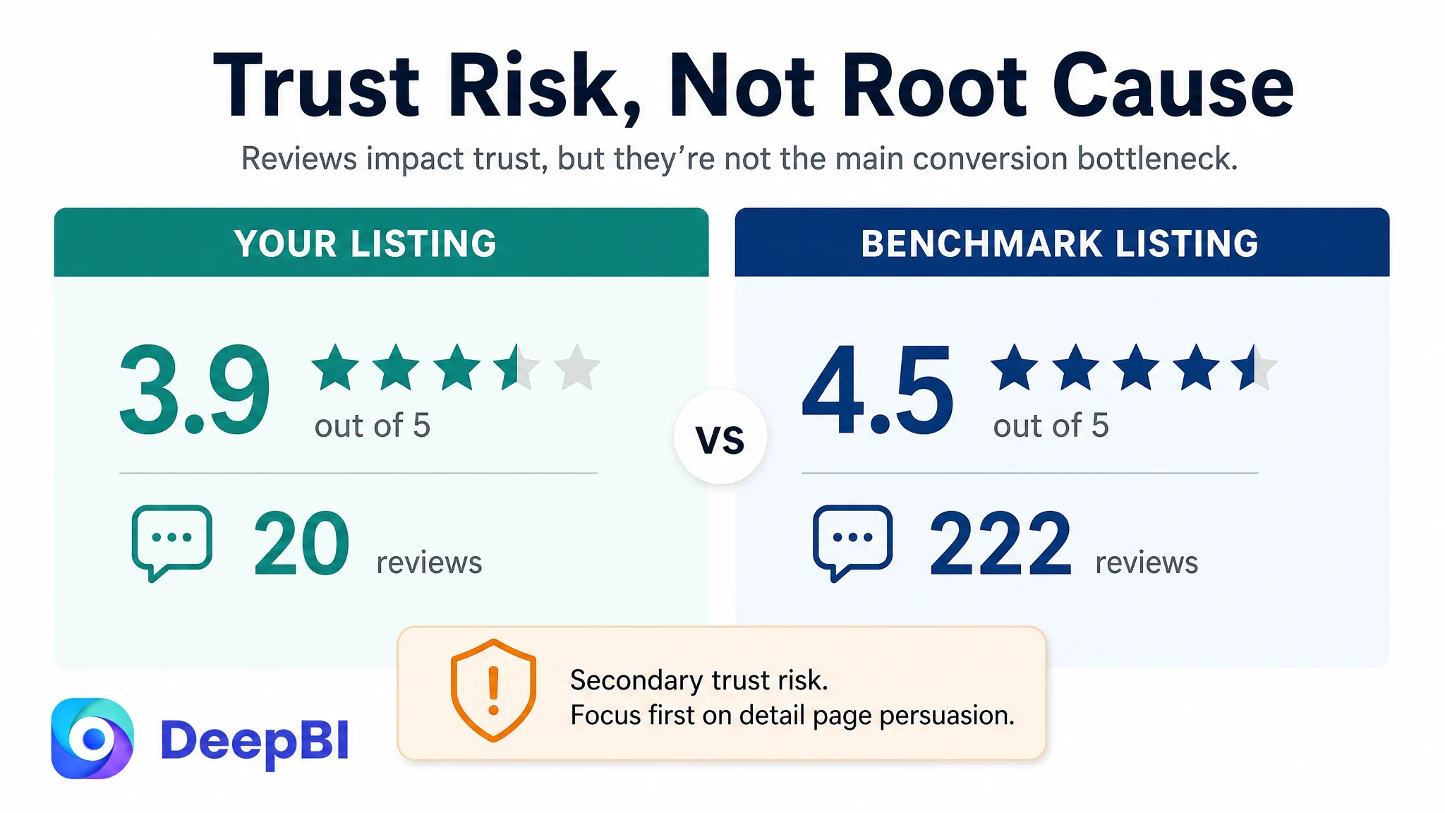
Reviews could not be repaired through copywriting alone. They represented a longer-term trust issue. But the page could still reduce unnecessary doubt by making its operating logic more transparent.
When a product has a smaller review base, unclear visuals become more costly. Shoppers have fewer external experiences to rely on, so the product page itself must carry more of the explanation burden.
The New Page Logic Began With Proof, Not Decoration
The recommended A+ structure was designed around the customer’s actual product claims rather than generic lifestyle imagery.
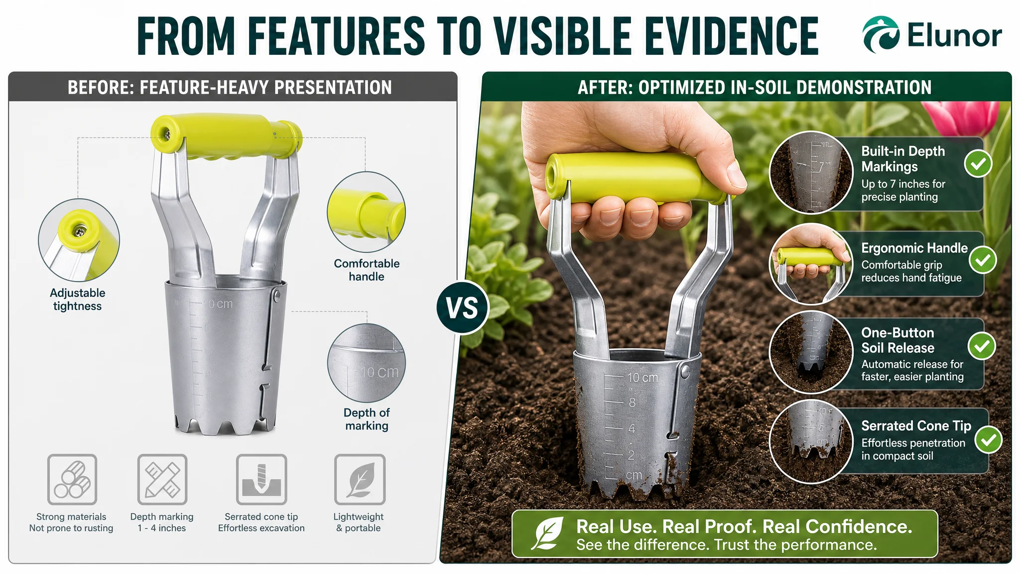
Show the depth markings in real soil
The Listing promised accurate planting depth up to 7 inches. The A+ content needed to show the built-in markings in a realistic gardening environment so shoppers could understand how the feature is used, not merely that it exists.
Explain the handle through use
The ergonomic claim needed to be connected to the hand position, grip, and planting movement. The goal was not to label the handle “comfortable,” but to show why it reduces effort during repeated use.
Demonstrate the one-button soil-release mechanism
The soil-release function was the product’s most important differentiating claim, yet it remained conceptually abstract in the original page. A clear sequence—press, lift, release—could make the mechanism immediately understandable.
Show the tool across credible planting situations
Tulips, daffodils, lilies, dahlias, and seedling transfer were useful applications, but they needed to appear as practical use cases rather than a disconnected list.
Build material confidence without overclaiming
The page could show the reinforced structure and serrated tip working in heavier soil. It should not imply unsupported performance claims. The goal was to reduce a realistic fear—bending or breakage—through clear product presentation.
Translate lightweight specifications into a benefit
The 8.1-ounce weight and 10.6-inch length were more meaningful when connected to portability and extended gardening sessions. Specifications become persuasive when shoppers understand the decision they help them make.
The Customer’s Understanding Shifted From “Add More Information” to “Make the Product Believable”
The most important outcome of this diagnosis was not a particular title rewrite or image replacement.
It was a change in how the Listing was understood.
The customer’s page did not need to compete by saying more than the benchmark. It needed to make its most valuable claims easier to verify. Its advantage was not a lack of product features. Its weakness was that those features were not arranged into a convincing visual sales logic.
DeepBI’s role in the case was to connect the score differences to a decision sequence:
1. The title needed sharper product and keyword prioritization.
2. The main-image sequence needed a consistent product identity.
3. The bullets needed to connect features with user outcomes.
4. The detail page needed to provide visual proof.
5. Reviews represented a separate, longer-term trust challenge.
6. Advertising should not be treated as the first response while the page remained difficult to trust.
That sequence prevented the team from treating every gap as equally urgent.
What Amazon Sellers Can Take From This Case
A low-converting Amazon Listing is often diagnosed through its most visible weakness: keywords, bids, main images, or ad cost. This case shows why that can be misleading.
The customer Listing had a title gap, but it was limited. Its bullet points were broadly comparable. Its main-image score was not the lowest dimension. The decisive problem was the absence of a detail-page story capable of turning product claims into confidence.
For Amazon sellers, the practical questions are straightforward:
- Does the main image identify the product without visual confusion?
- Does the title lead with the exact product type and strongest differentiator?
- Do the bullets explain why each feature matters?
- Does the A+ content demonstrate the mechanism rather than repeat the claim?
- Can a shopper understand the product’s use without relying on imagination?
- Is the page ready to convert more traffic before advertising is scaled?
The central lesson is not that A+ content solves every Amazon conversion problem. It is that Listing elements must work as one decision system.
When the page can explain the product, prove the mechanism, and reduce the shopper’s doubts, Amazon ads have a better chance to generate useful traffic rather than simply expose unresolved page defects.