

An Amazon seller came to a familiar product-page problem: the Listing was offering a 40-piece set of stubby claw hammers, yet the page was not building the level of trust expected from a professional tool listing. The initial direction leaned heavily on quantity, broad use cases, and keyword coverage. The product was visible, but its quality and handling experience were not immediately convincing.
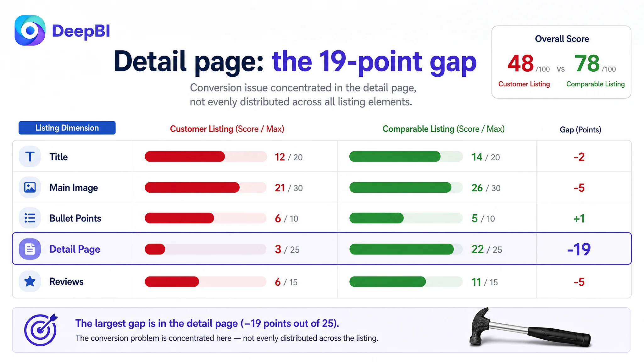
A competitive comparison showed that the issue was not simply a missing keyword or an insufficient number of product images. The Listing scored 48 out of 100, compared with 78 for a comparable high-performing listing. The largest gap was in the detail page, where the customer had only repeated text while the benchmark used structured visual storytelling, close-up evidence, and real-use scenes.
DeepBI reframed the problem around Amazon Listing conversion capacity. Before trying to make the 40-piece offer work harder through Amazon ads or broader traffic, the page needed to make one individual hammer look credible, useful, and comfortable to use. The later direction therefore focused on product quality, ergonomic grip, size clarity, practical scenarios, and a more complete A+ story.
For other Amazon sellers, the lesson is direct: when a Listing receives attention but does not create enough purchase confidence, more traffic may only expose the weakness faster. The first decision is not always how to optimize the ads. It may be whether the product page has earned the right to receive more traffic.
The Listing Was Selling Quantity Before It Sold Confidence
The product had an obvious commercial advantage: each package included 40 compact claw hammers. That quantity could appeal to craft projects, school or group activities, contractors, repair teams, or buyers who wanted spare tools available across multiple locations.
But the Listing made quantity the dominant visual story.
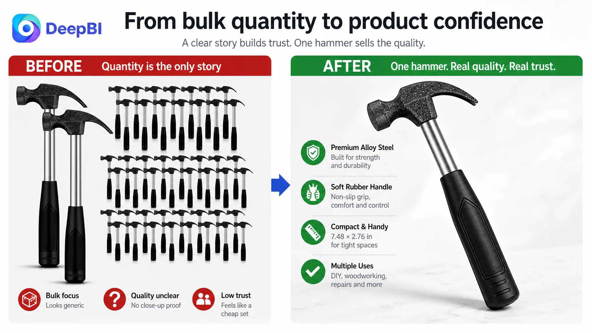
The primary image emphasized the bulk offer rather than the quality of one hammer. The product appeared closer to a low-cost gift set than a dependable hand tool. For buyers searching for a tool they could actually use for repairs, woodworking, crafting, or light demolition, the page did not answer the most immediate question:
What makes each hammer worth using, not merely worth buying in bulk?
This distinction mattered because bulk quantity can create two very different impressions.
- It can signal practical value and readiness for repeated use.
- It can also signal low quality if the individual product is not presented with enough evidence.
The customer’s page was leaning toward the second interpretation. It described quantity, comfort, and multiple uses, but the visual system did not establish the durability, control, and precision expected from a tool.
The result was not necessarily a lack of information. It was a lack of hierarchy. The page tried to communicate everything at once, while the buyer still lacked a clear reason to trust the individual product.
The First Diagnosis Focused on Coverage, Not the Conversion Constraint
The original Listing direction relied on several reasonable assumptions:
- A 40-piece package would create strong value.
- A wide range of use cases would attract more shoppers.
- Broad product language would cover more search intent.
- A comfortable rubber handle would help differentiate the product.
- Additional text could explain the product’s functions.
These assumptions were not entirely wrong. The problem was their order.
The page was being treated as if it primarily needed more coverage: more keywords, more uses, more quantity emphasis, and more descriptive text. But the competitive comparison showed that the deeper constraint was proof.
The Listing had to prove:
- What the compact size meant in actual use
- Whether the hammer looked durable enough for repeated impact
- Whether the handle provided a secure, comfortable grip
- How the claw could be used for practical tasks
- Why buying 40 units made sense beyond a low unit price
- Whether the product was intended for serious DIY and craft use rather than only gifting
This is where traditional Amazon optimization can become inefficient. A team may continue adjusting title terms, campaign targeting, or bid levels while the product page is still failing to create confidence.
Amazon ads can bring a shopper to the page. They cannot make an unclear product look more credible once the shopper arrives.
The Score Gap Pointed to One Dominant Problem
DeepBI’s comparison placed the customer Listing at 48 out of 100 and the comparable benchmark at 78.
The detailed scores were more revealing than the total:
- Title: Customer Listing: 12/20, Comparable Listing: 14/20, Gap: -2
- Main image: Customer Listing: 21/30, Comparable Listing: 26/30, Gap: -5
- Bullet points: Customer Listing: 6/10, Comparable Listing: 5/10, Gap: +1
- Detail page: Customer Listing: 3/25, Comparable Listing: 22/25, Gap: -19
- Reviews: Customer Listing: 6/15, Comparable Listing: 11/15, Gap: -5
The title and main image needed improvement, and the review profile created a separate trust disadvantage. But the detail-page gap was the clearest signal: 19 points behind the benchmark in a 25-point dimension.
That changed the decision order.
The page did not have a minor copy problem that could be solved by polishing a few sentences. It had a structural conversion problem. Its A+ area contained no meaningful visual modules and largely repeated basic specifications and functions. The benchmark, by contrast, used:
- A clear visual introduction
- A brand-positioning statement
- Multi-scenario application imagery
- Close-up modules for the head and handle
- Visual demonstrations of nail pulling and board prying
- Practical use scenes that connected the product to real tasks
The comparison did not say that the customer needed more decoration. It showed that the competitor was using the detail page to remove purchase doubts, while the customer page was using it to repeat information already available elsewhere.
The Detail Page Was the Largest Missed Trust Layer
A compact hammer creates several natural questions before purchase:
- Is it too small for practical work?
- Is the head strong enough for repeated impact?
- Will the handle slip or create excessive vibration?
- Is the claw functional or mainly decorative?
- Is the 40-piece set useful, or does it simply contain many low-value units?
- Can beginners and experienced users apply it effectively?
The customer’s A+ content did not resolve these questions visually. It relied on text, and some of that text blurred the positioning by moving between jewelry making, children’s use, home repair, and general tool applications.
That created two problems at once.
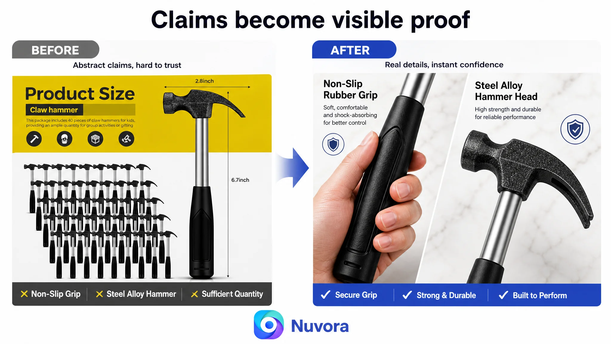
The page lacked visual evidence
Claims such as “high-strength alloy steel,” “soft rubber handle,” and “versatile use” remained abstract without close-up views or demonstrations. A shopper could read the claims but could not easily verify what they meant in practice.
The product identity became unstable
The Listing attempted to speak to too many audiences without giving each use case a clear role. It could appear to be:
- A jewelry-making tool
- A children’s craft accessory
- A home repair hammer
- A woodworking tool
- A general-purpose bulk item
- A gift set
Each audience may be relevant, but they cannot all lead the page at the same moment. The Listing needed a clearer center: a compact, manageable claw hammer set with practical value across craft, home repair, and light-duty applications.
The problem was not that the product had too few uses. The problem was that the page did not organize those uses into a convincing buying story.
Why DeepBI Did Not Recommend Tuning Ads First
When an Amazon Listing underperforms, advertising is often the first place teams look. They may adjust bids, refine search terms, separate campaigns, or reduce spend on inefficient targets.
Those actions can be appropriate when the traffic is mismatched or the campaign structure is weak. But they are not the right first response when the page itself has a major trust gap.
In this case, the Listing comparison indicated that more traffic would likely expose the same weaknesses:
1. The main image would attract attention without clearly communicating professional quality.
2. The title would carry too many ideas and risk truncation.
3. The product page would offer limited visual proof after the click.
4. The A+ area would repeat information instead of deepening confidence.
5. The review profile would make the missing visual proof more consequential.
This is the commercial risk of continuing to tune Amazon ads before repairing the page. Advertising can amplify the outcome already produced by the Listing. If the page is weak at converting, additional clicks may increase spend without improving the underlying sales logic.
The appropriate sequence was therefore:
- Clarify what the individual hammer is
- Establish quality and handling confidence
- Explain the practical meaning of the compact size
- Give the 40-piece offer a credible use context
- Build a visual A+ narrative
- Then evaluate whether paid traffic is being converted efficiently
This was not a decision to ignore advertising. It was a decision to stop asking advertising to compensate for a product-page problem.
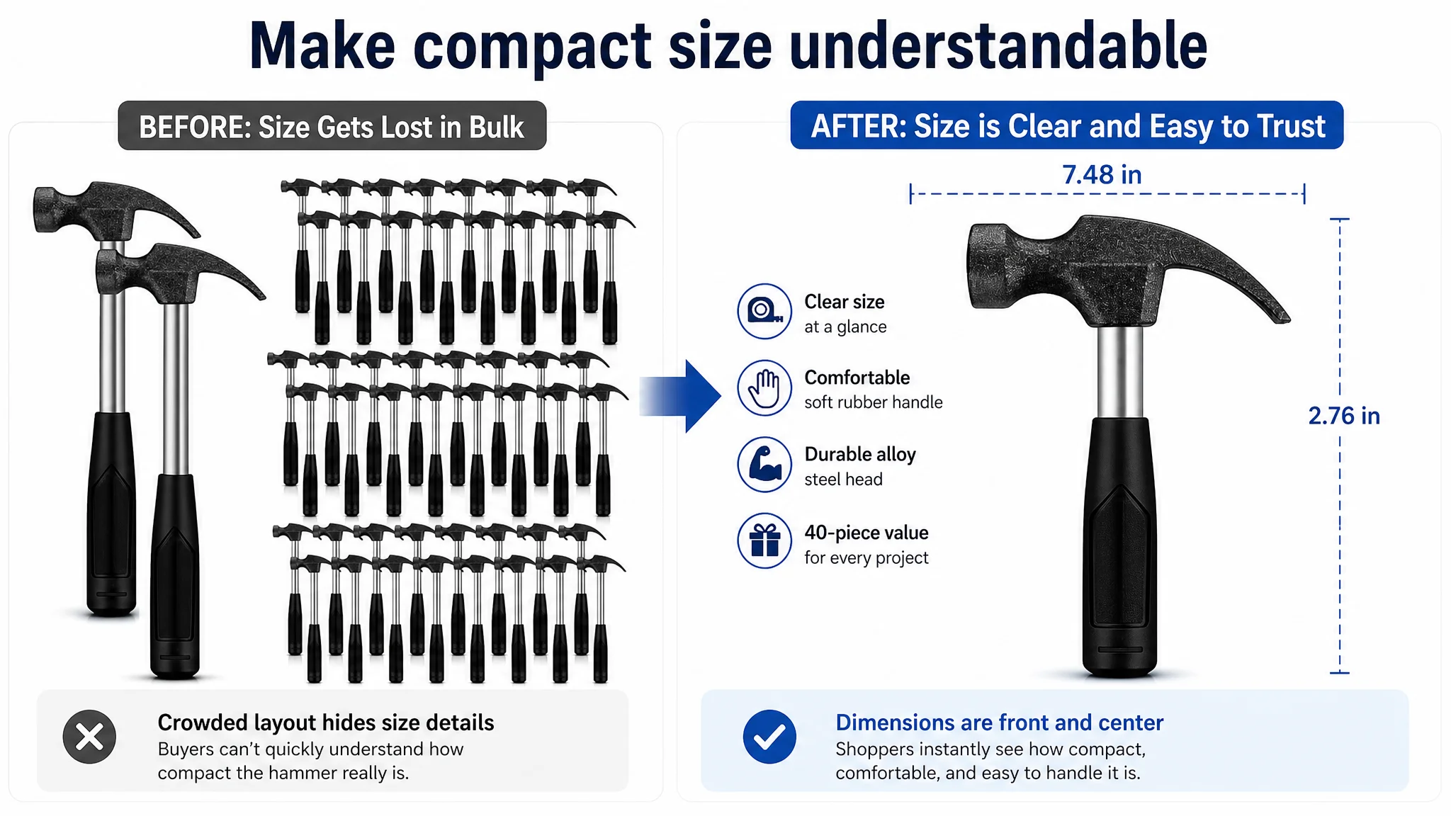
The Title Needed to Clarify the Product Before Expanding Reach
The existing title placed the core term “Claw Hammer” relatively late, while also carrying multiple descriptive phrases and a 40-piece quantity claim. At roughly 25 words, it risked making the most important information harder to find or easier to truncate.
The recommended direction reorganized the title around:
- The brand or product identifier
- The 40-piece stubby hammer set
- The soft rubber handle
- The compact claw hammer form
- High-value use cases
- Suitable users
The important change was not simply adding more search terms. It was creating a more readable relationship between product type, package value, and use.
A title such as:
“40 Pcs Stubby Hammer Set with Soft Rubber Handle, Small Claw Hammers Bulk for Home DIY, Crafting, Woodworking, Jewelry Making and Camping”
gives the shopper a faster answer to three questions:
- What is the product?
- What is included?
- Where might it be used?
The title should not carry the entire conversion burden. Its role is to establish relevance and set an accurate expectation for the images and page that follow.
The Main Image Had to Make One Hammer Matter
The main image was not merely a visual styling issue. It was the first point at which the Listing could either establish quality or reinforce the low-price interpretation.
The recommended change was to shift attention from the quantity of hammers to the qualities of a single tool:
- Show the stubby claw-hammer form clearly
- Make the rubber handle visible and legible
- Establish a durable, practical tool impression
- Keep the 40-piece value present without making it the only message
- Reduce clutter created by showing too many units at once
The supporting image sequence could then answer specific doubts in order.
Size should be shown, not implied
The compact format was described as approximately 7.48 by 2.76 inches. That information needed a clean scale comparison so buyers could understand what “stubby” meant in hand.
Without a reference, compact can sound convenient to one shopper and inadequate to another.
The handle needed a dedicated proof point
The soft rubber handle was one of the Listing’s more useful differentiators, but it was diluted inside a crowded detail matrix. A close-up should show the texture, contour, and grip structure while connecting them to a practical benefit:
- Firm handling
- Non-slip control
- Reduced vibration
- Less hand fatigue during repeated light-duty work
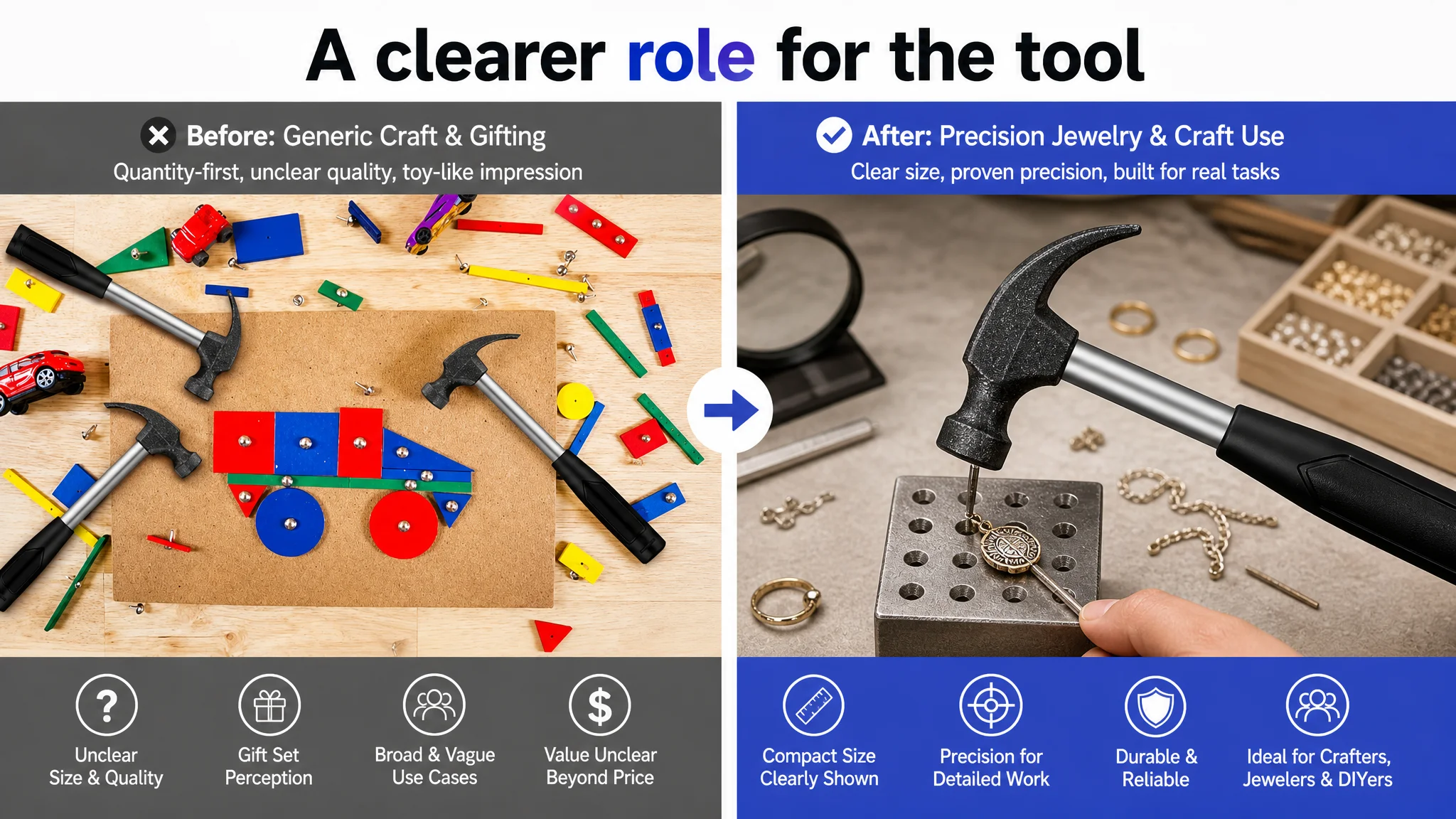
Use cases should validate the product’s role
Crafting, small repairs, woodworking, and nail pulling could be shown through focused scenes rather than broad claims. The goal was not to make the product appear capable of every task. It was to show the tasks the product was actually positioned to support.
The Bullet Points Were Not the Main Failure
One important result of the comparison was that the bullet points were not the largest weakness. The customer Listing scored 6 out of 10, while the benchmark scored 5.
That does not mean the bullets required no work. It means they were not the first constraint to address.
The customer’s bullets already had several strengths:
- A clearer progression from package contents to material and comfort
- More specific scenes such as home renovation and automotive repair
- Direct attention to handling fatigue
- A more user-oriented tone than the benchmark’s parameter-heavy structure
The revision therefore needed to preserve the customer’s stronger conversion logic while making the claims more disciplined and easier to scan.
A stronger bullet structure would connect:
- Bulk value with commercial, group, or spare-use scenarios
- Material with durability and resistance to wear
- Grip with control, comfort, and vibration management
- Compact design with maneuverability in tighter spaces
- Applications with specific tasks rather than a generic “multifunctional” promise
This illustrates why score-based diagnosis matters. If every dimension is treated as equally urgent, the team may spend time rewriting a relatively healthy section while leaving the 19-point detail-page gap untouched.
The A+ Page Needed a Sales Sequence, Not More Text
The later optimization direction organized the A+ page around the questions buyers ask as they move toward purchase.
Start with scale and manageability
The first module should make the compact size immediately understandable, potentially through a hand or common crafting reference. This reduces the risk that “stubby” is interpreted as “too small to be useful.”
Introduce the 40-piece value with context
Quantity should appear early, but not as a cheap bulk signal. The visual should show why multiple units may be useful:
- Shared craft projects
- School or group activities
- Commercial or multi-location use
- Home repair backups
- Spare tools kept available
Show the head as a real working component
A close-up of the forged or alloy-steel head, including the claw end, can support the durability story more effectively than another paragraph of claims. Any material or treatment language must remain aligned with the product’s confirmed specifications.
Make the handle benefits visible
The rubber handle should be shown through texture, shape, and grip points. The visual should connect the material to handling rather than leaving “soft” and “comfortable” as unsupported adjectives.
Demonstrate the two ends in use
Scenes involving nail pulling, prying boards, or light demolition can turn “multi-purpose” into something concrete. Each scene should communicate one task clearly instead of combining several unrelated uses into a crowded composition.
Close with long-term value
The final section can reinforce durability and resistance to rust or corrosion where those product claims are verified. This gives the shopper a reason to view the set as a practical long-term purchase rather than a disposable bulk item.
DeepBI’s role in this process was not to make the page visually busier. It was to connect each missing proof point to a specific visual or textual correction, while preserving the product’s actual structure and characteristics.
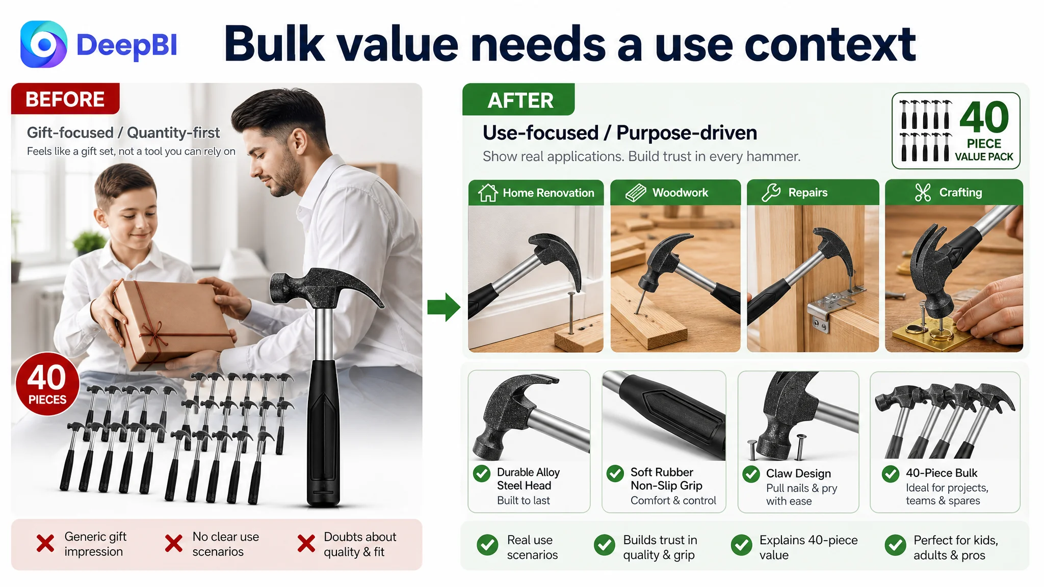
Reviews Created a Separate Trust Risk
The review profile added pressure to the page-level problem.
The customer Listing showed:
- 3.9 stars
- 25 total reviews
- 8 reviews visible on the first page
- 37.5% of those first-page reviews at three stars or below
The comparable Listing showed:
- 4.6 stars
- 143 total reviews
- A stronger overall social-proof position
The gap was 0.7 stars, accompanied by a substantial difference in review volume. This meant the product page could not rely on reviews to fill in missing confidence. It needed stronger product evidence in the images, bullet points, and A+ content.
The review diagnosis also required restraint. A stronger A+ page would not erase a weaker rating or substitute for product satisfaction. It would simply ensure that buyers receive a clearer and more accurate understanding of the product before purchase.
That distinction matters for Amazon sellers: Listing optimization can improve the quality of the buying explanation, but it cannot manufacture social proof or replace product quality.
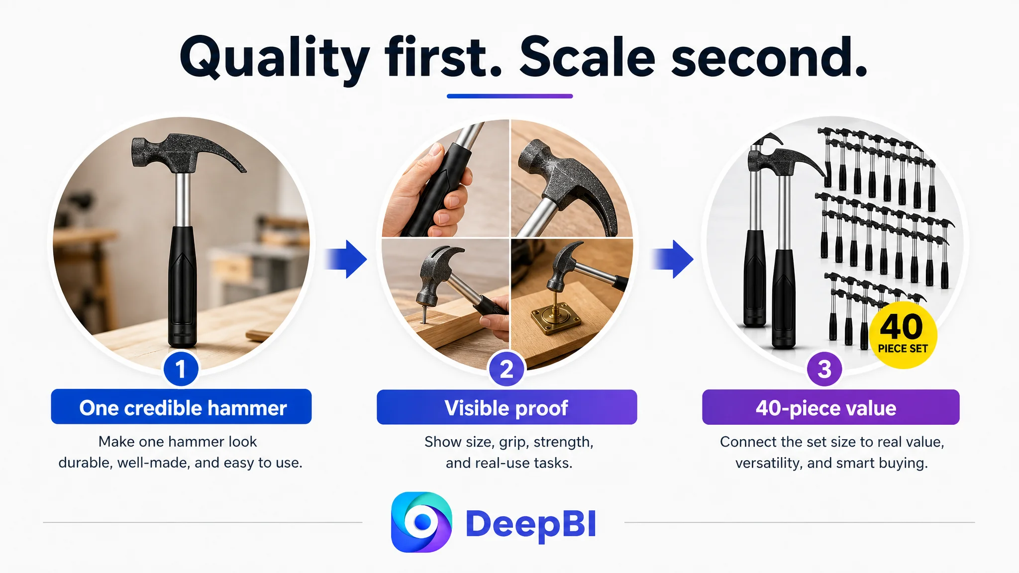
The Real Optimization Was a Change in Operating Logic
The final direction was not “add more images” or “rewrite the title.” It was a change in how the Listing was expected to convert.
The previous logic was:
Lead with quantity, cover many use cases, and explain the product through text.
The revised logic was:
Establish the quality and usability of one hammer, demonstrate its practical role, then explain why owning 40 units creates value.
That sequence gives the shopper a more stable path:
1. Recognize the product as a compact claw hammer.
2. Understand its size and handling characteristics.
3. See evidence of material and grip quality.
4. Confirm practical tasks through real-use scenes.
5. Understand the value of the 40-piece package.
6. Decide whether the product fits the intended user or project.
This is also why DeepBI’s diagnosis is more useful than a simple score. The score identifies where the Listing is losing competitive capacity. The comparison then explains why the gap matters and what order of decisions can address it without distorting the product’s actual identity.
Before Scaling Amazon Ads, Decide Whether the Page Can Carry the Click
The case material does not include post-optimization advertising or conversion results, so no claim can be made that ACOS declined, CVR recovered, or organic orders increased after the changes.
What can be established is the business logic of the correction.
The customer Listing was not primarily blocked by a lack of product information. It was blocked by a weak connection between information and trust. The largest gap sat in the A+ detail page, while the main image, title, and review profile reinforced the same concern from different angles.
The revised approach therefore aimed to make the Listing:
- More credible at the first click
- Clearer about compact size
- More persuasive about grip and durability
- More specific about practical applications
- More coherent in its treatment of children, adults, hobbyists, and professionals
- Better able to explain the business value of a 40-piece set
The broader lesson for Amazon sellers is not to stop optimizing ads. It is to place ad optimization in the correct sequence.
When a product page cannot yet convert attention into confidence, the most valuable next action may be to repair the page’s sales logic before asking Amazon ads to send more shoppers to it.
In this hammer Listing, the turning point was recognizing that the 40-piece offer was not the core story. It was the supporting value proposition. The core story had to begin with one credible, manageable, useful tool.