

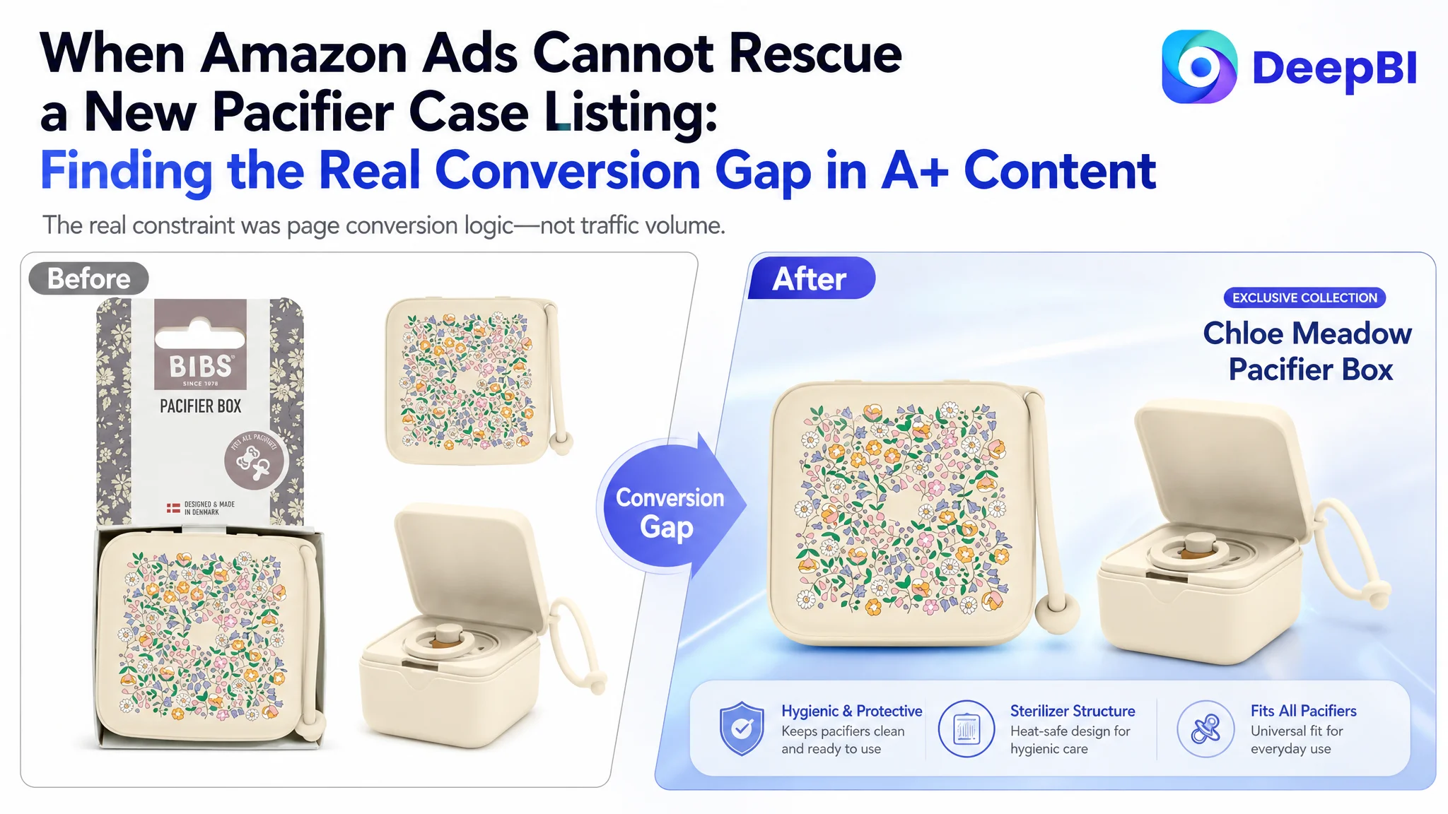
This case follows an Amazon seller in the US marketplace whose pacifier case Listing had a basic visibility foundation but a serious product-page conversion gap. The team had useful product functions to communicate, including storage for up to three pacifiers, a strap for portability, and microwave sterilization for silicone pacifiers. Yet those advantages were not organized into a persuasive Amazon product-page journey.
The initial direction focused on improving individual assets: refining the title, explaining sterilization steps, and presenting the product's existing functions more clearly. That approach treated the issue as an information problem. DeepBI's comparison showed that the larger constraint was structural: the Listing had almost no visual A+ content, no review foundation, and no complete path from customer concern to product proof.
The later optimization therefore centered on Amazon Listing conversion rather than isolated ad or copy adjustments. The priority became rebuilding the product page around capacity, portability, hygiene, safety, design, and credibility—while using the main images and A+ modules in a deliberate sequence. Other Amazon sellers can learn from this case that more traffic is not automatically more useful traffic. Before scaling Amazon ads, the page must be able to convert the questions and doubts that paid traffic brings with it.
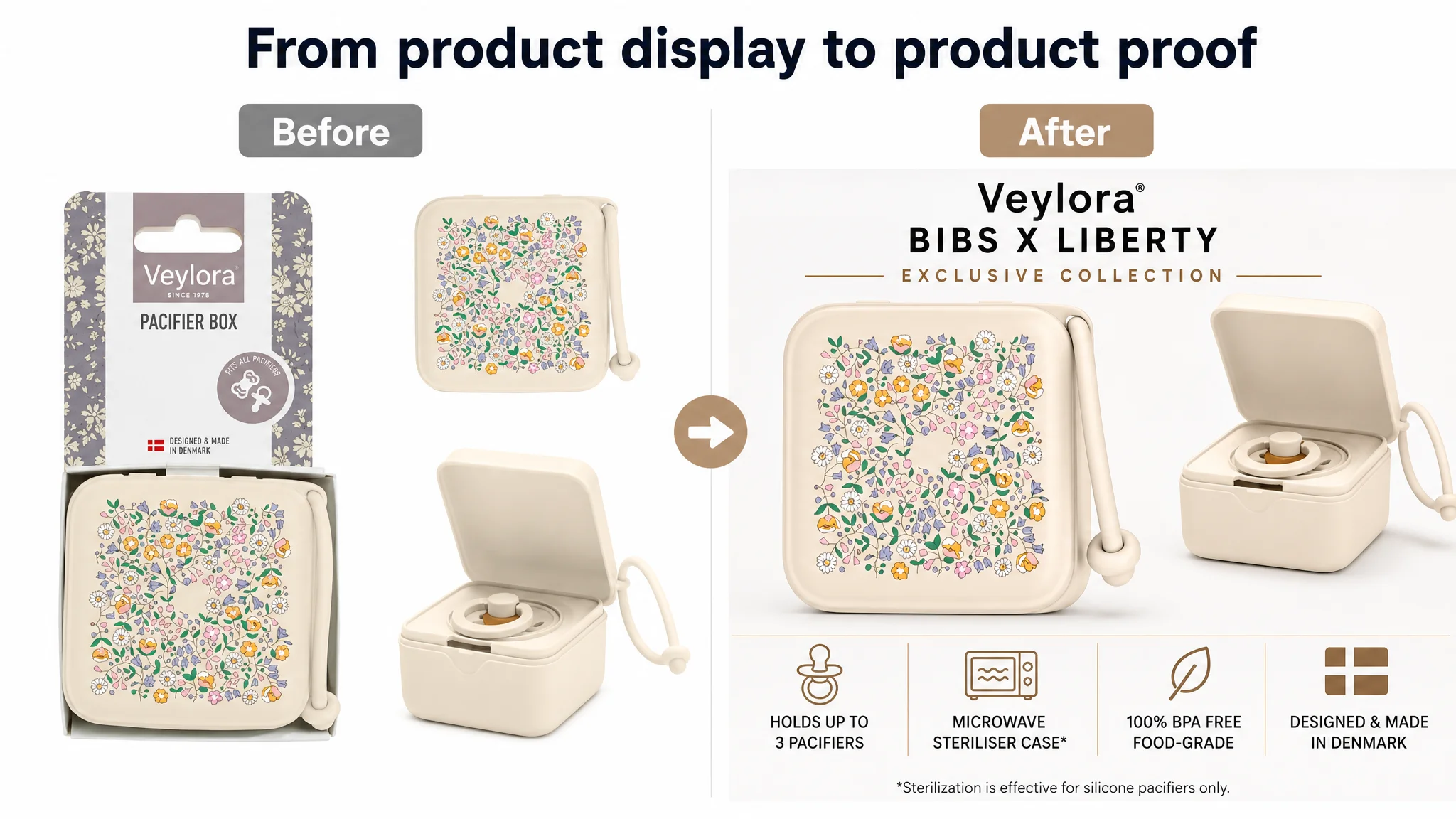
The Listing Looked Functional. The Business Problem Was Persuasion.
The product was a pacifier case with a strap and sterilizer function, positioned around portability, hygiene, and design. On paper, it had several clear selling points:
- It could hold up to three pacifiers.
- An insert could hold one pacifier separately.
- The strap could attach the case to a stroller, diaper bag, or crib.
- The case could be used for microwave sterilization with silicone pacifiers.
- It was made from BPA-free, food-grade material.
- Its design had an exclusive printed collection and Danish manufacturing credentials.
The issue was not a lack of features. It was that the page did not turn those features into a clear buying decision.
The original Listing relied heavily on basic product descriptions and repeated text. The A+ section had no image modules. The title included relevant functions, but its structure was loose. The bullet points explained details, yet they opened with a collaboration story and included instructions in a way that felt closer to a manual than a conversion path.
That distinction matters on Amazon. A customer may arrive from an ad already interested in a pacifier case, but still ask:
- How many pacifiers can it hold?
- Can I attach it to a stroller or diaper bag?
- How does the sterilization function work?
- Is the material safe?
- Is the case compact enough for daily use?
- Does the product look trustworthy and well made?
- What evidence suggests that other parents use it successfully?
The Listing did not answer these questions in a sufficiently visual or sequential way.
The page did not lack product information. It lacked a persuasive order for that information.
The Initial Misdiagnosis: Treating the Page as an Information Problem
The first optimization direction was understandable. The product had useful functions, but some of them were not expressed strongly enough. The title needed more compact keyword placement. The bullet points needed clearer benefits. The sterilization steps needed to be explained. The existing images contained several useful details.
That led naturally to a series of local improvements:
- Make the title more relevant to search terms.
- Add the capacity of three pacifiers.
- Explain the strap and drainage holes.
- Clarify the microwave sterilization process.
- Reinforce the material and manufacturing background.
- Improve the presentation of the existing images.
These actions were not wrong. They were incomplete.
The deeper misdiagnosis was assuming that better information alone would repair conversion. In reality, the Listing lacked the visual and trust-building structure needed to make that information persuasive. The page did not show enough of the product in use, did not provide a strong A+ narrative, and had no review evidence to support the claims.
If Amazon ads were used to send more traffic to the page, they would not solve this weakness. They would expose it to more shoppers.
Why isolated copy improvements were not enough
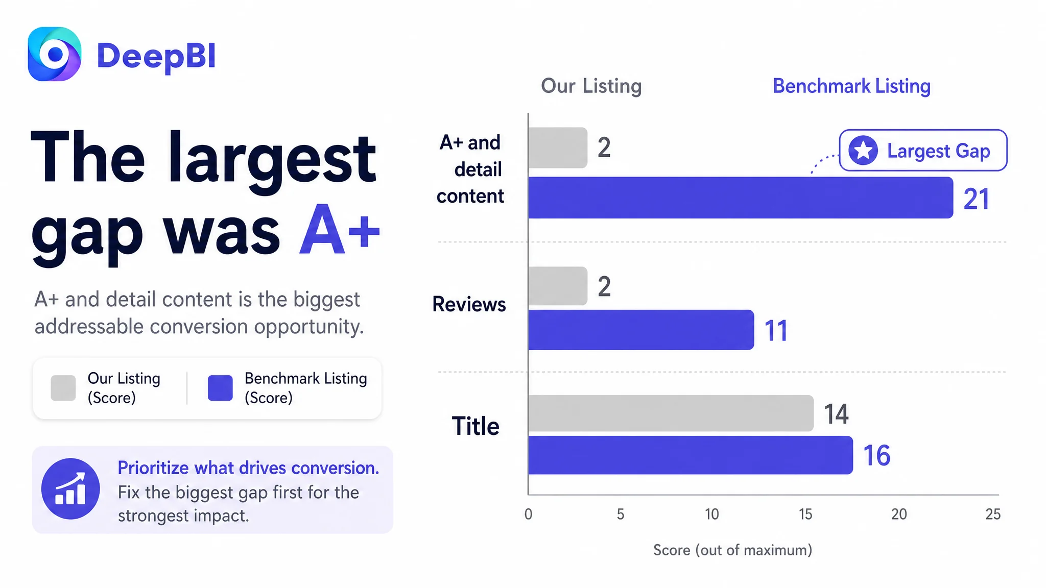
The title was scored at 14 out of 20, only two points below the comparable high-performing Listing. The bullet points scored 6 out of 10, one point behind. These were real gaps, but they were not the largest source of lost competitiveness.
The page's details section scored only 2 out of 25, compared with 21 for the comparable Listing. That nineteen-point difference was far more significant than the title or bullet-point gap.
This changed the order of operations.
The question was no longer, “How can the title and bullets contain more information?”
It became, “Why is the product page failing to demonstrate value after the customer has already shown interest?”
The Score Gap Pointed to One Dominant Constraint
DeepBI's comparison produced a total score of 50 out of 100 for the target Listing, compared with 78 for the benchmark Listing.
- Title: Target Listing: 14, Benchmark Listing: 16, Maximum score: 20, Gap: -2
- Main images: Target Listing: 26, Benchmark Listing: 23, Maximum score: 30, Gap: +3
- Bullet points: Target Listing: 6, Benchmark Listing: 7, Maximum score: 10, Gap: -1
- A+ and detail content: Target Listing: 2, Benchmark Listing: 21, Maximum score: 25, Gap: -19
- Reviews: Target Listing: 2, Benchmark Listing: 11, Maximum score: 15, Gap: -9
- Total: Target Listing: 50, Benchmark Listing: 78, Maximum score: 100, Gap: -28
The result contained an important nuance: the main image score was not lower than the benchmark. It was actually three points higher.
That meant the answer was not to discard the entire visual system and start over based on subjective taste. The page already had a usable visual foundation, including dimensions, functional labels, and product identification. The more urgent issue was how the images were sequenced and what the A+ content failed to do after the initial click.
The two largest gaps were:
1. A+ and detail content: 2 versus 21
2. Reviews: 2 versus 11
The review gap was commercially important, but it could not be solved through immediate copy or design changes. A new Listing with zero reviews naturally carries a trust disadvantage against a comparable product with 84 reviews and a 4.3-star rating.
The A+ gap, however, was directly addressable.
The decisive judgment was not “make every asset better.” It was “repair the page section with the greatest ability to change how shoppers understand the product.”
The Real Conversion Leak Was the Missing A+ Story
The benchmark Listing used a sequence of visual modules that moved through a recognizable decision path:
1. Product capacity and compatibility
2. Strap use and portability
3. Design and collection appeal
4. Sterilization and hygiene
5. Material safety
6. Physical size in a diaper-bag context
7. Manufacturing credibility
The target Listing had no equivalent visual narrative. Its A+ section consisted of basic text and repeated product information.
That created a trust break between interest and purchase.
A customer could read that the case was functional, but could not easily see:
- How three pacifiers fit inside.
- How the included insert changes the storage configuration.
- How the strap works in a daily parenting context.
- What the case looks like when carried with a diaper bag.
- How the sterilization process should be performed.
- Which material-safety claims were relevant.
- Why the design collection represented more than decoration.
The product page therefore remained at the level of a product description rather than becoming a complete buying argument.
The first A+ module had to remove the capacity doubt
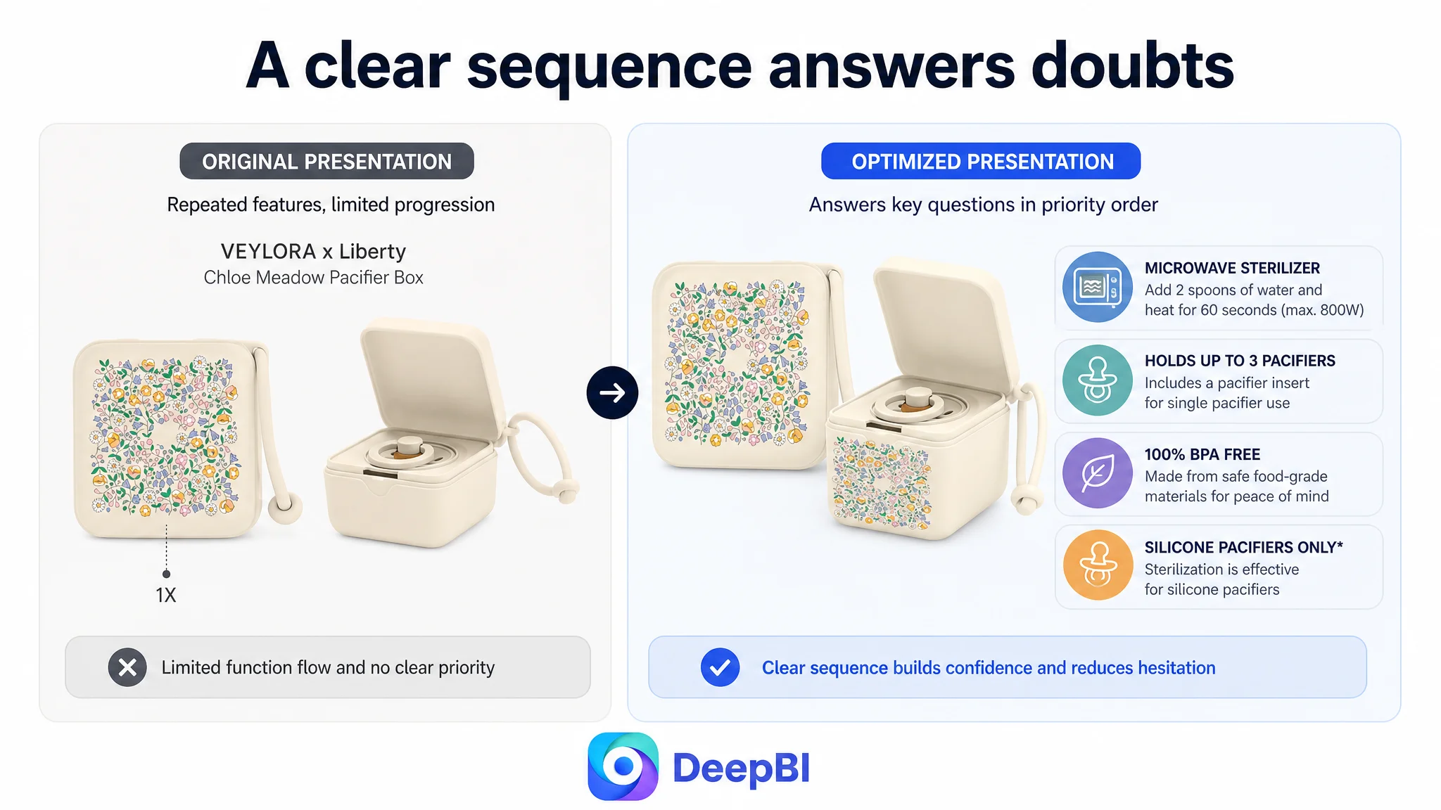
Capacity was one of the highest-priority purchase questions. The proposed first module was designed to show that the case could hold up to three pacifiers and could also use an insert for one pacifier.
This was more commercially useful than opening with a brand story. Parents deciding whether a pacifier case is practical usually need to understand its everyday function first. The product's design appeal could still matter, but it needed to follow the basic usability question rather than replace it.
The strap needed to be shown, not merely named
The strap was a differentiating feature, but the original page did not make its use sufficiently visible.
The recommended direction was to show the case attached to a stroller, diaper bag, or crib, using the existing product structure without inventing unsupported angles or accessories. This would turn “with strap” from a specification into a recognizable use case.
A shopper should not have to imagine how the strap fits into daily routines.
Sterilization required both clarity and boundaries
The sterilizer function was another strong differentiator, but it also carried a risk: unclear instructions could create misuse or distrust.
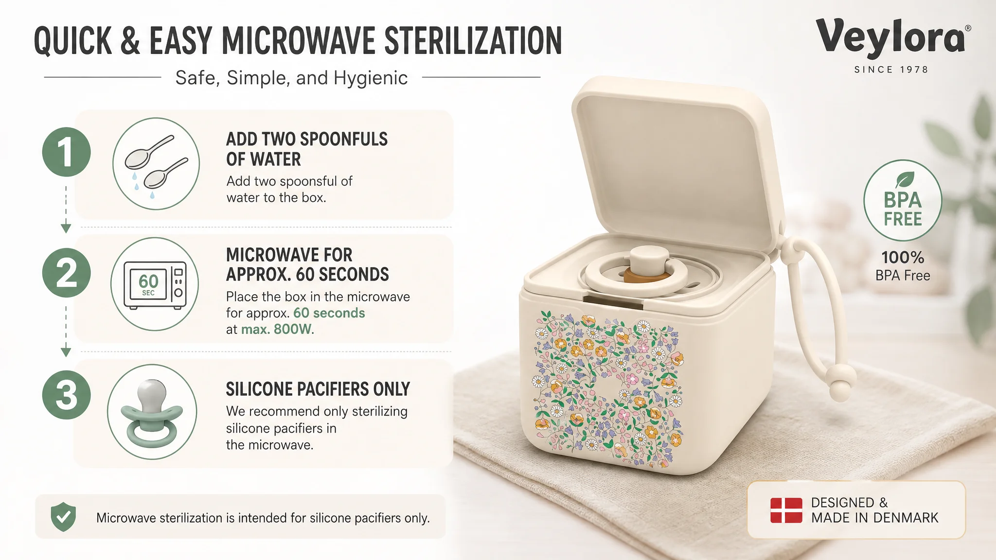
The proposed content needed to show the real process:
- Add two spoonfuls of water.
- Place the pacifier in the case.
- Microwave for approximately 60 seconds.
- Use a maximum of 800W.
- Sterilize silicone pacifiers only.
This was not simply a request for a more attractive image. It was a request for a visual explanation with a safety boundary. The warning about natural rubber pacifiers was especially important because responsible product communication must show not only what the product can do, but also where its use should stop.
Why DeepBI Did Not Prioritize Ads First
Advertising can increase exposure, clicks, and traffic volume. It cannot make an unclear product page feel clear.
For this Listing, the business risk of continuing with ad-first optimization was straightforward: paid traffic could be directed toward a page that had not yet built enough confidence to convert it. The result would be more traffic entering the same weak decision environment.
That is why the recommended order was:
1. Rebuild the page's conversion logic.
2. Make the highest-priority product doubts visible.
3. Strengthen trust through A+ content and safety communication.
4. Improve title and bullet-point sequencing.
5. Reassess how paid traffic is being received by the page.
This does not mean advertising was irrelevant. It means ads were not the first constraint to remove.
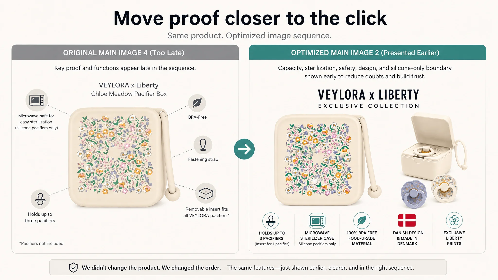
The main image analysis made this decision even more precise. The existing image set already communicated product identity and several functions. Instead of replacing everything, DeepBI recommended changing the role and sequence of selected images:
- Move the detailed multi-function graphic earlier, into the second image position.
- Combine or reduce repetition between the first two product views.
- Keep the effective size guide in its current logical role.
- Add proof-of-use imagery, such as the case attached to a bag.
- Shift the lifestyle image from decoration toward trust and collection identity.
This is a more disciplined approach than redesigning every image because a competitor's page looks more polished.
Advertising should not be asked to compensate for a page that has not yet earned the customer's confidence.
The Title Needed Search Structure, Not More Keyword Weight
The title gap was smaller than the A+ gap, but the existing structure still limited clarity.
The original title used several relevant terms, including pacifier box, soother holder, and sterilizer case. However, the phrases were arranged as a loose feature list. The benchmark title placed the core product term and strap function earlier, then added capacity and use context.
The recommended direction was to organize the title around:
- Core product form
- Strap and sterilizer function
- Storage and transport use
- Capacity of up to three pacifiers
- BPA-free, food-grade material
- Color
The proposed wording emphasized a compact sequence such as:
Pacifier Box with Strap and Sterilizer Case, Soother Holder for Storing and Transporting up to 3 Pacifiers, BPA-Free Food-Grade Material
The value of this change was not simply adding more terms. It was making the title easier to scan on Amazon mobile search while connecting keywords to actual use.
The title should communicate what the product is, what problem it solves, and why it is more practical than a basic storage box.
The Bullet Points Needed a Buying Logic
The original bullet points had useful content, but the order was not optimized for conversion.
The first bullet led with a collaboration story. The second focused on sterilization instructions. The remaining bullets covered capacity, material safety, and manufacturing background. This created a sequence that was technically informative but commercially uneven.
The recommended structure placed customer concerns first:
Convenience and hygienic storage
Lead with the everyday problem: keeping pacifiers clean, accessible, and easier to transport.
The collection design could remain part of the message, but it should support the core benefit rather than replace it.
Portability in daily routines
Explain how the strap works with a stroller, diaper bag, or crib. The drainage and ventilation details could support outdoor use, provided the wording remained accurate to the product.
Capacity and sterilization
Combine the storage capacity with the sterilizer function so shoppers understand the product as a multifunctional case rather than a simple container.
Material safety and maintenance
State the food-grade and BPA-free properties, along with durability and ease of cleaning, without extending beyond the confirmed product information.
Design and manufacturing credibility
Use the collection's design identity and Danish manufacturing background as the final reinforcement layer, after the practical questions have been answered.
This order follows the customer's decision process:
Need → Use case → Capacity → Hygiene and safety → Credibility
That is stronger than presenting the same facts in the order they happened to be available internally.
The Main Image Was Not the Main Failure
The main image analysis showed why diagnosis must be specific.
The target Listing's image system had strengths:
- Product identification was clear.
- Functional information was already present.
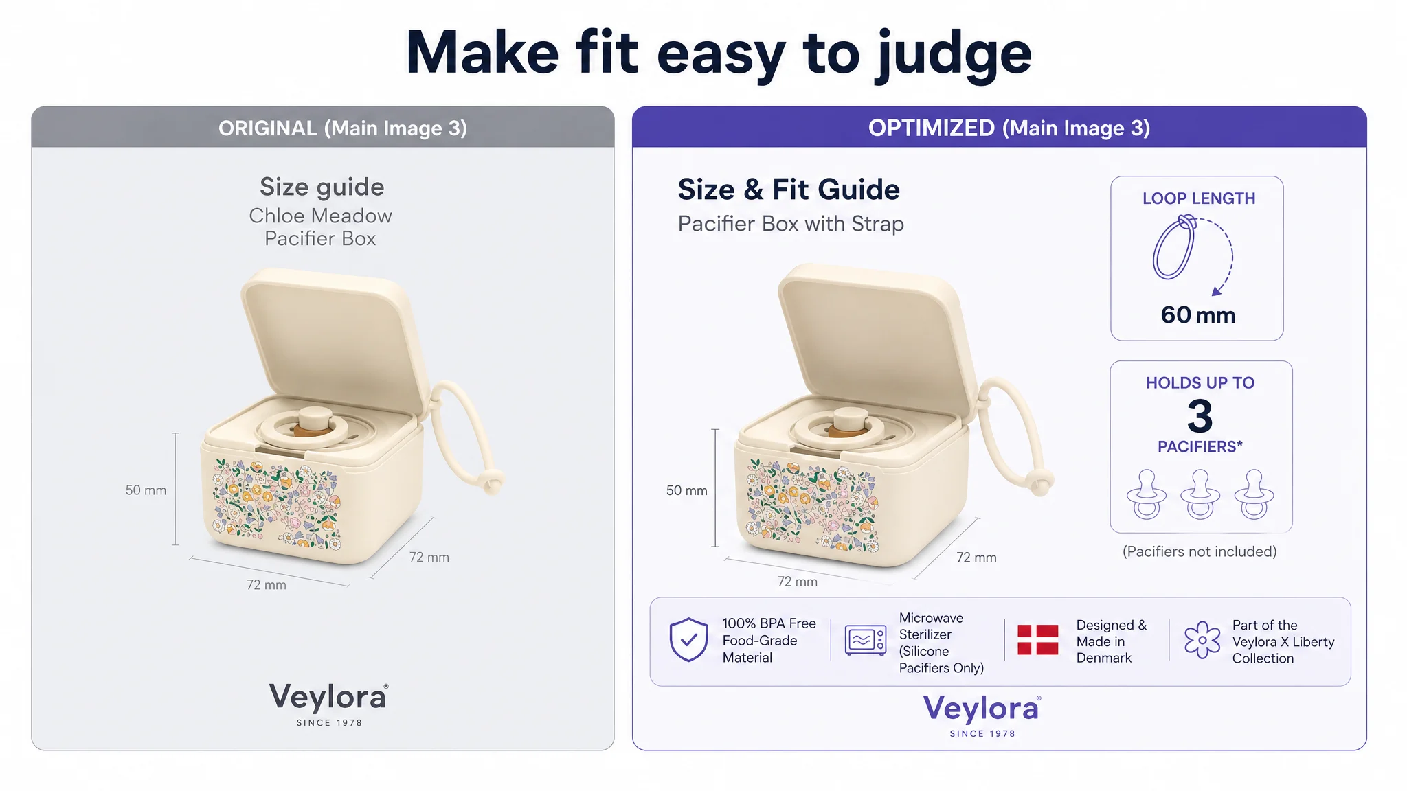
- Dimensions were communicated effectively.
- The image set included useful feature labels and brand-related cues.
The weaknesses were about role and sequence:
- The first image had several product views but did not immediately emphasize the exclusive collection.
- The second image used a redundant “1X” callout instead of advancing the persuasion.
- A detailed function graphic appeared too late.
- The lifestyle image created atmosphere but did not sufficiently validate real use.
- The set lacked a strong attachment or carry scenario.
The recommended changes therefore focused on making each image do a distinct job:
- Image 1: Establish product identity and collection appeal.
- Image 2: Explain the main functional advantages early.
- Image 3: Resolve size and fit questions.
- Image 4: Demonstrate functional use and sterilization.
- Image 5: Reinforce design, origin, and trust.
The goal was not to make the page more visually elaborate for its own sake. It was to prevent repeated images from occupying valuable positions while higher-priority doubts remained unanswered.
The Review Gap Made the Content Gap More Serious
The target Listing had zero reviews and no rating data on the first page. The benchmark Listing had 84 reviews and a 4.3-star rating, including verified purchase feedback, image reviews, and comments about capacity and cleaning convenience.
That difference created a trust disadvantage that content alone could not fully erase.
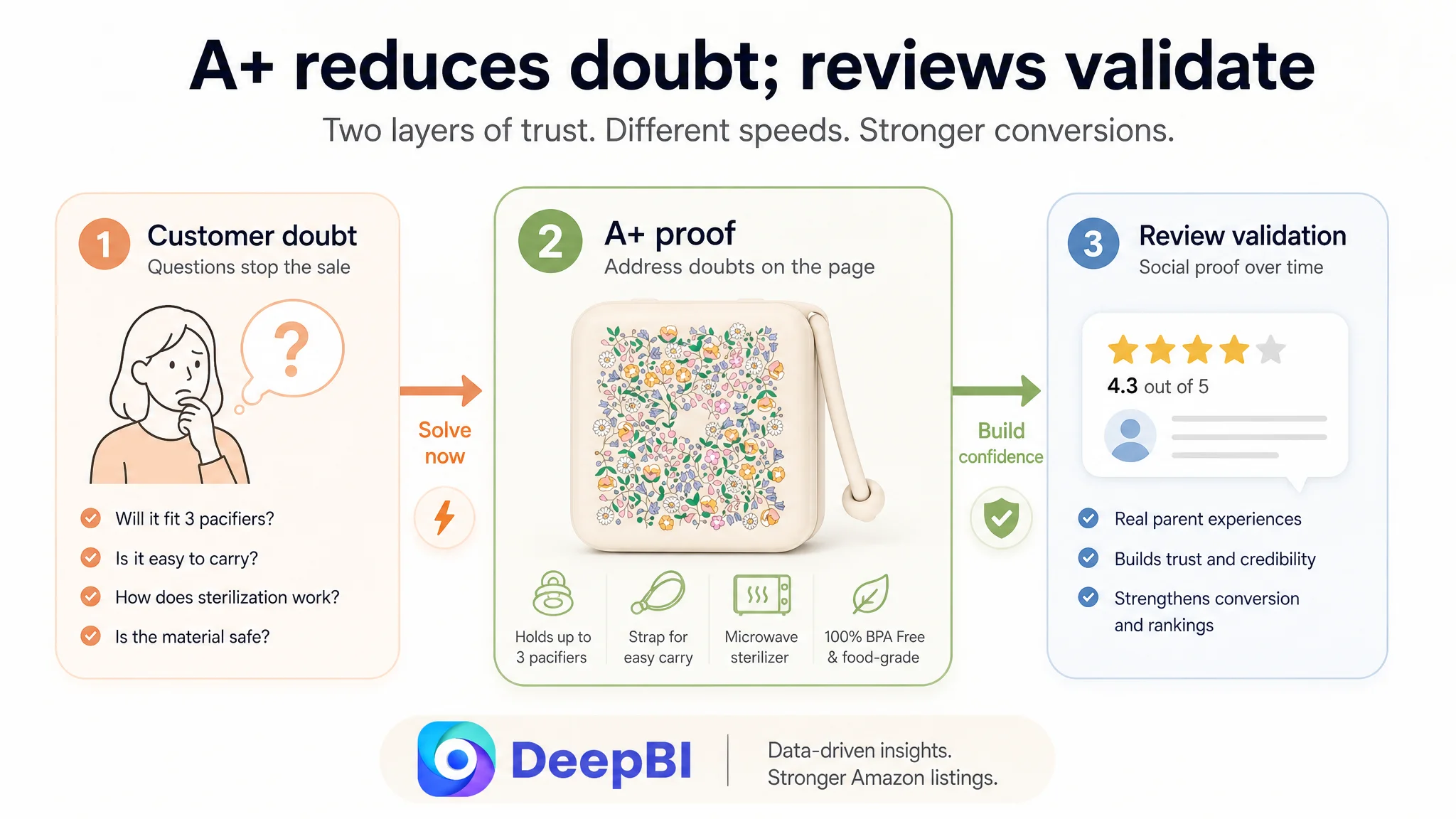
It also made the missing A+ content more costly. When a Listing has limited customer proof, its own page must work harder to demonstrate:
- What the product looks like in real use.
- How its functions work.
- What its safety boundaries are.
- Why the storage capacity is practical.
- Whether the design and manufacturing claims feel credible.
A+ content cannot manufacture review history. It can, however, reduce uncertainty in the areas that reviews would otherwise help explain.
This is why the recommendation did not treat reviews and A+ as interchangeable. Reviews were a market-validation gap. A+ was a page-communication gap. The second could be addressed immediately and should not be delayed while waiting for the first to improve.
What the Amazon Seller Needed to Change First
The final direction was not a broad redesign project. It was a prioritization decision.
The Listing needed to move from:
Feature description → scattered proof → purchase uncertainty
to:
Customer concern → visible solution → functional proof → safety boundary → credibility
The practical focus was:
- Rebuild the A+ section with image-led modules.
- Show capacity and compatibility before brand storytelling.
- Make the strap function visible in a realistic context.
- Explain sterilization clearly and responsibly.
- Reinforce BPA-free, food-grade material claims.
- Use the size module to show the case in a diaper-bag context.
- Reorder selected main images according to decision priority.
- Tighten the title around core search terms, capacity, and use.
- Rewrite bullets around pain points and outcomes rather than instructions alone.
- Treat reviews as a separate trust-building constraint rather than a reason to postpone page repair.
No post-optimization performance figures are provided in the case, so it would be premature to claim a specific CVR increase, ACOS decline, or organic-order recovery.
What can be stated clearly is that the operating risk changed. The team no longer had to evaluate every issue as an undifferentiated Listing weakness. It had a more defensible sequence: fix the largest conversion constraint first, then judge how traffic performs against the repaired page.
The Broader Amazon Lesson
This pacifier case illustrates a recurring Amazon operating problem: sellers often see the visible symptom before they identify the real constraint.
A title can be slightly weak without being the main reason a Listing fails. A main image can be visually imperfect without being the largest conversion leak. A product can have several strong functions without communicating them in a way that builds confidence.
The most important judgment came from the gap between the dimensions:
- The title was behind, but only modestly.
- The bullet points were behind, but not dramatically.
- The main images were not the weakest area.
- The A+ content was almost entirely underdeveloped.
- Reviews created a major trust gap, but were not an immediate page-design lever.
That evidence changed the optimization order.
The question before scaling Amazon ads is not only whether the Listing can attract a click. It is whether the product page can answer the customer's next question convincingly.
For Amazon sellers, that means ad efficiency cannot be separated from Listing conversion capacity. A product page must allow the title, main images, bullet points, A+ content, and reviews to work as one system.
In this case, DeepBI's value was not in recommending more content or prettier images. It was in locating the constraint that mattered most, distinguishing addressable page problems from slower-moving trust problems, and turning a scattered set of Listing weaknesses into a clear business decision:
Before sending more traffic, make the page capable of converting the traffic it already has.