

This case follows an Amazon seller in the handheld sewing machine and craft supplies category whose product page was not converting its market opportunity into enough buying confidence. The initial optimization direction focused on keyword coverage, feature density, accessory presentation, and technical details—the kinds of changes that often appear measurable, but do not necessarily repair a weak product-page decision path.
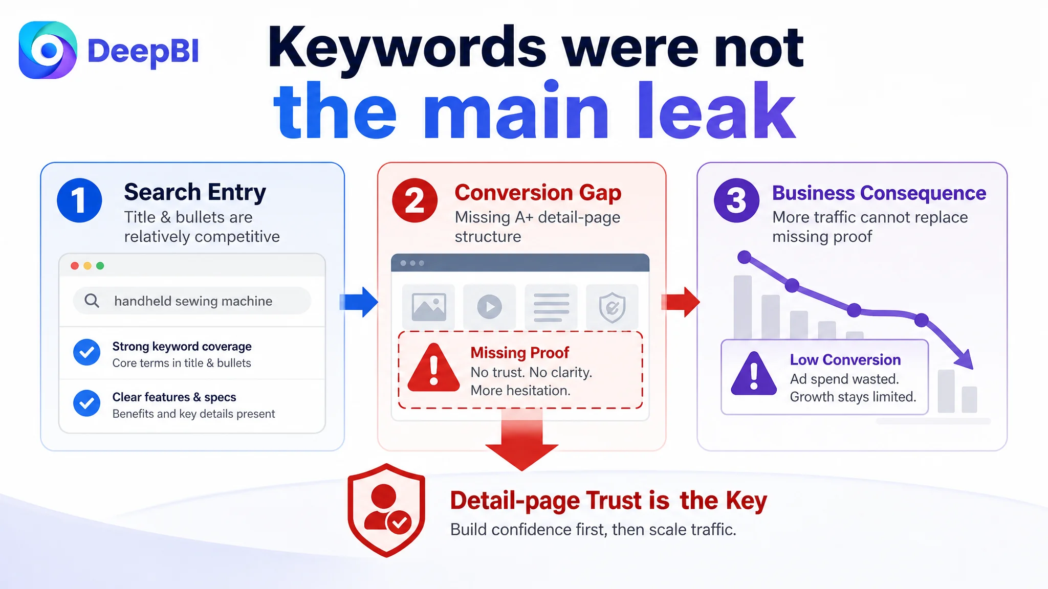
DeepBI’s diagnosis showed that the central issue was not the title or bullet points. Those areas were broadly competitive. The real gap was deeper: the Listing had no effective A+ content structure, weak visual storytelling, limited trust support, and no clear sequence for answering a beginner buyer’s concerns.
The later optimization therefore focused on rebuilding the Amazon product page around confidence first: show what the handheld machine is for, prove where it can be used, reduce setup anxiety, address stitch durability concerns, and only then present technical details and creative applications. For other Amazon sellers, the lesson is direct: before increasing traffic or refining keywords, determine whether the Listing has enough conversion capacity to deserve more traffic.
The Amazon Listing Looked Active, but Its Sales Logic Was Incomplete
The product was a mini handheld sewing machine positioned for beginners, quick clothing repairs, travel use, and DIY craft projects. On paper, the Listing contained many of the expected selling points:
- Portable handheld design
- Two-speed control
- USB and battery power options
- Up to 375 stitches per minute
- Compatibility with multiple fabric types
- Starter accessories
- Use cases including clothing repair and crafts
The problem was not a lack of information.
The problem was that the information did not arrive in the order a buyer needed.
A beginner considering a handheld sewing machine is rarely asking only, “What specifications does this product have?” The more important questions are usually:
- Will I understand how to use it?
- Can it handle the fabric I need to repair?
- Will the stitching hold?
- What happens if the thread comes loose?
- Can I use it at home or while traveling?
- Does the product look reliable enough to justify the purchase?
The product page addressed some of these questions indirectly. But indirect information creates work for the buyer. On Amazon, that work often becomes hesitation, comparison, or abandonment.
The Listing did not lack selling points. It lacked a persuasive order for those selling points.
The Original Diagnosis Focused on the Visible Parts of the Listing
The initial optimization direction was understandable. The title contained the core keyword “Handheld Sewing Machine” near the front and covered several relevant search terms, including electric stitching, DIY fabric repair, and craft projects. The bullet points also included concrete details such as the 375-stitches-per-minute speed and the 1.8 mm fabric-thickness limitation.
That made the Listing look like a text optimization opportunity.
The team could reasonably assume that more precise keyword placement, clearer feature language, and stronger accessory presentation would close the gap. The title could be shortened. Repeated wording could be removed. The bullet points could be reorganized. The starter kit could be presented more attractively.
Those changes were useful, but they were not the highest-priority business constraint.
The risk was treating a page-level conversion problem as a collection of local copy issues. If the page could not establish trust visually or answer the buyer’s practical concerns, then adding more keywords or rearranging specifications would only improve the description of a product that still felt uncertain to purchase.
This is where many Amazon Listing optimizations become trapped. The team keeps refining what is easiest to edit while leaving the strongest conversion barrier untouched.
The Score Gap Pointed to the Missing Layer
DeepBI compared the target Listing with a closely matched benchmark Listing in the same Amazon category. The comparison produced a total score of 50 out of 100, compared with 76 out of 100 for the benchmark—a 26-point difference.
The most important finding was not the total score. It was where the difference came from.
- Title: Target Listing: 15/20, Benchmark Listing: 14/20, Difference: +1
- Main image: Target Listing: 23/30, Benchmark Listing: 26/30, Difference: -3
- Bullet points: Target Listing: 7/10, Benchmark Listing: 6/10, Difference: +1
- Detail page: Target Listing: 0/25, Benchmark Listing: 22/25, Difference: -22
- Reviews: Target Listing: 5/15, Benchmark Listing: 8/15, Difference: -3
- Total: Target Listing: 50/100, Benchmark Listing: 76/100, Difference: -26
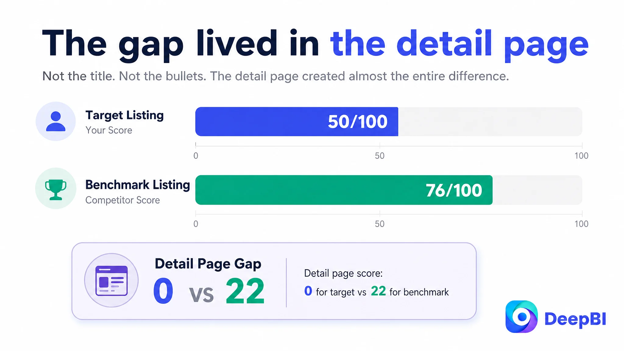
The diagnosis was clear: the page-level detail experience accounted for almost the entire competitive gap.
The title slightly outperformed the benchmark. The bullet points also scored slightly higher. That meant the Listing was not primarily losing because it lacked keywords or because every piece of copy was weak.
The largest problem was the absence of a complete A+ content and detail-page persuasion structure.
The page had no visual sequence to establish product capability, explain fabric suitability, demonstrate operation, reduce threading anxiety, or address the fear that a single stitch might unravel. The benchmark Listing, by contrast, used a full set of modules:
- A strong lifestyle-led opening visual
- Fabric suitability guidance
- Product structure callouts
- Functional explanations
- Threading instructions
- Operational reminders
- A broader use-case conclusion
This was not simply a difference in visual polish. It was a difference in how much decision risk each Listing removed.
The Real Constraint Was Listing Conversion Capacity
The benchmark Listing was not necessarily stronger in every individual sentence. In fact, its bullet points had some weaknesses. Certain descriptions overlapped, and some of the target Listing’s concrete parameters were more credible than the benchmark’s general claims.
But the benchmark used its page to create a more complete buying experience.
The target Listing described the machine.
The benchmark Listing helped the shopper imagine using the machine successfully.
That distinction matters in the handheld sewing machine category because the product is often purchased by beginners or casual users. These buyers may not need a highly technical explanation. They need enough evidence to believe that the first use will not become frustrating.
The target Listing’s existing content placed too much weight on:
- Accessory quantity
- Speed settings
- Power options
- General functions
- Technical operating details
Those elements were not irrelevant. They were simply introduced before the buyer had developed confidence in the product’s basic usefulness.
DeepBI therefore reframed the problem from:
“How can the Listing communicate more features?”
to:
“How can the product page remove the buyer’s main reasons for hesitation, in the order those concerns arise?”
That reframing changed the optimization priority.
The Main Image Was Not Just a Design Issue
The target Listing’s main image set was visually fragmented. One image emphasized the number of accessories. Another introduced speed scenarios. A later image explained power options, followed by a technical diagram and a final image that combined a test cloth with a disclaimer.
Each image had information. The problem was the sequence.
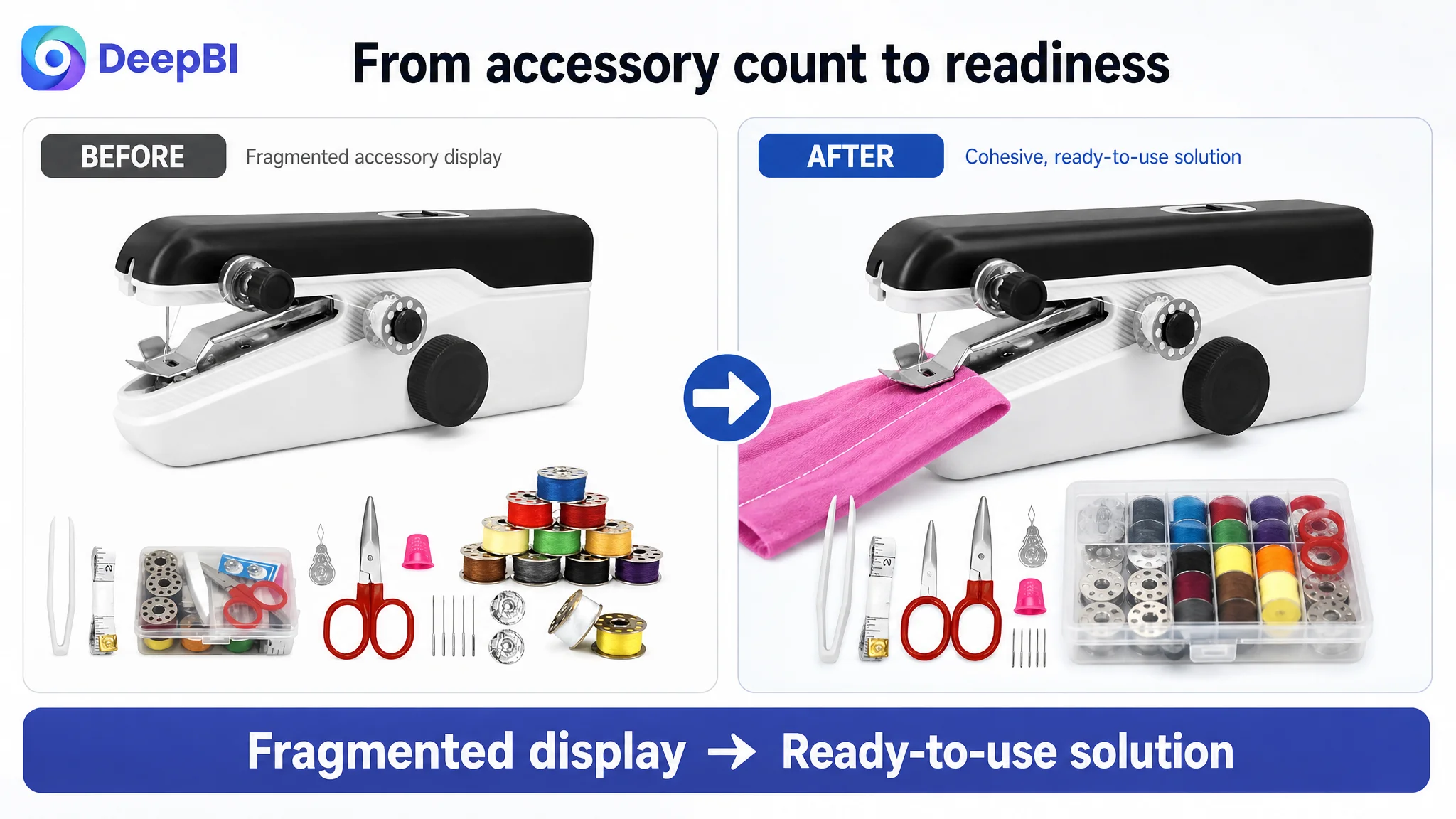
The opening image presented a collection of separate parts rather than a cohesive solution. For a beginner, a crowded accessory layout can communicate value, but it can also suggest a higher learning curve. The shopper may wonder whether the machine is ready to use or whether assembling and threading it will be difficult.
The benchmark image set created a more immediate product understanding. It showed a professional tool together with a complete use context, including a pre-sewn test cloth that implied readiness for action.
The recommended change was not to make the image more decorative. It was to change the role of the opening visual:
- From “many accessories included”
- To “a portable starter solution ready for a quick repair”
A more effective image path would establish the product in stages.
First, create user connection
The product should be shown in a handheld use situation, with fabric positioned under the needle. This immediately communicates portability and gives the shopper a reason to imagine using it at home, in a small workspace, or while traveling.
Then, explain control
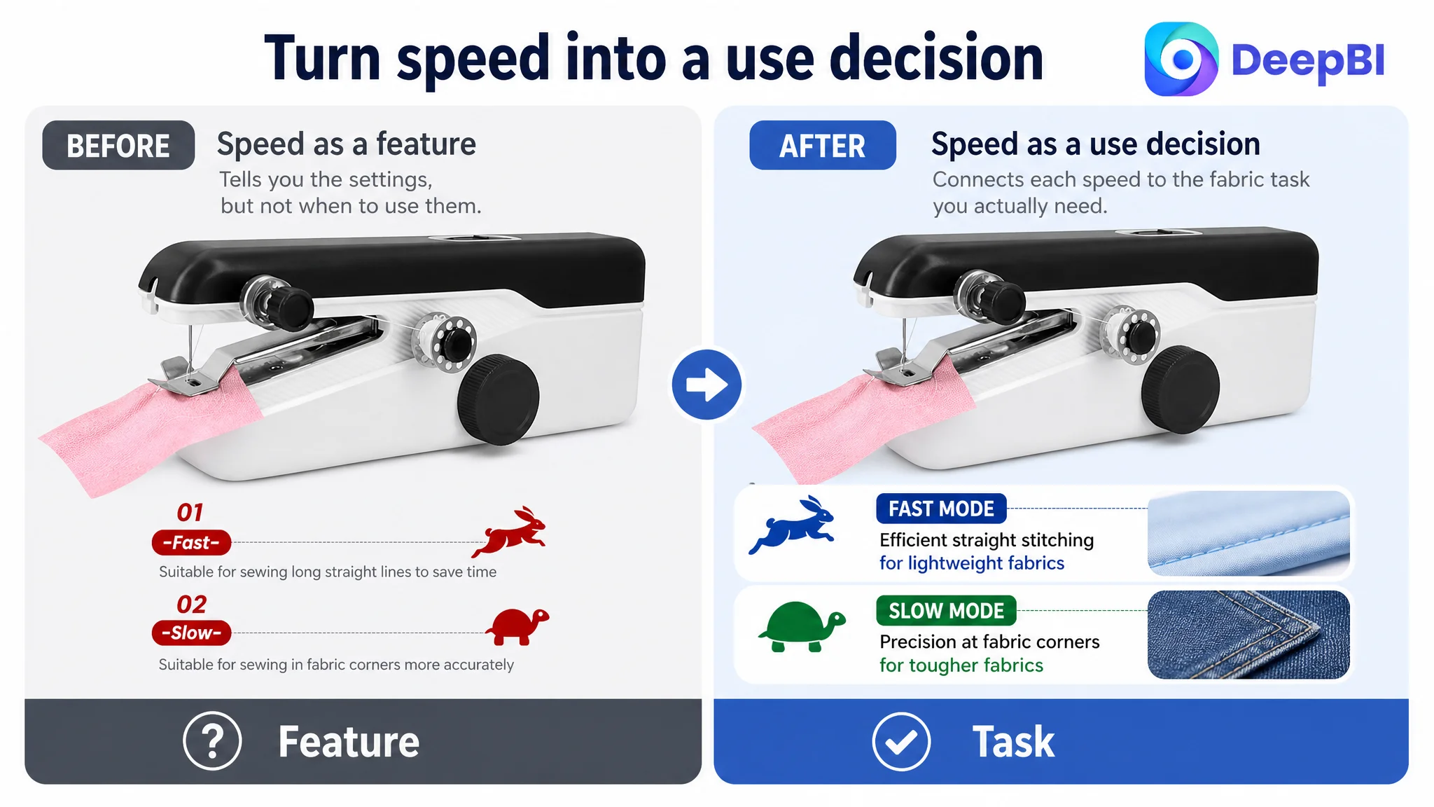
The two-speed function should be introduced after the basic use case is understood. The high-speed mode can support efficient straight stitching, while the slow mode can support greater control around corners.
Next, connect features to tasks
Speed settings, the single-thread feed system, and fabric compatibility should be shown as part of a practical workflow rather than as isolated technical labels.
Finally, present power flexibility
USB operation and the four-AA-battery option are more persuasive at the end of the visual sequence, after the shopper understands why portability matters. The battery note can remain, but it should not become the emotional conclusion of the image set.
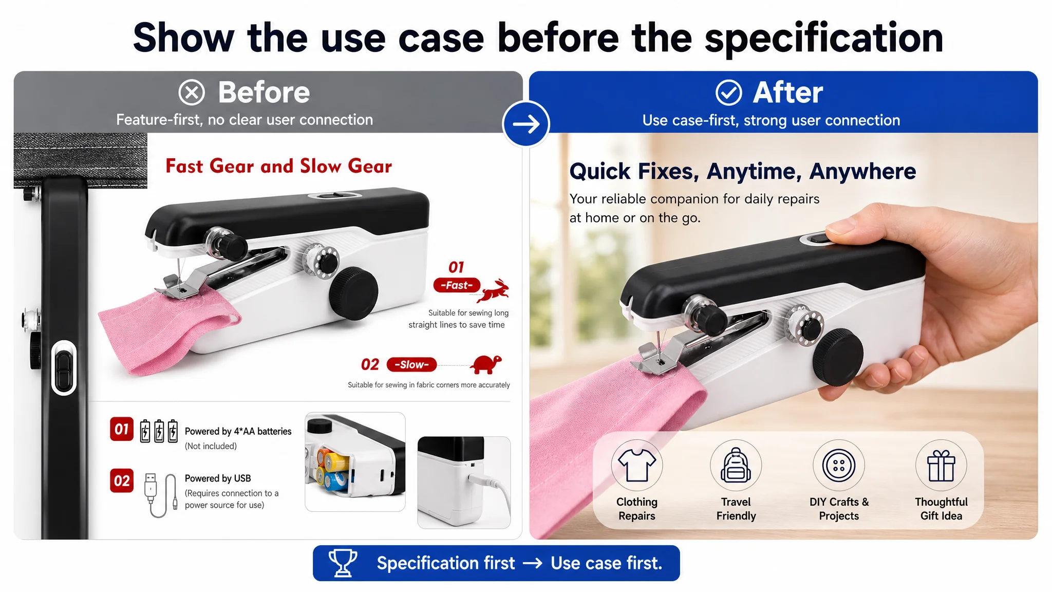
A product image should not only show what is included. It should show why the buyer will feel ready to use it.
The Title Needed Refinement, Not Rescue
The title was not the main problem, but it still had room for improvement.
The existing title placed the core keyword early, which supported search visibility. It also included several useful descriptors, such as electric stitching, DIY fabric repair, and mending applications. However, repeated use of “sewing machine” and related terms made the structure longer and less efficient to read, especially on mobile search results.
The recommended direction retained the strong search foundation while creating a cleaner hierarchy:
Mini Handheld Sewing Machine with Accessories, Portable Sewing Machine for Beginners, Quick Electric Stitching Tool for DIY Fabric, Clothes Repair, Home, Travel and Craft Projects
The role of this change was not to claim that title editing would solve the Listing. It was to make the traffic entry point more coherent:
- Core product type first
- Beginner positioning next
- Speed and electric operation after that
- Repair, home, travel, and craft applications at the end
The title should help the right shopper recognize the product quickly. It should not attempt to carry the entire sales argument by itself.
The Bullet Points Had Information, but Not a Buying Logic
The target Listing’s bullet points were in some ways more disciplined than the benchmark’s. Each point generally focused on one feature, and several included specific details that improved credibility.
The opportunity was to make the structure more outcome-oriented without sacrificing factual precision.
The first bullet should sell immediate use
Instead of beginning with an inventory of included parts, the first bullet should establish the compact handheld machine as a practical tool for quick repairs and temporary hemming.
The buyer should understand that portability is not merely a small form factor. It is useful when space is limited, time is short, or a repair is needed away from a traditional sewing machine.
The second bullet should connect speed to control
The 375-stitches-per-minute figure becomes more meaningful when paired with a result. High speed supports efficient straight stitching; low speed supports control around fabric corners.
This converts a specification into a decision benefit without overstating performance.
The third bullet should explain dual power in context
USB power supports convenient home use, while four AA batteries support portability and emergency use away from a power source. The point is not that the machine has two power options. The point is that the buyer can choose the operating mode based on the situation.
The fourth bullet should preserve the limitation
The product can be presented as suitable for materials ranging from delicate silk to sturdier denim, along with clothing, curtains, and DIY crafts. But the 1.8 mm thickness limitation must remain visible.
That limitation is not a weakness to hide. It is a boundary that helps set expectations and reduce avoidable dissatisfaction.
The fifth bullet should turn accessories into readiness
The starter kit should not be treated as a simple list of needles, bobbins, thread, scissors, tweezers, a spindle, and a test cloth. It should communicate that the buyer has the basic materials needed to begin a project.
The gift angle can follow after practical readiness is established, particularly for birthdays, Thanksgiving, Christmas, or other occasions.
Missing A+ Content Removed the Final Layer of Trust
The most consequential issue was the absence of a functional A+ content structure.
For a beginner-oriented sewing product, A+ content is not merely an opportunity to add brand imagery. It can answer practical questions that short bullets cannot fully resolve:
- What fabrics are suitable?
- How should the product be held?
- How does threading work?
- What do the controls do?
- How should the user prevent stitching problems?
- What can the machine be used for?
The benchmark Listing used its detail area to create this confidence in sequence. The target Listing had no comparable visual anchor.
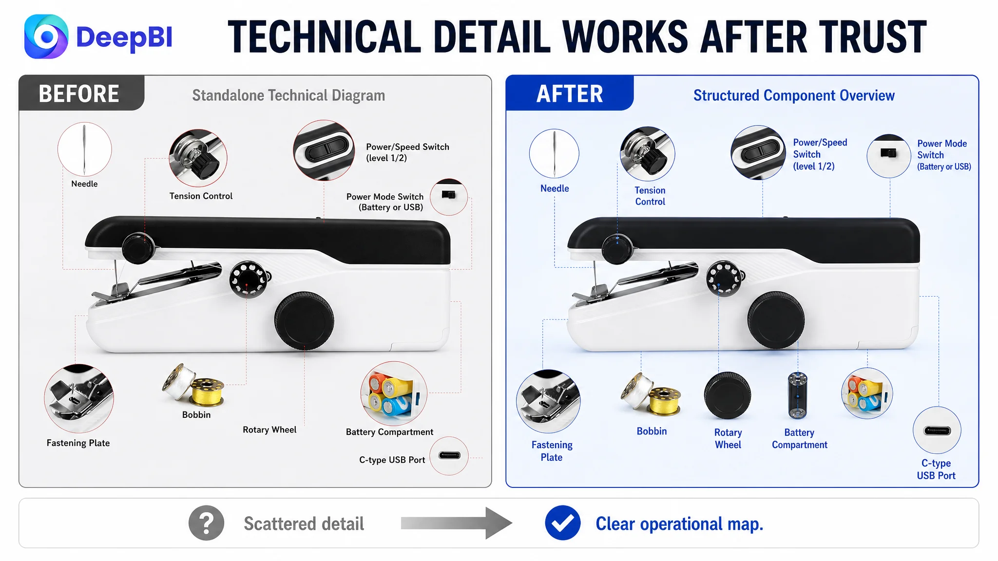
DeepBI’s recommended detail-page path was therefore organized around risk reduction.
Start with capability, not power warnings
The first module should establish that the machine is compact, user-friendly, and suitable for quick repairs. Power options should not dominate the opening because the buyer first needs to believe the product can perform the intended task.
Prove material suitability early
Fabric compatibility should be shown through direct visual examples, including lighter fabric and denim, while clearly communicating the 1.8 mm thickness limit.
This is stronger than leaving suitability buried in a later image or a general claim.
Reduce setup anxiety
Threading and basic operation should be demonstrated after relevance has been established. The existing threading visualization can be used here, but it should support a broader message: the product is manageable for a first-time user.
Show the complete control system
The two speed modes, USB connection, battery option, and other visible controls should be presented together in a clear functional diagram. This gives the buyer an operational map rather than scattered feature references.
Address stitch durability concerns
The included accessories should become part of a practical tutorial. A step-by-step knotting or thread-securing visual can address the fear that the stitch will unravel after the user finishes sewing.
This is a more valuable use of the accessories than simply displaying them in a kit photograph.
Place precautions after confidence is built
Usage reminders—such as selecting the correct power mode, cutting thread properly, and practicing on the test cloth—should appear after the product’s core capability and ease of use have been established.
Precautions are useful. Introduced too early, they can make the product feel complicated.
End with creative and practical applications
Only after functional questions have been answered should the page conclude with examples such as clothing repair, crafts, DIY projects, toys, or pet apparel. Inspiration works best when it follows proof.
Why DeepBI Did Not Recommend More Ad Tuning First
There was no evidence in this case that campaign restructuring, bid changes, or keyword expansion could repair the central weakness.
The Listing’s score pattern showed that the page was already relatively strong in the areas most closely associated with search entry:
- The title was slightly ahead of the benchmark.
- The bullet points were slightly ahead of the benchmark.
- The main image had a smaller gap than the detail page.
The severe deficit was in the part of the Amazon product page responsible for deeper evaluation and trust.
That created a clear decision order:
1. Repair the page’s core sales logic.
2. Make the product easier to understand visually.
3. Address material, setup, and durability concerns.
4. Then evaluate whether additional traffic can be converted more effectively.
Continuing to push traffic toward the existing page would risk amplifying its weaknesses. More shoppers might arrive, but they would still encounter an incomplete explanation of how the product works and why it is safe to buy.
Advertising can bring a shopper to the product page. It cannot substitute for the product page’s missing proof.
This does not mean Amazon ads are unimportant. It means ads should not be treated as the first answer when the page has not yet demonstrated conversion readiness.
The Business Change Was a Change in Diagnosis
The most important outcome of this case was not a claimed percentage increase in CVR or a promised decline in ACOS. The source material does not provide verified post-optimization performance data, so no numerical result should be invented.
The meaningful change was the shift in operating understanding.
The team could stop treating the Listing as a bundle of isolated assets and start treating it as a conversion system:
- The title creates search recognition.
- The main image creates an initial reason to click.
- The bullet points connect features to practical outcomes.
- A+ content removes uncertainty.
- Reviews and visual trust elements support the final decision.
- Ads become more useful when the page can convert the traffic they generate.
The target Listing did not need every element rewritten before progress could begin. It needed the largest constraint addressed first.
That constraint was the missing trust and explanation layer on the Amazon product page.
What Other Amazon Sellers Can Take From This Case
A strong title cannot compensate for an empty detail experience. A complete accessory kit cannot compensate for unclear operation. A technical specification cannot compensate for a buyer who still doubts whether the product will work in practice.
For Amazon sellers, the more useful diagnostic questions are:
- Is the traffic problem really a search problem?
- Is the click problem really caused by the main image?
- Is the conversion problem being misread as an advertising problem?
- Does the Listing prove the product’s value before presenting its specifications?
- Are A+ modules answering the buyer’s practical concerns in the right order?
- Does each image have a distinct role in the decision path?
- Is the page ready for more traffic, or would more traffic simply expose the same weaknesses?
In this handheld sewing machine case, the answer was not to keep adding information. It was to reorganize the information around buyer confidence.
That is the deeper role of Amazon Listing diagnosis: not to produce a higher score for its own sake, but to identify which missing layer is preventing the page from converting the attention it already has.
Before an Amazon seller scales ads, the Listing must earn the right to receive more traffic.