


This case involved an Amazon US seller whose kids’ solar system water bottle Listing appeared stronger in several visible areas. Its title placed the core search term more effectively, its five bullet points connected features with school and sports use, and its product offered a clear functional difference through a 2-in-1 lid. Yet the Listing still fell well behind a comparable high-performing product page in overall conversion readiness.
The initial optimization direction leaned toward keywords, feature wording, and repeated image adjustments. That approach assumed the page mainly needed sharper communication. DeepBI’s diagnosis showed a more fundamental issue: the product page lacked the visual story and trust structure needed to turn parent traffic into a purchase decision. The largest gaps were not in keyword coverage alone, but in the detail-page experience and review foundation.
The later optimization therefore focused on rebuilding the Amazon product page in the correct order: establish school and activity relevance, demonstrate the 2-in-1 lid, make safety and leakproof claims easier to verify, visualize insulation and construction, and use A+ content to connect the product’s functional and educational value. The broader lesson for Amazon sellers is clear: a Listing can contain good selling points and still fail if those points are not organized into a credible path to purchase.
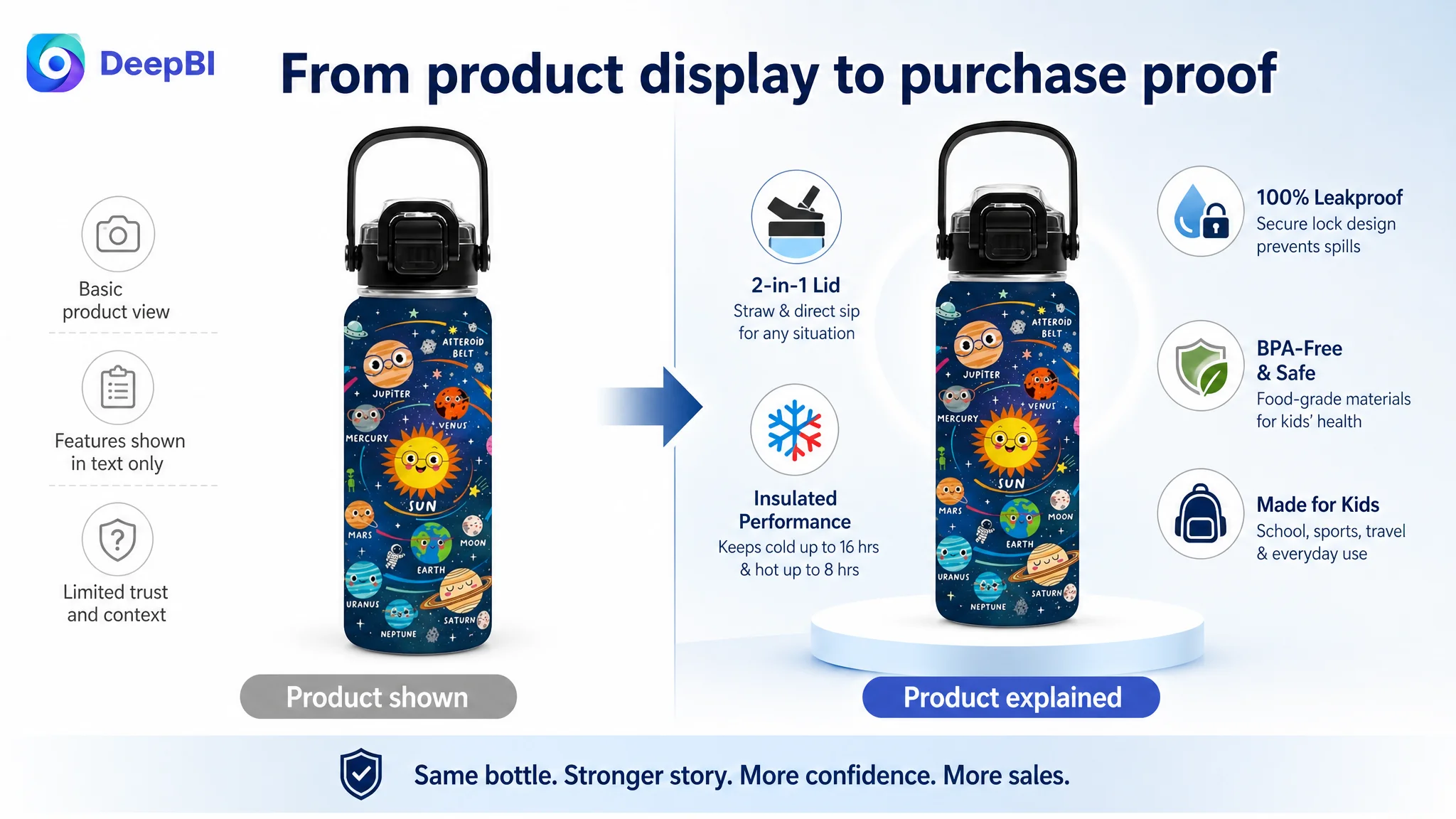
The Listing Looked Better in Some Places—and Still Lost Overall
The seller’s Listing received an overall score of 61 out of 100, compared with 76 for a comparable category competitor.
At first glance, the score gap was not explained by every part of the Listing. In fact, the customer’s title and bullet points performed relatively well in the comparison:
- Title: Customer Listing: 15/20, Comparable Listing: 12/20
- Main image: Customer Listing: 24/30, Comparable Listing: 25/30
- Bullet points: Customer Listing: 8/10, Comparable Listing: 4/10
- Detail page: Customer Listing: 14/25, Comparable Listing: 22/25
- Reviews: Customer Listing: 0/15, Comparable Listing: 13/15
- Total: Customer Listing: 61/100, Comparable Listing: 76/100
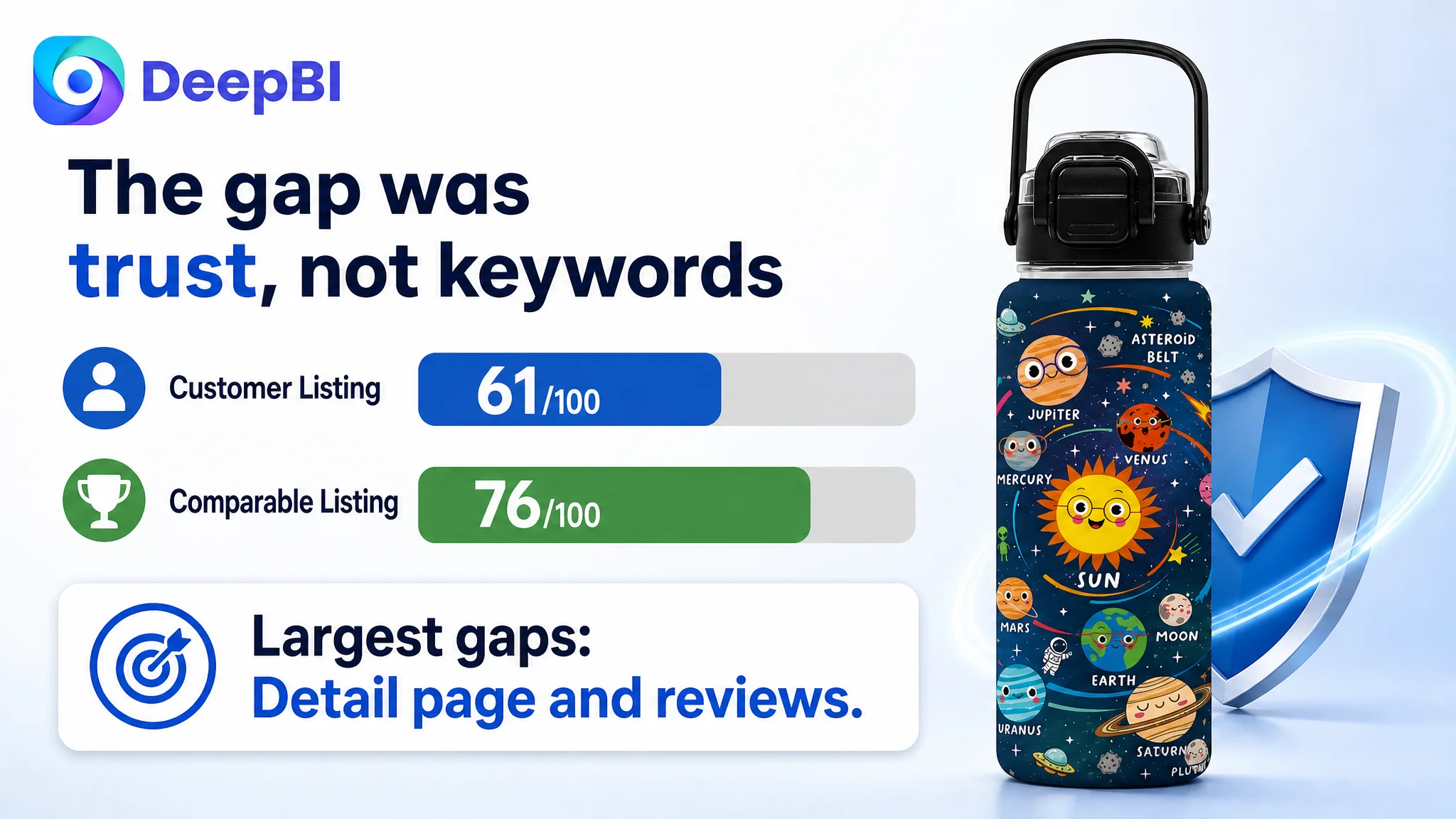
This created a misleading operating signal.
The title already included relevant terms such as “Kids Insulated Stainless Steel Water Bottle,” “Solar System Space,” “Leakproof,” and “BPA-Free.” The bullet points also described school use, the 2-in-1 lid, leakproof protection, insulation, and the space-themed gift angle.
The team could reasonably conclude that the Listing only needed more keyword refinement, more polished copy, or another round of image editing.
But the score distribution told a different story.
The Listing did not primarily lack selling points. It lacked enough evidence and structure to make those selling points believable.
The largest weakness was the detail-page dimension, where the Listing trailed by eight points. The review dimension created an even larger trust gap: the customer Listing had no reviews or rating data, while the comparable page showed a 4.7-star rating, hundreds of reviews, and a visible library of photo and video feedback.
That difference changed the diagnosis completely.
The Initial Direction Focused on Communication Before Trust
The customer’s existing optimization direction concentrated on areas that were relatively easy to edit:
- Moving core keywords forward in the title
- Adding more product attributes
- Describing the 2-in-1 lid
- Repeating leakproof, BPA-free, and insulation claims
- Showing multiple product patterns
- Explaining features through flat product images
These actions were not wrong in isolation. The title did need to balance search relevance with readability. The bullet points did need to communicate the product’s actual advantages. The product also had legitimate strengths, including:
- An 18-ounce capacity
- A solar system theme
- A 2-in-1 straw and direct-sip lid
- Up to 16 hours of cold retention
- Up to 8 hours of heat retention
- BPA-free, food-grade materials
- A wide-mouth design
- A built-in carry handle
The problem was that the page treated these strengths mainly as information.
It did not consistently turn them into a decision sequence for the buyer.
For a children’s water bottle, the purchaser is often a parent evaluating several practical questions at once:
- Will it fit in a backpack or cup holder?
- Will it leak inside a school bag?
- Is it safe and easy to clean?
- Can a child use the lid without help?
- Will the bottle survive daily handling?
- Is the insulation claim credible?
- Does the design feel suitable for school, sports, or gifting?
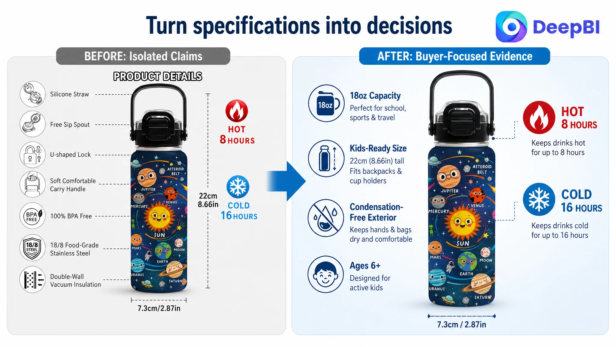
The existing page answered some of these questions in text, but did not provide enough visual proof. It also displayed six product images as flat product layouts, without a clear school, sports, or travel context.
The Listing was communicating features. The competitor was communicating how the product fits into a child’s life.
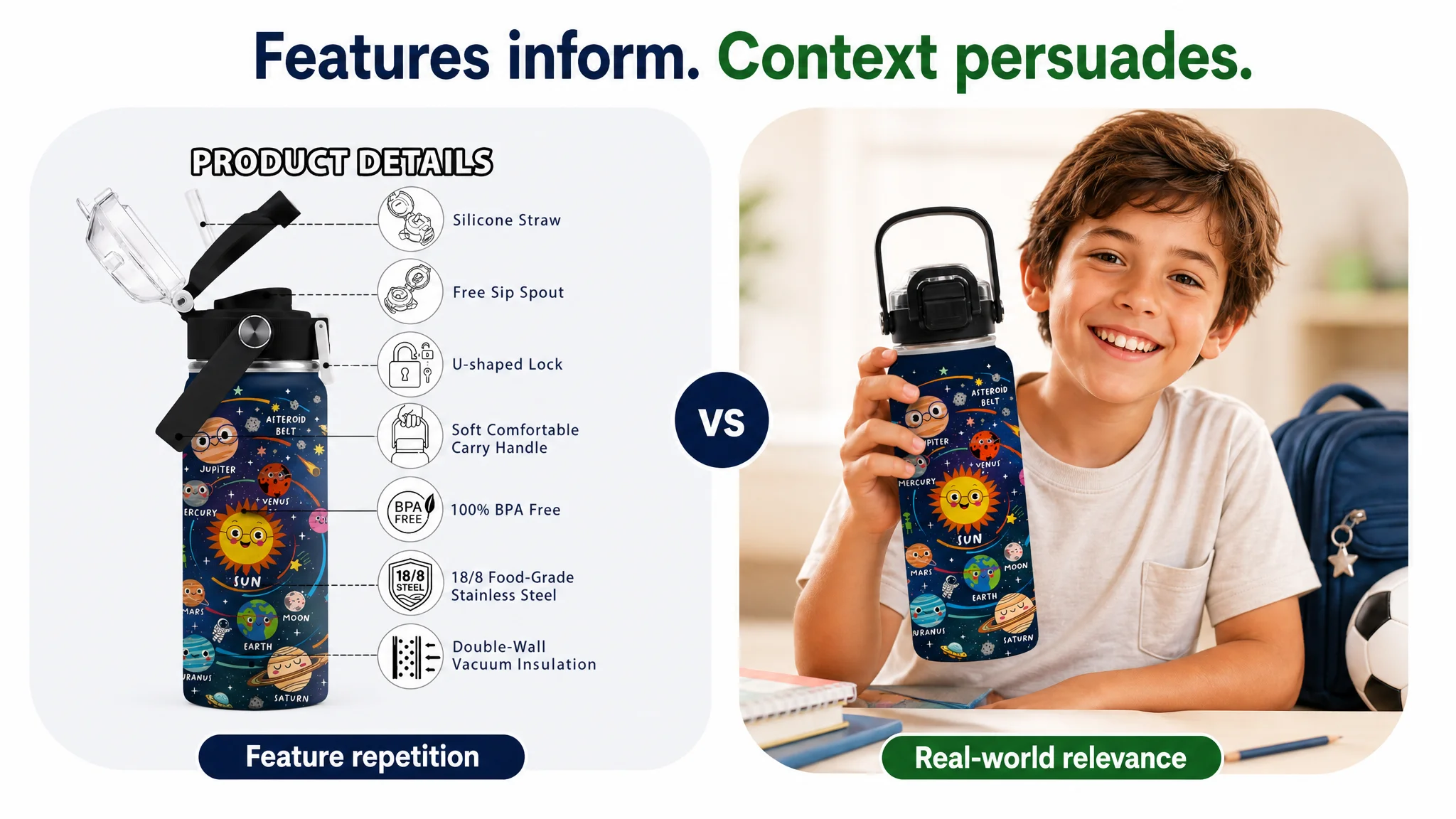
The Main Constraint Was Listing Conversion Capacity
DeepBI’s comparison showed that the page’s central constraint was not simply weak traffic attraction. It was insufficient Listing conversion capacity.
The title and bullets could help the product appear in relevant searches and explain its advantages after the click. But the detail-page experience was not strong enough to carry the buyer from interest to confidence.
Several gaps reinforced one another.
The page showed the product, but not the reason to choose it
The customer’s images relied heavily on product-only layouts. They presented the bottle and its patterns, but offered limited evidence of how it works in real use.
The comparable Listing used wider lifestyle scenes involving outdoor activity, sports, bags, and chilled drinks. Those images communicated several ideas without requiring the shopper to read every word:
- The bottle belongs in an active child’s routine
- It is suitable for school and outdoor use
- It can be carried easily
- It is associated with cold, refreshing drinks
- Its construction is intended for everyday handling
The customer’s solar system theme had emotional and educational potential, but the page did not build that potential into a complete visual story.
The images repeated information instead of advancing the decision
Several images repeated the lid modes or general features without adding a new layer of proof.
That weakened the browsing sequence. A shopper should be able to move through the image gallery and answer a different question at each stage:
1. What is the product and who is it for?
2. Will it fit the child’s daily routine?
3. How does the lid work?
4. Is it safe and leakproof?
5. How long does it keep drinks cold?
6. Can it withstand daily use?
7. Why is this a better gift or activity companion?
The customer’s gallery did not consistently follow that progression. It had information, but not enough decision architecture.
A+ content was not carrying the trust burden
The most consequential page-level gap was the absence of meaningful A+ content.
Without A+, the Listing had no dedicated space to explain or demonstrate:
- Material construction
- Insulation performance
- Safety and maintenance
- Size and fit
- The 2-in-1 lid
- School and sports scenarios
- The educational value of the solar system theme
- Why the product is suitable as a gift
This forced the title, bullet points, and basic image gallery to do too much work.
For a product purchased by parents for children, that is a serious limitation. The buyer is not only comparing appearance. They are assessing risk, usability, and durability. A+ content is where those concerns can be addressed in a more deliberate visual sequence.
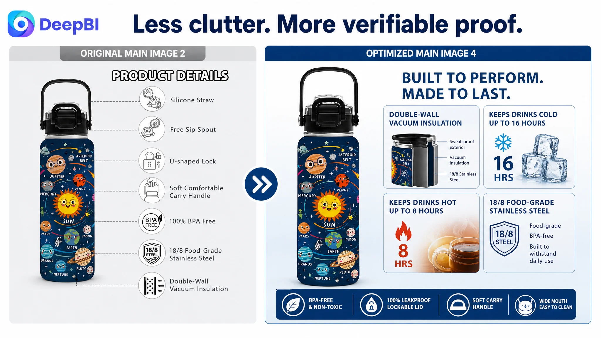
Why DeepBI Did Not Keep Tuning the Ads or Keywords First
There was no evidence in the case material that the product needed an endless cycle of bid changes or keyword expansion before the page was repaired.
The more important question was whether additional traffic would produce a better business outcome on the existing page.
If an Amazon Listing receives more paid traffic while its detail page lacks sufficient trust and visual proof, advertising can amplify the weakness rather than solve it. More impressions may create more clicks, but the product page still has to answer the buyer’s questions before the order is placed.
Advertising does not only amplify a product’s strengths. It can also amplify the consequences of an unconvincing product page.
That is why DeepBI prioritized Listing conversion capacity before treating traffic expansion as the main answer.
The decision order was commercially important:
- First, clarify what the product is and who it serves
- Then, show how it fits school, sports, and travel use
- Next, demonstrate the lid, safety, leakproof protection, and insulation
- Then, build confidence through construction details and A+ content
- Finally, let paid and organic traffic work against a more complete buying argument
This did not mean ignoring Amazon search relevance or ad performance. The title still needed to be structured around the product’s strongest search terms. But search optimization was not allowed to substitute for conversion logic.
The Title Was Not the Main Problem—but It Still Needed Discipline
The title was one of the customer Listing’s stronger dimensions. It placed “Kids Insulated Stainless Steel Water Bottle” near the front and included the solar system theme, size, lid type, leakproof positioning, and school and sports use.
The improvement was therefore not about adding more words. It was about reducing repetition and making the hierarchy easier to read:
Kids Insulated Stainless Steel Water Bottle with Straw Lid, 18oz Solar System Space Water Bottle for Boys Girls, Leakproof 2-in-1 Lid, BPA-Free for School Sports Travel
This structure gives the title a clearer order:
- Core product and material
- Theme and audience
- Capacity
- Functional difference
- Safety and usage context
The title could support discovery and set expectations, but it could not by itself establish the trust that was missing lower on the page.
The Bullet Points Had Stronger Logic Than the Images
The customer’s bullet points were also a relative strength. Unlike the comparable Listing, which relied more heavily on specifications, the customer’s copy connected features with use cases and emotional value.
The optimization was to make that logic easier to follow and more directly tied to parent concerns.
School fit before broad feature claims
The first bullet should establish the solar system theme while confirming practical size and fit:
- 18-ounce capacity
- Approximate height and width
- Backpack side-pocket compatibility
- Lunch bag and cup-holder use
- School and travel relevance
This reduces uncertainty before the shopper evaluates more technical claims.
The 2-in-1 lid as the clearest product difference
The dual-function lid was a genuine differentiator and deserved a more prominent role.
The straw mode could be connected with younger children and daycare use, while the direct-sip mode could be connected with quick hydration during sports or outdoor activities. That turns a structural feature into a reason to prefer this bottle over a simpler alternative.
Leakproof and safety claims require visible proof
“100% Leakproof” and “BPA-Free” are important claims, but unsupported claims can sound interchangeable across the category.
The page needed to show:
- The push-button lock
- The lid structure
- Food-grade components
- The wide mouth
- Cleaning access
- A direct leakproof demonstration
The goal was not to make the wording louder. It was to make the claim easier to verify.
Insulation needed to be tied to daily use
The 16-hour cold and 8-hour hot claims were stronger than the comparable Listing’s stated 12-hour cold-retention claim. But a numerical advantage matters only when shoppers can understand its relevance.
The page should connect insulation with:
- School-day use
- Sports and outdoor activities
- A sweat-free exterior
- A dry grip for children
- Ice filling through the wide mouth
This is where performance data becomes a practical benefit rather than an isolated specification.
The Image Sequence Needed to Follow Buyer Questions
DeepBI’s recommendations did not call for more decorative images. They called for a more purposeful sequence.
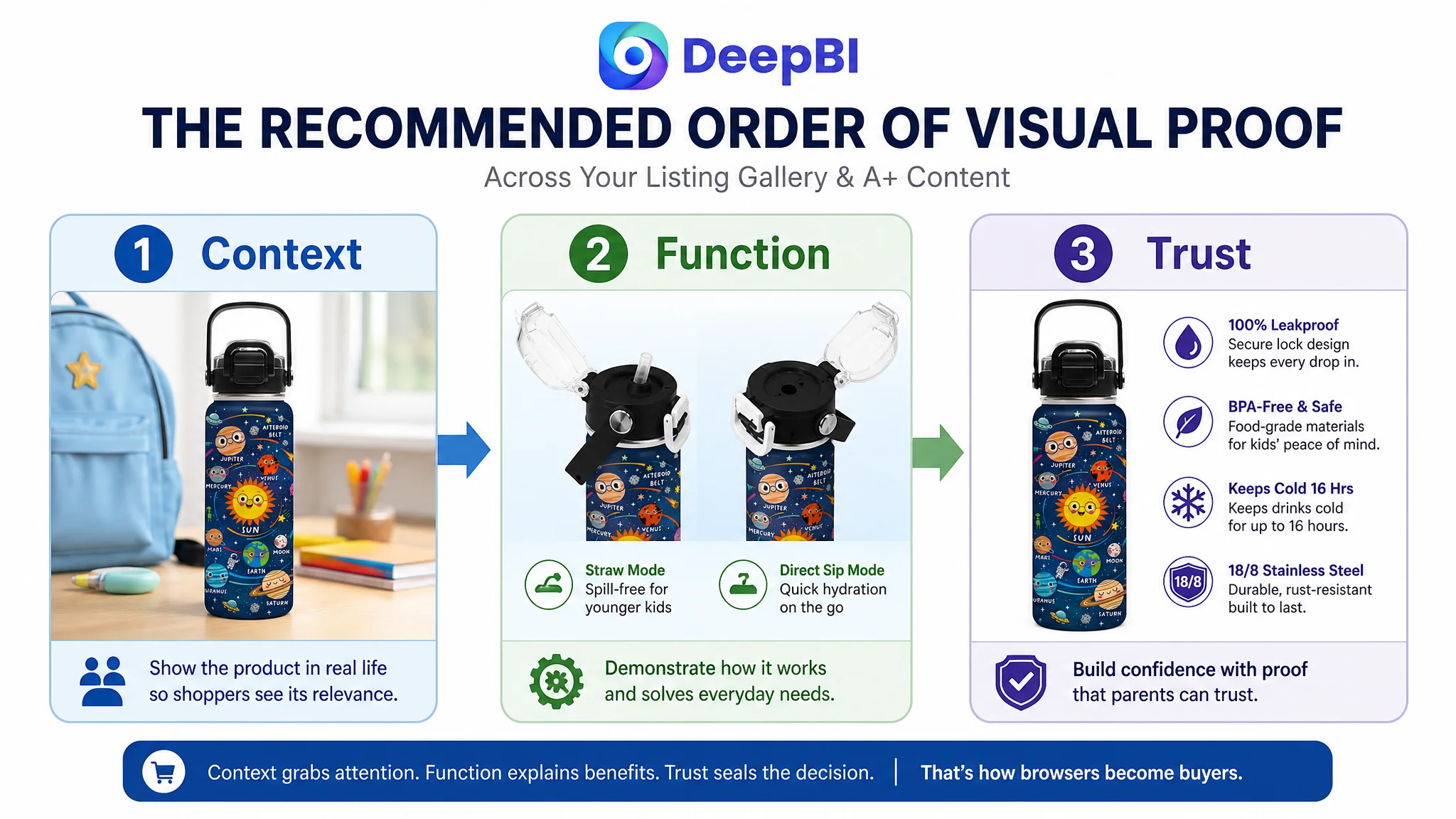
Start with relevance
The first supporting image should place the bottle in a realistic child-centered setting, such as a school backpack or sports environment. The purpose is to establish immediate relevance after the compliant Amazon main image.
The solar system design, 18-ounce size, and carry handle should be visible within that context.
Then demonstrate the lid
The next image should clearly show the 2-in-1 lid and the two drinking modes. It should focus on how the product works, rather than repeating the same feature in another layout.
Address safety and maintenance
The following image should make the parent’s practical concerns easier to resolve:
- BPA-free materials
- Food-safe construction
- Leakproof protection
- Wide-mouth access
- Cleaning convenience
Where applicable, claims such as dishwasher safety should only be included when confirmed for the actual product.
Make insulation visible
Cold drinks, ice, or condensation-control cues can help translate the insulation claim into visual evidence. The image should communicate the stated performance without implying unsupported results.
Show construction and durability
An exploded or clearly structured product diagram can help explain the bottle’s components, double-wall vacuum insulation, and stainless-steel construction. This is more persuasive than simply repeating “durable” in another text block.
End with scale and emotional value
A real-world child-handling image can help shoppers assess size and portability. The solar system theme can then be connected with curiosity, science interest, and gifting without allowing the emotional message to replace functional proof.
A+ Content Was the Missing Layer of Persuasion
The most important change was to use A+ content as a structured continuation of the product page—not as a collection of additional product images.
The recommended sequence was:
1. Lifestyle introduction
Show the bottle in school, sports, or travel settings.
2. 2-in-1 lid demonstration
Explain the straw and direct-sip modes through real product use.
3. Safety and maintenance
Present leakproof construction, BPA-free materials, food-safe components, and cleaning access.
4. Insulation performance
Visualize cold and hot retention using product-accurate cues.
5. Build quality
Show stainless-steel construction, double-wall insulation, sweat-free handling, and everyday durability.
6. Solar system identity
Use the labeled planets, stars, and astronauts to support educational and emotional differentiation.
7. Purchase reassurance
Summarize school, sports, travel, gifting, and daily hydration suitability.
This follows a more natural buyer journey:
See the context → understand the function → resolve the risk → verify the performance → recognize the difference → feel confident purchasing.
Reviews Were a Structural Trust Gap, Not a Copy Problem
The review dimension could not be solved through title or image editing.
The customer Listing had no review count, no star rating, and no visible customer feedback. The comparable page had a mature review base, a 4.7-star rating, hundreds of reviews, and visible photo and video contributions.
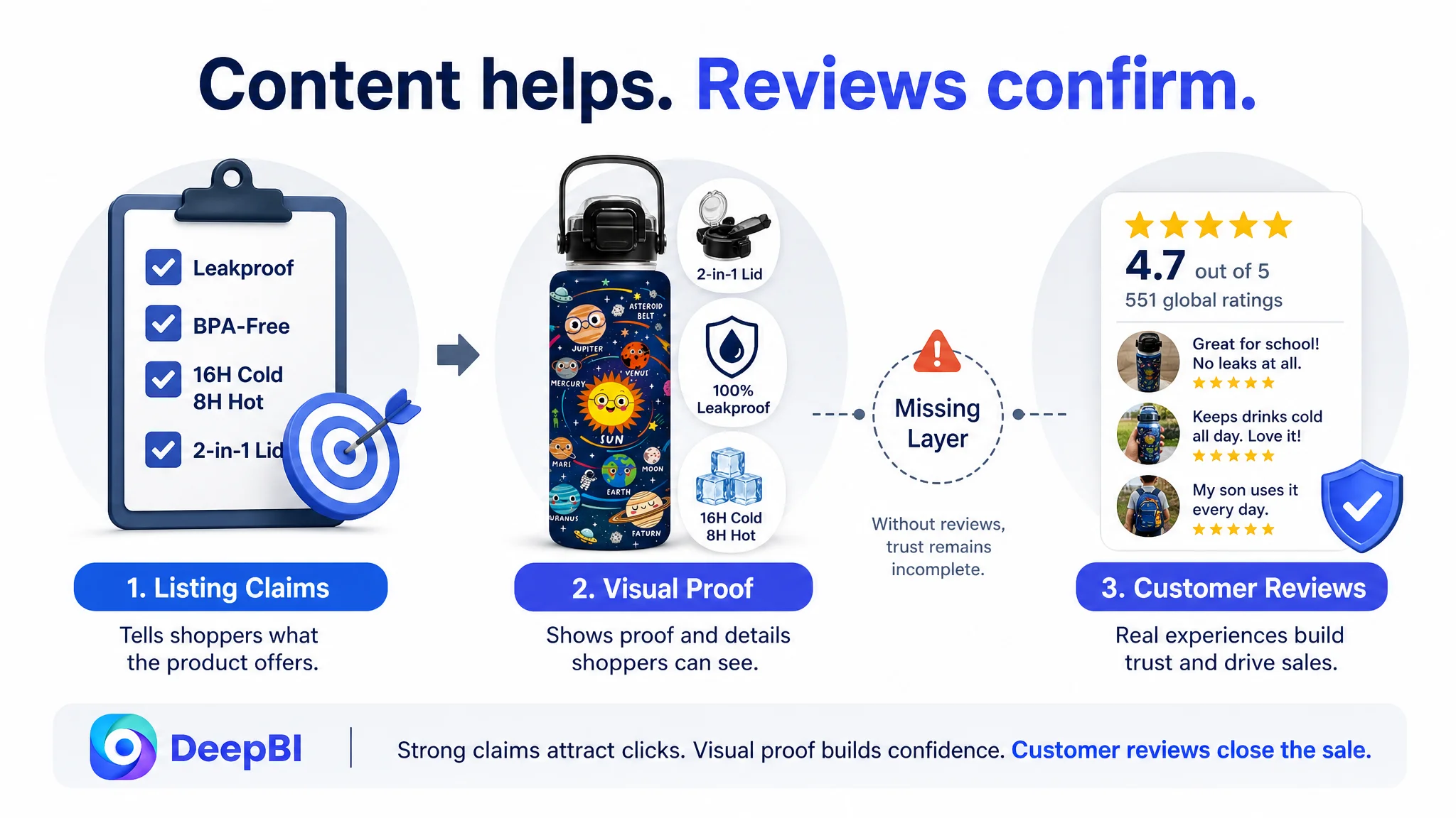
That gap affected the entire page. Even strong claims about leakproof performance, insulation, safety, or durability were being presented without customer evidence.
DeepBI therefore treated reviews as a structural risk in the Listing diagnosis, not as a reason to keep polishing copy indefinitely. The page needed to become more convincing through content while the product gradually built its own legitimate review foundation.
This distinction matters because sellers cannot design their way out of every trust problem. They can, however, avoid making the problem worse by sending more traffic to a page with no supporting proof.
The Operating Understanding Changed
The case did not end with a claim of guaranteed sales improvement. The source material does not provide post-optimization CVR, ACOS, TACOS, organic-order, or keyword-ranking results.
What changed was the business diagnosis and the order of decisions.
The seller could now separate three different questions:
- Can Amazon shoppers find the product?
The title and keyword structure addressed this relatively well.
- Will shoppers understand the product’s practical advantages?
The bullet points and image sequence needed clearer prioritization.
- Will shoppers trust the product enough to purchase it?
The detail page, A+ content, visual proof, and review foundation were the critical gaps.
That reframing prevented the team from treating every weak business outcome as an advertising or keyword problem.
Before scaling Amazon traffic, the seller had to determine whether the product page had earned the right to receive more of it.
For this kids’ solar system water bottle, the answer was not yet strong enough. The product had real differentiators, but those differentiators were not working together across the Amazon Listing.
The priority was therefore to repair the page’s sales logic: make the product relevant, make its functions visible, make its claims credible, and give parents enough evidence to move from interest to confidence.
That is the deeper lesson from the case. On Amazon, a better title may help win the click. A stronger product page determines whether the click has a chance to become an order.