


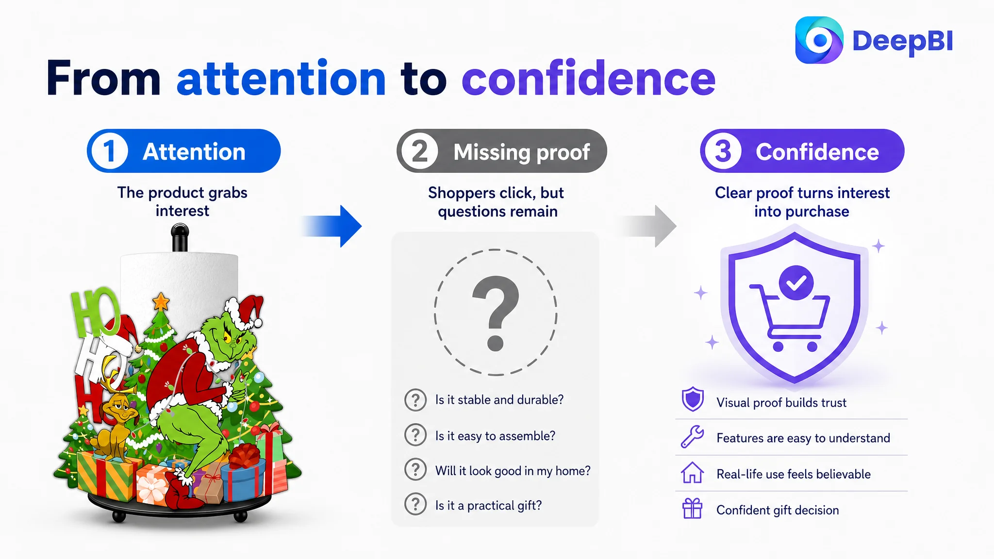
An Amazon seller selling a holiday-themed metal paper towel holder was facing a familiar product-page problem: the Listing had a clear product concept, but its sales logic was not strong enough to turn attention into confidence. The initial discussion naturally centered on images, title wording, and functional descriptions—the visible elements that seemed easiest to adjust.
But the deeper comparison told a different story. The Listing’s main-image and bullet-point scores were already ahead of the benchmark in the diagnostic review. The largest gap was not basic product visibility. It was the product page’s ability to provide visual trust, functional proof, and a convincing reason to buy.
DeepBI ultimately reframed the case as an Amazon Listing conversion problem rather than a simple creative problem. The later optimization focused on rebuilding the page in sequence: reassure shoppers that assembly is easy, prove that the holder is stable and practical, place it in believable home and holiday settings, and use A+ content to connect decoration, daily use, and gifting. Other Amazon sellers can learn from the case that traffic and product appeal are not enough; each page module must help the buyer move from interest to confidence.
The Amazon Listing looked more complete than it actually was
At first glance, this product page had several strengths.
The product had a distinctive holiday character design, a clear use case, and a natural gifting angle. Its bullet points did more than list specifications: they addressed problems such as tipping, roll replacement, one-handed tearing, and seasonal decoration. The main image also captured the product’s festive identity.
Yet the overall Listing score was only 48 out of 100, compared with 75 out of 100 for a comparable high-performing Amazon Listing.
That 27-point gap was not evenly distributed.
- Title: Target Listing: 13/20, Benchmark Listing: 16/20, Difference: -3
- Main images: Target Listing: 25/30, Benchmark Listing: 23/30, Difference: +2
- Bullet points: Target Listing: 7/10, Benchmark Listing: 5/10, Difference: +2
- Detail page and A+ content: Target Listing: 3/25, Benchmark Listing: 21/25, Difference: -18
- Reviews: Target Listing: 0/15, Benchmark Listing: 10/15, Difference: -10
- Total: Target Listing: 48/100, Benchmark Listing: 75/100, Difference: -27
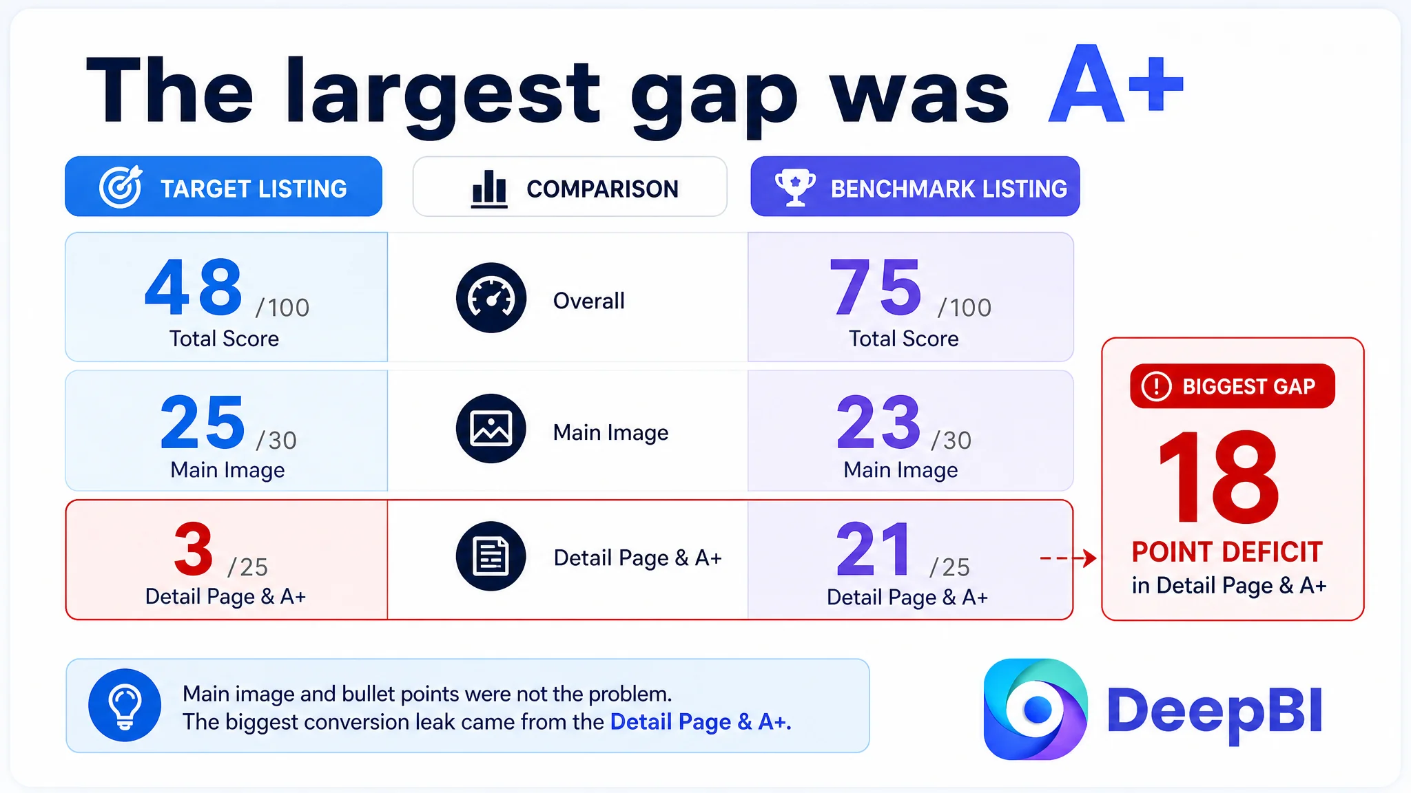
The score pattern mattered more than the total.
The target Listing was not losing primarily because shoppers could not understand what the product was. It was losing because the page did not provide enough evidence that the product would look good in a real home, remain stable during use, assemble without frustration, and work as a practical gift rather than a decorative novelty.
The main conversion leak was not a lack of product identity. It was a lack of proof after the shopper became interested.
The first diagnosis focused on visible creative problems
The customer’s Listing contained several elements that could reasonably attract criticism.
The title gave early space to the brand name before fully concentrating the core search phrase. It used descriptive language such as holiday decoration and party accessory, but offered fewer concrete functional signals than the benchmark. The structure was also relatively loose, with keyword groups separated without forming a compact search-and-benefit chain.
The image sequence had its own weaknesses. The second image moved quickly into specifications such as the base and dimensions, while assembly reassurance appeared later. A later image repeated close-up assembly information rather than adding a new reason to purchase. The final image reinforced the gifting context, but did not sufficiently prove that the product would be convenient in daily use.
These issues made it easy to reach a familiar conclusion:
- the title needed more keyword work;
- the image sequence needed to look more polished;
- the page needed clearer specifications;
- perhaps the product needed more reviews before it could convert.
All of those observations contained some truth. None explained the full business constraint.
The diagnostic scores showed that the main image and bullet points were not the weakest dimensions. Treating them as the primary problem would have led to more editing around the edges while leaving the largest gap untouched.
The real constraint was Listing conversion capacity
The decisive finding was the 3 out of 25 score for the detail page and A+ content.
The target Listing relied largely on text. It did not provide a structured visual story showing:
- how the holder looks in a real kitchen or bathroom;
- how the metal construction and weighted base support stability;
- how one-handed tearing works;
- how the top knob makes roll replacement easier;
- how the product fits into a holiday gathering;
- why the item is practical as well as decorative;
- where else it can be used beyond the kitchen.
The benchmark Listing, by contrast, used its detail content as a sequence of evidence. It showed styled home environments, material and structural details, use cases, and seasonal settings. Its A+ content did not merely repeat the bullet points. It gave the claims a visual context.
This distinction is particularly important for a decorative household accessory.
A shopper may like the holiday design immediately, but still hesitate:
- Will it look as good on my countertop as it does in the thumbnail?
- Will it tip when I tear a sheet with one hand?
- Is the metal structure substantial or lightweight?
- Is assembly actually simple?
- Is this a useful gift, or just a seasonal decoration?
The page had answers in text, but not enough visual proof.
A strong main image cannot carry the entire sale
The main image score was 25 out of 30, two points above the benchmark. That result changed the optimization order.
The first image was already doing an important job: it established the product category and communicated the whimsical holiday character. It created attention within a narrow seasonal niche. Replacing its identity with a completely different visual direction would have risked removing the product’s strongest emotional hook.
The problem was not that the image failed to attract attention. The problem was that the following sequence did not convert that attention into reassurance efficiently.
Assembly reassurance needed to move forward
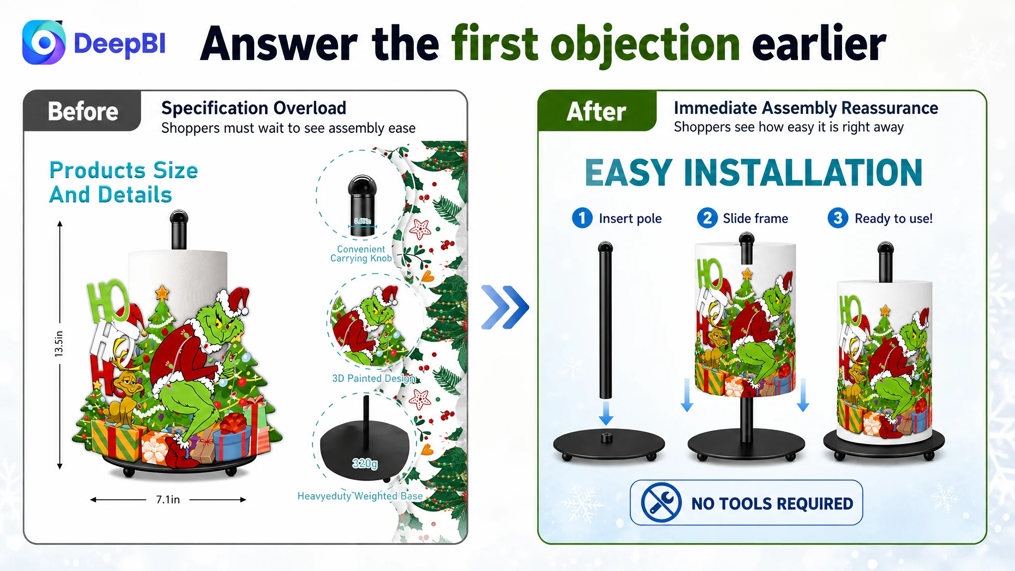
The second image prioritized specifications and structural information. Those details were useful, but they did not address the most immediate operational objection.
A buyer who is considering a countertop holder may first want to know whether it will be difficult to assemble. The recommended sequence therefore moved assembly reassurance into the second image position, using a concise, easy-to-scan diagram rather than a specification-sheet treatment.
The goal was not to add more information. It was to answer the right question earlier.
Repetition needed to become functional proof
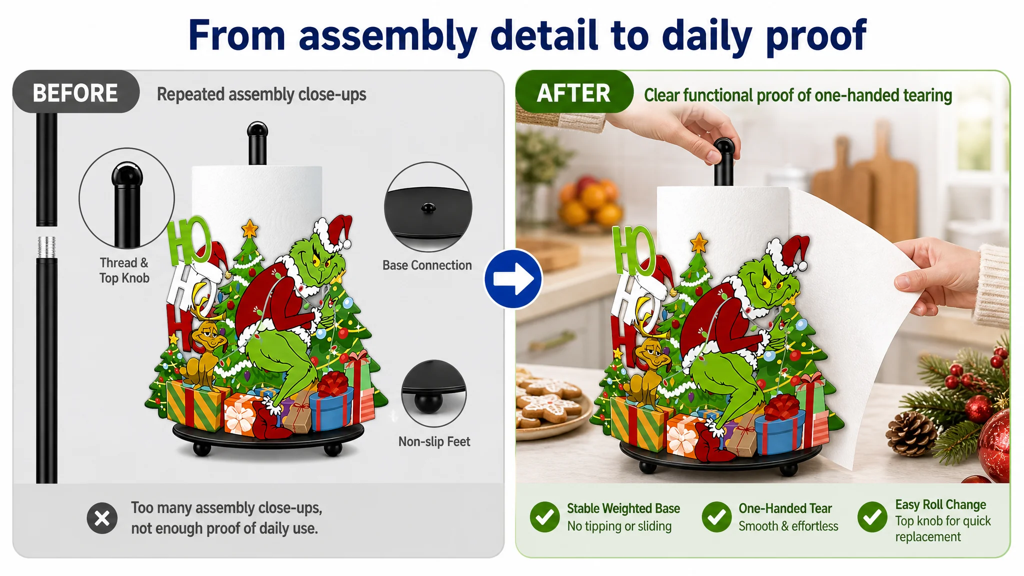
The existing sequence used multiple images to explain similar fixing and assembly mechanics. That created informational waste. The repeated close-ups did not materially advance the buyer’s decision once the assembly process had been explained.
The replacement direction used that position for a missing proof point: a real demonstration of stable, one-handed tearing. This was important because a holiday gift still has to work after it is unwrapped.
For a functional gift, emotional appeal opens the decision. Practical proof closes it.
The gift scene needed to carry both emotion and utility
The gifting image remained valuable because holiday decoration was central to the product’s positioning. But it needed to include a functional cue, such as a hand stabilizing the top knob while tearing a paper towel in a festive cooking environment.
That small change connected two previously separate arguments:
- this product looks appropriate as a holiday gift;
- this product will not become frustrating to use after the gift is received.
The title needed a tighter search-to-benefit chain
The title gap was smaller than the A+ gap, but it still affected both search relevance and click quality.
The existing title placed the core phrase after the opening brand term and relied heavily on broad descriptive language. It did not make the product’s physical and functional distinction clear enough at the beginning.
The revised direction placed the product identity and primary search phrase earlier, then connected it to concrete benefits and contexts:
- metal countertop paper towel holder;
- holiday or whimsical home decor;
- weighted base;
- kitchen and bathroom use;
- gift positioning.
This was not a matter of filling the title with more keywords. It was a matter of creating a cleaner semantic chain:
product form → functional reassurance → style and setting → gifting context
The benchmark title also demonstrated the value of concrete attributes such as a weighted base, a specific design pattern, and identifiable recipient groups. Those details make the result more legible to both Amazon search and shoppers scanning the results page.
The target Listing did not need to imitate the benchmark’s wording. It needed to make its own product’s strongest facts easier to find.
The bullet points had a better foundation than the page showed
The bullet-point score was 7 out of 10, ahead of the benchmark’s 5 out of 10.
That was an important counter-signal. The target Listing’s bullets already contained several conversion-oriented ideas:
- a holiday character design;
- a problem-to-solution structure around tipping and roll replacement;
- one-handed operation;
- multiple usage settings;
- a gifting angle.
The issue was not that the bullets lacked commercial intent. The issue was that the detail page did not provide enough visual support for those claims.
The optimization therefore focused on making the copy more specific and easier to validate rather than replacing its basic strategy.
From decorative description to a clear use case
The holiday design could be positioned as more than a novelty by connecting it to a real countertop, dining area, bathroom, or gathering. The product becomes easier to understand when the copy shows where it belongs and what role it plays.
From material mention to ownership reassurance
A metal construction and protective coating should be connected to daily use in humid kitchen or bathroom environments. The buyer is not only asking what the holder is made of. They are judging whether it will remain useful and presentable over time.
From function claim to operating evidence
“Easy to use” is weaker than showing the sequence:
1. place the roll on the pole;
2. secure it with the top knob;
3. tear with one hand;
4. replace the roll without complicated hardware.
The page needed to make that sequence visible.
From generic gift language to identifiable occasions
The gifting message became more concrete when connected to housewarmings, holiday gatherings, White Elephant exchanges, family, friends, or coworkers who enjoy seasonal decor.
That does not create a new product benefit. It gives the existing benefit a more recognizable buying situation.
A+ content had to become the missing trust layer
The most significant change was not an isolated image replacement. It was the reconstruction of the detail page as a visual sales argument.
The proposed A+ structure followed the buyer’s decision sequence.
First: establish aesthetic trust
The product should appear in a genuine home setting with flowers, fruit, dining elements, or other tasteful decor. This helps the shopper judge whether the holiday character can integrate into a real home rather than looking like a standalone novelty.
Second: prove material and stability
A focused module should show the metal pole, the weighted base, and the countertop stance. The purpose is to answer concerns about flimsy construction and tipping without relying on abstract claims.
Third: demonstrate daily operation
A visual sequence should show one-handed tearing and easy roll replacement through the top knob. This turns convenience from a promise into an observable action.
Fourth: validate the holiday role
A detailed holiday party or dining setup should show how the holder functions as a festive centerpiece or decor accent. This gives the seasonal positioning a believable environment.
Fifth: confirm usage boundaries
Additional scenes in a bathroom, dining area, or other suitable countertop environment can demonstrate versatility. The page should show where the product works, not merely list several locations.
Sixth: address ownership concerns
A durability-focused module should connect the protective surface and metal construction to repeated daily use and moisture exposure. This gives the buyer a reason to believe the product will remain useful after the holiday season.
Seventh: close on the gifting decision
The final module should bring the emotional and practical arguments together: a fun, functional holiday gift for people who enjoy distinctive seasonal home decor.
This sequence is more persuasive than repeating the same feature in different layouts because each module resolves a different hesitation.
Why reviews were not the first optimization target
The review gap was real.
The target Listing had no rating data and no customer reviews on the homepage. The benchmark had 161 reviews, a 4.0-star rating, and 13 reviews visible on the first page. Even with several lower-rated reviews among those visible, the overall volume provided a level of market validation that a new or lightly reviewed Listing could not immediately reproduce.
That made reviews a trust disadvantage, but not necessarily the first controllable lever.
Reviews accumulate through customer experience and time. A+ content, image sequencing, title structure, and bullet clarity can be improved more directly. When a Listing has no review history, the page must work harder in other ways to reduce perceived risk.
That means the page needs stronger visual honesty and functional transparency, not louder claims.
It must show:
- what the product looks like in a real environment;
- how it is assembled;
- how it behaves during use;
- what materials and structural features are visible;
- why the product is worth gifting.
The absence of reviews cannot be solved by design alone. But weak page proof can make the absence of reviews even more damaging.
Why DeepBI did not recommend tuning ads first
The case did not point to an advertising bid problem as the primary constraint.
When the largest score deficit sits in the detail page and A+ content, sending more paid traffic to the existing page risks amplifying the wrong outcome. More impressions may create more clicks, but shoppers can still abandon the page when they encounter unanswered questions about quality, stability, assembly, and practical use.
That is why the decision order mattered:
1. preserve the product’s strongest attention hook;
2. repair the page’s missing trust and usage proof;
3. tighten the title and supporting copy;
4. then evaluate whether additional Amazon ad traffic is being converted efficiently.
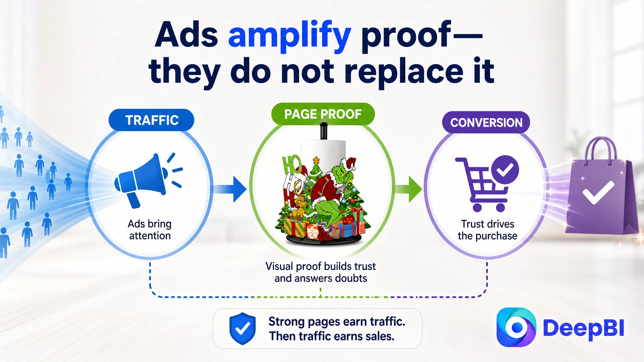
This does not mean ads are unimportant. It means ads should not be asked to compensate for a page that has not yet earned the traffic.
Advertising can amplify demand, but it cannot replace the product-page evidence that turns demand into an order.
The later optimization direction was a page-level reset
The recommended change was therefore broader than “make the images better.”
It was a reset of the Listing’s sales logic:
- keep the distinctive holiday character as the attention anchor;
- move assembly reassurance earlier;
- remove repetitive mechanical close-ups;
- add visible proof of one-handed tearing and stability;
- strengthen the title with earlier product and function signals;
- make the bullets more specific around durability, usage, and gifting;
- build A+ modules around aesthetics, structure, operation, occasions, versatility, durability, and gifting;
- use realistic home and holiday scenes to establish visual trust.
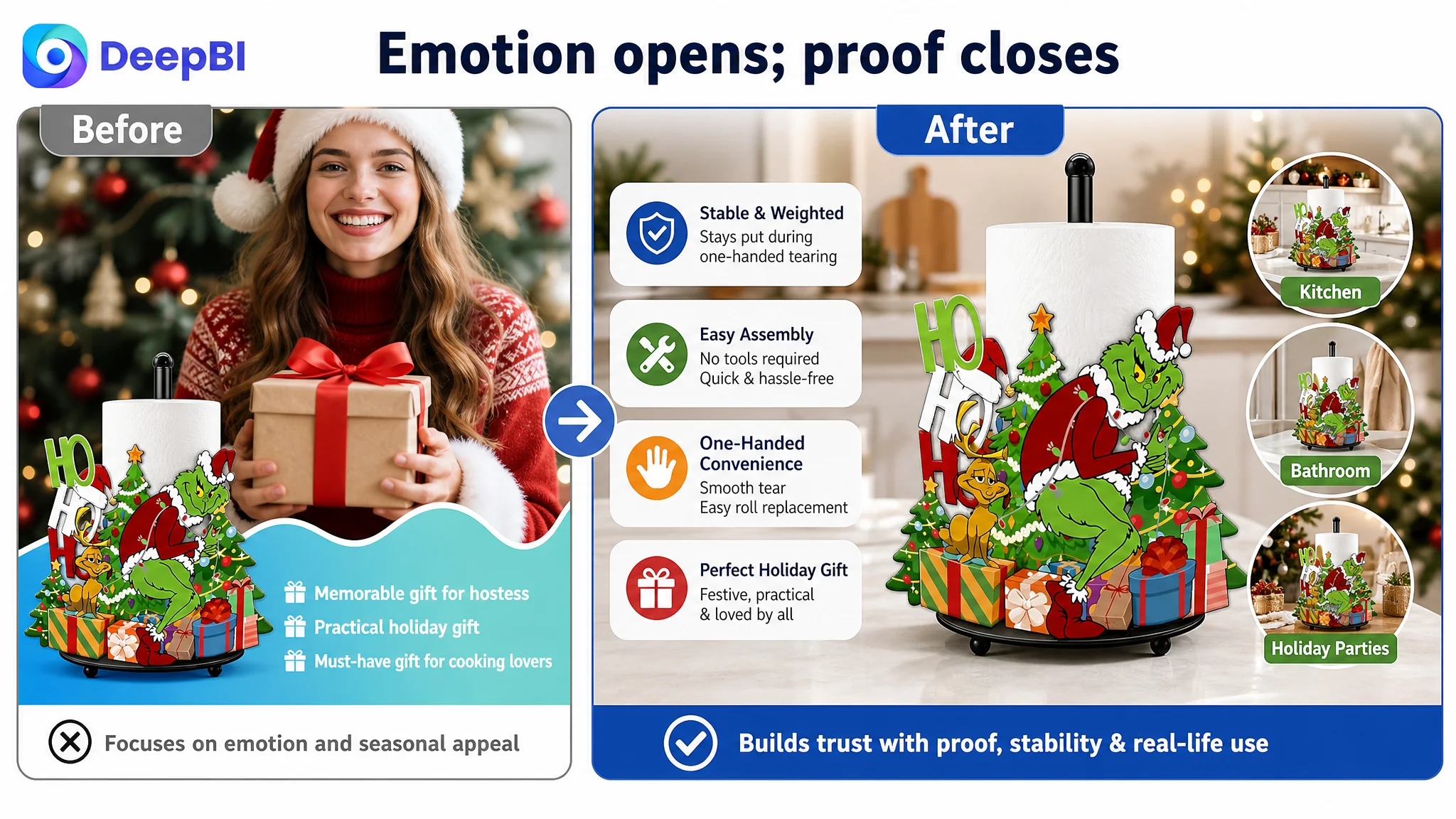
No unsupported post-optimization metrics are claimed in this case. The material does not provide confirmed changes in CVR, ACOS, organic orders, or advertising dependence.
What can be judged clearly is the operating direction. The Listing moved from a page that mainly described a festive paper towel holder toward one designed to answer the buyer’s complete decision:
Will it look good? Will it work reliably? Will it be easy to use? Is it suitable for gifting?
What Amazon sellers should take from this case
A Listing can have a recognizable product, a decent main image, and reasonably strong bullet points while still carrying a serious conversion risk.
The key is to compare dimensions rather than react to the most visible creative issue.
In this case, the main image was not the lowest-scoring area. The bullet points were not the lowest-scoring area. The largest weakness was the missing visual explanation layer between shopper interest and purchase confidence.
That leads to several practical judgments:
- A high-quality main image cannot compensate for weak A+ content.
- A functional claim is stronger when the page demonstrates it.
- Reviews matter, but controllable page assets should not wait for review volume to improve.
- A product positioned as a gift still needs rational proof of daily usability.
- Redundant images consume valuable decision space.
- Title optimization should connect search relevance with concrete product benefits.
- Amazon ads should be scaled only after the Listing can responsibly receive more traffic.
The customer initially had reasons to keep looking at titles, images, and advertising efficiency. DeepBI’s diagnosis changed the question.
The issue was not simply whether the product could attract attention.
It was whether the Amazon product page gave that attention enough evidence to become trust—and whether the page deserved more traffic before that evidence was in place.