

An Amazon seller in the US dog travel accessories category was facing a product-page conversion problem. The Listing described materials, dimensions, installation, and basic protection features, but its overall competitive score was only 49 out of 100, compared with 90 for a comparable high-performing Listing.
The initial direction was understandable: add more specifications, explain the product functions more clearly, and continue refining the Listing content. But that approach treated the page as an instruction sheet. DeepBI found that the deeper issue was not a lack of information. It was a lack of buying logic, visual proof, and trust-building structure—especially in the A+ content.
The later optimization therefore focused on the Amazon product page as a complete decision path: confirm vehicle fit, show the protection problem, explain the layered construction, demonstrate different use modes, reduce installation anxiety, and connect the product to real family and pet-travel scenarios. The case offers a practical lesson for Amazon sellers: before trying to scale traffic or polish isolated copy, determine whether the Listing is ready to convert the traffic it receives.
The Amazon Listing Had Product Information, but Not Enough Reasons to Buy
At first glance, the product page was not empty. It included the product name, size, material descriptions, protection claims, installation information, and package contents.
That created a common Amazon operating illusion: because the page contains information, it appears to be doing its job.
But shoppers do not evaluate a Listing by counting how many facts it contains. They move through a sequence of questions:
- Will this fit my vehicle?
- Will it protect the seat from hair, dirt, liquid, and scratches?
- Will it stay in place while driving?
- Can a passenger or child safety seat still use the back seat?
- Is it difficult to install or clean?
- Does the product look reliable enough to justify the purchase?
The page answered some of these questions in separate fragments. It did not connect them into a convincing decision path.
The core problem was not missing product facts. It was the missing connection between buyer concern, product solution, and visible proof.
That distinction mattered because Amazon traffic becomes expensive when a Listing receives attention but leaves too much work for the shopper.
The Working Assumption Was “Explain the Product Better”
The original content direction leaned toward product attributes: material, measurements, protection functions, applicable vehicles, installation steps, and package contents.
That approach is not wrong. It is simply incomplete for a product that depends heavily on fit, trust, and use context.
A dog car seat cover is not purchased only because it is made from Oxford cloth or has a certain width. The buyer is imagining a messy back seat, a moving dog, a family trip, a child safety seat, and the risk of damaging the vehicle interior.
The high-performing comparison Listing started from those concerns. Its content was organized around compatibility, waterproof and scratch-resistant protection, multiple configurations, installation, cleaning, and family use. The customer Listing was closer to a functional description.
This was the original misdiagnosis: the page was treated as if clearer specifications alone would resolve conversion resistance.
The more important question was whether the page made the product’s value immediately understandable.
The Score Gap Showed Where the Page Was Losing Conviction
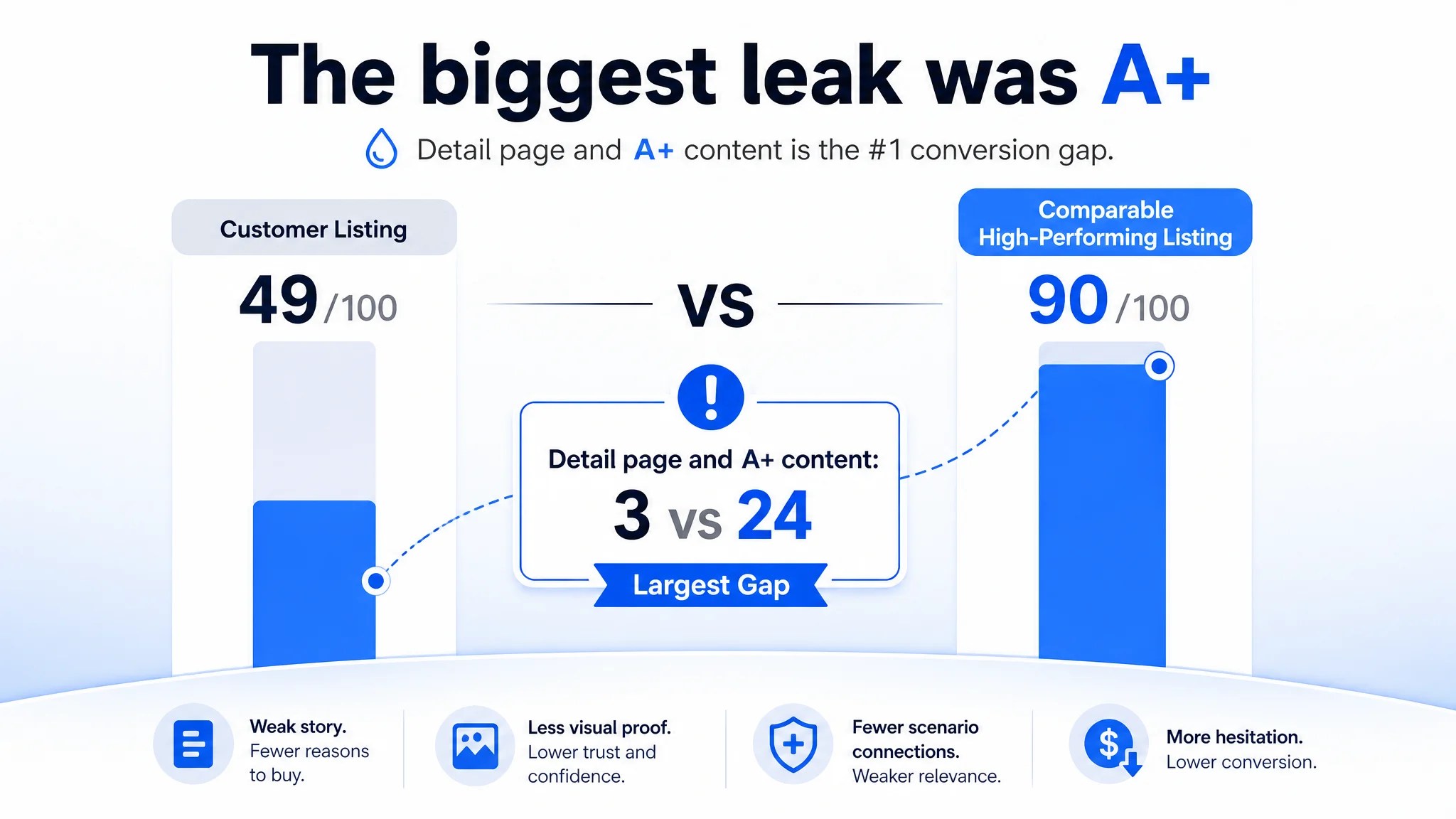
DeepBI’s comparison did not reduce the diagnosis to a general statement such as “the competitor looks better.” It quantified the difference across the major Amazon Listing dimensions.
- Title: Customer Listing: 16/20, Comparable high-performing Listing: 18/20, Gap: -2
- Main images: Customer Listing: 24/30, Comparable high-performing Listing: 27/30, Gap: -3
- Bullet points: Customer Listing: 5/10, Comparable high-performing Listing: 8/10, Gap: -3
- Detail page and A+ content: Customer Listing: 3/25, Comparable high-performing Listing: 24/25, Gap: -21
- Reviews: Customer Listing: 1/15, Comparable high-performing Listing: 13/15, Gap: -12
- Total: Customer Listing: 49/100, Comparable high-performing Listing: 90/100, Gap: -41
The largest gap was not in the title or main image. It was in the detail page and A+ content.
The Listing had no image-based A+ modules. Instead, it relied on repeated text describing specifications and functions. The comparison Listing used a much fuller structure: lifestyle scenes, problem-and-solution comparisons, multi-use configurations, installation visuals, material details, cleaning guidance, dimensions, and feature icons.
This made the priority clear. The page did not first need more advertising adjustments or more isolated wording changes. It needed a stronger conversion foundation.
The title needed sharper search and value communication
The customer title included relevant product terms and a distinctive safety-leash benefit, but the structure was long and leaned toward functional listing.
The recommended direction brought the product form, 600D Oxford material, waterproof and nonslip protection, safety leash, and vehicle compatibility into a more readable order. It also consolidated repeated phrases and retained vehicle types such as cars, SUVs, and trucks.
This was not keyword insertion for its own sake. The title had to perform two jobs at once:
1. Help Amazon understand the product and search context.
2. Help shoppers recognize the product’s relevance within seconds.
The safety leash was a useful differentiator, but placing it too late reduced its ability to contribute to the initial value impression.
The main image needed to answer “Can I picture this in my car?”
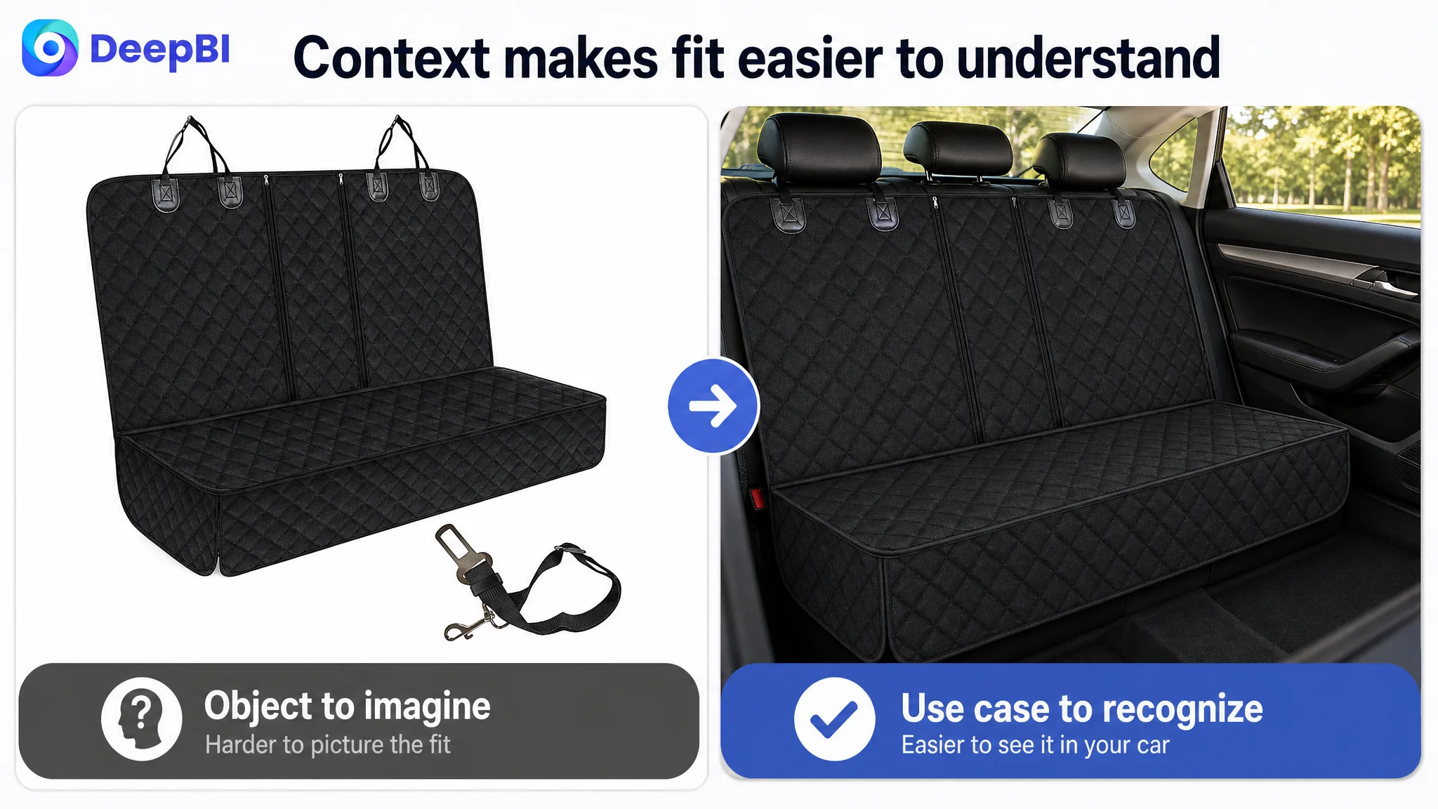
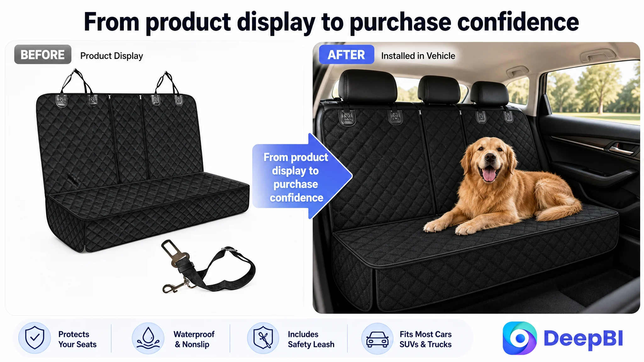
The customer’s first image used a clean product presentation, but it lacked an environmental anchor. A shopper had to mentally place the cover inside a vehicle before understanding how it would look in use.
The comparison Listing showed the product from an installed back-seat perspective. That made the use case immediately recognizable.
The recommended visual direction was therefore not simply “make the image more attractive.” It was to make the image more commercially informative:
- Show the cover installed in a general vehicle back seat.
- Establish the product’s presence and fit in context.
- Keep the core product visually dominant.
- Move attention away from the leash as an opening distraction.
- Add vehicle-type cues in the dimensions visual for SUVs, sedans, and trucks.
- Use a material-layer diagram to support the 600D Oxford and nonslip construction claims.
- Show anchors, buckles, and nonslip backing to address stability concerns.
Each image should have had a distinct role in the buyer’s decision process rather than repeating the same general product view.
The Bullet Points Described Features, but Did Not Resolve Concerns
The five bullet points were another example of information without enough persuasion.
The customer Listing began with materials, dimensions, protection functions, applicable vehicles, installation, and package contents. The comparison Listing began with the concerns that commonly stop a purchase: fit, waterproofing, durability, flexibility, cleaning, and family compatibility.
That difference changed the reading experience.
A feature-first bullet may say what the product has. A concern-first bullet should make clear why that feature matters.
Fitment had to come before material detail
The first priority was compatibility. A recommended opening bullet connected the approximate 53-by-47-inch size with sedans, SUVs, and trucks, while also addressing compatibility with child safety seats.
That reduced the most immediate hesitation: whether the product would fit the buyer’s vehicle and household use.
The material story needed to become a protection system
Instead of presenting 600D Oxford cloth as a standalone specification, the revised structure grouped the material layers with their functional outcomes:
- Resistance to scratches and wear
- Protection from liquids
- Nonslip support
- A barrier against hair, dirt, and everyday mess
The point was not to make a stronger claim than the product could support. It was to make the existing construction easier to understand as a complete protection system.
The four-in-one value needed visible explanation
The product’s zipper design and flexible configuration were not yet developed into a clear value proposition.
The revised direction connected the design to practical modes: full bench coverage, passenger-friendly use, compatibility with child safety seats, and broader travel use. This helped move the product beyond “a cover for a dog” toward “a flexible back-seat solution for pet-owning families.”
Installation and cleaning had to reduce ownership anxiety
A buyer may hesitate not because the product seems ineffective, but because it appears inconvenient.
The revised content made the installation sequence explicit: attach the buckles to the headrests and insert the seat anchors into the seat gaps. It also described cleaning through practical methods such as wiping, vacuuming, and machine washing where supported by the product material and use instructions.
These details mattered because they removed friction after the purchase decision had already begun.
The A+ Gap Was the Real Conversion Leak
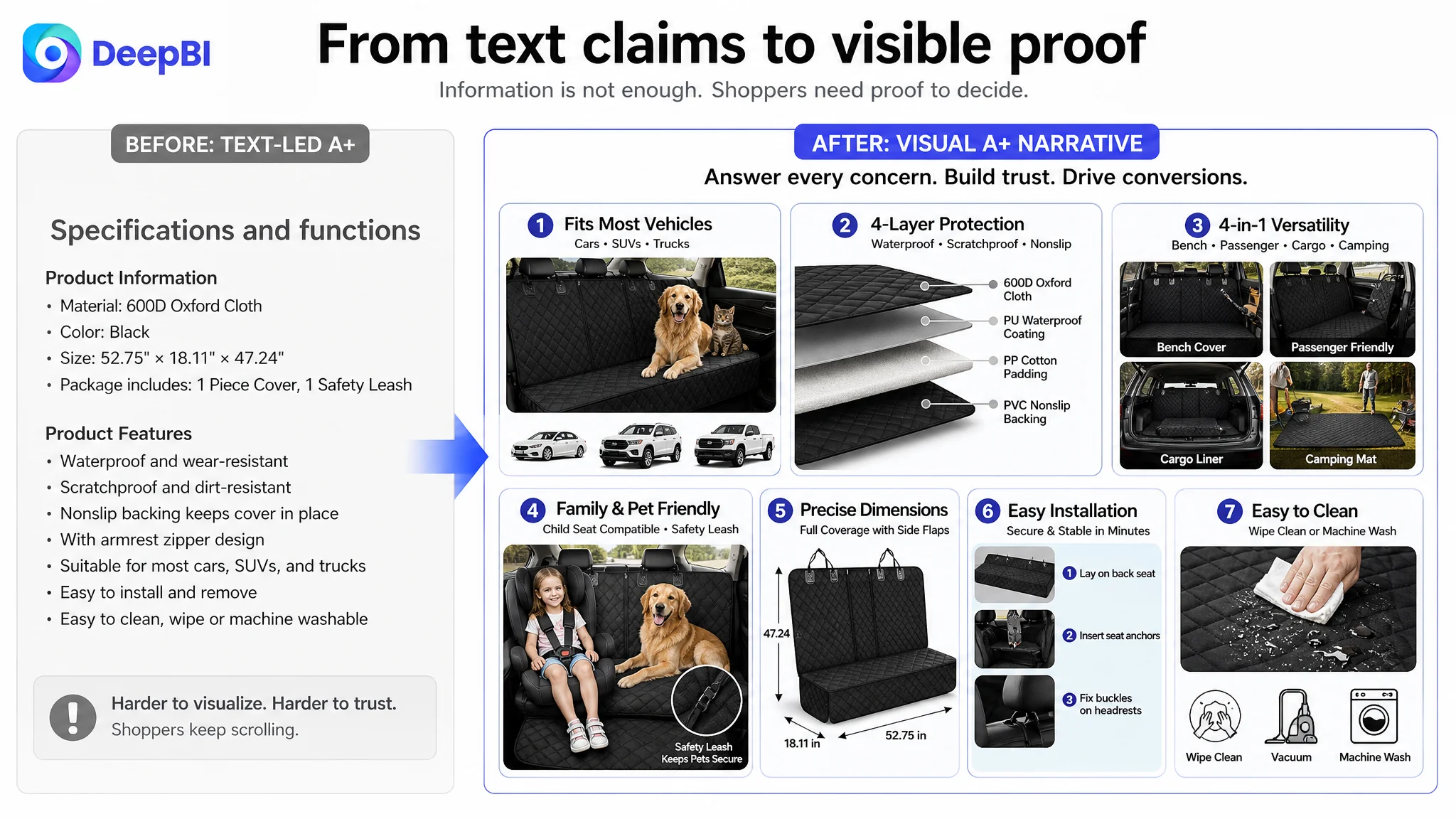
The 21-point gap in the detail-page dimension was the clearest signal in the diagnosis.
The customer’s A+ area had no image modules. That left the product relying on text to communicate durability, fit, safety, versatility, and cleaning. A shopper could read the claims, but could not easily see the product solving a real problem.
The comparison Listing used a sequence much closer to how people make a purchase decision:
1. Show the travel and vehicle context.
2. Visualize the mess and damage a back seat may experience.
3. Present the cover as the solution.
4. Explain the layered construction.
5. Demonstrate the different configurations.
6. Confirm child-seat and passenger compatibility.
7. Clarify dimensions.
8. Show installation and cleaning.
This was the point at which DeepBI reframed the problem. The customer did not merely need more A+ content. The page needed an A+ narrative.
The first module had to establish fit and use context
The opening visual should immediately communicate that the product belongs in a vehicle and is relevant to different vehicle types.
A happy travel scenario could establish emotional relevance, while fitment cues would provide practical reassurance. The two ideas needed to work together: “This is for my kind of trip” and “This should work in my kind of vehicle.”
The second module had to make the problem visible
Hair, liquids, crumbs, dust, and scratches are familiar concerns for pet owners. Showing the problem before presenting the protective solution would make the product’s role more concrete.
The purpose was not to exaggerate damage. It was to make the protection benefit visible rather than leaving it as a claim.
The third module had to prove versatility
The zipper and side-flap design could support several configurations. A visual breakdown would help shoppers understand how the same cover could adapt to a full bench, passenger use, or other travel arrangements.
Without this explanation, “multi-functional” remains an abstract label.
The later modules had to supply proof
The page also needed visual answers to the practical questions that often delay purchase:
- How does it stay in place?
- Where do the anchors go?
- How do the headrest buckles work?
- Can a child safety seat still be used?
- What are the exact dimensions?
- How is the cover cleaned?
This is where images, diagrams, and close-up details become more valuable than additional descriptive repetition.
A+ content was not decoration in this case. It was the missing layer between product claims and purchase confidence.
Reviews Were a Separate Trust Constraint
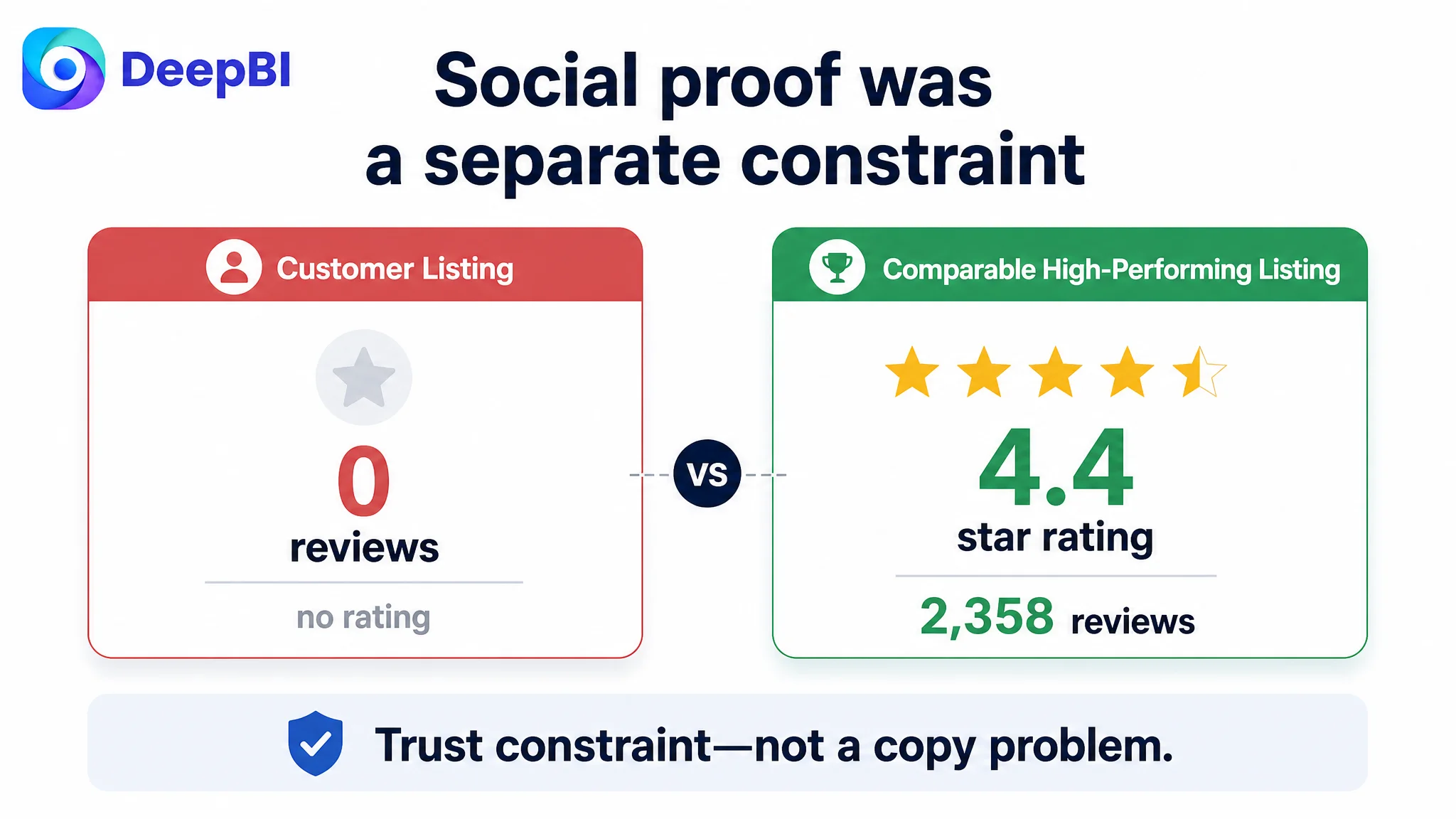
The Listing had no meaningful review foundation: no rating, no review count, and no customer comments on the first page.
The comparison Listing had a 4.4-star rating and 2,358 reviews, including visible customer feedback. That created a substantial trust advantage before the shopper evaluated the page content in detail.
Reviews could not be solved through copy or image restructuring alone. They represented a separate stage of marketplace validation. However, the absence of reviews made the Listing’s content weakness more serious. When social proof is limited, the page must work harder to provide clarity and credible evidence through fitment, materials, installation, use scenes, and transparent product details.
This is why the review gap was important to the diagnosis, but not the first optimization target. The page needed to strengthen every controllable trust signal while the product accumulated market feedback.
Why DeepBI Did Not Keep Tuning the Amazon Ads First
The available case material did not establish a specific post-optimization ACOS or CVR result, so the correct conclusion is not that advertising performance had already improved. The stronger conclusion is about decision order.
If a page has weak conversion logic, additional Amazon ad traffic can expose the weakness more quickly. Advertising may generate impressions and clicks, but it cannot make an unclear product page explain fitment, prove stability, or demonstrate multi-use value.
In this case, the page-level score made the risk visible:
- The title had a manageable structural gap.
- The main images needed stronger context and proof.
- The bullet points needed a concern-to-solution structure.
- The A+ content had the largest controllable gap.
- Reviews created an unavoidable trust disadvantage.
That evidence supported a Listing-first path.
The team should first repair the page’s ability to convert relevant traffic. Only then would advertising data become easier to interpret. A low conversion rate after a page rebuild would point to a different set of questions, such as traffic quality, offer competitiveness, or campaign targeting. Before the rebuild, those signals would be mixed with defects in the Listing itself.
The Optimization Was a Reordering of Business Logic
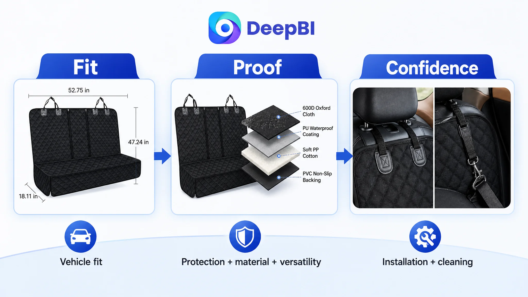
The recommended changes were not a collection of cosmetic edits. They reordered what the shopper needed to understand.
The revised Amazon product page was intended to move through this sequence:
Vehicle fit → protection problem → material proof → flexible use → family compatibility → installation → cleaning → purchase confidence
That sequence was more commercially useful than:
Material → size → function list → installation → package contents
Both structures contain facts. Only one follows the buyer’s decision path.
DeepBI’s role in the case was to identify that difference through structured comparison, then translate each gap into a concrete content or visual direction. For example:
- A weak fitment explanation became vehicle-type icons and clearer dimensions.
- A vague durability claim became a layered material diagram.
- An abstract versatility claim became configuration visuals.
- An installation concern became a step-by-step attachment diagram.
- A general protection statement became a before-and-after problem-and-solution module.
- An empty A+ area became a complete product-page narrative.
The important judgment was not that every image needed to be replaced. It was that every page element needed a defined role.
What Amazon Sellers Can Take From the Case
This dog car seat cover Listing illustrates a broader Amazon operating problem: a page can be technically complete and still commercially underdeveloped.
Several lessons stand out.
A low-conversion Listing is not always an advertising problem. When the page cannot carry trust and explanation, ads may only increase exposure to the weakness.
Specifications do not automatically create value. Size, material, and features become persuasive only when connected to a buyer concern and supported by clear evidence.
A+ content should follow the decision journey. Lifestyle scenes, pain-point visuals, material proof, fitment, installation, and maintenance should work as one narrative rather than as disconnected modules.
Main images and secondary images should have different jobs. The opening image should establish relevance and context. Later images should validate fit, construction, versatility, stability, and use.
Reviews matter, but they should not become an excuse to ignore controllable gaps. A new Listing may not yet have strong social proof, making page clarity and visual credibility even more important.
The right question before scaling Amazon ads is whether the page deserves more traffic. If the answer is not yet clear, Listing diagnosis should come before more aggressive traffic adjustments.
In this case, the real shift was from “add more product information” to “build a page that helps the shopper decide.” That is the difference between an Amazon Listing that describes a product and one that is prepared to convert relevant traffic.