

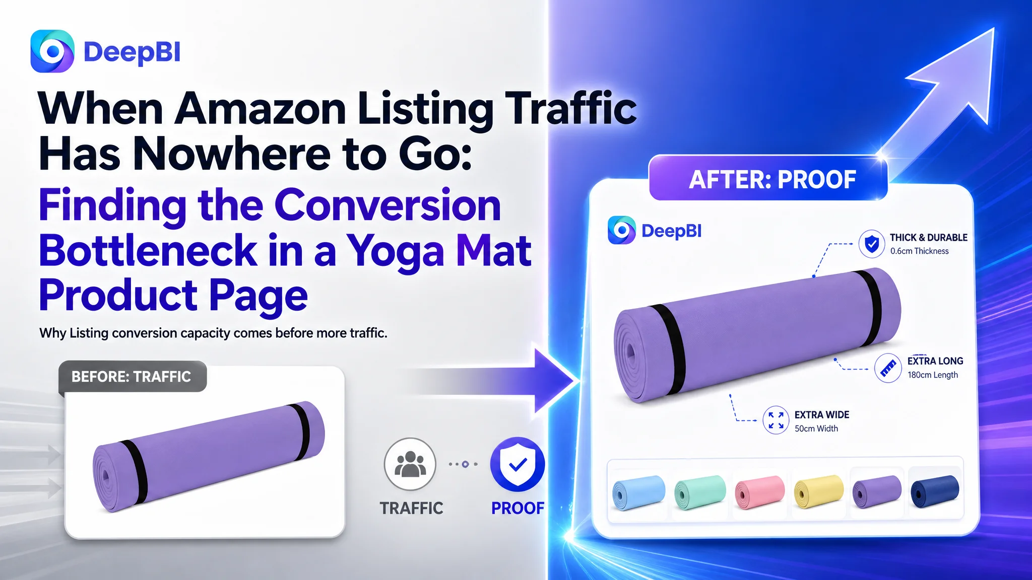
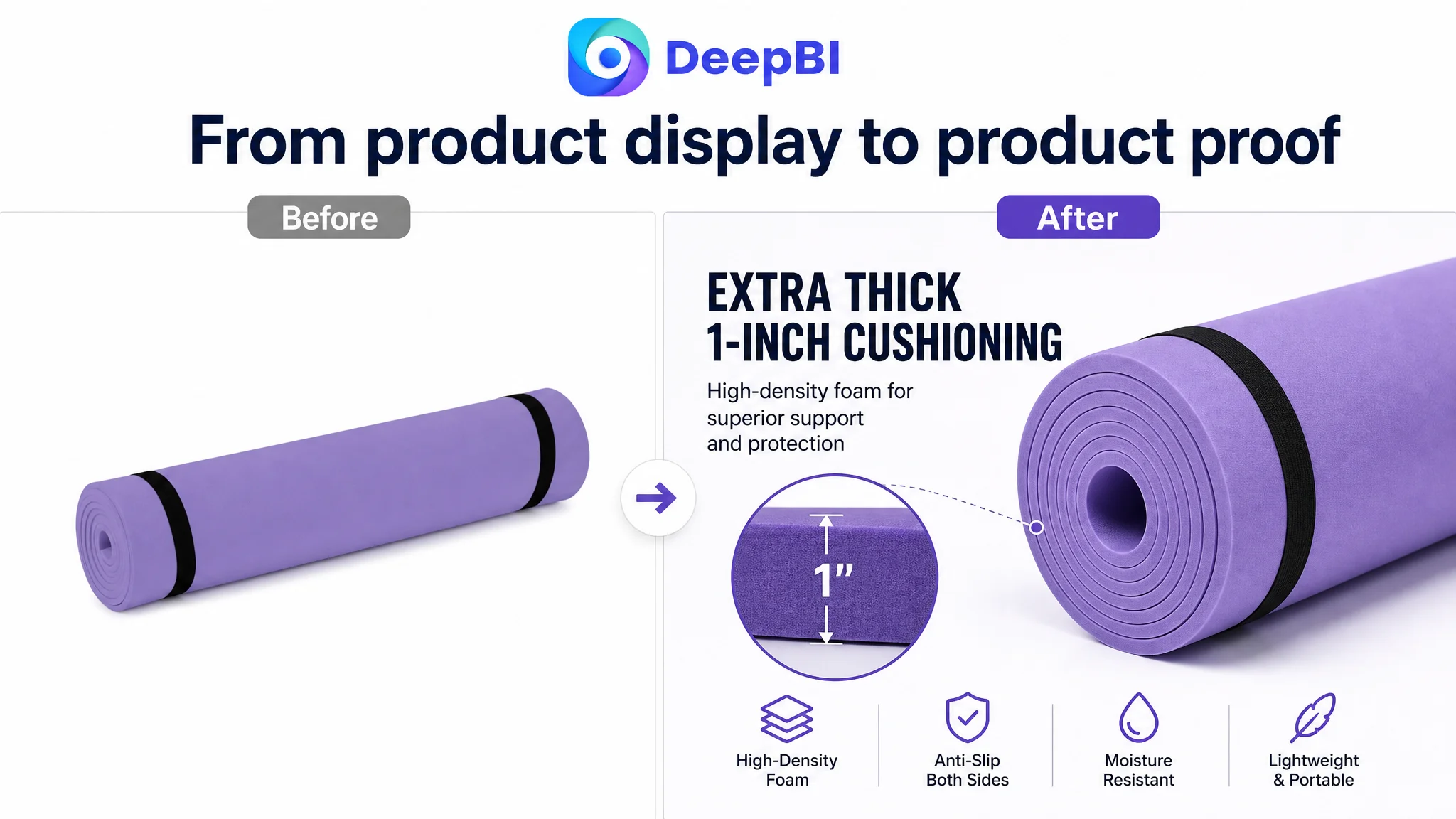
An Amazon seller in the fitness category was not facing a simple keyword or product-description issue. Its exercise mat Listing had a total competitiveness score of 44 out of 100, while a comparable high-performing Amazon Listing scored 90. The page could identify the product, but it did not communicate why the product deserved attention, trust, or purchase.
The initial optimization direction naturally leaned toward visible elements: adjust the title, improve the main images, add more specifications, and expand the usage scenarios. Those changes were necessary, but they did not explain the full size of the gap. The deeper issue was that the product page had almost no structured persuasion layer. Its A+ content contained no image modules, and the Listing had no review history to compensate for that weakness.
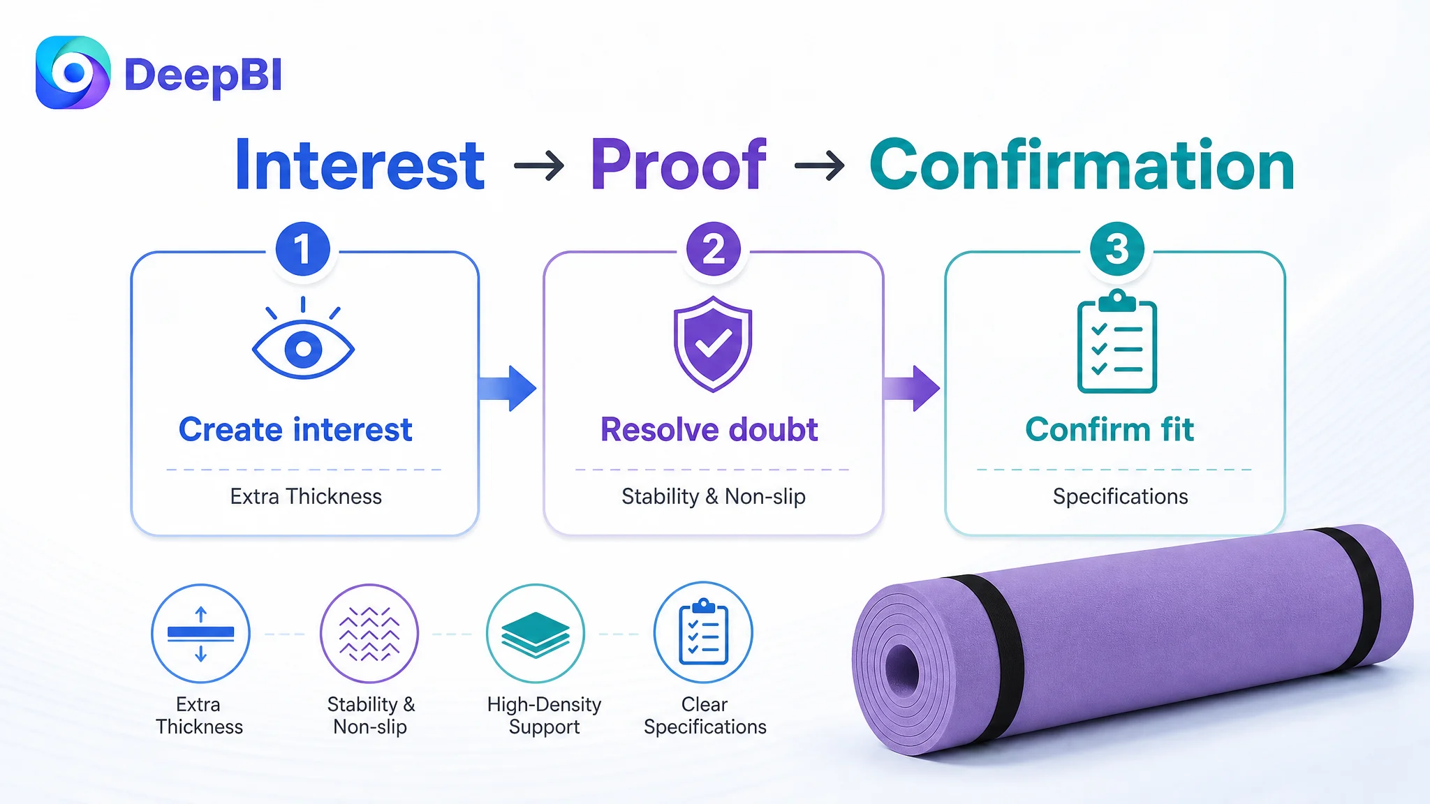
DeepBI reframed the problem as a product-page conversion capacity issue rather than a collection of isolated content defects. The later direction focused on rebuilding the Amazon Listing around a clear buying sequence: communicate the value of extra thickness, resolve concerns about softness and stability, prove non-slip and cushioning benefits, show practical usage, and use visual content to replace the trust that the page had not yet earned. For other Amazon sellers, the case offers a practical warning: before sending more paid traffic to a Listing, determine whether the page is prepared to convert it.
The Amazon Listing Was Present, but the Sales Logic Was Missing
At first glance, the product page contained the basic information expected from an exercise mat Listing:
- Extra-thick positioning
- Non-slip functionality
- High-density foam language
- Portable usage
- Multiple fitness scenarios
- Size and material information
But a product page can contain the right words and still fail to create a persuasive buying path.
The scoring comparison made that distinction visible:
- Title: Customer Listing: 14/20, Comparable high-performing Listing: 18/20, Gap: -4
- Main image: Customer Listing: 21/30, Comparable high-performing Listing: 26/30, Gap: -5
- Bullet points: Customer Listing: 5/10, Comparable high-performing Listing: 8/10, Gap: -3
- Detail content: Customer Listing: 3/25, Comparable high-performing Listing: 23/25, Gap: -20
- Reviews: Customer Listing: 1/15, Comparable high-performing Listing: 15/15, Gap: -14
- Total: Customer Listing: 44/100, Comparable high-performing Listing: 90/100, Gap: -46
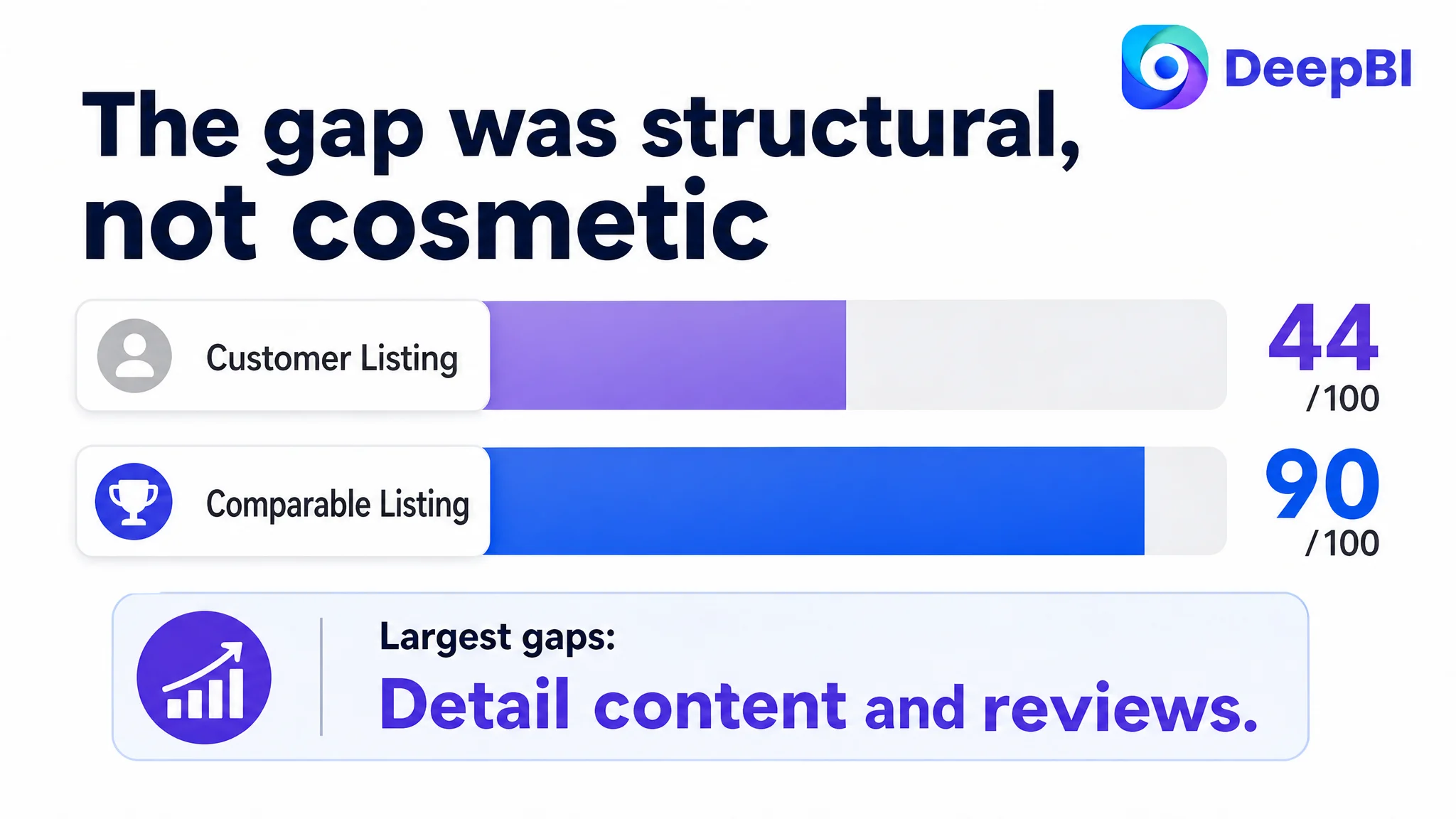
The largest gaps were not in keyword coverage alone. They were in detail content and trust.
The page did not lack product information. It lacked enough evidence for the shopper to believe the product would perform as promised.
That distinction changed the order of operations. Improving a title or replacing an image could strengthen the entrance to the Listing. It could not, by itself, repair a page that had little to show after the click.
The Initial Diagnosis Stopped Too Close to the Surface
The existing Listing made several familiar optimization problems easy to notice.
The title opened with “Extra Thick” rather than placing the core product term, “Yoga Mat,” in the strongest position. Its selling points were broadly functional—non-slip, high-density, and multiple use cases—but they did not create a strong reason to choose this product over another exercise mat.
The bullet points also followed a feature-listing pattern. They described non-slip performance, materials, portability, cushioning, and usage scenarios, but they did not consistently connect each feature to a buyer concern or a concrete outcome.
The main image set had similar limitations. It showed the product and its colors, but it did not make the extra thickness, density, cushioning, or stability immediately persuasive. A warehouse-oriented image and a static color display consumed valuable visual space without helping a shopper answer the most important questions:
- Will this mat provide meaningful cushioning on a hard floor?
- Will it remain stable during movement?
- Is the extra thickness supportive or overly soft?
- Can it be cleaned and stored conveniently?
- Is the product durable enough for repeated workouts?
These observations could lead a team toward a familiar conclusion: the title needs more keywords, the images need better design, and the bullets need more polished copy.
That conclusion would be incomplete.
The real problem was not that individual Listing elements were slightly weaker than the benchmark. It was that the page lacked a coordinated explanation of why extra thickness matters and how the product performs in real use.
Why More Feature Descriptions Would Not Be Enough
The customer’s Listing had no image-based A+ modules. Its detail content was limited to basic text covering functions, specifications, and usage notes.
The comparable high-performing Listing used a much fuller structure:
- Brand-level visual introduction
- Core feature icons
- Fitness and lifestyle scenarios
- Material-focused explanations
- Cleaning and handling guidance
- Size visualization
- Carrying-strap presentation
- Cushioning and impact-absorption explanation
This was not simply a difference in design quality. It was a difference in how the page handled buyer uncertainty.
A thick exercise mat creates a specific hesitation: will more cushioning also mean less stability? The page needed to address that concern early by explaining the role of high-density foam, double-sided grip, and resilient support.
It also needed to show, rather than merely state, how the mat supports the spine, hips, knees, and elbows on hard floors. A technical phrase such as “high-density foam” has limited persuasive value when it is not connected to a visible use case.
The existing content treated these points as separate specifications. A stronger page would connect them into a sequence:
1. Extra thickness creates cushioning for demanding floor exercises.
2. High-density foam helps the mat remain supportive rather than simply soft.
3. Double-sided texture helps reduce movement during poses, stretches, and strength training.
4. Moisture resistance supports easier cleaning after repeated workouts.
5. Portability and the carrying strap make the thicker format practical to store and transport.
That sequence is what turns features into a reason to buy.
The Largest Conversion Leak Was in Detail Content
The 20-point gap in detail content was the clearest signal in the diagnosis.
The customer Listing’s detail section relied on repeated text and basic specifications. It did not create a visual funnel from product introduction to proof of performance. By contrast, the benchmark page moved through a more complete commercial narrative:
Position the product → explain the core benefit → resolve the main concern → demonstrate usage → validate the material → confirm convenience → close with the value of the product.
For this exercise mat, that narrative could begin with a challenging workout or advanced pose rather than a generic yoga scene. The opening should establish that the mat is intended for more than light stretching.
The next section should explain the material and cushioning logic. This is where the page can proactively address the concern that a one-inch mat may be bulky or spongy.
Later sections can show:
- Stability during movement
- Grip during frequent sweating
- Cushioning under pressure
- Resistance to tearing and repeated use
- Easy cleaning
- Rolling, securing, and carrying
- Exact dimensions and material details
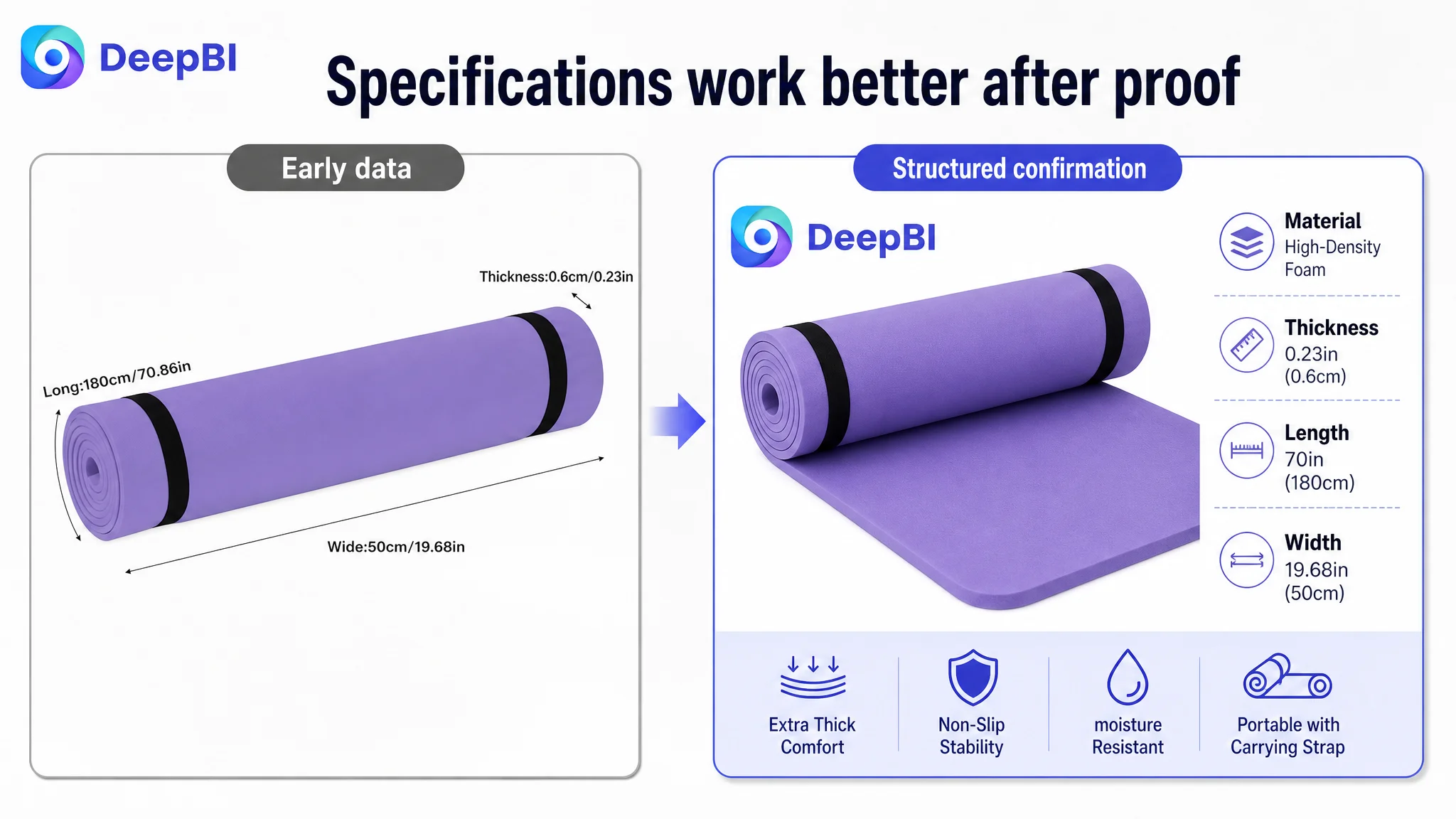
The order matters. Dimensions are useful for final confirmation, but they are not necessarily the strongest opening argument. A shopper first needs a reason to care about the product’s thickness, then evidence that the thickness creates a worthwhile benefit, and only then the specifications needed for purchase confirmation.
The Main Image Was Not Just a Design Problem
The main image score was 21 out of 30, only five points below the comparable Listing. On its own, that gap might not appear decisive. But the visual diagnosis showed why the image set still weakened the product page.
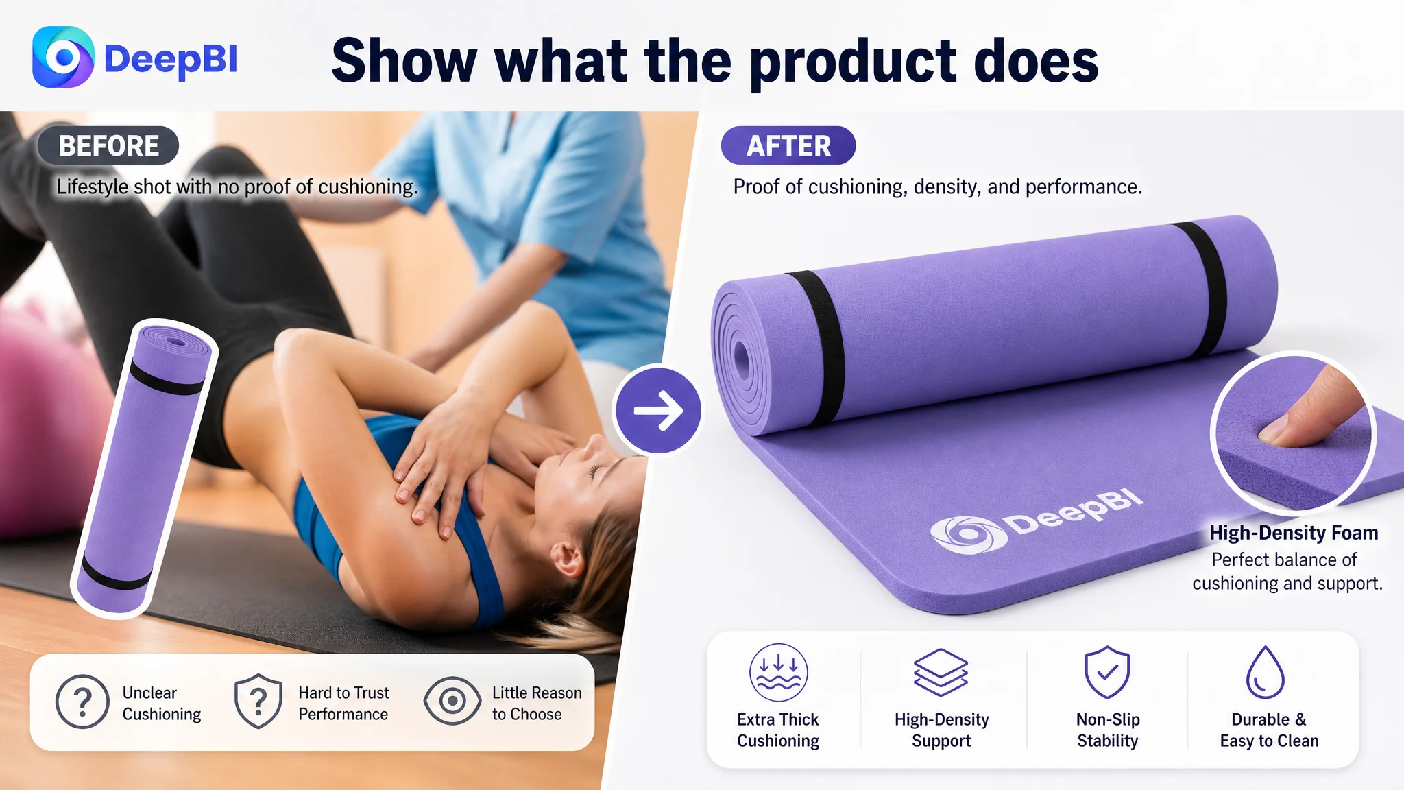
The first image mainly identified the product. It did not create an immediate visual hook around the feature most likely to distinguish this mat: substantial cushioning from its extra thickness and high-density foam.
The second image introduced specifications too early. Size and basic data can help with fit, but they do not compensate for a weak first impression.
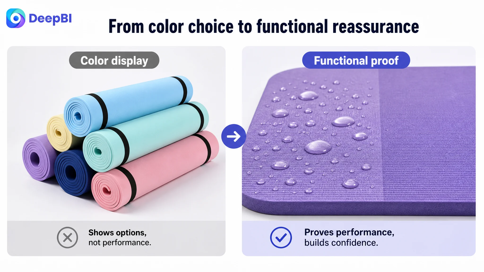
The third image used a static display of multiple colors instead of demonstrating a functional benefit. The fourth image showed a warehouse context that had little relevance to a shopper evaluating personal fitness equipment. The fifth image used a posed scene, but it did not convincingly prove how the mat behaves under pressure.
The recommended visual order was therefore not “make the images more attractive.” It was to assign each image a job in the buying decision:
Create the first visual reason to click
Use a close-up view that makes the one-inch thickness and dense foam visually clear. The purpose is to establish that this is a heavy-duty exercise mat, not a standard thin yoga mat.
Resolve the performance trade-off
Show how high-density foam provides cushioning while keeping the product practical and lightweight enough to transport. This helps address the natural concern that extra thickness may compromise handling or stability.
Demonstrate practical benefits
Use close-ups or contextual scenes to communicate grip, moisture resistance, cleaning convenience, and the carrying strap. These details answer everyday usage concerns more effectively than another product-only image.
Reserve specifications for confirmation
Move dimensions, weight, material, and thickness details later in the image sequence, after the functional value has been established.
Show the mat working under pressure
A realistic pose involving the knee, elbow, or another body area under pressure can make the cushioning promise more credible than a generic lifestyle composition.
A product image should not only show what the product is. It should help the shopper understand what the product does at the moment that matters.
The Title and Bullets Needed a Buying Logic, Not More Words
The title gap was smaller than the detail-page gap, but it still revealed the same underlying issue.
The benchmark title led with the core search term “Yoga Mat,” followed by a specific one-inch thickness claim, high-density positioning, anti-tear language, the carrying strap, and relevant use cases. The customer title opened with “Extra Thick” and used “Exercise Mat” later, while also listing several scenarios in a looser sequence.
The recommended direction retained the product’s actual positioning and specifications while making the structure more direct:
- Core product category
- Thickness
- Non-slip and high-density foam attributes
- Durability
- Size
- Main usage scenarios
The point was not to imitate another Listing’s wording. It was to make the title answer both search and buying questions more efficiently.
The bullet points required a similar shift. Instead of beginning with isolated features, each point needed to follow a pain point, solution, and outcome structure.
Extra-thick comfort and support
Connect high-density foam to cushioning for the spine, hips, knees, and elbows on hard floors.
Double-sided non-slip performance
Explain how the textured surfaces support stability during poses, stretches, strength training, and sweating.
Durability and moisture resistance
Show how the material handles sweat and dirt and how the mat can be wiped clean after use.
Lightweight portability
Explain how the mat can be rolled, secured, stored, and transported despite its extra-thick construction.
Versatility across routines
Expand the use cases to stretching, core work, meditation, abdominal exercises, and other floor-based routines.
This structure does more than improve readability. It makes the page easier to scan while giving each bullet a distinct role in reducing purchase hesitation.
Reviews Were a Separate Trust Constraint
The review dimension scored 1 out of 15. The customer Listing had no rating data and no review history, while the comparable high-performing Listing had a 4.7-star rating and 18,696 reviews.
This gap could not be solved through copywriting.
A well-structured A+ page can improve product understanding, but it cannot fully replace the reassurance provided by a mature review base. The absence of reviews meant the customer Listing needed stronger visual and informational evidence elsewhere on the page, while also recognizing that review accumulation was a separate business requirement.
That distinction matters because sellers may otherwise expect better images or revised bullets to neutralize every conversion barrier. They cannot.
In this case, review scarcity increased the importance of:
- Clear product demonstrations
- Specific material and usage explanations
- Visible dimensions
- Realistic performance scenes
- A complete A+ narrative
- Consistent communication between the title, images, bullets, and detail content
The page had to compensate for missing social proof with stronger product proof—without pretending that the two are equivalent.
Why DeepBI Did Not Treat This as an Ad-Tuning Problem
The case material does not provide post-optimization advertising results, so it would be inaccurate to claim that ACOS, CTR, CVR, or organic orders changed after the Listing recommendations. But the Listing diagnosis still establishes an important decision principle for Amazon sellers.
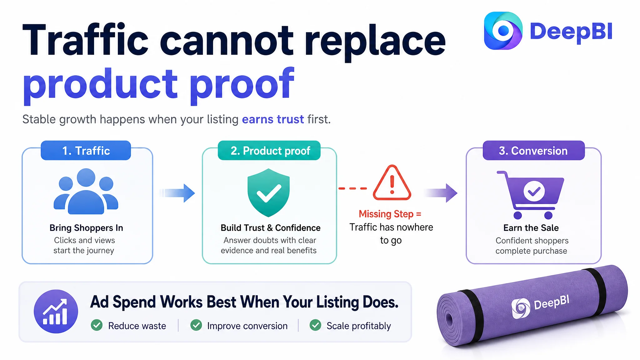
When a product page scores only 3 out of 25 in detail content and 1 out of 15 in reviews, increasing traffic before repairing the page can create a difficult operating condition: more shoppers arrive, but the page still lacks the evidence needed to convert them.
Advertising can amplify exposure. It cannot automatically create:
- A stronger value proposition
- A convincing material explanation
- A realistic demonstration of cushioning
- A clear response to stability concerns
- A complete visual story
- Social proof that does not yet exist
Advertising does not only amplify strengths. It can also amplify the consequences of a low-conversion Amazon Listing.
That is why the logical priority in this case was Listing conversion capacity. The title and main image still mattered because they controlled the entry point. But they were not the first or only problem. The page needed to be rebuilt as a connected system before additional traffic could be judged fairly.
The Optimization Direction Shifted From “Improve the Page” to “Prove the Product”
DeepBI’s diagnosis did not stop at assigning lower scores. It connected the score gaps to specific decisions.
The main image should prove thickness and cushioning rather than merely display the product.
The supporting images should answer practical concerns rather than repeat color or warehouse information.
The title should place core product language and concrete differentiators in a more efficient order.
The bullet points should convert specifications into user outcomes.
The A+ content should progress from inspiration to risk reduction, scenario validation, functional explanation, and final specification confirmation.
The product’s existing claims remained the boundary. The optimization could improve composition, visual hierarchy, and explanation, but it could not invent unsupported performance data, materials, or functions. That constraint is commercially important for an Amazon Listing: a visually persuasive promise that the product cannot deliver can create returns, negative reviews, and long-term trust damage.
The strongest direction was therefore not to make the page look more premium in the abstract. It was to make the product’s real value easier to verify.
What This Case Changes for Amazon Sellers
This exercise mat Listing shows why Amazon optimization often fails when each element is reviewed in isolation.
A title can contain relevant keywords and still lack a clear product position. A main image can display the item accurately and still fail to create a reason to click. Bullet points can mention every feature and still leave the shopper unsure what those features mean in use. A+ content can exist as text and still fail to provide a persuasive story. And a page with no reviews may require substantially stronger product evidence before paid traffic can become productive.
The more important lesson is about decision order.
Before treating advertising efficiency as a bidding or campaign-structure problem, sellers should ask whether the Amazon product page can convert the traffic already being sent to it. Before replacing images based on personal taste, they should identify which image is responsible for attracting attention, resolving doubt, validating performance, or confirming specifications. Before adding more copy, they should determine which buyer concern the copy is meant to remove.
For this Listing, the central constraint was not a lack of information. It was a lack of coordinated proof.
The next optimization phase therefore focused on restoring the page’s sales logic:
- Make the extra-thick value immediately understandable
- Explain why high-density foam matters
- Demonstrate grip, cushioning, and durability
- Connect features to real fitness concerns
- Build a complete A+ narrative
- Present specifications at the point of final confirmation
- Recognize review accumulation as a separate trust-building task
The case does not claim a measured post-change result that is not present in the source material. Its value lies in the diagnosis itself: a 44-point Listing was not asking for more traffic first. It was asking for a stronger reason to believe.