

An Amazon seller in the US kitchen-tools category was working with a Listing that appeared to need the usual round of improvements: a clearer title, stronger product images, and more persuasive bullet points. The product had several functions to communicate, including peeling, shredding, and bottle opening, but the page did not make those functions easy to understand or trust.
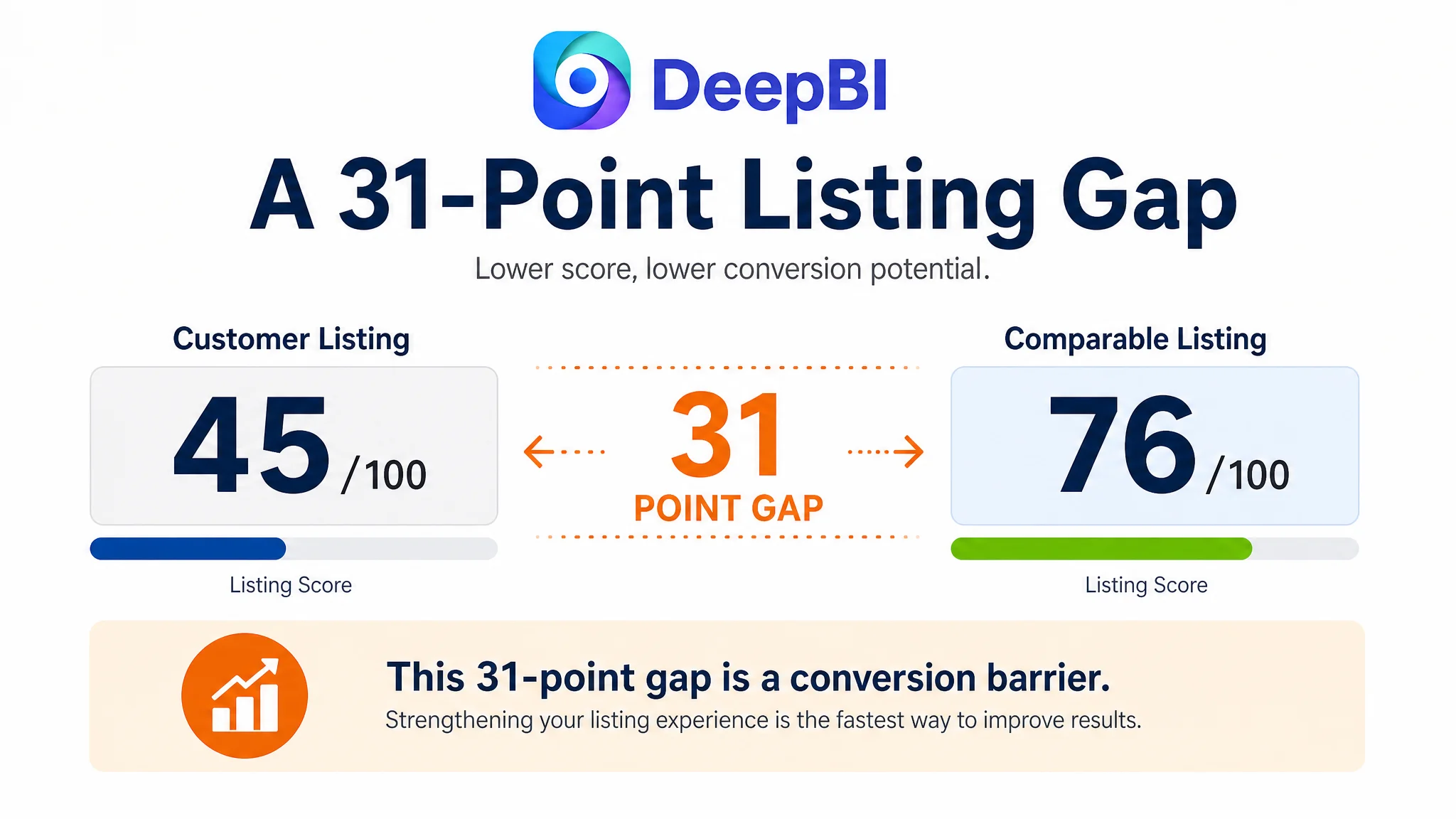
The initial optimization direction focused on tightening individual elements. Yet the deeper issue was not one weak phrase or one underperforming image. DeepBI’s comparison showed a 45/100 Listing score against 76/100 for a comparable high-performing Listing, with the largest gap concentrated in the product-page detail experience: 0 points versus 23.
That changed the order of decisions. Instead of treating the Amazon product page as a collection of separate assets, the team had to rebuild its sales logic: establish the 3-in-1 value first, show the product in realistic kitchen use, demonstrate grip and function, and then resolve questions about cleaning, storage, dimensions, and the two-piece set. The case offers a practical lesson for Amazon sellers: before pushing more traffic through Amazon ads or relying on keyword refinement, confirm that the Listing can convert the traffic it receives.
The page had functions to describe, but no clear reason to believe
The product was a 3-in-1 vegetable peeler with a wooden handle, stainless steel blade, scallion-shredding function, and built-in bottle opener. On paper, that gave the seller several usable selling points.
The problem was how those points appeared on the Amazon Listing.
The title led with the core keyword, but the rest of the structure became repetitive and scattered. Phrases such as “Multi-Functional Vegetable Peeler,” “3 in 1,” “Kitchen Gadgets Tool,” and “Grater & Bottle Opener” competed for attention without forming a clear hierarchy.
The bullet points had a similar issue. They mentioned blade material, handle comfort, cleaning, storage, and multiple uses, but they mostly described functions. They did not consistently connect each feature to a recognizable customer situation:
- Faster preparation during weeknight cooking
- More control than a lightweight plastic handle
- Shredding scallions for soups, noodles, and salads
- Opening bottles while hosting or camping
- Rinsing and storing the tool without adding clutter
The Listing contained information, but it did not yet create a persuasive path from recognition to purchase.
That distinction matters on Amazon. A customer may understand what a product is and still remain uncertain about whether it will work well, feel secure in the hand, or justify replacing an existing kitchen tool.
The first diagnosis focused on the visible assets
The initial direction was understandable. The title needed restructuring. The bullet points needed clearer benefits. The image sequence needed stronger functionality and more relevant scenes.
These were real problems.
The title score was 14/20, compared with 17/20 for the comparable Listing. The existing title placed the main keyword early, but it used repeated wording and left specific value points less visible. The competing structure made “stainless steel wide blade” and “scallion shredder” easier to recognize, while also extending the use context to kitchens, camping, and travel.
The bullet-point score was 5/10 against 7/10. Several points repeated ideas such as easy cleaning and storage, while the overall sequence lacked a clear order of value. The competitor’s structure moved more deliberately from efficiency to grip, then to additional functions, everyday use, and maintenance.
The main-image score was not the largest weakness. In fact, the Listing scored 25/30 in that dimension, one point above the comparison Listing. That made the real diagnosis more important: a reasonable score in one visible area could not compensate for a missing product-page experience.
The page had images, but no A+ content and no supporting detail modules. The detail-page score was 0/25.
That was the point where the problem changed from “improve the copy and images” to “repair the Listing’s conversion capacity.”
A 23-point detail-page gap changed the priority
DeepBI’s five-dimension comparison made the imbalance clear:
- Title: Customer Listing: 14/20, Comparable Listing: 17/20, Gap: -3
- Main image: Customer Listing: 25/30, Comparable Listing: 24/30, Gap: +1
- Bullet points: Customer Listing: 5/10, Comparable Listing: 7/10, Gap: -2
- Detail page: Customer Listing: 0/25, Comparable Listing: 23/25, Gap: -23
- Reviews: Customer Listing: 1/15, Comparable Listing: 5/15, Gap: -4
- Total: Customer Listing: 45/100, Comparable Listing: 76/100, Gap: -31
The score did not mean that every missing module would automatically produce a specific revenue outcome. It showed something more fundamental: the Listing was asking customers to make a purchase decision with almost no visual support beyond the basic gallery.
The comparable product page used a sequence that helped customers answer their questions in order:
1. What does the product do?
2. Is it comfortable and secure to use?
3. How do the different functions work?
4. What practical result does it deliver?
5. Will it fit my hand and storage space?
6. Is it easy to clean and suitable for daily use?
7. What exactly is included in the set?
The customer Listing had no equivalent sequence.
“The most serious conversion gap was not a weak adjective in the title. It was the absence of the page layer that turned product claims into visible evidence.”
Why DeepBI did not keep treating every issue equally
A common Amazon optimization mistake is to treat all Listing defects as independent tasks. The team updates the title, rewrites the bullets, replaces an image, and adds more keywords without deciding which constraint limits the next business outcome.
DeepBI’s diagnosis prioritized the issue with the greatest potential to affect the entire page: the missing detail and A+ experience.
The title and bullet-point recommendations were still necessary, but their role became clearer. They were not meant to carry the full conversion burden. They had to establish the product’s core value and guide the customer into the images and detail modules.
The main image also needed improvement, but not because the product was impossible to identify. Its role needed to shift from basic product presentation to immediate integrated value. The customer should be able to recognize the three functions and the wooden-handle design without having to interpret small, separated visual elements.
This decision order prevented the team from polishing isolated components while leaving the largest structural gap untouched.
If the page cannot explain, demonstrate, and reassure, additional traffic only creates more opportunities for the same uncertainty to repeat.
The new page logic started with functional recognition
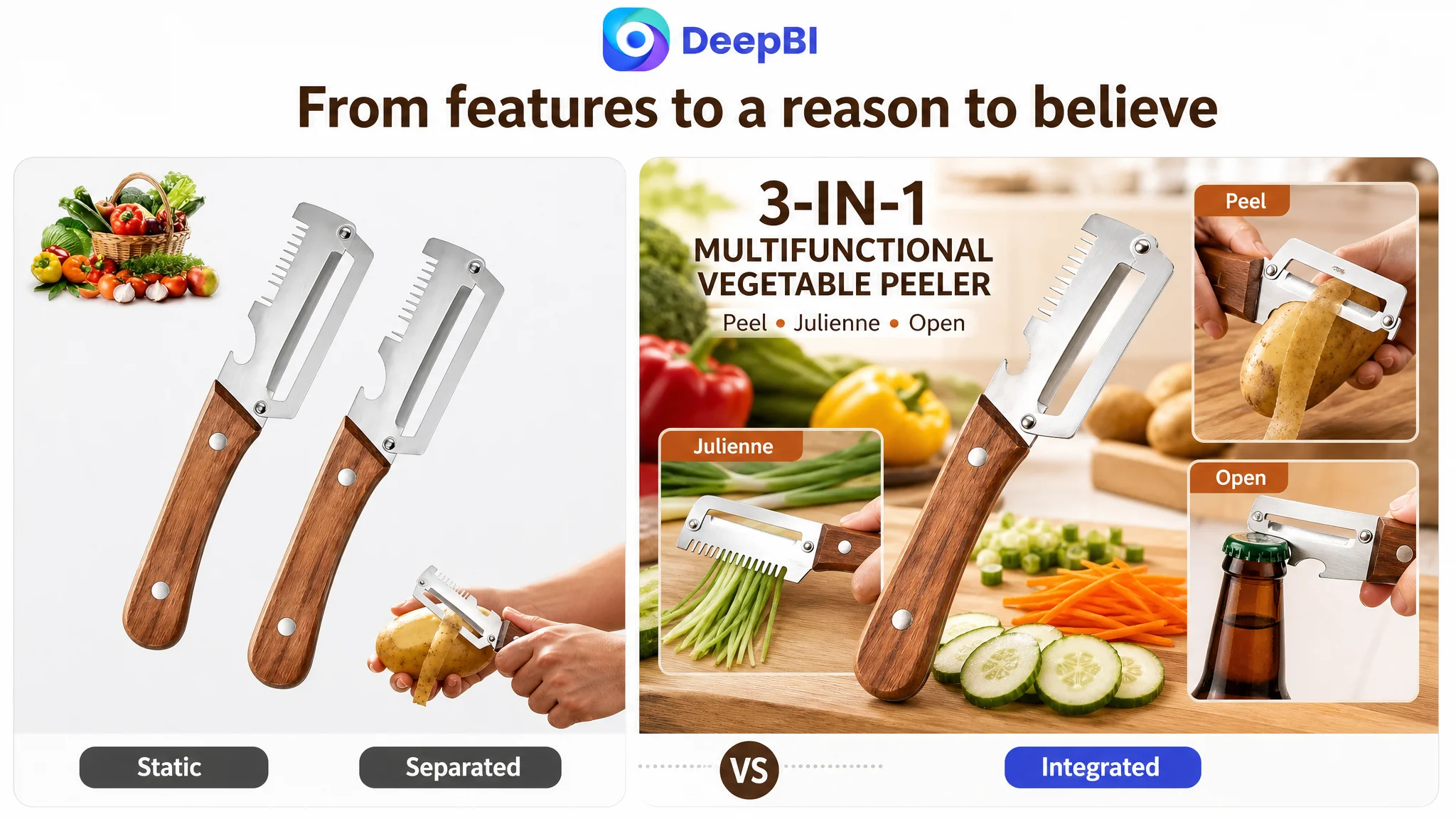
The first change was to establish the product’s 3-in-1 identity quickly.
The opening visual should make peeling, shredding, and bottle opening feel like parts of one coherent tool rather than unrelated claims. The product itself remained the source of truth; the improvement was in composition, sequence, and visual emphasis.
The page could then move into daily preparation scenes using familiar produce such as potatoes, carrots, apples, and other vegetables already associated with the product’s intended use. This was more useful than leading with a narrow scallion-shredding demonstration alone.
The goal was not to add decorative lifestyle imagery. It was to answer a practical question early:
Where would this tool fit into an ordinary kitchen routine?
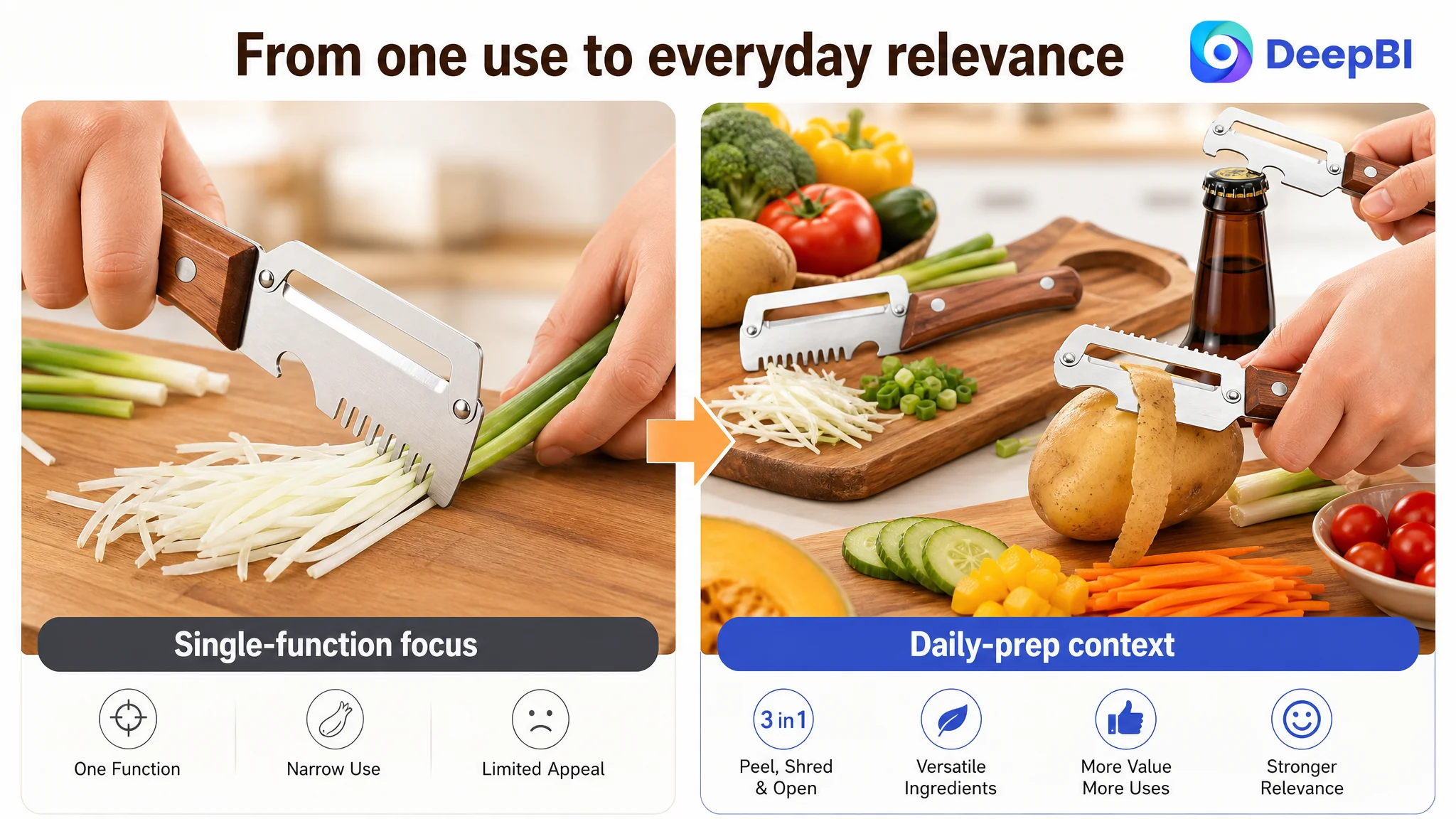
The title and bullets supported that same logic. A tighter title structure placed the main product form and key functions earlier, while adding concrete terms such as the stainless steel wide blade, scallion shredder, bottle opener, kitchen use, and camping context.
The revised bullet structure followed a more deliberate progression:
- Efficient peeling with a widened stainless steel blade
- A steadier wooden handle for control
- A built-in shredder for scallions and garnish preparation
- Peeling, shredding, and bottle opening in one compact tool
- Everyday use, rinsing, and easy storage
This was not keyword expansion for its own sake. It connected search language with buying logic.
The missing A+ content had to resolve doubts, not repeat claims
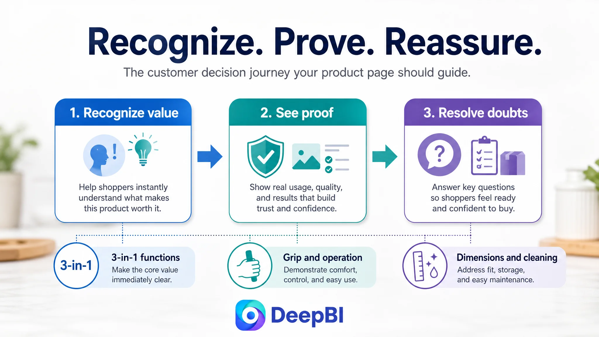
The recommended A+ structure was designed around the questions left unanswered by the original page.
The product needed an immediate functional entrance
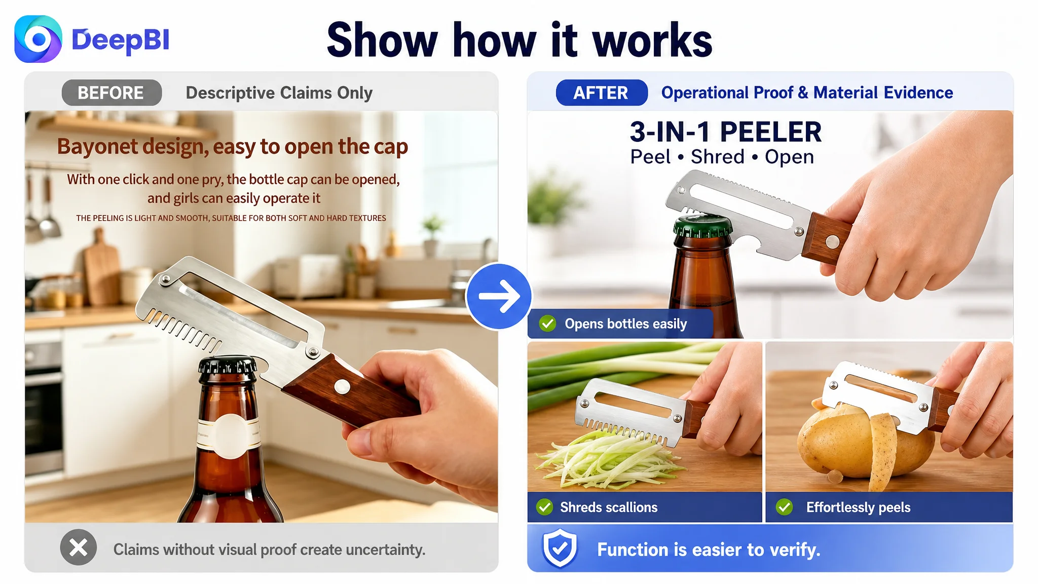
The first module would confirm the three core uses: peeling, shredding, and bottle opening. This gave the customer a fast visual summary consistent with the title and bullet points.
The handle needed proof through use
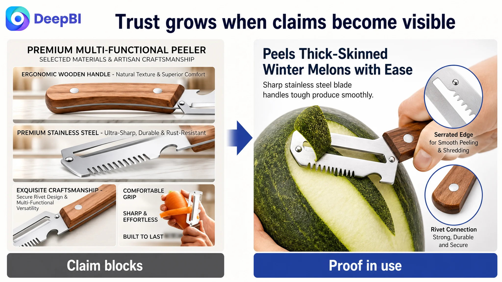
The wooden handle was a product attribute, but comfort and control were usage claims. The page therefore needed to show a secure grip, including use with wet hands where appropriate, rather than simply describing the handle as comfortable or non-slip.
The additional functions needed demonstration
A customer may understand the words “scallion shredder” and “bottle opener” but still wonder how those functions operate. Visual demonstrations could reduce that operational uncertainty and make the tool feel easier to use.
The value needed a result-oriented contrast
The page could show smoother preparation and more efficient handling instead of merely stating that the blade was sharp. The purpose was to make the benefit observable without inventing unsupported performance claims.
Rational information belonged later
Dimensions, hand fit, storage compatibility, cleaning, and the two-piece set were important, but they were not the strongest opening message. These details worked better after the page had established the product’s usefulness and usability.
This sequence followed the customer’s likely decision process: recognize the value, understand the use, assess the feel, verify the details, and then decide whether the set fits everyday needs.
Reviews revealed a separate trust risk
The review dimension was also weak, although it was not the primary reason to delay the page rebuild.
The detailed review snapshot showed:
- The customer Listing at 2.0 stars with 62 total reviews
- The comparable Listing at 2.7 stars with 416 total reviews
- No visible review content on the customer Listing’s first page
- A higher share of one- and two-star reviews for the customer Listing
- No customer review images or videos, while the comparable Listing had some visual review content
Both products were below a healthy review position, but the customer Listing had less review volume and less usable social proof. Its review environment therefore created a trust problem that stronger copy alone could not remove.
This also changed how visual optimization had to be handled. The page could build clearer product understanding, but it could not use A+ content to substitute for genuine customer experience. The team needed to separate what the page could control from what required product and customer-feedback improvement.
That distinction is commercially important. A polished page can clarify value and reduce uncertainty, but it should not conceal quality concerns or promise performance that reviews do not support.
DeepBI’s role was to turn gaps into a decision sequence
The value of DeepBI in this case was not simply identifying that the title was weak or that A+ content was missing. Those observations could be made manually.
The stronger judgment came from comparing the Listing against a relevant category benchmark and identifying where the score gap was concentrated. The system connected:
- A 31-point total Listing difference
- A 23-point detail-page difference
- A scattered title structure
- Feature-led rather than situation-led bullets
- A mostly static image sequence
- Missing visual demonstrations
- Weak review scale and trust signals
That evidence supported one business conclusion: the page had to be rebuilt as a connected sales argument before the team could expect isolated copy or image changes to carry the Listing forward.
DeepBI’s optimization logic also kept the proposed changes within the product’s actual boundaries. It did not require changing the product’s structure or inventing new functions. The improvement came from presenting the existing capabilities more clearly, using realistic scenes, showing material and operation details, and arranging the information in the order customers needed.
“The objective was not to make the vegetable peeler look more impressive. It was to make the customer’s decision require less interpretation.”
The operating lesson for Amazon sellers
This case did not end with a claim of guaranteed CVR growth or a specific ACOS reduction. The source material does not provide post-optimization advertising or sales results, so those outcomes should not be invented.
What it does provide is a clearer operating state and a more defensible decision path.
The Listing moved from a fragmented optimization agenda toward a prioritized plan:
- Repair the missing detail-page and A+ foundation
- Make the 3-in-1 value visible at the beginning
- Use the main image sequence to establish relevance and proof
- Rewrite the title around specific, high-value product attributes
- Rebuild the bullets around customer situations and outcomes
- Address grip, operation, cleaning, storage, and set value in sequence
- Treat review weakness as a separate trust and product-quality risk
- Avoid assuming that more traffic can compensate for missing page logic
For Amazon sellers, the broader lesson is straightforward:
Amazon ads and organic traffic can bring a customer to the product page, but the Listing still has to complete the sale.
When a page has a weak title, unclear images, repetitive bullets, and no A+ story, it is easy to blame keywords, bids, or traffic quality. But if the largest competitive gap sits inside the product-page experience, ad optimization is being asked to solve the wrong problem.
Before scaling traffic, the better question is whether the Amazon Listing gives shoppers enough clarity, evidence, and confidence to act.