

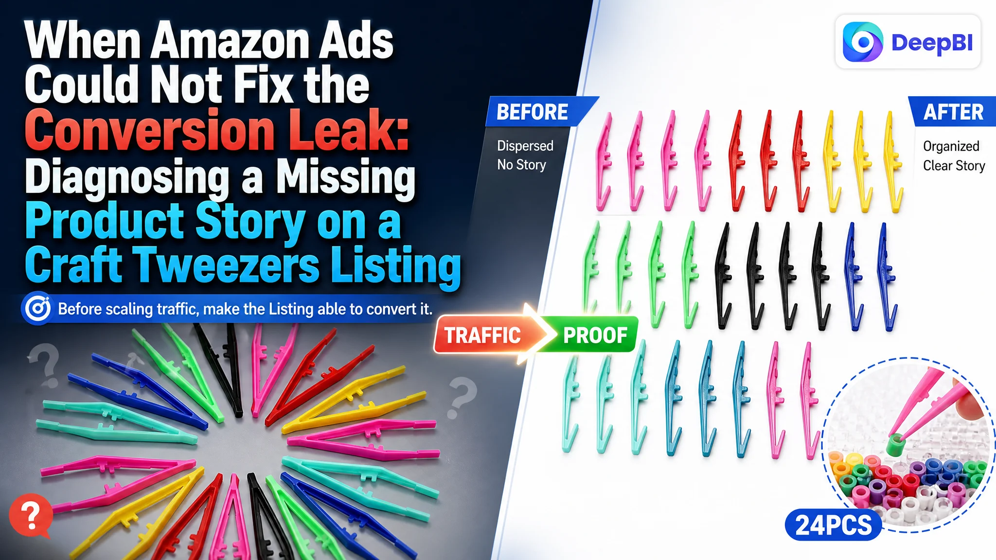
This case follows an Amazon seller in the craft-supplies category whose plastic tweezers Listing was competing for traffic without giving shoppers enough reason to trust or understand the product. The team could see the gap, but the first instinct was to improve individual product details and make the page more informative.
DeepBI’s diagnosis showed that the larger problem was not one weak phrase or one unattractive image. The Listing had a conversion-capacity problem: the title and bullet points did not organize the buying logic clearly, the visual sequence did not prove the product’s use, and the product page had no A+ content at all. Meanwhile, the listing had no review history to provide an alternative trust signal.
The later optimization therefore focused on rebuilding the Amazon product page as a complete decision path: clarify the search entry point, show the product’s quantity and precision, explain who it serves, and use realistic craft, classroom, and parent-child scenarios to make the value visible. For other Amazon sellers, the lesson is direct: before increasing paid traffic, judge whether the Listing is ready to convert it.
The Seller Saw a Product That Was Present, but Not Yet Competitive
Plastic tweezers are not a complex product. That simplicity can make the competitive problem harder to see.
A shopper searching Amazon for craft tweezers, bead tweezers, or plastic forceps may understand the basic product category immediately. But that does not mean the shopper can quickly answer the more important questions:
- How many pieces are included?
- Are the colors useful for classroom or family activities?
- Can the tweezers grip small beads accurately?
- Are they easy to hold?
- Are they appropriate for children’s craft practice?
- Can they support more than one type of project?
The customer’s Listing answered some of these questions in scattered form, but it did not lead shoppers through them in a convincing order.
That distinction matters. A product page can contain information and still fail to convert. On Amazon, conversion depends not only on whether the facts are available, but also on whether the page presents the right facts at the moment the shopper needs them.
The central issue was not a lack of product information. It was a lack of organized buying logic.
The comparison made the situation visible. The customer’s Listing scored 40 out of 100, while a comparable high-performing listing scored 81.
The gap was not evenly distributed:
- Title: Customer Listing: 11/20, Comparable Listing: 15/20, Gap: -4
- Main image: Customer Listing: 24/30, Comparable Listing: 23/30, Gap: +1
- Bullet points: Customer Listing: 5/10, Comparable Listing: 7/10, Gap: -2
- Product detail content: Customer Listing: 0/25, Comparable Listing: 23/25, Gap: -23
- Reviews: Customer Listing: 0/15, Comparable Listing: 13/15, Gap: -13
- Total: Customer Listing: 40/100, Comparable Listing: 81/100, Gap: -41
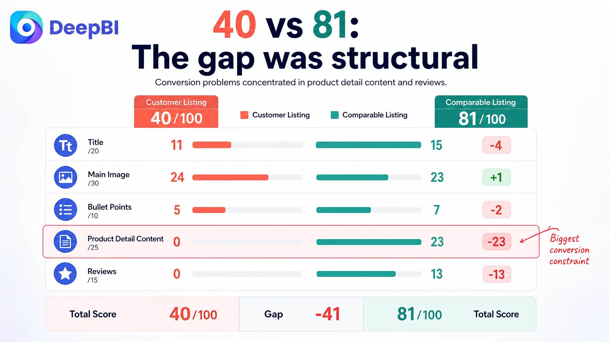
The most important signal was not that every element needed to be redesigned. It was that the customer’s product page had no detail-page content while the benchmark listing used a complete visual story.
The Initial Direction Focused on Product Details, Not Conversion Capacity
The practical misdiagnosis was to treat the problem as a matter of adding more product descriptions and improving isolated creative elements.
That direction is understandable. For a simple craft tool, operators often begin with the visible facts:
- plastic material
- quantity and colors
- anti-slip design
- serrated jaws
- intended craft uses
- size and handling
These facts are relevant. But if they are only added as separate claims, they do not necessarily solve the shopper’s hesitation.
The customer’s original title placed descriptive selling points such as “Non-slip” and “Sawtooth Collet Design” before the core product keyword. Its structure was closer to:
Quantity + features + keyword + use
The stronger comparison used a more searchable and readable sequence:
Quantity + core keyword + key benefit + broader applications
That difference is not merely stylistic. On Amazon, the title must serve two jobs at once: help the product be found and help the shopper understand what it is. When the main keyword appears too late and the title begins with scattered feature language, both jobs become less efficient.
The same issue appeared in the bullet points. The customer’s bullets described material, color, design, anti-slip features, and use cases, but the benefits were not prioritized around the needs of the likely buyers.
A parent or teacher is not only buying plastic tweezers. They may be buying a manageable way to support bead projects, classroom distribution, fine-motor practice, or a more engaging craft activity. A bullet point that only describes the physical design leaves the shopper to construct that value independently.
That is where traditional listing editing can stop too early. The copy becomes more complete, but the decision becomes no easier.
DeepBI Found the Largest Constraint in the Product Detail Layer
The score comparison changed the optimization order.
The title had a meaningful but limited gap. The bullet points also needed restructuring. The main image was not the weakest dimension; in fact, its score was slightly above the comparison listing. Reviews were a serious trust disadvantage, but review accumulation cannot be solved by rewriting a sentence.
The largest addressable gap was the product detail layer:
- customer Listing: 0/25
- comparable Listing: 23/25
The customer had no A+ module or structured detail content. The comparable listing used a sequence of visual modules covering:
- full product presentation
- dimensions and functional details
- real usage scenes
- color grouping
- child interaction
- DIY applications
- close-up product features
This was the point at which DeepBI reframed the case.
The page was not simply missing “more images.” It was missing the layers that turn a basic craft tool into a believable purchase:
1. What the shopper receives
A clear presentation of the full quantity, colors, and package structure.
2. How the product works
A close-up view of the tapered ends, serrated gripping area, and anti-slip handle design.
3. What problem it solves
The ability to pick up and place small beads or other craft materials with greater control.
4. Who benefits from it
Hobbyists, classrooms, families, and children practicing fine motor movements.
5. Where it fits into real life
Beading, fuse-bead projects, rhinestone work, pom-pom activities, science exploration, and other fine tasks.
Without those layers, the Listing remained at the level of “a pack of plastic tweezers.” The benchmark listing was selling a more complete use experience.
Advertising can bring a shopper to the page. It cannot create the missing proof once the shopper arrives.
The Main Image Was Not the Root Cause, but It Still Had a Role
The main-image score did not support blaming the entire problem on the primary visual. The customer’s score was 24/30, compared with 23/30 for the comparable listing.
That made the diagnosis more precise.
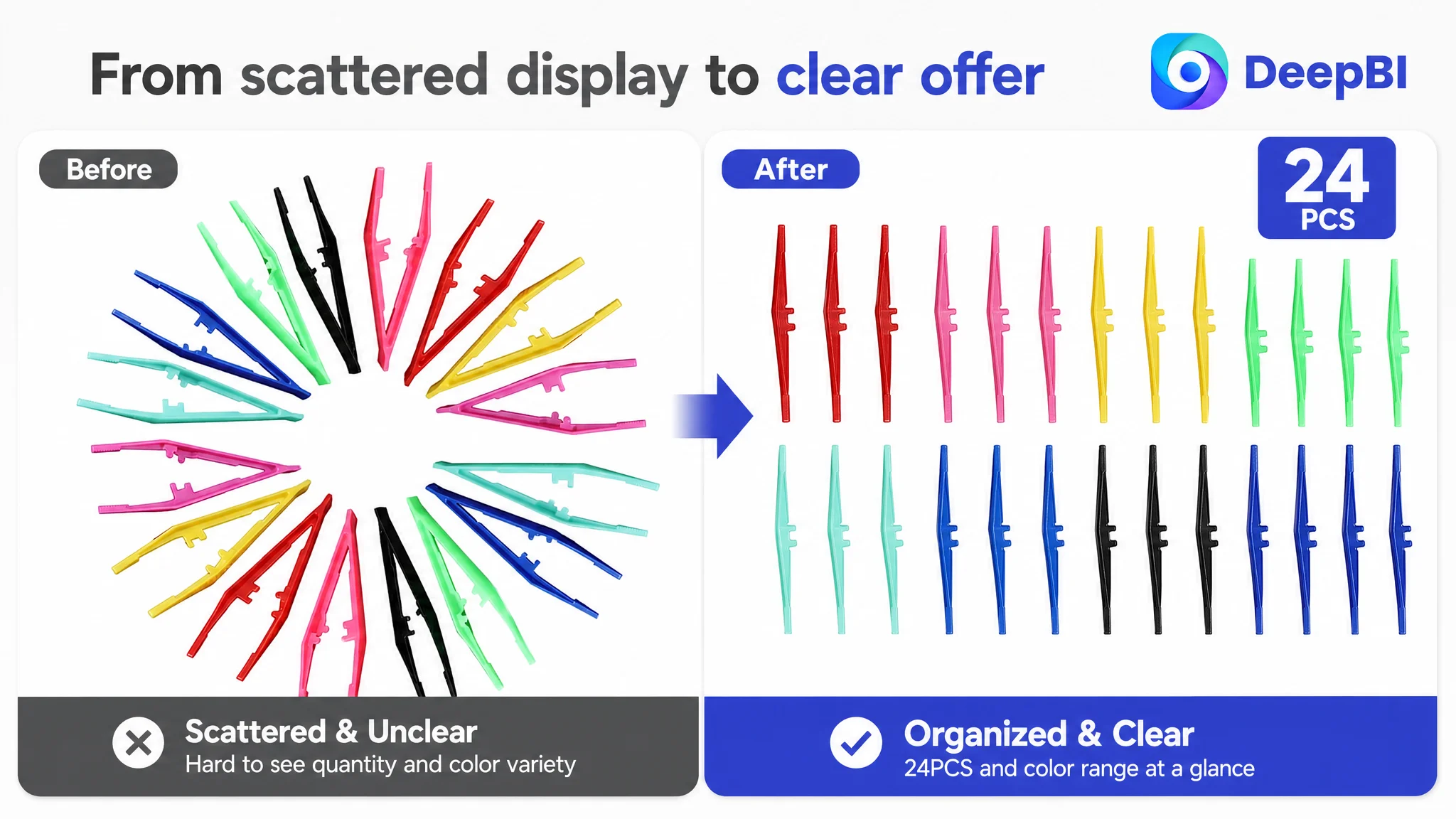
The main image was not the largest competitive deficit, but the visual system still had opportunities to communicate the product more efficiently. The existing arrangement showed the colors, yet the visual center was dispersed and the composition felt more like a collection of materials than a professional craft-tool presentation.
The recommended direction was to make the product quantity and color range immediately legible:
- arrange the tweezers in an orderly matrix
- make the set occupy most of the frame
- use a bright, high-contrast presentation
- show the quantity clearly
- preserve the actual product shape and colors
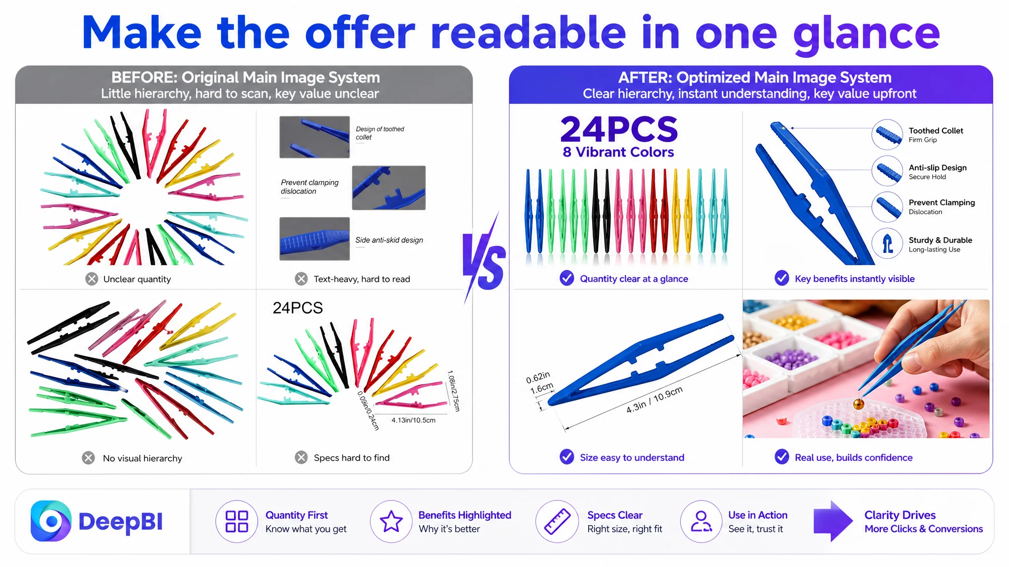
For secondary images, the focus shifted from dense explanation to fast visual recognition. Instead of relying on long sentences, the proposed sequence used focused demonstrations of:
- anti-slip handling
- serrated gripping detail
- product size
- precise bead placement
- use in fuse-bead projects
The point was not to make the images more decorative. It was to assign each image a job in the buying process.
The first visual should clarify the offer. A detail image should explain the design. A usage scene should demonstrate control. A craft scene should establish relevance.
That is a different approach from asking whether an image is merely attractive.
The Title Needed to Become a Search and Positioning Tool
The title gap was smaller than the detail-page gap, but it revealed the same underlying issue: the Listing was not prioritizing information according to shopper intent.
The customer’s title used “24 Pcs” and placed “Non-slip” and “Sawtooth Collet Design” before the most important product wording. The suggested direction moved “Bead Tweezers” closer to the front, then connected the product form to its functions and applications:
24 Pcs Bead Tweezers - Non-slip Plastic Tweezers with Sawtooth Collet for Beading Projects, Jewelry Making, Rhinestones, DIY Handicrafts, Kids Craft Tools for Home, Classroom and School
This structure improves more than keyword placement. It creates a clearer progression:
- what the product is
- what makes it useful
- what activities it supports
- who may use it
- where it belongs
The title also expands the application context through terms such as jewelry making, DIY crafts, and classroom use. This helps the Listing speak to more than one narrow use case without losing its core identity.
The important judgment was not “add more keywords.” It was “make the product’s market position readable in one pass.”
The Bullet Points Had Facts, but Not a Strong Buying Path
The bullet points needed to move from neutral description toward a sequence of buyer concerns.
The recommended structure began with safety and handling, then moved through package information, precision, educational value, and broader applications.
Material should establish confidence
The first bullet was reoriented around sturdy and lightweight plastic, comfortable handling, and suitability for both adults and children. These claims should remain aligned with verified product information, but the communication order matters: the shopper first needs confidence that the tool is practical to hold and use.
Quantity and size should reduce uncertainty
The second bullet brought the pack structure, colors, length, and opening width into one clear block. For a product often used in classrooms and family activities, quantity is not a minor specification. It affects whether the product feels sufficient for a group, a project, or repeated use.
The design should be connected to an outcome
The customer’s original feature language described physical attributes. The revised direction connected serrated jaws, tapered ends, anti-slip texture, and molded grip support to a practical result: picking up and placing small objects more accurately.
That is the difference between a feature list and a value statement.
Fine-motor practice should be treated as a use case
The comparison listing explicitly connected the product to fine-motor practice. The customer’s Listing did not make that connection strongly enough.
For parents, teachers, and kindergarten activities, this is not just an additional keyword. It explains why a simple tool belongs in a classroom or craft kit.
Applications should feel concrete
The final bullet expanded the use cases through specific activities such as bead collection, rhinestone work, pom-poms, bug exploration, science activities, small battery replacement, first-aid kits, and other fine household tasks.
The purpose was not to claim that every shopper needs all of these uses. It was to help more shoppers recognize a relevant use in the product.
The Missing A+ Content Removed the Trust Layer
The absence of A+ content was the decisive page-level weakness.
For this product category, A+ content is not valuable because it makes the Listing look more complete. It is valuable because it allows the seller to show what short copy cannot prove efficiently.
A strong detail sequence for these plastic tweezers would answer the following questions visually.
Is the full set easy to understand?
A complete color-grouped presentation can show the quantity and variety at a glance. This is especially relevant for classroom or family use, where buyers need to know whether the set is sufficient for multiple participants or projects.
Is the tool sized for the intended user?
A clear dimension module can show the approximate 4.3-inch length and opening width, helping shoppers judge handling and fit rather than guessing from a product photo.
Can it grip small objects precisely?
A close-up of the tip holding a small bead can demonstrate the function directly. This is stronger than repeating “precise” in a bullet point because it lets the shopper see the action.
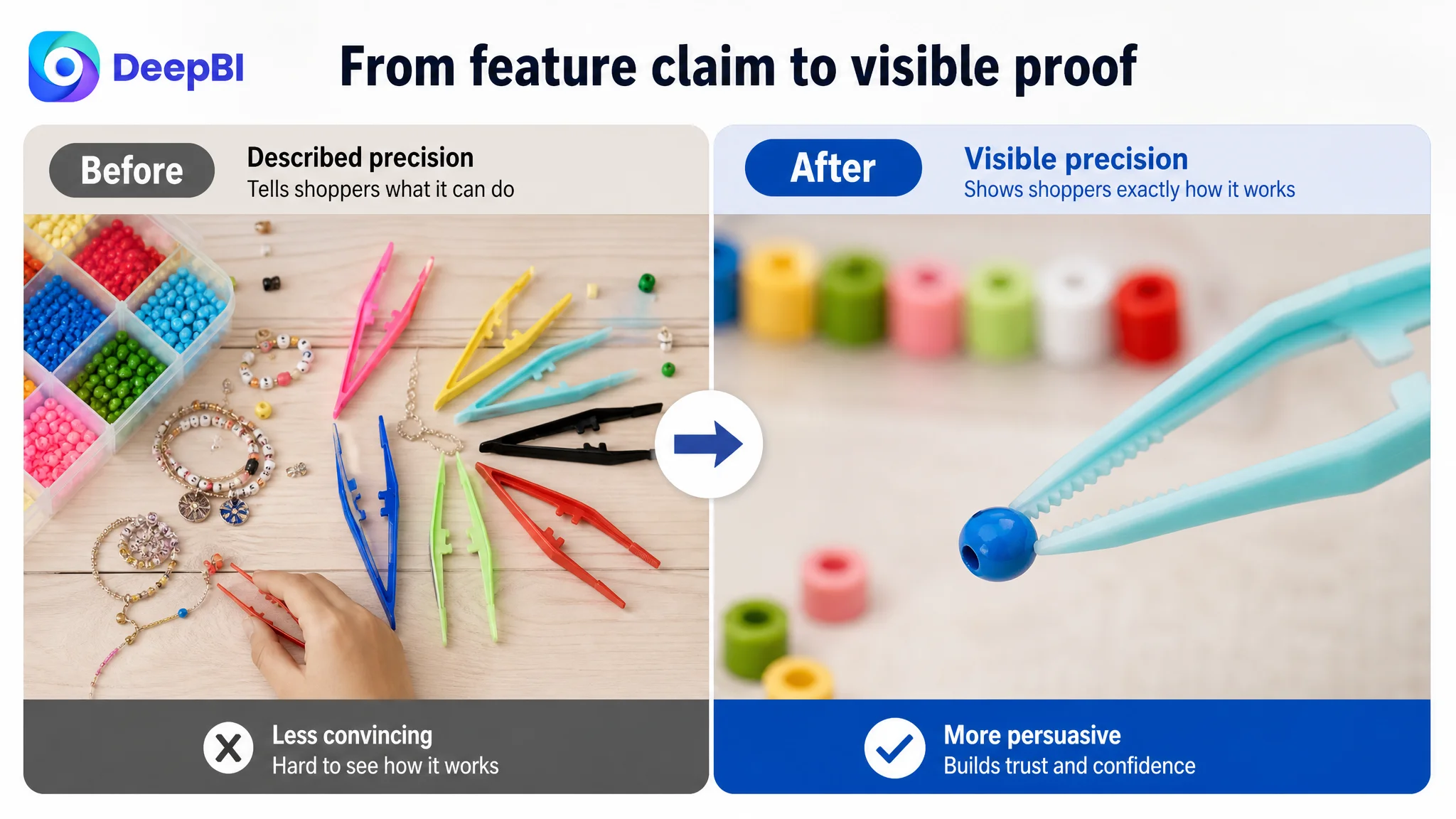
Does it belong in a real craft workflow?
A fuse-bead or DIY scene gives the product a recognizable context. The shopper can imagine the tool on a craft table, beside a template, or in a classroom activity.
Does it support fine-motor practice?
A supervised educational scene can connect the tweezers with hand-eye coordination and controlled placement. It gives the product relevance for parents and teachers without reducing it to a generic household forceps.
Can the product support an enjoyable shared activity?
A parent-child craft scene adds emotional context. It shows that the product can be part of family making and learning, not merely a small plastic accessory.
This is why the detail-page gap mattered more than a single image adjustment. The product needed a complete explanation of its role.
The Listing did not need a longer page. It needed a more persuasive sequence.
Why DeepBI Did Not Prioritize Ads First
The case material does not provide post-optimization advertising results such as CTR, CVR, ACOS, or TACOS. That limitation is important: no numerical advertising improvement should be claimed.
But the Listing diagnosis still establishes the correct decision order.
If a seller sends more Amazon ad traffic to a page with no A+ content, weak benefit framing, no review history, and limited proof of use, the additional traffic may simply expose the same conversion weakness at greater cost.
That is the business risk.
The team could continue adjusting:
- bids
- campaign structure
- keyword targeting
- match types
- budget allocation
Yet those changes would not answer the shopper’s unanswered questions on the product page.
The more responsible path was to repair the page’s conversion foundation first, then evaluate how paid and organic traffic responded. In this situation, ad optimization should support the Listing rather than compensate for it.
The decision logic can be stated simply:
1. The title and bullets were not organizing intent clearly enough.
2. The main image could communicate quantity and function more efficiently.
3. The product page lacked the visual proof supplied by A+ content.
4. The review gap created a separate trust constraint that content alone could not erase.
5. Therefore, scaling traffic before repairing the page would risk amplifying a low-conversion outcome.
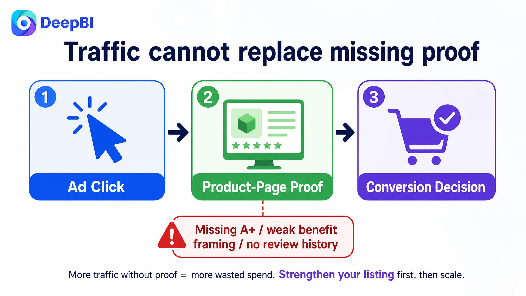
This is where DeepBI’s role was not to produce a longer checklist. Its value was to identify which gap had the greatest effect on the current business constraint.
The Optimization Direction Moved From “Describe the Tool” to “Prove the Use”
Once the diagnosis was clear, the proposed changes became more coherent.
The title would lead with the relevant product keyword and then connect features to applications.
The bullet points would follow a buyer-oriented order:
- material and handling confidence
- quantity, colors, and size
- precise picking and anti-slip support
- fine-motor practice
- versatile use cases
The visual plan would establish a consistent product story:
- bright, orderly presentation of the set
- close-up views of the gripping structure
- dimensions shown with a single product
- realistic bead-picking action
- fuse-bead and DIY project scenes
- classroom or educational use
- parent-child interaction
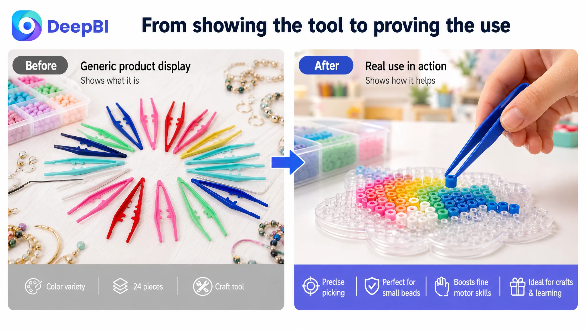
The AI image direction also needed to remain grounded in the actual product. The purpose was to improve composition, lighting, scene relevance, and information hierarchy without changing the tweezers’ physical structure, material, colors, or capabilities.
That boundary is commercially important. A visually impressive image that changes the product can create a new problem: shopper disappointment, negative reviews, and returns. For an Amazon Listing, visual improvement only has value when the final page remains faithful to what the customer will receive.
What Changed in the Business Understanding
Because the source material does not include a confirmed post-optimization data set, the case should not claim a specific CVR increase, ACOS decline, or organic-order recovery.
The supported change is in the operating logic.
The customer’s Listing was no longer viewed as a product with “some weak images and copy.” It was understood as a page whose sales argument had not yet been assembled.
That reframing changes future decisions:
- Ads should not be used as the first answer to every conversion problem.
- A high-quality main image does not compensate for an empty detail layer.
- Product features need to be translated into user outcomes.
- A+ content should resolve doubts, not merely decorate the page.
- Reviews are part of the trust funnel and must be treated as a separate business constraint.
- Quantity, dimensions, use cases, and user context should work together.
- Before scaling paid traffic, the team should ask whether the page deserves more traffic.
The real optimization was not “make the Listing look better.” It was “make the product easier to understand, trust, and choose.”
What Other Amazon Sellers Can Take From This Case
This craft-tweezers Listing illustrates a broader Amazon operating problem: sellers often optimize the most visible element instead of the most restrictive business constraint.
A title can be rewritten endlessly while the page still lacks visual proof. A campaign can be restructured repeatedly while the Listing continues to lose shoppers after the click. A main image can be made more polished while the shopper still cannot see how the product works in a real situation.
A stronger diagnosis begins with the full conversion system:
- Title: Can shoppers find and identify the product quickly?
- Main image: Does the offer become clear at the search-result stage?
- Bullet points: Do the features answer real buyer concerns?
- A+ content: Does the page prove the product’s function and relevance?
- Reviews: Is there enough independent trust to support the decision?
- Advertising: Is paid traffic being sent to a page capable of converting it?
For this Amazon seller, the largest gap was not a lack of traffic tactics. It was the absence of a complete product-page story.
The lesson is commercially practical: before asking Amazon ads to work harder, make sure the Listing can do its share of the selling.