

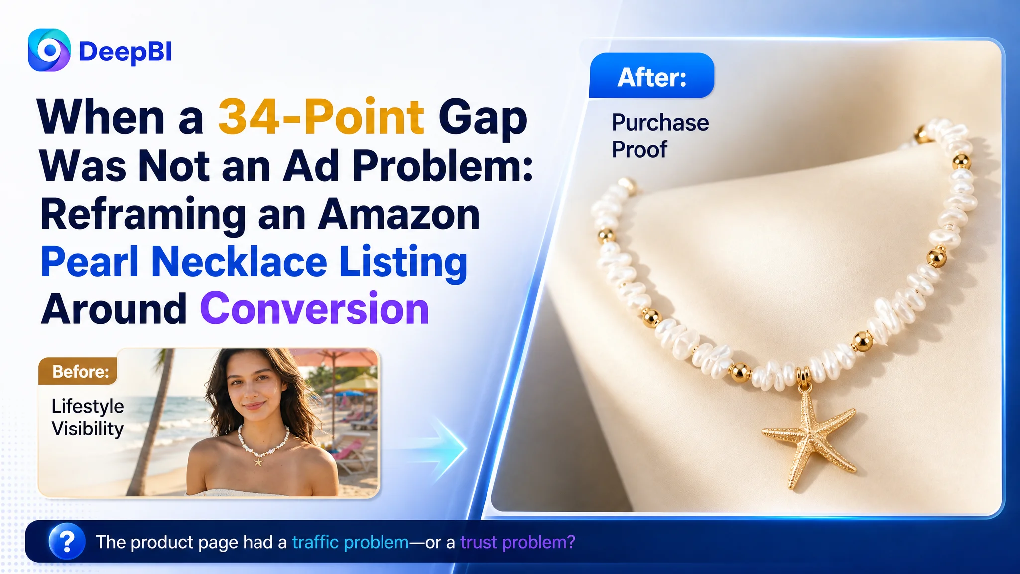
The customer was an Amazon US seller offering a shell, starfish, and pearl necklace for women. The product page had a clear summer and coastal identity, but its Listing competitiveness was far below a comparable category listing: 47 out of 100 versus 81.
The initial optimization direction focused on visible elements such as keyword placement, lifestyle imagery, and product descriptions. Those areas mattered, but they did not explain the full business problem. DeepBI found that the largest weakness was deeper in the Amazon product page: the Listing had no A+ content and no established review base, leaving paid or organic traffic with too little information and trust to support a purchase decision.
The later optimization therefore shifted from polishing isolated assets to rebuilding the page's sales logic. The work centered on a clearer Amazon title, more useful image sequencing, stronger material and size communication, scenario-based A+ content, and a more complete path from coastal style appeal to quality reassurance and gift intent. The case is useful for any Amazon seller who has been trying to improve traffic efficiency before confirming that the product page is ready to convert that traffic.
The Amazon Listing Looked Active, but Its Sales Logic Was Incomplete
At first glance, the Listing was not empty. It had model images, lifestyle language, and a recognizable design theme built around pearls, shells, starfish, summer, and beach style.
But when compared with a stronger category listing, the gap was not mainly a matter of taste.
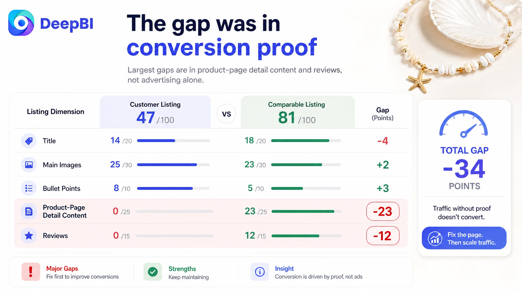
- Title: Customer Listing: 14/20, Comparable Listing: 18/20, Gap: -4
- Main images: Customer Listing: 25/30, Comparable Listing: 23/30, Gap: +2
- Bullet points: Customer Listing: 8/10, Comparable Listing: 5/10, Gap: +3
- Product-page detail content: Customer Listing: 0/25, Comparable Listing: 23/25, Gap: -23
- Reviews: Customer Listing: 0/15, Comparable Listing: 12/15, Gap: -12
- Total: Customer Listing: 47/100, Comparable Listing: 81/100, Gap: -34
The result was important: the customer was not simply losing because the main images were worse or because the bullet points were poorly written. In fact, the Listing scored slightly higher than the benchmark on the main-image dimension and three points higher on bullet points.
The largest loss came from the areas that help shoppers move from interest to confidence.
The Listing had a product story, but not yet a complete buying argument.
The Initial Assumption: Improve the Obvious Elements First
The natural response to a weak Amazon Listing is often to improve whatever shoppers see first:
- Add more keywords to the title
- Make the main image more attractive
- Repeat the beach and vacation theme more clearly
- Add more emotional language to the bullet points
- Make the product look more fashionable and giftable
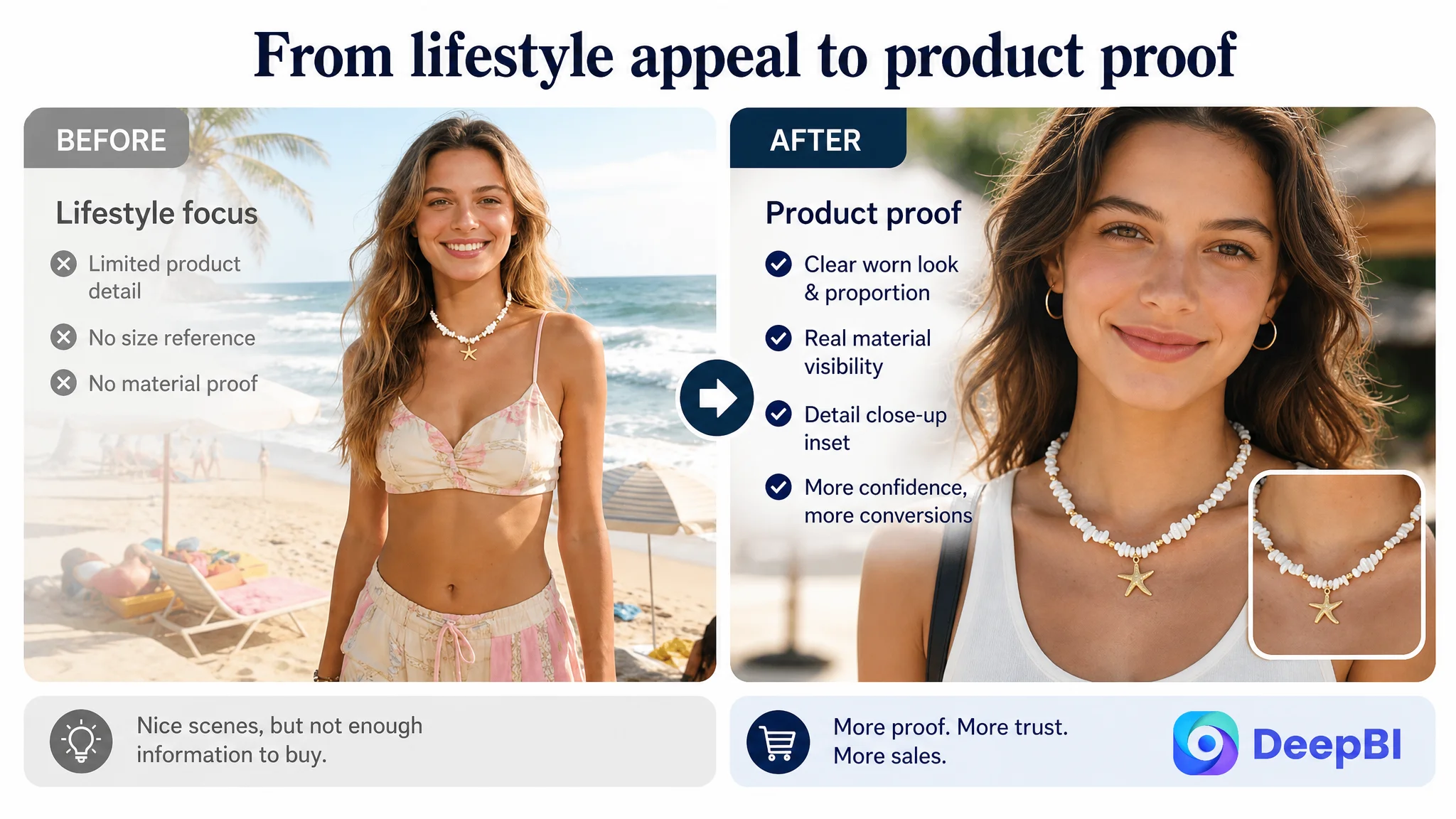
These actions were not irrelevant. The title did need restructuring, and the image sequence contained repetition. But treating those elements as the whole problem would have produced another round of isolated edits.
The deeper issue was that the page was being evaluated as a collection of assets rather than as a decision path.
A shopper considering a necklace like this may need answers to several different questions:
- What exactly is the product style?
- How large does it look when worn?
- Can the length be adjusted?
- What are the material and comfort claims?
- Does the product look refined enough to give as a gift?
- Can it work beyond a beach vacation?
- Does the seller provide enough visual proof to support the description?
The existing Listing answered some of these questions in fragments. It did not connect them in a deliberate sequence.
That distinction matters for Amazon ads as well. If an ad brings a shopper to the product page but the page cannot provide enough evidence to justify the purchase, additional traffic does not resolve the conversion problem. It only sends more visitors into the same incomplete decision path.
DeepBI Located the Real Constraint in the Product-Page Detail Layer
The score comparison made the priority clear. The 23-point gap in the detail-page dimension was far larger than the title gap, and it represented a missing conversion layer rather than a minor content weakness.
The customer Listing had no A+ content. The benchmark listing used a structured sequence that included:
- A brand-led visual banner
- Multiple worn-product scenes
- Close-up detail images
- Material and function callouts
- Gift scenarios
- Audience and use-case labels
This gave the benchmark page two advantages.
First, it established visual confidence. Shoppers could see the product worn, understand its scale, and inspect the pearl, pendant, chain, and clasp details.
Second, it expanded the reasons to buy. The necklace was not presented only as a beach accessory. It was also framed as a piece for weddings, birthdays, anniversaries, bridesmaid gifting, daily wear, and layered styling.
The customer page lacked both layers. It relied heavily on the shopper to infer appearance, quality, size, and gift suitability from limited images and text.
The most serious weakness was not a missing keyword. It was missing evidence.
Why More Advertising Would Not Have Solved This First
The business risk at this stage was not simply inefficient media buying. It was the possibility of amplifying a low-conversion page.
Advertising can create exposure and clicks, but it cannot independently provide the product-page proof that shoppers need after arriving. If the page does not show the product clearly, explain its fit, or establish enough confidence in its quality, ad optimization may improve traffic without producing a stable order response.
That is why the correct decision order was:
1. Clarify the Listing's positioning and core search entry points.
2. Repair the information gaps in the images and bullet points.
3. Build the missing A+ sales path.
4. Then evaluate how additional Amazon ad traffic is being converted.
This was not a decision to ignore advertising. It was a decision not to use advertising as a substitute for product-page readiness.
A stronger title or a better campaign may bring more relevant shoppers. But if those shoppers still cannot judge the necklace's scale, material presentation, adjustability, or gifting value, the underlying conversion constraint remains.
The Title Needed to Capture the Product Before the Lifestyle Language
The original title placed substantial emphasis on style and setting, including terms related to boho fashion, Hawaiian design, summer, and the beach. These descriptors supported the product identity, but they also competed with the core product terms.
DeepBI's recommended direction moved the product form closer to the front:
Shell Starfish Necklace for Women, 14K Gold Plated Layered Pearl Beaded Necklace, Dainty Adjustable Boho Hawaiian Summer Beach Jewelry, Birthday Anniversary Gift for Her
The logic was not to fill the title with more words. It was to establish the product before adding style and occasion context.
The revised structure prioritized:
- Product type: shell starfish necklace
- Audience: women
- Material and construction: 14K gold plated, layered, pearl beaded
- Functional detail: adjustable
- Style and setting: boho, Hawaiian, summer beach
- Gift occasions: birthday and anniversary
This also corrected the imbalance between generic style language and concrete purchase information. A shopper should not have to read the full title to determine what kind of necklace is being offered.
The Image Sequence Was Rebuilt Around Shopper Questions
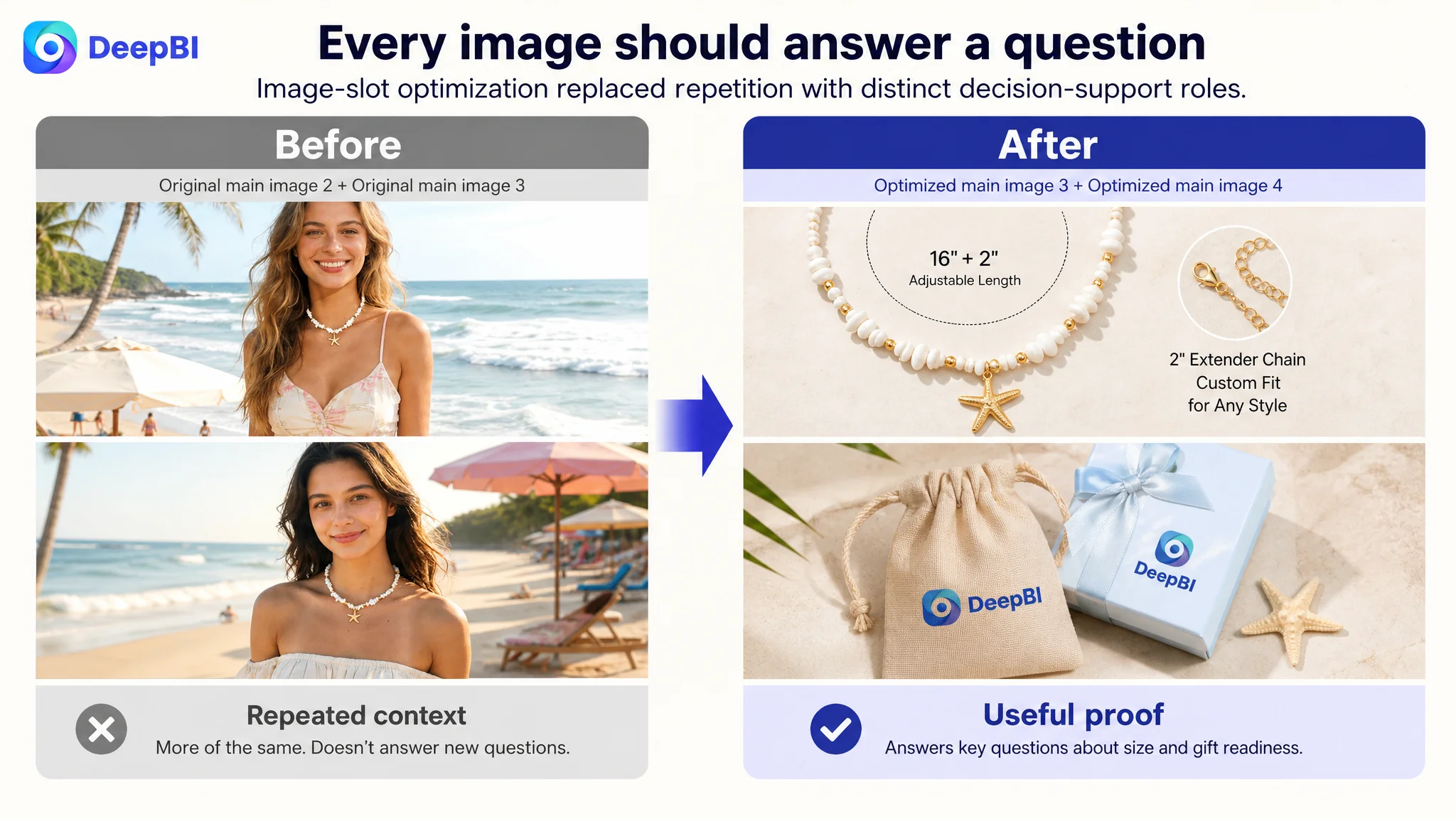
The main-image score was not the weakest area, but the image sequence still had an important structural problem: the first four images were highly repetitive model shots.
The issue was not that lifestyle images had no value. The coastal setting was relevant to the product's positioning. The issue was that several images performed the same job while leaving other buying questions unanswered.
The proposed sequence gave each image a distinct role.
The first image needed a stronger visual focal point
The existing coastal model image established atmosphere, but it did not make the pearl and starfish details immediately legible. The recommended direction retained the vacation context while bringing the product closer visually, using a focused detail treatment rather than allowing the necklace to disappear into the wider scene.
The goal was to make the product recognizable at a glance, especially in mobile search results.
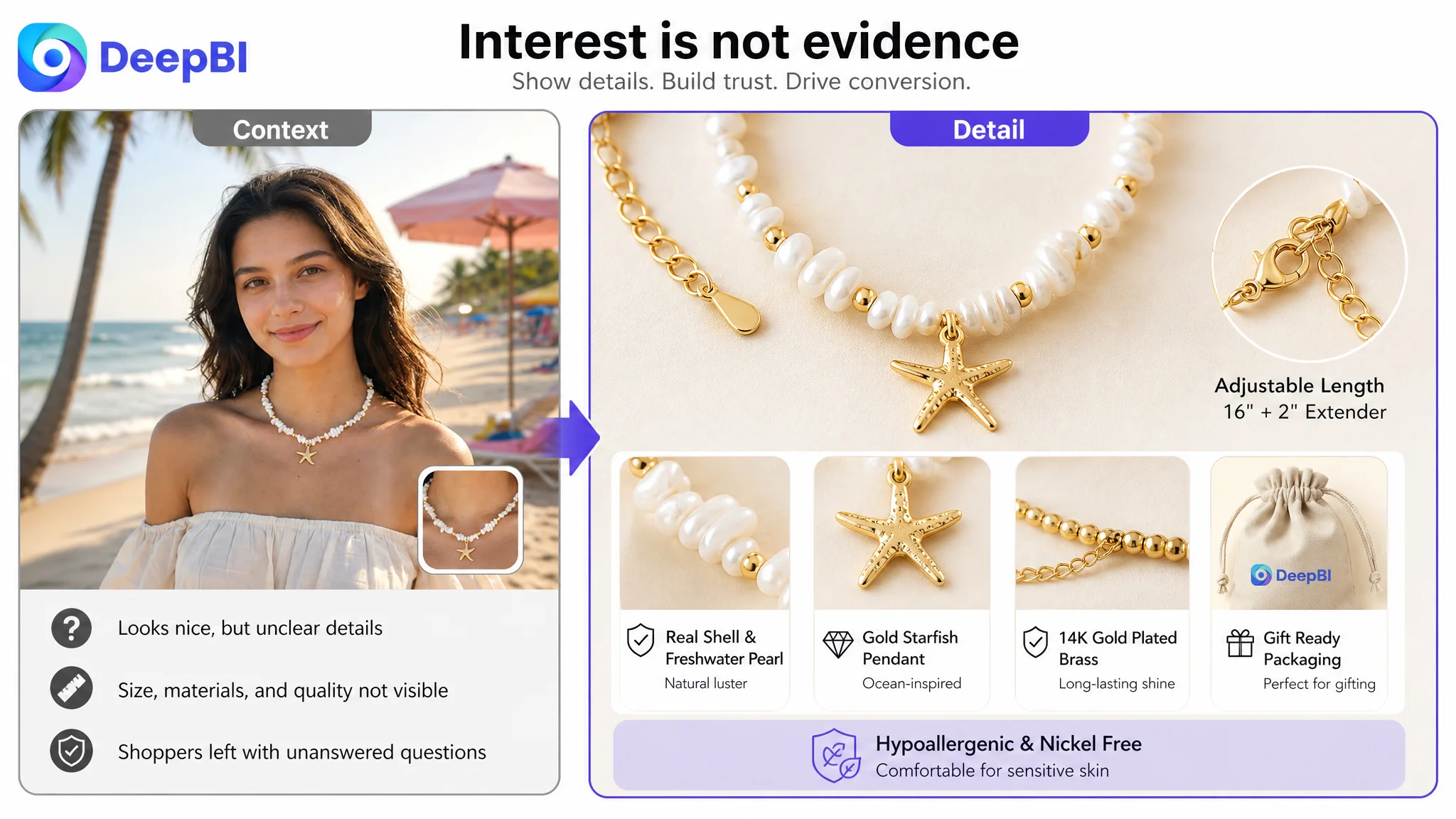
The second image needed to prove material and construction
Instead of another similar worn-product view, the next image should show the necklace in close detail:
- Pearl luster
- Starfish and shell pendant texture
- Gold-plated surface
- Chain connections
This responds to a different shopper concern: whether the product looks as refined in reality as it does in the lifestyle presentation.
The third image needed to remove size uncertainty
The product page had an opportunity to communicate the full necklace length, extender chain, and lobster clasp. These details are more useful when presented visually and quantitatively than when expressed only through a general word such as “adjustable.”
The proposed direction used the existing product structure and closed-state source material. It did not require inventing a new component or changing the necklace. It simply made the physical information easier to verify.
The fourth image needed to establish gift readiness
The necklace was described as suitable for birthdays, anniversaries, weddings, and bridesmaid gifting. The image sequence therefore needed a visual answer to a practical question: does the product arrive in a form that feels appropriate to give?
Showing the elegant jewelry pouch would connect the gift claim to something visible rather than leaving it as a line of copy.
The fifth image needed to clarify safety and quality claims
The final planned image could reinforce the material and comfort positioning, including the stated lead-free, nickel-free, and hypoallergenic claims where supported by the product information. The execution should remain faithful to the existing product and use visual emphasis, icons, and close-up presentation rather than introducing unsupported attributes.
The Bullet Points Already Had Emotion. They Needed More Decision Support.
The customer Listing's bullet points had a distinctive strength: they were built around coastal lifestyle, emotional appeal, and the “no more sizing worries” promise.
The benchmark listing, by contrast, was more specification-led. That did not mean the customer's copy should be replaced with dry technical writing. It meant the emotional positioning needed to be connected to concrete evidence.
The revised structure combined both approaches:
- Coastal design plus wear-alone or layered styling
- 14K gold-plated brass and hand-selected pearls
- Lead-free and nickel-free construction claims
- Approximately 16 inches with a 2-inch extender chain
- Lobster clasp details
- Gift packaging and occasions
- Vacation, cruise, poolside, and everyday styling
This created a more useful progression.
The first bullet answers why the product is visually appealing. The second addresses material and comfort. The third reduces fit uncertainty. The fourth explains gifting value. The fifth broadens use beyond a single vacation setting while reinforcing the product promise.
The improvement was not simply longer copy. It was a shift from isolated description to a sequence of reasons that support a purchase decision.
A+ Content Had to Complete the Trust Path
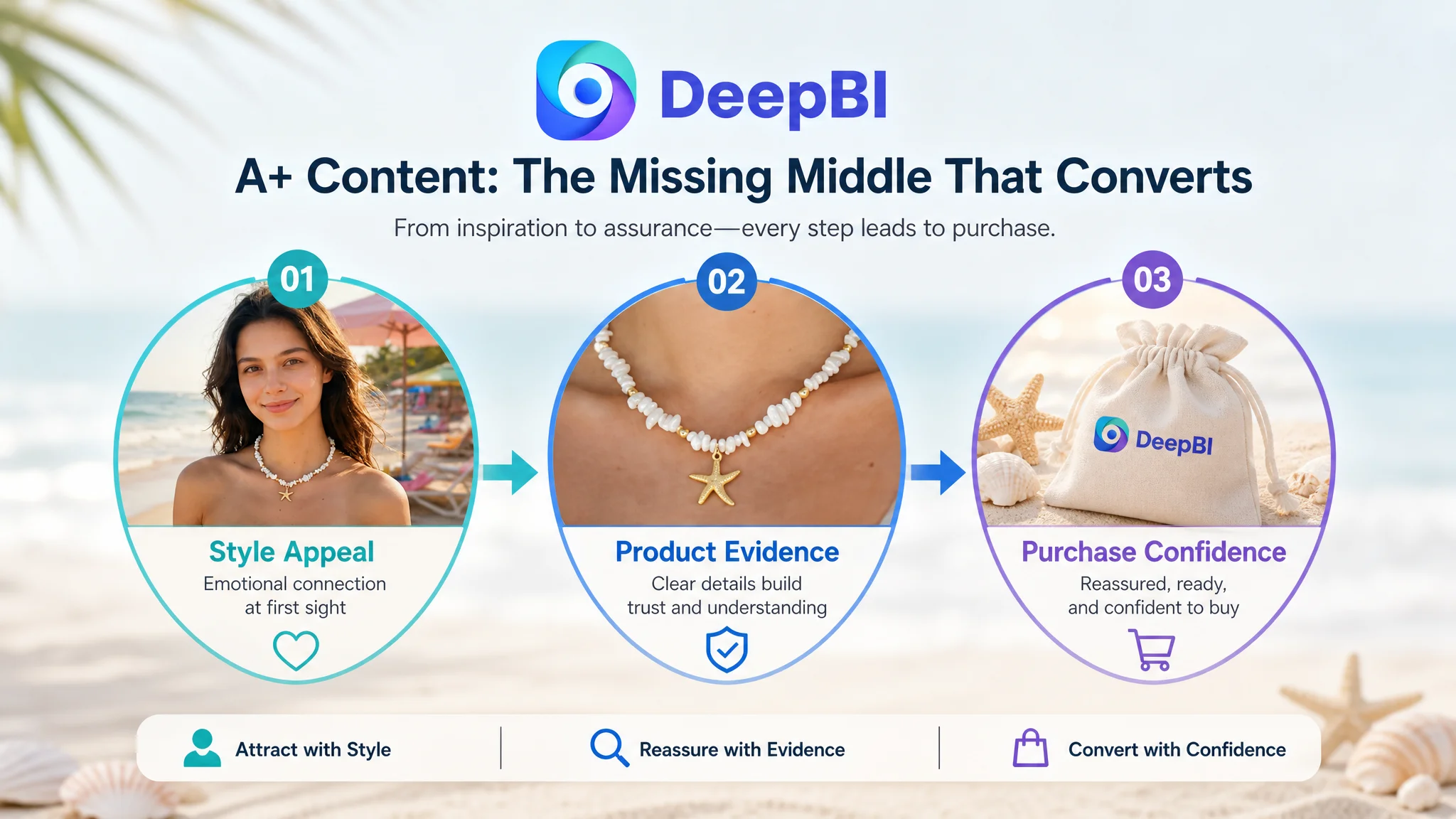
The missing A+ content was the clearest structural defect in the case. For this product category, A+ was not merely an opportunity to add decorative brand imagery. It was the space where the page could connect emotional style with rational reassurance.
The proposed content path included seven roles.
Set the product identity
Open with the refined ocean-inspired design: pearls, shell, and starfish elements presented as a cohesive boho jewelry style.
Show the product worn
Use real wearing scenarios to communicate scale, delicacy, layering, and compatibility with summer clothing such as swimwear or an off-shoulder dress.
Expand everyday relevance
The product should not appear limited to beach holidays. Additional scenes can show how the summer aesthetic works with casual daily outfits and relaxed commuting or leisure settings.
Address quality concerns directly
Close-up modules should present the clasp, extender chain, gold-plated surface, pearl, and pendant details. This is where shoppers can find answers to concerns about sturdiness, adjustability, material appearance, and comfort claims.
Confirm the static product appearance
A flat-lay or fashion display gives shoppers another view of the complete necklace and reinforces the relationship among its different elements.
Make the gift proposition visible
The jewelry pouch, gift recipients, and occasions should be shown together so that the gifting message is supported by both packaging and context.
End with a clear product promise
The final module can summarize the design, material, and comfort positioning without introducing unsupported service or performance claims.
This sequence turns A+ from a decorative add-on into the missing middle of the page's conversion logic.
The page needed to move shoppers from “I like the style” to “I understand what I am buying and why it is suitable.”
Reviews Were a Trust Gap, but Not an Instant Optimization Lever
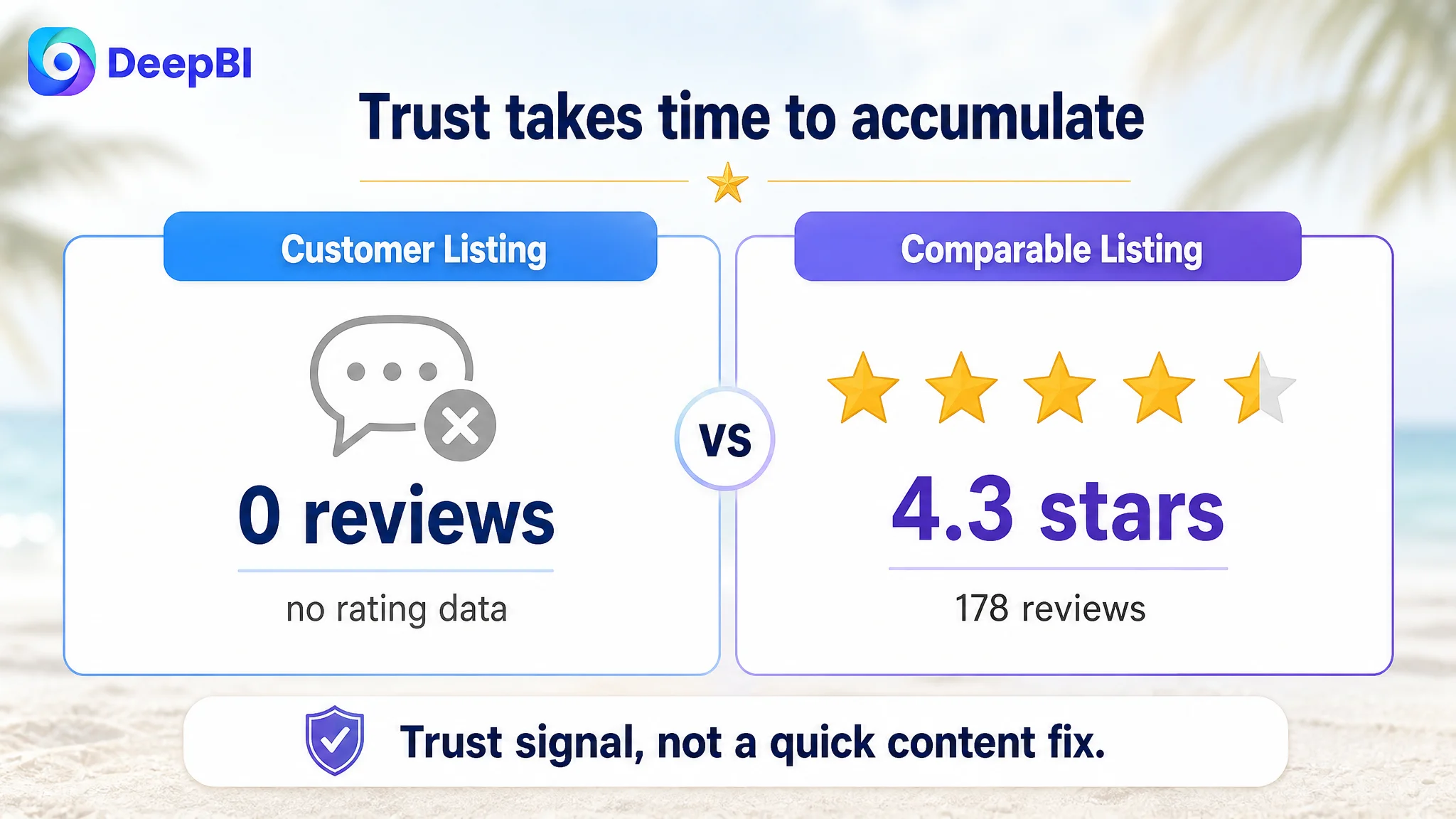
The customer Listing had no rating data and no reviews, while the comparable listing had a 4.3-star rating, 178 total reviews, and nine reviews visible on the first page.
This created a meaningful trust disadvantage. Even though the benchmark also contained several lower-rated reviews, its accumulated review volume still gave shoppers more evidence than a page with no review history.
However, reviews could not be treated as a quick content adjustment. The right business judgment was to recognize the gap without allowing it to obscure the more controllable page-level actions.
The seller could not immediately manufacture review history through title changes or image replacement. What could be addressed first was the page's ability to communicate the product accurately and persuasively while the review base developed through compliant operating practices.
That distinction prevented the team from treating every score gap as equally actionable at the same moment.
The Value of the Diagnosis Was the Order of Decisions
The case did not call for endless isolated revisions. It called for a clearer order of operations.
DeepBI's role was to connect the score differences with the actual shopper journey:
- The title was not precise enough at the search-entry stage.
- The image sequence spent too many slots repeating lifestyle context.
- The bullet points had useful emotion but needed more measurable product information.
- The A+ layer was entirely absent.
- The review base had not yet established trust.
Among these issues, the missing A+ content and incomplete product evidence represented the most important conversion constraint. Fixing them first reduced the risk of sending more traffic to a page that still required too much shopper interpretation.
Only after that foundation was rebuilt would Amazon ads provide a cleaner test of traffic quality, CTR, CVR, ACOS, and the relationship between paid and organic conversion.
What Changed in the Customer's Operating Understanding
The available case material does not include post-optimization performance figures, so no numerical improvement in CTR, CVR, ACOS, or organic orders should be claimed.
What did change was the operating diagnosis.
The Listing was no longer viewed as a product with a traffic problem that could be solved through more keywords or more attractive images alone. It was understood as a page with an incomplete conversion system.
That changed the next actions:
- The title was reorganized around the product's core search identity.
- Repeated lifestyle images were replaced by detail, size, material, and gifting information.
- Bullet points were structured around both emotional appeal and purchase reassurance.
- A+ content was planned as a complete sales path rather than a decorative module.
- Review absence was recognized as a longer-term trust constraint, not a reason to postpone every other improvement.
- Advertising was repositioned as a traffic lever that should be scaled only after the page could better convert the traffic it received.
For Amazon sellers, the broader lesson is straightforward:
Before asking whether Amazon ads are efficient, ask whether the product page has earned the right to receive more traffic.
A Listing does not convert because it contains more words or more images. It converts when the title, main images, bullet points, A+ content, and trust signals work together to answer the shopper's next question.
In this case, the most important optimization was not a single image, keyword, or bullet point. It was recognizing that the page had been asking advertising and search visibility to compensate for a missing conversion structure.