

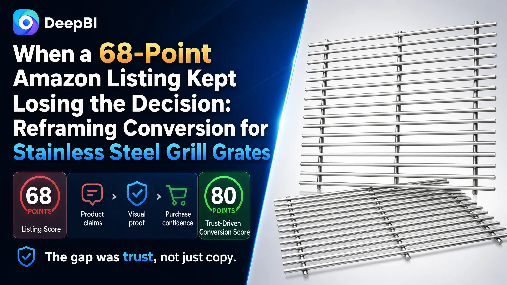
An Amazon seller of replacement grill grates was not facing a simple keyword or image problem. Its US Amazon Listing had the right product category, clear compatibility information, and several meaningful product advantages, yet the page still sat at 68 out of 100 against a comparable high-performing Listing at 80.
The initial optimization direction treated the page as a collection of separate edits: refine the title, expand the compatible model list, improve the main images, and add more product details. Those actions were reasonable, but they did not explain why the Listing remained commercially weaker. DeepBI’s diagnosis showed that the larger issue was the page’s ability to turn product advantages into confidence at each stage of the Amazon buying journey.
The most important gap was not the five-point copy. It was the combination of zero review support, weaker visual proof, and a less structured A+ experience. The later optimization therefore focused on making compatibility easier to verify, turning the 9mm stainless steel construction into visible evidence, and rebuilding the product page around real installation, cooking, safety, and maintenance scenarios.
For other Amazon sellers, the lesson is direct: a Listing can contain strong claims and still lack conversion capacity. Before putting more pressure on Amazon ads or continuing to adjust isolated keywords, sellers need to determine whether the product page gives shoppers enough reasons to click, trust, and buy.
The Listing Had Product Advantages, but the Page Was Not Converting Them Into Confidence
The product was a replacement grill grate designed for a major manufacturer’s Spirit and Spirit II 300-series gas grills. Its potential selling points were clear:
- 9mm solid stainless steel rods
- Food-grade SUS304 material
- Reinforced welds and smooth edges
- Compatibility across multiple grill models
- Easier maintenance than cast iron
- A two-pack configuration
- A tighter cooking surface designed to reduce food falling through
On paper, this was not an undifferentiated accessory.
The problem was that these advantages were not presented with equal strength across the full Amazon product page. Some were described in the bullets, some appeared in the images, and others were implied rather than demonstrated. The shopper still had to assemble the buying logic independently.
That created a fragile conversion path:
The product had reasons to be considered, but the page did not consistently prove why it was the safer replacement choice.
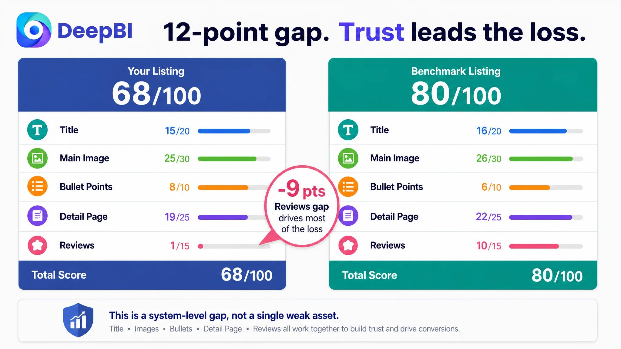
The overall score made that imbalance visible. The Listing scored 68 out of 100, while the comparable benchmark reached 80. The gap was not concentrated in one isolated formatting error. It reflected a broader weakness in how the page supported discovery, verification, and trust.
The Easy Diagnosis Was “Improve the Assets One by One”
The page review could easily have been handled as a checklist:
- Move keywords in the title
- Add more compatible models
- Make the main image brighter
- Rewrite the bullets
- Add more A+ modules
- Compare stainless steel with cast iron
Each action had merit. But treating them as independent tasks risked missing the central business problem.
The customer’s Listing already had relatively strong bullet-point logic. Its five-point score was 8 out of 10, compared with 6 for the benchmark. The copy emphasized upgrades, material advantages, cleaning convenience, and safety more directly than the comparable page.
That finding mattered because it ruled out a common but incomplete conclusion: that the Listing simply needed more aggressive copywriting.
The stronger question was:
Why did a Listing with competitive product claims still lack the same level of decision support?
DeepBI’s answer came from looking across the page rather than optimizing only the text.
The title was slightly behind the benchmark, with a score of 15 compared with 16. The main image was also close, at 25 compared with 26. These were real gaps, but not the largest ones.
The more serious weaknesses appeared in the supporting trust system:
- Detail page score: 19 versus 22
- Review score: 1 versus 10
- Total score gap: 12 points
The page was not failing because every element was poor. It was failing because the elements that should have compensated for a new or unproven product were not strong enough together.
The Largest Conversion Constraint Was Trust, Not Bullet-Point Quality
The most decisive difference was in reviews.
The target Listing had no rating data and no customer reviews. The comparable Listing had a 5.0-star rating, 16 total reviews, and eight visible reviews on the first page. Those reviews reinforced practical purchase concerns with phrases such as “fit perfectly,” “heavy duty,” and “high quality.”
For a replacement part, this type of evidence carries particular weight. Shoppers are not only asking whether the product looks durable. They are asking:
- Will it fit my exact grill?
- Will the rods warp under heat?
- Will the edges be safe to handle?
- Is the replacement truly heavier or more durable than standard alternatives?
- Will cleaning be easier than with the old grate?
- Does the product look reliable after installation?
Without review support, the product page had to carry more of that trust burden through its visual and informational structure.
Instead, some of the most important proof points remained relatively abstract.
A text claim such as “9mm solid stainless steel” is useful. A clear measurement image, a close-up of the solid rod, a visible cooking scenario, and a clean installation view make that claim easier to believe.
This is why the review gap could not be treated as a separate reputation issue. It changed the job of every other Listing element.
When reviews are absent, the page must work harder to make compatibility, material quality, and real-world use immediately credible.
The Main Image Was Not Just a Design Problem
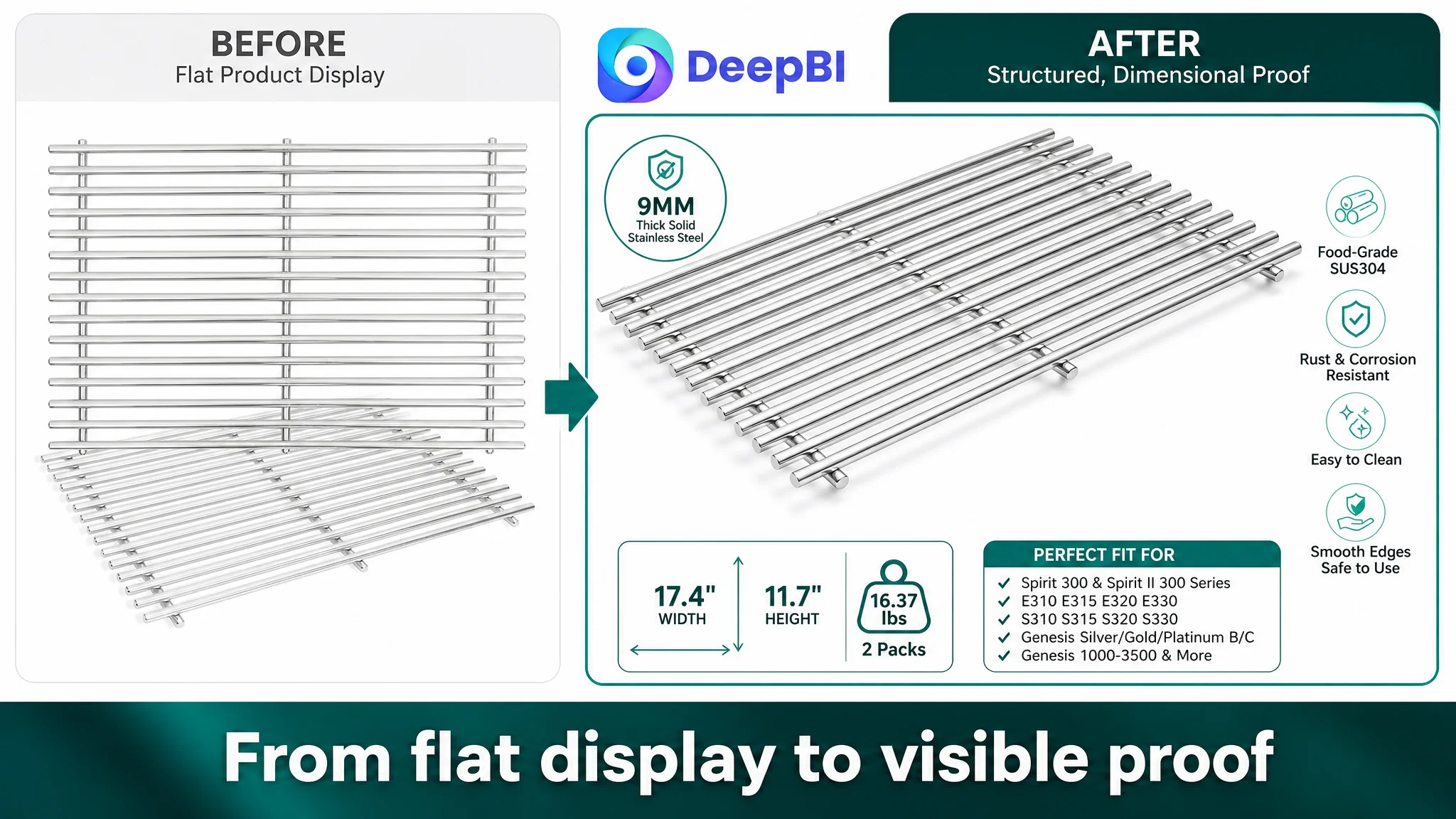
The existing main-image direction was described as dark, flat, and industrial. It lacked the dimensional depth and visual energy that could help the product stand out in Amazon search results.
That affects the first step of the funnel: the click.
The replacement grate is a relatively technical accessory. Its shape is simple, and shoppers may see several visually similar products in search. A flat product arrangement can make a substantial 9mm stainless steel construction look interchangeable with thinner alternatives.
The recommended direction therefore did not begin with decorative styling. It began with a commercial job for the image:
- Make the product occupy the visual field more decisively
- Use diagonal overlapping composition to create depth
- Preserve a clean white background
- Use controlled lighting to reveal the stainless steel surface
- Make the geometry of the solid rods easy to recognize
- Present the product as a substantial replacement component rather than a generic metal grid
Additional images could then answer more specific questions:
- What is the actual diameter?
- Is the rod solid?
- How many rods are included?
- How tight is the spacing?
- Which grill models are compatible?
- How does the grate look inside a real grill?
The important distinction is that the image set should not simply show more views. Each image should remove a different purchase hesitation.
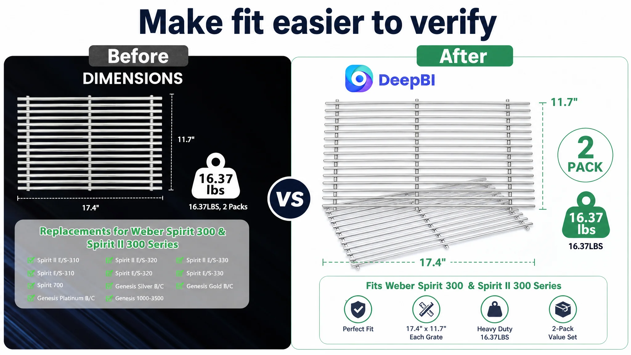
Compatibility Needed to Become a Visual Decision, Not a Text Search
For replacement parts, “fits multiple models” is not enough. Shoppers need to identify their own model quickly and avoid an expensive mistake.
The Listing contained detailed compatibility information, but some of it appeared as dense text. The comparable page used more structured presentation, including a compatibility matrix that grouped model families and sub-series clearly.
DeepBI therefore prioritized visualizing compatibility through:
- A clean grill-and-grate layout
- Model-family grouping
- Clear inclusion and exclusion notices
- A direct reminder to measure the original grate before ordering
- A structured presentation of compatible series rather than a long unbroken model string
This was not only a conversion improvement. It was also a risk-control decision.
A confused shopper may abandon the purchase. A confident but mistaken shopper may place an order and later return it. For a replacement accessory, making compatibility easier to verify protects both outcomes.
The title and bullets still mattered. The recommended title structure moved the core size and product type earlier, organized compatible model information more clearly, and reduced the imbalance created by leading with a low-recognition brand name.
But the title could not carry the entire burden. Search visibility and purchase confidence are related, but they are not the same problem.
The 9mm Advantage Needed Evidence
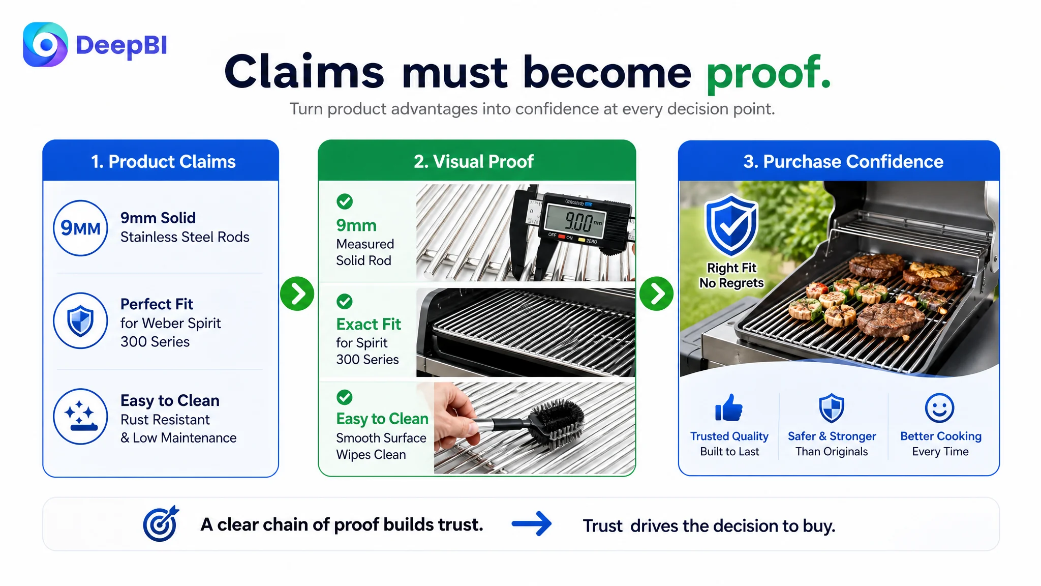
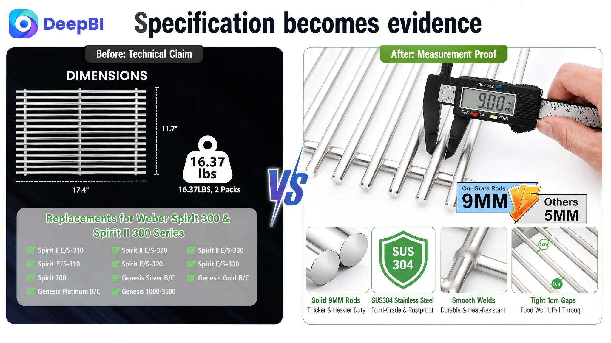
The Listing’s strongest technical differentiator was the 9mm solid stainless steel rod construction. The recommendations positioned it against common 5mm and 7mm alternatives and connected the specification to practical benefits:
- Greater resistance to warping
- Better heat retention
- A heavier-duty cooking surface
- More stable cooking performance
- A tighter surface for smaller foods
- Stronger durability over repeated use
However, a specification only becomes persuasive when shoppers can process it quickly.
The proposed visual treatment used a digital caliper showing a 9.0mm measurement, a close-up of the solid rod, and a clean comparison with a thinner alternative. This approach turns a technical statement into visible proof.
The same principle applied to safety. Reinforced welds and polished edges were not left as unsupported claims. A macro image of the weld points and rounded edges could show that the product was designed to be handled and cleaned without sharp burrs.
The product did not need more dramatic claims. It needed clearer evidence for the claims it already had.
The A+ Page Was Missing the Final Layer of Persuasion
The detail-page score was 19 out of 25, three points behind the benchmark. The difference was not simply a matter of having fewer images.
The comparable A+ experience created a more complete progression:
1. A real grill installation context
2. A cooking and food-use scene
3. Structural and material details
4. A measurable size explanation
5. A compatibility matrix
6. A visual benefits system
7. A maintenance or use-confidence layer
The target page had useful content, including a scene image, compatibility information, selling-point images, a thickness comparison, maintenance guidance, and food imagery. But the modules were less visually unified and relied more heavily on text lists.
That weakened scanability and made the customer do more interpretive work.
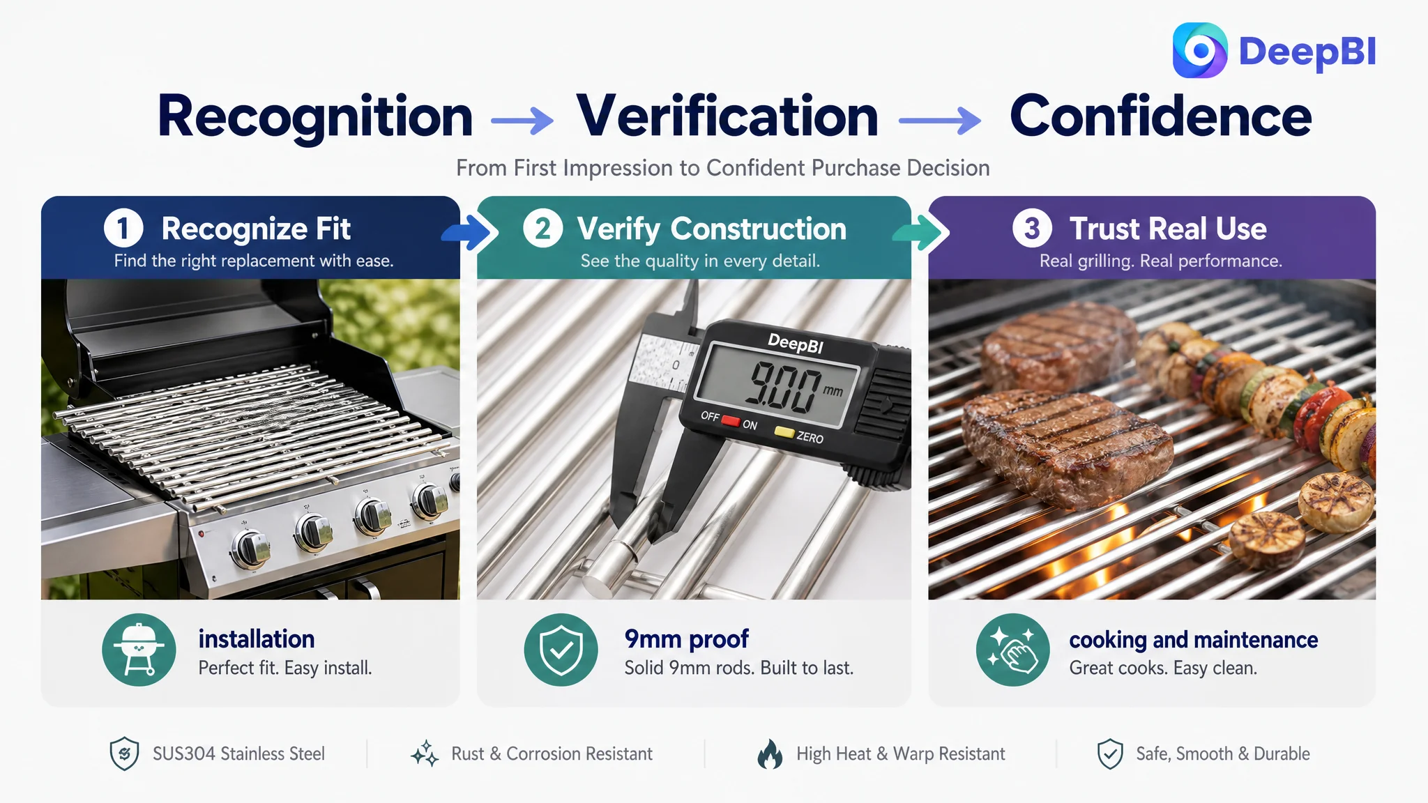
The later direction focused on rebuilding the A+ page around the questions shoppers actually ask.
Will it look right in my grill?
A realistic outdoor scene with the grate installed inside a compatible grill could establish a stronger expectation of fit than a product image alone.
Is the 9mm claim real?
A clean measurement scene could make the thickness visible and credible.
Will it perform under heat?
A food close-up with visible grill marks, warm firelight, and the stainless steel surface could connect construction to the cooking outcome.
Is it safe to handle?
A macro view of smooth edges and reinforced welds could support the safety claim directly.
Will it be difficult to maintain?
A cleaning scene could show the action more efficiently than a paragraph about maintenance.
Which grill models does it fit?
A structured compatibility module could reduce the cognitive load of checking a long model list.
This sequence gave the page a more coherent sales logic. It moved from recognition to verification, then from verification to use confidence.
Why More Ad Tuning Was Not the First Decision
The case material does not provide before-and-after Amazon ad metrics such as CTR, CVR, ACOS, or TACOS. That limitation is important. It would be inaccurate to claim that the Listing changes reduced ad costs or increased orders.
But the decision principle remains clear.
If paid traffic is sent to a product page with weak trust support, advertising may increase exposure without solving the conversion constraint. The page can receive more visits while continuing to lose shoppers at the same decision points.
For this Listing, the priority was therefore not to keep treating every commercial challenge as a campaign-setting problem. The priority was to repair the page’s ability to receive traffic responsibly.
That meant addressing the highest-risk combination first:
- No review support
- Weakly visualized compatibility
- Limited real-use proof
- A+ content that was informative but less persuasive
- A main image that did not fully communicate product substance
The decision order was not “images instead of ads.” It was “make the page more capable before asking traffic to scale the result.”
Advertising can amplify a strong product page, but it can also amplify the weaknesses that prevent a page from converting.
What DeepBI Changed in the Team’s Understanding
The value of this diagnosis was not a longer list of edits. It was a change in how the Listing was evaluated.
The customer did not have to discard the product’s existing positioning. The five-point copy already contained useful conversion logic, and the product had credible functional advantages. What needed to change was how those advantages were coordinated across the Amazon page.
The diagnosis reframed the work in four ways:
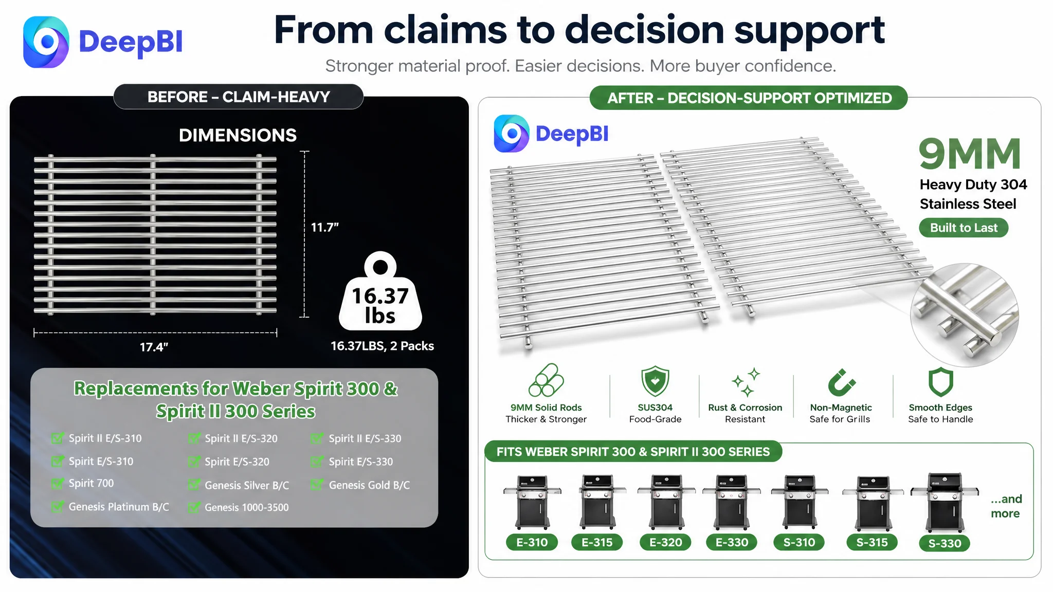
- From isolated edits to a conversion system: title, images, bullets, A+, and reviews had to support the same buying decision.
- From feature claims to visible proof: 9mm thickness, solid rods, compatibility, smooth edges, and easy maintenance needed visual evidence.
- From more information to lower decision friction: compatibility details had to be structured so shoppers could identify the right model quickly.
- From traffic-first thinking to page readiness: the Listing needed enough trust and clarity before additional traffic could become commercially useful.
The source material does not include confirmed post-optimization performance data, so the final outcome should be described in terms of operating direction rather than unsupported numerical gains.
The intended change was for the Listing to become more controllable: easier to understand in search, easier to verify on the product page, and more credible for a shopper deciding whether to replace an existing grill grate.
The Broader Amazon Lesson
A low-scoring Amazon Listing does not always need more copy, more keywords, or more advertising.
Sometimes the real problem is that the page has not yet turned its strongest product facts into a sequence of convincing decisions.
For this stainless steel grill grate Listing, the core opportunity was not hidden in a single missing phrase. It was distributed across the page:
- The title needed clearer priority and structure.
- The main image needed stronger visual presence.
- Compatibility needed to be easier to verify.
- The 9mm construction needed measurable proof.
- The A+ page needed a more complete use-and-trust narrative.
- The absence of reviews made every visual and informational weakness more consequential.
That is the kind of diagnosis Amazon sellers need before making the next optimization move.
The question is not only whether a Listing contains the right information. It is whether the page gives shoppers enough confidence to act on it.