

An Amazon seller in the baking-tool category was trying to improve a product page for a flour duster and powdered-sugar shaker on the US marketplace. The initial direction centered on familiar Listing work: move the main keyword forward, refine the title, clarify the bullets, and make the product images more attractive.
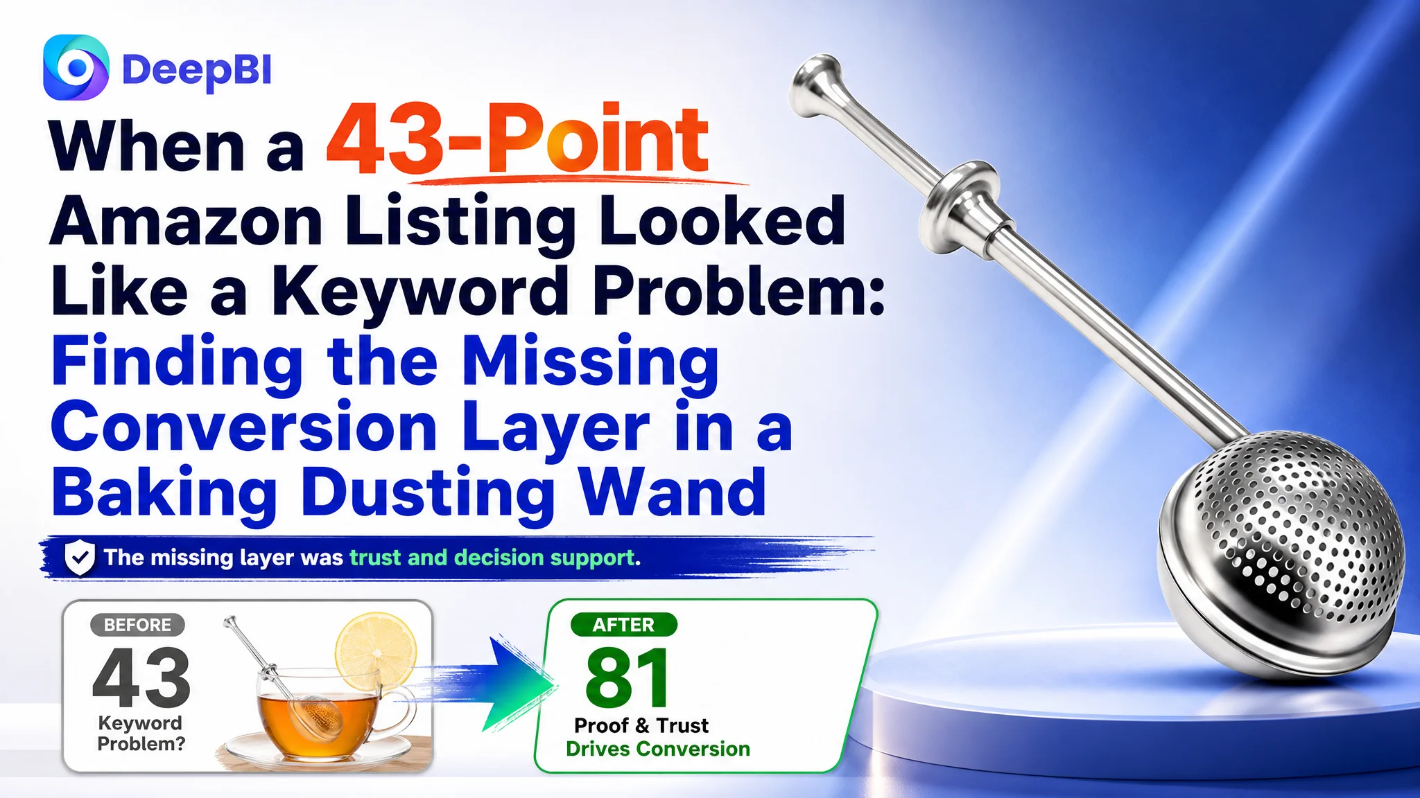
That direction addressed visible weaknesses, but it did not explain why the Listing remained commercially fragile. DeepBI’s comparison showed a much larger issue: the page was missing the trust and decision-making structure needed to convert shoppers. Its Listing score was 43 out of 100, compared with 81 for a comparable high-performing product page. The largest gaps were not in the title or main image, but in the detail experience and review foundation.
The later optimization therefore focused on rebuilding the Amazon product page as a complete sales path: clarify the product’s use cases, show the one-handed dusting action, visualize the result, support material and cleaning claims, and add an A+ story where none existed before. The case offers a useful reminder for Amazon sellers: before increasing traffic or repeatedly adjusting keywords, determine whether the product page has enough evidence to deserve that traffic.
The Listing Did Not Have a Single Weak Element. It Had a Broken Conversion Layer.
At first glance, the Listing appeared to have several ordinary content problems.
The title was loose. The main image lacked a strong visual focus. The bullets contained useful specifications but did not always connect those specifications to user benefits. The detail page had no A+ content. The product had no visible review history.
Any one of these issues could justify an optimization project. Together, however, they created a more fundamental constraint:
The product page could describe the tool, but it could not reliably help a new shopper decide to buy it.
This distinction matters on Amazon. A title can improve search relevance. A main image can earn the click. But the product page must still answer the shopper’s next questions:
- What problem does this tool solve?
- How does it work in actual use?
- Can it distribute powder evenly?
- Is it easy to load and control?
- Is the material credible and durable?
- Will it be easy to clean and store?
- Can other buyers be trusted to have had a good experience?
The page was not completely empty of information. It had product attributes, material details, cleaning instructions, and use cases. The problem was that these elements did not form a persuasive sequence.
The Original Direction Treated the Problem as Content Refinement
The initial optimization logic was understandable. The product’s core keyword, “Flour Duster,” needed to appear prominently. The title needed to include related search terms such as “Powdered Sugar Shaker” and “Flour Sifter.” The bullets could be made more polished and commercially direct. The images could be rearranged to make the product look more professional.
This approach treated the Listing as if its main weakness were insufficient relevance and presentation quality.
That diagnosis was incomplete.
A better title could help the product enter more relevant searches. More precise bullets could reduce ambiguity. Stronger images could improve the first impression. But none of those changes, by themselves, could replace the missing trust architecture on the page.
The product had no review data, while the comparable high-performing Listing had a 4.8-star rating and more than 4,800 reviews, including a strong set of visible four- and five-star reviews on the first page. That difference was not a minor content gap. It changed the level of proof available to a first-time shopper.
The customer was therefore not competing only on wording or image quality. The Listing was competing against a product page that had already accumulated substantial market validation.
A 38-Point Gap Revealed Where the Business Risk Actually Was
DeepBI’s score comparison made the imbalance visible.
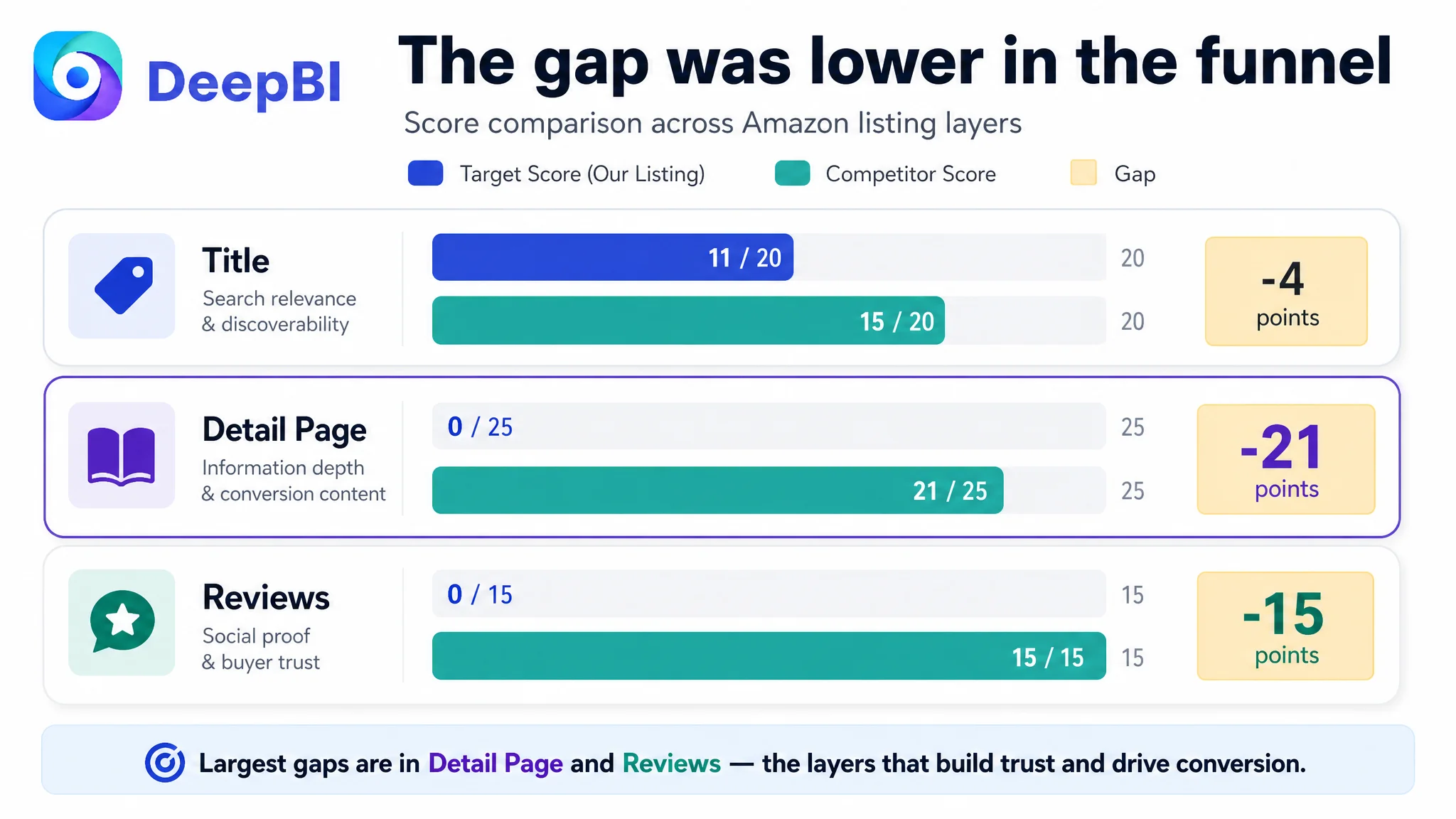
- Title: Target Listing: 11/20, Comparable high-performing Listing: 15/20, Gap: -4
- Main image: Target Listing: 25/30, Comparable high-performing Listing: 24/30, Gap: +1
- Bullet points: Target Listing: 7/10, Comparable high-performing Listing: 6/10, Gap: +1
- Detail page: Target Listing: 0/25, Comparable high-performing Listing: 21/25, Gap: -21
- Reviews: Target Listing: 0/15, Comparable high-performing Listing: 15/15, Gap: -15
- Total: Target Listing: 43/100, Comparable high-performing Listing: 81/100, Gap: -38
The most important finding was not simply that the total score was low. It was where the score was being lost.
The title gap was real, but limited. The main image and bullet points were not the primary weakness in the comparison. The decisive deficits were the detail page and review layer.
This changed the order of operations.
If the team had continued treating the title and advertising relevance as the main growth lever, it could have brought more qualified shoppers to a page that still lacked sufficient evidence. If the team had invested only in making the images more attractive, it might have improved presentation without fixing the shopper’s unanswered questions.
The core problem was insufficient Listing conversion capacity, driven especially by missing A+ content and an absent review foundation.
The Amazon Product Page Was Showing a Tool, Not the Result of Using It
The product is small and visually simple: a stainless-steel wand-style dusting tool with a spring handle. That simplicity creates a specific challenge on Amazon.
A static product image can show what the tool is. It does not automatically show why the tool is useful.
The high-performing comparison page used a much richer visual narrative. It showed flour being distributed, desserts being finished, and the product operating in real kitchen situations. It connected the tool to the result shoppers wanted: a lighter, more even layer of flour, cocoa, or powdered sugar.
The target page had no equivalent A+ content. There was no full-width visual introduction, no multi-scene use story, no action-to-result sequence, and no structured explanation of why the product’s design mattered.
That left the shopper to infer the value.
A product page should not force the shopper to translate “304 stainless steel” and “spring handle” into a reason to purchase.
The missing content was not decoration. It was decision support.
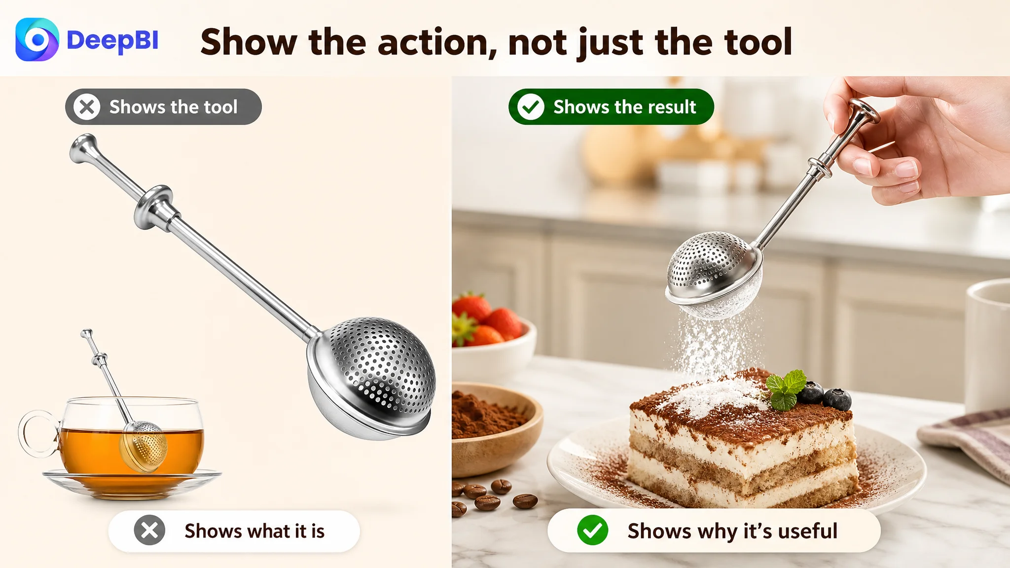
The Main Image Needed Focus, but It Was Not the Main Diagnosis
The main image comparison still identified meaningful opportunities.
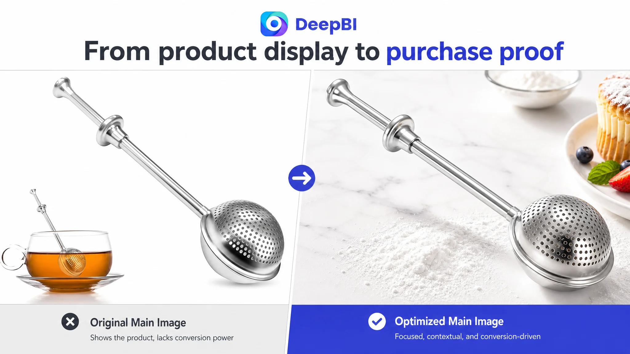
The recommended visual direction was a cleaner, more professional baking-tool presentation:
- Center the product and give it stronger visual weight.
- Use a 45-degree angle to communicate its shape more clearly.
- Remove distracting secondary elements.
- Use a clean white background and a light natural shadow.
- Add a restrained suggestion of powder to reinforce the product’s purpose without overwhelming the object.
- Show the spring handle in use rather than relying only on a static product pose.
- Use structured detail layouts for the mesh, spring mechanism, opening, and overall form.
- Expand the visual range to include flour, cocoa, powdered sugar, tea, and fine spices where those uses are supported by the product positioning.
These changes addressed click clarity and product understanding.
But the score comparison suggested that the main image was not the first issue to solve. Its score was already slightly above the comparable Listing. That did not mean the images were perfect; the analysis still pointed to weaker composition, limited narrative focus, and insufficient technical presentation. It meant the larger commercial risk sat lower in the funnel.
Improving the main image could help earn attention. It could not, by itself, create the trust that the page lacked.
The Title Needed Better Search Logic, Not More Keyword Density
The existing title placed “Baking Dusting Wand” early, but its structure was loose and read more like a product description than a compact Amazon title.
The recommended direction began with the clearer category term:
“Flour Duster for Baking, 304 Stainless Steel Dusting Wand with Spring Handle, One-Handed Powdered Sugar Shaker for Icing Sugar, Cocoa, Spices, Flour Sifter Tool, 1 Pack”
The purpose was not to fill the title with every possible phrase. It was to improve the relationship between search relevance and shopper comprehension.
The revised structure brought together:
- The core product term: “Flour Duster for Baking”
- The material: “304 Stainless Steel”
- The form and mechanism: “Dusting Wand with Spring Handle”
- The operating benefit: “One-Handed”
- Relevant use cases: powdered sugar, cocoa, spices, and flour
- A clearer product identity as both a shaker and sifter tool
The important change was structural. The title was expected to help shoppers understand the product faster, not merely to accumulate related keywords.
A title can open the door to the right search result. The rest of the Listing must give the shopper a reason to walk through it.
The Bullets Had Technical Information, but the Buying Logic Was Buried
The target bullets were more structured than the comparable Listing in several respects. They provided precise information about 304 stainless steel, welded construction, cleaning, storage, and use cases.
That was a strength. It was also part of the problem.
The information was presented primarily as specification and function. The shopper still had to connect each feature to a practical outcome.
The recommended restructuring followed a clearer sequence.
Precise dusting and controlled scooping
The dual-sided design was positioned around two distinct actions:
- A perforated side for a light, even layer
- A solid side for scooping flour or sugar directly
This made the product’s control advantage easier to understand and connected the design to the practical concern of avoiding excessive powder and messy countertops.
One-handed operation during preparation and finishing
The spring-operated handle was described as a stability and convenience feature, not just a mechanical detail. The intended message was that the tool could support both preparation and final decoration without requiring complicated handling.
Food-grade 304 stainless steel
The material and welded construction were retained because they were supported by the case material. The wording was aimed at professional pastry chefs and home bakers, helping the product feel suitable for repeated use without inventing a new performance claim.
Compact storage and dishwasher-safe maintenance
The slim wand shape was connected to drawer storage and placement in flour containers. Cleaning information was made more immediately useful by showing how the product fits into a dishwasher rather than leaving “dishwasher safe” as an isolated statement.
Multi-purpose use
The use cases were organized around recognizable baking and beverage moments: cocoa powder and powdered sugar on desserts, flour on work surfaces, and cinnamon or fine spices for drinks.
The goal was not to make the product appear to do everything. It was to make its supported use cases easier to visualize.
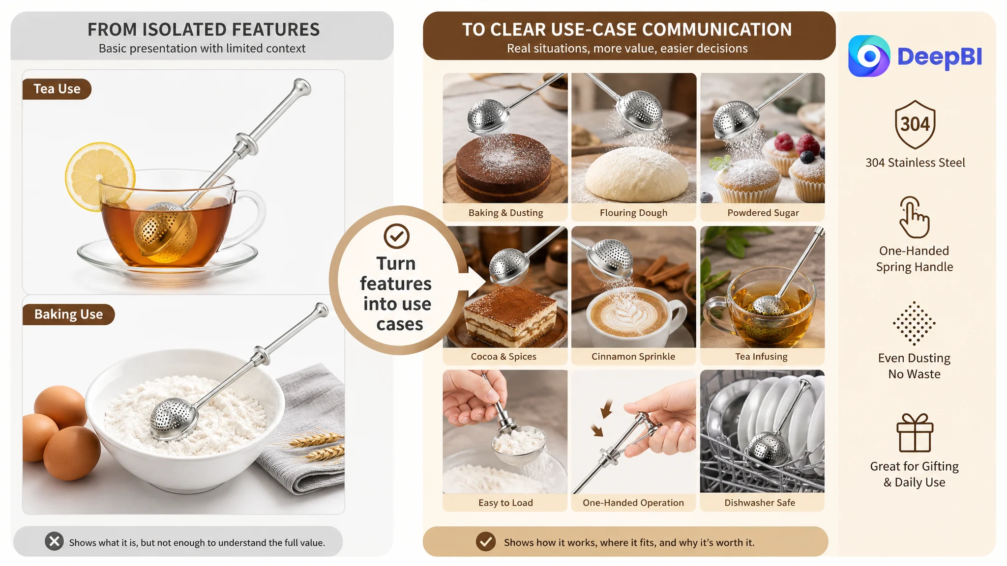
Missing A+ Content Removed the Final Layer of Persuasion
The largest content gap was the absence of A+ content.
The comparable Listing used A+ modules to create a sequence that the target page did not have:
1. A brand and product introduction
2. Multiple application scenes
3. Finished-food imagery
4. Core benefit explanations
5. Demonstration of the operating method
6. Material, cleaning, and usability reassurance
For this product, that sequence was especially important because the value is demonstrated through action and result.
A proposed A+ structure would begin with a clean header showing the product in use while introducing supported applications such as sugar, cocoa, leaf tea, and herbal tea. It would then move to the central use case: evenly dusting flour over dough or finishing a dessert with a light layer of powder.
From there, the page could address the shopper’s practical concerns:
- Is the powder distributed evenly?
- Can the tool be loaded easily?
- Does the spring handle support one-handed use?
- Is the stainless-steel construction credible?
- Is the tool compact enough to store?
- Can it be cleaned in a dishwasher?
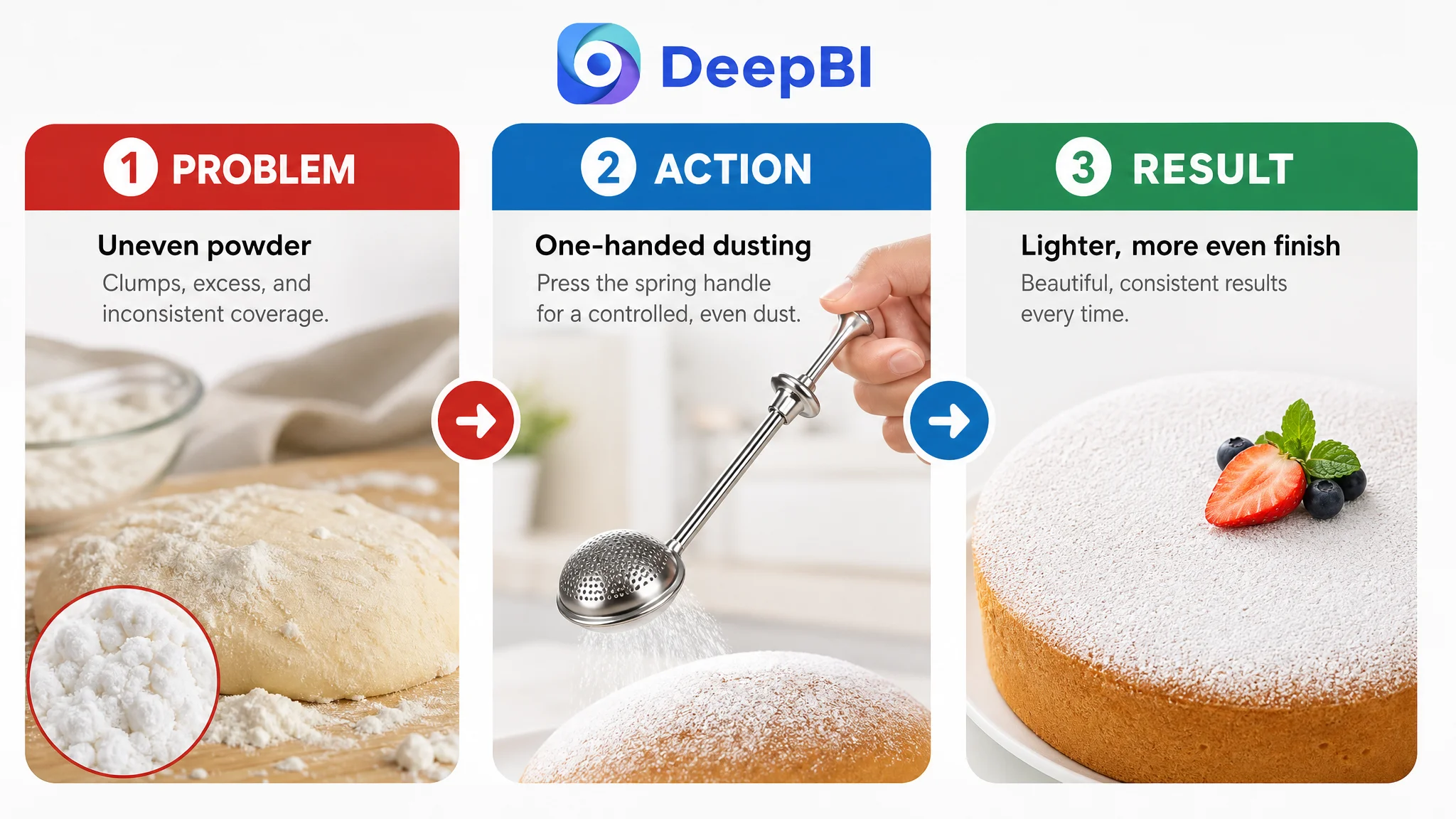
The strongest part of this structure is its movement from problem to action to result.
A+ content had to make the product’s benefit visible before the shopper was asked to trust the product.
A static product photograph says, “This is the tool.” A well-structured A+ sequence can show, “This is the problem, this is how the tool handles it, and this is the result you can expect from the supported use.”
The Review Gap Was a Trust Constraint, Not a Copywriting Problem
The target Listing had no visible rating data, no total review count, and no reviews on the first page. The comparable Listing had a 4.8-star rating, more than 4,800 reviews, and a strong set of visible positive reviews.
No title rewrite could neutralize that difference.
Reviews serve a different role from product copy. The seller controls the title, bullets, images, and A+ content. Reviews are interpreted as evidence from other buyers. When a new shopper compares two otherwise similar baking tools, the Listing with extensive positive validation starts with a trust advantage that content alone cannot reproduce immediately.
That does not make optimization pointless. It changes the objective.
The page needed to become as clear, credible, and useful as possible while the product built its own review history. A+ content could not replace reviews, but it could reduce uncertainty in areas that the seller could control:
- Demonstrate the product in realistic use.
- Show the powder distribution result.
- Explain the mechanism without exaggeration.
- Make material and cleaning information easy to verify.
- Clarify the supported use cases.
- Present the product with a more consistent professional identity.
The correct response to a review gap was therefore not to pretend it did not exist. It was to strengthen every other trust signal and avoid sending poorly supported traffic to the page.

Why DeepBI Did Not Recommend Tuning Ads First
The case did not call for a broad advertising expansion. It called for a better order of decisions.
If an Amazon seller sends more paid traffic to a Listing with weak conversion support, advertising can magnify the page’s defects:
- More shoppers arrive but remain uncertain.
- Click costs accumulate without enough orders.
- ACOS becomes harder to interpret.
- The team may blame bids or campaign structure for a page-level problem.
- Weak conversion can make future traffic decisions more conservative and less predictable.
That is why the Listing had to be repaired before aggressive traffic scaling.
The decision was not “never optimize ads.” It was “do not use ads as the first response to a conversion constraint.”
The page needed a clearer sales logic before advertising data could become useful again. Once the title, images, bullets, and A+ content were aligned, the team could more meaningfully evaluate whether traffic quality, CTR, or bid strategy was the next constraint.
This is the central operating lesson:
Advertising can bring a shopper to the product page. It cannot create the page’s missing proof after the shopper arrives.
The Optimization Direction Shifted From Decoration to Demonstration
The proposed changes were not a collection of unrelated design requests. They formed a visual decision path.
The main images were intended to establish product identity, operating method, dimensions, construction details, and use range. The A+ modules were intended to carry the deeper story:
- Product introduction and supported applications
- Even dusting over dough and desserts
- Professional baking context
- One-handed operation
- Baking and tea-related use
- Mesh and stainless-steel construction
- Dishwasher cleaning and maintenance
This structure followed the shopper’s natural questions rather than the internal order of the seller’s product specifications.
The visual direction also stayed within the product’s factual boundaries. It did not require changing the tool’s physical design or inventing unsupported functions. The emphasis was on composition, lighting, realistic use scenes, product details, and clearer information hierarchy.
That distinction is important when AI-generated visual assets are involved. The value is not in making the product look like something it is not. The value is in making its real design and supported use easier to understand.
What Changed in the Seller’s Business Understanding
The case material does not include confirmed post-optimization figures for CVR, ACOS, CTR, or organic order share. It would therefore be inappropriate to claim a specific performance lift.
The business change was visible first in the decision framework.
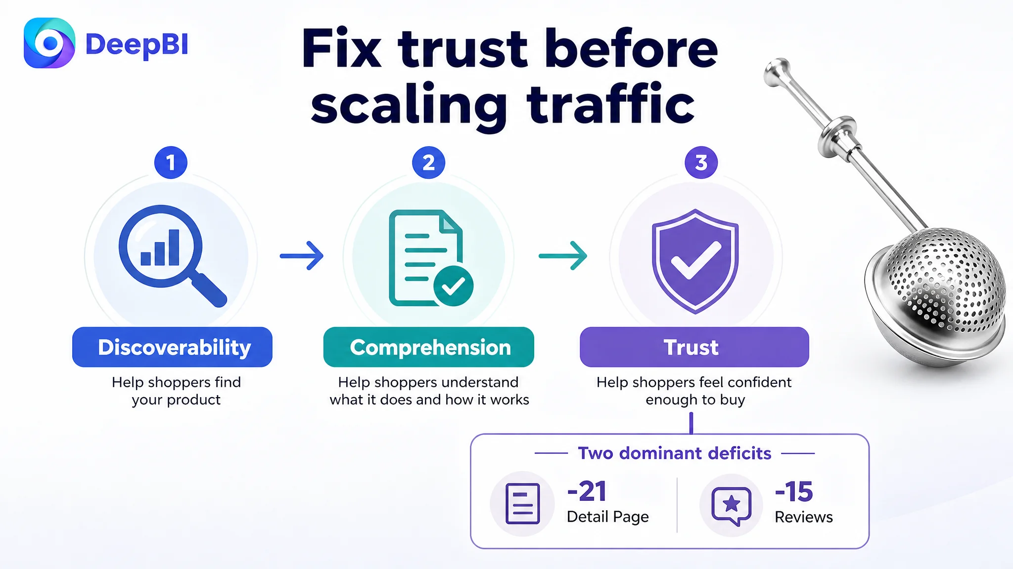
The seller’s Listing was no longer treated as a keyword and image polishing task. It was understood as a product-page conversion problem with three different layers:
- Discoverability: The title needed tighter keyword and benefit structure.
- Comprehension: The images and bullets needed to show how the tool works.
- Trust: The page needed A+ content and stronger visual proof while the review base was still developing.
That reframing made the optimization sequence more controllable. It also reduced the risk of judging advertising performance without accounting for the page’s ability to convert traffic.
The broader lesson for Amazon sellers is straightforward:
- A high ad cost does not automatically mean the campaign is the root problem.
- A weak title does not automatically explain a low order rate.
- Better-looking images are not enough if they do not show the product’s role in the buyer’s decision.
- Review volume and A+ content can create a major conversion gap even when the product itself is comparable.
- Before scaling Amazon ads, sellers should ask whether the Listing can explain, demonstrate, and substantiate the purchase.
For this baking dusting wand, the next step was not simply to buy more traffic. It was to make the product page capable of receiving that traffic.