

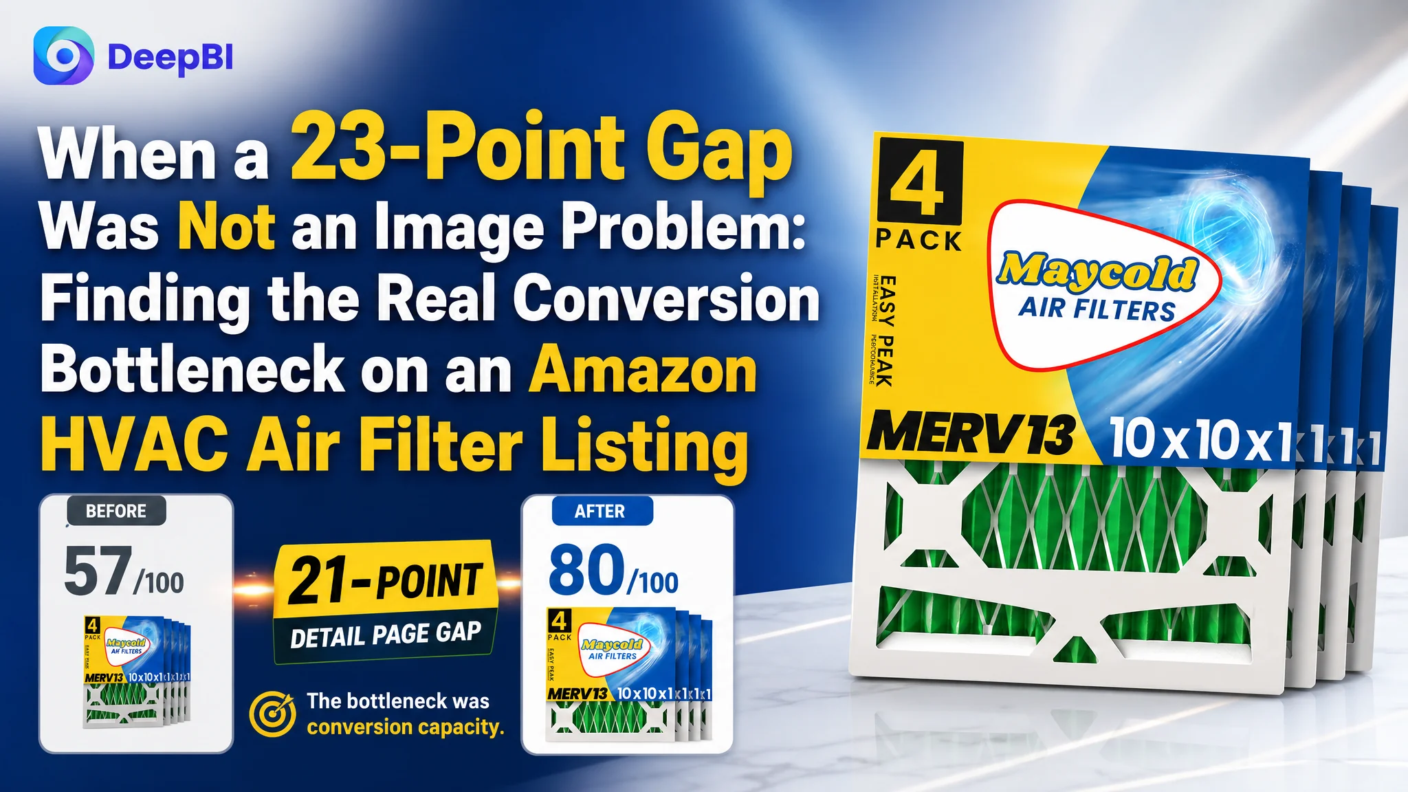
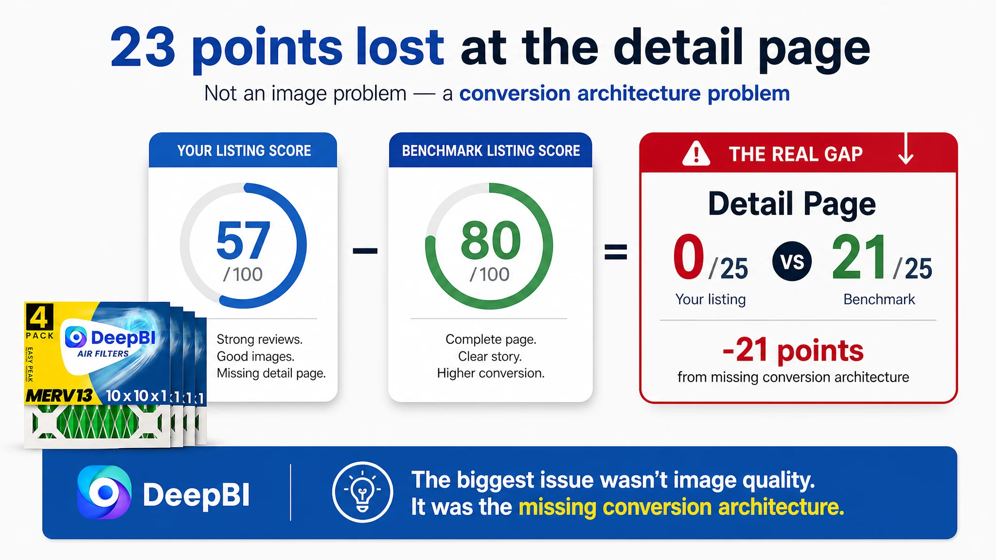
An Amazon seller in the HVAC air filter category was facing a clear product-page disadvantage on the US marketplace. Its Listing scored 57 out of 100 against 80 for a comparable high-performing Listing, while both products had the same 4.8-star rating. The obvious response was to refine the title, rewrite the bullet points, and make the product images look more competitive.
That diagnosis was directionally correct, but incomplete. The customer was treating the problem as a collection of copy and creative weaknesses. DeepBI found that the largest constraint was more structural: the product page had no A+ content at all, leaving a 21-point gap in the detail-page dimension and weakening the Listing’s ability to explain, reassure, and convert traffic.
The later optimization therefore focused on rebuilding the Amazon product page as a complete buying argument: clarify search intent in the title, organize the bullet points around product benefits and usage decisions, make the filtration logic visible, add realistic installation and home-use scenes, and use A+ content to turn MERV 13 from a technical label into a reason to buy. The case is a useful reminder for Amazon sellers: before increasing traffic or endlessly polishing individual assets, determine whether the Listing can actually carry the traffic it receives.
The Amazon Listing Looked Competitive in One Place and Weak in Another
At first glance, the product had several assets that should have supported conversion.
The customer’s Listing had:
- A 4.8-star rating
- 246 total reviews
- Eight high-quality reviews visible on the first page
- A 4-pack offer
- MERV 13 filtration
- Clear actual dimensions
- HVAC, AC, and furnace compatibility
- Individually wrapped filters
The review profile was not the source of the problem. The comparable Listing also held a 4.8-star rating, but had only 103 reviews. In terms of rating and review volume, the customer’s product was at least as credible, and in review count it had a meaningful advantage.
Yet the overall Listing score was 23 points below the benchmark.
That gap mattered because Amazon conversion is not decided by one strong element. A product can have excellent reviews and still lose the purchase decision if the page does not explain the product clearly enough, show how it fits into the buyer’s life, or reduce the uncertainty around performance and installation.
The Listing did not lack every form of trust. It lacked a complete path from search result to purchase decision.
The Initial Diagnosis Focused on Surface-Level Competitiveness
The customer’s initial working assumption was that the Listing needed to become more competitive through a series of visible improvements:
- Move keywords into stronger positions
- Improve the main image sequence
- Add more persuasive bullet points
- Communicate MERV 13 performance more clearly
- Present the product in a more polished visual style
Each of these actions had merit. The title was not structured as effectively as the benchmark. The bullet points contained relevant information but did not create a strong buying sequence. The image set was functional but lacked enough scene-based explanation.
The risk was that these issues could be treated as separate creative tasks.
A title rewrite might improve search relevance. A new image might improve click appeal. A stronger bullet point might clarify one product benefit. But if the page still lacked a deeper explanation of the product’s value, these improvements would remain disconnected.
For an Amazon seller, this is where optimization often becomes inefficient. The team keeps improving individual elements because each weakness is easy to name. The harder question is which weakness is limiting the entire page’s ability to convert.
DeepBI’s diagnosis shifted the focus from “Which asset looks weaker?” to “Which missing part prevents the customer from completing the decision?”
The Scorecard Made the Priority Clear
The comparison showed that the Listing’s weaknesses were not evenly distributed.
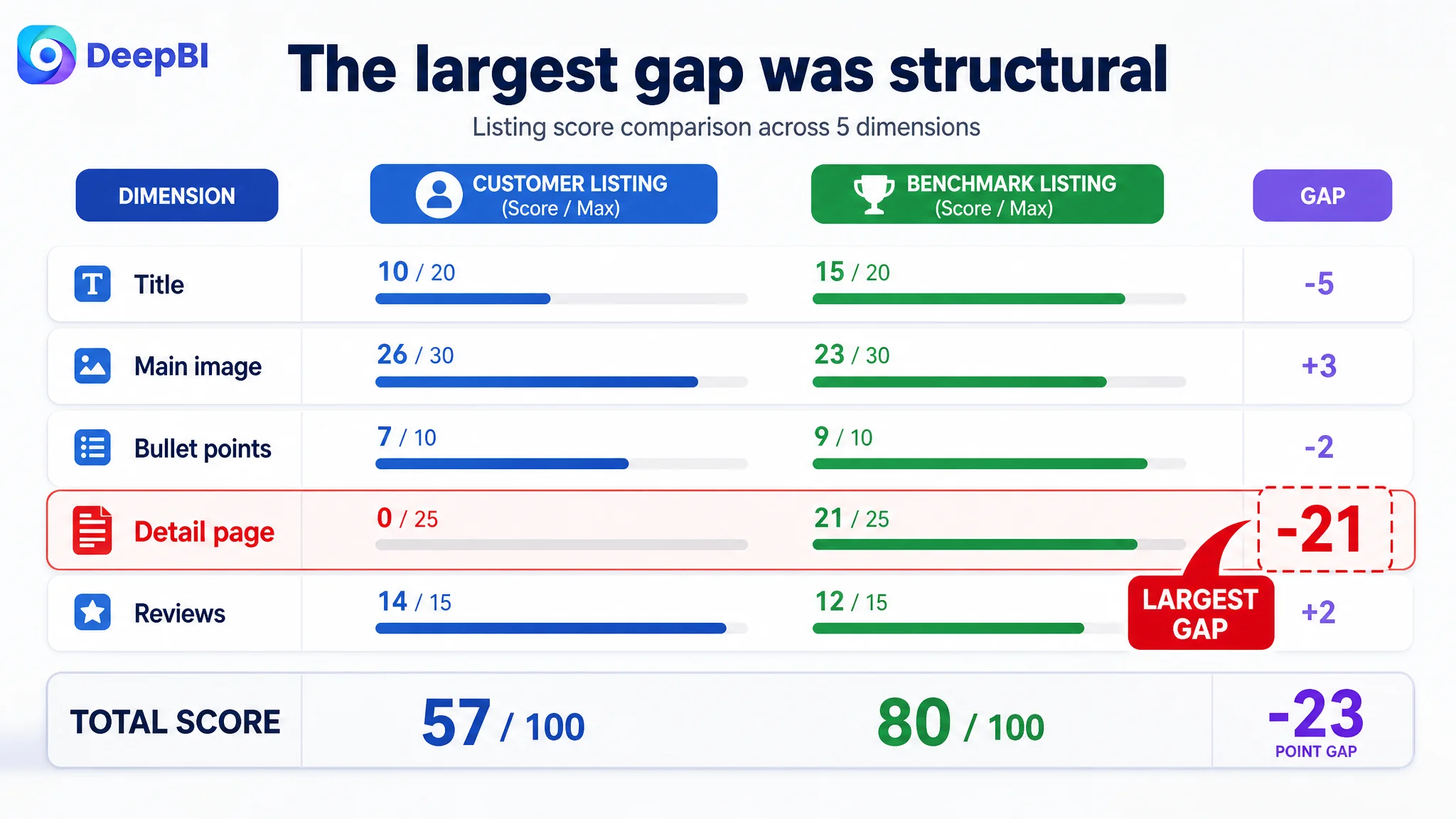
- Title: Customer Listing: 10/20, Benchmark Listing: 15/20, Gap: -5
- Main image: Customer Listing: 26/30, Benchmark Listing: 23/30, Gap: +3
- Bullet points: Customer Listing: 7/10, Benchmark Listing: 9/10, Gap: -2
- Detail page: Customer Listing: 0/25, Benchmark Listing: 21/25, Gap: -21
- Reviews: Customer Listing: 14/15, Benchmark Listing: 12/15, Gap: +2
- Total: Customer Listing: 57/100, Benchmark Listing: 80/100, Gap: -23
The most important finding was not that the customer’s images needed improvement. In the scoring comparison, the main-image dimension was actually three points higher than the benchmark.
That did not mean the images were perfect. The visual analysis still identified several opportunities:
- The first image placed too much emphasis on packaging information instead of product value
- The image sequence repeated technical information without giving each image a clear role
- The product was not shown in a realistic home environment
- Airflow and filtration performance were not communicated visually enough
- Installation and replacement guidance were not presented with sufficient realism
But these were secondary to the detail-page gap.
The decisive abnormality was the score of 0 out of 25 for the detail page, compared with 21 out of 25 for the benchmark.
The benchmark used A+ content to create a fuller product story:
- Brand-level introduction
- Multi-size product presentation
- Core feature icons
- Product-line and packaging context
- Visual explanations of filtration-related use cases
The customer’s Listing had none of these modules.
The Real Constraint Was Not More Traffic. It Was Conversion Capacity
For HVAC filters, MERV 13 is meaningful to knowledgeable buyers, but it is not automatically persuasive to every Amazon shopper.
A buyer may still be asking:
- What kinds of particles does this filter address?
- Will it fit the furnace or air conditioner?
- What is the actual size rather than the nominal size?
- How does it compare with a basic fiberglass filter?
- How often should it be replaced?
- Is installation straightforward?
- What does the multi-pack represent in practical use?
- Will the filter maintain its structure during regular HVAC operation?
The customer’s product page answered some of these questions in text, but not in a connected visual and narrative system.
Without A+ content, the page had no dedicated space to translate technical specifications into visible proof. MERV 13 remained a label. The filter’s pleated structure, synthetic media, wire mesh support, actual dimensions, installation process, and replacement cycle were not brought together in a sequence that matched the buyer’s decision process.
That is why DeepBI did not treat the missing A+ content as a cosmetic omission.
It was a conversion-capacity problem.
Advertising can bring a shopper to the Amazon product page. It cannot make an incomplete product explanation feel complete.
Why the Team Should Not Keep Tuning Ads First
The case material does not include a post-optimization advertising report or a confirmed ACOS and CVR change. That limitation is important: the diagnosis should not claim that a specific ad campaign caused the problem or promise a specific performance recovery.
The business logic is still clear.
If paid traffic reaches a page with weak product explanation, the seller may interpret the resulting inefficiency as an advertising problem. The team may respond by:
- Adjusting bids
- Rebuilding campaign structures
- Narrowing or expanding keyword targeting
- Shifting budgets
- Adding more search terms
- Reallocating spend toward campaigns with better short-term signals
Those actions can change traffic distribution, but they do not repair the page’s ability to convert the traffic.
In this case, the page-level evidence showed that the customer already had stronger review volume and a comparable rating. The largest gap was not social proof. It was the missing layer of information and persuasion between the product details and the purchase decision.
Continuing to push traffic before addressing that gap would create a business risk: the seller could spend more to expose the same conversion weakness to more shoppers.
The correct order was therefore:
1. Repair the Listing’s conversion logic.
2. Make the product’s value easier to understand.
3. Reduce uncertainty around fit, use, and replacement.
4. Then evaluate whether additional Amazon ad traffic is being converted more efficiently.
This is not an argument that ads are unimportant. It is an argument that ads should not be asked to compensate for a product page that has not finished its sales explanation.
The Title Needed to Serve Both Search and Decision-Making
The title gap was real, but it was not the root cause by itself.
The benchmark led with the core search phrase:
“10x10x1 MERV 13 Air Filters”
It also brought the pack size, actual dimensions, filtration benefit, and HVAC use case into a clearer order.
The customer’s title placed the brand name first and pushed important search and decision terms further back. The 4-pack was present, but its position reduced its impact. The ending focused on individual plastic wrapping, which may be useful but is less commercially important than the product’s primary use context.
The recommended structure moved toward:
- Core size and product phrase
- MERV 13 filtration level
- Pack quantity
- HVAC, AC, and furnace compatibility
- Actual dimensions
- Enhanced filter media
- Individually wrapped packaging
This was not merely a keyword insertion exercise. The title needed to communicate the product’s identity quickly on Amazon’s search results page, especially on mobile screens where shoppers may see only the beginning of the title.
The broader lesson was that search relevance and conversion clarity should work together. The title should help the right shopper recognize the product before the page has to persuade them in greater depth.
The Bullet Points Had Information, but Not a Buying Sequence
The customer’s bullet points covered several important subjects:
- Filtration performance
- Dimensions
- Compatibility
- Pack value
- Pleated design
- Material and safety considerations
The problem was not a total lack of information. The problem was that the points sat beside one another rather than building a decision path.
The benchmark’s stronger structure moved in a more deliberate order:
1. Explain the filtration material and technology.
2. Confirm fit and system compatibility.
3. Connect MERV 13 to everyday air-quality concerns.
4. Explain installation and airflow direction.
5. Quantify replacement timing and pack value.
DeepBI’s recommendations followed the same logic. The customer’s bullets needed to explain not only what the filter was, but why each feature mattered.
For example, “synthetic pleated media” becomes more meaningful when connected to electrostatic filtration and a comparison with traditional fiberglass filters. Actual dimensions become more persuasive when connected to preventing air from bypassing the filter. A 6-pack or 4-pack becomes easier to evaluate when linked to a replacement schedule.
The goal was to move the copy from parallel claims to a connected argument:
Product attribute → functional effect → user concern → practical value.
That structure is especially important for technical household products, where shoppers may not have the expertise to interpret specifications on their own.
The Main Image Needed More Focus, Not Just More Decoration
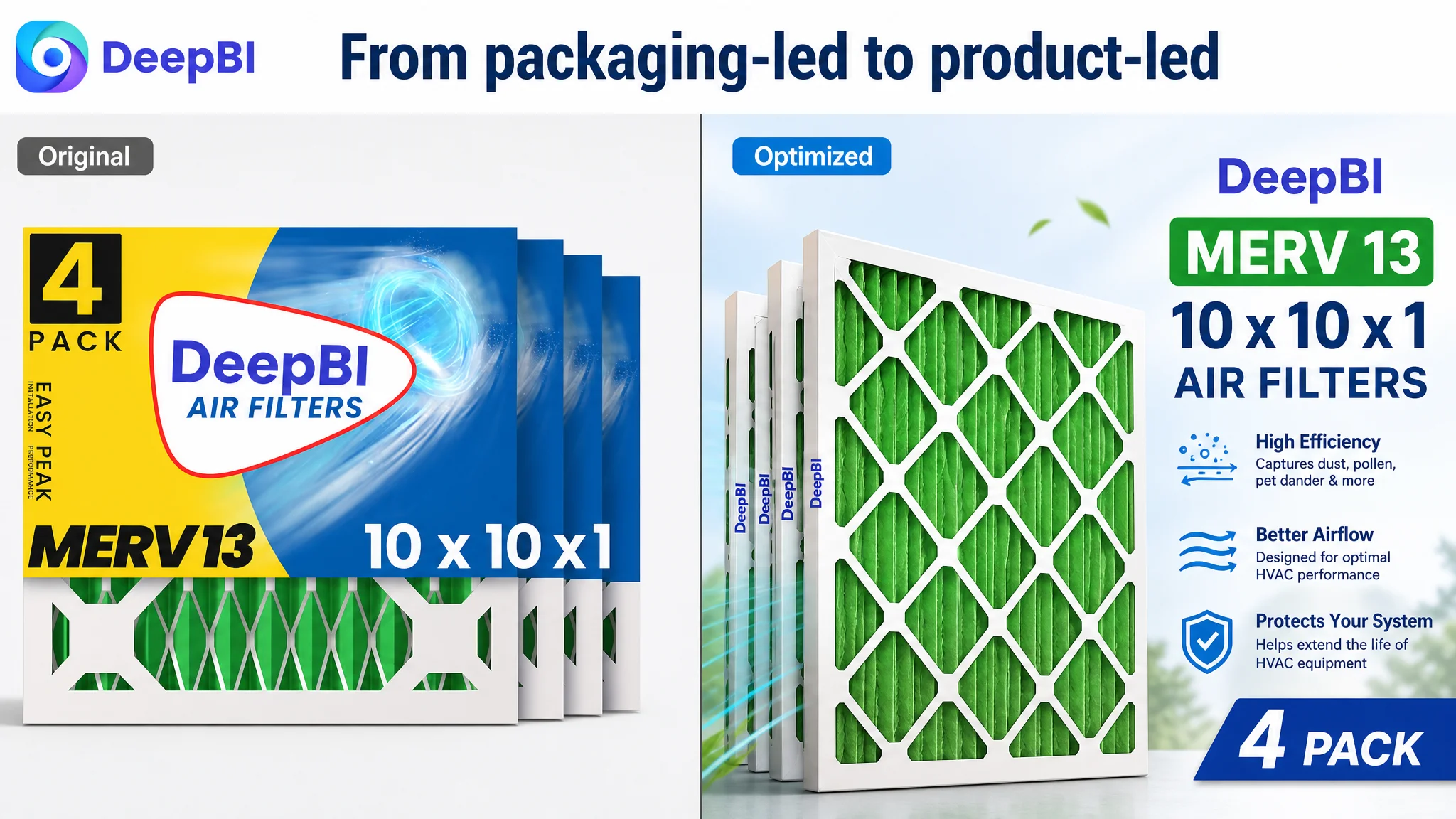
Although the main-image score was higher than the benchmark’s, the visual review still found that the image system was not using every asset efficiently.
The first image leaned toward packaging and specification presentation. On a mobile Amazon search page, that can make the product feel busier without making its value easier to recognize.
The recommended direction was to create a cleaner, more professional visual system:
- Give the product stronger central presence
- Improve white-space balance
- Make the 4-pack arrangement easier to read
- Use a clearer visual hierarchy for MERV 13
- Show airflow and filtration concepts through supporting images
- Add realistic home and installation contexts in compliant secondary images
- Use close-ups to make dimensions, pleats, frame construction, and support mesh easier to inspect
The distinction matters. The goal was not to make the images more elaborate for their own sake. It was to assign every image a decision-making role.
A useful sequence would answer one question at a time:
- What is the product and pack quantity?
- How does the filter work?
- What are the actual dimensions?
- What makes the construction reliable?
- Where does it fit?
- How is it installed?
- When should it be replaced?
- What sizes or product options are available?
This is how visual optimization supports conversion rather than becoming a collection of attractive but repetitive graphics.
A+ Content Had to Turn MERV 13 Into a Concrete Story
The most important later optimization was the addition of A+ content.
The proposed content direction connected seven areas that had previously been separated or missing:
A clean brand and product introduction
The opening module would place the filter in a bright, believable home environment and establish the central value proposition around HVAC protection and indoor air quality.
A visual explanation of filtration
MERV 13 is a technical rating. A close-up or visual simulation could connect the rating with recognizable concerns such as dust, pollen, smoke, and pet dander, without relying on the term alone.
Construction and durability details
A macro view of the pleated media, frame, and wire mesh support could make structural quality visible. This would help answer whether the filter looks capable of maintaining its form during normal use.
Installation and compatibility
A realistic HVAC installation scene could reduce uncertainty around fit and handling. The page should clearly connect the actual dimensions with furnaces, air conditioners, and other compatible systems.
Everyday household relevance
Because filtration benefits are difficult to see directly, a carefully framed lifestyle scene could help translate “cleaner indoor air” into a more recognizable home context. The imagery must remain credible and avoid unsupported health claims.
Replacement timing and pack value
A replacement-cycle module could explain the practical meaning of the pack quantity. The supplied recommendations reference replacing the filter approximately every 90 days, subject to actual usage conditions.
Size selection
A clean specification matrix could make actual dimensions easier to compare and reduce selection errors. For a product category where fit is critical, this is not a decorative addition. It directly supports purchase confidence.
The role of A+ content was therefore not to repeat the bullets in a larger format. It was to provide the visual proof and structured context that the standard Listing content could not carry alone.
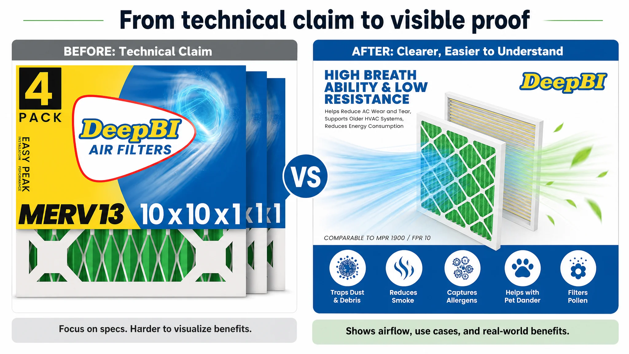
DeepBI’s Judgment Was About Sequence, Not Volume
A seller can add more words, more images, and more design elements while still leaving the core decision unresolved.
DeepBI’s value in this case was the ability to rank the gaps according to their likely business impact.
The scorecard showed:
- Reviews were already a strength
- The main image was not the lowest-scoring dimension
- The title and bullets needed refinement
- The detail page represented the largest competitive deficit by far
That led to a more disciplined optimization order:
1. Restore the missing A+ foundation.
2. Build a coherent product explanation around filtration, fit, installation, and replacement.
3. Reorder the title around core search intent.
4. Rebuild the bullet points into a benefit-led sequence.
5. Improve secondary images so each one resolves a specific purchase concern.
6. Use future Amazon advertising data to assess whether the repaired page is converting traffic more effectively.
This avoided a common operational mistake: treating every visible weakness as equally urgent.
The best next action was not the most noticeable defect. It was the defect with the greatest ability to limit the rest of the Listing.
The Business Understanding Changed
No clear post-optimization CVR, ACOS, TACOS, or organic-order data is provided in the case material, so the outcome should not be presented as a quantified performance claim.
The change was first a change in operating judgment.
The customer could now see that:
- A strong review profile does not compensate for missing product-page content.
- A technically accurate title can still lose search and conversion opportunities through weak ordering.
- Bullet points need to guide a decision, not merely list specifications.
- Main-image improvement should be based on the role of each visual asset, not subjective preference.
- A+ content is part of the Listing’s conversion architecture, not an optional brand decoration.
- MERV 13 must be explained through visible use cases and product logic.
- Amazon advertising should not be used to scale a page before its conversion foundation is ready.
For Amazon sellers, the broader lesson is straightforward but commercially important:
Before asking Amazon ads to deliver more traffic, ask whether the product page has earned the right to receive it.
In this HVAC air filter case, the answer was not found in a bid adjustment or a larger review count. It was found in the 21-point detail-page gap that prevented the Listing from turning its existing product strengths into a complete buying decision.