

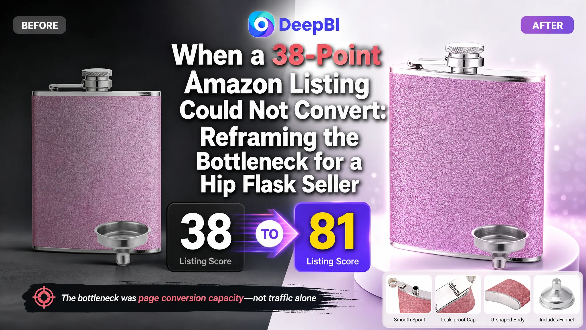
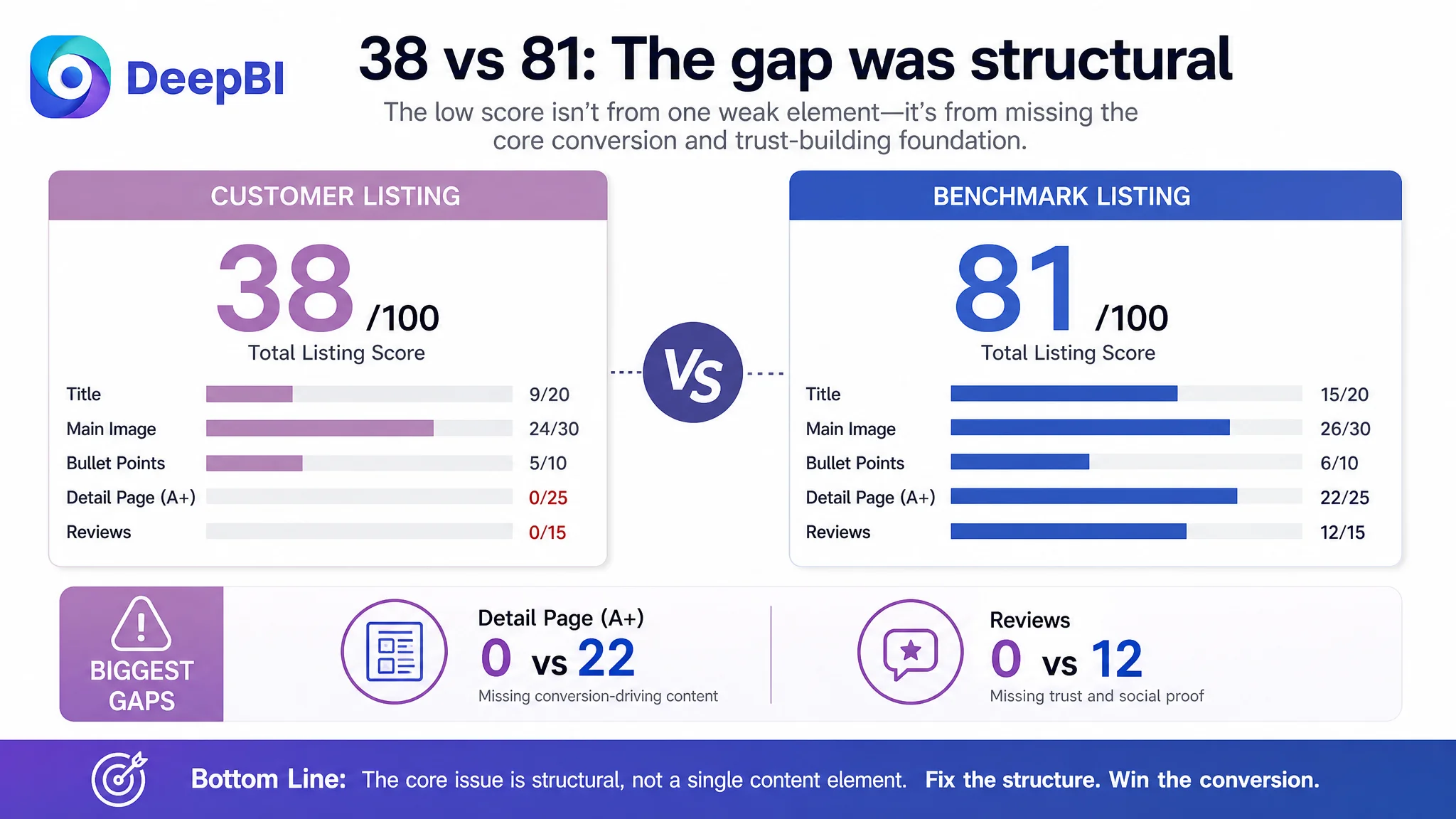
An Amazon seller in the US hip flask category was not dealing with a simple keyword problem. The product had a recognizable use case, but its Listing was failing to communicate value, build trust, or connect the product with the occasions that drive purchase decisions. With a total Listing score of 38 out of 100 against a comparable high-performing Listing at 81, the gap was too large to explain through one weak image or a few missing search terms.
The customer’s initial direction was closer to conventional Listing polishing: refine the title, improve the images, reorganize the bullet points, and make the product appear more attractive. Those actions were not irrelevant, but they treated the symptoms separately. DeepBI identified the more important issue: the Amazon product page had almost no persuasive structure beyond its basic content. The missing A+ content and absent review foundation left paid or organic visitors with too little evidence to justify the purchase.
The later optimization therefore focused on rebuilding the product page as a complete decision path: clarify the title, strengthen the main image without changing the product itself, turn bullet points into problem-and-solution arguments, and use A+ content to demonstrate safety, leak resistance, portability, gifting occasions, and maintenance. For other Amazon sellers, the lesson is straightforward: before sending more traffic to a Listing, determine whether the page has enough conversion capacity to deserve that traffic.
The Listing Did Not Have a Single Weak Element. It Had a Broken Sales Logic.
At first glance, the score comparison suggested several small gaps:
- Title: 9 versus 15
- Main image: 24 versus 26
- Bullet points: 5 versus 6
- Detail page: 0 versus 22
- Reviews: 0 versus 12
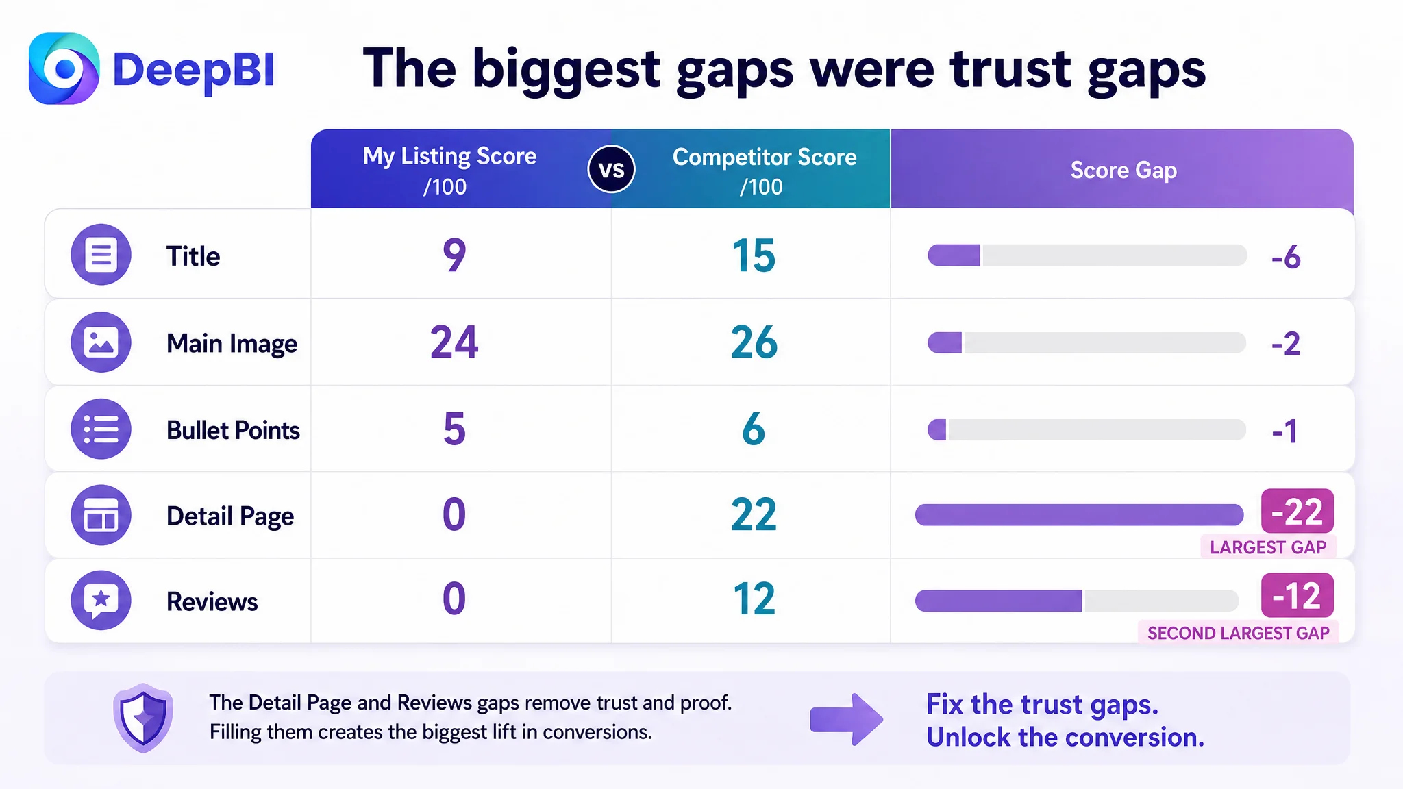
But the distribution mattered more than the total.
The title and bullet points were below the benchmark, but not catastrophically so. The main image was also behind, though the difference was relatively narrow. The largest structural problems were elsewhere:
The product page had no A+ content and no review history, so the Listing lacked the trust-building layer needed to convert consideration into purchase.
This distinction changed the order of operations. A seller looking only at the title might conclude that the Listing needed better keyword placement. A seller looking only at the images might conclude that the product needed more polished creative work. Yet neither adjustment alone could replace the missing explanation and credibility that customers typically need when evaluating a stainless steel flask for personal use or as a gift.
The page was not simply under-optimized. It was asking the shopper to make a relatively specific purchase decision with too little evidence.
The Original Diagnosis Focused on Content Pieces, Not Conversion Capacity
The customer’s initial approach was understandable. The title contained repeated uses of “Hip Flask,” several audience and style terms, and a broad list of outdoor occasions. The images contained product views and lifestyle concepts, but the overall presentation was not consistently communicating why the product should be chosen. The bullet points described features, but they did not build a strong sequence of reasons to buy.
That naturally led to a familiar optimization checklist:
- Remove repeated keywords from the title
- Add material terms
- Improve the image composition
- Add more use cases
- Rewrite the bullet points
- Make the product look more premium
These are valid actions, but the original diagnosis remained too narrow. It assumed that the Listing was fundamentally sound and only needed refinement.
The benchmark comparison showed otherwise. The comparable high-performing Listing was not merely using better words or more attractive photography. It was organizing the purchase decision around concrete value:
- A two-piece product configuration
- Included funnels and cups
- Specific gifting occasions
- Food-grade material positioning
- Leak-resistance claims supported by manufacturing details
- Portable dimensions
- A satisfaction guarantee
- A complete A+ story supported by multiple visual modules
- A mature review base
The difference was not just presentation quality. It was how much uncertainty each page removed before the shopper reached the purchase decision.
Why More Keyword Refinement Would Not Solve the Main Problem
The original title repeated the core product term and scattered its selling points across gender, style, portability, and outdoor use. The suggested direction was to consolidate the primary product phrase, add stainless steel as a material descriptor, and connect the product with both outdoor activities and gifting.
That is a useful correction. A title such as:
“8oz Stainless Steel Whiskey Flask for Men and Women, Leak-Proof Minimalist Hip Flask, Portable Pocket Flask for Climbing, Camping, BBQ and Wedding Gift”
has a clearer structure than a title built around repeated keyword insertion. It places the product type, material, use benefit, portability, and occasion in a more readable order.
But title optimization could only improve the entrance to the funnel. It could not repair what happened after the click.
A more efficient title may help shoppers understand the product faster. It does not, by itself, prove that the flask is safe for intended use, that the cap is secure, that the product is easy to carry, or that it is suitable as a wedding or holiday gift. Those questions belonged to the product page.
The title could earn attention. The rest of the Listing had to earn confidence.
The Main Image Was a Click Problem, but Not the Whole Conversion Problem
The main image analysis found several visual weaknesses:
- The product lacked a strong visual anchor
- The composition felt more decorative than functional
- The product did not immediately communicate why it was useful
- Some lifestyle images appeared staged rather than authentic
- The product’s portability and thickness were not communicated clearly enough
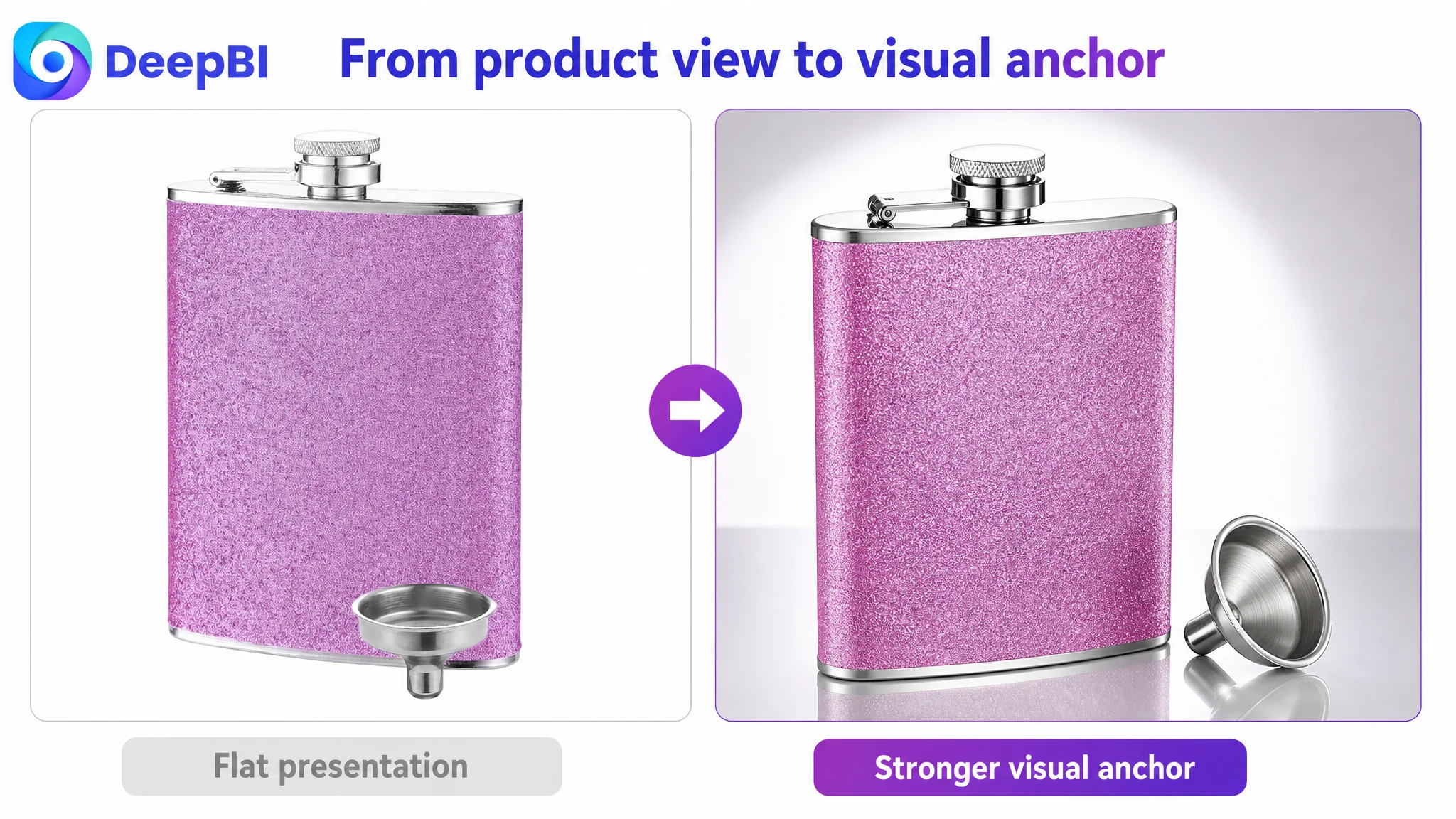
These issues can affect CTR, especially in Amazon search results where shoppers compare small thumbnails quickly. A product that looks flat, crowded, or difficult to interpret may lose attention before the title has a chance to work.
The recommended visual direction was a more modern party and lifestyle aesthetic: stronger contrast, realistic material backgrounds, controlled depth of field, and angles that make the flask feel like a portable accessory rather than a generic container.
For Amazon compliance and clarity, the primary image should still preserve a clean white-background product presentation. Lifestyle scenes, pocket-use demonstrations, pouring actions, and social occasions belong in secondary images or A+ modules where they can explain context without weakening the main image’s role.
The priority was not to alter the flask’s color, form, or physical design. It was to improve how the existing product was framed.
That distinction is commercially important. A visual redesign that makes the product look better but changes its apparent shape, finish, accessories, or proportions may create a gap between expectation and reality. DeepBI’s visual reasoning kept the product itself as the fixed point and treated angle, lighting, composition, and context as the variables.
The Bullet Points Had Information, but Not a Persuasive Sequence
The customer’s bullet points covered material, appearance, cleaning, portability, and use cases. The problem was not a complete absence of information. It was the order and strength of the argument.
The benchmark Listing followed a more decision-oriented sequence:
1. Material and safety
2. Leak resistance
3. Portability
4. Use occasions
5. Purchase reassurance
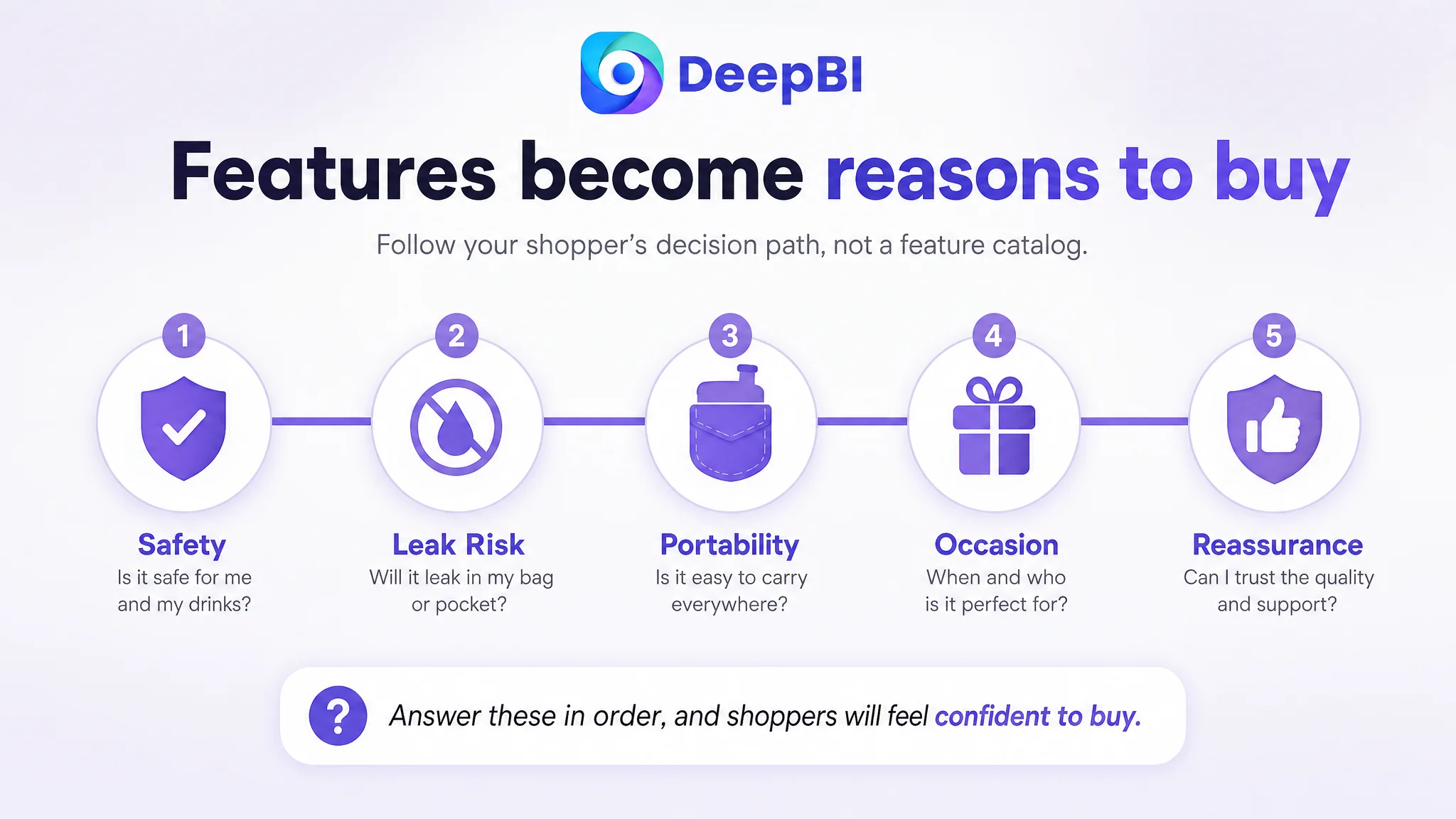
That sequence follows the shopper’s likely concerns. What is it made of? Will it leak? Can I carry it? When would I use or give it? What happens if there is a problem?
The customer’s bullet points were closer to a catalog of attributes. The revised structure aimed to connect each attribute to a purchase concern:
Material should answer a safety question
If the product’s food-grade stainless steel specification is verified, the bullet point should explain the relevant properties without relying on vague phrases such as “high quality.” Claims about corrosion resistance, rust resistance, or non-toxicity should be used only when supported by the actual product information.
Leak resistance should answer a practical risk
“Leak-proof” is more persuasive when the page explains the relevant cap or sealing construction. References to laser welding or air-pressure testing should appear only if those manufacturing facts are confirmed for this product.
Portability should answer a daily-use question
The flask’s compact shape, curvature, dimensions, and pocket or backpack compatibility should be presented together. A shopper should not have to infer portability from a generic phrase such as “unique design.”
Use cases should answer a relevance question
Camping, hiking, fishing, boating, barbecues, weddings, and holiday gifting are not interchangeable keywords. They represent different motivations. The page should show how the same product fits those occasions rather than merely listing them.
Assurance should answer a purchase-risk question
A satisfaction guarantee or service commitment can help complete the trust loop, but it must reflect the seller’s actual policy. It should not be added as decorative copy.
The important change was therefore not simply rewriting five bullets. It was turning them into a sequence that moved from product facts to customer confidence.
The Missing A+ Content Was the Largest Conversion Leak
The most decisive gap in the comparison was the detail-page score: 0 for the customer versus 22 for the comparable Listing.
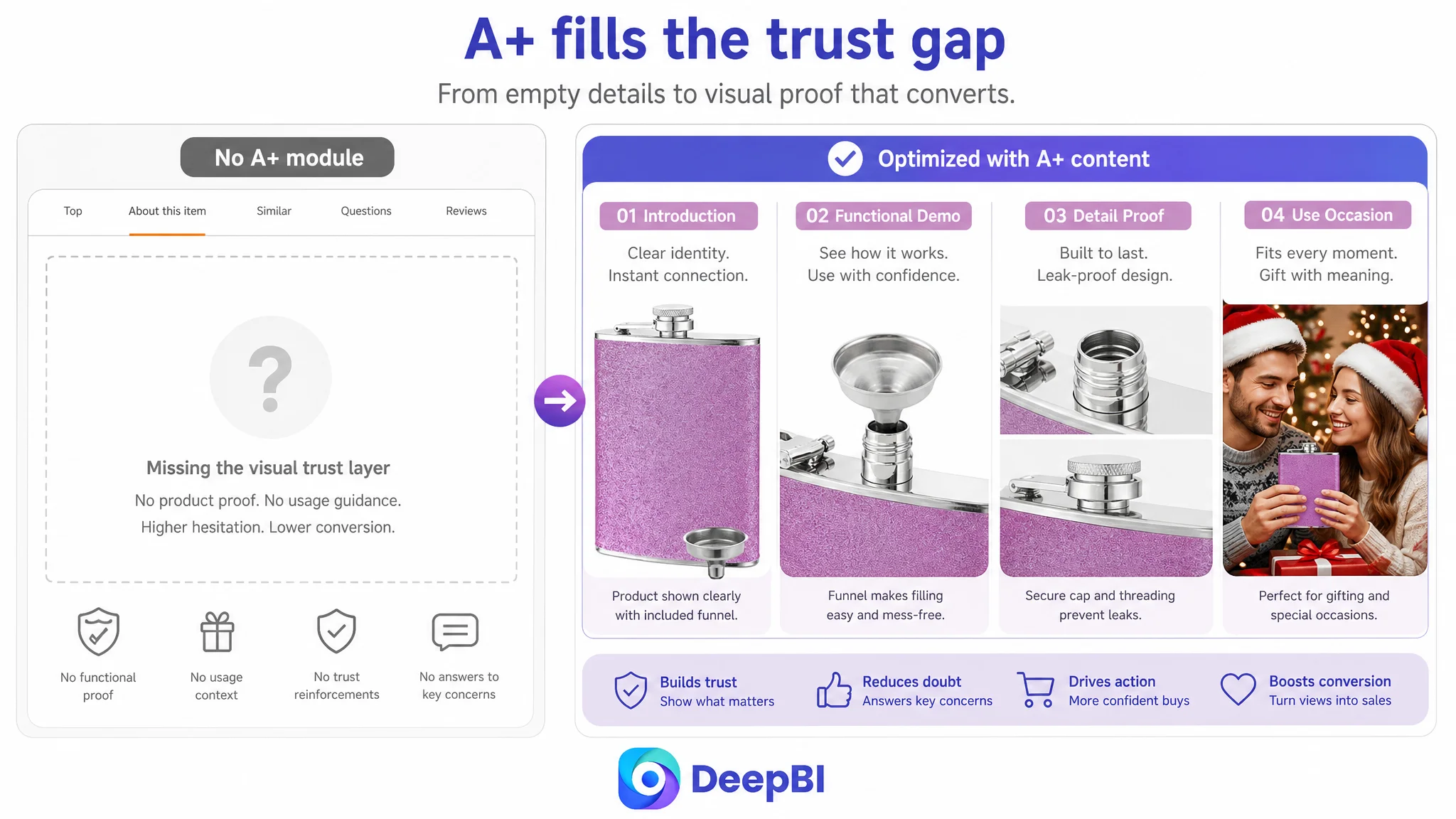
The customer had no A+ module. The benchmark page used a six-part visual system covering:
- A lifestyle introduction
- Functional demonstrations
- Material detail
- Safety and leak-resistance structure
- Seasonal gifting
- Multiple use environments
Without A+, the customer’s page had no dedicated space to connect the product with a wedding, holiday, party, or outdoor occasion. It also had no room to demonstrate the cap structure, communicate material confidence, or provide maintenance guidance in a visually organized way.
This is where the original optimization direction had to change most clearly.
A+ content was not an optional decoration for this Listing. It was the missing middle of the sales argument.
A stronger A+ structure could begin with a wedding or celebration scene to establish the gifting context. It could then move into a functional section showing the filling process and cleaning considerations, followed by close-ups of the bottle opening, cap, threads, and sealing structure. A later module could introduce holiday gifting and a multi-scene grid for parties, outdoor activities, and everyday carrying.
The final section should provide practical maintenance guidance, such as emptying the flask after use and avoiding unsuitable storage conditions, but only where the advice is accurate for the product and consistent with its care requirements.
This sequence matters because it follows the way uncertainty develops:
1. Why would I want this?
2. What does it do?
3. Can I trust the material and construction?
4. Will it fit my occasion?
5. How should I maintain it?
The page had previously stopped before answering most of these questions.
Reviews Made the Trust Gap Impossible to Ignore
The customer Listing had no rating data, no review count, and no review content on the first page. The comparable Listing had a 4.5-star rating, 773 reviews, and visible customer feedback.
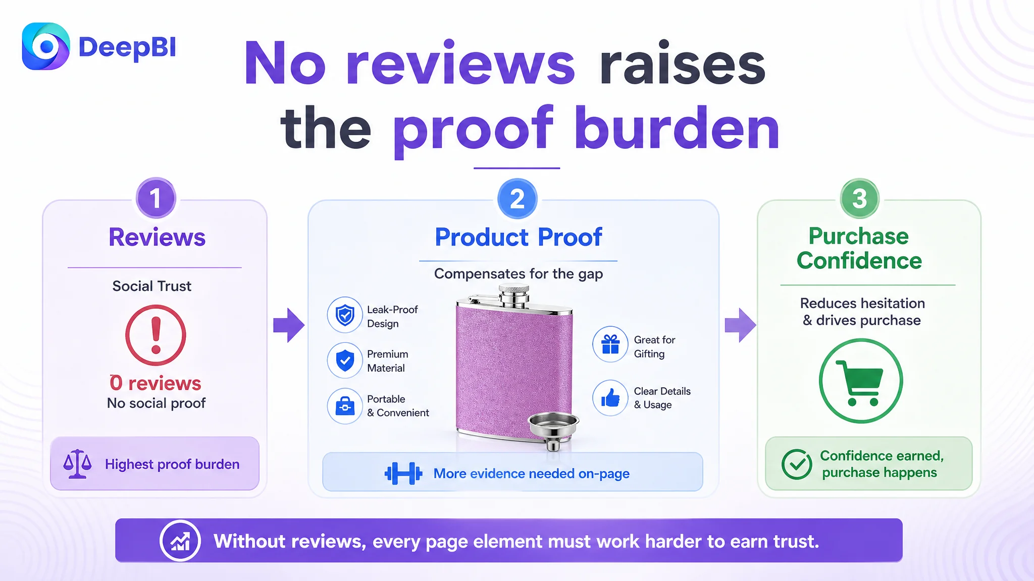
Reviews cannot be manufactured through Listing optimization, and no content change can instantly close that gap. But the difference still had to be included in the diagnosis because it shaped the amount of proof the page needed to provide elsewhere.
A mature review base gives shoppers social evidence. A new Listing without reviews has to compensate through clearer product information, stronger visual demonstrations, precise expectations, and a more complete trust structure. It must reduce avoidable doubts rather than asking the shopper to rely on incomplete information.
This also affects advertising decisions. Sending more Amazon ad traffic to a page with no reviews and no A+ content may increase exposure without resolving the underlying confidence gap. The traffic can reveal interest, but the page may still struggle to convert that interest into orders.
That is why reviews were treated as a structural risk, not as a reason to make unsupported promises.
DeepBI Reframed the Decision: Repair the Page Before Scaling Traffic
The case did not provide post-optimization CVR, ACOS, TACOS, or organic-order data. It would therefore be misleading to claim that the changes produced a specific percentage improvement.
What the diagnosis did establish was the correct order of action.
The Listing had a 43-point total gap, with 22 points missing in the detail-page dimension alone. The product page also lacked review evidence. Under those conditions, continued ad tuning would risk amplifying a low-conversion destination.
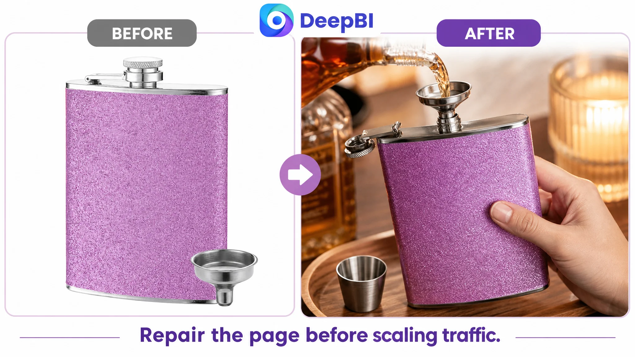
The better path was:
1. Clarify the product’s value and use occasions in the title
2. Rebuild the visual hierarchy of the image set
3. Turn bullet points into a trust and decision sequence
4. Add A+ content that demonstrates functions and scenarios
5. Maintain strict accuracy around material, construction, dimensions, and guarantees
6. Only then evaluate whether additional traffic could be converted efficiently
This does not mean Amazon ads were irrelevant. Ads still determine how much traffic reaches the page and which search intent is being tested. But ad performance should be interpreted alongside Listing conversion capacity.
When the page cannot explain or prove the product, changing bids only changes how quickly the problem is exposed.
The Optimization Was About Rebuilding Trust, Not Making the Flask Look Expensive
The recommended visual direction described a modern, stylish party atmosphere with realistic materials, controlled lighting, and cinematic depth. That direction was useful because the product’s stronger purchase motivations were social and emotional as well as functional.
A hip flask can be purchased for:
- A wedding party or groomsman gift
- A holiday present
- A personal accessory for outdoor activities
- A party or barbecue occasion
- A compact item for carrying a preferred beverage
The page needed to show those motivations without losing product truth. A celebration scene could establish gifting relevance. A pocket image could demonstrate portability. A close-up could make the cap and opening easier to understand. A multi-scene layout could broaden the product’s relevance without turning the page into a random collage.
The role of AI-generated visuals in this process was not to invent a more luxurious product. It was to translate the diagnosed gaps into controlled visual instructions while preserving the actual product’s shape, color, materials, and included components.
That is the difference between decorative image generation and business-led Listing optimization.
The Seller’s Understanding Had to Change
The central shift in this case was not a new title or a new group of images. It was a change in how the seller interpreted the Listing.
The customer began with a content-improvement problem:
- The title needed better keywords
- The images needed more polish
- The bullet points needed clearer wording
DeepBI reframed it as a page-conversion problem:
- The title did not communicate value and occasion efficiently
- The image set did not establish enough functional or social context
- The bullet points did not form a persuasive buying logic
- The absence of A+ content removed the product demonstration and trust layer
- The lack of reviews increased the burden on every other page element
That judgment also clarified what not to do. The team should not keep treating advertising as the primary lever while the product page remained structurally incomplete. Nor should it add unverified claims merely because a competitor used them. Material, manufacturing, performance, and service statements must reflect the actual product and policy.
The broader lesson for Amazon sellers is durable:
Ads can bring a shopper to the Listing, but the product page determines whether that visit becomes commercially useful.
For this hip flask seller, the next stage was not about producing more traffic at any cost. It was about giving the existing Listing a coherent reason to be trusted, understood, and chosen.