An Amazon seller in the laundry accessories category was facing a familiar pressure: the product page was receiving attention, but the Listing did not give shoppers enough reasons to trust the product and buy. The initial instinct was to improve keyword coverage, add more selling points, and make the images more informative.
That direction was not entirely wrong, but it missed the larger issue. DeepBI’s comparison showed that the Listing’s title and main image were relatively close to a comparable high-performing Amazon Listing. The larger gaps were in the product-page story and customer trust: the A+ content lacked a clear problem-to-solution path, while the Listing had no review history to support the purchase decision.
The later optimization therefore focused less on adding more information and more on making the information work together. The Amazon product page needed a clearer laundry-room context, stronger visual proof, more precise title and bullet-point logic, and a realistic explanation of how the product fits into a household washing and drying routine.
For other Amazon sellers, the lesson is straightforward but commercially important: when ads appear inefficient, the first question should not always be whether the campaigns need more tuning. It may be whether the Amazon Listing deserves the traffic it is already receiving.
The Seller Saw an Advertising Problem
Laundry accessories are easy to underestimate. A small reusable laundry ball may look simple, but the buying decision still depends on several questions:
- Will it help clean or dry clothes more effectively?
- Will it reduce tangling and wrinkles?
- Is it safe for fabrics and sensitive household use?
- Does it work in both washing machines and dryers?
- Is the material durable and trustworthy?
- Does it offer enough value compared with detergent or fabric softener?
The customer’s Amazon Listing addressed many of these subjects. The title included functions such as anti-static performance, wrinkle reduction, clothing protection, and compatibility with washing machines. The bullet points also emphasized durability, savings, environmental value, and ease of use.
On paper, the page contained a substantial amount of information.
The problem was that information volume did not translate into decision confidence.
The team initially treated the situation as an advertising and keyword-efficiency issue. If the page was not producing enough orders from traffic, perhaps the campaign structure, bids, or search terms needed further refinement. More keyword coverage and more complete product messaging appeared to be the logical next steps.
But that diagnosis assumed the page was already capable of converting traffic efficiently.
DeepBI’s Listing comparison challenged that assumption.
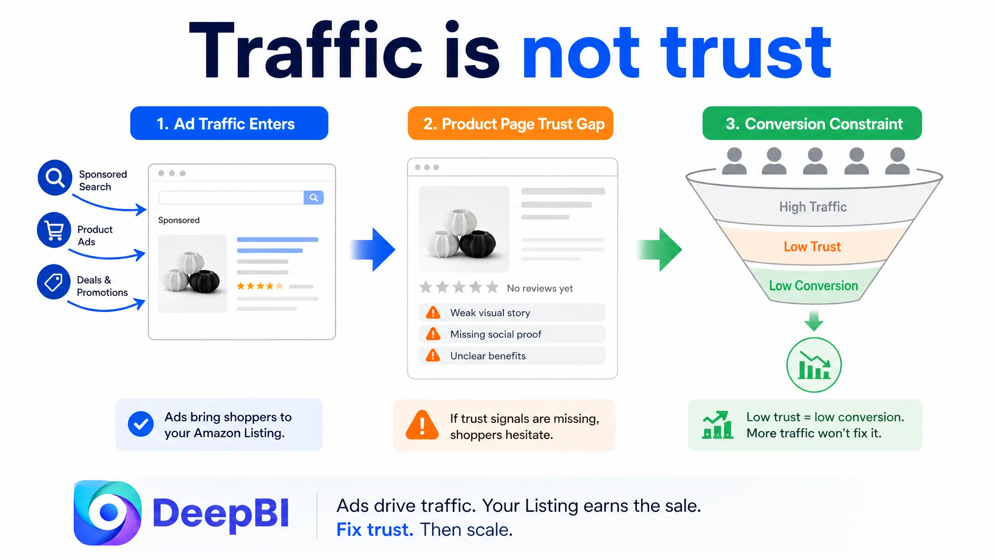
Advertising can bring shoppers to the Amazon product page. It cannot make an unclear page feel trustworthy.
The First Diagnosis Was Not Completely Wrong, but It Was Incomplete
The title was one of the stronger parts of the Listing.
Its score was 12 out of 20, compared with 11 for the benchmark Listing. The customer’s title covered more functional claims and placed important search terms such as “Reusable Laundry Balls” and “Washing Machine” near the front. It also included a specific product size, which could support professionalism and clarity.
The weakness was not a lack of keywords. It was the way those keywords were assembled.
The title packed multiple functions into a dense sequence: anti-static performance, wrinkle reduction, clothing protection, washer compatibility, and other claims appeared one after another. By contrast, the benchmark Listing used a more compact structure that connected the product form with a recognizable benefit, such as cleaner and softer laundry.
This distinction matters on Amazon. A title has to serve both search visibility and fast human comprehension. A title that covers every possible selling point may still make the shopper work too hard to understand the primary reason to buy.
The same pattern appeared in the main image set. The product had been presented through several informational treatments, but some of the images relied heavily on text overlays, collage-like layouts, or CGI-style demonstrations. The content was trying to explain the product, yet the visual system did not create a strong, memorable product impression.
So the initial optimization direction—more keywords, more information, and more visual explanation—was addressing visible symptoms. It was not yet addressing the page’s ability to form a persuasive buying sequence.
The Score Difference Located the Real Constraint
The overall Listing comparison produced a score of 61 out of 100 for the customer’s page, compared with 80 for the benchmark Listing.
The gap was not evenly distributed.
- Title: Customer Listing: 12/20, Benchmark Listing: 11/20, Gap: +1
- Main image: Customer Listing: 24/30, Benchmark Listing: 26/30, Gap: -2
- Bullet points: Customer Listing: 9/10, Benchmark Listing: 5/10, Gap: +4
- Product-page content: Customer Listing: 16/25, Benchmark Listing: 24/25, Gap: -8
- Reviews: Customer Listing: 0/15, Benchmark Listing: 14/15, Gap: -14
- Total: Customer Listing: 61/100, Benchmark Listing: 80/100, Gap: -19
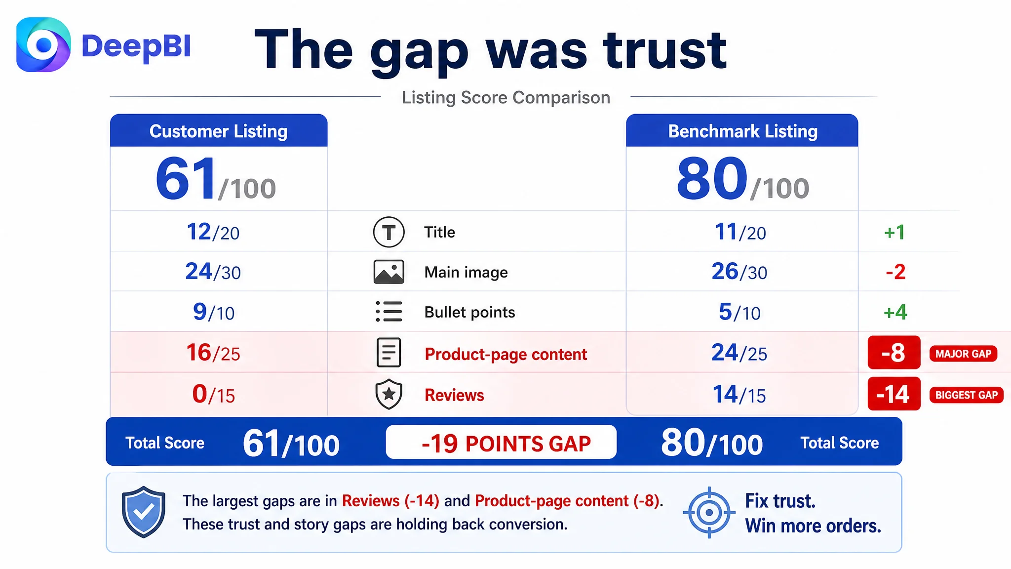
This table changed the order of priorities.
The Listing was not primarily losing because its title was invisible or because its main image was unusable. It was losing most heavily where shoppers needed reassurance and context:
1. The review layer provided no trust support.
2. The A+ and product-page content did not explain the product through a complete usage story.
3. The page contained claims and images, but they did not consistently connect household concerns to product action and expected outcomes.
The review gap was especially significant. The customer’s Listing had no rating data, no review count, and no customer comments on the first page. The comparable Listing had a 4.7-star rating, more than 1,000 reviews, and visible customer feedback describing real usage situations.
Reviews cannot be created through copywriting or image design. That limitation had to be acknowledged rather than disguised. However, it also made the remaining page-level trust work more important. When a new Listing has little or no review support, the title, imagery, bullet points, and A+ content must provide unusually clear answers to the questions that reviews would normally help resolve.
The Product Page Had Information, but Not a Buying Logic
The largest controllable gap was in the product-page content.
The customer’s A+ content included product displays, size information, water-effect demonstrations, environmental imagery, rotation illustrations, washer and dryer compatibility, stacked product views, and household scenes. These assets covered many topics, but they did not form a clear narrative.
A shopper needed to move through a sequence such as:
Household problem → How the laundry balls work → What changes during washing or drying → Why the materials and use are trustworthy → How to use them
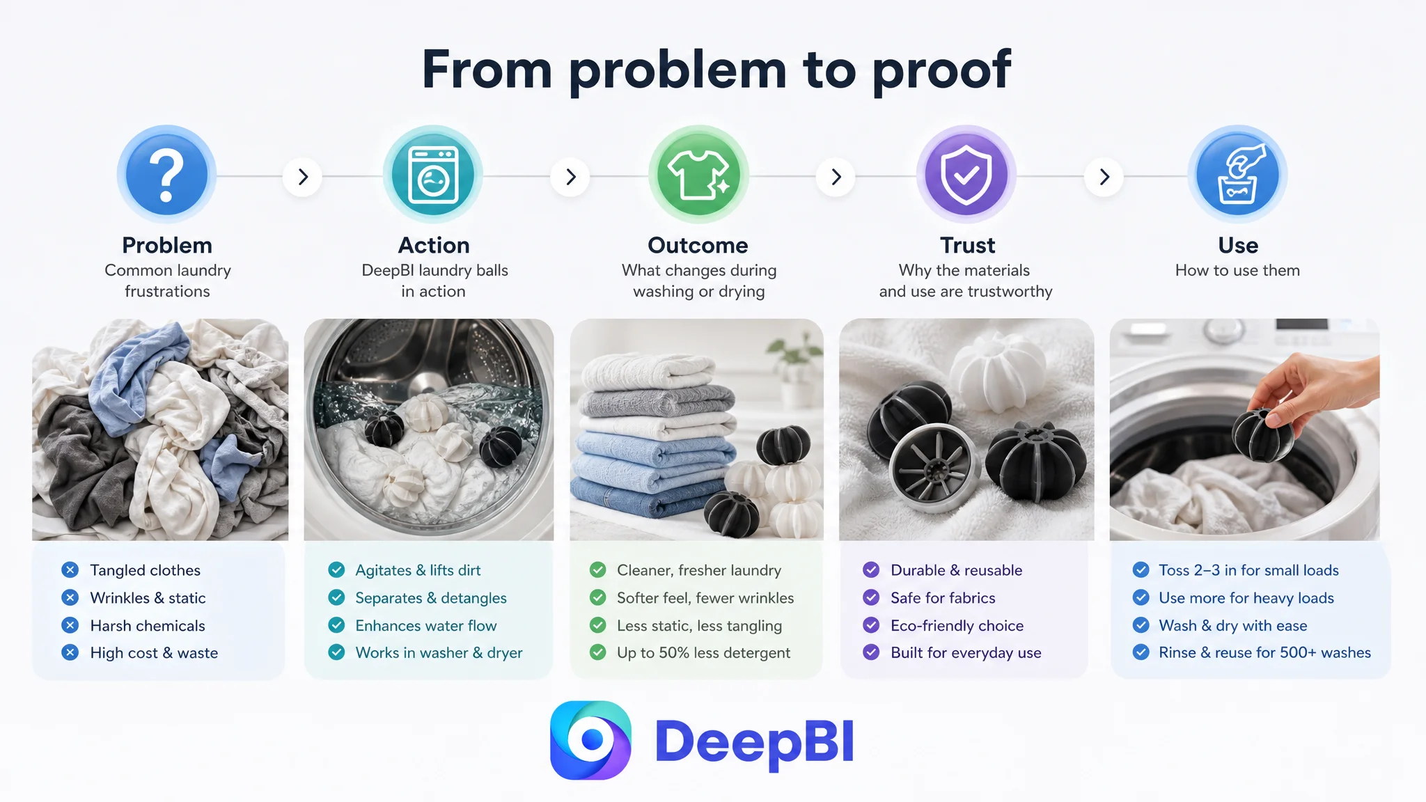
The existing page often moved between images without completing that sequence.
The problem was not shown in the right context
For a laundry product, the most credible setting is the laundry room, the washing machine, the dryer, and the fabric itself.
Some existing scenes placed the product on a bed or a general household surface. These settings were not necessarily visually unattractive, but they were disconnected from the moment when the shopper needed to understand the product’s purpose.
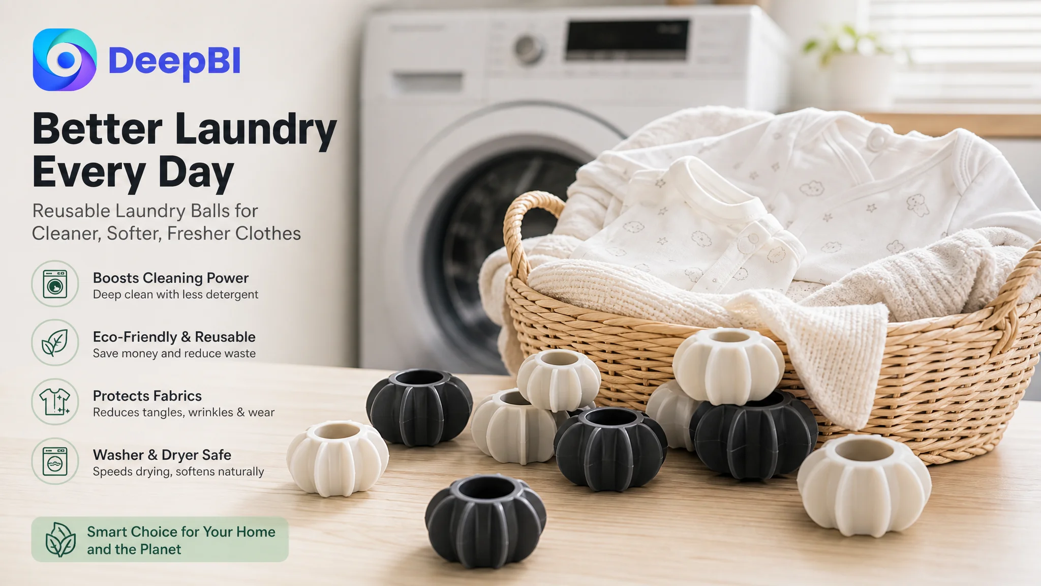
A real laundry-room environment could make the use case immediately legible: a washing machine, a basket of clothes, a clean laundry surface, and the balls ready to be added to a load. The visual message becomes more direct because the scene answers, without explanation, where and how the product is used.
Environmental messaging was too abstract
An image of the Earth communicates environmental intention, but it does not show the shopper what changes in daily use.
For this category, a more concrete comparison would connect the product to detergent use, chemical exposure, recurring household purchases, or the number of reusable items included in the pack. Any specific reduction claim, however, would need to be supported by the product’s actual evidence and compliant wording.
The important change is not simply replacing one graphic with another. It is moving from an abstract value statement to a visible household trade-off.
Material safety needed clearer support
Laundry products come into direct contact with clothing, towels, bedding, and sometimes baby garments. Shoppers may therefore question whether a hard or poorly explained material could damage fibers or create unwanted residue.
The customer’s page did not sufficiently explain material composition, machine compatibility, cleaning frequency, or other practical details. These should not be invented. If the product is confirmed to use a particular material or has verified safety information, that information can become part of the trust structure. If it is not confirmed, the page should not imply certifications, material properties, or safety claims that the product cannot substantiate.
DeepBI’s role in this judgment was not to fill the page with stronger claims at any cost. It was to identify which unanswered questions could block conversion and distinguish verified information from assumptions.
The Main Image Needed a Reason to Click
The main image score was 24 out of 30, only two points below the benchmark. That meant the main image was not the largest numerical problem, but it still had meaningful room to improve.
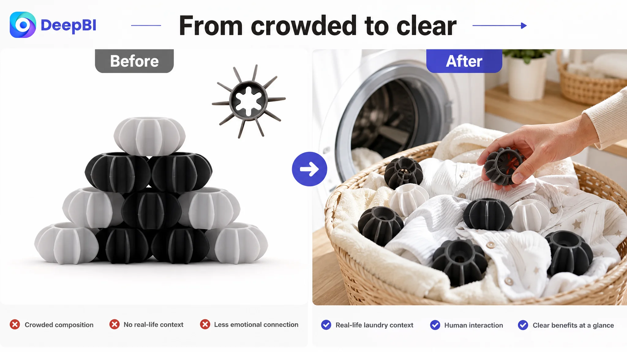
The central issue was visual hierarchy.
Some images relied on stacked product arrangements, multiple panels, or dense explanatory elements. This created an impression of effort, but not necessarily a strong first impression. On a mobile search page, shoppers need to recognize the product shape, pack value, and visual identity quickly.
The proposed direction was to move toward:
- A cleaner, more restrained composition
- Stronger contrast between the product and background
- More deliberate use of negative space
- Closer views of the product’s leaf-like structure
- Realistic fabric and laundry-room settings
- Consistent visual treatment across the image set
A human hand could help communicate scale and use, while a clean product arrangement could make the pack feel more substantial. A close-up could show the actual shape and texture rather than relying on technical lines or oversized labels.
The goal was not to make the product look more expensive than it is. It was to remove visual noise that made the product feel less clear and less distinctive.
The image set did not need more decoration. It needed a stronger relationship between product form, household use, and expected benefit.
The Bullet Points Already Had Stronger Commercial Potential
Interestingly, the customer’s bullet-point score was 9 out of 10, four points higher than the benchmark’s 5 out of 10.
This did not mean the bullet points should be left untouched. It meant the customer already had useful commercial material that could be organized more effectively with the rest of the page.
The existing bullets emphasized outcomes such as durability, savings, environmental value, clothing protection, and reduced chemical use. The benchmark Listing relied more heavily on functional explanations and operating instructions.
Both approaches had value.
The customer’s page was stronger when it described why the product mattered. The benchmark was stronger when it described how the product worked and how to use it.
A more complete structure would connect the two:
Product durability and material information
If verified, the page can explain pack size, material, expected use, and any relevant safety characteristics. Unsupported claims such as wash-count guarantees or specific certifications should not be added merely because a competitor mentions them.
Physical cleaning action
The product’s shape and movement should be described in language that helps shoppers visualize its role during a cycle. The explanation should stay within the product’s confirmed functionality rather than promising results that have not been demonstrated.
Clothing protection and detangling
The page should connect the anti-tangling benefit with familiar items such as delicates, knitwear, towels, or everyday clothing, provided those use cases are accurate for the product.
Washer and dryer use
A clear explanation of when the balls are used in the washer, dryer, or both can remove practical uncertainty. It should also clarify any machine or load limitations that are known and relevant.
Quantity and load guidance
Instructions such as how many balls to use for different load sizes can be helpful, but the recommended quantity must reflect actual product guidance. The purpose is to make the product feel easy to adopt, not to add operational detail without evidence.
The key improvement was to make every bullet answer a decision question instead of presenting a disconnected claim.
Why DeepBI Did Not Keep Tuning Ads First
At this stage, continuing to adjust Amazon ads first would have created a structural risk.
If the page had a weak conversion path, more traffic would not necessarily improve the outcome. It could simply expose more shoppers to the same uncertainty:
- Is the product safe for clothing?
- Does it really work in both machines?
- What makes it different from other laundry balls?
- How does it reduce tangling or improve drying?
- Is the product suitable for a household with sensitive fabrics or baby clothing?
- What evidence supports the environmental and savings claims?
This is why Listing conversion had to be addressed before aggressive traffic expansion.
The decision was not that advertising was irrelevant. Amazon ads remained important for visibility and controlled testing. The decision was about sequence:
1. Repair the page’s ability to explain the product.
2. Make the primary visuals clear and credible.
3. Connect the title and bullet points to one consistent value proposition.
4. Strengthen the A+ story with real usage context and verifiable support.
5. Then evaluate whether paid traffic is being converted more efficiently.
This order prevents advertising from amplifying page-level defects.
It also creates a cleaner basis for interpreting later ad data. If the product page has been materially clarified, changes in CTR, CVR, ACOS, or organic-order share become more useful signals. Without that repair, campaign adjustments can become a cycle of reacting to symptoms.
The New A+ Direction Was Built Around Real Laundry Behavior
The proposed A+ revision centered on four practical changes.
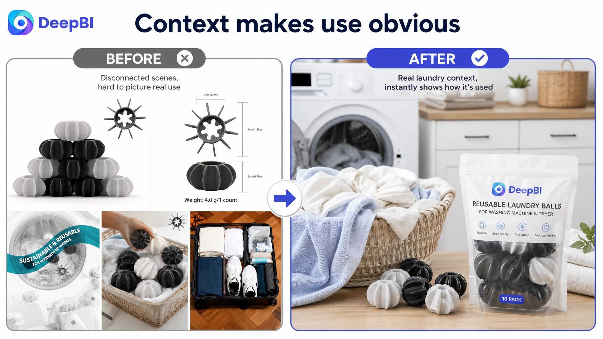
Replace disconnected household scenes
Bedroom and general home scenes would be replaced with a clean laundry-room environment. The product should appear near a washing machine, laundry basket, or folded clothing, making the use case immediately recognizable.
Turn environmental value into a visible comparison
Instead of relying only on symbolic environmental imagery, the page could show the reusable product alongside a measured amount of detergent or softener, with carefully verified claims. The visual should communicate the intended reduction in recurring chemical product use or household waste without overstating the result.
Simplify the opening banner
The first A+ module should establish the product, primary use, and central benefit quickly. The product should remain the visual focus, while short supporting phrases explain the most important value rather than competing with it.
Add a fabric-contact trust scene
A close-up of the laundry balls among soft cotton garments or towels could address concerns about fabric contact. Baby clothing or sensitive-skin use should only be mentioned if the product’s material and safety basis support that positioning. The image can create a softer, more reassuring impression without making a medical or certification claim.
Together, these changes would make the page easier to understand as a product system rather than a collection of isolated images.
The Optimization Direction Changed the Business Question
Before the diagnosis, the team’s question was close to:
How can we make the ads more efficient?
After reviewing the Listing evidence, the more useful question became:
Can this product page convert the traffic that the ads are buying?
That shift matters because advertising efficiency is not created inside the campaign manager alone. It is produced across the relationship between the search term, the ad, the product page, the offer, and the shopper’s level of trust.
For this laundry ball Listing, the score comparison showed that keyword coverage was not the main constraint. The larger issue was that the page did not yet make the product’s value sufficiently concrete.
The product had potential selling points:
- Reusable household use
- Cleaning assistance
- Reduced tangling
- Possible washer and dryer compatibility
- Clothing-care benefits
- Environmental and cost-saving positioning
But potential selling points only become conversion assets when shoppers can understand them, believe them, and connect them to their own laundry routine.
What Changed in the Seller’s Operating Understanding
The case material does not include confirmed post-optimization results, so it would be premature to claim a specific CVR increase, ACOS decline, or organic-order recovery.
The more defensible change was in decision quality.
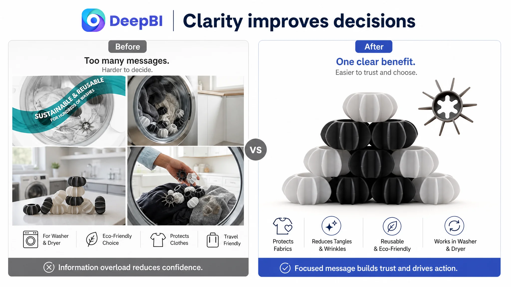
The seller could now separate several issues that had previously been grouped together as an advertising problem:
- A title can contain many keywords and still feel overloaded.
- A main image can be informative and still lack visual distinction.
- Strong bullet points can be weakened if the A+ content tells a different story.
- A product page with no review history has to work harder to establish trust through clarity and evidence.
- More ad traffic is not automatically useful traffic.
- Product-page conversion capacity should be assessed before scaling paid exposure.
DeepBI’s value in this case was not a list of isolated image or copy edits. It was the ability to compare the Listing against a relevant market benchmark, locate where the 19-point difference was concentrated, and determine which weakness should be addressed first.
The customer did not need to choose between ads and Listing optimization. The customer needed to understand their order of operations.
The Broader Lesson for Amazon Sellers
Amazon sellers often react to rising ACOS by changing bids, search terms, budgets, and campaign structures. Those actions can be necessary, but they cannot compensate indefinitely for a product page that fails to build confidence.
A better diagnostic sequence is:
- Is the main image earning attention in a crowded search result?
- Does the title communicate the primary reason to buy without becoming a keyword list?
- Do the bullet points explain both function and outcome?
- Does the A+ content show the product in its real operating environment?
- Are key material, compatibility, and usage questions answered with verified information?
- Does the Listing have review support, or must the content carry more of the trust burden?
- Is the page ready for more paid traffic?
For this Amazon laundry accessories seller, the answer was not to abandon advertising. It was to stop treating advertising as the first and only lever.
The Listing had to become clearer before the traffic could become more valuable. Once the product page could present a consistent story—from search result to product details to household use—Amazon ads would have a stronger foundation on which to work.