

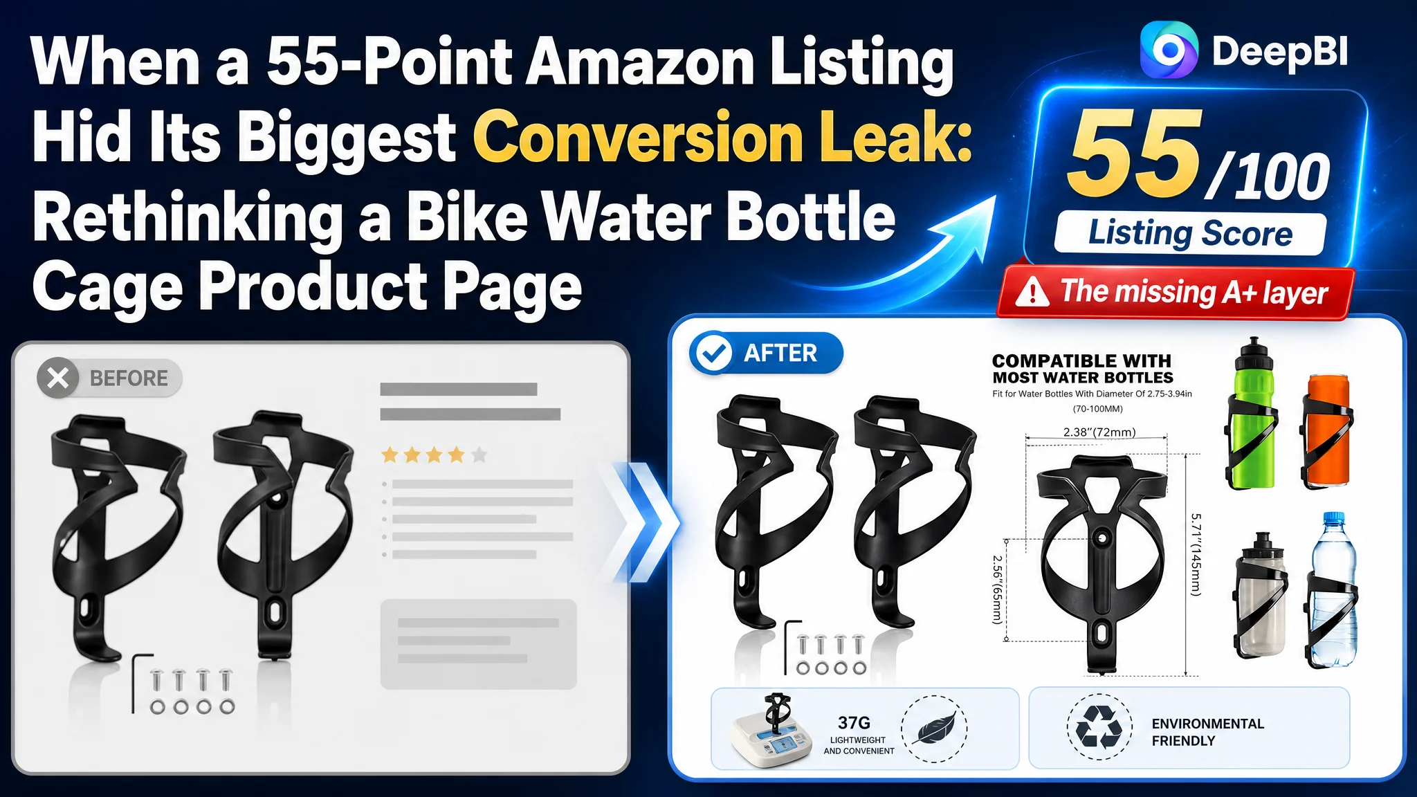
An Amazon seller in the US bicycle accessories category was facing a Listing competitiveness problem. The product page had strong ratings and reasonably complete bullet points, but its overall Listing score was only 55/100, compared with 80/100 for a comparable high-performing Amazon listing.
The first instinct was to focus on visible details: refine the title, improve the main images, strengthen the material claims, and add more complete product information. Those changes were useful, but they did not explain the largest gap. DeepBI’s diagnosis showed that the real weakness was not a single keyword or isolated image. The page had no A+ content at all, leaving the product without the visual structure and trust-building logic needed to convert Amazon traffic.
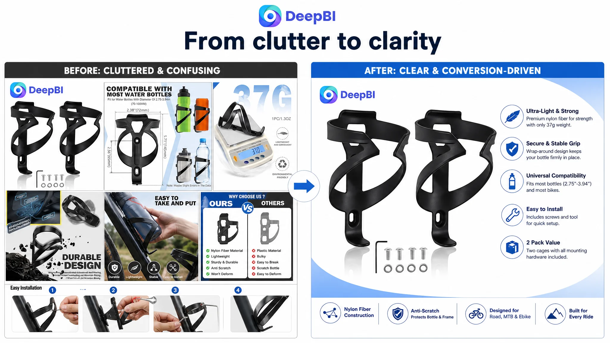
The later optimization therefore focused on restoring the page’s sales logic: position the core category term more clearly, organize the product benefits around real cycling concerns, show installation and outdoor use more convincingly, and build a structured A+ experience around stability, lightweight design, compatibility, and the two-pack value.
For other Amazon sellers, the lesson is direct: before increasing Amazon ad traffic or repeatedly polishing individual Listing elements, determine whether the product page has enough conversion capacity to deserve more traffic.
The Listing Did Not Have One Weak Element. It Had One Dominant Gap.
The overall score comparison looked like this:
- Title: Target Listing: 14, Comparable Listing: 16, Maximum score: 20
- Main images: Target Listing: 25, Comparable Listing: 23, Maximum score: 30
- Bullet points: Target Listing: 8, Comparable Listing: 6, Maximum score: 10
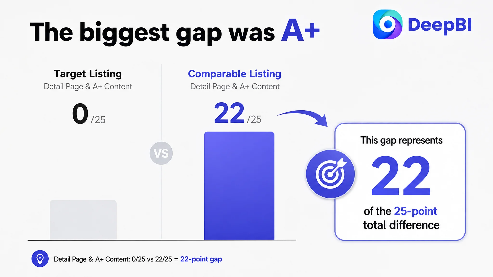
- Detail page and A+ content: Target Listing: 0, Comparable Listing: 22, Maximum score: 25
- Reviews: Target Listing: 8, Comparable Listing: 13, Maximum score: 15
- Total: Target Listing: 55, Comparable Listing: 80, Maximum score: 100
At first glance, the score suggested several areas for improvement. The title was slightly behind. Reviews were weaker in volume. Image execution still had room to improve. But these gaps were not equal.
The detail-page score was 0 out of 25, while the comparable Listing scored 22.
That difference represented 22 of the 25-point total gap.
The central problem was not that the Listing lacked information. It lacked a structured place where the information could become persuasive.
This distinction mattered because a seller can spend considerable time refining a title or rewriting bullet points while leaving the page’s largest conversion constraint untouched.
For an Amazon product page, the title helps create search relevance and initial understanding. The main image helps win attention in the search results. Bullet points answer practical questions. But A+ content and supporting detail modules help the shopper assemble the final purchase decision: where the product is used, how it works, why it can be trusted, and whether it fits the buyer’s situation.
That final layer was absent.
The Initial Suspicion Pointed to Keywords and Creatives
The most obvious explanations were familiar ones:
- The title might not be using the strongest category wording.
- The main images might not stand out enough on mobile.
- The product might need more technical detail.
- The Listing might need more persuasive material comparisons.
- The low review count might be holding back trust.
These were reasonable suspicions. The product was a bike water bottle cage, a category where shoppers often compare several similar-looking accessories quickly. Search wording, visual clarity, compatibility, installation, and stability all influence the decision.
But treating every visible weakness as equally important would have created a scattered optimization plan.
The title was only two points behind the benchmark. The main-image score was actually two points higher. The bullet-point score was also two points higher. These areas required refinement, but they did not explain why the Listing was 25 points behind overall.
The customer’s initial direction could therefore have become a familiar Amazon optimization trap: keep adjusting the visible front-end elements while overlooking the missing page structure behind them.
DeepBI reframed the question:
Which gap was most likely preventing the Listing from turning product interest into purchase confidence?
The answer was the absent detail-page experience.
The Title Needed Better Search and Buying Logic
The title was not unusable. Its problem was that it did not lead with the clearest category recognition.
The comparable Listing placed “Bike Water Bottle Cage” near the beginning, making the product type immediately legible to both search systems and shoppers. The target Listing led with “Holder,” which could weaken category recognition even though the product itself was clear from the rest of the title.
The title also placed terms such as “2 Pack” and “Screw” in the middle of the sequence. That interrupted the main value path:
category → core benefit → use case → compatibility → specifications
The revised direction brought the category phrase forward:
Universal Bike Water Bottle Cage, Ultralight Nylon Fiber Bicycle Bottle Holder with Screws, Cycling Drink Cup Rack for Road, MTB, Mountain, Ebike - Black, 2 Pack
The purpose was not to copy a competitor’s wording. It was to improve the title’s decision order:
- Make “Water Bottle Cage” immediately recognizable.
- Preserve the product’s genuine lightweight nylon-fiber attribute.
- Add “Universal” to address compatibility concerns.
- Include relevant bicycle use cases.
- Move color and pack quantity to the end for cleaner reading.
The title was a traffic-entry improvement. It was not the root-cause correction.
That distinction is important for Amazon sellers. Better keyword placement can help a shopper find and understand the product, but it cannot replace the trust-building work of the product page.
The Bullet Points Were Stronger Than the Score Suggested
The bullet points were not the weakest part of this Listing.
Compared with the benchmark, the target Listing had several strengths:
- Clear section headings
- More complete coverage of compatibility, material, installation, use, and appearance
- More scenario-based language
- Stronger comparison between nylon and ordinary plastic or metal
- More direct emphasis on secure retention and ease of access
The optimization challenge was therefore not simply “write better bullets.” It was to make the information easier to follow as a buying argument.
The recommended structure connected each product attribute to a concern a cyclist might actually have.
Lightweight material had to become a practical benefit
Instead of stopping at “nylon fiber,” the copy connected the material to durability, weight, temperature resistance, and protection against scratching the bottle or bicycle frame.
Secure retention had to answer the rough-road concern
The product’s wrap-around arm design was positioned around the fear of a bottle bouncing out on mountain trails, rather than being described as a generic structural feature.
Compatibility had to reduce purchase uncertainty
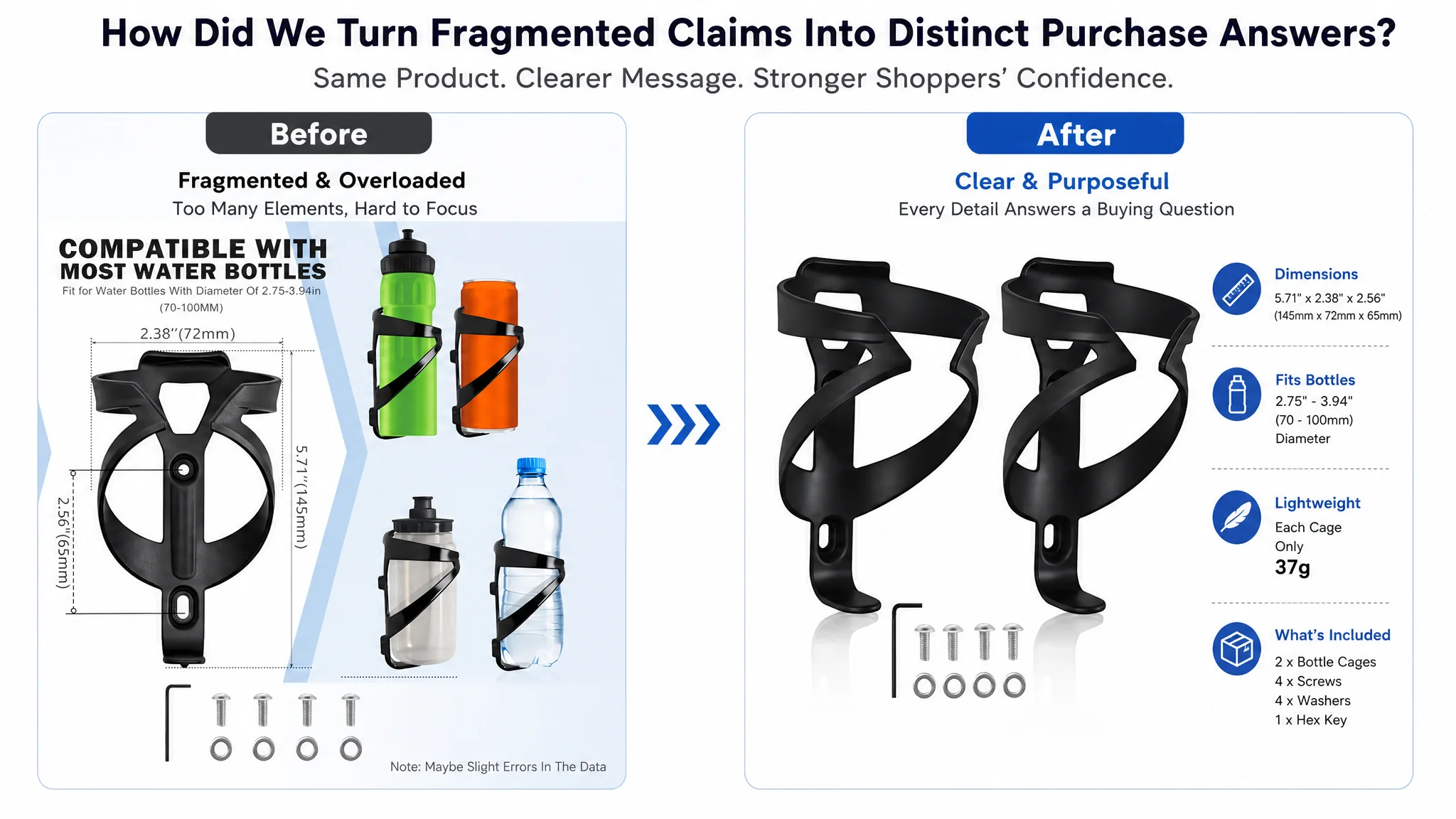
The revised bullet direction named road, mountain, hybrid, gravel, touring, electric, and commuter bicycles, while also stating the supported bottle diameter range of 2.75 to 3.94 inches.
Installation had to include the condition that matters
The page needed to make clear that the cage includes mounting hardware, while also warning shoppers to confirm that the bicycle frame has pre-drilled threaded mounting holes.
The two-pack had to connect to actual riding behavior
For longer rides, commuting, or extended outdoor use, two cages can represent a practical hydration setup rather than merely a larger quantity.
The bullets already contained useful product information. The key improvement was to organize that information around the customer’s decision sequence.
The Main Images Needed Clarity, Not More Decoration
The main-image score was higher than the benchmark, but the visual review still found several conversion risks.
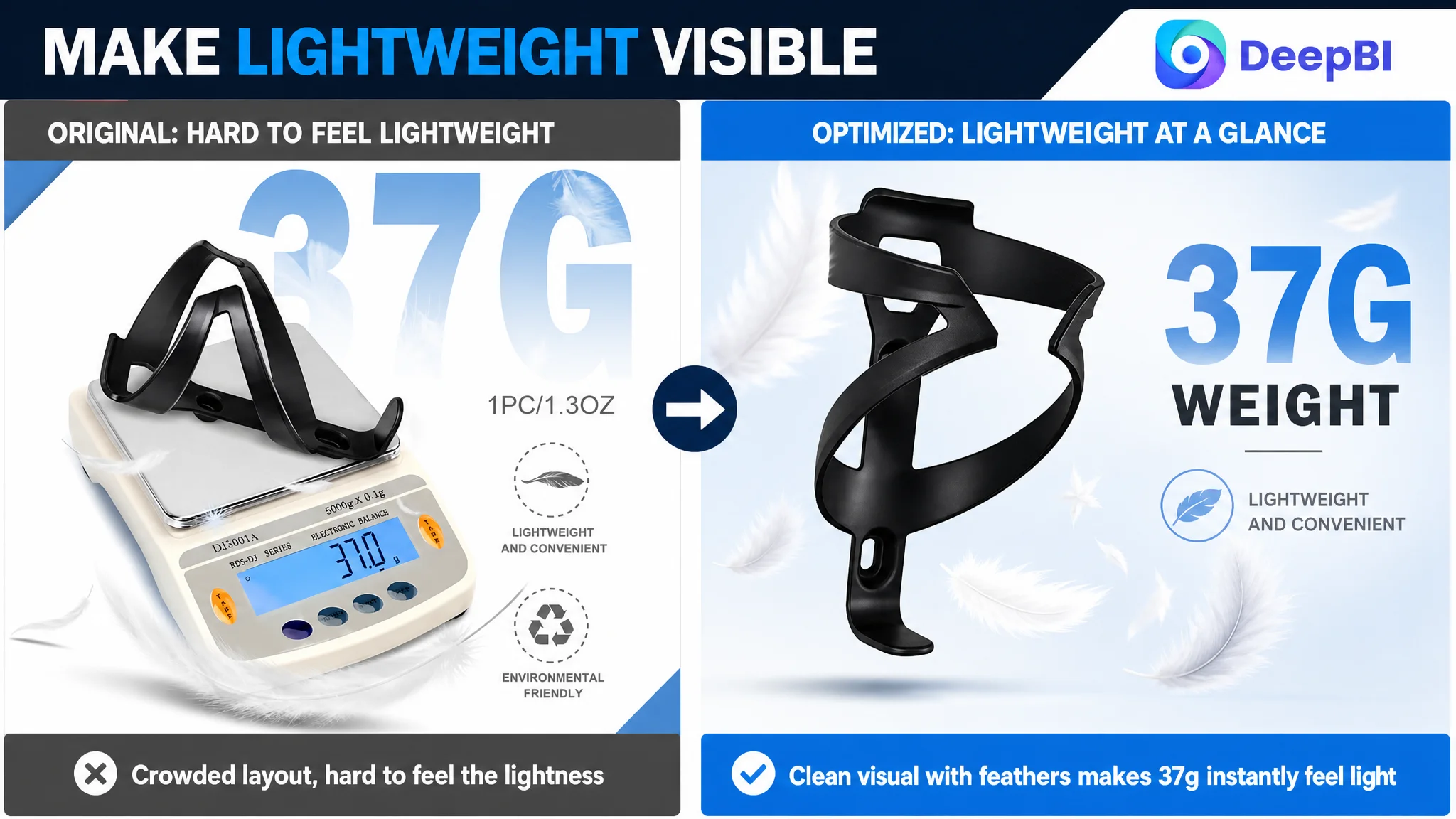
Some images had scattered accessories, excess graphic elements, or weak visual hierarchy. One image used an everyday scale to communicate the 37-gram weight, making the product feel ordinary rather than lightweight. Another image used an internal wireframe-style presentation that did not help shoppers understand the real product in use.
These were not problems solved by adding more visual effects.
The recommended image direction was more disciplined:
- Present the two cages in a clean, centered composition.
- Arrange the screws and hex tool in an orderly way.
- Use a pure white background for specification-oriented images.
- Remove unnecessary geometric shapes and clutter.
- Use restrained measurement markings for dimensions.
- Express the 37-gram weight through a lightweight visual metaphor.
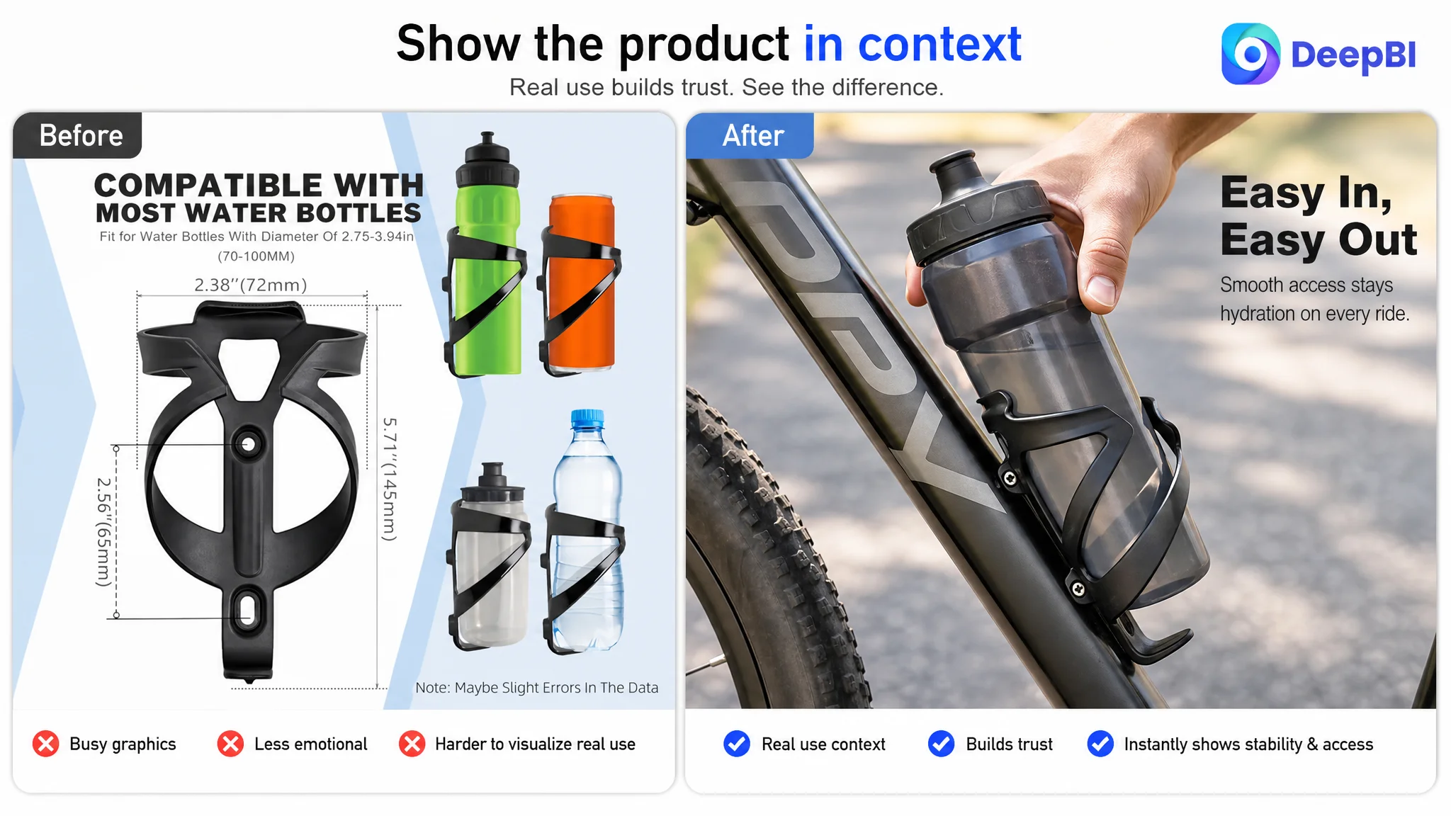
- Show the cage mounted on a mountain bike in a real outdoor setting.
- Use close-up interaction to show a hand inserting and removing a bottle.
Each image needed a distinct role.
The primary product image should make the product and two-pack quantity immediately clear. The dimension image should answer fit-related questions. The weight image should make “lightweight” visually understandable. The outdoor image should address stability in a real riding environment. The close-up image should reduce uncertainty about bottle access.
The goal was not to make every image more dramatic. It was to make every image answer a different purchase question.
This is where visual optimization becomes a business decision rather than an aesthetic exercise.
The Missing A+ Content Was the Conversion Constraint
The largest difference between the two Amazon Listings was the detail page.
The benchmark used a structured visual experience that included:
- A strong outdoor cycling scene
- Multiple product views and color presentation
- Installation guidance
- Feature icons
- Close-up details
- Accessory information
- Related products such as a triangle bag and phone bag
- A clear two-pack presentation
The target Listing had none of these A+ modules.
For a bicycle accessory, this absence was especially costly. Shoppers are not only asking whether the cage exists. They are asking:
- Will it stay in place on rough roads?
- Will it fit my bicycle?
- Can I install it without difficulty?
- Will the bottle be easy to remove while riding?
- Is the two-pack useful for a longer ride?
- Does the product look like a reliable piece of cycling equipment?
A structured A+ page could answer these questions in a sequence that ordinary bullet points could not fully provide.
The opening scene had to establish the use case
A close-up of the cage mounted on a bicycle in a rugged outdoor environment would help shoppers imagine the product under real riding conditions.
The purpose was not to imply performance beyond the available evidence. It was to make the intended use context tangible and show the cage holding a bottle on a bicycle frame.
Lightweight design needed a visual explanation
A controlled product presentation using a lightweight visual metaphor could make the 37-gram specification easier to understand without relying on a paragraph of copy.
The product should remain visually accurate. The improvement would come from composition, lighting, and context rather than changing its physical appearance.
Installation needed to be shown step by step
A clean exploded view could show the cage, screws, and frame tube in alignment. A four-step installation module with hand operation and an Allen key would make the process more concrete.
This was also the right place to clarify the threaded-hole requirement. A page that explains installation conditions before purchase can prevent avoidable confusion and reduce the risk of returns.
The two-pack needed to look complete
Displaying both cages together with the included hardware could create a clear “what you receive” moment. It would help shoppers understand the value of the pack and connect the quantity to the practical need for carrying two bottles.
Why DeepBI Did Not Prioritize More Ad Tuning
This case did not call for adding traffic before repairing the page.
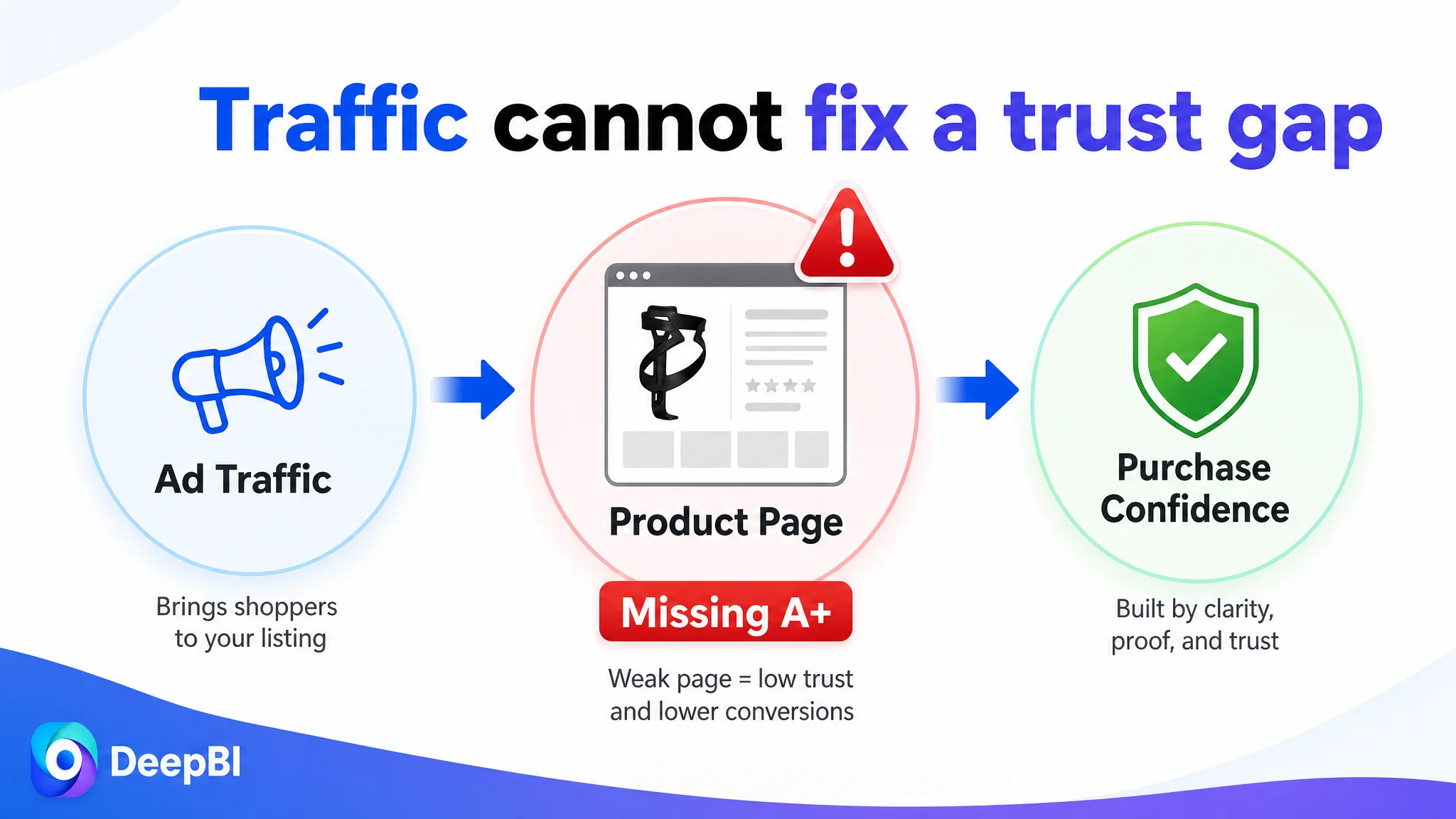
If Amazon ads send more shoppers to a product page with no A+ content, the ads may simply expose the same trust gap to a larger audience. The traffic arrives, but the page still lacks the visual evidence and structured explanation needed to convert it.
Advertising can amplify a product’s strengths. It can also amplify a Listing’s omissions.
The decision order was therefore:
1. Repair the largest product-page gap.
2. Clarify category relevance and compatibility.
3. Improve the image sequence so each asset has a clear commercial role.
4. Build A+ content around real product concerns.
5. Then evaluate whether additional Amazon ad traffic can be converted more efficiently.
This does not mean ads are unimportant. It means ad efficiency depends partly on the page receiving the traffic.
A title revision may improve search understanding. A stronger main image may improve the click opportunity. Better bullets may reduce uncertainty. But without a complete product-page narrative, the Listing remains dependent on shoppers filling in too many blanks themselves.
DeepBI’s judgment came from comparing the size and role of each gap rather than treating every recommendation as equally urgent.
The Optimization Plan Had to Stay Inside Product Reality
The visual recommendations were not instructions to redesign the product or invent new capabilities.
The cage had to remain the same product:
- Nylon-fiber construction
- Black finish
- Two-piece pack
- Included screws and mounting tool
- Compatibility with bicycle frames that have threaded mounting holes
- Support for the stated bottle diameter range
- Lightweight specification of 37 grams
The improvements were applied to presentation:
- Composition
- Camera angle
- Lighting
- Background
- Outdoor context
- Installation sequencing
- Information hierarchy
- Text organization
That boundary mattered. A visually impressive image that changes the product’s shape, material, accessories, or installation condition could create a mismatch between the Listing and the item customers receive.
DeepBI’s role in this case was not to generate an attractive image in isolation. It was to translate the diagnosed business gap into a specific, executable presentation plan while keeping the product truthful.
The Review Gap Was Real, but It Was Not the First Repair
The target Listing had a 4.8-star rating from only seven reviews. The benchmark had a lower 4.3-star rating but more than 4,000 reviews, including image and video reviews.
This created an important distinction:
- Rating quality was a strength.
- Review volume was a trust-scale weakness.
The positive rating showed that the existing customer feedback was valuable. But seven reviews could not create the same sense of market validation as thousands of reviews.
That gap should not be ignored, but it also could not be solved through title rewriting or image generation. More importantly, it was not the largest Listing-content deficit. The absent A+ experience represented a direct and addressable page-level weakness.
The correct judgment was to preserve the positive review advantage while recognizing that review scale would remain a longer-term trust factor.
The Case Changed the Meaning of “Optimization”
Before the diagnosis, optimization could easily have been understood as a sequence of isolated tasks:
- Rewrite the title.
- Add keywords.
- Improve the images.
- Expand the bullets.
- Compare review counts.
- Increase advertising exposure.
After the diagnosis, the Listing could be understood as a connected conversion system.
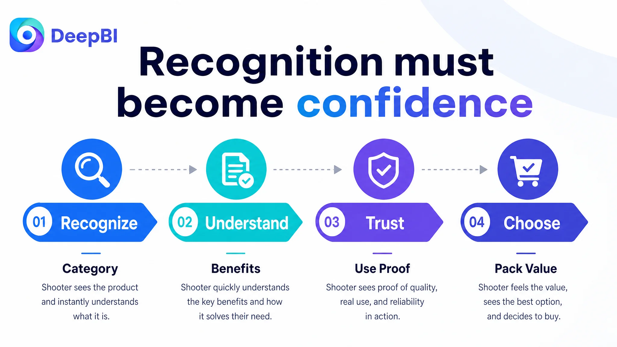
The title needed to establish category relevance. The main image needed to create immediate recognition. The bullet points needed to organize the buying logic. The A+ content needed to demonstrate use, stability, installation, compatibility, and pack value. Reviews needed to reinforce trust over time.
Each element had a role, but the missing A+ layer was preventing the rest from working as a complete product-page experience.
A strong Amazon Listing is not a collection of improved fields. It is a sequence that moves the shopper from recognition to confidence.
What Other Amazon Sellers Can Take From This Case
This bike water bottle cage Listing offers a practical diagnostic pattern for Amazon sellers:
- Do not assume the largest problem is the most visible one.
- Compare score gaps by dimension before choosing the optimization order.
- Separate search-entry problems from product-page conversion problems.
- Treat A+ content as part of the sales argument, not as optional decoration.
- Give every image a specific decision-making role.
- Turn material and specification claims into shopper-relevant outcomes.
- State compatibility and installation conditions clearly.
- Protect genuine advantages, such as a high rating, even when review volume is low.
- Do not send more paid traffic to a page that has not earned the opportunity to convert it.
The target Listing did not need a completely different product story. It needed the existing story to be made visible, structured, and credible across the Amazon product page.
That is the difference between editing a Listing and diagnosing one.