

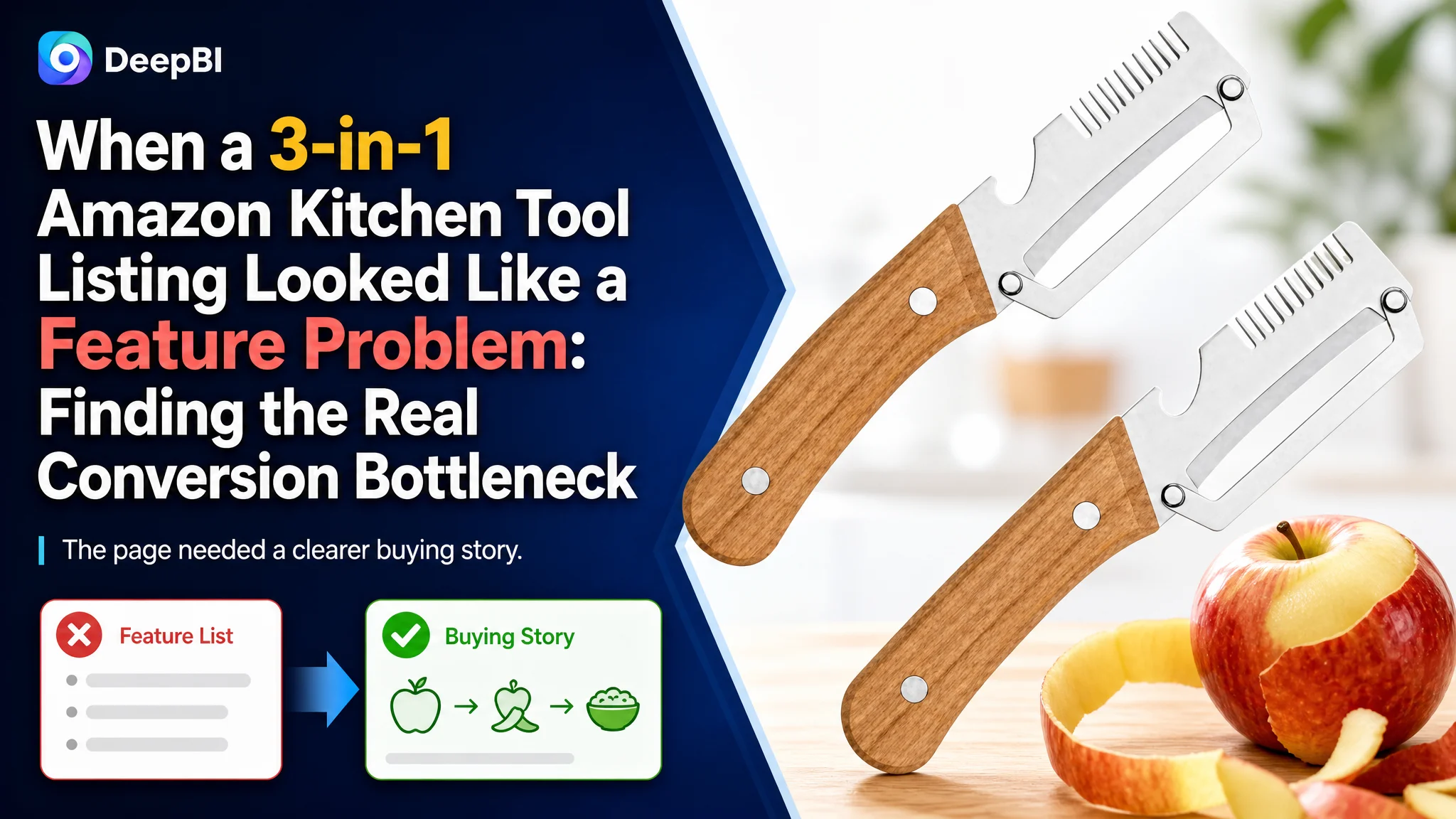
An Amazon seller in the kitchen-tools category was trying to make a 2-piece vegetable peeler set more competitive. The Listing had several useful functions—peeling, julienne slicing, grating, and bottle opening—but its overall competitive score was only 62 out of 100, compared with 80 for a comparable high-performing Amazon Listing.
The initial direction was understandable: clarify the functions, add more product information, and make the images communicate more specifications. But that approach did not address the deeper issue. DeepBI found that the Amazon product page was not failing because the product lacked features. It was failing because those features were not being turned into a clear buying story.
The real gap was concentrated in the page's conversion structure: a static and restrictive image sequence, a title with weaker search and value signals, bullet points that listed functions without building a cooking-use logic, and an A+ section too thin to establish trust. The later optimization therefore focused on proving outcomes, clarifying the role of each tool, showing the product in use, and rebuilding the page before treating more traffic as the answer.
For other Amazon sellers, the case carries a practical warning: when an Amazon Listing has useful functions but still struggles to compete, adding more information may not be enough. The first question should be whether the product page gives shoppers a reason to click, a reason to trust, and a clear reason to buy.
The Listing Had Functions. The Page Did Not Yet Have a Sales Logic.
The product was positioned as a multifunctional kitchen tool set. In principle, that gave the Amazon seller several usable selling points:
- Peeling common fruits and vegetables
- Creating julienne strips
- Grating or chopping applicable vegetables
- Opening bottles
- Providing a compact tool for kitchens, picnics, camping, or travel
Yet the page presented these functions as separate facts rather than as a connected preparation experience.
The overall score made the imbalance visible:
- Title: Customer Listing: 14/20, Comparable Listing: 17/20, Gap: -3
- Main image: Customer Listing: 23/30, Comparable Listing: 26/30, Gap: -3
- Bullet points: Customer Listing: 7/10, Comparable Listing: 8/10, Gap: -1
- A+ content: Customer Listing: 16/25, Comparable Listing: 24/25, Gap: -8
- Reviews: Customer Listing: 2/15, Comparable Listing: 5/15, Gap: -3
- Total: Customer Listing: 62/100, Comparable Listing: 80/100, Gap: -18
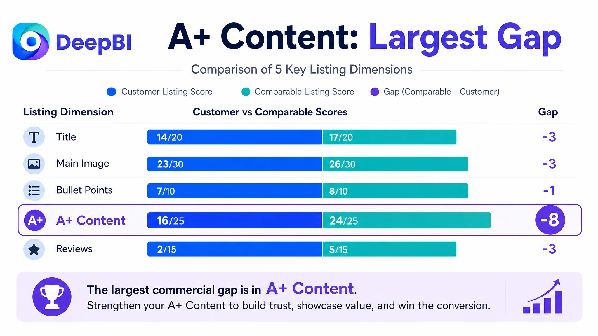
The most important gap was not the one-point difference in bullet points or the three-point difference in the title. It was the eight-point difference in A+ content.
That gap indicated a larger problem: the Amazon product page was not doing enough to convert product interest into purchase confidence.
The product did not primarily need more claims. It needed a clearer path from feature recognition to purchase confidence.
The Original Diagnosis Stopped at “Show More Functions”
The customer’s Listing already emphasized its multifunctional design. The title began with “3-in-1,” and the images attempted to communicate the different uses, materials, and scenarios.
That made the original optimization direction seem logical: add more functional descriptions, make the product specifications more visible, and show additional use cases.
But this approach treated the page as an information container. It assumed that if shoppers understood more of the product, they would naturally become more willing to buy.
DeepBI’s comparison showed why that assumption was incomplete.
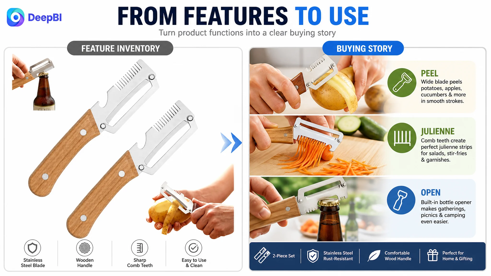
The comparable Listing did not simply mention that it had multiple functions. It gave each tool a role in a familiar kitchen workflow:
- A wide peeler for common fruits and vegetables
- A julienne blade for thin strips
- A bottle opener for gatherings and outdoor use
- A clear distinction between the two pieces in the set
The customer Listing, by contrast, concentrated on broad phrases such as “multifunctional,” “stainless steel,” and “ergonomic wooden handle.” Those points were useful, but they did not answer the shopper’s more practical questions:
- Which tool should be used for which task?
- What does the result look like?
- Can the tool handle regular kitchen ingredients?
- Is the two-piece set genuinely useful, or is it just a collection of functions?
- Why should this product be trusted over a basic plastic peeler?
The problem was not a complete lack of content. It was a lack of decision order.
Amazon Ads Can Amplify a Weak Product Page
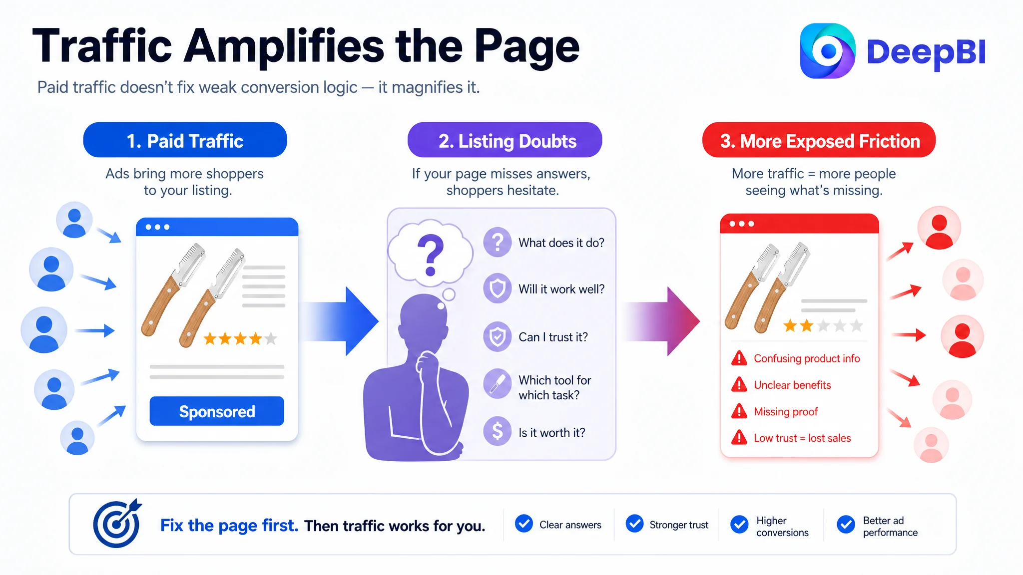
The case material does not provide post-optimization ad metrics, so it would be inappropriate to claim a specific ACOS decline or CVR increase. But the Listing diagnosis exposes a common Amazon advertising risk.
If an Amazon seller sends paid traffic to a product page that does not establish value quickly, advertising may increase visits without creating proportionate orders. The page receives more opportunities to convert, but it also exposes its own weaknesses more frequently.
For this kitchen-tool Listing, the risk appeared in several places:
- A shopper could see the product but not immediately understand the full set structure.
- A shopper could notice a warning about hard vegetables and interpret it as a limitation.
- A shopper could see a bottle beside the product without seeing the bottle-opening function demonstrated.
- A shopper could read technical material claims without seeing enough proof of durability or control.
- A shopper could find a static result image but not see the tool producing that result.
This is why advertising and Listing optimization cannot be diagnosed separately.
Advertising does not only amplify a product’s advantages. It can also amplify the page’s unresolved doubts.
The correct operating question was therefore not “How can the seller add more traffic?” It was “Can this Amazon product page make the traffic useful once it arrives?”
The Score Gap Pointed to a Conversion Bottleneck, Not a Single Bad Image
DeepBI did not treat the 62-point score as a reason to change every element at once. The score comparison helped establish where the largest commercial constraint was concentrated.
The title was functional, but not competitive enough
The customer title led with “3-in-1,” which communicated the product’s broad function. However, it did not make the strongest search and quality signals easy to recognize.
The comparable title placed “Stainless Steel” earlier, included “Julienne,” and framed the product as a 2-piece multifunctional set. Those choices made the title more aligned with how shoppers might search and evaluate a kitchen peeler.
The recommended direction was not to copy the competitor’s wording. It was to rebuild the customer title around a clearer structure:
- Core product form
- Material
- Primary functions
- Julienne use
- Kitchen preparation context
- 2-piece set format
The proposed title also corrected a formatting problem in the original wording and removed unnecessary repetition. This mattered because title optimization on Amazon is not just about inserting more keywords. It is about making search relevance and product value readable at the same time.
The main image sequence showed features without proving outcomes
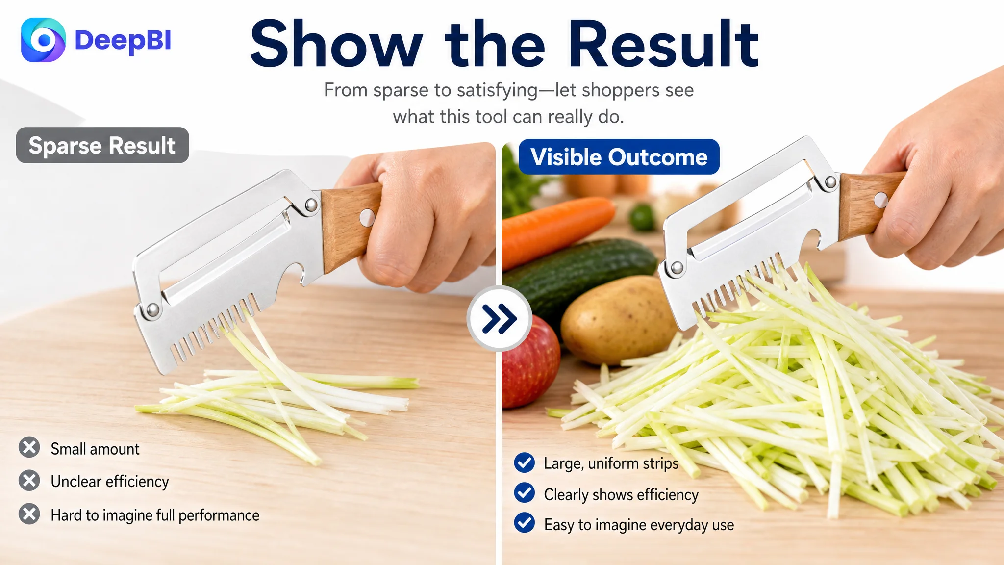
The image set contained product displays, material callouts, and use references. But the most distinctive function—the julienne capability—was not visually convincing enough.
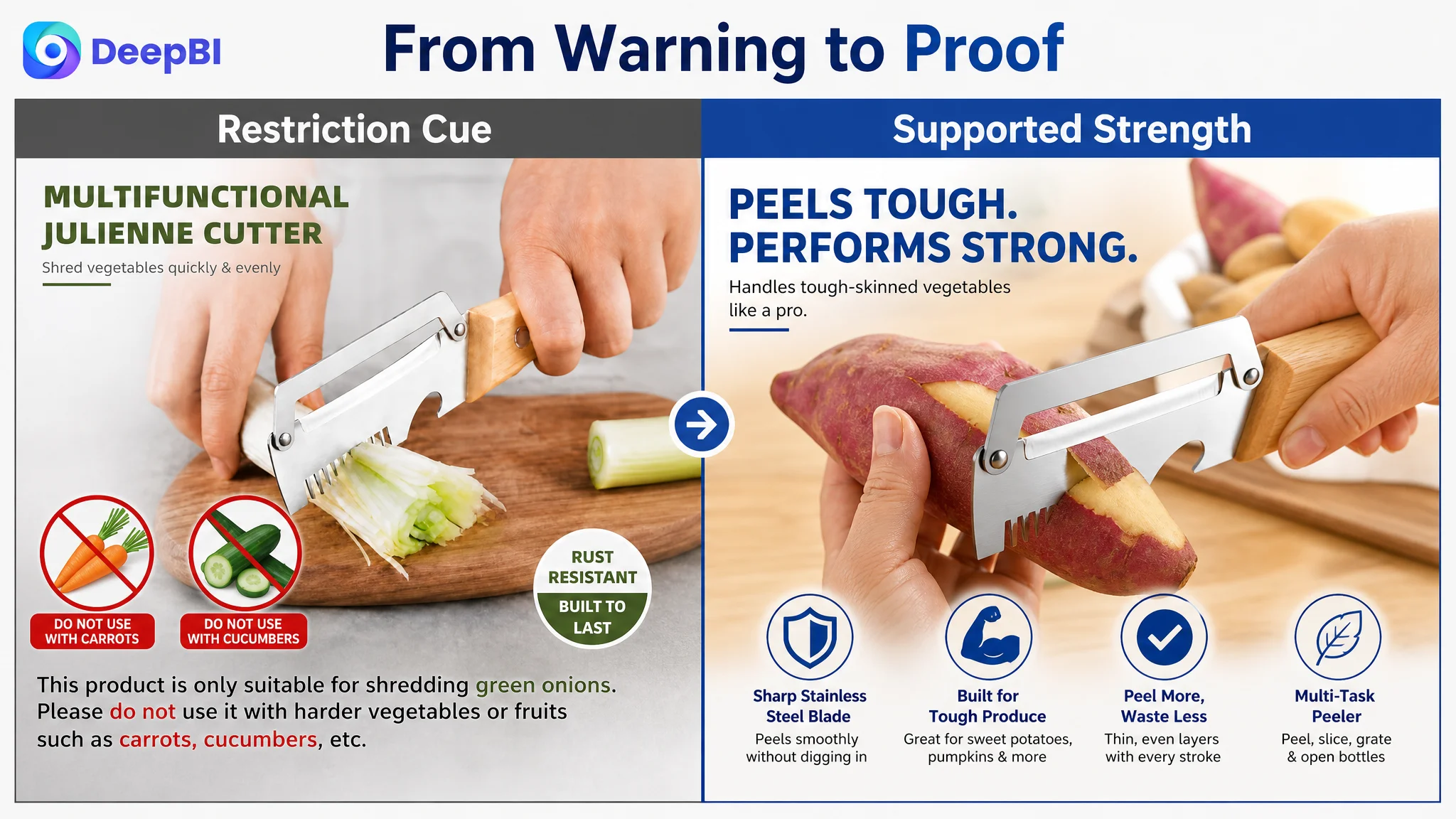
The output was sparse, and the action did not create a strong sense of speed or result. Another image presented a warning about not using the tool with carrots. Even if factually cautious, that presentation created a negative buying signal at exactly the point where the page should have been establishing capability.
A further image showed fish scaling, but that was a relatively narrow use case for shoppers looking for a vegetable peeler. It consumed visual attention without reinforcing the main purchase reason.
DeepBI’s judgment was to change the visual role of the images:
- Show peeling and julienne functions in active use.
- Increase the visible quantity and uniformity of finished strips.
- Demonstrate common ingredients such as potatoes, apples, onions, and other supported produce.
- Turn the hard-skin message into a positive proof of supported performance.
- Replace the niche fish-scaling scene with broader kitchen utility.
- Clarify which tool performs which function.
The important distinction was between showing a feature and proving a result.
The bullet points had information, but not enough progression
The customer’s bullet points covered multifunctionality, blade design, stainless steel construction, wooden-handle comfort, portability, and cleaning.
The issue was not that these topics were irrelevant. The issue was that several points stayed at the level of product description.
The recommended structure moved through a more persuasive sequence:
1. What the set does in daily cooking
2. Why the wider blade improves preparation efficiency
3. How the julienne function applies to suitable vegetables
4. Why the stainless steel and wooden-handle construction supports control
5. How the compact format fits storage, travel, and gifting
This structure gives each bullet a distinct job. It also connects product attributes to recognizable kitchen situations.
For example, “wide stainless steel blades” becomes more meaningful when linked to potatoes, apples, cucumbers, or tough-skinned produce. “Julienne function” becomes easier to understand when linked to salads, noodle bowls, soups, and garnish preparation.
The customer Listing was not missing words. It was missing a hierarchy of reasons to buy.
The Largest Weakness Was the A+ Story
The A+ section was the clearest point of failure.
The customer page used only two modules, mainly showing dimensions, product arrangements, and general usage icons. The comparable Listing used a more complete sequence:
- A strong opening value proposition
- Active kitchen demonstrations
- Broader application scenarios
- Hand-operation close-ups
- Material and construction details
- Side-by-side demonstrations of the different functions
This created an important contrast.
The customer’s A+ content told shoppers what the product was. The comparable page helped shoppers imagine using it.
The opening needed to establish the product’s role
The first module should make the complete set understandable immediately. It needs to communicate that the product is not merely a basic peeler, but a 2-piece preparation set with distinct functions.
A strong opening visual would establish:
- The complete 2-piece configuration
- The primary role of each tool
- The core peeling and julienne functions
- The product’s intended kitchen context
Without that opening frame, shoppers must piece the product identity together by scanning several disconnected images.
Static results could not prove ease of use
The customer page showed prepared food and arranged ingredients, but did not consistently show the tool producing those results.
That left a credibility gap. A shopper could see the intended outcome, but not the process that supposedly creates it.
The replacement direction was to show active demonstrations:
- The standard blade peeling an apple or potato
- Thin and relatively uniform layers being removed
- The julienne side producing visible vegetable strips
- The bottle opener being used in an appropriate social or outdoor context
These demonstrations are not decorative additions. They reduce uncertainty.
Material claims needed visible support
The Listing referred to stainless steel and a natural wooden handle, but the A+ page lacked enough close-up evidence.
A material claim becomes more persuasive when shoppers can inspect:
- Blade edges
- Rivets or attachment points
- Handle contours
- Grip shape
- The relationship between the steel head and wooden handle
The objective was not to invent certifications or unsupported durability claims. It was to make existing product attributes visible and credible.
The two-piece relationship needed to be resolved
A multifunctional set can create confusion if the shopper cannot tell which piece handles which task.
The final A+ module should provide a complete overview of the set and label the role of each tool clearly. This is especially important because the Listing’s central value depends on the combination of the two pieces.
If the shopper still has to ask, “Which one peels, which one juliennes, and where is the bottle opener?” the page has not finished the selling job.
DeepBI Did Not Prioritize More Ad Tuning First
The decision order was based on constraint, not convenience.
The title had gaps. The images had weak result proof. The bullet points needed a clearer structure. Reviews were also a trust weakness. But the A+ gap showed that the page lacked the content architecture required to bring all of these claims together.
That made Listing conversion capacity the first priority.
Continuing to adjust advertising before repairing the page would risk sending more traffic into the same uncertainty. Even if keyword targeting or bids were improved, shoppers would still encounter:
- Incomplete function demonstrations
- A negative limitation cue
- Weak differentiation at the thumbnail stage
- Limited proof of materials and handling
- Unclear two-piece identity
- No meaningful review base on the customer Listing
The correct path was therefore:
1. Rebuild the page’s value hierarchy.
2. Prove the primary functions visually.
3. Clarify the title and bullet-point logic.
4. Strengthen the A+ trust sequence.
5. Apply only supported claims and supported use cases.
6. Then evaluate how paid and organic traffic respond.
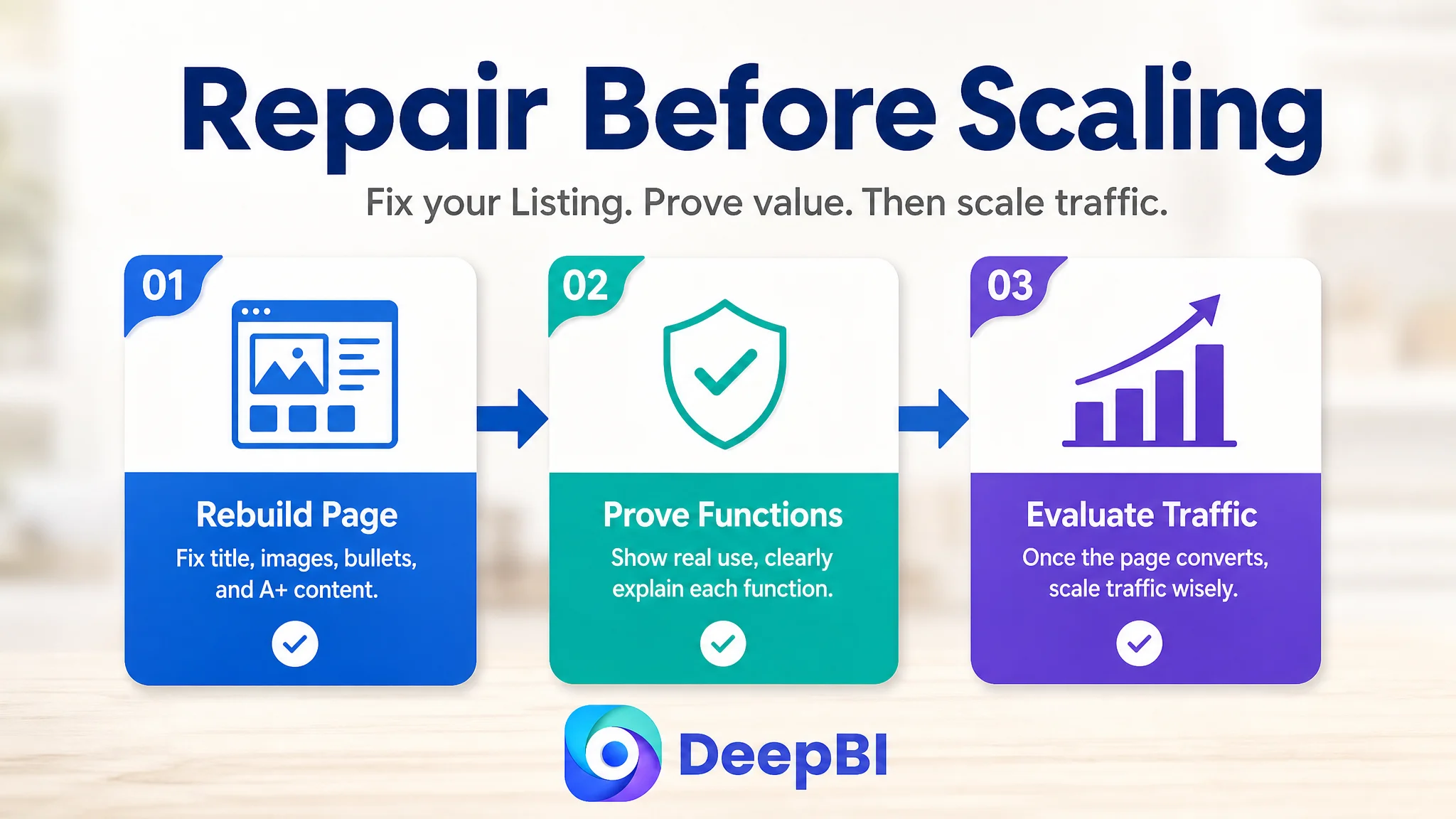
This sequence protects the seller from confusing traffic acquisition with conversion improvement.
The Optimization Stayed Inside the Product’s Real Boundaries
One of the most important aspects of the case was what the optimization did not do.
The product page could not claim that the tool handled every hard vegetable in every way. The visual direction therefore had to respect the product’s actual supported uses.
That meant:
- Showing the standard peeling side with supported hard-skinned produce
- Avoiding claims that the julienne function could process unsupported ingredients
- Demonstrating the bottle opener only where the tool genuinely provided that function
- Keeping the product’s physical structure, material, and design unchanged
- Using competitor visuals as a reference for communication logic, not as a template to copy
This boundary is commercially important. A visually stronger Listing that misrepresents the product may create more clicks but also more disappointment, negative reviews, and returns.
DeepBI’s role in this case was not to make the product appear to be something else. It was to make the existing product easier to understand and more credible.
From Feature Inventory to Purchase Confidence
The later page direction was organized around the shopper’s decision process.
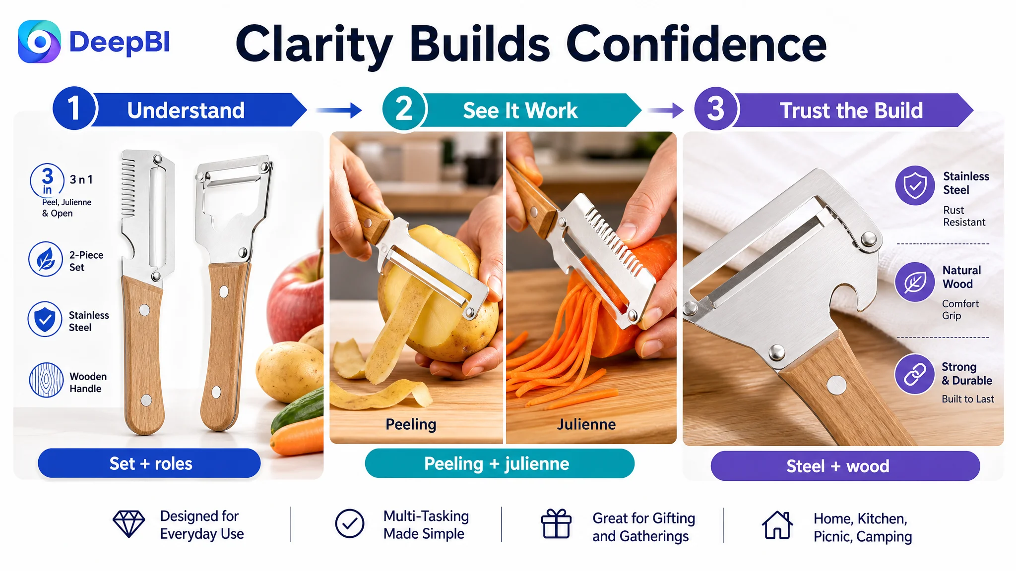
First: understand the product
The title and opening visual needed to establish the 2-piece set, core functions, material, and kitchen use.
Then: see the product work
The image sequence and A+ modules needed to show peeling, julienne preparation, and bottle opening in action.
Next: believe the construction
Close-ups of the stainless steel blade and wooden handle needed to support claims about control, comfort, and daily use.
Finally: understand the broader value
The page could then present compact storage, easy rinsing, portability, picnic use, camping use, and gifting as secondary value—not as substitutes for the core kitchen proposition.
This order matters because secondary benefits cannot compensate for an unclear primary use case.
A product page earns the right to discuss portability and gifting only after it has made the main cooking task easy to understand.
The Review Gap Remained a Separate Trust Risk
The customer Listing had no effective review base: zero total reviews and no visible rating signal. The comparable Listing had 41 reviews but only a 2.9-star average, with a high share of low ratings.
This produced an unusual but important competitive situation.
The comparable product had more social proof, but that proof was materially negative. The customer product had no accumulated negative feedback, but it also had no customer evidence to support trust.
The page could not solve this problem through design alone. Better A+ content could make the product easier to evaluate, but it could not replace genuine customer experience or create reviews immediately.
That is why the review dimension should be treated as a separate operating track:
- Product-page communication must not overpromise.
- Functional claims must match actual use.
- The customer experience should support the claims made in the Listing.
- Review development should be monitored alongside Listing and advertising performance.
The correct conclusion is not that strong visuals eliminate the need for reviews. It is that a weak review base makes the page’s clarity and credibility even more important.
What Changed in the Seller’s Business Understanding
The case did not end with a claim of guaranteed performance improvement. The source material does not provide post-optimization CVR, ACOS, TACOS, or organic-order data.
What it does show is a change in operating logic.
The customer’s Listing was no longer treated as a collection of isolated assets:
- The title was not just a keyword field.
- The main images were not just product displays.
- The bullet points were not just technical specifications.
- The A+ section was not just additional decoration.
- Advertising was not treated as the only lever for generating orders.
Instead, the page was understood as a conversion system.
The title helps the shopper recognize relevance. The images create the initial reason to click and understand. The bullets organize the use cases. The A+ content proves the functions and reduces trust concerns. Reviews provide customer validation. Advertising then becomes more useful because the page is better prepared to receive the traffic.
That is the central lesson from this Amazon kitchen-tools case:
Before scaling traffic, an Amazon seller should determine whether the Listing has enough clarity and proof to deserve that traffic.
For this 2-piece vegetable peeler set, the real opportunity was not to make the product sound more multifunctional. It was to make the product’s existing functions easier to see, easier to trust, and easier to place within an everyday cooking routine.
That is where DeepBI’s diagnosis mattered—not as a list of image or copy edits, but as a decision about which business constraint had to be addressed first.