

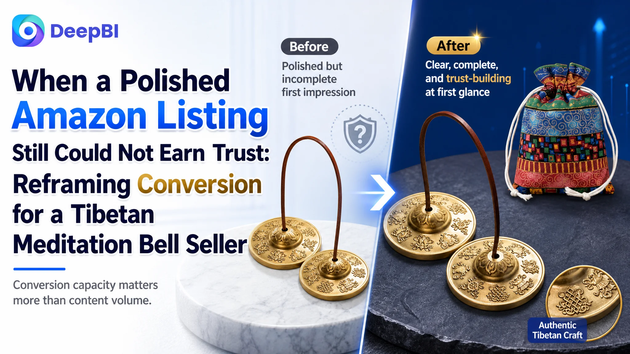
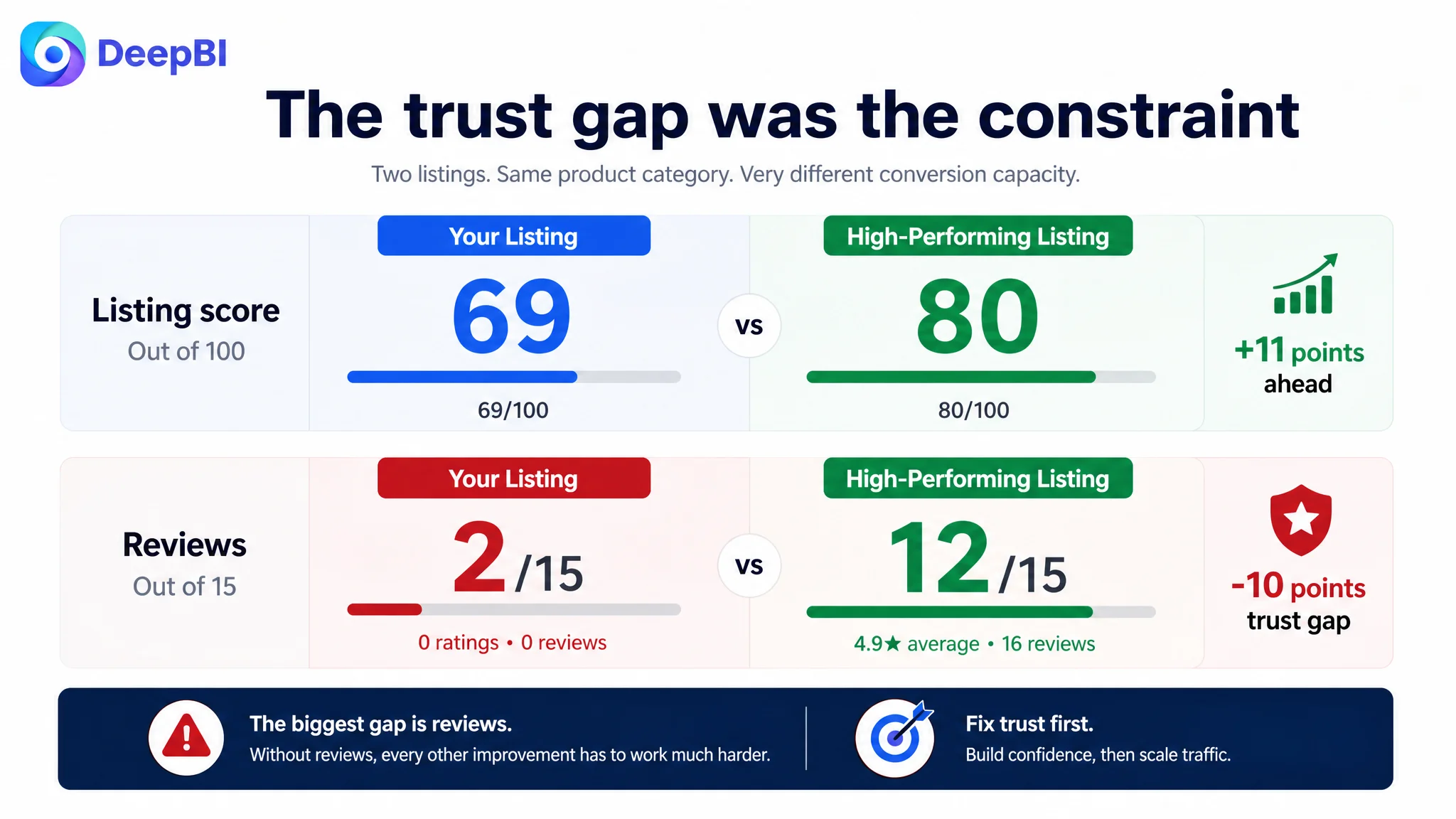
An Amazon seller in the US marketplace was not facing a simple content shortage. The product page already had clear lifestyle scenes, craftsmanship details, sound-related messaging, and meditation use cases. Yet its Listing scored 69 out of 100, compared with 80 for a closely matched high-performing listing, and the page had no customer reviews at all.
The initial optimization direction leaned toward improving visible content: refining the title, strengthening the main images, adding more usage scenes, and presenting the product's spiritual and cultural value more clearly. Those changes were reasonable, but they did not fully explain why the Amazon product page still struggled to convert attention into confidence.
DeepBI ultimately located the more important constraint: the page was asking shoppers to understand too much and trust too quickly. The product set was not verified clearly enough at the start of the page, the learning curve was not sufficiently reduced, and the absence of review proof created a ten-point trust gap against the benchmark listing. The later direction therefore focused on conversion logic first: clarify the complete gift set, show how the bells are used, make the engraved symbols more credible, and strengthen the product's value as a meaningful meditation gift.
For other Amazon sellers, the lesson is direct: when an Amazon Listing receives attention but does not build confidence, more advertising or more decorative content may only amplify the leak. Before scaling traffic, sellers need to determine whether the product page makes the purchase decision easy enough to complete.
The Amazon Listing Looked More Complete Than It Actually Was
At first glance, this Tibetan meditation bell and tingsha cymbal Listing did not appear weak.
The page covered:
- Brass construction
- Engraved Eight Auspicious Symbols
- Resonant sound
- Meditation and relaxation
- Yoga and sound healing
- Ritual and folk performance
- Portability
- Gift suitability
Its A+ content also used high-quality photography, wood-toned backgrounds, meditation settings, craftsmanship close-ups, and lifestyle scenes. On visual quality alone, the page was estimated to be within a relatively strong range.
That created the first diagnostic difficulty.
A page can contain all the expected information and still fail to answer the questions that determine conversion:
- What exactly is included in the set?
- Is this product easy to use?
- What does the first use look like?
- Are the engraved symbols authentic and meaningful?
- Does the product feel gift-ready?
- Why should a shopper trust this Listing when there are no reviews?
The customer page had content. What it lacked was a sufficiently direct decision path.
The problem was not that the Amazon product page had nothing to say. It was that its most important proof points were not appearing in the order shoppers needed them.
The Initial Diagnosis Focused on Better Presentation
The first instinct in this type of Amazon Listing is understandable.
The title could include stronger search language. The main image could look more premium. The A+ page could present the meditation atmosphere more elegantly. Additional lifestyle images could help shoppers imagine using the product.
The customer Listing was already moving in that direction. Its copy emphasized meditation, healing, relaxation, rituals, and gifting. Its images leaned toward visual quality and emotional atmosphere.
But this approach risked treating the problem as a presentation gap alone.
The Listing did not primarily need more atmosphere. It needed stronger evidence at key moments in the buying process.
A shopper searching for a Tibetan meditation bell or tingsha cymbal may not already understand the product category. They may be comparing unfamiliar products, evaluating the meaning of the symbols, wondering how the bells are struck, and deciding whether the set feels substantial enough to give as a gift.
In that context, a beautiful image is useful only if it also reduces uncertainty.
The original direction was therefore incomplete—not because image quality and keyword coverage were irrelevant, but because they were being considered before the deeper trust and usability barriers had been resolved.
The Score Gap Revealed Where Conversion Capacity Was Being Lost
DeepBI's comparison with a closely matched benchmark produced a total score of 69 versus 80.
The total gap mattered, but the distribution mattered more.
- Title: Customer Listing: 16/20, Benchmark Listing: 18/20, Gap: -2
- Main image: Customer Listing: 24/30, Benchmark Listing: 26/30, Gap: -2
- Bullet points: Customer Listing: 6/10, Benchmark Listing: 5/10, Gap: +1
- A+ content: Customer Listing: 21/25, Benchmark Listing: 19/25, Gap: +2
- Reviews: Customer Listing: 2/15, Benchmark Listing: 12/15, Gap: -10
The result did not point to a general quality failure.
The title and main image were somewhat behind the benchmark. The bullet points and A+ content were not the weakest areas—in fact, they scored slightly higher. The decisive gap was reviews.
The customer page had:
- No rating data
- Zero total reviews
- No comments visible on the first page
The benchmark listing had:
- A 4.9-star average
- Sixteen reviews
- Six reviews visible on the first page
- Detailed customer content, including images and videos
This did not mean that content optimization was unnecessary. It meant that the Listing was operating under a severe trust disadvantage, making every other conversion improvement more important.
A shopper could understand the product and still hesitate because there was no independent confirmation that the product sounded as described, looked as shown, or made a suitable gift.
That is why the review gap could not be treated as a minor score difference.
A page with zero reviews cannot rely on product claims alone. Its images, structure, usage guidance, and authenticity cues must carry more of the trust burden.
The Main Image Was Not Just a Visual Issue
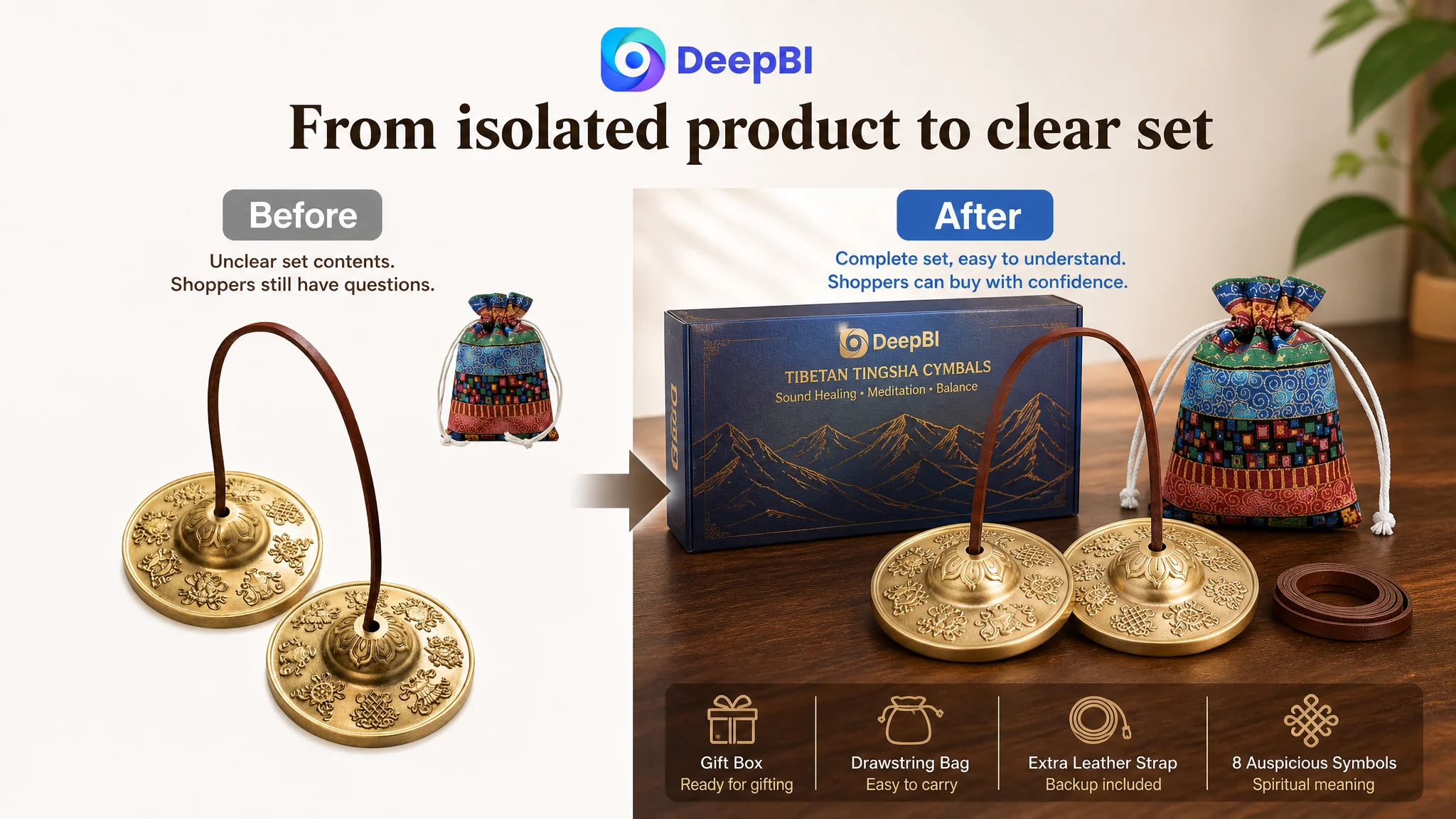
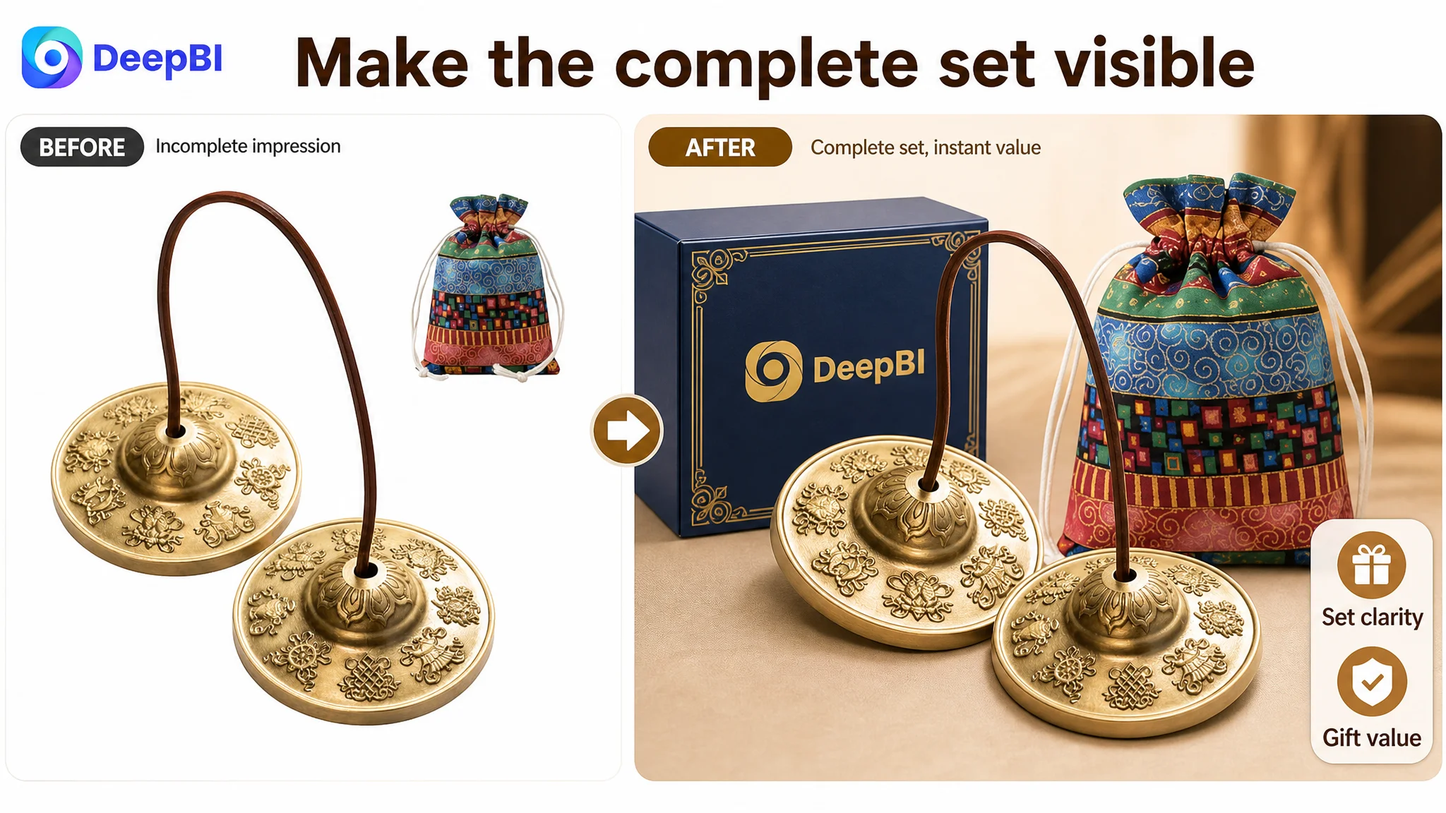
The customer Listing's first image mainly showed the product as a floating or isolated object. It introduced the meditation bells, but it did not immediately verify the complete set.
The storage bag was not clearly integrated into the first impression. The gift presentation was not established. The shopper had to infer what would actually arrive.
The benchmark listing used a more complete bundle arrangement. Its visual structure communicated a higher-value set more quickly through the product, accessories, and packaging.
This distinction affects both click behavior and conversion after the click.
On the Amazon search page, a static product view can appear interchangeable with many other meditation accessories. A complete, grounded arrangement gives the shopper a clearer reason to inspect the Listing. On the product page, it also answers a practical concern: whether the product is a complete kit or only a pair of bells with minimal accessories.
The recommended direction was not to imitate the competitor's image. It was to clarify the customer's own product:
- Show both brass cymbals prominently
- Present the front and back details where relevant
- Include the actual cloth carry bag
- Make the set feel complete without adding unverified components
- Use a stable, premium composition rather than a floating presentation
The goal was not simply to make the image more attractive.
It was to make the product's value visible before the shopper had to read deeply.
The Title Needed Search Precision, Not More Description
The title gap was modest—16 compared with 18—but it affected how the product entered the shopping journey.
The customer's title began with “Tibetan Meditation Bell,” while the benchmark began with the more specific “Tibetan Tingsha Cymbals.” The benchmark also surfaced the 2.5-inch size, gift box, drawstring bag, and stress-relief meditation use case more directly.
The proposed title direction was:
Brass Tibetan Meditation Bell with Cloth Bag, Tingsha Cymbals Chime Bells for Yoga, Sound Healing & Stress Relief, 8 Lucky Symbols Engraved, Zen Mindfulness Buddhist Meditation Gift
The business logic was not to fill the title with more keywords indiscriminately. It was to connect three parts of the shopping decision:
1. What the product is: meditation bell, tingsha cymbals, chime bells
2. Why the shopper may want it: yoga, sound healing, stress relief, mindfulness
3. What makes this set distinctive: brass construction, Eight Auspicious Symbols, cloth bag, gift positioning
The title also needed to remain within Amazon's character expectations and read naturally.
A better title could improve discoverability, but it could not solve the review deficit by itself. Its role was to bring more relevant shoppers to the page and establish a clearer expectation before the images and bullets took over.
The Bullet Points Were Not the Weakest Link
One of the more important findings was that the customer Listing's bullet points scored slightly higher than the benchmark: 6 versus 5.
That prevented a common mistake—rewriting every element simply because the page was underperforming.
The customer's bullet structure already had a useful sequence:
- Material and sound
- Vibration and meditation value
- Portability and accessories
- Appearance
- Gift suitability
The issue was not that the copy lacked a logical order. It was that some claims were broad and lacked enough concrete detail to support trust.
The refinement therefore focused on making the existing logic more specific:
- Name examples of the Eight Auspicious Symbols
- State the material clearly
- Add verified dimensions and accessory information
- Explain how the bells are used
- Connect the sound to meditation and mindfulness use
- Clarify who may find the set meaningful as a gift
This is a different approach from simply adding more promotional language.
The bullet points needed to help an unfamiliar shopper understand the product without overclaiming what it could do. In an Amazon Listing with no reviews, precise information is more valuable than exaggerated promises.
The title did not communicate the product category precisely enough
“Tibetan Meditation Bell” describes the general purpose, but “Tingsha Cymbals” gives the shopper a more specific category term.
That distinction matters for both search matching and buyer confidence. A shopper looking for tingsha cymbals may not immediately recognize a title built around a broader phrase.
The product had meaning, but the page needed to make that meaning concrete
The engraved Eight Auspicious Symbols were presented as a visual feature. The stronger direction was to identify examples such as the lotus, endless knot, and conch, then connect those details to the product's cultural and meditation positioning.
This turns an ornamental detail into evidence of what the shopper is buying.
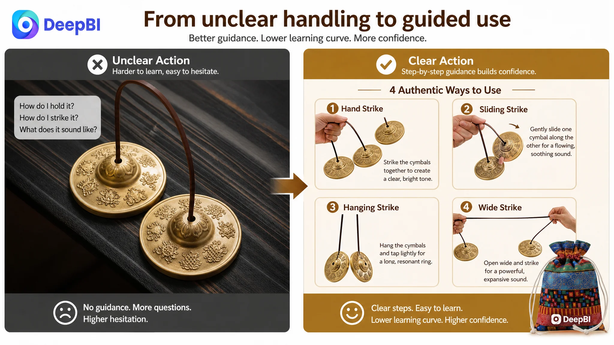
The usage promise needed a visible explanation
Terms such as “sound healing,” “yoga,” and “meditation” describe settings, but they do not show what the customer should do with the product.
The page needed to reduce that gap with clear, truthful demonstrations of striking and handling.
The A+ Page Was Strong in Atmosphere but Weak in Sequence
The customer A+ content scored 21 out of 25, higher than the benchmark's 19.
That result is important because it shows why a single score can be misleading.
The A+ page was not failing because it looked unprofessional. It used polished photography and clearly presented:
- Brass material
- Engraved relief patterns
- Resonant sound
- Ritual use
- Meditation use
- Folk performance
- Relaxation-oriented lifestyle scenes
However, the modules were not arranged around the most urgent buyer questions.
The customer page moved from aesthetic presentation to application and emotional atmosphere. The benchmark listing, despite some repetitive and lower-resolution content, invested more space in showing how the product worked.
For an unfamiliar product, usage instruction can be more persuasive than another lifestyle image.
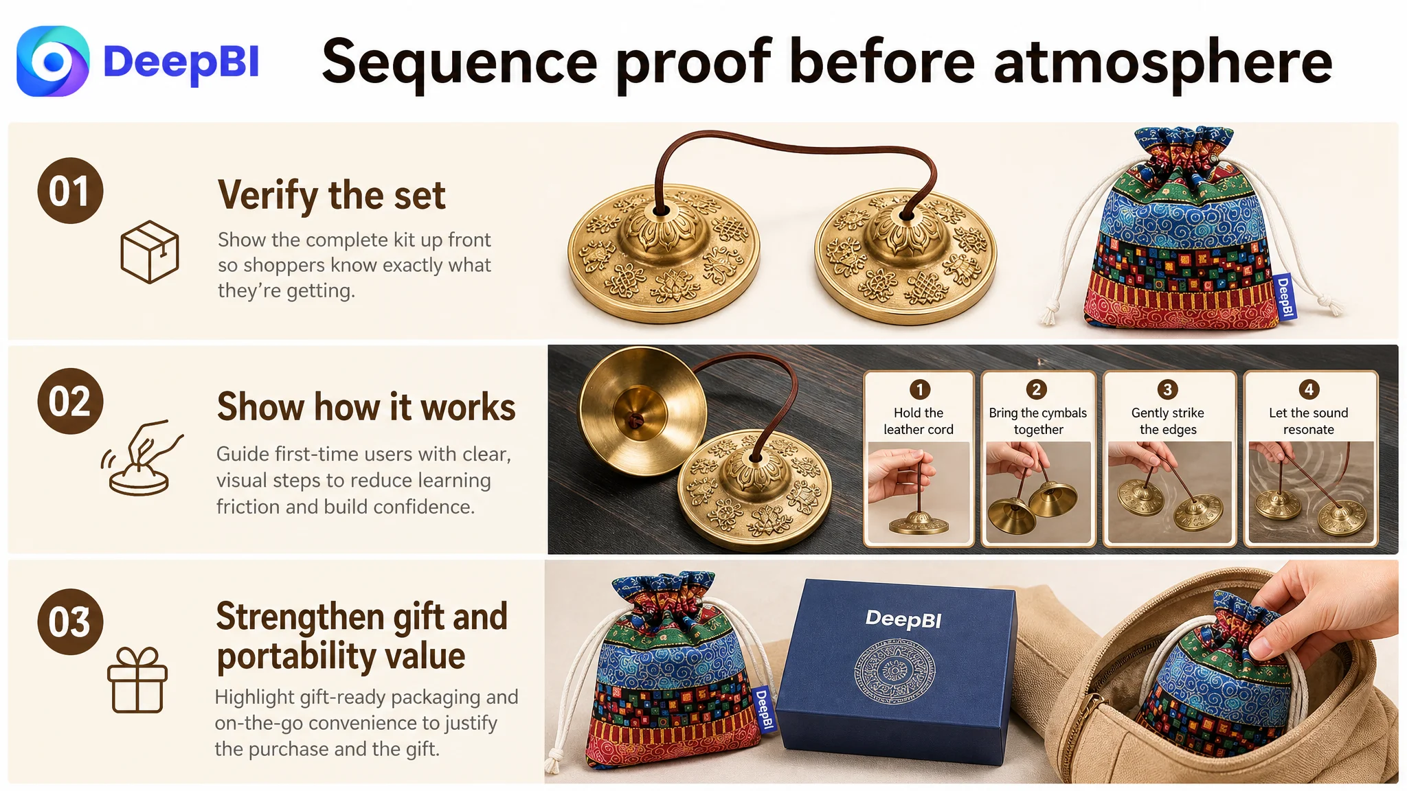
The revised A+ logic therefore prioritized:
1. Complete kit verification
Show the bells, carry bag, and actual packaging together near the beginning.
2. Basic usage guidance
Demonstrate the primary striking method clearly and simply.
3. Authenticity and craftsmanship
Connect the engraved symbols to close-up product detail and the complete set.
4. Sound and handling control
Show different legitimate ways to handle or strike the bells, rather than relying only on graphic sound waves.
5. Meditation context
Retain the calm lifestyle setting, but keep the hands and grip visible enough to connect atmosphere with actual use.
6. Gift presentation
Replace a redundant reading or relaxation scene with a clear presentation of the gift-ready experience.
7. Portability and storage
Close with a practical use case showing how the carry bag supports travel, outdoor sessions, or studio use.
This sequence follows the shopper's decision path more closely:
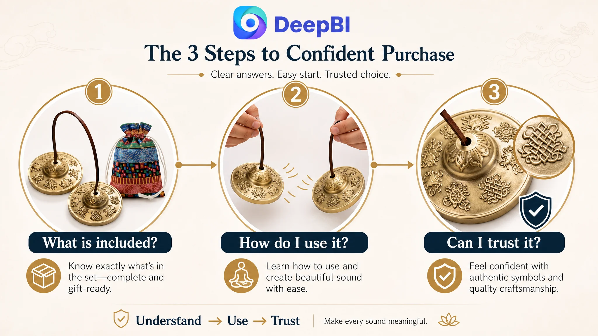
What is included? How do I use it? Is it authentic? What does it feel like in practice? Is it suitable as a gift? Can I take care of it and carry it easily?
Why DeepBI Did Not Prioritize More Ad Tuning
There was no evidence in this case that another round of bid adjustments or campaign restructuring would solve the central problem.
The reason is straightforward: advertising can bring a shopper to the Amazon product page, but it cannot provide the review proof that the page does not have. It cannot explain an unclear usage method. It cannot make an incomplete-looking gift set feel complete.
If the page is receiving relevant traffic but the shopper remains uncertain, increasing traffic volume can increase exposure without improving the underlying conversion capacity.
That creates several risks:
- More paid visits arrive at a page with no independent proof
- Advertising spend is used to test a page before its decision logic is ready
- A weak conversion signal makes ACOS harder to interpret
- The team may blame keywords or bids for a product-page problem
- More traffic amplifies the same trust and usability gaps
The correct decision order was therefore to repair the page's ability to receive and convert attention before treating advertising as the primary lever.
This did not mean ignoring Amazon ads. It meant giving the ads a stronger destination.
A revised title could improve relevance. A clearer main image could improve the first impression. Better A+ sequencing could help conversion. Usage guidance could reduce hesitation. Together, these changes would make later advertising data more meaningful because the page would be better prepared to convert the traffic it received.
The Real Priority Was Conversion Capacity, Not Content Volume
The customer Listing already had enough material to create a strong narrative. It had product craftsmanship, cultural symbolism, meditation scenes, and a portable design.
The problem was that the sales logic was distributed across the page rather than concentrated at the moments of highest uncertainty.
The most important improvements were therefore structural:
- Bring the complete set forward
- Make the product category more precise in the title
- Show the actual method of use
- Link visual details to authenticity and meaning
- Replace redundant lifestyle content with gift and portability proof
- Use verified dimensions and accessories to support confidence
- Avoid adding claims or components the product does not actually have
This is where DeepBI's diagnosis mattered. The system did not treat the highest-scoring dimension as the first place to make changes. It compared the Listing against a relevant benchmark, examined the score distribution, and connected visible content gaps to the likely decision barriers.
The recommendation was not “make every module better.”
It was “fix the modules that prevent the shopper from understanding, trusting, and using the product.”
What Changed in the Operating Logic
The available case material does not provide post-optimization CTR, CVR, ACOS, TACOS, or organic-order results, so no numerical performance claim can be made.
The meaningful change was in the operating logic of the Listing.
Before the diagnosis, the page risked being evaluated mainly through aesthetic quality and information coverage. After the diagnosis, the team had a clearer hierarchy:
- Reviews represented the largest trust risk.
- The main image needed to verify the complete product set.
- The title needed more precise category and use-case language.
- The A+ page needed to reduce usage difficulty before adding more atmosphere.
- Gift value and portability needed visible proof, not only bullet-point claims.
- Advertising should not be treated as the first solution to a page-level conversion constraint.
This reframing also made future testing more controllable. Instead of changing title, images, bullets, and A+ content without a clear reason, the team could connect each revision to a specific business question.
The Lesson for Amazon Sellers
This case is easy to misread as a story about improving a meditation bell Listing.
The more useful lesson is broader.
An Amazon product page can have polished images, reasonable copy, clear use cases, and even a strong A+ score, yet still be unable to convert consistently because the page does not resolve the shopper's most important doubts in the right order.
The customer page did not need to become louder. It needed to become easier to trust.
Before asking Amazon ads to scale traffic, ask whether the Listing has earned the right to receive more of it.
For sellers, that means separating three questions:
1. Can shoppers find the product?
This is where title structure and relevant search terms matter.
2. Will shoppers stop and inspect it?
This is where the main image and visible value of the set matter.
3. Will shoppers feel confident enough to buy?
This is where reviews, usage guidance, authenticity, gift presentation, and A+ sequencing matter.
DeepBI's role in this case was not to produce more content for its own sake. It was to identify which weakness was limiting the Amazon Listing at its current stage and to establish the correct order of decisions.
For this seller, the next move was not to keep polishing isolated images or push more traffic into the same page. It was to rebuild the page's conversion logic—so that when Amazon ads brought shoppers in, the Listing had a clearer chance to turn attention into confidence.