

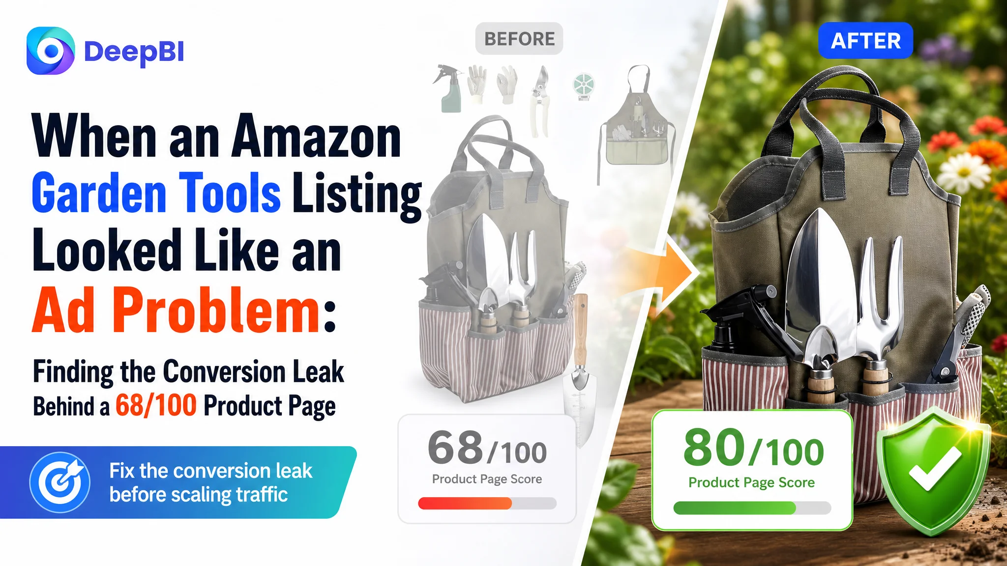
An Amazon seller’s 11-piece garden tools listing was competing for attention in the US marketplace, but its product page was not giving shoppers enough reasons to trust the set and buy. The initial instinct was familiar: improve the title, refine the keywords, and make the product images look more attractive.
That direction addressed visible symptoms, but it did not explain the larger gap. DeepBI’s comparison placed the listing at 68/100 against 80/100 for a comparable high-performing garden tools listing. The largest weakness was not the title alone. It was the product page’s ability to turn product information into confidence, especially through the main images, A+ content, and review presentation.
The later optimization therefore focused on rebuilding the Amazon Listing’s sales logic: show the tools in use, bring material and size information forward, make the bullet points speak to user concerns, and use the A+ page to establish a clearer sequence from application scenario to technical proof and product detail. For other Amazon sellers, the lesson is direct: before sending more traffic to a listing, determine whether the page is ready to convert it.
The Page Did Not Lack Product Information. It Lacked a Strong Reason to Believe
At first glance, the listing appeared complete.
It included a set of stainless steel hand tools, wooden handles, a canvas tote bag, gloves, a watering can, an apron, and other gardening accessories. The title mentioned the product count, materials, storage bag, and gifting use cases. The image set displayed the full kit and several individual components.
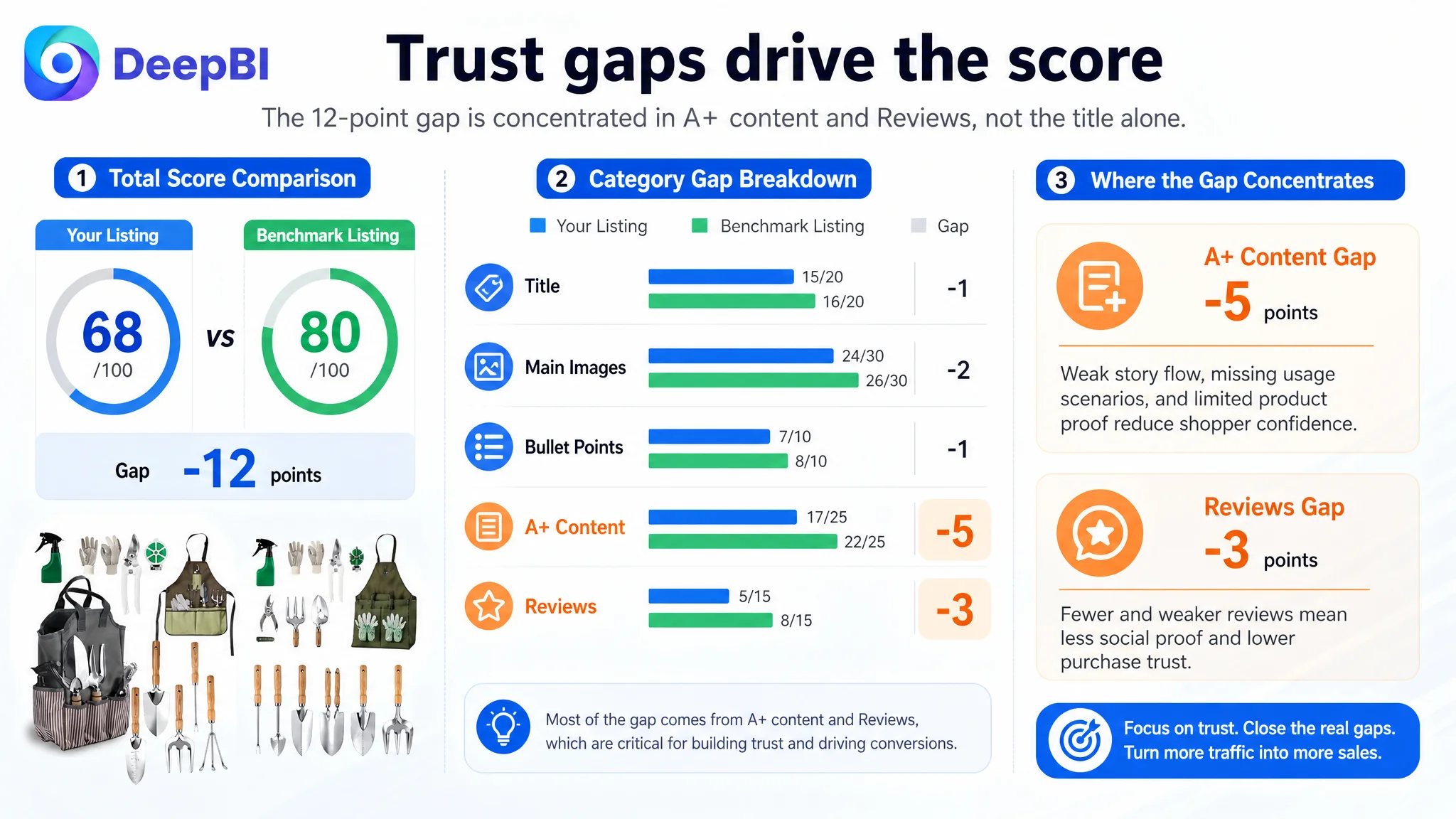
Yet the listing’s overall score was 68/100, 12 points behind a comparable benchmark listing.
- Title: Customer listing: 15/20, Benchmark listing: 16/20, Gap: -1
- Main images: Customer listing: 24/30, Benchmark listing: 26/30, Gap: -2
- Bullet points: Customer listing: 7/10, Benchmark listing: 8/10, Gap: -1
- A+ content: Customer listing: 17/25, Benchmark listing: 22/25, Gap: -5
- Reviews: Customer listing: 5/15, Benchmark listing: 8/15, Gap: -3
- Total: Customer listing: 68/100, Benchmark listing: 80/100, Gap: -12
The distribution of the gap mattered more than the total score.
The title was only one point behind. The main image and bullet-point gaps were also relatively limited. But A+ content was five points behind, while reviews were three points behind. That pattern indicated that the listing’s central problem was not merely search visibility or keyword placement.
The product page was providing information, but not building confidence in the order shoppers needed.
The Original Diagnosis Was Too Narrow
The customer’s initial optimization direction centered on the title, product count, and basic feature presentation.
That was understandable. The benchmark listing placed “13-Piece Garden Tools Set” at the beginning of its title, included a repotting mat as a differentiated use-case term, and described its handles through benefits such as ergonomic comfort and reduced hand fatigue. The customer listing, by comparison, gave more space to accessory names and relied more heavily on material descriptions.
These differences suggested several reasonable title improvements:
- Move the core phrase “11 Piece Stainless Steel Garden Tools Set with Wooden Handles” closer to the beginning.
- Clarify the audience through terms such as women, moms, and home gardeners.
- Emphasize indoor and outdoor gardening use.
- Reduce the prominence of lower-value accessory wording.
- Present the set as a complete and practical gardening gift.
The same pattern appeared in the bullet points. The original copy described the kit and its components, but the competitor’s copy more consistently connected features with user outcomes:
- A gift for a defined audience rather than a general product description.
- Rust resistance and durability rather than only steel thickness.
- Reduced hand strain rather than a general “steady grip.”
- Easier organization and more enjoyable gardening rather than tools simply being kept upright.
These were useful improvements. But they were not the whole diagnosis.
If the team had treated the problem as a title-and-copy issue alone, it would have kept polishing the words while leaving the deeper conversion barriers in place.
The Main Image Showed the Kit, But Not the Gardening Experience
The customer’s image set placed significant emphasis on product display and accessory presentation. The kit was visible, the bag was shown in a garden setting, and the apron appeared in use.
The problem was not that these images were irrelevant. The problem was that they occupied valuable visual positions without answering the shopper’s most important questions quickly enough.
A shopper considering a garden tools set may be asking:
- Is this a complete kit or just a collection of small tools?
- Can these tools handle actual soil and planting work?
- Are they easy to control for a beginner?
- Are the materials substantial enough for repeated use?
- What exactly comes with the set?
- Is the storage bag durable and practical?
The customer’s images answered some of these questions indirectly. The benchmark listing answered them more directly through functional scenes, parameter graphics, and clearer accessory close-ups.
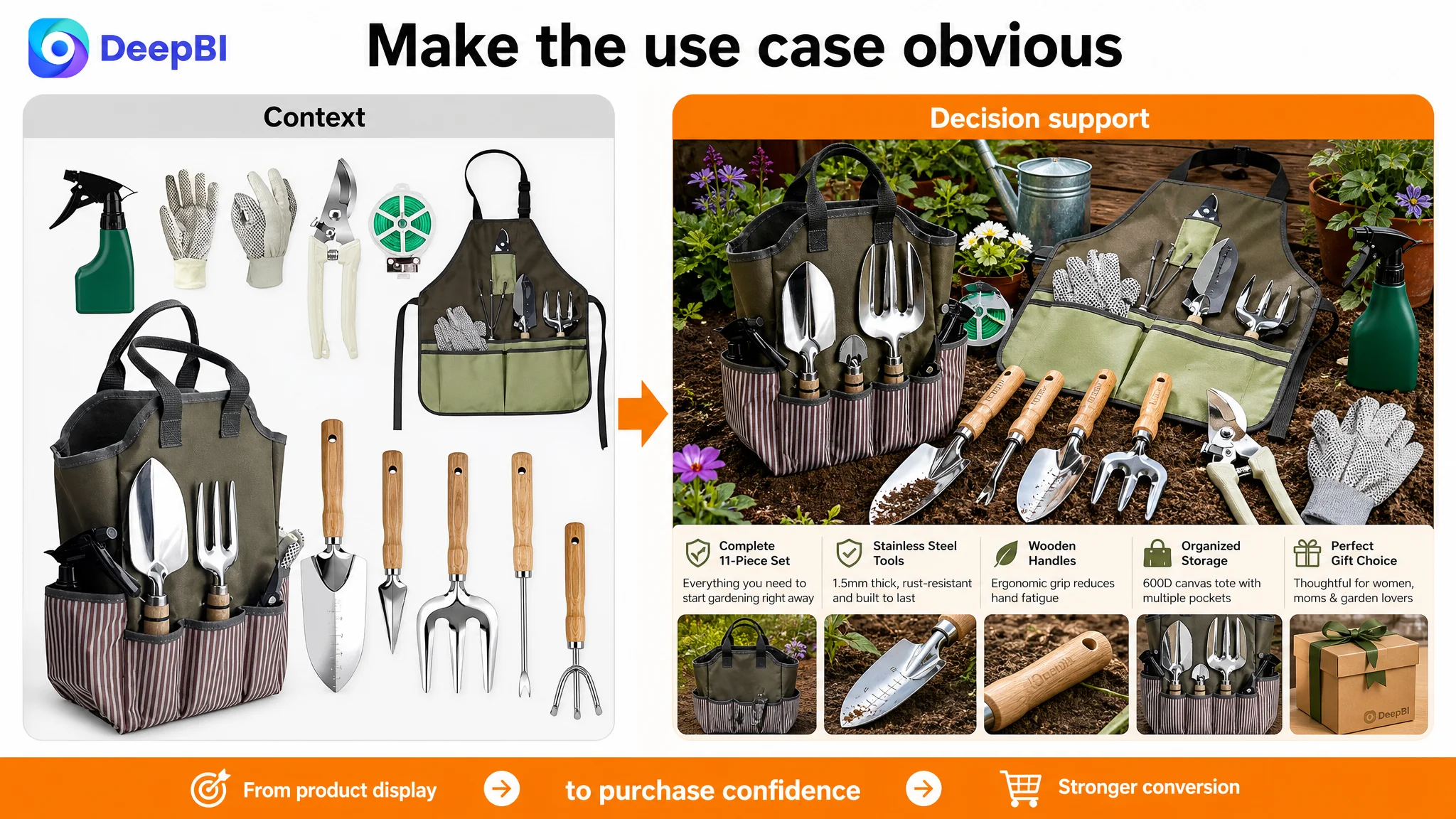
The first image needed to communicate completeness faster
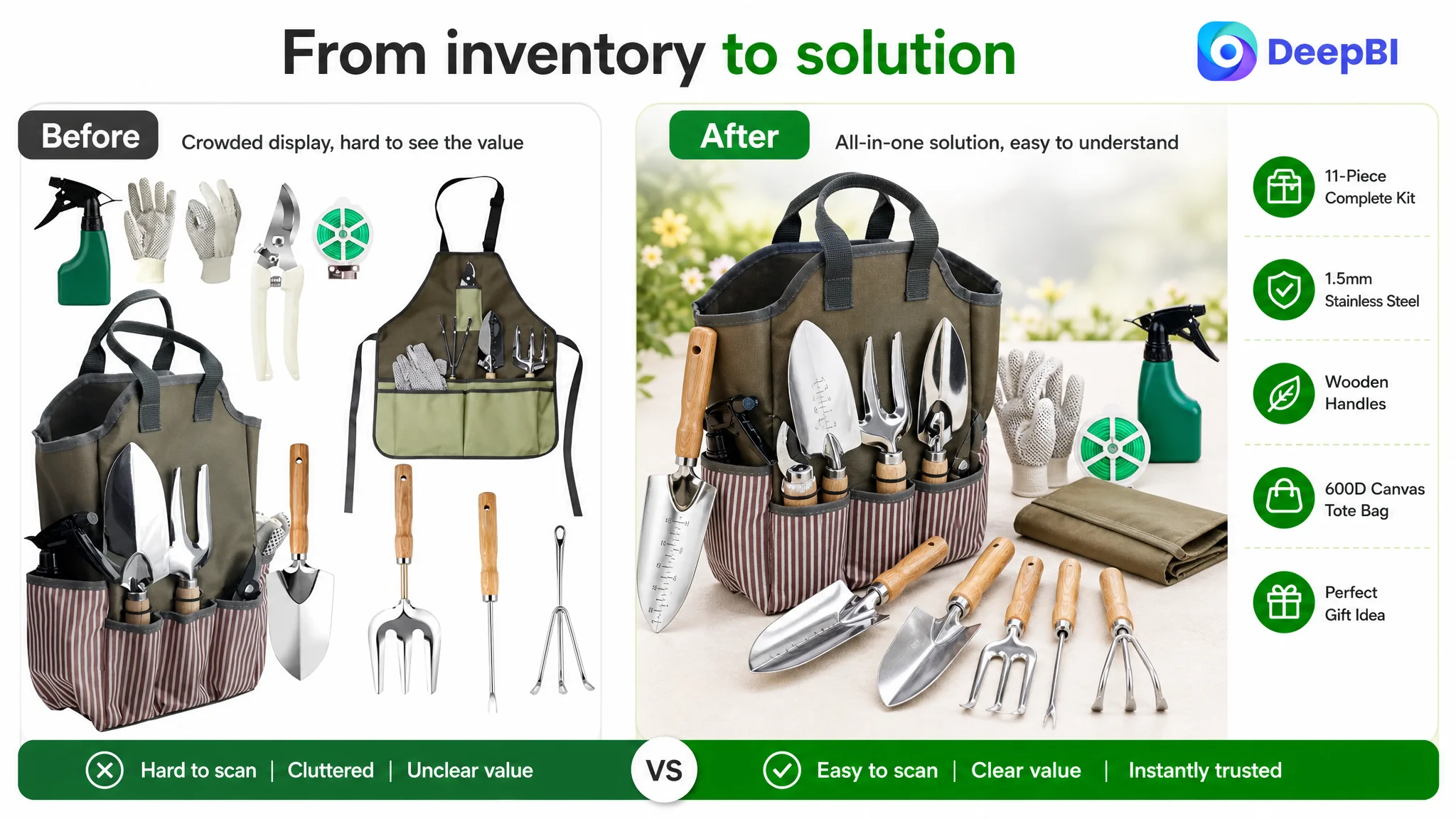
The customer’s full-kit display created an initial impression of variety, but the arrangement was less streamlined and less visually forceful than the benchmark.
The first image needed to do more than show every component. It needed to make the value of the complete kit immediately legible:
“Everything needed to start gardening is included.”
That is a different visual task from inventory display. It requires cleaner organization, stronger visual hierarchy, and a composition that makes the product feel like a complete solution rather than a pile of accessories.
The second and third images focused on context instead of proof
The bag and apron scenes created lifestyle context, but they did not demonstrate the core performance of the tools.
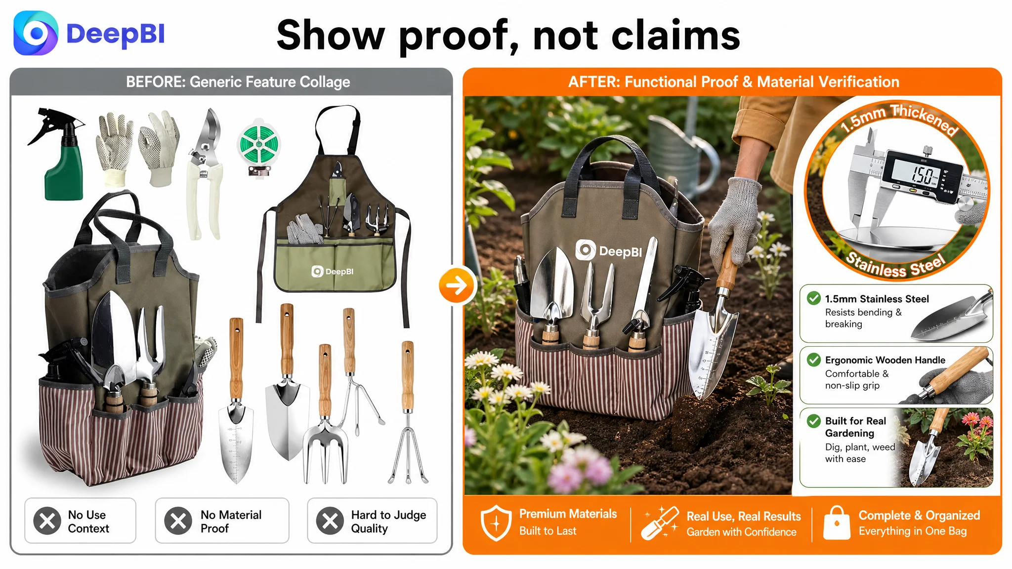
For this category, real use matters. A gloved hand digging soil, loosening a planting bed, transplanting seedlings, or removing weeds can communicate more than a static product arrangement. It shows the shopper how the product enters the gardening task.
The recommendation was therefore to shift image roles:
- From storage presentation to tool performance.
- From passive accessory display to practical use.
- From general garden atmosphere to a clear beginner-friendly application.
This was not a request to make the images more dramatic for its own sake. It was a decision to place functional proof earlier in the Amazon product-page journey.
The image set needed objective quality signals
The benchmark also made stronger use of visible specifications.
The customer listing referred to stainless steel and wooden handles, but the material information was not consistently converted into easy-to-read visual proof. The recommendation was to bring forward confirmed attributes such as:
- 1.5mm stainless steel
- Natural wooden handles
- 600D canvas tote bag
- Tool and bag dimensions where verified
This distinction is important. “Heavy duty” is a claim. A visible thickness specification, material callout, or measured size gives shoppers a basis for evaluating that claim.
The Bullet Points Had Features, But Not Enough Buying Logic
The customer’s bullet points contained the necessary components and product details. The issue was the order and framing.
A functional list tells shoppers what the product has. A conversion-oriented bullet point explains why that combination matters.
The recommended structure reframed the same confirmed product attributes around the customer’s decision process:
A complete set for immediate use
Rather than opening with a broad list of components, the first bullet should establish the all-in-one value of the 11-piece kit. It should clarify that the set covers indoor pots and outdoor flower beds, helping beginners understand why they would not need to assemble a separate collection of tools.
Material durability with a practical outcome
The 1.5mm stainless steel specification should be connected to resistance against bending, breaking, rust, and corrosion during ordinary gardening use.
The purpose is not to exaggerate performance. It is to translate a material fact into a relevant concern: whether the tools can withstand digging, planting, loosening soil, and weeding.
Handles described through comfort
“Wooden handles” identifies the material. It does not fully explain the experience.
The revised direction emphasized a steady, non-slip grip, balanced handling, and reduced hand strain, while keeping the audience grounded in the actual use case: beginners, seniors, and people spending longer periods in a backyard or balcony garden.
Storage presented as workflow improvement
The 600D canvas tote bag and its deep exterior pockets were not merely storage accessories. They could be positioned around a practical result: tools remain organized, easy to carry, and easier to reach during gardening.
That creates a stronger connection between the feature and the activity.
Gift positioning supported by confidence
The gift angle was relevant for this product, especially for beginners, new homeowners, plant lovers, and occasions such as birthdays or Mother’s Day. But the warranty should support the purchase decision rather than become the dominant message.
The key was to let the page first establish product usefulness and quality, then use the 12-month warranty as a final layer of reassurance.
The bullet points did not need more adjectives. They needed a clearer sequence from user concern to product response.
The A+ Page Was the Largest Structural Weakness
The most significant gap appeared in the A+ content: 17/25 compared with 22/25 for the benchmark.
The customer’s A+ page included a banner, tote bag imagery, tool modules, a full-kit image, hose-related accessory images, and combination-set visuals. However, the modules did not form a strong progression.
The page moved between product inventory, storage, isolated tool views, and repeated feature statements. The content was present, but the persuasion path was fragmented.
The benchmark listing used a more deliberate sequence:
1. Establish the product in a real gardening scene.
2. Confirm the main tools individually.
3. Provide dimensions and technical information.
4. Show storage accessories and material quality.
5. Reinforce comfort, safety, and practical use.
6. Return to the complete kit in an easy-to-understand context.
That sequence reduced uncertainty one step at a time.
The opening module needed to show the task
The first A+ module should not function only as a brand or product introduction. It should immediately answer what the kit helps the customer do.
A scene showing a person planting, digging, or working with potted plants would provide functional proof and reduce the distance between the product and the intended activity.
The message should be practical:
- Complete gardening kit
- Ready for indoor and outdoor use
- Suitable for people starting their gardening journey
- Easy to carry from storage to the yard
The next module needed to confirm the core tools
The original second module placed attention on the tote bag and user context before fully confirming the five primary hand tools.
That interrupted the evaluation path.
For most shoppers, the first rational question is whether the core tools are substantial and suitable for the job. The page should therefore introduce the trowel, transplanter, fork, weeder, and rake as a coherent group before moving into storage and accessories.
The data module needed to reduce size uncertainty
The original tool modules showed individual products but added limited new information. The recommendation was to rebuild one section as a rational data hub.
This could include verified dimensions, tool proportions, and the confirmed 1.5mm stainless steel thickness. The goal was to eliminate practical uncertainty:
- How large are the tools?
- Are they suitable for tight spaces?
- Do they appear substantial enough for garden soil?
- What does “heavy duty” mean in measurable terms?
Where a specification was not confirmed, it should not be invented. The page should use only verified product data.
The accessory module needed to prove material quality
The tote bag and apron were important parts of the set, but the original page did not give their construction enough visual attention.
Close-up imagery of the 600D canvas texture, reinforced areas, pockets, and practical carry design could turn the bag from an included accessory into part of the product’s value proposition.
This matters because a weak storage component can undermine the perception of the entire kit.
Repeated inventory images consumed persuasion space
One A+ module largely repeated the complete product inventory while using broad phrases such as durable, heavy duty, and practical.
That added little new evidence.
A+ content has limited space. Each module should resolve a different concern. If a module does not introduce a new scene, specification, use case, or trust signal, it risks becoming visual repetition rather than conversion support.
Comfort needed a clearer place in the story
The customer listing had natural wooden handles, but the page did not fully explain why that mattered.
A later module could show handle contours, grip position, surface texture, and balanced handling. This would address discomfort and control concerns without making unsupported safety claims.
The purpose was not to imitate the competitor’s exact design language. It was to make the customer’s own confirmed product attributes easier to evaluate.
Reviews Added a Separate Trust Constraint
The review dimension scored 5/15 against 8/15 for the benchmark.
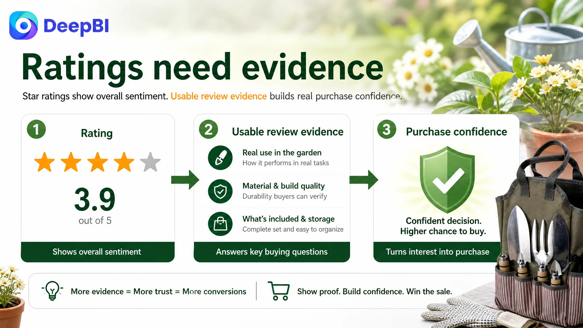
Both listings displayed a 3.9-star rating, but the quality of the review presentation was materially different. The customer listing showed 25 total reviews, yet the page capture contained no valid review content on the first page. The benchmark listing had 28 total reviews and eight visible reviews with specific usage experiences.
This created an important trust problem.
A star rating without accessible, credible review content gives shoppers little evidence about actual use. In contrast, detailed reviews can help future buyers assess durability, comfort, tool completeness, and suitability for indoor or outdoor gardening.
The issue was not simply that the customer listing had fewer reviews. It was that the available review signal did not function effectively as proof.
This also affected the interpretation of negative feedback. The customer listing showed a 38% share of reviews at three stars or below, while the benchmark had a higher approximate negative-review share. Yet the benchmark’s review system was more complete and its detailed positive experiences could provide balance. The customer listing lacked that same visible trust structure.
A listing cannot rely on a rating number alone when the product page is already asking shoppers to accept claims about durability and usability.
Why DeepBI Did Not Recommend Tuning Ads First
The case did not call for abandoning Amazon ads. It called for putting the page diagnosis ahead of further traffic expansion.
Ads can create impressions and clicks. They cannot, by themselves, make a static product page communicate use, quality, or confidence more effectively.
If the page is weak at the conversion stage, additional traffic may simply expose more shoppers to the same uncertainty:
- The main image shows a kit but not its practical capability.
- The title contains relevant information but does not prioritize every high-value search and use-case signal.
- The bullet points describe features without consistently connecting them to customer concerns.
- The A+ page repeats product information instead of progressing from application to proof.
- The visible review experience does not provide enough confidence.
In that situation, continued ad tuning can create the appearance of optimization while leaving the central constraint untouched.
Advertising does not only amplify strengths. It can also amplify a product page’s existing conversion defects.
DeepBI’s judgment came from connecting the score distribution with the content structure. The page did not show a catastrophic title or main-image failure. Instead, the largest gaps were in the areas responsible for trust, explanation, and decision support.
That made Listing conversion capacity the first priority.
The Optimization Direction Followed a Different Order
The recommended sequence was not a long list of disconnected edits. It was a change in decision order.
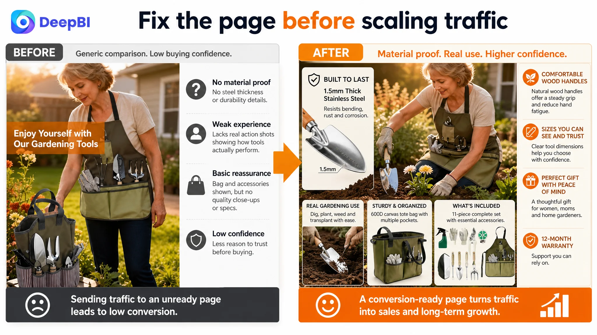
First: show the gardening task
Use real activity scenes early in the image sequence and at the beginning of A+ content. The customer should see the tools digging, planting, cultivating, or weeding rather than only arranged beside a bag or apron.
Second: confirm the core product
Present the five main tools clearly and show what is included. Make the full kit easy to understand without forcing shoppers to count or interpret a cluttered composition.
Third: make verified specifications visible
Use confirmed material and size information, including 1.5mm stainless steel, natural wooden handles, 600D canvas, and precise dimensions where available.
Fourth: connect features to user outcomes
Rewrite the title and bullet points around complete kit value, durability, comfort, organization, beginner suitability, and gifting use cases.
Fifth: validate the accessories
Use close-up details to establish that the storage bag and apron are practical parts of the set, not low-value extras.
Sixth: reinforce comfort and reassurance
Use handle details and the 12-month warranty to reduce practical and purchase risk after the core product value has already been established.
This order reflects how shoppers evaluate a garden tools set. They first need to understand what the product is for, then whether it can perform, then whether its materials and construction justify confidence, and finally whether the purchase feels safe.
What Changed in the Customer’s Business Understanding
The case material does not include post-optimization CVR, ACOS, TACOS, CTR, or organic-order results. No performance numbers should therefore be assigned to the later recommendations.
What can be stated clearly is the change in operating judgment.
The customer was no longer looking at the Amazon Listing as a collection of assets that needed cosmetic improvement. The title, main images, bullet points, A+ content, and reviews were understood as one connected conversion system.
That changed several priorities:
- The title was treated as both a search entry point and a positioning statement.
- The main images were treated as decision-stage communication, not product decoration.
- The bullet points were treated as a feature-to-benefit sequence rather than a specification list.
- The A+ page was treated as a structured trust journey rather than a group of promotional modules.
- Reviews were treated as part of the page’s proof system, not merely a star score.
- Advertising was treated as traffic that must be earned by the page’s ability to convert.
DeepBI’s role in this case was not to produce a longer list of edits. It was to identify where the listing was losing commercial force and to establish which problem had to be addressed first.
The Broader Lesson for Amazon Sellers
For many Amazon sellers, a weak conversion rate quickly becomes an advertising conversation. Teams discuss bids, search terms, campaign structure, and budget allocation because those are visible operating controls.
But when the page itself is not persuasive, advertising optimization can become a way of managing symptoms.
The more useful question is:
If the listing receives the next wave of relevant traffic, does the page give shoppers enough evidence to act?
For this garden tools listing, the answer was not yet strong enough. The product had real attributes to communicate: a complete 11-piece set, 1.5mm stainless steel tools, wooden handles, a 600D canvas tote bag, practical gardening accessories, and a 12-month warranty.
The problem was that these attributes were not arranged into a sufficiently clear sales logic.
A stronger Amazon product page would make the customer understand the product in sequence:
Here is the gardening task. Here are the tools that handle it. Here is what they are made of. Here is how they feel and function. Here is how the set stays organized. Here is why it is suitable for the intended user.
Only after that sequence is clear can additional paid traffic become more useful.
The real correction was not “make the listing look better.” It was to rebuild the page so that the product’s actual value could be understood, verified, and trusted.